Nested Gradients with background-clip
I can’t say I use background-clip all that often. I’d wager it’s hardly ever used in day-to-day CSS work. But I was reminded of it in a post by Stefan Judis, which consistently was itself a learning-response post to a post over here by Ana Tudor.
Here’s a quick explanation.
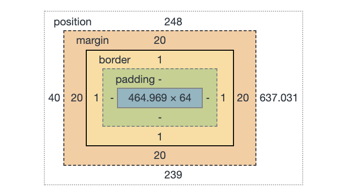
You’ve probably seen this thing a million times:
That’s showing you the size and position of an element, as well as how that size is made up: content size, padding, margin, and border.
Those things aren’t just theoretical to help with understanding and debugging. Elements actually have a content-box, padding-box, and border-box. Perhaps we encounter that most often when we literally set the box-sizing property. (It’s tremendously useful to universally set it to border-box).
Those values are the same values as background-clip uses! Meaning that you can set a background to only cover those specific areas. And because multiple backgrounds is a thing, that means we can have multiple backgrounds with different clipping on each.
Like this:
See the Pen
Multiple background-clip by Chris Coyier (@chriscoyier)
on CodePen.
But that’s boring and there are many ways to pull off that effect, like using borders, outline, and box-shadow or any combination of them.
What is more interesting is the fact that those backgrounds could be gradients, and that’s a lot harder to pull off any other way!
See the Pen
Nested Gradients by Chris Coyier (@chriscoyier)
on CodePen.
The post Nested Gradients with background-clip appeared first on CSS-Tricks.
