Archive

Archive for August, 2019

Faster Image Loading With Embedded Image Previews

August 23rd, 2019 No comments
Representation of the temporal structure of a JPEG in baseline mode

Faster Image Loading With Embedded Image Previews

Faster Image Loading With Embedded Image Previews

Christoph Erdmann

2019-08-23T13:30:59+02:002019-08-23T15:35:46+00:00

Low Quality Image Preview (LQIP) and the SVG-based variant SQIP are the two predominant techniques for lazy image loading. What both have in common is that you first generate a low-quality preview image. This will be displayed blurred and later replaced by the original image. What if you could present a preview image to the website visitor without having to load additional data?

JPEG files, for which lazy loading is mostly used, have the possibility, according to the specification, to store the data contained in them in such a way that first the coarse and then the detailed image contents are displayed. Instead of having the image built up from top to bottom during loading (baseline mode), a blurred image can be displayed very quickly, which gradually becomes sharper and sharper (progressive mode).

Representation of the temporal structure of a JPEG in baseline mode

Baseline mode (Large preview)

Representation of the temporal structure of a JPEG in progressive mode

Progressive mode (Large preview)

In addition to the better user experience provided by the appearance that is displayed more quickly, progressive JPEGs are usually also smaller than their baseline-encoded counterparts. For files larger than 10 kB, there is a 94 percent probability of a smaller image when using progressive mode according to Stoyan Stefanov of the Yahoo development team.

If your website consists of many JPEGs, you will notice that even progressive JPEGs load one after the other. This is because modern browsers only allow six simultaneous connections to a domain. Progressive JPEGs alone are therefore not the solution to give the user the fastest possible impression of the page. In the worst case, the browser will load an image completely before it starts loading the next one.

The idea presented here is now to load only so many bytes of a progressive JPEG from the server that you can quickly get an impression of the image content. Later, at a time defined by us (e.g. when all preview images in the current viewport have been loaded), the rest of the image should be loaded without requesting the part already requested for the preview again.

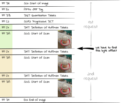
Shows the way the EIP (Embedded image preview) technique loads the image data in two requests.

Loading a progressive JPEG with two requests (Large preview)

Unfortunately, you can’t tell an img tag in an attribute how much of the image should be loaded at what time. With Ajax, however, this is possible, provided that the server delivering the image supports HTTP Range Requests.

Using HTTP range requests, a client can inform the server in an HTTP request header which bytes of the requested file are to be contained in the HTTP response. This feature, supported by each of the larger servers (Apache, IIS, nginx), is mainly used for video playback. If a user jumps to the end of a video, it would not be very efficient to load the complete video before the user can finally see the desired part. Therefore, only the video data around the time requested by the user is requested by the server, so that the user can watch the video as fast as possible.

We now face the following three challenges:

  1. Creating The Progressive JPEG
  2. Determine Byte Offset Up To Which The First HTTP Range Request Must Load The Preview Image
  3. Creating the Frontend JavaScript Code

1. Creating The Progressive JPEG

A progressive JPEG consists of several so-called scan segments, each of which contains a part of the final image. The first scan shows the image only very roughly, while the ones that follow later in the file add more and more detailed information to the already loaded data and finally form the final appearance.

How exactly the individual scans look is determined by the program that generates the JPEGs. In command-line programs like cjpeg from the mozjpeg project, you can even define which data these scans contain. However, this requires more in-depth knowledge, which would go beyond the scope of this article. For this, I would like to refer to my article “Finally Understanding JPG“, which teaches the basics of JPEG compression. The exact parameters that have to be passed to the program in a scan script are explained in the wizard.txt of the mozjpeg project. In my opinion, the parameters of the scan script (seven scans) used by mozjpeg by default are a good compromise between fast progressive structure and file size and can, therefore, be adopted.

To transform our initial JPEG into a progressive JPEG, we use jpegtran from the mozjpeg project. This is a tool to make lossless changes to an existing JPEG. Pre-compiled builds for Windows and Linux are available here: https://mozjpeg.codelove.de/binaries.html. If you prefer to play it safe for security reasons, it’s better to build them yourself.

From the command line we now create our progressive JPEG:

$ jpegtran input.jpg > progressive.jpg

The fact that we want to build a progressive JPEG is assumed by jpegtran and does not need to be explicitly specified. The image data will not be changed in any way. Only the arrangement of the image data within the file is changed.

Metadata irrelevant to the appearance of the image (such as Exif, IPTC or XMP data), should ideally be removed from the JPEG since the corresponding segments can only be read by metadata decoders if they precede the image content. Since we cannot move them behind the image data in the file for this reason, they would already be delivered with the preview image and enlarge the first request accordingly. With the command-line program exiftool you can easily remove these metadata:

$ exiftool -all= progressive.jpg

If you don’t want to use a command-line tool, you can also use the online compression service compress-or-die.com to generate a progressive JPEG without metadata.

2. Determine Byte Offset Up To Which The First HTTP Range Request Must Load The Preview Image

A JPEG file is divided into different segments, each containing different components (image data, metadata such as IPTC, Exif and XMP, embedded color profiles, quantization tables, etc.). Each of these segments begins with a marker introduced by a hexadecimal FF byte. This is followed by a byte indicating the type of segment. For example, D8 completes the marker to the SOI marker FF D8 (Start Of Image), with which each JPEG file begins.

Each start of a scan is marked by the SOS marker (Start Of Scan, hexadecimal FF DA). Since the data behind the SOS marker is entropy coded (JPEGs use the Huffman coding), there is another segment with the Huffman tables (DHT, hexadecimal FF C4) required for decoding before the SOS segment. The area of interest for us within a progressive JPEG file, therefore, consists of alternating Huffman tables/scan data segments. Thus, if we want to display the first very rough scan of an image, we have to request all bytes up to the second occurrence of a DHT segment (hexadecimal FF C4) from the server.

Shows the SOS markers in a JPEG file

Structure of a JPEG file (Large preview)

In PHP, we can use the following code to read the number of bytes required for all scans into an array:

<?php
$img = "progressive.jpg";
$jpgdata = file_get_contents($img);
$positions = [];
$offset = 0;
while ($pos = strpos($jpgdata, "xFFxC4", $offset)) {
    $positions[] = $pos+2;
    $offset = $pos+2;
}

We have to add the value of two to the found position because the browser only renders the last row of the preview image when it encounters a new marker (which consists of two bytes as just mentioned).

Since we are interested in the first preview image in this example, we find the correct position in $positions[1] up to which we have to request the file via HTTP Range Request. To request an image with a better resolution, we could use a later position in the array, e.g. $positions[3].

3. Creating The Frontend JavaScript Code

First of all, we define an img tag, to which we give the just evaluated byte position:

<img data-src="progressive.jpg" data-bytes="<?= $positions[1] ?>">

As is often the case with lazy load libraries, we do not define the src attribute directly so that the browser does not immediately start requesting the image from the server when parsing the HTML code.

With the following JavaScript code we now load the preview image:

var $img = document.querySelector("img[data-src]");
var URL = window.URL || window.webkitURL;

var xhr = new XMLHttpRequest();
xhr.onload = function(){
    if (this.status === 206){
        $img.src_part = this.response;
        $img.src = URL.createObjectURL(this.response);
    }
}

xhr.open('GET', $img.getAttribute('data-src'));
xhr.setRequestHeader("Range", "bytes=0-" + $img.getAttribute('data-bytes'));
xhr.responseType = 'blob';
xhr.send();

This code creates an Ajax request that tells the server in an HTTP range header to return the file from the beginning to the position specified in data-bytes… and no more. If the server understands HTTP Range Requests, it returns the binary image data in an HTTP-206 response (HTTP 206 = Partial Content) in the form of a blob, from which we can generate a browser-internal URL using createObjectURL. We use this URL as src for our img tag. Thus we have loaded our preview image.

We store the blob additionally at the DOM object in the property src_part, because we will need this data immediately.

In the network tab of the developer console you can check that we have not loaded the complete image, but only a small part. In addition, the loading of the blob URL should be displayed with a size of 0 bytes.

Shows the network console and the sizes of the HTTP requests

Network console when loading the preview image (Large preview)

Since we already load the JPEG header of the original file, the preview image has the correct size. Thus, depending on the application, we can omit the height and width of the img tag.

Alternative: Loading the preview image inline

For performance reasons, it is also possible to transfer the data of the preview image as data URI directly in the HTML source code. This saves us the overhead of transferring the HTTP headers, but the base64 encoding makes the image data one third larger. This is relativized if you deliver the HTML code with a content encoding like gzip or brotli, but you should still use data URIs for small preview images.

Much more important is the fact that the preview images are available immediately and there is no noticeable delay for the user when building the page.

First of all, we have to create the data URI, which we then use in the img tag as src. For this, we create the data URI via PHP, whereby this code is based on the code just created, which determines the byte offsets of the SOS markers:

<?php
…

$fp = fopen($img, 'r');
$data_uri = 'data:image/jpeg;base64,'. base64_encode(fread($fp, $positions[1]));
fclose($fp);

The created data URI is now directly inserted into the `img` tag as src:

<img src="<?= $data_uri ?>" data-src="progressive.jpg" alt="">

Of course, the JavaScript code must also be adapted:

<script>
var $img = document.querySelector("img[data-src]");

var binary = atob($img.src.slice(23));
var n = binary.length;
var view = new Uint8Array(n);
while(n--) { view[n] = binary.charCodeAt(n); }

$img.src_part = new Blob([view], { type: 'image/jpeg' });
$img.setAttribute('data-bytes', $img.src_part.size - 1);
</script>

Instead of requesting the data via Ajax request, where we would immediately receive a blob, in this case we have to create the blob ourselves from the data URI. To do this, we free the data-URI from the part that does not contain image data: data:image/jpeg;base64. We decode the remaining base64 coded data with the atob command. In order to create a blob from the now binary string data, we have to transfer the data into a Uint8 array, which ensures that the data is not treated as a UTF-8 encoded text. From this array, we can now create a binary blob with the image data of the preview image.

So that we don’t have to adapt the following code for this inline version, we add the attribute data-bytes on the img tag, which in the previous example contains the byte offset from which the second part of the image has to be loaded.

In the network tab of the developer console, you can also check here that loading the preview image does not generate an additional request, while the file size of the HTML page has increased.

Shows the network console and the sizes of the HTTP requests

Network console when loading the preview image as data URI (Large preview)

Loading the final image

In a second step we load the rest of the image file after two seconds as an example:

setTimeout(function(){
    var xhr = new XMLHttpRequest();
    xhr.onload = function(){
        if (this.status === 206){
            var blob = new Blob([$img.src_part, this.response], { type: 'image/jpeg'} );
            $img.src = URL.createObjectURL(blob);
        }
    }
    xhr.open('GET', $img.getAttribute('data-src'));
    xhr.setRequestHeader("Range", "bytes="+ (parseInt($img.getAttribute('data-bytes'), 10)+1) +'-');
    xhr.responseType = 'blob';
    xhr.send();
}, 2000);

In the Range header this time we specify that we want to request the image from the end position of the preview image to the end of the file. The answer to the first request is stored in the property src_part of the DOM object. We use the responses from both requests to create a new blob per new Blob(), which contains the data of the whole image. The blob URL generated from this is used again as src of the DOM object. Now the image is completely loaded.

Also now we can check the loaded sizes in the network tab of the developer console again..

Shows the network console and the sizes of the HTTP requests

Network console when loading the entire image (31.7 kB) (Large preview)

Prototype

At the following URL I have provided a prototype where you can experiment with different parameters: http://embedded-image-preview.cerdmann.com/prototype/

The GitHub repository for the prototype can be found here: https://github.com/McSodbrenner/embedded-image-preview

Considerations At The End

Using the Embedded Image Preview (EIP) technology presented here, we can load qualitatively different preview images from progressive JPEGs with the help of Ajax and HTTP Range Requests. The data from these preview images is not discarded but instead reused to display the entire image.

Furthermore, no preview images need to be created. On the server-side, only the byte offset at which the preview image ends has to be determined and saved. In a CMS system, it should be possible to save this number as an attribute on an image and take it into account when outputting it in the img tag. Even a workflow would be conceivable, which supplements the file name of the picture by the offset, e.g. progressive-8343.jpg, in order not to have to save the offset apart from the picture file. This offset could be extracted by the JavaScript code.

Since the preview image data is reused, this technique could be a better alternative to the usual approach of loading a preview image and then a WebP (and providing a JPEG fallback for non-WebP-supporting browsers). The preview image often destroys the storage advantages of the WebP, which does not support progressive mode.

Currently, preview images in normal LQIP are of inferior quality, since it is assumed that loading the preview data requires additional bandwidth. As Robin Osborne already made clear in a blog post in 2018, it doesn’t make much sense to show placeholders that don’t give you an idea of the final image. By using the technique suggested here, we can show some more of the final image as a preview image without hesitation by presenting the user a later scan of the progressive JPEG.

In case of a weak network connection of the user, it might make sense, depending on the application, not to load the whole JPEG, but e.g. to omit the last two scans. This produces a much smaller JPEG with an only slightly reduced quality. The user will thank us for it, and we don’t have to store an additional file on the server.

Now I wish you a lot of fun trying out the prototype and look forward to your comments.

(dm, yk, il)
Categories: Others Tags:

5 Human Things UX Designers Can Learn From Conversational Design

August 23rd, 2019 No comments

It seems like magic: you talk to the phone, and it talks back. And if you’re lucky, it says something useful. You type into the chat box, and if the bot is good, you find out what you need to know. [Cue: shocked-looking stock photo models.] The current marketing term for it is “conversational design”, and it’s gaining more and more traction beyond big companies like Apple, Google, and Amazon.

Conversational design is actually old, in technological terms. IBM did a lot of the groundwork for voice-activated tech as far back as the ’60s. One of the first big chatbots, Jabberwacky, was conceived in 1981 and launched in 1997, and later evolved into Cleverbot.

Chatbots and their voice-activated cousins were initially little more than proofs of concept

Chatbots and their voice-activated cousins were initially little more than proofs of concept. There was even a bot or two where you could talk to “God”. Then came Apple, with Siri. Siri was probably the first commercially viable conversational interface. At least, it was the first massively successful UI of its kind.

Since then, the concept has taken off, and now everyone who wants to provide customer service without actually talking to their customers, is in on it…with conversational UIs of varying quality. See, good conversational design is just good design. You have to follow pretty much the same basic principles to get your message across. However, building a good conversational UI requires us to focus on design principles that might not otherwise get a lot of love in your average visual UI.

In the spirit of looking beyond our immediate area of expertise, and learning from other design disciplines, let’s see what the best conversational designers can teach the rest of us:

1. Anticipation

Anticipating the needs of our users is central to all design projects, no matter what kind of design you’re talking about. Conversational design, however, takes this to another level. Dealing with the needs of people who are talking to their device like it’s a person requires anticipating all the questions they might have, and indeed, all the ways they might ask those questions.

The best conversational UIs are based on very thorough research, massive data sets, years of testing, and a fair amount of guesswork to try and predict what people are going to need. Doing an A/B test doesn’t sound so bad now, does it?

2. Interpretation

Real conversations often go something like, “Hey, you know that guy, the pretty one, from the show yesterday?”

“We were watching stuff on the CW. They’re all annoyingly pretty.”

“The one with the hair? The dark hair? Skinny… goes fast?”

“You mean The Flash. Goddammit Brian, his superhero name is two short words. You can and should remember this.”

Human beings are highly inefficient at communicating what they mean, which is why there are literal college courses on various forms of communication. Half the effort of a conversation is often spent trying to figure out another person’s frame of reference, to then figure out what they mean.

Conversational UIs, therefore, cannot rely on specific, limited input from their users, like visual UIs can. They have to take a chunk of speech or text, scan it for meaning, scan it for relevant information, and then see if there’s anything at all they can do with it. And they’re typically not allowed to swear at us.

Beyond anticipating a user’s needs, all designers need to get better at determining their intent, when they click on a button five times to see if it’ll do something different, browse through the navigation menu seemingly at random, or any other weird stuff you see in your analytics.

3. Flexibility

For a quick example, let’s look at what happens when a conversational UI is not nearly flexible enough.

4. There Are Two Sides to Every Button Click

Regular UI design often comes down to laying out a path, a journey, and hoping users will hit all the right buttons to follow it. Conversational design recognizes the fact that every time someone uses your UI (of any kind), there’s a a two-way conversation happening. You said your piece already, when you designed the interface, and now it’s the user’s turn.

With a live conversation, we can adapt to someone’s input in real time, and the conversation will change to reflect that. The better conversational UIs can do this as well.

Imagine a world where your website can adapt to the user’s input on the fly, making it easier for them to find things they want. It already exists to some extent, with algorithms, big data, curated timelines (ugh), and recommended products (meh), and even some innovative apps that do their best to offer help when a user seems lost (thanks!), but this is a concept we’ve barely begun to explore. And it’s exciting.

5. Just Use Semantic HTML Already

We already know we need proper, semantic HTML for better SEO. And we need it for people who can’t rely on their eyes to browse the Internet. But if that’s not enough for you, consider poor Siri, Alexa, and their long-suffering siblings. The artificial assistants we talk to sometimes have to read through your markup—that’s right, your markup—to figure out where and what in the seven hells your phone number is, for example.

Listen, I’m not saying that improperly formatted data is what’s going to set off the AI rebellion, but I’m pretty sure that people who write bad HTML will be pretty high on “The List”.

Featured image via DepositPhotos.

Source

Categories: Designing, Others Tags:

Weekly Platform News: Improving UX on Slow Connections, a Tip for Writing Alt Text and a Polyfill for the HTML loading attribute

August 22nd, 2019 No comments

In this week’s roundup, how to determine a slow connection, what we should put into alt text for images, and a new polyfill for the HTML loading attribute, plus more.

Detecting users on slow connections

Algolia is using the Network Information API (see the API‘s Chrome status page) to detect users on slow connections — about 9% of their users — and make the following adjustments to ensure a good user experience:

  • increase the request timeout when the user performs a search query (a static timeout can cause a false positive for users on slow connections)
  • show a notification to the user while they’re waiting for search results (e.g., “You are on a slow connection. This might take a while.”)
  • request fewer search results to decrease the total response size
  • debounce queries (e.g., don’t send queries at every keystroke)
navigator.connection.addEventListener("change", () => {
  // effective round-trip time estimate in ms
  let rtt = navigator.connection.rtt;

  // effective connection type
  let effectiveType = navigator.connection.effectiveType;

  if (rtt > 500 || effectiveType.includes("2g")) {
    // slow connection
  }
});

(via Jonas Badalic)

Alt text should communicate the main point

The key is to describe what you want your audience to get out of the image rather than a simple description of what the image is.

<!-- BEFORE -->
<img alt="Graph showing the use of the phrase "Who you
          gonna call?" in popular media over time.">

<!-- AFTER -->
<img alt="Graph illustrating an 800% increase in the use
          of the phrase "Who you gonna call?" in popular
          media after the release of Ghostbusters on
          June 7th, 1984.">

(via Caitlin Cashin)

In other news…

  • There is a new polyfill for the HTML loading attribute that is used by wrapping the images and iframes that you want to lazy-load in elements (via Maximilian Franzke).
  • WeChat, the Chinese multi-purpose app with over one billion monthly active users, hosts over one million “mini programs” that are built in a very similar fashion to web apps (essentially CSS and JavaScript) (via Thomas Steiner).
  • Microsoft has made 24 new (online) voices from 21 different languages available to the Speech Synthesis API in the preview version of Edge (“these voices are the most natural-sounding voices available today”) (via Scott Low)

Read more news in my new, weekly Sunday issue. Visit webplatform.news for more information.

The post Weekly Platform News: Improving UX on Slow Connections, a Tip for Writing Alt Text and a Polyfill for the HTML loading attribute appeared first on CSS-Tricks.

Categories: Designing, Others Tags:

Advice for Technical Writing

August 22nd, 2019 No comments

In advance of a recent podcast with the incredible technical writer and Smashing Magazine editor-in-chief Rachel Andrew, I gathered up a bunch of thoughts and references on the subject of technical writing. So many smart people have said a lot of smart things over the years that I thought I’d round up some of my favorite advice and sprinkle in my own experiences, as someone who has also done his fair share of technical writing and editing.

There is a much larger world of technical writing out there. My experience and interest is largely about web technology and blogging, so I’m coming at it from that angle and many of the people I quote throughout are in that same boat.

Picking something to write about

If you want to write for CSS-Tricks and you ask me what you should write about, I’m probably going to turn that question around on you. It’s likely I don’t know you well enough to pick the perfect topic for you. More importantly, what I really want you to write about is something that is personal and important to you. Articles rooted in recent excitement about a particular idea or technology always come out better than dictated assignments.

My best advice:

Write the article you wish you found when you googled something.

— Chris Coyier (@chriscoyier) October 30, 2017

That said, I do maintain a list of ideas specifically for this site. Any writing can be done on assignment and sometimes that elicits the spark needed for something great and on-target for the audience of a site.

Write at the moment of learning

The moment you learn something is the best time to write. It’s fresh in your mind and you can remember what it was like before you understood it. You also understand what it takes to go from not knowing to knowing it. That’s the journey you need to take people on.

If you don’t have time, at least try to capture the vibe wherever you save your ideas. Don’t just write down “dataset.” Write down some quick notes like, “I didn’t realize DOM elements had a .dataset property for getting and setting data attributes. I wonder if it’s better to use that than getAttribute.” That way, you’ll be able to reload that realization in your brain when you revisit the idea.

What have you learned in just the last few days? I bet there is a blog post there. Manuel Matuzovic does an excellent job of putting this into practice with the “Today I Learned” (TIL) section of his blog.

Comparing technologies is an underused format

Here’s some advice Rachel shared that I don’t see taken advantage of nearly enough:

There is a sweet spot for writing technical posts and tutorials. Write for the professional who hasn’t had time to learn that thing yet, and link it back to things they already know. For example explaining a modern JS technique to someone who knows jQuery.

— Rachel Andrew (@rachelandrew) February 20, 2019

Tell me about how this new framework relates to Backbone. Tell me how this CMS relates to WordPress. Tell me how some technology connects to another technology that is safe to assume is more widely understood.

Technology changes a lot, but what technology does doesn’t change all that much.

Careful with that intro

The main comment I add on tutorials I review is to ask for an intro that describes what the tutorial is about. I’m 600 words in and still don’t know what the tutorial is about and who it is for. #writing

— Rachel Andrew (@rachelandrew) January 5, 2018

Not getting to the point right at the top of technical articles is a dang epidemic. The start of a technical article is not the time to wax poetic or drop some cliché light philosophy like, “Web design sure has changed a lot.” You don’t have to be boring, but you do need to tell me what this article is going to get into and who it is for.

Brian Rinaldi says:

“Does the title make the article sound interesting?” If the title interests a reader, they’ll typically read the intro and decide, “Is it worth my time reading the whole thing?” A common mistake I see in a lot of technical posts is either too much introduction or, alternatively, far too little.

A single well-written paragraph can set the stage for a technical blog post.

Careful with the title, too

I remember a conversation from years ago with content strategist Erin Kissane where she strongly advised me to choose boring titles for everything. Not just the title of blog posts, but for everything, including the names of sections, tags, and even subheadings within posts.

Here’s the thing with boring: it works. Boring isn’t the right word either; it’s clarity. The world is full of clickbait, and maybe that’s effective in some genres, but technical blogging isn’t one of them.

A nice clear blog post title: Getting Started with GraphQL, Phoenix, and React by Margaret Williford

A terrible version of the same: Build a web app with modern technologies in 30 minutes!

What’s a web app? What technologies? What’s modern about them? What’s with the weird time limit?

SEO matters and Margaret’s article is going to do a lot better in both the short and long term with that clear title.

The outro

Ben Halpern says that the next most important thing after the intro is:

[…] the last paragraph.

People don’t read top-to-bottom the moment when they arrive, so there is a good chance it’s the second paragraph people read. Personally, I find the beginning a lot more important than the ending, but there is a certain art to the ending as well.

A lot of people just

Conclusion

and write a few words about what was just went over. Honestly, I don’t hate that. It falls into this time tested pattern:

  1. Tell ’em what you’re gonna tell ’em
  2. Tell ’em
  3. Tell ’em what you told ’em

That helps your message sink in and brings things full circle. Technical blogging isn’t terribly different from marketing in that sense. You’re trying to get people to understand something and you’re using whatever tricks you need to to get the job done. A little repetition is a classic trick.

Make it scannable

Brian Rinaldi says:

[…] the wall of text can be easily be made less intimidating and appear much more visually appealing through the use of visual elements that break it up. The easiest is to simply place section subheadings throughout your post.

I agree: subheadings are probably the easiest and most powerful trick for scannability.

Other methods:

  • Lists: Like what I’m doing right now! I didn’t have to use a list. Paragraphs might have worked as well, but a list makes contextual sense here and is probably tricking some of you into reading this. Or at least scanning it and getting some key points in the process.
  • Images: Please make them relevant and contextual. Skip the funny GIF. Screenshots are often great in a technical context because they provide a visual to what might otherwise be a difficult concept to explain. I like Unsplash for thematic imagery, too, but you can do better than a random picture of trees, a woman drinking coffee, or a random rack of servers.
  • Illustrations: The abstract nature of an illustration is your friend. It tricks people into having a quick thought about what you are describing. They generally take a little work to pull off, but the pay-off for you and the reader can be huge.
  • Videos: You can’t simply drop a 42-minute video in the middle of a blog post, but if you can make it clear that you are demonstrating something visual and the video is less than a minute, it can be a powerful choice. You’ve always got as well to make it GIF-like.
  • Blocks of code: Technical blog posts are often about code. Don’t avoid code, embrace it. I love how Dan Abramov sprinkles in code blocks in blog posts not so much to demonstrate syntax and setup, but to make points. I’m going to recommend Embedded Pens as well, because they’re fully interactive demoes in addition to serving as code blocks.
  • Tables: Don’t forget about tabular data! Presenting information (particularly data or definitions) in a table makes it more understandable than it would have been any other way.
  • Collapsing sections: The
    /

    elements make quick work of collapsible content. If you’ve got a large section of content that is good to be there but doesn’t need to be read by everyone, collapse it! Our reference guide of media queries for devices is a decent example of this in action.

Whatever you pick here, you should pick things that help enhance the points you’re making even if in some ways it feels like trickery. It’s trickery to help readability, and that’s a good thing.

My favorite technique? A little bit of design. Use design principals like spacing, color, and alignment to help the readability of posts. We even go so far as to art direct some posts where design can enhance the central point being made.

The point here isn’t to do away with walls of text altogether. Sometimes that’s exactly what’s needed because you’re asking a reader to deeply read a passage that they otherwise wouldn’t get what’s needed from the content. However, more often than not, a post can strongly benefit from some healthy use of white space.

Use an active voice

I find this one a little tricky to wrap my head around, but Katy Decorah has a great presentation about technical writing that explains this point in great detail. It’s kinda like using present tense and stating a point directly rather than passively.

Passive: “After the file is downloaded…”
Active: “After you download the file…”

Passive: “The request is processed by the server.”
Active: “The server processes the request.”

Here’s another clear explanation with examples by Neal Whitman, read by Mignon Fogarty (Grammar Girl):

The key point is made about a minute into the recording.

There are lots of words to avoid

“Just” is a big one. Brad Frost:

“Just” makes me feel like an idiot. “Just” presumes I come from a specific background, studied certain courses in university, am fluent in certain technologies, and have read all the right books, articles, and resources. “Just” is a dangerous word.

There are plenty of others to avoid, which which I’ve written about before. Read the comments in that last link. Long story short: there are lots of words that do more harm than good in technical writing, not only because they can come across as preachy, but because they usually don’t help the sentences where they’re used. Try taking “just” out of any sentence. The sentence will still make sense without it.

Simply Clearly Just Of course Everyone knows Easy However So Basically Turns out In order to Very

Be mindful of your tone

Tone is concerned with how you say something in consideration of the context. For example, you wouldn’t deliver bad news to someone with a happy tone. The way you express yourself ought to be aligned with the situation.

This is our tone goal on this site:

Friendly. Authoritative. Welcoming. We’re all in this together. Flexible (nondogmatic about ideas). Thankful.

MailChimp has a very extensive guide to theirs.

It’s worth pointing out that tone and voice are separate concepts. I like to think of voice as never changing (it’s your personality which is a part of who you are) while tone changes to suit the context. In other words, you can have a professional voice while communicating in a friendly tone.

I don’t think there is one true tone that is perfect for technical writing, but since the high-level goal of any technical writing is to help someone understand something complicated, you can use tone to help. A joke in the middle of a set of intricate steps is confusing. A bunch! of! excitement! about something might feel out of place or disingenuous, but being drab and lifeless is worse. I’d say if you’re writing under your own name, let’s feel a little bit of your personality as long as it’s not at the cost of clarity. If you’re writing under a brand, match what they have established whether it has been codified or not.

Careful about length

The general tendency in technical writing is to write too much rather than too little. Wade Christensen:

Whether trained by school assignments with word minimums or just uncritical, most of us write too much. Beyond approaching each draft with a ruthless cutting mentality, there are several ways to write short from draft one.

Word limits can help, even if they’re self-imposed.

I heard from a fledgling editor recently who struggled with his writers submitting posts with high word counts, so he suggested they keep it to 1000-1500 as a guideline and that seemed effective. This post is roughly double the high end there, for comparison.

The real solution, if the resources are there, is ruthless editing.

I personally don’t find that writing too long is the only issue. I’ve had just as many occurrences of writers going too short and not digging into the topic deep enough. I don’t like focusing on the length; I like focusing on the clarity of the delivery and usefulness of the content itself.

Side note: Breaking up a post into multiple parts (as separate posts in a series) is not a solution for posts that are too long. In fact, it can exacerbate the problem. Do that only if the different parts are thematically different and can stand alone without the other parts.

Don’t stop yourself from writing

There is an invisible force, built from fear, that keeps a lot of people away from technical blogging. “Meh, everybody already knows this,” you might think. (They don’t). “What if I’m wrong and someone calls me out?” (You aren’t wrong if what you’re doing is working for you.)

There can still be blockers even if you overcome those fears and start putting words to screen. Here’s Max Böck:

There is a thing that happens to me while writing. I start with a fresh idea, excited to shape it into words. But as time passes, I lose confidence.

The trick for Max is not to wait too long and to ignore feelings holding you back:

I’ll publish something as soon as I feel confident that all the important points I want to get across are there. I try to ignore the voice screaming “it’s not ready” just for long enough to push it online.

Jeremy Keith goes so far to say we shouldn’t even keep drafts:

I think keeping drafts can be counterproductive. The problem is that, once something is a draft rather than a blog post, it’s likely to stay a draft and never become a blog post. And the longer something stays in draft, the less likely it is to ever see the light of day.

The chances that your writing helps someone is pretty high! Matthias Ott:

Even the smallest post can help someone else out there.

Think you’re too inexperienced? You’re probably not, but even if you were, a perspective from someone with less experience is still useful. Ali Spittel:

If you have a blog post that contains mostly correct information, or at least your interpretation of the topic, then you’re experienced enough. There are lots of excellent posts out there from the perspective of newbies, and they’re really important!

Fear is a real thing in writing and dealing with it can be debilitating. While it’s primarily geared toward creative writing, The War of Art by Stephen Pressfield is a good read to help break through the fear.

There is no one perfect style

We each have our own unique perspectives and writing styles. One writing style might be more approachable to some, and can therefore help and benefit a large (or even small) number of people in ways you might not expect.

…says Sara Soueidan. She continues:

Just write.

Even if only one person learns something from your article, you’ll feel great, and that you’ve contributed — even if just a little bit — to this amazing community that we’re all constantly learning from.

Technical blog posts don’t have to be devoid of creativity. You could create a wonderful technical blog post that is an annotated chat room conversation between two developers learning from each other. Or a blog post that is a series of videos that build on each other.

The more introductory, the higher the bar

The web is saturated with beginner-rated and surface-level blog posts. There’s a sea of crash courses, 101s, and intros out there. You’ve gotta knock it out of the park if you want to stand out from the pack and be useful.

There is no particular change in tone necessarily for a beginner-focused post. You don’t need to do the equivalent of talking slowly or talking down. You only need to be clear, and clarity is valuable to readers at any skill level, not to mention appreciated by them as well. A very advanced programmer can and will appreciate the clarity in a technical blog post even if it’s something they already understand.

But the bar isn’t that high in general

You don’t need a decade of experience to write a blog post. I’d say it’s closer to a day of experience, a desire to write, and having something to say. I think you’d be surprised at how little you need to do to make a blog post stand out and be read. Put in some effort, make clear points, focus on readability, and you will do well.

I hope the advice in this post helps!

Abstraction is helpful, but real-world examples are sometimes better

Christine writes:

It’s one thing to describe a high-level concept, and another to explain or illustrate how that concept applies to the real world. In technical writing, you’ll often be covering complex or hard-to-understand subjects, so it’s even more important to use a well-placed example or two to showcase why your topic matters, or how it relates to the real world.

I find myself pushing back on code that is too abstract more than I push back on code that is too focused on a real-world use case. I’d rather see ["Charles Adok", "Samantha Frederick"] than ["foo", "bar"] or [a, b] any day, but more importantly, what is then done with that data to make it feel like a relatable programming scenario.

But avoid real-world examples that come at the cost of clarity. If abstraction is useful to drive a complex point home without getting lost in the details, so be it.

Blogging opens doors

Everyone I’ve ever met who had ever actively blogged has said that blogging has had a positive impact on their career. Besides being a public demonstration of your ability to think and present ideas, it helps you understand things better. To teach is to learn.

I’d attribute my own blogging as the biggest contributor to any success I’ve had. Here’s Khoi Vinh, a designer ten times more successful than I’ll ever be:

It’s hard to overstate how important my blog has been, but if I were to try to distill it down into one word, it would be: “amplifier.”

You get better at what you do.

There is no way around it: practice makes you better. The expectations around practice are sometimes very clear and culturally ingrained. In order to get better at playing the piano, you take piano lessons and practice. We all know this. But people also say “Oh, I’m a terrible cook,” as if cooking as a skill is somehow fundamentally different than playing the piano and doesn’t require the same amount of learning and practice.

You get better at writing by writing more. That is, writing with stakes. Writing and then publicly publishing what you write such that people read it.

You can go to school for writing. You could get a writing coach. My thinking is nothing teaches better than writing often. Whatever it is you sink time into is what you end up getting good at. Is 10,000 hours a good framework for you? Go with it. Heck, I find even people that sit around watching a lot of TV end up being pretty damn good at watching TV.

Your voice alone < A story with context < Stories including others < Research and data along with stories including others

An article where you just say some stuff is OK. You’re allowed to say stuff.

But you can do better.

An article where you tell a true story about how something worked for you is better. Context! Now we can better understand where you are coming from when you say your stuff. Plus everybody likes a story.

An article where you combine that with quoting other people’s writing and stories is even better. Now you’re painting a larger picture and helping validate what you’re saying. Context and flavor!

An article where you combine all that with research and data is the best. Now you’re being personal, acknowledging a world outside yourself, layering in context, and avoiding being too anecdotal. Kapow! Now you’re writing!

Are you pitching?

Read what the site says about guest writing. Here’s ours.

Not to scare you off, but 90% of submissions are garbage. Maybe 75% is outright spam and another 15% are people that clearly didn’t read anything we had to say about guest posting and are way off base. I can usually tell from the quality of writing in the email itself if they’ll be a good guest blogger.

I say things like that, and then feel compelled to remind you the bar isn’t that high.

Are there any useful tools?

There probably is, but I don’t wanna link you off to tools I can’t vouch for. All I use is Dropbox Paper for collaborative writing because the sharing model is easy and allows for co-editing and commenting. Plus Grammarly because it catches a ton of mistakes as you go.

??

The post Advice for Technical Writing appeared first on CSS-Tricks.

Categories: Designing, Others Tags:

Navbar Nudging on @keyframers

August 22nd, 2019 No comments

I got to be the featured guest over on The Keyframers the other day. We looked at a Dribbble shot by Björgvin Pétur Sigurjónsson and then slowly built it, taking some purposeful detours along the way to discuss various tech.

We start by considering doing it entirely in CSS, then go for some light JavaScript to alter some data attributes as state, then ultimately end up using flipping.

This is where we ended up:

See the Pen
Navbar Nudging w/ Chris Coyier | Three Person Collaborative Animation Tutorial | @keyframers 2.14.0
by @keyframers (@keyframers)
on CodePen.

The video:

(My audio goes from terrible to good at about 12 minutes.)

Other takes!

Some of our Animigos made their own fantastic versions of this animation!

?? @steeevg: https://t.co/ZP5RxJcAAa
?? @mariod: https://t.co/PAFiGyZzGs

Have another solution in mind?
Give it a shot and share your results!

— the @keyframers (@keyframers) August 15, 2019

The post Navbar Nudging on @keyframers appeared first on CSS-Tricks.

Categories: Designing, Others Tags:

Testing Made Easier Via Framework Minimalism And Software Architecture

August 22nd, 2019 No comments
Smashing Editorial

Testing Made Easier Via Framework Minimalism And Software Architecture

Testing Made Easier Via Framework Minimalism And Software Architecture

Ryan Kay

2019-08-22T13:00:59+02:002019-08-23T04:35:30+00:00

Like many other Android developers, my initial foray into testing on the platform lead me to be immediately confronted with a demoralizing degree of jargon. Further, what few examples I came across at the time (circa 2015) did not present practical use cases which may have inclined me to think that the cost to benefit ratio of learning a tool like Espresso in order to verify that a TextView.setText(…) was working properly, was a reasonable investment.

To make matters even worse, I did not have a working understanding of software architecture in theory or practice, which meant that even if I bothered to learn these frameworks, I would have been writing tests for monolithic applications comprised of a few god classes, written in spaghetti code. The punchline is that building, testing, and maintaining such applications is an exercise in self-sabotage quite regardless of your framework expertise; yet this realization only becomes clear after one has built a modular, loosely-coupled, and highly-cohesive application.

From here we arrive at one of the main points of discussion in this article, which I will summarize in plain language here: Among the primary benefits of applying the golden principles of software architecture (do not worry, I will discuss them with simple examples and language), is that your code can become easier to test. There are other benefits to applying such principles, but the relationship between software architecture and testing is the focus of this article.

However, for the sake of those who wish to understand why and how we test our code, we will first explore the concept of testing by analogy; without requiring you to memorize any jargon. Before getting deeper into the primary topic, we will also look at the question of why so many testing frameworks exist, for in examining this we may begin to see their benefits, limitations, and perhaps even an alternative solution.

Testing: Why And How

This section will not be new information for any seasoned tester, but perhaps you may enjoy this analogy nonetheless. Of course I am a software engineer, not a rocket engineer, but for a moment I will borrow an analogy which relates to designing and building objects both in physical space, and in the memory space of a computer. It turns out that while the medium changes, the process is in principle quite the same.

Suppose for a moment that we are rocket engineers, and our job is to build the first stage* rocket booster of a space shuttle. Suppose as well, that we have come up with a serviceable design for the first stage to begin building and testing in various conditions.

“First stage” refers to boosters which are fired when the rocket is first launched

Before we get to the process, I would like to point out why I prefer this analogy: You should not have any difficulty answering the question of why we are bothering to test our design before putting it in situations where human lives are at stake. While I will not try to convince you that testing your applications before launch could save lives (although it is possible depending on the nature of the application), it could save ratings, reviews, and your job. In the broadest sense, testing is the way in which we make sure that single parts, several components, and whole systems work before we employ them in situations where it is critically important for them to not fail.

Returning to the how aspect of this analogy, I will introduce the process by which engineers go about testing a particular design: redundancy. Redundancy is simple in principle: Build copies of the component to be tested to the same design specification as what you wish to use at launch time. Test these copies in an isolated environment which strictly controls for preconditions and variables. While this does not guarantee that the rocket booster will work properly when integrated in the whole shuttle, one can be certain that if it does not work in a controlled environment, it will be very unlikely to work at all.

Suppose that of the hundreds, or perhaps thousands of variables which the copies of the rocket design have been tested against, it comes down to ambient temperatures in which the rocket booster will be test fired. Upon testing at 35° Celsius, we see that everything functions without error. Again, the rocket is tested at roughly room temperature without failure. The final test will be at the lowest recorded temperature for the launch site, at -5° Celcius. During this final test, the rocket fires, but after a short period, the rocket flares up and shortly thereafter explodes violently; but fortunately in a controlled and safe environment.

At this point, we know that changes in temperature appear to be at least involved in the failed test, which leads us to consider what parts of the rocket booster may be adversely effected by cold temperatures. Over time, it is discovered that one key component, a rubber O-ring which serves to staunch the flow of fuel from one compartment to another, becomes rigid and ineffectual when exposed to temperatures approaching or below freezing.

It is possible that you have noticed that his analogy is loosely based on the tragic events of the Challenger space shuttle disaster. For those unfamiliar, the sad truth (insofar as investigations concluded) is that there were plenty of failed tests and warnings from the engineers, and yet administrative and political concerns spurred the launch to proceed regardless. In any case, whether or not you have memorized the term redundancy, my hope is that you have grasped the fundamental process for testing parts of any kind of system.

Concerning Software

Whereas the prior analogy explained the fundamental process for testing rockets (while taking plenty of liberty with the finer details), I will now summarize in a manner which is likely more relevant to you and I. While it is possible to test software by only launching it to devices once it is in any sort of deployable state, I suppose instead that we can apply the principle of redundancy to the individual parts of the application first.

This means that we create copies of the smaller parts of the whole application (commonly referred to as Units of software), set up an isolated test environment, and see how they behave based on whatever variables, arguments, events, and responses which may occur at runtime. Testing is truly as simple as that in theory, but the key to even getting to this process lies in building applications which are feasibly testable. This comes down to two concerns which we will look at in the next two sections. The first concern has to do with the test environment, and the second concern has to do with the way in which we structure applications.

Why Do We Need Frameworks?

In order to test a piece of software (henceforth referred to as a Unit, although this definition is deliberately an over-simplification), it is necessary to have some kind of testing environment which allows you to interact with your software at runtime. For those building applications to be executed purely on a JVM (Java Virtual Machine) environment, all that is required to write tests is a JRE (Java Runtime Environment). Take for example this very simple Calculator class:

class Calculator {
    private int add(int a, int b){
        return a + b;
    }

    private int subtract(int a, int b){
        return a - b;
    }
}

In absence of any frameworks, as long as we have a test class which contains a mainfunction to actually execute our code, we can test it. As you may recall, the main function denotes the starting point of execution for a simple Java program. As for what we are testing for, we simply feed some test data into the Calculator’s functions and verify that it is performing basic arithmetic properly:

public class Main {

    public static void main(String[] args){
    //create a copy of the Unit to be tested
        Calculator calc = new Calculator();
    //create test conditions to verify behaviour
        int addTest = calc.add(2, 2);
        int subtractTest = calc.subtract(2, 2);

    //verify behaviour by assertion
        if (addTest == 4) System.out.println("addTest has passed.");
        else System.out.println("addTest has failed.");

        if (subtractTest == 0) System.out.println("subtractTest has passed.");
        else System.out.println("subtractTest has failed.");
    }
}

Testing an Android application is of course, a completely different procedure. Although there is a main function buried deep within the source of the ZygoteInit.java file (the finer details of which are not important here), which is invoked prior to an Android application being launched on the JVM, even a junior Android developer ought to know that the system itself is responsible for calling this function; not the developer. Instead, the entry points for Android applications happen to be the Application class, and any Activity classes which the system can be pointed to via the AndroidManifest.xml file.

All of this is just a lead up to the fact that testing Units in an Android application presents a greater level of complexity, strictly because our testing environment must now account for the Android platform.

Taming The Problem Of Tight Coupling

Tight coupling is a term which describes a function, class, or application module which is dependent on particular platforms, frameworks, languages, and libraries. It is a relative term, meaning that our Calculator.java example is tightly coupled to the Java programming language and standard library, but that is the extent of its coupling. Along the same lines, the problem of testing classes which are tightly coupled to the Android platform, is that you must find a way to work with or around the platform.

For classes tightly coupled to the Android platform, you have two options. The first, is to simply deploy your classes to an Android device (physical or virtual). While I do suggest that you test deploy your application code before shipping it to production, this is a highly inefficient approach during the early and middle stages of the development process with respect to time.

A Unit, however technical a definition you prefer, is generally thought of as a single function in a class (although some expand the definition to include subsequent helper functions which are called internally by the initial single function call). Either way, Units are meant to be small; building, compiling, and deploying an entire application to test a single Unit is to miss the point of testing in isolation entirely.

Another solution to the problem of tight coupling, is to use testing frameworks to interact with, or mock (simulate) platform dependencies. Frameworks such as Espresso and Robolectric give developers far more effective means for testing Units than the previous approach; the former being useful for tests run on a device (known as “instrumented tests” because apparently calling them device tests was not ambiguous enough) and the latter being capable of mocking the Android framework locally on a JVM.

Before I proceed to railing against such frameworks instead of the alternative I will discuss shortly, I want to be clear that I do not mean to imply that you should never use these options. The process which a developer uses to build and test their applications should be born of a combination of personal preference and an eye for efficiency.

For those who are not fond of building modular and loosely coupled applications, you will have no choice but to become familiar with these frameworks if you wish to have an adequate level of test coverage. Many wonderful applications have been built this way, and I am not infrequently accused of making my applications too modular and abstract. Whether you take my approach or decide to lean heavily on frameworks, I salute you for putting in the time and effort to test your applications.

Keep Your Frameworks At Arms Length

For the final preamble to the core lesson of this article, it is worth discussing why you might want to have an attitude of minimalism when it comes to using frameworks (and this applies to more than just testing frameworks). The subtitle above is a paraphrase from the magnanimous teacher of software best practices: Robert “Uncle Bob” C. Martin. Of the many gems he has given me since I first studied his works, this one took several years of direct experience to grasp.

Insofar As I understand what this statement is about, the cost of using frameworks is in the time investment required to learn and maintain them. Some of them change quite frequently and some of them do not change frequently enough. Functions become deprecated, frameworks cease to be maintained, and every 6-24 months a new framework arrives to supplant the last. Therefore, if you can find a solution which can be implemented as a platform or language feature (which tend to last much longer), it will tend to be more resistant to changes of the various types mentioned above.

On a more technical note, frameworks such as Espresso and to a lesser degree Robolectric, can never run as efficiently as simple JUnit tests, or even the framework free test from earlier on. While JUnit is indeed a framework, it is tightly coupled to the JVM, which tends to change at a much slower rate than the Android platform proper. Fewer frameworks almost invariably means code which is more efficient in terms of the time it takes to execute and write one or more tests.

From this, you can probably gather that we will now be discussing an approach which will leverage some techniques which allows us to keep the Android platform at arms length; all the while allowing us plenty of code coverage, test efficiency, and the opportunity to still use a framework here or there when the need arises.

The Art Of Architecture

To use a silly analogy, one might think of frameworks and platforms as being like overbearing colleagues who will take over your development process unless you set appropriate boundaries with them. The golden principles of software architecture can give you the general concepts and specific techniques necessary to both create and enforce these boundaries. As we will see in a moment, if you have ever wondered what the benefits of applying software architecture principles in your code truly are, some directly, and many indirectly make your code easier to test.

Separation Of Concerns

Separation Of Concerns is by my estimation the most universally applicable and useful concept in software architecture as a whole (without meaning to say that others should be neglected). Separation of concerns (SOC) can be applied, or completely ignored, across every perspective of software development I am aware of. To briefly summarize the concept, we will look at SOC when applied to classes, but be aware that SOC can be applied to functions through extensive usage of helper functions, and it can be extrapolated to entire modules of an application (“modules” used in the context of Android/Gradle).

If you have spent much time at all researching software architectural patterns for GUI applications, you will likely have come across at least one of: Model-View-Controller (MVC), Model-View-Presenter (MVP), or Model-View-ViewModel (MVVM). Having built applications in every style, I will say upfront that I do not consider any of them to be the single best option for all projects (or even features within a single project). Ironically, the pattern which the Android team presented some years ago as their recommended approach, MVVM, appears to be the least testable in absence of Android specific testing frameworks (assuming you wish to use the Android platform’s ViewModel classes, which I am admittedly a fan of).

In any case, the specifics of these patterns are less important than their generalities. All of these patterns are just different flavours of SOC which emphasize a fundamental separation of three kinds of code which I refer to as: Data, User Interface, Logic.

So, how exactly does separating Data, User Interface, and Logic help you to test your applications? The answer is that by pulling logic out of classes which must deal with platform/framework dependencies into classes which possess little or no platform/framework dependencies, testing becomes easy and framework minimal. To be clear, I am generally talking about classes which must render the user interface, store data in a SQL table, or connect to a remote server. To demonstrate how this works, let us look at a simplified three layer architecture of a hypothetical Android application.

The first class will manage our user interface. To keep things simple, I have used an Activity for this purpose, but I typically opt for Fragments instead as user interface classes. In either case, both classes present similar tight coupling to the Android platform:

public class CalculatorUserInterface extends Activity implements CalculatorContract.IUserInterface {

    private TextView display;
    private CalculatorContract.IControlLogic controlLogic;
    private final String INVALID_MESSAGE = "Invalid Expression.";

    @Override
    protected void onCreate(Bundle savedInstanceState) {
        super.onCreate(savedInstanceState);

        controlLogic = new DependencyProvider().provideControlLogic(this);

        display = findViewById(R.id.textViewDisplay);
        Button evaluate = findViewById(R.id.buttonEvaluate);
        evaluate.setOnClickListener(new View.OnClickListener() {
            @Override
            public void onClick(View view) {
                controlLogic.handleInput('=');
            }
        });
        //..bindings for the rest of the calculator buttons
    }

    @Override
    public void updateDisplay(String displayText) {
        display.setText(displayText);
    }

    @Override
    public String getDisplay() {
        return display.getText().toString();
    }

    @Override
    public void showError() {
        Toast.makeText(this, INVALID_MESSAGE, Toast.LENGTH_LONG).show();
    }
}

As you can see, the Activity has two jobs: First, since it is the entry point of a given feature of an Android application, it acts as a sort of container for the other components of the feature. In simple terms, a container can be thought of as a sort of root class which the other components are ultimately tethered to via references (or private member fields in this case). It also inflates, binds references, and adds listeners to the XML layout (the user interface).

Testing Control Logic

Rather than having the Activity possess a reference to a concrete class in the back end, we have it talk to an interface of type CalculatorContract.IControlLogic. We will discuss why this is an interface in the next section. For now, just understand that whatever is on the other side of that interface is supposed to be something like a Presenter or Controller. Since this class will be controlling interactions between the front-end Activity and the back-end Calculator, I have chosen to call it CalculatorControlLogic:

public class CalculatorControlLogic implements CalculatorContract.IControlLogic {

    private CalculatorContract.IUserInterface ui;
    private CalculatorContract.IComputationLogic comp;

    public CalculatorControlLogic(CalculatorContract.IUserInterface ui, CalculatorContract.IComputationLogic comp) {
        this.ui = ui;
        this.comp = comp;
    }

    @Override
    public void handleInput(char inputChar) {
        switch (inputChar){
            case '=':
                evaluateExpression();
                break;
            //...handle other input events
        }
    }
    private void evaluateExpression() {
        Optional result = comp.computeResult(ui.getDisplay());

        if (result.isPresent()) ui.updateDisplay(result.get());
        else ui.showError();
    }
}

There are many subtle things about the way in which this class is designed that make it easier to test. Firstly, all of its references are either from the Java standard library, or interfaces which are defined within the application. This means that testing this class without any frameworks is an absolute breeze, and it could be done locally on a JVM. Another small but useful tip is that all of the different interactions of this class can be called via a single generic handleInput(...) function. This provides a single entry point to test every behaviour of this class.

Also note that in the evaluateExpression() function, I am returning a class of type Optional from the back end. Normally I would use what functional programmers call an Either Monad, or as I prefer to call it, a Result Wrapper. Whatever stupid name you use, it is an object which is capable of representing multiple different states through a single function call. Optional is a simpler construct which can represent either a null, or some value of the supplied generic type. In any case, since the back end might be given an invalid expression, we want to give the ControlLogicclass some means of determining the result of the backend operation; accounting for both success and failure. In this case, null will represent a failure.

Below is an example test class which has been written using JUnit, and a class which in testing jargon is called a Fake:

public class CalculatorControlLogicTest {

    @Test
    public void validExpressionTest() {

        CalculatorContract.IComputationLogic comp = new FakeComputationLogic();
        CalculatorContract.IUserInterface ui = new FakeUserInterface();
        CalculatorControlLogic controller = new CalculatorControlLogic(ui, comp);

        controller.handleInput('=');

        assertTrue(((FakeUserInterface) ui).displayUpdateCalled);
        assertTrue(((FakeUserInterface) ui).displayValueFinal.equals("10.0"));
        assertTrue(((FakeComputationLogic) comp).computeResultCalled);

    }

    @Test
    public void invalidExpressionTest() {

        CalculatorContract.IComputationLogic comp = new FakeComputationLogic();
        ((FakeComputationLogic) comp).returnEmpty = true;
        CalculatorContract.IUserInterface ui = new FakeUserInterface();
        ((FakeUserInterface) ui).displayValueInitial = "+7+7";
        CalculatorControlLogic controller = new CalculatorControlLogic(ui, comp);

        controller.handleInput('=');

        assertTrue(((FakeUserInterface) ui).showErrorCalled);
        assertTrue(((FakeComputationLogic) comp).computeResultCalled);

    }

    private class FakeUserInterface implements CalculatorContract.IUserInterface{
        boolean displayUpdateCalled = false;
        boolean showErrorCalled = false;
        String displayValueInitial = "5+5";
        String displayValueFinal = "";

        @Override
        public void updateDisplay(String displayText) {
            displayUpdateCalled = true;
            displayValueFinal = displayText;
        }

        @Override
        public String getDisplay() {
            return displayValueInitial;
        }

        @Override
        public void showError() {
            showErrorCalled = true;
        }
    }

    private class FakeComputationLogic implements CalculatorContract.IComputationLogic{
        boolean computeResultCalled = false;
        boolean returnEmpty = false;

        @Override
        public Optional computeResult(String expression) {
            computeResultCalled = true;
            if (returnEmpty) return Optional.empty();
            else return Optional.of("10.0");
        }
    }
}

As you can see, not only can this test suite be executed very rapidly, but it did not take very much time at all to write. In any case, we will now look at some more subtle things which made writing this test class very easy.

The Power Of Abstraction And Dependency Inversion

There are two other important concepts which have been applied to CalculatorControlLogic which have made it trivially easy to test. Firstly, if you have ever wondered what the benefits of using Interfaces and Abstract Classes (collectively referred to as abstractions) in Java are, the code above is a direct demonstration. Since the class to be tested references abstractions instead of concrete classes, we were able to create Fake test doubles for the user interface and back end from within our test class. As long as these test doubles implement the appropriate interfaces, CalculatorControlLogiccould not care less that they are not the real thing.

Secondly, CalculatorControlLogichas been given its dependencies via the constructor (yes, that is a form of Dependency Injection), instead of creating its own dependencies. Therefore, it does not need to be re-written when used in a production or testing environment, which is a bonus for efficiency.

Dependency Injection is a form of Inversion Of Control, which is a tricky concept to define in plain language. Whether you use Dependency Injection or a Service Locator Pattern, they both achieve what Martin Fowler (my favourite teacher on such topics) describes as “the principle of separating configuration from use.” This results in classes which are easier to test, and easier to build in isolation from one another.

Testing Computation Logic

Finally, we come to the ComputationLogic class, which is supposed to approximate an IO device such as an adapter to a remote server, or a local database. Since we need neither of those for a simple calculator, it will just be responsible for encapsulating the logic required to validate and evaluate the expressions we give it:

public class CalculatorComputationLogic implements CalculatorContract.IComputationLogic {

    private final char ADD = '+';
    private final char SUBTRACT = '-';
    private final char MULTIPLY = '*';
    private final char DIVIDE = '/';

    @Override
    public Optional computeResult(String expression) {
        if (hasOperator(expression)) return attemptEvaluation(expression);
        else return Optional.empty();

    }

    private Optional attemptEvaluation(String expression) {
        String delimiter = getOperator(expression);
        Binomial b = buildBinomial(expression, delimiter);
        return evaluateBinomial(b);
    }

    private Optional evaluateBinomial(Binomial b) {
        String result;
        switch (b.getOperatorChar()) {
            case ADD:
                result = Double.toString(b.firstTerm + b.secondTerm);
                break;
            case SUBTRACT:
                result = Double.toString(b.firstTerm - b.secondTerm);
                break;
            case MULTIPLY:
                result = Double.toString(b.firstTerm * b.secondTerm);
                break;
            case DIVIDE:
                result = Double.toString(b.firstTerm / b.secondTerm);
                break;
            default:
                return Optional.empty();
        }
        return Optional.of(result);
    }

    private Binomial buildBinomial(String expression, String delimiter) {
        String[] operands = expression.split(delimiter);
        return new Binomial(
                delimiter,
                Double.parseDouble(operands[0]),
                Double.parseDouble(operands[1])
        );
    }

    private String getOperator(String expression) {
        for (char c : expression.toCharArray()) {
            if (c == ADD || c == SUBTRACT || c == MULTIPLY || c == DIVIDE)
                return "" + c;
        }

        //default
        return "+";
    }

    private boolean hasOperator(String expression) {
        for (char c : expression.toCharArray()) {
            if (c == ADD || c == SUBTRACT || c == MULTIPLY || c == DIVIDE) return true;
        }
        return false;
    }

    private class Binomial {
        String operator;
        double firstTerm;
        double secondTerm;

        Binomial(String operator, double firstTerm, double secondTerm) {
            this.operator = operator;
            this.firstTerm = firstTerm;
            this.secondTerm = secondTerm;
        }

        char getOperatorChar(){
            return operator.charAt(operator.length() - 1);
        }
    }

    }

There is not too much to say about this class since typically there would be some tight coupling to a particular back-end library which would present similar problems as a class tightly coupled to Android. In a moment we will discuss what to do about such classes, but this one is so easy to test that we may as well have a try:

public class CalculatorComputationLogicTest {

    private CalculatorComputationLogic comp = new CalculatorComputationLogic();

    @Test
    public void additionTest() {
        String EXPRESSION = "5+5";
        String ANSWER = "10.0";

        Optional result = comp.computeResult(EXPRESSION);

        assertTrue(result.isPresent());
        assertEquals(result.get(), ANSWER);
    }

    @Test
    public void subtractTest() {
        String EXPRESSION = "5-5";
        String ANSWER = "0.0";

        Optional result = comp.computeResult(EXPRESSION);

        assertTrue(result.isPresent());
        assertEquals(result.get(), ANSWER);
    }

    @Test
    public void multiplyTest() {
        String EXPRESSION = "5*5";
        String ANSWER = "25.0";

        Optional result = comp.computeResult(EXPRESSION);

        assertTrue(result.isPresent());
        assertEquals(result.get(), ANSWER);
    }

    @Test
    public void divideTest() {
        String EXPRESSION = "5/5";
        String ANSWER = "1.0";

        Optional result = comp.computeResult(EXPRESSION);

        assertTrue(result.isPresent());
        assertEquals(result.get(), ANSWER);
    }

    @Test
    public void invalidTest() {
        String EXPRESSION = "Potato";

        Optional result = comp.computeResult(EXPRESSION);

        assertTrue(!result.isPresent());
    }
}

The easiest classes to test, are those which are simply given some value or object, and are expected to return a result without the necessity of calling some external dependencies. In any case, there comes a point where no matter how much software architecture wizardry you apply, you will still need to worry about classes which cannot be decoupled from platforms and frameworks. Fortunately, there is still a way we can employ software architecture to: At worst make these classes easier to test, and at best, so trivially simple that testing can be done at a glance.

Humble Objects And Passive Views

The above two names refer to a pattern in which an object that must talk to low-level dependencies, is simplified so much that it arguably does not need to be tested. I was first introduced to this pattern via Martin Fowler’s blog on variations of Model-View-Presenter. Later on, through Robert C. Martin’s works, I was introduced to the idea of treating certain classes as Humble Objects, which implies that this pattern does not need to be limited to user interface classes (although I do not mean to say that Fowler ever implied such a limitation).

Whatever you choose to call this pattern, it is delightfully simple to understand, and in some sense I believe it is actually just the result of rigorously applying SOC to your classes. While this pattern applies also to back end classes, we will use our user interface class to demonstrate this principle in action. The separation is very simple: Classes which interact with platform and framework dependencies, do not think for themselves (hence the monikers Humble and Passive). When an event occurs, the only thing they do is forward the details of this event to whatever logic class happens to be listening:

//from CalculatorActivity's onCreate() function:
evaluate.setOnClickListener(new View.OnClickListener() {
            @Override
            public void onClick(View view) {
                controlLogic.handleInput('=');
            }
        });

The logic class, which should be trivially easy to test, is then responsible for controlling the user interface in a very fine-grained manner. Rather than calling a single generic updateUserInterface(...) function on the user interface class and leaving it to do the work of a bulk update, the user interface (or other such class) will possess small and specific functions which should be easy to name and implement:

//Interface functions of CalculatorActivity:
        @Override
    public void updateDisplay(String displayText) {
        display.setText(displayText);
    }

    @Override
    public String getDisplay() {
        return display.getText().toString();
    }

    @Override
    public void showError() {
        Toast.makeText(this, INVALID_MESSAGE, Toast.LENGTH_LONG).show();
    }
//…

In principal, these two examples ought to give you enough to understand how to go about implementing this pattern. The object which possesses the logic is loosely coupled, and the object which is tightly coupled to pesky dependencies becomes almost devoid of logic.

Now, at the start of this subsection, I made the statement that these classes become arguably unnecessary to test, and it is important we look at both sides of this argument. In an absolute sense, it is impossible to achieve 100% test coverage by employing this pattern, unless you still write tests for such humble/passive classes. It is also worth noting that my decision to use a Calculator as an example App, means that I cannot escape having a gigantic mass of findViewById(...) calls present in the Activity. Giant masses of repetitive code are a common cause of typing errors, and in the absence of some Android UI testing frameworks, my only recourse for testing would be via deploying the feature to a device and manually testing each interaction. Ouch.

It is at this point that I will humbly say that I do not know if 100% code coverage is absolutely necessary. I do not know many developers who strive for absolute test coverage in production code, and I have never done so myself. One day I might, but I will reserve my opinions on this matter until I have the reference experiences to back them up. In any case, I would argue that applying this pattern will still ultimately make it simpler and easier to test tightly coupled classes; if for no reason other than they become simpler to write.

Another objection to this approach, was raised by a fellow programmer when I described this approach in another context. The objection was that the logic class (whether it be a Controller, Presenter, or even a ViewModel depending on how you use it), becomes a God class.

While I do not agree with that sentiment, I do agree that the end result of applying this pattern is that your Logic classes become larger than if you left more decisions up to your user interface class.

This has never been an issue for me as I treat each feature of my applications as self-contained components, as opposed to having one giant controller for managing multiple user interface screens. In any case, I think this argument holds reasonably true if you fail to apply SOC to your front end or back end components. Therefore, my advice is to apply SOC to your front end and back end components quite rigorously.

Further Considerations

After all of this discussion on applying the principles of software architecture to reduce the necessity of using a wide-array of testing frameworks, improve the testability of classes in general, and a pattern which allows classes to be tested indirectly (at least to some degree), I am not actually here to tell you to stop using your preferred frameworks.

For those curious, I often use a library to generate mock classes for my Unit tests (for Java I prefer Mockito, but these days I mostly write Kotlin and prefer Mockk in that language), and JUnit is a framework which I use quite invariably. Since all of these options are coupled to languages as opposed to the Android platform, I can use them quite interchangeably across mobile and web application development. From time to time (if project requirements demand it), I will even use tools like Robolectric, MockWebServer, and in my five years of studying Android, I did begrudgingly use Espresso once.

My hope is that in reading this article, anyone who has experienced a similar degree of aversion to testing due to paralysis by jargon analysis, will come to see that getting started with testing really can be simple and framework minimal.

Further Reading on SmashingMag:

(dm, il)
Categories: Others Tags:

Using requestAnimationFrame with React Hooks

August 21st, 2019 No comments

Animating with requestAnimationFrame should be easy, but if you haven’t read React’s documentation thoroughly then you will probably run into a few things that might cause you a headache. Here are three gotcha moments I learned the hard way.

TLDR: Pass an empty array as a second parameter for useEffect to avoid it running more than once and pass a function to your state’s setter function to make sure you always have the correct state. Also, use useRef for storing things like the timestamp and the request’s ID.

useRef is not only for DOM references

There are three ways to store variables within functional components:

  1. We can define a simple const or let whose value will always be reinitialized with every component re-rendering.
  2. We can use useState whose value persists across re-renderings, and if you change it, it will also trigger re-rendering.
  3. We can use useRef.

The useRef hook is primarily used to access the DOM, but it’s more than that. It is a mutable object that persists a value across multiple re-renderings. It is really similar to the useState hook except you read and write its value through its .current property, and changing its value won’t re-render the component.

For instance, the example below will always show 5 even if the component is re-rendered by its parent.

function Component() {
  let variable = 5;

  setTimeout(() => {
    variable = variable + 3;
  }, 100)

  return <div>{variable}</div>
}

…whereas this one will keep increasing the number by three and keeps re-rendering even if the parent does not change.

function Component() {
  const [variable, setVariable] = React.useState(5);

  setTimeout(() => {
    setVariable(variable + 3);
  }, 100)

  return <div>{variable}</div>
}

And finally, this one returns five and won’t re-render. However, if the parent triggers a re-render then it will have an increased value every time (assuming the re-render happened after 100 milliseconds).

function Component() {
  const variable = React.useRef(5);

  setTimeout(() => {
    variable.current = variable.current + 3;
  }, 100)

  return <div>{variable.current}</div>
}

If we have mutable values that we want to remember at the next or later renders and we don’t want them to trigger a re-render when they change, then we should use useRef. In our case, we will need the ever-changing request animation frame ID at cleanup, and if we animate based on the the time passed between cycles, then we need to remember the previous animation’s timestamp. These two variables should be stored as refs.

The side effects of useEffect

We can use the useEffect hook to initialize and cleanup our requests, though we want to make sure it only runs once; otherwise it’s really easy to end up doubling the amount of the animation frame requests with every animation cycle. Here’s a bad example:

function App() {
  const [state, setState] = React.useState(0)

  const requestRef = React.useRef()
  
  const animate = time => {
    // Change the state according to the animation
    requestRef.current = requestAnimationFrame(animate);
  }
    
  // DON'T DO THIS
  React.useEffect(() => {
    requestRef.current = requestAnimationFrame(animate);
    return () => cancelAnimationFrame(requestRef.current);
  });
  
  return <div>{state}</div>;
}

Why is it bad? If you run this, the useEffect will trigger the animate function that will both change the state and request a new animation frame. It sounds good, except that the state change will re-render the component by running the whole function again including the useEffect hook that will spin up a new request in parallel with the one that was already requested by the animate function in the previous cycle. This will ultimately end up in doubling our animation frame requests each cycle. Ideally, we only have 1 at a time. In the case above, if we assume 60 frame per second then we’ll have 1,152,921,504,606,847,000 animation frame requests in parallel after only one second.

To make sure the useEffect hook runs only once, we can pass an empty array as a second argument to it. Passing an empty array has a side-effect though, which avoids us from having the correct state during animation. The second argument is a list of changing values that the effect needs to react to. We don’t want to react to anything — we only want to initialize the animation — hence we have the empty array. But React will interpret this in a way that means this effect doesn’t have to be up to date with the state. And that includes the animate function because it was originally called from the effect. As a result, if we try to get the value of the state in the animate function, it will always be the initial value. If we want to change the state based on its previous value and the time passed, then it probably won’t work.

function App() {
  const [state, setState] = React.useState(0)

  const requestRef = React.useRef()
  
  const animate = time => {
    // The 'state' will always be the initial value here
    requestRef.current = requestAnimationFrame(animate);
  }
    
  React.useEffect(() => {
    requestRef.current = requestAnimationFrame(animate);
    return () => cancelAnimationFrame(requestRef.current);
  }, []); // Make sure the effect runs only once
  
  return <div>{state}</div>;
}

The state’s setter function also accepts a function

There’s a way to use our latest state even if the useEffect hook locked our state to its initial value. The setter function of the useState hook can also accept a function. So instead of passing a value based on the current state as you probably would do most of the time:

setState(state + delta)

… you can also pass on a function that receives the previous value as a parameter. And, yes, that’s going to return the correct value even in our situation:

setState(prevState => prevState + delta)

Putting it all together

Here’s a simple example to wrap things up. We’re going to put all of the above together to create a counter that counts up to 100 then restarts from the beginning. Technical variables that we want to persist and mutate without re-rendering the whole component are stored with useRef. We made sure useEffect only runs once by passing an empty array as its second parameter. And we mutate the state by passing on a function to the setter of useState to make sure we always have the correct state.

See the Pen
Using requestAnimationFrame with React hooks
by Hunor Marton Borbely (@HunorMarton)
on CodePen.

The post Using requestAnimationFrame with React Hooks appeared first on CSS-Tricks.

Categories: Designing, Others Tags:

Other Ways to SPAs

August 21st, 2019 No comments

That rhymed lolz.

I mentioned on a podcast the other day that I sorta think WordPress should ship with Turbolinks. It’s a rather simple premise:

  1. Build a server-rendered site.
  2. Turbolinks intercepts clicks on same-origin links.
  3. It uses AJAX for the HTML of the new page and replaces the current page with the new one.

In other words, turning a server-rendered app into “Single Page App” (SPA) by way of adding this library.

Why bother? It can be a little quicker. Full page refreshes can feel slow compared to an SPA. Turbolinks is kinda “old” technology, but it’s still perfectly useful. In fact, Starr Horne recently wrote a great blog post about migrating to it at Honeybadger:

Honeybadger isn’t a single page app, and it probably won’t ever be. SPAs just don’t make sense for our technical requirements. Take a look:

  • Our app is mostly about displaying pages of static information.
  • We crunch a lot of data to generate a single error report page.
  • We have a very small team of four developers, and so we want to keep our codebase as small and simple as possible.

… There’s an approach we’ve been using for years that lets us have our cake and eat it too … and its big idea is that you can get SPA-like speed without all the JavaScript.

That’s what I mean about WordPress. It’s very good that it’s server-rendered by default, but it could also benefit from SPA stuff with a simple approach like Turbolinks. You could always add it on your own though.

Just leaving your server-rendered site isn’t a terrible thing. If you keep the pages light and resources cached, you’re probably fine.

Chrome has started some new ideas:

I don’t doubt this server-rendered but enhance-into-SPA is what has helped popularize approaches like Next and Gatsby.

I don’t want to discount the power of a “real” SPA approach. The network is the main offender for slow websites, so if an app is architected to shoot across relatively tiny bits of data (rather relatively heavy huge chunks of HTML) and then calculate the smallest amount of the DOM it can re-render and do that, then that’s pretty awesome. Well, that is, until the bottleneck becomes JavaScript itself.

It’s just unfortunate that an SPA approach is often done at the cost of doing no server-side rendering at all. And similarly unfortunate is that the cost of “hydrating” a server-rendered app to become an SPA comes at the cost of tying up the main thread in JavaScript.

Damned if you do. Damned if you don’t.

Fortunately, there is a spectrum of rendering choices for choosing an appropriate architecture.

The post Other Ways to SPAs appeared first on CSS-Tricks.

Categories: Designing, Others Tags:

Bringing A Better Design Process To Your Organization

August 21st, 2019 No comments
man holding pen on paper

Bringing A Better Design Process To Your Organization

Bringing A Better Design Process To Your Organization

Eric Olive

2019-08-21T13:30:59+02:002019-08-22T08:06:54+00:00

As user experience (UX) designers and researchers, the most common complaint we hear from users is:

“Why don’t they think about what I need?”

In fact, many organizations have teams dedicated to delivering what users and customers need. More and more software developers are eager to work with UX designers in order to code interfaces that customers will use and understand. The problem is that complex software projects can easily become bogged down in competing priorities and confusion about what to do next.

The result is poor design that impedes productivity. For example, efficiency in healthcare is hampered by electronic medical records (EMRs). Complaints about these software systems are legion. Dr. Steven Ugent, a Boston-based dermatologist and Yale Medical School alumnus, is no exception.

Since 2010, Dr. Ugent has used two EMR systems: Before 2010, he finished work promptly at 5:15 every day. Since he and his colleagues started using EMRs, he typically works an extra half hour to 1.5 hours in the evening. “I don’t know any doctor who is happy with their medical records system. The crazy thing is that I was much more efficient when I was using pen and paper.”

man holding pen on paper

The EMR systems are clunky, inflexible, and hard to customize. Ugent, for instance, cannot embed photos directly into his chart notes. Instead, he must open the folder with the photo of the mole and then open a different folder to see the text. This setup is particularly cumbersome for dermatologists who rely heavily on photos when treating patients.

Ugent succinctly summarizes the problem with EMRs:

“The people who design it [the EMR system] don’t understand my workflow. If they did, they would design a different system.”

Doctors are not alone in their frustration with clunky software. Consumers and professionals around the world make similar complaints:

“Why can’t I find what I need?”

“Why do they make it so hard?”

“Why do I have to create a login when I simply want to buy this product. I’m giving them money. Isn’t that enough?”

A major contributor to clunky software is flawed design processes. In this article, we’ll outline four design process problems and explain how to address them.

  1. Complexity
  2. Next-Release Syndrome
  3. Insufficient Time For Design Iterations
  4. Surrendering Control To Outside Vendors

1. Complexity

Scale, multiple stakeholders, and the need for sophisticated code are among the many factors contributing to the complexity of large software projects.

Sometimes overlooked, however, are complex laws and regulations. For example, insurance is heavily regulated at the state level, adding a layer of complexity for insurance companies operating in multiple states. Banks and credit unions are subject to regulation while utilities must comply with state and federal environmental laws.

Healthcare products and software subject to FDA regulations offer an even greater challenge. The problem isn’t that the regulations are unreasonable. Safety is paramount. The issues are time, budget, and the planning necessary to meet FDA requirements.

As Jeff Horvath, Ph.D., a UX consultant with extensive experience in healthcare, explains: “These requirements add a couple of orders of magnitude to the rigor for writing test protocols, test setup, data gathering, analysis, quality controls, and getting approval to conduct the research in the first place.” For example, a single round of usability testing jumps from six weeks (a reasonable time frame for a standard usability test) to six months. And that’s with a single round of usability testing. Often, two or more rounds of testing are necessary.

This level of rigor is a wakeup call for companies new to working with the FDA. More than once, Horvath has faced tough conversations with clients who were unprepared for the extended timelines and additional budget necessary to meet FDA requirements. It’s hard, but necessary. “It pays to be thorough,” says Horvath. In 2018 the FDA approved a mere 11% of pre-market submissions.

The demands on researchers, designers, and developers are higher for healthcare software requiring FDA compliance than for traditional software products. For example:

  • A UX researcher can only conduct one or two usability test sessions per day as opposed to the more common five to six sessions per day for standard software.
  • UX designers must remain hyper-attentive to every aspect of the user’s interaction with software. Even one confusing interaction could cause a clinician to make an error that could jeopardize a patient’s health. For the same reason, UI designers must draw interfaces that remain faithful to every interaction.
  • A longer time frame for design and usability testing means that the developer’s coding efforts must be planned carefully. Skilled and well-intentioned developers are often eager to modify the code as soon as new information becomes available. While this approach can work in organizations well practiced in rapid iteration, it carries risk when designing and coding complex systems.

Failure to manage complexity can have fatal consequences as happened when Danielle McCray was admitted to Tallahassee Memorial Hospital as she was about to give birth. To ease her discomfort, healthcare workers connected her to a patient-controlled analgesia machine, a programmable infusion pump.

Eight hours later McCray was pronounced dead from a morphine overdose. A major factor in this tragedy was the flawed design of the infusion pump used to administer medication. The pump required 27 programming steps. Failure to address such complexity by designing a more intuitive user interface contributed to unnecessary death.

Solution

The solution is to acknowledge and address complexity This point sounds logical. Yet, as explained above, complicated FDA regulations often surprise company leaders. Denial doesn’t work. Failing to plan means your organization will likely fall into the 89% of pre-market submissions the FDA rejected in 2018.

When conducting usability tests, user experience researchers must take three steps to manage the complexity associated with FDA regulations:

  1. The moderator (the person who runs the usability test) must be hyper-attentive. For example, if an MRI scan requires a technician to follow a strict sequence of steps while using the associated software, the moderator must observe carefully to determine if the participant follows the instructions to the letter. If not, the task is rated as a failure meaning that both the interface design and associated documentation will require modification;
  2. The moderator must also track close calls. For example, a participant might initially perform the steps out of order, discover the mistake, and recover by following the proper sequence. The FDA considers this a near miss, and the moderator must report it as such;
  3. The moderator must also assess the participant’s knowledge. Does she believe that she has followed the proper sequence? Is this belief accurate?

2. Next-Release Syndrome

One factor in the failure to acknowledge complexity is a fix-it-later mindset we call next-release syndrome. Software bugs are not a problem because “we’ll fix that in the next release.” The emphasis on speed over quality and safety makes it all too easy to postpone solving the hard problems.

Anyone involved in product design and development must tackle next-release syndrome. Two examples make the point:

  • We discovered serious design flaws with a client’s healthcare tracking software. The company chose to release the software without addressing these problems. Not surprisingly, customers were unhappy.
  • We conducted usability tests for a large credit union based in the U.S. The participants were seasoned financial advisers. Testing revealed serious design flaws including confusing status icons, buttons with an unclear purpose, and a nearly hidden link that prevented participants from displaying important data. Remember, if the user doesn’t see it, it’s not there. When we reported the findings, the response was: “We’ll fix that in the next release.” As expected, the web application was not well received. Responses from users included: “Why did you ask us to review the app if you had no intention of making changes?”

Solution: Reject The Fix-It-Next-Time Mentality

The solution is to address serious design problems now. Sounds straightforward. But, how do you convince decision-makers to change the entrenched “fix-it-later” mindset?

The key is to shift the conversation about achievement away from product delivery toward the value created. For example, teams that take the time to revise a design based on user research are likely to see better customer reactions and, over time, increased customer loyalty.

Strengthen the case by using quantitative data to show decision-makers the direct connection between user research and increased revenue and a positive customer experience.

Use data to connect research and design improvements to specific business goals

Use data to connect research and design improvements to specific business goals (Large preview)

Re-defining value is, in effect, a process improvement because it establishes a new set of priorities that better serve customers and your company’s long-term interests. As McKinsey reports in The Business Value of Design: “Top-quartile companies embrace the full user experience; they break down internal barriers among physical, digital, and service design.”

3. Insufficient Time For Design Iterations

Related to the next-release syndrome is insufficient time to iterate the design based on research findings or changing business requirements. “We don’t have time for that,” is the common refrain from developers and product owners. Designers working in Agile environments are frequently pressured to avoid “holding up” the development team.

Development speeds along, and the software is released. We’ve all seen the results from confusing phone apps, to clunky medical records software, to the cumbersome user interface for financial advisers referenced above.

Solution: Design Spikes

One solution comes from the coding world. In his article “Fitting Big-Picture UX Into Agile Development”, Damon Dimmick offers the idea of design spikes, “bubbles of time that allow designers to focus on complex UX issues.” They fit into the Scrum framework by temporarily taking the place of a regular sprint.

Design iteration

Design iteration (Large preview)

Design spikes offer several advantages:

  • They allow UX teams to focus on holistic issues and avoid getting bogged down in granular design issues that are sometimes emphasized within a single sprint;
  • They offer the opportunity to explore complex UX questions from a high level. If needed, the UX design team can also engage in design-centric thinking at any point in order to solve larger UX challenges;
  • By adopting design spikes, UX teams can leverage the same flexibility that development teams use in the agile process and devote the time needed to focus on design issues that don’t always fit well into a standard scrum sprint;
  • Development unlikely to be affected by design decisions can proceed.

Naturally, design iterations often affect certain parts of the code for a site, app, or software product. For this reason, during design spikes any code that will likely be affected by the design spike cannot move forward. But, as Dimmick clearly states, this “delay” will likely save time by avoiding re-work. It simply does not make sense to write code now and then re-write it a few weeks later after the team has agreed on a revised design. In short, postponing some coding actually saves time and budget.

4. Relying Too Heavily On Vendors

Addressing complexity, resisting next-release syndrome, and allowing time for iteration are essential to an effective design process. For many firms, another consideration is their relationship with software vendors. These vendors play an important, even critical, role in development. Yet, granting them too much leverage makes it difficult to control your own product.

Outsourcing to software vendors

Outsourcing to software vendors (Large preview)

Certainly, we should treat colleagues and vendors with respect and make reasonable requests. That doesn’t mean, however, that it’s necessary to surrender all leverage as happened during my tenure at a large finance firm.

While working at this firm as a UX designer, I frequently encountered this dynamic:

Manager: “Hey, Eric can you evaluate this claims software that we’re planning to buy? We just want to make sure it works as intended.”

Me: “Sure, I’ll send you my preliminary findings by the end of the week.”

Manager: “Great”

The following week:

Manager: “Thanks for the review. I see that you found three serious issues: Hard to find the number for an existing claim, screens with too much text that are hard to read, and the difficulty of returning to a previous screen when processing a new claim. That is concerning. Do you think those issues will hinder productivity?”

Me: “Yes, I think these issues will increase stress and processing time in the Claims Center. I’m quite concerned because my previous work with Janet’s team demonstrated that the Claims Center reps are already highly stressed.”

Manager: “Really good to know. I just sent the check. I’ll ask the vendor to fix the problems before they ship.”

Me (screaming inside): “Noooooooooooooo!”

This well-intentioned manager did precisely the wrong thing. He asked for changes after sending the check. No surprise that the vendor never made the requested changes. Why would they? They had their money.

Not only did this scenario play out repeatedly at that company, but I’ve witnessed it throughout my UX career.

Solution

The solution is clear. If the vendor product does not meet customer and business needs, and the changes you request are within scope, don’t pay until the vendor makes the changes. It really is that simple.

Conclusion

In this piece, we’ve identified four common barriers to quality design and corresponding solutions:

  1. Complex regulations and standards
    The solution is to acknowledge and address complexity by devising realistic timelines and sufficient budget for research and iterative design.
  2. Shipping software with bugs with a promise to fix them later
    The solution is to avoid next-release syndrome and address serious problems now. Persuade decision-makers by re-defining the meaning of value within your organization.
  3. Insufficient time for design iterations
    The solution is to include design spikes in the agile development process. These bubbles of time temporarily take the place of a sprint and allow designers to focus on complex UX issues.
  4. Relying too heavily on vendors
    The solution is to retain leverage by withholding final payment until the vendor makes requested changes as long as these changes are within the original project scope.

The fourth solution is straightforward. While the first three are not easy, they are concrete because they can be applied directly to existing design processes. Their implementation does not require a massive reorganization or millions of dollars. It simply requires commitment to delivering a better experience.

(ah, il)
Categories: Others Tags:

What’s the Best Way to Share Your Work Online?

August 21st, 2019 No comments

Thankfully, you no longer have to rely on a resume to try to communicate how talented you are to others.

Your skills as a freelancer should be shared with others through visual media. It makes a lot more sense than writing up a one page summary that says, “I graduated from so-and-so university in 2010 and worked as a designer for XYZ Agency for three years.” Yes, your history is important, but not as much as what you’re able to do with the knowledge and skills acquired over that time period.

Whether you’re a web designer, graphic designer, web developer, photographer, or another type of digital creative, there’s a lot of value in being able to show off your work online.

However, with all of the different ways there are to share your work and expertise, which channels will guarantee a return? And is that all that should matter when sharing your work online?

The Pros and Cons of Sharing Your Work

While there are dozens of places that make it easy for designers and developers to share their work, as well as other samples they’ve created, many of them won’t be worth your time. It could be because the audience reach isn’t ideal, because they make you pay to share your work, or because it requires too much effort to pitch your idea or work in the first place.

If you want to share your work and get something out of it (which you really should), these are the channels you should focus on:

1. Your Website

First and foremost, your work needs to be published to your website. That’s non-negotiable. However, you should be selective of what you show and how you show it. You should also consider what format you want to share your work and expertise because you have a lot more flexibility with a website.

For example, this is the Work page for Semiqolon:

It’s not just a block of client logos that show off who this agency has worked for nor is it a lifeless case studies page with screenshots of websites they’ve designed. These are in-depth, well-written case studies that show their process and results.

Another place to show off your expertise is your blog:

This is where you take the knowledge you’ve acquired and turn it into actionable references for anyone looking to leverage your expertise. This is less about promoting your work and more about promoting your knowledge.

Pros

  • You have 100% control over what you share;
  • There are no distractions from competitors;
  • Professionally written and designed content provide no-nonsense proof to prospects that you can do what you promise.

Cons

  • It takes time to create case studies and blog posts;
  • You have to optimize for search and actively share with others if you want people to see it;
  • Because writing is a heavy component, what you write needs to be done well.

2. Social Media

You can do a lot of things on social media. However, there’s no universal use case that applies to all social media channels.

For instance, LinkedIn is a good place to share authoritative content and make professional connections. But it’s probably not the best place to share photos of your work.

On the other hand, a platform like Instagram would be perfect for that. Web developer Andriy Haydash (@the_web_expert) has a great example of how to do this:

First, he uses his bio to succinctly explain what he does as a web developer and shows people to his website.

Next, his feed is full of development samples:

The trouble a lot of designers and developers run into is that they merge the personal with the professional. But how many prospective clients are going to want to see you running around the beach with your kids or dog? If you’ve pointed them towards Instagram as a professional reference, then the expectation is that you’ll show your work there.

So, when sharing your samples on social media, choose platforms that are geared towards visuals (e.g. Instagram and Pinterest). Then, make sure you create a channel specifically dedicated to your brand.

Pros

  • Social media is free and easy to use;
  • It requires significantly less work to publish samples of your work than other channels do.

Cons

  • Many people just use social media to make connections. Not to have someone’s work pushed in their face.
  • You can build a reputation by sharing high-quality content, but no more than 20% of those promotions should be your own on certain platforms.

3. Codepad

Unlike a code-sharing/storage platform like Github which is mainly a place to collaborate, Codepad enables developers to create client-friendly demos. If you’re in the business of designing custom features and functionality, and you don’t mind sharing your code with other developers, this is a good place to do so.

What’s more, you can use Codepad to create extensive collections of demos as Avan C. has done here:

This gives you the chance to show off what you’re good at without having to create extensive case studies for your website. It also allows you to add value to the web development community by sharing code snippets they can use.

Pros

  • Share your custom-made snippets and demos for other developers to use and repurpose;
  • Create a collection of demos you can show to clients to demonstrate your vision without having to waste your time building something they don’t understand or want.

Cons

  • Clients probably aren’t looking for you on Codepad or might be too intimidated to enter a website where developers share code;
  • You can’t share snippets or demos from client work you’ve done, so this means publishing stuff you’ve created in your spare time (if you have any).

4. Behance

If you’re looking for an external website to show off your portfolio of work, Behance is a fantastic choice.

Just keep in mind that it’s not enough to create high-quality graphics of your project. If you want people to find your work and explore it, you have to properly optimize your project with a description, tools used, and tags.

Here’s an example of a project Navid Fard contributed to:

There’s a lot of engagement with this project: 9,609 views, 1,024 likes, 56 comments.

This aspect of Behance is great for allowing your work to become a source of inspiration for other designers and developers. But there’s another benefit to using Behance:

Personal profiles on Behance show off various projects you’ve contributed to, how much love the Behance community has shown the work, and also provides people with the ability to follow and get in touch.

Pros

  • Gives you a place to share client work as well as stuff you’ve done on your own, so you can show off a wider, bolder range of content if you want;
  • Engagement rates are readily available, so you can see how many people viewed your project, liked it, and commented on it;
  • You have a shareable to send to clients you want to work with or employers you want to work for.

Cons

  • Need to get client permission before you share their intellectual property here;
  • Have to do some work to optimize each project in order for people to find it;
  • Your projects have to compete for attention against similar-looking work.

So, Is It a Good Idea to Share Your Work?

Yes! It’s a great idea to share your work online.

However, it’s important to manage your expectations. The channels above — while great places to share samples — can take awhile to get you in front of a sizable and worthwhile audience. Especially if you’re competing side-by-side against similar looking creations.

You also need to be very careful with copyright and security. Sharing clients’ work online is fine if they’ve given you permission to do so. If you’re sharing work you’ve done in your free time, that’s risky as well, but more so because of the possibility of theft.

But there are pluses and minuses to everything you do in marketing your business. And sharing your work can really help you gain exposure, establish credibility, and more effectively sell your services.

Source

Categories: Designing, Others Tags: