Archive

Archive for August, 2019

Can you view print stylesheets applied directly in the browser?

August 19th, 2019 No comments

Yep.

Let’s take a look at how to do it in different browsers. Although note the date of this blog post. This stuff tends to change over time, so if anything here is wrong, let us know and we can update it.

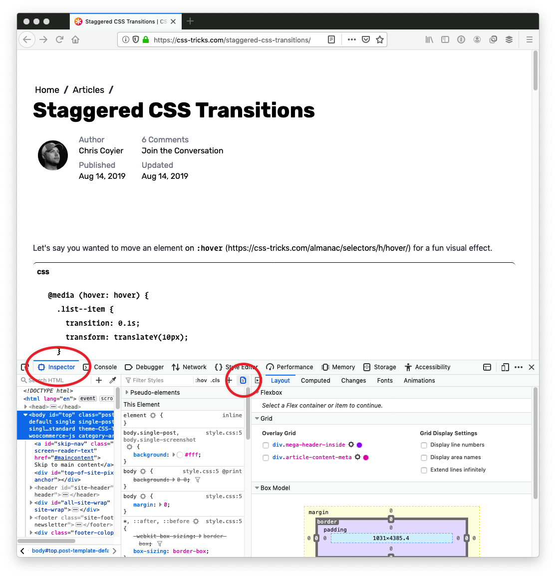
In Firefox…

It’s a little button in DevTools. So easy!

  1. Open DevTools (Command+Option+i)
  2. Go to the “Inspector” tab
  3. Click the little page icon

In Chrome and Edge…

It’s a little weirder, I think, but it’s still a fairly easy thing to do in DevTools.

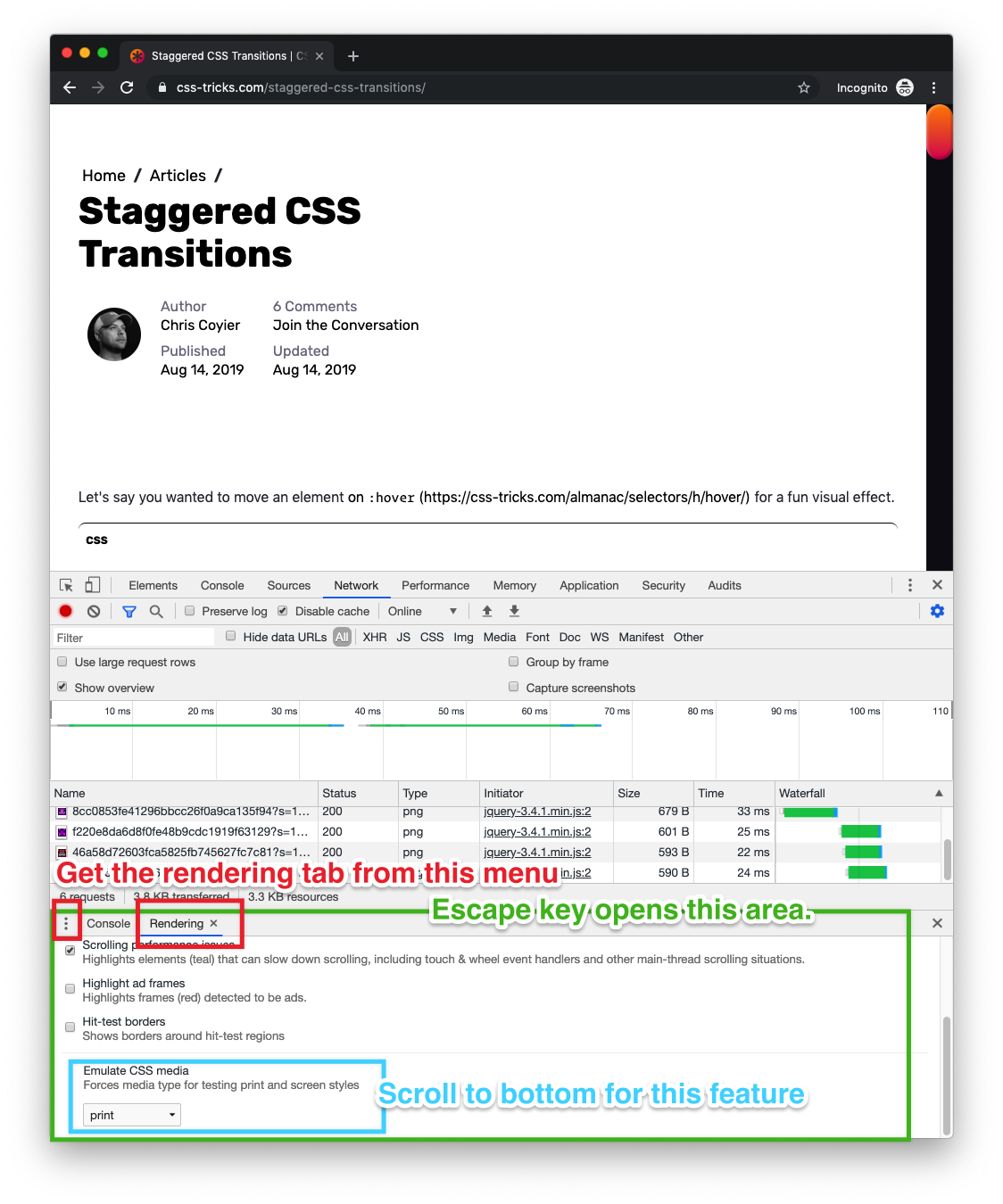
  • Open DevTools (Command+Option+i)
  • If you don’t have the weird-special-bottom-area-thing, press the Escape key
  • Click the menu icon to choose tabs to open
  • Select the “Rendering” tab
  • Scroll to bottom of the “Rendering” tab options
  • Choose print from the options for Emulate CSS media

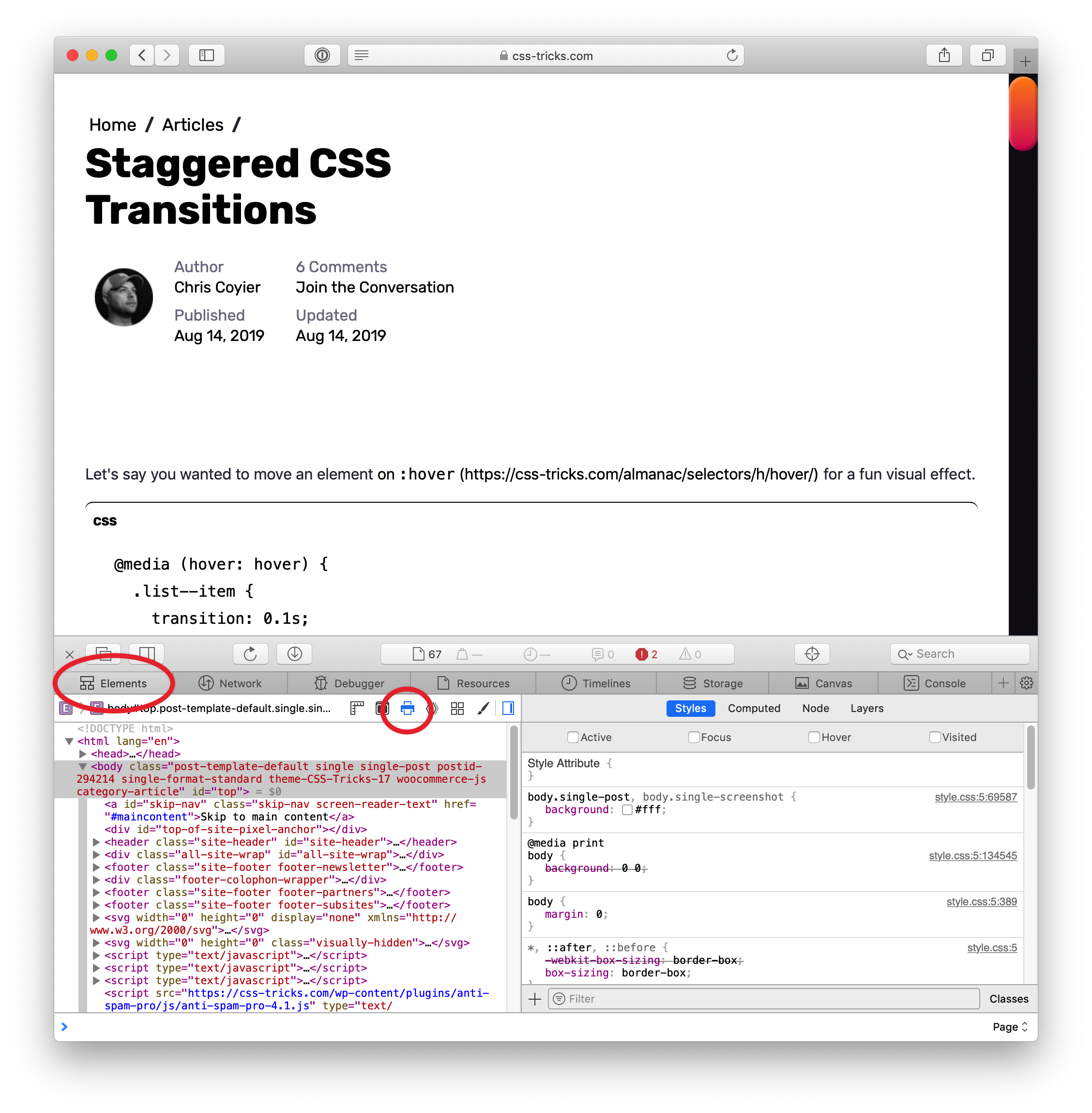
In Safari…

Safari has a little button a lot like Firefox, but it looks different.

  1. Open DevTools (Command+Option+i)
  2. Go to the “Inspector” tab
  3. Click the little page icon

The post Can you view print stylesheets applied directly in the browser? appeared first on CSS-Tricks.

Categories: Designing, Others Tags:

Visa Redesigned Its Iconic Logo For The Digital Age

August 19th, 2019 No comments

In the world of design, there are a few unwritten rules. For a logo, a few of those rules are don’t make it over the top, don’t make it overly and unnecessarily colorful, and make it match the brand.

One thing that we haven’t considered (at least some of us) is taking that list of rules and sending them to the opposite side of the spectrum. Is there such a thing as a logo that is so boring that it goes against those unwritten laws?

Let’s look at what Visa has done with their newest logo and talk about it.

The old Visa logo

This of course, is the old Visa logo. There’s nothing special about it. In fact, if it didn’t say Visa, you could easily mistake it for -insert any generic massive corporation here-. But what it does represent is the brand. It’s a calming dark blue, and it boasts a small golden-yellow accent atop the V that really draws your focus to the start of the logo.

Pretty simple, right? It’s not the Mona Lisa, but it certainly has some aspect of design. Not even that much can be said about the new logo.

The new logo

Yep. That’s it. Believe it or not, there are some changes at play here. But, as we were discussing before, they are so far from being unique that they might put you to sleep.

For starters, they completely dropped the golden-yellow highlight. In a sense, it does unify the logo a little bit better, so maybe that wasn’t the worst choice.

The next thing you’ll notice is the color change. Visa went from a kind of playful blue to a dark, more serious blue, and added in a slight color gradient.

The reason, according to Visa, that they dropped the original color scheme actually dates back to the creation of credit cards. Way back in 1958, Bank of America sent out what they referred to as Bank of Americards.

Back then, Bank of America was based in California. The colors of those cards back then (again, the first ever credit card) was gold and blue. The blue represented the clear california sky, and the gold was taken from the color of the rolling golden hills. These colors represented the luxury of having a credit card simply because they represented the first credit cards created.

Now, what does that have to do with anything? Visa decided to cut these colors out because they wanted the logo to represent everyone and everywhere. In fact, there tagline is “Everywhere you want to be.”

So, it makes sense that they’d want to cut colors that represent a single state. But, they certainly did not have to be so boring about it.

And that’s pretty much all they changed. All we’re left with is a bland and easily ignorable sans serif. It’s quite boring and unnecessary. Most of the time, brands change their logo to signify change. This logo is far from changed. It is un-unique in every sense of the word, and lacks everything that makes a company stand out.

What to take away from this

Listen, I get that nobody should really expect much design-wise from a company that provides financial services. What I am saying is that they could have tried much harder.

When most people open up their wallet or purse, this logo is one of the first things that greet them. Every single time you pay for something, you and everyone around you will see this logo. Granted, it is quite small in this case, and in reality nobody will see it, but still.

You would expect a massive corporation to at least put a little more thought into the words that define their existence.

As of right now, Visa seems pretty happy about their new change. On the other hand, it’s left many designers world-wide questioning their use of blue completely. Only time will tell if Visa keeps the change, or continues to charge full-steam ahead confidently.

Read More at Visa Redesigned Its Iconic Logo For The Digital Age

Categories: Designing, Others Tags:

Pitching Your Writing To Publications

August 19th, 2019 No comments
Screenshot of the Smashing Contact Form

Pitching Your Writing To Publications

Pitching Your Writing To Publications

Rachel Andrew

2019-08-19T14:00:59+02:002019-08-20T17:57:15+00:00

Recently, I had a chat with Chris Coyier and Dave Rupert over on the Shoptalk Podcast about writing for publications such as Smashing Magazine and CSS-Tricks. One of the things we talked about was submitting ideas to publications — something that can feel quite daunting even as an experienced writer.

In this article, I’m going to go through the process for pitching, heavily based on my own experience as a writer and as Editor in Chief of Smashing. However, I’ve also taken a look at the guidelines for other publications in order to help you find the right places to pitch your article ideas.

Do Your Research

Read existing articles on the site that you would like to write for. Who do they seem to be aimed at? What tone of voice do the writers take? Does the publication tend to publish news pieces, opinion, or how-to tutorials? Check to see if there are already other pieces which are on the same subject as your idea, i.e. will your piece add to the conversation already started by those articles? If you can show that you are aware of existing content on a particular subject, and explain how you will reference it or add to that information, the editor will know you have done some research.

Research more widely; are there already good pieces on the subject that an editor will consider your piece to be a repeat of? There is always space for a new take on an issue, but in general, publications want fresh material. You should be ready to explain how your piece will reference this earlier work and build upon it, or introduce the subject to a new audience.

A good example from our own archives is the piece, “Replacing jQuery With Vue.js”. There are a lot of introductions to Vue.js, however, this piece was squarely aimed at the web developer who knows jQuery. It introduced the subject in a familiar way specifically for the target audience.

Find The Submission Guide

The next thing to do is to find the submission information on the site you want to write for. Most publications will have information about who to contact and what information to include. From my point of view, simply following that information and demonstrating you have done some research puts you pretty high up the queue to be taken seriously. At Smashing Magazine, we have a link to the guide to writing for us right there on the contact form. I’d estimate that only 20% of people read and follow those instructions.

The link to our submission guide on our Contact Us page.

When you submit your idea, it is up to you to sell it to the publication. Why should I run with your idea over the many others that will show up today? Spending time over your submissions will make a huge difference in how many pieces you have accepted.

Different publications have different requirements. At Smashing Magazine, we ask you to send an outline first, along with some information about you so that we can understand your expertise in the subject matter. We’re very keen to feature new voices, and so we’ll accept pieces from writers who haven’t got a huge string of writing credentials.

The information we request helps us to decide if you are likely to be able to deliver a coherent piece. As our articles are technical in nature (often tutorials), I find that an outline is the best way to quickly see the shape of the proposal and the scope it will cover. A good outline will include the main headings or sections of the article, along with an explanation of what will be taught in that section.

For many other publications, a common request is for you to send a pitch for the article. This would typically be a couple of paragraphs explaining the direction your piece will take. Once again, check the submission guide for any specific details that publication is interested to see.

The Verge has an excellent submission guide which explains exactly what they want to see in a pitch:

“A good pitch contains a story, a narrative backbone. Pitches should clearly and concisely convey the story you plan to write and why it matters. The best pitches display promising pre-reporting and deep knowledge of the topic as well as a sense of the angle or insight you plan to pursue. If your story depends on access to a person or company, you should say whether you have obtained it already (and if not, what your prospects are). Pitches should also be written in the style you expect to write the story.”

— “How To Pitch The Verge,” The Verge

A List Apart explains what they will accept in their contribution page:

“… a rough draft, a partial draft, or a short pitch (a paragraph or two summarizing your argument and why it matters to our readers) paired with an outline. The more complete your submission is, the better feedback we can give you.”

— “Write For Us,” A List Apart

The Slate has a list of Do’s and Don’ts for pitching:

“Do distill your idea into a pitch, even if you have a full draft already written. If you happen to have a draft ready, feel free to attach it, but please make sure you still include a full pitch describing the piece in the body of the email.”

— “How To Pitch Slate,” The Slate

Including your pitch or outline in the body of the email is a common theme of pitch guidelines. Remember that your aim is to make it as easy as possible for the editor to think, “that looks interesting”.

Include A Short Biography

The editor doesn’t need your life story, however, a couple of sentences about you is helpful. This is especially useful if you are a newer writer who has subject matter expertise but fewer writing credentials. If you are proposing an article to me about moving a site from WordPress to Gatsby, and tell me that the article is based on your experience of doing this on a large site, that is more interesting to me than a more experienced writer who has just thought it would be a good topic to write about.

If you do have writing credits, a few relevant links are more helpful than a link to your entire portfolio.

When You Can’t Find A Submission Guide

Some publications will publish an email address or contact form for submissions, but have no obvious guide. In that case, assume that a short pitch as described above is appropriate. Include the pitch in the body of the email rather than an attachment, and make sure you include contact details in addition to your email address.

If you can’t find any information about submitting, then check to see if the publication is actually accepting external posts. Are all the articles written by staff? If unsure, then get in touch via a published contact method and ask if they accept pitches.

I’ve Already Written My Article, Why Should I Send An Outline Or Pitch?

We ask for an outline for a few reasons. Firstly, we’re a very small team. Each proposal is assessed by me, and I don’t have time in the day to read numerous 3000-word first draft proposals. In addition, we often have around 100 articles in the writing process at any one time. It’s quite likely that two authors will want to write on the same subject.

On receiving an outline, if it is going in a similar direction to something we already have in the pipeline, I can often spot something that would add to — rather than repeat — the other piece. We can then guide you towards that direction, and be able to accept the proposal where a completed piece may have been rejected as too similar.

If you are a new writer, the ability to structure an outline tells me a lot about your ability to deliver us something useful. We are going to spend time and energy working with you on your article, and I want to know it will be worthwhile for all of us.

If you are an experienced writer, the fact that you have read and worked with our guidelines tells me a lot about you as a professional. Are you going to be difficult for our editorial team to work with and refuse to make requested changes? Or are you keen to work with us to shape a piece that will be most useful and practical for the audience?

In The Verge submission guide included above, they ask you to “clearly and concisely” convey the story you plan to write. Your pitch shouldn’t be an article with bits removed or about the first two paragraphs. It’s literally a sales pitch for your proposed article; your job is to make the editor excited to read your full proposal! Some publications — in particular those that publish timely pieces on news topics — will ask you to attach your draft along with the pitch, however, you still need to get the editor to think it is worth opening that document.

Promoting Yourself Or Your Business

In many guides to self-promotion or bootstrapping the promotion of a startup, writing guest posts is something that will often be suggested. Be aware that the majority of publications are not going to publish an advert and pay you for the privilege.

Writing an article that refers to your product may be appropriate, as most of our expertise comes from doing the job that we do. It is worth being upfront when proposing a piece that would need to mention your product or the product of the company you work for. Explain how your idea will not be an advert for the company and that the product will only be mentioned in the context of the experience gained in your work.

Some publications will accept a trade of an article for some promotion. CSS-Tricks is one such publication, and describes what they are looking for as follows:

“The article is intended to promote something. In that case, no money changes hands. In this scenario, your pitch must be different from a sponsored post in that you aren’t just straight up pitching your product or service and that you’re writing a useful article about the web; it just so happens to be something that the promotion you’ll get from this article is valuable to you.”

— “Guest Posting,” CSS-Tricks

Writing for a popular publication will give you a byline, i.e. your credit as an author. That will generally give you at least one link to your own site. Writing well-received articles can be a way to build up your reputation and even introduce people to your products and services, but if you try and slide an advert in as an article, you can be sure that editors are very well used to spotting that!

Pitching The Same Idea To Multiple Publications

For time-sensitive pieces, you might be keen to spread the net. In that case, you should make publications aware of submitting that you have submitted it elsewhere. Otherwise, it is generally good practice to wait for a response before offering the piece to another publication. The Slate writes,

“Do be mindful if you pitch your idea to multiple publications. We try to reply to everyone in a timely manner, typically within one to two days. As a general rule, and if the story isn’t too timely, it’s best to wait that amount of time before sharing the pitch with another publication. If you do decide to cast a wide net, it’s always helpful to let us know ahead of time so we can respond accordingly.”

— “How To Pitch Slate,” The Slate

If Your Pitch Is Rejected

You will have ideas rejected. Sometimes, the editor will let you know why, but most often you’ll get a quick no, thanks. Try not to take these to heart; there are many reasons why the piece might be rejected that have nothing to do with the article idea or the quality of your proposal.

The main reasons I reject pitches are as follows:

  1. Obvious Spam
    This is the easy one. People wanting to publish a “guest post” on vague subjects, and people wanting “do-follow links”. We don’t tend to reply to these as they are essentially spam.
  2. No Attempt At A Serious Outline
    I can’t tell anything about an idea from two sentences or three bullet points, and if the author can’t spend the time to write an outline, I don’t think I want to have a team member working with them.
  3. Not A Good Topic For Us
    There are some outlines that I can’t ever see being a great fit for our readers.
  4. An Attempt To Hide An Advert
    In this case, I’ll suggest that you talk to our advertising team!
  5. Difficult To Work With
    Last but not least, authors who have behaved so badly during the pitch process that I can’t bring myself to inflict them on anyone else. Don’t be that person!

If I have a decent outline on a relevant subject in front of me, then one of two things are going to happen: I’ll accept the outline and get the author into the writing process or I’ll reply to the author because there is some reason why we can’t accept the outline as it is. That will usually be because the target audience or tone is wrong, or we already have a very similar piece in development.

Quite often in these scenarios, I will suggest changes or a different approach. Many of those initial soft rejections become an accepted idea, or the author comes back with a different idea that does indeed work.

Ultimately, those of us who need to fill a publication with content really want you to bring us good ideas. To open my inbox and find interesting pitches for Smashing is a genuine highlight of my day. So please do write for us.

Things To Do

  • Research the publication, and the type of articles they publish;
  • Read their submissions guide, and follow it;
  • Be upfront if you have sent the pitch to other publications;
  • Include a couple of sentences about you, and why you are the person to write the article. Link to some other relevant writing if you have it;
  • Be polite and friendly, but concise.

Things To Avoid

  • Sending a complete draft along with the words, “How do I publish this on your site?”;
  • Sending things in a format other than suggested in the submissions guide;
  • Pitching a piece that is already published somewhere else;
  • Pitching a hidden advert for your product or services;
  • Following up aggressively, or sending the pitch to multiple editors, Facebook messenger, and Twitter, in an attempt to get noticed. We publish a pitch contact, because we want pitches. It might take a day or two to follow up though!

More Pitching Tips

(il)
Categories: Others Tags:

20 Freshest Web Designs, August 2019

August 19th, 2019 No comments

This month we leap back to the culture of America circa 1969, dive into the oceans with whales, discover multiple approaches to pitching a design agency, get invited to festivals, and shop online the right way. Enjoy!

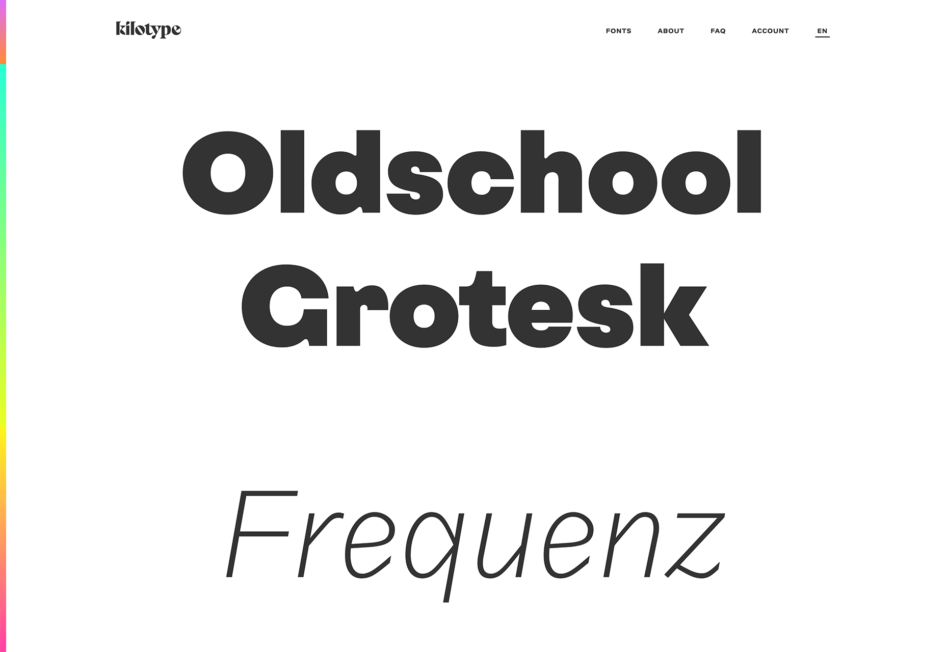
Kilotype

Kilotype’s awesome new site shows off its variable fonts with a clever mouse-track — move your cursor around the screen vertically and horizontally to see the full range of each family’s weight and italic.

Once Upon a Time in Hollywood

The latest film from Tarantino is steeped in the culture of 1969, from the moon landing to Woodstock. This amazing promo-site does an incredible job of transporting you to a different era.

Wade and Leta

Wade and Leta are a partnership of talented art directors, whose offbeat sense of the absurd leads to some truly original and inspiring work. The homepage videos range from hilarious to bizarre.

Morenita

If there’s one place I’d like to be right now, it’s floating around the coast of Menorca on beautiful traditional fishing boat, and that’s all thanks to this inspiring site for Balearic boat hire.

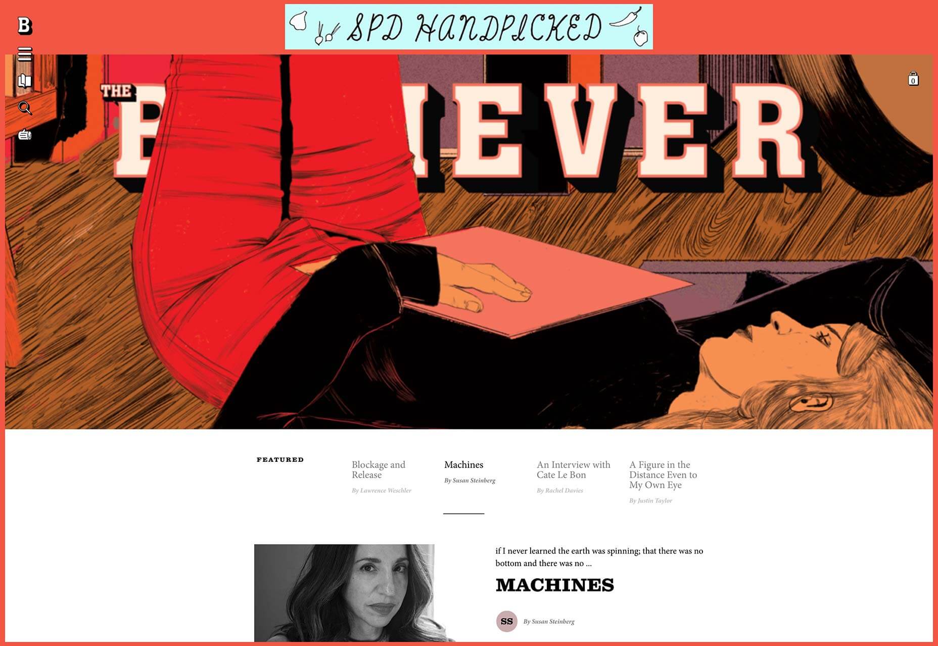
The Believer Magazine

The site for The Believer Magazine is charmingly counter-culture, with deceptively sophisticated typography and New Yorker-quality illustration. Exactly what you’d expect from a modern culture publication.

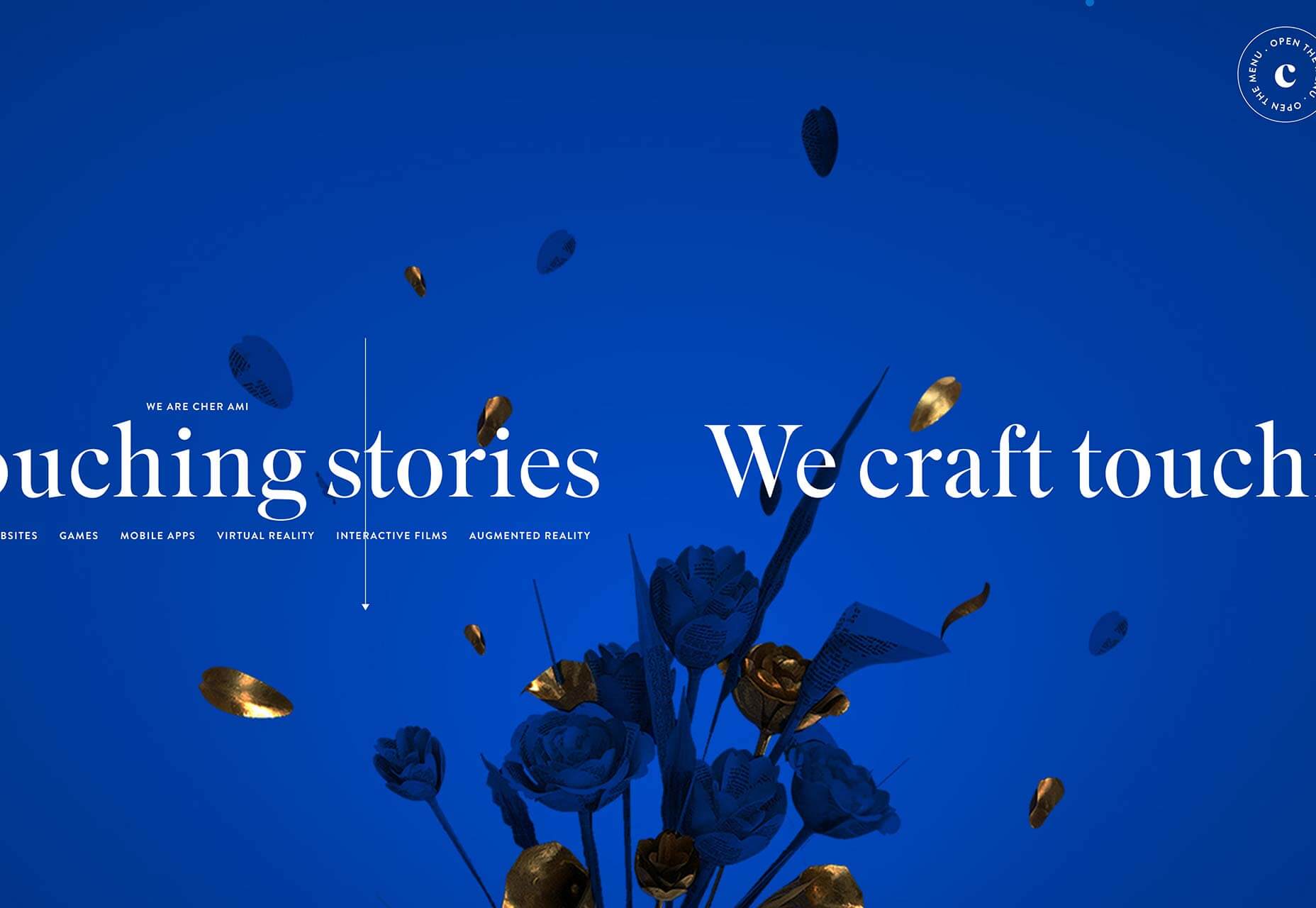
Cher Ami

Cher Ami’s site features plenty of engaging work, but it’s the little details that make this site special, like the way the menu flies out not-quite-square, and the hyperspace-style transitions.

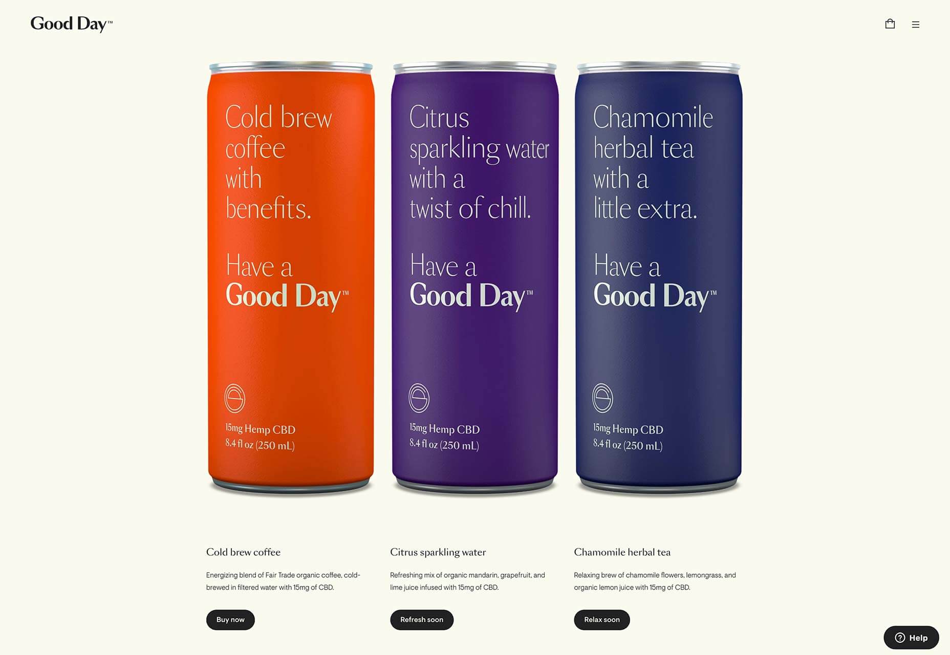
Good Day

Good Day sells CBD-infused beverages from a tastefully minimal site. At roughly $6/drink, it’s not cheap, and this sophisticated site is ideal for positioning the company in the luxury consumables market.

Dice

Dice is a German music and arts festival. Its site features some incredible, generated organic shapes, with animated gradients to match, and the seamless eternal scroll is a delight.

Flatiron Collective

The Flatiron Collective site opens with animated illustration. It’s an eye-catching pitch for business, far into left-field from the usual agency promotional site, and doesn’t even showcase previous work.

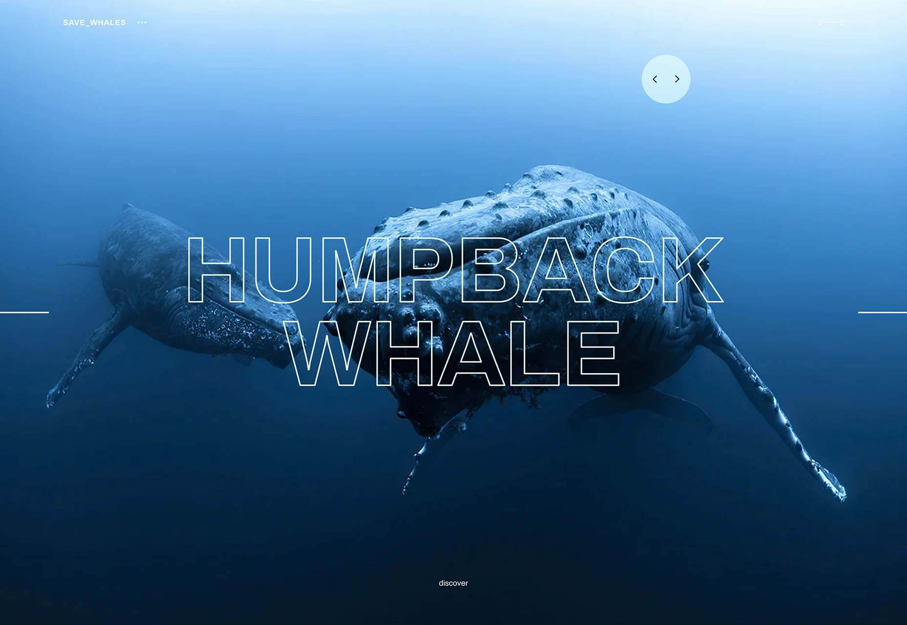
Save Whales

Whales are among the most intelligent, graceful, and magical creatures in the world. This inspiring site features extraordinary photography and facts about the magnificent creatures.

InDnegev

InDnegev is an Israeli music festival with a psychedelic animated site. The site features bold color choices, subtle animation, and two people riding a giant fox made out of stars, because why not.

Gucci Marmont

One of the big trends in online shopping is 3D, and Gucci’s Marmont collection jumps on this trend with a 17th-century inspired art exhibition featuring its latest purses. Scroll to browse.

Oust

Oust is a leading creative agency with tons of amazing work. Instead of pressing its portfolio, Oust’s site shows off the energy and ambition of the company’s professional culture.

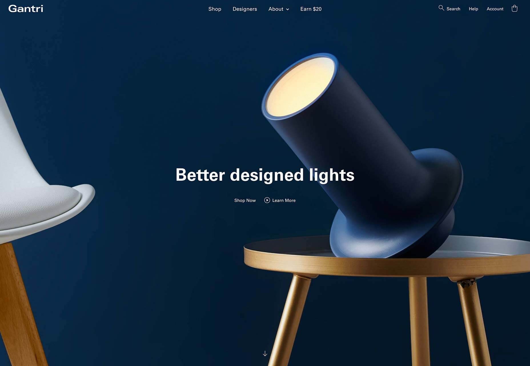
Gantri

Gantri designs better lights, and its site is a glorious collection of careful ecommerce best practices and stellar product photography. This is exactly how you should sell products online.

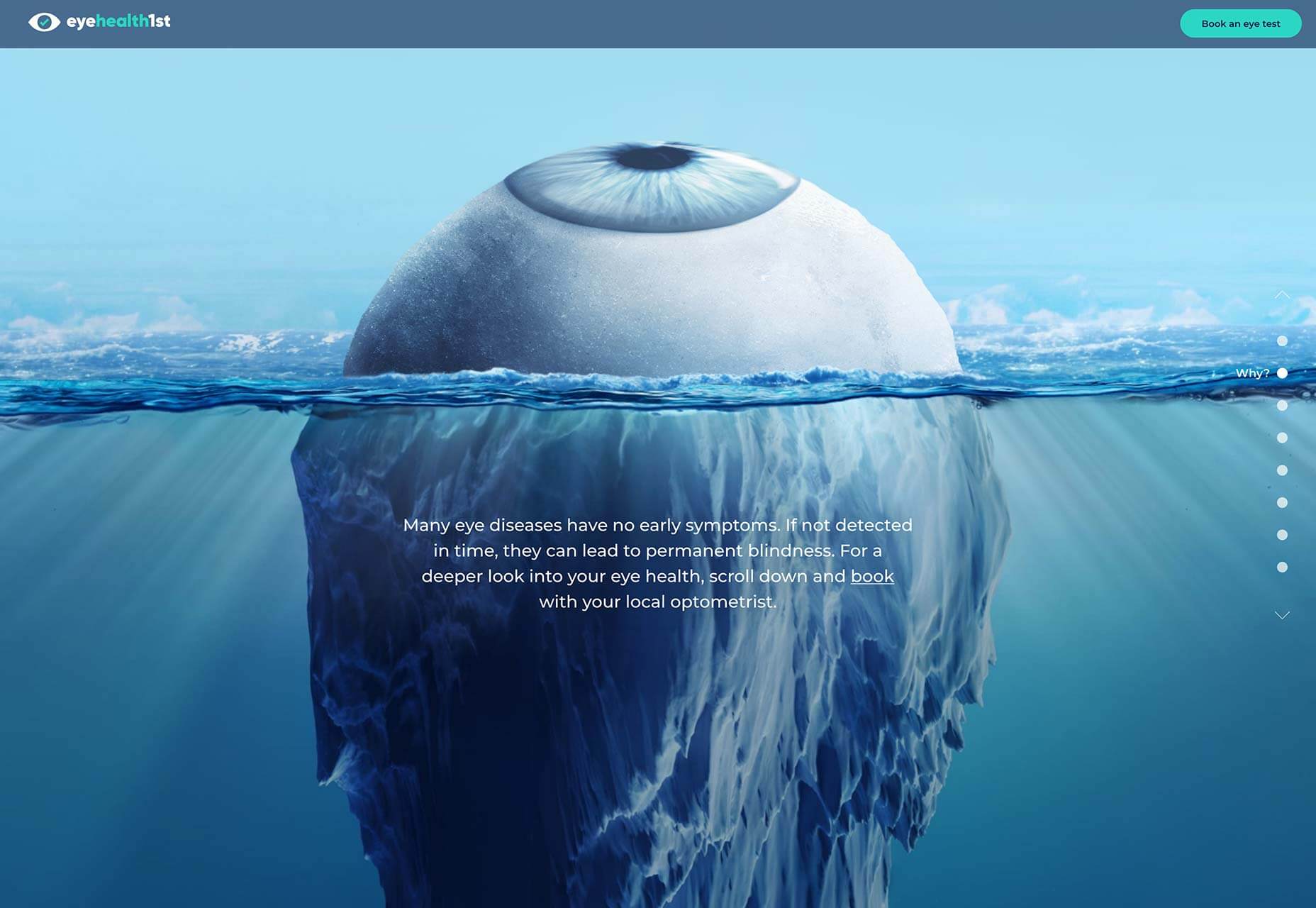
eyehealth1st

Look Deeper is an eye health campaign from Australia that wants to educate you about the dangers your eyes face, with an impactful infographic style site highlighting the various threats to your eyesight.

Ada Sokó?

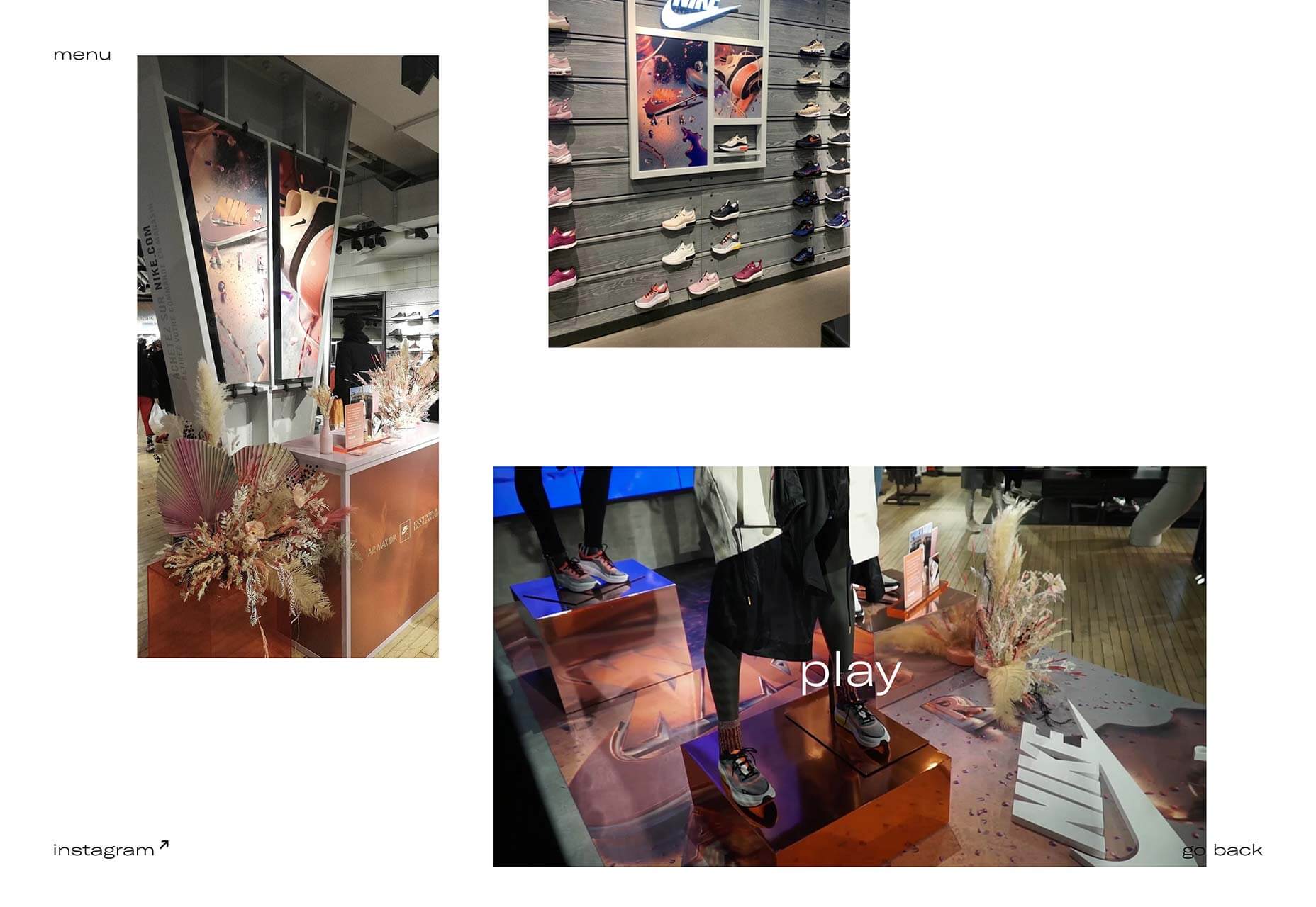
Ada Sokó?’s portfolio is designed to focus entirely on her unique brand of futuristic, 3D artwork. Alongside commercial work you’ll also find some exceptional personal work.

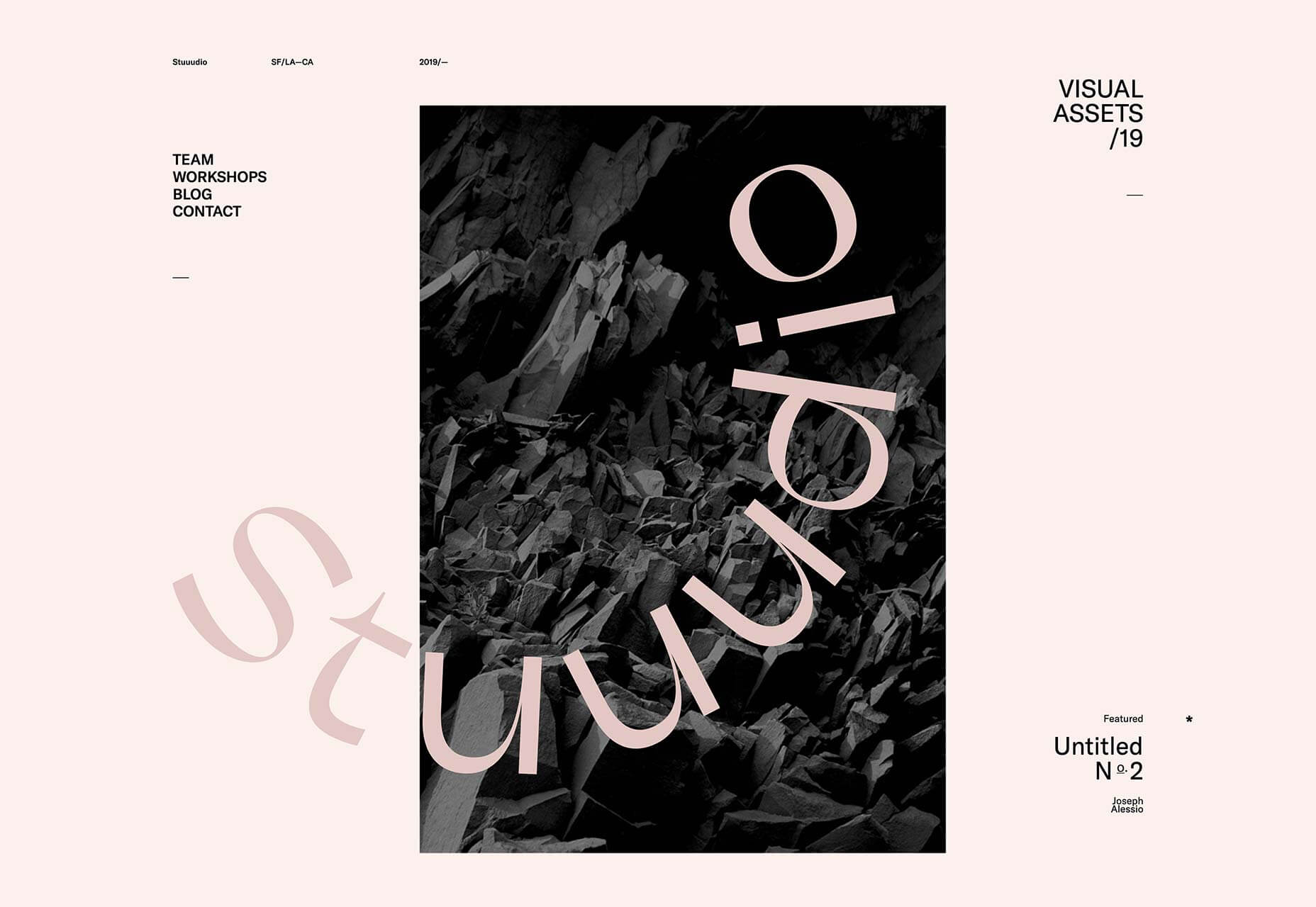
Stuuudio

Embracing the www-ness of using three letters, where one would be too real-world, is Stuuudio, a design agency with a nice line in blobby-animated transitions. It’s a good take on the classic agency site.

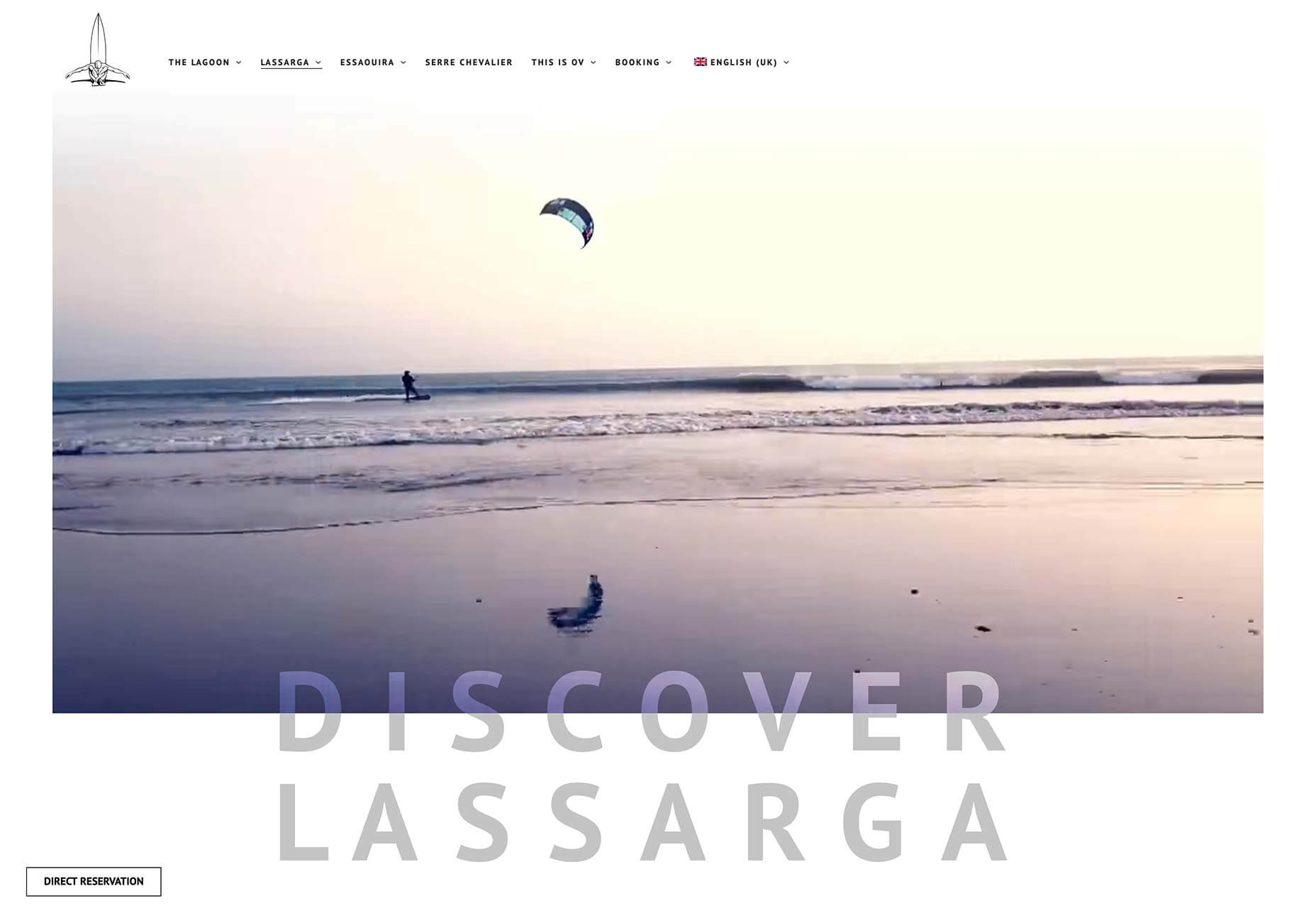
Ocean Vagabond

Ocean Vagabond is a watersports company in Morocco. Its homepage features some small-scale video, but navigate to one of the location pages for inspiring video and typography interaction.

Festival

Festival is a vibrant and engaging one-pager for the Camberwell College of Art undergraduate degree show. With light-hearted typography and interactive confetti, it’s a great online invitation.

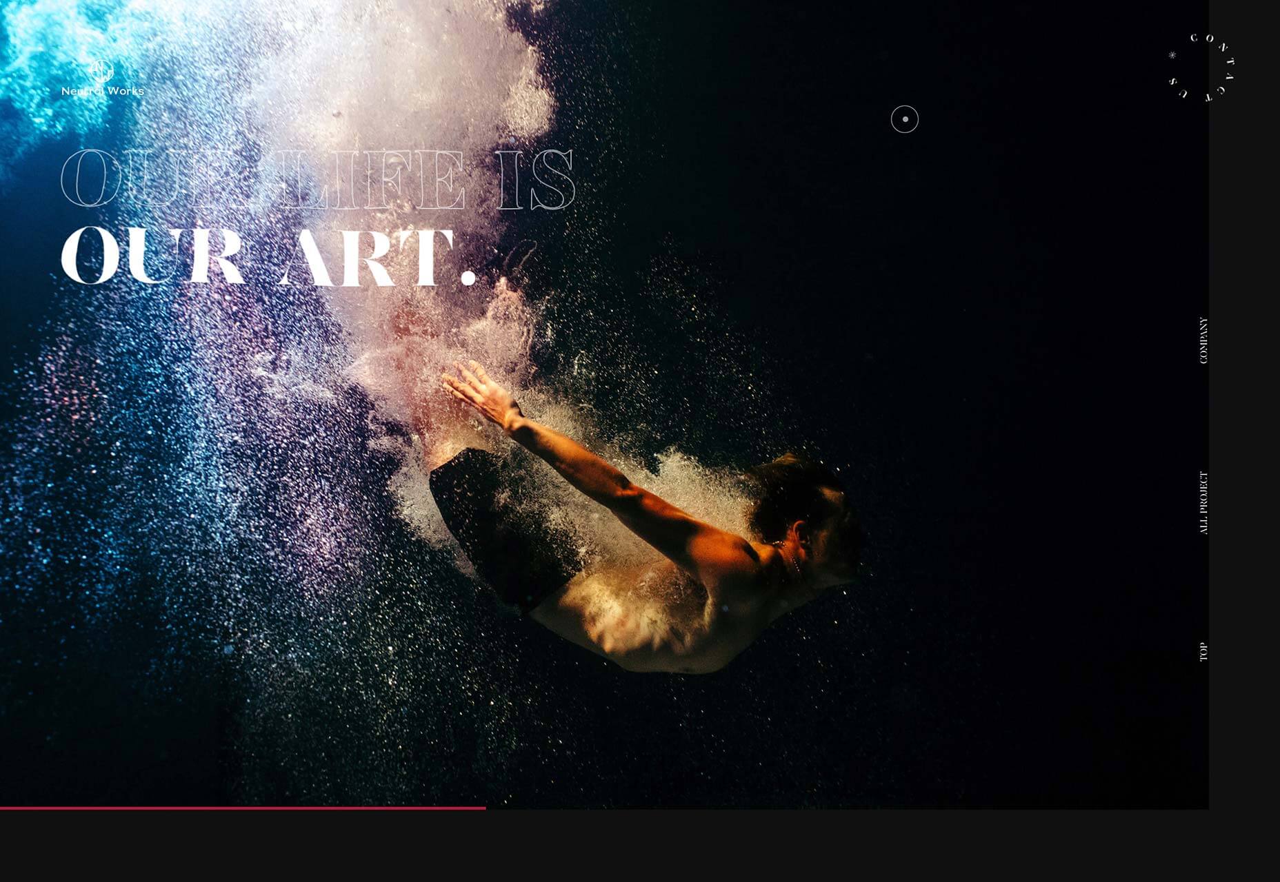
Neutral Works

Neutral Works is another design agency with a penchant for interesting, liquid-style transitions. Based in Japan, it’s fascinating to see the different approach to familiar products in a foreign culture.

Source

Categories: Designing, Others Tags:

Popular Design News of the Week: August 12, 2019 – August 18, 2019

August 18th, 2019 No comments

Every week users submit a lot of interesting stuff on our sister site Webdesigner News, highlighting great content from around the web that can be of interest to web designers.

The best way to keep track of all the great stories and news being posted is simply to check out the Webdesigner News site, however, in case you missed some here’s a quick and useful compilation of the most popular designer news that we curated from the past week.

Note that this is only a very small selection of the links that were posted, so don’t miss out and subscribe to our newsletter and follow the site daily for all the news.

Image Optimization for the Web (2019 Guide)

Extra.css

Do Creatives Still Need Personal Websites?

Noted: New Logo for Lotus

How to Choose the Right Font for your Website

Adobe’s Next Big Bets are on AR and Mixed Reality Software

4 Rules for Intuitive UX

This YouTuber Redesigned the Logos of Starbucks, Coffee Bean, and Folgers-and They’re Brilliant

Beautiful Examples of Anime UI

Adobe Fresco: A Free App for the iPad Made to Beat Procreate

The Real Reason Snap Changed its Logo

5 Sneaky Typography Errors to Avoid

Uber Design Platform

WeWork Isn’t a Tech Company; It’s a Soap Opera

How Tinder Design Hooks You up

Here’s How Google’s New Keyword Selection Preferences Work

The Evolution of Visual Design and Tech’s Designer Renaissance

50+ Best Free Fonts for Minimal Design

Dieter Rams Designed One of Gillette’s Most Successful Razors

Three Years of Misery Inside Google, the Happiest Company in Tech

Designer Vs Corporation

Superposition: Use the Design System You Already Have

Finding Brand True North

The Four Critical Factors to Planning a Successful Project

UX Can’t Be Defined by One Set of “Rules”

Want more? No problem! Keep track of top design news from around the web with Webdesigner News.

Source

Categories: Designing, Others Tags:

Draggin’ and Droppin’ in React

August 16th, 2019 No comments

The React ecosystem offers us a lot of libraries that all are focused on the interaction of drag and drop. We have react-dnd, react-beautiful-dnd, react-drag-n-drop and many more, but some of them require quite a lot of work to build even a simple drag and drop demo, and some do not provide you with more complex functionality (e.g. multiple drag and drop instances), and if they do, it becomes very complex.

This is where react-sortable-hoc comes into play.

? This tutorial requires basic knowledge of React library and React hooks.

This library has “HOC” in its name for a good reason. It provides higher-order components that extends a component with drag and drop functionality.

Let’s walk through an implementation of its functionalities.

Spinning up a project

For this tutorial we are going to build an app with funny GIFs that can be dragged around the viewport.

GitHub Repo

Let’s create a simple app and add drag-n-drop functionality to it. We’re going to use create-react-app to spin up a new React project:

npx create-react-app your-project-name

Now let’s change to the project directory and install react-sorting-hoc and array-move. The latter is needed to move items in an array to different positions.

cd your-project-name
yarn add react-sortable-hoc array-move

Adding styles, data and GIF component

For simplicity’s sake, we are going to write all styles in our App.css file. You can overwrite styles you have there with the following ones:

.App {
  background: #1a1919;
  color: #fff;
  min-height: 100vh;
  padding: 25px;
  text-align: center;
}

.App h1 {
  font-size: 52px;
  margin: 0;
}

.App h2 {
  color: #f6c945;
  text-transform: uppercase;
}

.App img {
  cursor: grab;
  height: 180px;
  width: 240px;
}

Let’s create our state with GIFs. For this purpose we gonna use React’s built-in useState hook:

import React, { useState } from 'react';

Now add following before the return statement:

const [gifs, setGifs] = useState([
  'https://media.giphy.com/media/3ohhwoWSCtJzznXbuo/giphy.gif',
  'https://media.giphy.com/media/l46CbZ7KWEhN1oci4/giphy.gif',
  'https://media.giphy.com/media/3ohzgD1wRxpvpkDCSI/giphy.gif',
  'https://media.giphy.com/media/xT1XGYy9NPhWRPp4pq/giphy.gif',
]);

It’s time to create our simple GIF component. Create a Gif.js file in the src directory and pass in the following code:

import React from 'react';
import PropTypes from 'prop-types';

const Gif = ({ gif }) => (<img src={gif} alt="gif" />)

Gif.propTypes = {
  gif: PropTypes.string.isRequired,
};

export default Gif;

We always try to follow the best practices while writing code; thus we also import PropTypes for type checking.

Import the Gif component and add it to the main App component. With a bit of clean up, it looks like this:

import React, { useState } from 'react';
import './App.css';

import Gif from './Gif';

const App = () => {
  const [gifs, setGifs] = useState([
    'https://media.giphy.com/media/3ohhwoWSCtJzznXbuo/giphy.gif',
    'https://media.giphy.com/media/l46CbZ7KWEhN1oci4/giphy.gif',
    'https://media.giphy.com/media/3ohzgD1wRxpvpkDCSI/giphy.gif',
    'https://media.giphy.com/media/xT1XGYy9NPhWRPp4pq/giphy.gif',
  ]);


  return (
    <div className="App">
      <h1>Drag those GIFs around</h1>
      <h2>Set 1</h2>
        {gifs.map((gif,  i) => <Gif key={gif} gif={gif} />)}
    </div>
  );
}

export default App;

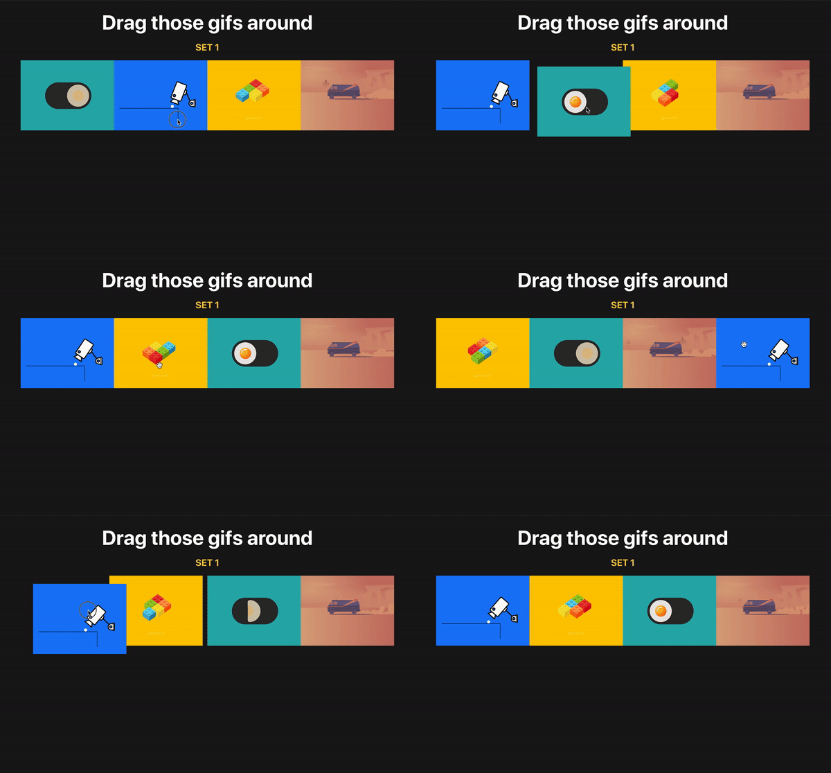
Go to http://localhost:3000/ to see what the app looks like now:

A screenshot of react-sortable-hoc-article-app

Onto the drag-n-drop stuff

Alright, it’s time make our GIFs draggable! And droppable.

To start, we need two HOCs from react-sortable-hoc, and the >arrayMove method from the array-move library to modify our new array after dragging happens. We want our GIFs to stay on their new positions, right? Well, that’s what this is going to allow us to do.

Let’s import them:

import { sortableContainer, sortableElement } from 'react-sortable-hoc';
import arrayMove from 'array-move';

As you might have guessed, those components will be wrappers which will expose functionality needed for us.

  • sortableContainer is a container for our sortable elements.
  • sortableElement is a container for each single element we are rendering.

Let’s do the following after all our imports:

const SortableGifsContainer = sortableContainer(({ children }) => <div className="gifs">{children}</div>);
    
const SortableGif = sortableElement(({ gif }) => <Gif key={gif} gif={gif} />);

We’ve just created a container for our children elements that would be passed inside our SortableGifsContainer and also created wrapper for a single Gif component.
If it’s a bit unclear to you, no worries — you will understand right after we implement it.

?Note: You need to wrap your children in a div or any other valid HTML element.

It’s time to wrap our GIFs into the SortableGifsContainer and replace the Gif component with our newly created SortableGif:

<SortableGifsContainer axis="x" onSortEnd={onSortEnd}>
  {gifs.map((gif, i) =>
    <SortableGif
    // don't forget to pass index prop with item index
      index={i}
      key={gif}
      gif={gif}
    />
  )}
</SortableGifsContainer>

It’s important to note that you need to pass the index prop to your sortable element so the library can differentiate items. It’s similar to adding keys to the lists in React).

We add axis because our items are positioned horizontally and we want to drag them horizontally, while default is vertical dragging. In other words, we’re limiting dragging along the horizontal x-axis. As you can see we also add an onSortEnd function, which triggers every time we drag or sort our items around. There are, of course, a lot more events but you can find more info in the documentation which already does an excellent job of covering them.

Time to implement it! Add the following line above the return statement:

const onSortEnd = ({ oldIndex, newIndex }) => setGifs(arrayMove(gifs, oldIndex, newIndex));

I want to explain one more thing: our function received an old and new index of the item which was dragged and, of course, each time after we move items around we modify our initial array with the help of arrayMove.

Tada! Now you know how to implement drag-n-drop in your project. Now go and do it! ? ? ?

What if we have multiple lists of items?

As you can see, the previous example was relatively simple. You basically wrap each of the items in a sortable HOC and wrap it around with sortableContainer and, bingo, you’ve got basic drag and drop.

But how will we do it with multiple lists? The good news is that react-sortable-hoc provides us with a collection prop so we can differentiate between lists.

First, we should add second array of GIFs:

const [newGifs, setNewGifs] = useState([
  'https://media.giphy.com/media/xiOgHgY2ceKhm46cAj/giphy.gif',
  'https://media.giphy.com/media/3oKIPuMqYfRsyJTWfu/giphy.gif',
  'https://media.giphy.com/media/4ZgLPakqTajjVFOVqw/giphy.gif',
  'https://media.giphy.com/media/3o7btXIelzs8nBnznG/giphy.gif',
]);

If you want to see them before we move next, add the following lines after the SortableGifsContainer closing tag:

{newGifs.map(gif => <Gif key={gif} gif={gif} />)}

Alright, time to replace it with a draggable version.

Implementation is the same as in first example besides one thing — we have added a collection prop to our SortableGif. Of course, you can come up with any name for the collection, just remember, we’re gonna need it in for our onSortEnd function.

<h2>Set 2</h2>

<SortableGifsContainer axis="x" onSortEnd={onSortEnd}>
  {newGifs.map((gif,  i) => <SortableGif index={i} key={gif} gif={gif} collection="newGifs" />)}
</SortableGifsContainer>

Next we need to add the collection prop to our first list. I’ve chosen the name GIFs for the first list of items, but it’s up to you!

Now we need to to change our onSortEnd function. Our function received old and new indexes, but we can also destructure a collection from it. Right, exactly the one we’ve added to our SortableGif.

So all we have to do now is write a JavaScript switch statement to check for the collection name and to modify the right array of GIFs on drag.

const onSortEnd = ({ oldIndex, newIndex, collection }) => {
  switch(collection) {
    case 'gifs':
      setGifs(arrayMove(gifs, oldIndex, newIndex))
      break;
    case 'newGifs':
      setNewGifs(arrayMove(newGifs, oldIndex, newIndex))
      break;
    default:
      break;
  }
}

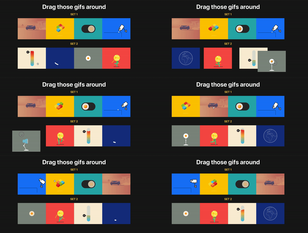
Time to check it out!

As you can see, we now have two separate lists of GIFs and we can drag and sort. Moreover, they are independent meaning items from different lists won’t be mixed up.

Exactly what we wanted to do! Now you know how to create and handle drag and drop with multiple lists of items. Congratulations ?

Hope you’ve enjoyed it as much as I did writing it! If you’d like to reference the complete code, it’s all up on GitHub here. If you have any questions, feel free to contact me via email.

The post Draggin’ and Droppin’ in React appeared first on CSS-Tricks.

Categories: Designing, Others Tags:

Accessibility and web performance are not features, they’re the baseline

August 16th, 2019 No comments

This week I’ve been brooding about web performance and accessibility. It all began when Ethan Marcotte made a lot of great notes about the accessibility issues that are common with AMP:

In the recordings above, I’m trying to navigate through the AMP Story. And as I do, VoiceOver describes a page that’s impossible to understand: the arrows to go back or forward are simply announced as “button”; most images are missing text equivalents, which is why the screen reader spells out each and every character of their filenames; and when a story’s content is visible on screen, it’s almost impossible to access. I’d like to say that this one AMP Story was an outlier, but each of the nine demos listed on the AMP Stories website sound just as incomprehensible in VoiceOver.

Ethan continues to argue that these issues are so common in AMP that accessibility must not be a priority at all:

Since the beginning, Google has insisted AMP is the best solution for the web’s performance problem. And Google’s used its market dominance to force publishers to adopt the framework, going so far as to suggest that AMP’s the only format you need to publish pages on the web. But we’ve reached a point where AMP may “solve” the web’s performance issues by supercharging the web’s accessibility problem, excluding even more people from accessing the content they deserve.

I’ve been thinking a lot about this lately — about how accessibility work is often seen as an additional feature that can be tacked onto a project later — rather than accessibility work being a core principle or standard of working on the web.

And I’ve seen this sentiment expressed time and time again, in the frameworks, on Twitter, in the design process, in the development process, and so much so that arguing about the importance of accessibility can get pretty exhausting. Because at some point we’re not arguing about the importance of accessibility but the importance of front-end development itself as a series of worthy skills to have. Skills that can’t be replaced.

Similarly, this post by Craig Mod, on why software should be lightning fast, had me thinking along the same lines:

I love fast software. That is, software speedy both in function and interface. Software with minimal to no lag between wanting to activate or manipulate something and the thing happening. Lightness.

Later in the piece, Mod describes fast software as being the very definition of good software and argues that every action on a computer — whether that’s a website or an app — should feel as if you’re moving without any latency whatsoever. And I couldn’t agree more; every loading screen and wait time is in some degree a mark of failure.

Alex Russell made a similar point not so long ago when he looked at the performance of mobile phones and examined how everyone experiences the web in a very different way:

The takeaway here is that you literally can’t afford desktop or iPhone levels of JS if you’re trying to make good web experiences for anyone but the world’s richest users, and that likely means re-evaluating your toolchain.

I’m sort of a jerk when it comes to this stuff. I don’t think a website can be good until it’s fast. The kind of fast that takes your breath away. As fast as human thought, or even faster. And so my point here is that web performance isn’t something we should aspire to, it should be the standard. The status quo. The baseline that our work is judged by. It ought to be un-shippable until the thing is fast.

The good news is that it’s easier than ever to ship a website with these base requirements of unparalleled speed and accessibility! We have Page Speed Insights, and Web Page Test, not to mention the ability to have Lighthouse perform audits with every commit in GitHub automatically as we work. Ire Aderinokun showed us how to do this not so long ago by setting up a performance budget and learning how to stick to it.

The tools to make our websites fast and accessible are here but we’re not using them. And that’s what makes me mad.


While I’m on this rant — and before I get off my particularly high horse — I think it’s important to make note of Deb Chachra’s argument that “any sufficiently advanced negligence is indistinguishable from malice.” With that in mind, it’s not just bad software design and development if a website is slow. Performance and accessibility aren’t features that can linger at the bottom of a Jira board to be considered later when it’s convenient.

Instead we must start to see inaccessible and slow websites for what they are: a form of cruelty. And if we want to build a web that is truly a World Wide Web, a place for all and everyone, a web that is accessible and fast for as many people as possible, and one that will outlive us all, then first we must make our websites something else altogether; we must make them kind.

The post Accessibility and web performance are not features, they’re the baseline appeared first on CSS-Tricks.

Categories: Designing, Others Tags:

Handwritten Fonts Inspiration – The 7 Most Famous Handwritten Fonts

August 16th, 2019 No comments

In a competitive market, there are many ways to make your brand stand out. You could go for a unique catchphrase, a state-of-the-art product, or maybe just better prices. All of those ideas are great ideas, but sometimes a little design ingenuity is the best tactic, and what better way to be unique than having a custom logo font.

Typography is a detail that a lot of people notice. It has to be legible and friendly, yet fit your brand perfectly without losing its meaning. Coming up with handwritten logo fonts can be quite difficult, but thankfully you have the internet to inspire you.

With no further ado, let’s look at 10 of the most famous handwritten logo fonts to inspire your next project.

Ford

Henry Ford was an incredibly smart man. Not only did he perfect the commercial production line for vehicles, he was also quite the salesman.

The inspiration for the Ford logo is simple: it’s Henry’s handwriting. Well, actually, it was his chief engineer’s handwriting, but it’s designed after Henry’s.

This logo font has stood the test of time, as it was designed all the way back in 1909, and it’s still used as Ford’s main logo to this day. The font, in combination with the colors, feels inviting and very recognizable. Here’s to 100+ more years, Ford.

Disney

Since we’re talking about brands that have built their reputation on family names, it would be silly not to mention Disney.

Walt Disney is famous for his ambition and drive. His name is the very foundation that provides the framework for some of the biggest grossing movies of all time. This isn’t even mentioning their multiple theme parks around the world, private cruise lines and numerous television stations.

At the heart of all of this success is Walt Disney’s name, handwritten by him, as the logo and face of the company. Every single character in his name is easily recognized as being apart of the logo, and even separated from the rest, it can probably be pointed out.

Disney’s handwritten logo font is the perfect example of what a handwritten font should accomplish, and it serves as the perfect inspiration.

Ray Ban

Ray Ban has made their name in the fashion world. For years now, they have reigned supreme in the industry, with few competitors.

It was Ray Ban that came up with the first ever aviator sunglasses design. Even if you’ve never owned a pair, you most certainly know what Ray Bans are, and the luxury that the name represents.

One thing that may not be so clear, however, is where the name and the logo font came from. Let’s start with the name. The name is fairly simple. Back when they designed the aviators, they had one thing in mind: to block out all of the sun’s “rays” so that people could wear them comfortably. Can you see where this is going? Ray Bans got their name from banning the rays of the sun from entering our eyes.

As for the typography that Ray Ban chose to represent them, it’s a handwritten-style cursive that is incredibly unique. Much like the previous 2 examples, they wanted to pick a font that would stand the test of time. I’d say they did a pretty good job.

Kellogg’s

Kellogg’s boasts one of those logos that has a lot of meaning behind it. The story goes that back in the day, William Kellogg would hand sign each and every one of his boxes of cornflakes for quality check reasons. It wasn’t until the 1910’s and 1920’s that the logo really began to take off, however.

Over the years, Kellogg’s has made very slight changes to the logo itself. The core typography has remained the same. Without a doubt, Kellogg’s is one of the most recognizable logo fonts in the world.

Wendy’s

The famous American fast food joint, Wendy’s, just recently made the swap over to a handwritten font. Before, they were using a bold typeface that really didn’t compliment the restaurant as well as the new cursive font does.

On a small side note, the typography is paired with another custom aspect of the food chain: the image. The image is a portrait of the original founder’s daughter, Wendy. Overall, the new font is a way better fit for the brand, as the image and the font gives it a more personal touch.

Le Tour de France

Le Tour de France is a world famous bike race that takes place in none other than France itself. The logo that they chose to represent them is quite iconic as well.

Recently, the logo was updated with a smoother edge, in addition to a few other small changes. Still, though, you can see that this font looks very handwritten. Overall, the font hasn’t changed much since the new update, and it still looks great.

There is also a hidden image built within the typography in the logo. Can you spot it? Here’s a hint: it’s a bike race.

Virgin

Over the years, Virgin has made quite a name for themselves. From their mobile phone services, to their trains and media outlets, they’re more popular now than ever.

If you take a look at their logo, it looks exactly as if someone with great handwriting decided to write the famous name in ink on a piece of paper. It’s a simple logo, but it’s kind of allowed to be with an incredible logo font like that.

All the inspiration you’ll ever need

If you’re looking for a nice handwritten logo font, there are plenty out there for you to download. What makes a logo truly unique, however, is the inability to be copied. Using custom typography usually isn’t cheap, but it is certainly worth it.

Using a truly handwritten font basically ensures that your logo (or whatever else you decide to use the handwritten font for) will be relevant for years to come. Take a look at any one of these examples of custom typography, and draw your inspiration. In 100 year’s time, you might still be using the same logo like Ford. Or, you might have a mega successful restaurant chain that is truly unique like Wendy’s. You really never know.

All-in-all, a custom, handwritten logo font is a great way to go, but it’s not for every brand. You really have to make sure that it fits the brand completely. After all, corporate bank doesn’t really scream “friendly.” The real lesson here is to make absolutely sure you pick the right font, and the success will follow.

Read More at Handwritten Fonts Inspiration – The 7 Most Famous Handwritten Fonts

Categories: Designing, Others Tags:

Monthly Web Development Update 8/2019: Strong Teams And Ethical Data Sensemaking

August 16th, 2019 No comments
Lazy loading images of cats

Monthly Web Development Update 8/2019: Strong Teams And Ethical Data Sensemaking

Monthly Web Development Update 8/2019: Strong Teams And Ethical Data Sensemaking

Anselm Hannemann

2019-08-16T13:51:00+02:002019-08-16T17:06:32+00:00

What’s more powerful than a star who knows everything? Well, a team not made of stars but of people who love what they do, stand behind their company’s vision and can work together, support each other. Like a galaxy made of stars — where not every star shines and also doesn’t need to. Everyone has their place, their own strength, their own weakness. Teams don’t consist only of stars, they consist of people, and the most important thing is that the work and life culture is great. So don’t do a moonshot if you’re hiring someone but try to look for someone who fits into your team and encourages, supports your team’s values and members.

In terms of your own life, take some time today to take a deep breath and recall what happened this week. Go through it day by day and appreciate the actions, the negative ones as well as the positive ones. Accept that negative things happen in our lives as well, otherwise we wouldn’t be able to feel good either. It’s a helpful exercise to balance your life, to have a way of invalidating the feeling of “I did nothing this week” or “I was quite unproductive.” It makes you understand why you might not have worked as much as you’re used to — but it feels fine because there’s a reason for it.

News

  • Three weeks ago we officially exhausted the Earth’s natural resources for the year — with four months left in 2019. Earth Overshoot Day is a good indicator of where we’re currently at in the fight against climate change and it’s a great initiative by people who try to give helpful advice on how we can move that date so one day in the (hopefully) near future we’ll reach overshoot day not before the end of the year or even in a new year.
  • Chrome 76 brings the prefers-color-scheme media query (e.g. for dark mode support) and multiple simplifications for PWA installation.

UI/UX

JavaScript

Web Performance

  • Some experiments sound silly but in reality, they’re not: Chris Ashton used the web for a day on a 50MB budget. In Zimbabwe, for example, where 1 GB costs an average of $75.20, ranging from $12.50 to $138.46, 50MB is incredibly expensive. So reducing your app bundle size, image size, and website cost are directly related to how happy your users are when they browse your site or use your service. If it costs them $3.76 (50MB) to access your new sports shoe teaser page, it’s unlikely that they will buy or recommend it.
  • BBC’s Toby Cox shares how they ditched iframes in favor of ShadowDOM to improve their site performance significantly. This is a good piece explaining the advantages and drawbacks of iframes and why adopting ShadowDOM takes time and still feels uncomfortable for most of us.
  • Craig Mod shares why people prefer to choose (and pay for) fast software. People are grateful for it and are easily annoyed if the app takes too much time to start or shows a laggy user interface.
  • Harry Roberts explains the details of the “time to first byte” metric and why it matters.

CSS

HTML & SVG

  • With Chrome 76 we get the loading attribute which allows for native lazy loading of images just with HTML. It’s great to have a handy article that explains how to use, debug, and test it on your website today.

Lazy loading images of cats

No more custom lazy-loading code or a separate JavaScript library needed: Chrome 76 comes with native lazy loading built in. (Image credit)

Accessibility

Security

  • Here’s a technical analysis of the Capital One hack. A good read for anyone who uses Cloud providers like AWS for their systems because it all comes down to configuring accounts correctly to prevent hackers from gaining access due to a misconfigured cloud service user role.

Privacy

Work & Life

  • For a long time I believed that a strong team is made of stars — extraordinary world-class individuals who can generate and execute ideas at a level no one else can. These days, I feel that a strong team is the one that feels more like a close family than a constellation of stars. A family where everybody has a sense of predictability, trust and respect for each other. A family which deeply embodies the values the company carries and reflects these values throughout their work. But also a family where everybody feels genuinely valued, happy and ignited to create,” said Vitaly Friedman in an update thought recently and I couldn’t agree more.
  • How do you justify a job in a company that has a significant influence on our world and our everyday lives and that not necessarily with the best intentions? Meredith Whittaker wrote up her story of starting at Google, having an amazing time there, and now leaving the company because she couldn’t justify it anymore that Google is using her work and technology to get involved in fossil energy business, healthcare, governance, and transportation business — and not always with the focus on improving everyone’s lives or making our environment a better place to live in but simply for profit.
  • Synchronous meetings are a problem in nearly every company. They take a lot of time from a lot of people and disrupt any schedule or focused work. So here’s how Buffer switched to asynchronous meetings, including great tips and insights into why many tools out there don’t work well.
  • Actionable advice is what we usually look for when reading an article. However, it’s not always possible or the best option to write actionable advice and certainly not always a good idea to follow actionable advice blindly. That’s because most of the time actionable advice also is opinionated, tailored, customized advice that doesn’t necessarily fit your purpose. Sharing experiences instead of actionable advice fosters creativity so everyone can find their own solution, their own advice.
  • Sam Clulow’s “Our Planet, Our Problem” is a great piece of writing that reminds us of who we are and what’s important for us and how we can live in a city and switch to a better, more thoughtful and natural life.
  • Climate change is a topic all around the world now and it seems that many people are concerned about it and want to take action. But then, last month we had the busiest air travel day ever in history. Airplanes are accountable for one of the biggest parts of climate active emissions, so it’s key to reduce air travel as much as possible from today on. Coincidentally, this was also the hottest week measured in Europe ever. We as individuals need to finally cut down on flights, regardless of how tempting that next $50-holiday-flight to a nice destination might be, regardless of if it’s an important business meeting. What do we have video conferencing solutions for? Why do people claim to work remotely if they then fly around the world dozens of times in their life? There are so many nice destinations nearby, reachable by train or, if needed, by car.

Update from a team member of what happened during the week and what he's working on

The team at Buffer shares what worked and what didn’t work for them when they switched to asynchronous meetings. (Image credit)

Going Beyond…

  • Leo Babauta shares a tip on how to stop overthinking by cutting through indecision. We will never have the certainty we’d like to have in our lives so it’s quite good to have a strategy for dealing with uncertainty. As I’m struggling with this a lot, I found the article helpful.
  • The ethical practices that can serve as a code of conduct for data sensemaking professionals are built upon a single fundamental principle. It is the same principle that medical doctors swear as an oath before becoming licensed: Do no harm. Here’s “Ethical Data Sensemaking.”
  • Paul Hayes shares his experience from trying to live plastic-free for a month and why it’s hard to stick to it. It’s surprising how shopping habits need to be changed and why you need to spend your money in a totally different way and cannot rely on online stores anymore.
  • Oil powers the cars we drive and the flights we take, it heats many of our homes and offices. It is in the things we use every day and it plays an integral role across industries and economies. Yet it has become very clear that the relentless burning of fossil fuels cannot continue unabated. Can the world be less reliant on oil?
  • Uber and Lyft admit that they’re making traffic congestion worse in cities. Next time you use any of those new taxi apps, try to remind yourself that you’re making the situation worse for many people in the city.

Thank you for reading. If you like what I write, please consider supporting the Web Development Reading List.

—Anselm

(cm)
Categories: Others Tags:

12 Best CMS for 2019

August 16th, 2019 No comments

2019 is half over, but don’t let that stop you from trying something new… specifically, a new CMS. “But Ezequiel, good buddy, I don’t have time to check out a whole new content management system. I have websites to make!”, you say, in those exact words.

That’s fair, but you should be keeping an eye on the up-and comers anyway. These are the people who have the sheer brass walnuts (which are a real thing, unisex, and available to anyone with money) to go up against giants like WordPress, Joomla, and mostly WordPress. They do this with nothing but a pretty good idea, a GitHub repository, and sometimes some corporate funding of some kind, if they’re very lucky. You ignore them at your own peril.

Well, maybe not peril, but these projects deserve a look.

The CMS that have been selected for this list were (almost) all launched post-2017 (or at least their GitHub repos were), and they’re all free, or at least have a free plan. They’re also all under active development. Let’s get started…

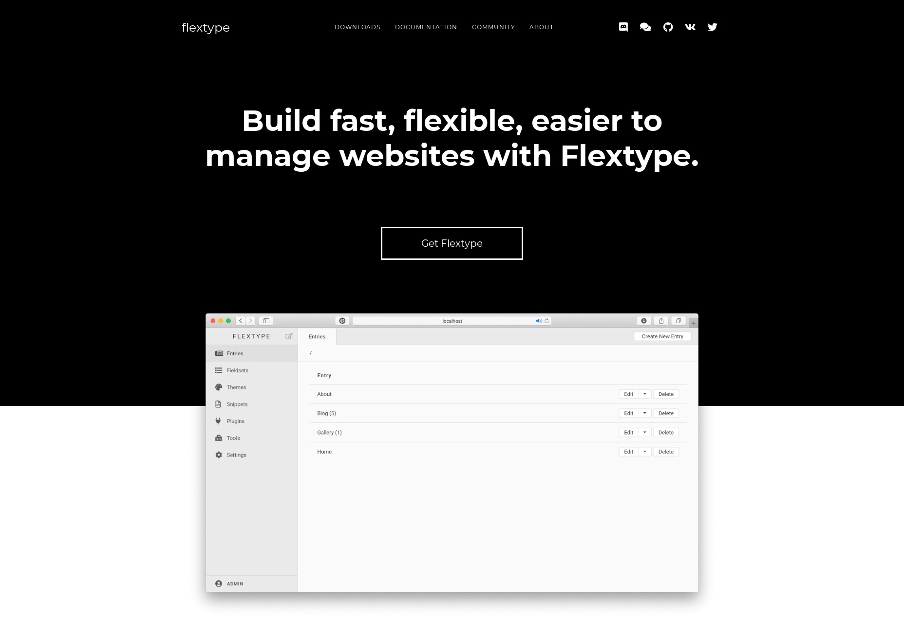
Flextype

Flextype is a simple, PHP7-based, flat-file CMS that’s designed to keep things flexible, allowing you to create more or less anything you want. And I do mean “anything”; Flextype makes it dead-easy to define custom fields for any content entry, and has a built-in theme editor

The actual content editing is easy enough, with a simple WYSIWYG editor, though Markdown support is available via plugin. Doing anything fancy with the content requires the use of WordPress-style shortcodes, though.

All in all, it’s a solid foundation for a CMS, and I can’t wait to see what they do with it.

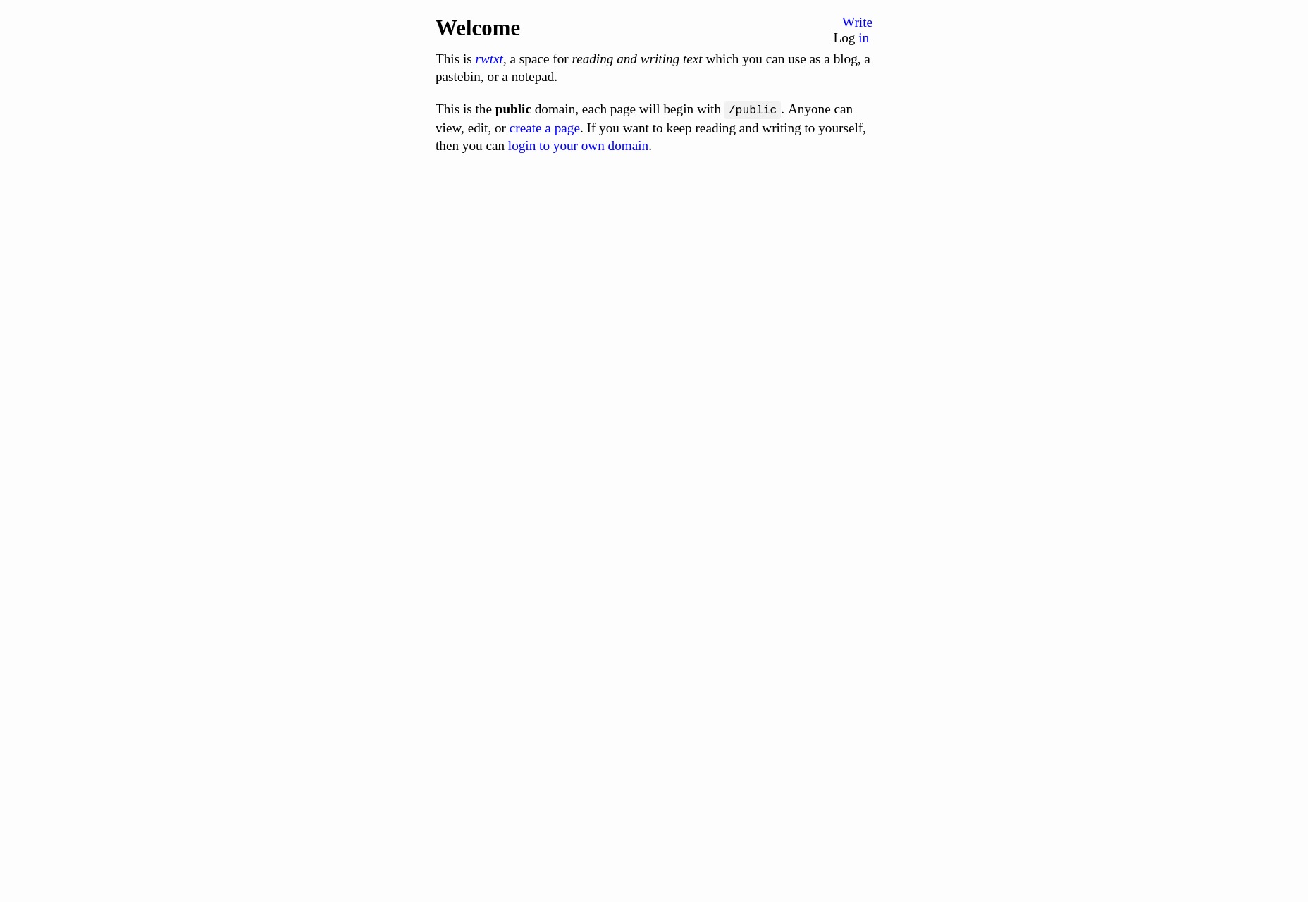
rwtxt

rwtxt is designed to be a simple, searchable notepad where you can jot down notes, keep a journal, or use it as a pastebin. It’s reminiscent of a wiki in that, in its default configuration, anyone can add a page to the public area of the site.

However, you can also add a “domain”, or a sort of personal notepad where you can either keep your private notes private, or make them public and publicly searchable. You can also log into multiple domains at a time, so you could theoretically use rwtxt to run a site with multiple blogs that are thematically different. (You can also add custom CSS to a domain, for further differentiation.)

The whole experience is very bare-bones, but I’m fascinated to see where it goes.

Relevant: rwtxt Github Repo
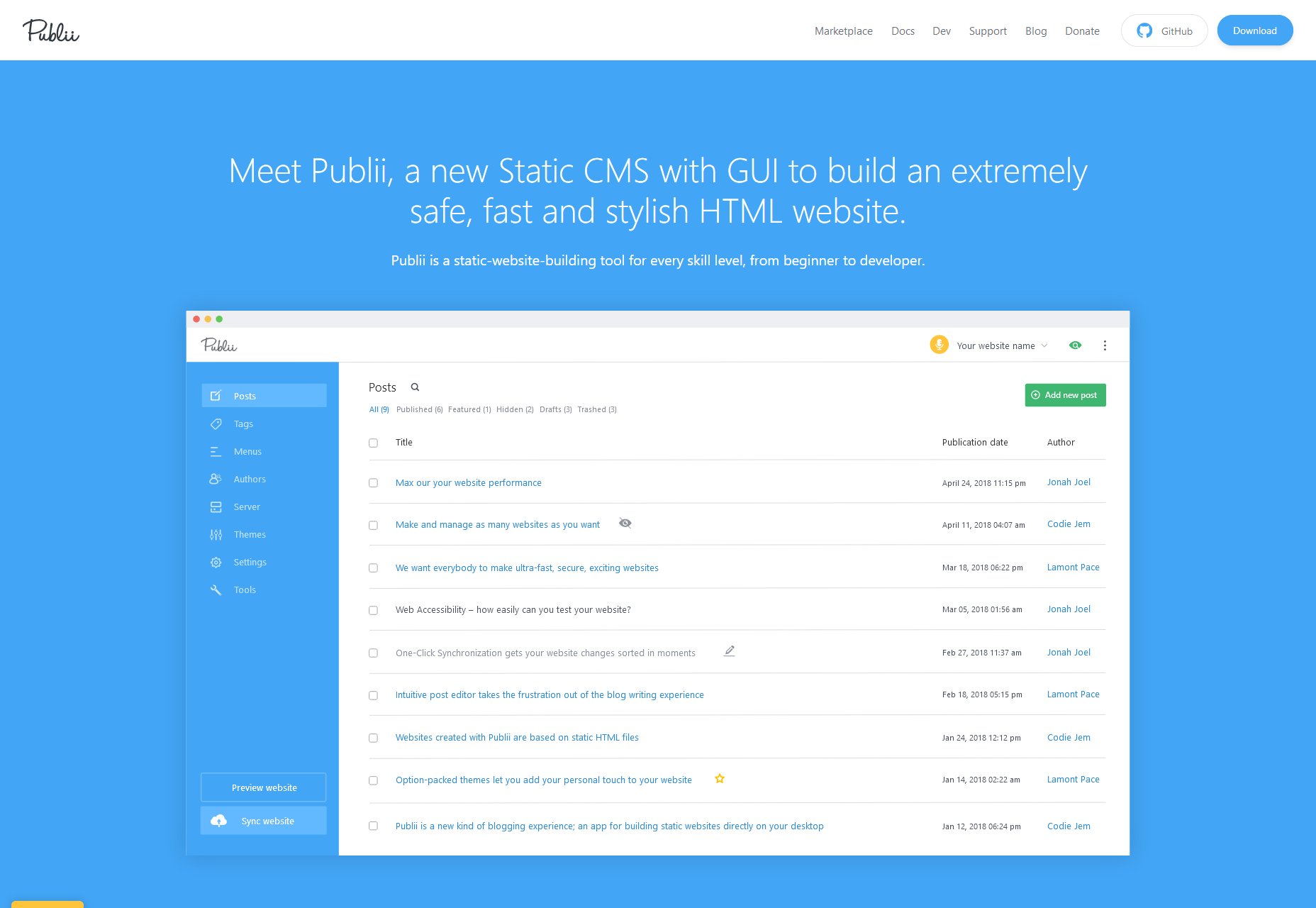
Publii

Publii is one of a few new GUI-focused Static CMS apps that run on the desktop, rather than on your server. You download the app, use it to build a static site, then upload that site onto the hosting of your choice. It’s not a new idea, but it’s one that seems to have picked up steam, lately.

Publii in particular seems to be the most modern and feature-complete of these CMS, and is open source and free to use. It seems to be blog-focused, and there is a marketplace with both free and paid theme options of excellent quality.

Other features include website syncing (supports FTP, GitHub Pages, Gitlab, AWS, Netlify, or Google Cloud), a preview function, a WordPress importer, and a focus on SEO. It’s very definitely focused at more beginner-level users.
ClassicPress

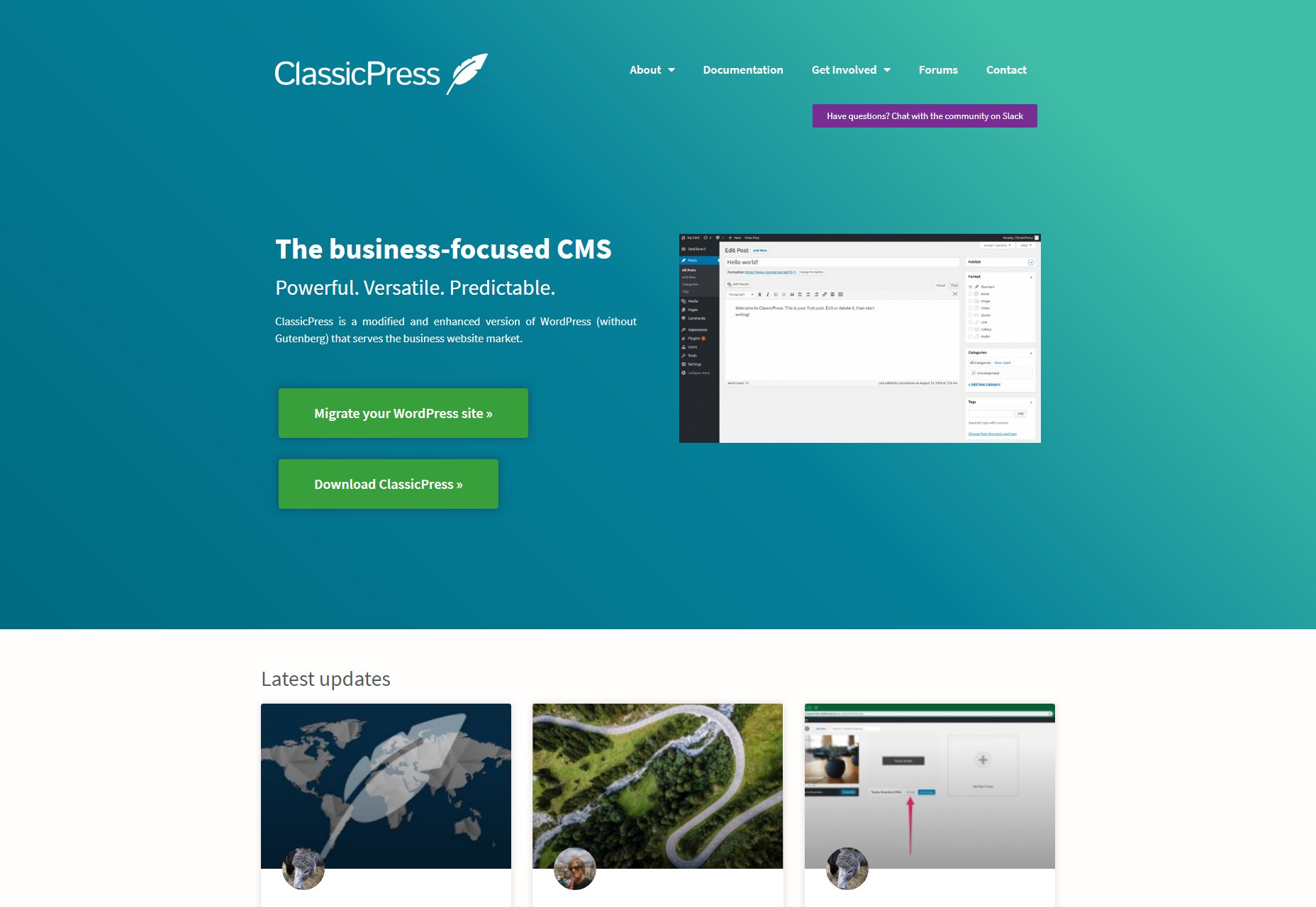
Speaking, however briefly, of WordPress, ClassicPress is literally a WordPress fork that notably lacks a certain block-based content editor that lots of people disliked. Otherwise, the current version aims to improve security and optimization, remove some bloat, and points the CMS squarely at business users who might be put off by quirky language such as “Howdy”.

The biggest difference so far, besides using the classic content editor, is the governance of the project; there’s a very large focus placed on democracy and voting to determine the future of the project, where WordPress’ future is largely written by Automattic (the company that makes it).
Twill

Twill isn’t strictly a CMS, as such. It’s a “CMS toolkit”, designed to help developers very quickly create a custom CMS to match any need. As such, it’s not something you’d want to install just to start your own blog.

But if you’re a developer, or a business owner who needs a custom-built CMS, it does look like a promising way to get exactly the functionality you need, faster. It’s based on the Laravel PHP framework, so if that’s something you already use and like, try it out.
Canner

CannerCMS is similar to Twill in that it’s a build-your-own CMS kit of sorts. Unlike Twill, it seems to be Node-based, so if writing JavaScript is more your style, CannerCMS has you covered.

Incidentally, they also has a SaaS version of the product, which takes care of all the hosting, CDN configuration, and other general hassles for you. The open source edition also apparently lacks multi-language support, which the SaaS version has.
Grafite CMS

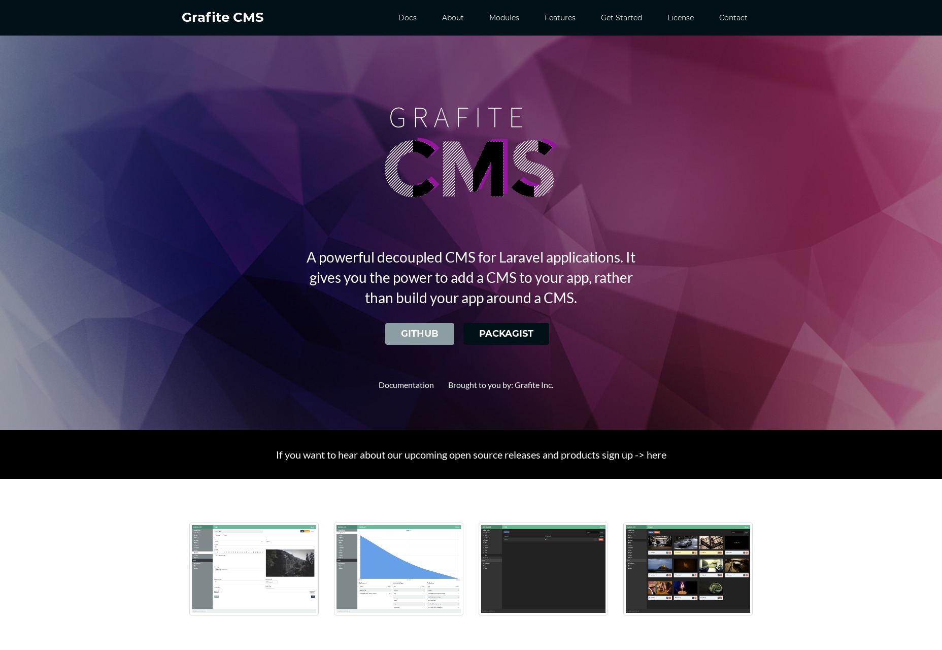
Grafite CMS is a sort of dual purpose CMS. By that I mean you can use it as a standalone CMS, on its own and fully functional, or as an add-on to an existing site or web app. Now lots of CMS will allow you to do this via an API of some sort, but Grafite CMS actually comes with two separate setup/installation modes, depending on whether you want to use Grafite CMS on its own, or integrate it into something larger.

It’s also modular, in that content types like “Pages”, Blog”, “Events”, and other are modules that you can activate or deactivate at will. You can, of course, make your own modules if you need a custom content type. It’s very much based on a “use only what you need” philosophy.
Vapid

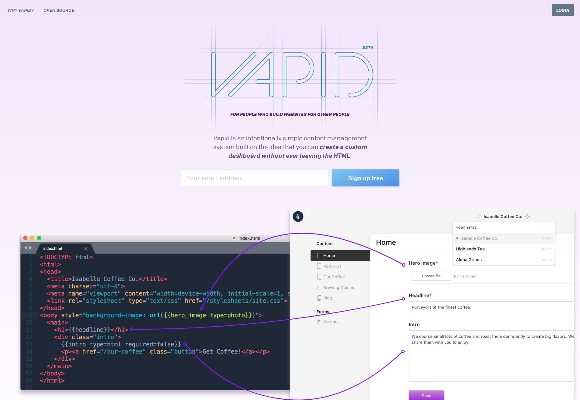
Vapid has been mentioned once before here on Web Designer Depot, but it’s worth looking at again, in case you missed it. It’s billed as an intentionally simple CMS, and they mean it. The dashboard is literally generated based on the tags you use in your templates. Every time you mark part of a page as editable content, the dashboard will add the appropriate form field in the admin UI.

It’s written in NodeJS, and you can host the app on your own server for free if you know how (the code itself is open source), or you can deploy your website to Vapid’s own hosting service. Publishing your site there does cost money of course, but the plans are quite reasonable, with the first paid plan starting at 7 USD.
Zola

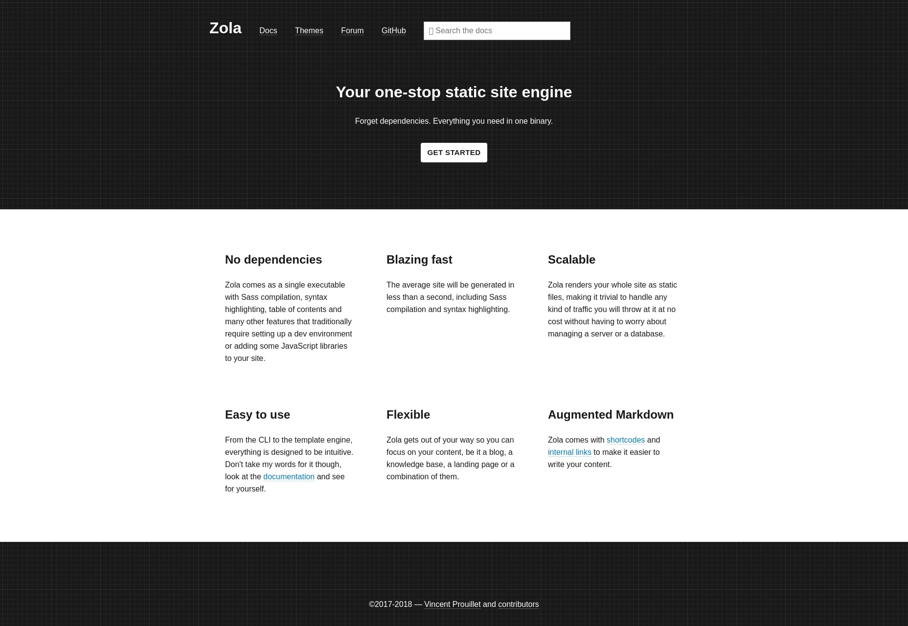
Zola is a static site generator written in Rust, so it does depend on using a command line interface, but otherwise, they keep development simple. I mean, when’s the last time you heard of a static site generator that didn’t have any dependencies? There are even premade binaries for Windows, Mac, and Linux, so installation is quick and simple.

So yeah, even if you’ve got only a rudimentary understanding of programming like myself, you can probably build sites with Zola. It’s got a list of features about a mile long, including custom taxonomies, LiveReload, Netlify support, shortcodes, image processing, and more. The content is all handled by Markdown, of course.
Academic

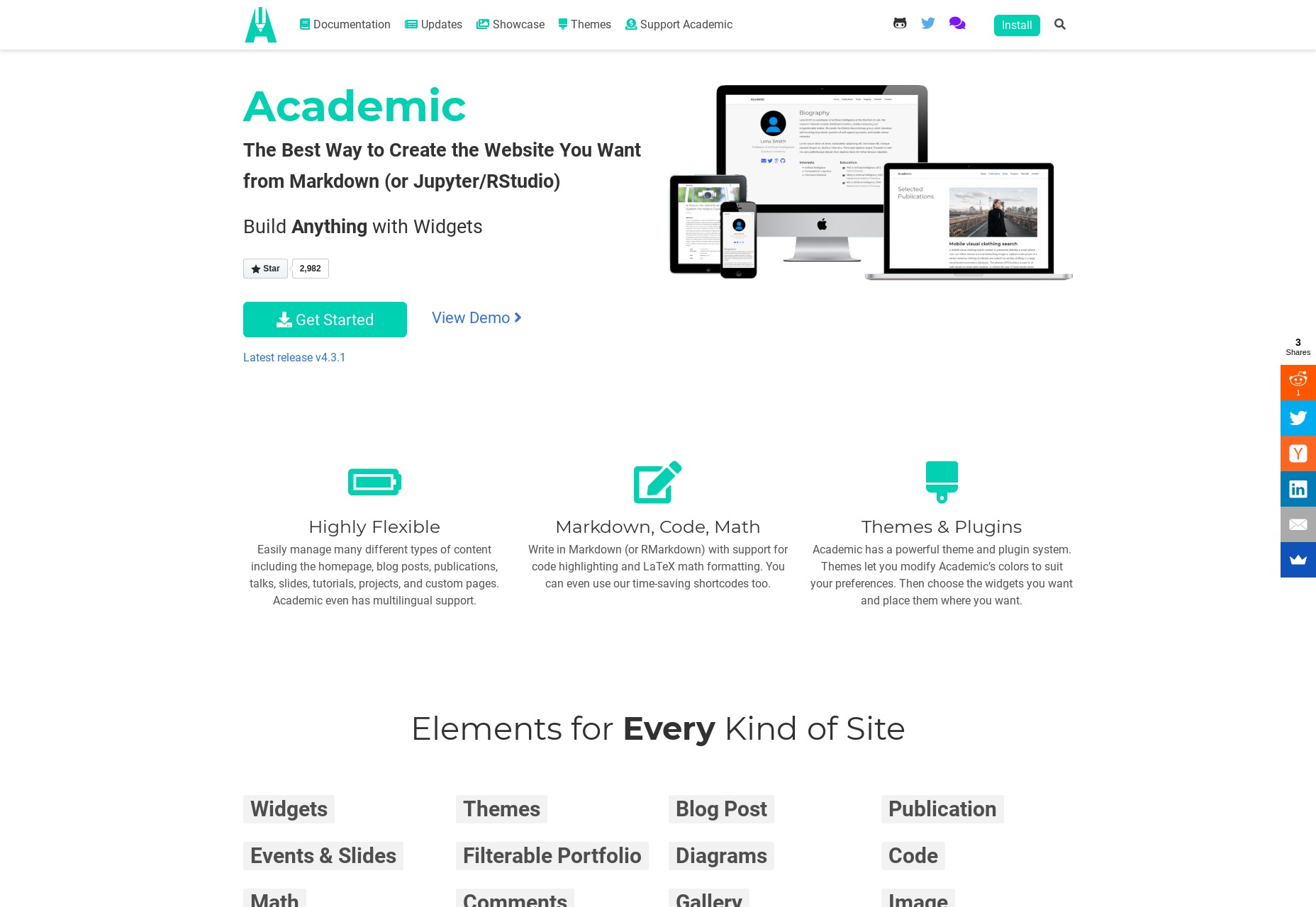
Academic is interesting because it’s a CMS built on top of another CMS. Specifically, it’s a website / page builder built on top of the Hugo static site generator. It’s designed to take the complexity of a static site generator, and make everything sort of drag and drop. And I do mean everything.

There’s support for easily managing custom pages, talks, slides, tutorials, as well as all the usual content types. There’s multilingual support, and everything can be written in Markdown and, interestingly enough, LaTeX if you’re the math-loving type. Existing themes mostly seem to be Material Design-based, but of course you can make your own.
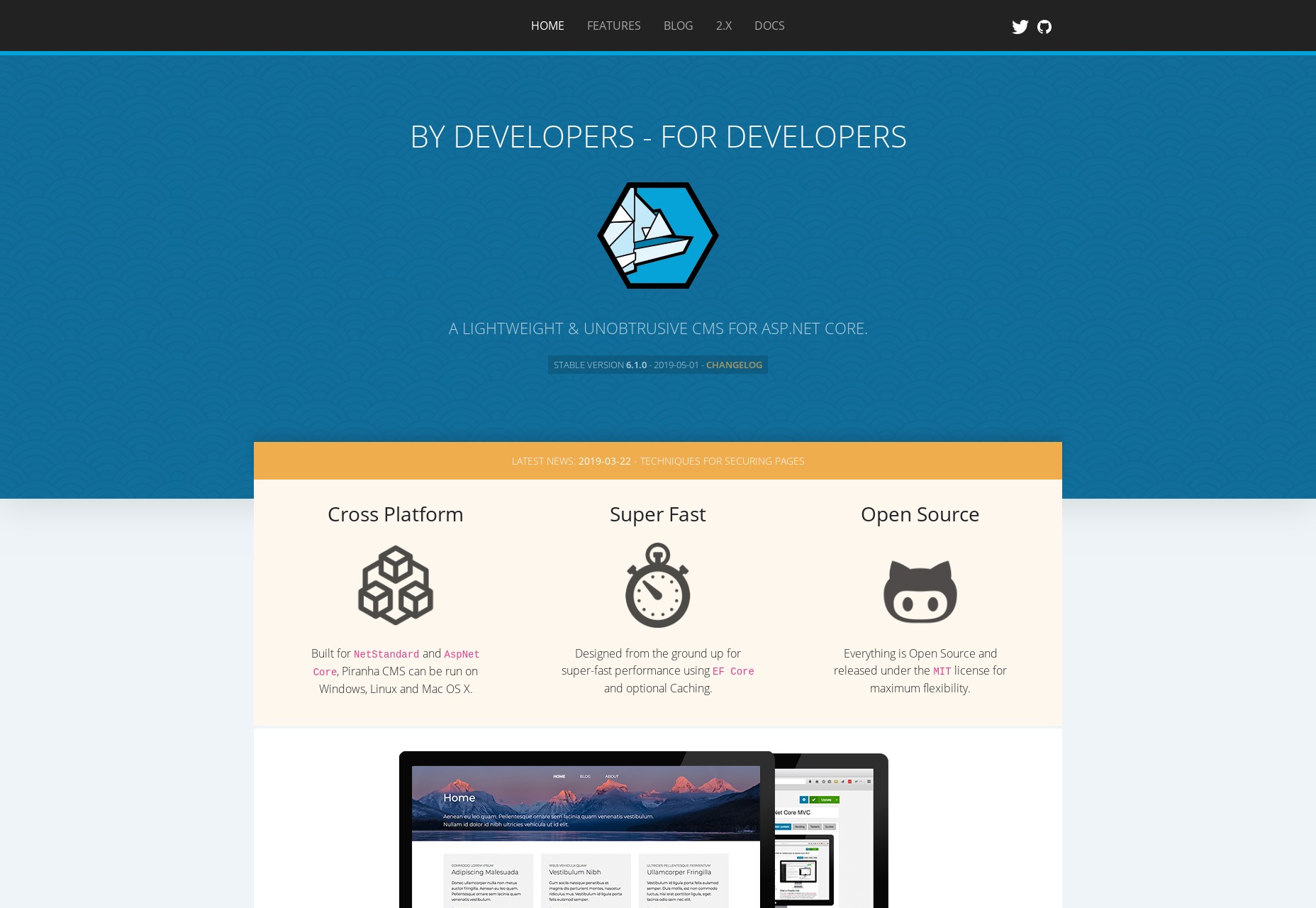
Piranha CMS

I didn’t want our ASP.NET lovers out there feel like we’d forgotten them. For you, Piranha CMS looks rather promising. Interestingly for an ASP.NET CMS, it can run on Windows, Mac, and Linux, with a focus on speed and easy publishing. Considering the tech it’s based on, it’s also Azure-ready right out of the box, if that’s something that matters to you.

Besides all that, you can edit your content as HTML or Markdown, or even plain text. There’s also a Gutenberg-style block editor. There’s image processing, easy internal linking, and even easy ways to run multiple blogs on the same site. The whole thing seems to be aimed at big publishers.
Squidex

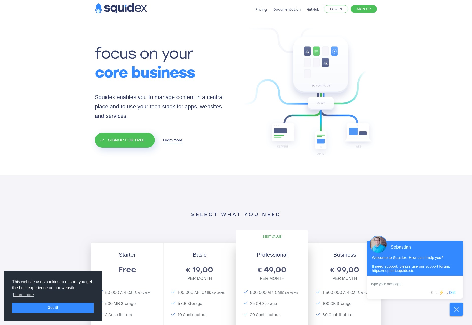
Squidex is an ASP.NET-based open source headless CMS (that means they don’t dictate how any of your HTML gets output) that you can run on your own server, or use their SaaS option which also has a limited free plan. It’s the sort of CMS that’s meant to be used as a central repository for all of your content, which you can access anywhere via their API. So theoretically, you could use it to run multiple internal and / or external websites.

As such, it’s the sort of CMS where you sort of have to build your own dashboard, as well as the front end user interface. That said, it does look real good, and offers loads of options to help you build the CMS of your (apparently quite nerdy) dreams.
Featured image via Unsplash.

Source
Categories: Designing, Others Tags: