3 Essential Design Trends, September 2019
This month’s collection of design trends focuses on a bit of a slow burn – design techniques that appeal to millennials (maybe) and Generation Z.
Gen-Zers are those born between 1997 and 2012, meaning part of this generation is in grade school. This generation is impacting design trends already because they are the most digital savvy generation yet. And they start using digital tools at even younger ages, making it no surprise that they have a significant influence on website design.
Here’s what’s trending in design this month.
1. Youthful Appeal
Content and design with a more youthful appeal is trending.
It’s a little complicated to fully describe; but when you see it, you’ll probably know it. These projects are a little more bold in color, imagery, and voice. Remember all the light blue that dominated the website design landscape for so long? You won’t find it here. Color palettes are meant to grab your attention and make you feel something.
The overall imagery features plenty of action, in the form of actual animation or video or shapes and design elements that infer motion and activity. The common theme is that the design is busier, lighter, and incredibly active. Three examples that do it in quite different ways:
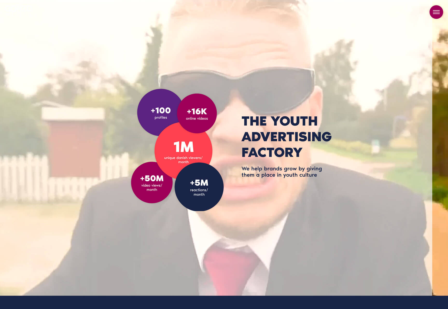
- Gonzo Media features fast-moving video with young people and bright colors for data points. The language is direct and they want you to understand youth feel and marketing (it’s part of their brand).
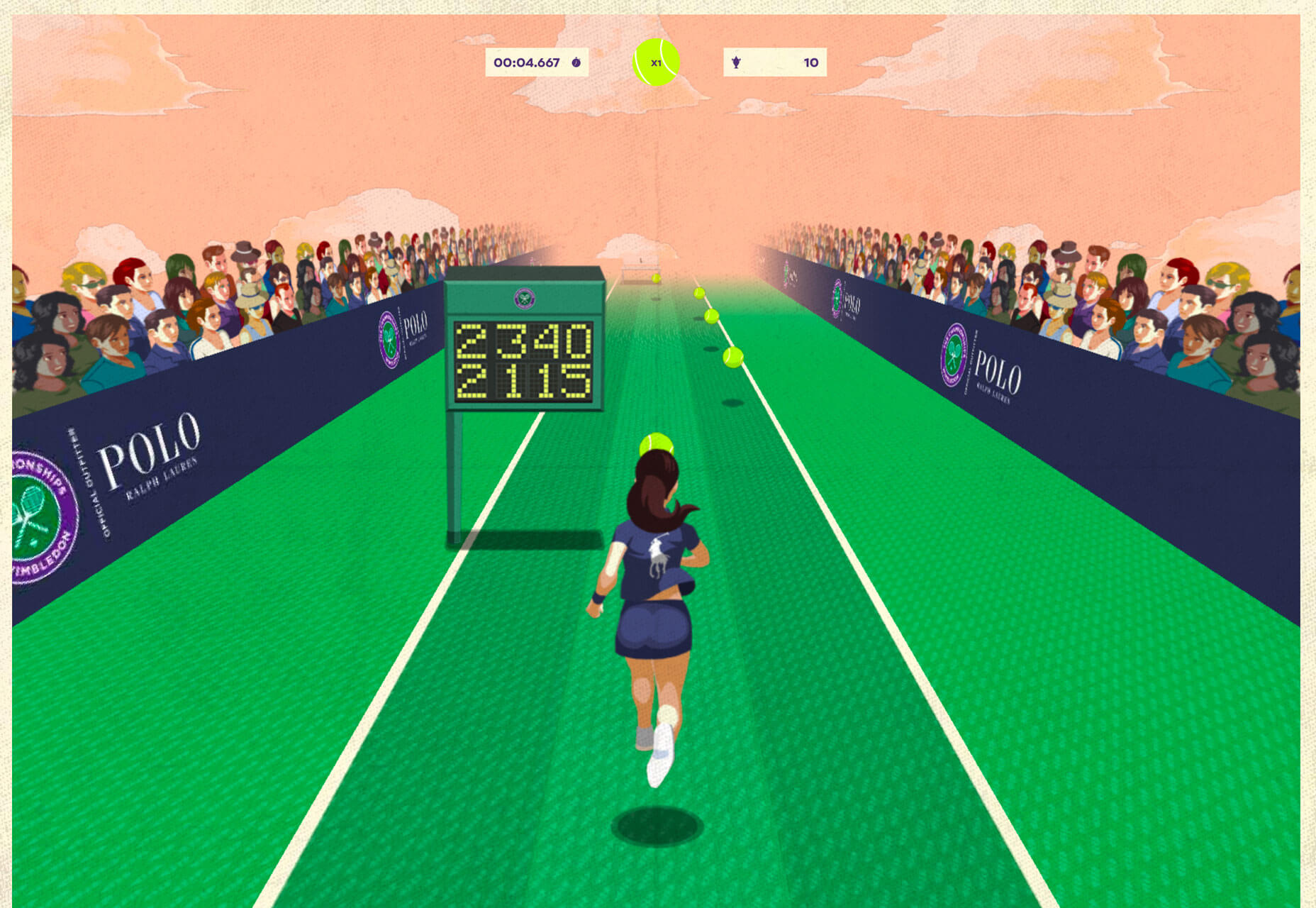
- The gamification of Wimbledon by Ralph Lauren pulls together two things that aren’t typically connected with “youth” in a new way that’s fun and inviting; the game brings a fresh idea to something that spans generations visually and interactively.
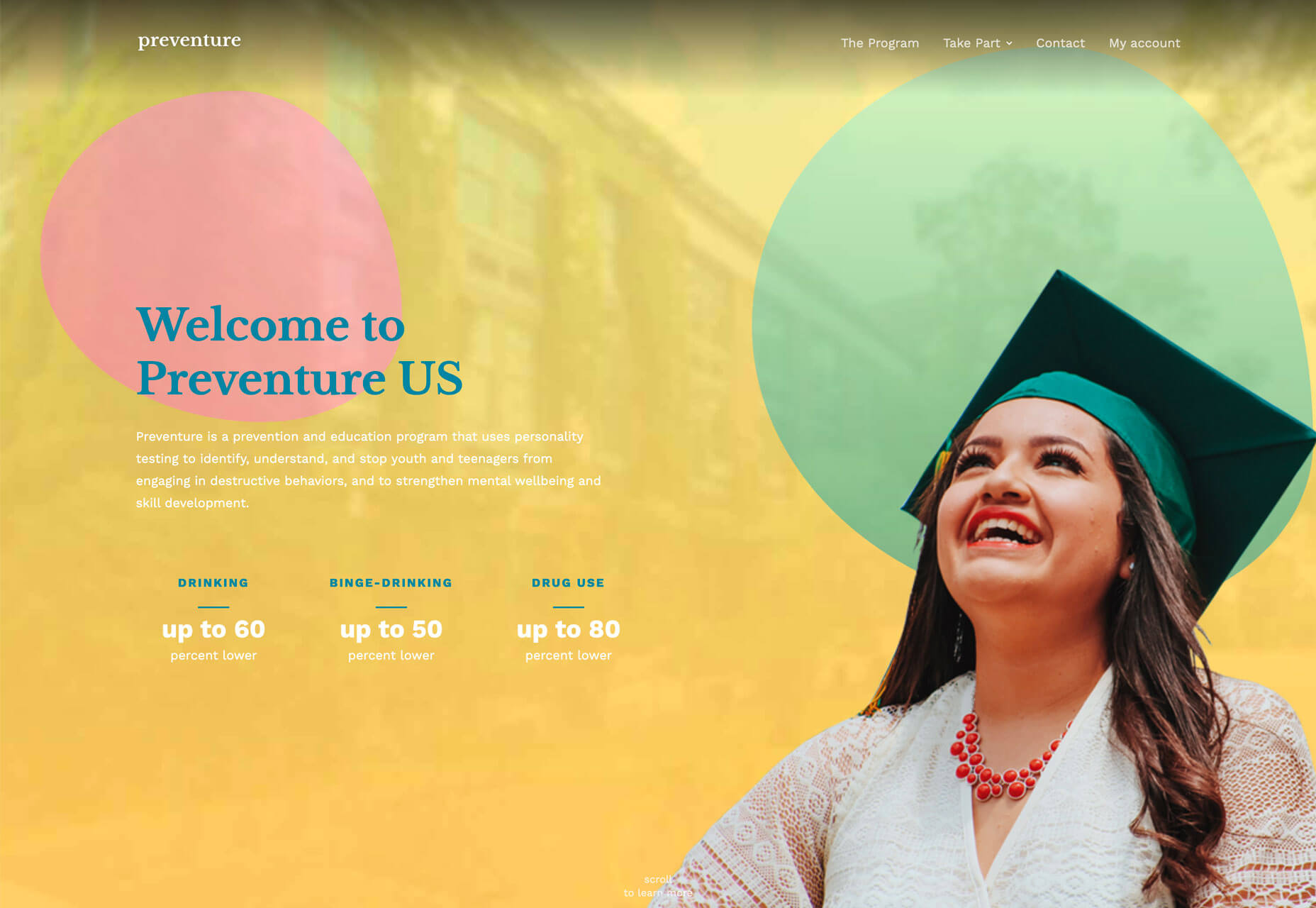
- Preventure uses color and young faces again to get a message across. What’s interesting here is that while the content is about teens, it’s targeted at their parents and caretakers. The design has a youthful appeal that’s used to speak another generation; that shows the power and influence of this trend overall.
2. TikTok Aesthetic
The New York Times claimed that TikTok is “Rewriting the World” earlier this year. The social platform which features short videos is super popular (and growing) and features a style that’s a bit harsh, and even brutalist by design.
The TikTok style features short video clips, often with filters or glitchy effects. It has a feel that’s more instant and almost oddly organic. It’s not polished and things that look like (or actually are) mistakes are just par for the course.
How does this turn into a design trend?
We’ve seen a resurgence in brutalism overall, but what you get from this social platform is a less professional look to projects with more risk-taking when it comes to design style and effects. Projects have a look that says, “I just did this real quick, and it’s awesome anyway.”
Think of the style as not quite brutal and somewhat arrogant. It’s bold, fresh and works.
These projects are somewhat disruptive from what we’re used to seeing and draw attention. That’s the whole goal for most web projects and here it works in a number of different ways.
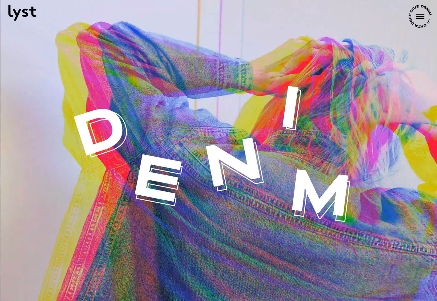
- Lyst uses the glitchy video effect that’s dominant on TikTok.
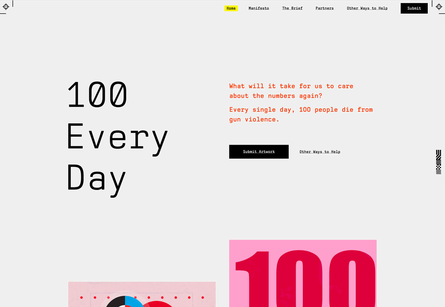
- 100 Everyday has a more static display with a brutalist style and interesting use of space.
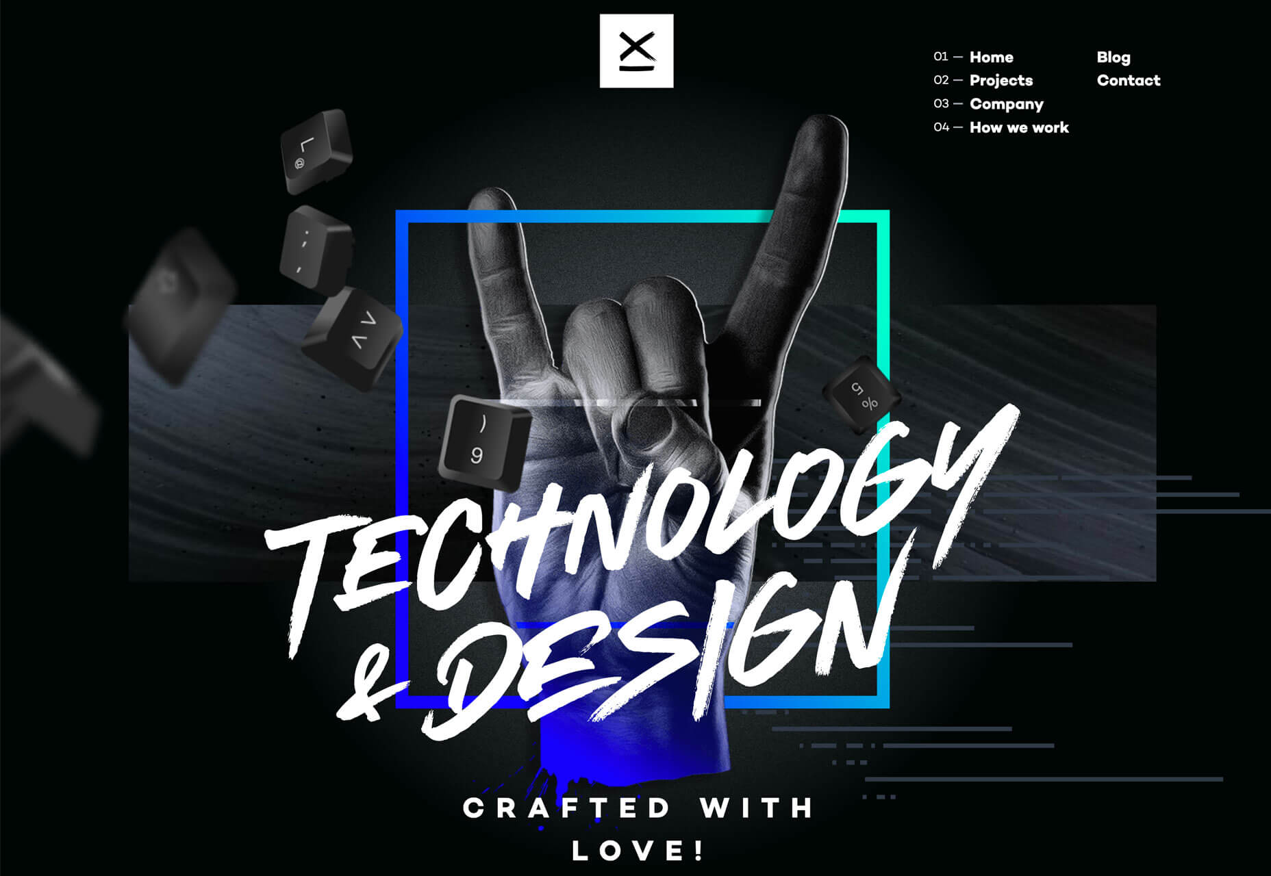
- 9 Elements is more polished, but also with glitchy effects on a light animation and plenty of high design.
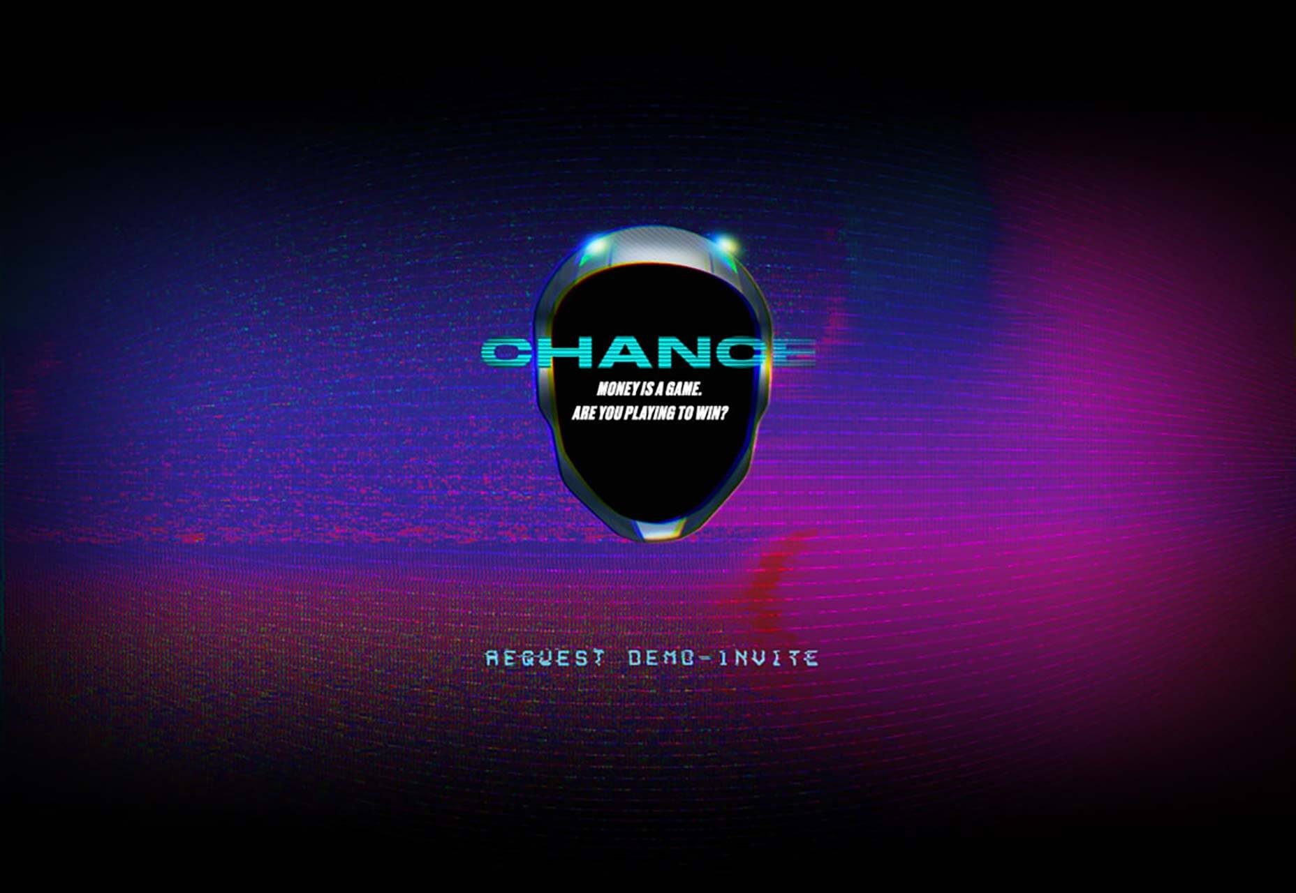
3. Futuristic Feel
Nothing says “next generation” like a futuristic style design. More of these projects are popping up thanks to the influence of virtual reality and AI themes.
What’s especially neat about these projects is that everyone’s vision of futuristic is a little bit different. The examples below show that with both light and dark themes and imagery that feels realistic or totally unreal.
The best part of a futuristic design theme is no one really knows what the next thing looks like, so it’s all imagination. That can make these design concepts interesting and intimidating to tackle.
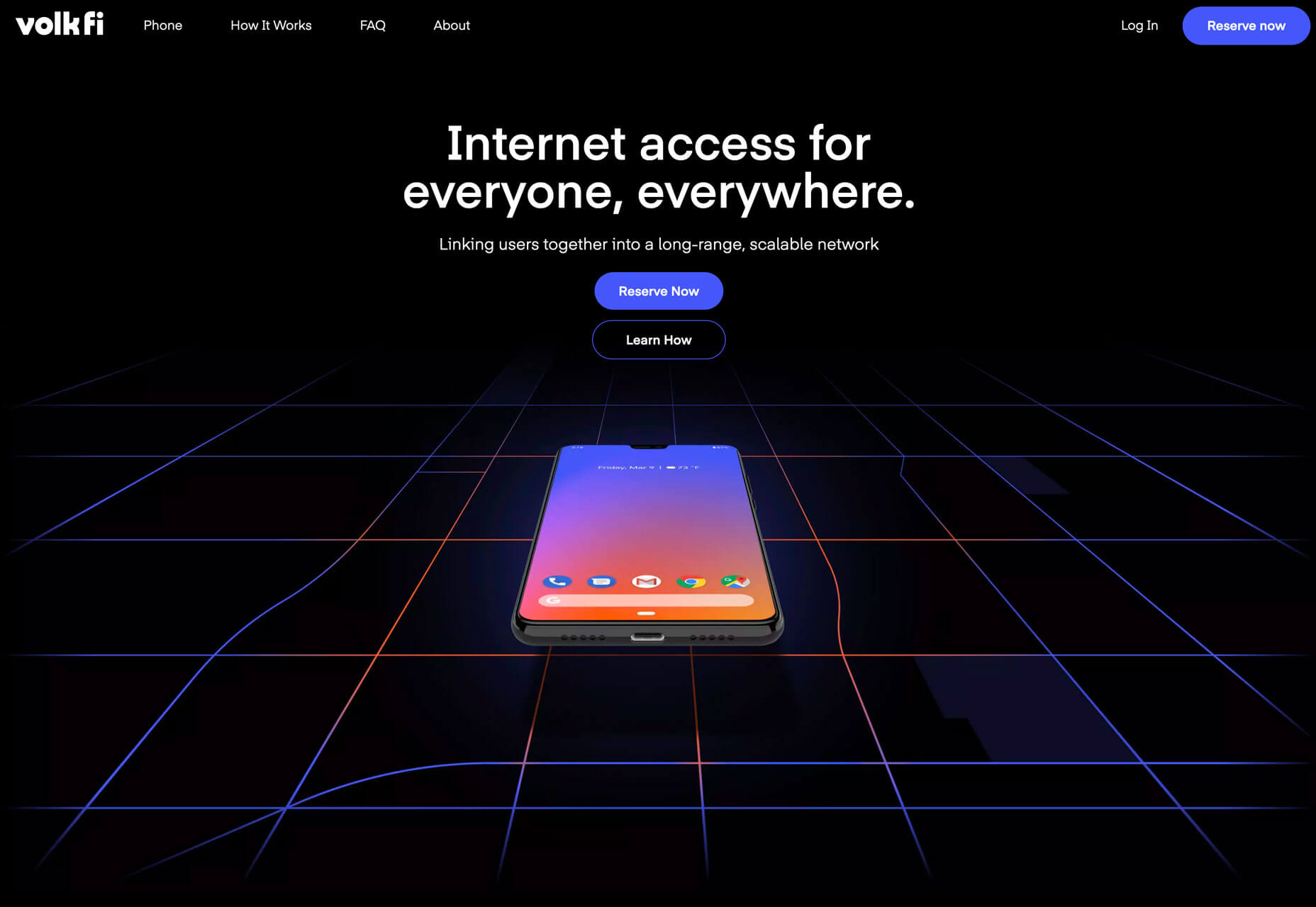
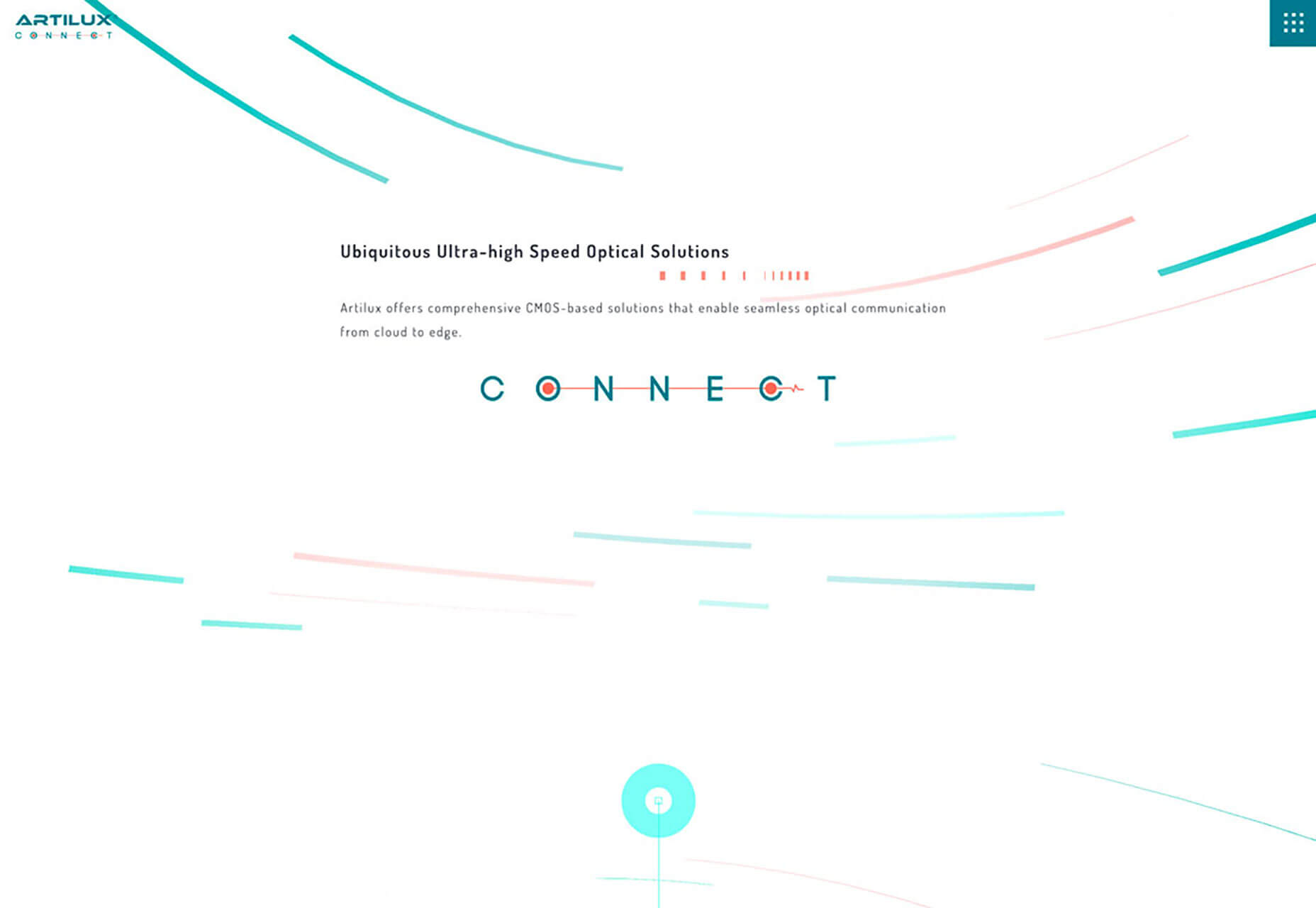
Common design themes when it comes to future-feel right now include bright color, animation, robotic imagery, lack of photos, and code themes. You might also find design elements that fade into the horizon, something you can see in all three examples below with lines or design elements that almost seem to go forever.
Conclusion
The best part of trends that are more of a long game is that more of these projects will pop up and each one will evolve these concepts a little more. It’ll be fun to look at these ideas again in six months or a year and see how they have changed.
You are probably already starting to feel pressure in client proposals to design for a more Gen-Z audience. And it’s doable without going too over the top. Incorporate some of these ideas to find just the right look and feel for projects in the pipeline. Don’t be afraid to look at trends outside of website design to influence your work. (That’s where many of these ideas started.)
