Various Methods for Expanding a Box While Preserving the Border Radius
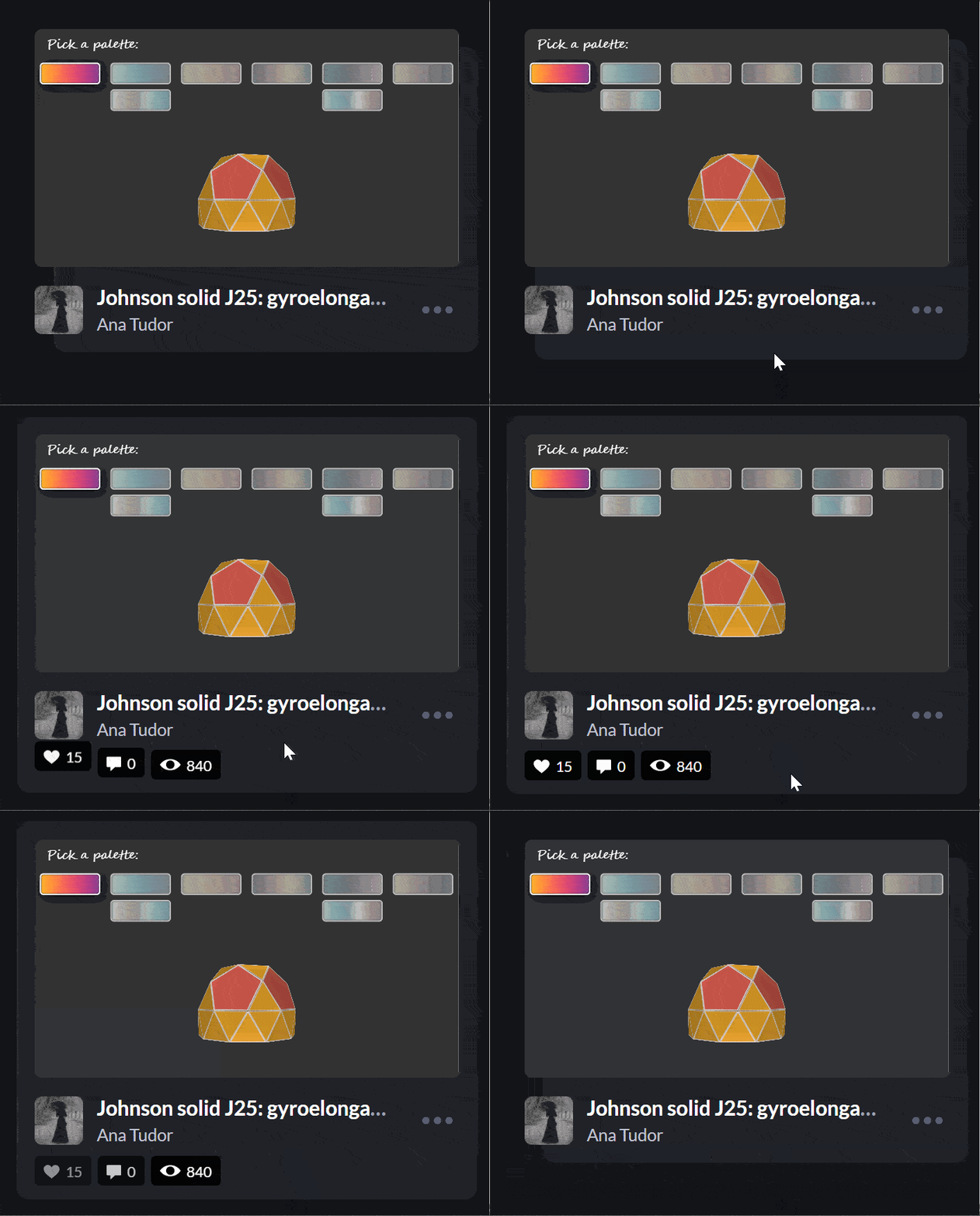
?I’ve recently noticed an interesting change on CodePen: on hovering the pens on the homepage, there’s a rectangle with rounded corners expanding in the back.
Being the curious creature that I am, I had to check how this works! Turns out, the rectangle in the back is an absolutely positioned ::after pseudo-element.
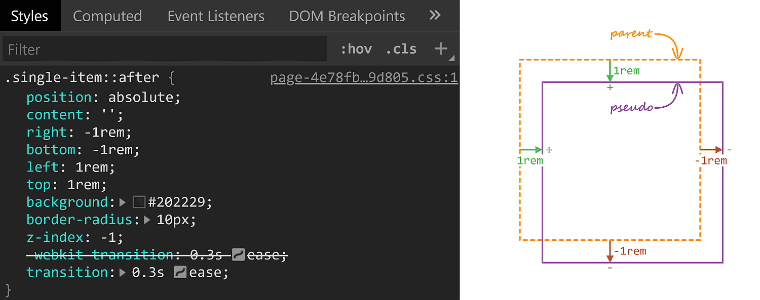
::after styles. A positive offset goes inwards from the parent’s padding limit, while a negative one goes outwards.On :hover, its offsets are overridden and, combined with the transition, we get the expanding box effect.
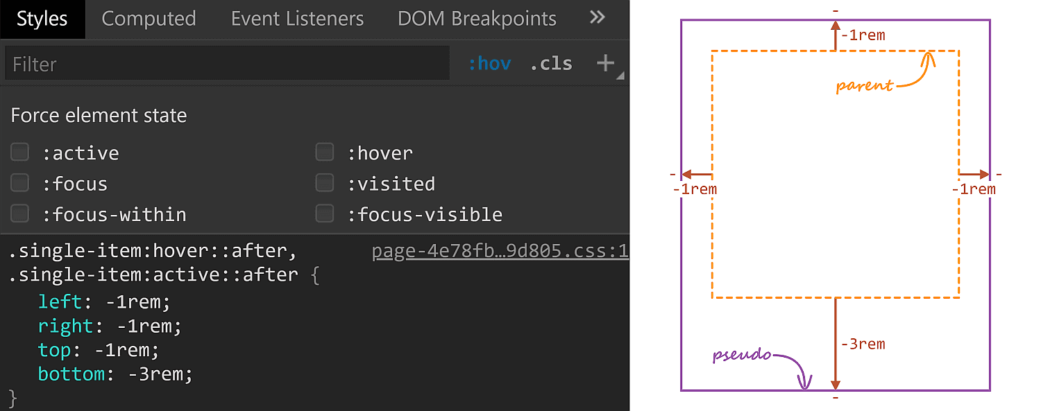
::after styles on :hover.The right property has the same value (-1rem) in both the initial and the :hover rule sets, so it’s unnecessary to override it, but all the other offsets move by 2rem outwards (from 1rem to -1rem for the top and left offsets and from -1rem to -3rem for the bottom offset)
One thing to notice here is that the ::after pseudo-element has a border-radius of 10px which gets preserved as it expands. Which got me to think about what methods we have for expanding/shrinking (pseudo-) elements while preserving their border-radius. How many can you think of? Let me know if you have ideas that haven’t been included below, where we take a look at a bunch of options and see which is best suited for what situation.
Changing offsets
This is the method used on CodePen and it works really well in this particular situation for a bunch of reasons. First off, it has great support. It also works when the expanding (pseudo-) element is responsive, with no fixed dimensions and, at the same time, the amount by which it expands is fixed (a rem value). It also works for expanding in more than two directions (top, bottom and left in this particular case).
There are however a couple of caveats we need to be aware of.
First, our expanding element cannot have position: static. This is not a problem in the context of the CodePen use case since the ::after pseudo-element needs to be absolutely positioned anyway in order to be placed underneath the rest of this parent’s content.
Second, going overboard with offset animations (as well as, in general, animating any property that affects layout with box properties the way offsets, margins, border widths, paddings or dimensions do) can negatively impact performance. Again, this is not something of concern here, we only have a little transition on :hover, no big deal.
Changing dimensions
Instead of changing offsets, we could change dimensions instead. However, this is a method that works if we want our (pseudo-) element to expand in, at most, two directions. Otherwise, we need to change offsets as well. In order to better understand this, let’s consider the CodePen situation where we want our ::after pseudo-elements to expand in three directions (top, bottom and left).
The relevant initial sizing info is the following:
.single-item::after {
  top: 1rem;
  right: -1rem;
  bottom: -1rem;
  left: 1rem;
}
Since opposing offsets (the top–bottom and left–right pairs) cancel each other (1rem - 1rem = 0), it results that the pseudo-element’s dimensions are equal to those of its parent (or 100% of the parent’s dimensions).
So we can re-write the above as:
.single-item::after {
  top: 1rem;
  right: -1rem;
  width: 100%;
  height: 100%;
}
On :hover, we increase the width by 2rem to the left and the height by 4rem, 2rem to the top and 2rem to the bottom. However, just writing:
.single-item::after {
  width: calc(100% + 2rem);
  height: calc(100% + 4rem);
}
…is not enough, as this makes the height increase the downward direction by 4rem instead of increasing it by 2rem up and 2rem down. The following demo illustrates this (put :focus on or hover over the items to see how the ::after pseudo-element expands):
See the Pen by thebabydino (@thebabydino) on CodePen.
We’d need to update the top property as well in order to get the desired effect:
.single-item::after {
  top: -1rem;
  width: calc(100% + 2rem);
  height: calc(100% + 4rem);
}
Which works, as it can be seen below:
See the Pen by thebabydino (@thebabydino) on CodePen.
But, to be honest, this feels less desirable than changing offsets alone.
However, changing dimensions is a good solution in a different kind of situation, like when we want to have some bars with rounded corners that expand/shrink in a single direction.
See the Pen by thebabydino (@thebabydino) on CodePen.
Note that, if we didn’t have rounded corners to preserve, the better solution would be to use directional scaling via the transform property.
Changing padding/border-width
Similar to changing the dimensions, we can change the padding or border-width (for a border that’s transparent). Note that, just like with changing the dimensions, we need to also update offsets if expanding the box in more than two dimensions:
See the Pen by thebabydino (@thebabydino) on CodePen.
In the demo above, the pinkish box represents the content-box of the ::after pseudo-element and you can see it stays the same size, which is important for this approach.
In order to understand why it is important, consider this other limitation: we also need to have the box dimensions defined by two offsets plus the width and the height instead of using all four offsets. This is because the padding/ border-width would only grow inwards if we were to use four offsets rather than two plus the width and the height.
See the Pen by thebabydino (@thebabydino) on CodePen.
For the same reason, we cannot have box-sizing: border-box on our ::after pseudo-element.
See the Pen by thebabydino (@thebabydino) on CodePen.
In spite of these limitations, this method can come in handy if our expanding (pseudo-) element has text content we don’t want to see moving around on :hover as illustrated by the Pen below, where the first two examples change offsets/ dimensions, while the last two change paddings/ border widths:
See the Pen by thebabydino (@thebabydino) on CodePen.
Changing margin
Using this method, we first set the offsets to the :hover state values and a margin to compensate and give us the initial state sizing:
.single-item::after {
  top: -1rem;
  right: -1rem;
  bottom: -3rem;
  left: -1rem;
  margin: 2rem 0 2rem 2rem;
}
Then we zero this margin on :hover:
.single-item:hover::after { margin: 0 }See the Pen by thebabydino (@thebabydino) on CodePen.
This is another approach that works great for the CodePen situation, though I cannot really think of other use cases. Also note that, just like changing offsets or dimensions, this method affects the size of the content-box, so any text content we may have gets moved and rearranged.
Changing font size
This is probably the trickiest one of all and has lots of limitations, the most important of which being we cannot have text content on the actual (pseudo-) element that expands/shrinks — but it’s another method that would work well in the CodePen case.
Also, font-size on its own doesn’t really do anything to make a box expand or shrink. We need to combine it with one of the previously discussed properties.
For example, we can set the font-size on ::after to be equal to 1rem, set the offsets to the expanded case and set em margins that would correspond to the difference between the expanded and the initial state.
.single-item::after {
  top: -1rem;
  right: -1rem;
  bottom: -3rem;
  left: -1rem;
  margin: 2em 0 2em 2em;
  font-size: 1rem;
}
Then, on :hover, we bring the font-size to 0:
.single-item:hover::after { font-size: 0 }See the Pen by thebabydino (@thebabydino) on CodePen.
We can also use font-size with offsets, though it gets a bit more complicated:
.single-item::after {
  top: calc(2em - 1rem);
  right: -1rem;
  bottom: calc(2em - 3rem);
  left: calc(2em - 1rem);
  font-size: 1rem;
}

.single-item:hover::after { font-size: 0 }
Still, what’s important is that it works, as it can be seen below:
See the Pen by thebabydino (@thebabydino) on CodePen.
Combining font-size with dimensions is even hairier, as we also need to change the vertical offset value on :hover on top of everything:
.single-item::after {
  top: 1rem;
  right: -1rem;
  width: calc(100% + 2em);
  height: calc(100% + 4em);
  font-size: 0;
}

.single-item:hover::after {
  top: -1rem;
  font-size: 1rem
}
Oh, well, at least it works:
See the Pen by thebabydino (@thebabydino) on CodePen.
Same thing goes for using font-size with padding/border-width:
.single-item::after {
  top: 1rem;
  right: -1rem;
  width: 100%;
  height: 100%;
  font-size: 0;
}

.single-item:nth-child(1)::after {
  padding: 2em 0 2em 2em;
}

.single-item:nth-child(2)::after {
  border: solid 0 transparent;
  border-width: 2em 0 2em 2em;
}

.single-item:hover::after {
  top: -1rem;
  font-size: 1rem;
}
See the Pen by thebabydino (@thebabydino) on CodePen.
Changing scale
If you’ve read pieces on animation performance, then you’ve probably read it’s better to animate transforms instead of properties that impact layout, like offsets, margins, borders, paddings, dimensions — pretty much what we’ve used so far!
The first issue that stands out here is that scaling an element also scales its corner rounding, as illustrated below:
See the Pen by thebabydino (@thebabydino) on CodePen.
We can get around this by also scaling the border-radius the other way.
Let’s say we scale an element by a factor $fx along the x axis and by a factor $fy along the y axis and we want to keep its border-radius at a constant value $r.
This means we also need to divide $r by the corresponding scaling factor along each axis.
border-radius: #{$r/$fx}/ #{$r/$fy};
transform: scale($fx, $fy)
See the Pen by thebabydino (@thebabydino) on CodePen.
However, note that with this method, we need to use scaling factors, not amounts by which we expand our (pseudo-) element in this or that direction. Getting the scaling factors from the dimensions and expansion amounts is possible, but only if they’re expressed in units that have a certain fixed relation between them. While preprocessors can mix units like in or px due to the fact that 1in is always 96px, they cannot resolve how much 1em or 1% or 1vmin or 1ch is in px as they lack context. And calc() is not a solution either, as it doesn’t allow us to divide a length value by another length value to get a unitless scale factor.
This is why scaling is not a solution in the CodePen case, where the ::after boxes have dimensions that depend on the viewport and, at the same time, expand by fixed rem amounts.
But if our scale amount is given or we can easily compute it, this is an option to consider, especially since making the scaling factors custom properties we then animate with a bit of Houdini magic can greatly simplify our code.
border-radius: calc(#{$r}/var(--fx))/ calc(#{$r}/var(--fy));
transform: scale(var(--fx), var(--fy))
Note that Houdini only works in Chromium browsers with the Experimental Web Platform features flag enabled.
For example, we can create this tile grid animation:
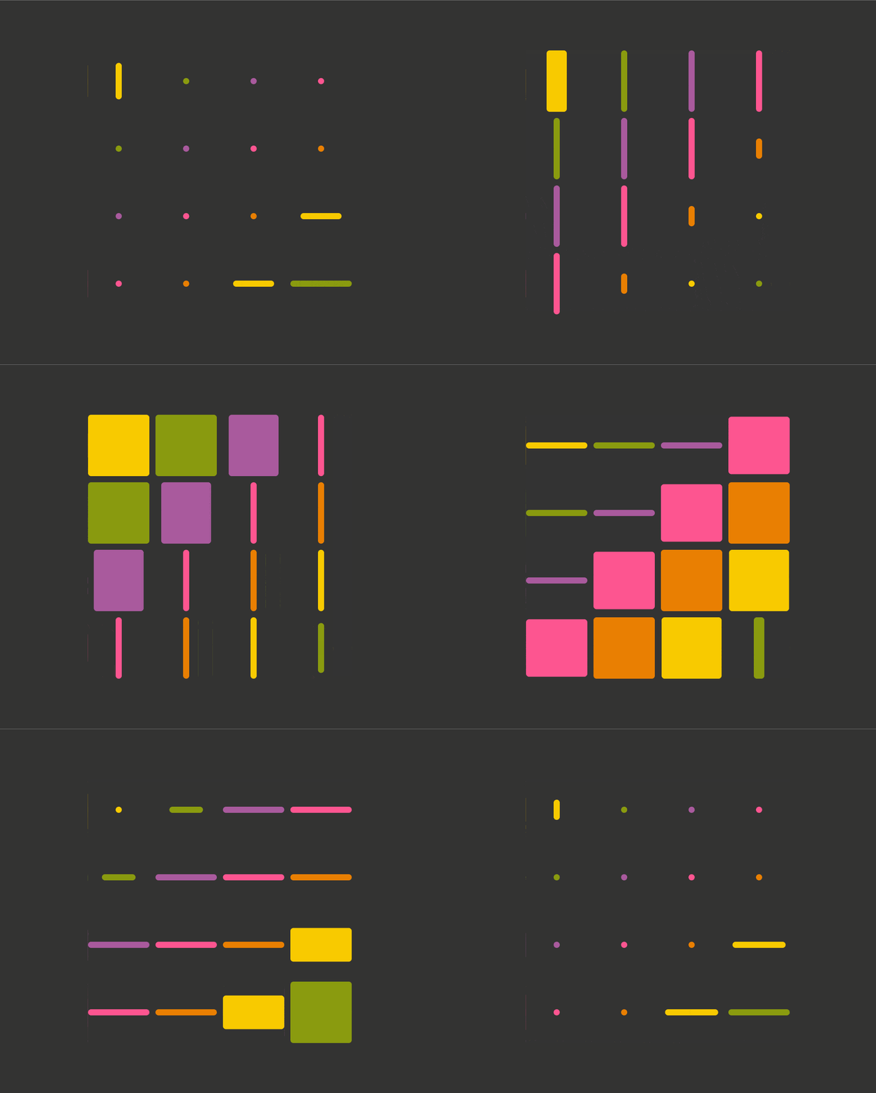
The square tiles have an edge length $l and with a corner rounding of $k*$l:
.tile {
  width: $l;
  height: $l;
  border-radius: calc(#{$r}/var(--fx))/ calc(#{$r}/var(--fy));
  transform: scale(var(--fx), var(--fy))
}
We register our two custom properties:
CSS.registerProperty({
  name: '--fx',
  syntax: '<number>',
  initialValue: 1,
  inherits: false
});

CSS.registerProperty({
  name: '--fy',
  syntax: '<number>',
  initialValue: 1,
  inherits: false
});
And we can then animate them:
.tile {
  /* same as before */
  animation: a $t infinite ease-in alternate;
  animation-name: fx, fy;
}

@keyframes fx {
  0%, 35% { --fx: 1 }
  50%, 100% { --fx: #{2*$k} }
}

@keyframes fy {
  0%, 35% { --fy: 1 }
  50%, 100% { --fy: #{2*$k} }
}
Finally, we add in a delay depending on the horizontal (--i) and vertical (--j) grid indices in order to create a staggered animation effect:
animation-delay:
  calc((var(--i) + var(--m) - var(--j))*#{$t}/(2*var(--m)) - #{$t}),
  calc((var(--i) + var(--m) - var(--j))*#{$t}/(2*var(--m)) - #{1.5*$t})
Another example is the following one, where the dots are created with the help of pseudo-elements:
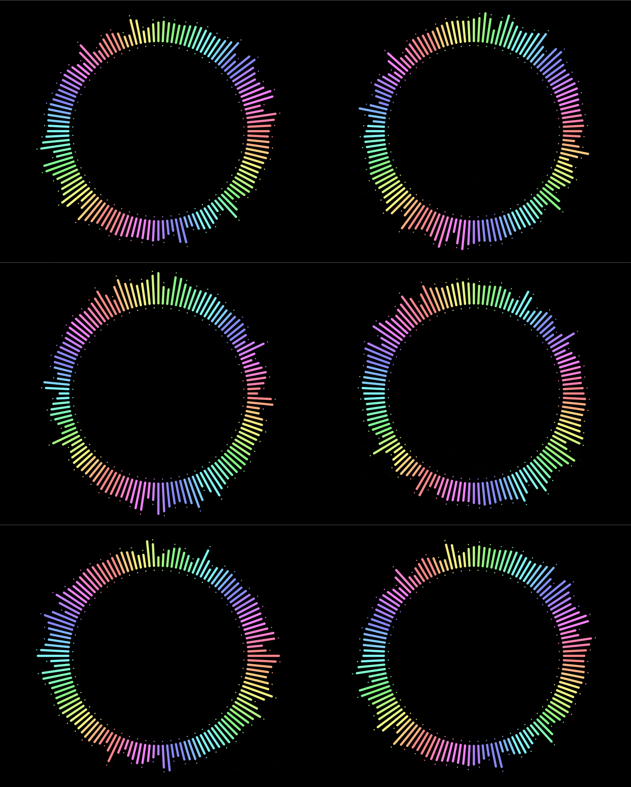
Since pseudo-elements get scaled together with their parents, we need to also reverse the scaling transform on them:
.spike {
  /* other spike styles */
  transform: var(--position) scalex(var(--fx));

  &::before, &::after {
    /* other pseudo styles */
    transform: scalex(calc(1/var(--fx)));
  }
}
Changing… clip-path!
This is a method I really like, even though it cuts out pre-Chromium Edge and Internet Explorer support.
Pretty much every usage example of clip-path out there has either a polygon() value or an SVG reference value. However, if you’ve seen some of my previous articles, then you probably know there are other basic shapes we can use, like inset(), which works as illustrated below:
inset() function works. (Demo)So, in order to reproduce the CodePen effect with this method, we set the ::after offsets to the expanded state values and then cut out what we don’t want to see with the help of clip-path:
.single-item::after {
  top: -1rem;
  right: -1rem;
  bottom: -3em;
  left: -1em;
  clip-path: inset(2rem 0 2rem 2rem)
}
And then, in the :hover state, we zero all insets:
.single-item:hover::after {
  clip-path: inset(0)
}
This can be seen in action below:
See the Pen by thebabydino (@thebabydino) on CodePen.
Alright, this works, but we also need a corner rounding. Fortunately, inset() lets us specify that too as whatever border-radius value we may wish.
Here, a 10px one for all corners along both directions does it:
.single-item::after {
  /* same styles as before */
  clip-path: inset(2rem 0 2rem 2rem round 10px)
}

.single-item:hover::after {
  clip-path: inset(0 round 10px)
}
And this gives us exactly what we were going for:
See the Pen by thebabydino (@thebabydino) on CodePen.
Furthermore, it doesn’t really break anything in non-supporting browsers, it just always stays in the expanded state.
However, while this is method that works great for a lot of situations — including the CodePen use case — it doesn’t work when our expanding/shrinking elements have descendants that go outside their clipped parent’s border-box, as it is the case for the last example given with the previously discussed scaling method.
The post Various Methods for Expanding a Box While Preserving the Border Radius appeared first on CSS-Tricks.
