Paperform
Buy or build is a classic debate in technology. Building things yourself might feel less expensive because there is no line item on your credit card bill, but has cost in the form of time. Buying things, believe it or not, is usually less expensive when it comes to technology that isn’t your core focus. Build your core technology, buy everything else.
That’s what I think of with a tool like Paperform. A powerful form builder like Paperform costs me a few bucks, but saves me countless hours in building something that might become extremely complex and a massive distraction from my more important goals.
Paperform is a form builder, but disguised within a page builder
Imagine you’re building a registration form for a conference. (That’s a perfect fit for Paperform, by the way, as Paperform has payment features that can even handle the money part.) The page that explains the conference and the registration form for the conference can be, and maybe should be, the same thing.
The Paperform designer makes it quite intuitive to build out a page of content.
It is equally intuitive to sprinkle questions into the page as you are writing and design it, making it an interactive form.
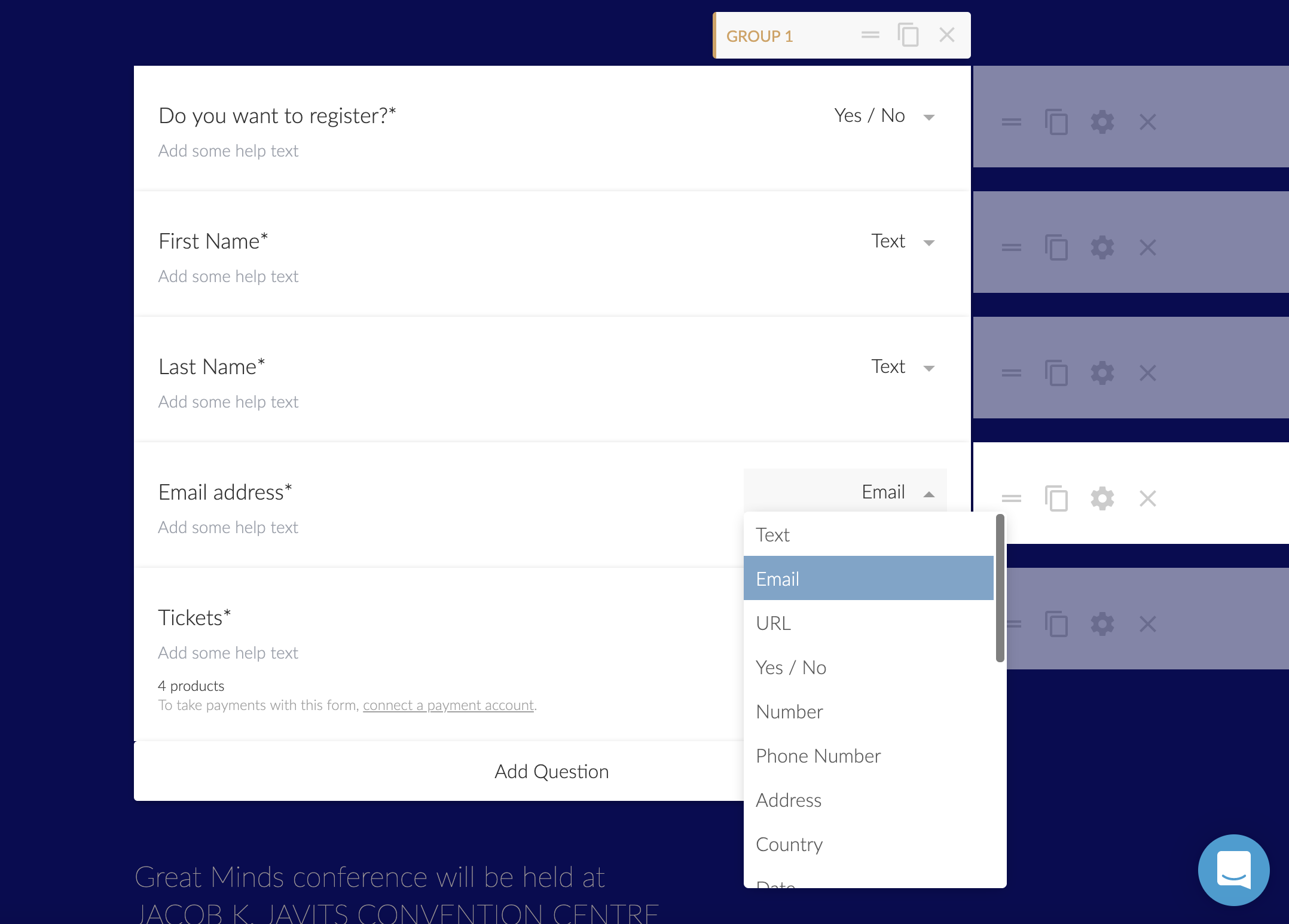
Block editing
As a little aside, I dig how the editor is block-based. That’s a trend I can get behind lately, with some of my favorite apps like Notion really embracing it and huge projects like Gutenberg in WordPress.

This feels lighter than both of those, a little bit more like the Dropbox Paper editor. Building a form is just like editing a document is a principle they have and I think they are right on. It really is just like working in a document with perhaps a bit more configuration possibilities when you get into the details.
You’ve got a lot of power at the question level
With a form builder, you really want that power. You don’t want to get knee-deep into building a form only to find out you can’t do the thing you need to with the functionality and flow of the form. Here’s a bunch of yes’s:
- Can you make a field be required? Yes.
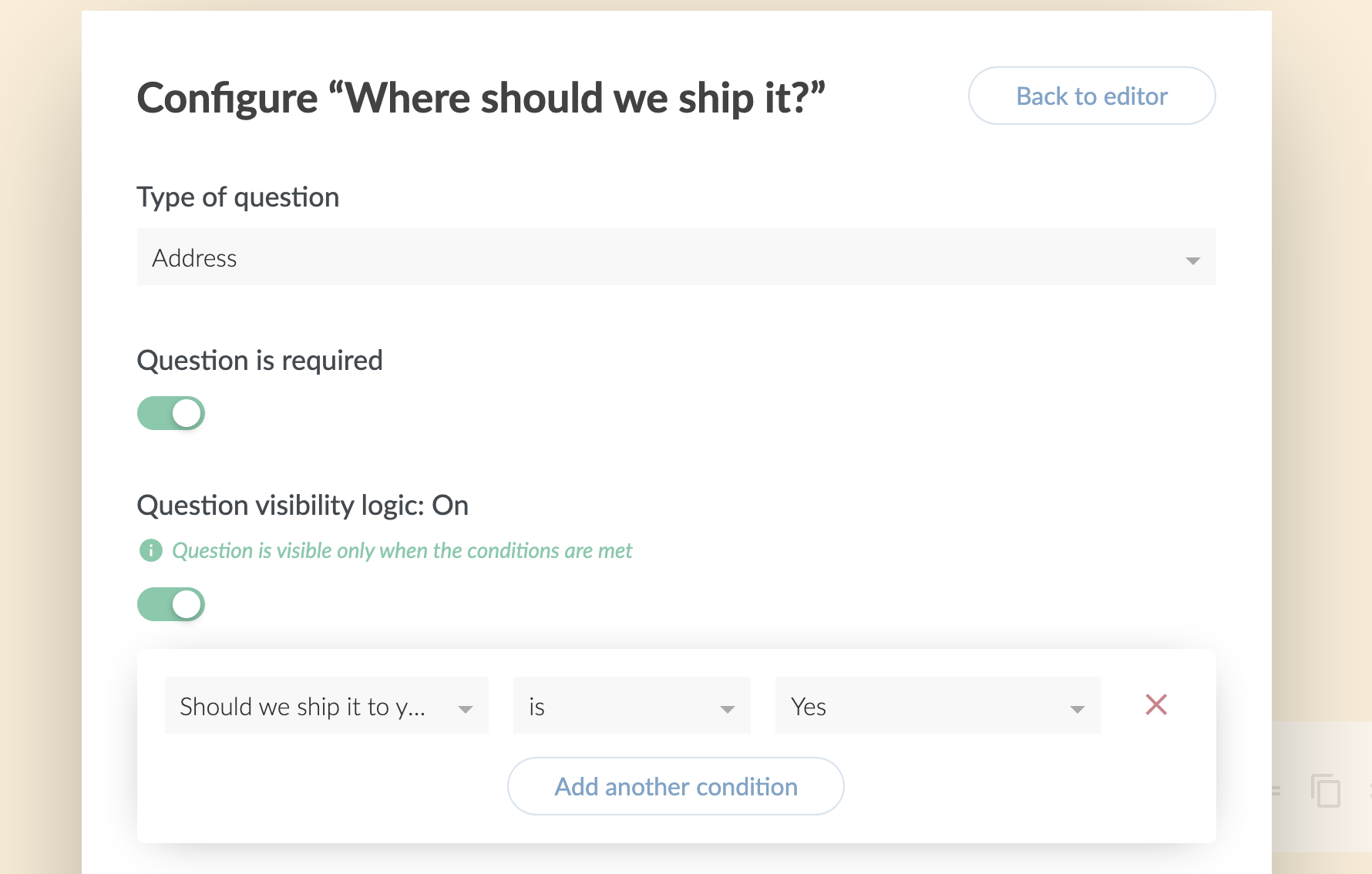
- Can you apply conditional logic to hide/show fields? Yes.
- Can you apply put default and placeholder text? Yes.
- Can you set minimum and maximums? Yes.
- Can you control the layout? Yes.
- Can you control the design? Yes.
- Can you programmatically prefill fields? Yes.
- Can you have hidden fields? Yes.
- Can you have complex fields like address and signatures? Yes.
Features like logic on questions, I happen to know, are particularly tricky to nail the UX on, and Paperform does a great job with it. You control the logic from option built naturally into the form builder where you would expect to find it.
Theming is very natural
Controlling color and typography are right up front and very obvious. Color pickers for all the major typographic elements, and the entire kitchen sink of Google Fonts for you to pick from.
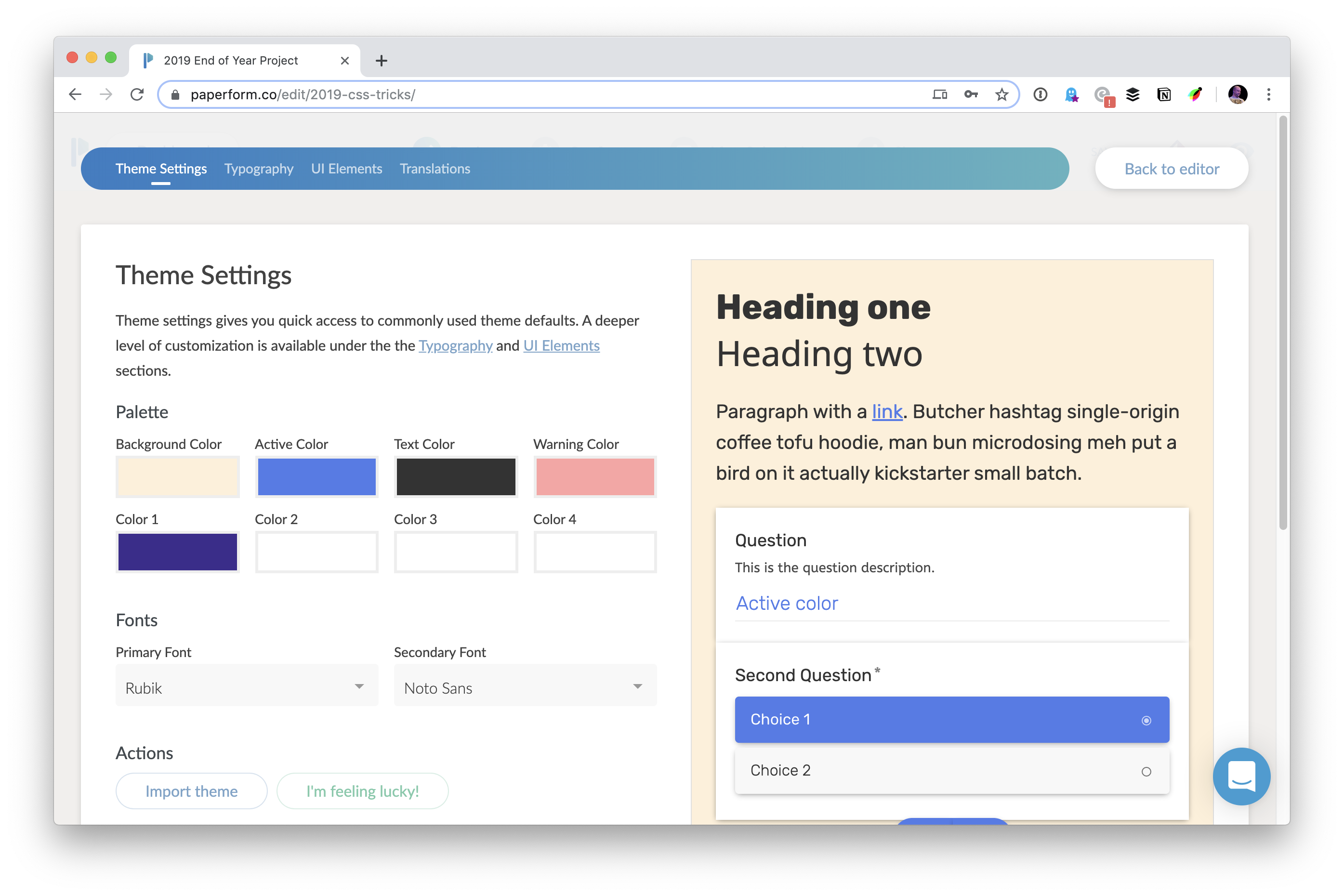
I really like that at no point does it feel like you are leaving “the place where you’re building the form”. You can easily flip around between building the content and design and theme and logic and all that while it’s saving your work as you go.
All the most common stuff has UI controls for you, and other big features are easy to find, like uploading background images and controlling buttons. Then if you really need to exert 100% control, their highest plan allows you to inject your own CSS into the form.
“After Submission”
What an obvious thing to call it! I love that. This is where you configure everything that happens with the form data after you’ve captured it. But instead of calling it something dry and obtuse like “Form Data Configuration Options” or something, it’s named after what you are thinking: “What happens after the form is submitted? That’s what I’m trying to control.”
There are three things that I tend to think about after form submission:
- Where is the confirmation email going to go?
- What does the success message say to the user?
- What integrations can I use?
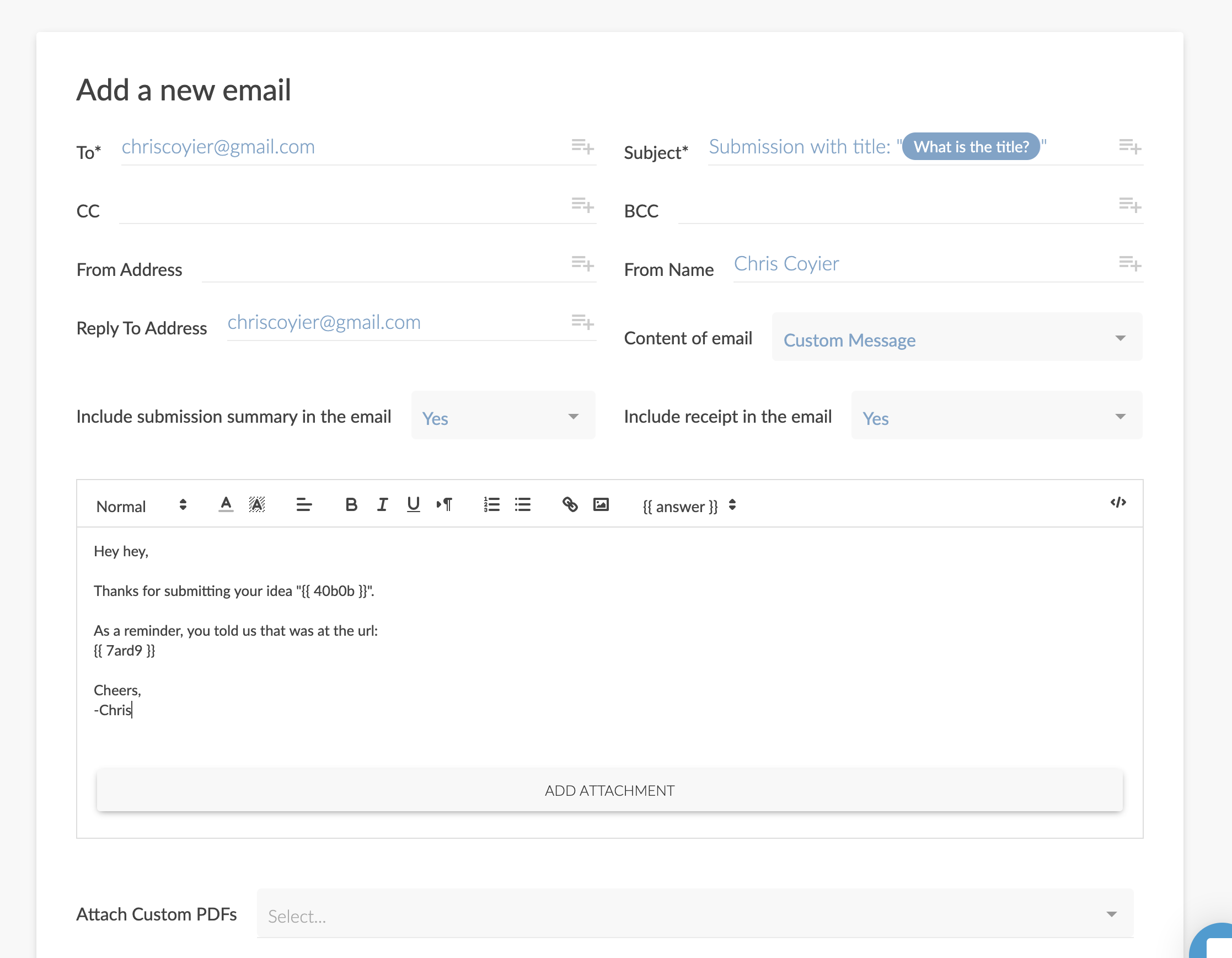
A nice touch? By default, the form is set up to email you all submissions. Do nothing, and you get that. That’s probably what you want 90% of the time anyway. But if you want to get in there and manipulate that email with custom destinations, subject lines, and even entirely reformatted content, you’ve got it.
In the same fashion, you can create custom PDFs from the submitted data, which is a pretty unique feature and I imagine quite important for some folks.
Customizing that success message, which I find to be appropriate pretty much 100% of the time, is just a matter of changing two fields.
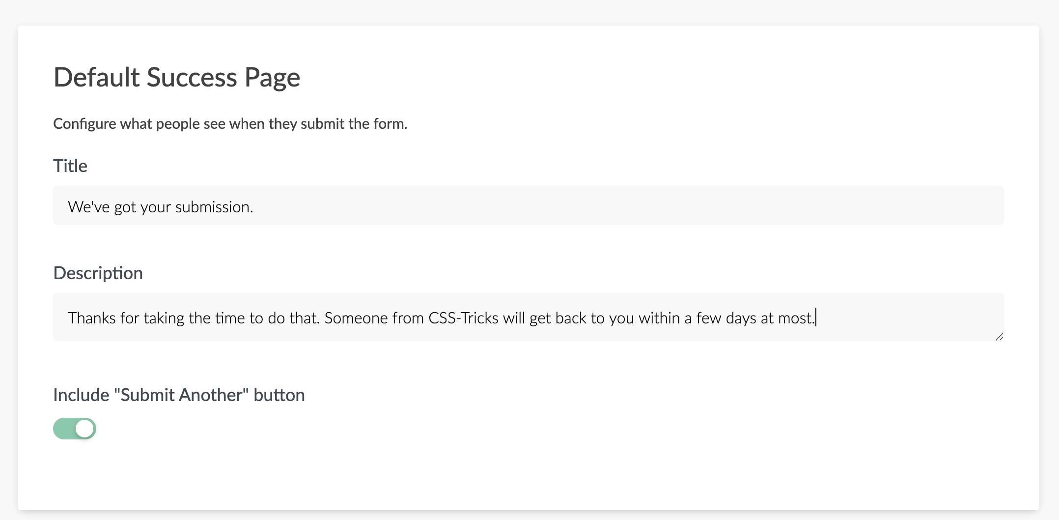
Integrations-wise, for me, the big ones I find myself using are:
- Make a Trello card from this.
- Put the person on a MailChimp list.
- Send a Slack notification.
They’ve got all those, plus webhooks (hit this arbitrary URL with the data after submission) and Zapier, which covers just about every use case under the sun.
Of course, when you’re done building your form, you get a URL you can send people to. For me, the vast majority of the time, what I want to do is embed the form right onto another site, and they have all the options you could want for that as well.
New feature: Calculations
Just a few days ago, they added the ability to essentially do math with form data. There are some fairly straightforward use-cases, like calculating the price of a product based on questions on the form. But the feature was built to be rather open-ended in what you can do with it. Imagine using a calculation as part of a Buzzfeed style quiz that tells you what kind of dragon you are, or disabling submission of the form until a calculation can be made that is satisfactory, or the notification from the form goes to a different person based on the calculation.
I can’t cover everything
Paperform is too big for one blog post. I barely mentioned payments, which is a massive feature they handle very well. I’d just end by saying it’s a very impressive product and if you’re picking a form builder, picking one as feature-rich as Paperform isn’t likely to be one you’ll regret.
The post Paperform appeared first on CSS-Tricks.
