Archive

Archive for September, 2019

How to Get Your Newsletter Read

September 4th, 2019 No comments

Being in the business of building websites, it’s easy to forget that no matter how great they look, how well they perform, or how optimized they are for search, a website alone will not attract visitors back to it. You have to give them a good reason to return.

Blogging and other content generation is one way to do this. Running special promotions is another. Lead magnets are a good idea, too.

That said, we still run into the problem of how to let visitors know to return and see all of this new and awesome stuff that’s been added to the site.

A newsletter is a great way to do this. The only thing is, you have to, first, convince them to subscribe and, then, create a regular newsletter service that’s worth reading.

You also have to figure out how to make this free service one that’s worth your while. In other words, how do you get visitors to not only subscribe and open your newsletters, but to click on the links and take action on your site?

What Makes a Newsletter Successful?

Let’s start by looking at what makes a newsletter successful.

In a 2019 email marketing report by GetResponse, they revealed the average newsletter performance for all their users:

These are the metrics you must pay attention to when assessing the success of your own newsletter:

Open Rate: An email service provider will first remove the number of emails that bounced (i.e. were undeliverable) from the count. It then divides the number of opened emails by the total number of subscribers. This tells you at what percentage of subscribers opened them.

# opened emails / (# sent emails – # bounced emails) = Open Rate

Click-through Rate: A similar calculation is performed to identify the rate at which people clicked on links in your emails. This is a more important metric as it indicates that subscribers not only received the email, but cared enough about the message to take action (and go back to your site)!

# clicked emails / (# sent emails – # bounced emails) = Click-through Rate

Click-to-open Rate: This formula takes it a step further and asks you to look at how effectively you’re converting over email. In other words, for the people who were persuaded to open your newsletter, what percentage of them followed your call to action?

(# unique clicks / # unique opens) = Click-to-open Rate

Unsubscribe Rate and Spam Rate are also important to keep your eyes on. These metrics will give you a good idea of how subscribers feel about your newsletters and whether they’re missing the mark or are a valuable asset in your marketing arsenal.

How to Increase Your Newsletter Open and Click Rates

Your newsletter data can do a lot more than just tell you whether or not your email marketing efforts have been successful. You can use it to identify problem areas, too.

Learn how to read the data and you’ll be able to repair the email marketing flow to get more people to sign up for your newsletter, open it, and click back to your website.

When You Don’t Have Any Signups

There are a number of things that may be wrong here, but they all stem from your website and, more specifically, the newsletter subscription form on it. For starters, how are you serving the form to your visitors?

Is it as a pop-up? That may be your issue right there. Our visitors are inundated with pop-ups: push notification requests, lead gen giveaways, cookie consent requests, site abandonment warnings, and so on. Don’t design your form so that it’s easy to dismiss.

What about the design itself? Does it stick out on the page like a sore thumb or, conversely, get lost in the design? Are you asking for too much information? Are there any other red flags?

Scroll to the very bottom of this page and you’ll find WebDesigner Depot‘s ever-present subscription form:

Not only is this form easy to fill out, but it includes all sorts of positive encouragement and trust marks around it.

Sharing the number of subscribers, promising exclusive access, and asking for explicit consent are all great ways to start a relationship with a subscriber. That way, when you do send that first newsletter their way, there’s no confusion as to what it is or what kind of value they’re going to get from it:

When There Aren’t Many Opens, But Bounces Aren’t an Excuse

Let’s say your bounce rate is low, so you know that subscribers are getting your newsletters. Yet, your open rate is abysmal (like below 5%). What’s going on here?

Something’s happening the second your email hits their inbox.

First, take a look at your sender email. Does your address match the name of your brand or is it something like jason12456@hotmail.com? If you have a website, then your email address needs to match the domain name. The same goes for the name that shows up in the “From:” field.

Another thing that could be happening is that your subject line is turning subscribers off.

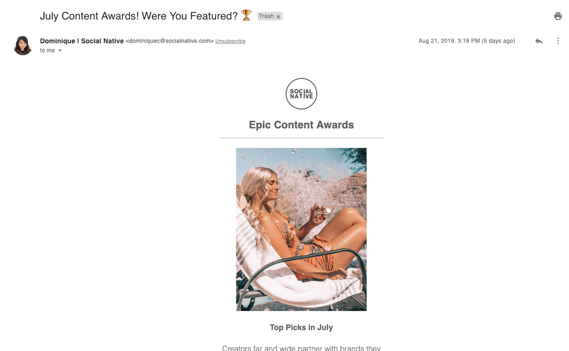
This is Social Native‘s newsletter:

Notice how the message comes from a real person (with a photo and all) whose email address matches the domain name. That’s good. Also notice how appealing that subject line is: “July Content Awards! Were You Featured? ?” Heck, it even includes an eye-catching emoji. That’s even better.

The subject line is short, snappy, and inviting. What’s more, it tells subscribers exactly what they’re going to see in the newsletter.

While a little bit of mystery might work in some cases to increase open rates, be very careful. Unless your subscribers know you well and trust the content you send them, sending a subject line like “How many fingers am I holding up?” likely won’t help your open rates. Always err on the side of clarity and positivity if in doubt.

When Your Newsletter Is Getting Opened, But CTR Is Too Low

Like I said earlier, it’s important to know your open rate, but it doesn’t mean much if you get 40% opens but no clicks. If that’s what’s happening to you, then there are one of a few underlying issues here.

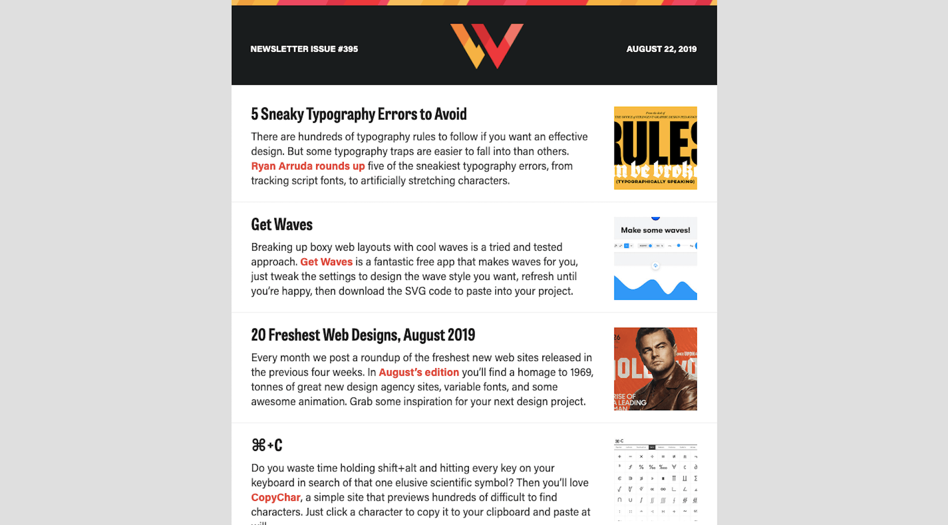
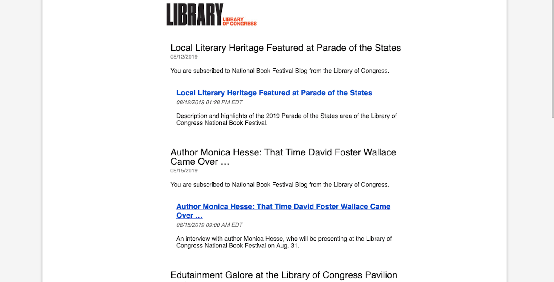
The first is that the design sucks. It could be a number of things: the color palette is jarring, the images aren’t loading, the typography is difficult to read. Or it could be because there’s no design at all, like this example from the Library of Congress:

The newsletter has no visual component and the content itself is poorly composed. Notice how it says “You are subscribed…” under the first instance of each blog post title.

The second reason you might not be getting clicks is that there’s nothing of value in the message.

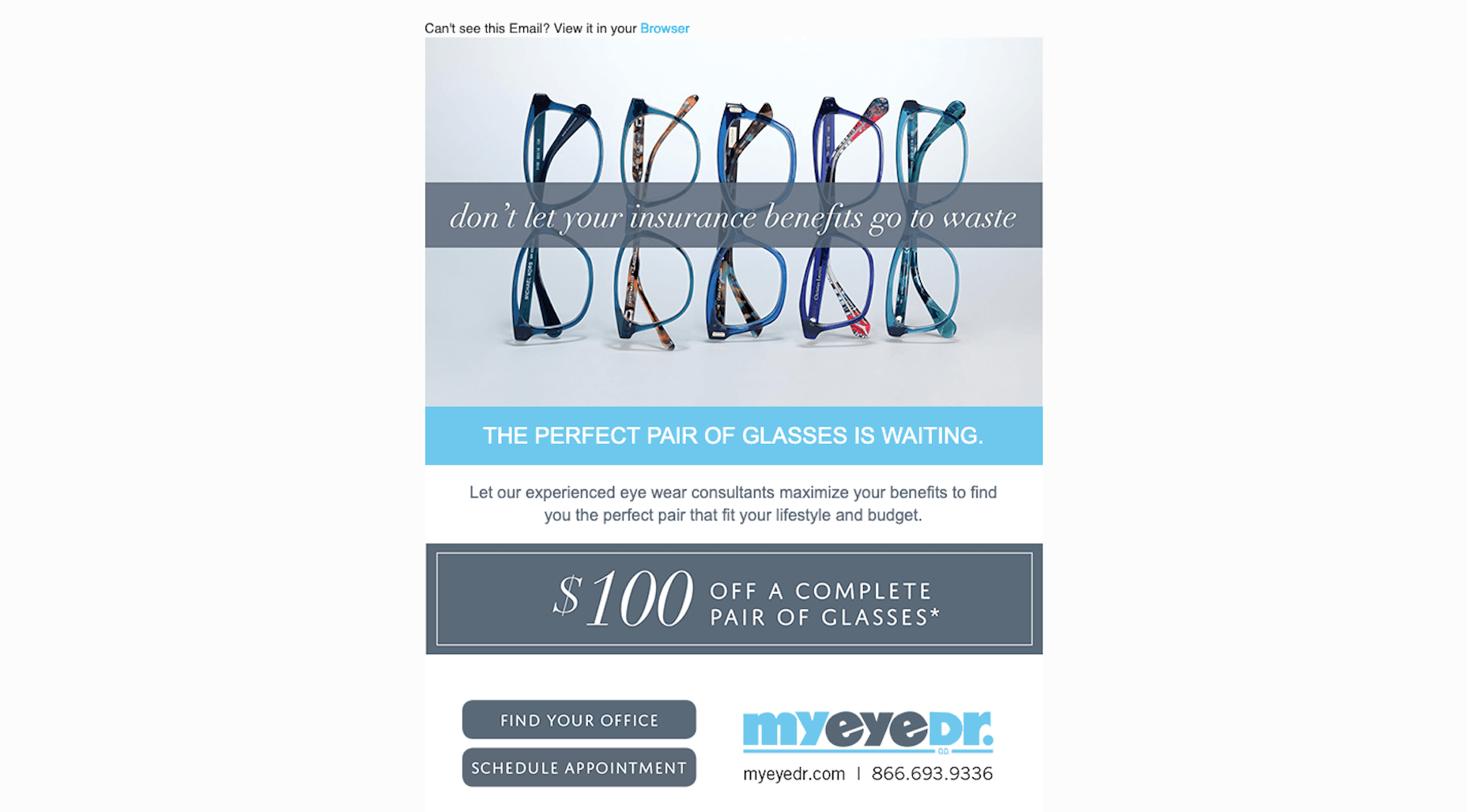
This is a great example of how to provide value in your newsletters. This one comes from MyEyeDr.:

It’s beautifully designed, there’s a clear offer for $100 off what would otherwise be an expensive set of glasses, and the calls-to-action make it easy to take next steps.

Another thing to be mindful of is the length of your newsletter. Unless your subscribers signed up to receive lengthy diatribes from you every week, save those speeches for your blog. You need the content of your message to be concise, valuable, and readable if you want people to click your links.

When You Have a Good CTR, But Your Landing Page Bounce Rate Is High

Okay, so you’ve gotten your subscribers to open and click. For some reason, though, there’s nothing happening on the landing page you’ve directed them to.

The problem here is obvious: the landing page doesn’t fulfill the expectations set in the email.

If it’s a blog post you sent them to, review the content of it. Does the description match the post? Is the topic too shallowly explored? Are there broken links, missing images, or other errors on the page?

If it’s a sales landing page you sent them to, are you clear in the newsletter where you were about to send them? Does the landing page match the rest of your site or could it possibly pass for a phishing page? Is there an overwhelming amount of content to get through?

It doesn’t really matter where the link goes so long as you set the right expectations in your newsletter and then deliver on the linked page.

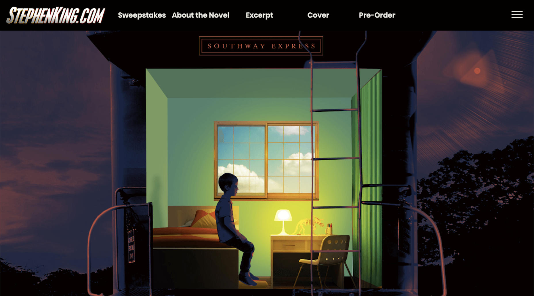
For example, this is a recent newsletter from Stephen King:

It summarizes a new book he’s about to release. The link then tells subscribers that they can get more information about the upcoming book as well as an excerpt. And that’s exactly what happens when they arrive on the beautifully designed landing page:

You’ve earned the trust of your website visitors for them to subscribe to your newsletter. And you’ve impressed them enough with your email to persuade them to return to your site. Don’t betray their trust by directing them somewhere that hasn’t been as well thought through as everything else until this point.

Wrap-Up

You might find after all this that your metrics are a mixed bag. Sometimes you get a lot of opens and clicks, and other times you don’t. That might just mean that your newsletter content is inconsistent and that you need to refine your strategy so you only deliver the kinds of content your subscribers find the most value in. It also might mean that you need better list segmentation.

If you suspect something is off and that your open and click-through rates should be higher, A/B test some alternative designs and content. You may be surprised by what you find.

Featured image via DepositPhotos.

Source

Categories: Designing, Others Tags:

Overflow And Data Loss In CSS

September 4th, 2019 No comments
Screenshot three boxes, variable amounts of content, the bottoms of the boxes line up

Overflow And Data Loss In CSS

Overflow And Data Loss In CSS

Rachel Andrew

2019-09-04T12:30:59+02:002019-09-04T12:35:19+00:00

CSS is designed to keep your content readable. If you consider an HTML document that is marked up with headings and paragraphs (with no CSS applied), it displays in the browser in a readable way. The headings are large and bold, and the paragraphs have space between them which is controlled by the browser default stylesheet. As soon as you want to change the layout of your page, however, you start to take some of the control into your own hands. In some cases, this will mean that you give yourself the job of dealing with overflow.
In this article, I’m going to take a look at the different ways we encounter overflow on the web. We’ll see how new layout methods and new values in CSS can help us to deal with overflow and create less fragile designs. I’ll also explain one of the fundamental concepts behind the design of CSS — that of avoiding data loss.

CSS Lists, Markers, And Counters

There is more to styling lists in CSS than you might think. Let’s take a look at lists in CSS, and moving onto some interesting features defined in the CSS Lists specification: markers and counters. ?

What Do We Mean By Overflow?

If we look back a few years (before the advent of layout methods such as Flexbox and Grid Layout), then consider being handed a design like the one below. A very simple layout of three boxes, different amounts of content in each, but the bottom of those boxes needs to line up:

Screenshot three boxes, variable amounts of content, the bottoms of the boxes line up

A neat set of boxes (Large preview)

With a floated layout, such a seemingly straightforward task was impossible. When floated, each box has no relationship to its neighbor; this means that has no way to know that the next door box is taller and to grow to match the height.

Screenshot three boxes, variable amounts of content, the bottoms of the boxes do not line up

The box bottoms do not align (Large preview)

Sometimes, in an attempt to make things line up, designers would then restrict the height of the boxes by second-guessing the amount of content in order to make the boxes tall enough to match. Of course, things are never that simple on the web and when the amount of content differed, or the text size was larger, the text would start to poke out of the bottom of the box. It would overflow.

Screenshot three boxes, variable amounts of content, content overflowing the bottom of the box

Overflow caused by fixing the box heights (Large preview)

This would sometimes lead to people asking how they could prevent too much content getting into the site. I’ve had people in support for my own CMS product asking how to restrict content for this very reason. They tell me that this extra content is “breaking the design”. For those of us who understood that not knowing how tall things were was a fundamental nature of web design, we would create designs that hid the lack of equal height boxes. A common pattern would have a gradient fading away — to mask the unevenness. We would avoid using background colors and borders on boxes. Or, we would use techniques such as faux columns to create the look of full-height columns.

This inability to control the height of things in relationship to other things therefore influenced web design — a technical limitation changing the way we designed. (I enjoy the fact that with Flexbox and Grid.) Not only did this problem disappear but the default behavior of these new layout methods is to stretch the boxes to the same height. The initial value of align-items is stretch, which causes the boxes to stretch to the height of the grid area or flex container.

See the Pen [Equal Height Boxes](https://codepen.io/rachelandrew/pen/VwZzxjV) by Rachel Andrew.

See the Pen Equal Height Boxes by Rachel Andrew.

In addition, CSS Grid gives us a nice way to ask for things to be at least a certain size, but grow larger if they need to. If you set a track size using the minmax() function, you can see a minimum and maximum size for the track. Setting rows to minmax(200px, auto) means that the track will always be at least 200 pixels in the block dimension — even if the grid items are empty. If, however, the content of a grid item means that it will be larger than 200 pixels, with the max set to auto it can grow. You can see this in the example below: The first row is 200 pixels as there are no items making it larger. The second row has a grid item with more content in than will fit, and so auto is being used and the track has grown larger than 200 pixels.

See the Pen [Minmax()](https://codepen.io/rachelandrew/pen/zYOdjKP) by Rachel Andrew.

See the Pen Minmax() by Rachel Andrew.

The minmax() function gives you the ability to create designs that look as if they have that perfect fixed size. In an ideal world (when the amount of content is pretty much as you expected), you will get those nice uniform rows. However, if additional content is added, there will be no overflow as there would be if you had fixed the height of the rows to 200 pixels. The row will expand; it might not be exactly what you wanted as a designer, but it will not be unreadable.

Inline Overflow

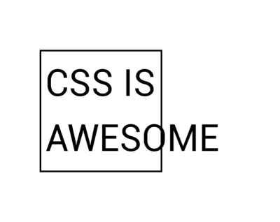
The potential for overflow happens whenever we restrict the size of things. In the above example, I am describing restriction in the block dimension, which horizontal language users will think of as height. However, we can also end up with overflow in the inline direction if we restrict the inline size or width of a box. This is something that we see in the “CSS is Awesome” meme:

Image contains the words ‘CSS is Awesome' in a bordered box. The word awesome is too long to fit in the box so pokes out past the border

The ‘CSS Is Awesome’ meme (Large preview)

The author of this meme commented on a CSS-Tricks post about it saying,

“I do have a slightly better grasp on the concept of overflow now, but at the time it just blew my mind that someone thought the default behavior should be to just have the text honk right out of the box, instead of just making the box bigger like my nice, sensible tables had always done.”

So why does CSS make the text “honk right out of the box” rather than grow the box?

In the meme, you have overflow in the inline direction. The word “awesome” is larger than the width applied to the box, and so it overflows. CSS fairly reasonably assumes that if you have made the box a certain width, you want the box that width. Perhaps it needs to fit into a layout which would break if boxes suddenly became larger than set.

That particular issue (i.e. the need to set sizes on everything in a layout and making sure they did not total more than the available inline size of the container) is something that our modern layout methods have addressed for us. If we imagine that our box had that absolute inline size so that it could fit in a line with other boxes in a float-based grid, today you might choose to approach that layout using Flexbox.

With the floated layout, you have to set the sizing on each item — potentially before you know what the content will be. You will then have big things forced into small containers and small things left with a lot of space around them.

Irregular sized items in regular sized boxes

Items in a floated layout need to have a width set (Large preview)

However, if we use Flexbox, we can allow the browser to work out how much space to assign each item. Flexbox will then ensure that bigger things get assigned more space while smaller things get less. This squishy sizing means that the box that contains the word “awesome” will grow to contain the box, and the text won’t honk right out or overlap anything else. Overflow issue solved; this behavior is really what Flexbox was designed for. Flexbox excels at taking a bunch of unevenly sized stuff and returning the most useful layout for those things.

Irregular sized items in boxes which are sized to make best use of space

Flexbox distributes space between the items (Large preview)

Outside of Flexbox, it is possible to tell our box to be as big as is needed for the content and no more. The min-content keyword can be used as a value for width or inline-size if working with flow-relative logical properties. Set width: min-content and the box grows just as big as is needed to contain the word “awesome”:

See the Pen [Awesome with min-content](https://codepen.io/rachelandrew/pen/LYPjmbJ) by Rachel Andrew.

See the Pen Awesome with min-content by Rachel Andrew.

Avoiding Data Loss

The reason that the box overflows as it does (with the word escaping from the border of the box), is that the default value for the overflow property is visible. You could (if you wanted) manage that overflow in a different way. For example, using overflow: auto or overflow: scroll would give your box scrollbars. This is probably not something you want in this scenario, but there are design patterns where a scrolling box is appropriate.

Another possibility would be to decide that you are happy to crop the overflow by using overflow: hidden. Perhaps you might think that hiding the overflow would have been a better default, however, the fact that CSS chooses to make the overflow visible by default (and not hidden) is a clue to a core value of designing CSS. In CSS (as in most places), we try to avoid data loss. When we talk about data loss in CSS, we are typically describing some of your content going missing. In the case of overflow: hidden, the overflowing content disappears. This means that we have no way to get to it to see what we have missed out on.

In some cases, this could be a real problem. If you have managed to create a design so fragile that the button of your form is in the cropped-off area, your user has no ability to complete the form. If the final paragraph is trimmed off, we never know how the story ends! Also, the problem with things vanishing is that it isn’t always obvious that they have gone. As the designer, you may not spot the problem, especially if it only happens in certain viewport sizes in a responsive design. Your users may not spot the problem — they just don’t see the call to action, or think it is somehow their problem they can’t place their order and so go away. However, if things overflow messily, you will tend to spot it. Or, at worse, someone using the site will spot it and let you know.

So this is why CSS overflows in a messy, visible way. By showing you the overflow, you are more likely to get a chance to fix it than if it hides the overflow. With the overflow property, however, you get a chance to make the decision yourself about what should happen. If you would prefer the overflow be cropped (which may be the right decision in some cases), use overflow: hidden.

Data Loss And Alignment

The better alignment abilities we have gained in recent years also have the potential for data loss. Consider a column of flex items that are up against the edge of the viewport and with different sizes. Aligned to flex-start, the items all stick out more to the right. Aligned to center, however, the longer item would actually end up off the side of the viewport. Alignment could therefore cause data loss.

To prevent accidental data loss caused by alignment, CSS now has some new keywords which can be used along with the alignment properties. These are specified in the Box Alignment specification — the specification which deals with alignment across all layout methods including Grid and Flexbox. They are currently only supported in Firefox. In our example above, if we set align-items: safe center, then the final item would become aligned to start rather than forcing the content to be centered. This would prevent the data loss caused by the item being centered and therefore pushed off the side of the viewport.

If you do want the alignment (even if it would cause overflow), then you can specify unsafe center. You’ve then requested that the browser does your chosen alignment no matter what then happens to the content. If you have Firefox, then you can see the two examples: one with safe and the second with unsafe alignment.

See the Pen [Safe and unsafe alignment](https://codepen.io/rachelandrew/pen/QWLMrpE) by Rachel Andrew.

See the Pen Safe and unsafe alignment by Rachel Andrew.

In the talk on which I based this article, I described web design as being a constant battle against overflow. One of the truths of designing for the web is that it’s very hard to know how tall or how large (in the block dimension any element that contains text will be. However, as I have shown above, we have never had so many ways to manage overflow or the potential of overflow. This means that our designs can be far more resilient, and we can create patterns that will work with varying amounts of content. These might seem like small shifts in our capabilities, but I think the possibilities they open up to us are huge.

(il)
Categories: Others Tags:

Start capturing leads even while your site isn’t published

September 4th, 2019 No comments

Whatever your motivation for starting a website may be, chances are that one of your primary goals is to attract potential customers and ultimately – keep in touch with them and convert them into customers. In the marketing world, we call this process of obtaining data from an interested prospect lead capturing.

As a cornerstone of sales and growth, leads are the secret sauce to growing your customer base and increasing your business profit. Simply put, leads are potential customers that could be interested in your product or service. There are multiple ways in which you can generate and capture leads, and they are a crucial part of the sales funnel. Therefore, it’s no wonder that lead pages require extra attention and that each detail is a piece of a bigger puzzle.

With lead pages resulting in conversions and increased customer base, the interest in setting up a lead page vs a home page has skyrocketed, too. After lead pages have shown significantly better results than home pages in terms of capturing leads, many marketers have now switched to devising lead sites almost exclusively.

Most website owners set up intricate ways of generating leads once their website is up. However, what many seem to forget is that you can start capturing leads even before the launch! In this article, we will present some of the techniques that you can use to kickstart your lead generating process even while you don’t have a page ready yet.

Set up a Coming Soon page to capture leads

The trick to capturing leads without an actual lead page is in developing a “Coming Soon” page that will ignite the interest of visitors and provide you with highly qualified leads.

While you’re working on making your website spectacular, you can set up a coming soon page that will let your visitors know that you’re working on something, even if you have just reset your site.

This can be a great transition period between the start of your development and the actual launch of your homepage. A Coming Soon page also has many other potential benefits that will help to establish trust between you and your early visitors and spark an interest in your brand in early stages of development.

With the Coming Soon & Maintenance Mode plugin, you can set any of the templates so that your website continues to work wonders for your marketing even when it’s not up yet.

Set up lead-capturing forms

If your goal is to collect data from persons and businesses that might benefit from your services, a call-to-action form to sign up is the best way to start.

Make sure you include how the user will benefit if they share their personal data. This can be in the form of a discount for email subscribers, for example.

On a Coming Soon page, you can choose from some of the templates that contain a lead-capturing form. You won’t need any specific technical knowledge to do this and you will be able to quickly transfer your leads to whichever CRM platform you’re using.

Test out different modes of lead capturing

A Coming Soon page is a great way to test out the performance of a call-to-action page or a lead page, without burdening your brand and reputation with too much experiments and uncertainty.

Just like with all things related to website performance, the number 1 thing to do to know that you’re going in the right direction is to perform A/B or multivariate testing of different form options. You can do this by using Google’s Optimize tool and see what option works best with your visitors.

After one of the 2 or more options proves to be more successful, you can automatically clone it to your new lead-capturing page.

Play around with different channels

Most website owners tend to rely on email newsletter sign up forms as the safest bet for hot leads. However, there are many other unique and fresh ways that you can come into contact with your visitors and customers and turn them into qualified leads.

Some of the most popular ones include:

  • Chat communication. If you run a website where it’s crucial to communicate with your customers on a personal basis, you can manage your live chat manually or hire customer support staff. In other cases, where it’s important to approach your visitor and capture their info whatever it takes, you can use AI chatbots that will lead the conversation straight to your CRM program.
  • Special offers. Regardless of whether you’re selling goods or services, there are always interesting treats that you can offer to your visitors. If you provide a discount or a bonus code for visitors who fill out your form and sign up for your newsletter, you will surely grab the attention of a wider audience.
  • Offer free perks. Many marketers agree that offering a free service such as an eBook or a short skill course can skyrocket your chances of successfully capturing leads. Depending on the business you’re in, you can easily find a perk that will present a taste of what the users might expect when they sign up with you. Remember to put yourself in your potential customer’s shoes and ask yourself whether you would be interested if you were them.
  • Organize a raffle. Even though raffles with prizes are no novelty to the social media scene and eCommerce pages, there are actually not that many lead pages that provoke attention and interest using a prize raffle. If you want tons of emails, phone numbers or other personal info from people who want your product, organizing a raffle on your Coming Soon page is a great way to do so. Players who sign up will be qualified leads that are actually interested in owning your product. And you will be left with hundreds and thousands of emails even before your website is complete!

Remember to be unique, hard to forget and thought-provoking: this is the best recipe for capturing the highest number of leads!

Categories: Others Tags:

Fast Software

September 3rd, 2019 No comments

There have been some wonderfully interconnected things about fast software lately.

We talk a lot of performance on the web. We can make things a little faster here and there. We see rises in success metrics with rises in performance. I find those type of charts very satisfying. But perhaps even more interesting is to think about the individual people that speed affects. It can be the difference between I love this software and Screw this, I’m out.

Craig Mod, in “Fast Software, the Best Software”, totally bailed on Google Maps:

Google Maps has gotten so slow, that I did the unthinkable: I reinstalled Apple Maps on my iPhone. Apple Maps in contrast, today, is downright zippy and responsive. The data still isn’t as good as Google Maps, but this a good example of where slowness pushed me to reinstall an app I had all but written off. I’ll give Apple Maps more of a chance going forward.

And puts a point on it:

But why is slow bad? Fast software is not always good software, but slow software is rarely able to rise to greatness. Fast software gives the user a chance to “meld” with its toolset. That is, not break flow.

Sometimes it’s even life and death! Hillel Wayne, in “Performance Matters,” says emergency workers in an ambulance don’t use the built-in digital “Patient Care Report” (PCR) system, instead opting for paper and pencil, simply because the PCR is a little slow:

The ambulance I shadowed had an ePCR. Nobody used it. I talked to the EMTs about this, and they said nobody they knew used it either. Lack of training? “No, we all got trained.» Crippling bugs? No, it worked fine. Paper was good enough? No, the ePCR was much better than paper PCRs in almost every way. It just had one problem: it was too slow.

It wasn’t even that slow. Something like a quarter-second lag when you opened a dropdown or clicked a button. But it made things so unpleasant that nobody wanted to touch it. Paper was slow and annoying and easy to screw up, but at least it wasn’t that.

“Input delay” is a key concept here. Just the kind of thing that can occur on the web if your JavaScript is doin’ stuff and, as they say, “occupying the main thread.”

Monica Dinculescu created a Typing delay experiment that simulates this input delay. The “we’re done here” setting of 200ms is absolutely well-named. I’d never use software that felt like that. Jay Peters over on The Verge agreed, and anything higher is exponentially worse.

Extra interesting: random delay is worse than consistent large delays, which is probably a more likely scenario on our own sites.

The post Fast Software appeared first on CSS-Tricks.

Categories: Designing, Others Tags:

Recreating Netlify’s Neat-o Sliding Button Effect

September 3rd, 2019 No comments

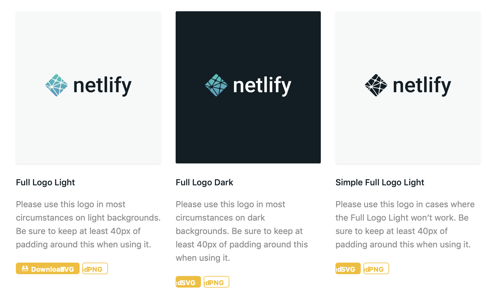
Have you seen Netlify’s press page? It’s one of those places where you can snag a download of the company’s logo. I was looking for it this morning because I needed the logo to use as a featured image for a post here on CSS-Tricks.

Well, I noticed they have these pretty looking buttons to download the logo. They’re small and sharp. They grab attention but aren’t in the way.

They’re also interactive! Look at the way they expand and reveal the word “Download” on hover.

Nice, right?! I actually noticed that they looked a little off in Safari.

That made me curious about how they’re made. So, I recreated them here as a demo while cleaning up some of the spacing stuff:

See the Pen
Netlify Sliding Buttons
by Geoff Graham (@geoffgraham)
on CodePen.

How’d they do it? The recipe really comes down to four ingredients:

  • Using the left property to slide the “Download” label in and out of view
  • Using padding on the button’s hover state to create additional room for showing the “Download” label on hover
  • Declaring a 1:1 scale() on the button’s hover state so all the content stays contained when things move around.
  • Specifiying a transition on the button’s padding, the background-position of the button icon and the transform property to make for a smooth animation between the button’s default and hover states.

Here’s what that looks like without all the presentation styles:

See the Pen
Style-less Netlify Sliding Buttons
by Geoff Graham (@geoffgraham)
on CodePen.

If you’re having a tough time visualizing what’s happening, here’s an illustration showing how the “Download” label is hidden outside of the button (thanks to overflow: hidden) and where it’s pushed into view on hover.

So, by putting negative left values on the icon and the “Download” label, we’re pushing them out of view and then resetting those to positive values when the entire button is hovered.

/* Natural State */
.button {
    background: 
      #f6bc00 
      url(data:image/svg+xml;base64,...)
      no-repeat -12px center;
    overflow: hidden;
}
  
.button span:nth-child(1) {
  position: absolute;
  left: -70px;
}

/* Hovered State */
.button:hover {
  padding-left: 95px;
  background-position: 5px center;
}

.button span:nth-child(1) {
  position: absolute;
  left: -70px;
}

Notice that leaving things in this state would let the button icon slide into view and create enough room for the “Download” label, but the label would actually float off the button on hover.

See the Pen
Style-less Netlify Sliding Buttons
by Geoff Graham (@geoffgraham)
on CodePen.

That’s where adding a 1:1 scale on the button helps keep things in tact.

* Hovered State */
.button:hover {
  padding-left: 95px;
  background-position: 5px center;
  transform: scale(1, 1);
}

Those padding values are magic numbers. They’ll be different for you based on the font, font-size, and other factors, so your mileage may vary.

The last core ingredient is the transition property, which makes everything slide smoothly into place rather than letting them snap. It’s provides a much nicer experience.

/* Natural State */
.button {
    background: 
      #f6bc00 
      url(data:image/svg+xml;base64,...)
      no-repeat -12px center;
    overflow: hidden;
    transition: padding .2s ease, background-position .2s ease, transform .5s ease;
}

Toss in some little flourishes, like rounded corners and such, and you’ve got a pretty slick button.

See the Pen
Netlify Sliding Buttons
by Geoff Graham (@geoffgraham)
on CodePen.

The post Recreating Netlify’s Neat-o Sliding Button Effect appeared first on CSS-Tricks.

Categories: Designing, Others Tags:

14 Best Collaboration Tools to Boost Teams’ Productivity

September 3rd, 2019 No comments

Being productive doesn’t have to be rocket science. However, if you’re not using tools that empower your team, you could be creating more work for yourselves.

The key is a collaboration, and unfortunately, a lot of classic workplace software doesn’t lend itself to this.

I speak from experience: I’ve been in workplaces where we were all siloed in our own apps and workflows, and having traditional email and document tools only compounded the problems.

In this guide, we will go over some collaboration-based tools that can help teams in any industry, with any project management style, work more efficiently.

Airtable

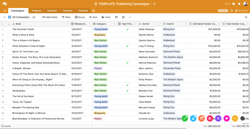
If you need to organize a lot of tasks, share files, or plan projects, spreadsheets might not be the first thing to come to mind. However, Airtable offers a fresh and modern approach to the classic spreadsheet. In Airtable, each piece of data becomes a “record” that you can expand and interact with, and team members can easily access, comment on, or even upload files to a record.

Airtable allows you to assign records to collaborators as tasks, so it doubles as a project management system. I’ve worked in places where Airtable was a hub for editing copy, sharing photos, and planning assignments. Airtable integrates with Box for document sharing.

Pros:

  • Is fast and sleek.
  • Offers templates to help you get the most out of it.
  • Allows you to create different “views” of your data

Cons:

  • Can be time-consuming or daunting to set up
  • Places some of the most useful features behind a paywall.
  • Is on the expensive side

Brief

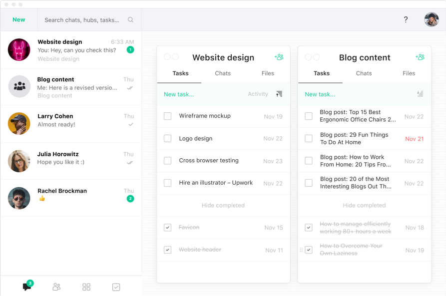
Distraction is the number-one killer of productivity, but it’s more likely to happen if you’re having to check multiple apps for project files. Brief solves this problem by keeping messages, files, and tasks all in one place.

Brief allows team members to organize around activity hubs, rather than forcing them to keep track of project files in multiple places.

Pros:

  • Converts messages into tasks
  • Offers easy chat functions
  • Is intuitive with a simple, attractive design
  • Allows team members to quickly share large files
  • Integrates with Zoom for phone calls
  • Is free to use

Cons:

  • Doesn’t integrate with many other third-party apps

Chanty

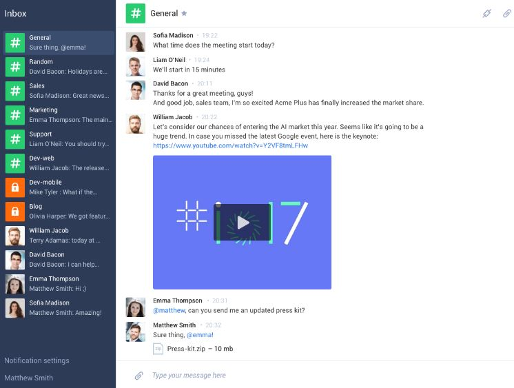
If you find that all your time is being taken up by drafting messages, Chanty is a good solution for you. It uses AI to help you communicate with your team and stores all your messages for easy access.

Chanty also offers voice calls and integrations with other apps so that it can become a central communication hub.

Pros:

  • Allows you to easily search past messages
  • Is simple and easy to use

Cons:

  • Has limited third-party integrations or capacity for task management

Dropbox

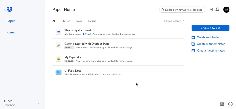
Although its name suggests that it’s simply a file sharing service, Dropbox offers easy, reliable storage solutions. Even better, it enables collaboration by allowing team members to comment on files. One of its tools, Paper, allows cloud-based document creation and management.

Dropbox is available across platforms and devices, so you’re never far from your work. It’s essential to people in communications- or design-oriented offices.

Pros:

  • Offers a free plan with 2GB of storage
  • Allows collaboration among Mac and Windows users
  • Uses Office Online for easy editing of stored files
  • Includes document recovery

Cons:

  • Requires paid plan for more storage
  • Is sometimes slow to sync

Evernote

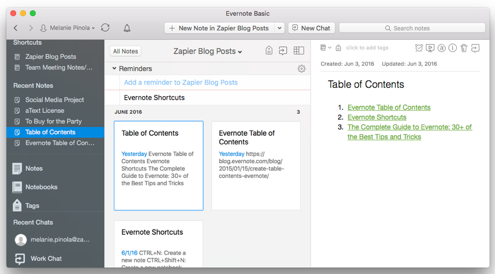
Evernote started its career as a notes app, but its collaborative power lies in its lesser known features, such as its “work chat” that allows team members to quickly share notes or files. Evernote permits you to attach PDFs, Word docs, tasks, and reminders to any note, so it can be used as a project management system. I’ve used it to work on drafts with editors, create shared to-do list, and share meeting notes with team members.

Evernote offers desktop, mobile, and web-based apps so that your work is always synced and ready to go.

Pros:

  • Provides ample storage
  • Includes browser “web clipper” to quickly save articles and screenshots
  • Lets your organize by tags
  • Can search for text inside images and PDFs attached to notes

Cons:

  • Requires paid plan for more storage

Flock

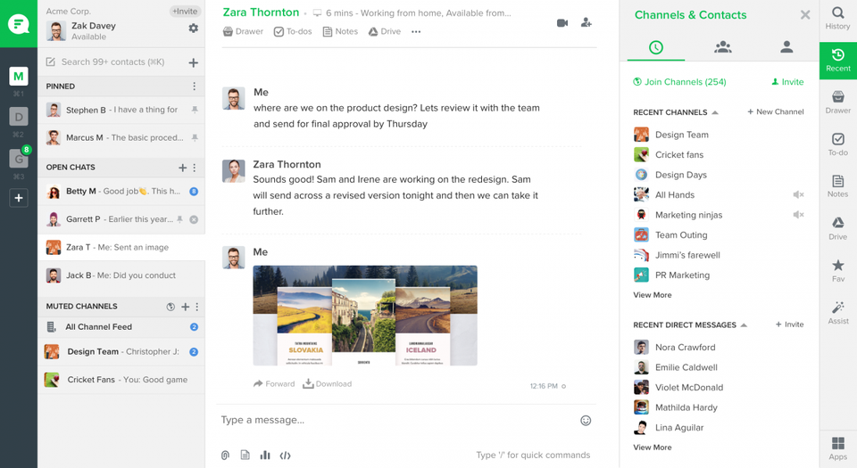
Flock is primarily a messaging tool, but allows collaborators to organize chats by channels that can be tied to certain projects or teams. It also offers video calls and screen sharing to help facilitate remote collaboration or communicate with clients.

Flock also offers tasks, notes, and reminders, and so it can double as a project management app.

Pros:

  • Is quick-loading
  • Permits keyword search throughout messages
  • Allows you to organize messages and save time

Cons:

  • Doesn’t integrate with many third-party apps

GitHub

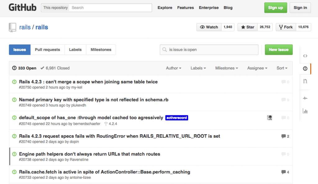
For programmers, few apps are as useful as GitHub. It allows collaborators to comment on code, create “forks” into new versions, and propose or roll back changes.

GitHub is also a robust project management system that allows tasks to be assigned and files to be shared among teams. The GitHub community includes a knowledge base and forum to help collaborators grow their skills.

Pros:

  • Includes private repositories
  • Facilitates both short- and long-term planning
  • Tracks changes and enables a transparent development process

Cons:

  • Requires paid upgrade for some features

Hightail

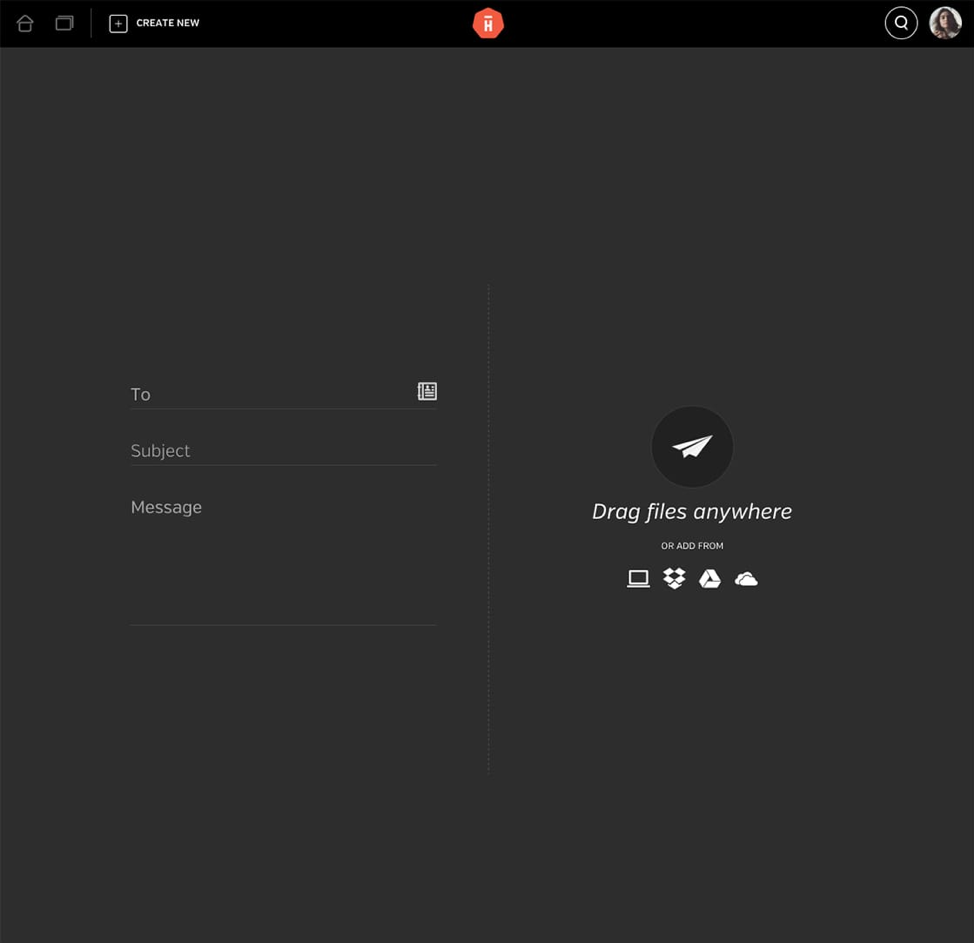
I’ve worked on a lot of teams where video projects were common, and it was always a pain to share super-large files. Hightail is a great way to get the latest footage or draft to your collaborators because it also allows you to gather feedback.

Even better, you don’t have to download space-hogging files to your hard drive; Hightail allows you to review them right in your browser.

Pros:

  • Offers unlimited online file storage if you upgrade
  • Quickly sends even large files
  • Offers security features to help keep unwanted eyes off your projects

Cons:

  • Requires you to upgrade to share files more than 100MB in size, store unlimited files, or make files available for longer than 7 days

Microsoft Teams

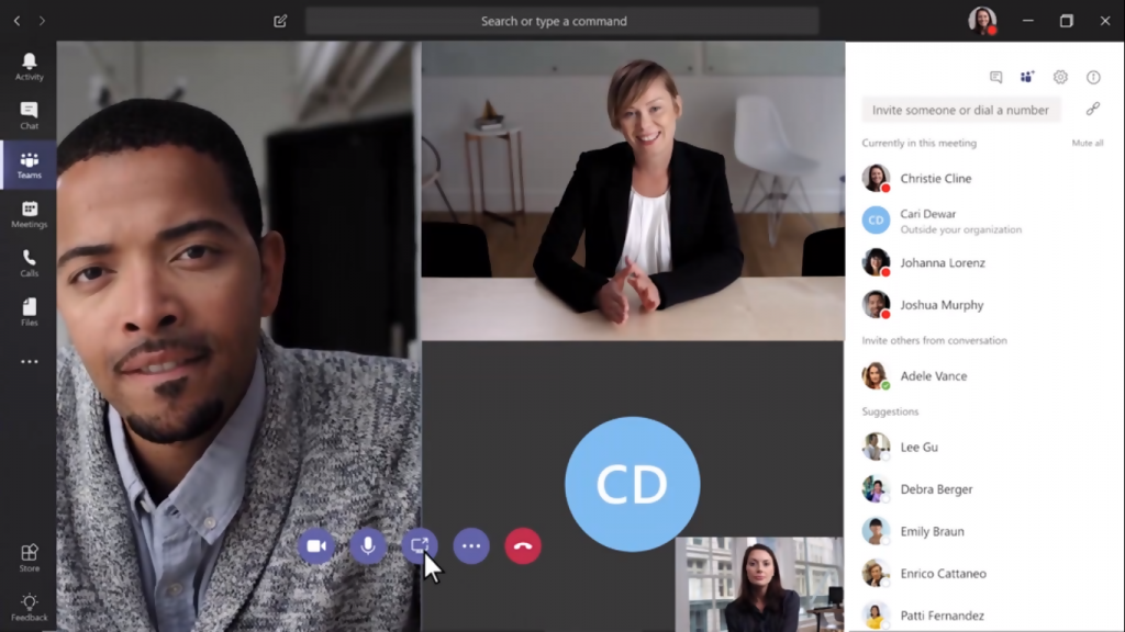
Teams is Microsoft’s solution for collaborators tired of swapping Word documents or PowerPoints through email. This comprehensive app combines work chat, video conferencing, and file sharing to help streamline the collaborative process.

Even better, Microsoft Teams allows people outside your team to join virtual meetings, which makes it a great way to communicate with clients.

Pros:

  • Integrates with all the Office 365 apps
  • Includes cloud storage solutions

Cons:

  • Is not intuitive to use

Slack

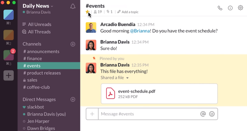
Slack is a communication app with a twist: it allows you to form channels to help organize messages, but it also uses bots to send you notifications, automate communications, and create polls. The Slack App Directory provides bots to help transform Slack into a project management system. Slack also integrates with a variety of third-party apps.

Most importantly, Slack allows you to break out your messages into threads and share large files. I’ve been amazed by how quickly Slack can share even video files that are several minutes long!

Pros:

  • Allows you to search past messages and shared files
  • Includes one-on-one chats
  • Is customizable and attractive
  • Has bots to help streamline your workflow

Cons:

  • Requires a paid plan to retain full message history

Trello

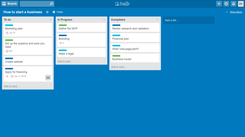
Trello is a task management system at its core, but it facilitates collaboration by allowing commenting and file sharing. Its large directory of “power ups” allows you to integrate third-party apps such as Evernote or Dropbox and expand the functionality of its “cards.” In my experience, Trello is great for Kanban project management but also for mood boarding and digital content management.

To help keep your team on track, Trello allows you to set due dates for any card and set up email reminders.

Pros:

  • Customizable, drag and drop interface
  • Offers mobile, desktop, and web-based apps
  • Is free to use with up to one “power up” per board

Cons:

  • Requires paid upgrade for more power ups and to have more than 10 shared boards

WebEx

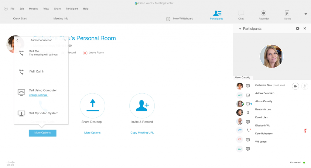
If you’ve got remote team members or clients, face-to-face meetings can be challenging. WebEx offers fast, high-quality video conferencing and screen sharing to help you all stay on the same page.

The tool also includes chat and file sharing options.

Pros:

  • Is simple and easy to use
  • Allows different chat rooms
  • Includes a virtual whiteboard to facilitate brainstorming sessions

Cons:

  • Is a little pricey
  • Is buggy on some browsers

Wunderlist

At first glance, Wunderlist seems like a simple to-do app. However, I’ve discovered that it offers a remarkable way to collaborate: it allows tasks to be assigned to team members, and you can attach images, documents, and notes to any task. You can set due dates, recurring tasks, and reminders.

You can create unlimited shared lists, and you can add hashtags to any to-do to provide yet another way to organize them. For example, I have shared lists for different teams, but if I want to see all graphic design-related tasks, I simply click on the #graphicdesign hashtag.

Pros:

  • Is intuitive, quick-loading, and customizable.
  • Allows you to create tasks with natural language (e.g. “call Susan tomorrow at 10am” will create a task with the appropriate due date and reminder)
  • Lets you identify subtasks for any to-do.
  • Is available on desktop, mobile, and on its web-based app.

Cons:

  • Doesn’t allow you to set dependencies or link tasks to each other.

Zoho

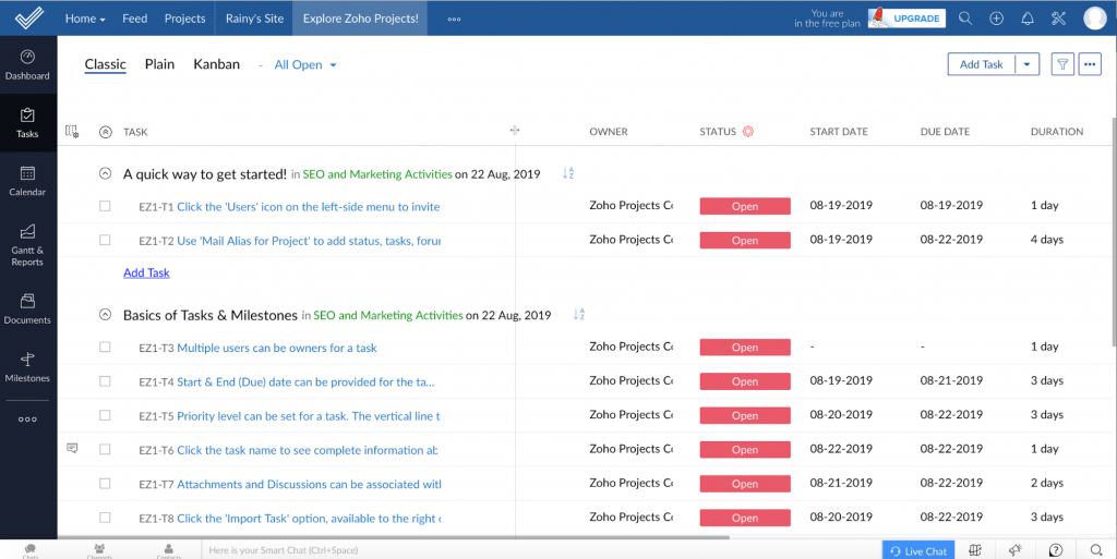
Zoho includes a huge number of apps for any business. Its core functionality includes its email, which integrates with its task management system. It’s great for team collaboration because it allows you to share emails by simply tagging team members. You can also annotate emails or turn them into tasks.

Zoho also includes video conferencing, code collaboration, and client management tools.

Pros:

  • Is a full-featured office suite, with many options available for free
  • Offers a combined approach to tasks and email
  • Includes mobile and web-based apps

Cons:

  • Is a little intimidating and clinky to set up
  • Requires paid upgrade for a lot of the apps.

Conclusion

These tools blend different technologies and methodologies to offer your team a seamless experience that can facilitate collaboration. Most are cloud-based or offer cross-platform or web apps so that your team and clients can be on board no matter what device they’re using. And best of all, they all enable quick file sharing, messaging or commenting, and synchronization to give you peace of mind.

Categories: Others Tags:

Automating Website Deployments Through Buddy

September 3rd, 2019 No comments
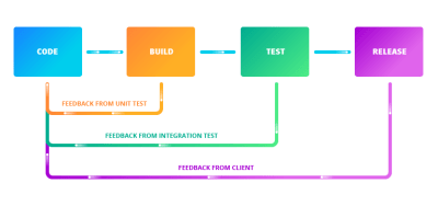
Continuous delivery enables getting feedback as early as possible

Automating Website Deployments Through Buddy

Automating Website Deployments Through Buddy

Leonardo Losoviz

2019-09-03T12:30:00+02:002019-09-03T15:08:24+00:00

(This is a sponsored article.) Managing the deployment of a website used to be easy: It simply involved uploading files to the server through FTP and you were pretty much done. But those days are gone: Websites have gotten very complex, involving many tools and technologies in their stacks.

Nowadays, a typical web project may require to execute build tools to compress assets and generate the deliverable files for production, upload the assets to a CDN and invalidate stale ones, execute a test suit to make sure the code has no errors (for both client and server-side code), do database migrations (and, to be on the safe side, first execute a backup of the database), instantiate the desired number of servers behind a load balancer and deploy the application to them (through an atomic deployment, so that the website is always available), download and install the dependencies, deploy serverless functions, and finally notify the team that everything is ready through Slack or by email.

All this process sounds like a bit too much, right? Well, it actually is too much. How can we avoid getting overwhelmed by the complexity of the task at hand? The solution boils down to a single word: Automation. By automating all the tasks to execute, we will not dread doing the deployment (and having a trembling sweaty finger when pressing the Enter button), indeed we may not be even aware of it.

Automation improves the quality of our work, since we can avoid having to manually execute mind-numbing tasks again and again, which will enable us to use all our time for coding, and reassures us that the deployment will not fail due to human errors (such as overriding the wrong folder as in the old FTP days).

Introduction To Continuous Integration, Delivery, And Deployment

Managing and automating software deployment involves both tools and processes. In particular, Git as the version control system where to store our source code, and the availability of Git-hosting services (such as GitHub, GitLab and BitBucket) which trigger events when new code is pushed into the repository, enable to benefit from the following processes:

  • Continuous Integration
    The strategy of merging changes in the code into the main branch as often as possible, upon which automated tests against a build of the codebase are run to validate that the new code doesn’t introduce errors;
  • Continuous Delivery
    An extension to Continuous Integration which also automates the release process, enabling to deploy the project into production at any moment;
  • Continuous Deployment
    An extension to Continuous Delivery which automatically deploys the new code whenever it passes all required tests (as small a change it may contain), enabling to easily identify the source of any problem that might arise, and removing pressure off the team as it doesn’t need to deal with a “release day” anymore.

Adhering to these strategies has several benefits. The most immediate one is that our product can ship new features faster, indeed they can go live as soon as the team has finished coding them. The team can also receive feedback immediately (either from team members on a development environment, from the client on a staging environment, and from the users after it goes live) and be able to react straight away, thus creating a positive feedback loop. And because the whole process is fully automated, the team can save time and focus on the code, thus improving the quality of the product.

Continuous delivery enables getting feedback as early as possible

Continuous delivery enables getting feedback as early as possible. (Large preview)

Introducing Buddy, A Tool For Automating Software Deployment

The popularity of Git has given rise to a new generation of tools to manage the complexity of software deployments. Buddy is one of these new tools, born with the goal of making it easy to implement Continuous Integration/Delivery/Deployment, while broadening the number of features our application can provide, improving its quality, and reducing its costs by allowing to incorporate the offerings of the best or cheapest cloud-based service providers (among them AWS, DigitalOcean, Google Cloud Platform, Cloudflare, Rackspace, Azure, and others) into our stacks. This way, for instance, our application can be hosted on GitHub, be protected from DDoS through Cloudflare, have its static files hosted through DigitalOcean, use serverless functions from AWS Lambda, and authenticate users through Firebase, and everything is handled seamlessly.

Buddy operates through the use of pipelines: Sets of actions defined by the developer in a specific order, executed either manually or automatically when executing a Git push, that deliver the application from a Git repository to wherever needed and transforming it as required. Pipelines are extremely flexible, enabling developers to add only the required actions and have them customized for their specific needs.

For instance, the following pipeline performs all required tasks to deploy some Node.js application: execute the build step, upload files to the server through SFTP, upload assets to AWS S3 and purge them from the CDN, restart the server and finally inform the team through Slack (as it can be appreciated in the image below, the pipeline can be self-explanatory):

An example of a pipeline to deploy a Node.js application. (Large preview)

We can create different pipelines for different environments, and execute special actions when the process fails (such as when a test was not successful when the server to deploy to is down, or others). For instance, the following pipeline (to deploy a Node.js & PHP app that uses DigitalOcean, Fortrabbit & AWS CloudFront for hosting) makes a backup of assets and purges the CDN only when deploying to production, and sends a notification to the team through Slack in case of failure:

Pipeline configured for different environments. (Large preview)

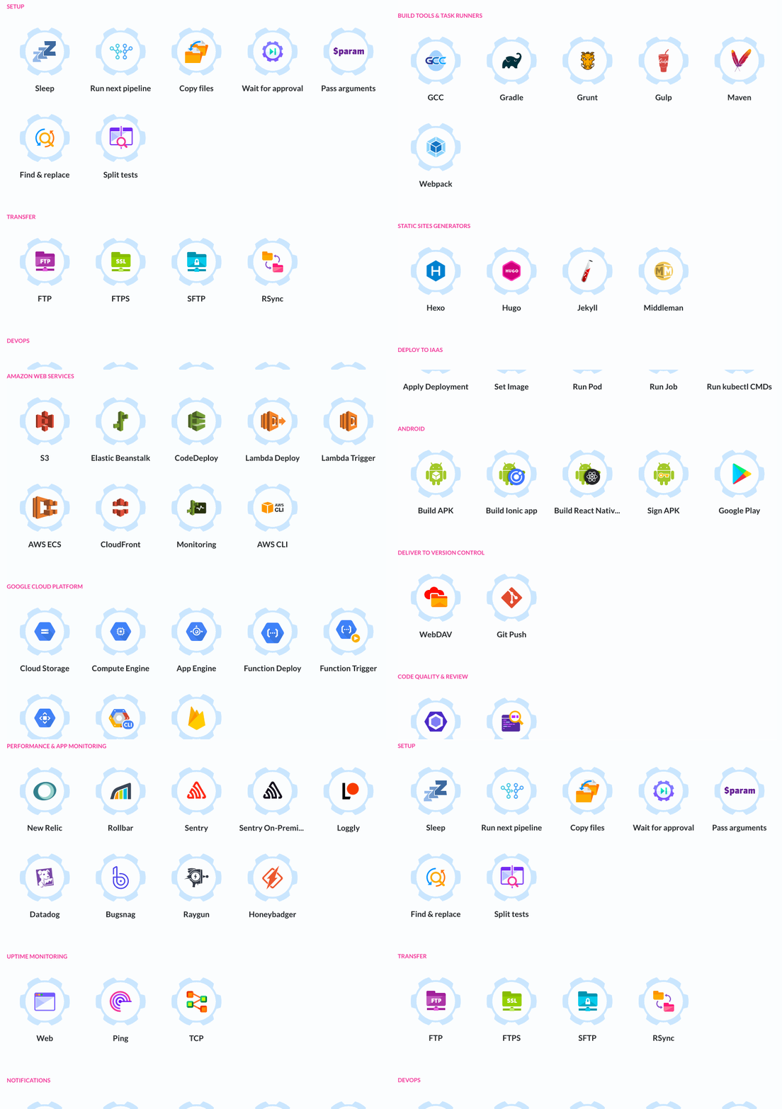
A noteworthy effect of configuring our pipelines with actions from different cloud-service providers is that we can conveniently switch among them whenever the need arises, making it easy to avoid vendor lock-in (this includes also changing the repository provider). Buddy offers slightly over 100 actions out of the box, and also allows developers to create and use their own actions. This image shows all the readily available actions:

Buddy actions
Out of the box actions in Buddy. (Large preview)

Creating A Pipeline

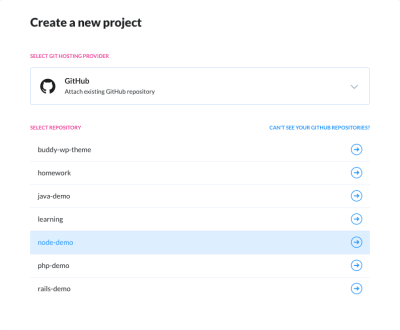
Let’s see how to create a simple pipeline to test and deploy a Node.js application, and send a notification to the team. The first step is to create a new project, during which you will be asked to select the project’s hosting provider (from among GitHub, GitLab, Bitbucket, Buddy Git Hosting, and your private Git server), and then to select the repository:

Tutorial step 1: Selecting the hosting provider

Selecting the hosting provider (Large preview)

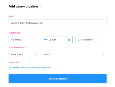
Then we can create the pipeline, specifying when it must run (either manually, automatically after new code is pushed to the repository, or automatically every x amount of time) and from which branch:

Tutorial step 2: Creating a new pipeline

Creating a new pipeline (Large preview)

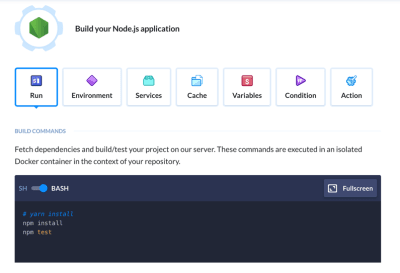
Then we can add actions to the pipeline. For that, we simply click on the “+” button to add a new action, upon which we must configure it as needed. To build and test a Node.js application we add and configure a “Node.js” action:

Tutorial step 3: Adding a Node.js action

Adding a Node.js action (Large preview)

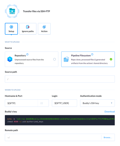
After testing the application, we can deploy it by uploading it to our production server through SFTP. For this, we add an “SFTP” action, and configure it through custom-defined environment variables ${SFTP} and ${SFTP_USER}:

Tutorial step 4: Adding an SFTP action

Adding an SFTP action (Large preview)

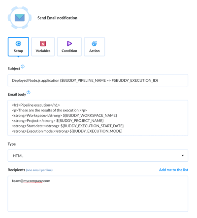
Finally, we send an email to the team with the results of the execution. For this, we add and configure the “Email” action:

Tutorial step 5: Adding an Email action

Adding an Email action (Large preview)

That’s it. Our pipeline will look like this:

Tutorial step 6: Pipeline finished

Pipeline finished (Large preview)

From this moment on, if the pipeline was configured to run when new code is pushed to the repository, doing a git push will trigger the execution of the pipeline.

Staying Constantly Up To Date

Web development is in a never-ending state of flux, with new tools and services being launched without a break, some of them often becoming a hot trend immediately and the new normal barely a few months later. Technologies seldom heard of a few years ago progressively gain importance and eventually become a must (voice search, machine learning, WebAssembly), new frameworks and libraries offer new ways of building sites (GraphQL, Gatsby, Next.js, Nuxt.js), and our applications need to be accessed from newly-invented devices (Amazon Echo, In-car systems). To keep our applications relevant, we must continuously evaluate the latest offerings and decide if to add them to our technology stack. Hence, it is extremely important that our platforms for developing the application do not restrict what technologies we can use.

Buddy deals with this issue by continuously collecting feedback from its users about what they need (through user polls, their forum, communication channels, and tweets), and its team strives to deliver the required features. The Buddy blog provides a glimpse of the intense pace of development: For instance, in the last few months they implemented features for building static apps and websites with Gatsby, deploying to UpCloud and to Google Cloud Functions, triggering pipelines with webhooks, integrating with Firebase, building and running Docker containers on AWS ECS, and many others.

Conclusion

Automation has become a must to avoid being overwhelmed by the complexity of modern website deployment. We can make use of Continuous Integration/Delivery/Deployment (readily feasible by hosting our source code through Git) to shorten the time needed for delivering new features into our applications and getting feedback from the users.

Buddy helps in this task, enabling developers to create pipelines to execute actions concerning a wide array of technologies and cloud-service providers, and combining these actions in any possible way to satisfy the most particular needs.

You can check out Buddy for free for 2 weeks and, if you need to host your data, you can also install it on your own premises.

Smashing Editorial(ms, ra, yk, il)
Categories: Others Tags:

How To Build Your Online Authority Using Facebook Ads

September 3rd, 2019 No comments

Over 2 billion people use Facebook and 1.5 billion checks in with their feed every day.

So, if you’re looking for a big pool of potential customers, this global social media powerhouse has you covered.

Not only is Facebook one of the top online sales channels, but success on social media also feeds online success overall. And businesses know it.

A solid Facebook presence boosts your online authority, which top pundits believe to be one of the most important search engine ranking factors. The higher your authority, the better your business will rank in search results. So, how can you harness the power of Facebook ads? In this post, I’ll show you how.

What is the online authority?

You can think of online authority like the internet’s version of ‘word-of-mouth’. The more people are talking about you, interacting with you and sharing what you have to say, the more ‘authority’ search engines assume you have in your area. Meaning, they’ll bump website, articles and other media with your name on up the SERPs.

Why do you need it?

Put simply, authority-building is part of brand-building. The stronger your online presence, the more recognition, and association you build for your brand.

Types of Facebook ads

If you want to take advantage of Facebook’s advertising power, you need to understand the available options. Facebook offers a truly dizzying array of ad types, so here is a selection of the most applicable to authority-building. These ads work because they do one of the following:

  • Send traffic to your website
  • Encourage people to share your content
  • Get your name and work in front of industry influencers
  • Build your reputation as a thought leader
  • Encourage page likes and follows

Link click ads

These simple ads promote your website and direct traffic to your chosen landing pages. They’re used to drive sales, subscriptions and other conversions. But you can use them to direct your Facebook followers to your best content and promote backlink opportunities.

Video ads and multi-product ads

Video ads and image carousels (multi-product ads) take advantage of people’s strong preference for multi-media content. You can add links to landing pages (see above) or back to your Facebook page to bring in more likes.

Page post boosts

You can boost any of your Facebook posts. Boosting promotes your content to specific audiences, which you can choose down a person’s job title. Facebook places the word ‘sponsored’ on the post, which is visible when it appears on your target’s wall. These ads are best at encouraging page likes and shares.

Dynamic products ads

Facebook places these ads using dynamic algorithms ads based on people’s past engagements with your website or page. They’re great at directing people from your Facebook page to your website.

Page like ads

Page like ads are pretty self-explanatory. If you want to increase the number of pages likes you have, use these to target the audiences you think are most likely to ‘like’ you.

Define your audience

To get the most out of advertising, it needs to be targeted. Using the ‘custom’ function in Facebook’s Audience Insights tool, you can work out what kind of people are most likely to interact with your ads.

The simplest method is to search for people who ‘like’ one of your main competitors and view a summary of their statistics. For example, are they mostly female, ages 25-34 and follow a lot of pages about famous internet cats? Or, are they 55-70-year-old retired campervan owners?

Using Facebook’s audience insights feature, you can find out what devices your audience use, what countries they are in and how often they log into the platform.

Target influencers

To build your online authority fast, you need to generate backlinks from industry influencers. According to search engine logic, if the big guns are talking about you, you must know what you’re doing.

If you want influencers to link to your content, you need to get it seen by them. To do this you could:

  • Find out who they are
  • Use their information to create ‘audience profiles’ for your adverts
  • Produce killer content can’t resist sharing
  • Advertise it directly to them
  • Mention and link to them in your content

Boost your popular posts

There’s no point paying to advertise something half-baked. Facebook’s ‘boost post’ ads allow you to build your following and get more traction from well-performing content.

Target fresh eyes and new audiences with Facebook’s Page Insights function, which identifies your most popular post and give them a boost. Alternatively, use the Insights function included with most good website builders to find your most popular on-site content and post/boost this through Facebook.

When boosting posts, make sure you:

  • Use content that’s helpful to your audience (how-to’s, lists of resources, tutorial videos are all great candidates)
  • Add links to landing pages on your website within the article (internal links build your SEO and direct traffic to where it’s needed)
  • Make sure all content has visible sharing buttons (who knows, it might even go viral)
  • Add calls-to-action to tell the reader what you would like them to do next

Start a conversation

You might think your role ends once you’ve picked and paid for the right ad type. Not so! Interaction builds authority. It’s rarely enough to push out a post and let it lie. Always interact with commenters on your posts and on the website landing pages you’ve directed to from your content.

People are more likely to follow links, convert and interact with future posts if you show that you care whether they get involved.

To sum things up….

Much to the disappointment of many a small business owner, there’s no quick fix for successful authority building. But luckily, getting your business noticed with Facebook ads will give it a big shove in the right direction. By following these simple tips, you’ll start climbing up the ranks and rein in the SEO benefit in no time.

Categories: Others Tags:

Need to scroll to the top of the page?

September 2nd, 2019 No comments

Perhaps the easiest way to offer that to the user is a link that targets an ID on the element. So like…

<html id="top">
  <body>
     <!-- the entire document -->
     <a href="#top">Jump to top of page</a>
  </body>
</html>

But we’ve got a few options here.

If you want it to smooth scroll up to the top, you can do that in CSS if you like:

html {
  scroll-behavior: smooth;
}

Note that placing a property on the HTML element like that is all-encompassing behavior you don’t have much control over.

In this case, we aren’t linking to a focusable element either, which means that focus won’t change. That’s probably important, so this would be better:

<html>
  <body>
     <a id="top"></a>
     <!-- the entire document -->
     <a href="#top">Jump to top of page</a>
  </body>
</html>

It’s better because the focus will move to that anchor tag, which is good for people using the keyboard or assistive technology.

These require clicks though. You might need to trigger scrolling within JavaScript, in which case:

window.scrollTo(0, 0);

…is a sure bet to scroll the window (or any other element) back to the top. The scrolling behavior of that is determined by CSS as well, but if you aren’t doing that, you can force the smoothness in JavaScript:

window.scroll({
  top: 0, 
  left: 0, 
  behavior: 'smooth'
});

For a more complete story about smooth scrolling, we have a page for that.

The post Need to scroll to the top of the page? appeared first on CSS-Tricks.

Categories: Designing, Others Tags:

Should a website work without JavaScript?

September 2nd, 2019 No comments

The JS Party podcast just had a fun episode where they debated this classic question by splitting into two groups of two. Each group was assigned a “side” of this debate, and then let loose to debate it. I don’t think anybody can listen to a show like this and not be totally flooded with thoughts! Here are mine.

  • This is one of those holy war arguments that has raged on for years. Perhaps that’s because people are seeking an answer that applies to the entire web, and the web is too big to pin this broad of an answer to.
  • The question itself worth a look. Why are we talking about hamstringing our sites in this particular way? Should our websites work without HTML? Should our websites work without databases? Perhaps we focus on JavaScript the most because JavaScript has become the largest bottleneck of web performance (even more so than the network!) and we experience failed JavaScript more so than any other type of web failure (except, perhaps, entire sites not loading) (or icons fonts, jeez).
  • I enjoyed all the stumbling around the terminology of “web apps” and “web sites” (web things!). This is such a weird one. It’s so easy to picture the difference in your head: it’s like facebook versus a blog! But when you start trying to define it exactly, it gets really murky really quickly and the distinction loses any value, if it had any to start with. Here’s more on that.
  • Accessibility is certainly involved in all conversation about the web, but it probably can’t be broadly applied here. There is a notion that assistive tech doesn’t run JavaScript — so a site that requires JavaScript to use it is a 100% fail for those users. Best I know, that’s entirely not the case anymore. We can debate to death the role of JavaScript in accessibility problems, but just because a particular site requires JavaScript to run doesn’t by itself render the site inaccessible.
  • It’s easy enough to flip off JavaScript, browse around the web, find broken things, and chinflip them for this apparent failure. The failure being that this site, or a feature on the site, could have been architected to work without JavaScript. Rule of least power. This is tricky. It’s easy not to care about a person who has intentionally disabled a part of their web browser and still wants everything to work. I straight up don’t care about that. But the resiliency part is more interesting. If you do build a part of a site to work without JavaScript, it will work both before and after the JavaScript executes, which is pretty great.
  • The concept of building functional content and features without JavaScript and enhancing the experience with JavaScript is called progressive enhancement. I’m both a fan and careful not to insist that everything on earth is always to be built that way (see top bullet point). There are situations where progressive enhancement both increases and reduces technical debt. The only wide brush I’d use here is to say that it’s worth doing until the debt is too high.
  • There is an in-between moment with progressive enhancement. If a feature is functional without JavaScript, that means it’s likely you are deferring the loading of that JavaScript for the performance benefit. But it does eventually need to be downloaded and executed. What happens during that time? There is a performance and UX cost there. Best case, it’s negligible. Worst case, you break the feature during this in-between time.
  • I find it more interesting to debate this kind of thing on a site-by-site and feature-by-feature basis. Application holotypes might be an interesting way to scope it. They often turned to Slack as an example which is a perfect choice. How would you build a 20-author movie review site? How you would architect a social and media-heavy site like Dribbble? How do you build dropdown navigation? What about a one-page brochure site where the client wants parallax? How about an airline app that needs a native mobile app as well? And of course, it makes you think about sites you work on yourself. Does CodePen run on the right set of technologies? Does CSS-Tricks?
  • If a site is “client-side rendered” (CSR), that means JavaScript is doing the data fetching and creating the DOM and all that. If we’re talking about websites “working” or not with our without JavaScript, a site that is client-side rendered will 100% fail without JavaScript. It is sort of the opposite of “server-side rendered” (SSR) in which the document comes down as HTML right from the server. SSR is almost certainly faster for a first-loading experience. CSR, typically, is faster to move around the site after loading (think “single page app,” or SPA).
  • It’s not just SSR vs. CSR — there is a whole spectrum. It’s more and more common to see sites try to take advantage of the best of both worlds. For example, Next/Nuxt/Gatsby, or Ember’s fastboot.
  • Service workers are JavaScript. Web workers are JavaScript. Some of the fancy resilience and performance features of the web are powered by the same technology that causes the grief we debate about.

The post Should a website work without JavaScript? appeared first on CSS-Tricks.

Categories: Designing, Others Tags: