Archive

Archive for September, 2019

How Powerful Micro-Interactions Boost Your UX

September 20th, 2019 No comments

Because of the sense of value users perceive from micro-interactions, they not only boost engagement, but also inspire positive feelings towards your brand, and ultimately, influence users’ actions.

This article will discuss the basics of micro-interactions and how you can utilize them to enhance your UX design.

What Are Micro-Interactions?

In digital design, micro-interactions are found in most user engagements with products. It occurs when you hover your mouse over text and it changes color to indicate it can be clicked. It’s when animation comes out showing the progress of your upload. It’s even the message that pops up to let you know you’ve input the wrong password.

These little visual cues and other subtle indicators are micro-interactions. And while they may not be readily noticed by users, that’s actually, often, when they’re properly executed. Micro-interactions, however subtle they may be, hold the general design scheme together – providing bits of information that allow users to navigate the interface and perform basic functions.

How Micro-Interactions Work

Micro-interactions have four basic elements: trigger, rules, feedback, and loops/modes. These elements help organize the operational cycle of these design elements:

Triggers

These are what initiate the micro-interaction process—a tap of a button, or a click of a mouse, for example. It can also be initiated by the system when certain qualifications are met, like when you get sound notifications when you receive a message.

These triggers work with a set of established action rules that prescribe what can and can’t be done.

Rules

These basically determine what happens once a micro-interaction is triggered. So when you swipe up on Tinder, for example, the rules state that you’ve “Super liked” someone. But the rules also state that still can’t message them until they’ve liked you back.

Feedback

As the name implies, it lets users know what’s going on. Anything a user sees, hears, or even feels when a micro-interaction is happening is feedback. For example, if you set your phone to vibrate, that short vibration is feedback.

Loops/Modes

These basically define the nature of the interaction—does it flash once, repeat? What happens over time? For example, the loops can be the number of times a user can input the wrong password, while the mode would be that an account would be temporarily blocked after five password errors.

When and How to Use Micro-Interactions

1. Page Animation

When you talk about page animation, it could be the creative transition between pages or just a cool scrolling progress icon. These types of micro-interactions can give users better insight into the relationship between previous and current pages. It also makes even the process of skimming more engaging.

2. Swiping

Similarly, you can also take advantage of how innate swiping has become by incorporating smooth transitions to your content when users swipe. This way, you can add some entertainment value to your content (without users needing to get on a dating app).

3. Animated Input Fields

You probably haven’t met anyone that enjoys filling out forms. But animating fields can at least make the mundane task more engaging, and even helpful.

4. Status Animation

Similarly, in this age of dwindling attention spans and on-demand entertainment, nobody likes to wait. But by using animations for things like download/upload status, you can show users’ progress, while adding more fun to an otherwise boring function.

You can even use it to add to your branding.

5. Notifications

When it comes to notifications, it’s better if you can give users options. For example, there are users who prefer less intrusive notifications. Others, meanwhile, wouldn’t mind Facebook Messenger’s chat bubble popping up even while they’re watching a YouTube video.

Facebook and Instagram have taken this to another level, providing users with a hit of dopamine every time someone likes their posts. This builds habits, making users look forward to getting notifications.

6. Pull-Down Menu

It’s become a staple design in smartphones’ operating systems, and it’s because it’s incredibly user-friendly. Just by pulling down from the top of your screen, you get access to all your notifications and your basic settings. Ease of navigation is one of the most important functions of micro-interactions, and pull-down menus enable just that.

7. Call-to-Action Buttons

Your CTAs are there for a reason – and that’s because you want users to click on them. Adding animation to your CTA buttons can help stimulate users’ behavior. And at the very least, make them curious about what might happen.

8. Anchor Text Animation

Animating anchor text is a great way to incorporate creative branding into simple functions like going back to your homepage or even just indicating that something can be clicked.

9. Tutorials

Micro-interactions are also a great way to educate users about how to use your product. Simple animations or even graphics that point out basic functions can go a long way towards better UX by making your product easy to use, and unveiling cool hidden functions.

Takeaway

These small details all add value to the overall experience of your users. A small feature like a non-intrusive notification or a cool status animation can make users feel that the company cares about them, and leads to feelings of goodwill towards the brand. And once that sort of relationship is built, you can then influence their actions to align with your own goals.

With everything going digital, it’s getting harder and harder to stand out from the crowd – but these subtle micro-interactions can help you achieve just that.

Source

Categories: Designing, Others Tags:

15 Questions To Ask Your Next Potential Employer

September 20th, 2019 No comments
Smashing Editorial

15 Questions To Ask Your Next Potential Employer

15 Questions To Ask Your Next Potential Employer

Robert Hoekman Jr

2019-09-20T12:30:59+02:002019-09-20T21:35:44+00:00

In my book “Experience Required”, I encourage in-house UX professionals to leave companies who refuse to advance their UX intelligence and capability. There are far too many companies these days who understand the value of UX to waste your time being a martyr for one who will only frustrate you. Your best chance of doing a good job is to avoid a bad position.

Smartly, during a recent Q&A about the book, an audience member asked how we can avoid taking these jobs in the first place. What kinds of questions, he wondered, can you ask during an interview to spot red flags before the company stabs the whole flagpole into your sacred UX heart?

Know What You Want To Know

There’s the usual stuff, sure, such as asking why the position you’re applying for is currently open. What the company’s turnover rate is like. Why that turnover rate is so low or high. A little Googling will easily enough net you a decent list of broad questions you can ask any employer.

But what you really want is to get UX-specific. You want to hone in on precisely what your life might be like should you take the position.


Your best chance of doing a good job is to avoid a bad position.

Sadly, I lacked a great answer at the time to the question about interview questions, so I let it eat at me until I woke up at three a.m two days later and started writing notes. That morning, I emailed my reply to the moderator.

Ask A Great Question, Then Shut Up

To devise the list below, I considered what kinds of things I’d wish a company knew and understood about UX prior to working with them. I can operate in all kinds of situations—as a UX and process innovation consultant, this has been my job, and pleasure, for nearly 13 years now—but I want to know from the start, every time, that the effort will be set up for success. These questions aim to uncover the dirty details that will tell me what I’m walking into.

Much like a good validation session or user interview, these questions are open-ended and designed to draw out thoughtful, long-winded responses. (One-word answers are useless.) I strongly recommend that when and if you ask them, you follow each question with a long, stealthy vow of silence. People will tell you all about who they are if you just shut up long enough to hear them do it. Stay quiet for at least ten seconds longer than you think is reasonable and you’ll get the world.


People will tell you all about who they are if you just shut up long enough to hear them do it.

I’d ask these questions of as many individuals as possible. Given that tech interviews are often hours-long and involve many interviewers, you should be able to grab yourself a wealth of good answers before you head out the door to process and sleep.

If, on the contrary, you are given too little time to ask all these questions, prioritize the ones you’re personally most concerned about, and then consider that insufficient interview time might be a red flag.

Important: The key to the answers you receive is to read between the lines. Listen to what is said, note what is not said, and decide how to interpret the answers you get. I’ve included some red flags to watch out for along with each question below.

The Questions

Let’s get right to it.

1. How does this company define UX? As in, what do you believe is the purpose, scope, and result of good UX work?

Intent

Literally every person on Earth who is asked this question will give a slightly, or wildly, different answer than you expect or hope for. At the very least, the person interviewing you should have an opinion. They should have a sense of how the company views UX, what the various UX roles have to offer, and what effect they should have.

Red Flag(s)

The UX team has a very limited role, has no real influence, and the team, for the most part, is stretched so thin you could put them on a cracker.

2. How do the non-UX people on your product team currently participate in UX decisions?

Follow-ups: Describe a recent example of this kind of participation. What was the UX objective? How was that objective vetted as a real need? What did you do to achieve the objective, step-by-step? How did it turn out? What did you learn?

Intent

Find out how the entire product team approaches UX and how collaborative and supportive they might be in acquiring and acting on good research insights.

Red Flag(s)

They don’t participate in UX decisions.

3. What UX roles exist in the organization, and what do they do?

Intent

Determine where you’ll fit in, and how difficult it might be for you to gain influence, experience, or mentorship (depending on what you’re after). Also, build on the previous question about who does what and how.

Red Flag(s)

UX people at the company are heavily skilled in graphic design, and not so skilled in strategy. The current team members have limited influence. Your role will be similar. Strategy is handled by someone else, and it trickles down to the UX team for execution.

4. Who is your most experienced UX person and in what ways does that experience separate them from others?

Intent

Determine the range of UX intelligence on the team from highest to lowest. Is the person at the top whip-smart and a fantastic leader? Does that person mentor the others and make them better?

Red Flag(s)

The interviewer cannot articulate what makes that person better or more compelling than others. If they can’t answer this question, you’re speaking to someone who has no business making a UX hiring decision. Ask to speak to someone with more inside knowledge.

Noteworthy, but not necessarily a red flag: If you learn that the most experienced person on the team is actually someone with a very sleight skill set, this can mean either there’s room for you to become an influencer, or the company puts so little value on UX that they’ve selected only employees with a small view of UX. The latter could mean you’ll spend all your time trying to prove the value of bigger UX involvement and more strategic work. You may like that sort of thing. I do. This would not be a red flag for me. It might be for you.

5. What are the company’s plans for UX long-term? (Expand it? Reduce it? How so, and why? Is there a budget for its expansion? Who controls it and how is it determined?)

Intent

Map out your road for the next couple of years. Can you rise into the role you want? Or will you be stuck in a cul-de-sac with zero chance of professional growth?

Red Flag(s)

We plan to keep doing exactly what we do now, and what we do now is pretty boring or weak. Also, we have no budget—like, ever—so if you want to bring in a consultant, attend a seminar, hire another person, or run a comprehensive usability study with outside customers, well, good luck with that.

6. How do UX professionals here communicate their recommendations?

Follow-up: How could they improve?

Intent

Learn how they do it now, and more importantly, whether or not it works.

Red Flag(s)

The interviewer has no answer, or—far worse—has an anti-answer that involves lots of arm-waving and ideas falling on deaf ears. The former can, again, mean the interviewer has no business interviewing a UX candidate. The latter can mean the UX team is terrible at communicating and selling its ideas. While this can be overcome with your much better communication skills, it will almost certainly mean the company has some baggage to wade through. Poor experiences in the past will put other product team members on defense. You’ll have to play some politics and work extra heard on building rapport to get anywhere.

7. Who tends to offer the most resistance to UX recommendations and methods and why?

Follow-up: And how much power does that person have?

Intent

This person will either give you the most grief or will give you the great opportunity to improve your communication skills (remember: design is communication!). Knowing who it is up front and how that person operates can tell you what the experience will be like.

Red Flag(s)

Executives, because they distrust UX. If you lack support at the top, it will be a daily struggle to achieve anything substantive.

8. What do UX practitioners here do to advance their values and methods beyond project work? Please be specific.

Intent

See how motivated the UX team is to perpetuate UX values to the rest of the company and improve how the team works.

Red Flag(s)

They don’t.

9. What do you think they should do differently? Why?

Intent

Discover how your interviewer feels about UX. This is, after all, a person who has a say in hiring you. Presumably, this person will be a big factor in your success.

Red Flag(s)

Keep their noses out of product development, stop telling the engineers what to do (speaks to perception of pushy UX people).

10. Describe a typical project process. (How does it start? What happens first? Next? And then?)

Intent

Find out if there is a process, what it looks like, and how well it aligns with your beliefs as a UX professional.

Red Flag(s)

You’ll be assigned projects from the top. You’ll research them, design a bunch of stuff in a vacuum with no way to validate and without any iteration method, and then you’ll hand all your work to the Engineering team, who will then have a thousand questions because you never spoke to each other until just now.

Bonus Question

How and when does the team try to improve on its process? (If it doesn’t, let’s call that a potential red flag as well.)

11. How has your company learned from its past decisions, and what have you done with those learnings?

Intent

UX is an everlasting experiment. Find out if this company understands it’s supposed to learn from the work and become smarter as a result.

Red Flag(s)

No examples, no thoughts.

12. If this is an agency who produces work for clients: What kind of support or backup does this agency provide for its UX recommendations, and how much power does the UX group have to push back against wrongheaded client ideas?

Follow-ups: How does the team go about challenging those ideas? Provide a recent example.

Intent

Find out how often you’ll be thrown under the proverbial bus when a client pushes back against what you know to be the right approach to a given problem. Your job will be to make intelligence-based recommendations; don’t torture yourself by working with people who refuse to hear them.

Red Flag(s)

The interviewer says the agency does whatever the clients demand. You will be a glorified wireframe monkey with no real power to change the world for the better.

13. How does the company support the UX group’s work and methods?

Intent

Determine how the company as a whole thinks about UX, both as a team and a practice. Is UX the strange alien in the corner of the room, or is it embraced and participated in by every product team member?

Red Flag(s)

UX is a strange alien. Good luck getting anyone to listen to you.

14. What design tools (software) does your team use and why?

Follow-ups: How receptive are people to trying new tools? How does evolution happen?

Intent

Know what software you should be familiar with, why the team uses it, and how you might go about introducing new tools that could be better in some situations.

Red Flag(s)

Gain insight into how the team thinks about the UI portion of the design process. Does it start with loose ideas drawn on napkins and gradually move toward higher-quality? Or does it attempt to start with perfection and end up throwing out a lot of work? (See the next question for more on this.)

15. Does a digital design start low-fi or high-fi, and what is the thinking behind this approach?

Follow-up: If you start lo-if, how does a design progress?

Intent

You can waste a lot of hours on pixel-perfect work you end up throwing out. A company who burns through money like that is also going to be the first one to cut staff when things get tight. No idea should be carried through to its pixel-perfect end until it’s been collaborated on and vetted somehow, so you want to know that the company is smart enough to start lo-fidelity and move gradually to hi-fidelity. Hi-fi work should be the result of validation and iteration, not the start of it. A lo-fi > hi-fi process mitigates risk.

Red Flag(s)

All design work starts and ends in Photoshop or Sketch, and is expected to be 100% flawless and final before anyone sees what you’ve produced.

Running The Interview

In an unrelated Q&A years ago, a hiring manager asked how to spot a good UX professional during an interview. I answered that he should look for the person asking all the questions. I repeated this advice in Experience Required.

Now you can be the one asking all the questions.

And in doing so, not only will you increase your odds of being offered the gig, you’ll know long before the offer shows up whether to accept it.

If you, dear reader, have more ideas on how to scavenger-hunt a company’s red flags, we’re all ears. Tell us about it in the comments below.

(cc, il)
Categories: Others Tags:

7 Techniques to nail your Email Personalization

September 20th, 2019 No comments

If you think including “Hi [First name] in your email completes personalization, you have probably got the personalization concept wrong.

In Fact, this is only the beginning.

Personalized content is an integral part of modern marketing and Email is no different. Consumers expect to see a more humanized version of the brand both offline and online and expect relevant content tailor-made for them. Brands are trying new techniques to show authenticity in communication improve consumer experience over the internet.

Personalization is one of the best ways to improve those conversion rates. Personalized email marketing is vital to make your email stand out. It has proved several times from the statistics of many companies’ conversion rates! Here are a few:

  • 93% of companies experienced an increase in conversion rates after personalizing their search engine marketing.
  • 92% of companies saw a hike in conversions with personalized emails.
  • The same was true for 94% of companies that personalized their website.

Source-Econsultancy

Personalization can create a significant impact on conversions as we have seen from the numbers. But unless it’s done rightly, marketers and companies will not experience its full benefits! In fact, personalization is a complicated strategy to nail.! From the stats, only 19% of companies in the Econsultancy study found it easy, but 39% found it highly challenging.

Many companies are only getting minimal results from their efforts. For driving conversions through personalization successfully, it is vital to focus on the customer! It means you must focus on the minutest details of a customer’s experience that can effectively influence their purchase decisions.

Here we will go through the seven effective techniques to nail the email personalization that will help you boost your conversion rate.

1. Start by obtaining valid data for personalization

Collecting the right information is essential in the initial stage of personalization. You can start by collecting data from readers on sign-up forms. As a subscriber adds themselves to your email list, you will be able to ask them some questions other than an email address or a name.

You can ask for details like their location, birthday, occupation, and more., but always try to keep the field short but sweet. You can start by asking for a few bits of information without pushing a customer to exit the form before signing up. You can also make use of Integration to obtain more data.

If you don’t have the right resources for collecting information, integration is a perfect way of getting them. Many businesses claim they don’t possess enough employees to carry out or monitor data collection! You can look for some Integration Software. There are many CRM software available.

Finally, you should formulate a subscriber preference center if you want to discover what your readers want to view in the first place! These settings will allow the users to update their subscription details to keep unwanted emails out of their inbox. This way, you won’t waste time sending them.

This technique allows subscribers to make their own choices, making them feel more in control of their inbox.

Once you’ve started collecting the proper data, you can begin to personalize your subject lines!

2. Move on to personalizing your subject line

In email marketing, the subject line has been of great importance. It is also the personalization tactic that has to be most precise to work! The subject line must vary from industry to industry, audience to audience, and so on. Subject lines may seem like a small section of your message, but they’re one of the first impressions you have on your email receivers. Creating a catchy subject line is a marketer’s ticket for standing out in a crowded inbox.

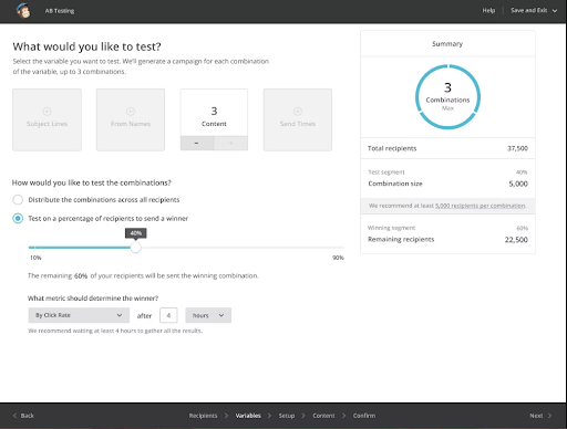
Do an A/B testing for uncovering the styles preferred by most of the audience. With proper testing, you will be able to modify the subject line of your content based on the data collected regarding the subscriber’s needs, interests, age, and more. This way, open rates, and conversion rates will start to go up! You can do A/B testing with most of the email services. This is what it looks like on MailChimp.

Once you have successfully got your subject lines set, you should move focus on triggered emails!

3. Make use of behavior-triggered emails

Behavior-triggered emails are real-time feedback on how your customers are using the product! One great example is Facebook. They send an email if you don’t log in for five days, and this is a behavior-triggered email!

These emails have higher open rates in comparison to traditional methods. They are an essential communication tool impacting many customers to stay for a lifelong! Trigger emails are easily automated and are sent to customers for multiple actions like up-selling and cross-selling, re-engagement, and the list goes on!

The use of behavior triggers is a smart move as it brings back most of the users back to their website and gets them to use the products! If timed and implemented correctly, you will be able to see the difference is those conversion rates.

4. Personalize based on the number of visits

Personalizing based on the number of visits has been adopted by many businesses by displaying personalized dynamic content! Displaying offers based on the users’ previous browsing history is a great way to attract potential customers based on their requirements.

Notifying them about any changes in the price or any new deals can be an ideal driving factor but always keep in mind to send promotions to those who have shown an interest in a related topic rather than sending them randomly!

Another excellent dynamic personalization method is to present a welcome popup for first-time visitors with a great video or a message to get them acquainted with your brand and website!

If customers do not convert initially, providing them with valuable resources that they find beneficial can help build a good relationship with them.

5. Personalize based on the location and time of the user

One of the primary factors affecting conversions in marketing and business is customer experience! Any inconvenience caused can frustrate your customer and lower your chances of converting them!

It is a proven fact that sending emails during certain times of day proves to be better than others! However, You can A/B test this and plan a time to send your mails. It is unlikely that all your customers are in the same location or respond to emails at the same time. They can be from different geo-locations scattered across different time zones, and possibly receive emails at non-optimal times!

A dynamic geo-location personalization can be an excellent solution for boosting conversions. You can perform this by using the customers’ data you have collected for scheduling your emails at the best time! Sending mail at a personalized time can create an impact on the open rate, but keep in mind to keep the content relevant to the subscriber! You can analyze the customer data showing past open histories and send an email at the most optimum time!

Personalized timings can win you consistent customers in the long run, so be sure about getting those timings right!

6. Personalize based on the device type

Personalizing based on the type of device customers use may seem like a primary method used by many these days, but it is more than just designing a mobile-responsive site! Mobile-responsiveness can help improve site navigation but does not significantly boost conversion rates. There are many ways to personalize the activities of your mobile and tablet visitors so that they convert!

You can begin by making it easy for first-time shoppers to complete their shopping by offering social login options. Many WordPress plugins are available for adding a social login option on your site!

You can also illustrate a click-to-call button on your contact page, social media page, or effective landing page to increase the number of leads. You can display them in your search ads too for getting good responses.

Google allows you to create call extensions and add them to your ads, and these extensions allow people to tap on your phone number and call your business directly!

7. Increase your success rate with personalized Landing pages

Pairing personalized emails and landing pages can push your success rate further and can prove to be effective in creating a successful email outreach campaign. You have to make sure that landing pages are matching with what you are sending them. It shouldn’t seem like your recommendation email has no links to the actual product you are trying to sell!

This the reason to always make sure there are relevant landing pages in your emails! You can increase membership subscriptions and generate more leads by pairing personalized emails with landing pages that matched different customer segments! This way, both the email and the landing pages will contain the same content focusing on converting customers based on their specific interest!

Always make sure the landing page relates to the customers you are targeting and the buying stage they are in for getting leads and eventually converting them!

Summing Up

Email personalization is a simple and very effective way to gain new and paying customers. These seven techniques are effective in boosting conversion rates. Here, the main focus was getting personalization right resulting in the delivery of relevant real-time experiences for every customer!

Categories: Others Tags:

Weekly Platform News: Emoji String Length, Issues with Rounded Buttons, Bundled Exchanges

September 19th, 2019 No comments

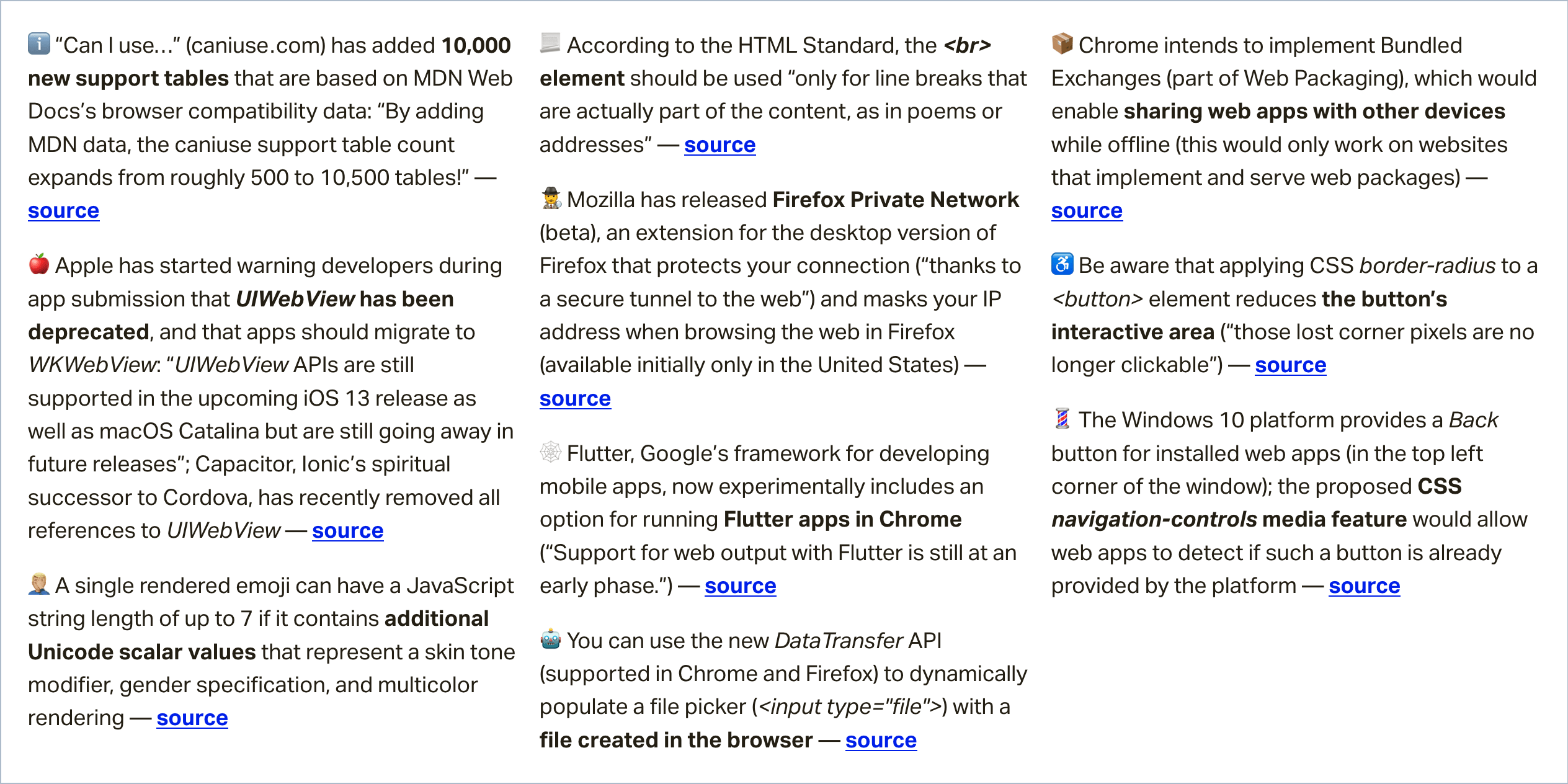
In this week’s roundup, the string length of two emojis is not always equal, something to consider before making that rounded button, and we may have a new way to share web apps between devices, even when they are offline.

The JavaScript string length of emoji characters

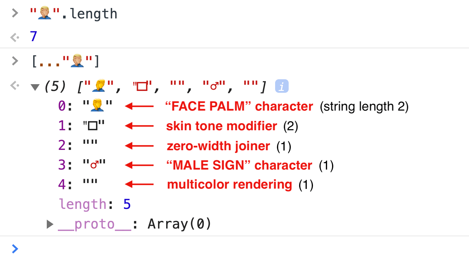
A single rendered emoji can have a JavaScript string length of up to 7 if it contains additional Unicode scalar values that represent a skin tone modifier, gender specification, and multicolor rendering.

(via Henri Sivonen)

An accessibility issue with rounded buttons

Be aware that applying CSS border-radius to a

Categories: Designing, Others Tags:

Buddy on CSS-Tricks

September 19th, 2019 No comments

Here’s a little direct product endorsement for ya: I literally use Buddy for deployment on all my projects.

Buddy isn’t just a deployment tool, we’ll get to that, but it’s something that Buddy does very well and definitely a reason you might look at picking it up yourself if you’re looking around for a reliable, high-quality deployment service.

Here’s my current setup:

  • CSS-Tricks is WordPress site.
  • The whole wp-content folder is a private repository on GitHub.
  • The hosting is on Flywheel, which gives me SFTP access to the server.
  • When I push to the Master branch, Buddy automatically deploys the changed files over SFTP. This is fast because the fact it’s only dealing with changed files.

The setup on Buddy for this is incredibly nice and simple and I’ve never once had any problems with it. You may want to look at zero-downtime deployments as well, where files are uploaded to a separate directory first and swapped out with the destination directories if the entire upload is successful.

And I don’t just use this setup for CSS-Tricks but all my sites that need this kind of deployment.

But like I said, Buddy isn’t just deployment. Buddy is all about pipelines. You (visually) configure a bunch of tasks that you want Buddy to do for you and the trigger that kicks it off. Pushing to Master is just one possible trigger, you can also kick them off manually or on a timer.

What tasks? Well, a common one would be running your tests. You know: Continuous Integration (CI) and Continuous Development (CD). You can tell Buddy to run whatever terminal commands you want (they’ll spin up a Docker container for you), so however you run tests and get output will work just fine.

You could have it shoot you an email, hit some other web service, or run a build process.

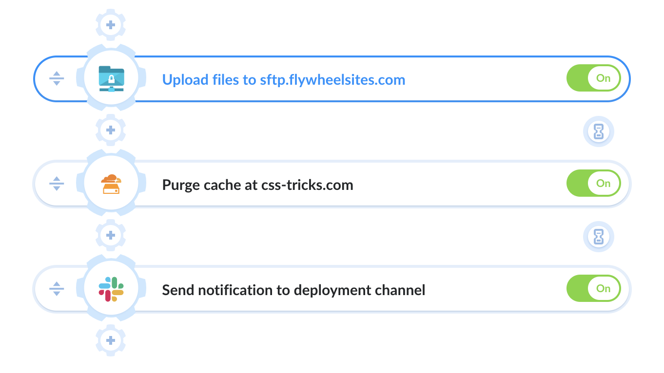
Here’s the actual tasks I run in my pipeline right now:

  1. Upload the files over SFTP
  2. Tell Cloudflare to purge all the cache on the site
  3. Send a message to a particular channel on Slack (also do that on failure)

So useful.

It’s so easy to set up it almost encourages doing more with your pipelines. I need to get some Cypress tests in there and I’d love to integrate an action to automatically optimize all images in the commits.

The post Buddy on CSS-Tricks appeared first on CSS-Tricks.

Categories: Designing, Others Tags:

Git Pathspecs and How to Use Them

September 19th, 2019 No comments

When I was looking through the documentation of git commands, I noticed that many of them had an option for . I initially thought that this was just a technical way to say “path,” and assumed that it could only accept directories and filenames. After diving into the rabbit hole of documentation, I found that the pathspec option of git commands are capable of so much more.

The pathspec is the mechanism that git uses for limiting the scope of a git command to a subset of the repository. If you have used much git, you have likely used a pathspec whether you know it or not. For example, in the command git add README.md, the pathspec is README.md. However, it is capable of much more nuance and flexibility.

So, why should you learn about pathspecs? Since it is a part of many commands, these commands become much more powerful with an understanding of pathspecs. With git add, you can add just the files within a single directory. With git diff, you can examine just the changes made to filenames with an extension of .scss. You can git grep all files except for those in the /dist directory.

In addition, pathspecs can help with the writing of more generic git aliases. For example, I have an alias named git todo, which will search all of my repository files for the string 'todo'. However, I would like for this to show all instances of the string, even if they are not within my current working directory. With pathspecs, we will see how this becomes possible.

File or directory

The most straightforward way to use a pathspec is with just a directory and/or filename. For example, with git add you can do the following. ., src/, and README are the respective pathspecs for each command.

git add .      # add CWD (current working directory)
git add src/   # add src/ directory
git add README # add only README directory

You can also add multiple pathspecs to a command:

git add src/ server/ # adds both src/ and server/ directories

Sometimes, you may see a -- preceding the pathspec of a command. This is used to remove any ambiguity of what is the pathspec and what is part of the command.

Wildcards

In addition to files & directories, you can match patterns using *, ?, and []. The * symbol is used as a wildcard and it will match the / in paths — in other words, it will search through subdirectories.

git log '*.js' # logs all .js files in CWD and subdirectories
git log '.*'   # logs all 'hidden' files and directories in CWD
git log '*/.*' # logs all 'hidden' files and directories in subdirectories

The quotes are important, especially when using *! They prevent your shell (such as bash or ZSH) from attempting to expand the wildcards on their own. For example, let’s take a look at how git ls-files will list files with and without the quotes.

# example directory structure
#
# .
# ├── package-lock.json
# ├── package.json
# └── data
#     ├── bar.json
#     ├── baz.json
#     └── foo.json

git ls-files *.json 

# package-lock.json
# package.json

git ls-files '*.json'

# data/bar.json
# data/baz.json
# data/foo.json
# package-lock.json
# package.json

Since the shell is expanding the * in the first command, git ls-files receives the command as git ls-files package-lock.json package.json. The quotes ensure that git is the one to resolve the wildcard.

You can also use the ? character as a wildcard for a single character. For example, to match either mp3 or mp4 files, you can do the following.

git ls-files '*.mp?'

Bracket expressions

You can also use “bracket expressions” to match a single character out of a set. For example, if you’d like to make matches between either TypeScript or JavaScript files, you can use [tj]. This will match either a t or a j.

git ls-files '*.[tj]s'

This will match either .ts files or .js files. In addition to just using characters, there are certain collections of characters that can be referenced within bracket expressions. For example, you can use [:digit:] within a bracket expression to match any decimal digit, or you can use [:space:] to match any space characters.

git ls-files '*.mp[[:digit:]]' # mp0, mp1, mp2, mp3, ..., mp9
git ls-files '*[[:space:]]*' # matches any path containing a space

To read more about bracket expression and how to use them, check out the GNU manual.

Magic signatures

Pathspecs also have the special tool in their arsenal called “magic signatures” which unlock some additional functionality to your pathspecs. These “magic signatures” are called by using :(signature) at the beginning of your pathspec. If this doesn’t make sense, don’t worry: some examples will hopefully help clear it up.

top

The top signature tells git to match the pattern from the root of the git repository rather than the current working directory. You can also use the shorthand :/ rather than :(top).

git ls-files ':(top)*.js'
git ls-files ':/*.js' # shorthand

This will list all files in your repository that have an extension of .js. With the top signature this can be called within any subdirectory in your repository. I find this to be especially useful when writing generic git aliases!

git config --global alias.js 'ls-files -- ':(top)*.js''

You can use git js anywhere within your repository to get a list of all JavaScript files in your project using this.

icase

The icase signature tells git to not care about case when matching. This could be useful if you don’t care which case the filename is — for example, this could be useful for matching jpg files, which sometimes use the uppercase extension JPG.

git ls-files ':(icase)*.jpg'

literal

The literal signature tells git to treat all of your characters literally. This would be used if you want to treat characters such as * and ? as themselves, rather than as wildcards. Unless your repository has filenames with * or ?, I don’t expect that this signature would be used too often.

git log ':(literal)*.js' # returns log for the file '*.js'

glob

When I started learning pathspecs, I noticed that wildcards worked differently than I was used to. Typically I see a single asterisk * as being a wildcard that does not match anything through directories and consecutive asterisks (**) as a “deep” wildcard that does match names through directories. If you would prefer this style of wildcards, you can use the glob magic signature!

This can be useful if you want more fine-grained control over how you search through your project’s directory structure. As an example, take a look at how these two git ls-files can search through a React project.

git ls-files ':(glob)src/components/*/*.jsx' # 'top level' jsx components
git ls-files ':(glob)src/components/**/*.jsx' # 'all' jsx components

attr

Git has the ability to set “attributes” to specific files. You can set these attributes using a .gitattributes file.

# .gitattributes

src/components/vendor/*  vendored # sets 'vendored' attribute
src/styles/vendor/*      vendored

Using the attr magic signature can set attribute requirements for your pathspec. For example, we might want to ignore the above files from a vendor.

git ls-files ':(attr:!vendored)*.js' # searches for non-vendored js files
git ls-files ':(attr:vendored)*.js'  # searches for vendored js files

exclude

Lastly, there is the “exclude’” magic signature (shorthand of :! or :^). This signature works differently from the rest of the magic signatures. After all other pathspecs have been resolved, all pathspecs with an exclude signature are resolved and then removed from the returned paths. For example, you can search through all of your .js files while excluding the .spec.js test files.

git grep 'foo' -- '*.js' ':(exclude)*.spec.js' # search .js files excluding .spec.js
git grep 'foo' -- '*.js' ':!*.spec.js' .       # shorthand for the same

Combining signatures

There is nothing limiting you from using multiple magic signatures in a single pathspec! You can use multiple signatures by separating your magic words with commas within your parenthesis. For example, you can do the following if you’d like to match from the base of your repository (using top), case insensitively (using icase), using only authored code (ignoring vendor files with attr), and using glob-style wildcards (using glob).

git ls-files -- ':(top,icase,glob,attr:!vendored)src/components/*/*.jsx'

The only two magic signatures that you are unable to combine are glob and literal, since they both affect how git deals with wildcards. This is referenced in the git glossary with perhaps my favorite sentence that I have ever read in any documentation.

Glob magic is incompatible with literal magic.


Pathspecs are an integral part of many git commands, but their flexibility is not immediately accessible. By learning how to use wildcards and magic signatures you can multiply your command of the git command line.

The post Git Pathspecs and How to Use Them appeared first on CSS-Tricks.

Categories: Designing, Others Tags:

Automatically compress images on Pull Requests

September 19th, 2019 No comments

Sarah introduced us to GitHub Actions right after it dropped about a year ago. Now they have improved the feature and are touting its CI/CD abilities. Run tests, do deployment, do whatever stuff computers do! It’s essentially a YAML file that says run this, then this, then this, etc., with configuration.

GitLab kinda paved the way on this particular feature, although you don’t get the machines for free on GitLab, nor does it seems like there is an ecosystem of tasks to build your actions workflow from.

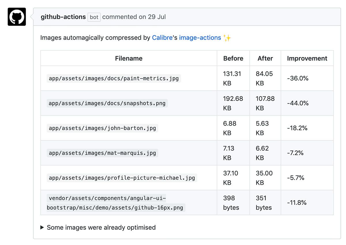
It’s that ecosystem of tasks that I would think makes this especially interesting. “Democratizing DevOps,” if I’m feeling saucy. Karolina Szczur and Ben Schwarz’s new action to automatically optimize all images in a pull request showcases that. This makes it almost trivially easy to add to any Git(Hub)-based workflow and has huge obvious wins. Perhaps the future is peicing together our own pipelines from open-source efforts like this as needed.

Looks nice, eh?

Direct Link to ArticlePermalink

The post Automatically compress images on Pull Requests appeared first on CSS-Tricks.

Categories: Designing, Others Tags:

How AI Is Helping Solve Climate Change

September 19th, 2019 No comments
An iceberg melting due to climate change

How AI Is Helping Solve Climate Change

How AI Is Helping Solve Climate Change

Nicholas Farmen

2019-09-19T13:00:59+02:002019-09-19T12:06:21+00:00

Have you heard of the French artist Marcel Duchamp? One of his most famous works is the “fountain” which was created from an ordinary bathroom urinal. In simply renaming this common object, Duchamp successfully birthed a completely new style of art.

The same can be done with AI. Why do humans only have to use this powerful invention to solve business-related issues? Why can’t we think a little more like Duchamp and use this ‘all-powerful’ technology to solve one of the scariest problems that mankind has ever faced?

The Global Threat Of Climate Change

If you’ve read any recent reports and predictions about the future of our climate, you’ve probably realized that mankind is running out of time to find a solution for the global threat of climate change. In fact, a recent Australian policy paper proposed a 2050 scenario where, well, we all die.

To those who aren’t scared of water levels rising 25 meters by 2050, there have been other studies that suggest human hardships are right around the corner. In March of 2012, the World Water Assessment Programme predicted that by 2025, 1.8 billion people on earth will be living in regions with absolute water scarcity.

So what data and research is leading scientists to believe there will be a water or food apocalypse scenario in the future?

According to NASA, the main cause of climate change is the rising amount of greenhouse gases in our atmosphere. And sadly, ‘mother earth’ is not doing this all by herself.

In 1830, humans began engaging in activities that released greenhouse gases, contributing to the rising temperatures that we are feeling today. Some of these activities I refer to include the burning of fossil fuels, the pollution of oceans, and deforestation. However, even the mass production of beef is contributing to climate change.

Now, you may be wondering how humans could combat and limit our greenhouse gas emissions. Obviously, we should be limiting all of the activities that I alluded to above. This would mean limiting our electricity, coal, and oil usage, planting trees, and sadly for many, giving up steak dinners altogether.

But would all of this be enough to undo centuries of atmospheric pollution? Is all of this even accomplishable before humans are forced to face the extinction of their species? I don’t know. Humans haven’t even been able to cease the production of beef, let alone our daily oil-guzzling automobiles and airplanes.

If only there was a very intelligent software that could run some emissions numbers, and tell us if all of these efforts would be enough to prevent future disaster scenarios…

An iceberg melting due to climate change

Melting icebergs, a symbol of global warming. (Image source: Unsplash) (Large preview)

AI Approaches And Environmental Use Cases

Solving any problem takes time. With climate change, it took scientists about 40 years to to gain any sort of understanding of the problem. And that’s fair — humans had to first study the climate to make sure climate change existed, then study the causes of climate change to see the role humans have played. But where are we today after all of this study? Still studying.

And the problem with climate change is that time is not on our side — mankind has to find and implement some solutions relatively fast. That’s where AI could help.

To date, there are two different approaches to AI: rules-based and learning-based. Both AI approaches have valid use cases when it comes to studying the environment and solving climate change.

Rules-based AI are coded algorithms of if-then statementsthat are basically meant to solve simple problems. When it comes to the climate, a rules-based AI could be useful in helping scientists crunch numbers or compile data, saving humans a lot of time in manual labor.

But a rules-based AI can only do so much. It has no memory capabilities — it’s focused on providing a solution to a problem that’s defined by a human. That’s why learning-based AI was created.

Learning-based AI is more advanced than rules-based AI because it diagnoses problems by interacting with the problem. Basically, learning-based AI has the capacity for memory, whereas rules-based AI does not.

Here’s an example: let’s say you asked a rules-based AI for a shirt. That AI would find you a shirt in the right size and color, but only if you told it your size and preferences. If you asked a learning AI for a shirt, it would assess all of the previous shirt purchases you’ve made over the past year, then find you the perfect shirt for the current season. See the difference?

When it comes to helping solve climate change, a learning-based AI could essentially do more than just crunch CO2 emission numbers. A learning-based AI could actually record those numbers, study causes and solutions, and then recommend the best solution — in theory.

AI Impacting Climate Change, Today

To most, AI is buzz word used to describe interesting tech software. But to the companies below, AI is starting to be seen as a secret weapon.

SilviaTerra

Forests are important for our climate. The carbon dioxide that’s emitted by many human activities is actually absorbed by trees. So if we just had more trees.

This is why SilviaTerra was brought to life.

Powered by the funds and technology of Microsoft, SilviaTerra uses AI and satellite imaging to predict the sizes, species, and health of forest trees. Why is this important? It means that conservationists are saved countless hours of manual fieldwork. It also means that we can help trees grow bigger, stronger, and healthier, so they can continue to help our climate.

DeepMind

Sometimes, we may ask ourselves, “What can’t Google do?” Well, it turns out Google can’t really do everything.

Looking to improve their costs (and potentially their carbon footprint), Google turned to a company called DeepMind. Together, the two companies developed an AI that would teach itself how to use only the bare minimum amount of energy necessary to cool Google’s data centers.

The result? Google was able to cut the amount of energy they use to cool their data centers by 35%. But that may not even be the coolest part! DeepMind’s co-founder, Mustafa Suleyman, said that their AI algorithms are general enough to where the two companies may be able to use them for other energy-saving applications in the future.

An AI robot

Although AI is still very controversial among many, it’s difficult not to agree on how it can help to improve sales, productivity, and even customer service. (Image source: Unsplash) (Large preview)

Green Horizon Project

All of you data-lovers out there know that it’s hard to say you’re impacting something if you’re unable to measure your impact. This is why the Green Horizon Project came about.

IBM‘s Green Horizon Project is an AI that creates self-configuring weather and pollution forecasts. IBM created the project with the hope that they could help cities become more efficient, one day.

Their aspirations became a reality in China. Between 2012 and 2017, IBM’s Green Horizon Project helped the city of Beijing decrease their average smog levels by 35%.

CycleGANs

So here’s a term you may never heard of in your life: “GAN.” It stands for Generative Adversarial Network. Basically, it’s a network that generates statistics or information without you having to do anything.

Why is the term important? Because automation is important when you have limited time and resources to solve a problem.

Intellectuals of Cornell University used GANs to create an AI to train itself to produce images that portray geographical locations before and after extreme weather events. The visuals produced by this AI could help scientists predict the impacts of certain climate changes, helping humans prioritize our combative efforts.

Software With The Potential To Impact Climate Change

In studying the number of AI that is already being used to have a positive impact on climate change, you may be thinking that we don’t need any more new software. And maybe you’re not wrong — why don’t we repurpose the software we do have?

With that being said, here are a few software with the potential to be secret weapons:

Airlitix

Airlitix is an AI and machine-learning software that is currently being used in drones. While it was originally developed to automate greenhouse management processes, it could quite easily be used to manage the health of national forests. Airlitix has the capacity to not only collect temperature, humidity, and carbon dioxide data, but the AI can also analyze soil and crop health.

But with humans needing to plant over 1.2 trillion trees to combat climate change, we should consider automating our efforts further. Instead of taking the time to tend to national parks, the Airlitix software could be built upon so that drones could plant our trees, release plant nutrients, or even deter forest arsonists.

A drone in a national park

Too many times, drones have proved to be useful during times of natural disasters. (Image source: Unsplash) (Large preview)

Google Ads

Both Google and Facebook have very powerful AI software that they currently use to create relevant consumer ads using consumer browsing data. In fact, Google’s AI ‘Google Ads’ has helped their company earn hundreds of billions in revenue.

While revenue is cool, the Google Ads algorithm currently promotes consumer purchases relatively objectively. Imagine if the AI could be rewritten to prioritize the ads of companies that are offering sustainable products and services.

Nowadays, there isn’t much competition for Google. There’s Bing, Yahoo, DuckDuckGo, and AOL. (Out of the people I know, I don’t know any that use AOL.) If you’re feeling fearless, maybe you could develop a new search engine that helps connect consumers with environmentally-friendly companies.

Sure, it would be hard to compete with companies as large as Google, but you don’t have to compete forever to make a profit. There’s always a chance your startup gets acquired, and then you ride off into the sunset.

AlphaGo

While AlphaGo is an AI software that could help scientists find the next ‘wonder drug,’ it was originally created by DeepMind to teach itself how to master the game of chess. After beating the world’s best chess players, the AlphaGo AI has since moved on to conquer the strategy of more complex board games.

But what do board games have to do with climate change? Well, if the AlphaGo AI can outsmart humans in a game of chess, maybe it can outsmart us in coming up with creative ways to limit and reduce the number of greenhouse gases in our atmosphere.

Future Outlook For AI And Climate

As I see it, the purpose of AI is to assist mankind in solving problems. Climate change has proven to be a complex problem that humans are becoming great at studying, but I have yet to see a very positive future-outlook from environmentalists in the news.

If not to help humans influence climate change directly, couldn’t we use AI to portray doomsday scenarios that scare the world into coming together? Could we use AI to portray positive potential outlooks that would be possible if people were to do more in their daily lives to help triage climate issues?

Even with the latest Amazon fires, I didn’t see any tweets about the idea of using drones to combat the spread of flames. It’s clear to me that even with all of the impressive AI software and tech available to humans today, environmental use cases are still not widespread knowledge.

So my advice to readers is to try the ‘Duchamp approach’ — today. Consider the AI and tech that you use or develop regularly, and see if there’s a way to reimagine it. Who knows, you may be the one to solve a problem that has stumped some of the best climatologists and scientists of our time.

How Improving Website Performance Can Help Save The Planet

Climate change may not seem like an issue that should concern web developers, but the truth is that our work does have a carbon footprint, and it’s about time we started to think about that. ?

(cc, yk, il)
Categories: Others Tags:

Web Developer Search History

September 18th, 2019 No comments

Sophie Koonin blogged “Everything I googled in a week as a professional software engineer,” which was a fascinating look into the mind of a web developer and what they need to look up during day-to-day work. We all joke that we just Google stuff (or StackOverflow stuff) we don’t know off the bat and copy and paste, but this is more to the heart of it.

A few just from one day:

react-apollo release notes
jest silence warnings – don’t judge me, ok?
semantic HTML contact details – wanted to check if the

tag was relevant here
dominos accessibility – popcorn.gif

Gift Egwuenu followed up with “The Art of Googling.”

A few:

  • Filter an Array with JavaScript – I was working on a chore and needed to see how the filter method works
  • Take a screenshot on Mac
  • Center a div with Grid
  • Undo a git commit
  • Grid with React Native – checking if this was a thing with React Native

Reading these, I alternate from “eeeeesh, good luck” to “I wish I could have been there because I could have probably helped.”

This is a fun little blogging trend I’d love to see more people do. (Reminds me of that “How we do CSS at [company]” thing.)

I’ll do my last few days, unearthed from Google’s My Activity area, filtered to search-only.

This was just a couple of hours yesterday morning, with some noise and distracting stuff removed:

  • Sara Vieira – Was looking for her Twitter to credit a tweet.
  • javascript closest – Was looking for the DOM version rather than the jQuery version
  • jquery parent – Confirming that was a real API it had
  • minimap moz element – Finding an article that was a great use case for the
  • element() function in CSS
  • web unleashed – Going to this conference later in the week and needed to look at the site
  • server log analytics
  • states in australia
  • view html source in spark mail
  • bat crypto
  • html validator
  • html unescape
  • should email html have title?
  • window.scrollto
  • useCallback
  • rails rss feed content type
  • content type for rss feeds
  • river city girls

You next! You next!

The post Web Developer Search History appeared first on CSS-Tricks.

Categories: Designing, Others Tags:

How Web Content Can Affect Power Usage

September 18th, 2019 No comments

Because we know that all people with battery-powered devices are constantly concerned about their battery levels, and that websites are significant consumers of that battery power, we should probably think about this stuff a lot more than we do.

I’d expect the browser itself to be our main ally here, doing smart things to reduce power consumption without us developers needing to think too much about it. But we’ve learned over the years that it’s always a shared responsibility. We regularly need to help the browser do its job the best it can (think responsive images and will-change).

Some direct tips from Benjamin Poulain and Simon Fraser’s article:

  • Minimize the use of timers to avoid waking up the CPU. Try to coalesce timer-based work into a few, infrequent timers. Lots of uncoordinated timers which trigger frequent CPU wake-ups are much worse than gathering that work into fewer chunks.
  • Minimize continually animating content, like animated images and auto-playing video. Be particularly vigilant to avoid “loading” spinner GIFs or CSS animations that continually trigger painting, even if you can’t see them. IntersectionObserver can be used to run animations only when they are visible.
  • Use declarative animations (CSS Animations and Transitions) where possible. The browser can optimize these away when the animating content is not visible, and they are more efficient than script-driven animation.
  • Avoid network polling to obtain periodic updates from a server. Use WebSockets or Fetch with a persistent connection, instead of polling.

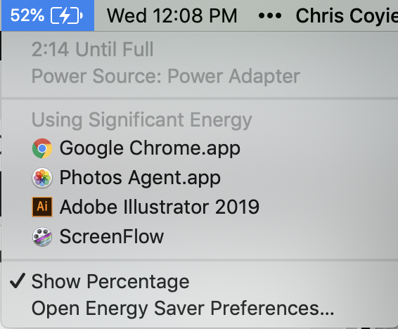
I’d like to see more developer tooling along the lines of how macOS makes it easy to see apps that are demanding significant power:

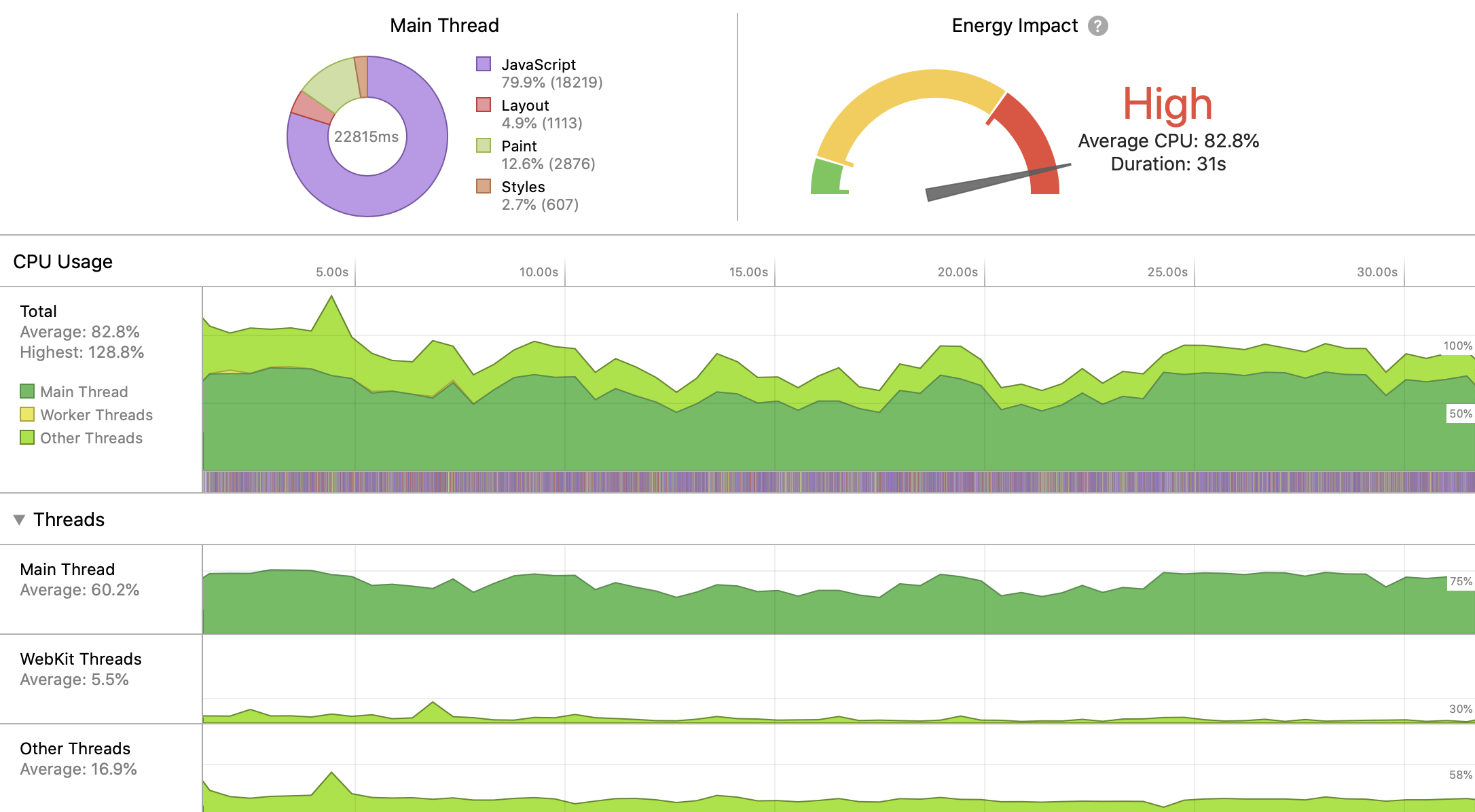
WebKit DevTools does has it:

We used to have a Battery Status API, but that’s been deprecated, so not a big part of the story right now.

I was just at the Web Unleashed conferencewhere Kyle Simpson talked about this rather directly in his keynote lecture. His main idea is that we should ask users a bit more directly and solicit their preferences. Hey user, are you in a situation where you want to use as little battery power as possible? Tell us and we’ll do what we can to make that happen (even on a site-by-site basis).

Direct Link to ArticlePermalink

The post How Web Content Can Affect Power Usage appeared first on CSS-Tricks.

Categories: Designing, Others Tags: