Weaving One Element Over and Under Another Element
In this post, we’re going to use CSS superpowers to create a visual effect where two elements overlap and weave together. The epiphany for this design came during a short burst of spiritual inquisitiveness where I ended up at The Bible Project’s website. They make really cool animations, and I mean, really cool animations.
My attention, however, deviated from spiritualism to web design as I kept spotting these in-and-out border illustrations.
I wondered if a similar could be made from pure CSS… and hallelujah, it’s possible!
See the Pen
Over and under border design using CSS by Preethi Sam (@rpsthecoder)
on CodePen.
The principal CSS standards we use in this technique are CSS Blend Modes and CSS Grid.
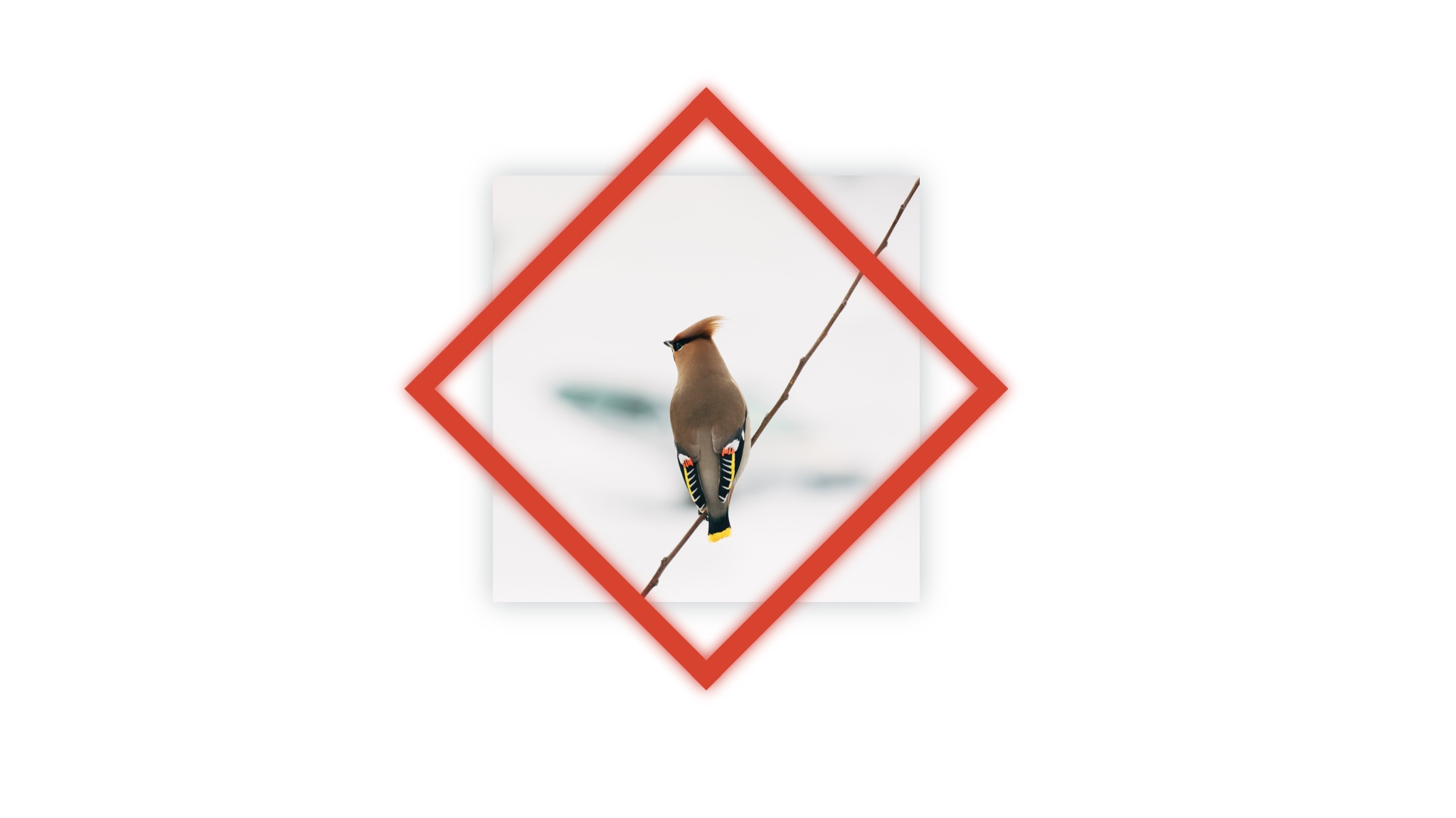
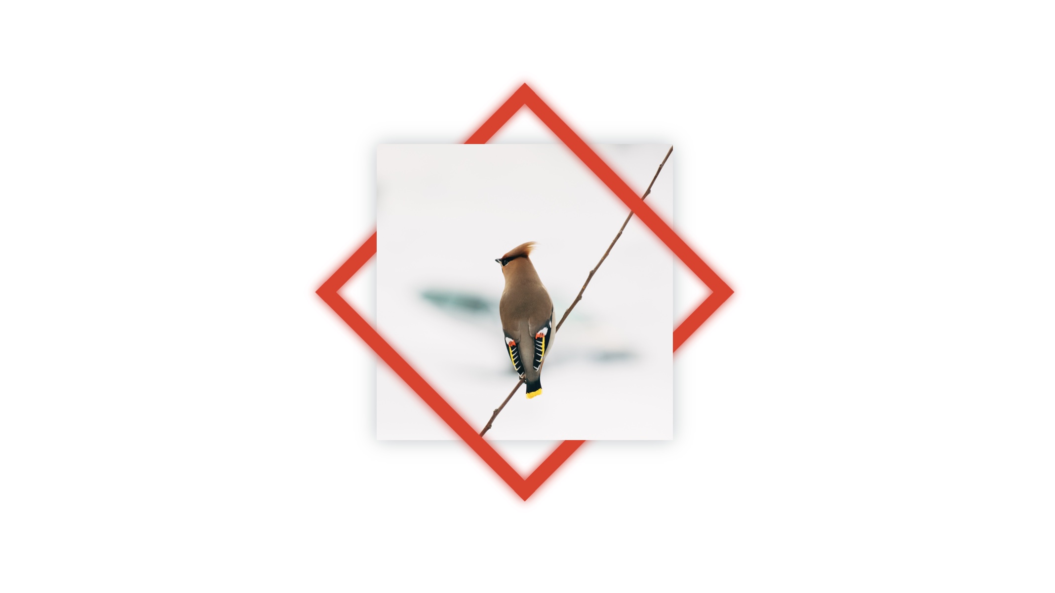
First, we start with an image and a rotated frame in front of that image.
<div class="design">
  <img src="bird-photo.jpg">
  <div class="rotated-border"></div>
</div>
.design {
position: relative;
height: 300px;
width: 300px;
}
.design > * {
position: absolute;
height: 100%;
width: 100%;
}
.rotated-border {
box-sizing: border-box;
border: 15px #eb311f solid;
transform: rotate(45deg);
box-shadow: 0 0 10px #eb311f, inset 0 0 20px #eb311f;
}The red frame is created using border. Its box-sizing is set to include the border size in the dimensions of the box so that the frame is centered around the picture after being rotated. Otherwise, the frame will be bigger than the image and get pulled towards the bottom-right corner.
Then we pick a pair of opposite corners of the image and overlay their quadrants with their corresponding portion in a copy of the same image as before. This hides the red frame in those corners.
We basically need to make a cut portion of the image that looks like below to go on top of the red frame.
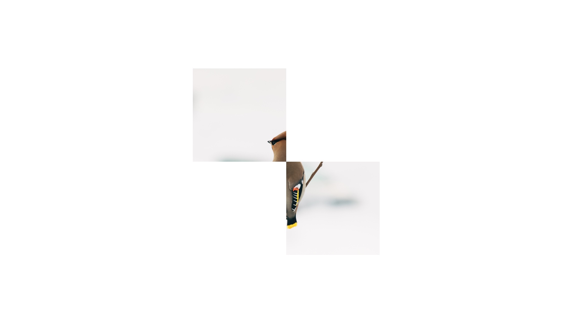
.rotated-border element.So, how do we alter the image so that only two quadrants of the image are visible? CSS Blend Modes! The multiply value is what we’re going to reach for in this instance. This adds transparency to an element by stripping white from the image to reveal what’s behind the element.
Chris has a nice demo showing how a red background shows through an image with the multiply blend mode.
See the Pen
Background Blending by Chris Coyier (@chriscoyier)
on CodePen.
OK, nice, but what about those quadrants? We cover the quadrants we want to hide with white grid cells that will cause the image to bleed all the way through in those specific areas with a copy of the bird image right on top of it in the sourcecode.
<div id="design">
    <img src="bird-photo.jpg">
    <div class="rotated-border"></div>

    <div class="blend">
      <!-- Copy of the same image -->
      <img src="bird-photo.jpg">
      <div class="grid">
        <!-- Quadrant 1: Top Left -->
        <div></div>
        <!-- Quadrant 2: Top Right -->
        <div data-white></div>
        <!-- Quadrant 3: Bottom Left -->
        <div data-white></div>
        <!-- Quadrant 4: Bottom Right -->
        <div></div>
      </div>
    </div>

</div>
.blend > * {
position: absolute;
height: 100%;
width: 100%;
}
/* Establishes our grid */
.grid {
display: grid;
grid: repeat(2, 1fr) / repeat(2, 1fr);
}
/* Adds white to quadrants with this attribute */
[data-white]{
background-color: white;
}The result is a two-by-two grid with its top-right and bottom-left quadrants that are filled with white, while being grouped together with the image inside .blend.
To those of you new to CSS Grid, what we’re doing is adding a new .grid element that becomes a “grid” element when we declare display: grid;. Then we use the grid property (which is a shorthand that combines grid-template-columns and grid-template-rows) to create two equally spaced rows and columns. We’re basically saying, “Hey, grid, repeat two equal columns and repeat two equal rows inside of yourself to form four boxes.”
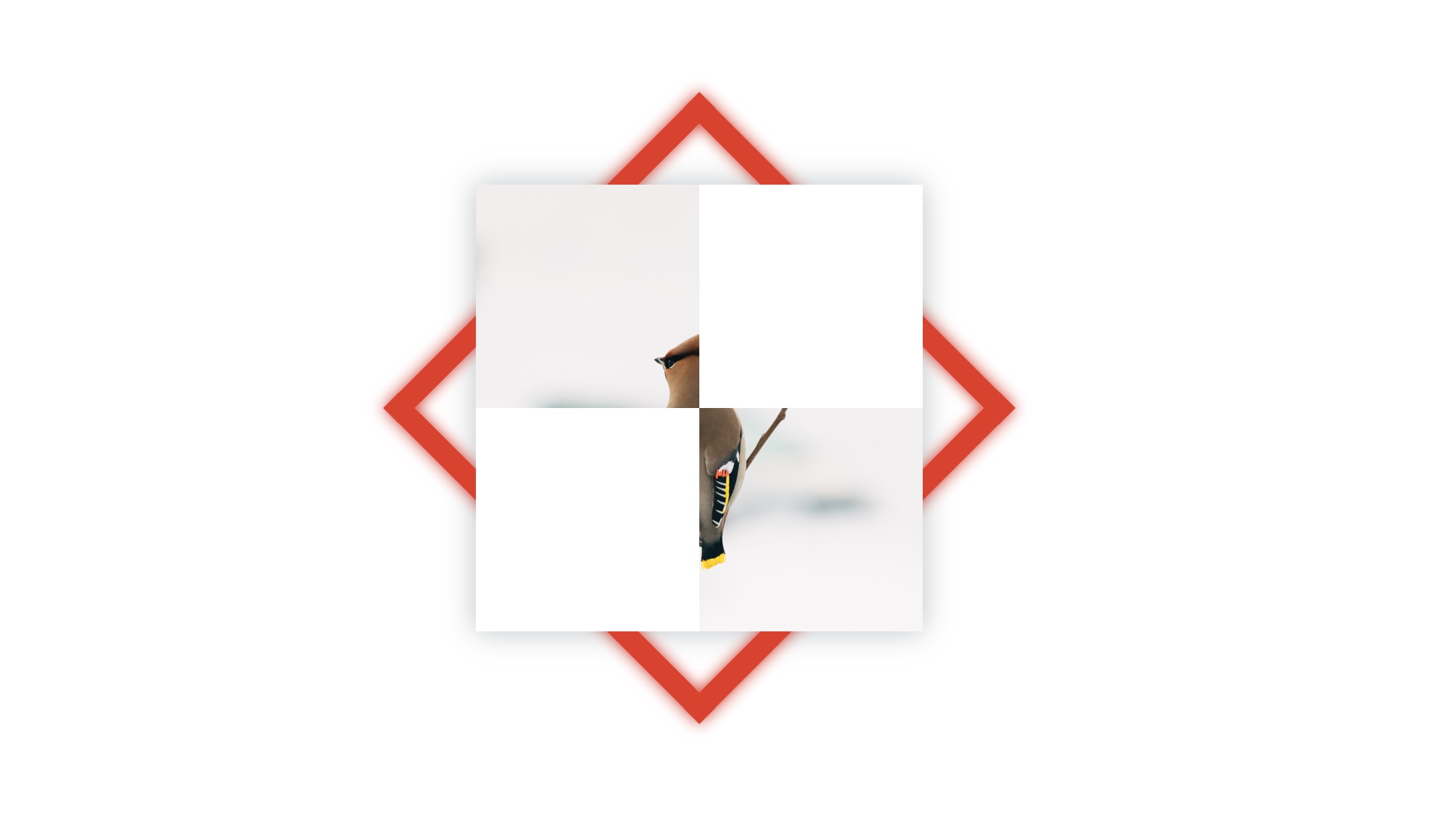
Now we apply the multiply blend mode to .blend using the mix-blend-mode property.
.blend { mix-blend-mode: multiply; }The result:
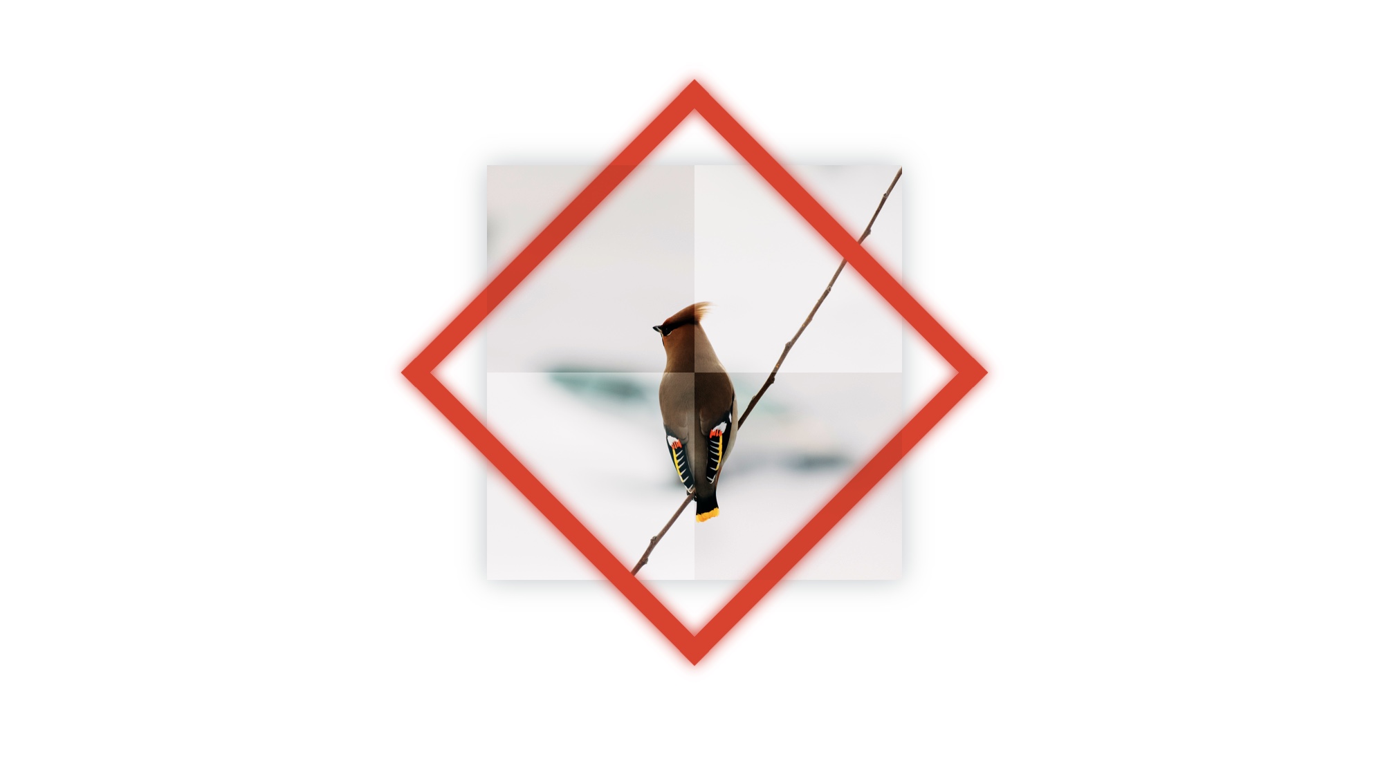
As you can see, the blend mode affects all four quadrants rather than just the two we want to see through. That means we can see through all four quadrants, which reveals all of the red rotated box.
We want to bring back the white we lost in top-left and bottom-right quadrants so that they hide the red rotated box behind them. Let’s add a second grid, this time on top of .blend in the sourcecode.
<div id="design">
  <img src="bird-photo.jpg">
  <div class="rotated-border"></div>

  <!-- A second grid  -->
  <!-- This time, we're adding white to the image quandrants where we want to hide the red frame  -->
  <div class="grid">
    <!-- Quadrant 1: Top Left -->
    <div data-white></div>
    <!-- Quadrant 2: Top Right -->
    <div></div>
    <!-- Quadrant 3: Bottom Left -->
    <div></div>
    <!-- Quadrant 4: Bottom Right -->
    <div data-white></div>
  </div>

  <div class="blend">
    <img src="bird-photo.jpg">
    <div class="grid">
      <!-- Quadrant 1: Top Left -->
      <div></div>
      <!-- Quadrant 2: Top Right -->
      <div data-white></div>
      <!-- Quadrant 3: Bottom Left -->
      <div data-white></div>
      <!-- Quadrant 4: Bottom Right -->
      <div></div>
    </div>
  </div>

</div>
The result!
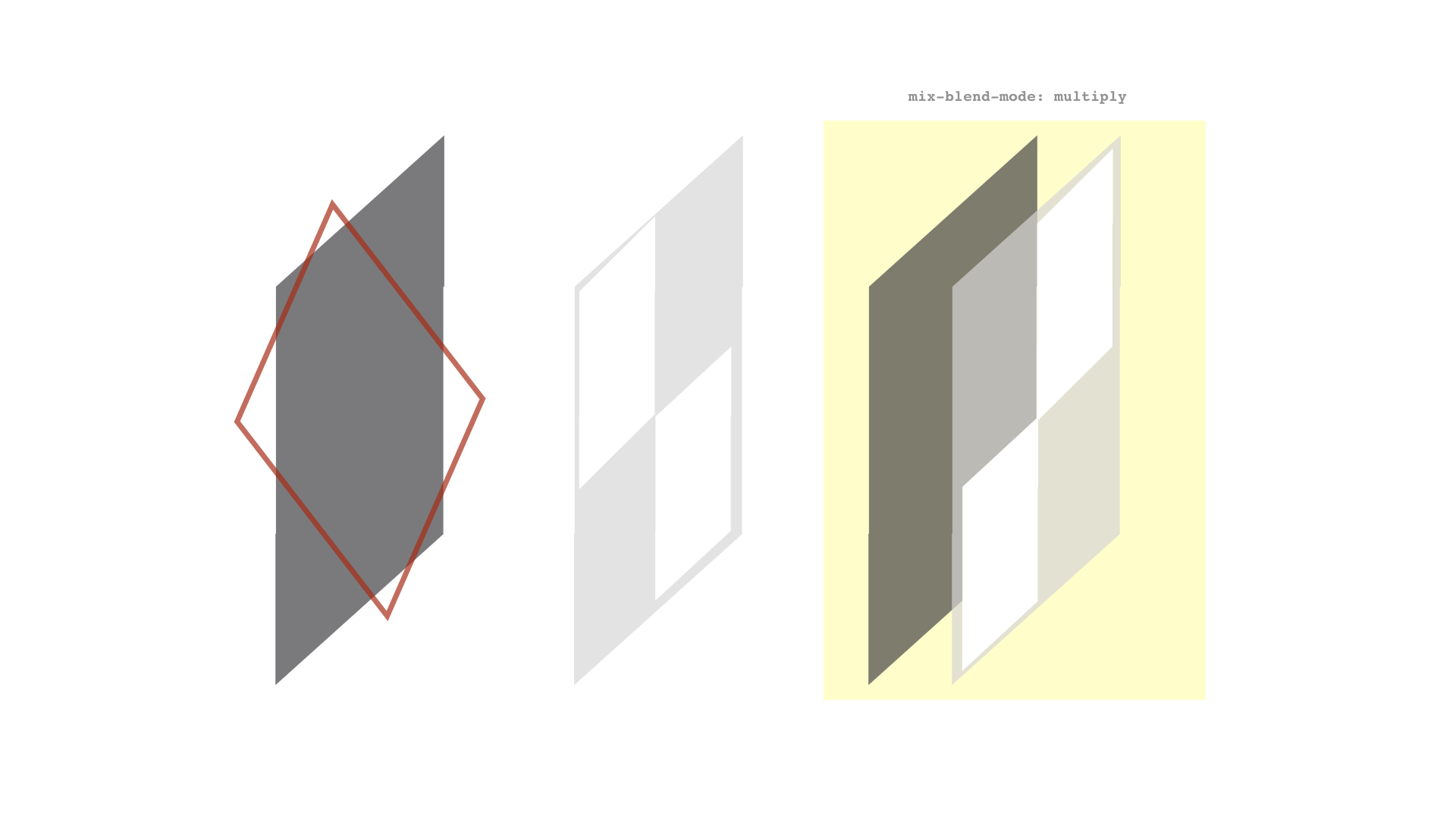
Summing up, the browser renders the elements in our demo like this:
??
- ??At bottommost is the bird image (represented by the leftmost grey shape in the diagram below)
- ??Then a rotated red frame
- ??On top of them is a grid with top-left and bottom-right white cells (corners where we don’t want to see the red frame in the final result)
- ??Followed by a copy of the bird image from before and a grid with top-right and bottom-left white cells (corners where we do want to see the red frame) – both grouped together and given the blending mode, multiply?.
You may have some questions about the approach I used in this post. Let me try to tackle those.
What about using CSS Masking instead of CSS Blend Modes?
For those of you familiar with CSS Masking – using either mask-image or clip-path – it can be an alternative to using blend mode.
I prefer blending because it has better browser support than masks and clipping. For instance, WebKit browsers don’t support SVG reference in the CSS mask-image property and they also provide partial support for clip-path values, especially Safari.
Another reason for choosing blend mode is the convenience of being able to use grid to create a simple white structure instead of needing to create images (whether they are SVG or otherwise).
Then again, I’m fully on board the CSS blend mode train, having used it for knockout text, text fragmentation effect… and now this. I’m pretty much all in on it.
Why did you use grid for the quadrants?
The white boxes needed in the demo can be created by other means, of course, but grid makes things easier for me. For example, we could’ve leaned on flexbox instead. Use what works for you.
Why use a data-attribute on the grid quadrant elements to make them white?
I used it while coding the demo without thinking much about it – I guess it was quicker to type. I later thought of changing it to a class, but left it as it is because the HTML looked neater that way… at least to me. 🙂
Is multiply the only blend mode that works for this example?
Nope. If you already know about blend modes then you probably also know you can use either screen, darken, or lighten to get a similar effect. (Both screen and lighten will need black grid cells instead of white.)
The post Weaving One Element Over and Under Another Element appeared first on CSS-Tricks.
