Archive

Archive for October, 2019

3 Essential Design Trends, November 2019

October 28th, 2019 No comments

There’s always a balance between visual design and functional design. Many of the “rules” of design as we know them exist to make visuals more functional.

That’s not exactly true of all of the techniques that are trending right now. But sometimes rules are made to be broken, right? You can take these trends in and decide whether they work for you or not. (There’s no right or wrong answer.)

Here’s what’s trending in design this month.

1. Obscured Text Elements

When it comes to text elements, the first thought is often readability. Not with this design trend.

More design projects are showcasing text elements that are partially obscured or hidden within other elements. And while these designs look pretty cool and are visually stunning, whether it actually works might be more debatable.

Each of the examples below uses this trend in a slightly different way.

Granyon Party uses oversized text in a layered design – background, text, animated illustration – where the words are hyphenated and in a layer behind design elements. While the obscured text is fairly easy to read, the addition of hyphenation and a monotone color palette makes it a little trickier.

Lafaurie Paris uses black text over an image layer with dark coloring, leaving little contrast between the two. This makes the main text element a challenge in terms of readability on an otherwise visually stunning design.

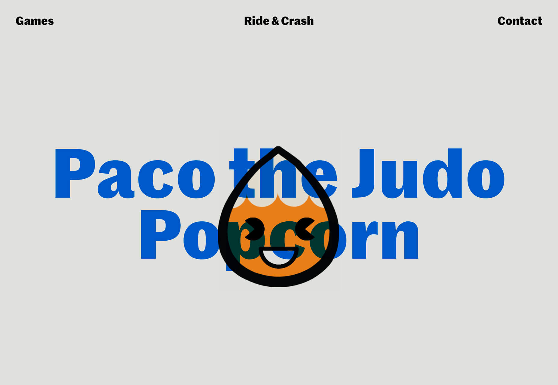
Ride & Crash’s Paco the Judo Popcorn has a text layer that’s behind a semitransparent animated illustration. It’s not too difficult to read, but does make you stop and really think about the words on the screen. Use of space helps draw focus and make it a little easier to digest.

With all of these examples, the design has to weigh big questions: Is the visual display worth losing readability? Will visitors understand and interact with the design?

2. Animated Spheres

Circles have always been a popular design element. They carry plenty of symbolism and meaning and can set the right tone for projects. Circles are also a little less rigid than hard-edged elements, such as buttons or calls to action.

Bigger spheres with animation are a solid way to draw users into design elements and focus the eye.

This trending element might be pure decoration or serve a more functional role.

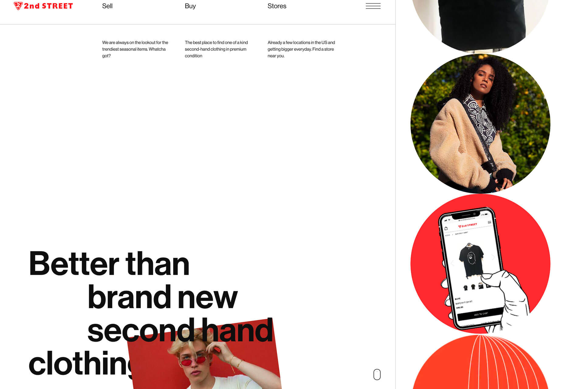
2nd Street uses large spheres down the right margin as a secondary level of navigation. The middle circles have a link and hover animation to help signal this action. The bottom circle is a decoration with movement that helps draw the eye and encourage users to move the mouse in that direction, activating the other circular buttons.

Eslam Said uses a large sphere in the center of the screen with simple movement to create visual interest in the portfolio website. The simple design and movement are hard to stop looking at with a soothing feel to them.

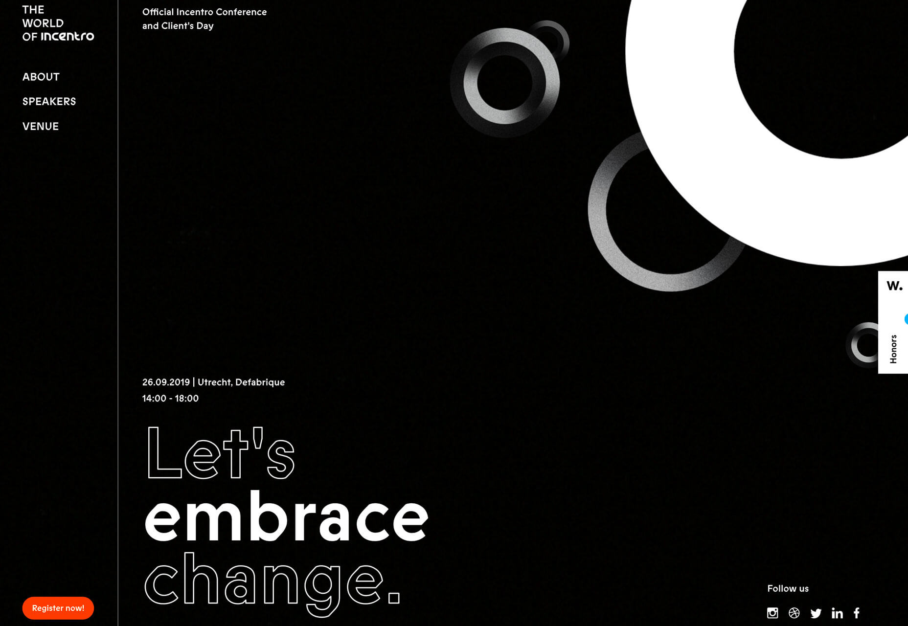
World of Incentro uses multiple spheres with small movements and subtle animation as a decorative element. Further, the design uses a red, circular cursor to encourage engagement with the design. (If you click around this site a little, you’ll also find that it makes use of the first trend mentioned here, with different layers of obscured text.)

3. Large Left Margins

This might be my personal favorite trend, as a fan of asymmetrical balance. These designs use large left margins and areas of whitespace opposite a more visually full right side with an art element that fades off the screen.

They create a beautifully imbalanced balance with visual weight that draws the eye across this screen.

But this style isn’t for everyone, especially if you really like more symmetry. The challenge with this style is how elements stack on smaller mobile or vertical screens. The result isn’t often as stunning as the desktop counterpart.

Ervaxx uses a simple animation paired with large bold text. The large font size offsets the weight of the animated blob on the right.

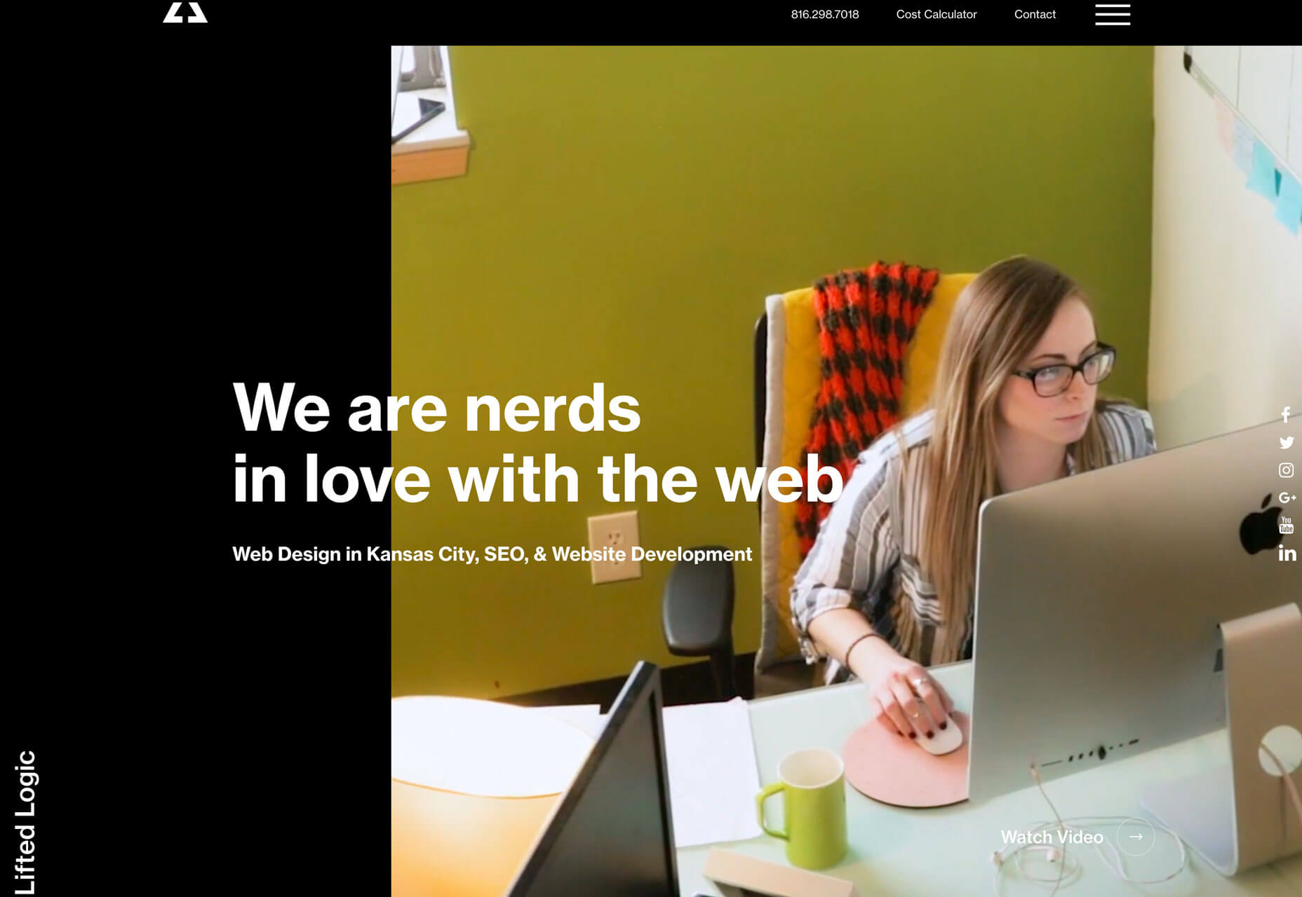
Lifted Logic carries a hero text element across white (ahem, black) space into a video. The use of space really pulls the eye across the text into the image and back.

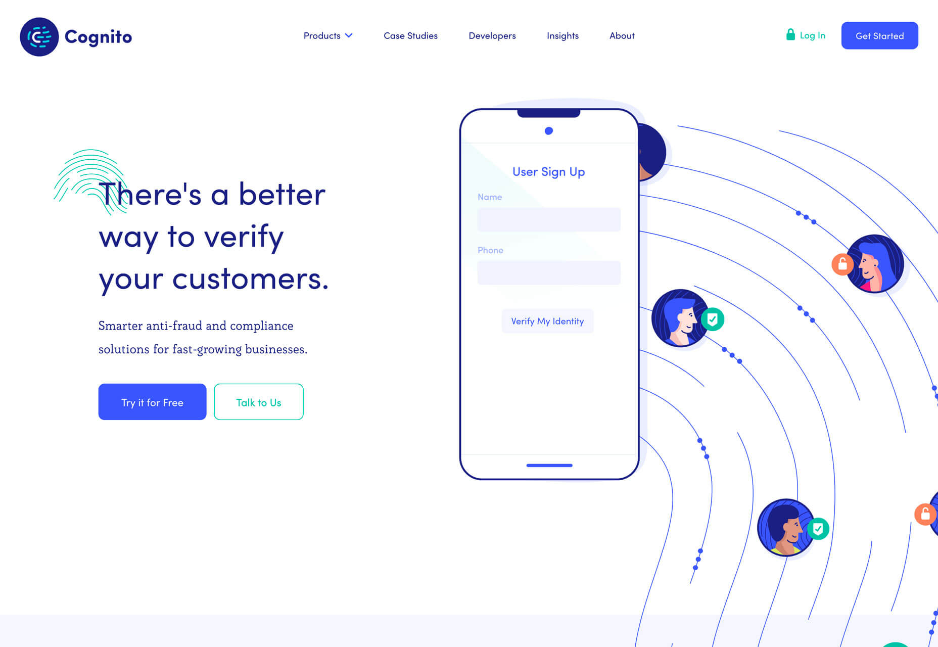
Cognito uses balanced weights with text and line illustrations across the screen. Space, here, makes the design feel a little less busy with a lot of elements to take in at once – navigation menu, headline, secondary text, two buttons, animated illustration, and a chat box.

Conclusion

It’s possible to love the look of a trendy design, but never use the technique because you don’t find that it works with your content or in a way that focuses on usability. And that’s ok. That’s the beauty of trends; they spark conversation and push all designers to think bigger and better.

Do you tend to be more of a visual or functional designer? Most of us have fairly distinct tendencies and it’s good food for thought.

Source

Categories: Designing, Others Tags:

Animated Position of Focus Ring

October 27th, 2019 No comments

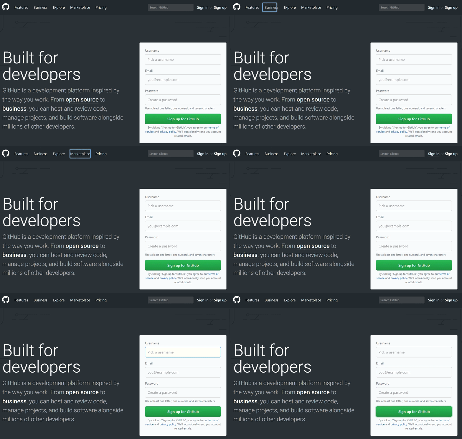
Maurice Mahan created FocusOverlay, a “library for creating overlays on focused elements.” That description is a little confusing at you don’t need a library to create focus styles. What the library actually does is animate the focus rings as focus moves from one element to another. It’s based on the same idea as Flying Focus.

I’m not strong enough in my accessibility knowledge to give a definitive answer if this is a great idea or not, but my mind goes like this:

  • It’s a neat effect.
  • I can imagine it being an accessibility win since, while the page will scroll to make sure the next focused element is visible, it doesn’t otherwise help you see where that focus has gone. Movement that directs attention toward the next focused element may help make it more clear.
  • I can imagine it being harmful to accessibility in that it is motion that isn’t usually there and could be surprising.

On that last point, you could conditionally load it depending on a user’s motion preference.

The library is on npm, but is also available as direct linkage thanks to UNPKG. Let’s look at using the URLs to the resources directly to illustrate the concept of conditional loading:

<link 
  rel="stylesheet" 
  href="//unpkg.com/focus-overlay@latest/dist/focusoverlay.css" 
  media="prefers-reduced-motion: no-preference"
/>

<script>
const mq = window.matchMedia("(prefers-reduced-motion: no-preference)");

if (mq.matches) {
  let script = document.createElement("script");
  script.src = "//unpkg.com/focus-overlay@latest/dist/focusoverlay.js";
  document.head.appendChild(script);
}
</script>

The JavaScript is also 11.5 KB / 4.2 KB compressed and the CSS is 453 B / 290 B compressed, so you’ve always got to factor that into as performance and accessibility are related concepts.

Performance isn’t just script size either. Looking through the code, it looks like the focus ring is created by appending a

to the that has a super high z-index value in which to be seen and pointer-events: none as to not interfere. Then it is absolutely positioned with top and left values and sized with width and height. It looks like new positional information is calculated and then applied to this div, and CSS handles the movement. Last I understood, those aren’t particularly performant CSS properties to animate, so I would think a future feature here would be to use animation FLIP to take advantage of only animating transforms.

The post Animated Position of Focus Ring appeared first on CSS-Tricks.

Categories: Designing, Others Tags:

Popular Design News of the Week: October 21, 2019 – October 27, 2019

October 27th, 2019 No comments

Every week users submit a lot of interesting stuff on our sister site Webdesigner News, highlighting great content from around the web that can be of interest to web designers.

The best way to keep track of all the great stories and news being posted is simply to check out the Webdesigner News site, however, in case you missed some here’s a quick and useful compilation of the most popular designer news that we curated from the past week.

Note that this is only a very small selection of the links that were posted, so don’t miss out and subscribe to our newsletter and follow the site daily for all the news.

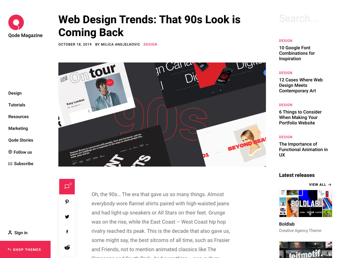
Web Design Trends: That 90s Look is Coming Back

Google Chrome will Block Mixed Content – Are You Ready for It?

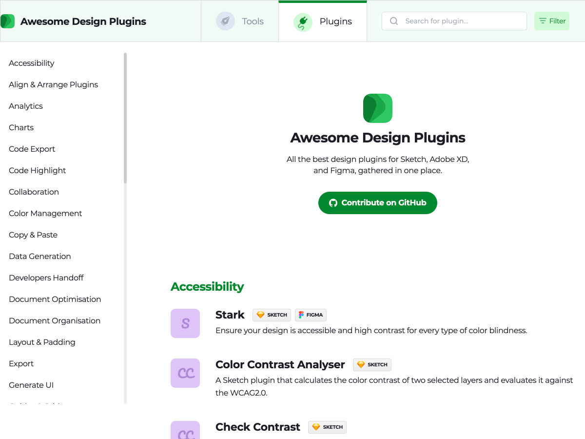
Awesome Design Plugins

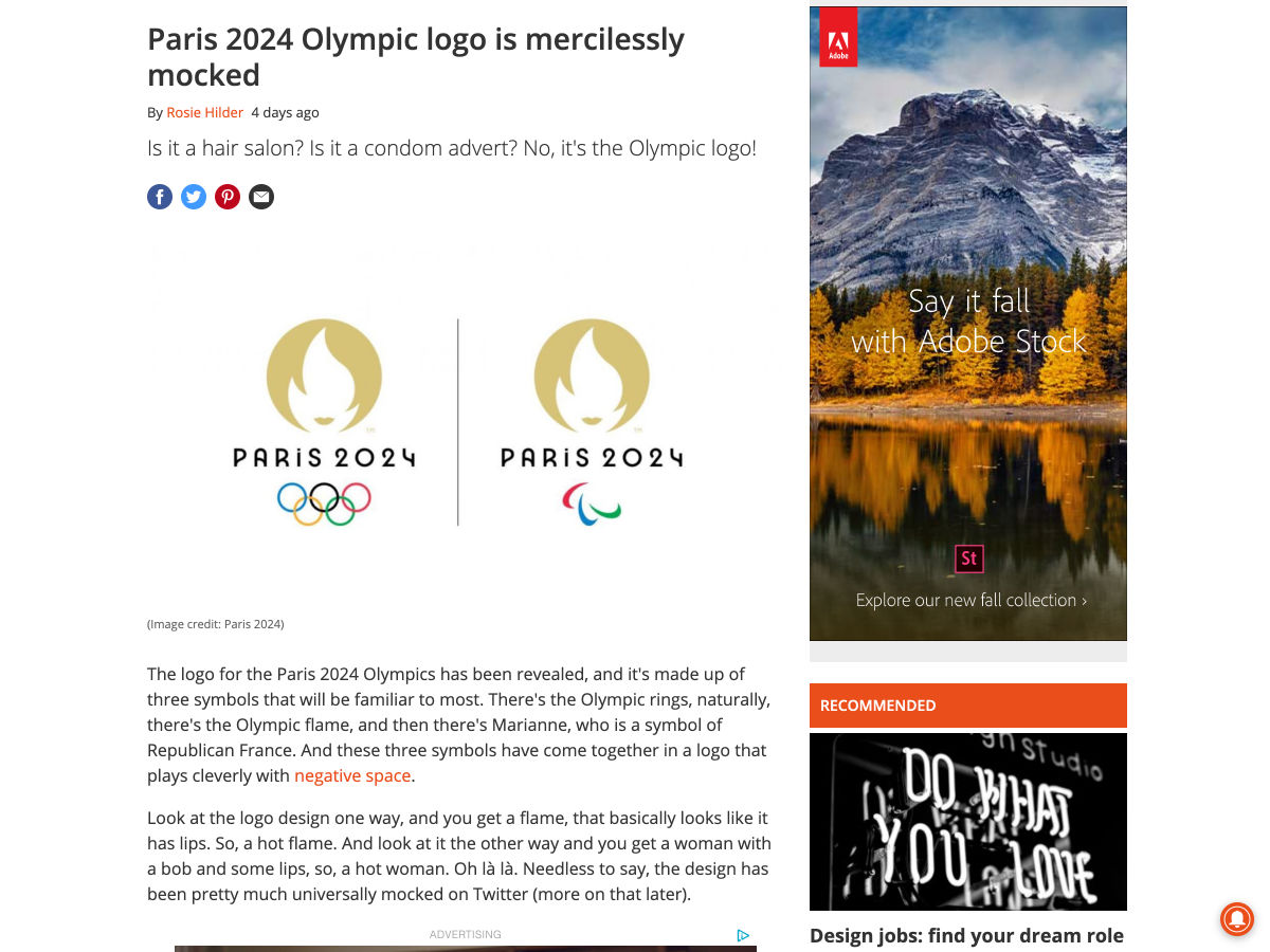
Paris 2024 Olympic Logo is Mercilessly Mocked

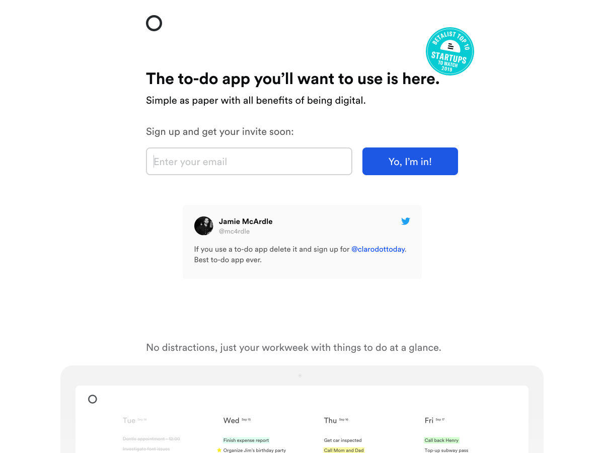
A New To-do-list App

Ghost 3.0

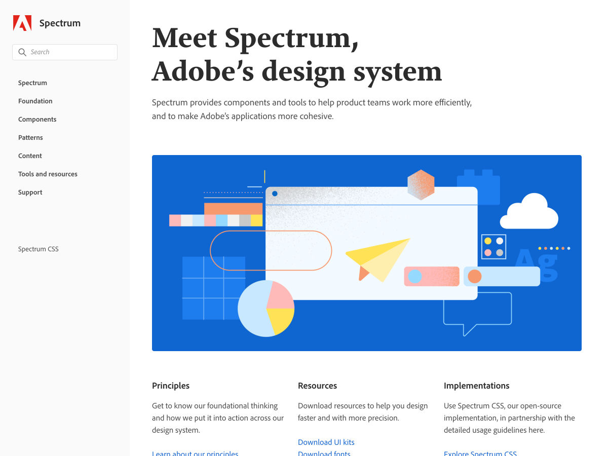
Spectrum, Adobe’s Design System

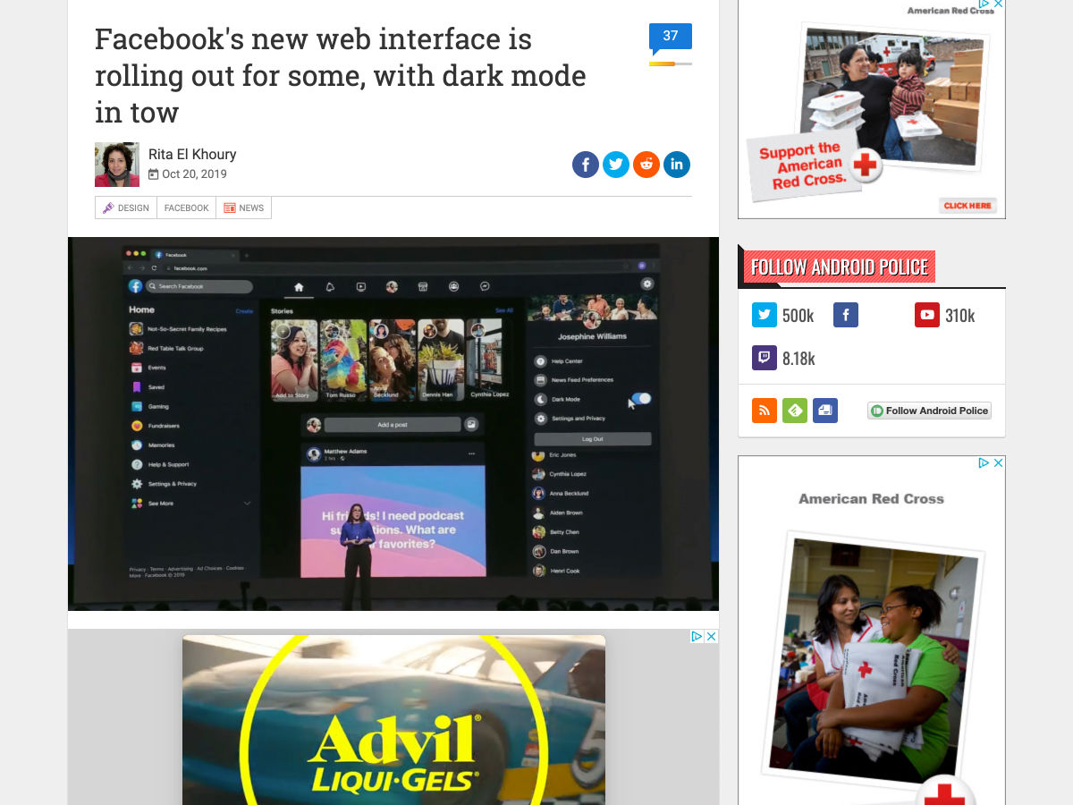
Facebook’s New Web Interface is Rolling Out for Some, with Dark Mode in Tow

The Five Inconvenient Truths of Web Design

8 Trends for Pairing Fonts in 2019

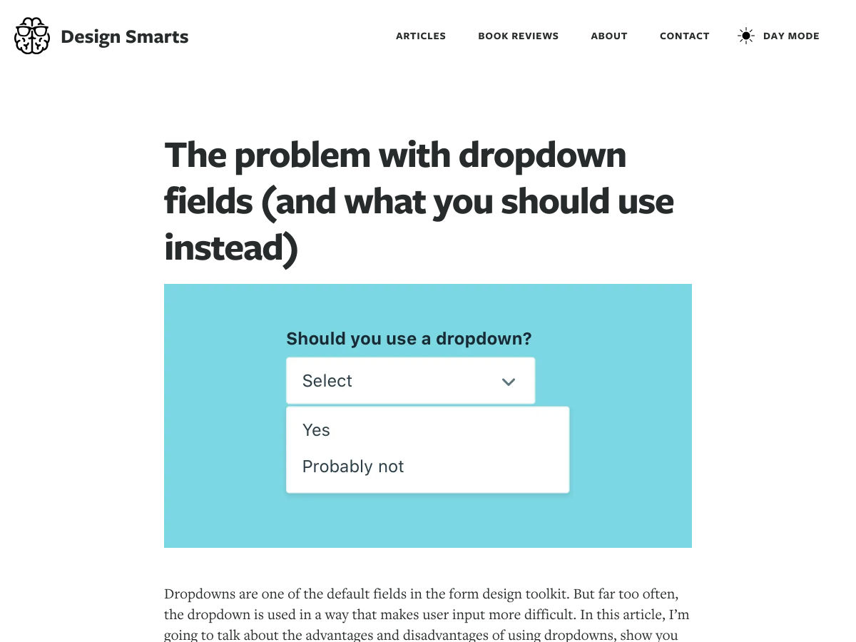
The Problem with Dropdown Fields (and What You Should Use Instead)

How to Choose a Font for a Project

New Tina CMS

YeahNo Bot

Isobuild – The First Exclusive Isometric Editor

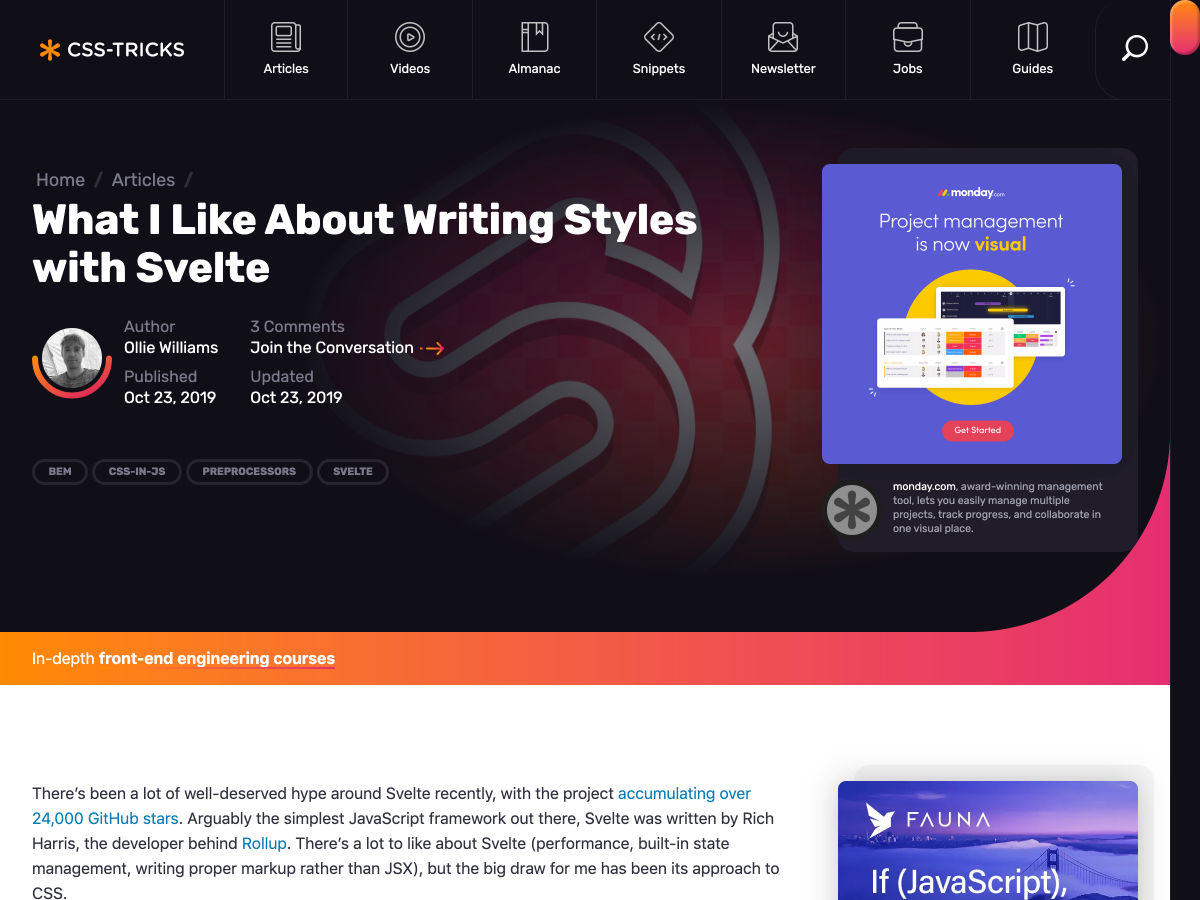
What I like About Writing Styles with Svelte

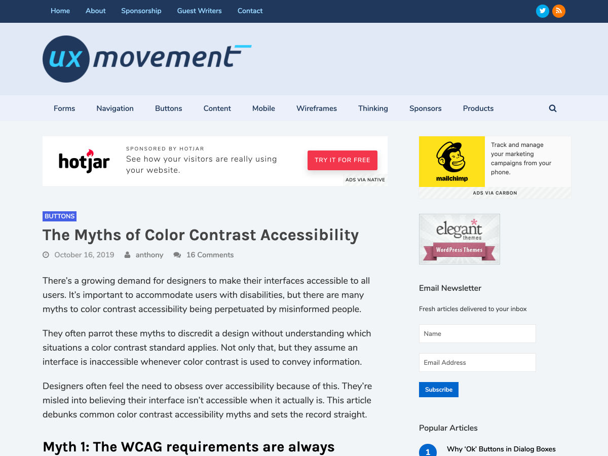
The Myths of Color Contrast Accessibility

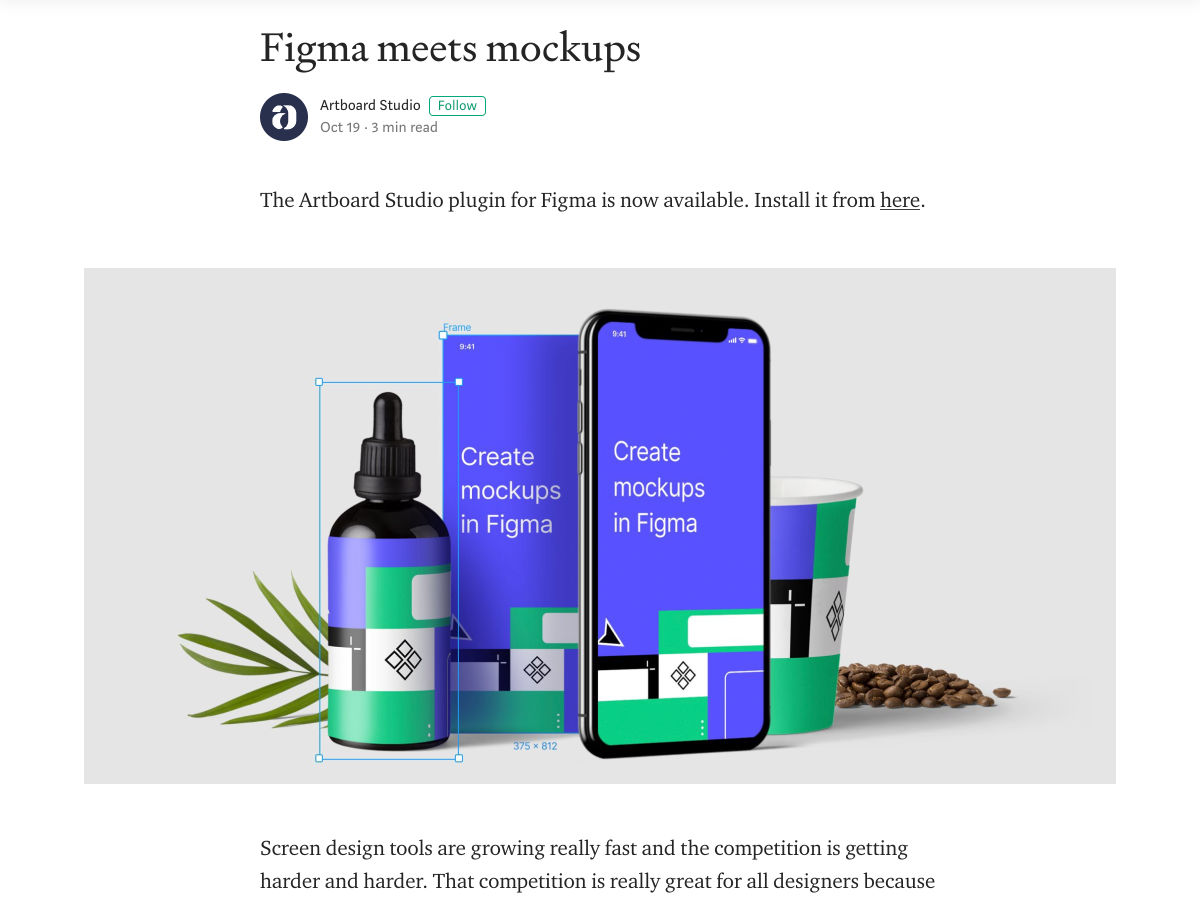
Figma Meets Mockups

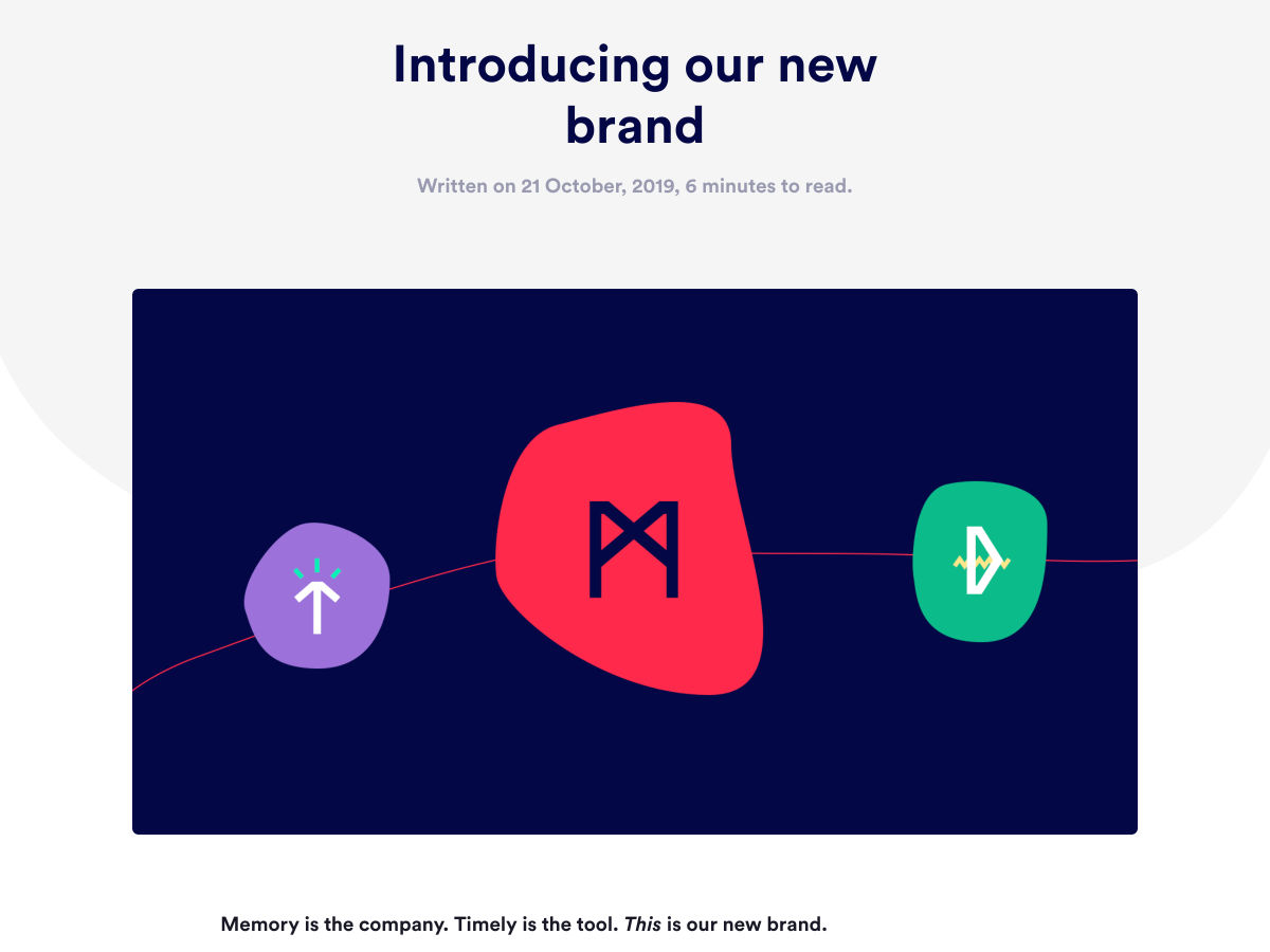
Memory – Introducing Our New Brand

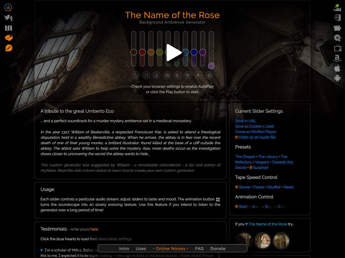
The Name of the Rose Background Ambience Generator

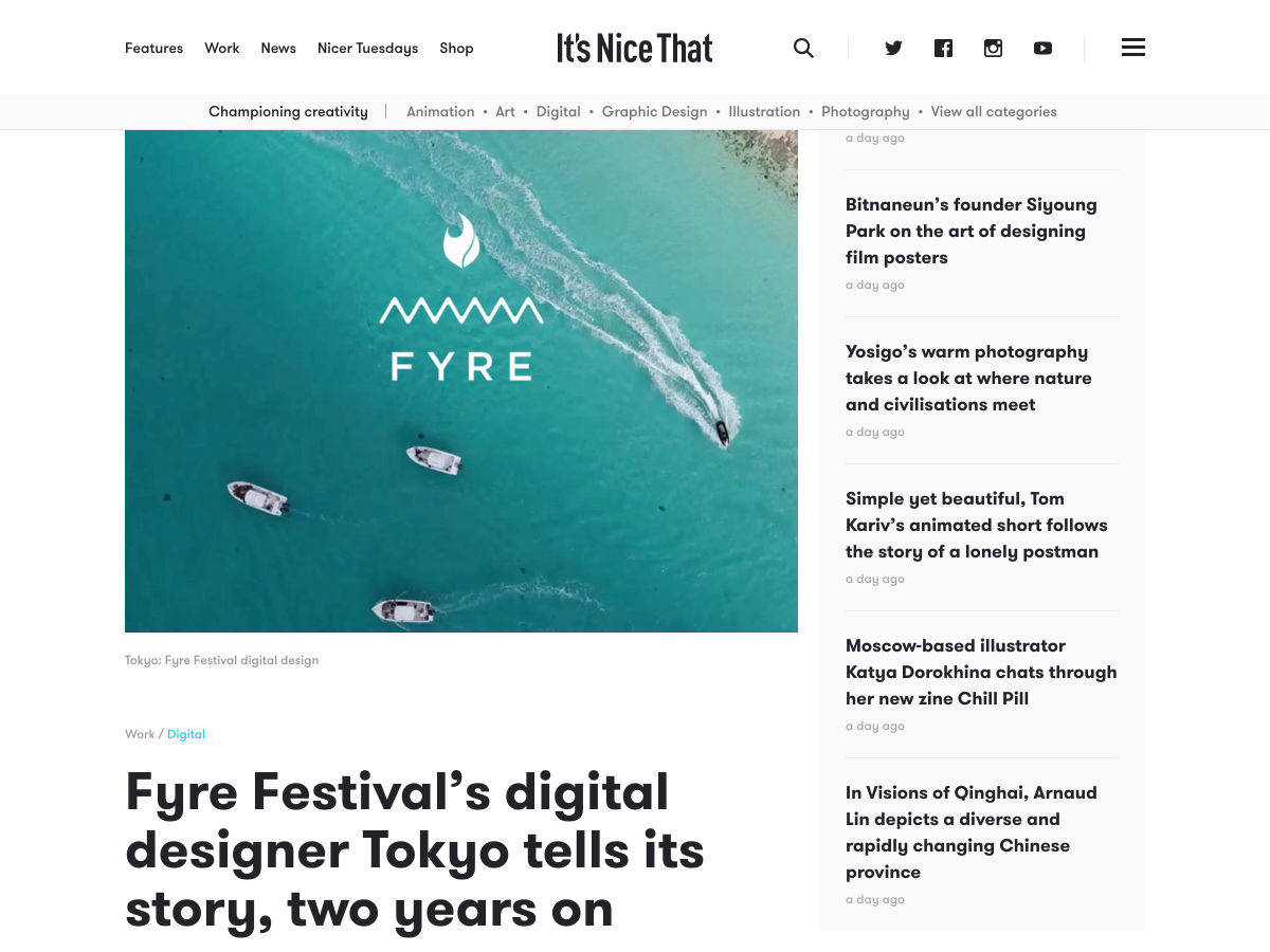
Fyre Festival’s Digital Designer Tokyo Tells its Story, Two Years on

The Internet of Creation Disappeared. Now We Have Surveillance and Control

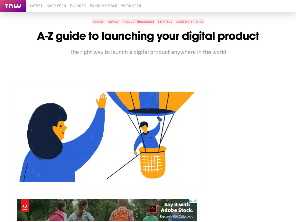
A-Z Guide to Launching your Digital Product

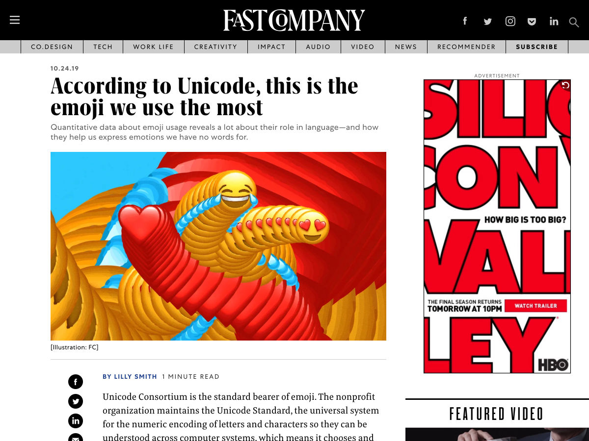
According to Unicode, this is the Emoji We Use the Most

Adobe and Amazon Launch Alexa Skill Aimed at Creatives, the Inspiration Engine

Want more? No problem! Keep track of top design news from around the web with Webdesigner News.

Source

Categories: Designing, Others Tags:

The Power of Visual Communication Tools in the World of Designers

October 26th, 2019 No comments

Visuals are a designer’s best friend. Think about it: this line of work is literally dependent on visuals, starting from creating prototypes to exchanging necessary feedback for product enhancements.

Designers do not see this world through words. They see it through the lens of creativity and innovation. So, when it comes to conveying a visual message to people who do not share their creative minds, designers face lots of miscommunication and frustration. Fortunately, today’s visual communication tools make it possible for them to avoid this obstacle.

Before we dive into ways visual communication tools can solve designers’ problems, let’s first talk about how design influences our everyday life and what it takes to create a successful design. We might not realize this, but design is all around us. It is the driving force behind our decisions and experiences.

Designers put a lot of thought into ways they can influence our behavior and elicit appropriate emotions. Even the choice of color of a certain product or brand logo is never random. Ever wondered why famous restaurant chains, such as McDonald’s, Wendy’s, and Coca-Cola, use the color red in their logos? It is because red has been proven to stimulate the appetite. Well-thought-out designs have a profound, yet subtle impact on our lives.

But what does it take to create an impactful design that would stimulate us to act or feel a certain way? It turns out that behind every successful design there is a strategy led by customer empathy. The key to evoking feelings in your target audience is understanding their needs, emotions, and motivations.

Empathy allows designers to put themselves in the shoes of the people the product is designed for and understand their pain points. It motivates them to think outside of the box and craft solutions that will make their target audience’s lives better. To create an empathy-driven design, one needs to start with design thinking. This entails:

  • Conducting interviews. This tactic will enable you to better understand your target audience’s needs, desires, and hopes.
  • Observing impartially by asking “What?” “How?” “Why?”. When designing a product, it is important to ask yourself how it will benefit your customers and why they need it. This customer-centric approach will open the door to many innovative solutions that will be appreciated by your target audience.
  • Creating a design thinking empathy map. This map focuses on four major areas that are what the user: Said, Did, Thought, and Felt. Due to this information, you will be able to make a personal connection with your customers and relate to them, which will result in producing incredibly successful results.

Another important aspect of the design thinking process is creating prototypes. A prototype is not a finished, high-resolution product. It serves as a stepping stone towards your final end goal. A prototype allows designers to see how users behave and whether the implemented solutions have been successful. The goal is to quickly convey the look, feel, and functionality of your design. When creating a prototype, you need to focus on the end-user and the solutions you will him or her with. Most importantly, you need to ask yourself what the main purpose of your prototype is and what results you expect to accomplish. If your prototype does not meet your expectations, it means you need to eliminate some potential obstacles and come up with new solutions.

Keep in mind that you will experience failures with prototypes. They are inevitable. So, does this mean that building a prototype is a waste of time? No, it absolutely does not. Prototypes are designed to serve as learning opportunities. Whether it be a product or form design that you are working on, a prototype will help you get one step closer to your desired result.

Now, let’s go back to explaining how visual communication tools can simplify designers’ lives. Team collaboration and constant feedback are an integral part of their everyday workflow. A successful design takes many hours of brainstorming and constant improvements. This sounds easy, but it is not in reality. The hardest part of this process is being able to turn visual ideas into words, which usually leads to confusion and misunderstandings. While it might be easier to convey your messages to the team in person, it is definitely more complicated to express your creative thoughts through an email. As a result, designers end up spending an excessive amount of time on back-and-forth emails that distract them from completing other important projects.

Another common obstacle that designers deal with is sharing their visual ideas with non-designers. This problem becomes especially evident when dealing with clients who have unrealistic expectations. Unfortunately, they do not acknowledge that even simple-appearing changes can take more effort than it might seem and they can affect the overall design.

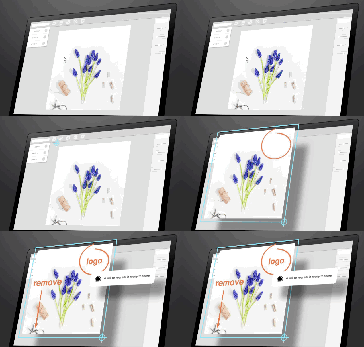
So, how can visual communication tools, such as CloudApp, fix poor communication and help designers express their creative ideas more efficiently? It is important to note that visuals relay important information in a concise and easy to comprehend way. To be more precise, CloudApp’s innovative features – a screen recorder, snipping tool, and GIF creator, allow designers to make the most of visual explanation, as opposed to trying to find the right words every single time. To show how these features work in action, below you can find some specific examples:

  • To facilitate a better feedback exchange, you can use CloudApp’s snipping tool to take a screenshot of your screen and annotate it with some suggestions.
  • If you would like to provide your teammate with more insightful feedback, you can use CloudApp’s webcam recorder to create a quick video with a personalized message. You can also use this tool to explain to your clients how your designs work and clear their unrealistic expectations.
  • If time is a scarcity for you, you can convey messages faster with the GIF creator that can help you provide your team members with clear visual instructions.

Using visual communication tools to communicate with others will allow designers to focus on creativity and design instead of being bogged down by emails. Try one out to see how much time and effort you can save as a designer.

Categories: Others Tags:

Bidirectional Horizontal Rules in CSS

October 25th, 2019 No comments

Say you have a

and the design calls for a thick border along the left side. Well, you might not necessarily mean left side, but actually mean on the side of the start of the text.

That’s exactly what CSS logical properties are meant to address, and Hussein Al Hammad has a nice article laying out some use cases, including the blockquote thing I mentioned above.

By using logical properties, you don’t have to mess around with manually writing selectors including [dir="rtl"] or needing to be aware of writing modes and such. The box model stuff (borders, padding, margin…) will adjust where it needs to be.

Hussein’s blockquote is a good baby step example for understanding of all this:

blockquote {
  /* Rather than... */
  border-left: 4px solid #aaa;
  padding-left: 1.75rem;

  /* You'd do... */
  border-inline-start: 4px solid #aaa;
  padding-inline-start: 1.75rem;
}

See the Pen
Logical properties demo: blockquote
by Hussein Al Hammad (@hus_hmd)
on CodePen.

Support is pretty good.

This browser support data is from Caniuse, which has more detail. A number indicates that browser supports the feature at that version and up.

Desktop

Chrome Opera Firefox IE Edge Safari
69 62* 41 No 76 12.1

Mobile / Tablet

iOS Safari Opera Mobile Opera Mini Android Android Chrome Android Firefox
12.2-12.4 46* No 76 76 68

One thing that threw me off in the article is the term “Horizontal Rules.” First I imagined the


element. Then I imagined wanting to reverse the direction of the design with logical properties. Usually an


is just a line so horizontal direction doesn’t matter, but let’s say it’s like a shorter line along the edge where new lines start after wrapping.

We could draw the shorter line with backgrounds that cover different parts of the box model, then use logical properties where the padding applies. This is a pretty unique edge case, but it’s fun to fiddle with:

See the Pen


s that are direction aware kinda by Chris Coyier (@chriscoyier)
on CodePen.

It would be even easier if we had logical gradients.

Direct Link to ArticlePermalink

The post Bidirectional Horizontal Rules in CSS appeared first on CSS-Tricks.

Categories: Designing, Others Tags:

The Landscape of Cross-Platform App Development

October 25th, 2019 No comments

I don’t track this stuff very well, but I get it. If you want a native app for Android and iOS, it sure would be nice to only have to write it once rather than two very different languages. Roughly double your reach without doubling the work. More and more of these things are reaching into desktop as well, meaning three targets for one.

Stuff like PhoneGap comes to mind. They say, “Reuse existing web development skills to quickly make hybrid applications built with HTML, CSS and JavaScript.” That’s obviously compelling for web developers who would have to learn minimal new things. My brain leans more toward, “Well if I’m going to write this thing in HTML, CSS, and JavaScript, why don’t I leave it at that?” Progressive Web Apps are doing great things. Still, I’m curious what the flagship PhoneGap apps are. Do I use any great ones and not even know it?

If you’re going to layer on a framework, but still stay in JavaScript-land, I’d think the biggest player is React Native. I hear it’s almost always used with Expo these days, which apparently has a thing to help React Native work on the web. Plus, there is literally React Native for Web.

In React-land, there is another new player: Ionic React. It targets all three platforms (iOS, Android, and Desktop) right out of the gate. Ionic isn’t new though — it’s long been a framework that does this in JavaScript (alternatively in Angular) and is apparently coming soon to Vue. Compelling. Nader Dabit has a first-look blog post that is pretty well done.

This all starts to get confusing to me as apparently Ionic ultimately uses Cordova under the hood… just like PhoneGap does? Or something? But now Ionic is moving to their own thing? I guess it makes sense that there are some low-level interpreter things that translate web primitives to native primitives and that people build developer tooling on top of that.

Google’s got a stake in this game with Flutter. Flutter is about hitting all three targets and helping you build the UI. Material design, animation and performance are all first-class citizens. It’s all in Dart though. Dart can compile to JavaScript (so it can be used for web stuff) but it also compiles to machine code. I imagine Flutter apps are compiled that way when they become native apps for bonus performance. I don’t have a good sense of how popular Dart is, but I’d assume web developers really won’t care what they’re writing in if great performance on all three targets is the outcome.

Ever further outside my wheelhouse is Xamarin, which is Microsoft’s take on unifying development on multiple platforms. The languages involved here are .NET and C#. It has all the same promises as everything else: build with this and it works everywhere! This is for developer convenience! It’s fast and you will make amazing things with it!

I’m always of two minds with all this stuff. Some part of me is envious of really nice native apps. Most of my favorite apps on my phone feel very native, although I’m not sure I could spot which framework created them, if any. For example, I have a Dribbble app on my phone and I quite like it. It’s simple and nice. I open it up and I’m logged in, which is usually not the case when I open a web app. It feels fast and has all the in-page animation stuff you expect from a native app. I totally wish we had an app like that for CodePen. Maybe if we were starting over today we’d write it in some cross-platform framework that targets all three platforms and maybe gives us some cool competitive advantage. Another part of me is like, meh, I’m a web guy on purpose. I think the native open web is the place to be and has the most longevity. A codebase that serves that well will be the least regrettable over time.

The post The Landscape of Cross-Platform App Development appeared first on CSS-Tricks.

Categories: Designing, Others Tags:

5 Unexpected UX Design Skills to Help You Level Up

October 25th, 2019 No comments

Whenever a hiring boom like this happens, you have to consider how it could work against you. Sure, there are more job openings. However, that means that more UX designers (and designer wannabes) are going to come out of the woodwork, trying to snag up the highly coveted gigs.

So, let’s assume that you’re all starting from the same place: with the baseline skills UX designers are expected to have like empathy, user testing, and wireframing. How are you going to differentiate yourself from the lookalike UX designers who all promise to do the same thing?

You set yourself apart with additional and unexpected skills.

1. Information-Gatherer

There’s a lot of emphasis put on UX designers to be good communicators. But communication is a broad term that could refer to how designers collaborate with their teams, discuss results with clients, or conduct user testing.

Ask the right questions the first time

With user input playing such a critical role in the decision-making process, it’s a good idea for UXDs to drill down even further into their skillset. Being able to conduct successful user or client interviews as well as formulating questionnaires and surveys is just as important.

Ask the right questions the first time and you’ll find it becomes easier to move all the pieces into place as you build or refine an experience.

2. Feedback Wrangler

There’s no such thing as a one-man team in UX design. You have to collaborate with UI designers, UX writers, coders, marketers, clients, and users. Which means you need to be an adept feedback wrangler if you want to succeed in this role. That goes both for handing out feedback as well as receiving it.

This also means becoming efficient in feedback wrangling because not only will you give and receive it in person, it’ll be coming through a variety of channels, too. So, being able to organize and give proper priority to feedback and communication within your team and with others will be incredibly important.

3. Emerging Technologist

It’s one thing to be a skilled UXD in this day and age. It’s another thing to be able to make a lifelong career out of it, which means always having your eye on what’s coming down the road.

45% of managers said they’ll be hiring UX designers with VR skills

As you know, technologies and trends are always changing. If you get stuck in one place, it’s going to be mighty hard to find work as a designer when your peers have made the pivot.

So, one thing you should pay close attention to in the coming years is emerging technologies like AI, machine learning, AR, and VR. In that Adobe report cited earlier, 45% of managers said they’ll be hiring UX designers with VR skills and 37% will hire AR-skilled designers over the next few years.

4. Ethical Designer

One of the problems you might run into with designing apps is the matter of ethics. Specifically, the kinds of apps that see users engage with them over long stretches (like games) or repeatedly throughout the day (like social media).

Yes, you want to design the perfect experience that inspires users to regularly engage with your app. But do you want it to be such an addictive experience that it becomes detrimental to their health?

As tech addiction and sleep deprivation caused by improper use of technology become greater issues in our society, UX app designers may need to adopt more ethical approaches to their work.

5. Cross-Disciplinarian

One of the skills UX designers are most commonly associated with is empathy. But that usually means having such a deep understanding of what your users want so that you may design the right experience for them. What about empathy for the people you work with though?

If you think about it, the decisions you make affect your teammates. You design an experience that the UI designer then has to visualize. Or that your UX writer has to put words to. Or that your coder has to translate into something usable for the web. Is it fair to design an experience without understanding the actual work it takes to make it a reality?

If you haven’t dabbled in CSS or JavaScript, if you haven’t done any writing recently, if you haven’t been involved in the marketing of websites you build, it might be a good idea to get your hands dirty now. Not only will it give you a better understanding of how everything fits together, it will allow you to design experiences that don’t constantly test the limits of what your team can do.

Use Your Unexpected UX Design Skills to Level Up

It is, of course, important to master the baseline set of skills as a UX designer. Without that solid foundation, additional skills above won’t be able to give you much assistance in your race to the top. That said, if you are already a skilled UX designer and you’re ready to level up, these unexpected UX design skills could give you what you need to edge out the competition.

Featured image via Unsplash.

Source

Categories: Designing, Others Tags:

Writing Asynchronous Tasks In Modern JavaScript

October 25th, 2019 No comments
Smashing Editorial

Writing Asynchronous Tasks In Modern JavaScript

Writing Asynchronous Tasks In Modern JavaScript

Jeremias Menichelli

2019-10-25T12:30:59+02:002019-10-25T15:07:51+00:00

JavaScript has two main characteristics as a programming language, both important to understand how our code will work. First is its synchronous nature, which means the code will run line after line, almost as you read it, and secondly that it is single-threaded, only one command is being executed at any time.

As the language evolved, new artifacts appeared in the scene to allow asynchronous execution; developers tried different approaches while solving more complicated algorithms and data flows, which led to the emergence of new interfaces and patterns around them.

Synchronous Execution And The Observer Pattern

As mentioned in the introduction, JavaScript runs the code you write line by line, most of the time. Even in its first years, the language had exceptions to this rule, though they were a few and you might know them already: HTTP Requests, DOM events and time intervals.

If we add an event listener to respond to the click of an element from the user, it doesn’t matter what the language interpreter is running it will stop, run the code we wrote in the listener callback and then go back to its normal flow.

Same with an interval or a network request, addEventListener, setTimeout, and XMLHttpRequest were the first artifacts to access to asynchronous execution for web developers.

Though these were exceptions of synchronous execution in JavaScript, it’s crucial to understand that the language is still single-threaded. We can break this synchronicity but the interpreter still will run one line of code at a time.

For example, let’s check out a network request.

var request = new XMLHttpRequest();
request.open('GET', '//some.api.at/server', true);

// observe for server response
request.onreadystatechange = function() {
  if (request.readyState === 4 && xhr.status === 200) {
    console.log(request.responseText);
  }
}

request.send();

No matter what is happening, by the time the server comes back, the method assigned to onreadystatechange gets called before taking back the program’s code sequence.

Something similar happens when reacting to user interaction.

const button = document.querySelector('button');

// observe for user interaction
button.addEventListener('click', function(e) {
  console.log('user click just happened!');
})

You might notice that we are hooking up to an external event and passing a callback, telling the code what to do when it takes place. Over a decade ago, “What is a callback?” was a pretty much-expected interview question because this pattern was everywhere in most codebases.

In each case mentioned, we are responding to an external event. A certain interval of time reached, a user action or a server response. We weren’t able to create an asynchronous task per se, we always observed occurrences happening outside of our reach.

This is why code shaped this way is called the Observer Pattern, which is better represented by the addEventListener interface in this case. Soon event emitters libraries or frameworks exposing this pattern flourished.

Node.js And Event Emitters

A good example is Node.js which page describes itself as “an asynchronous event-driven JavaScript runtime”, so event emitters and callback were first-class citizens. It even had an EventEmitter constructor already implemented.

const EventEmitter = require('events');
const emitter = new EventEmitter();

// respond to events
emitter.on('gretting', (message) => console.log(message));

// send events
emitter.emit('gretting', 'Hi there!');

This was not only the to-go approach for asynchronous execution but a core pattern and convention of its ecosystem. Node.js opened a new era of writing JavaScript in a different environment — even outside the web. As a consequence, other asynchronous situations were possible, like creating new directories or writing files.

const { mkdir, writeFile } = require('fs');

const styles = 'body { background: #ffdead; }';

mkdir('./assets/', (error) => {
  if (!error) {
    writeFile('assets/main.css', styles, 'utf-8', (error) => {
      if (!error) console.log('stylesheet created');
    })
  }
})

You might notice that callbacks receive an error as a first argument, if a response data is expected, it goes as a second argument. This was called Error-first Callback Pattern, which became a convention that authors and contributors adopted for their own packages and libraries.

Promises And The Endless Callback Chain

As web development faced more complex problems to solve, the need for better asynchronous artifacts appeared. If we look at the last code snippet, we can see a repeated callback chaining which doesn’t scale well as the number tasks increase.

For example, let’s add only two more steps, file reading and styles preprocessing.

const { mkdir, writeFile, readFile } = require('fs');
const less = require('less')

readFile('./main.less', 'utf-8', (error, data) => {
  if (error) throw error
  less.render(data, (lessError, output) => {
    if (lessError) throw lessError
    mkdir('./assets/', (dirError) => {
      if (dirError) throw dirError
      writeFile('assets/main.css', output.css, 'utf-8', (writeError) => {
        if (writeError) throw writeError
        console.log('stylesheet created');
      })
    })
  })
})

We can see how as the program we are writing gets more complex the code becomes harder to follow for the human eye due to multiple callback chaining and repeated error handling.

Promises, Wrappers And Chain Patterns

Promises didn’t receive much attention when they were first announced as the new addition to the JavaScript language, they aren’t a new concept as other languages had similar implementations decades before. Truth is, they turned out to change a lot the semantics and structure of most of the projects I worked on since its appearance.

Promises not only introduced a built-in solution for developers to write asynchronous code but also opened a new stage in web development serving as the construction base of later new features of the web spec like fetch.

Migrating a method from a callback approach to a promise-based one became more and more usual in projects (such as libraries and browsers), and even Node.js started slowly migrating to them.

Let’s, for example, wrap Node’s readFile method:

const { readFile } = require('fs');

const asyncReadFile = (path, options) => {
  return new Promise((resolve, reject) => {
    readFile(path, options, (error, data) => {
      if (error) reject(error);
      else resolve(data);
    })
  });
}

Here we obscure the callback by executing inside a Promise constructor, calling resolve when the method result is successful, and reject when the error object is defined.

When a method returns a Promise object we can follow its successful resolution by passing a function to then, its argument is the value which the promise was resolved, in this case, data.

If an error was thrown during the method the catch function will be called, if present.

Note: If you need to understand more in-depth how Promises work, I recommend Jake Archibald’s “JavaScript Promises: An Introduction” article which he wrote on Google’s web development blog.

Now we can use these new methods and avoid callback chains.

asyncRead('./main.less', 'utf-8')
  .then(data => console.log('file content', data))
  .catch(error => console.error('something went wrong', error))

Having a native way to create asynchronous tasks and a clear interface to follow up its possible results enabled the industry to move out of the Observer Pattern. Promise-based ones seemed to solve the unreadable and prone-to-error code.

As a better syntax highlighting or clearer error messages help while coding, a code that is easier to reason becomes more predictable for the developer reading it, with a better picture of the execution path the easier to catch a possible pitfall.

Promises adoption was so global in the community that Node.js rapidly release built-in versions of its I/O methods to return Promise objects like importing them file operations from fs.promises.

It even provided a promisify util to wrap any function which followed the Error-first Callback Pattern and transform it into a Promise-based one.

But do Promises help in all cases?

Let’s re-imagine our style preprocessing task written with Promises.

const { mkdir, writeFile, readFile } = require('fs').promises;
const less = require('less')

readFile('./main.less', 'utf-8')
  .then(less.render)
  .then(result =>
    mkdir('./assets')
      .then(writeFile('assets/main.css', result.css, 'utf-8'))
  )
  .catch(error => console.error(error))

There is a clear reduction of redundancy in the code, especially around the error handling as we now rely on catch, but Promises somehow failed to deliver a clear code indentation that directly relates to the concatenation of actions.

This is actually achieved on the first then statement after readFile is called. What happens after these lines is the need to create a new scope where we can first make the directory, to later write the result in a file. This causes a break into the indentation rhythm, not making it easy to determinate the instructions sequence at first glance.

A way to solve this is to pre-baked a custom method that handles this and allows the correct concatenation of the method, but we would be introducing one more depth of complexity to a code that already seems to have what it needs to achieve the task we want.

Note: Take in count this is an example program, and we are in control around some of the methods and they all follow an industry convention, but that’s not always the case. With more complex concatenations or the introduction of a library with a different shape, our code style can easily break.

Gladly, the JavaScript community learned again from other language syntaxes and added a notation that helps a lot around these cases where asynchronous tasks concatenation is not as pleasant or straight-forward to read as synchronous code is.

Async And Await

A Promise is defined as an unresolved value at execution time, and creating an instance of a Promise is an explicit call of this artifact.

const { mkdir, writeFile, readFile } = require('fs').promises;
const less = require('less')

readFile('./main.less', 'utf-8')
  .then(less.render)
  .then(result =>
    mkdir('./assets')
      .then(writeFile('assets/main.css', result.css, 'utf-8'))
  )
  .catch(error => console.error(error))

Inside an async method, we can use the await reserved word to determinate the resolution of a Promise before continuing its execution.

Let’s revisit or code snippet using this syntax.

const { mkdir, writeFile, readFile } = require('fs').promises;
const less = require('less')

async function processLess() {
  const content = await readFile('./main.less', 'utf-8')
  const result = await less.render(content)
  await mkdir('./assets')
  await writeFile('assets/main.css', result.css, 'utf-8')
}

processLess()

Note: Notice that we needed to move all our code to a method because we can’t use await outside the scope of an async function today.

Every time an async method finds an await statement, it will stop executing until the proceeding value or promise gets resolved.

There’s a clear consequence of using async/await notation, despite its asynchronous execution, the code looks as if it was synchronous, which is something we developers are more used to see and reason around.

What about error handling? For it, we use statements that have been present for a long time in the language, try and catch.

const { mkdir, writeFile, readFile } = require('fs').promises;
const less = require('less')

async function processLess() {
  const content = await readFile('./main.less', 'utf-8')
  const result = await less.render(content)
  await mkdir('./assets')
  await writeFile('assets/main.css', result.css, 'utf-8')
}

try {
  processLess()
} catch (e) {
  console.error(e)
}

We rest assured any error thrown in the process will be handled by the code inside the catch statement. We have a centric place that takes care of error handling, but now we have a code that is easier to read and follow.

Having consequent actions that returned value doesn’t need to be stored in variables like mkdir that don’t break the code rhythm; there’s also no need to create a new scope to access the value of result in a later step.

It’s safe to say Promises were a fundamental artifact introduced in the language, necessary to enable async/await notation in JavaScript, which you can use on both modern browsers and latest versions of Node.js.

Note: Recently in JSConf, Ryan Dahl, creator and first contributor of Node, regretted not sticking to Promises on its early development mostly because the goal of Node was to create event-driven servers and file management which the Observer pattern served better for.

Conclusion

The introduction of Promises into the web development world came to change the way we queue actions in our code and changed how we reason about our code execution and how we author libraries and packages.

But moving away from chains of callback is harder to solve, I think that having to pass a method to then didn’t help us to move away from the train of thought after years of being accustomed to the Observer Pattern and approaches adopted by major vendors in the community like Node.js.

As Nolan Lawson says in his excellent article about wrong uses in Promise concatenations, old callback habits die hard! He later explains how to escape some of these pitfalls.

I believe Promises were needed as a middle step to allow a natural way to generate asynchronous tasks but didn’t help us much to move forward on better code patterns, sometimes you actually need a more adaptable and improved language syntax.


As we try to solve more complex puzzles using JavaScript, we see the need for a more mature language and we experiment with architectures and patterns we weren’t used to seeing on the web before.

We still don’t know how the ECMAScript spec will look in years as we are always extending the JavaScript governance outside the web and try to solve more complicated puzzles.

It’s hard to say now what exactly we will need from the language for some of these puzzles to turn into simpler programs, but I’m happy with how the web and JavaScript itself are moving things, trying to adapt to challenges and new environments. I feel right now JavaScript is a more asynchronous friendly place than when I started writing code in a browser over a decade ago.

Further Reading

(dm, il)
Categories: Others Tags:

Weekly Platform News: WebAPK Limited to Chrome, Discernible Focus Rectangles, Modal Window API

October 24th, 2019 No comments

In this week’s roundup: “Add to home screen” has different meanings in Android, Chrome and Edge add some pop to focus rectangles on form inputs, and how third-party sites may be coming to a modal near you.

Let’s get into the news.

WebAPKs are not available to Firefox on Android

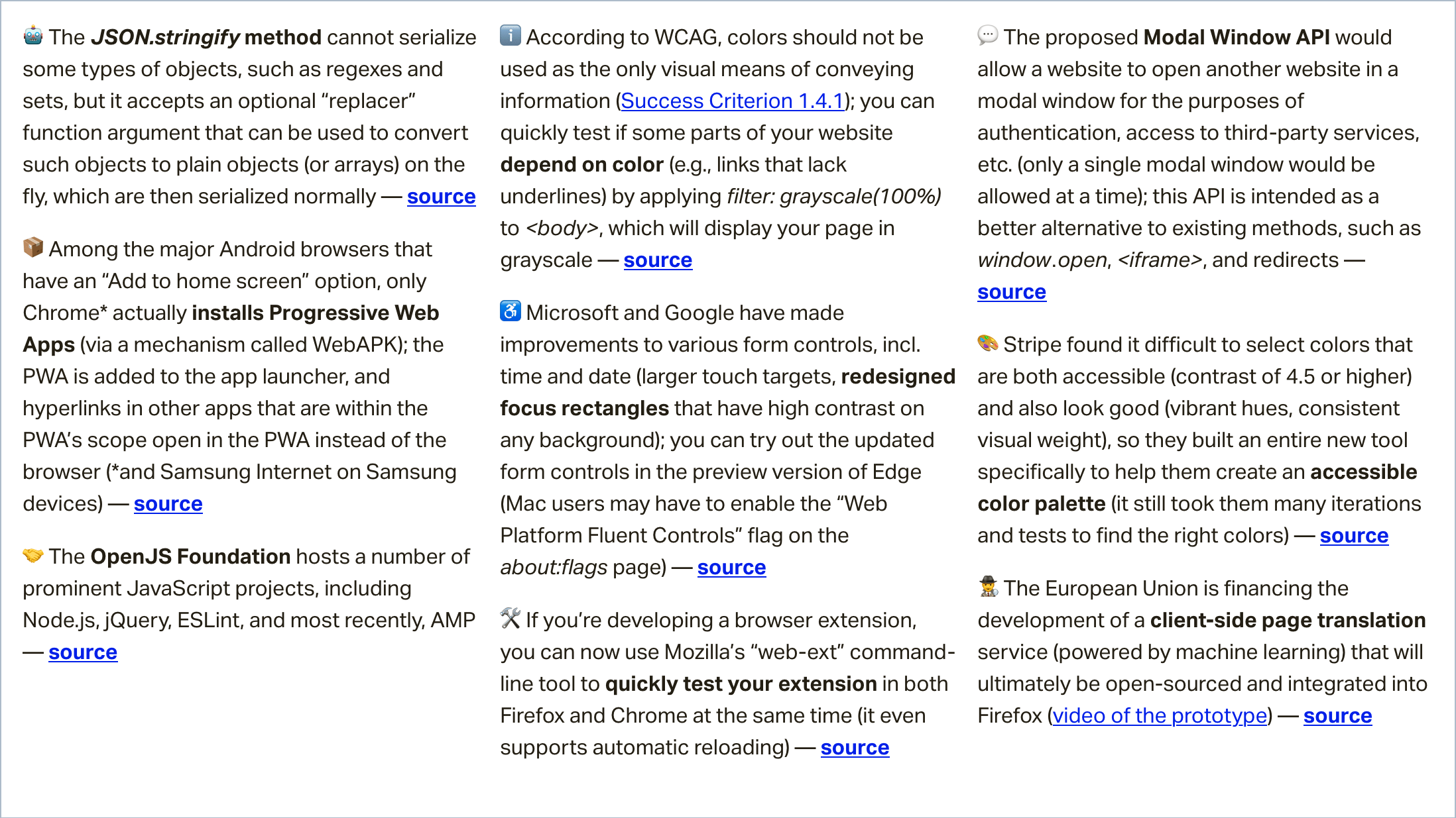
On Android, both Chrome and Firefox have an “Add to home screen” option, but while Firefox merely adds a shortcut for the web app to the user’s home screen, Chrome actually installs the web app (as long as it meets the PWA install criteria) via a WebAPK.

Progressive Web Apps installed in such a way are added to the device’s app drawer, and URLs that are within the PWA‘s scope (as specified in its manifest) open in the PWA instead of the default browser.

Tiger Oakes who is implementing PWA-related features at Mozilla, explains why Firefox cannot install PWAs on Android: “WebAPK is not available to us since we don’t own an app store like Google Play and Galaxy Apps.”

(via Tiger Oakes)

More accessible focus rectangles are coming to Chrome and Edge

Microsoft and Google have made accessibility improvements to various form controls. The two main changes are the larger touch targets on the time and date inputs, and the redesigned focus rectangles that are now easily discernible on any background.

The updated form controls are available in the preview version of Edge. Mac users may have to manually enable the “Web Platform Fluent Controls” flag on the about:flags page.

(via Microsoft Edge Dev)

A newly proposed API for loading third-parties in modal windows

The proposed Modal Window API would allow a website to load another website in a modal window (in a top-level browsing context) for the purposes of authentication, payments, sharing, access to third-party services, etc.

Only a single modal window would be allowed at a time, and the two websites could communicate with each other via message events (postMessage method).

This API is intended as a better alternative to existing methods, such as pop-ups, which can be confusing to users and blocked by browsers, and redirects, which cause the original context to be torn down and recreated (or completely lost in the case of an error in the third-party service).

(via Adrian Hope-Bailie)

More news…

Read even more news in my weekly Sunday issue that can be delivered to you via email every Monday morning.

More News ?

The post Weekly Platform News: WebAPK Limited to Chrome, Discernible Focus Rectangles, Modal Window API appeared first on CSS-Tricks.

Categories: Designing, Others Tags:

Understanding How Reducers are Used in Redux

October 24th, 2019 No comments

A reducer is a function that determines changes to an application’s state. It uses the action it receives to determine this change. We have tools, like Redux, that help manage an application’s state changes in a single store so that they behave consistently.

Why do we mention Redux when talking about reducers? Redux relies heavily on reducer functions that take the previous state and an action in order to execute the next state.

We’re going to focus squarely on reducers is in this post. Our goal is to get comfortable working with the reducer function so that we can see how it is used to update the state of an application — and ultimately understand the role they play in a state manager, like Redux.

What we mean by “state”

State changes are based on a user’s interaction, or even something like a network request. If the application’s state is managed by Redux, the changes happen inside a reducer function — this is the only place where state changes happen. The reducer function makes use of the initial state of the application and something called action, to determine what the new state will look like.

If we were in math class, we could say:

initial state + action = new state

In terms of an actual reducer function, that looks like this:

const contactReducer = (state = initialState, action) => {
  // Do something
}

Where do we get that initial state and action? Those are things we define.

The state parameter

The state parameter that gets passed to the reducer function has to be the current state of the application. In this case, we’re calling that our initialState because it will be the first (and current) state and nothing will precede it.

contactReducer(initialState, action)

Let’s say the initial state of our app is an empty list of contacts and our action is adding a new contact to the list.

const initialState = {
  contacts: []
}

That creates our initialState, which is equal to the state parameter we need for the reducer function.

The action parameter

An action is an object that contains two keys and their values. The state update that happens in the reducer is always dependent on the value of action.type. In this scenario, we are demonstrating what happens when the user tries to create a new contact. So, let’s define the action.type as NEW_CONTACT.

const action = {
  type: 'NEW_CONTACT',
  name: 'John Doe',
  location: 'Lagos Nigeria',
  email: 'johndoe@example.com'
}

There is typically a payload value that contains what the user is sending and would be used to update the state of the application. It is important to note that action.type is required, but action.payload is optional. Making use of payload brings a level of structure to how the action object looks like.

Updating state

The state is meant to be immutable, meaning it shouldn’t be changed directly. To create an updated state, we can make use of Object.assign or opt for the spread operator.

Object.assign

const contactReducer = (state, action) => {
  switch (action.type) {
    case 'NEW_CONTACT':
    return Object.assign({}, state, {
      contacts: [
        ...state.contacts,
        action.payload
      ]
    })
    default:
      return state
  }
}

In the above example, we made use of the Object.assign() to make sure that we do not change the state value directly. Instead, it allows us to return a new object which is filled with the state that is passed to it and the payload sent by the user.

To make use of Object.assign(), it is important that the first argument is an empty object. Passing the state as the first argument will cause it to be mutated, which is what we’re trying to avoid in order to keep things consistent.

The spread operator

The alternative to object.assign() is to make use of the spread operator, like so:

const contactReducer = (state, action) => {
  switch (action.type) {
    case 'NEW_CONTACT':
    return {
        ...state, contacts:
        [...state.contacts, action.payload]
    }
    default:
      return state
  }
}

This ensures that the incoming state stays intact as we append the new item to the bottom.

Working with a switch statement

Earlier, we noted that the update that happens depends on the value of action.type. The switch statement conditionally determines the kind of update we’re dealing with, based on the value of the action.type.

That means that a typical reducer will look like this:

const addContact = (state, action) => {
  switch (action.type) {
    case 'NEW_CONTACT':
    return {
        ...state, contacts:
        [...state.contacts, action.payload]
    }
    case 'UPDATE_CONTACT':
      return {
        // Handle contact update
      }
    case 'DELETE_CONTACT':
      return {
        // Handle contact delete
      }
    case 'EMPTY_CONTACT_LIST':
      return {
        // Handle contact list
      }
    default:
      return state
  }
}

It’s important that we return state our default for when the value of action.type specified in the action object does not match what we have in the reducer — say, if for some unknown reason, the action looks like this:

const action = {
  type: 'UPDATE_USER_AGE',
  payload: {
    age: 19
  }
}

Since we don’t have this kind of action type, we’ll want to return what we have in the state (the current state of the application) instead. All that means is we’re unsure of what the user is trying to achieve at the moment.

Putting everything together

Here’s a simple example of how I implemented the reducer function in React.

See the Pen
reducer example
by Kingsley Silas Chijioke (@kinsomicrote)
on CodePen.

You can see that I didn’t make use of Redux, but this is very much the same way Redux uses reducers to store and update state changes. The primary state update happens in the reducer function, and the value it returns sets the updated state of the application.

Want to give it a try? You can extend the reducer function to allow the user to update the age of a contact. I’d like to see what you come up with in the comment section!

Understanding the role that reducers play in Redux should give you a better understanding of what happens underneath the hood. If you are interested in reading more about using reducers in Redux, it’s worth checking out the official documentation.

The post Understanding How Reducers are Used in Redux appeared first on CSS-Tricks.

Categories: Designing, Others Tags: