10 Popular Design Trends It’s Time to Let Die
If you’ve ever moved from one home to another, you know how difficult it can be to get rid of things you’ve owned for years. While digging through your closet, you find an old pair of pants you used to wear all the time despite the growing holes in the knees. But you tell yourself, “Maybe I’ll wear them around the house when it gets warmer” or “I bet the grunge look will come back in style”.
It’s easy to make these kinds of justifications in web design and development, too. You think:
“I’ve used the keyword meta tag for as long as I can remember. What can it hurt to keep doing so?”
Similar to how your clothes may become outdated or your appliances obsolete over time, the same thing happens with design and development trends. Rather than hold onto techniques that no longer serve you and only add more to your workload, it’s a much better idea to clear them out and make way for modern trends that’ll have a greater impact.
10 Popular Design Trends It’s Time to Let Die
When we talk about outdated web design trends, we’re not just talking about ones that have been obsolete for years. We’re also referring to trends and techniques that we know for a fact compromise the user experience and need to go away ASAP.
1. Cheesy Stock Photos
There’s nothing inherently bad about using stock photos. Many clients don’t have the budgets or wherewithal to create their own company photos and stock photos are a viable alternative.
That said, there was a time when “bad” (i.e. super cheesy and unrealistic) stock photos were all the rage. Even today, you’ll find websites that use these kinds of photos because there’s still an assumption that two people shaking hands in a well-lit conference room signals trust. (It doesn’t.)

Image via DepositPhotos.
2. Hero Sliders
Image slider technology was pretty great in its heyday. It allowed web designers to conserve space while displaying a number of promotional offers at once. In addition to sliders often slowing down page speeds, they also have a tendency to slow users down as they distract them from moving onto other parts of a website.
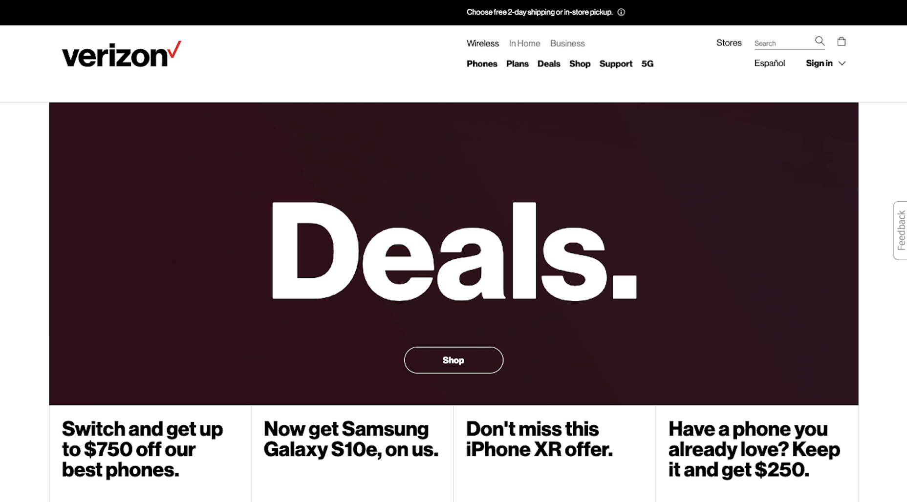
Verizon Wireless, for instance, has a great example of a strong but simple hero image design in 2019:
This is vastly different from the image slider it used back in 2013:
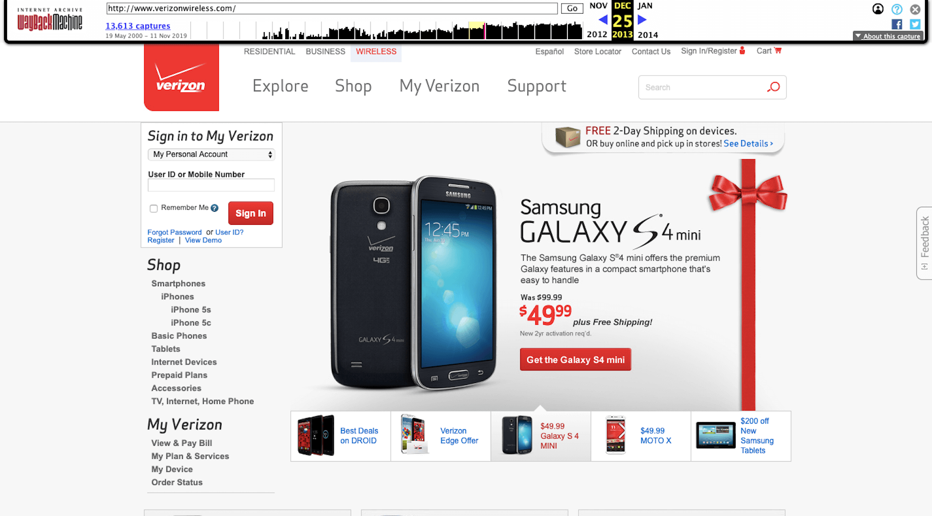
For the most part, we’ve learned to be more efficient with this space, though there are still some websites that can’t make up their minds about which offer to show above the fold… which only makes it more difficult for visitors to decide next steps. Take the initiative and do it for them with a single hero banner.
3. Autoplay
It’s not common to find websites with background audio, let alone autoplay audio, these days. That said, what you do occasionally find are websites that automatically play videos or ads with audio. Needless to say, this needs to stop. If your video (or audio) players don’t allow your visitors to take control of when they start, change that up now.
4. The 3-Click Rule
Over the years, web designers have looked for ways to decrease friction in the user experience. The three-click rule was meant to be one of the ways to do this. However, according to a recent report from the Nielsen Norman Group, there’s never been any data to back up this claim:
“In fact, a study by Joshua Porter has debunked it; the study showed that user dropoff does not increase when the task involves more than 3 clicks, nor does satisfaction decrease. Limiting interaction cost is indeed important, but the picture is more complicated than simply counting clicks and having a rule of thumb for the maximum number allowed.”
Rather than minimize for minimization’s sake, consider the complexity of the task or funnel you’re designing when determining quantity of steps.
5. (External) Links That Open in the Same Tab
There are a number of reasons to add links to your content: for navigational purposes, promotional purposes, and referential purposes. But when you add a hyperlink to your text, consider the following: Is it okay if the link directs visitors to a page in this same browser tab?
External links, for instance, should always open in a new browser tab. Your goal in designing a website is to get more visitors to convert. Letting an external link replace your website in the open tab will only decrease the chances of that happening. In some cases, internal links shouldn’t be opened in the same tab either. So, be sure to think about this the next time you add a link to your site.
6. Non-Traditional Scrolling
Although we’ve become accustomed to swipe gestures in mobile apps, horizontal and other non-traditional scrolling isn’t something that’s caught on with websites. While it’s definitely a design trend that helped many businesses set themselves apart from the pack a few years back, it’s just too gimmicky to use these days.
Robby Leonardi‘s interactive resume website was one of the first I remember seeing and it was a brilliant way to capture attention — especially from those of us who grew up with Mario.
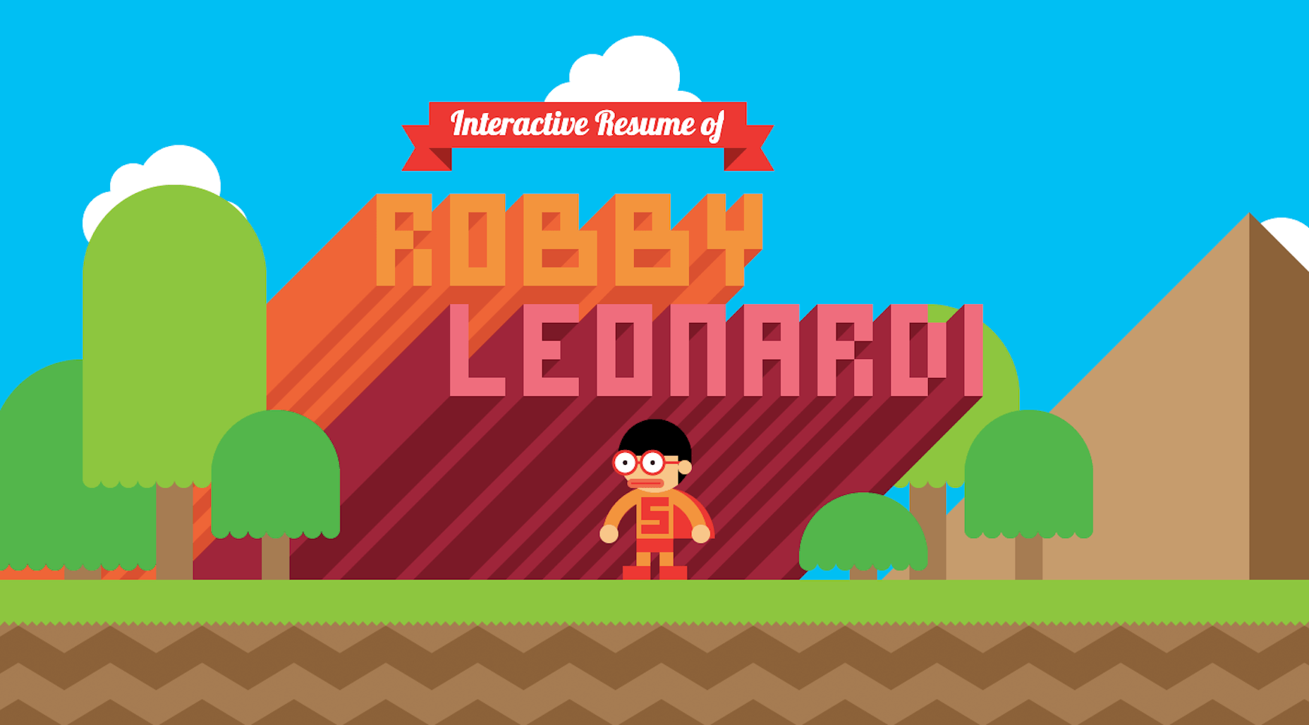
But today? Any sort of non-traditional scrolling is just impractical and unnecessary. Even Robby’s current website has broken up this side-scrolling design and turned it into a vertical-scrolling page:
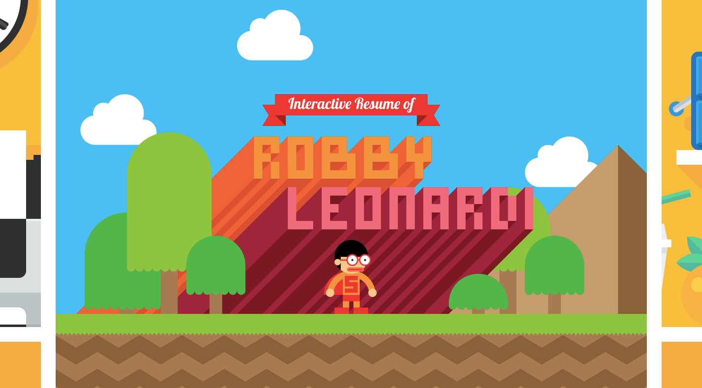
If you want to keep visitors engaged with your website in this day and age, don’t make them figure out how to scroll through your website.
7. Keyword Meta Tag
For years (we’re talking nearly a decade), the keyword meta tag has not been supported by popular search engines. Despite knowing that the meta tag is useless, some designers still take the time to add it in. But why bother if it’s an extra step that gets you nothing in return?
8. Bad Pop-ups
Although pop-ups have undergone an evolution over the years — from the super-annoying pop-up ads that appeared outside the browser to the ever-present privacy notices we now see thanks to GDPR. While there is certainly some value in using pop-ups on a website, there are just too many kinds of bad pop-ups that need to disappear.
“Bad” pop-ups are ones that:
- Show up too early on a website (like the second someone enters it);
- Appear too many times during a single or return visit;
- Send users to Facebook Messenger to collect their lead magnet and then bombard them with messages there;
- Contain two buttons. Users that accept the offer, get a friendly message. Those that don’t are served up aggressive or shame-inducing language;
- Repeat an offer that’s already designed into the website as a promotional banner.
9. Slow-Loading Websites
Mobile websites are notoriously difficult to optimize for speed when compared to their desktop counterparts. Unlike in years past where you could’ve rationalized away speed optimizations for mobile, today, it needs to be a priority with Google’s mobile-first indexing. PWAs are one way to give your mobile site an instant speed boost.
On a related note, by designing a PWA instead of a mobile-responsive website, you’d be able to cater to users with poor or no wi-fi connectivity — a segment that’s often been overlooked in web design.
10. Flash
I cannot believe I’m having to include this last one in 2019, but it seems there are still websites using the Flash Player.
Adobe has already told us that it would be cutting support for Flash next year. Web browsers are starting to remove their support for Flash players as well. And good riddance. Flash has long had issues with security flaws and usability issues.
If you’re trying to hold out on this (or your clients are dragging their feet), keep in mind that this is what visitors will see on many browsers in 2020 and beyond:
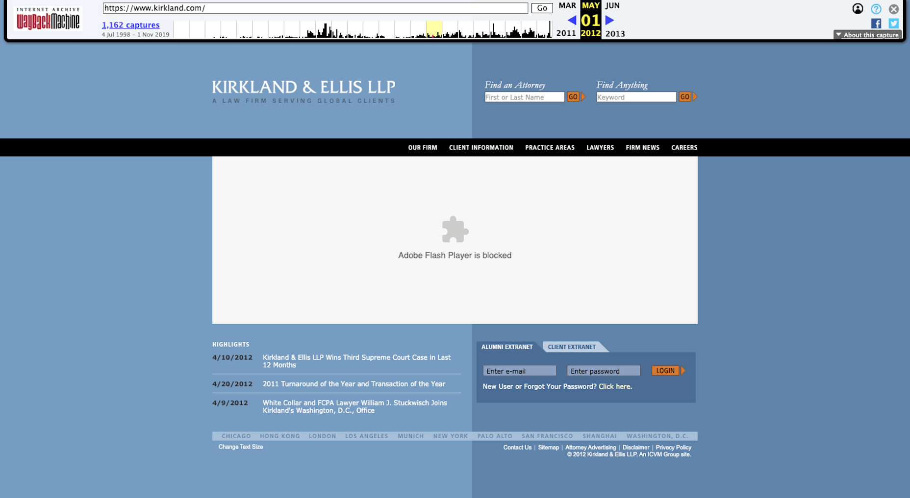
Bottom line: If the creator of Flash is pulling support, you need to do the same for any of your websites that still use it.
Wrap-Up
It’s easy to get wrapped up in what the next big thing is in web design — AR tech, typography trends, color gradients, etc. But what about all of those trends and techniques that have become a habit over the years?
Rather than hold onto outdated design strategies that will only hinder your progress as a web designer and hold your clients’ websites back, start shedding these obsolete (or soon-to-be obsolete) practices now.
