Archive

Archive for November, 2019

Smashing Podcast Episode 3 With Jina Anne: What Are Design Tokens?

November 19th, 2019 No comments
Jina Anne

Smashing Podcast Episode 3 With Jina Anne: What Are Design Tokens?

Smashing Podcast Episode 3 With Jina Anne: What Are Design Tokens?

Drew McLellan

2019-11-19T05:00:00+00:002019-11-19T16:06:02+00:00

In this episode of the Smashing Podcast, we’re talking about Design Tokens. What are they, what problem do they solve, and how can they be used within an existing Design System? Drew McLellan talks to someone who is much more than a token expert: Jina Anne.

Show Notes

Transcript

Drew: She’s a design systems advocate and coach. While at Amazon, she was senior design systems lead and she was lead designer on the Lightning Design System at Salesforce, while at Apple she led the CSS architecture and style guide for the Apple Online Store. She’s worked with GitHub, Engine Yard, and the Memphis Brooks Museum of Art and more. She founded and organizes Clarity, the first design systems conference, and is on the Sass core team where she leads the brand design and website for Sass. When it comes to design systems, you’d be hard pushed to find anyone more qualified, but did you know that she’s never seen a sidewalk? My smashing friends, please welcome Jina Anne. Hello, Jina.

Jina Anne: Hello.

Drew: How are you?

Jina Anne: I’m smashing.

Drew: I wanted to talk to you today about design tokens, which I think is a phrase many of us have probably heard passed about, but we perhaps aren’t sure what it means. But before we get to that, I guess we should talk a little bit about design systems. I mean, design systems are your thing, right?

Jina Anne: Yeah. It rules everything around me. Yeah.

Drew: I think that there’s something that we’re seeing is becoming increasingly common in projects and people are making them public and seems to be a real movement around design systems. But I think there are plenty of organizations that don’t have them in place still. What problem does a formalized design system solve from your point of view?

Jina Anne: It can solve many problems. I think some of the more common problems that people seek to solve is around maintainability and consistency. That usually has to do with design debt or in some cases code debt, some cases both. I also look at it as a… Like, it’s not just about the code or the design, but also the problems around how people work together. So, I look at it as a way to also solve some of the issues around communication and workflow process and so on.

Drew: Are design systems then something exclusively that are useful to really big teams and big organizations?

Jina Anne: I don’t think so. I’ve seen them work really well with smaller teams or sometimes even with a lone designer. They definitely help with larger teams for sure, but they are definitely not exclusive to large teams. In fact, I think if you see yourself perhaps growing at some point to be a large team, then having the system in place already will help you do that more efficiently.

Drew: What did you think are the sort of symptoms that somebody might be looking for if they’re working and they’re still having problems? What do those problems look like that might be solved by putting a design system in place?

Jina Anne: There’s a few, duplication of efforts, duplication of code. You might have a breakdown in communication where things just aren’t being built the way they’re expected to be built. It could come down to things that aren’t documented well, so people don’t really quite know what the best thing is to use or where to look. Yeah, there are all sorts of signs.

Drew: I guess design systems are generally a concept, rather than a specific technical solution. In your work, you must see people using all sorts of different tools to achieve design systems.

Jina Anne: Yeah.

Drew: What are some of the more common ways that people actually go about it?

Jina Anne: I think the most common ways are having a component library done in code and often cases you’ll see it in it like a React library or an Angular library, whatever, platform you’re using. There’s usually also a website associated with it that will display those components. Then you’ll usually see perhaps like a Sketch or a Figma library as well.

Jina Anne: But one of the things that I like to stress to people is that if you look at that website that displays your documentation and your components, that website is not actually your design system. It’s a representation of your design system. So, I think a lot of people spend a lot of time on making this gorgeous, beautiful website and it’s fine. They’re nice to look at and they’re nice to share and they help a lot with communicating what you’re doing and even with recruiting.

Jina Anne: But it’s the system itself that it represents that I want people to spend their love and care into, so thinking through what’s going into that website, like the content and how you’ve organized things, how you’ve named things, the things that you’re systemizing, so, yeah. I think a lot of people think about the artifacts, like the deliverables, but really it’s a lot more than that. It’s a lot of process and workflow as well.

Drew: Is it exclusively web projects that the design system would help with?

Jina Anne: Not at all. It is the most common, I believe, from, at least, what I’ve seen, but design systems definitely can cover many things. In the digital space, you have native platforms, but even outside the digital space, I think a lot of people talk about design systems in a digital product space. But they’ve been around for ages for traditional medias and real-world scenarios. If you have seen the NASA graphic standards manual from like the ‘70s, that was a design system. It just was across all the different like rockets and spacesuits and all that, instead of digital products.

Drew: So, I guess, there must be some overlap between things, traditional things like brand guidelines and that sort of documentation that I think probably people are familiar with in all sorts of walks of life. There must be a crossover between that sort of documentation of a system and a more modern concept of a design system.

Jina Anne: Yeah, I believe so. I think a lot of people forget that it’s all about branding. The whole reason any of this even started and why we want to display these things in a uniform or unified way is all about the brand because brand isn’t just logos. It’s how people use and experience your company’s service or product or whatever it is that you offer. So, yeah, absolutely.

Drew: So, I’ve got a design system in place, I mean an organization. We’ve done a whole lot of work. We’ve got a design system. There are creatives within the organization working in maybe, like you mentioned, Figma or Sketch. We’ve got web designers using that in a CSS. Perhaps we’ve got a mobile team doing like Android and iOS development, building apps. Loads of people working with a design system contributing into it and consuming stuff from it. Where do design tokens come in? What problem do they solve?

Jina Anne: Ooh, yes. Let me first take it back to a story. When I first joined at Salesforce, I was actually part of a small project team. It was a different product, it’s like a productivity tool like tasks and notes and things like that. We were only three designers and I was the only one that, I guess, I wouldn’t say brave enough, but maybe interested enough to work with the Android designs. The other two designers, I think, just weren’t quite as interested. So, I was basically the main designer on our Android app. Then I also did a lot of design for iOS app and, of course, the web application as well and the marketing website, so lots of different projects in play.

Jina Anne: With the website, since I like to design and code, it was pretty straightforward. I could go ahead and build the buttons and typography and everything that we needed for the web application or the marketing website, document it in code and deliver that.

Jina Anne: However, with both the Android and iOS app, I don’t really know how to code for that and so I wasn’t able to deliver the same thing. So, I was having to do a ton of redlines specs, which, if you’re not familiar with redlines, it’s essentially where you are specking out every single spacing, font size, color, anything to indicate how to build it for the engineer. I would do these for many, many, many screens and, of course, a lot of those screens had variations because maybe you’re showing what happens when you clicked that button or when a certain state happens. So, doing this across many, many screens and then saving those up to Dropbox and then documenting it in a Wiki. That was the process that I was having to do at the time.

Jina Anne: I usually think about things in a CSS way, like especially the C in CSS, so I usually think, “Oh, well, font sizes should only need to be declared one time because it’s going to cascade everywhere.” But I found that with certain engineers that I’ve worked within the past, if you don’t spec it, and I guess with native it works a little differently, they’re not going to build it and so I would have to be very explicit and name pretty much everything per screen. I was just like, “Oh, why is it like this?” Then any time we made any changes, I had to go back through and change all those screens again. It was not fun at all.

Jina Anne: Fast forward to when I moved over to the core team of Salesforce, I had been working in the Sass website and I’ve been playing around with using a YAML file to store the data for colors, typography, spacing and so on and was looping over that data to create the style guide, as well as the Sass variables in the classes. The reason I did that was we open-sourced the Sass website and I wanted people to be able to contribute to the design as well. But I didn’t want to make it a tedious process where you had to update the style guide along with any colors that you’re adding and so doing it this way, just kind of automated that process.

Jina Anne: I showed that to the team at Salesforce and then that kind of is where the concept of design tokens spawned off of. So they built a tool called Theo and there’s other tools out now that do the same thing like Style Dictionary. But the idea of it is you have this automated tool that takes the data that you give it and generates the code. You might think, “Well, that might be over-engineering variables. Why not just use variables?”

Jina Anne: Well, the idea is, as you alluded to earlier, like native platforms just take those attributes in a totally different way and so trying to scale design to Android and iOS, whatever other platforms that get Salesforce. We had some people on Java, we had some people on React yet, some people on Angular, PHP, not just internally at Salesforce, but also externally with all our partners and customers that were building their own applications. So, this was a way to store our visual information as data and then, in an automated way, generate the variables or the XML data you needed or the JSON data, whatever format that particular platform looked for.

Jina Anne: Then what was great about it was we found, let’s say a color doesn’t pass contrast ratios. I didn’t have to then notify the Android team and the iOS team and the web team. I just made that change and then they would get that change automatically the next time that they would pull in the latest. So, it just really helped streamline a lot of that and helped us be able to take off some of the burdens of updating visual designs from the engineers and that let us do that.

Drew: So, instead of being sort of variables within one particular code base, within your own React codebase or within your PHP or within your Java or wherever, they’re like variables across an entire organization? Is that fair to say?

Jina Anne: Correct. Correct. Then what’s cool is things like colors, for example, like transparent colors, you do that differently in Android, like eight-digit hex, instead of RGBA like you would with web. So that tool that you use, if you’re using one that is built to think through all this, does that transformation for you. So, rather than saying RGBA 50 comma, 40 comma, whatever the color, you can just say color background card or something like that. It’s really more of a named entity now and then you can all be speaking the same language, even though it might render a different syntax.

Drew: Right. So, although variables kind of the nuts and bolts of how it might be implemented, the idea is kind of much bigger than just what you’d think of as just variables. I mean, I guess in a way like RSS could be called just variables. But, actually, the way it enables us to distribute blog content and podcasts and everything has a much wider impact than just the core technology that’s there.

Jina Anne: Yeah, I think that’s actually a really good metaphor. I do see a lot of people when they use it or talk about it in their own design system website, they’re usually only talking about like Sass variables or CSS variables. I think that’s why there’s this confusion, like, “Well, isn’t that just variables?” It’s, like, “Why are we renaming it?” But it is that much broader application of it with a whole process around it. It even gets into like how you distribute those variables across components, like on a global level or on an individual component level. You can have multi-layers and so on. It can get pretty interesting.

Drew: So, I suppose as well as helping in the maintenance, you mentioned being able to change a color in one central location and then have everything that is, using those design tokens, be able to pick it up when the next build or next refresh from the system, presumably this has the potential to enable all sorts of other interesting things. I know a lot of people make sort of white-labeled products. It’s the same core product, but it’s customized with different design tweaks for different and things. So, using design tokens could actually be a solution for those sorts of applications as well, the need to span more than just one particular codebase.

Jina Anne: Right. Yeah. So, that was definitely a use case at Salesforce. We have a lot of, I don’t know why I’m still using present tense, but we had a lot of customers that wanted to be able to brand their UI that they were using. So, we had this concept of certain variables that we wanted to actually be seen more as like a constant, like maybe it’s an error color versus colors that were meant to be configured, like brandable colors. So, for some people’s needs that can get interesting, too, white labeling or offering any sort of theming, dark mode or night mode, even offering a feature, which you may have seen in Gmail, but it’s like that comfortable, cozy, compact spacing density. So, there are all sorts of extra stuff that you can get with it across multiple products very quickly, which is really nice.

Drew: It is really an extension of core principles of programming where you make sure that you’ve really defined things once in one place, so you don’t have multiple instances so it’s easy to update. But it is looking at that as a much, much bigger idea than just one small element of a product, looking at it across everything and centralizing that.

Jina Anne: Yeah, so we definitely looked at these as our source of truth. However, in case anybody is worried about like, “Well, Android does things differently than iOS,” or you might have some concerns there. Depending on how you’ve architected things, you can still solve for those use cases. So, we would have a global token set that all our products would basically import in, but then we made them in a way where you could either alter it for that particular context or extend it, like offer maybe additional tokens that only that particular context needs. So, you can still give the fine-tune experience that you need to give to each of those context, while bringing in the most common shared things.

Drew: On a technical level, how would this actually work? Is there like a common file format the different systems share? Is there like an established standard for how you declare your design tokens?

Jina Anne: It’s interesting that you asked that. There’s actually a community group formed through… W3C has all these community groups. It’s not really exactly a working group, but it’s still like an initiative across various people that are in this space trying to come up with a recommendation of what those standards could be. Even how people store their data can change. Like it could be YAML, it could be JSON, it could even be a spreadsheet. Then what you export would be different because you might be using Sass, you might be using LESS, you might be using some sort of XML base system. We actually don’t want to tell you which of those things to use because depending on our use case, you might need to use spreadsheets instead of JSON or YAML or you might need to use XML instead of Sass or LESS or even CSS variables. That’s because everybody’s products are so different and have different needs.

Jina Anne: But what we can standardize on is around the tooling to generate these things. The reason we want to try to come to some sort of standard is because so many design tools are starting to implement this, InVision, Adobe, Figma. All these tools are looking at design tokens because there is a need to not just make this a code-based thing, but make this a design tool-driven thing as well. We don’t want to do it in a way where those tools don’t feel like they can innovate. We want them to be able to innovate, but at least offer some sort of standards so that new tool-makers can get into this space and already have sort of an established understanding of how to set that up. So, while we’re not going to get strict on your format of what file format you’re using or what tool you’re using, we’re going to more try to standardize on like the internal process and basically the API of it.

Drew: Because like I said, once that API has been defined, the tooling can spring up around it that speaks with that API for whatever tools that people want to use. So, somebody could write up a Java library that speaks that API, and then anything that’s using Java could make use of it and so on. Are there any tools currently that support design tokens in any way?

Jina Anne: Yeah. On the code side, I mentioned already Theo and Style Dictionary. There’s also one called Diez, D-I-E-Z. That’s kind of newer to the space and it’s taking it beyond, just like doing the transformation process, but kind of treating design tokens as a component in a way and so that’s cool.

Jina Anne: Then on the design side, InVision already has it in their DSM tool, which is their Design System Manager tool. The last I looked at it, it was just colors and typography, but I do know when I… I talked to Evan, who is one of the main folks behind that product. He did tell me other things like spacing should be coming into play, if it’s not already. I haven’t looked at it super recently. I know there are newer tools that are really catching my eye, like modules and interplay. Both of those are code-driven design tools.

Jina Anne: Then I’ve been told that it’s supposed to come into some of the stuff that Figma and Adobe are doing, so I’m not sure if I’m revealing secrets. I don’t think I am. I think it’s all stuff they’ve talked about publicly. But, yeah, I’m really excited because I think while it was something that we were doing really just making our design system work easier, it’s kind of almost accidentally created a path for bringing design tools and code cluster together. That’s really exciting to me.

Drew: The makers of these various tools, are they working with the design tokens community group?

Jina Anne: Yeah, a lot of them have joined. Since I’m a chair member, I get to see by email, everybody who joins. It sends me a notice. What’s cool is not only just seeing all these design tool people joining, but also seeing big companies. I saw like Google and Salesforce and all that, so it’s really exciting. Because I think it shows that this really matters to where a lot of people are doing on a large scale and small scale and that’s pretty cool.

Drew: So, if I was sort of listening to this and thinking about my own projects, thinking, “Ah, yes, design tokens are absolutely the answer to all these problems that I’m having,” where would I go to find out more to start learning and start maybe using design tokens?

Jina Anne: It’s a really good question. There are a few articles and I can send you some links to include with this, but I think one of the first articles, which I wish I had written, but Nathan Curtis wrote and that he actually kind of helped bring attention to them. I think he inspired a lot of people to start using them, so he kind of discusses what they are and how to use them, his recommended way.

Jina Anne: I don’t like the title of this next article I’m going to mention, but it’s called Design Tokens for Dummies. I’m not a fan of using that terminology, but it is a pretty well thought-through article that goes to pretty much everything about them. There was a CSS Tricks article by Robin Randall recently that just explains really what they are. I did a All You Can Learn Library session for Jared Spool a while back, but it is a membership-based thing so you would have to have access to that to see it. I know there’s been a lot of presentations and stuff, but there’s not like an official book to it yet. But that’s perhaps something I’m working on. It’s like one of two books I’m working on, actually.

Drew: So, if I’m a toolmaker or I work for maybe a big organization that’s having these sorts of problems and they’ve got some ideas about maybe contributing to the process of designing how the standard works, is the design tokens community group something that I could get involved in?

Jina Anne: Absolutely. I think you’ll want a GitHub because that’s where all of the public discussions and notes and things are happening. Then on the W3C community group website, you can create an account there. Having that account enables you to join other community groups as well. But then, yeah, at that point once you’ve created your account there and… I think it asks if you have any affiliations, like if you work for a big company or anything like that, just so it’s transparent, like if you have any, I wouldn’t say necessarily bias, but like a certain interest. It just helps everybody understand where you’re coming from. Anyway, at that point, yeah, you join and you’re pretty much in.

Drew: It’s quite an open process then.

Jina Anne: Yeah.

Drew: What’s in the future for design tokens? What’s coming down the line?

Jina Anne: I’m really excited about what’s going on with the community group. Kaelig’s been doing most of the leading of it. He’s the co-chair with me and I really love seeing his passion behind this. My particular interests in this are really around the education of it. So, kind of similarly to the work I’ve been doing with the Sass community, I kind of want to do a little bit of that for the design token community, like talk through how to educate people on what this is and not just make it an API doc, but also like where to get started, how to get into this. That’s something I’m interested in project-wise.

Jina Anne: I’m also really keen to see where this evolves, especially with all these design tool companies getting involved. Then a lot of people mostly think about design tokens as a visual abstraction, but really what it came from was the same technology that you used for localizing content. You wrap things in strings and then you can pass through different stuff, so bringing it back to its roots. I’d love to see the application of this apply in different ways, like interactions and content. I’m not really super keen on AR/VR-type stuff, but how does it maybe manifest there? Yeah, really just seeing it kind of go beyond just like the visual layer of what we see.

Drew: I guess that’s the beauty of having an open process like the W3C community group, is that people who do have specialisms in things like AR and VR can contribute to the conversation and bring their expertise to it as well.

Jina Anne: Absolutely.

Drew: I’ve been learning a lot about design tokens today. What have you been learning about lately?

Jina Anne: I’m always trying to learn something, but I’ve actually been occasionally taking some cocktail classes. Yeah. I’m not really with the interest of becoming a bartender, but more of just having an appreciation for cocktails. What’s cool about these classes is they’re beyond just making cocktails. They actually talk about business practices and ethical practices, the hygiene of your bar, all sorts of stuff like that, so it’s been really fascinating because I think I have like this weird fantasy of one-day leaving tech and maybe going into that. Let’s see.

Drew: Do you have a favorite cocktail?

Jina Anne: Manhattan.

Drew: It’s good. It’s good.

Jina Anne: Yeah.

Drew: You can’t go wrong with a Manhattan.

Jina Anne: I have been ordering a lot of Old Fashioneds lately so that would probably be number two.

Drew: Do you have a favorite bourbon?

Jina Anne: Ooh. The first one that came to mind is Angel’s Envy. It’s like finished in port barrels that have kind of this slightly port-like essence to it. Their rye is really good, too. It’s like finished in rum barrels, so it almost has like a banana bread-like flavor to it.

Drew: This is a direction I wasn’t expecting to go in today.

Jina Anne: Yeah.

Drew: Was there anything else you’d like to talk about design tokens?

Jina Anne: My take is, just like with design systems, people are going to use them in different ways and also there might be people out there that don’t even need to use this. If you just have like an editorial website that is pretty straightforward, maybe all you really need are CSS variables and that’s it. There’s no need to over-engineer things.

Jina Anne: This is really more for people that really need to scale or if you have a theming context then maybe. But, yeah, it’s really not meant for everyone. So, just because it’s becoming kind of a hot thing to talk about, you might not need to even bother with it.

Drew: If you, dear listener, would like to hear more from Jina, you can follow her on Twitter where she’s @Jina, or find her and all her projects on the web at sushiandrobots.com. Thanks for joining us today, Jina. Do you have any parting words?

Jina Anne: Design systems are for people.

Smashing Editorial(dm, ra, il)
Categories: Others Tags:

Teaching CSS

November 19th, 2019 No comments

I’ve been using CSS as a web developer since CSS became something we could actually use. My first websites were built using tags and

s for layout. I remember arguments about whether this whole CSS thing was a good idea at all. I was quickly convinced, mostly due to the ability to easily change the font on an entire site in one place. Managing common styles was so useful at a time when most websites were just a stack of HTML pages with no management of content or any form of templating. I was an early adopter of using CSS rather than tables for layout, despite the backdrop of people asking, “but what about Netscape 4?”

CSS is a remarkable language. Those early sites were developed in a time where the best we standards advocates hoped for was that browsers would support the CSS that existed; that developers would validate their HTML and CSS and use the CSS that existed. Yet, a website built back then that is still online, or one accessed via the Wayback Machine will still work in a modern browser. Such is the care that has been taken to not break the web by the CSS Working Group, and the other groups working to add features to the web platform.

I’ve been teaching CSS for almost as long as I’ve been using CSS. I’m incapable of having a thought without turning it into words. I write things down to remember them, I write things down to help them make sense to me. This leaves me with a lot of words, and from the earliest days of my career I had an idea that they might be useful to other people and so I started to publish them. Over the years I’ve learned how to teach people, discovered the things which seem to help the various concepts click for folk with different ways of learning and processing information. Since the early days of CSS layout, we’ve been teaching it along the following lines.

  • this is a block thing
  • this is an inline thing
  • you can turn the block things into inline things and vice versa using the display property
  • this is the Box Model, it is very important and also kind of weird.

Typically we would teach CSS by jumping right in, styling up a layout and explaining the strange collection of hacks that allowed for a layout as we went along. Unlike other languages, where we might start with the core fundamentals of programming, in CSS we had very few concepts to teach outside of building things and explaining the weirdness in the context of actual layouts. The Box Model was important because it was all we really had in terms of layout. It was core to our method of giving things a size and pushing them around in a way that would allow them to line up with other carefully sized things to make something that looked like a grid. If you didn’t understand the standard Box Model, and that the width you set wasn’t actually the width the thing took up, your carefully calculated percentages would add up to more than 100%, and bad things would happen.

Over the last few years, we’ve been handed all of these new tools, Flexbox and Grid give us a layout system designed for CSS. Perhaps less obviously, however, a set of concepts are emerging that give us a real way to explain CSS layout for the first time. There has been something of a refactoring of the language, turning it from a collection of hacks into something that can be taught as a cohesive system. We can start with normal flow and move onto what it is to change the value of display because it is here that all of our new layout capabilities live. We can share how display controls two things – the outer value of block and inline and the inner formatting context – which might be grid, or flex, or normal flow.

Explaining Writing Modes early on is vital. Not because our beginner is going to need to format a vertical script, or even use vertical writing creatively immediately. It matters because writing modes explain why we talk about start and end, and the block and inline dimensions rather than the physical top, right, bottom and left corners of their screen. Understanding these things makes alignment in grid and flexbox and the line-based positioning in grid much easier to understand. The Box Model can then drop back to a brief explanation of the fact that width and height (or inline-size and block-size) relate to the content-box and we can change it to relate to the border-box with the box-sizing property. In a world where we aren’t giving things a size and pushing them around, the Box Model becomes just part of our discussion on Box Sizing, which includes the intrinsic sizing far more useful when working with flexbox and grid.

Finally we need to focus on the idea of Conditional CSS. Media Queries and Feature Queries mean we can test the environment of our user using metrics such as their viewport size, whether they are using a pointing device or a touchscreen, and the capabilities of their browser. We can never be sure how our websites are going to be encountered, but we increasingly have the ability in CSS to optimize for the environment once we are there. One of the greatest skills we can give to the person beginning their journey as a web developer is an understanding of this truth. The person visiting your site might have a touchscreen, they might be using a screen reader, they may be on a small-screen device, and they might be on IE11. In all of these cases, there are things you want to do that will not work in their situation, your job is to deal with it and CSS has given you the tools to do so.

As I started my CSS layout journey with a backdrop of people complaining about Netscape 4, I now continue against a backdrop of people whining about IE11. As our industry grows up, I would love to see us leaving these complaints behind. I think that this starts with us teaching CSS as a robust language, one which has been designed to allow us to present information to multiple environments, to many different people, via a sea of ever-changing devices.

The post Teaching CSS appeared first on CSS-Tricks.

Categories: Designing, Others Tags:

How A VPN Can Help Digital Marketers

November 19th, 2019 No comments
How A VPN Can Help Digital Marketers

As a digital marketer, you’ll be constantly faced with a plethora of challenges, from attaining accurate data on your competitors, keeping track of PPC adverts, and forming the most effective marketing strategy for your business.

So, if you’re getting ready to launch a new campaign or looking for better ways to research how well your business is ranking in search results, there’s one tool all digital marketers should disregard at their peril: a VPN.

So, what is a VPN?

A VPN (known as a Virtual Private Network) works to protect your online activities by encrypting internet traffic and tunneling it through to a remote server which then allocates a new IP address.

When connected, you’re effectively disguising your true location, thanks to your new IP address, and now appear to be surfing the web in an entirely different location, anywhere in the world.

Many VPN providers offer thousands of servers from different continents making it possible to unblock geo-restricted content found on sites like Netflix, YouTube or Spotify. VPN’s can even help to bypass government implemented firewalls designed to censor social media and news outlets, even in the toughest of regions such as China.

Better still, VPNs also encrypt your internet traffic so your ISP cannot see which sites you visit, and also further secures your data with strong encryption, keeping it safe from opportunistic hackers and snoopers.

How can this benefit an online marketer?

For digital marketers, a VPN can do a lot more than simply than allow you to kick back and enjoy that unblocked Netflix movie on your work break, it is, in fact, a powerful tool that can enhance every facet of your marketing strategy and edge yourself in front of competitors.

Here are the top benefits that a VPN can bring:

1. Improve Your SEO Marketing Strategy

The ability to change your location and trick Google into thinking you’re actually somewhere else in the globe couldn’t be more valuable.

Perhaps your game plan involves placing appropriate ads alongside organic search results using Google Ads. Normally, you would simply use the Google Ad Preview tool to observe your current PPC campaigns and also plan new campaigns accordingly by being able to view top keywords that are used in various locations.

However, if you’re targeting a market beyond your current location you may run into difficulties when attempting to find clearer search engine results pages (SERPs).

For example, if you reside in the US and you want to find out more about how to optimize your SEO for the UK, a VPN can help you out here by allowing you to connect to a UK server and masking your current location. This essentially tricks Google into thinking you’re a web surfer from the UK, giving you more accurate and localized search results than what Google Ad Preview would have provided.

Now you can truly discover: who occupies the first position; which keywords rank higher in certain locations; what SEO tactics your competitors use to approach a market; or even monitor your current ad campaigns from your customer’s point of view in any location in the world.

2. Avoid Censorship and Unblock Restricted Content

Various countries around the world have varying degrees of censorship and how they enforce it.

China, for example, is notoriously strict when preventing access to sites and services such as Netflix, YouTube, Google Maps and What’s App. The Chinese government has by far the strongest firewall there is; access to content which is deemed to be a threat to their citizens is massively curtailed.

Digital marketers visiting or working remotely in the region could find their business activities severely disrupted; therefore, purchasing a quality VPN will be a top priority before jetting off.

However, The Great Firewall of China doesn’t make using VPNs a smooth ride; certain protocols used by VPNs to connect to the internet – like IKEv2 and OpenVPN – are strong and trustworthy, but can experience connectivity issues at times. There are few VPN providers who can successfully penetrate China’s firewall, and that list can change anytime as the government frequently seeks to strengthen its restrictions.

Besides censorship, a less serious issue is often encountered when sites such as YouTube restricts their video content to certain regions. Thankfully, a simple switch to a new IP address will resolve that issue. Afterward, you’ll be able to view untainted search results; view localized adverts; and observe the trends in order to target that particular region.

3. Improve Your Link Building

A widely used method in digital marketing is link building. Whilst Google’s search algorithm frequently changes, the tactic of creating strong backlinks has remained as important as ever.

However, you’ll encounter certain websites which restrict users when creating multiple links and even if a user tries to create multiple accounts to avoid this, the website also tracks the IP addresses of each computer which creates a roadblock.

To get around this, a VPN comes to the rescue as it provides many different IP addresses allowing you to create multiple accounts undetected.

4. Protect Sensitive Data And Encrypt Internet Traffic

Every internet user is aware of the existence of Cyberattacks, and the theft of identifiable personal information is big business. Whilst large corporations may often be the victims of massive data breaches, so too are small to medium-sized businesses.

For the internet marketer, securing your personal and client’s data should be as important as any other factor in your business model. There are numerous preventable mistakes that can occur all of the time and are often costly to the reputation and survival of a business. A VPN can offer protections that give you peace of mind.

When using a VPN, your internet connection is encrypted making it impossible for your ISP to collect and store information about which websites you visit. The same goes for hackers and opportunistic data thieves who are more likely to be satisfied with targeting unprotected web surfers. VPNs often use the standard AES-256 encryption method, as there is yet no evidence indicating that data encoded with this method can be decrypted.

However, changing your IP address is not the only benefit when it comes to security. To further enhance your protection it’s highly recommended to opt in to using a VPN’s very own DNS Leak Protection. This is because every time you type a URL in the address bar, your computer sends out a query to a DNS server in order to fetch and display the correct website content you’re asking for.

So, if you’re simply using your ISP’s default DNS servers, you are still exposing a fraction of valuable data unnecessarily, and it’s most likely being collected and analyzed by your ISP.

Finally, the best VPN providers also never collect logs of your internet activities or the pages you visit; therefore, you don’t have to worry about your information being stored and analyzed for any nefarious purpose.

5. Travel And Work Anywhere In The World

Working remotely and maintaining adequate access to the internet unhindered needn’t be a headache it once was. However, there are still some security hazards to confront.

Connecting to public Wi-Fi hotspots – particularly those that don’t require a password – can be a risky practice. Whether it’s free or paid Wi-Fi services found on public transport, cafes, or even hotels, hackers can indiscriminately hoover up data from unsuspecting web surfers.

Such tactics are known as man-in-the-middle attacks where hackers can even spoof a real Wi-Fi network. Once a user connects to such a network they can then be monitored or even directed to fake websites. This means that you’re at risk of exposing your passwords to any accounts as well as the sensitive content contained within. Unless, of course, you’re using a VPN provider. Here you can shield your data with strong encryption making it impossible to decrypt and thwart the attempts of data thieves.

6. Bypass Google’s Search Query reCAPTCHAs

One of the main pitfalls every internet marketer intends to avoid is being flagged by Google. It doesn’t necessarily spell the end of your marketing plan, but things can quickly become cumbersome if you’re constantly being required to verify you’re not a robot to Google reCAPTCHAs. This can happen after conducting too many searches too quickly.

However, when utilizing a VPN, it’s business as usual; you’ll no longer find those nuisance verification processes cropping up every few minutes. A VPN will allow you to alter your IP address so Google won’t recognize that those multiple searches actually came from you.

7. Remain Anonymous To Your Competitors

Online competition is fierce, and you need to stay in front of your competitors.

A VPN can help disguise your presence as you dutifully pay a visit to your competitors website and observe their strategies. But if they catch on that a particular IP address belongs to you, it may lead them to discover who you are, and perhaps even copy you.

Even Google may latch on to your activities, and their algorithms may not be too impressed if they see certain tactics they frown upon, such as buying backlinks.

So covering your tracks is vital to move ahead in this market.

In Conclusion

Many online marketers have still yet to realize the potential a VPN has for their marketing business. A VPN is clearly a tactful tool that offers online marketers a competitive advantage whilst providing an extra layer of security at the same time.

Whatever your marketing goals, the benefits of maintaining privacy while browsing, avoiding falling foul to Google’s algorithm, and protecting your data from prying eyes are surely worth the extra slice of your marketing budget.

Categories: Others Tags:

The Communal Cycle of Sharing

November 18th, 2019 No comments

What I’m interested in this year is how we’re continuing to expand on tools, services, and shared side projects to collectively guide where we take the web next, and the way we’re sharing that.

So many other mediums—mostly analog ones—have been around for ages and have a deeper history. In the grand scheme of things, the web, and thus the job of building for it, are still pretty new. We talk about open source and licenses, the ebbs and flows of changes of web-related (public and for-profit) education, the never-ending conversation about what job titles we think web builders should have, tooling, and so much more. The communal experience of this field is what makes and keeps this all very interesting.

The sharing aspect is equally, if not more important, than the building itself.

I thoroughly enjoy seeing browsers share more of their new builds include. I’m grateful that we have multiple browsers to work with and not one monolithic giant. I’m obsessed that websites like CodePen and Glitch exist and that sharing is the main goal of those services, and that people’s lives have changed because of an experiment they created or came across. I’m touched that people make things for their own needs and feel inclined to share that code or that design process with someone else. I’m also glad to see design tools focus on collaboration and version control to improve our process.

Recently, I was thinking about how delightful it was to set up Netlify to host my site and also use it for client work at thoughtbot. I used to try to understand how to set up staging previews based on pull requests or scratch my head as I tried to understand why the “s” in “https” was so important. But now Netlify helps with those things so much that it’s almost like that side of their service was built for people like me.

But, it gets better. In a community Slack, a fellow web builder says “Hey, Netlify’s a great tool and my static site generator now works on it.”

So then here I am at midnight and wide awake, starting a new demo repository using 11ty.

? I’ve been working hard on an @eleven_ty and @NetlifyCMS starter kit called Hylia and it’s now available for you all to use!

Website: https://t.co/i6SalsgHdV
GitHub: https://t.co/2FXIq0CSF3

I made it to help *you* to publish your own content and empower more voices. pic.twitter.com/IRCKKxwB3P

— Andy Bell (@hankchizljaw) June 20, 2019

Fast forward, and another fellow builder shares their project Hylia, which makes starting an 11ty site on Netlify delightfully easy.

And all of this is freely available to use.

Putting this all together, I realize we’re moving from a place where we’re not just sharing what we have, we’re working to build and improve on what others have built. And then sharing that, and the cycle continues. In a way, we’ve been doing this all along but it feels more noticeable now. In a way, we’re not just building websites, but building and iterating the way we build websites, and that is exciting.

The post The Communal Cycle of Sharing appeared first on CSS-Tricks.

Categories: Designing, Others Tags:

The Best Cocktail in Town

November 18th, 2019 No comments

I admit I’ve held in a lot of pent-up frustration about the direction web development has taken the past few years. There is the complexity. It requires a steep learning curve. It focuses more on more configuration than it does development.

That’s not exactly great news for folks like me who consider themselves to be more on the design side of the front-end spectrum. I remember grimacing the first time I found myself using a Grunt workflow on a project. Now, how I long for the “simplicity” of those days.

That’s not to say I haven’t enjoyed experimenting with new development workflows and frameworks. I actually find Vue to be pretty pleasant. But I think that might have to do with the fact that it’s organized in a HTML-CSS-JS structure that feels familiar and that it works with straight-up HTML.

I’m finding myself rekindling my love for a development workflow that’s as close to a vanilla combination of HTML, CSS, and JavaScript as I can get. Everything generally compiles back to these languages anyway. CSS has gotten more complex, yes, but it has also gotten more powerful and empowering (hello, CSS grid, custom properties, and calc!) to the point that using a preprocessor requires an intentional choice for me. And JavaScript? Yeah, it done got big, but it’s getting nicer to write all the time.

HTML, CSS, and JavaScript: it’s still the best cocktail in town.

If there’s one new thing in the dev landscape that’s caught my attention more than anything in the past year, it’s the evolution of JAMstack. Hot dang if it isn’t easier to deploy sites and changes to them while getting continuous delivery and a whole lot of performance value to boot. Plus, it abstracts server work to the extent that I no longer feel beholden to help from a back-end developer to set me up with different server environments, fancy testing tools, and deployment integrations. It’s all baked into an online dashboard that I can configure in a matter of minutes. All hail the powerful front-end developer!

I’ve been building websites for nearly 20 years and I feel like the last five have seen the most changes in the way we develop for the web. Progressive web apps? Bundlers and tree-shaking? Thinking in components? Serverless? Yes, it’s a crazy time for an old dog like me to learn new tricks, but it brings a level of excitement I haven’t experienced since learning code the View Source way.

That’s why I still find myself loving and using a classic workflow as much as I can in 2019, but can still appreciate the new treats we’ve gotten in recent years and how they open my mind up to new possibilities that challenge the status quo.

The post The Best Cocktail in Town appeared first on CSS-Tricks.

Categories: Designing, Others Tags:

The Kind of Development I Like

November 18th, 2019 No comments

I’m turning 40 next year (yikes!) and even though I’ve been making websites for over 25 years, I feel like I’m finally beginning to understand the kind of development I like. Expectedly, these are not new revelations and my views can be summed up by two older Computer Science adages that pre-date my career.

  1. Composition over inheritance
  2. Convention over configuration

Allow me to take you on a short journey. In modern component-driven web development, I often end up with or see structures like this:

<ComponentA>
  <ComponentB>
    <ComponentC />
  </ComponentB>
</ComponentA>

Going down this route is a system where everything is nested child components and props or data are passed down from parent components. It works, but for me, it zaps the fun out of programming. It feels more like plumbing than programming.

Seeing Mozilla’s new ECSY framework targeted at 2D games and 3D virtual reality scenes, I immediately found myself gravitating towards its programming model where Components chain their behaviors onto objects called Entities.

EntityA
  .addComponent('ComponentA')
  .addComponent('ComponentB')

Hey! That looks like a chained jQuery method. I like this and not just for nostalgia’s sake. It’s the “composition” of functionality that I like. I know CSS is fraught with inheritance problems, but it reminds me of adding well-formed CSS classes. I gravitate towards that. Knowing I personally favor composition actually helped me resolve some weird inconsistent feelings on why I genuinely like React Hooks (composition) even though I’m not particularly fond of the greater React ecosystem (inheritance).

I think I must confess and apologize for a lot of misplaced anger at React. As a component system, it’s great. I used it on a few projects but never really bonded with it. I think I felt shame that I didn’t enjoy this very popular abstraction and felt out of sync with popular opinion. Now I think I understand more about why.

I should apologize to webpack too. As a bundling and tree shaking tool, it does a great job. It’s even better when all the configuration is hidden inside tools like Angular CLI and Nuxt. My frustrations were real, but as I learn more about myself, I realized it might be something else…

My frustrations with modern web development have continued to tumble downwards in levels of abstraction. I now think about npm and wonder if it’s somewhat responsible for some of the pain points of modern web development today. Fact is, npm is a server-side technology that we’ve co-opted on the client and I think we’re feeling those repercussions in the browser.

The Unix Philosophy encourages us to write small micro libraries that do one thing and do it well. The Node.js Ecosystem did this in spades. This works great on the server where importing a small file has a very small cost. On the client, however, this has enormous costs. So we build processes and tools to bundle these 46,000 scripts together. But that obfuscates the end product. It’s not uncommon that a site could be using fetch, axios, and bluebird all at the same time and all of lodash just to write a forEach loop.

In an “npm install your problems away” world, I feel like we do less programming and more configuring things we installed from the Internet. As dependencies grow in features and become more flexible, they allow you to configure some of the option flags. As a one-off, configs are a great feature. But cumulatively, even on a “simple” project, I can find myself managing and battling over a half dozen config files. One day while swimming in a sea of JSON configs it dawned on me: I don’t like configuration.

“Convention over configuration” was a set of ideals popularized by David Heinemeier Hansson (@DHH) and it guided a lot of the design of Ruby on Rails. While the saying has waned in popularity some, I think it sums up the kind of development I like, especially when frameworks are involved. Frameworks should try to be a collection of best practices, to save others from having to overthink decisions. I’ve said it before, but I think Nuxt does this really well. When I step into a system of predefined conventions and minor configuration, I’m much happier than the opposite system of no conventions and lots of configuration.

It’s a little weird to be turning 40 and discovering so much about the job I do on a daily basis. But it’s nice to have found some vocabulary and principles for what I like about development. Your list of things you like may be different than mine and that’s a good thing. I’d love to know more about the kind of development you like. What do you like to build? What are you optimizing for? What is your definition of success?

The post The Kind of Development I Like appeared first on CSS-Tricks.

Categories: Designing, Others Tags:

We asked web developers we admire: “What about building websites has you interested this year?”

November 18th, 2019 No comments

For the first time ever here on CSS-Tricks, we’re going to do an end-of-year series of posts. Like an Advent calendar riff, only look at us, we’re beating the Advent calendar rush! We’ll be publishing several articles a day from a variety of web developers we look up to, where gave them all the same prompt:

What about building websites has you interested this year?

We’re aiming for a bit of self-reflection and real honesty. As in, not what you think you should care about or hot takes on current trends, but something that has quite literally got you thinking. Our hope is that all put together, the series paints an interesting picture of where we are and where we’re going in the web development industry.

We didn’t ask people for their future predictions directly. Our hope is that the future is glimpsable through seeing what is commanding developer attention. I mention that as this series take some inspiration from NeimanLab’s series that run each year (e.g. 2019, 2018, 2017…) which directly asks for people’s predictions about journalism. Maybe we’ll try that one year!

Automattic has a been a wonderful partner to us for a while now, and so I’m using this series as another way to thank them for that. Automattic are the makers of WordPress.com and big contributors to WordPress itself, which this site runs on, and make premium plugins like WooCommerce and Jetpack, which we also use.

Stay tuned here on the blog for all the wonderful thoughts from developers we’ll be publishing this week (hey even RSS is still cool I heard) or bookmark the homepage for the series.

The post We asked web developers we admire: “What about building websites has you interested this year?” appeared first on CSS-Tricks.

Categories: Designing, Others Tags:

6 Best Apps of 2019 to Keep You Productive

November 18th, 2019 No comments

Do you want to get more done within the day?

There are always so many tasks to do and things to learn. But since we have limited time, we must make the most out of the time we have.

In fact, if you’re experiencing decreased productivity then chances are you’re also experiencing workflow interruption, inefficient work time, and poor overall morale as a result.

Believe me when I say I know that productivity can be a real challenge for entrepreneurs and employees alike. While emails came into existence to increase our productivity, they can actually prove to be harmful when used wrongly.

That’s why below I’ve listed six different apps you can use that can help you with your everyday business tasks and keep you laser-focused.

This way, you can spend your time more effectively.

Ready? Let’s dive in!

1. Monday

Working hard and slaving away, working 80-hour weeks is not a sustainable path.

If you’re not careful, you’ll burn out.

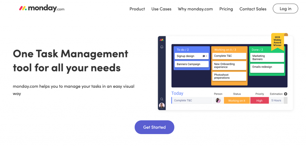
To boost efficiency, I highly recommend Monday, a task management platform to keep track of your different tasks.

With Monday, you can assign tasks to different team members, prioritize tasks with due dates so you know what to focus on first, and view overall progress all in one dashboard.

After all… If you want to get more done in the day, you need to work smarter, not harder!

Task management tools are critical if you want to leverage high-output activities and minimize time wastage.

2. Last Pass

Did you know that a smartphone user uses on average, 30 apps per month?

Remembering the login passwords to all your apps is pretty tricky (almost impossible if you ask us!)

But repeat the same passwords, and you’re inviting the hackers in (It’s like leaving your home keys under the doormat!)

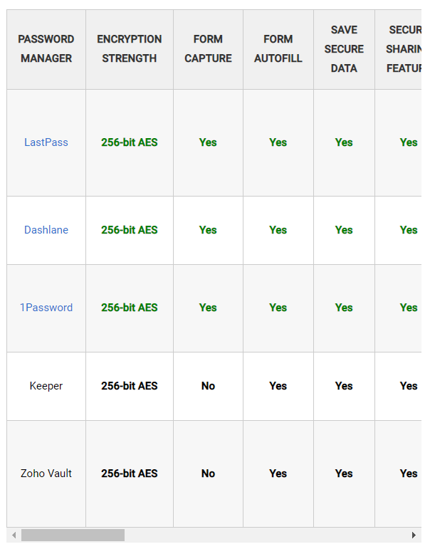
To combat this problem, look into password managers like Last Pass.
They’re excellent as they save your sensitive data like passwords, credit cards, and even insurance cards. LastPass is widely ranked on reviews as the top password manager out there:

With a password manager, you just need to remember one password (the one for the password manager). Easy enough, right?

Get organized and save time.

3. SocialPilot

With 69% of the US population consuming social media, you need to be online if you’re growing your business or building a personal brand.

But it’s not enough just having a social media profile.

You’ll need to consistently plan, produce, and schedule content dates and times to publish them consistently.

It’s a lot of effort.

That’s why you should use a social media marketing tool like SocialPilot. With this tool, you can prepare and schedule your content on a range of social media platforms, like travel bloggers Adventure For Less recommend:

(Image Source)

This ensures you never miss a post!

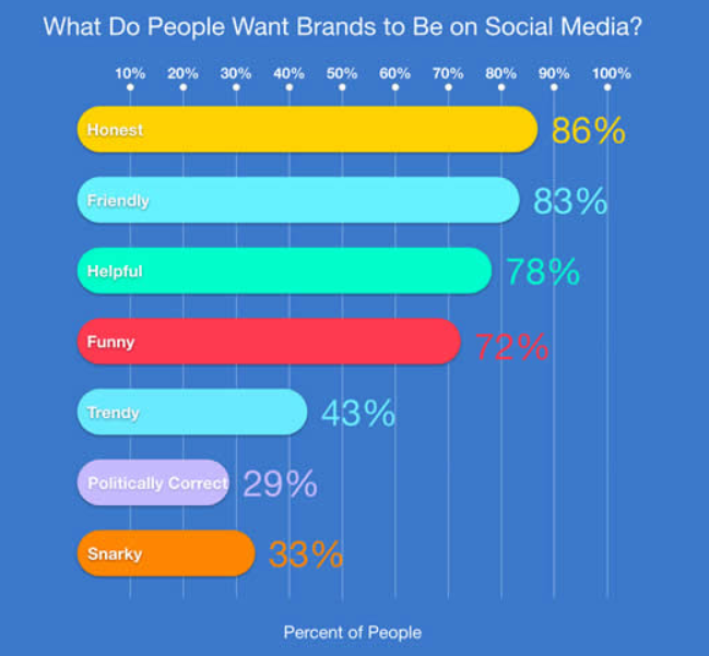
When it comes to consumers and brands on social media, 86% want brands to be honest, 83% to be friendly, and 78% to be helpful.

It takes time to build an honest and understanding relationship with customers.

Social media planning tools are great and will help you nurture these relationships in the long run.

3. Canva

Every business requires content, but did you know 80% of marketers use visual assets in their social media marketing now?

Everyone is upping their content game so they can solve their audience’s problems and increase their bottom line in the process.

So should you.

Creating visual assets can be difficult and time-consuming. But with Canva’s easy drag-and-drop feature, you can make a variety of online visuals like infographics and social media posts.

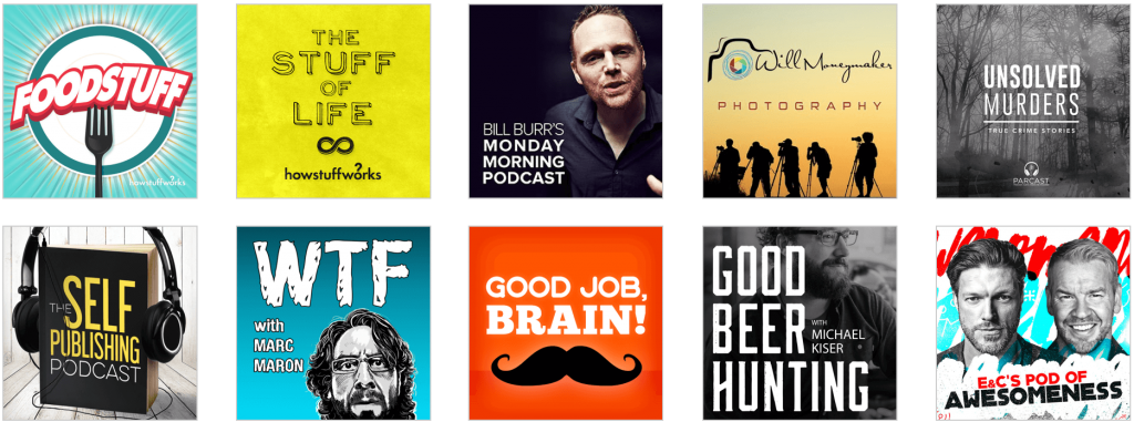
Wanna host your own podcast but don’t want to hire an expensive designer to design the cover?

Fear not, you can create beautiful podcast album covers in Canva, too.

It’s super simple to get started.

You can design a cover like these in only minutes — saving you loads of time!

5. Evernote

I know it’s essential to keep your notes organized.

But it’s so easy to misplace them.

With Evernote, you can take your notes anywhere, and search for information faster. Create to-do lists, reminders, meeting notes, and even plan and draft up your blog posts here.

For example, you can create a blog post like Lendio does on loans in Evernote, and directly export it to your content management system to save time!

(Image Source)

Have lots of images to upload to your blog post? Don’t worry, Evernote can handle that too!

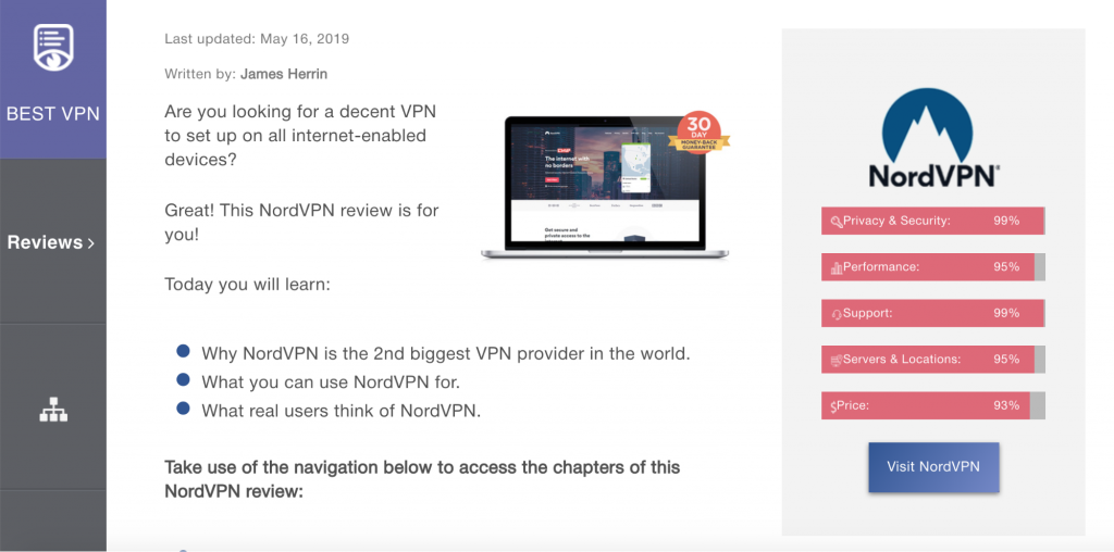
With Evernote, you can even include all of your images for your post like VPN Reviews does in their NordVPN review post.

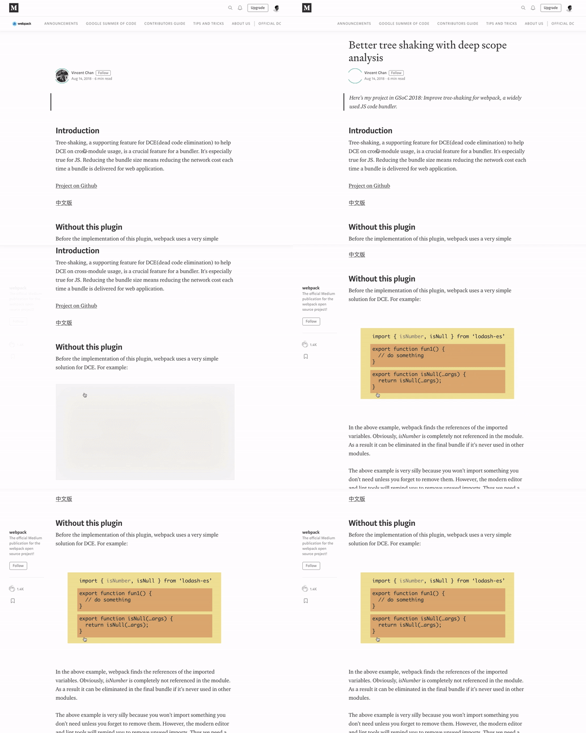
Here’s an example of how you can begin your draft and editing process in Evernote:

And here’s the final product once published:

Evernote is great because it stores all your notes, photos, lists, and to-do reminders in one place and definitely comes in handy for bloggers.

Plus, you can also share these notes with others and collaborate on the same “note” together!

6. Unbounce

When it comes to websites, everyone talks about starting a blog and site on WordPress.

But even WordPress templates take time to build.

You’d also have to download and install additional plugins if you want to measure specific stats.

A quicker way to build a simple landing page is through Unbounce.

Unbounce’s platform is specifically designed to help you create landing pages that convert more leads and sales. There’s also no coding required.
Have a look at Housecall Pro’s example below.

(Image Source)

Yeah, that’s something you can easily build in your landing page builder.

Final Thoughts

It’s important to be productive throughout the day.

With only so few hours, we should make the most of it.

That’s why you should spend your time more effectively by leveraging everyday tools such as Focus Me, Last Pass, Buffer, Canva, Evernote, and Unbounce.

They’ll help you get more done with less time.

Make working smarter a new motto for 2019. Who’s with me?

Categories: Others Tags:

Ways to Organize and Prepare Images for a Blur-Up Effect Using Gatsby

November 18th, 2019 No comments

Gatsby does a great job processing and handling images. For example, it helps you save time with image optimization because you don’t have to manually optimize each image on your own.

With plugins and some configuration, you can even setup image preloading and a technique called blur-up for your images using Gatsby. This helps with a smoother user experience that is faster and more appealing.

I found the combination of gatsby-source-filesystem, GraphQL, Sharp plugins and gatsby-image quite tedious to organize and un-intuitive, especially considering it is fairly common functionality. Adding to the friction is that gatsby-image works quite differently from a regular tag and implementing general use cases for sites could end up complex as you configure the whole system.

Medium uses the blur-up technique for images.

If you haven’t done it already, you should go through the gatsby-image docs. It is the React component that Gatsby uses to process and place responsive, lazy-loaded images. Additionally, it holds the image position which prevents page jumps as they load and you can even create blur-up previews for each image.

For responsive images you’d generally use an tag with a bunch of appropriately sized images in a srcset attribute, along with a sizes attribute that informs the layout situation the image will be used in.

<img srcset="img-320w.jpg 320w,
              img-480w.jpg 480w,
              img-800w.jpg 800w"
      sizes="(max-width: 320px) 280px,
            (max-width: 480px) 440px,
            800px"
      src="img-800w.jpg">

You can read up more on how this works in the Mozilla docs. This is one of the benefits of using gatsby-image in the first place: it does all the resizing and compressing automatically while doing the job of setting up srcset attributes in an tag.

Directory structure for images

Projects can easily grow in size and complexity. Even a single page site can contain a whole bunch of image assets, ranging from icons to full-on gallery slides. It helps to organize images in some order rather than piling all of them up in a single directory on the server. This helps us set up processing more intuitively and create a separation of concerns.

While attempting to organize files, another thing to consider is that Gatsby uses a custom webpack configuration to process, minify, and export all of the files in a project. The generated output is placed in a /public folder. The overall structure gatsby-starter-default uses looks like this:

/
|-- /.cache
|-- /plugins
|-- /public
|-- /src
    |-- /pages
    |-- /components
    |-- /images
    |-- html.js
|-- /static (not present by default)
|-- gatsby-config.js
|-- gatsby-node.js
|-- gatsby-ssr.js
|-- gatsby-browser.js

Read more about how the Gatsby project structure works here.

Let’s start with the common image files that we could encounter and would need to organize

For instance:

  • icons
  • logos
  • favicon
  • decorative images (generally vector or PNG files)
  • Image gallery (like team head shots on an About page or something)

How do we group these assets? Considering our goal of efficiency and the Gatsby project structure mentioned above, the best approach would be to split them into two groups: one group that requires no processing and directly imported into the project; and another group for images that require processing and optimization.

Your definitions may differ, but that grouping might look something like this:

Static, no processing required:

  • icons and logos that require no processing
  • pre-optimized images
  • favicons
  • other vector files (like decorative artwork)

Processing required:

  • non-vector artwork (e.g. PNG and JPG files)
  • gallery images
  • any other image that can be processed, which are basically common image formats other than vectors

Now that we have things organized in some form of order, we can move onto managing each of these groups.

The “static” group

Gatsby provides a very simple process for dealing with the static group: add all the files to a folder named static at the root of the project. The bundler automatically copies the contents to the public folder where the final build can directly access the files.

Say you have a file named logo.svg that requires no processing. Place it in the static folder and use it in a component file like this:

import React from "react"

// Tell webpack this JS file requires this image
import logo from "../../static/logo.svg" 

function Header() {
  // This can be directly used as image src
  return <img src={logo} alt="Logo" />
}

export default Header

Yes, it’s as simple as that — much like importing a component or variable and then directly using it. Gatsby has detailed documentation on importing assets directly into files you could refer to for further understanding.

Special case: Favicon

The plugin gatsby-plugin-manifest not only adds a manifest.json file to the project but also generates favicons for all required sizes and links them up in the site.

With minimal configuration, we have favicons, no more manually resizing, and no more adding individual links in the HTML head. Place favicon.svg (or .png or whatever format you’re using) in the static folder and tweak the gatsby-config.js file with settings for gatsby-plugin-manifest

{
  resolve: `gatsby-plugin-manifest`,
  options: {
    name: `Absurd`,
    icon: `static/favicon.svg`,
  },
},

The “processed” group

Ideally, what we’d like is gatsby-image to work like an img tag where we specify the src and it does all the processing under the hood. Unfortunately, it’s not that straightforward. Gatsby requires you to configure gatsby-source-filesystem for the files then use GraphQL to query and processed them using Gatsby Sharp plugins (e.g. gatsby-transformer-sharp, gatsby-plugin-sharp) with gatsby-image. The result is a responsive, lazy-loaded image.

Rather than walking you through how to set up image processing in Gatsby (which is already well documented in the Gatsby docs), I’ll show you a couple of approaches to optimize this process for a couple of common use cases. I assume you have a basic knowledge of how image processing in Gatsby works — but if not, I highly recommend you first go through the docs.

Use case: An image gallery

Let’s take the common case of profile images on an About page. The arrangement is basically an array of data with title, description and image as a grid or collection in a particular section.

The data array would be something like:

const TEAM = [
  {
    name: 'Josh Peck',
    image: 'josh.jpg',
    role: 'Founder',
  },
  {
    name: 'Lisa Haydon',
    image: 'lisa.jpg',
    role: 'Art Director',
  },
  {
    name: 'Ashlyn Harris',
    image: 'ashlyn.jpg',
    role: 'Frontend Engineer',
  }
];

Now let’s place all the images (josh.jpg, lisa.jpg and so on) in src/images/team You can create a folder in images based on what group it is. Since we’re dealing with team members on an About page, we’ve gone with images/team The next step is to query these images and link them up with the data.

To make these files available in the Gatsby system for processing, we use gatsby-source-filesystem. The configuration in gatsby-config.js for this particular folder would look like:

{
  resolve: `gatsby-source-filesystem`,
  options: {
    name: `team`,
    path: `${__dirname}/src/images/team`,
  },
  `gatsby-transformer-sharp`,
  `gatsby-plugin-sharp`,
},

To query for an array of files from this particular folder, we can use sourceInstanceName It takes the value of the name specified in gatsby-config.js:

{
  allFile(filter: { sourceInstanceName: { eq: "team" } }) {
    edges {
      node {
        relativePath
        childImageSharp {
          fluid(maxWidth: 300, maxHeight: 400) {
            ...GatsbyImageSharpFluid
          }
        }
      }
    }
  }
}

This returns an array:

// Sharp-processed image data is removed for readability
{
  "data": {
    "allFile": {
      "edges": [
        {
          "node": {
            "relativePath": "josh.jpg"
          }
        },
        {
          "node": {
            "relativePath": "ashlyn.jpg"
          }
        },
        {
          "node": {
            "relativePath": "lisa.jpg"
          }
        }
      ]
    }
  }

As you can see, we’re using relativePath to associate the images we need to the item in the data array. Some quick JavaScript could help here:

// Img is gatsby-image
// TEAM is the data array

TEAM.map(({ name, image, role }) => {
  // Finds associated image from the array of images
  const img = data.allFile.edges.find(
    ({ node }) => node.relativePath === image
  ).node;

  return (
    <div>
      <Img fluid={img.childImageSharp.fluid} alt={name} />
      <Title>{name}</Title>
      <Subtitle>{role}</Subtitle>
    </div>
  );
})

That’s the closest we’re getting to using src similar to what we do for tags.

Use case: Artwork

Although artwork may be created using the same type of file, the files are usually spread throughout the in different sections (e.g. pages and components), with each usually coming in different dimensions.

It’s pretty clear that querying the whole array, as we did previously, won’t wor. However, we can still organize all the images in a single folder. That means we an still use sourceInstanceName for specifying which folder we are querying the image from.

Similar to our previous use case, let’s create a folder called src/images/art and configure gatsby-source-filesystem. While querying, rather than getting the whole array, here we will query for the particular image we need in the size and specification as per our requirements:

art_team: file(
    sourceInstanceName: { eq: "art" }
    name: { eq: "team_work" }
  ) {
    childImageSharp {
    fluid(maxWidth: 1600) {
      ...GatsbyImageSharpFluid
    }
  }
}

This can be directly used in the component:

<Img fluid={data.art_team.childImageSharp.fluid} />

Further, this can be repeated for each component or section that requires an image from this group.

Special case: Inlining SVGs

Gatsby automatically encodes smaller images into a base64 format and places the data inline, reducing the number of requests to boost performance. That’s great in general, but might actually be a detriment to SVG files. Instead, we can manually wrangle SVGs to get the same performance benefits, or in the case we might want to make things more interactive, incorporate animations.

I found gatsby-plugin-svgr to be the most convenient solution here. It allows us to import all SVG files as React components:

import { ReactComponent as GithubIcon } from './github.svg';

Since we’re technically processing SVG files instead of raster images, it’d make sense to move the SVG file out of static folder and place it in the folder of the component that’s using it.

Conclusion

After working with Gatsby on a couple of projects, these are a few of the ways I overcame hurdles when working with images to get that nice blur-up effect. I figured they might come handy for you, particularly for the common use cases we looked at.

All the conventions used here came from the gatsby-absurd starter project I set up on GitHub. Here’s the result:

It’s a good idea to check that out if you’d like to see examples of it used in a project. Take a look at Team.js to see how multiple images are queried from the same group. Other sections — such as About.js and Header.js — illustrate how design graphics (the group of images shared across different sections) are queried. Footer.js and Navbar.js have examples for handling icons.

The post Ways to Organize and Prepare Images for a Blur-Up Effect Using Gatsby appeared first on CSS-Tricks.

Categories: Designing, Others Tags:

The Department of Useless Images

November 18th, 2019 No comments

Gerry McGovern:

The Web is smothering in useless images. These clichéd, stock images communicate absolutely nothing of value, interest or use. They are one of the worst forms of digital pollution because they take up space on the page, forcing more useful content out of sight. They also slow down the site’s ability to download quickly.

:laugh: :cry:

It’s so true, isn’t it? How much bandwidth and electricity is spent sending middle-aged-man-staring-into-camera.jpg?

Great photography can be a powerful emotional trigger and be a distinguishing feature of a design, but there is a line between that and some random Unsplash thing. (Says the guy who absolutely loves the Unsplash integration on Notion.)

Direct Link to ArticlePermalink

The post The Department of Useless Images appeared first on CSS-Tricks.

Categories: Designing, Others Tags: