Archive

Archive for November, 2019

Abstracting WordPress Code To Reuse With Other CMSs: Concepts (Part 1)

November 18th, 2019 No comments
Smashing Editorial

Abstracting WordPress Code To Reuse With Other CMSs: Concepts (Part 1)

Abstracting WordPress Code To Reuse With Other CMSs: Concepts (Part 1)

Leonardo Losoviz

2019-11-18T12:00:00+00:002019-11-19T05:25:33+00:00

Making code that is agnostic of the CMS or framework has several benefits. For instance, through its new content editor Gutenberg, WordPress enables to code components which can be used for other CMSs and frameworks too, such as for Drupal and for Laravel. However, Gutenberg’s emphasis on re-utilization of code is focused on the client-side code of the component (JavaScript and CSS); concerning the component’s backend code (such as the provision of APIs that feed data to the component) there is no pre-established consideration.

Since these CMSs and frameworks (WordPress, Drupal, Laravel) all run on PHP, making their PHP code re-usable too will make it easier to run our components on all these different platforms. As another example, if we ever decide to replace our CMS with another one (as has recently happened that many people decried WordPress after its introduction of Gutenberg), having the application code be agnostic from the CMS simplifies matters: The more CMS-agnostic our application code is, the less effort will be required to port it to other platforms.

Starting with application code built for a specific CMS, the process of transforming it to CMS-agnostic is what, in this article, I will call “abstracting code”. The more abstract the code is, the more it can be re-used to work with whichever CMS.

Making the application completely CMS-agnostic is very tough though — even possibly impossible — since sooner or later it will need to depend on the specific CMS’s opinionatedness. Then, instead of attempting to achieve 100% code reusability, our goal must simply be to maximize the amount of code that is CMS-agnostic to make it reusable across different CMSs or frameworks (for the context of this article, these 2 terms will be used interchangeably). Then, migrating the application to a different framework will be not without pain, but at least it will be as painless as possible.

The solution to this challenge concerns the architecture of our application: We must keep the core of the application cleanly decoupled from the specifics of the underlying framework, by coding against interfaces instead of implementations. Doing so will grant additional benefits to our codebase: We can then focus our attention almost exclusively on the business logic (which is the real essence and purpose of the application), causing the code to become more understandable and less muddled with the limitations imposed by the particular CMS.

This article is composed of 2 parts: In this first part we will conceptualize and design the solution for abstracting the code from a WordPress site, and on the 2nd part we will implement it. The objective shall be to keep the code ready to be used with Symfony components, Laravel framework, and October CMS.

Code Against Interfaces, Rely On Composer, Benefit From Dependency Injection

The design of our architecture will be based on the following pillars:

  1. Code against interfaces, not implementations.
  2. Create packages, distribute them through Composer.
  3. Dependency Injection to glue all parts together.

Let’s analyze them one by one.

Code Against Interfaces, Not Implementations

Coding against interfaces is the practice of interacting with a certain piece of code through a contract. A contract, which is set up through an interface from our programming language (PHP in our case since we are dealing with WordPress), establishes the intent of certain functionality, by explicitly stating what functions are available, what inputs are expected for each function, and what each function will return, and it is not concerned with how the functionality must be implemented. Then, our application can be cleanly decoupled from a specific implementation, not needing to know how its internals work, and being able to change to another implementation at any time without having to drastically change code. For instance, our application can store data by interacting with an interface called DataStoreInterface instead of any of its implementations, such as instances of classes DatabaseDataStore or FilesystemDataStore.

In the context of WordPress, this implies that — by the end of the abstraction — no WordPress code will be referenced directly, and WordPress itself will simply be a service provider for all the functions that our application needs. As a consequence, we must consider WordPress as a dependency of the application, and not as the application itself.

Contracts and their implementations can be added to packages distributed through Composer and glued together into the application through dependency injection which are the items we will analyze next.

Create Packages, Distribute Them Through Composer

Remember this: Composer is your friend! This tool, a package manager for PHP, allows any PHP application to easily retrieve packages (i.e. code) from any repository and install them as dependencies.

Note: I have already described how we can use Composer together with WordPress in a previous article I wrote earlier this year.

Composer is itself CMS-agnostic, so it can be used for building any PHP application. Packages distributed through Composer, though, may be CMS-agnostic or not. Therefore, our application should depend on CMS-agnostic packages (which will work for any CMS) as much as possible, and when not possible, depend on the corresponding package that works for our specific CMS.

This strategy can be used to code against contracts, as explained earlier on. The packages for our application can be divided into two types: CMS-agnostic and CMS-specific ones. The CMS-agnostic package will contain all the contracts and all generic code, and the application will exclusively interact with these packages. For each CMS-agnostic package containing contracts, we must also create a CMS-specific package containing the implementation of the contracts for the required CMS, which is set into the application by means of dependency injection (which we’ll analyze below).

For example, to implement an API to retrieve posts, we create a CMS-agnostic package called “Posts”, with contract PostAPIInterface containing function getPosts, like this:

interface PostAPIInterface
{
  public function getPosts($args);
}

This function can be resolved for WordPress through a package called “Posts for WordPress”, which resolves the contract through a class WPPostAPI, implementing function getPosts to simply execute WordPress function get_posts, like this:

class WPPostAPI implements PostAPIInterface
{
  public function getPosts($args) {
    return get_posts($args);
  }
}

If we ever need to port our application from WordPress to another CMS, we must only implement the corresponding CMS-specific package for the new CMS (e.g. “Posts for October CMS”) and update the dependency injection configuration matching contracts to implementations, and that’s it!

Note: It is a good practice to create packages that only define contracts and nothing else. This way, it is easy for implementers to know exactly what must be implemented.

Dependency Injection To Glue All Parts Together

Dependency injection is a technique that allows declaring which object from the CMS-specific package (aka the “service provider”) is implementing which interface from the CMS-agnostic package (aka the “contract”), thus gluing all parts of the application together in a loosely-coupled manner.

Different CMSs or frameworks may already ship with their own implementation of a dependency injection component. For instance, whereas WordPress doesn’t have any, both Symfony and Laravel have their own solutions: DependencyInjection component and Service Container respectively.

Ideally, we should keep our application free from choosing a specific dependency injection solution, and leave it to the CMS to provide for this. However, dependency injection must be used also to bind together generic contracts and services, and not only those depending on the CMS (for instance, a contract DataStoreInterface, resolved through service provider FilesystemDataStore, may be completely unrelated to the underlying CMS). In addition, a very simple application that does not require an underlying CMS will still benefit from dependency injection. Hence, we are compelled to choose a specific solution for dependency injection.

Note: When choosing a tool or library, prioritize those ones which implement the corresponding PHP Standards Recommendation (in our case, we are interested in PSR-11), so they can be replaced without affecting the application code as much as possible (in practice, each solution will most likely have a custom initialization, so some re-writing of application code may be unavoidable).

Choosing The Dependency Injection Component

For my application, I have decided to use Symfony’s DependencyInjection component which, among other great features, can be set-up through YAML and XML configuration files, and it supports autowiring, which automatically resolves how different services are injected into one another, greatly reducing the amount of configuration needed.

For instance, a service Cache implementing a contract CacheInterface, like this one:

namespace MyPackageMyProject;
class Cache implements CacheInterface
{
  private $cacheItemPool;
  private $hooksAPI;

  public function __construct(
    CacheItemPoolInterface $cacheItemPool, 
    HooksAPIInterface $hooksAPI
  ) {
    $this->cacheItemPool = $cacheItemPool;
    $this->hooksAPI = $hooksAPI;
  }

  // ...
}

… can be set as the default service provider through the following services.yaml configuration file:

services:
  _defaults:
    bind:
      MyPackageMyProjectHooksAPIInterface: '@hooks_api'

  hooks_api:
    class: MyPackageMyProjectContractImplementationsHooksAPI

  cache:
    class: MyPackageMyProjectCache
    public: true
    arguments:
      $cacheItemPool: '@cache_item_pool'

  cache_item_pool:
    class: SymfonyComponentCacheAdapterFilesystemAdapter

As it can be observed, class cache requires two parameters in its constructor, and these are resolved and provided by the dependency injection component based on the configuration. In this case, while parameter $cacheItemPool is manually set, parameter $hooksAPI is automatically resolved through type-hinting (i.e. matching the expected parameter’s type, with the service that resolves that type). Autowiring thus helps reduce the amount of configuration required to glue the services and their implementations together.

Make Your Packages As Granular As Possible

Each package must be as granular as possible, dealing with a specific objective, and containing no more or less code than is needed. This is by itself a good practice in order to avoid creating bloated packages and establishing a modular architecture, however, it is mandatory when we do not know which CMS the application will run on. This is because different CMSs are based on different models, and it is not guaranteed that every objective can be satisfied by the CMS, or under what conditions. Keeping packages small and objective then enables to fulfill the required conditions in a progressive manner, or discard using this package only when its corresponding functionality can’t be satisfied by the CMS.

Let’s take an example: If we come from a WordPress mindset, we could initially assume that entities “posts” and “comments” will always be a part of the Content Management System, and we may include them under a package called “CMS core”. However, October CMS doesn’t ship with either posts or comments in its core functionality, and these are implemented through plugins. For the next iteration, we may decide to create a package to provide for these two entities, called “Posts and Comments”, or even “Posts” under the assumption that comments are dependent on posts and bundled with them. However, once again, the plugins in October CMS don’t implement these two together: There is a plugin implementing posts and another plugin implementing comments (which has a dependency on the posts plugin). Finally, our only option is to implement two separate packages: “Posts” and “Comments”, and assign a dependency from the latter to the former one.

Likewise, a post in WordPress contains post meta attributes (i.e. additional attributes to those defined in the database model) and we may assume that every CMS will support the same concept. However, we can’t guarantee that another CMS will provide this functionality and, even if it did, its implementation may be so different than that from WordPress that not the same operations could be applied to the meta attributes.

For example, both WordPress and October CMS have support for post meta attributes. However, whereas WordPress stores each post meta value as a row on a different database table than where the post is stored, October CMS stores all post meta values in a single entry as a serialized JSON object in a column from the post table. As a consequence, WordPress can fetch posts filtering data based on the meta value, but October CMS cannot. Hence, the package “Posts” must not include the functionality for post meta, which must then be implemented on its own package “Post Meta” (satisfiable by both WordPress and October CMS), and this package must not include functionality for querying the meta attributes when fetching posts, which must then be implemented on its own package “Post Meta Query” (satisfiable only by WordPress).

Identifying Elements That Need To Be Abstracted

We must now identify all the pieces of code and concepts from a WordPress application that need be abstracted for it to run with any other CMS. Digging into an application of mine, I identified the following items:

  • accessing functions
  • function names
  • function parameters
  • states (and other constant values)
  • CMS helper functions
  • user permissions
  • application options
  • database column names
  • errors
  • hooks
  • routing
  • object properties
  • global state
  • entity models (meta, post types, pages being posts, and taxonomies —tags and categories—)
  • translation
  • media

As long as it is, this list is not yet complete. There are many other items that need abstraction, which I will not presently cover. Such items include dealing with the location of assets (some framework may require to place image/font/JavaScript/CSS/etc. files on a specific directory) and CLI commands (WordPress has WP-CLI, Symfony has the console component, and Laravel has Artisan, and there are commands for each of these which could be unified).

In the next (and final) part of this series of articles, we will proceed to implement the abstraction for all the items identified above.

Evaluating When It Makes Sense To Abstract The Application

Abstracting an application is not difficult, but, as shall be observed in the next article, it involves plenty of work, so we must consider carefully if we really need it or not. Let’s consider the advantages and disadvantages of abstracting the application’s code:

Advantages

  • The effort required to port our application to other platforms is greatly reduced.
  • Because the code reflects our business logic and not the opinionatedness of the CMS, it is more understandable.
  • The application is naturally organized through packages which provide progressive enhancement of functionalities.

Disadvantages

  • Extra ongoing work.
  • Code becomes more verbose.
  • Longer execution time from added layers of code.

There is no magic way to determine if we’ll be better off by abstracting our application code. However, as a rule of thumb, I’ll propose the following approach:

Concerning a new project, it makes sense to establish an agnostic architecture, because the required extra effort is manageable, and the advantages make it well worth it; concerning an existing project, though, the one-time effort to abstract it could be very taxing, so we should analyze what is more expensive (in terms of time and energy): the one-time abstraction, or maintaining several codebases.

Conclusion

Setting-up a CMS-agnostic architecture for our application can allow to port it to a different platform with minimal effort. The key ingredients of this architecture are to code against interfaces, distribute these through granular packages, implement them for a specific CMS on a separate package, and tie all parts together through dependency injection.

Other than a few exceptions (such as deciding to choose Symfony’s solution for dependency injection), this architecture attempts to impose no opinionatedness. The application code can then directly mirror the business logic, and not the limitations imposed by the CMS.

In the next part of this series, we will implement the code abstraction for a WordPress application.

(rb, dm, yk, il)
Categories: Others Tags:

Introducing 15 Best New Portfolios, November 2019

November 18th, 2019 No comments

This month, the slow decline of minimalism continues, and color is everywhere. There’s some awesome type, and video-based maximalism seems to be gaining a foothold. Enjoy!

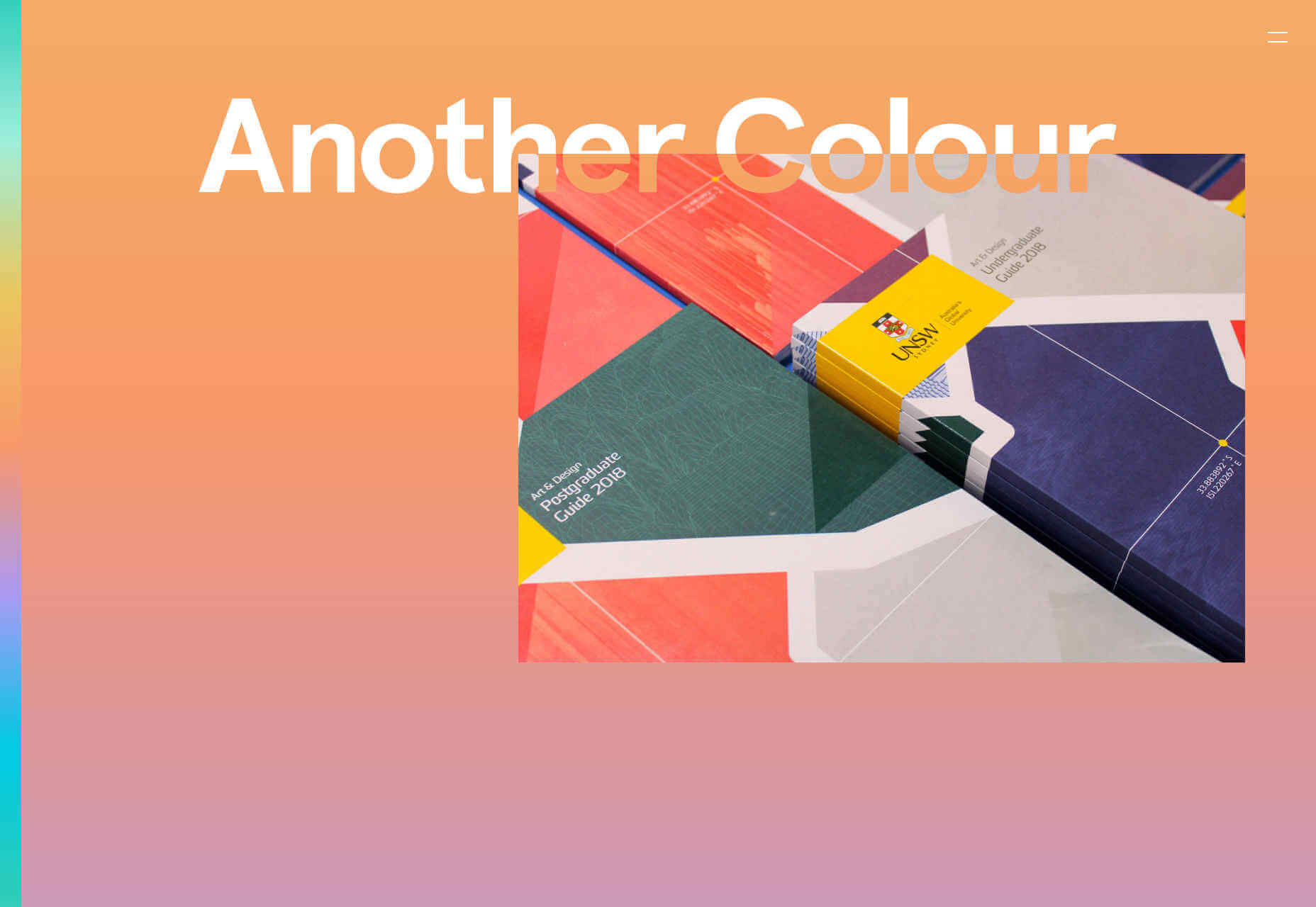
Another Colour

I adore Another Colour‘s site. It takes incredible complexity to produce an effect this simple. The landing page is a looping rainbow gradient, and the gradient strip on the left takes you to the related point. Click a case study, and you’ll see tons of great UX detail. The masks being used to create contrasting type is a cool effect.

Superimpose

Superimpose goes for full visual overload. With repeat images, rapidly changing graphics, and videos in constant flux — the whole thing feels like the tour film for a French techno band. The menu is terribly hard to find, hidden behind the logo, but there’s not much there in any case, the focus of the site is the endless scroll on the landing page.

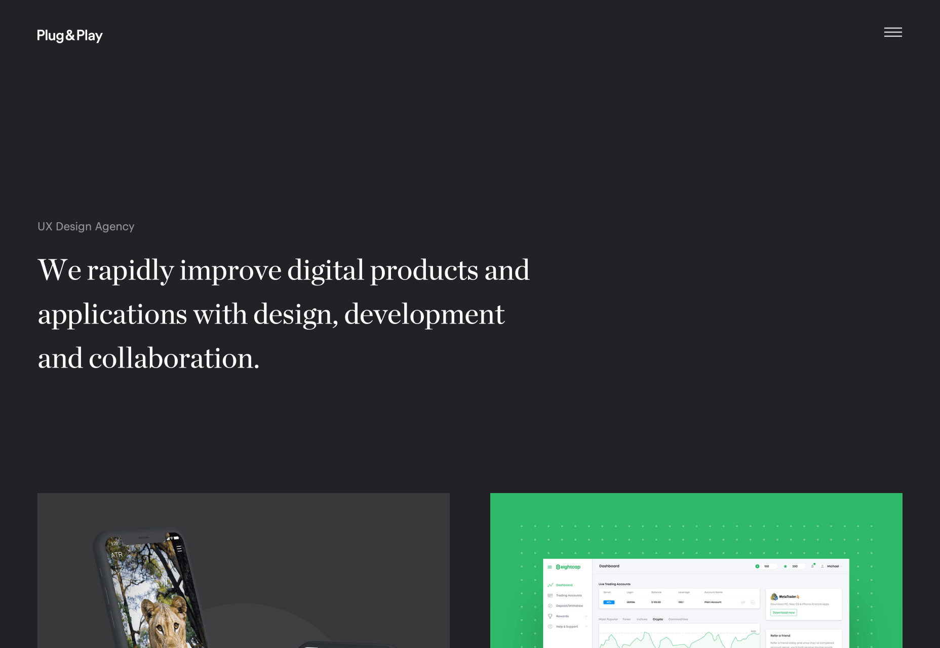
Plug & Play

Back in the realms of established user experience, the agency site for Plug & Play feels a lot less challenging. There’s the simple mission statement in large type that we’ve come to expect, and work overlapping the bottom edge encourages you to scroll. What I really like is is the way in which the site transitions from dark mode to light, as you scroll to the case studies. It’s a brilliant example of a simple transition that can be tied to a scroll.

Root

The video on the homepage of Root‘s site made me snort coffee up my nose. An old British guy with a plummy accent, reads out a list of font names in a deadpan style. I don’t know if everyone would understand what the names refer to, but check out their client list and you’ll see that it’s working for them. I’m not a fan of the mobile-only approach though.

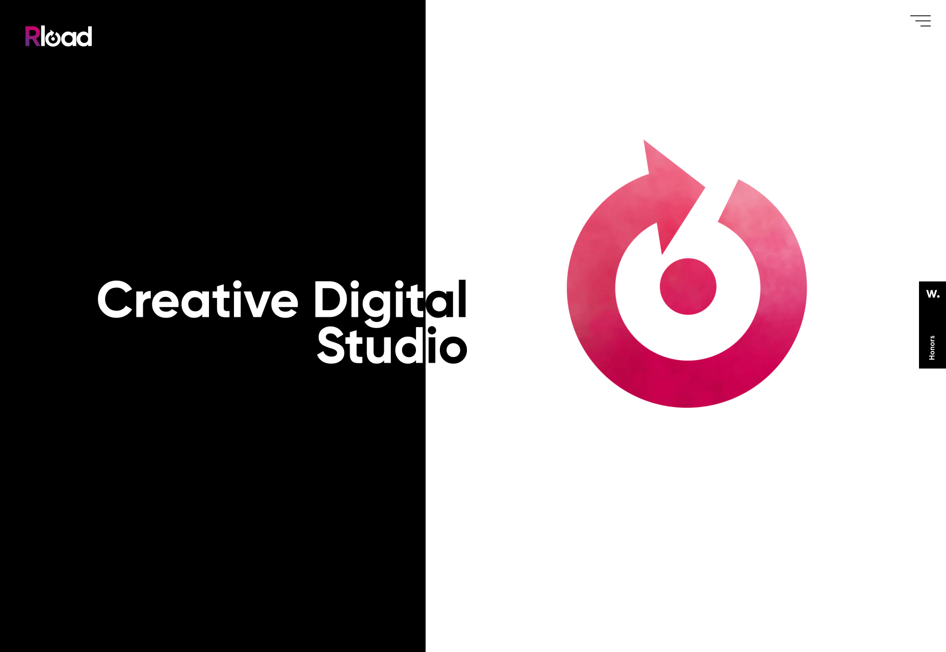
Rload

From a slightly anarchic British agency, to a highly-polished Spanish one. Rload hangs everything on its logo, with videos of smoke, and ink in water, behind a mask in order to add motion to the design. It’s a simple and effective way to present color and animation, without adding too much bloat. Their project page has embraced the brutalist trend, softened with a nice animated blob.

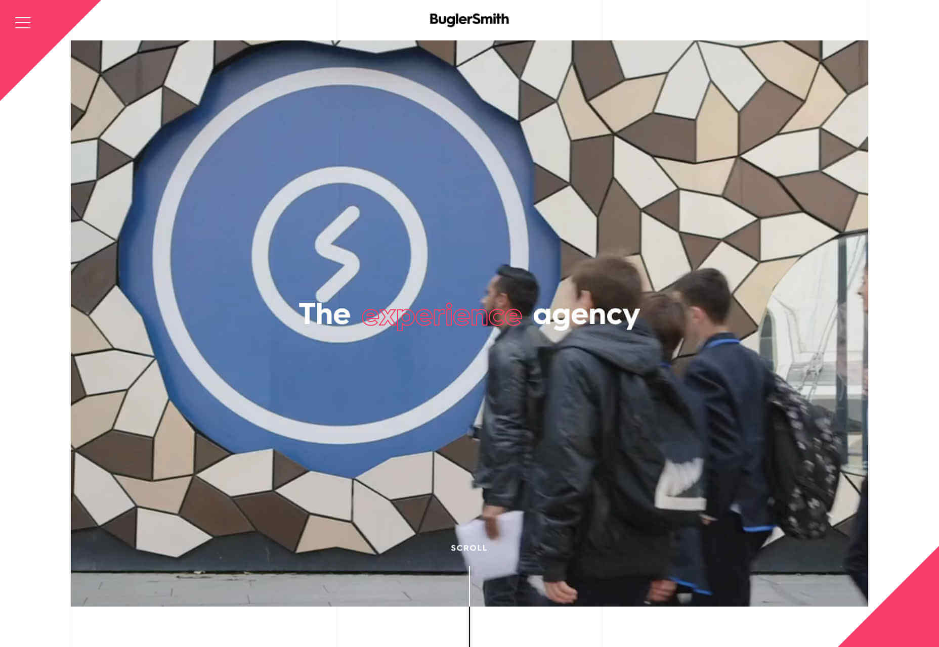
BuglerSmith

BuglerSmith is a creative agency, working on all kinds of media and interactive campaigns. Their site uses a very strong, very traditional 12-column grid to position thumbnails offset from each other, embracing the post-Brutalist trend. What really works is that some of the grid columns are highlighted with a fine line, which gives the scrolling page an incredible sense of depth. What’s more, it’s hard to dislike any agency that embraces neon pink.

Michele Smolensky

Speaking of neon pink, what could possibly beat neon pink, other than blackletter type set in neon pink. Michele Smolensky is a freelance designer and developer, from Austin Texas. Her site is simple, but the color combination of deep blue and neon pink really pops, and you’ve got to love any site that has the confidence to embrace blackletter, possibly the world’s most underused style of typeface.

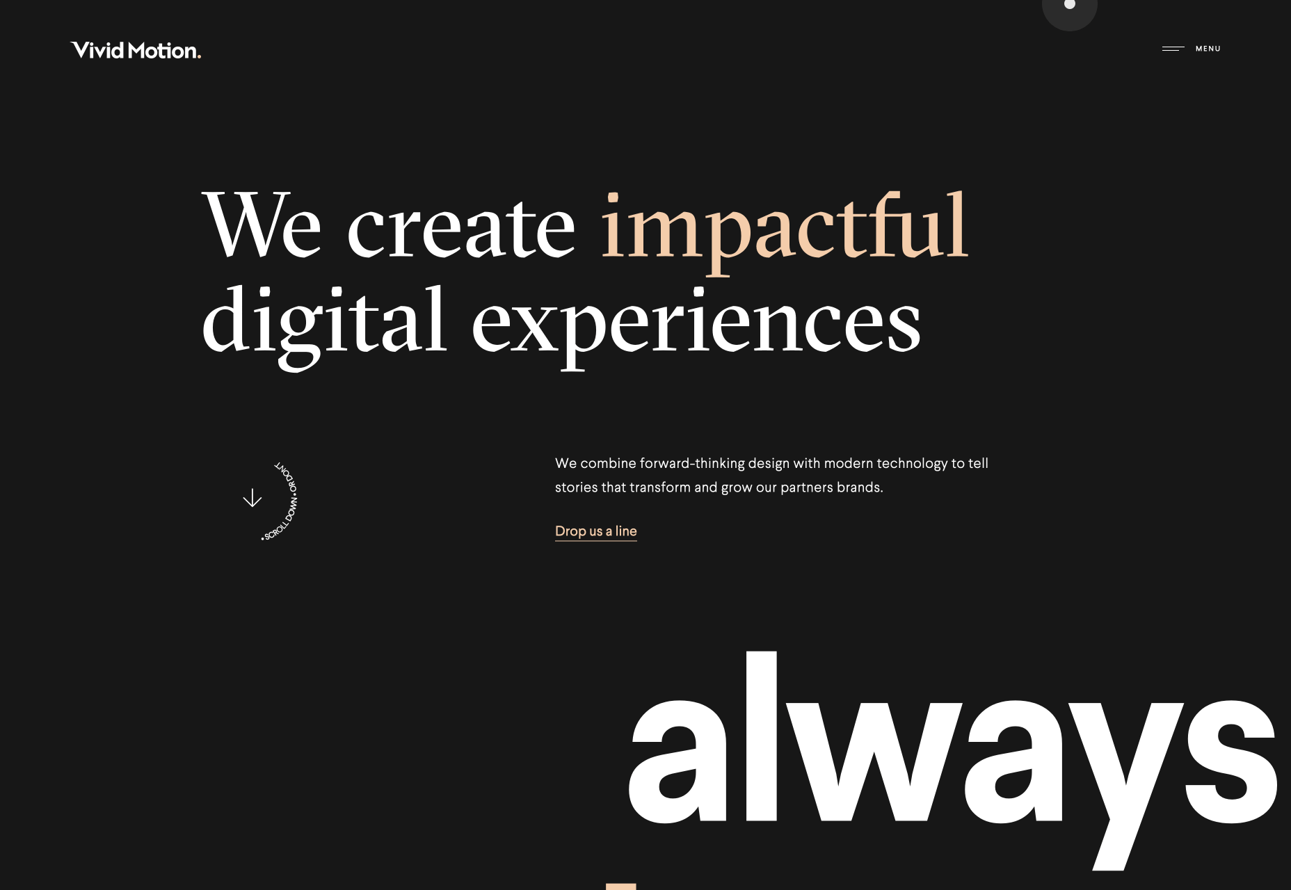
Vivid Motion

Vivid Motion is another site embracing beautiful typography. Vivid Motion relies on GT Spectra — a lovely serif font with tons of character thanks to those sharp cutaways. Scroll rapidly and the thumbnails sheer nicely to enhance the sense of motion. The dark background and simple grid feels like a lot of similar sites, but the considered typography really makes this site stand out.

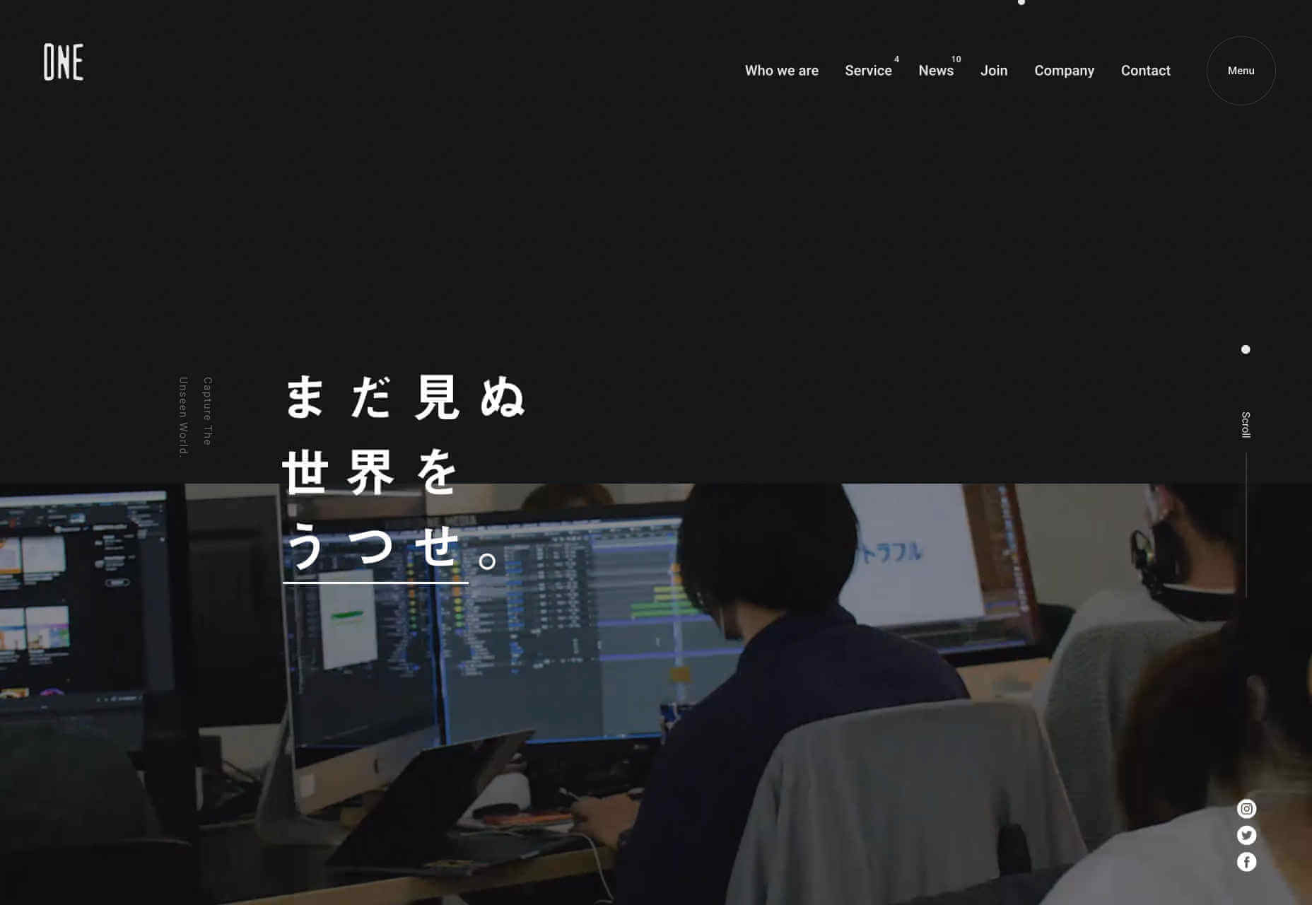
One Media

I love the energy of One Media‘s site. It’s more than just the rapid-cut video, the whole layout, the overlapping elements, and the interaction of the different blocks of text all contributes. It also makes use of a big design trend: menus that rely on overlays rather than background color, in order to stand out.

Elium

Elium is a Paris-based design studio specializing in product design. Their site features a slow-motion video that is effortlessly cool, and light-filled; precisely what I think of when I think of Paris. They’ve adopted a little of the spirit of brutalism with their offset images, but this site really longs for minimalism with the geometric sans-serif, and the subtle shifts in grey. I still can’t quite let go of this style.

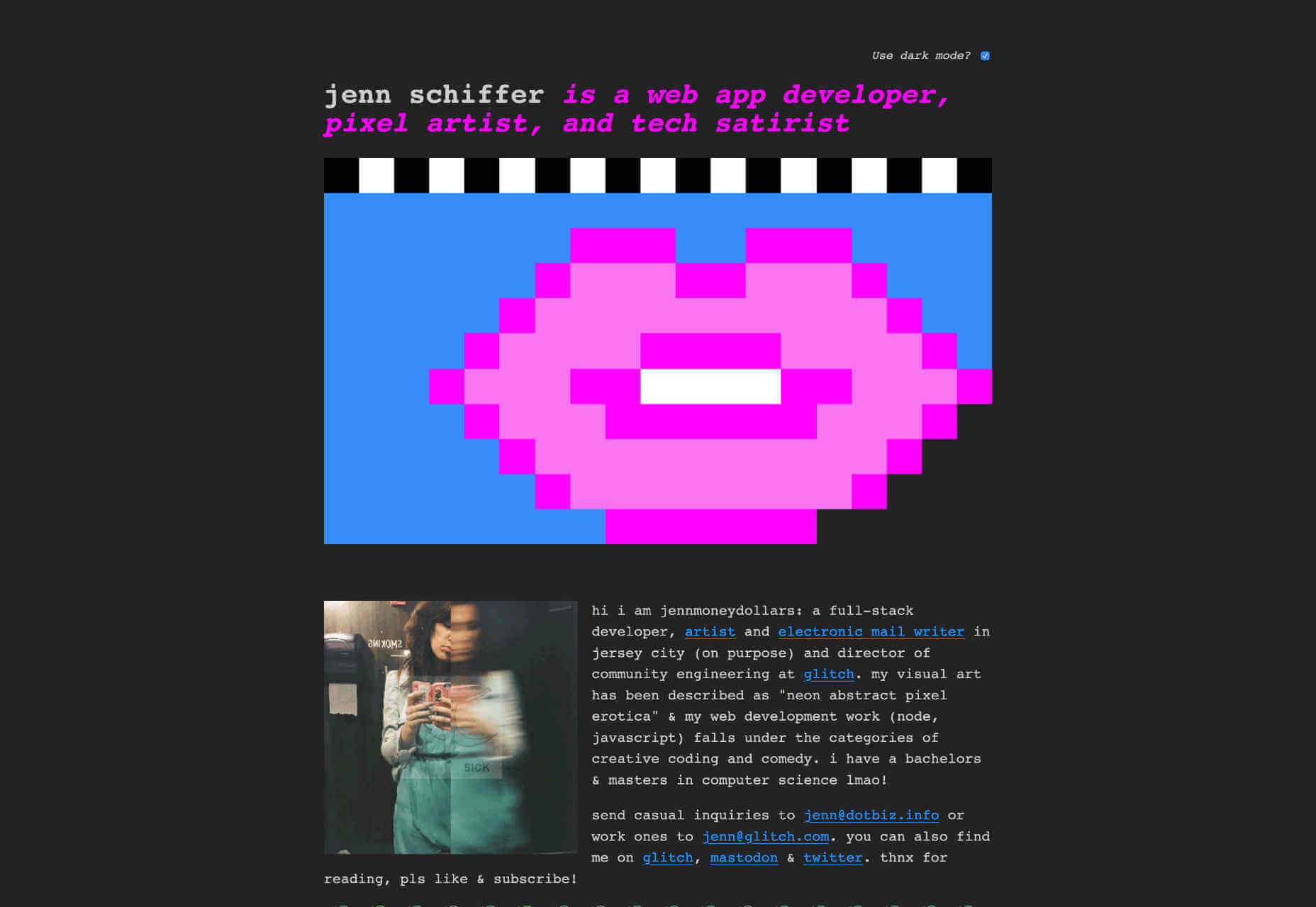
Jenn Schiffer

After a little visit to minimalism, we’re back to brutalism with a vengeance. Jenn Schiffer‘s site might be my favourite this month, because it harks back to the early web, when we posted what we loved, not what had been analysed, measured, and approved. Describing herself as a web app developer, pixel artist, and tech satirist, this site is cool AF. And the fact that she’s included a dark mode option is hilariously awesome.

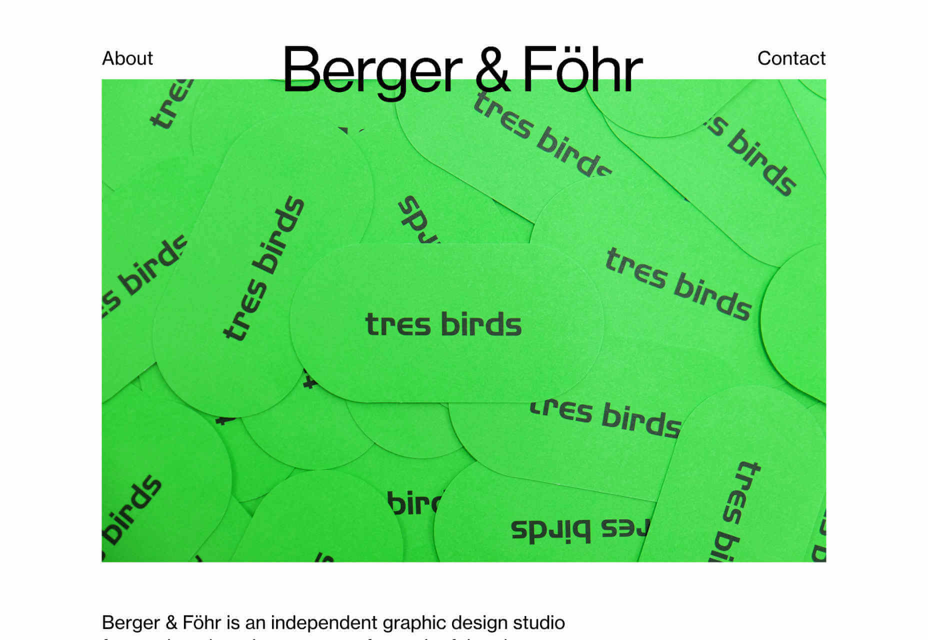
Berger & Föhr

Back to nice, sensible, orderly design. Berger & Föhr is a graphic design agency focused on brand ideas and identities. It’s a simple site that gives over all the attention to the actual portfolio. The work on show is highly accomplished, the identity for Hampton Architecture, Blackbelly, and Ello particularly stand out. If you had a healthy budget to rebrand your business, this is where you would spend it.

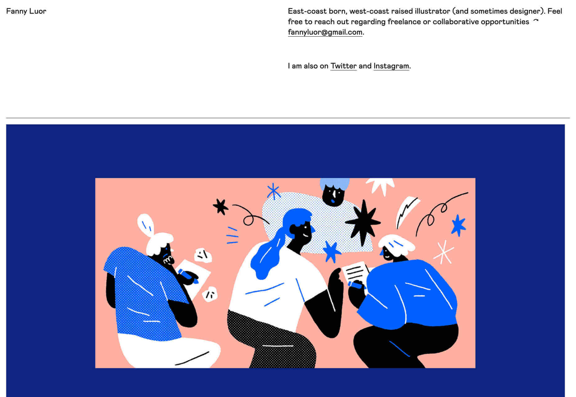
Fanny Luor

Fanny Luor is a freelance illustrator (and sometimes designer) whose site features some awesome work for clients like Dropbox and Intercom. Her very simple site is an exercise in self-restraint, which lets her work speak for itself. The illustration is both modern, and reminiscent of mid-late twentieth century illustration, with rich color blocks and simple shapes.

Huncwot

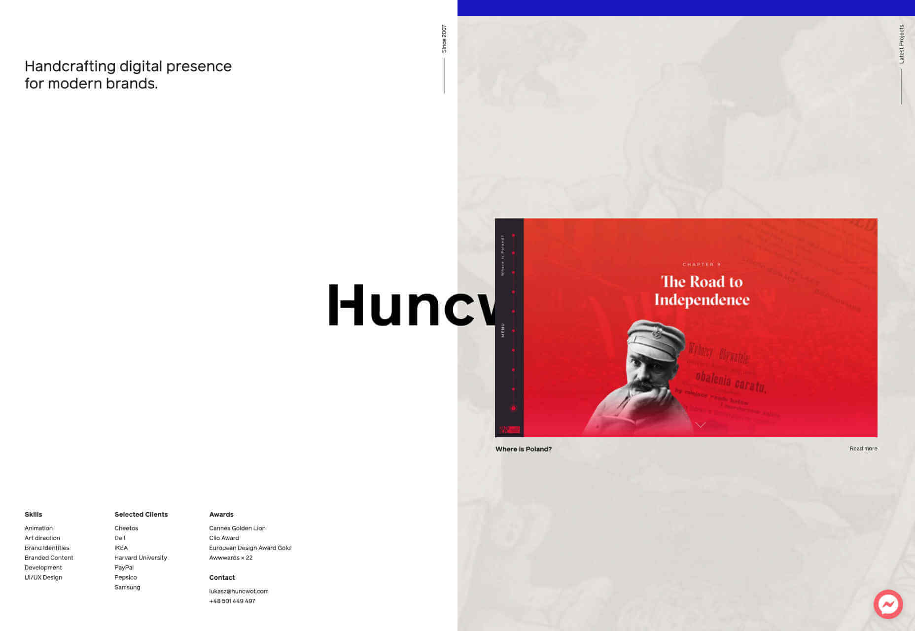
Huncwot‘s site is a simple premise, executed brilliantly. It’s a split-screen design with company details on the left, and work on the right. As you scroll the logo, which straddles both, is overlapped by the design thumbnails to create a subtle sense of depth. There’s even some parallax scrolling (yikes!) thrown in for good measure.

Austin Mayer

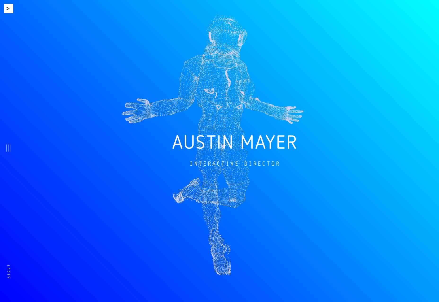
Austin Mayer describes himself as an ‘Interactive Director’ and the fun particle-explody effect on his landing page is certainly attention grabbing. What I really love is the use of the blue gradient. It feels like forever since I’ve seen blue used this well, creating a sense of space and light, without relying on darkmode to do it. Did I mention he’s done work for Beyoncé? Yup!

Source

Categories: Designing, Others Tags:

Popular Design News of the Week: November 11, 2019 – November 17, 2019

November 17th, 2019 No comments

Every week users submit a lot of interesting stuff on our sister site Webdesigner News, highlighting great content from around the web that can be of interest to web designers.

The best way to keep track of all the great stories and news being posted is simply to check out the Webdesigner News site, however, in case you missed some here’s a quick and useful compilation of the most popular designer news that we curated from the past week.

Note that this is only a very small selection of the links that were posted, so don’t miss out and subscribe to our newsletter and follow the site daily for all the news.

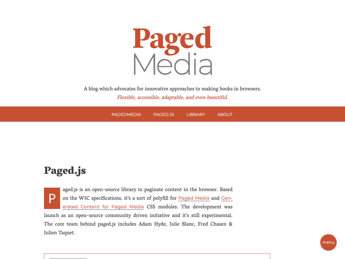
Paged.js

Facebook is Secretly Using your iPhone’s Camera as You Scroll your Feed

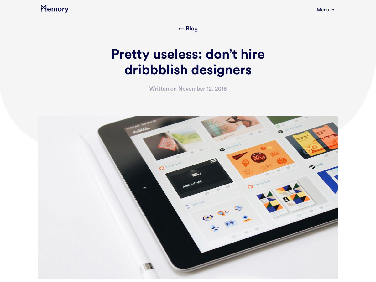
Don’t Hire Dribbblish Designers

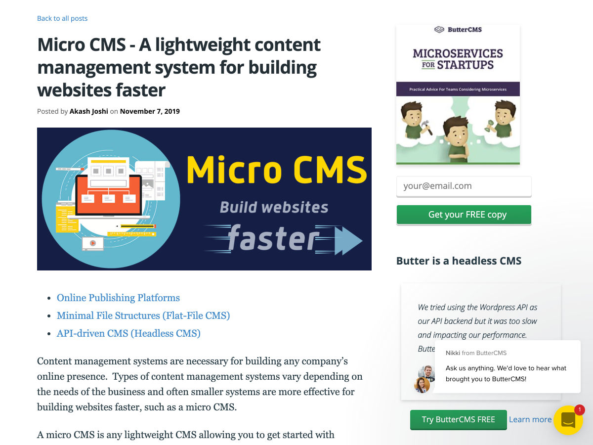
Micro CMS – A Lightweight Content Management System for Building Websites Faster

The 16-Inch MacBook Pro

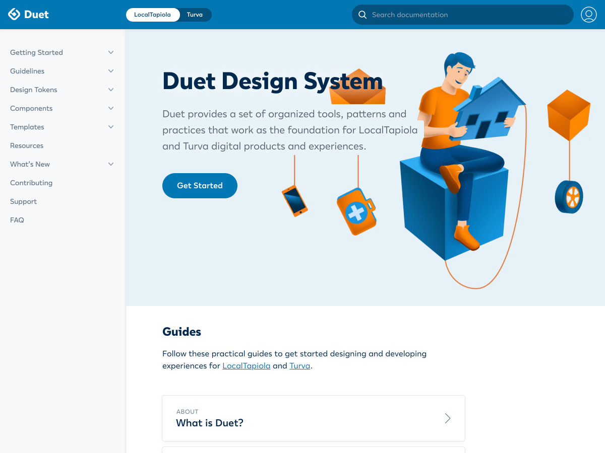
Duet Design System

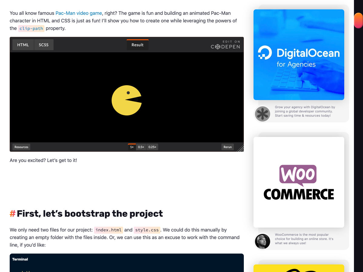
Pac-Man… in CSS!

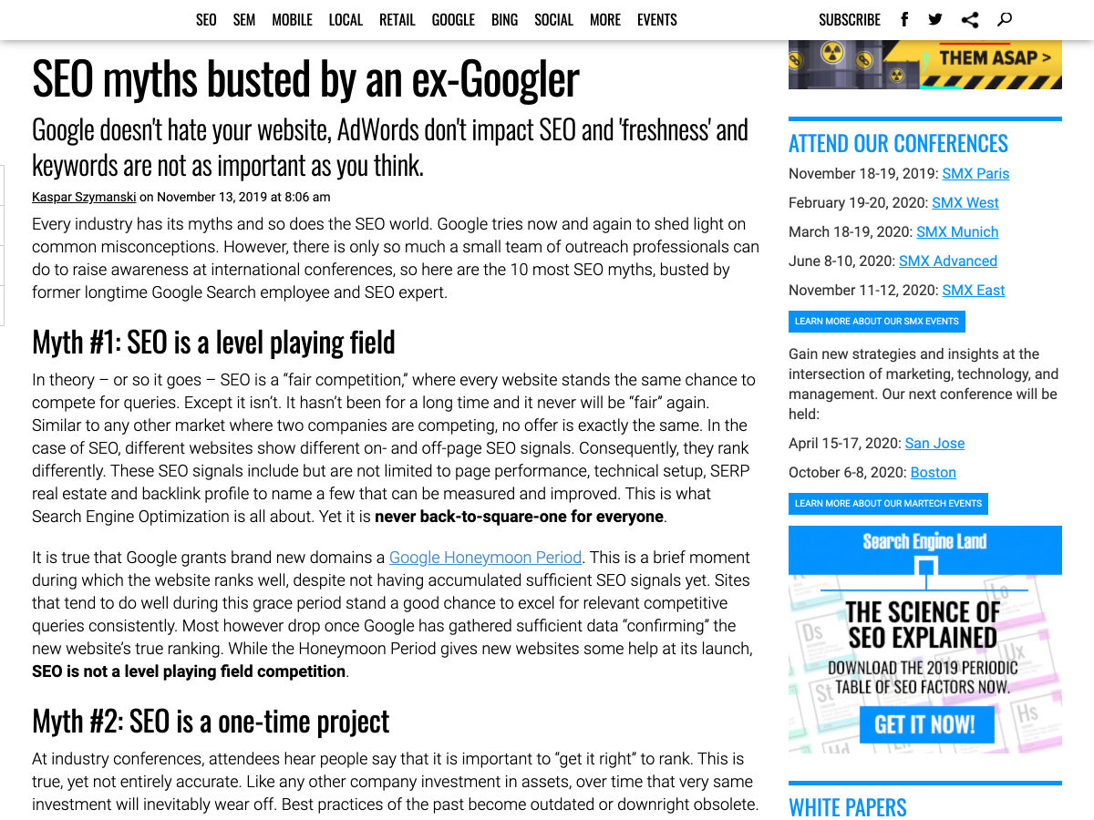
SEO Myths Busted by an Ex-Googler

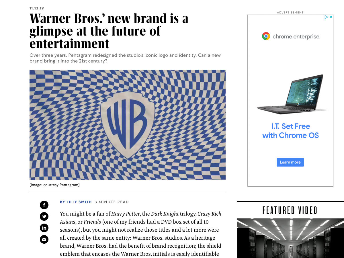
Warner Bros.’ New Brand is a Glimpse at the Future of Entertainment

YouTube Says it has ‘no Obligation’ to Host Anyone’s Video

Mobile Dark Patterns

Chrome ‘Speed Badging’ will Shame Websites that Load Slowly

How to Get Started in Product Illustration

A Touch of Neon in Web Design: Using Color to Draw a User’s Attention

5 Essential UX Design Tips

My Complete Toolkit for Design and Productivity

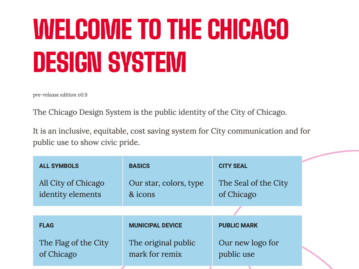
Chicago Design System

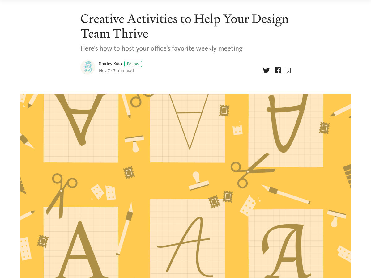
Creative Activities to Help your Design Team Thrive

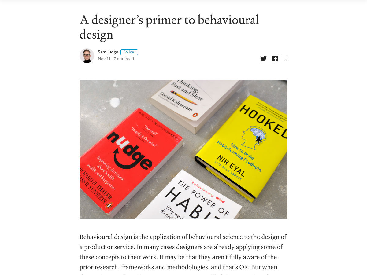
A Designer’s Primer to Behavioural Design

Apple Eyes 2022 Release for AR Headset, 2023 for Glasses

Know your Worth! A Guide to Setting your Rates

The 2019 Web Almanac

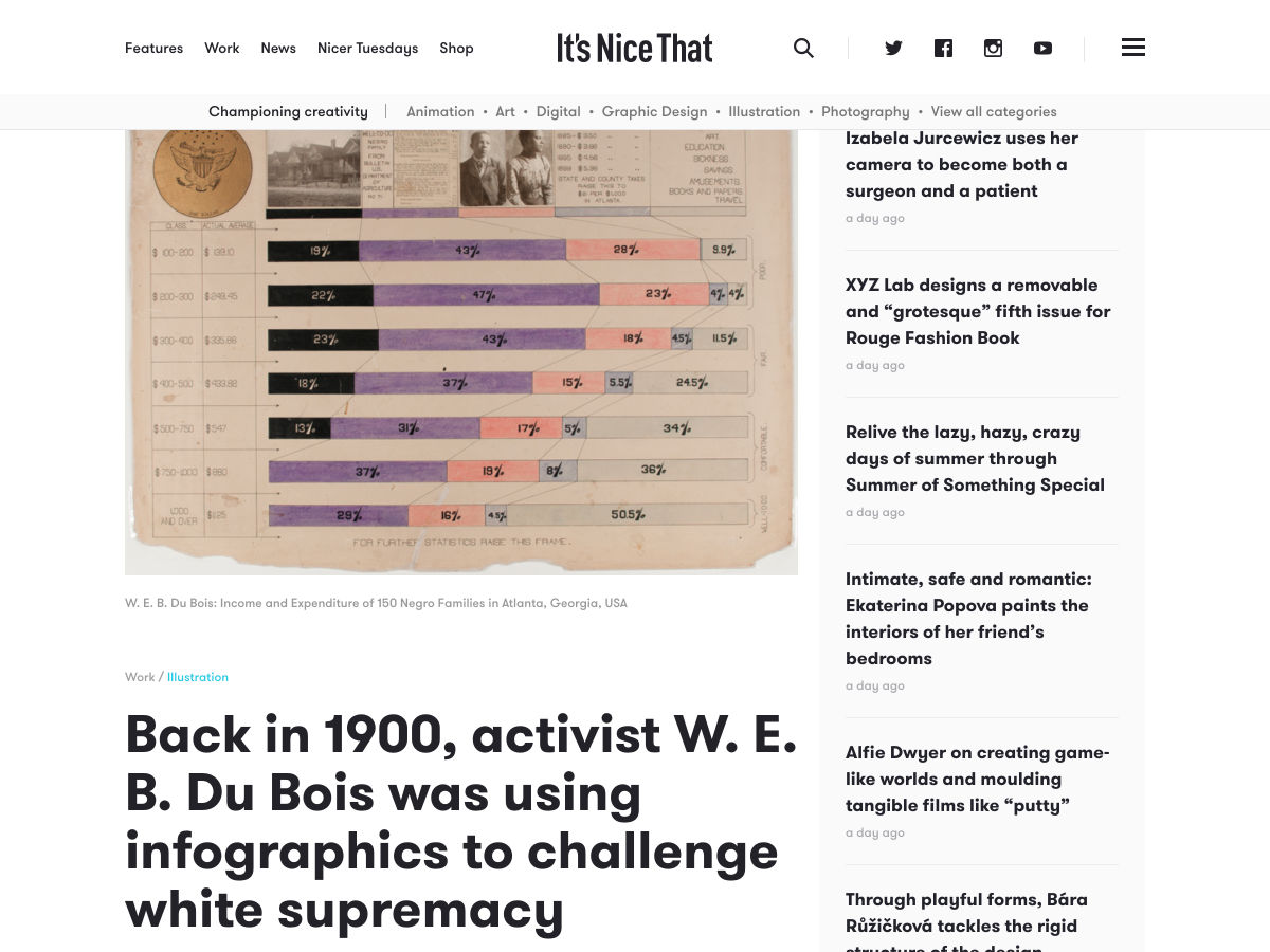
Back in 1900, Activist W. E. B. Du Bois was Using Infographics to Challenge White Supremacy

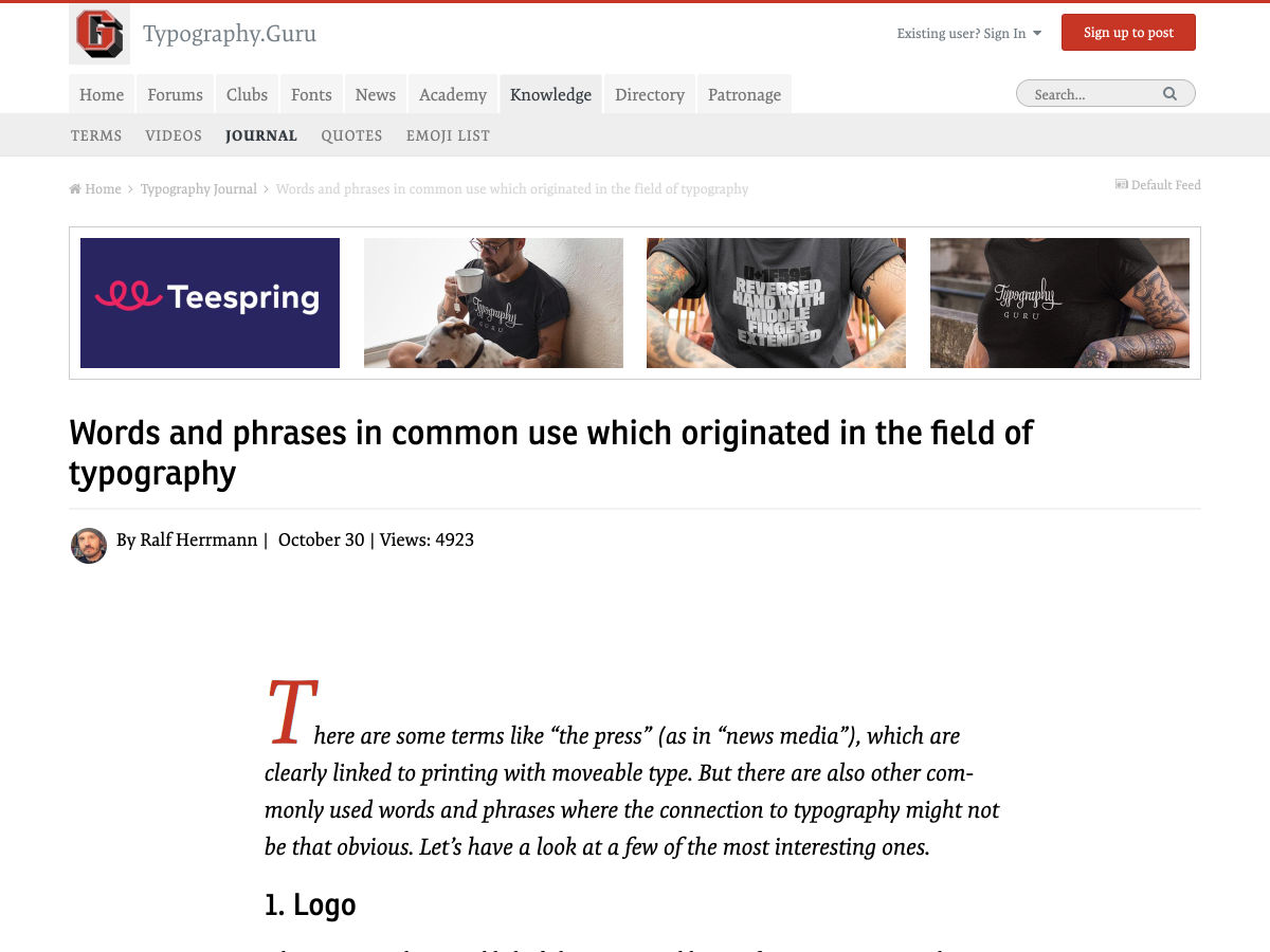
Words and Phrases in Common Use Which Originated in the Field of Typography

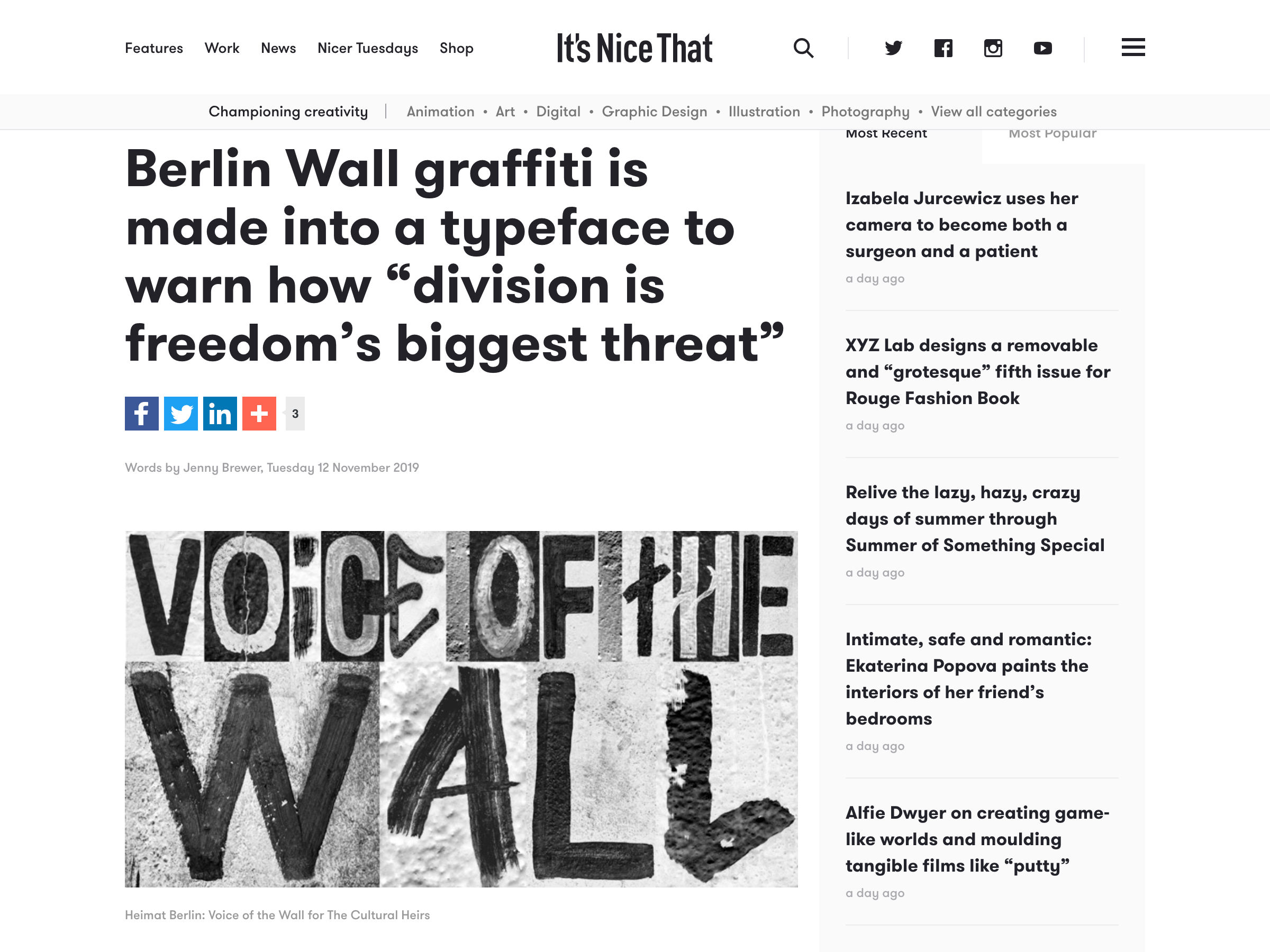
Berlin Wall Graffiti is Made into a Typeface

Want more? No problem! Keep track of top design news from around the web with Webdesigner News.

Source

Categories: Designing, Others Tags:

JAMstack CMSs Have Finally Grown Up!

November 15th, 2019 No comments
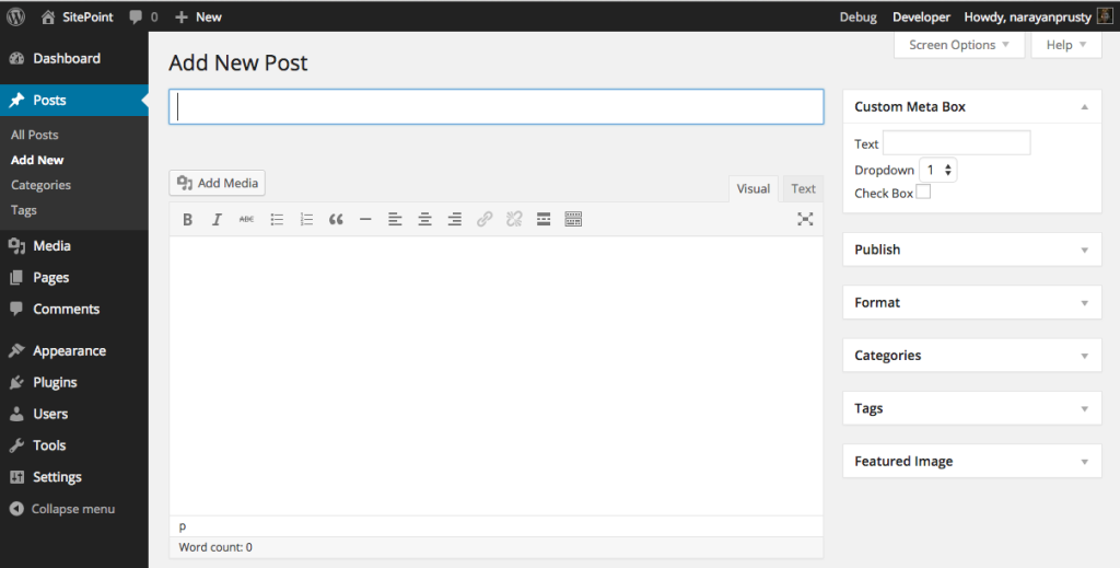
The WordPress editor showing a field for the post title and a text area for the post content.

This article is based on Brian’s presentation at Connect.Tech 2019. Slides with speaker notes from that presentation are available to download.

In my experience, developers generally find the benefits of the JAMstack easy to comprehend. Sites are faster because the resources are static and served from a CDN. Sites are more secure because there is no framework, application server or database to compromise. Development and deployment can be optimized because all of the pieces that make up the stack are unbundled. And so on.

What can be more difficult for developers to comprehend are the trade-offs that this can often require for the folks who create and edit content. Traditional, monolithic content management systems have often been ridiculed by developers (yes, even WordPress) who became frustrated trying to bend the tool to their will in order to meet project requirements. But, until recently, the JAMstack largely just passed that burden onto the non-technical content creators and editors.

By developers, for developers

Static site generators (i.e. tools like Jekyll, Hugo and Gatsby) grew enormously in popularity in large part because developers adopted them for projects. They became common solutions for things like blogs, documentation or simple static pages. By and large, these were sites created by developers, maintained by developers and with the content primarily written and edited by developers.

When I first wrote about these tools in a report for O’Reilly in 2015, this is what I said:

Just in case this isn’t already clear, I want to emphasize that static site generators are built for developers. This starts with the development of the site all the way through to adding content. It’s unlikely that non-developers will feel comfortable writing in Markdown with YAML or JSON front matter, which is the metadata contained at the beginning of most static site engine content or files. Nor would non- technical users likely feel comfortable editing YAML or JSON data files.

—Me (Static Site Generators report for O’Reilly 2015)

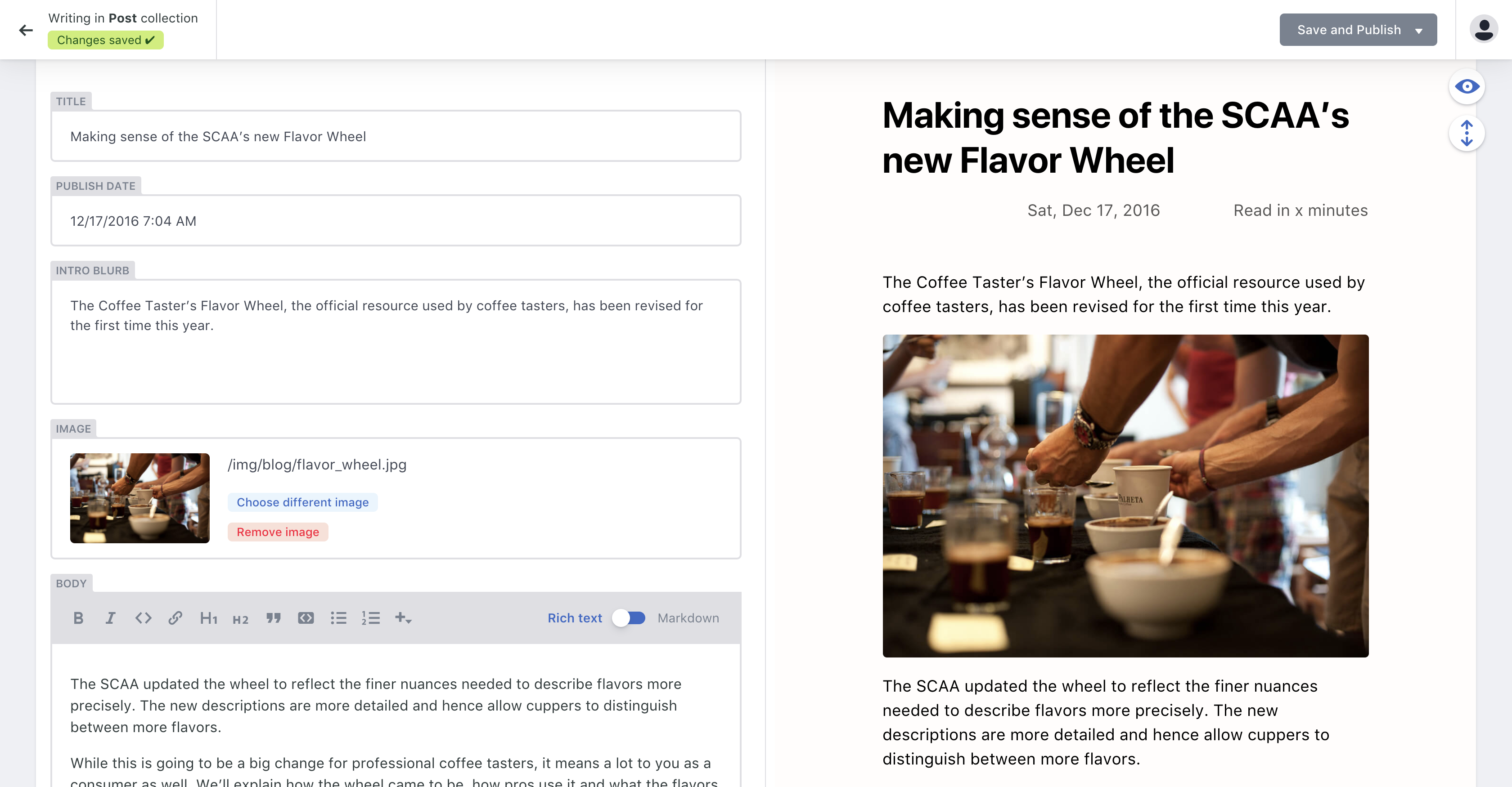
When, two years later, I wrote a book for O’Reilly on the topic (with my friend Raymond Camden), not too much had changed. There were some tools at the very early stages, including Jekyll Admin and Netlify CMS, but they had not matured to a point that they could realistically compete with the sort of WYSIWYG tooling that content editors were used to in tools like WordPress.

The WordPress editing experience

By contrast, the editing experience of static CMSs still required an understanding of Markdown and other markup (YAML, Liquid, etc.).

An editing screen in Netlify showing post fields on the left and a preview of the post on the right.
The Netlify CMS editing experience in 2017

Suffice it to say, whatever the technical merits of the architecture at the time, from a content editing standpoint, this was not a toolset that was ready for mainstream adoption.

The awkward teenage years

Over the ensuing two years, a combination of a couple of trends started to make the JAMstack a viable solution for mainstream content sites with non-technical editors. The first was that the static CMS matured into what we now generally refer to as git-based CMS solutions. The second was the rise of the headless, API-first CMS as a solution adopted by enterprises.

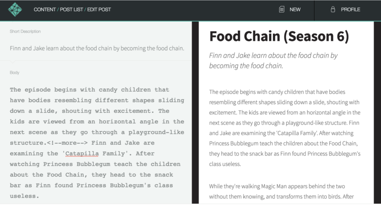
Let’s take a look at the first trend… well… first. Netlify CMS, an open-source project from Netlify, is an example of a git-based CMS. A git-based CMS doesn’t store your content, as a traditional CMS would, but it has tools that understand how to edit things like Markdown, YAML, JSON and other formats that make up a JAMstack site. This gives the content editors tools they feel comfortable with, but, behind the scenes, their content changes are simply committed back into the repository, forcing a rebuild of the site. While Netlify CMS is installed on the site itself, other popular git-based CMS options are web-based, including Forestry and DatoCMS.

An editing screen in Netlify from 2017 showing post fields on the left and a preview of the post on the right.
The current editing experience in Netlify CMS

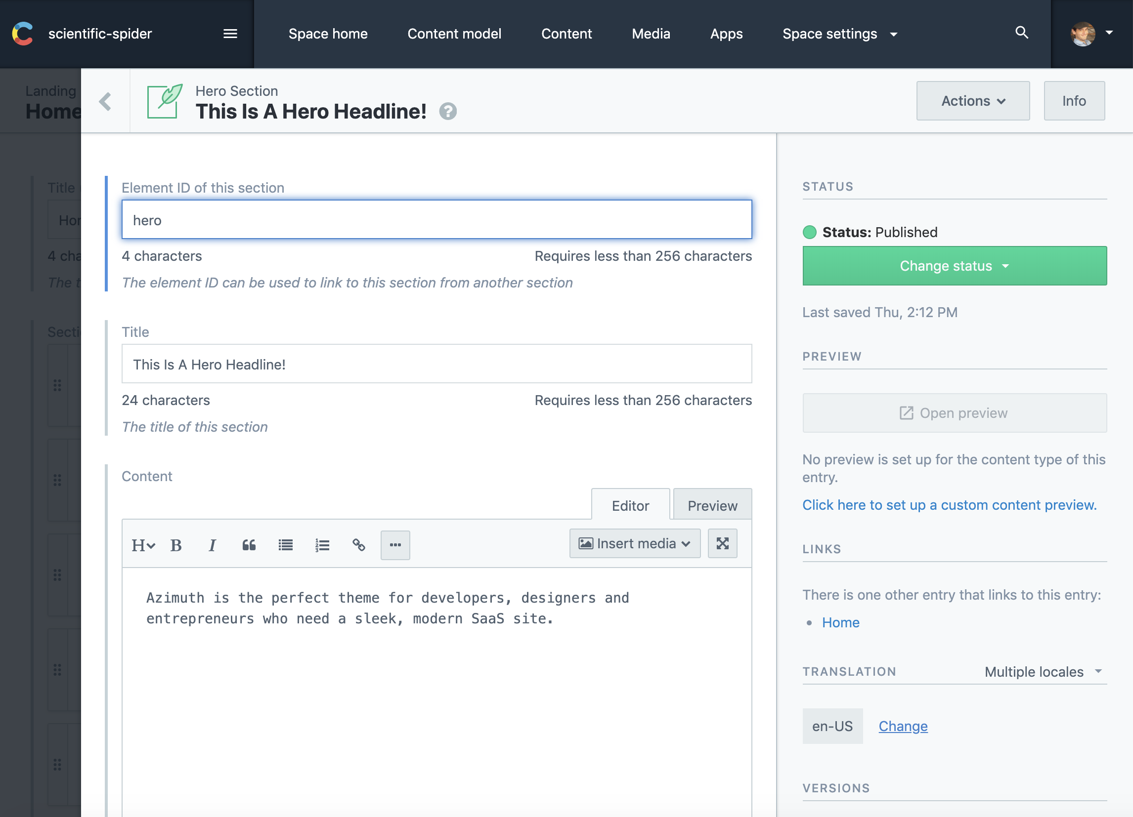
The headless, API-first CMS functions much more like the editing experience in a traditional CMS. It not only offers tools for creating and editing content, but it stores that content. However, it makes that content available to the front end – any front-end – via an API. While not limited to JAMstack in any way, an API-first CMS works well with it because the creation and management of the content is separate from the display of that content on the front end. In addition, many API-first CMSs offer pre-built integrations with some of the most widely used static site generators. Popular API-first options include Contentful and Sanity.

The Contentful admin, showing post fields on the left and post settings on the right.
Contentful

HeadlessCMS.org is a site maintained by Netlify that has a comprehensive list of all the available tools, both git-based and API-first. For a good look at the differences, pros and cons between choosing a git-based versus an API-first CMS, check out this post by Bejamas.

Both git-based and API-first headless CMS options began to give non-technical content editors the tools they needed on the backend to create content. The awkwardness of these “teenage years” comes from the fact that the tooling is still disconnected from the frontend. This makes it difficult to see how changes you’ve made in the backend will impact the frontend until those changes are actually committed to the repo or pushed live via the API. Add in the time cost of a rebuild and you have a less than ideal editing experience where mistakes can more easily make it to the live site.

A Look at the future

So what does the future look like when the JAMstack CMS is finally grown up? Well, we got a good look at this year’s JAMstack_conf_sf. Coincidentally, there were two presentations demonstrating new tools that are bringing the content editing experience to the frontend, letting content editors see what they are changing, how their changes will look and how they will impact the layout of the site.

The first presentation was by Scott Gallant of Forestry. In it, he introduced an new open source projects from Forestry called TinaCMS that brings a WYSIWYG style content editing experience to the frontend of sites that use a git-based CMS and Gatsby or Next.js (both React-based tools).

Animated flow for editing a page on the front end with Tina CMS.
TinaCMS

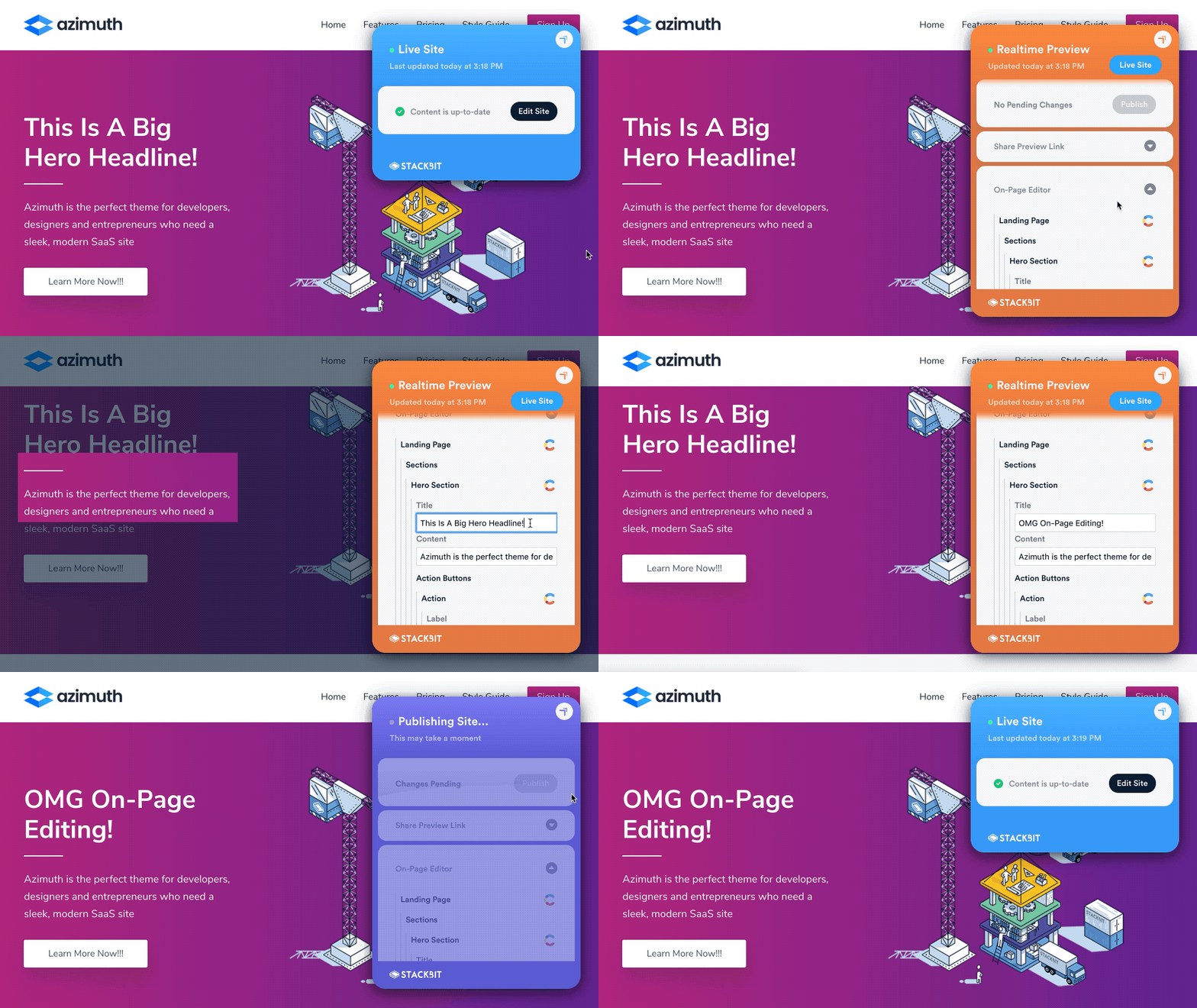
The second presentation was by Ohad Eder-Pressman of Stackbit (full disclosure: I work as a Developer Advocate for Stackbit) that introduced an upcoming set of tools called Stackbit Live. Stackbit Live is designed to be CMS and static site generator agnostic, while still allowing on-page editing and previewing of a JAMstack site.

Animation of editing a page on the front end with Stackbit Love
Stackbit Live

What both these tools demonstrated is that we’re at a point where a “JAMStack + headless” architecture is a real alternative to a traditional CMS. I believe we’ve reached the tipping point whereby we’re no longer trading a great developer experience for an uncomfortable editing experience for content authors. By 2020, JAMstack CMS will officially be all grown up. ????

The post JAMstack CMSs Have Finally Grown Up! appeared first on CSS-Tricks.

Categories: Designing, Others Tags:

The Amazingly Useful Tools from Yoksel

November 15th, 2019 No comments

I find myself web searching for some tool by Yoksel at least every month. I figured I’d list out some of my favorites here in case you aren’t aware of them.

The post The Amazingly Useful Tools from Yoksel appeared first on CSS-Tricks.

Categories: Designing, Others Tags:

How We Perform Frontend Testing on StackPath’s Customer Portal

November 15th, 2019 No comments

Nice post from Thomas Ladd about how their front-end team does testing. The list feels like a nice place to be:

  1. TypeScript – A language, but you’re essentially getting various testing for free (passing the right arguments and types of variables)
  2. Jest – Unit tests. JavaScript functions are doing the right stuff. Works with React.
  3. Cypress – Integration tests. Page loads, do stuff with page, expected things happen in DOM. Thomas says their end-to-end tests (e.g. hitting services) are also done in Cypress with zero mocking of data.

I would think this is reflective of a modern setup making its way across lots of front-end teams. If there is anything to add to it, I’d think visual regression testing (e.g. with a tool like Percy) would be the thing to add.

As an alternative to Cypress, jest-puppeteer is also worth mentioning because (1) Jest is already in use here and (2) Puppeteer is perhaps a more direct way of controlling the browser — no middleman language or Electron or anything.

Thomas even writes that there’s a downside here: too-many-tools:

Not only do we have to know how to write tests in these different tools; we also have to make decisions all the time about which tool to use. Should I write an E2E test covering this functionality or is just writing an integration test fine? Do I need unit tests covering some of these finer-grain details as well?

There is undoubtedly a mental load here that isn’t present if you only have one choice. In general, we start with integration tests as the default and then add on an E2E test if we feel the functionality is particularly critical and backend-dependent.

I’m not sure we’ll ever get to a point where we only have to write one kind of test, but having unit and integration tests share some common language is nice. I’m also theoretically opposite in my conclusion: integration/E2E tests are a better default, since they are closer to reality and prove that a ton is going right in just testing one thing. They should be the default. However, they are also slower and flakier, so sad trombone.

Direct Link to ArticlePermalink

The post How We Perform Frontend Testing on StackPath’s Customer Portal appeared first on CSS-Tricks.

Categories: Designing, Others Tags:

Smashing Monthly Roundup: Community Resources And Favorite Posts

November 15th, 2019 No comments

Smashing Monthly Roundup: Community Resources And Favorite Posts

Smashing Monthly Roundup: Community Resources And Favorite Posts

Iris Lješnjanin

2019-11-15T14:00:00+00:002019-11-16T02:35:54+00:00

On behalf of the Smashing team, welcome to another monthly update to keep you all in the loop about all things smashing. Join us as we share the latest news and highlight the things we have enjoyed reading over the past month.

Many of the included posts are sourced from the most popular links from our Smashing Newsletter. If you don’t get our newsletter yet, then sign up here to receive useful techniques and goodies (including a free eBook on accessibility)!

What’s New At Smashing?

The last SmashingConf of this year took place in New York, an event that got sold out a long way in advance and another one we’re all quite proud of. In case you missed out, our editor-in-chief Rachel Andrew summed up everything in a post with videos and photos of SmashingConf NY. You can find the slides of the talks over here, and even already grab your super early-bird ticket if you like!

Next, there’s a ‘lil project that we’ve been meaning to launch for a quite a while, and it’s finally happening! We’re proud to have kicked off the Smashing Podcast, a bi-weekly podcast that is moderated by our dear friend Drew McLellan — make sure to subscribe and tune into any podcast player of your choice.

Last but not least, we’re excited and looking very much forward to the release of the upcoming Smashing book “Inclusive Components” written by Heydon Pickering on the whys and the hows, making accessibility more approachable and friendly for developers. Stay tuned!

Recommended Reading on Smashing Magazine

We publish a new article every day, and so if you’re not subscribed to our RSS feed or follow us on social media, you may miss out on some brilliant articles! Here are some that our readers seemed to enjoy and recommend further:

  • How To Stop Analysis Paralysis With Design” by Suzanne Scacca
    When it comes to putting our visitors on the spot, giving them too many options hurts their decision-making ability along with how they feel about the experience as a whole.
  • What Newspapers Can Teach Us About Web Design” by Frederick O’Brien
    Before the home page, there was the front page. From the Gutenberg Principle to grid systems to above the fold, newspapers teach us much about the foundations of web design.
  • Creating Online Environments That Work Well For Older Users” by Barry Rueger
    A significant part of the Internet-using population is aged 50 or older — including the people who invented it. Designers need to understand what older users need and why it’s not enough to just say, “I can read it, so what’s the problem?”
  • Writing A Multiplayer Text Adventure Engine In Node.js” by Fernando Doglio
    A 4-part series that takes you through step by step to help you create a text-adventure engine with Node.js.

Best Picks From Our Newsletter

We’ll be honest: Every second week, we struggle with keeping the Smashing Newsletter issues at a moderate length — there are just so many talented folks out there working on brilliant projects! So, without wanting to make this monthly update too long either, we’re shining the spotlight on the following projects:

Note: A thank you to Cosima Mielke for writing and preparing these posts!

Free Services For Developers

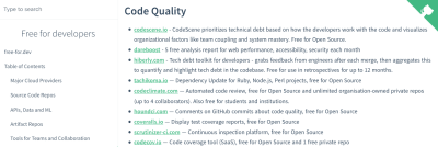
So many services out there offer free tiers, but they can be hard to find. Free For Developers wants to change that and lists software and other services that have free tiers for developers.

Free for developers

free-for.dev, a list of SaaS, PaaS and IaaS offerings that have free tiers of interest to devops and infradev.

The services included in the list are particularly interesting for System Administrators, DevOps Practitioners, and other infrastructure developers and cover everything from cloud providers and source code repos to testing, log management, payment integration, and a lot more. More than 500 people have contributed to this community project and you are welcome to submit your findings, too, of course. A handy resource for the bookmarks.

Git Command Cheatsheet

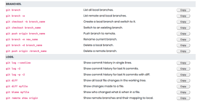
Do you know your git commands? While you probably know the most common ones by heart, there are always those commands that are easily forgotten because you don’t need them often. A concise refresher now comes from Rainer Selvet.

A list of git commands and what they do

GitSheet, a dead simple git cheatsheet.

Described as a “dead simple git cheatsheet” by its creator, GitSheet lists git commands and what they do by topic. A nifty little feature: You can copy a command to your clipboard with just a click. Simple yet effective.

A Playground For Tinkering With Design Systems

You’re about to build a design system but don’t really know where or how to begin? Well, the Design System Playground might be a great place to get started.

Choosing a body font on the Design System Playground

Design System Playground, an open-source project built by John Polacek.

The playground offers a lot of room to tinker with different font and color combinations and, once you’re happy with your choices, it generates a design system that you can export and use in your projects right away. If the visual direction of your design isn’t clear yet, there’s also the option to use a preset theme or random choices to build upon.

Freebie: Mix-And-Match Illustrations

Illustrations are a fantastic way to breathe some life into a project. But not all of us have the skills to create them ourselves or the time or the budget to hire an illustrator. For these occasions, the mix-and-match illustration library which Leni Kauffman created, might come in handy.

Fresh Folk, a beautiful illustration library of
people and objects created and designed by London-based illustrator Leni Kauffman.

Fresh Folk lets you combine poses, outfits, and skin tones into different characters. The library also includes background elements (e.g., tables, seating, lamps, plants) to create different settings — from office spaces to nature scenes. Free for personal and commercial projects.

Real-Time Visualization Of Tokyo’s Public Transport

A stunning 3D data visualization project comes from Akihiko Kusanagi: Mini Tokyo 3D displays Tokyo’s public transport system on a map in realtime.

Tokyo's public transportation system visualized on a map

Large preview, a real-time 3D digital map of Tokyo’s public transport system.

You can follow along Tokyo’s trains moving through the city, with information on the train line, train number, next and previous stops, and possible delays. The data for this mammoth project is sourced from Open Data Challenge for Public Transportation in Tokyo which promotes the openness of public transportation data. Their aim is to make public transportation (which is considered to be the world’s most complicated) easier to navigate. Inspiring!

Vintage Science And Tech Ads

If you’ve got a sweet spot for vintage graphic design, here’s a very special goodie for you: a Flickr album with more than 1,400 science and tech ads from the 1950s and 60s.

Science and Tech Ads

Science and Tech Ads” (Flickr album), a random assortment of science ads collected from various science and tech magazines of the 50s and 60s.

The ads come from various science and tech magazines and are great examples of the modernist mid-century aesthetic — and a fascinating journey back to the times when the foundations of the technologies we take for granted today were being laid. Eye candy!

JavaScript Frameworks Security Report 2019

The folks at Snyk published their state of JavaScript frameworks security report for 2019. It investigates the state of security for the Angular and React ecosystems as well as security practices for the popular JavaScript frameworks Vue.js, Bootstrap, and jQuery.

The opening slide from the security report

JavaScript Frameworks Security Report 2019, a report that investigates the state of security for both the Angular and React ecosystems.

Given the fact that Angular and React both have their proponents with ongoing discussions whether one or the other is a true framework, the report doesn’t intend to venture into rivalries but reviews each of them as viable front-end ecosystem alternatives, while focusing on security risks and best practices and the differences between them. A must-read.

Designing Accessible Color Systems

Getting color contrast right is an essential part of making sure that not only people with visual impairments can easily use your product but also everyone else when they are in low-light environments or using older screens. However, if you’ve ever tried to create an accessible color system yourself, you probably know that this can be quite a challenge.

A color system for icons consisting of nine colors

Designing Accessible Color Systems” written by Daryl Koopersmith and Wilson Miner.

The team at Stripe recently decided to tackle the challenge and redesign their existing color system. The benefits it should provide out of the box: pass accessibility guidelines, use clear and vibrant hues that users can easily distinguish from one another, and have a consistent visual weight without a color appearing to take priority over another. If you’re curious to find out more about their approach, their blog post will give you valuable insights.

Digital Wellbeing Experiments

Everyone has a different relationship with their phones, but we all have something in common: There are always those moments when it feels that phones distract from life rather than improve it — when having dinner with friends and everyone checks their incoming notifications, for example.

An illustration of a woman gone fishing on a deserted island. She's surrounded by a camera and a video app icon

Digital Wellbeing Experiments”, a showcase of ideas and tools that help people find a better balance with technology.

With their Digital Wellbeing Experiments, Google now showcases ideas and tools that help people find a better balance with technology and inspire designers and developers to consider digital wellbeing in everything they design and build. There are experiments that let you switch off from technology as a group, for example, stay focused by getting the right apps at the right times, or take the most important things with you on a printed “paper phone”. The code for the experiments is open-source, and if you have an idea for a digital wellbeing experiment, the Hack Pack will help you bring it to life.

Recursive: A Free Highly-Flexible Variable Font

A font that gives you typographic control over five stylistic axes and can go from Sans to Mono? The variable font Recursive makes it possible, offering an entirely new level of flexibility.

A screenshot of the Recursive font

Recursive Font, a typographic palette for vibrant code and UI.

Taking full advantage of variable font technology, Recursive enables you to choose from a wide range of predefined styles or dial in exactly what you want for each of its axes. Inspiration came from single-stroke casual signpainting to give the font a flexible and energetic look, making it a great fit for data-rich-apps, technical documentation, code editors, and much more. Please note that Recursive is still under active development and will soon be available through Google Fonts. A beta version is already available.

Open-Source Tutorials For Learning GraphQL

GraphQL enables a client to specify exactly what data it needs from an API, so instead of multiple endpoints that return fixed data structures, a GraphQL server exposes a single endpoint and responds with precisely the data a client asked for. If you want to wrap your head around GraphQL, here are two great resources to get you started.

Illustration of a wizard and three little dragons who seem to be learning something from him

There are a number of open-source community maintained tutorials that will help you to move from the basics of GraphQL to building a real-time application in no time.

How to GraphQL is a free open-source tutorial to take your GraphQL skills from zero to production. Divided up into two parts, part one covers the core concepts of GraphQL while part two gives you a broader understanding of the GraphQL ecosystem. The other learning resource comes from the makers of the GraphQL engine Hasura: three open-source community-maintained tutorials (front-end, mobile, and back-end tutorials) teach you GraphQL to get you ready to build a real-time application in two hours.

Fixing Image Orientation

Image orientation on the web is, well, complicated. When Michael Scharnagl worked on a side project, he noticed that the images he uploaded to his server were shown in the wrong orientation. Now he wrote a blog post in which he dives deeper into the issue and how to fix it.
Portrait image shown in landscape mode

Image orientation on the web explained by Michael Scharnagl.

The reason for portrait images being displayed in landscape mode when they are embedded using or background-image is the EXIF data for the image. How a browser deals with EXIF orientation depends on the browser, and there’s no cross-browser way to easily correct it either. Michael’s Node.js fix helps you correct the orientation. A handy little tip.

From Smashing With Love

A month can be a long time to stay on top of things, so please do subscribe to our bi-weekly newsletter and our podcast if you still haven’t. Each and every issue is written and edited with love and care. No third-party mailings or hidden advertising — promise!

You can also tune into our very own Smashing TV, and follow us on Twitter, Facebook as well as LinkedIn. Please do always feel free to reach out and share your projects with us! We love hearing from you!
Keep up the brilliant work, everyone! You’re smashing!

Smashing Newsletter

Upgrade your inbox and get our editors’ picks 2× a month — delivered right into your inbox. Earlier issues.


Useful tips for web designers. Sent 2× a month.
You can unsubscribe any time — obviously.

Smashing Editorial(cm, vf, ra, il)
Categories: Others Tags:

Unwritten Rules of Travel: Don’t Mix Business and Pleasure

November 15th, 2019 No comments

Every travel fanatic fantasizes about having a job that they love that also allows them to travel.

The company pays for your flight and your hotel, leaving you to discover somewhere new. How could that possibly have any negative consequences?

The thing is when traveling for business the necessity to be on your A-game is imperative. Often business travelers are on a mission to represent their company or pitch a new idea to a potential client. It’s not time to relax. It’s time to work. Airport, car-rentals, hotel check-ins, meetings, organized dinner meetings and more consume business traveler’s schedules.

Maybe they can slip in a visit to a National Monument or grab a bite of a local dish. The reality, though, is that they return home more exhausted than before. This can take a toll on health and well-being including long term chronic problems.

On the contrary, when you consider traveling for pleasure, the benefits abound. These moments are a time for enjoying some dedicated time for yourself. That can mean different things for each individual, but the results are the same. Hiking across a mountain, taking a week in the Caribbean, or finding a buzzing city to explore is a depart from the ordinary. Plus, it’s an opportunity to recharge. Leaving work behind is the key to the innumerable benefits reaped from vacation travel.

To illustrate the impact of business and leisure travel on your health and well-being, the team at Reservations.com put together an infographic to encourage you to make sure to draw a line between the two.

The Surprising Effects of Business vs Leisure Travel on Your Health and Well-Being

Categories: Others Tags:

Weekly Platform News: Internet Explorer Mode, Speed Report in Search Console, Restricting Notification Prompts

November 14th, 2019 No comments

In this week’s roundup: Internet Explorer finds its way into Edge, Google Search Console touts a new speed report, and Firefox gives Facebook’s notification the silent treatment.

Let’s get into the news!

Edge browser with new Internet Explorer mode launches in January

Microsoft expects to release the new Chromium-based Edge browser on January 15, on both Windows and macOS. This browser includes a new Internet Explorer mode that allows Edge to automatically and seamlessly render tabs containing specific legacy content (e.g., a company’s intranet) using Internet Explorer’s engine instead of Edge’s standard engine (Blink).

Here’s a sped-up excerpt from Fred Pullen’s presentation that shows the new Internet Explorer mode in action:

(via Kyle Pflug)

Speed report experimentally available in Google Search Console

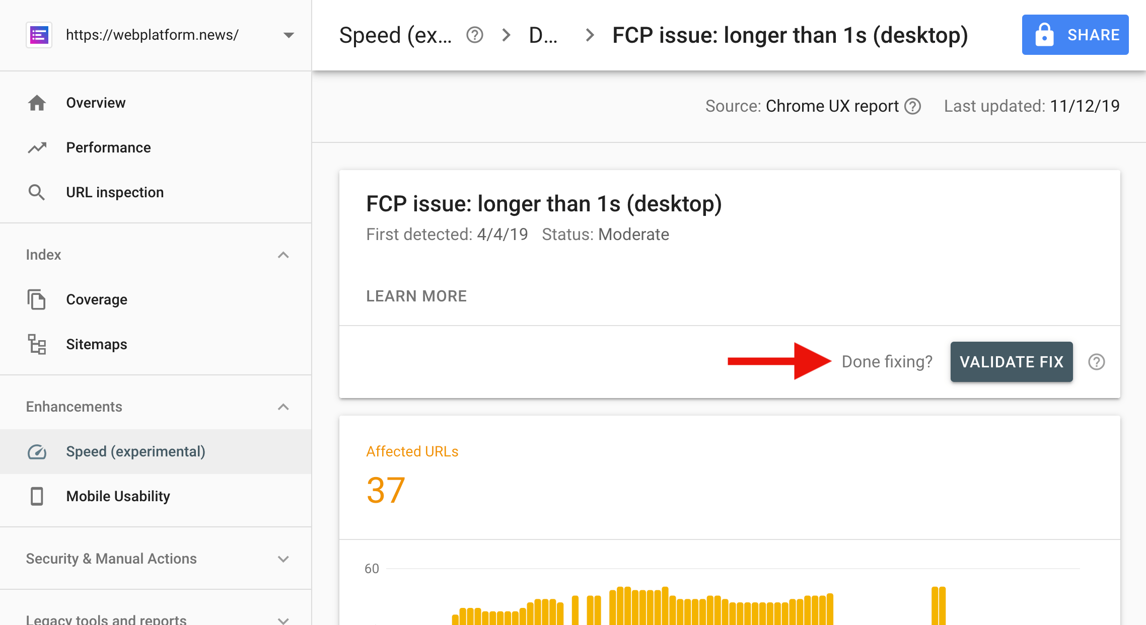
The new Speed report in Google’s Search Console shows how your website performs for real-world Chrome users (both on mobile and desktop). Pages that “pass a certain threshold of visits” are categorized into fast, moderate, and slow pages.

Tip: After fixing a speed issue, use the “Validate fix” button to notify Google Search. Google will verify the fix and re-index the pages if the issue is resolved.

(via Google Webmasters)

Facebook’s notification prompt will disappear in Firefox

Firefox will soon start blocking notification prompts on websites that request the notification permission immediately on page load (Facebook does this). Instead of the prompt, a small “speech balloon” icon will be shown in the URL bar.

Websites will still be able to show a notification prompt in Firefox as long as they request permission in response to a user interaction (a click, tap, or key press).

(via Marcos Càceres)

More news…

Read more news in my weekly newsletter for web developers. Pledge as little as $2 per month to get the latest news from me via email every Monday.

More News ?

The post Weekly Platform News: Internet Explorer Mode, Speed Report in Search Console, Restricting Notification Prompts appeared first on CSS-Tricks.

Categories: Designing, Others Tags:

Learn UI Design

November 14th, 2019 No comments

Erik Kennedy’s course Learn UI Design is open for enrollment for less than a week. Disclosure, that link is our affiliate link. I’m linking to it here because I think this is worthy of your time and money if you’re looking to become a good UI designer.

I think of Erik sorta like the Wes Bos of design teaching. He really gets into the nitty-gritty and the why of good design. Design is tricky in that way. Adjusting some colors, spacing, and lines and stuff can feel so arbitrary at times. But you still have a sense for good and bad. The trick is honing your eye for spotting what is bad in a design and how to fix it. Erik excels at teaching that.

The course is a thousand bucks. Not very cheap. Personal lessons double that. It’s reasonable for you to have some questions.

Yes, it’s pro-quality. Yes, it’s 20 hours of video. Yes, you have lifetime access and can complete it on your own schedule. Yes, students get design jobs after completing it. Yes, there’s a student community with 1,000+ folks. Yes, you can use Sketch or Figma.

It’s a lot. It’s very modern and made to teach you how to be a designer in today’s world. So no, it’s not free or even inexpensive — but it’s good.

Direct Link to ArticlePermalink

The post Learn UI Design appeared first on CSS-Tricks.

Categories: Designing, Others Tags: