Archive

Archive for December, 2019

A Use Case for a Parent Selector

December 31st, 2019 No comments

Having a “parent selector” in CSS is mentioned regularly as something CSS could really use. I feel like I’ve had that thought plenty of times myself, but then when I ask my brain for a use case, I find it hard to think of one. Well, I just had one so I thought I’d document it here.

A classic parent/child:

<div class="parent">
  <div class="child"></div>
</div>

Say it makes a lot of sense for this parent to have hidden overflow and also for the child to use absolute positioning.

.parent {
   overflow: hidden;
   position: relative;
}

.child {
   position: absolute; 
}

Now let’s say there’s one special circumstance where the child needs to be positioned outside the parent and still be visible. Hidden overflow is still a good default for the vast majority of situations, so it’s best to leave that rule in place, but in this very specific situation, we need to override that overflow.

.special-child {
   position: absolute; 
   bottom: -20px; /* needs to be slightly outside parent */
}

/* Not real, but just to make a point */
.special-child:parent(.parent) {
   overflow: visible;
}

That selector above is fake but it’s saying, “Select the parent of .special-child,” which would allow that override as needed. Maybe it’s like this:

.parent < .special-child {

}

…which is selecting the element on the left rather than the right. Who knows? Probably both of those are problematic somehow and the final syntax would be something else. Or maybe we’ll never get it. I have no idea. Just documenting a real use case I had.

You might be thinking, “Why not just use another special class on the parent?” I would have, but the parent was being injected by a third-party library through an API that did not offer to add a class of my choosing on it. Ultimately, I did have to add the class to the parent by writing some custom JavaScript that queried the DOM to find the .special-child, find the parent, then add the class there.

Do y’all have some other use-cases for a parent selector?

The post A Use Case for a Parent Selector appeared first on CSS-Tricks.

Categories: Designing, Others Tags:

Wufoo + Zapier

December 31st, 2019 No comments

Wufoo has always been great with integrations. They have integrations with specific apps, like Campaign Monitor, Mailchimp, and Typekit, but they also integrate with Zapier, which is sort of like an integration inside an integration.

That’s kinda meta, but the idea is actually pretty straightforward: Wufoo integrates with Zapier, which integrates with a gazillion (yes, I did the math) other apps. That opens up a whole world of possibilities for what you can do with a Wufoo form.

Some interesting ones:

  • Trigger an email to send to someone from Campaign Monitor or Mailchimp when they’ve submitted the form.
  • Collect submissions in a Google Sheet to build you own database of entries.
  • Automatically create a card in Trello once the form has been submitted.
  • Add the person who is submitting the form to a contact list in Salesforce.
  • Push notifications to Slack once someone completes the form.

Wufoo shared their own list of ideas. Let’s sum them up here:

  • Wufoo + your customer relationship management (CRM) tool
  • Wufoo + your email tool
  • Wufoo + your file storage tool
  • Wufoo + your website-building tool
  • Wufoo + your project management tool
  • Wufoo + your calendar tool
  • Wufoo + your spreadsheet tool

That one about website-building tools is pretty sweet. This lets Wufoo hook up to something, say WordPress, so that you can do something like publish a new page for every submission. Think about that. You have one integration to send an email to the user when they submit the form and perhaps it contains a link to a personalized page. Voltron powers, unite!

The post Wufoo + Zapier appeared first on CSS-Tricks.

Categories: Designing, Others Tags:

Procreate for Android

December 31st, 2019 No comments
Procreate for Android

Drawing is one of the most common hobbies. It’s a great way of having fun and expressing yourself.

And now, with the help of technology, it’s really easy to draw and edit your work digitally. And, you don’t need a high-end graphics tablet, you can just use your Android tablet or iPad to create real art.

The thing is though, there are many drawing apps to choose from. If you are starting, or just want to learn more about alternative drawing apps, you are at the right spot.

Best drawing apps on Android and iOS:

Procreate (iOS – $9.99)

Procreate is a powerful drawing app that is exclusive to iOS. It gets the best out of the great combination of iPad Pro and Apple Pencil. It’s much more than just a drawing app, it’s a feature-packed digital art studio. It supports 4K canvases, up to 128 layers and more than a hundred customizable brushes. Procreate brings performance to the artists. It’s a robust tool, so it may be a bit hard to grasp at first if you in just for simple doodling.

ArtRage (Android, iOS – $4.99)

ArtRage is a great drawing and painting that works not only on your mobile devices but also on your PC and Mac. It has many tools that mimic the real world painting tools and mediums such as watercolors, rollers and paper options. You can also create custom brushes and use perspective tools. If you are looking for a more authentic and natural touch, make sure to try it.

ArtFlow (Android – Free)

ArtFlow is a design studio that is exclusive to Android. The free version includes nine customizable brushes, a color picker, a symmetry tool and support for two layers which is more than enough for a hobby drawer. ArtFlow’s premium features are more for seasoned and aspiring digital artists looking for an Android drawing app.

Affinity Designer (iOS – $49.99)

If you want to rock the iPad and Apple pencil combo, Affinity Designer is another great choice. It works both on mobile and desktop but it’s more customizable with on the iPad with the Apple Pencil. The finished drawing can be exported in various formats. It’s a bit expensive and complicated for someone who is just doodling, but if you are a hobbyist or a professional you should look into it.

Adobe Illustrator Draw (Android, iOS – Free)

A vector graphics drawing app from Adobe, it can be enhanced with Creative cloud integration. There are 5 customizable pens, stylus support for popular devices. You can save your work on your mobile device and open it in the desktop version of Illustrator later. It syncs up with Photoshop through exporting the PNG Files, and assets can be imported from Color CC and Shape CC, helping you work wherever you want.

MediBang Paint (Android, iOS)

MediBang Paint is also available on PC/Mac. You can use over 800 premade backgrounds, 50 brushes and 20 fonts for free. If you are interested in creating a comic, MediBang is a great choice. It also has an active community so there are many tutorials online that you can benefit from.

Autodesk Sketchbook (Android, iOS – Free)

Autodesk SketchBook used to be paid, but now it’s completely free. It features pencils, inks, markers, over 190 customizable brushes. You also get access to the exclusive Copic® Color Library. You can export your work as JPG, PNG, BMP, TIFF, and PSD. And the interface is really user-friendly and easy to learn.

Adobe Photoshop Sketch

From pencils to thick acrylic, Adobe Photoshop Sketch got you covered. You can access 11 tools that can adjust the size, color, opacity and blending settings. You can also create your own brushes using Capture. Again, if you use Creative Cloud services you can take advantage of many other services.

Infinite Painter (Android, iOS – Free 7-day Trial)

Infinite Painter was originally an Android exclusive, but it is now available on the iPad as well. After the 7-day trial, the premium features are available as in-app purchases. It offers over 160 brush presets and also the ability to create your brushes. You can transform multiple layers simultaneously and export your images as JPEG, PNG, PSD or ZIP.

Categories: Others Tags:

2019: A Smashing Year In Review

December 31st, 2019 No comments
An illustration of Topple the Smashing Mascot cat networking while sitting in a comfortable couch with its laptop placed on its lap holding a cup of coffee or tea, who knows

2019: A Smashing Year In Review

2019: A Smashing Year In Review

Rachel Andrew

2019-12-31T13:30:00+00:002019-12-31T14:16:57+00:00

2019 has been a productive — sometimes challenging — but ultimately very successful year for the Smashing Team. In this annual round-up, I’d like to share some of my thoughts and those of some of the Smashing team, as we look back on the past year as well as look ahead and forward to 2020.

Travel And Friendships

As always, my 2019 has involved a lot of travel. In addition to my conference speaking engagements and travel to W3C meetings, I attended all four of our Smashing conferences; I ran CSS Layout workshops in Toronto, New York and San Francisco. The conferences are a time when most of the team is together in person.

The home of Smashing is in Freiburg, Germany, and before SmashingConf Freiburg, we held a big team meeting, with almost everyone who is involved with Smashing able to take part. There have been many changes in the Smashing Team this year, and that meeting in Freiburg was a chance for us all to come together; I believe that it was one of the most valuable things we have done this year.

There are many challenges in doing all of the things we do as a small (mainly part-time and remote) team. However, if we keep talking and keep the Smashing community at the heart of everything we do, the past year demonstrates that we can achieve amazing things!

The Conferences

The SmashingConf team of Amanda Annandale, Charis Rooda and Mariona Jones are a force of nature. They seem to achieve the impossible and (as Charis told me) still have time to enjoy the surroundings of the places they visit.

The team in front of the Toronto sign

The SmashingConf team in Toronto

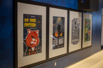
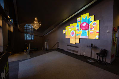
I’m always blown away when I walk into the venue and see what has been achieved — even before the event starts. Artwork created by the talented Ricardo Gimenes is everywhere — such as the movie posters from Toronto, and the artwork in the theater we use as a venue in New York.

Movie posters features Topple the Smashing cat

Our movie posters in Toronto (Photo credit Marc Thiele)

A large theatre sign featuring Topple the cat

The signage in the theater in New York (Photo credit Drew McLellan)

One of my favorite things to do at the conferences is to lead the Smashing Run, which we normally manage to do on both conference days. This is becoming quite a fixture, with several attendees and speakers running and chatting for half an hour before breakfast. I’m already looking forward to our inaugural run in Austin in 2020, though it may be a bit of a warm one!

I sometimes help the conference team out when words need writing or editing, and sometimes when the legality of balloons is called into question. As Amanda Annandale (Senior Event Manager) remembers:

“September marked my third year at Smashing, and while it provided a whole new set of challenges, it also provided a huge sense of accomplishments. The conference team sat down at the end of 2018 and was able to make some big plans for the future.

“It’s been amazing to see these plans (from organization to side-events to new locations), and our team, come together. But, new tasks can bring about some hilarious roadblocks. Smashing is on a long and necessary quest to reduce our carbon footprint. BUT, Vitaly is rather partial to balloons.

“For those who may not know (because Rachel Andrew and I were shocked to learn), foil balloons are heavily regulated in the state of California. This (we discovered while spending a disproportionate time researching eco-balloons over plastic balloons) is obviously bad for the environment. We’ve never been so happy to find a company making fully eco-friendly balloons, that are fully biodegradable in a very short amount of time! This experience definitely strengthened our resolve.

“We are now working with a company out of Austin to improve our printing processes to be more eco-friendly, and working with each of our caterers to reduce our waste. We still have a way to go, but we’re aiming for a Smashing impact in 2020!”

Conference attendees standing up throwing balloons

The (eco-friendly) balloons are deployed in San Francisco (Photo credit Marc Thiele)

Conferences are expensive to produce and we are fortunate to have some wonderful partners who help us to create these events. They are looked after by our partnerships manager Mariona Jones, who has been joined this year by Esther Fernández. Between them, they are working to bring together all of the Smashing properties in order to create new partnership opportunities. Mariona told me,

“The most exciting moment this year has been to be able to create together with the whole team the Smashing Media platform bringing together events, magazine, publishing house, membership and Smashing TV. The highlight of the year is undoubtedly the birth of the partnerships and data office and the addition to the Smashing Family of my dear colleague Esther.”

Esther adds,

“Joining the Smashing team has been one of the highlights of the year. It’s been a pleasure to enter this community and to make the Smashing conferences happen.”

I’m looking forward to working together with Mariona and Esther this year as we open up new opportunities for partnerships that cross the boundaries of the different parts of the platform!

Smashing Magazine

Topple the Cat wearing its Thinking HatThe heart of what I do at Smashing is the online magazine; as Editor in Chief, my role here is to try to bring you web design and development content that will inform you, help with your day-to-day work, and also make you think. We publish almost every weekday, so always have a large list of articles moving through the writing, editing and publishing process.

Looking through our analytics, I pulled up a list of the most popular articles published in the last year. The range of topics making it to the top may surprise you, and demonstrate the wide range of subjects we cover here. We have the Front-End Performance Checklist, an article comparing Sketch, Figma, and Adobe XD, and two articles about designing tables: Table Design Patterns On The Web and How To Architect A Complex Web Table. HTML and CSS are always popular with How To Align Things In CSS, How To Learn CSS and HTML5 Input Types: Where Are They Now? —all getting a top spot. They are joined by Styling An Angular Application With Bootstrap and Using Vue.js To Create An Interactive Weather Dashboard. That’s quite the range of subject matter!

Covering such a broad spectrum of web design and development is certainly a challenge and one I couldn’t do alone. My subject editors Alma Hoffmann, Chui Chui Tan, Drew McLellan and Michel Bozgounov bring their expertise to the topics they help curate. Copy editors Andrew Lobo and Owen Gregory help preserve the tone of voice of our authors while ensuring the content is easy to understand for an international audience. Cosima Mielke ensures that the newsletter is well researched along with many other roles (including eBook production), and Yana Kirilenko does a great job of getting articles from Google Docs, Dropbox Paper and various Markdown apps into the CMS. Senior editor Iris Ljesnjanin does an amazing job of keeping everything on track, fielding the email, hitting publish on most of the pieces, and making sure that we are all using smashingly correct punctuation! I am very grateful for all of their work.

Vitaly and I are well-known faces in the web community, however, there is a whole cast of folk working behind the scenes to keep the magazine running successfully. I don’t say thank you enough, but I sincerely appreciate all the work that goes into the magazine across the team.

Smashing Magazine turned 13 this year to which I shared personal stories from the team — you can read more about the people behind the Smashing scenes over here.

This year, I’ve tried to bring the various facets of the business into the magazine. For example, each conference results in a set of high-quality videos of the presentations which was hidden away on Vimeo. This year, I’ve published a write-up of each event, listing all of the videos. I hope that this means more people can benefit from the wisdom of our speakers and also shows the brilliant work the conference team does in curating and putting on these events.

Something that I really enjoy is to publish articles by folks who have never written for a large publication before and to help their articles go through the process. Earlier this year, I wrote an article on Pitching Your Writing To Publications. If your 2020 goals include writing for Smashing Magazine, drop us a line with an outline of your idea. We would love to work with you!

Smashing Books And Our First Print Magazine

In 2019, we published two printed books, plus our very first print magazine. Art Direction For The Web was published in the spring, and at the end of the year, we began shipping Inclusive Components.

In the middle of the launch of Inclusive Components, we welcomed a new team member, Ari Stiles. She told me,

“It was challenging and fun to start working on the Smashing Library right after Heydon’s book was released, when promotion was already in full swing. A bit like stepping in front of a firehose — but in a good way! It helps that Inclusive Components is a well-written, timely book. I love helping people discover new and helpful resources like this one, and I’m excited about all of our new books for 2020.”

Topple the Cat presenting the Smashing Print coverSelecting a topic for our first print magazine was tricky. We wanted these magazines to be a snapshot of the industry at a certain time, but also to have a longer shelf life than tutorials on topics that will be out of date in a few months. Ultimately, for issue one, we chose a subject that was at the forefront of many minds in 2019 — that of ethics and privacy. The collection of essays I commissioned is designed to make you think, and we still have a few print copies and the digital version, if you would like to read them.

? We’re currently in the planning stage for issue 2 — watch this space!

All of our books come with an eBook version, and one of Cosima Mielke‘s many roles is to produce this version from the final manuscript. Memories of working on these projects were her response when I asked her about her 2019:

“As an eBook Producer, the moment when you’re being handed over the proofread manuscript to get started with eBook production is always a special moment. So many people — reviewers, proofreaders, and most importantly, the authors themselves, have already invested so much time and efforts into the manuscript, and now it’s your turn to put it into its final shape: the eBook that people are going to download and read.

“My personal highlight (and biggest challenge) this year was to turn the monumental opus that Andy provided with “Art Direction for the Web” into an eBook. The assets included almost 600 images — most of the designs created by Andy from scratch — and turning these into an eBook that does justice to the author’s meticulous work, provides a pleasant reading experience (given the rather limited possibilities that eBook reading devices usually offer), and has a reasonable file size at the same time, was quite a balancing act. Looking back, it was the most challenging eBook I have worked on to date — and, naturally, these kinds of projects make you feel proudest once you’ve accomplished them. I’m already curious to find out what 2020 will bring.”

The Smashing Podcast

For the first time this year, Smashing Magazine has a podcast. Hosted by Drew McLellan, this bi-weekly show interviews someone from the world of web design and development. We hope to bring you some well-known names, but also speak to folks doing interesting things across the industry.

In addition to having a very broad base of subject matter, Smashing has a global audience; we’d like to reflect that and bring you interviews from people all over the world. I asked Drew for his thoughts on these first few episodes:

“I was really pleased to be able to launch the Smashing Podcast this year. We spent quite a bit of time in development with it, trying to work out what the best format and tone to take would be. We tried to make it sound like Smashing and embody the same values; a good place to learn and stay informed, but with a sense of fun.

Our early guests have included experts such as Jina Ann, Liz Elcoate, and Jason Pamental. And we’ve spoken to authors of Smashing books Andy Clarke and Heydon Pickering.

The reception so far has been great, and you can always let us know what you think via the contact page. I’m looking forward to releasing episodes with the guests we have lined up for 2020!”

If you haven’t listened to an episode yet, you can catch up by subscribing here, or check out the individual episodes and full transcripts.

Smashing Membership

Topple the Cat showing off its ice skating skillsWe love our Smashing Members! This year you have continued to sign up and support the publication of independent content. We’ve been running webinars (with the help of Scott Whitehead and Bethany Andrew where members get to chat with one another in our Membership Slack, while enjoying free copies of our eBooks, plus a copy of the print magazine! We’re really keen to build on and evolve membership over the next years, and we sincerely thank our members for their support.

We have been running a membership table at our event, where members and prospective members can chat with the team. Our partnership manager, Mariona Jones remembers,

“While running the membership table at SmashingConf, I met a group of attendees who shared their passion for many things, among them open-source, stickers, code, and caffeine while browsing together through the first-ever Smashing print magazine on ethics and privacy and conversing about the relevance of this important topic.”

That’s enough from me! Still, we can’t wrap up 2019 without some thoughts from Vitaly, without who Smashing would not exist at all.

Vitaly on stage in front of a slide saying Welcome

Vitaly opens a SmashingConf (Photo credit Marc Thiele)

“It’s common to think that it’s all about the achievements or goals that make a year special, but for me, this year was full of meeting wonderful people. So, so many people. I’ve had a chance to speak with hundreds of people all around the globe, learning from their experiences and sharing mine. I was lucky to travel to over 40 places this year, from Albania, Serbia and Bosnia-Herzegovina to Kyiv, Sweden and Budapest. I vividly remember some of the stories and experiences I shared over a fire in the evening, in cars on the way somewhere, and in buses talking to strangers I’ll never see again. These were extremely rewarding, valuable and precious moments for me. They are the ones that I’ll be looking back to years from now. In essence, it’s all about people in the end.

“It was wonderful to connect with some of our readers at New Adventures in Nottingham, InfoShare in Gdansk, Poland, BTConf in Dusseldorf, FrontEndUnited in Utrecht, Netherlands, YGLF in Vilnius, Lithuania, perf.now in Amsterdam, Netherlands, and so many others! That said, travel is not without drama. When I was on a short vacation in Albania, I ended up getting lost in the woods in the middle of nowhere at midnight. That was quite scary, but thanks to 6% on my phone and a hardly visible, remote McDonalds sign, I was able to get out in a few hours, returning to the hotel around 5 AM.

“I think that this year at Smashing we’ve learned what it really means to be a team. We had tough and difficult situations, but we pulled together in a respectful, kind and very supportive way, and we kept strong and we made it. It was a year full of challenges and adventures, but in the end, we’ve grown even closer together, and I’m very proud of our team for getting there. I’m also very proud of the fact that we have been exploring topics that are often not seen as particularly interesting nor trendy — accessibility, ethical design, privacy. At our conferences, for example, we’ve looked into common problems and issues that developers and designers struggle with, and tried to find solutions and common techniques to tackle them. It’s something that I strongly believe is important for the health of our industry, and I’m happy to see more discussions around these topics this year.

“My sincere hope is that we’ll establish an even stronger team filling in the gaps we currently have, and we’ll manage to create a very strong alignment within the company. I hope we’ll be able to reach out to more people — especially the new generation of designers and developers — and connect with them. I can’t wait for the books that we’ll be releasing next year as well! I have a number of ideas in mind of things I think we could do, but before jumping there, I want to make sure we are stable, healthy and strong. No rush — I’ve been patient my entire life.”

Onwards To 2020!

The whole team is looking forward to seeing what 2020 brings, and to sharing that with the Smashing Community — wherever you are in the world. Thank you for being part of our journey!

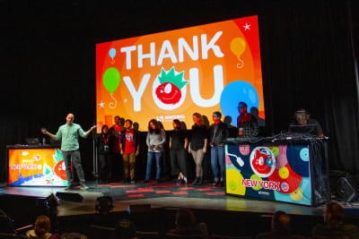
A lineup on stage in front of a screen saying Thank you

The Smashing team on stage in New York (Photo credit: Drew McLellan)
Smashing Editorial(il)
Categories: Others Tags:

New Adventures Ahead! (January 2020 Wallpapers)

December 31st, 2019 No comments
New Year, New Beginnings

New Adventures Ahead! (January 2020 Wallpapers)

New Adventures Ahead! (January 2020 Wallpapers)

Cosima Mielke

2019-12-31T12:30:00+00:002019-12-31T14:16:57+00:00

Let’s welcome 2020 with a new wallpaper! After all, the new year is the perfect occasion to tidy up your desktop and start on a fresh, blank slate — no clutter, just the things you really need and space for what’s about to come. And some inspiration, of course.

As every month since more than nine years already, artists and designers from across the globe once again took out their favorite tools to create wallpapers to inspire you, make you smile, think, or just to cater for a blob of color on a dark winter day. The wallpapers are available in versions with and without a calendar for January 2020 and can be downloaded for free. And since this little challenge has brought forth so many unique artworks over the past few years, we also assembled a selection of older January favorites at the end of this post. We wish you a wonderful start into the new year and a lot of exciting adventures to cross your way in 2020!

Please note that:

  • All images can be clicked on and lead to the preview of the wallpaper,
  • We respect and carefully consider the ideas and motivation behind each and every artist’s work. This is why we give all artists the full freedom to explore their creativity and express emotions and experience through their works. This is also why the themes of the wallpapers weren’t anyhow influenced by us but rather designed from scratch by the artists themselves.

Submit your wallpaper

Do you have an idea for a February wallpaper design? We are always looking for creative talent to be featured in our wallpapers posts. Don’t be shy, join in! ?

New Year, New Beginnings

— Designed by MasterBundles from USA

National Popcorn Day

“In this epic Netflix and Chill era, nothing has gotten more important than popcorn during the newest blockbuster! Time to gain awareness about celebrating our delicious guilty pleasure during the movies!

A little story around the wallpaper: Mr Popcorn and Mrs Popcorn are enjoying a great movie with… You guessed it right, popcorn!! But Mr Popcorn is somewhat annoyed as his Mrs eats Popcorn from his head instead of eating from the bucket right in between the loved ones.”

Designed by Nicolas van der Straten Ponthoz from Belgium

It’s Snowing!

“It is January, it’s cold and snowy… In the house, the fireplace is on and it’s hot. Only penguins are enjoying time out there.”

Designed by Veronica Valenzuela from Spain

It's Snowing!

Month of the Garnet Birthstone

“I wanted to approach the monthly challenge from a more unique perspective. Instead of chosing a cliché subject that has been done way too many times before, I chose a less known, special subject. The birthstone. Enjoy.”

Designed by Bram Copermans from Belgium

Month of the Garnet Birthstone

Rubber Ducky Day

“Winter can be such a gloomy time of the year. The sun sets earlier, the wind feels colder and our heating bills skyrocket. I hope to brighten up your month with my wallpaper for Rubber Ducky Day!”

Designed by Ilya Plyusnin from Belgium

Rubber Ducky Day

Good Intentions

— Designed by Jonathan Verhaegen from Belgium

Good intentions

The King Of Rock And Roll

“On January 8th 1935, the creator of the rock ‘n’ roll genre was born and he’s back for his final debut on this wallpaper!”

Designed by Bailey Lievens from Belgium

The King Of Rock And Roll

Aquaman

“Aquaman relaxing in the ‘nice’ January weather.”

Designed by Ricardo Gimenes from Sweden

Aquaman

Laughter Is An Instant Vacation

“These are polarized times we’re living through. It seems like there is division all around. So sometimes you just have to find the time to remember that the one thing that connects us all is a good laugh. And there is no better laugh than the belly laugh! So on the 24th of January, let’s celebrate one of life’s truly great joys and let it all hang out!”

Designed by Ever Increasing Circles from the United Kingdom

Laughter Is An Instant Vacation

Chocolate Cake Day

“I really love chocolate cake, so when I found out about “Chocolate Cake Day” I had to make a wallpaper about it!”

Designed by Aaron Claes from Belgium

Chocolate Cake Day

Earth’s Rotation Day

— Designed by Bob Storms from Belgium

Earth's Rotation Day

Go Green & Save The Earth

“Taking care of the Earth is not just a responsibility, it’s a necessity. So I designed a wallpaper to remind everyone what we can do to help save the planet.”

Designed by Farhat Asif from India

Go Green & Save The Earth

Stickers from the 70’s

“I didn’t want to make a typical New Year themed wallpaper for January so I started looking for fun ideas. Apparently January 13th is day of the stickers and so I made something original with this. I wanted to add an extra challenge that was totally out of my comfort zone. So I designed everything in seventies style. Grooovy baby!”

Designed by Bastien Corens from Belgium

Stickers from the 70's

The Wolf’s Month

“I love wolves!”

Designed by Morgane Van Achter from Belgium

Wolfs month

Oldies But Goodies

The beginning of something new, the colors of winter, local New Year’s traditions — these are just a few of the things that inspired people to create a January wallpaper over the years. Below you’ll find a selection of designs from our archives that are just too good to be forgotten. Enjoy! (Please note that these wallpapers don’t come with a calendar.)

Start Somewhere

“If we wait until we’re ready, we’ll be waiting for the rest of our lives. Start today — somewhere, anywhere.”

Designed by Shawna Armstrong from the United States

Start Somewhere

Facts

“I was reminded of a simple fact while I was browsing for inspiration for this wallpaper. I’ve read on Wikipedia that January is the coldest month on most of the northern hemisphere and the hottest one on most of the southern hemisphere. I found it fascinating that someone in Australia is enjoying a surf while I am watching the first snowflakes of the winter. I was hoping to create a wallpaper that will serve as a reminder of the fact that we live in a fascinating world full of varieties and contrasts. The old-worn-out-encyclopedia style hopefully emphasizes the educational theme of the wallpaper.”

Designed by Danijel Gajan from Serbia

Smashing Desktop Wallpapers - January 2012

Hidden Gem

“Kingfishers are called ‘ijsvogels’ (ice-birds) in Dutch. Not because they like the winter cold, but because of the intense blue and teal colors…”

Designed by Franke Margrete from the Netherlands

Hidden Gem

Freedom

“It is great to take shots of birds and think about the freedom they have. Then I start dreaming of becoming one and flying around the world with their beautiful wings.”

Designed by Marija Zaric from Belgrade, Serbia

Freedom

January Is The Month For Dreaming

“It can be very hot in Australia and very cold in Europe so I think that it is a good month for dreaming and making plans.”

Designed by Tazi from Australia

January Is The Month For Dreaming

Travel And Explore

“For once you have tasted flight you will walk the earth with your eyes turned skywards, for there you have been and there you will long to return. (Leonardo da Vinci)”

Designed by Dipanjan Karmakar from India

Travel & Explore

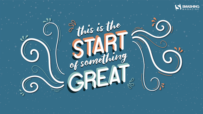
A New Beginning

“I wanted to do a lettering-based wallpaper because I love lettering. I chose January because for a lot of people the new year is perceived as a new beginning and I wish to make them feel as positive about it as possible! The idea is to make them feel like the new year is (just) the start of something really great.”

Designed by Carolina Sequeira from Portugal

A New Beginning

Open The Doors Of The New Year

“January is the first month of the year and usually the coldest winter month in the Northern hemisphere. The name of the month of January comes from ‘ianua’, the Latin word for door, so this month denotes the door to the new year and a new beginning. Let’s open the doors of the new year together and hope it will be the best so far!”

Designed by PopArt Studio from Serbia

Open the Doors of the New Year

Pop, Fizz, Clink

“I wanted to try my hand at creating a low poly illustration and thought a champagne glass would be fun.”

Designed by Denise Johnson from Chicago

Pop, Fizz, Clink

Oaken January

“In our country, Christmas is celebrated in January when oak branches and leaves are burnt to symbolize the beginning of the New Year and new life. It’s the time when we gather with our families and celebrate the arrival of the new year in a warm and cuddly atmosphere.”

Designed by PopArt Studio from Serbia

Oaken January

Snowy Octopus

— Designed by Karolina Palka from Poland

Snowy Octopus

Soft Wishes

“Let yourself be carried away by the delicate desires of your heart…”

Designed by Katia Piccinni from Italy

Smashing Desktop Wallpapers - January 2012

Boom!

— Designed by Elise Vanoorbeek from Belgium

Boom.

The Early January Bird

“January is the month of a new beginning, hope and inspiration. That’s why it reminds me of an early bird.”

Designed by Zlatina Petrova from Bulgaria

The Early January Bird

Winter Leaves

— Designed by Nathalie Ouederni from France

Winter Leaves

Caucasian Mountains

“From Caucasus with love!”

Designed by Ilona from Russia

Smashing Desktop Wallpapers - January 2012

Wolf-Month

“Wolf-month (in Dutch “wolfsmaand”) is another name for January.”

Designed by Chiara Faes from Belgium

Wolf-Month

Be Awesome Today

“A little daily motivation to keep your cool during the month of January.”

Designed by Amalia Van Bloom from the United States

be awesome today

Blue Neon Sign

— Designed by Jong S. Kim from the United States

Smashing Desktop Wallpaper — January 2013

Join In Next Month!

Thank you to all designers for their participation. Join in next month!

Smashing Newsletter

Upgrade your inbox and get our editors’ picks 2× a month — delivered right into your inbox. Earlier issues.


Useful tips for web designers. Sent 2× a month.
You can unsubscribe any time — obviously.

Smashing Editorial(cm, il)
Categories: Others Tags:

6 Best Art Podcasts

December 31st, 2019 No comments
Best Art Podcasts

You are on your way back from work and stuck in traffic, or you are doing the house chores that are long overdue. You don’t want to lose the limited personal time that you already have, but your living room is a mess.

What do you do? Just open up a podcast, whether you want to learn more about a certain topic, or you want to laugh and have fun while doing laundry.

Selecting a podcast shouldn’t be an issue, there are podcasts for almost everything nowadays. Do you want to get better at doing hand-stands while eating a bowl of cereal? There is probably a podcast out there somewhere explaining how to do it.

Do you want to get into art podcasts? We got you covered.

Best Art Podcasts

A Piece of Work

A Piece of Work covers everything you want to learn about contemporary and modern art but were afraid to ask. A bike wheel attached to a stool, a banana taped to a wall; for many people, these works raise a lot of questions. Hosted by Abbi Jacobson, A Piece of Work tackles everything with conversations with artists, curators, and Abbi’s friends including RuPaul, Hannibal Burres, Teri Gevinson and Questlove.

The Lonely Palette

“A podcast that returns art history to the masses, one painting at a time.”

Creator/host Tamar Avishai picks a popular object, interviews people in front of it and then explains the social context, the movement of art, and the anecdotes.

ArtCurious

There are many wonderful stories in art history, and host Jennifer Dasal dives into the unexpected, the slightly odd and strangely wonderful. It’s a podcast that everybody could listen to enjoy, you want to know who Banksy is or did Van Gogh really kill himself? Well, check ArtCurious out!

Bad at Sports

It’s a weekly podcast about contemporary art. It features artists, critics, dealers, curators and other people from the art world.

Raw Material

Raw Material is an arts and culture podcast from the San Francisco Museum of Modern Art. They focus on a different topic each season, with a different host. This provides art to be explored through different eyes each season.

Artists Helping Artists

If you are looking for different ways to sell your art online, artist Leslie Saeta is here to help. Leslie has experience with 30+ years of marketing experience, and she knows about the business side of art. She has a non-traditional approach to marketing her art online and she is passionate about sharing her knowledge and experience.

These are the podcasts we enjoy the most at the moment. There are many more art podcasts that you can check out if you enjoy art make sure to give these a listen!

What are your favorite art podcasts? Tell us in the comments!

Categories: Others Tags:

Smashing Podcast Episode 6 With Luca Mezzalira: What Are Micro-Frontends?

December 31st, 2019 No comments
Luca Mezzalira

Smashing Podcast Episode 6 With Luca Mezzalira: What Are Micro-Frontends?

Smashing Podcast Episode 6 With Luca Mezzalira: What Are Micro-Frontends?

Drew McLellan

2019-12-31T05:00:00+00:002019-12-31T14:16:57+00:00

We finish off this year with yet another Smashing podcast! This time, we’ll be talking about micro-frontends. What is a micro-frontend? How is it different from the sort of approach we might be taking at the moment? Let’s find out from micro-frontend pioneer, Luca Mezzalira.

Show Notes

Weekly Update

Micro-Frontends

Transcript

Drew McLellan: He’s a Google developer expert on web technologies and manager of the London JavaScript community. With more than 15 years experience, he currently works as VP of Architecture, designing sports video platform DAZN, which delivers on demand sports content to millions of users all watching live. He’s the author of the book Front-End Reactive Architectures for Apress and is also a technical reviewer for Apress, Packt Publishing, Pragmatic Bookshelf, and O’Reilly, as well as being an experienced public speaker at technical conferences all around the world. He’s Italian, sports a handsome beard, and clearly has deep knowledge of the web platform. But did you know he once crossed South America on an ostrich? My smashing friends, please welcome Luca Mezzalira. Hi, Luca. How are you?

Luca Mezzalira: I’m smashing.

Drew: I want to talk to you today about the subject of micro-frontends. Now this is a concept that’s completely new to me, certainly by the name, and I expect it’s new to a lot of our listeners, too. Before we get into micro-frontends themselves, I guess we should understand the problem that you’re looking to address with them. So perhaps you could tell us a little bit about how you see applications in a more traditional way and what sort of problems do those things hit that maybe micro-frontends might be the solution to?

Luca: Okay, that’s a good starting point, in my opinion. So usually when you implement or design a new green field project and you want to work with front end applications, you have a few architecture that you can leverage. You can use a single page application, you can use a server side rendering application, or you can use a multi-page application composed by just simple HTML pages. Obviously those are super valid options and I think very used by many, many developers. The real problem that we’re trying to solve here is how you can scale these concepts with distributed teams to hundreds of developers working on the same codebase, because the reality is when you’re working in these platforms in particular, when you think about SaaS platform for instance, you need to have multiple developers and multiple teams that are working on the same project. And obviously the way how, for instance, you do acquisition or retention is completely different on the way how you expose the catalog or how you show a specific part of a platform.

Luca: So now in my experience I work a lot with single-page application. I work with server-side rendering application, but at some point in DAZN I’d be asked to think about a way to scale our technical team. And I need to come up … if for backend we have some solution that are microservices in this case, so we can scale our APIs independently, and take in consideration that the scale and the volume for a specific throughput on a specific API. On the front end, really, it’s really more difficult because if you think about that, you don’t have technical problem to solve when you need to scale, if you’re using a single page application, for instance. Probably for a server-side rendering you have some, but on a single-page application, for instance, it’s distributed by nature because it’s on client-side, different client-side.

Luca: So the only thing that they are loading are just some static files like CSS and HTML and JavaScript that are served by CDN, and in that case you can scale accordingly, it’s not a big challenge. But the real challenge is how you scale the teams working on the same platform, because sometimes the challenges that are faced by one team could be completely different from the challenges that are faced by another team, and usually what you do is you try to find a lot of tradeoffs between the things. Because if you think, let’s try to think on a normal use case. So usually when you start a platform you’re starting small. So you try to create that quick single-page application, as well you have your monolith, so you just set up everything in your CICD just once for front end and back end, and then you start to iterate on your logic. But the reality is when you have success, you need to evolve this part, and it’s not always maintaining the same architecture that could, let’s say, create the benefit for your business, because maybe you can find some bottlenecks.

Luca: So now going back to the single-page application part. So if we want to scale a single-page application part, the challenge is not technical, it’s with humans if you want. So how we can scale teams working on the same application. So what I did a few years ago is, was the starting to look at a possible architecture that and principles that would allow me to scale the front end as well as the backend. So working on the backend principles so that you can find the microservices. I started to look at the different solution and they came out with the micro-frontends that at the beginning we didn’t even call it that way because obviously for years ago there wasn’t the, let’s say, that name for that specific architecture.

Luca: But the reality is taking a monolith, so a single page application and slicing it in a way that will allow us to focus ourselves in a tiny problem. So a smaller problem than the entire application and trying to solve that in the best way possible. Technically speaking. Obviously that lead to have independent pieces of your frontend application that could be deployed in production without affecting all the others. So the challenge basically for Micro-frontend is trying to figure out their way to take a single page application or server side rendered application and create a artifact of these, let’s say, as close as possible to a business domain, and can be deployed independently.

Drew: So I mean you mentioned micro services on the back end. So conceptually this is a similar sort of solution to the problem. The micro services serve on the back end, but ported over to the front end. Is that a rough equivalence or is it more involved in that?

Luca: Yes. No, it’s a way to solve the same problem it is trying to solve microservices on the back end but on the front end in this time. Usually when I started this journey at the beginning, you know, you start to think about that and you start to evaluate different approaches. And in the last few months I came up with what they call, the Micro-frontend decision framework that basically is four steps that they use in order to, let’s say you identify an approach for Micro-frontend, because if up to now, we usually pick one framework that designed architecture for us and we implement on top of their architecture. If you think about angular or think about React or Redux. You have all the pieces that are needed but you don’t take architectural decisions. You would take a design decisions or how you implement on top of that specific architecture.

Luca: So on Micro-frontend you need to start the step back. So we need to think about how we want to first slice our application. So there are two usually options for that. You can slice horizontally, so you can have multiple micro-frontends in the same view or you can slice vertically. Therefore you always load one Micro-frontend per time. And those decision are quite key because it will then cascade certain other options that you have based on the initial decision to make. So the first, as I said, you decide how you want to slice your application. The second one is how you want to compose your application. So you want to have like, for instance, an app shell that is loading one or multiple micro-frontends in the same view. You want to have, I don’t know, application server that is composing different fragments of your applications, so different Micro-frontend and then serve the final view to your user. Or you want to use edge-side included, it’s a standard that is inside of CDNs in order to compose a page and serve these there.

Luca: Those are three of the options that you have. And then apart from composing, then you need to think how you want to route. So how you route from, I don’t know, /login or /signin to the catalog part or a specific detail object. Also here you have like three option. You can do it at the application server, you can do it on CDN level with Lambda Edge or any other web workers in CloudFlare or anything else. Or you can do a client site. So you have a logic inside your app shell that you say, okay, now for this specific URL you need to load another view or another micro-frontend. And the last bit is how you communicate with Micro-frontend.

Luca: So usually if you have like multiple Micro-frontend on the same page, there is higher complexity on managing this communication, because you need to maintain the different Micro-frontend independent. So that means you cannot have any reference on how the page is structured. So usually you can use stuff like custom events or an event meter that is injected inside each single Micro-frontend. And then the Micro-frontend are communicating together. Obviously in the other case when you have like let’s say a vertical split off your Micro-frontend is way easier, because inside the vertical basically the representation of a vertical Micro-frontend is a single page application or a single page. And in that case it’s easier to let’s say create and share having a shared state across the entire Micro-frontend.

Luca: Then if you think about having multiple Micro-frontend all together, then you should avoid to have states that are shared across Micro-frontend, because otherwise you are coupling things. Instead of the whole concept here is decoupling and have independent deployment. And therefore let’s say the challenges of a horizontal split, which is the first decision you should take or vertical split, are completely different, and we need to be very well aware which one fits our use case.

Drew: So rather than a specific technical solution, micro frontends are very much like a design pattern that you would implement in whatever technology is appropriate for the particular problem you’re trying to solve?

Luca: Yeah, more than technology, I would see that we pick the right architecture for the right job. Just to give you an example, I was talking … there is a famous framework, a fairly new for Micro-frontend, it’s called Luigi framework, that was released by SAP open source. What they are doing is creating some iframes where they are wrapping their Micro-frontend inside it. So now if you think about that, let’s say, using iframes nowadays, you’re on a public website that maybe as the SEO or other features that are mandatory, it could be problematic.

Luca: But in the case of SAP, if you think about that, they have like enterprise application where they can control the browser that the user is using, they can control the environment, they don’t need to be available on a multitude or different version of the browser. So for them these thing allows them to have certain areas of the application that are constant and they have certain areas that are changing independently without any problem. But obviously an iframe solution wouldn’t work in other situation. Just to give another example, Spotify, we’re using iframes at the beginning. In fact the desk publication is still composed by multiple iframes and each single iframe is a tiny application that does, I don’t know, just a music player or just their recommendation, whatever it is. They try to have the same approach on web, but they dismissed that this year in order to move back to a single page application.

Luca: And that means, they explain why in the technical blog, they were saying that obviously if you apply that to millions of users that are using iframes that needs to load every time the same vendors file. And then you have like a lot of dependancies duplicated and the time for interacting with your page would be longer. So in reality, this approach could fit for certain use cases, but they shouldn’t fit for all of them. That’s why I’m saying, as I described before, if you have a decision framework that helps you to address those thing and you can start to say, okay, I sliced the application in this way, therefore I have those options that are available when I want to compose, when I want to route, when I want to communicate, it should guide you in order to have the right decision at the right time.

Luca: Then obviously apart from those four decisions, there are many others. Like how you create consistency in the design system that you have across all the Micro-frontend. Or I don’t know how you manage the dependencies and avoid the clashing of the dependency inside the Micro-frontend, but the reality is those four decisions that I mentioned before will allow you to then take all the others in a quick way without having the problem of overthinking, which is the best solution because you already set the cornerstone, the four pillars, that will allow you to take all the other decision … I don’t say in a easy way, but in a quicker way than a review or the spectrum of opportunities.

Drew: You mentioned before, the way that Micro-frontend can help with the sort of structure of teams within your organization and having lots of people working on the same application. What are some of the implications then and does it make any difference if your teams are distributed or co located or are there any challenges that are faced there?

Luca: Yes. So I can tell you what is the story of DAZN. That is the company where I’m working on. Currently in DAZN, we had like a nice challenge. So currently we have over 300 people that are working on the front and the back end of our platform. It’s an OTT platform that is streaming live at sport events globally. And the interesting bit is if all microservices we know how to manage more or less and we have distributed teams. So we have four dev centers. We’d want to put teams in each single dev centers on the front, and we tried this approach and it work pretty well. So with Micro-frontend we were able to provide different business domains in different locations and allow the cross communication between teams inside a specific business domain, very because the worst case scenario there that if you have to speak with another team on your same business domain, you just reach the walking distance from your desk. If instead you need to discuss specific thing on the distributive team, so with maybe somebody in London instead of Amsterdam, or instead of company in Poland, you just organize a call.

Luca: But those kinds of communication are more rare than the ones that are happening across teams inside the same location. And that’s why we started working on that. So the first thing that they did was looking at how our users were interacting with our website, how did the company was structured. And when we identify the four key areas that we are working on, that are currently acquisition and retention, let’s say porting of their core application on multiple TV’s and mobile and having the core domain that for us is the video player and the discovery phase of our content. And finally all the back office elements. I was able to identify those four areas and we those four areas we assigned for each single dev center.

Luca: Obviously there are some point of contacts between those areas, but then there are ways that you can let’s say mitigate and have some initial workshop with the different teams that are in different location and then work towards the same API contract for instance, or the same goal with having some checkpoints during the development. But the nice thing of approaching that allowed approaching with Micro-frontend is the fact that we finally understand deeply how our system was working. We sit down and we analyze how we were structured and we changed not only the way how we were affected things, but also how the company was working. And that was a kind of a different approach from what they have seen so far. But it’s proving that is working pretty well in the case that each single team can interact with the team of the same location in the same domain.

Luca: So they are talking exactly on the same language if you are talking about the domain driven design. And that is that if they need to interact with other teams, they can literally share the workshop or flying to another dev center and it’s less than a problem. But in this way we let’s say, augment the throughput and reduce the communication overhead, and the extent of dependencies that were happening in other situation that they were working on.

Drew: And do all these teams need to be using like a standardized JavaScript framework? Do they all need to be coding in the same things, they all need to be either React or Angular or to enable the interoperability between them or can people be using different things for different Micro-frontend?

Luca: Yeah. So in DAZN we decided to slice vertically our Micro-frontend and that was a decision that allowed us to have the freedom to pick the technology that we need for each single Micro-frontend. Considering that every time we load one Micro-frontend per time and this means that for instance, that how we have a landing page is different from the sign in / sign up journey. So we can update … we’re mainly using React at the moment. But if, for instance, I remember when React 16 was a release that we were able to release in production React 16, also if it wasn’t in the stable version for just a landing page and see if it was working without affecting all the other teams.

Luca: And then at their own speed, at thier own pace, they were updating their own stuff. So that allows us also to let’s say try new technologies or new assumptions that we have on the existing application with a certain amount of users. Because we implement the also candidate releases for front end. We implement the, let’s say several practices that allows us to just try certain times in production and see how the things are working.

Luca: The beauty of these approaches that we can independently decide to have the right tool for the right job more than having a common denominator across the entire stack. Because as you can imagine, when you started to work on a project, the decision that you made the first few years are probably different on the decision that you made in a trajectory where the company’s growing, the business is evolving and these became more mature and the challenge is completely different. So it wouldn’t be flexible enough or agile enough, if you think about that, the fact that we stick with the same decision we take two years ago. In particular an institution like DAZN, that we move from basically zero to 3000 employees in three years. So as you can imagine it was a massive growth and it was a massive growth for the company as well as on the user base.

Drew: Is there an established way for the different Micro-frontend to share data and to communicate with each other, for example, just to keep each other in step with the same view or is there a way to do that?

Luca: Yes, there is. It depends which of the decision framework, which path you’re going to take. Because if you’re going to take the vertical slice that became very easy. So what we have in order to communicate through Micro-frontend is an app shell that is loading in Micro-frontend inside itself. And what it does is storing everything that has to be, let’s say, shared across different Micro-frontend or on a web storage, either a session or local storage or in memory. And then based on those information, the Micro-frontend is loaded, can retrieve from the app shell to this information and then consume that, amend that or change them. It’s completely up to how you slice the application, but in this case, just to provide an example, if you think when you are authenticated users and you need to go to the sign in page, when you in and the APIs are our consumed and they are providing a JWT token, Micro-frontend is passing these to the app shell and the app shell these starting we saved their web storage.

Luca: Then after that the app shell is loading the new authenticated area for that specific application and those authenticated areas, they’re retrieving the JWT token from the app shell and is performing either a refresh access token or is validating some data starting inside the JWT token. So it’s using basically the information that were produced by another Micro-frontend at their own wheel.

Drew: It sounds like a very interesting concept and I can potentially see lots of big advantages to working this way, but it can’t be without its challenges, surely. Are there any particular things that are more difficult to deal with when architecting things in this way?

Luca: I think first and foremost the main challenges that I see is the shift of mindset. Because before we were used to have a, let’s say, the tech leads or the lead developers that were deciding everything around an entire application taking all decisions. Now finally we move from this centralized entity to a de-centralized entity that is local for each state. As you can imagine, this is bringing some challenges because if before we have someone that is tracing the path, now is that we have, let’s say, multiple people at the top defining the right path inside their domain, and this is a huge shift of mindset.

Luca: On the other side, I think the complexity is accepting sometimes that you doing the wrong abstraction could be, let’s say, more expensive than duplicating code. And that’s I know there’s something that I found very challenging in managing developers because they’re thinking, “Okay, now I can reuse this object or this specific library hundreds of times inside the project,” but the reality is very different. I saw components library that were abstract and they spend a lot of time making that as the best code ever or the best in a perfect shape. But the reality were used just twice. So the effort of doing that, it wasn’t exactly that. I saw on the other side libraries that they started with a couple of use cases for a specific component. And then those use cases became 10 and then the code became unmaintainable.

Luca: So trying to add a new function inside the same component could be more at risk than a benefit. So I think the other thing that we need to understand with Micro-frontend is how much we want to share it and how much we want to duplicate. And there is no harm, honestly, duplicating. In our case for instance we have a duplication of footer and header, and we did that mainly because we changed like three times the header in four years. So as you can imagine the fact that we are centralizing these, are assigned to a team and create an external dependency for all the teams, all the hundreds of developers that we have, is more let’s say an issue that a benefit for the company because we are not adding an enormous value.

Luca: At the same time currently we are refactoring, our shared libraries that would be payment library, because obviously payment has some logic behind that and if we want to change once, we don’t want to apply that twice in multiple parts of the code. We want to have just one library that is a source of truth, but for the header and footer, also if there is a discrepancy or for pixel or there is a function that this is deployed like a week later, it won’t hurt the application.

Drew: So are there some telltale signs that people should look for when evaluating an application and thinking, “Oh yes, this would be a good candidate to move to a Micro-frontend sort of architecture?”

Luca: Yeah, so my suggestion would be first and foremost I wouldn’t start a greenfield project with Micro-frontend unless we know exactly how it should be built. And usually it’s very unlikely that you have this information because, particularly if you have a new platform or a new project and it’s the first time that you are working on this, it could be a nontrivial finding this information. Usually what I suggest is starting with an existing architecture that would be so a single page application and then evolving that. In particular for instance I found, I think that using Micro-frontend for legacy applications or when we want to replace specific part of the application or when we have a project that we want to evolve and scale for multiple teams, those are three use cases that I feel very strong could suit the Micro-frontend architecture. Obviously that doesn’t mean that from now on everything should be made Micro-frontend, because Micro-frontend is not the silver bullet at all.

Luca: What they are is an additional architecture that we can leverage on the front end world. And up to now we had like a certain amount of architectures, now we have an additional one. But that’s a lot of challenges because obviously you need to, if before server side rendering or a single page application, there are clear patterns that were explored and then implemented by several framework and so on. With Micro-frontend currently, is one way to do things. But adding the decision framework probably should allow people to make the right decisions for their use cases. Because often there are a lot of misconceptions on what Micro-frontend are and how they should be used. And lots of people are thinking that maybe let’s say, are evil for, I don’t know, having too many libraries in one view or other things.

Luca: The reality is you need to understand deeply the concept, understand how to implement that and then you can start to work on that. I fully agree that there are technical challenges and there are a lot of decisions that you have to make and you cannot just start straight away with an editor in front of you writing code and thinking, okay, now I’m creating a micro-frontend architecture. Because you need to understand the concept, understand the context and create, also governance around that because the complexity is not just writing the code, it’s also understanding how all the pieces are fitting together in the CICD part the SEO part and so on.

Luca: So Micro-frontend does provide, let’s say a level of flexibility and require a lot of effort for defining the governance right. Because when you have the governance right, everything would be smooth. Often and unfortunately I would say too often, I saw companies that where they don’t spend enough time on the governance side, understanding the CICD for instance, because they don’t think that this is important. But instead for Micro-frontend, like for microservices, having automation right will allow you to speed up the development. If you don’t spend enough time on the automation bit, you risk to have more burden than benefits.

Drew: I guess it’s like so many things in the web development world where people are in danger of diving in with a technical solution before they’ve really understood the problem. And it sounds like with Micro-frontend is very much a case you need to see the problem and then implement the solution to know what problem that you’re solving. I guess the very nature of Micro-frontend make it very easy to start integrating into an existing application, to spot a small problem and swap it out with a Micro-frontend in order to solve that problem. Is that a reasonable suggestion?

Luca: Yeah, I would say so. In this case, the only thing that I would suggest if we start in this way is looking more at the vertical slicing over the horizontal slicing, because otherwise you need to solve so many problems about, let’s assume that for instance you’re using Angular and you want to move to a new version of Angular. If you need to have two Angular version living together without using I-frame, it could be complicated or even not possible. So if you start, you the aspect not from … if you check the challenge, not from the technical point of view, but from the business point of view. Maybe for instance, you can take, I don’t know, the sign-in part on that you want to write with a different version or the same version but more update version of a framework and that could be a good way. And then you route through the path. That could be a good way to replace slowly but steady a specific application.

Luca: What we have done in our case is basically applying the strangler pattern that is a well known pattern for microservices, but on the front end. So based on the URL and based on the browser and country of the user. So slowly but steady, basically we were killing the monolith, that in this case was single page application, releasing our new application more often and see the behaviors of the users, if it was improving the experience, it was causing any problem on our system or not. And that allowed us to provide immediate value to the business, but at the same time allowed us to test our assumptions and see if we were going to the right direction or not.

Drew: It sounds like a very attractive solution to some problems I’m sure a lot of people are facing. If I, as a developer, wanted to start investigating more about Micro-frontend, where would be a good place to start?

Luca: Yes, so currently I’m spending a lot of my spare time trying to advocating around these architecture, because I think there are a lot of misconceptions. On my Medium account. I’ve wrote several articles that are available there as well. A recorded a lot of videos in conferences that you can find on YouTube without any problem. And the other thing I would suggest if you’re looking for some code example on some frameworks, the one that I would recommend to start with is a single SPA, mainly because it has a vertical slicing approach, it’s easier to pick it up and you can start to understand the benefit of this architecture. Then there are many others that are available. Before I mentioned Luigi framework, as well as many others that are currently out there that are allowing you to compose multiple Micro-frontends in the same view.

Luca: Like another one in my head is TailorJS is another interesting. But definitely there is open components that is one developed by Open Table. But in general there are plenty of opportunity if you start to search about Micro-frontend, they’re out there.

Drew: That sounds great. Is there anything else that you wanted to talk about with regard to the Micro-frontends?

Luca: Yeah. Personally I would suggest to take an open mind approach on learning this architecture and this approach, technical approach, mainly because I believe that there is a lot of good, but we need to, let’s say, invest a bit of time and spend a bit of time to deeply understand how the things are working. Because obviously there isn’t, just one way to do things. We are used that we take a framework and immediately we start to work on it and it’s super productive, if you think about that.

Luca: But in this case you need to spend a bit of more time understanding, as you said a couple of times, the problem. Understand which is the pattern that would allow you to express better not only from a technical point of view but those two from our organizational point of view, the solution that you have in mind.

Drew: So I’ve been learning all about Micro-frontend today. What have you been learning about lately?

Luca: Recently there are two things that I’m learning. So last week I was in Las Vegas during the AWS event and is obviously a cloud conference. Pretty amazing, 70,000 people, a lot of sessions that were spreading several hotels in Vegas. And there for me, a serverless is a paradigm that I’m studying the most because I truly believe that in the future that will be the way how we are going to design and implement software and obviously AWS is very prominent on this approach.

Luca: And the second topic is around management and how to be a leader of a tech team. Because obviously I’m SVP of architecture. I have a team of architects that I’m leading and you can never rest because you need to not only to be on top of the technical side, but you need also to understand the people problems, understand how you can make them successful. Because obviously if they are successful, you are successful. You are first a technical facilitator to a certain extent. So that for me, those for me are the two things that currently I’m studying on top of exploring the Micro-frontend world.

Drew: If you, dear listener, would like to hear more from Luca, you can follow him on Twitter where he’s @LucaMezzalira or find his activities collected together at Lucamezzalira.com. Thanks for joining us today, Luca. Did you have any parting words?

Luca: No, but thank you very much for listening up to now.

Smashing Editorial(dm, ra, il)
Categories: Others Tags:

Embedded Content in Markdown

December 31st, 2019 No comments

Markdown supports HTML, so if you need to, say, embed a YouTube video, you can just copy and paste the embed code from them, drop it into a Markdown document, and you should be good to go. With YouTube specifically, there are other options. But in general, you don’t need to do anything special to embed third-party media in Markdown.

You do need to do whatever is necessary for that particular service though. For example, on CodePen, you visit any particular Pen to get the embed code, click “Embed” in the footer, choose options, and ultimately get the embed code. On Twitter, you click a down arrow thingy and choose Embed Tweet, then get forwarded to some other website where you choose options and ultimately get the embed code. It’s different on every service.

That’s the spirit behind gatsby-remark-embedder from Michaël De Boey, which I recently saw. It spells this out:

Trying to embed well known services (like CodePen, CodeSandbox, Slides, SoundCloud, Spotify, Twitter or YouTube) into your Gatsby website can be hard, since you have to know how this needs to be done for all of these different services.

So what this plugin does is allows you to drop a URL to the thing you’re trying to embed on its own line, and it’s magically transformed into embed code. For example, you put a URL to a Pen like this:

https://codepen.io/Coderesting/pen/yLyaJMz

…and you get:

<iframe
  src="https://codepen.io/team/codepen/embed/preview/PNaGbb"
  style="width:100%; height:300px;"
></iframe>

…by the time the content makes its way to the DOM.

As an owner of CodePen, I can’t help but to remind you that doing it this way means you can’t take advantage of having a theme or making it editable. But hey, I get it.
What I think is a smidge funny is that… this is exactly what oEmbed is. The whole spirit of oEmbed is, “Put a URL to a thing on its own line and we’ll try to make it into an embed for you.” It’s a clearly defined spec and there is a clear source of data of sites that support the feature.

But I suppose it’s a failing of oEmbed that people either don’t know about it or don’t use it. Even Embedly seems kinda dead-ish?

The post Embedded Content in Markdown appeared first on CSS-Tricks.

Categories: Designing, Others Tags:

Gatsby and WordPress

December 30th, 2019 No comments

Gatsby and WordPress is an interesting combo to watch. On one hand, it makes perfect sense. Gatsby can suck up data from anywhere, and with WordPress having a native REST API, it makes for a good pairing. Of course Gatsby has a first-class plugin for sourcing data from WordPress that even supports data from popular plugins like Advanced Custom Fields.

On the other hand, Gatsby is such a part of the JAMstack world that combining it with something as non-JAMstack-y as WordPress feels funny.

Here’s some random thoughts and observations I have about this pairing.

  • Markus says this combination allowed him to “find joy again” in WordPress development.
  • A world in which you get to build a WordPress site but get to host it on Netlify, with all their fancy developer features (e.g. build previews), is certainly appealing.
  • Scott Bolinger has a five-minute tour of his own site, with the twist of some of the pages can be statically-built, and other parts dynamically loaded.
  • There is a GraphQL plugin for WordPress, which I suppose would be an alternate way to yank data in a Gatsby-friendly way. Jason Bahl, the wp-graphql guy, literally works for Gatsby now and has “Development sponsored by Gatsby” as the plugin’s Twitter bio. It’s unclear if this will be the default future way to integrate Gatsby and WordPress. I sort of suspect not, just because the REST API requires no additional plugin and the GraphQL plugin takes a little work to install. Anecdotally, just installing it and activating it triggers a fatal error on my site, so I’ll need to work with my host on that at some point because I’d love to have it installed.
  • We see big tutorial series on the subject, like Tim Smith’s How To Build a Blog with WordPress and Gatsby.js.
  • Getting a WordPress site on static hosting seems like a big opportunity that is barely being tapped. Gatsby is just an early player here and is focused on re-building your site the React way. But there are other tools like WP2Static that claim to export a static version of your WordPress site-as is then upload the output to a static host. Ashley Williams and Kristian Freeman get into that in this video (starting about 20 minutes in) and host the result on a Cloudflare Workers site.

The post Gatsby and WordPress appeared first on CSS-Tricks.

Categories: Designing, Others Tags:

A CSS Tribute to SVG

December 30th, 2019 No comments

This demo from Jérémie Patonnier is incredible. Make sure to look at it in Firefox because some Chrome bug apparently prevents the entire thing from working.

The big idea is that the entire demo is one element. That’s it. It is duplicated with elements when needed, and each individual duplication is styled via CSS, which can control stuff like stroke, fill, x, y, etc.

Direct Link to ArticlePermalink

The post A CSS Tribute to SVG appeared first on CSS-Tricks.

Categories: Designing, Others Tags: