A Handy Sass-Powered Tool for Making Balanced Color Palettes
For those who may not come from a design background, selecting a color palette is often based on personal preferences. Choosing colors might be done with an online color tool, sampling from an image, “borrowing” from favorite brands, or just sort of randomly picking from a color wheel until a palette “just feels right.”
Our goal is to better understand what makes a palette “feel right” by exploring key color attributes with Sass color functions. By the end, you will become more familiar with:
- The value of graphing a palette’s luminance, lightness, and saturation to assist in building balanced palettes
- The importance of building accessible contrast checking into your tools
- Advanced Sass functions to extend for your own explorations, including a CodePen you can manipulate and fork
What you’ll ultimately find, however, is that color on the web is a battle of hardware versus human perception.
What makes color graphing useful
You may be familiar with ways of declaring colors in stylesheets, such as RGB and RGBA values, HSL and HSLA values, and HEX codes.
rbg(102,51,153)
rbga(102,51,153, 0.6)
hsl(270, 50%, 40%)
hsla(270, 50%, 40%, 0.6)
#663399
Those values give devices instructions on how to render color. Deeper attributes of a color can be exposed programmatically and leveraged to understand how a color relates to a broader palette.
The value of graphing color attributes is that we get a more complete picture of the relationship between colors. This reveals why a collection of colors may or may not feel right together. Graphing multiple color attributes helps hint at what adjustments can be made to create a more harmonious palette. We’ll look into examples of how to determine what to change in a later section.
Two useful measurements we can readily obtain using built-in Sass color functions are lightness and saturation.
- Lightness refers to the mix of white or black with the color.
- Saturation refers to the intensity of a color, with 100% saturation resulting in the purest color (no grey present).
$color: rebeccapurple;

@debug lightness($color);
// 40%

@debug saturation($color);
// 50%;
However, luminance may arguably be the most useful color attribute. Luminance, as represented in our tool, is calculated using the WCAG formula which assumes an sRGB color space. Luminance is used in the contrast calculations, and as a grander concept, also aims to get closer to quantifying the human perception of relative brightness to assess color relationships. This means that a tighter luminance value range among a palette is likely to be perceived as more balanced to the human eye. But machines are fallible, and there are exceptions to this rule that you may encounter as you manipulate palette values. For more extensive information on luminance, and a unique color space called CIELAB that aims to even more accurately represent the human perception of color uniformity, see the links at the end of this article.
Additionally, color contrast is exceptionally important for accessibility, particularly in terms of legibility and distinguishing UI elements, which can be calculated programmatically. That’s important in that it means tooling can test for passing values. It also means algorithms can, for example, return an appropriate text color when passed in the background color. So our tool will incorporate contrast checking as an additional way to gauge how to adjust your palette.
The functions demonstrated in this project can be extracted for helping plan a contrast-safe design system palette, or baked into a Sass framework that allows defining a custom theme.
Sass as a palette building tool
Sass provides several traditional programming features that make it perfect for our needs, such as creating and iterating through arrays and manipulating values with custom functions. When coupled with an online IDE, like CodePen, that has real-time processing, we can essentially create a web app to solve specific problems such as building a color palette.
Here is a preview of the tool we’re going to be using:
See the Pen
Sass Color Palette Grapher by Stephanie Eckles (@5t3ph)
on CodePen.
Features of the Sass palette builder
- It outputs an aspect ratio-controlled responsive graph for accurate plot point placement and value comparing.
- It leverages the result of Sass color functions and math calculations to correctly plot points on a 0–100% scale.
- It generates a gradient to provide a more traditional “swatch” view.
- It uses built-in Sass functions to extract saturation and lightness values.
- It creates luminance and contrast functions (forked from Material Web Components in addition to linking in required precomputed linear color channel values).
- It returns appropriate text color for a given background, with a settings variable to change the ratio used.
- It provides functions to uniformly scale saturation and lightness across a given palette.
Using the palette builder
To begin, you may wish to swap from among the provided example palettes to get a feel for how the graph values change for different types of color ranges. Simply copy a palette variable name and swap it for $default as the value of the $palette variable which can be found under the comment SWAP THE PALETTE VARIABLE.
Next, try switching the $contrastThreshold variable value between the predefined ratios, especially if you are less familiar with ensuring contrast passes WCAG guidelines.
Then try to adjust the $palette-scale-lightness or $palette-scale-saturation values. Those feed into the palette function and uniformly scale those measurements across the palette (up to the individual color’s limit).
Finally, have a go at adding your own palette, or swap out some colors within the examples. The tool is a great way to explore Sass color functions to adjust particular attributes of a color, some of which are demonstrated in the $default palette.
Interpreting the graphs and creating balanced, accessible palettes
The graphing tool defaults to displaying luminance due to it being the most reliable indicator of a balanced palette, as we discussed earlier. Depending on your needs, saturation and lightness can be useful metrics on their own, but mostly they are signalers that can help point to what needs adjusting to bring a palette’s luminance more in alignment. An exception may be creating a lightness scale based on each value in your established palette. You can swap to the $stripeBlue example for that.
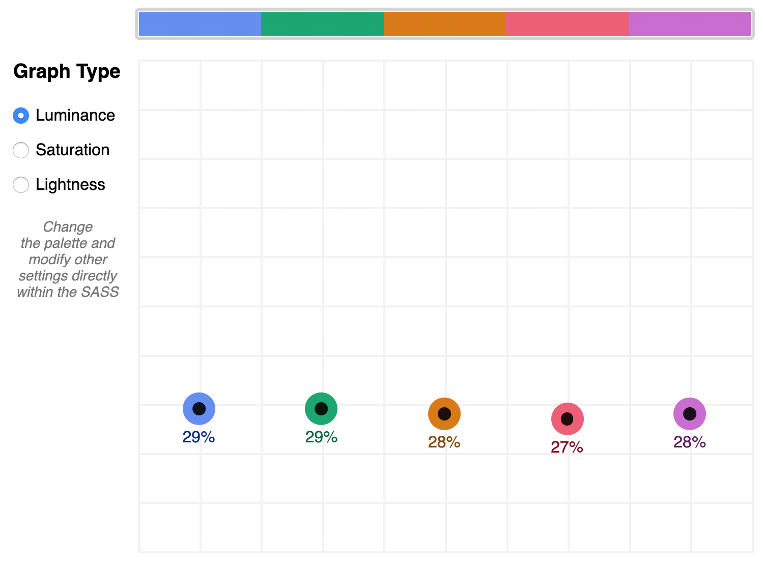
The $default palette is actually in need of adjustment to get closer to balanced luminance:
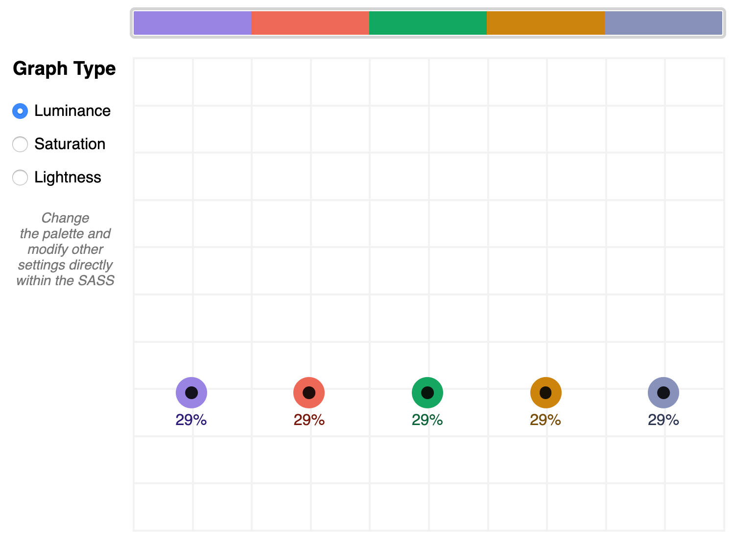
$default palette’s luminance graphA palette that shows well-balanced luminance is the sample from Stripe ($stripe):

$stripe palette luminance graphHere’s where the tool invites a mind shift. Instead of manipulating a color wheel, it leverages Sass functions to programmatically adjust color attributes.
Check the saturation graph to see if you have room to play with the intensity of the color. My recommended adjustment is to wrap your color value with the scale-color function and pass an adjusted $saturation value, e.g. example: scale-color(#41b880, $saturation: 60%). The advantage of scale-color is that it fluidly adjusts the value based on the given percent.
Lightness can help explain why two colors feel different by assigning a value to their brightness measured against mixing them with white or black. In the $default palette, the change-color function is used for purple to align it’s relative $lightness value with the computed lightness() of the value used for the red.
The scale-color function also allows bundling both an adjusted $saturation and $lightness value, which is often the most useful. Note that provided percents can be negative.
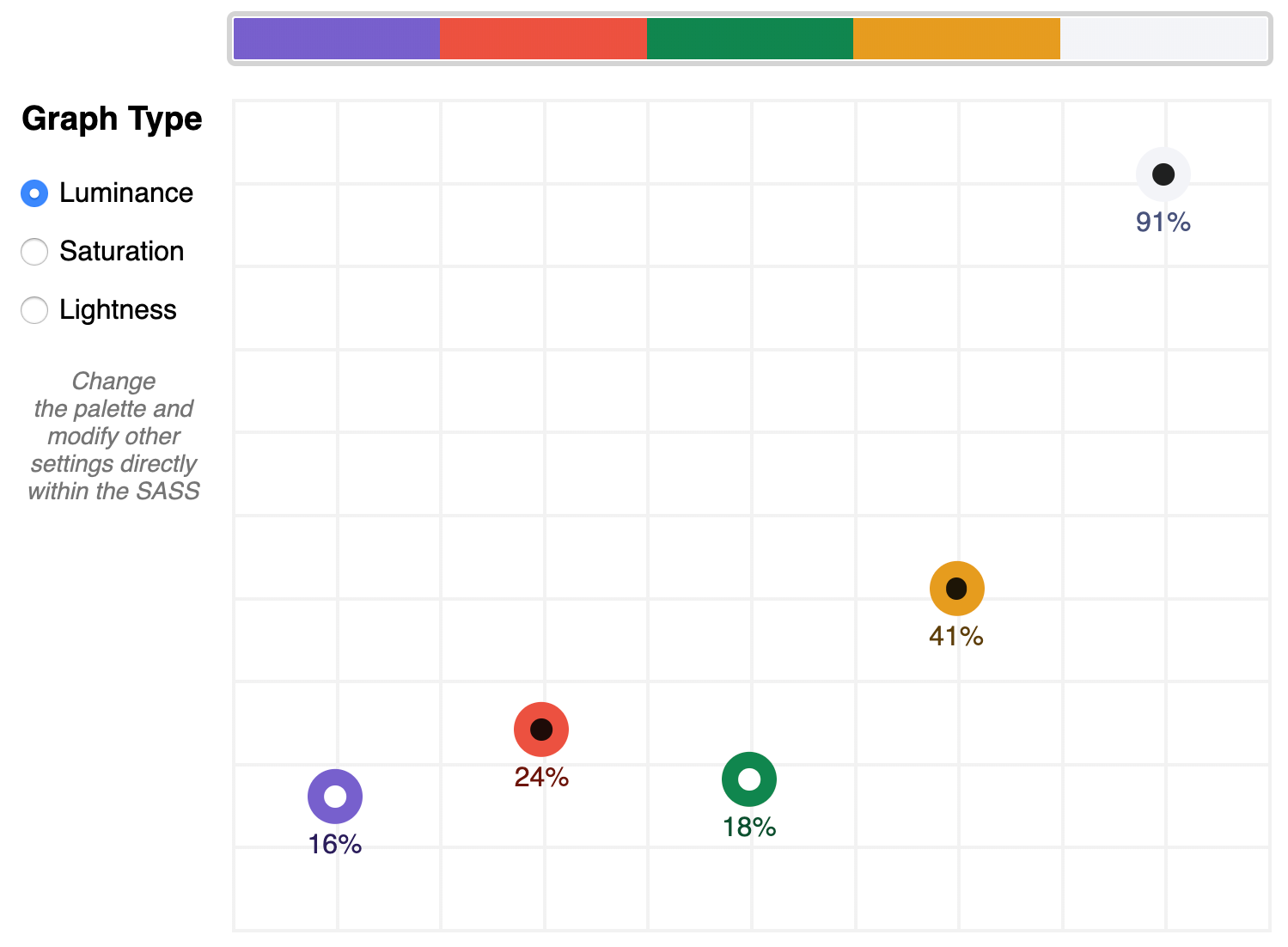
By making use of Sass functions and checking the saturation and lightness graphs, the $defaultBalancedLuminance achieves balanced luminance. This palette also uses the map-get function to copy values from the $default palette and apply further adjustments instead of overwriting them, which is handy for testing multiple variations such as perhaps a hue shift across a palette.

$defaultBalancedLuminance luminance graphTake a minute to explore other available color functions.

Contrast comes into play when considering how the palette colors will actually be used in a UI. The tool defaults to the AA contrast most appropriate for all text: 4.5. If you are building for a light UI, then consider that any color used on text should achieve appropriate contrast with white when adjusting against luminance, indicated by the center color of the plot point.
Tip: The graph is set up with a transparent background, so you can add a background rule on body if you are developing for a darker UI.
Further reading
Color is an expansive topic and this article only hits the aspects related to Sass functions. But to truly understand how to create harmonious color systems, I recommend the following resources:
- Color Spaces – is a super impressive deep-dive with interactive models of various color spaces and how they are computed.
- Understanding Colors and Luminance – A beginner-friendly overview from MDN on color and luminance and their relationship to accessibility.
- Perpetually Uniform Color Spaces – More information on perceptually uniform color systems, with an intro the tool HSLuv that converts values from the more familiar HSL color space to the luminance-tuned CIELUV color space.
- Accessible Color Systems – A case study from Stripe about their experience building an accessible color system by creating custom tooling (which inspired this exploration and article).
- A Nerd’s Guide to Color on the Web – This is a fantastic exploration of the mechanics of color on the web, available right here on CSS-Tricks.
- Tanaguru Contrast Finder – An incredible tool to help if you are struggling to adjust colors to achieve accessible contrast.
- ColorBox – A web app from Lyft that further explores color scales through graphing.
- Designing Systematic Colors – Describes Mineral UI‘s exceptional effort to create color ramps to support consistent theming via a luminance-honed palette.
- How we designed the new color palettes in Tableau 10 – Tableau exposed features of their custom tool that helped them create a refreshed palette based on CIELAB, including an approachable overview of that color space.
The post A Handy Sass-Powered Tool for Making Balanced Color Palettes appeared first on CSS-Tricks.
