The New Facebook Logo and Reasons Behind This Change

[source]
Facebook has been around for 15 years and we all know that it needs little to no introduction.
With a boasting 1.63 billion daily active users, Facebook is easily the most popular app to date.
Since 2004, Facebook has been connecting friends and family from all over the globe.
We probably all use it, and we probably use more Facebook apps than we think.
Facebook is the parent company of 74 companies total, which include some of the most popular apps out there, such as Instagram, Whatsapp, Oculus VR and more.
So what started as a single app, grew into something bigger. Connecting families and loved ones from across the world, helping businesses grow, and find other communities.
[source]
But Facebook is more than just a social app. They have an astounding 43,000+ employees that work in over 60 offices around the world.
And although they do have great apps that we all probably enjoy using or enjoyed using at one time, we can’t forget about the major scandal of selling private information that went down last year.
But we’re not here to talk about that today.
Today we are talking about Facebook’s new logo design that was created in-house by Dalton Maag and Saffron.
To quote the reason why they’re updating their logo…
“The new company branding is designed to help us better represent the diversity of products we build, establish a distinction from the Facebook app and communicate our purpose in the world.
Through the process [of redesigning], three foundational design behaviors that informed our brand system emerged:
- Clarity: a brand that simplifies and builds understanding
- Empathy: a system that is respectful of context and environment
- Creating Space: design that supports people and their stories”
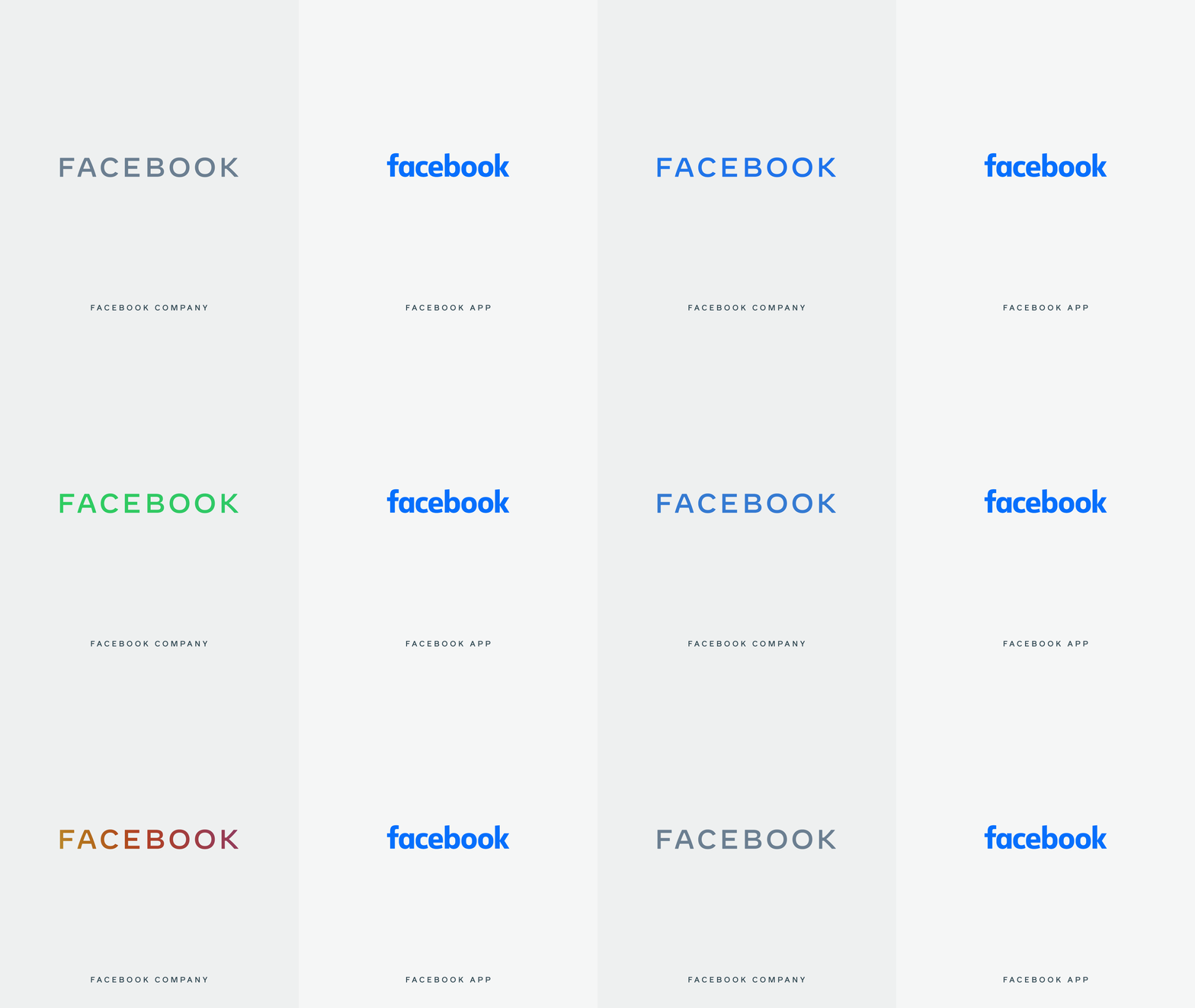
Think of the new logo redesign as a design for the parent company. This way the logo can be distinguished from the app to the parent company.

“Today, when people hear “Facebook” they think of the Facebook app. This posed a unique design challenge. We needed the wordmark to establish distinction from the Facebook app and allow for a clearer connection to the full family of technologies. The new brand system uses custom typography, rounded corners, open tracking and capitalization to create visual distinction between the company and the app.”

[source]
As opposed to the Facebook app logo, the corporate logo is written in all caps, in a unique font that was designed in-house. It was designed with an openness of mind and clarity. With a horizontal structure and consistent stroke width, I can’t deny that the new corporate Facebook logo is as beautiful as it is simple.
You may be wondering what color the Facebook corporate logo will be. There is a more complicated answer to that.

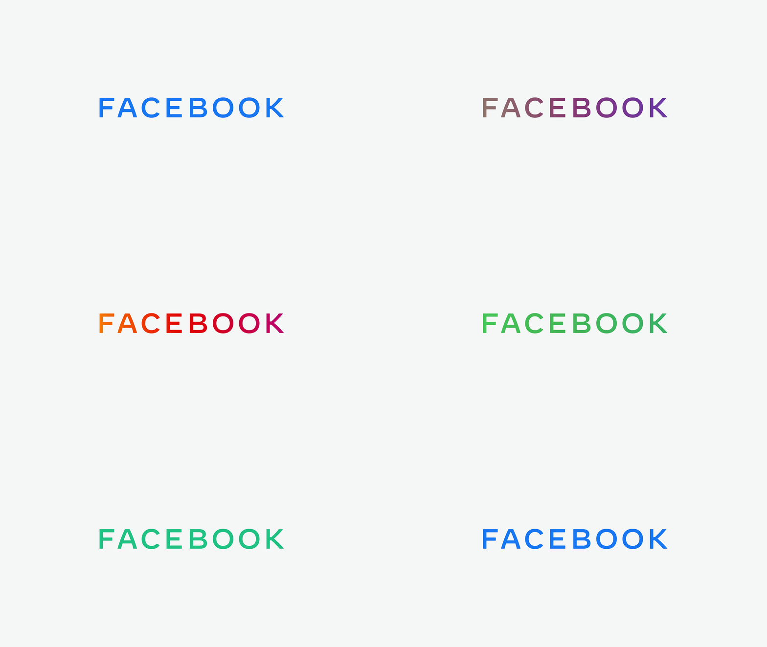
The new logo will be fluid when it comes to color. It will adjust according to its environment and present a matching color or gradient. This is great because it could match the green of Whatsapp, the beautiful Instagram color gradient, or the recognizable blue of Facebook.

I personally like the simplicitiy of the new Facebook logo.
But I want to know what you guys have to say. What do you think? Are you here for it, or will you have to go with a hard pass?
Let us know in the comment section down below.
Until next time,
Stay creative, folks!
Read More at The New Facebook Logo and Reasons Behind This Change