A Whole Bunch of Places to Consider Contrast in a Single Paragraph
When we’re thinking about choosing colors in design, we’re always thinking about accessibility. Whenever colors touch, there is contrast and, if we’re talking about the color contrast of text, it needs to be high enough to be readable. This benefits people with a variety of visual disabilities, but also everyone appreciates easily readable text.
Let’s look at the color contrast considerations of just a single paragraph!
A link in a paragraph is probably set in another color to distinguish it as a link.
Focusable elements, like links, need to have focus styles as well. By default, we’ll probably get a fuzzy blue outline, so we’ll need to check that that has sufficient color contrast. And if we customize it, that customization will need good color contrast as well.

We’ll also need a hover state for mouse users. Here, I’ll use a background effect that covers about half the text. When you do something like that, the effect needs to be strong enough to be noticeable on hover, and the contrast needs to work on both backgrounds.

It’s not ultra common, but you can style :visited links as well. The styling is somewhat limited (you can’t change opacity or background, for example, because it’s a security concern), but you can change the color. If you do that, it also needs proper contrast. Perhaps we could yank the color differentiation away with color: inherit; to somewhat de-emphasize the link but still indicate it.

Another thing to consider is people highlighting text. On my machine, I have it set up to highlight in an orange color by default (it’s normally a light blue on macOS).

Hopefully, the link colors hold up under any highlight color choice a user might have. They tend to be very light shades.

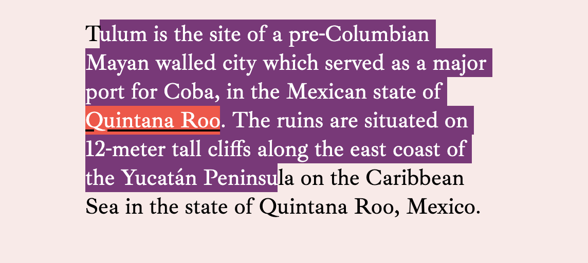
You can control text selection color through CSS as well with ::selection { background: purple; }. If you’ve done that, you have to check all your colors again to make sure you’ve gotten sufficient contrast.

You can try to take measures into your own hands by changing both color and background.

But note that the link inside the text has lost some of its contrast here. We could keep going down the rabbit hole by setting new colors on a::selection and every other element that has its own colorations within the text.

I’d say a good rule of thumb is to go very light if you’re going to do a custom highlighting color and then not do any further customizations specifically for the selected text.
The idea for this post came from some bug reports I’ve gotten from people reporting that links are hard to read on this site when highlighting text, then focusing a link. I tried fixing it by getting more elaborate, but there are limits to what you can do.
::selection a:focus { /* nope */ }
a:focus::selection  { /* nope */ }
a::selection:focus  { /* nope */ }
It’s better handled by doing less than more.
I recently read Ethan Muller’s Designing for Design Systems post and he makes a similar point about contrast, but across a color spectrum rather than across contexts. For example, your blue link color might work just fine on a few of your design system colors, but not so much on others.

There are a couple things that might help with this.
- The generic advice of “every time you declare a background-color, declare a color” might help.
- I’ve used parent-level classes like
on-lightto change colors of things broadly inside light-colored containers. - I’ve used a Sass mixin to help make it easier to change links and the link states, so I’m more apt to do it when changing backgrounds.
@mixin linkStyleText($linkColor) {
  a {
    // Update generic link styles with $linkColor
    &:hover,
    &:focus {
      // Also change the hover/focus styles, probably by altering $linkColor programatically
    }
  }
}

.variation {
   background: $someNewBGColor;
   linkStyleText($someNewLinkColor)
}
Well, thanks for coming on this journey with me. It just occurred to me that color contrast isn’t quite as simple as checking a single link color on a background to make sure it passes. There might be a dozen or more things to check depending on how many things you colorize in your body copy.
The font in these screenshots is Ibarra Real Nova, which was just recently released on Google Fonts.
The post A Whole Bunch of Places to Consider Contrast in a Single Paragraph appeared first on CSS-Tricks.
