Archive

Archive for December, 2019

How to Create eCommerce Photos on a Tight Budget?

December 11th, 2019 No comments

Creating eCommerce photos professionally requires some skill and expertise that can help you keep your budget frugally organized and within your reach.

If you’re going to seek some valuable tips for capturing images for eCommerce business that will captivate customers’ attention, then we’ve gathered some tips that will be helpful for you to shoot products without spending so much.

A professional photographer always attempts to capture good photos that entice customers to go to eCommerce stores, make a desire for the products and create confidence to make a purchase. But there are secrets behind the professional photos: you probably don’t know them. Great product photos are possible using minimal photography equipment at a low investment if you have learnt the procedure. But how much will it cost to get professional eCommerce photos?

Answer to this question is very complicated and finally spoils down to this: spend as much as you can and work to get the highest result at your cost. Today I’m going to break down product photography tips on small budgets of UD$ 100, US$ 500 or US$ 1,000.

Ecommerce Product Photography for a Budget of US $100

It’s not impossible to create product photos on a small budget of US$100 if you know the procedure and can be a tightwad. You must have the right equipment and tools to get it done.

1. Your smartphone camera or a second-hand Nikon Coolpix camera ($70)

2. Camera tripod or smartphone mount ($20-30)

3. Whiteboards for using backdrop ($05)

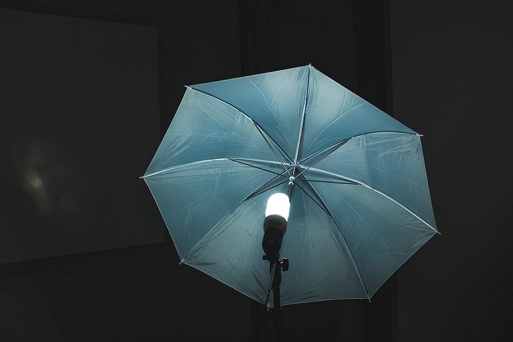
4. Natural lighting through a window (free of cost)

Try photography on a sunny day as good photos are the results of sufficient lighting. If not available, then wait for a good sunny day when you can take stunning product shots. Never take product photographs in the direct sun, then your photos may get hard shadowy.

Set up your table near a window where you can get the lighting you need to take photos. Support whiteboards so that it sweeps down across the wall and on your tabletop. Make sure you use the whiteboard as a backdrop and the base on which your product will sit on so that you can take photos in white background.

To bounce backlight on your products, you’ll have to utilize another small white poster board. Fold a small piece in half and support it up right before your product, not in front of the camera. In order to gain various results and product views from various aspects, attempt different settings on the camera and take different shots.

You must use a tripod to avoid camera shaking that may result in blur images, otherwise, you may adopt another way to stop shaking. You should bear in mind that blur images can’t be taken in a good position through post-processing, and customers won’t get a good idea about a product viewing images.

Ecommerce Product Photography for a Budget of US $500

Within this budget, you can get a good camera like Canon PowerShot ELPH 340 HS 16MP Digital Camera and good tools to create exclusive product photos, and for that, you need to know the right procedure and practice accordingly. In this photoshoot, you will need:

1. Canon PowerShot ELPH 340 HS 16MP Digital Camera ($200 -$300)

2. White board + light Tent ($70)

3. Two Tabletop lights ($40)

4. Tripod ($20-$30)

The setup for this photoshoot is similar to that of $100, and just exchange the whiteboard for a lightbox that will help diffuse studio light in the right way. The Canon PowerShot ELPH 340 HS 16MP features some additional modes including full manual capacity.

On this budget, lighting will be the most crucial thing whether you would like to use studio light or natural light, you will get flexibility in case of using studio light while much natural light might give you a great opportunity to capture your desired shots.

You must invest in purchasing a tripod with a camera, as it’s very tough to keep it still while shooting products.

In case your camera shoots using aperture priority, AV (for Canon) or A (for Nikon) or manual mode, your aperture should be as minimum as possible, and lighting is the essence for good shots here. This will create a desired blur background effect around your products.

Ecommerce Product Photography for a Budget of US $1000

1. Canon PowerShot G7 X Digital Camera or Nikon DSLR Camera ($500- $600)

2. Studio backdrop on a frame + Photo Tent ($70)

3. Lighting Kit ($60)

4. Tripod ($50)

Photography is an art that depends on technological set up to make a big difference. You might aloof from a lot of lighting blunders if you own a camera that has a better sensor and faster lens. That’s not true that your photos will be of high quality and professional if you can spend a lot of money for a costly camera and lenses, but it’s anticipated that you’ll be able to have a better level with a professional setup that is very essential for professional photography.

You should invest in a good camera you can afford and use this camera for long-term photography. Consider your business goals and a profit on your investment if you’re willing to purchase a top-level of the camera body. Also, consider other features a camera has to offer and you may be interested in them. A good camera may be a blessing for photography toolkit and if you’re willing to spend $500+ for a camera body, then you can anticipate that it will last for several years. I purchased Canon EOS Rebel for professional photography 7 years ago and I have upgraded it with video features so that I could shoot video.

Within this budget, you must upgrade your tripod to make sure that your equipment is safe and harmless on a sturdy tripod that you manage for your cost. You’ll find lots of tutorials on ‘how to use a camera perfectly’ on Youtube and Dailymotion. You can choose remote control shutter release and you can get it for any major DSLRs under US$ 30 to adjust your setup.

Photo Retouching Tasks

Photo Retouching is a must for making any product photos look outstanding and professional. No matter how skillfully you’ve taken your photos there may be some flaws that you can’t avoid in any way without photo post-processing. That’s why, capturing is done, the retouching of the RAW images comes first.

Photo Retouching is the technique that involves the process to remove any flaws from the images whether it may be removing unwanted objects or blemishes or changing photo color or something else. Photos must be in real appearance so that they can display look and view of your products naturally and realistically. If you are not able to edit your photos on your own, you can hire a graphic professional designer by using services like Graphic World 24.

But how to retouch photos? And which tool to use for retouching task?

There is an array of photo editing tools in the market to utilize for photo retouching but for professional post-processing, you can choose Adobe Photoshop that will help you create and retouching crisp and appealing photos to allure potentials customers. There are lots of photo retouching methods, 3 of them are very crucial.

Remove blemishes using the Healing Brush tool

If yours is an apparel product photo featured with a model, you might view blemishes on the skin and that flaw is not to be covered by makeup. Use Healing Brush tool in Photoshop to eliminate blemishes and fix the photos and to do so, select a flawless part of the skin on the model and keeping it as basis remove blemishes of the reaming part of the skin.

Brighten or Darken your photos using Dodge or Burn tool

Adobe Photoshop provides you with lots of necessary features for making photos stand out, and Dodge or Burn tool is the best one amongst them to perform skin retouching. Dodge tool is used to darken skin whereas Burn tool allows you to brighten your photo. This feature helps to adjust photo’s exposure that is very instrumental to measure how dark or bright your photo looks.

Utilize image RAW file format

In order to facilitate retouching tasks easier, using the RAW file format is the best option. This file format gives you the facility to change photo settings as you wish to keep photo quality unchanged. But if you use JPEG file format, you will have to create a new copy of the image as quality will lose once you edit the image but RAW file allows you to get the same quality as you shot images.

Conclusion

No matter whatever your photography budget, if you apply effective and fruitful methods to your photoshoot, you can create high-quality professional images for your clients. In this era of visualization, there is no alternative of digital images for eCommerce product showcase that can help customers take an idea about the product, inquiry about the product and finally decide to make a purchase. I hope this article will help you create a top-notch product image in your desired budget.

If you think I’ve escaped anything in my writing that is very crucial for others to know, please share it in the comments below.

Categories: Others Tags:

Is The F-Pattern Still Relevant in Web Design?

December 11th, 2019 No comments

It’s always good to have a set of guidelines to follow when designing a website — especially if you have little to no user data to go on.

Over the years, we’ve been introduced to tons of these guidelines and design trends; some of which have fallen out of favor while others have persisted over the years. One of those web design guidelines that’s persisted is the F-pattern.

But is it still relevant today, what with mobile-first design practices?

What Is The F-Pattern?

When we refer to patterns like the F-pattern, Gutenberg layout, or layer-cake pattern in web design, what we’re talking about is how readers scan the content on a page. And thanks to heat mapping technology and research from organizations like Nielsen Norman Group (going back to 2006), we have proof of its existence.

As you can see from these eye-tracking studies from NNG, the F-pattern isn’t always an explicit “F” shape.

Instead, it refers to a general reading pattern whereby certain parts of the page are read in full — usually at the top and somewhere in the middle. In some cases, readers may stop to peruse additional sections of the page, making the pattern look more like the letter “E”. The rest of the page, for the most part, gets lightly scanned along the left-hand margin.

This principle actually applies to both desktop and mobile screens.

Although mobile devices have a smaller horizontal space, readers still have a tendency to focus on the top section, scan down the page a bit, read a bit more, and then scan down to the end. Again, it won’t look like a traditional “F” shape, but the concept is the same.

Is the F-pattern Still Relevant?

Essentially, this is the message the F-pattern has taught web designers and copywriters: “No one’s going to look at everything you’ve done, so just put the good stuff at the top.”

It seems like a pessimistic way to approach web design, doesn’t it?

The fact of the matter is, it is a pessimistic approach. At the time it was devised, however, we didn’t know any better. We were looking at the data and thinking, “Okay, this is how our users behave. We must create websites to suit that behavior.”

But the best web designers don’t just kick back and let visitors take the reins. They take control of the experience from start to finish, so that visitors don’t have to figure out where to go or what to do next. Designers carefully craft a design and lay out content in a way that draws visitors into a website and takes them on a journey.

When NNG revisited its report on the F-shaped pattern in 2017, this is the conclusion it came to:

“When writers and designers have not taken any steps to direct the user to the most relevant, interesting, or helpful information, users will then find their own path. In the absence of any signals to guide the eye, they will choose the path of minimum effort and will spend most of their fixations close to where they start reading (which is usually the top left most word on a page of text).”

Basically, our visitors are only resort to reading a page using the F-pattern when we’ve provided a subpar experience.

So, to answer the question above: No, the F-pattern isn’t still relevant.

What Should Web Designers Do Instead?

It’s important to recognize that visitors are bound to scan your website. Everyone’s so short on time and patience these days that it’s become a natural way of engaging with the web.

That said, there’s a difference between scanning a web page to see if it’s worth reading and scanning a web page simply to get it over and done with (which is essentially what the F-pattern encourages).

Knowing this, web designers should create pages that encourage scanning — to start, anyway. Pages that contain:

  • Short sentences and paragraphs;
  • Headers and subheaders to give a quick and informative tease of what’s to come;
  • Elements that create natural pauses, like bulletpoints, images, bolded text, hyperlinks, bountiful spacing, etc.

If you can keep visitors from encountering intimidating walls of text, they’ll be more likely to go from scanning the page to reading it… instead of scanning it and closing out the browser.

I’d also recommend not focusing so much on reading patterns. Unless you’re spending a lot of time designing text-heavy pages, they’re not going to apply as much.

Instead, focus on designing an experience that’s welcoming and encouraging, and makes it easy for your visitors to go from Point A to Point B. If you direct them to the most valuable bits of your website, they’ll follow you.

Featured image via Unsplash.

Source

Categories: Designing, Others Tags:

Web Design And Development Advent Roundup For 2019

December 11th, 2019 No comments
An illustration that says ‘Advent Roundup 2019' with the Smashing Cat on the left wearing a colorful Christmas sweater and a red stocking cap, while on the left flies a happy-looking birdie wearing a green stocking cap

Web Design And Development Advent Roundup For 2019

Web Design And Development Advent Roundup For 2019

Rachel Andrew

2019-12-11T10:30:30+02:002019-12-11T21:08:27+00:00

In the run-up to Christmas, there is a tradition across the web design and development community to produce advent calendars, typically with a new article or resource for each day of December. Last year, I did a roundup of these calendars, and now that the 2019 season is in full swing, here is this year’s line-up.

I’m sure you’ll notice that the majority of the calendars published here are true community efforts, often with the bulk of the work falling to an individual or tiny team, with no budget to pay authors and editors. So, please join us in supporting these efforts; share the articles that you enjoyed reading and join the discussions respectfully.

An illustration that says ‘Advent Roundup 2019' with the Smashing Cat on the left wearing a colorful Christmas sweater and a red stocking cap, while on the left flies a happy-looking birdie wearing a green stocking cap

Whether you celebrate Christmas or not, you can certainly learn a lot of new things. (Large preview)

What follows is an amazing variety of calendars, taking different approaches to the idea of publishing something every day in advent. There are plenty of traditional articles, but also code challenges to get involved with. I’ve tried to locate RSS Feeds and Twitter accounts to make it easy for you to keep track of your favorites. Enjoy!

It’s A Shape Christmas

It’s A Shape Christmas is a digital calendar that counts down to Christmas and reveals a bespoke illustration each day themed around four different shapes (Square, Triangle, Circle and Hexagon) and Christmas. The project was started in 2011 by a UK design agency called Made by Shape. This year, it is showcasing some of the best of the previous seasons.

24 Ways

For twenty-four days, 24 ways is publishing a daily dose of web design and development goodness to bring folks a little Christmas cheer. It’s celebrating 15 years of advent publishing and will be taking a well-earned break after this year’s “final countdown”.

24 Days In Umbraco

24 Days In Umbraco24 Days In Umbraco is a calendar of articles relating to the Umbraco CMS. However, the themes of the articles so far this year will be of interest to more people than just those who use Umbraco. I enjoyed the article from December 2nd — Setting The Stage by Laura Weatherhead about public speaking.

PerfPlanet Calendar

Performance CalendarPerfPlanet is back for another season with all things speed and web performance. The Web Performance Calendar has been publishing since 2009 and is maintained by Sergey Chernyshev.

Lean UXMas

Lean UXMasLean UXMas has been publishing each advent since 2014 and is a collection of the most popular articles from this year’s Agile & Lean UX News delivered daily this coming December.

24 Days In December

24 Days In DecemberBack with 24 thoughts from the PHP family is 24 Days in December. They began publishing in 2015, when Andreas Heigl realized that he missed Web Advent who had stopped publishing in 2012.

Perl Advent

Perl Advent Calendar 2019Perl Advent is back. Mark Fowler has been publishing since 2000 and is the longest running web advent calendar that I know of. You’ll find insightful articles written by diverse author submissions from all types of Perl programming levels, so sit back and enjoy 2019’s for 24 merry days of Perl!

24 Accessibility

24 Accessibility24 Accessibility are back for a third year of accessibility posts in the run-up to Christmas. The site also has an excellent set of a11y related books, events, and Twitter accounts to follow in the sidebar.

“A Language A Day” Advent Calendar

“A Language A Day” Advent CalendarIn this calendar, Andrew Shitov is introducing a different programming language each day. I like the fact that for each language he is examining the same set of tasks, which makes for interesting comparisons. It’s an impressive amount of work to undertake.

SysAdvent

SysAdventNow in its 11th year, SysAdvent is a collection of articles written by sysadmins and published with the goals of sharing, openness, and mentoring.

Ladies of Code

Ladies of CodeNew this year is the Ladies of Code Advent Calendar, from Ladies of Code, an organization that runs workshops, meetups, and hack nights across Europe.

The JVM Programming Advent Calendar

The JVM Programming Advent CalendarOriginally the Java Advent Calendar, this annual offering renamed to JVM Advent as the ecosystem is more than just the Java language.

RIPSTECH Java Security Calendar

RIPSTECH Java Security CalendarIn 2017 RIPSTECH published a PHP Security calendar and in 2018 a WordPress Security calendar. They are back for 2019 with a focus on Java security. Can you spot the vulnerability in each of the 24 challenges?

WordPress Snippets Til Christmas

WordPress Snippets Til ChristmasElliott Richmond has come together with other folks in the WordPress community to publish useful WordPress snippets every day of advent to help developers improve their workflow.

The Third Annual C# Advent

The Third Annual C# AdventA community effort with 50 slots, two per day, for people to claim and write an article about C# development. The articles are hosted on the authors’ sites or on Medium, and so the calendar is a list of links to them all.

Marco’s Extended Advent Calendar

Marco's Extended Advent CalendarMarco Zehe is posting daily until Christmas, and says these posts could be about “everything and anything”. However, expect a strong accessibility focus given his areas of expertise!

IT Security Advent Calendar

Security Advent Calendar Basic Security Advice“Stay safe online all Advent time” is the credo of the IT Security Advent Calendar. Counting down to Christmas, it features a new tip for protecting your devices, networks, and data each day.

HaXmas

Rapid7 HaXmas Advent CalendarHaXmas is a security advent calendar by Rapid7 that is full of stories, advice, inspiration, and a bit of fun. Keep an eye on a new tidbit every day throughout December!

PHP Advent Calendar

PHP Advent CalendarEvery year, for the first 24 days in December, the PHP Advent Calendar invites members of the PHPamily to share some gifts with you. And this year is no exception, of course.

Azure Advent Calendar

Azure Advent CalendarRun by Richard Hooper and Gregor Suttie, the initial idea of this advent calendar was to give people who aren’t that well-known an opportunity to share their content with the community. What started with 25 slots expanded to 75. A small community-driven idea brought to you by the community!

Web???????? Advent Calendar 2019

Adventar calendarThis Japanese advent calendar has been running since 2013. Its focus lies on web accessibility, with a new author exploring a topic each day. The calendar is moderated by @hokaccha.

24 Jours De Web

24 Jours De Web24 Jours De Web is a lovely French calendar which first appeared back in 2012. The creators support the Pierre Deniker Foundation and kindly ask readers to donate to help this charity support mental health research and education.

Kodekalender by Knowit

Knowit calendarThis Norwegian calendar is a series of programming challenges (each open for 24 hours only) with a prize draw at the end. Solving more puzzles gets you more entries. Good luck!

Fronteers Advent Calendar

Fronteers Advent CalendarFor the Dutch speakers among you, Fronteers are running an advent calendar on their blog. As last year, each writer chooses a charity, and the Fronteers organization will donate 75 euros on their behalf.

SELFHTML Adventskalender

SELFHTML Advent CalendarAn advent calendar with web development tips in German comes from the SELFHTML community, who are committed to documenting web technologies for German-speaking developers in their SELFHTML wiki.

Advent Of Code

Advent Of CodeIf you prefer a puzzle over an article, take a look at Advent of Code. Created by Eric Wastl, this is an advent calendar of small programming puzzles for a variety of skill sets and skill levels that can be solved in any programming language you like.

HACKvent 2019

HACKvent 2019The folks at Hacking Lab bring you a new (white-hack) hacking challenge every day during advent. You earn points based on the difficulty of your solution, but be quick, you need to solve the challenge on the same day to receive full points.

25 Days Of Serverless

Serverless Coding Challenges Advent Calendar25 Days Of Serverless has a new coding challenge waiting for you every day, for 25 days. Solve it in the programming language of your choice and submit your solution via GitHub. The best solutions will be showcased every week and possibly in a final series recap.

Advent Of Cyber

‘Try Hack Me' Advent CalendarAdvent of Cyber is TryHackMe’s Christmas Security Challenge. And since security can be a daunting field, they break down common security topics into “byte-sized” challenges leading up to Christmas.

#DevToolsAdvent

#DevToolsAdventAlex Lakatos started #DevToolsAdvent to count down the days to Christmas. Every day, he’ll be tweeting a useful Firefox DevTools tip or trick.

#devAdvent

#devAdventLast year Sarah Drasner announced that she would be highlighting a person and project every day of Advent using the hashtag #devAdvent. She is continuing the tradition this year. Follow along to get to know some new folks and the work they do.

Last year I did a dev advent calendar, and I’m going to keep it going this year. Every day from the 1st to the 25th, I’ll highlight a new person/project that I’m into and think people would benefit from knowing about. ??

The hashtag is #devAdvent if you want to follow along

— Sarah Drasner (@sarah_edo) November 29, 2019

#CodeTidbits30

#CodeTidbits30Another tweet calendar comes from Samantha Ming: follow her as she tweets 30 days of handy JS, HTML, and CSS snippets.

#CodeTidbits30 Day 1 ?

For the entire Dec, DAILY posts! 30 days straight of the very best JS, HTML, CSS snippets!

Let’s start off with a classic. 3 ways to filter out duplicates from an array and return only the unique values.#Codenewbie #100DaysOfCode #301DaysOfCode pic.twitter.com/7j1dSh3CgW

— Samantha Ming (@samantha_ming) December 1, 2019

Bekk Christmas

React, JavaScript, Security And Elm ChristmasLast year, Norwegian company Bekk produced four calendars. This year, they are back with twelve! In a blog post, they explain why they are producing such a huge number of articles this year. I learned that there are over 100 authors from within the company — many of who have not written articles before. Therefore, in the lead up they have been taking part in writing workshops. Perhaps we will find some future Smashing authors among them!

The homepage for the project is at bekk.christmas where you can check out the topics that interest you most.

Share The Ones I Missed!

There seem to be even more calendars publishing this year than last, despite the fact that some are taking a break this year. It’s been nice to find some calendars in languages other than English, too! If you know of a calendar related to web design and development that I haven’t mentioned here, please post it in comments section below.

Enjoy your seasonal reading!

Smashing Editorial(il, cm)
Categories: Others Tags:

The Importance of Visual Context in Web Design for E-commerce Website

December 11th, 2019 No comments

Whether you outsource your web design skills to third-party brands or actively work on your personal business website, creating a visual context within your layout and design elements is of utmost importance.

According to Tech Jury, 73% of companies actively invest resources into refining their web design to differentiate their brand and reach a wider audience as a result.

In the e-commerce industry, the visual context you present your visitors with is essential when it comes to persuading them that your platform has all the products and services they will ever need. However, a lot of factors and visual elements go into what makes the visual context tick. It is about visual design quality as much as it is about User Experience (UX), helping you determine which elements and information to present your visitors with at which point during their customer’s journey.

A different study performed by Hosting Tribunal showcased that 90% of users continue their e-commerce shopping experiences because of adequate UX with 94% of first impressions about a website being design-related. With that said, let’s dive into the basics of the visual context in web design, which elements make up its core, as well as some of the most important reasons to consider changing your approach in e-commerce website design going forward.

Visual Context Defined

Let’s start off by introducing the concept of the visual context and how it plays into e-commerce web design. The visual context can be defined as the environment in which certain content is presented. It is not a product or service by itself, rather, it helps a viewer create a sense of value in regards to their target item. Interestingly, according to Finances Online, 38% of users stated that they would not visit a website again if its content doesn’t load properly or if it features too much content without reason, while 46% of them claimed to leave websites because they couldn’t tell what the company does or can do for them.

For example, if an e-commerce website focuses on book sales akin to Book Depository, the visual context, in this case, is created by visuals which correlate with reading, literature, book quotes, etc. The visual context is created by visual content and the two cannot exist without one another. While the visual context won’t affect your SEO or search engine ranking, it will affect the experience each individual user has once they come across your website’s landing page, making it a pivotal part of your UX design.

Brian Ronnie, Head of Content Department at TopEssayWriting spoke on the matter briefly: “When it comes to creating the visual context on your website, you want to make sure that your content creators understand the purpose, products, and services of your business as best as possible. This will allow them to create higher quality marketing content, promotional materials, written posts and other elements which will add up to the final visual context impression of incoming visitors.”

Essential Visual Elements to Consider

Before we discuss why the visual context is important and should find its way into your web design approach going forward, let’s cover several essential elements which create the aforementioned context. A combination of these (and other) visual elements in your e-commerce website’s presentation will allow you to create a more appealing, inviting and user-friendly storefront for your brand.

White Space

It’s worth noting that white space is as important as any other visual element in your website’s layout. In layman’s terms, white space quite literally translates to the blank space in-between each visual element currently on your website.

A good example of this can be found in a typical blog post, it’s spaced out paragraphs and visuals which are separated from the text by a few dozen pixels and create a harmonic whole as a result. Don’t be afraid of white space while creating your visual context hierarchy and the e-commerce website you design will become that much more legible and intuitive for it.

Color Palette

The color palette you choose to implement in your website should never be wide and without rhyme or reason. Instead, choose your colors based on two pre-existing elements: your branding and the industry you operate in.

The combined color gradient of these two groups will allow you to create a limited, focused and representative combination of colors, adding to the professional and controlled nature of your website’s presentation.

Typography

Even though web design doesn’t facilitate a lot of freedom of choice when it comes to fonts (due to the browser and device limitations), you can still play with typography to a certain extent. Create a hierarchy of titles, subheadings, content, header, footer and other positions in your layout which will naturally contain words and phrases.

Different font sizes, bolds, and italics can be an effective tool in your visual context, creating a greater focus around important page elements such as calls to action, product description, etc. Combined with writing platforms such as ClassyEssay and Evernote, typography should be one of your focus web design points given its informative nature.

Visuals (Multimedia/Visualized Data)

Lastly, the most important aspect of creating the visual context in e-commerce web design lies in the visuals. Visual content and its placement can communicate your brand’s intent, services, and credibility, unlike any other design element. As such, your content creators and web designers should focus on creating a wide arrangement of content types from static visuals to infographics and videos and implement them into the content strategy going forward.

Offering different content types will allow your visitors to get a better sense of your quality as an online storefront and give them options when it comes to choosing which content to digest at any given moment. Coupled with the above-mentioned visual context elements, visual content such as images, charts, demonstration videos, and promotional ads will paint a cohesive picture (no pun intended) of your brand and elevate you from the competition.

Why Visual Context Matters in Web Design for E-Commerce Websites

1. Cohesive User Experience Design

How you treat your website, content and site maintenance are what will define your UX in the e-commerce industry. Creating a cohesive journey from your landing page to the checkout button is what a focused, meaningful visual context will be able to provide for your website. As such, it’s important to develop content, promotional landing page banners, popups and any other form of content on your website with a goal in mind.

Brand storytelling and content personalization should also be on your mind when producing new content for your e-commerce website regardless of its sales-centric nature. Every piece of media, writing or call to action present on your website should be created in context with different sales goals. Whether these goals are defined through KPIs, SMART goal-setting or mind-mapping, referring to them in your content production will keep your website on-brand.

2. First Impressions through Visual Context

It can be argued that the landing page of any website is the make-or-break element to keep an eye out for when designing the site’s visual layout. As we’ve mentioned previously, users are prone to leaving websites outright if their landing pages, visual context and business purpose are unclear from the get-go. That being said, you should pay close attention to the visual hierarchy of your design elements on the landing page to create a positive first impression with any incoming visitor going forward.

Don’t rely on auto-play content, pop-up calls to action, chatbot pop-ups and other automated elements on the landing page itself. Instead, let the page breathe while presenting your visitor with a welcome in the form of a greeting, the latest deals to check out and clear site navigation to boot. Etsy is a good example of an e-commerce platform which offers the visual context for its products, presents the reader with the latest trending products, popular deals, and navigation options for further exploration. Adopt a similar approach in your design thinking and your engagement rates will become significantly higher as a result of the redefined visual context.

3. Informative Content Facilitation

The visual context present on your website should facilitate user interaction and encourages subsequent purchases of your products. It’s important then that you produce visual content which directly corresponds with that intention rather than to simply make your website more visually appealing. For example, a clothing-centric e-commerce website should feature trending apparel, popular pieces, and products on discount in its visual content, especially on the landing page itself.

If an e-commerce website features visuals which serve nothing more than to fill a blank space (such as sidebars which are often relegated to white space), a user might leave the site in search of more engaging options. Native ads should be the marketing strategy of choice for creating a consistent visual context for an e-commerce website regardless of its focus industry. Pushing jewelry and accessories to users currently browsing through cooking utensils is a sure-fire way of driving them away from a potential purchase, for example. Use every pixel of your website’s layout to point the user toward deals and to encourage them to browse and purchase items which interest them.

4. Every Niche is a Different Story

It’s important to note that every niche in the e-commerce industry is a different story when it comes to creating the visual context. While platforms such as Amazon and Ali Express might feature “anything and everything” on their storefronts, they too adopt a certain web design style which suits their “jack-of-all-trades” approach. If your website is focused on a specific niche such as hiking equipment, cosmetics or something else entirely, you can use that fact to your advantage in content production going forward.

You can adapt a brand storytelling approach to creating content for your landing page, product descriptions and blog posts which will keep the interest and focus of your visitors strictly on the industry itself. Likewise, any user quotes or testimonials you use can be complemented with visuals of satisfied customers, creating a wholesome visual context for visitors to engage and identify with. There is no right or wrong way to approach the creation of the visual context which works for every e-commerce website out there – be a storyteller and let visitors discover what your brand’s story is as they browse through its pages.

5. Brand Identification & User Retention

Lastly, when all is said and done, the visual context present on your e-commerce website should facilitate brand identification and user retention for the foreseeable future. Any visitor to your website remotely interested in the industry you operate in should be able to identify with your business, its approach to customer servicing and the products and deals you feature.

This will ensure that one-time customers come back for more purchases down the line, spread word of mouth about your website to their social circles and effectively become brand advocates for your e-commerce platform. All of this, however, should be preceded with a meaningful visual context presentation and an unobstructed browsing experience which doesn’t rely on frequent pop-ups, interruptions or visuals which lead the eye away from what matters the most – the products themselves.

Visual Context Mistakes to Avoid

Now that we have a clearer understanding of what makes the visual context so important in the e-commerce sphere, let’s talk about several mistakes worth avoiding. These mistakes are natural counterpoints to what makes the visual context essential for a successful website, making their avoidance highly recommended in the long run. Make sure to amend and/or repair any of the following points in your website’s design if you identify with what is discussed.

No Target Audience

While a strong visual context will allow the bulk of your content to shine and come into the forefront, its poor execution will have the opposite effect. Creating a clear system of product categories with different themes, deals, and visuals to complement the product groups is a great way to get started on your website’s visual context design.

The visual context you create should have a clear target audience in regards to which demographics, territories, and lifestyles you want to attract to your e-commerce platform. Targeting a specific set of customers will allow you to elevate your conversion rates, increase the platform’s revenue and facilitate positive word of mouth to spread throughout the web.

Off-Brand Visuals

Speaking of targeting, off-brand visuals can cost your website its credibility and appeal in a very short time-span. To avoid creating off-brand visuals going forward, you should define a clear style guide for your content creators to follow.

Using the visual context elements section above will allow you to put your brand elements, color scheme, fonts and other visuals on paper and organize them into a cohesive whole. That way, no off-brand visuals will ever find their way into your e-commerce website’s visual context (without deliberate rebranding or redesign activities).

SEO-Heavy Writing

Written content is a part of the visual context hierarchy you create for your website as much as any other element present on the layout. However, writing should always be written for users first and then optimized for SEO post-production.

Content written with SEO algorithms and ranking in mind will never have the same appeal or entice users into purchasing your products as much as personalized content and user-centric writing will. In this regard, writing tools such as BeGraded and Hemingway can help you edit and format any written content pre-publishing in order to nail the keyword density, length, and other factors preemptively.

Unresponsive & Slow Website

Depending on the volume, file types and back-end architecture of your website, the visual content you produce can significantly reduce your site’s performance, load times and SEO ranking as a whole. Given the nature of e-commerce websites and their focus on visuals and the visual context, you should optimize your content strategy accordingly.

Third-party hosting solutions such as Image Shack and YouTube are great alternatives to storing visuals and multimedia on your own server. Likewise, reducing their size and optimizing them for faster web loading will ensure that your e-commerce site will perform at peak efficiency around the clock.

No Social Proof

Lastly, social proof is one of, if not the essential element of successful e-commerce websites. Testimonials, reviews, quotes and professional recommendations in regards to your products and website as a whole are pivotal to your site’s performance. Placing the social proof in a visual context on your landing page or creating a dedicated recommendations page in itself will allow you to build credibility and trust with the audience around the globe.

Lacking any form of social proof as an e-commerce website will place much of your hard work in web design and content production into the shadow of competitors which placed a higher value in reviews and testimonials of their satisfied users. Combine this written content with complementary visuals in order to enrich and solidify your e-commerce website’s visual context and your conversion rates will gain a positive uptick as a result.

Content Creates Context (Conclusion)

Any web designer or developer can create high-quality visuals for the websites they work on without much effort. However, additional research, design thinking and a keen eye for web layout will allow creative designers to make the visual context out of the information available to them.

Don’t rush into content production, web design or subsequent layout optimization without planning or clear goals in mind. Take time to define what makes your brand tick, which visual elements represent it the best and why visitors would want to convert into customers in the first place. Once you understand the nuance behind your brand’s purpose, creating a visual context for its website will become that much easier and enjoyable as a result.

Categories: Others Tags:

Making a Better Custom Select Element

December 11th, 2019 No comments

We just covered The Current State of Styling Selects in 2019, but we didn’t get nearly as far and fancy as Julie Grundy gets here. There is a decent chunk of JavaScript that powers it, so I’m still very much eyeballing browsers’ recent interest in giving us more powerful selects in (presumably) just HTML and CSS.

I tossed a fork on CodePen in case you just wanna see the final result.

This is also the first article in the 2019 edition of 24 Ways, the long-running and wonderful annual advent calendar for developers that is worth reading every single year.

Direct Link to ArticlePermalink

The post Making a Better Custom Select Element appeared first on CSS-Tricks.

Categories: Designing, Others Tags:

WordPress.com: One CMS, Infinite Possibilities

December 11th, 2019 No comments

(This is a sponsored post.)

Have you ever looked at a site and knew exactly what CMS powers it? You might see a distinctive design aesthetic that gives it away. Or maybe it’s something even less obvious and even harder to articulate, but you know it when you see it.

That seems true with just about any platform, especially those that rely on a set of templates. If you were to jump from one site ot another on the same platform, you can see the similarities, sort of like walking down the street of a neighborhood where all the homes are designed by the same architect.

It’s not a bad thing. But like homes, we tend to want websites with personality and that feel unique. That’s one of the things that makes WordPress.com a nice hosted platform option.

Yes, it has core themes, some of which are commonly used. What it also has is hundreds of others, including 110 themes that are free. The designs range from portfolio- and business-themed sites to ones themed around traditional blogs, weddings, travel, music, and food. There’s so many to choose from, and they’re introducing more every year. Take a look through some live sites using WordPress.com. The variety is awesome and showcases the many possibilities of WordPress as a content management system.

We’ve said it before: if you can build a site with WordPress.com, you should build a site on WordPress.com. We’re proud to have WordPress as a sponsor here at CSS-Tricks and wouldn’t hesitate to recommend it to anyone who needs a quick and easy way to spin up a site. Plus, with a free plan tier, it’s even easier to get started.

Start your website

Direct Link to ArticlePermalink

The post WordPress.com: One CMS, Infinite Possibilities appeared first on CSS-Tricks.

Categories: Designing, Others Tags:

Quoting in HTML: Quotations, Citations, and Blockquotes

December 10th, 2019 No comments

It’s all too common to see the incorrect HTML used for quotes in markup. In this article, let’s dig into all this, looking at different situations and different HTML tags to handle those situations.

There are three major HTML elements involved in quotations:


Let’s take a look.

Blockquotes

Blockquote tags are used for distinguishing quoted text from the rest of the content. My tenth grade English teacher drilled it into my head that any quote of four lines or longer should be set apart this way. The HTML spec has no such requirement, but as long as the text is a quote and you want it to be set apart from the surrounding text and tags, a blockquote is the semantic choice.

By default, browsers indent blockquotes by adding margin on each side.

See the Pen
The Blockquote Tag
by Undead Institute (@undeadinstitute)
on CodePen.

As a flow element (i.e. “block level” element), blockquote can contain other elements inside it. For example, we can drop paragraphs in there with no problem:

<blockquote>
  <p></p>
  <p></p>
</blockquote>

But it could be other elements, too, like a heading or an unordered list:

<blockquote>
    <h2></h2>
    <ul>
      <li></li>
      <li></li>
    </ul>
</blockquote>

It’s important to note that blockquotes should only be used for quotations rather than as a decorative element in a design. This also aids accessibility as screen reader users can jump between blockquotes. Thus a blockquote element used solely for aesthetics could really confuse those users. If you need something more decorative that falls outside the bounds of extended quotations, then perhaps a div with a class is the way to go.

blockquote,
.callout-block {
  /* These could share styling */
}

Quoting with Q

Q tags () are for inline quotes, or what my tenth grade teacher would say are those under four lines. Many modern browsers will automatically add quotation marks to the quote as pseudo elements but you may need a backup solution for older browsers.

See the Pen
The Q Tag
by CSS-Tricks (@css-tricks)
on CodePen.

Typical quotation marks are just as valid for inline quotes as the element. The benefits of using , however, are that it includes a cite attribute, automatic handling of quotation marks, and automatic handling of quote levels. elements should not used for sarcasm (e.g. “you would use a tag for sarcasm, wouldn’t you?”), or signifying a word with air quotes (e.g. “awesome” is an “accurate” description of the author). But if you can figure out how to mark up air quotes, please let me know. Because that would be “awesome.”

The citation attribute

Both and blockquotes can use a citation (cite) attribute. This attribute holds a URL that provides context and/or a reference for the quoted material. The spec makes a point of saying that the URL can be surrounded by spaces. (I’m not sure why that’s pointed out, but if you want to anger the semantic code deities, you’ll have to do more than throw spaces around.)

<p>The officer left a note saying <q cite="https://johnrhea.com/summons">You have been summoned to appear on the 4th day of January on charges of attempted reader bribery.</q></p>

That cite attribute isn’t visible to the user by default. You could add it in with a sprinkle of CSS magic like the following demo. You could even fiddle with it further to make the citation appear on hover.

See the Pen
Attributable citations
by CSS-Tricks (@css-tricks)
on CodePen.

Neither of those options are particularly great. If you need to cite a source such that users can see it and go to it, you should do it in HTML and probably with the element, which we’ll cover next.

The citation element

The tag should be used for referencing creative work rather than the person who said or wrote the quote. In other words, it’s not for quotes. Here are the examples from the spec:

<p>My favorite book is <cite>The Reality Dysfunction</cite> by
Peter F. Hamilton. My favorite comic is <cite>Pearls Before
Swine</cite> by Stephan Pastis. My favorite track is <cite>Jive
Samba</cite> by the Cannonball Adderley Sextet.</p>

Here’s another example:

See the Pen
Cite This!
by CSS-Tricks (@css-tricks)
on CodePen.

If the author of this article told you he’d give you a cupcake, and you him by name, that would be semantically incorrect. Thus no cupcakes would change hands. If you cited the article in which he offered you a cupcake, that would be semantically correct, but since the author wouldn’t do that, you still wouldn’t get a cupcake. Sorry.

By default, browsers italicize cite tags and there’s no requirement that a or

be present to use the cite element. If you want to cite a book or other creative work, then slap it in the cite element. The semantic deities will smile on you for not using either or elements.

But where to put the cite element? Inside? Outside? The upside down? If we put it inside the

or the , we’re making it part of the quote. That’s forbidden by the spec for just that reason.

<!-- This is apparently wrong -->
<blockquote>
  Quote about cupcake distribution from an article
  <cite>The Article</cite>
</blockquote>

Putting it outside just feels wrong and also requires you to have an enclosing element like a

if you wanted to style them together.

<div class="need-to-style-together">
  <blockquote>
    Quote about cupcake distribution from an article
  </blockquote>
  <cite>The Article</cite>
</div>

N.B. If you google this issue you may come across an HTML5 Doctor article from 2013 that contradicts much of what’s laid out here. That said, every time it links to the docs for support, the docs agree with the article you’re currently reading rather than the HTML5 Doctor article. Most likely the docs have changed since that article was written.

Hey, what about the figure element?

One way to mark up a quotation — and in a way that pleases the semantic code deities — is to put the blockquote within a figure element. Then, put the cite element and any other author or citation information in a figcaption.

<figure class="quote">
  <blockquote>
    But web browsers aren't like web servers. If your back-end code is getting so big that it's starting to run noticably slowly, you can throw more computing power at it by scaling up your server. That's not an option on the front-end where you don't really have one run-time environment—your end users have their own run-time environment with its own constraints around computing power and network connectivity.
  </blockquote>
  <figcaption>
    &mdash; Jeremy Keith, <cite>Mental models</cite>
  </figcaption>
</figure>

While this doubles the number of elements needed, there are several benefits:

  1. It’s semantically correct for all four elements.
  2. It allows you to both include and encapsulate author information beyond citing the name of the work.
  3. It gives you an easy way to style the quote without resorting to divs, spans or wretchedness.

See the Pen
It Figures You’d Say That
by CSS-Tricks (@css-tricks)
on CodePen.

None of this is for dialogue

Not ! Those are for attention-grabbing modals. Dialogue, as in, conversational exchanges between people speaking or typing to each other.

Neither

nor nor are to be used for dialogue and similar exchanges between speakers. If you’re marking up dialogue, you can use whatever makes the most sense to you. There’s no semantic way to do it. That said, the spec suggests

tags and punctuation with or tags to designate the speaker and tags to mark stage directions.

Accessibility of quotes

From the research I’ve done, screen readers should not have any issue with understanding semantic-deity-approved ,

, or tags.

[VIDEO]

More “ways” to “quote”

You can add quotation marks to a

using CSS pseudo elements. The element comes with quotation marks baked in so they need not be added, however adding them as pseudo-elements can be a workaround for older browsers that don’t automatically add them. Since this is how modern browsers add the quotation marks there’s no danger of adding duplicate quotes. New browsers will overwrite the default pseudo elements, and older browsers that support pseudo elements will add the quotes.

But you can’t, like I did, assume that the above will always give you smart opening and closing quotes. Even if the font supports smart quotes, sometimes straight quotes will be displayed. To be safe, it’s better to use the quotes CSS property to up the intelligence on those quotation marks.

blockquote {
  quotes: "“" "”" "‘" "'";
}

See the Pen
“Quot-a-tizing” the blockquote
by CSS-Tricks (@css-tricks)
on CodePen.

Multi-level quoting

Now let’s look at quote levels. The tag will automatically adjust quote levels.

Let’s say you’re in an area that uses the British convention of using single quotes. You could use the CSS quotes rule to put the opening and closing single quotes first in the list. Here’s an example of both ways:

See the Pen
Quote Within a Quote
by CSS-Tricks (@css-tricks)
on CodePen.

There is no limit to nesting. Those nested elements could even be within a blockquote that’s within a blockquote.

If you add quotation marks to a blockquote, know that the blockquote does not change the quote level the way a tag does. If you expect to have quotes within a blockquote, you may want to add a descendant selector rule to start elements within a blockquote at the single quote level (or double quotes if you follow British conventions).

 blockquote q {
  quotes: "‘" "'" "“" "”";
}

The last quote level you put in will continue through subsequent levels of quotation. To use the double, single, double, single… convention, add more levels to the CSS quotes property.

q {
  quotes: "“" "”" "‘" "'" "“" "”" "‘" "'" "“" "”";
}

Hanging punctuation

Many typography experts will tell you that hanging the quotation marks on blockquotes looks better (and they’re right). Hanging punctuation is, in this case, quotation marks that are pushed out from the text so that the characters of the text line up vertically.

One possibility in CSS is using a slightly negative value on the text-indent property. The exact negative indentation will vary by font, so be sure to double check the spacing with the font you end up using.

blockquote {
  text-indent: -0.45em;
}

There is a nicer way to handle this by using the hanging-punctuation CSS property. It’s only supported in Safari at the time of this writing, so we’ll have to progressively enhance:

/* Fallback */
blockquote {
  text-indent: -0.45em;
}

/* If there's support, erase the indent and use the property instead */
@supports ( hanging-punctuation: first) {
  blockquote {
    text-indent: 0;
    hanging-punctuation: first;
  }
}

Using hanging-punctuation is better because it’s less fiddly. It’ll just work when it can.

See the Pen
Hanging Your Punctuation
by CSS-Tricks (@css-tricks)
on CodePen.

Can we animate quotation marks?

Of course we can.

See the Pen
Dancing Quotes
by CSS-Tricks (@css-tricks)
on CodePen.

Why you’d need to do this, I’m not totally sure, but the quotation marks in a tag are added are pseudo elements in the UA stylesheet, so we’re able to select and style them — including animation — if we need to.

Wait, maybe we just solved the air quotes thing after all.

The post Quoting in HTML: Quotations, Citations, and Blockquotes appeared first on CSS-Tricks.

Categories: Designing, Others Tags:

How to Get Files to Your Dropbox Through Your Website

December 10th, 2019 No comments
dropbox file request

For your business or personal needs we’re sure that you are going to need to get some files from either your customers, business associates or friends.

You might be needing to collect job applications, portfolio submissions, consent letters or just plain Christmas photos that your great aunt took last year. As these files start to come from further zip codes it becomes harder and harder to collect them in person. That’s why most people started to rely on collecting these files online, using HTML file upload forms embedded to their web pages or blogs.

Another question comes to mind is how to store these files after you start receiving them in large quantities. Luckily there are many different services like OneDrive, Dropbox, Box, Google Drive that provide online storage.

Even receiving files and storing them made easier with the great solutions, one might still find it time-consuming to transfer the received files to their desired online storage service. Luckily there is a very easy and efficient way to handle this process using JotForm and Dropbox.

The user can request and collect the files along with the personal information of the sender via creating an online form themselves or using one of the many file upload form templates of JotForm. Then, the user can embed the form on their website easily in order to start receiving files. After that, they can benefit from the Dropbox integration of JotForm and the received files will automatically be uploaded to the designated folder in the user’s Dropbox account.

The file sender does not need to have a Dropbox account and the file receiver doesn’t have to manually transfer the received files to their online storage. This makes the Dropbox file request a very swift process.

So you don’t need to overestimate the process of requesting a file from your users or friends to store in your online storage space. You can just focus on the more important aspects of your business or what to get your great aunt for next Christmas.

Categories: Others Tags:

How to Get Files to Your Dropbox Through Your Website

December 10th, 2019 No comments

For your business or personal needs we’re sure that you are going to need to get some files from either your customers, business associates or friends.

You might be needing to collect job applications, portfolio submissions, consent letters or just plain Christmas photos that your great aunt took last year. As these files start to come from further zip codes it becomes harder and harder to collect them in person. That’s why most people started to rely on collecting these files online, using HTML file upload forms embedded to their web pages or blogs.

Another question comes to mind is how to store these files after you start receiving them in large quantities. Luckily there are many different services like OneDrive, Dropbox, Box, Google Drive that provide online storage.

Even receiving files and storing them made easier with the great solutions, one might still find it time-consuming to transfer the received files to their desired online storage service. Luckily there is a very easy and efficient way to handle this process using JotForm and Dropbox.

The user can request and collect the files along with the personal information of the sender via creating an online form themselves or using one of the many file upload form templates of JotForm. Then, the user can embed the form on their website easily in order to start receiving files. After that, they can benefit from the Dropbox integration of JotForm and the received files will automatically be uploaded to the designated folder in the user’s Dropbox account.

The file sender does not need to have a Dropbox account and the file receiver doesn’t have to manually transfer the received files to their online storage. This makes the Dropbox file request a very swift process.

So you don’t need to overestimate the process of requesting a file from your users or friends to store in your online storage space. You can just focus on the more important aspects of your business or what to get your great aunt for next Christmas.

Categories: Others Tags:

Building A CSS Layout: Live Stream With Rachel Andrew

December 10th, 2019 No comments
Smashing Editorial

Building A CSS Layout: Live Stream With Rachel Andrew

Building A CSS Layout: Live Stream With Rachel Andrew

Vitaly Friedman

2019-12-10T10:30:00+00:002019-12-11T12:37:55+00:00

We’re opening up our Smashing TV webinars to everyone, and today you’re welcome to follow along as Rachel Andrew builds a layout using CSS Grid and Flexbox.

In the session, Rachel will be building a component of a layout, talking through her thinking as she does so. Is Flexbox or Grid the right method to use? How will the component respond to different screen sizes? And, what about those old browsers?

If you are a Smashing Member then you will get the added benefit of being able to ask your own questions after the session.

Rachel Andrew On CSS Layouts

The session took place on December 10 at 6:00 PM Berlin time (12:00 PM New York time). In case the video below doesn’t play, you can also watch it directly on YouTube.

From Smashing With Love

To help you stay on top of things, you can subscribe to our bi-weekly newsletter, in which we announce what’s happening in the Smashing universe. Each and every newsletter issue is written and edited with love and care. No third-party mailings or hidden advertising — promise!

You can also follow us on Twitter, Facebook, LinkedIn and even stay updated with our bi-weekly Smashing Podcast. Please do always feel free to reach out and share your thoughts with us — we love hearing from you!

(ra, il)
Categories: Others Tags: