Archive

Archive for December, 2019

Struggling To Get A Handle On Traffic Surges

December 10th, 2019 No comments
Digital Ocean vCPU droplets

Struggling To Get A Handle On Traffic Surges

Struggling To Get A Handle On Traffic Surges

Suzanne Scacca

2019-12-10T10:00:00+00:002019-12-11T12:37:55+00:00

(This is a sponsored article.) When a traffic spike hits, you want your website to be able to ride the wave instead of drown beneath it.

But how do you do that without constantly overspending on server resources in anticipation of a traffic surge that may or may not happen?

Part of it comes down to knowing how to read your data really well so that you can predict upcoming upticks (or slumps) in traffic. Even then, the ebbs and flows of your data don’t always accurately predict when a traffic surge will hit, how big it will be or how long it will last.

So, what you need to do is make sure your clients’ websites are prepared to take the hit and then sustain the traffic. What we’re going to do today is help you create a system of tools, monitoring, and testing that will enable your websites to do this.

How To Prepare Your Website For A Traffic Surge

To properly prepare your website for traffic surges, you need to set up a system that’s both proactive and reactive. Here’s what it should include:

1. Move Your Website to a Scalable Cloud Solution

The reason why traffic surges are able to wreak havoc on websites is because the hosting servers and resources are unprepared to handle them. Pure and simple.

That said, if you can’t predict when a surge will happen, how do you ensure your hosting has the capacity to handle the increased traffic load? Do you simply throw more money into an oversized hosting plan just in case?

Obviously, that’s not a cost-efficient way to deal with a potential traffic surge. Instead, you should look for a hosting solution that will scale to your needs.

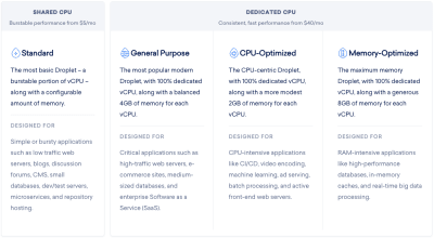
Leverage DigitalOcean Hosting Technology

One such provider that can help with this is DigitalOcean, a developer of scalable cloud solutions.

What’s nice about this option is that DigitalOcean gives you optimized “droplets” to choose from. There’s no need to guess which plan is right for you — everything is clearly spelled out in DigitalOcean’s very useful use case recommendations:

Digital Ocean vCPU droplets

DigitalOcean sells virtual CPUs that are optimized for specific use cases. (Source: DigitalOcean) (Large preview)

As you can see, Droplets are easy-to-configure virtual machines built for different kinds of websites and applications. What’s more, they’re configured for speed and security right out of the box with KVM hypervisors, SSD storage and 40GbE connectivity.

What’s more, as your website’s traffic grows, it’s easy to upgrade the amount of storage and bandwidth within your Droplet. And if you can figure out the rhyme or reason for traffic surges later on, you can quickly scale your resources up and down to accommodate the changes in traffic.

That said, a scalable cloud hosting solution isn’t enough to deal with traffic surges. There are a couple more things you’ll need.

Use Load Balancers for Surges

If you’re unfamiliar with load balancing technology, let’s take a look at the difference between a website with and without it.

This is what happens when someone visits your website without a load balancer:

DigitalOcean - No Load Balancing graphic

A graphic from DigitalOcean on how visitors access a website without load balancing. (Source: DigitalOcean) (Large preview)

They log onto the Internet, enter your URL in their web browser or click on a link to it and then your server is supposed to deliver your website to their screen.

But if the amount of traffic requesting access to your site suddenly surges, this lone server may not be able to efficiently handle the load. This is why excessively high traffic surges can lead to painfully slow websites or no access to websites altogether.

With a load balancer, however, this is what happens to your web traffic:

DigitalOcean - Load Balancing graphic

A graphic from DigitalOcean on how visitors access a website when load balancing is implemented. (Source: DigitalOcean) (Large preview)

A load balancer serves as a sort of proxy for your server. This way, when traffic peaks, your server doesn’t have to struggle to handle the demand. Instead, the load balancer leverages multiple servers to balance out the growing volume of HTTP requests.

It’s kind of like distributing your workload amongst your team. Rather than continue to pile on the requests for team members who are already overloaded, you share the work with those who have the capacity for it.

Unlike real-world work distribution, however, load balancers do all of this behind the scenes and don’t need you to coordinate anything as it’s fully managed.

Take Advantage of Performance Monitoring and Backups

So long as you have the right amount of bandwidth and storage configured in your droplet, and load balancing activated, your website will be in good shape. It won’t be impervious to traffic surges, but it’ll be as close to it as you can get.

Just keep in mind that for all of the fortifying you do at the server level, it’s still important to have a contingency plan in place.

Your business (website) continuity plan should include all of the things you need to do to get your website back to normal, including how to:

  • Restore the website,
  • Investigate the event that led to it,
  • And reach out to visitors and customers who were impacted.

That said, there are some parts of your continuity plan that DigitalOcean can help with.

Automated backups are essential for any website, but they’re absolutely critical if you know that your website will be susceptible to traffic surges. 24/7 support is another must and is something DigitalOcean offers as well.

Another thing to look for is built-in performance monitoring — something I’m going to touch on further down in this post.

2. Optimize Your Assets

With a solid cloud hosting solution in place, you can certainly give your website the help it needs to survive a huge traffic surge. However, it can’t all fall on your host. You need to do your part to make your website “light” enough to serve over and over again to the onslaught of visitors.

Here are some things you can do to optimize your website and its assets for greater performance:

Enable Caching and Other File Optimizations

Want your digital assets to be easier to handle? Then, you’ll need the following optimizations configured:

Caching

There are a variety of ways to implement caching and speed up how quickly your website gets delivered to visitors’ browsers. You can do this at the server, page, browser database levels.

Your web host can help you configure server caching.

If you’ve built your website with a content management system like WordPress, you can install a caching plugin to take care of the website and database baching for you. (It’ll also do things like file minification, Gzip compression combine CSS and JavaScript files.)

You can always enable caching manually. You’ll use your cache headers and two mechanisms in particular — Cache-control and Expires — to configure how your content is cached.

Image Optimization

Don’t forget about your media. Image and video files can take up a lot of room on your server as well as impede how quickly your server works during a traffic surge. To optimize these assets, you should use file compression and resizing.

To compress images in bulk, I’ll use an online tool like TinyPNG or TinyJPG to handle it for me.

TinyPNG image compression

TinyPNG offers a quick and easy way to bulk-compress image assets. (Source: TinyPNG) (Large preview)

On average, I can usually cut my file sizes by about 75% with this one tool.

To further shrink the heft of your images, you should be resizing them. There’s no reason to upload full-sized assets to a website if the maximum width you’re going to use is 1280 pixels or thereabouts.

For this, I’ll either use my file software to do it all in one go or I’ll use an online service like Bulk Resize Photos.

Bulk Resize Photos image resizing tool

Bulk Resize Photos offers an easy way to bulk-resize image assets using a variety of resizing methods. (Source: Bulk Resize Photos) (Large preview)

There’s a lot of flexibility here in how images are resized, but I find that setting a max width usually works best.

Use Managed Databases

In addition to optimizing the assets you put into a website, you should take some care to optimize your databases. That said, it’s often easier said than done.

While I’m familiar with database cleanup and optimization plugins you can use with WordPress to keep things running more smoothly, that’s not going to help much when it comes to a traffic surge. You need something that will help your database continue to process incoming data requests even at a higher rate.

For that, you’d be best off with a managed database solution — something you can provision from DigitalOcean.

When a traffic surge is detected, managed database services simplify what needs to be done in order to scale your resources accordingly. There are no calculations needed; simply log into your account and add more resources as needed.

Another reason why managed services are ideal in these kinds of situations is because of their built-in high availability. And this isn’t just some blanket promise of 99.9% uptime. If you take a look at your host’s SLA, you’ll find that it will go to great lengths to prevent egregious amounts of downtime.

Add a CDN

There’s another layer of optimization to add to your site when traffic surges are a common occurrence: a CDN.

Content delivery networks are useful for a whole host of reasons. They’re great for serving websites to global visitors. They’re definitely handy for e-commerce websites that want to provide a faster checkout experience. And they provide additional speed, security, and failover for websites that occasionally encounter high upticks in traffic.

If you’re planning on using DigitalOcean to host your website, look to its Spaces product (with built-in CDN integration) for more efficient storage and delivery of your assets.

3. Analyze Your Traffic Reports

In general, it’s really important to be diligent about collecting data from your website. That’s especially so when battling traffic surges. Here’s why:

If there are predictable highs and lows in your website traffic, you’ll know when and how exactly to plan for them. This not only means optimizing your website and server to handle the traffic but having the right amount of staff on to monitor and manage it.

To do this, use Google Analytics to keep tabs on everything.

Google Analytics - charting out pageviews

A sample traffic and pageviews chart from Google Analytics. (Source: Google Analytics) (Large preview)

This example is a 12-month data pull that shows how many page views occurred every day (more or less). You can do this with other metrics like the number of users or sessions as well. The main goal, however, is to identify any sources of stress throughout the year, and excessive pageviews (or e-commerce conversions, if relevant) may be a more effective way to measure this.

You can see here that there were a number of high-highs and low-lows that took place:

Google Analytics - traffic surge searching

An example of how Google Analytics users would look for traffic surges in their data. (Source: Google Analytics) (Large preview)

Rather than take them at face value, cross-reference them against other data points to ensure that what you’re looking at was a traffic surge you can learn from.

Rule Out Web Development

For example, was there any on-site development going on on those days? If someone were repairing a bug or designing a new page, that could cause the pageview numbers to increase greatly.

If this happens a lot, it would be a good idea to automatically strip this data out of your reports at the Google Analytics level. You can do this from the Admin menu.

Go to View > Filters > Add Filter:

Google Analytics filters

Google Analytics users can remove their personal visit and pageview metrics from results. (Source: Google Analytics) (Large preview)

By filtering out data for your IP address as well as anyone else who may preview the site frequently for testing or content creation purposes, you’ll give yourself a more accurate view of your traffic levels.

Let’s say that the spikes in traffic weren’t from your internal team. Next, you’ll want to see if these traffic surges (or drops) occur at predictable intervals.

Look for Predictable Surges

If your website has been live for more than a year, you can use Google Analytics to see if there’s a correlation. Simply set your dates to compare against the same timeframe from the previous year:

Google Analytics date range comparison

Google Analytics allows users to compare two date ranges side-by-side. (Source: Google Analytics) (Large preview)

Then, look for overlaps in traffic surges:

Google Analytics date range comparison data

Google Analytics users can simultaneously review two date ranges for traffic surge predictability. (Source: Google Analytics) (Large preview)

In this case, there’s maybe only one or two notable spikes that occurred in both years. The first was in early April and the other was around mid-November.

If these were excessively large surges in both years — like at least five times more than the usual amount of traffic — I’d say they’d be worth investigating. In this example, however, it’s probably just a coincidence and they can be ruled out.

Check the Calendar

If you have identified a notable traffic surge in your data, the last thing to do is check it against your calendar.

What you’re looking for are events that could have caused the surge. Things like:

  • Holiday sales that generated a bunch of buzz.
  • Press releases that got picked up on major news wires.
  • Viral blog posts or email offers you sent out.

I’d also suggest looking at the traffic during the days or weeks following the traffic surge.

How did it taper off? Was it suddenly or a slow burn? Was the website able to improve its daily traffic numbers — even slightly — thanks to the surge?

Also, look at how the organization was impacted. This is especially important for e-commerce websites that provide customer support and product returns. Was there an uptick in post-sale activity after the surge? When did it hit? How long did it last for?

If you can figure out why the traffic surge happened (i.e. what event triggered it) and what the fallout was, you can actually use this to your advantage in the future. For example, if you know that a sale or viral post caused the surge, you can plan your server and staffing resources ahead of the next one.

Regardless of what you find looking at old reports, this needs to become part of your ongoing process. Set up Google Analytics to generate traffic reports and email them to you on a regular basis. This way, as traffic levels change — for good or bad — you’ll always be in the know with what’s going on and can adapt your strategy accordingly.

4. Real-time Performance Monitoring

Google Analytics will help you figure out what happened in the past and prepare more effectively for future traffic surges. Real-time performance monitoring, on the other hand, will allow you to react to traffic surges and other performance changes in the heat of the moment.

There are various tools you can use for real-time monitoring. Here’s just a sample of them:

Frontend Performance Monitoring

When page speed suddenly begins to deteriorate or your website goes down, there’s no time to waste. That said, it shouldn’t be up to you to regularly log into your website to make sure everything’s running fine.

Instead, you can use an uptime and speed monitoring service like Pingdom:

Pingdom monitoring and alerting services

Users can automate uptime, user and speed monitoring with Pingdom. (Source: Pingdom) (Large preview)

It handles the tedious job of monitoring your website for upticks in traffic, problems with speed or uptime as well as issues detected at checkout. It will also serve you real-time notices so you can take care of issues caused by traffic surges before they get too bad.

This way, you’ll only need to give your website the attention and care it needs when a traffic surge has a negative impact on performance instead of constantly worrying about it.

Backend Performance Monitoring

While it’s great to have a frontend monitoring service to tell you when traffic’s out of whack, it’s not enough. You need to know what’s going on on the backend as well.

Of course, with a managed hosting solution, you’ll get some help from your provider. However, it’s a good idea to familiarize yourself with your server metrics so you can be proactive about fighting off the devastating effects of surges.

Here are some of the metrics to keep an eye on:

  • Hosting resources (like memory and disk space),
  • Your application performance (like error rates and resource usage),
  • Connectivity (like latency and bandwidth utilization).

Become acquainted with these key metrics so you’re never scrambling to figure out what’s going on with your website or how to fix it.

Now, with DigitalOcean, you won’t just get access to these handy metrics. It will set you up with real-time monitoring and alerts, too. And that’s not all.

The problem with many monitoring systems is that they’re just that: they look for outages, errors, and instability, but it’s still up to you to take action. With DigitalOcean, though, you can automate certain actions to take place when specific scenarios are detected.

For example, let’s say your website is receiving a much larger rush of traffic than you had anticipated for the holiday sale. Your resources are depleting too fast, which would normally put a website in risk of slowing to a crawl or crashing altogether. But in this case, the monitoring mechanism has noted the issue and your auto-scaling action has been triggered.

Imagine how useful it would be to automate your server’s response to certain events. You could spend less time worrying about how to restore your website and instead focus on how to keep optimizing your server assets to sustain the high levels of traffic.

Wrapping Up

If your clients’ websites or PWAs aren’t ready for a traffic surge, it could spell major trouble for their businesses once the dust settles. And it’s not just downtime or slow-loading pages that will cost them (or you).

Having all of those extra visitors see a website that’s in ill shape — from broken checkouts or forms to malware infections — will hurt your business, too.

Rather than cross your fingers or tell yourself that your website isn’t big enough or popular enough to experience one of those traffic surges, be prepared. By starting with a practical cloud hosting solution from DigitalOcean and then optimizing your server, assets and processes surrounding them, you’ll improve your website’s chances of not only surviving a surge intact but greatly profiting from it.

(ra, yk, il)
Categories: Others Tags:

How Facebook Avoids Ad Blockers

December 9th, 2019 No comments

Dylan Paulus:

Facebook actually hides ‘dummy’ DOM nodes between the ‘Sponsored’ text. These values are entirely random characters, with a random number of DOM nodes between them. Invisible characters. At this point our CSS ad blocker is completely broken. There is no way for us to possibly code every possible value in CSS.

We’ve covered this before when Mike Pan noted it. Looks like it’s evolved a bit since then, getting even a little tricker.

I just opened my Facebook and selected “Copy Outer HTML” on the word “Sponsored”:

<span class="v_19dt4zixpg r_19dt4zk7i5"><span class="fsm fwn fcg"><span class="q_19dt4zirbc"><a class="d_19dt4zioka h_19dt4ziol1" role="button" id="u_fetchstream_3_6"><span class="s_19dt4ziok9 d_19dt4ziok- e_19dt4ziokq"><span class="s_19dt4ziok9 d_19dt4ziok- e_19dt4ziokq"><span data-content="a" class="s_19dt4ziok9 l_19dt4zlqyi b_19dt4ziokl"></span></span><span class="s_19dt4ziok9 d_19dt4ziok- e_19dt4ziokq"><span data-content="t" class="s_19dt4ziok9 l_19dt4zlqyi b_19dt4ziokl"></span></span><span class="s_19dt4ziok9 d_19dt4ziok- e_19dt4ziokq"><span data-content="S" class="s_19dt4ziok9 l_19dt4zlqyi b_19dt4ziokl"></span></span><span class="s_19dt4ziok9 d_19dt4ziok- e_19dt4ziokq"><span data-content="p" class="s_19dt4ziok9 l_19dt4zlqyi b_19dt4ziokl"></span></span><span class="s_19dt4ziok9 d_19dt4ziok- e_19dt4ziokq"><span data-content="r" class="s_19dt4ziok9 l_19dt4zlqyi b_19dt4ziokl"></span></span><span class="s_19dt4ziok9 d_19dt4ziok- e_19dt4ziokq"><span data-content="i" class="s_19dt4ziok9 l_19dt4zlqyi b_19dt4ziokl"></span></span><span class="s_19dt4ziok9 d_19dt4ziok- e_19dt4ziokq"><span data-content="n" class="s_19dt4ziok9 l_19dt4zlqyi b_19dt4ziokl"></span></span><span class="s_19dt4ziok9 d_19dt4ziok- e_19dt4ziokq"><span data-content="S" class="s_19dt4ziok9 l_19dt4zlqyi n_19dt4ziokm"></span></span><span class="s_19dt4ziok9 d_19dt4ziok- e_19dt4ziokq"><span data-content="i" class="s_19dt4ziok9 l_19dt4zlqyi b_19dt4ziokl"></span></span><span class="s_19dt4ziok9 d_19dt4ziok- e_19dt4ziokq"><span data-content="p" class="s_19dt4ziok9 l_19dt4zlqyi n_19dt4ziokm"></span></span><span class="s_19dt4ziok9 d_19dt4ziok- e_19dt4ziokq"><span data-content="o" class="s_19dt4ziok9 l_19dt4zlqyi n_19dt4ziokm"></span></span><span class="s_19dt4ziok9 d_19dt4ziok- e_19dt4ziokq"><span data-content="i" class="s_19dt4ziok9 l_19dt4zlqyi b_19dt4ziokl"></span></span><span class="s_19dt4ziok9 d_19dt4ziok- e_19dt4ziokq"><span data-content="n" class="s_19dt4ziok9 l_19dt4zlqyi n_19dt4ziokm"></span></span><span class="s_19dt4ziok9 d_19dt4ziok- e_19dt4ziokq"><span data-content="o" class="s_19dt4ziok9 l_19dt4zlqyi b_19dt4ziokl"></span></span><span class="s_19dt4ziok9 d_19dt4ziok- e_19dt4ziokq"><span data-content="a" class="s_19dt4ziok9 l_19dt4zlqyi b_19dt4ziokl"></span></span><span class="s_19dt4ziok9 d_19dt4ziok- e_19dt4ziokq"><span data-content="c" class="s_19dt4ziok9 l_19dt4zlqyi b_19dt4ziokl"></span></span><span class="s_19dt4ziok9 d_19dt4ziok- e_19dt4ziokq"><span data-content="s" class="s_19dt4ziok9 l_19dt4zlqyi n_19dt4ziokm"></span></span><span class="s_19dt4ziok9 d_19dt4ziok- e_19dt4ziokq"><span data-content="n" class="s_19dt4ziok9 l_19dt4zlqyi b_19dt4ziokl"></span></span><span class="s_19dt4ziok9 d_19dt4ziok- e_19dt4ziokq"><span data-content="s" class="s_19dt4ziok9 l_19dt4zlqyi b_19dt4ziokl"></span></span><span class="s_19dt4ziok9 d_19dt4ziok- e_19dt4ziokq"><span data-content="o" class="s_19dt4ziok9 l_19dt4zlqyi b_19dt4ziokl"></span></span><span class="s_19dt4ziok9 d_19dt4ziok- e_19dt4ziokq"><span data-content="r" class="s_19dt4ziok9 l_19dt4zlqyi b_19dt4ziokl"></span></span><span class="s_19dt4ziok9 d_19dt4ziok- e_19dt4ziokq"><span data-content="e" class="s_19dt4ziok9 l_19dt4zlqyi b_19dt4ziokl"></span></span><span class="s_19dt4ziok9 d_19dt4ziok- e_19dt4ziokq"><span data-content="o" class="s_19dt4ziok9 l_19dt4zlqyi n_19dt4ziokm"></span></span><span class="s_19dt4ziok9 d_19dt4ziok- e_19dt4ziokq"><span data-content="g" class="s_19dt4ziok9 l_19dt4zlqyi b_19dt4ziokl"></span></span><span class="s_19dt4ziok9 d_19dt4ziok- e_19dt4ziokq"><span data-content="r" class="s_19dt4ziok9 l_19dt4zlqyi n_19dt4ziokm"></span></span><span class="s_19dt4ziok9 d_19dt4ziok- e_19dt4ziokq"><span data-content="d" class="s_19dt4ziok9 l_19dt4zlqyi b_19dt4ziokl"></span></span><span class="s_19dt4ziok9 d_19dt4ziok- e_19dt4ziokq"><span data-content="e" class="s_19dt4ziok9 l_19dt4zlqyi n_19dt4ziokm"></span></span><span class="s_19dt4ziok9 d_19dt4ziok- e_19dt4ziokq"><span data-content="f" class="s_19dt4ziok9 l_19dt4zlqyi b_19dt4ziokl"></span></span><span class="s_19dt4ziok9 d_19dt4ziok- e_19dt4ziokq"><span data-content="d" class="s_19dt4ziok9 l_19dt4zlqyi n_19dt4ziokm"></span></span></span></a></span></span></span>

I guess we shouldn’t be terribly surprised at Facebook being user-hostile. I can imagine a workplace environment where fighting against ad blockers is turned into this fun kinda cat-and-mouse technological tennis match. But what they are fighting against is people wanting to exert a little control over what they allow into their eyes, ears, and brains.

It’s worth noting that nothing else in the DOM helps identify a post as an ad. So in that sense it’s just like how Google has evolved SERPs in how ads look just like organic results aside from a tiny “AD” before the URL.

We run sponsored posts here on CSS-Tricks too, so please feel free to hold our feet to the fire of accountability if you feel sponsored posts aren’t clear enough.

Direct Link to ArticlePermalink

The post How Facebook Avoids Ad Blockers appeared first on CSS-Tricks.

Categories: Designing, Others Tags:

Music and Web Design

December 9th, 2019 No comments

Brad has a long history in music outside of being a web designer, and draws some interesting parallels. One is that he had reached for more complex music in an effort to become a better musician — and developers can do the same thing. The other is that the composition of music can be seen from very large parts down to very tiny parts, just like atomic design.

I have two go-to connections between music and web design myself.

  1. Expectation of practice. Learning to play a musical instrument has a healthy cultural expectation: to get good at it, you have to practice. I’d love to see that expectation make its way more clearly into absolutely everything else in the world, from ironing clothes to inventing soups to writing code.
  2. Learning from multiple angles. Everybody who is actually good at a thing has learned it from 100 angles. You read books, you practice, you watch YouTube videos, you take a lesson, you go to school, you go out and live it, you get a mentor, you squeeze yourself into social circles. This is true for music (nobody learns from a single source) and equally true for web design (getting good comes from a breadth of experiences).

Allow me to quote myself:

People are obsessed with asking musicians if they’re self-taught. Like, if they are, their amazingness triples because it means their creative genius was delivered by a lightning bolt at birth. They don’t need anyone else to learn; they merely look at those guitar strings and know what to do.

And if they were taught by a teacher, then, well, that’s all out the door. If they are good at all, then it’s because the teacher delivered that to them.

Total nonsense.

People learn anything — music and web development included — inside a hurricane of influences. Let’s stick with music for a second. Learning to play comes in many forms. You learn by listening to music an awful lot. You can do fundamental practice, like finger exercises and going up and down scales. You can learn to transpose chords on a chalkboard. You can watch YouTube all day and night. You can sign up for online courses. You can go to local jams to watch and play along. You can join a band. You can take lessons from someone advertising on Craigslist. You can go to a local music school. You can read books about music.

You get the idea.

You can and probably will do all of that. With learning web design and development, getting anywhere will involve all sorts of ways. There’s no silver bullet. It takes bashing on it lots of different ways. There’s no requirement to sprinkle money on it, but you do need multiple angles, time, and motivation.

Direct Link to ArticlePermalink

The post Music and Web Design appeared first on CSS-Tricks.

Categories: Designing, Others Tags:

A Handy Sass-Powered Tool for Making Balanced Color Palettes

December 9th, 2019 No comments

For those who may not come from a design background, selecting a color palette is often based on personal preferences. Choosing colors might be done with an online color tool, sampling from an image, “borrowing” from favorite brands, or just sort of randomly picking from a color wheel until a palette “just feels right.”

Our goal is to better understand what makes a palette “feel right” by exploring key color attributes with Sass color functions. By the end, you will become more familiar with:

  • The value of graphing a palette’s luminance, lightness, and saturation to assist in building balanced palettes
  • The importance of building accessible contrast checking into your tools
  • Advanced Sass functions to extend for your own explorations, including a CodePen you can manipulate and fork

What you’ll ultimately find, however, is that color on the web is a battle of hardware versus human perception.

What makes color graphing useful

You may be familiar with ways of declaring colors in stylesheets, such as RGB and RGBA values, HSL and HSLA values, and HEX codes.

rbg(102,51,153)
rbga(102,51,153, 0.6)
hsl(270, 50%, 40%)
hsla(270, 50%, 40%, 0.6)
#663399

Those values give devices instructions on how to render color. Deeper attributes of a color can be exposed programmatically and leveraged to understand how a color relates to a broader palette.

The value of graphing color attributes is that we get a more complete picture of the relationship between colors. This reveals why a collection of colors may or may not feel right together. Graphing multiple color attributes helps hint at what adjustments can be made to create a more harmonious palette. We’ll look into examples of how to determine what to change in a later section.

Two useful measurements we can readily obtain using built-in Sass color functions are lightness and saturation.

  • Lightness refers to the mix of white or black with the color.
  • Saturation refers to the intensity of a color, with 100% saturation resulting in the purest color (no grey present).
$color: rebeccapurple;

@debug lightness($color);
// 40%

@debug saturation($color);
// 50%;

However, luminance may arguably be the most useful color attribute. Luminance, as represented in our tool, is calculated using the WCAG formula which assumes an sRGB color space. Luminance is used in the contrast calculations, and as a grander concept, also aims to get closer to quantifying the human perception of relative brightness to assess color relationships. This means that a tighter luminance value range among a palette is likely to be perceived as more balanced to the human eye. But machines are fallible, and there are exceptions to this rule that you may encounter as you manipulate palette values. For more extensive information on luminance, and a unique color space called CIELAB that aims to even more accurately represent the human perception of color uniformity, see the links at the end of this article.

Additionally, color contrast is exceptionally important for accessibility, particularly in terms of legibility and distinguishing UI elements, which can be calculated programmatically. That’s important in that it means tooling can test for passing values. It also means algorithms can, for example, return an appropriate text color when passed in the background color. So our tool will incorporate contrast checking as an additional way to gauge how to adjust your palette.

The functions demonstrated in this project can be extracted for helping plan a contrast-safe design system palette, or baked into a Sass framework that allows defining a custom theme.

Sass as a palette building tool

Sass provides several traditional programming features that make it perfect for our needs, such as creating and iterating through arrays and manipulating values with custom functions. When coupled with an online IDE, like CodePen, that has real-time processing, we can essentially create a web app to solve specific problems such as building a color palette.

Here is a preview of the tool we’re going to be using:

See the Pen
Sass Color Palette Grapher
by Stephanie Eckles (@5t3ph)
on CodePen.

Features of the Sass palette builder

  • It outputs an aspect ratio-controlled responsive graph for accurate plot point placement and value comparing.
  • It leverages the result of Sass color functions and math calculations to correctly plot points on a 0–100% scale.
  • It generates a gradient to provide a more traditional “swatch” view.
  • It uses built-in Sass functions to extract saturation and lightness values.
  • It creates luminance and contrast functions (forked from Material Web Components in addition to linking in required precomputed linear color channel values).
  • It returns appropriate text color for a given background, with a settings variable to change the ratio used.
  • It provides functions to uniformly scale saturation and lightness across a given palette.

Using the palette builder

To begin, you may wish to swap from among the provided example palettes to get a feel for how the graph values change for different types of color ranges. Simply copy a palette variable name and swap it for $default as the value of the $palette variable which can be found under the comment SWAP THE PALETTE VARIABLE.

Next, try switching the $contrastThreshold variable value between the predefined ratios, especially if you are less familiar with ensuring contrast passes WCAG guidelines.

Then try to adjust the $palette-scale-lightness or $palette-scale-saturation values. Those feed into the palette function and uniformly scale those measurements across the palette (up to the individual color’s limit).

Finally, have a go at adding your own palette, or swap out some colors within the examples. The tool is a great way to explore Sass color functions to adjust particular attributes of a color, some of which are demonstrated in the $default palette.

Interpreting the graphs and creating balanced, accessible palettes

The graphing tool defaults to displaying luminance due to it being the most reliable indicator of a balanced palette, as we discussed earlier. Depending on your needs, saturation and lightness can be useful metrics on their own, but mostly they are signalers that can help point to what needs adjusting to bring a palette’s luminance more in alignment. An exception may be creating a lightness scale based on each value in your established palette. You can swap to the $stripeBlue example for that.

The $default palette is actually in need of adjustment to get closer to balanced luminance:

The $default palette’s luminance graph

A palette that shows well-balanced luminance is the sample from Stripe ($stripe):

The $stripe palette luminance graph

Here’s where the tool invites a mind shift. Instead of manipulating a color wheel, it leverages Sass functions to programmatically adjust color attributes.

Check the saturation graph to see if you have room to play with the intensity of the color. My recommended adjustment is to wrap your color value with the scale-color function and pass an adjusted $saturation value, e.g. example: scale-color(#41b880, $saturation: 60%). The advantage of scale-color is that it fluidly adjusts the value based on the given percent.

Lightness can help explain why two colors feel different by assigning a value to their brightness measured against mixing them with white or black. In the $default palette, the change-color function is used for purple to align it’s relative $lightness value with the computed lightness() of the value used for the red.

The scale-color function also allows bundling both an adjusted $saturation and $lightness value, which is often the most useful. Note that provided percents can be negative.

By making use of Sass functions and checking the saturation and lightness graphs, the $defaultBalancedLuminance achieves balanced luminance. This palette also uses the map-get function to copy values from the $default palette and apply further adjustments instead of overwriting them, which is handy for testing multiple variations such as perhaps a hue shift across a palette.

The $defaultBalancedLuminance luminance graph

Take a minute to explore other available color functions.

http://jackiebalzer.com/color offers an excellent web app to review effects of Sass and Compass color functions.

Contrast comes into play when considering how the palette colors will actually be used in a UI. The tool defaults to the AA contrast most appropriate for all text: 4.5. If you are building for a light UI, then consider that any color used on text should achieve appropriate contrast with white when adjusting against luminance, indicated by the center color of the plot point.

Tip: The graph is set up with a transparent background, so you can add a background rule on body if you are developing for a darker UI.

Further reading

Color is an expansive topic and this article only hits the aspects related to Sass functions. But to truly understand how to create harmonious color systems, I recommend the following resources:

  • Color Spaces – is a super impressive deep-dive with interactive models of various color spaces and how they are computed.
  • Understanding Colors and Luminance – A beginner-friendly overview from MDN on color and luminance and their relationship to accessibility.
  • Perpetually Uniform Color Spaces – More information on perceptually uniform color systems, with an intro the tool HSLuv that converts values from the more familiar HSL color space to the luminance-tuned CIELUV color space.
  • Accessible Color Systems – A case study from Stripe about their experience building an accessible color system by creating custom tooling (which inspired this exploration and article).
  • A Nerd’s Guide to Color on the Web – This is a fantastic exploration of the mechanics of color on the web, available right here on CSS-Tricks.
  • Tanaguru Contrast Finder – An incredible tool to help if you are struggling to adjust colors to achieve accessible contrast.
  • ColorBox – A web app from Lyft that further explores color scales through graphing.
  • Designing Systematic Colors – Describes Mineral UI‘s exceptional effort to create color ramps to support consistent theming via a luminance-honed palette.
  • How we designed the new color palettes in Tableau 10 – Tableau exposed features of their custom tool that helped them create a refreshed palette based on CIELAB, including an approachable overview of that color space.

The post A Handy Sass-Powered Tool for Making Balanced Color Palettes appeared first on CSS-Tricks.

Categories: Designing, Others Tags:

Inspirational Designer of The Week – Meet Aurélien Salomon

December 9th, 2019 No comments

Welcome back to this week’s edition of Inspirational Designer of The Week!

Today, I’m honored to welcome Aurélien Salomon to the scene.

[source]

Aurélien Salomon is an exceptionally talented French UI/UX designer who plays by his own rules.

And by doing so, he’s been able to work with famous enterprises that favored him, such as Apple, Google, Tinder, and Uber, just to name a few.

[source]

So what’s his design philosophy?

Well, he says, “I believe in simplicity, I love solving problems and crafting amazing experiences.”

And this shows clearly in his work.

[source]

He has worked on loads of different design projects, extending from web design to creating IOS apps from scratch.

If you’re on Dribbble as much as I am, then you will surely recognize his work for its simplicity and originality.

[source]

Aurélien Salomon is from Martinique (a small French island in the Caribbean), and studied engineering in Paris and Montreal.

How did he get into design?

Salomon has loved designing ever since he can remember.

[source]

He says it all started when he was a kid, and his love for design showed through the way he played with legos.

He had always had a passion for designing and engineering, so he specialized in cognitive ergonomics, which proves to be a very useful field for a designer.

[source]

What was his growth experience like?

In the beginning, he worked for a start-up and then moved on to a design agency.

But we all know that being your own boss can be the best thing ever, in my opinion, so he moved onto bigger and better things: freelancing.

[source]

And in his words, once he began to freelance, he “[I] was lucky enough to work with big companies like Apple, Google, Tinder, Uber and more.

One of the projects he is most proud of and that he can share with us is this MacOS redesign concept.

[source]

And speaking of Apple, here are some other Apple design projects and concepts that he’s worked on that we’re obsessed with.

[source]

When Aurélien starts a new design project with a new client, he says that he always that it is vital to understand their business, what the business is trying to achieve and how you as a designer can impact their project in the best way possible.

[source]

When he begins working with new clients, he starts by communicating clearly with the client what their goals are and what the want to achieve.

Once they get a solid foundation to work from, he then takes a look at the competition.

[source]

After all of this, he starts to gain inspiration from various platforms, such as Dribbble, Behance, or even real-life things, such as books and movies.

When asked what is the most important element of UX design, he said…

“The most important part of UX is to come up with a holistic approach.”

[source]

There are many steps a designer should follow and never neglect, such as user research, understanding, brainstorming, prototyping, and testing.

A typical day in Aurélien Salomon’s life looks like this…

He starts every morning like this:

He wakes up at 8 am, brews his white tea, and then meditates.

That sounds like my morning goals, to be completely honest here.

[source]

He then works very hard until around 7 or 8 pm.

Between the working hours, he tries to take breaks to stretch or go on runs, in order to be sure he gets sufficient exercise.

Wrapping things up

Aurélien is an inspiration to us all.

You can be anything you want to be.

To find more of Aurélien’s work, you can follow him on Dribbble and Behance.

Until next time, folks.

Stay creative!

Read More at Inspirational Designer of The Week – Meet Aurélien Salomon

Categories: Designing, Others Tags:

Benefits of Artificial Intelligence for Business

December 9th, 2019 No comments

Artificial intelligence isn’t a new concept.

As a matter of fact, it has been around ever since the 1950s and a workshop at the Dartmouth College at which the field of AI research was established.

Although many people still think of AI from the perspective of humanoid sentient robots with a mind of their own, the truth is that much of this technology still revolves around its capability to make use of huge volumes of data.

And that’s exactly what businesses can benefit from.

Automating Business Processes

There’s a plethora of different simple, repetitive, and mundane business tasks that still have to be done.

Automation is a solution whose benefits are cost reduction, improved performance, reliability, eliminating human error, and availability.

In other words, by implementing AI-powered automation, businesses can completely transform their production lines, quality control, storage management, speed up their supply chain, as well as facilitate orders, payments, and customer support, among many other things.

For example, collaborative robots or cobots have disrupted the manufacturing industry.

These intelligent machines work side by side with humans in order to optimize different manufacturing processes. They can be easily set up and programmed, as well as safe to operate with. Cobots pick up the slack and do the dirty, unsafe, or boring jobs instead of people.

According to an analysis, Amazon managed to reduce its operating expenses by 20% with the help of Kiva Robots.

Improving Customer Experience

With the advancement of different technologies, customers have become increasingly demanding and they won’t settle for average service or product quality.

As a result of this, customer experience is the new currency, and 88% of companies make it a priority.

But it’s hard to set the bar high in this respect by leveraging only the human workforce.

Cobots’ office counterparts, chatbots, don’t do the heavy lifting, but are equally impressive in terms of efficiency, cutting costs, and performance.

These smart algorithms can take over customer support and significantly improve customer satisfaction and experience. Chatbots are available 24/7/365 and they can handle a number of queries simultaneously, thus reducing waiting times.

64% of people say that 24-hour service is the best feature of chatbots, so it’s clear how beneficial these can be for any business.

In other words, businesses that are responsive, never put their customers on hold, and do everything to help and assist them will dominate the market.

However, chatbots have the reputation of delivering predefined, canned phrases and answers. This used to be true a couple of years ago, but the latest state-of-the-art bots are much more sophisticated to the extent that soon it will be impossible to tell the difference between them and human support agents.

Apart from helping customers solve their product issues and providing them answers to different questions, chatbots are also capable of collecting valuable customer information. Paired with the power of big data analytics, they can also process and interpret the unstructured data – something that wasn’t possible in the past – and identify different patterns.

In layman’s terms, AI-powered chatbots can understand your customers’ behavior, their interests, preferences, and needs, and offer them the right solution at the right time.

It’s only logical that a growing number of companies plan on jumping the AI bandwagon and tries to figure out how to create artificial intelligence software that will fit their needs.

Predicting Customer Behavior

Predictable revenue is something that every business should strive for.

There’s no need to throw darts in the dark and rely on chance when predictive analytics can allow making data-driven decisions both in marketing and sales.

With the help of data mining, statistics, and AI, companies are now able to identify the most effective ways of reaching their customers.

Moreover, the lack of alignment between marketing and sales is an extremely costly mistake – that’s how businesses lose $1 trillion annually.

By introducing a lead-scoring system supported by AI, these two departments will be able to collaborate on a deeper level and make the right decisions, thus boosting conversions. This practically means that marketing will more easily identify high-quality, sales-ready leads and forward them to sales. In other words, salespeople will be provided with all the right information necessary to close deals and they won’t have to waste time on those who have no intention of making a purchase.

Offering Personalized Customer Recommendations

The phrase “Customers who bought this product also bought” is familiar to all those who have ever purchased anything on Amazon (and almost any other online store.)

This powerful algorithm is what many businesses use in order to cross-sell and upsell, and stats say that it’s responsible for 35% of Amazon’s revenue.

By analyzing their customers’ buying and spending habits, on-site behavior, and different preferences and interests, AI can help businesses show accurate and relevant product or service suggestions. And unlike humans, AI can process all these vast amounts of customer information at lightning speed thus accelerating the entire sales process.

Every time a customer views a certain product or puts something in the shopping cart, the algorithm records it, and compares these results with those of people who liked similar products. That’s how an entire gamut of different recommendation parameters is created.

It won’t be wrong to say that artificial intelligence is still at its infancy and that the best is yet to come. However, even this scratching the surface has brought numerous benefits to early adopters.

Categories: Others Tags:

Brand Illustration Systems: Drawing A Strong Visual Identity

December 9th, 2019 No comments

Brand Illustration Systems: Drawing A Strong Visual Identity

Brand Illustration Systems: Drawing A Strong Visual Identity

Yihui Liu

2019-12-09T12:30:00+00:002019-12-09T14:11:23+00:00

In the flood of online content, companies live or die by their brand image. A brand image has to express the company’s message and connect with users, who should instantly recognize it across different media, even away from the company’s website and marketing content. A strong brand image is like an anchor, helping ensure user attachment and fix value associations.

Brand image is typically built up from different visual elements — logos, color palette, a particular font. Alongside these, illustrations are another powerful means of visual communication which are more and more in demand for online UI.

Why? Because illustrations introduce narrative elements to visual content and allow for subtler emotions or more complex situations to be expressed. Including human figures make ideas active and accessible, often in a light-hearted or whimsical way. Illustrations turn away from realism and let you build the world as the brand sees it.

This is an important piece in the larger puzzle of online campaigns. Digital design, using vectors, favors clean, bold images which translate well into distinctive branding illustrations. Rather than single-use designs, these online illustrations are being used as part of comprehensive visual systems. Images in an illustration system share a unifying mood or style, which makes them identifiable with the brand’s wider image and message, even as they represent different aspects of a product or service.

Illustration systems increase the range and depth of messages a company communicates visually about itself, from mission statements to practical product support, while strengthening brand image.

Design Process

So how should you go about designing an effective brand illustration system? I take you through my design process, with examples from the recent overhaul we undertook at Spacebase.

Research The Brand

First thing’s first — know the brand you’ll be designing for. This might sound obvious but don’t underestimate the work involved. Even if you think you already have a working knowledge, it’s worth investing time to refresh or deepen your understanding of the brand.

Dig into the culture behind the company and its products or services. What is their principal message, what forms do their existing visual identity take, and what is the direction the company wants to grow in?

Investigating this thoroughly at the beginning will save you headaches and dead-ends later on.

Understand Stakeholder Needs

As well as doing your own research, you’ll need to speak to the stakeholder. This connection is crucial to the success of your design — so involve them early and keep them updated with the process.

Get answers to key questions about the design: where will the illustrations appear and what do they need to express? What kind of situations and emotions might they play on? What are the technical parameters you need to work within?

At this stage, the stakeholder might not be very clear about what they want. Nonetheless, you should listen carefully to their input and consider their expectations in relation to the goals of the business and their wider brand image.

At Spacebase, the aim was to make the online booking platform more approachable and human. I thought deeply about the relationship between meeting rooms and the people who use them. We wanted to capture the brand message of breaking out of regular workspaces, into new and exciting ones, in a smooth, convenient, supportive way. The designs had to come across as friendly, modern, and simple.

Organize Inspiration

A moodboard is essential for getting to grips with the input you receive and organizing your ideas. Collect images from competitors or companies in the field with similar qualities to your intended goal and then compile these into a resource. Looking at what inspires you can be a guide to the overall tone you want to achieve and suggest the way to a first iteration. This is also useful material to show the stakeholders, as it gives them a sense of the direction the illustrations will take before the work of creating concepts begins.

Some of the brand illustrations which inspired me. (Large preview)

For the Spacebase design, I was particularly inspired by the Airbnb, IBM, and Shopify illustrations. The simple design of people and spaces really stood out for me, and I was interested in how the muted color palettes keep the illustrations focused, without overwhelming the pictorial elements. They produce an impression of calm, warmth and inclusivity.

Concept Creation

After researching and moodboarding, I start sketching on Adobe Illustrator. Sometimes I use a Wacom tablet but mainly I stick to my mouse with the Pen tool. I use shapes to create a basic structure, and use the Pen tool to add detail and enhance the basic outline.

Drawing onscreen. (Large preview)

Bear in mind that the images you design should cohere to form a uniform system, not form standalone scenes. So even if this is the first iteration — aim to give the illustrations a distinctive flavor which you will be able to replicate across different designs in the future. This might not come at first but feel your way towards an internal logic for the branding illustrations and aim to be consistent with this in your decisions.

With the Spacebase illustrations, we focused on human characters and color scheme as ways to keep the images in line with other visual branding elements.

The evolution of the email banner for booking confirmations. (Large preview)

I started drawing the human characters with basic outlines, to get a feel for the emotions they would represent and how they would inhabit interior spaces. I wanted flowing lines to give them dynamic profiles and suggest movement. I also wanted to avoid anything that looked too heavy — lightweight and friendly were keywords. Diversity was also important to me, as Spacebase is an international company, and I always want viewers of illustrations to see themselves.

Alongside the human figures, I wanted the objects and environments to have a distinct style — abstract, futuristic and design-forward. We wanted to show interiors which are bright, beautiful, involving the users in the spatial dynamic, and with objects that suggest an idealized professional working environment. At the same time, these were not to distract attention. Spacebase is all about inspiring meeting rooms but their brand is more about the people who use these spaces. This took many iterations to get just right.

Exploring different lines and color palettes. (Large preview)

After the sketches had been refined, I thought about a color scheme. Colors are powerful and evoke instant reactions — so it was important to me not to overwhelm the illustrations. I wanted subtle shades to enhance and complement the scenes. The color scheme should also reflect the brand’s personality and match their other visual elements. For the Spacebase color scheme, it was important to break from monochrome and stay away from the drab colors normally associated with meeting rooms. Their main branding color is orange so I balanced this with cooler pastel tones: purple, sky blue, grey, and mustard yellow.

Feedback

After the first iteration, get all the feedback you can.

Clearly, you need to speak to the main stakeholder for their take on your design. But also try to seek out the opinion of users or colleagues, if you have any — especially people who don’t work in design. Their responses can guide you toward the next steps you should take to improve the illustrations. Design for real target users, rather than imagined needs.

Overall I prefer to hear about people’s frustrations overhearing their praise. Accolades are nice but not terribly useful. Getting to know the pain points of users (or something that does not make sense to them visually), indicates where to focus your attention. Even if they don’t agree with your own ideas, the stakeholders and their users must love the design. Good design is in the eye of the user.

One of the illustrations I struggled with most at Spacebase was the banner for cancellation emails. Customers receive these either when they have canceled their own booking or when Spacebase has had to cancel it.

Nobody likes bad news, so I wanted the design to share their disappointment and suggest sympathy and understanding. Early versions were too heavy, though. Colleagues said it felt like the end of the world, that some drastic judgment had been passed. It took a long time (and many iterations) to move in a different direction.

The design for booking cancellation took many iterations. (Large preview)

In the end, we removed the human figures altogether. This was a way to avoid the illustration becoming too emotionally charged and give it a more neutral feel. The latest iteration minimizes the drama — it acknowledges an issue through semi-abstract representations of screens but also points to a future beyond the cancellation.

Reference Library

As you create your illustrations, it’s useful to build up a library of the different elements you have already used. This means you can refer back to them in the future and make sure you keep the style and feel consistent across different illustrations. Keeping your illustrations coherent is key to the overall effectiveness of your system in the long-term.

Image library for human figures. (Large preview)

Image library for objects. (Large preview)

Repeat

Be prepared to go through this process many times.

We went through many stages to get to the final iterations. (Large preview)

Constant iteration is the most important part of producing a successful visual identity. Keep creating new versions, obtaining feedback, and drafting new iterations. Everything is a prototype and you have to stay open to tweaks in order to make your branding as relatable to users as possible. Keep stakeholders updated and involved and be ready for unexpected turns — design is also a journey and each step gets you closer to an exceptional result.

As long as you immerse yourself in research and feedback, you’ll be heading in the right direction. That’s what I find most rewarding about design — I am motivated by the ongoing process and when I feel like I’m constantly improving upon things, I am happy to be doing what I do.

The Spacebase branding illustrations have helped consolidate brand identity. (Large preview)
(cc, yk, il)
Categories: Others Tags:

Exciting New Tools for Designers, December 2019

December 9th, 2019 No comments

As you are shopping this month for others, why not find a few goodies for yourself? Our roundup of new tools and resources is packed with usable items. And most are free, so there’s no shame in trying out something for yourself. Here’s what’s new for designers this month.

CSS Background Generator

CSS Background Generator gives you the tools – and code – to create an interesting animated background for digital projects. Demo 1 uses a fun web design trend with circular blobs with adjustments for color, size, and speed. Once you get the background set up in a way that works for you, show the code and copy it to your projects. Thanks go to Vincent Will for making a tool that functional and easy to use.

CameraBag Pro

CameraBag Pro just reinvented itself with a new release and features, making it a robust choice for photo editing. The Mac app is packed with editing tools and intuitive adjustments and custom presets (this might be one of the best features since you can instantly preview each before applying it). The tool works for photos and videos with styles that work for both types of images and batch processing tools (watermarks, resizing, and cropping). This is a robust image editing tool that makes quick work of adjusting images. This is a premium app, but one of the least expensive photo/video editing tools out there.

CodersRank

CodersRank creates a 360-degree coder profile based on the public and private data you hold on various coding sites. It creates visual charts that you can use to show off your credentials to potential clients or employers (or figure out what you know in relation to others in the industry). The site also includes learning tools and a job board.

Advent of Code 2019

Advent of Code is a seasonally-appropriate Advent calendar of programming puzzles for a variety of skill sets and skill levels that can be solved in any programming language. Use them as a speed contest, interview prep, company training, university coursework, practice problems, or to challenge each other. There’s even a leaderboard to help you keep up with others.

Pantone Color of the Year: Classic Blue

Pantone’s Color of the Year for 2020 is 19-4052 Classic Blue. It’s a hue that’s probably a staple in many of your projects. Here’s how Pantone describes it: “Instilling calm, confidence, and connection, this enduring blue hue highlights our desire for a dependable and stable foundation on which to build as we cross the threshold into a new era.” This is one of the times that the color of the year has featured a color that is such a common one. The just released color guide includes swatches and tools in this classic color for 2020.

Wooof

Wooof is just for fun. Instead of spending time looking for cat videos in your downtime, you can spend it looking at the “internet’s biggest collection of open source dog pictures.” You can browse, save favorites and even look at the source code and API. Be prepared to get lost in this rabbit hole.

Realistic 3D Photo Cards

Realistic 3D Photo Cards is a pen by Jouan Marcel that uses hover effects and Vue.js to create cool cards that animate and move in a space with depth on hover. The motion is simple and realistic; you’ll want to fork it.

JetOctopus

JetOctopus is a tool to help you navigate technical SEO. It’s a SaaS crawler and log analyzer that helps you find website problems and prioritize solutions to improve your online presence.

The Svelte Handbook

The Svelte Handbook is a starting point for anyone who wants to learn about this newer web framework for building apps. Author Flavio Copes says: “The ideal reader of the book has zero knowledge of Svelte, has maybe used Vue or React, but is looking for something more, or a new approach to things.” And the guide is 100 percent free. So, get reading.

Universal Color Convertor

Universal Color Convertor is a Mac app that converts colors from HEX/RGB/HSL to other formats and code snippets (CSS, Swift, Java, C#, and Dart).

Slack Cleaner

Slack Cleaner can clean all the unused and space-eating files in your Slack account. It makes it easy to find and delete unwanted files with bulk delete functionality.

Terms and Conditions Generator

Terms and Conditions Generator helps create a professional and customized document that’s been designed by an international legal team. It works in eight languages and includes more than 100 clauses to work with.

CSS Scan

CSS Scan is a browser extension that lets you copy the CSS of an element on any website. It’s taking website inspection to the next level and works on pretty much any website, regardless of what it’s built on. The best part is that it even works with animation code by visualizing keyframe CSS without having to search through source code.

Botfront

Botfront is an open-source tool to build chatbots on top of the Rasa library. Design and implement conversations with a single step. You can run it on your laptop or servers. Plus, there’s plenty of documentation to guide you along.

StackShare API

StackShare API, a tool to get insight into the backend technologies a company uses, is still in beta and has a lot of potential application. (API scraping tools seem to be growing in popularity by the day.) Use it to build better custom profiles, generate leads, and learn about industry trends.

Webiny

Webiny is a serverless app form builder that works for creating simple and complex forms. Use it to create custom forms and validators, track revisions to forms, use the integrated ReCAPTCHA, integrate other apps, and manage submissions. Plus, everything works in an easy drag and drop interface.

Kampsite

Kampsite helps you get feedback from customers and website owners so you can make adjustments that they want with your product or design. Once a log starts, it’s easy to share ideas, upvote popular requests, and engage with users. The tool installs with just a couple of clicks and can help you create beter web experiences.

GooFonts

GooFonts is a tool that tags Google fonts for easy search using keywords, variants, and subsets. What’s cool about this project is that it can take some of the hassle out of finding the right Google Fonts in a quick and easy way. It just takes a couple clicks to return results that have the look you want with examples.

Reborn Display

Reborn Display is a vibrant handwriting style display typeface. The style is readable and just a little bit funky. It includes upper- and lowercase letters and ligatures.

Snowballs

Snowballs is perfect for a December roundup with a holiday theme. Each character includes snowflakes around the design and fun swashes and tails for end letters. It includes upper-and lowercase letters and numbers.

Snow Kei

Snow Kei is another winter-themed typeface with snowflakes in the letter shapes. It is a fun option for holiday-themed projects. The display font includes 156 characters.

Source

Categories: Designing, Others Tags:

Popular Design News of the Week: December 2, 2019 – December 8, 2019

December 8th, 2019 No comments

Every week users submit a lot of interesting stuff on our sister site Webdesigner News, highlighting great content from around the web that can be of interest to web designers.

The best way to keep track of all the great stories and news being posted is simply to check out the Webdesigner News site, however, in case you missed some here’s a quick and useful compilation of the most popular designer news that we curated from the past week.

Note that this is only a very small selection of the links that were posted, so don’t miss out and subscribe to our newsletter and follow the site daily for all the news.

11 Web Accessibility Myths Debunked

Pay Attention to these Web Design Trends for 2020

Google Fonts by Tags

Understanding the Golden Ratio in Design

10 Rules of Dashboard Design

2019 Design Tools Survey

Welcome to XD Ideas – Where Designers Go to Grow

The State of UX in 2020

I Ditched Google for DuckDuckGo. Here’s Why You Should Too

Designing for Development

End of the Year Desktop Wallpapers (December Edition)

10 Things that Helped Me Improve as a UI Designer

How Sketching will Make You a Smarter Designer

Better Web List

Google Confirms Nov. 2019 Local Search Update

Runway Palette

Vladmir Putin is Extricating Russia from the World-wide-web

The Plain Text Project

Designers: 4 Must-Have Clauses in a Contract

The Power of Social Proofing

Pantone’s 2020 Color of the Year is the New Black

Spotify 2019 Wrapped

ApostropheCMS – An Open-Source Node.js CMS for the Enterprise

5 Bad Habits that Can Hurt your WordPress Website

Fluiditype for Simple Typography

Want more? No problem! Keep track of top design news from around the web with Webdesigner News.

Source

Categories: Designing, Others Tags:

Motion Paths – Past, Present and Future

December 6th, 2019 No comments

Cassie Evans has a great intro to motion paths. That is, being able to animate an element along a path. Not just up/down/left/right, but whatever curvy/wiggly/weird path you want.

It’s an interesting subject because there are so many different technologies helping to do it over time. SMIL, JavaScript-powered animation libraries, native JavaScript APIs, and even CSS via offset-path and friends. I think offset-path is funny – it was changed to that name from motion-path as you don’t technically have to apply motion to an element you place on a path in this way.

There’s no clear winner. I’m (perhaps obviously) a fan of doing stuff like this in CSS whenever possible, but the browser support there is essentially Chrome-only. Plus seeing SVG path values in CSS always feels a smidge uncomfortable because of the unitless numbers. SMIL feels like essentially dead technology, but at least then you’re in SVG-land and the paths make good sense in that context. If browser support is vital, you have to use a library.

I do think there is untapped cool design possibility in motion paths. It’s not just for landing space ships, but can be for practical stuff like how a modal enters a page.

Direct Link to ArticlePermalink

The post Motion Paths – Past, Present and Future appeared first on CSS-Tricks.

Categories: Designing, Others Tags: