Archive

Archive for December, 2019

Adding Dynamic And Async Functionality To JAMstack Sites

December 18th, 2019 No comments
Empty search form

Adding Dynamic And Async Functionality To JAMstack Sites

Adding Dynamic And Async Functionality To JAMstack Sites

Jason Lengstorf

2019-12-18T11:30:00+00:002019-12-18T17:35:44+00:00

It’s increasingly common to see websites built using the JAMstack — that is, websites that can be served as static HTML files built from JavaScript, Markup, and APIs. Companies love the JAMstack because it reduces infrastructure costs, speeds up delivery, and lowers the barriers for performance and security improvements because shipping static assets removes the need for scaling servers or keeping databases highly available (which also means there are no servers or databases that can be hacked). Developers like the JAMstack because it cuts down on the complexity of getting a website live on the internet: there are no servers to manage or deploy; we can write front-end code and it just goes live, like magic.

(“Magic” in this case is automated static deployments, which are available for free from a number of companies, including Netlify, where I work.)

But if you spend a lot of time talking to developers about the JAMstack, the question of whether or not the JAMstack can handle Serious Web Applications™ will come up. After all, JAMstack sites are static sites, right? And aren’t static sites super limited in what they can do?

This is a really common misconception, and in this article we’re going to dive into where the misconception comes from, look at the capabilities of the JAMstack, and walk through several examples of using the JAMstack to build Serious Web Applications™.

JAMstack Fundamentals

Phil Hawksworth explains what JAMStack actually means and when it makes sense to use it in your projects, as well as how it affects tooling and front-end architecture. Read article ?

What Makes A JAMstack Site “Static”?

Web browsers today load HTML, CSS, and JavaScript files, just like they did back in the 90s.

A JAMstack site, at its core, is a folder full of HTML, CSS, and JavaScript files.

These are “static assets”, meaning we don’t need an intermediate step to generate them (for example, PHP projects like WordPress need a server to generate the HTML on every request).

That’s the true power of the JAMstack: it doesn’t require any specialized infrastructure to work. You can run a JAMstack site on your local computer, by putting it on your preferred content delivery network (CDN), hosting it with services like GitHub Pages — you can even drag-and-drop the folder into your favorite FTP client to upload it to shared hosting.

Static Assets Don’t Necessarily Mean Static Experiences

Because JAMstack sites are made of static files, it’s easy to assume that the experience on those sites is, y’know, static. But that’s not the case!

JavaScript is capable of doing a whole lot of dynamic stuff. After all, modern JavaScript frameworks are static files after we get through the build step — and there are hundreds of examples of incredibly dynamic website experiences powered by them.

There is a common misconception that “static” means inflexible or fixed. But all that “static” really means in the context of “static sites” is that browsers don’t need any help delivering their content — they’re able to use them natively without a server handling a processing step first.

Or, put in another way:


“Static assets” does not mean static apps; it means no server required.

Can The JAMstack Do That?

If someone asks about building a new app, it’s common to see suggestions for JAMstack approaches such as Gatsby, Eleventy, Nuxt, and other similar tools. It’s equally common to see objections arise: “static site generators can’t do _______”, where _______ is something dynamic.

But — as we touched on in the previous section — JAMstack sites can handle dynamic content and interactions!

Here’s an incomplete list of things that I’ve repeatedly heard people claim the JAMstack can’t handle that it definitely can:

  • Load data asynchronously
  • Handle processing files, such as manipulating images
  • Read from and write to a database
  • Handle user authentication and protect content behind a login

In the following sections, we’ll look at how to implement each of these workflows on a JAMstack site.

If you can’t wait to see the dynamic JAMstack in action, you can check out the demos first, then come back and learn how they work.

A note about the demos:

These demos are written without any frameworks. They are only HTML, CSS, and standard JavaScript. They were built with modern browsers (e.g. Chrome, Firefox, Safari, Edge) in mind and take advantage of newer features like JavaScript modules, HTML templates, and the Fetch API. No polyfills were added, so if you’re using an unsupported browser, the demos will probably fail.

Load Data From A Third-Party API Asynchronously

“What if I need to get new data after my static files are built?”

In the JAMstack, we can take advantage of numerous asynchronous request libraries, including the built-in Fetch API, to load data using JavaScript at any point.

Demo: Search A Third-Party API From A JAMstack Site

A common scenario that requires asynchronous loading is when the content we need depends on user input. For example, if we build a search page for the Rick & Morty API, we don’t know what content to display until someone has entered a search term.

To handle that, we need to:

  1. Create a form where people can type in their search term,
  2. Listen for a form submission,
  3. Get the search term from the form submission,
  4. Send an asynchronous request to the Rick & Morty API using the search term,
  5. Display the request results on the page.

First, we need to create a form and an empty element that will contain our search results, which looks like this:

<form>
  <label for="name">Find characters by name</label>
  <input type="text" id="name" name="name" required />
  <button type="submit">Search</button>
</form>

<ul id="search-results"></ul>

Next, we need to write a function that handles form submissions. This function will:

  • Prevent the default form submission behavior
  • Get the search term from the form input
  • Use the Fetch API to send a request to the Rick & Morty API using the search term
  • Call a helper function that displays the search results on the page

We also need to add an event listener on the form for the submit event that calls our handler function.

Here’s what that code looks like altogether:

<script type="module">
 import showResults from './show-results.js';

 const form = document.querySelector('form');

 const handleSubmit = async event => {
   event.preventDefault();

   // get the search term from the form input
   const name = form.elements['name'].value;

   // send a request to the Rick & Morty API based on the user input
   const characters = await fetch(
     `https://rickandmortyapi.com/api/character/?name=${name}`,
   )
     .then(response => response.json())
     .catch(error => console.error(error));

   // add the search results to the DOM
   showResults(characters.results);
 };

 form.addEventListener('submit', handleSubmit);
</script>

Note: to stay focused on dynamic JAMstack behaviors, we will not be discussing how utility functions like showResults are written. The code is thoroughly commented, though, so check out the source to learn how it works!

With this code in place, we can load our site in a browser and we’ll see the empty form with no results showing:

Empty search form

The empty search form (Large preview)

If we enter a character name (e.g. “rick”) and click “search”, we see a list of characters whose names contain “rick” displayed:
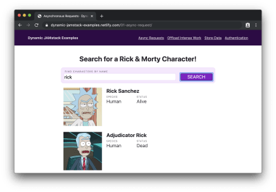
Search form filled with “rick” with characters named “Rick” displayed below.

We see search results after the form is filled out. (Large preview)

Hey! Did that static site just dynamically load data? Holy buckets!

You can try this out for yourself on the live demo, or check out the full source code for more details.

Handle Expensive Computing Tasks Off the User’s Device

In many apps, we need to do things that are pretty resource-intensive, such as processing an image. While some of these kinds of operations are possible using client-side JavaScript only, it’s not necessarily a great idea to make your users’ devices do all that work. If they’re on a low-powered device or trying to stretch out their last 5% of battery life, making their device do a bunch of work is probably going to be a frustrating experience for them.

So does that mean that JAMstack apps are out of luck? Not at all!

The “A” in JAMstack stands for APIs. This means we can send off that work to an API and avoid spinning our users’ computer fans up to the “hover” setting.

“But wait,” you might say. “If our app needs to do custom work, and that work requires an API, doesn’t that just mean we’re building a server?”

Thanks to the power of serverless functions, we don’t have to!

Serverless functions (also called “lambda functions”) are a sort of API without any server boilerplate required. We get to write a plain old JavaScript function, and all of the work of deploying, scaling, routing, and so on is offloaded to our serverless provider of choice.


Using serverless functions doesn’t mean there’s not a server; it just means that we don’t need to think about a server.

Serverless functions are the peanut butter to our JAMstack: they unlock a whole world of high-powered, dynamic functionality without ever asking us to deal with server code or devops.

Demo: Convert An Image To Grayscale

Let’s assume we have an app that needs to:

  • Download an image from a URL
  • Convert that image to grayscale
  • Upload the converted image to a GitHub repo

As far as I know, there’s no way to do image conversions like that entirely in the browser — and even if there was, it’s a fairly resource-intensive thing to do, so we probably don’t want to put that load on our users’ devices.

Instead, we can submit the URL to be converted to a serverless function, which will do the heavy lifting for us and send back a URL to a converted image.

For our serverless function, we’ll be using Netlify Functions. In our site’s code, we add a folder at the root level called “functions” and create a new file called “convert-image.js” inside. Then we write what’s called a handler, which is what receives and — as you may have guessed — handles requests to our serverless function.

To convert an image, it looks like this:

exports.handler = async event => {
 // only try to handle POST requests
 if (event.httpMethod !== 'POST') {
   return { statusCode: 404, body: '404 Not Found' };
 }

 try {
   // get the image URL from the POST submission
   const { imageURL } = JSON.parse(event.body);

   // use a temporary directory to avoid intermediate file cruft
   // see https://www.npmjs.com/package/tmp
   const tmpDir = tmp.dirSync();

   const convertedPath = await convertToGrayscale(imageURL, tmpDir);

   // upload the processed image to GitHub
   const response = await uploadToGitHub(convertedPath, tmpDir.name);

   return {
     statusCode: 200,
     body: JSON.stringify({
       url: response.data.content.download_url,
     }),
   };
 } catch (error) {
   return {
     statusCode: 500,
     body: JSON.stringify(error.message),
   };
 }
};

This function does the following:

  1. Checks to make sure the request was sent using the HTTP POST method
  2. Grabs the image URL from the POST body
  3. Creates a temporary directory for storing files that will be cleaned up once the function is done executing
  4. Calls a helper function that converts the image to grayscale
  5. Calls a helper function that uploads the converted image to GitHub
  6. Returns a response object with an HTTP 200 status code and the newly uploaded image’s URL

Note: We won’t go over how the helper functions for image conversion or uploading to GitHub work, but the source code is well commented so you can see how it works.

Next, we need to add a form that will be used to submit URLs for processing and a place to show the before and after:

<form
 id="image-form"
 action="/.netlify/functions/convert-image"
 method="POST"
>
 <label for="imageURL">URL of an image to convert</label>
 <input type="url" name="imageURL" required />
 <button type="submit">Convert</button>
</form>

<div id="converted"></div>

Finally, we need to add an event listener to the form so we can send off the URLs to our serverless function for processing:

<script type="module">
 import showResults from './show-results.js';

 const form = document.querySelector('form');
 form.addEventListener('submit', event => {
   event.preventDefault();

   // get the image URL from the form
   const imageURL = form.elements['imageURL'].value;

   // send the image off for processing
   const promise = fetch('/.netlify/functions/convert-image', {
     method: 'POST',
     headers: { 'Content-Type': 'application/json' },
     body: JSON.stringify({ imageURL }),
   })
     .then(result => result.json())
     .catch(error => console.error(error));

   // do the work to show the result on the page
   showResults(imageURL, promise);
 });
</script>

After deploying the site (along with its new “functions” folder) to Netlify and/or starting up Netlify Dev in our CLI, we can see the form in our browser:
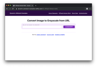
Empty image conversion form

An empty form that accepts an image URL (Large preview)

If we add an image URL to the form and click “convert”, we’ll see “processing…” for a moment while the conversion is happening, then we’ll see the original image and its newly created grayscale counterpart:
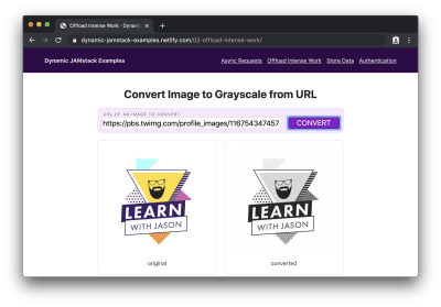
Form filled with an image URL, showing the original image below on the left and the converted image to the right

The image is converted from full color to grayscale. (Large preview)

Oh dang! Our JAMstack site just handled some pretty serious business and we didn’t have to think about servers once or drain our users’ batteries!

Use A Database To Store And Retrieve Entries

In many apps, we’re inevitably going to need the ability to save user input. And that means we need a database.

You may be thinking, “So that’s it, right? The jig is up? Surely a JAMstack site — which you’ve told us is just a collection of files in a folder — can’t be connected to a database!”

Au contraire.

As we saw in the previous section, serverless functions give us the ability to do all sorts of powerful things without needing to create our own servers.

Similarly, we can use database-as-a-service (DBaaS) tools, such as Fauna and Amplify DataStore, to read and write to a database without having to set one up or host it ourselves.

DBaaS tools massively simplify the process of setting up databases for websites: creating a new database is as straightforward as defining the types of data we want to store. The tools automatically generate all of the code to manage create, read, update, and delete (CRUD) operations and make it available for us to use via API, so we don’t have to actually manage a database; we just get to use it.

Demo: Create a Petition Page

If we want to create a small app to collect digital signatures for a petition, we need to set up a database to store those signatures and allow the page to read them out for display.

For this demo we’ll use Fauna as our DBaaS provider. We won’t go deep into how Fauna works, but in the interest of demonstrating the small amount of effort required to set up a database, let’s list each step and click to get a ready-to-use database:

  1. Create a Fauna account at https://fauna.com
  2. Click “create a new database”
  3. Give the database a name (e.g. “dynamic-jamstack-demos”)
  4. Click “create”
  5. Click “security” in the left-hand menu on the next page
  6. Click “new key”
  7. Change the role dropdown to “Server”
  8. Add a name for the key (e.g. “Dynamic JAMstack Demos”)
  9. Store the key somewhere secure for use with the app
  10. Click “save”
  11. Click “GraphQL” in the left-hand menu
  12. Click “import schema”
  13. Upload a file called db-schema.gql that contains the following code:
type Signature {
 name: String!
}

type Query {
 signatures: [Signature!]!
}

Once we upload the schema, our database is ready to use. (Seriously.)

Thirteen steps is a lot, but with those thirteen steps, we just got a database, a GraphQL API, automatic management of capacity, scaling, deployment, security, and more — all handled by database experts. For free. What a time to be alive!

To try it out, the “GraphQL” option in the left-hand menu gives us a GraphQL explorer with documentation on the available queries and mutations that allow us to perform CRUD operations.

Note: We won’t go into details about GraphQL queries and mutations in this post, but Eve Porcello wrote an excellent intro to sending GraphQL queries and mutations if you want a primer on how it works.

With the database ready to go, we can create a serverless function that stores new signatures in the database:

const qs = require('querystring');
const graphql = require('./util/graphql');

exports.handler = async event => {
 try {
   // get the signature from the POST data
   const { signature } = qs.parse(event.body);

   const ADD_SIGNATURE = `
     mutation($signature: String!) {
       createSignature(data: { name: $signature }) {
         _id
       }
     }
   `;

   // store the signature in the database
   await graphql(ADD_SIGNATURE, { signature });

   // send people back to the petition page
   return {
     statusCode: 302,
     headers: {
       Location: '/03-store-data/',
     },
     // body is unused in 3xx codes, but required in all function responses
     body: 'redirecting...',
   };
 } catch (error) {
   return {
     statusCode: 500,
     body: JSON.stringify(error.message),
   };
 }
};

This function does the following:

  1. Grabs the signature value from the form POST data
  2. Calls a helper function that stores the signature in the database
  3. Defines a GraphQL mutation to write to the database
  4. Sends off the mutation using a GraphQL helper function
  5. Redirects back to the page that submitted the data

Next, we need a serverless function to read out all of the signatures from the database so we can show how many people support our petition:

const graphql = require('./util/graphql');

exports.handler = async () => {
 const { signatures } = await graphql(`
   query {
     signatures {
       data {
         name
       }
     }
   }
 `);

 return {
   statusCode: 200,
   body: JSON.stringify(signatures.data),
 };
};

This function sends off a query and returns it.

An important note about sensitive keys and JAMstack apps:

One thing to note about this app is that we’re using serverless functions to make these calls because we need to pass a private server key to Fauna that proves we have read and write access to this database. We cannot put this key into client-side code, because that would mean anyone could find it in the source code and use it to perform CRUD operations against our database. Serverless functions are critical for keeping private keys private in JAMstack apps.

Once we have our serverless functions set up, we can add a form that submits to the function for adding a signature, an element to show existing signatures, and a little bit of JS to call the function to get signatures and put them into our display element:

<form action="/.netlify/functions/add-signature" method="POST">
 <label for="signature">Your name</label>
 <input type="text" name="signature" required />
 <button type="submit">Sign</button>
</form>

<ul class="signatures"></ul>

<script>
 fetch('/.netlify/functions/get-signatures')
   .then(res => res.json())
   .then(names => {
     const signatures = document.querySelector('.signatures');

     names.forEach(({ name }) => {
       const li = document.createElement('li');
       li.innerText = name;
       signatures.appendChild(li);
     });
   });
</script>

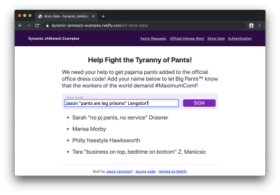
If we load this in the browser, we’ll see our petition form with signatures below it:
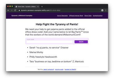
Empty petition form with a list of signatures below

An empty form that accepts a digital signature (Large preview)

Then, if we add our signature…

Petition form with a name in the field, but not submitted yet

The petition form with a name filled in (Large preview)

…and submit it, we’ll see our name appended to the bottom of the list:
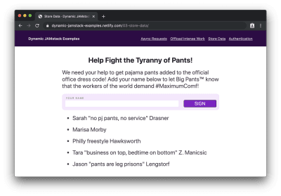
Empty petition form with the new signature at the bottom of the list

The petition form clears and the new signature is added to the bottom of the list. (Large preview)

Hot diggity dog! We just wrote a full-on database-powered JAMstack app with about 75 lines of code and 7 lines of database schema!

Protect Content With User Authentication

“Okay, you’re for sure stuck this time,” you may be thinking. “There is no way a JAMstack site can handle user authentication. How the heck would that work, even?!”

I’ll tell you how it works, my friend: with our trusty serverless functions and OAuth.

OAuth is a widely-adopted standard for allowing people to give apps limited access to their account info rather than sharing their passwords. If you’ve ever logged into a service using another service (for example, “sign in with your Google account”), you’ve used OAuth before.

Note: We won’t go deep into how OAuth works, but Aaron Parecki wrote a solid overview of OAuth that covers the details and workflow.

In JAMstack apps, we can take advantage of OAuth, and the JSON Web Tokens (JWTs) that it provides us with for identifying users, to protect content and only allow logged-in users to view it.

Demo: Require Login to View Protected Content

If we need to build a site that only shows content to logged-in users, we need a few things:

  1. An identity provider that manages users and the sign-in flow
  2. UI elements to manage logging in and logging out
  3. A serverless function that checks for a logged-in user using JWTs and returns protected content if one is provided

For this example, we’ll use Netlify Identity, which gives us a really pleasant developer experience for adding authentication and provides a drop-in widget for managing login and logout actions.

To enable it:

  • Visit your Netlify dashboard
  • Choose the site that needs auth from your sites list
  • Click “identity” in the top nav
  • Click the “Enable Identity” button

We can add Netlify Identity to our site by adding markup that shows logged out content and adds an element to show protected content after logging in:

<div class="content logged-out">
  <h1>Super Secret Stuff!</h1>
  <p>🔐 only my bestest friends can see this content</p>
  <button class="login">log in / sign up to be my best friend</button>
</div>
<div class="content logged-in">
  <div class="secret-stuff"></div>
  <button class="logout">log out</button>
</div>

This markup relies on CSS to show content based on whether the user is logged in or not. However, we can’t rely on that to actually protect the content — anyone could view the source code and steal our secrets!

Instead, we created an empty div that will contain our protected content, but we’ll need to make a request to a serverless function to actually get that content. We’ll dig into how that works shortly.

Next, we need to add code to make our login button work, load the protected content, and show it on screen:

<script src="https://identity.netlify.com/v1/netlify-identity-widget.js"></script>
<script>
 const login = document.querySelector('.login');
 login.addEventListener('click', () => {
   netlifyIdentity.open();
 });

 const logout = document.querySelector('.logout');
 logout.addEventListener('click', () => {
   netlifyIdentity.logout();
 });

 netlifyIdentity.on('logout', () => {
   document.querySelector('body').classList.remove('authenticated');
 });

 netlifyIdentity.on('login', async () => {
   document.querySelector('body').classList.add('authenticated');

   const token = await netlifyIdentity.currentUser().jwt();

   const response = await fetch('/.netlify/functions/get-secret-content', {
     headers: {
       Authorization: `Bearer ${token}`,
     },
   }).then(res => res.text());

   document.querySelector('.secret-stuff').innerHTML = response;
 });
</script>

Here’s what this code does:

  1. Loads the Netlify Identity widget, which is a helper library that creates a login modal, handles the OAuth workflow with Netlify Identity, and gives our app access to the logged-in user’s info
  2. Adds an event listener to the login button that triggers the Netlify Identity login modal to open
  3. Adds an event listener to the logout button that calls the Netlify Identity logout method
  4. Adds an event handler for logging out to remove the authenticated class on logout, which hides the logged-in content and shows the logged-out content
  5. Adds an event handler for logging in that:
    1. Adds the authenticated class to show the logged-in content and hide the logged-out content
    2. Grabs the logged-in user’s JWT
    3. Calls a serverless function to load protected content, sending the JWT in the Authorization header
    4. Puts the secret content in the secret-stuff div so logged-in users can see it

Right now the serverless function we’re calling in that code doesn’t exist. Let’s create it with the following code:

exports.handler = async (_event, context) => {
 try {
   const { user } = context.clientContext;

   if (!user) throw new Error('Not Authorized');

   return {
     statusCode: 200,
     headers: {
       'Content-Type': 'text/html',
     },
     body: `
       

You're Invited, ${user.user_metadata.full_name}!

If you can read this it means we're best friends.

Here are the secret details for my birthday party:
jason.af/party

`, }; } catch (error) { return { statusCode: 401, body: 'Not Authorized', }; } };

This function does the following:

  1. Checks for a user in the serverless function’s context argument
  2. Throws an error if no user is found
  3. Returns secret content after ensuring that a logged-in user requested it

Netlify Functions will detect Netlify Identity JWTs in Authorization headers and automatically put that information into context — this means we can check for a valid JWTs without needing to write code to validate JWTs!

When we load this page in our browser, we’ll see the logged out page first:
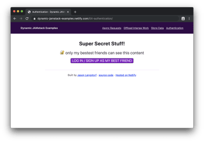
Logged out view showing information about logging in or creating an account

When logged out, we can only see information about logging in. (Large preview)

If we click the button to log in, we’ll see the Netlify Identity widget:
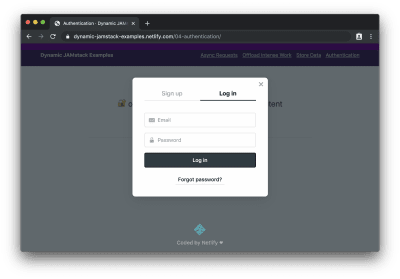
A modal window showing sign up and login tabs with a login form displayed

The Netlify Identity Widget provides the whole login/sign up experience. (Large preview)

After logging in (or signing up), we can see the protected content:

Logged in view showing information about a birthday party

After logging in, we can see protected content. (Large preview)

Wowee! We just added user login and protected content to a JAMstack app!

What To Do Next

The JAMstack is much more than “just static sites” — we can respond to user interactions, store data, handle user authentication, and just about anything else we want to do on a modern website. And all without the need to provision, configure, or deploy a server!

What do you want to build with the JAMstack? Is there anything you’re still not convinced the JAMstack can handle? I’d love to hear about it — hit me up on Twitter or in the comments!

(dm, il)
Categories: Others Tags:

Less is (Almost) Definitely More: An Introduction to Hick’s Law for Web Designers

December 18th, 2019 No comments

Imagine the public excitement when, in 1951, William Edmund Hick (“Hickey” to his friends?!) and Ray (with an “a”) Hyman published research about people’s responses to a bunch of flashing lights. I’m sure no-one could imagine how important this work would be for the information age since, of course, at that time, a bank of flashing lights was pretty much the height of technological sophistication.

More accurately known as the Hick-Hyman law, their research draws the (not really earth-shattering) conclusion that the more options you have to choose from, the longer it takes you to choose — we’re still waiting to see what they thought about the wetness of water.

Yes, alright.

There are, in fact, some really important implications of this law. It touches disciplines as diverse as Aviation, Self Defence and, of course, Web Design. Here’s how it works:

What is Hick’s Law?

In simple(ish) terms, Hick and Hyman both found that, when people are presented with more choices, the increase in their response time is logarithmic. This just means that, as the number of choices increases, the response time increases at a decreasing rate. In the end, increasing the number of choices stops making much difference. ?

Don’t panic, here’s a picture:?

You can think of the horizontal axis as the number of items to choose from, and the vertical axis as time. Notice, that for 1 item, the choice time is 0. Adding more choices makes a big difference in the beginning, but much less towards the end.

This law really only applies for sorted lists and tends to break down as choices become more complex, as we’ll see.

It actually describes a kind of binary search. Those of you who got further in computer science than I did will recognize that this means half of the remaining items are searched at a time. The remaining half is subdivided, one half of it is searched and so on. In human terms, it’s like narrowing down the search of, say a buffet table, by deciding if you’re going to start on the right or left. Then, having chosen the right side, deciding whether to start with soup or salad.

The law applies equally to the number of stimuli (say, menu items) and the number of responses. So a menu like this:

will take more time to process than a menu like this:

If you can’t break down the choices logically (because the list is random, for example), searching in a binary fashion won’t help. This is also true in situations where you’re familiar with the interface, or guess (correctly) in advance which choices you’ll be offered. These, then are exceptions to Hick’s Law.

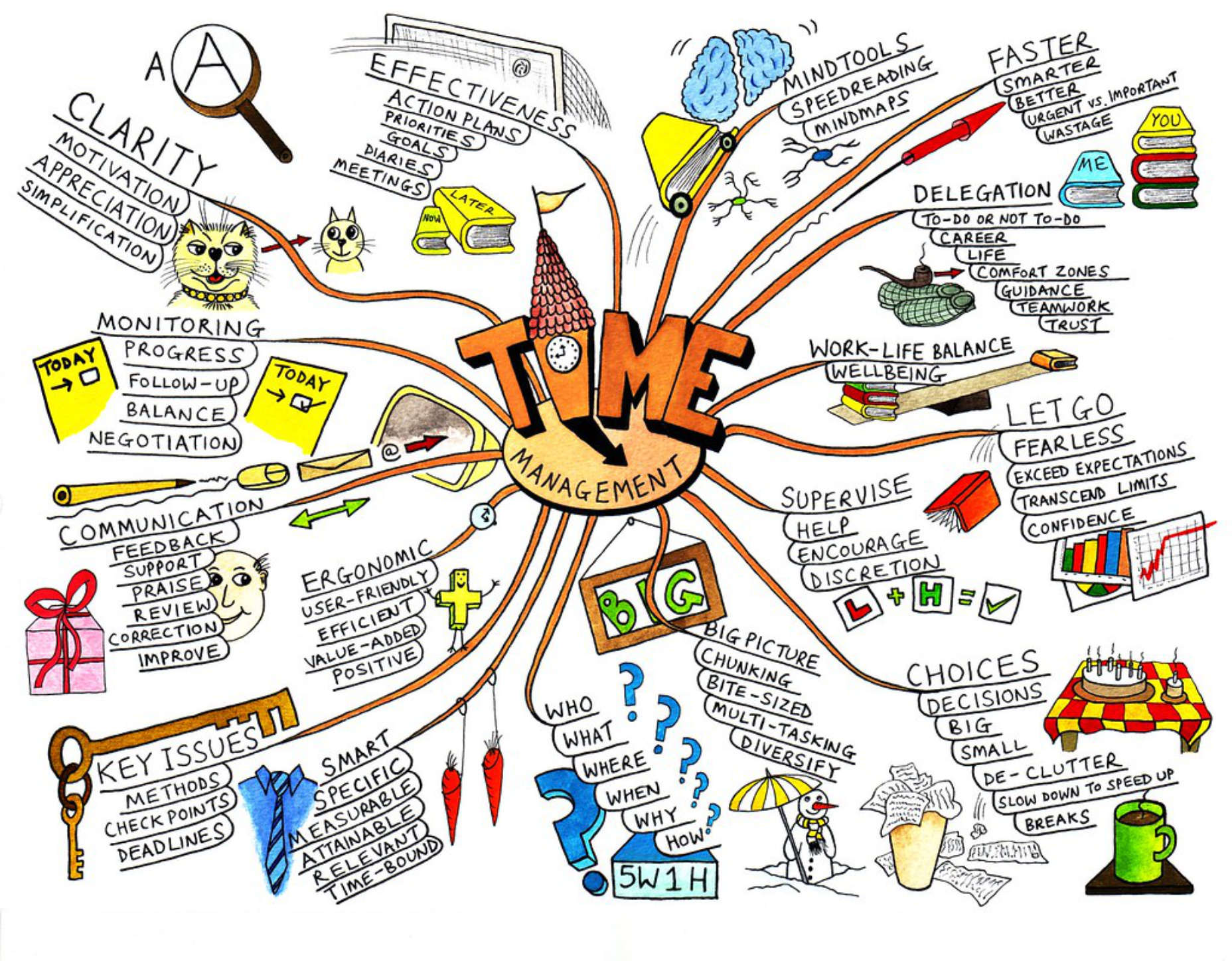
It doesn’t really apply, for example, when deciding “how to manage your time”…

Time Management Choice by Jean-Louis Zimmerman via Flickr.

Relevance to Web Design

Here’s a simple rule: The longer it takes to make a choice, the easier it becomes to make no choice at all. Don’t be that designer! Most of the time, less is more.?

There are four performance metrics that are strongly affected by Hick’s law:

  • Bounce
  • Engagement
  • Average Time on Page
  • Subjective User Experience?

If you’ve got your UX head on, you’ll realize, of course, that each of these affects your traffic, search ranking, and ultimately — if it’s a money-making business — revenue. Let’s look at each in turn:

Bounce

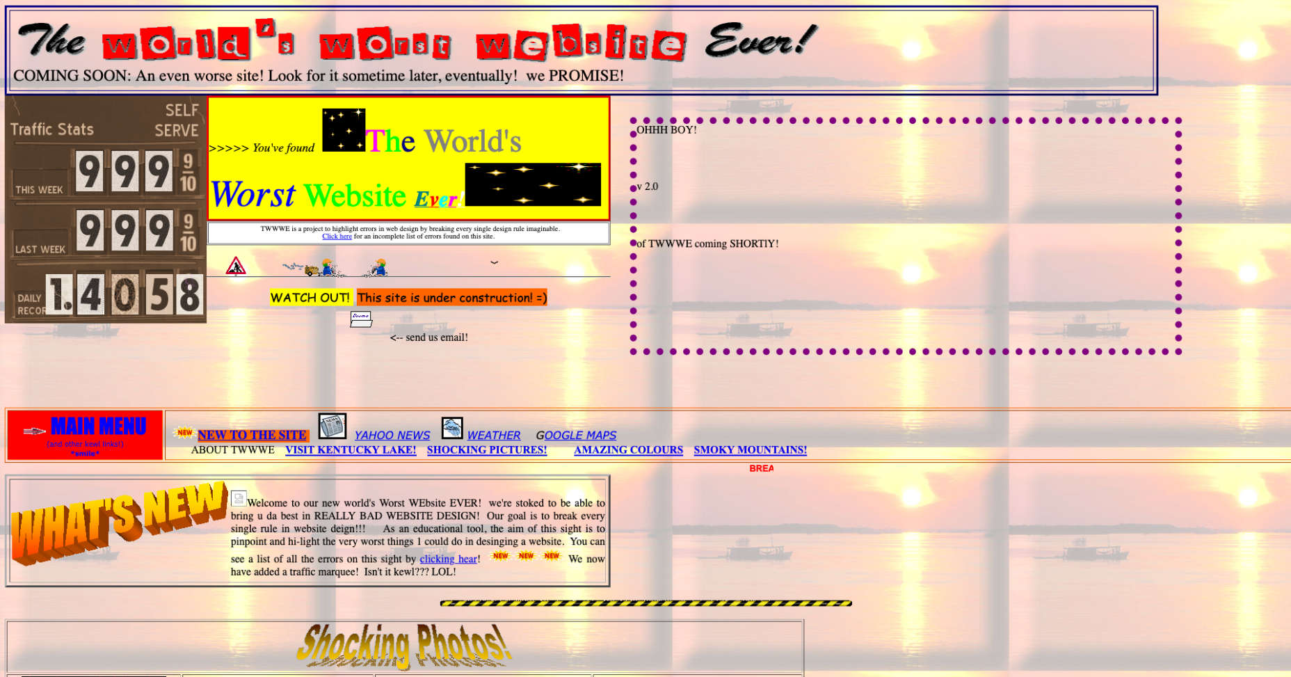
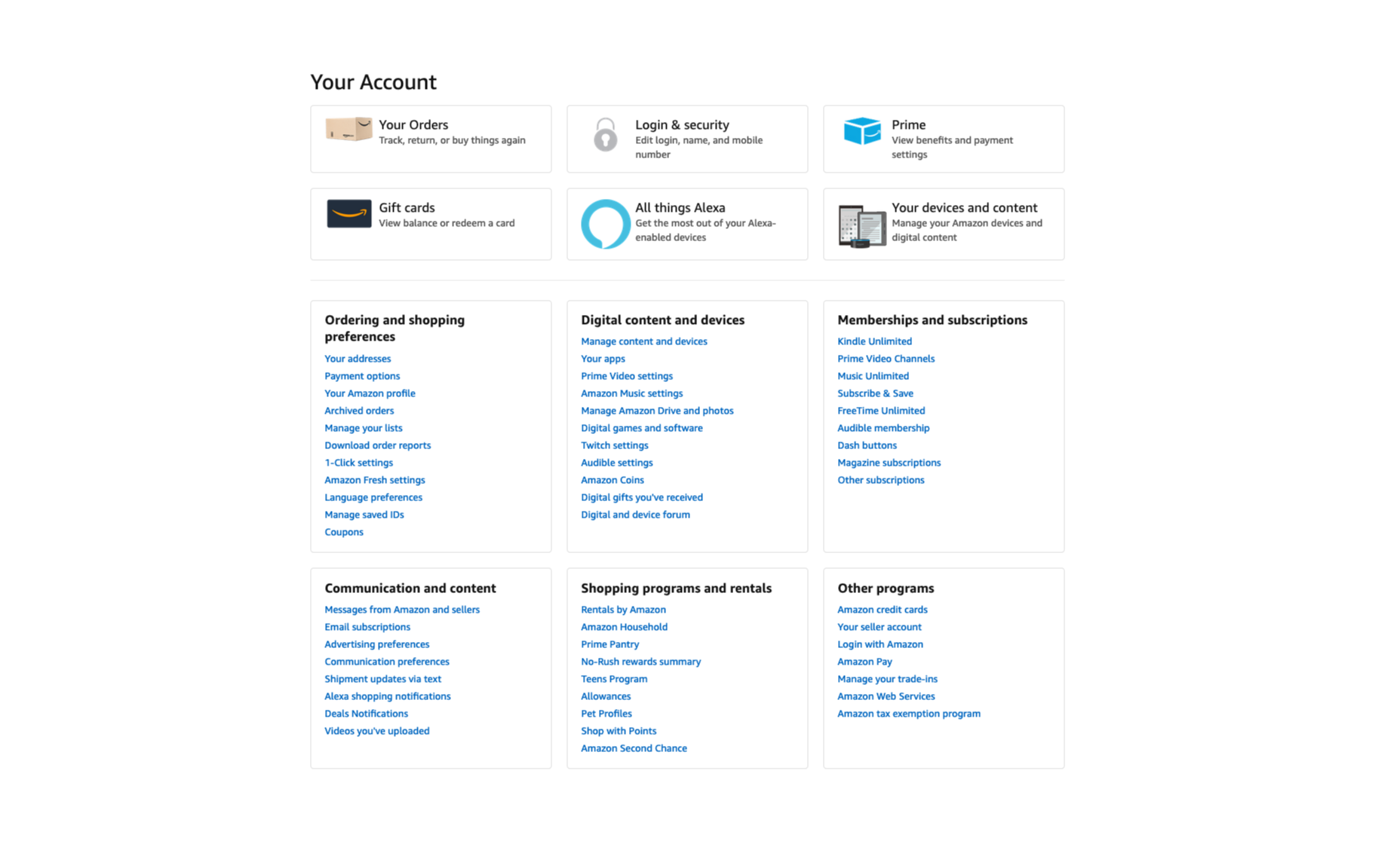
The big problem here is information overload. If you arrive on a landing page and see something like this:

You “might” start by trying to make a decision about where to go next, but pretty soon you’re going to just, err… go. This is one good reason why less is more.

Engagement

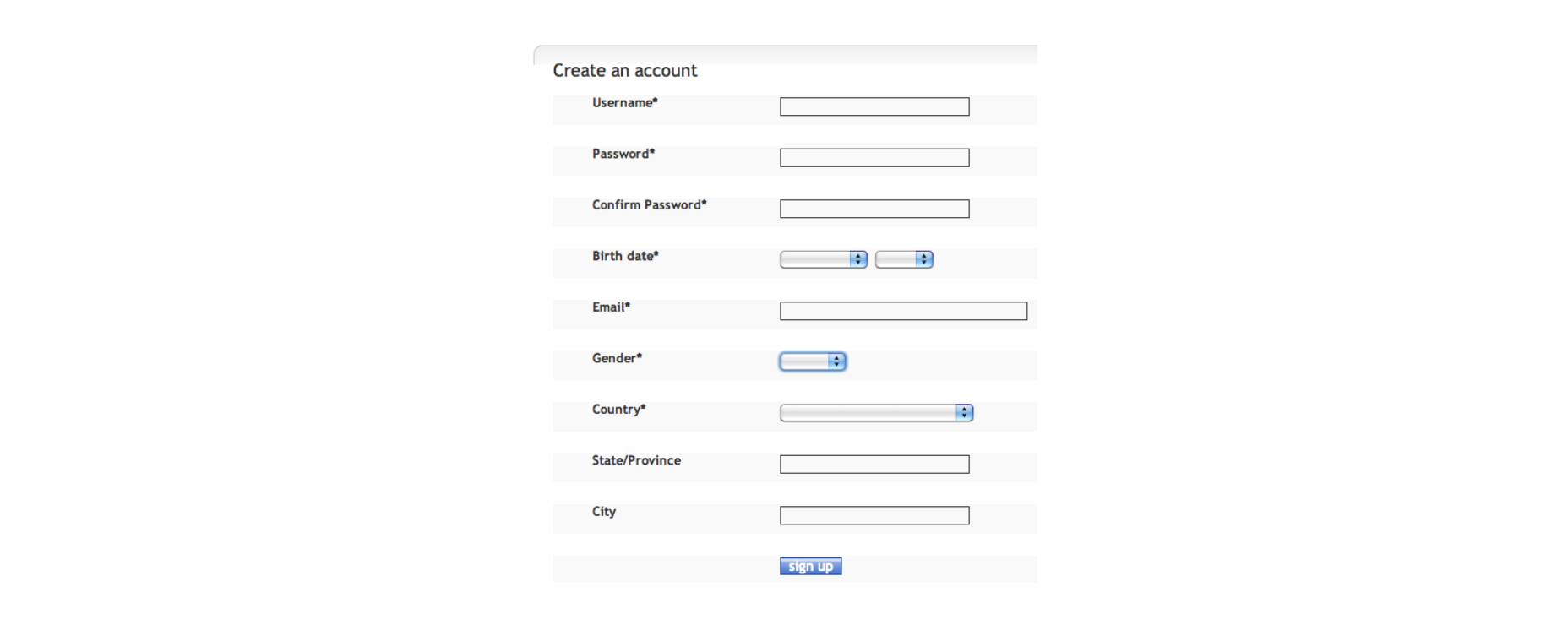
Users don’t want to be faced with tough decisions or to spend a lot of time getting through things like registration. They want to get to the content they’re looking for as fast as possible. If your sign up process looks like this:?

You’d probably be better off with something like this:?

Even if you then go on to ask them more information, you can do it in small chunks. If not you risk losing people halfway through.

Average Time on Page

This is one situation where less may not be more: the more items you have on the page or in a menu — as Hick’s law tells you — the longer they’ll spend on it. The gamble is that having too many items will risk a bounce.

Subjective User Experience

In many ways, what users say or feel about their experience is more important than any hard metric. Take frustration for example. If you’ve never seen “User Inyerface” and/or never felt frustration, try it, it’s hilarious. And also not.

From a Hick’s law point of view, User Inyerface illustrates three really important things:

  • If you can’t find an option, it doesn’t count as an option.
  • Unless you use a consistent method for identifying potential choices (a mouse-pointer change or relevant label, for example), everything becomes a potential choice!
  • Frustration is a powerful driver to abandon any activity, no matter how much you might want to complete it.

Chances are you’ll spend a couple of minutes on that site (great for AToP and Bounce) but never, ever, go back again.

Important Uses for Hick’s Law

Hick’s law is powerful but doesn’t apply in every situation. As a web designer, you can exploit both these facts to your advantage.

Group Menu Items Together

Using meaningful headings: product categories, for example, turns one massive choice into lots of smaller ones:?

Decision times will be shorter, and your users will get a fast, breezy experience.

Consider Contrast

By using contrasting color, shape, size and texture, you can indicate choices more clearly. As well as a way of grouping similar or important options, this uses familiarity to decrease response times and improve user experience. A good example of this is in guiding users towards “safe” options to help them avoid negative outcomes.

Think About Goals

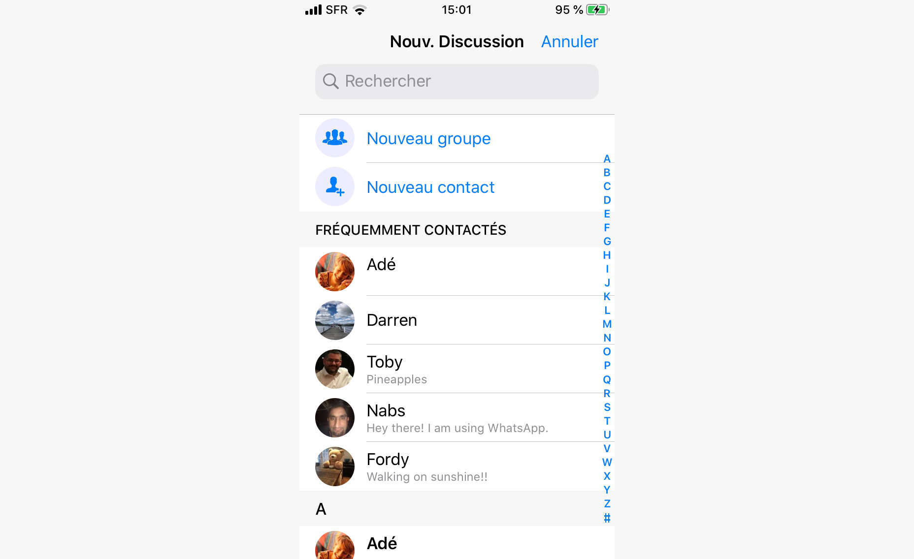
Remember that the decision-making process always begins with a goal. Understand the most likely goals of your users. When ordering and grouping menus, think about how users will segment their choices. WhatsApp, for example, offers 5 “Frequent Contacts” before presenting an alphabetical list.

Research and Test

Don’t leave it to chance. Find out what works for other sites, and, more importantly for your users before going live.

Exceptions to Hick’s Law

Exceptions to Hick’s law, aside from long, unordered lists (which you want to avoid at all costs), involve cases where there is familiarity, and users can guess what’s coming next.

Meet Expectations

There are clear conventions for things like buttons, links, information hierarchy and standard icons. By adhering to these conventions you’ll allow your users to break Hick’s Law and save time in their decision making, even when there are a lot of options.

Don’t Forget Your Users

You know your site or application really well so, in testing your own work, your experience will be much smoother than theirs. Get other people to test it for you before the client does.

Key Points

Hick’s Law means that the more choices you offer to your users, the longer it will take them to pick one. In a web design context, long choice times tend to mean higher bounce, lower engagement and more user frustration. That’s why, in general, less is always more.

The law is based on binary choice, so it’s important to segment the choices you present, and order them in clear, logical, user-centered ways. This will help to break large menus up into smaller “sub choices”. You can find creative ways to do this with things like color, shape and texture.

Where average time on page is concerned, there’s a balance to be struck between decreasing choice time, and holding attention. Realistically, though, UX is more important than metrics.

Source

Categories: Designing, Others Tags:

Design APIs: The Evolution of Design Systems

December 17th, 2019 No comments

A clever idea from Matthew Ström:

[…] design APIs don’t seem like a stretch of the imagination. An API-driven approach is the natural extension of the work currently being done on design systems, including tokens and standardization projects.

If you buy into the idea of design tokens, that expresses itself as a chunk of JSON with things like colors and spacing values. No reason an API couldn’t deliver that, potentially empowering a build process that pulls the most recent decisions from a central location.

Direct Link to ArticlePermalink

The post Design APIs: The Evolution of Design Systems appeared first on CSS-Tricks.

Categories: Designing, Others Tags:

The Order of CSS Classes in HTML Doesn’t Matter

December 17th, 2019 No comments

That’s right! And I can prove it, too. Let’s look at some CSS first:

.a {
  color: red;
}

.b {
  color: blue;
}

And now let’s look at some markup:

<div class="a b">Here's some text</div>

The text is going to be blue because .b is defined last in the CSS, right? But what if we go about and switch the order in which those classes are called in HTML:

<div class="b a">Here's some text</div>

What color do you think the text should be? Red or blue?

This certainly might sound like a silly question but it tends to trip up a lot of folks who happen to be familiar with CSS-in-JS solutions. And this week I’ve spoken to two very senior front end engineers who thought similarly as well!

But the text in the example above will always be blue no matter what order those CSS classes are in. And that’s because the markup is just reading the CSS in the order that it’s written — the cascade wins in this example.

The post The Order of CSS Classes in HTML Doesn’t Matter appeared first on CSS-Tricks.

Categories: Designing, Others Tags:

The JAMstack Landscape

December 17th, 2019 No comments

It’s no big secret that Netlify invented the term JAMstack. While it’s possible to embrace the JAMstack without using Netlify, it’s notable that Netlify is at the very heart of the whole “JAMstack landscape.”

What does “JAMstack landscape” even mean? I like the term because it sets the stage that JAMstack isn’t just this one thing, but a way of building sites by piecing together a bunch of different ideas, the most important of which is static file hosting. It’s so important, I one jokingly called it SHAMstack. With static hosting at the core, it means that everything else you need to do can’t rely on hosted server-side languages, at least not right alongside the production website on the same server.

Without any server-side language available, how do you process your forms? Netlify does it for you. But there are a bunch of other services out there also.

What if you need to do your own special processing of data? That’s what cloud functions are for, and Netlify does it for you, but there are other services in the space.

What if you need a login system? Netlify does that along with other companies.

So that’s what “landscape” means. There are lots of companies, all involved in some slice of this pie. That’s something that makes Netlify so interesting. You can use them for just about every slice of that pie, and it’s a damn tasty pie (i.e. they do a great job of all the services they offer).

If it’s helpful to visualize, every time a hear JAMstack landscape mentioned, it’s always accompanied by this image from crv.com and this image from Redpoint.

The post The JAMstack Landscape appeared first on CSS-Tricks.

Categories: Designing, Others Tags:

The New Facebook Logo and Reasons Behind This Change

December 17th, 2019 No comments
new facebook logo

new facebook logo 2019

[source]

Facebook has been around for 15 years and we all know that it needs little to no introduction.

With a boasting 1.63 billion daily active users, Facebook is easily the most popular app to date.

Since 2004, Facebook has been connecting friends and family from all over the globe.

We probably all use it, and we probably use more Facebook apps than we think.

Facebook is the parent company of 74 companies total, which include some of the most popular apps out there, such as Instagram, Whatsapp, Oculus VR and more.

So what started as a single app, grew into something bigger. Connecting families and loved ones from across the world, helping businesses grow, and find other communities.

[source]

But Facebook is more than just a social app. They have an astounding 43,000+ employees that work in over 60 offices around the world.

And although they do have great apps that we all probably enjoy using or enjoyed using at one time, we can’t forget about the major scandal of selling private information that went down last year.

But we’re not here to talk about that today.

Today we are talking about Facebook’s new logo design that was created in-house by Dalton Maag and Saffron.

To quote the reason why they’re updating their logo…

“The new company branding is designed to help us better represent the diversity of products we build, establish a distinction from the Facebook app and communicate our purpose in the world.

Through the process [of redesigning], three foundational design behaviors that informed our brand system emerged:

  • Clarity: a brand that simplifies and builds understanding
  • Empathy: a system that is respectful of context and environment
  • Creating Space: design that supports people and their stories”

[source]

Think of the new logo redesign as a design for the parent company. This way the logo can be distinguished from the app to the parent company.

“Today, when people hear “Facebook” they think of the Facebook app. This posed a unique design challenge. We needed the wordmark to establish distinction from the Facebook app and allow for a clearer connection to the full family of technologies. The new brand system uses custom typography, rounded corners, open tracking and capitalization to create visual distinction between the company and the app.”

facebook corporation new logo

[source]

As opposed to the Facebook app logo, the corporate logo is written in all caps, in a unique font that was designed in-house. It was designed with an openness of mind and clarity. With a horizontal structure and consistent stroke width, I can’t deny that the new corporate Facebook logo is as beautiful as it is simple.

You may be wondering what color the Facebook corporate logo will be. There is a more complicated answer to that.

The new logo will be fluid when it comes to color. It will adjust according to its environment and present a matching color or gradient. This is great because it could match the green of Whatsapp, the beautiful Instagram color gradient, or the recognizable blue of Facebook.

new facebook logo

I personally like the simplicitiy of the new Facebook logo.

But I want to know what you guys have to say. What do you think? Are you here for it, or will you have to go with a hard pass?

Let us know in the comment section down below.

Until next time,

Stay creative, folks!

Read More at The New Facebook Logo and Reasons Behind This Change

Categories: Designing, Others Tags:

Smashing Podcast Episode 5 With Jason Pamental: What Are Variable Fonts?

December 17th, 2019 No comments
Jason Pamental

Smashing Podcast Episode 5 With Jason Pamental: What Are Variable Fonts?

Smashing Podcast Episode 5 With Jason Pamental: What Are Variable Fonts?

Drew McLellan

2019-12-17T05:00:00+00:002019-12-17T10:08:34+00:00

In this episode of the Smashing Podcast, we’re talking about variable fonts. What are they, how do they differ from regular fonts, and how can they help in the design and performance of our websites? Drew McLellan talks to a font of knowledge on the matter, Jason Pamental.

Show Notes

Weekly update:

Variable Fonts

Transcript

Drew McLellan: He’s a design strategist, UX leader, technologist, expert in web typography, and invited expert on the W3C Web Fonts Working Group. He writes, speaks, and works with teams and brand owners on how to set type better on digital platforms. He’s spoken with organizations like Adobe, Audible, Condé Nast, GoDaddy, IBM, and given presentations and workshops and conferences all over the world. His newsletter, Web Typography News, is popular with those wanting latest updates and tips on typography on the web. He’s clearly an expert in web typography. But did you know he represented Sweden at Lawn Croquet in the 1984 Olympic Games? My smashing friends, please welcome Jason Pamental. Hello, Jason. How are you?

Jason Pamental:I’m smashing. Especially after that intro.

Drew: I wanted to talk with you today obviously about web typography because that’s really your thing. You are a real expert with web typography. About that in general, but in particular, talk a little bit about variable fonts. I’ll be the first to admit I’m no typography expert. I mean, please consider me as uninformed as anyone listening. You cannot patronize me with any information about typography. I guess we’ve had usable web fonts on the web for probably about a decade now. Is that right?

Jason:Yeah. Actually, wasn’t it you that started something on Twitter a couple days ago? It was like November 9th in 2009. It’s like 10 year in two days since Typekit launched. I know Font Deck was right in the same time frame. Then Google Fonts and Monotype Service not long after. I had a beta invite that was given to me by my friend, John Cianci, who is actually now still a colleague of my wife’s at the agency where she works to Typekit sometime in 2009. That was a complete reinvention of my interest in the web. I mean, it was nothing short of a revolution for me. I mean, I’d always loved typography when I’d studied it in school, but we couldn’t do anything with it on the web for 15 years. That was pretty amazing.

Drew: There must be designers working on the web now having had web fonts for 10 years plus potentially. There are designers working on the web now who have never designed a site without the ability to select from a huge range of typefaces.

Jason:Yeah, it’s true. Nobody without that experience had to push the pixels uphill in both directions like we did growing up. We’re not some cranky old men shaking their fists at the sky. But yeah, it is kind of amazing just with all of the things that have changed on the web, the idea that some people never experienced in any other way is remarkable.

Drew: By the time we got web fonts, that was a massive shift in how we started to use typography on the web because we could really start to use typography on the web. There were obviously things that we could do with web safe fonts, but we were pretty limited to a very restricted palette. But there’s potentially now another big shift almost as significant perhaps with variable fonts. I mean, what are variable fonts? What do they do for us? Where do we begin?

Jason:I always try and start with giving people a frame of reference. So when we think about using fonts on the web, the thing we have to remember is that currently with “traditional” fonts, every font is an individual width, weight, slant, variant of that typeface. For every one we want to use on the web, we have to load a file. For a typical website where you’re using it for body copy, you’re loading, usually, four fonts: the regular, bold, italic, and bold italic. All of those things have to get loaded. Each one of those is a little bit of data that has to be downloaded and processed and rendered.

Jason:So typically, what we’ve done over the years is constrain ourselves to using that very small number of fonts, which is actually not particularly great typography practice. It’s much more common in graphic design to use a much broader range. You might use eight or 10 different weights and variants of a typeface in a given design. On the web, we’ve been very constrained because of performance. The big difference in a variable font is all of those permutations, those variations are contained in a single file. That format is really efficient because what it’s doing is storing the regular shape of that character and then what are called the deltas of where the points along those curves would move to render it as bold or thin or wide or narrow.

Jason:So by only storing the differences, you don’t have to store the whole outline. It’s a much more efficient format. While it’s not as small as a single font file, it’s still much smaller than all of the individual ones taken separately. If you look at something like Plex Sans from IBM, all of those separate files might be nearly a megabyte where two variable font files that contain all the widths and weights in the upright in one file, the italics in the other is like 230K. That’s for really, really complete character sets. Most people could use a subset of that and get it even smaller. I’ve generally been seeing those file sizes around 50 to 100K for a typical Western language website need. That’s not that different from loading… Once you load three or four individual font files, you’re probably loading more data than that. It’s an interesting win for performance, but it also then opens up the whole range of the typeface for us to use on the web through CSS.

Drew: So it’s almost like delivering the recipe rather than the meal. Rather than here’s the italic version, here’s the bold version. It’s like, “Here’s the regular version and to make it italic, you would do this, to make it bold, you would do that.” That reduces the file size that goes down over the wire.

Jason:Yeah. Well, in a way, it’s giving you all the ingredients and then you can make any recipe you want. Because you could really go everywhere from… To go back to the Plex example, from 100 to 700 weight where 700 is sort of the typical bold, 400 would be kind of a normal weight. But then you have much lighter. So you could do really big and really fine line headings or block quotes or different items or like emphasis, and then be able to kind of modulate what you want bold to be at different sizes. There’s all kinds of different things that you can do for better typography, better user experience, all the while getting better performance. That’s the gatekeeper.

Drew: So there’s almost an infinite number of tweaks of steps between what we would think of today as regular and bold? You actually got the ability to go anywhere along that axis to tweak between the two?

Jason:Right. What I think is really exciting to me as somebody that studied graphic design and has looked fairly closely at print design for many years, the idea of what bold is really should change based on the size of the text that you’re rendering. So by default, that 400 and 700 for normal and bold is kind of what the web defaults to. But in truth, the only reason you’re calling out bold is you want some emphasis, you want something to stand out. But the heavier the font gets out of small size, the harder it is to read. It kind of fills in the little open spaces. Instead of using 700 for body copy when it’s set at that roughly 16 pixel size or whatever we’re using there, you use maybe 550, 575 where you get enough emphasis but the letter forms are still more open. Then as it gets bigger, you might use a heavier weight.

Jason:But again, it’s sort of your choice at that point. By modulating that for getting the right level of emphasis, but still maintaining really good legibility, we have so much more flexibility. I’m really hoping that as these become more popular and more widely used, that we can start to teach people to be a little bit more nuanced with the way they use that range and actually get more expressive and also more readable at the same time.

Drew: One thing I’ve noticed implementing designs as a front end and implementing designs that I’ve been given is that different color contrast combinations and light text on a dark background versus dark text on light background, the weights can look completely different. So presumably, this would help to even out and sort of finesse the visual and the reading experience based on changes like that?

Jason:Absolutely. That’s one of the things that I usually will showcase in workshops and talks is adding in support for that light mode media query. You can flip that contrast but then you do want to do it in kind of a nuanced way. Depending on the typeface, it can end up looking really heavy or kind of spindly with a serif typeface. Sometimes you want to go a little heavier or a little lighter, but you then also tend to need to space the lettering out when you have it on a dark background or else the letter forms kind of bleed together. There’s little things that you can adjust in the typography. The media query is dropped dead simple. I mean, it’s like two lines of code to add that to your site. Then it’s what you do with that. It’s not necessarily just inverting the colors. Sometimes you need to adjust for contrast, but also tweak the type itself for better legibility.

Drew: So presumably, it’s not just weight that can be varied in a variable font. There are other ways we can change our font as displayed?

Jason:Yeah. It’s completely up to the type designer. I think it’s really good to reinforce that this is not a free for all in the browser. The browser can only render what has been enabled in the font. Ultimately, it’s the type designer who says the weight ranges this to this. You might have a width axis. It would get a little bit narrower or a little bit wider, but there’s also the ability to have what are called registered axes. There’s width, weight, slant, italic, and optical size. Those are all sort of core things that are mapped to CSS properties. Slant allows an angle in between one and another, so upright and I’ve actually seen ones with a reverse slant as well as a forward slant. That’s totally open. Italic is generally on or off but not necessarily. You can actually have… Well, there are type designers that have experimented with changing the letter forms over gradually as you shift from normal to italic, and sort of substituting letters along the way. That’s kind of an interesting thing.

Jason:But then there’s the ability to have custom axes. The type designer can define whatever custom axes they want to vary. You’ve seen ones that add sort of a gravity spread drippiness and all kinds of fun twisting shapes, or extending serifs, changing the height of the ascenders and descenders. On the lowercase letter forms, changing whether or not they are serifs or not. There’s all kinds of things that you can do. It’s really up to the imagination of a type designer. I think we’re only scratching the surface as to what could realistically happen with all those things. It’s all accessible through CSS.

Drew: Yeah. All of these properties can be tweaked just through the normal CSS that you’re delivering with the rest of your design. What sort of things can we do in CSS to sort of trigger those changes? Is it just like we would do with a responsive layout where we have media queries to trigger that?

Jason:There’s all kinds of ways you can do it. There’s a small change that you have to make. I’m assuming that we’ll provide a bunch of links to some stuff that will help people kind of play around with this stuff. I mean, I’ve written a bunch. Hopefully, that will help people out. Then on the use side, the font weight axis is just mapped to font weight. Instead of saying regular bold, you just supply a number. You can change that with media queries. You can change it with JavaScript. You can kind of do it whatever you want with that. I’ve been using a technique called CSS Locks that I learned from Tim Brown to basically use math. CSS custom properties and calculations to scale it from, once you hit a small break point up to a large break point, it kind of smoothly scales the font size and line height.

Jason:Then you can also use a little bit of JavaScript to do the same thing with their weight if you want to. The weight axis maps to font weight, the CSS property. The width axis in the font will map to font stretch, and that’s just expressed as a percentage. I should note that many type designers are not necessarily thinking through how this is expressed so you might see weight ranges that do weird things like go from 400 to 650. You still have to express it as a percent, but it works. It’s fine. You just need to know what normal is and all the fonts are documented. Then with anything other than those two, currently, there’s a little bit uneven support in the implementation for slant and italic. A lot of those things you sort of need to fall back to using font variation settings and then you can supply several things at once. It’s kind of like font feature settings. It’s sort of a lower level syntax where you can supply a comma separated list of this four letter axis and the value, the next one, the next one.

Jason:The one thing that people need to keep in mind is that when you use font variation settings, you lose all the semantic understanding of that and you lose the fallback. Font weight and font stretch are universally supported in all the browsers. You should definitely use those attributes. For anything else, you might use font variation settings. But the advantage to using font weight the way you normally would is if the variable font doesn’t load, the browser can still do something with that. Whereas if it doesn’t understand variable fonts, or it doesn’t load, if everything is in font variation settings, then you lose all of the styling information. That’s just a little side note there just in terms of what is supported where. But I should also say that it is supported in all the shipping browsers that you’re likely to encounter in most circumstances. I-11 doesn’t work, but you can deliver static web fonts, and then use ad supports in your CSS to change over to the variable fonts. Then you’ll avoid any duplicate downloads of assets and it works really well. I have that in production on several sites already.

Drew: I think like many of the sort of more modern web technologies you’re seeing, if there’s a variable font that has been bubbling away quietly for a while, and is only when it sort of finally boils over and we get support in browsers and people like yourself making noise about it and letting everyone know that it’s there. It can almost feel to the standard designer or developer who’s just day-to-day getting on with their job and not tracking all the latest downloads. It can seem like it’s come out of nowhere. But I guess this has been bubbling away for quite… I mean, you mentioned the two slightly different implementations that we’re now dealing with. There’s a sort of older and a newer standard for implementing?

Jason:Well, it’s actually not older and newer. They’re both very intentional. I’ll come back to that in a second because it is really worth kind of understanding what the difference is with those. But you’re right. The format was introduced just over three years ago, was in September of 2016. We actually had the first working implementation in the nightly build of Safari three weeks later. It was pretty remarkably quick that we had working browser. Safari was the first one to ship full support for it. I think it was when High Sierra came out. I don’t know, it was like Safari 12 or something like that.

Jason:But not that long after, we ended up getting support shipped in Firefox, Edge, and Chrome. We’ve actually had browser support for almost two years. But there weren’t a ton of fonts. There’s been this sort of steady evolution. The support for using them on the web has actually been there longer than anywhere else. I mean, technically, this format works on desktop OS as well. So if you have a TTF format, you can install it in your desktop OS on Windows or Mac, and you can use it in any application. You can’t always get to vary the axes the way you might want to play with them kind of infinitely, but there are this notion of named instances embedded in that font file that map it back to what we’re used to.

Jason:In Keynote, for example, there’s not explicit support for variable fonts, but the format does work if there are things like in Tech Sense, again, condensed, light. You’ll have those normal, regular, regular bold, narrow, etc, all would be available in a drop down menu just like installing the whole family. Then if you’re in Illustrator or Photoshop or now InDesign that just shipped last week or Sketch that shipped a couple weeks ago, they all support variable fonts now, so that you can then access all of the different axes and play with it to your heart’s content. But in the browser, that’s where we’ve had a lot more to work with. Taking a cue from your wife, I have been kind of beating this drum for a while trying to get people to be more aware of it. Then thanks to the work that the Firefox team has done in creating developer tools. With Jen Simmons kind of pushing that along, we have incredible tools to work with on the browser that help us understand what the fonts are capable of.

Drew: You mentioned type designers and the font capabilities. There are lots of fonts that are available?

Jason:Well, a lot of people are doing it now. Probably the best and most comprehensive place to go look for them is Nick Sherman’s site, v-fonts.com, v-fonts.com. That’s just a catalog site. It’s rapidly becoming really, really big. There’s more variable fonts coming out all the time now. There’s not a huge number of open source ones, but if you search on GitHub for variable fonts, you actually will find a whole bunch of projects there. But Google has launched a beta of their new API with about a dozen variable fonts available there. There’s more coming from them. They just released Recursive at recursive.design, which is a fantastic new typeface from Stephen Nixon. The Plex variable, one is available, that’s open source. Then there’s tons of commercial ones.

Jason:The cool thing about that is Monotype has released some pretty big ones. But it’s lots of smaller foundries and individual designers that are just kind of leading the way in experimenting with this format. I think that’s really great for design and great for the web that we’re seeing all of these new designs from new designers or smaller designers that are kind of breaking this new ground. Because I like to see them succeed with this because they’ve really taken the initiative to kind of put some great stuff out there.

Drew: Are we seeing any updating of existing fonts to be variable fonts to have families replaced by a single variable font? Is that happening at all?

Jason:It is. The ones that Monotype released are updates to some really classic typefaces. FF Meta was one that I helped them launch by designing the demo for that last year. They’ve got that. Univers, Frutiger, Avenir, I think those are the ones that they’ve released so far, those four. Those are really kind of core classic brand typefaces. They’re working on more. I know they have at least another half dozen or so that are kind of in various stages of production. I know that Dalton Maag which does a ton of custom typeface work for large corporations has several really nice variable fonts. I’ve been doing some work with TypeTogether. They also have several really great typefaces. I know that one…

Jason:I’ve shown at some of the conferences where I’ve spoken about these things that Adidas has their own too that they’ve been using for all of their brand work in print for almost two years now. Which is really, really remarkable stuff. But also Mark Simonson is working on a variable version of Proxima Nova. That’s kind of a big deal. That’s been one of the best selling web fonts of all time. It’s happening. It’s happening in bits and pieces kind of all up and down the scale. But even something as simple as subscribing to David Jonathan Ross, Font of the Month Club, will get you a variable font almost every month. I mean, he’s been really incredible on the stuff that he’s been putting out. It’s like $72 for the year or something like that. He’s been putting out all kinds of really beautiful stuff.

Drew: It is quite interesting then, because obviously, with the capabilities of variable fonts, you could create new designs that make use of these. But potentially, there could be sites that are in production where there are variable font versions now available where somebody could go back, revisit that, and replace out multiple font files with a new implementation based on a new variable font version.

Jason:Yeah, absolutely. That’s some of the questions that I get fairly regularly. Recently, I was looking at a pretty large sports broadcasting website that the development team asked me about that same question. I looked, and sure enough, for two of the typefaces they’re using, there are variable fonts available. A quick bit of research showed us that we could replace four instances of one typeface and three of the other with two variable font files and take over 70% of the file size away in five requests. I mean, it would be a question win from a performance standpoint. For really large scale site, when you look at removing almost 300K of data download across millions of users, that actually adds up to real dollar savings and bandwidth cost. Even from that purely practical standpoint without rewriting any of their CSS, just replacing those fonts, it’s already going to be a significant win for them in performance, in page render time and then in actual bandwidth costs for them.

Drew: In practical terms, is it as simple as it sounds, just swapping one out for the other?

Jason:It can be. I think the perfect example of that is something that Google sort of casually let slip at ATypI in September that they have started doing that with Oswald to the tune of 150 million times a day. They made a variable font version of it, and they just started surfing it on websites that were using enough instances where it would yield a significant benefit. They didn’t tell anybody. They didn’t tell the site owners. Nobody had to do a thing. Because it had the right mapping of the weight axis so the defaults would just work. 150 million times a day is a lot of font serving. That’s starting to give them some better insights into what would this landscape look like for them if they could start to switch over the top five web fonts that they serve? I’m assuming Open Sans is probably one of those. I know Lato is probably in there, Roboto.

Jason:So if you look at those and look at what optimized versions of those might look like, then you can see that there are some very clear reasons why Google would be interested in that. Then if you look on the other side, just the design space and how much truer to a brand voice a company could be if they’re working with the whole range of their own brand typeface rather than having to swap in different ones or be more limited in their palette. So there’s really interesting things to learn and explore on kind of both ends of that spectrum.

Drew: It sounds like an exciting brave new world of typography and opportunities for doing type in a more sort of sensitive and potentially more creative way on the web than we’ve had been able to do before.

Jason:Well, that’s certainly what I hope. I think that one of the biggest barriers to adoption with fonts on the web at all stages has been performance. So what happens? How long does it take to load? What does that mean to the render time on the page? We’ve got those issues of that sort of flash of invisible text or unstyled text. Grappling with all those things, really, it comes back to how long does it take everything to get there? How does the browser react to that? There’s lots of things we can do to mitigate some of those issues. But it really comes down to if we have a better font and a better way to serve it, then all of those issues become much less significant. So having that in place, then we get to be way more expressive. We can really try and push the design end of this and try and be a little more creative.

Drew: Because you’ve written lately sort of expressing the feeling that perhaps the web has drifted into a bit of a trap of designing an article template per site maybe with some variations for a few different types of content. But everyone’s sort of drifting towards this medium.com style of single column of text very readable to my eyes. Nicely typeset. Is that such a bad thing?

Jason:I don’t think it’s bad. I just think it’s going to get boring. I mean, when Medium came out, that was pretty novel. I mean, I think that one column of… Like you say, it was pretty nicely typeset copy. It has nice an area. It wasn’t crowded. It wasn’t cramped and sidebars and all this other stuff. There’s always going to be questions of business model and what will support that. That’s why a really beautiful redesign of, I think, it was the Seattle Times that Mike Monteiro for Mule Design did a few years ago. Absolutely gorgeous until it launched. Then they had these massive banners down either side of the column and it just kind of took away all that whitespace. It was a real shame.

Jason:I understand that companies have to make money. There are ramifications to that. So it would be wonderful to have that be one option. To have that nice clean layout. But it shouldn’t be the only one. We have all these capabilities in CSS that allow us to do really interesting things with margins and layout. I mean, it’s not even just the fact that we have grid now. But the fact that we can do calculations in the browser in CSS allows us to do a lot more interesting stuff. You layer in with that, the ability to be much more expressive with type, then we could start to look at what they do in magazines. Vanity Fair doesn’t have one article template. They have six or seven or eight. If you really look at how they lay those things out, there’s a tremendous amount of variability but it is playing within a system.

Jason:So when we create a design system for our website, instead of stopping at just one layout, we have a relatively easy way to build some switches into our content management systems. Most of them support a fair amount of flexibility. There’s no reason why we couldn’t give people a choice. I want to use layout one, two, three, four, five, six. That’s going to introduce different margins, different offsets. Maybe introducing the ability to create some columns. There’s lots of different things that we could do that would make for a much more interesting web. I think that type can play a really big part in that.

Drew: Is type our savior when it comes to adding a bit more personality back to the web?

Jason:Well, I think it can be. I think we’ve had this long evolution on the web towards better usability. But I think that one of the casualties there is when all we’re ever concerned about is that utilitarian, is it usable approach? That tends to beat out personality. Then when every single website is… Again, we had web fonts come along and that created a new level of expressiveness that we didn’t have before. Then all of a sudden, we could… Displays got better. So serifs came back into the mix. We could use those again on the web. These things added some life. Then we’ve kind of optimized back to everybody using one or two San-serifs. It’s Open Sans or it’s Roboto or Oswald or whatever. We’re kind of back to the same thing where there are tons of really good, really readable typefaces. We haven’t really taught this current generation of UX designers who are often the ones driving a lot of this anything about typography. Anything about how expressive it can be, how much it can alter the mood and the tone.

Jason:So we have a huge number of people that are dictating the design direction of things on the web who have ideas about type that are perhaps not as well-informed as somebody who studied graphic design and those notions of readability. We need to bring those things together. It’s not one or the other. It’s an and. It needs to be.

Drew: Especially when we talk about personality and about tone and mood. From a business point of view or from what we’re talking about is aspects of a brand. So in making everything look the same, are we losing the ability to communicate a brand to customers?

Jason:Absolutely. Not to dive into politics, but I think the whole… One of the major issues that we certainly experienced in the US, and I’m sure it’s not that different from what happened in the UK over the last few years. When all the news is consumed through a single platform, and everything looks the same, there’s no distinction of voice. So it’s something like 75% of adults in the US say that they get a significant portion of their news from Facebook. I mean, let’s set aside just how generally horrifying that is. But given that everything is presented uniformly, there’s no difference between an article from The Guardian, to New York Times, The Wall Street Journal, The Washington Post, and Joe’s right wing news. It’s all presented exactly the same.

Jason:When we see that logo, that type style, the Guardian is so characteristic. The Wall Street Journal is so characteristic. We recognize instantly when we see it, even just a headline. We know where that came from. Then there’s this automatic association with that brand and that authenticity. When you strip all of that away, you’re left with, “Okay, I’m going to evaluate this on a headline. Then it’s on, who wrote a better headline? That’s not a lot to go on. So I think that we have lost a tremendous amount. If you look at what Apple News Plus is trying to do, there are some efforts on a part of a few companies to try and reintroduce that. Blundell did a really interesting job of that in Europe. They launched in the US, but I’m not really sure they’re ever really that successful. That was a platform that would allow you to subscribe and see content from all these different top level newspapers and publications. It would always be in their own design. So that was really kind of an interesting approach there. It was always preserving the brand voice, that authenticity and that authority that would go along with that news. It really helped provide some cues for you as a reader to kind of evaluate what you’re reading.

Jason:I think that’s important. I think it’s not something to be taken lightly.

Drew: Thinking back to RSS readers in days gone past, the same sort of problems we were seeing then where everyone’s content was being just distributed via RSS and appearing in a reader in identical format, identical layout. I think you do lose something of the personality and the voice.

Jason:Yeah. It’s true. I don’t think that’s an entirely solvable problem. I think if you can imagine an RSS reader with a different typeface for every headline, it would be crazy. There’s a reason why that that doesn’t work that well, but there has to be some middle ground. Type does play a role in that. Then certainly, once you get back to the website, there is that sort of instant recognizability that will help that experience stand apart from seeing it anywhere else.

Drew: So say I’m a designer. I’m working in a small agency. I’m turning out designs for all sorts of different clients. I look at my work. I think, “This is all good. This is readable, but it’s got no personality in it.” Where do I start to actually put back some interest, some excitement, and not just lean on this sort of uniform UX driven layout that I’ve sort of conditioned myself to use?

Jason:Well, I think the thing to do is if you’ve never studied typography, you haven’t necessarily kind of trained your eyes to see what the differences are in one typeface to another. Even when you have studied graphic design, you have to remind yourself of these things all the time. So I think oftentimes that I’ll recommend, and actually, I wrote about this a few weeks ago because I kept getting asked like, “Where do you start?” I made a list of books that I think are really helpful. So something like Ellen Lupton’s book, Thinking with Type is a fantastic introduction to looking at type and seeing it. Erik Spiekermann’s book, Stop Stealing Sheep is a great one although I think at the moment, it’s out of print. I think that he might be working on another edition but that’s so… If you find that one, that’s a good one as well.

Jason:Those will help introduce you to the terminology and understanding what the differences are between the different styles of text. Then once you have that basic introduction, it gives you a better frame of reference when you look at other websites. Getting a sense of like, why does this one feel warmer than that one? What are the combinations of type? What are the characteristics? As a web developer often does or web designer often does, you inspect an element, see what the typeface is that’s being used there, and that can start to help build a palette of ones that you become familiar with. Very often, designers do hone in on a few that they get to know well and they tend to use them on a lot of different projects. That’s not necessarily a bad thing. It’s certainly better now if you’re working with a variable font and you can be that much more varied.

Jason:So you can decide that on this website, this is what I want to call normal. This is the width that I want to use and the other aspects of it. So even using the same typeface across websites because you have access to the full range of characteristics, it could still look quite different.

Drew: So I think there’s a lot of reading to be done. I’m sure we’ll add some links to the show notes of all the excellent articles you’ve written up and some references to these books and what have you. Because I think there’s so much to learn. I think we’ve always got to be learning with these things. The learning never ends.

Jason:It’s true. It is true. That is something that I’ve enjoyed immensely when I started writing this newsletter. Every week when I’m writing it, I’m reading more of the specs. I’m reading more of what other people have discovered and written. There’s tremendously knowledgeable folks out there. Rich Rutter, for instance, from Clearleft, wrote a fantastic book called Web Typography. He was one of the founders of Font Deck, which was one of the very first services to launch. He’s always been kind of the most scholarly of authors about this stuff. I mean, he’s really tremendously thoughtful in the way he puts those things together. But there’s a bunch of people doing really interesting stuff. That has kind of forced me to kind of keep up with what other people are doing all the time, which is really fantastic.

Drew: Is there anything in particular that you’ve been learning lately?

Jason:The stuff that I’ve been learning the most is actually the corners of the specs. I think it’s something that… I mean, again, probably the biggest influence for me on that is probably Rachel [Andrew]. That she’s always talking about like, “Well, if you actually read what’s written here, there’s actually really good stuff to know.” So in reading exactly what the specs are, there’s a tremendous amount of great typographic control that is available to us. Then layering into that different things like mix blend modes and CSS and learning more about different size units and how they interact together and learning how to use and where you can use CSS custom properties. I keep reading little bits more and more and then kind of compare that to what the browsers are doing. It really has been a tremendous experience for me in what I’ve been learning every week. Even having been doing this stuff for 25 years, there’s still like a new gem every time I dig into one of these things.

Drew: That’s fantastic. Thank you. So if you dear listener would like to hear more from Jason or perhaps hire him to work with you on your web typographic challenges, you can follow him on Twitter where he’s @jpamental, or find his website at rwt.io where you can also find the web typography newsletter to sign up to. So thanks for talking to us today, Jason. Do you have any parting words?

Jason:Yeah, experiment. I mean, there’s lots of open source stuff to play with. I think once people get this in their hands and get familiar with it, that I think they’ll start to see more and more how much fun they can have with this stuff and how much more expressive they can be. I think I was talking to the design director at The Wall Street Journal actually on Friday. I was then talking to their design team. We were talking about it’s great that you have a design system that standardizes things, but it’s then like any good design where you break that rule. That’s where the exciting things really happen. So we’ve gotten this necessary evolution of like getting really good at the system. Now we’ve got to break it some. That’s when we can get excited again. Break the rules. That’s my best advice, I think.

Smashing Editorial(dm, ra, il)
Categories: Others Tags:

The Origin Story of Container Queries

December 16th, 2019 No comments

Container queries don’t exist today but a lot of web developers have been arguing in their favor lately. At first, the idea sounds relatively simple: whereas media queries allow us to make style changes based on the width of the browser, container queries would allow us to make style updates when the width of an element’s parent changes.

That’s an important distinction to make and would likely solve a ton of daily problems for most web developers, especially those working on large design systems with components that are designed to be used without any context of the elements around them.

Zach Leatherman walks us through the history of container queries to date and how calls for their support started:

Container Queries are an often requested feature of the web platform. It has become almost cliché to mention it when talking about problems we’d like the web platform to solve. Container Queries would go a long way toward helping web developers do their jobs better and its omission is a huge limitation when developing component-based code for the web.

I’ve found in my work on a big ol’ design system that media queries just don’t cut it anymore when it comes to making components because our team frequently needs to change the styles of an element based on the width of the parent element. So, my hot take on this subject is that, after CSS Grid, container queries are the next big piece of the web design layout puzzle.

As Ethan Marcotte wrote on the subject some time ago:

Speaking just for myself, I know container queries would revolutionize my design practice, and better prepare responsive design for mobile, desktop, tablet—and whatever’s coming next.

Direct Link to ArticlePermalink

The post The Origin Story of Container Queries appeared first on CSS-Tricks.

Categories: Designing, Others Tags:

“Link In Bio” is a slow knife

December 16th, 2019 No comments

Anil Dash:

If Instagram users could post links willy-nilly, they might even be able to connect directly to their users, getting their email addresses or finding other ways to communicate with them. Links represent a threat to closed systems.

On CodePen, we have a TextExpander snippet we use for every single Instagram post we schedule through Buffer and it expands to this:

Looking for the code? It’s open-source on CodePen, follow the link ? in our profile and find the author’s Pen there.

I can’t quite explain it, but I feel taken in by this sleight of hand. My brain goes, “Oh, they just can’t allow links on Instagram posts because it would just turn into a cesspool of spam and bad behavior.”. But of course, that isn’t the real reason. Instagram is already a mess of spam, and it’s fairly easy to avoid. Links wouldn’t change that. If anything they would be a helpful honeypot for catching bad actors. Links just make it easy to leave.

Minor note about linking out: Business accounts with over 10,000 followers can add a URL as a “swipe up” gesture on Instagram Stories. Whoop-de-doo.

Direct Link to ArticlePermalink

The post “Link In Bio” is a slow knife appeared first on CSS-Tricks.

Categories: Designing, Others Tags:

Domain-Driven Design With React

December 16th, 2019 No comments

There is very little guidance on how to organize front-end applications in the world of React. (Just move files around until it “feels right,” lol). The truth is that we can do better. Let’s take a look at one pattern you might consider using to architect your site.

At first, you might split up your code between /components and /containers folders. This works for small sites but you’ll find yourself look for something more robust when scaling to larger sites. Luckily, decades of research into systems design has given us a wealth of patterns to explore to create a scalable architecture.

One of those is domain-driven design, and it has regained popularity over the last few years. Let’s explore how we can use it in React-land.

A primer on domain-driven design

Domain-driven design (DDD) is the practice of managing complexity of software applications by relating their underlying data models to domain logic. That’s a mouthful, so let’s break it down further.

The domain is an ontology, meaning how things are grouped in the world. For example, the word joist has a very specific connection to the domain of building construction. Another word, like Mike, can belong to multiple domains, such as the domain of Biblical names (short for Michael), or in the domain of politics as it relates to the NATO phonetic alphabet.

When the design is domain-driven, it means we place the model of our domain (e.g. a playing card in the domain of Poker) in a context (e.g. the contextual grouping, such as a Game) to help manage the complexity.

Organizing a DDD site

Domain-driven design is specifically for handling the complexity of growing sites as they add more and more models. It doesn’t really make sense for a site with one model. Once you get to about four models, that’s a good time to start looking at binding your models to multiple contexts. This isn’t a hard-and-fast rule, so don’t feel like you have to break out into multiple contexts, but once you get above four models, those contextual groupings will begin to surface.

Start by organizing your domains

Let’s use Twitter as our example site to organize. One way to separate domains within Twitter is to split up our models between the Blog platform that powers the Tweets and the Interaction elements that enable the micro-blogging to spread and flourish.

Is this the only way to separate concerns in Twitter? Definitely not! One key aspect of DDD is that there is no one correct way to create domains. There are plenty of ways to split up the bounded contexts of an application, so don’t focus too much on the architecture we’ve chosen. Instead, use this as a springboard to understand how we can apply DDD to the organization of our front-end code.

That said, our code will now be structured to look like this (assuming you start with something like create-react-app):

twitter/
├── App.css
├── App.js
├── App.test.js
├── blog/
└── interaction/

Define the components and containers in each domain

Now that we have our basic folder structure set up, it is time to add some real components! Looking at our domain UML diagram above, it would be useful to start with containers that fetch data on a given page and components that organize the templates that compose those pages. Expanding on our app, we now have the following structure in place (omitting our accompanying test.js files for simplicity):

twitter/
├── App.css
├── App.js
├── App.test.js
├── blog/
│   ├── HomePage.js
│   ├── TweetCard.js
│   ├── TweetDialog.js
│   ├── TweetList.js
│   ├── TweetListItem.js
│   ├── UserPage.js
│   └── UserCard.js
└── interaction/
    ├── FollowButton.js
    ├── LikeButton.js
    └── ShareButton.js

We still keep our App file to initialize React to our root-level HTML tag. With our domains in place, we begin to build our containers (such as HomePage and UserPage) and components (such as TweetCard and TweetListItem). Alternatively, we could further segment the models within our domains to look like so:

twitter/
└── blog/
    ├── user/
    │   ├── HomePage.js
    │   ├── UserCard.js
    │   └── UserPage.js
    └── tweet/
        ├── TweetCard.js
        ├── TweetDialog.js
        ├── TweetList.js
        └── TweetListItem.js

But given the size of the application it isn’t necessary at this stage.

Add helpers, if they’re needed

As we build out our application our UIs will continue to increase in complexity. To deal with this, we have two methods for separating concerns and pulling logic out of our component templates: presenters and utilities. Presenters push all of the visual presentation logic out of the templates to keep the view layer as clean and simple as possible. Utilities collect shared functionality for all other logic on the front end that is not specifically related to the templates. Let’s examine these a bit closer.

Clean up templates with presenters

Think of a Twitter profile. What kinds of elements do you see here on my account?

There’s information directly related to my user: name, handle, description, location, website, birthday, start date. There are also counts of associations between other models — how many other users are following me? How many other users am I following? There’s additional logic that isn’t even captured on the page, such as my tweets, replies, media uploads, and content I’ve liked. To capture all of this presentational logic appropriately, we can add an additional file within our file tree to isolate our presenter pattern from the JSX component:

twitter/
└── blog/
    ├── user/
    │   ├── UserCard.js
    │   ├── UserCard.presenter.js

Push out logic into utilities

Certain presentational logic is so fundamental that it could be useful across applications regardless of whether or not it is used within rendering. Currency formatting, validations, and timestamp formatting are all use cases where we could benefit from isolated utility functions across our application. Where do those live? Since they span domains, utilities can be in their own folder:

    twitter/
    ├── App.css
    ├── App.js
    ├── App.test.js
    ├── blog/
    │   ├── HomePage.js
    │   ├── TweetCard.js
    │   ├── TweetDialog.js
    │   ├── TweetList.js
    │   ├── TweetListItem.js
    │   ├── UserCard.js
    │   ├── UserCard.presenterjs
    │   └── UserPage.js
    ├── interaction/
    │   ├── FollowButton.js
    │   ├── LikeButton.js
    │   └── ShareButton.js
    └── utils/
         ├── currency.js
         ├── time.js
         └── validation.js

There is no wrong way to organize your app!

Ultimately, the choice is yours. This is just one example for myriad ways you could arrange your application. Domain-driven design is a valuable tool because it separates business logic in a meaningful way, creates a clearer distinction for domain expertise amongst developers, and provides rules for easily organizing and scaling your code.

But if you’re looking for an alternative to the traditional chaos of React application file structures, take a look at domain-driven design. It may be just the thing.

Lastly, if you like this sort of content and want to learn more about front-end, user interface development, and UX design and research (organized by your experience in the industry), I run a free newsletter that you might want to check out.

The post Domain-Driven Design With React appeared first on CSS-Tricks.

Categories: Designing, Others Tags: