I recently accepted a teaching position at a local college here in SoCal where I’ll be spouting off whatever I know (or more likely don’t know!) about HTML and CSS. It’s suffice to say I was all ears (well, actually eyes) when Rachel Andrew recently published a post on teaching CSS.
The display property is a core piece to understanding the layout possibilities of CSS, particularly, as Rachel points out, the outer value (block and inline) and the inner formatting context (coming in grid, flex and normal flow varieties). Understanding that difference is what led to my personal CSS “A-ha!” moment.
That’s why I’m so glad to see Rachel publish the slides from her presentation at An Event Apart in San Francisco this month.
We’re talking 114 slides of pure box-y goodness! Pay close attention to slides 37-42 because they cover information on the refactored two-value display syntax.
If you are the owner of a small business, then you know just how hard it is for you and your business to stand out of the crowd.
Especially when you live in a big town or city and have loads of competitors surrounding you.
Luckily enough, word-of-mouth marketing is beginning to take a backseat when it comes to people deciding on whether or not they should use your services.
One crucial way you can stand out from your tens or hundreds of competitors is by having an amazing website to represent you and your business.
I know from personal experience, that before I go anywhere new, I will look up the business or place online, and if their website is out-dated or not easy-to-use, then I simply will not go and search for the next similar place and check out their website, and so on.
Because having a great online presence is so important, I’ve rounded up some of my favorite website designs for small businesses from all around the globe.
Creative Web Design Trends for Small Businesses
Whether you’re an aspiring business owner looking for great websites to gather some inspiration from for your own website, or you’re a graphic designer working on your newest project, we can all learn a little something from these amazing websites.
So, let’s get to it!
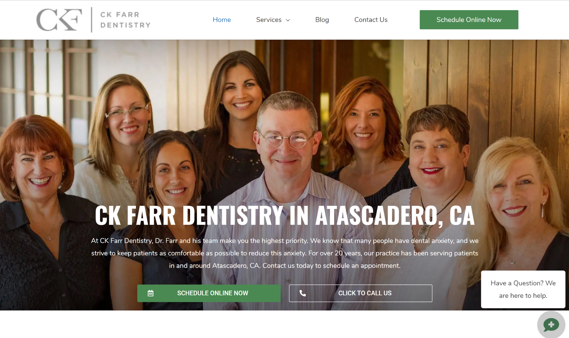
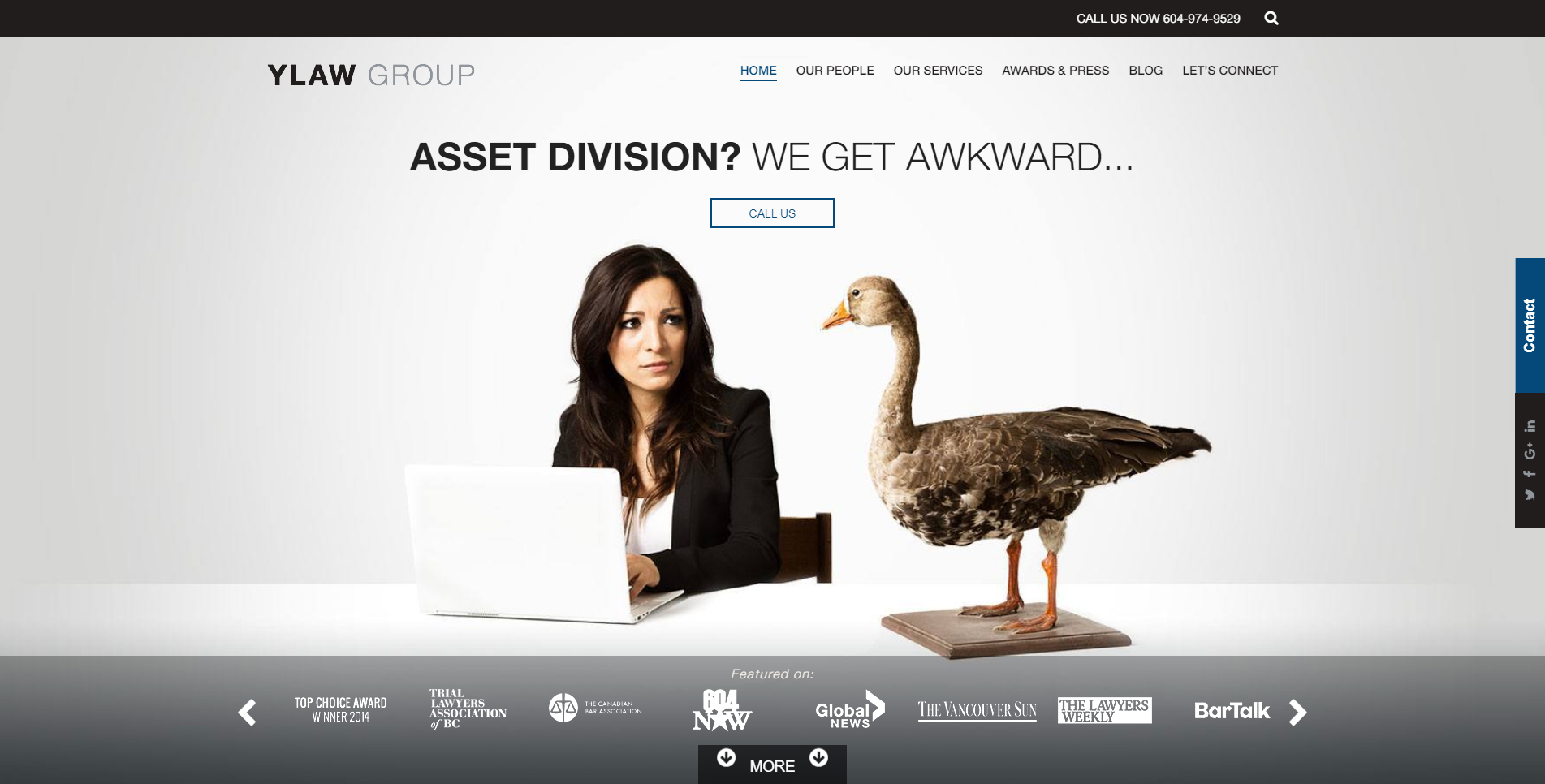
Dentistry Website Design
Now there are lots of different ways to present your dental clinic, which the dental marketing guy makes very clear to us.
Because medical services are very personal, it can be an intimidating task for a person to decide which doctors and practices to go with.
That’s why presenting your team front and center on the home page could be a crucial part of winning over a new patient.
When a person is trying to decide which dental clinic to go to and they search for “Dental clinics near me”, and this website shows up, they’ll surely feel a sense of relief.
Dentists are many times portrayed as scary, but when you present your team on the home page like this, all giving off kind smiles, a person will feel more comfortable and will be more inclined to go with your practice.
This website is clean, clear, and to the point. It’s easy to navigate and the dominating color is blue, which gives a person a sense of trust, loyalty, and calm.
High-quality candid videos and friendly photos on your homepage are a great idea for your website design.
If you specialize in dentistry and want a professional and sleek design for your webpage, but don’t have the time to make it yourself, definitely check out what The Dental Marketing Guy has to offer.
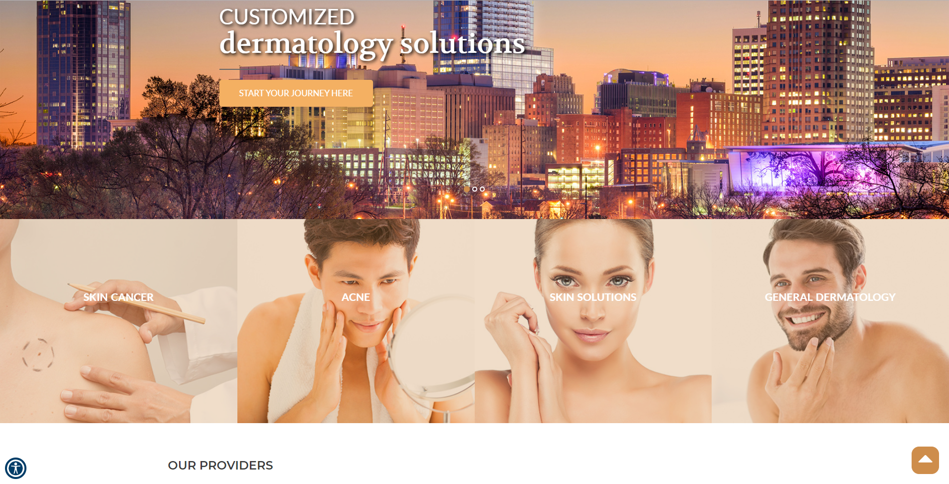
Dermatology Website Design
Next up, we have skincare websites.
And the main point I want to touch on for the next two websites is representation.
In the image above, we see four stunning women, who are all different but reminding each of us that beauty is diverse and comes in all shades, shapes, and sizes.
I don’t think there’s anything more beautiful than that.
Not to mention the website is minimalist and easy to navigate. A major win-win.
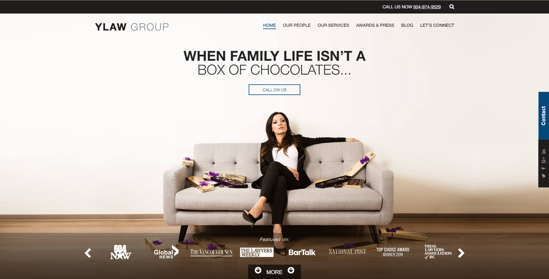
When I hear the words “Family-owned”, for some reason I instantly trust them.
Make sure to highlight the best qualities of your services on the front page to convince people why you’re the best and they should go with you and not someone else.
The minimalism of this homepage is just right, and the contrasting colors really give it something interesting for the eyes to gravitate towards.
The logo is then brought to the attention to the viewer and the color is so captivating, they’re bound to read what you have to say, and now you gained more brand recognition.
And Finally
We’ve come to the end of this inspirational article. I hope you found it helpful and inspiring for your next design project.
Drop us a link in the comment section down below to some of your favorite locally-owned business websites that you find inspiring or some you made yourself!
Drawing can instantly lower barriers and make communication with a client much easier. Having a face-to-face meeting with your client can cause anxiety for those of us that push pixels for a living, but even the simplest kind of sketching can help. On top of drawing, let’s take a few clues from a meeting rockstar: Priya Parker.
Author of the book “The Art of Gathering” and TED Talk speaker, Priya Parker is a proponent of making gatherings (and meetings!) meaningful. Her top line meeting ideas include allowing some controversy, fostering group decision making, and setting meeting goals. I’ll touch on all three of these items and show how to use the act of drawing to accomplish them.
Our Example
Let’s walk through such a goal-oriented sitemap meeting. Our faux-client: an event service company called BPS Events Services. They rent tables, designs centerpieces, and acts as a one-stop shop for sit-down events — everything but the food. Let’s go meet the team: a marketer, salesman, warehouse manager, and one executive officer. All very different points of view.
Walk in the door, make your introductions, and start off with goals in mind (and in voice). Declare the goal and set a time limit at the forefront. Avoid sloppy language like “I want to have a sitemap from today’s meeting” but use more concrete terms such as “The output from today’s 90-minute meeting will be a sitemap.” Expectations are always appreciated, and so are time limits.
Leave Your Laptop At Home, Markers Are The Better Tool
I don’t use technology to organize the thoughts of my clients. Adding a layer of digitization between what is said and what is captured is a barrier that clients find difficult to overcome, and frankly, off-putting. If a client is afraid of the tech you are using to craft something, they may devalue the input they wish to offer because of that fear.
I want full honesty, and I want my permission to correct me, in order to get things right. That’s why I use large-scale drawing on a whiteboard. Not only does it work in realtime, but it’s also correctable, and I know that when my customer picks up a marker; they really have full intentions to help me understand the whole story of their company and their customers.
The whiteboard as a canvas is large enough to expand on important points, to create concepts that are temporary before they are made permanent (or erased!) and even allow for those in a room to stretch. The whiteboard is energy; it’s the energy of creativity, the energy of idea exploration, and it allows everyone to make mistakes. It’s a perfect canvas when ideas are not nailed down.
And I will admit, a marker may induce a bit of fear to many (we’ve all heard it, or said it: “I can’t draw”) but no one is afraid to write a word or two, or tell someone else what to visibly edit!
Your client is made up of several different stakeholders, with varying responsibilities and personalities, and each with different website “must-haves”. The best possible person in the room, however, should be a prospective customer acting as a website visitor. As this invite may not be possible, a set of proxies made up of personas will do.
Inviting made up personas into the meeting may work against the ambitions and personal goals of your real attendees. What fun!
Creating Our New Guests
A customer persona, (with its physical manifestation being a customer profile) is a specification of a user that your client may encounter. They can be detailed and complex, or extremely simple.
Many customer profiles include information including an avatar or photo, demographic information, interests, and how they spend their money.
The persona is used as a lensing tool to understand how a customer may act, feel, and interact with your brand or organization. In our case, it is website specific.
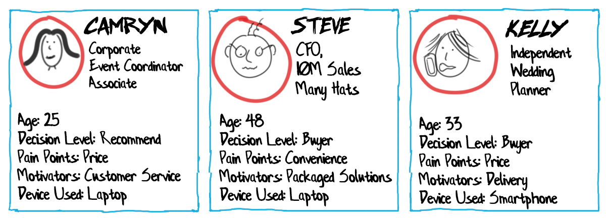
For BPS Events Services, we will create three customer persona profiles to act as typical site visitors that may be buyers:
Camryn, the corporate event coordinator;
Steve, the CFO of a mid-sized company planning a sales meeting;
Kelly, the independent wedding planner.
A graphic list of web-oriented characteristics for our three example personas (Large preview)
I start with a name, age, and any other demographic or personal characteristics to make them seem real. The more real a person seems, the more likely your team can sympathize with their positions. Hats, actions and locations can enhance “cartoony” stick figures well and help tell the story.
Second, I focus on four simple persona statements:
The device used to visit your site,
Decision level,
Pain points
Motivators.
These four personal statements tell the room how the person may interact with your company, why they need may need you, and how you can influence them. It’s basic yes, but we have set ourselves up with only 90 minutes!
More importantly, the customer profiles must be made visible by the whole group at once — not just paper on the table. Large visible profiles are the stand-in for the actual persona. They can be pointed to, stood in front of, yelled at, and can accept empathy (as much as markings on a board can receive!)
The Value Of Visitor Presence
The real value of having site visitor profiles in the room is the lens they provide for present stakeholders. Forcing attendees to see a new website tailored to visitor needs adds a little controversy, and forces all to see the problems through new eyes.
Similar to the Thinking Hats group discussion system, customer personas allow meeting attendees to see through new eyes and look through filters that remove selfish motives -effectively putting down personal agendas. This methodology is a helpful tool for web designers who many struggle with getting clients to think visitor-first.
Additionally, you likely don’t have to be “the bad guy”. Likely one person in attendance will be a customer persona advocate. This person will police the others and call them out if the personas are not honored — and even defend the personas. This advocate may never have had the chance to steer others into the customer-focused viewpoint before — and this may very well be one of those few chances.
Step On Up To The Whiteboard
Many create customer profiles ahead of time on paper or boards (a project for you, dear web designer, or for your client). But they can also be created rough, on the fly, and on a whiteboard with various degrees of detail. I personally like creating them live because attendees can have a say and make adjustments.
Tip: Getting 10 minutes alone with your target whiteboard before a meeting can work wonders!
Don’t overdo it, just create something clean, legible, and that can be referenced throughout the meeting!
Being able to point to a persona is important in the upcoming conversations. The examples above are created with large names so they can be spoken in the room, with common color schemes for ease of recognition, and with text in black for easy readability.
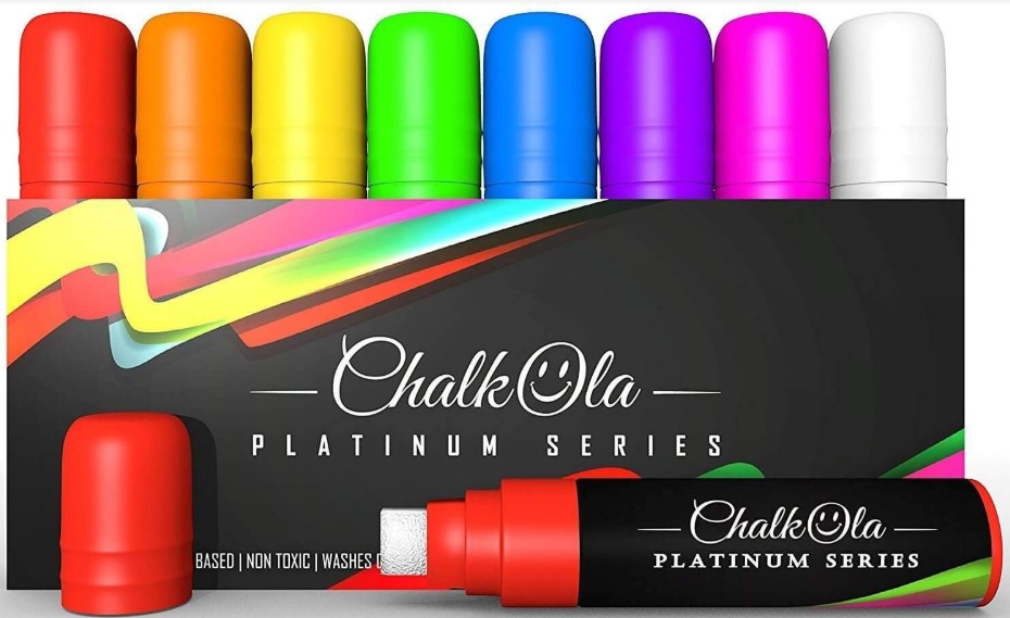
Whiteboards are of course ubiquitously available in conference rooms across the industrialized world. Hate squeaky whiteboards? Get a 48” wide roll of paper online and some no-bleed low-odor markers like Mister Sketch or Neuland brand.
Some More Drawing Tips
In the case of the whiteboard, you may be tempted to use that readily available red marker for multiple components — resist! Invest in your own set of whiteboard markers and look like a champ — there are a variety of choices out there: rainbow colors, standard colors in wide widths, and even neon-colored chalk-based markers (whiteboard safe) that come with thicknesses as wide as 15mm! Nothing says “Wow I know what I am doing” quite like hot pink in a world of faded thin blue lines.
Thick and vibrant chalk-based whiteboard markers make your whiteboard work highly unique. (Large preview)
The Visitor Journey Through The New Website
A Customer journey is typically defined as the empathetic review of a customer’s interaction with a problem and your solution. This is generally used in broader scope-marketing campaigns. Customer journeys can be incredibly powerful and telling but also complicated.
Let’s start simple, and ask your customers personas how they plan to navigate your new or revised website.
Let The Sitemap Guidance Begin!
Today we are NOT talking about how visitors GET to the website, but only, what their experience is once they get there.
Assign a landing page for every visitor. If you have guidance from an existing data set of analytics, borrow the top three landing pages. If you don’t, choose from what you know and can assume: the home page, the number one standalone product or service, and an evergreen blog post. (Considering landing pages for specific campaigns? Go for it!)
A sample whiteboard setup ready for customer journey questioning and pathfinding (Large preview)
Use your whiteboard to craft the very beginnings of a sitemap in a format that suggests room for growth. The center of the whiteboard is used for the customer’s ‘page’ journeys, and the right sidebar is used to capture the sitemap in an organized fashion of your choice.
Ask the room: “When your users land on their first page of your site on their first visit, what do they see and how do they feel? Let’s start with Camryn (persona 1).”
The responses to this question should go well beyond sitemap preference. Because the question offered the verb “feel” you will find responses including words like trust, payday, relief, confusion, leadership, and so on. This empathetic question sets the tone for the rest of your meeting, helps you understand your client’s own brand understanding, and opens up the conversation on the right foot.
Run through this question for each persona, and log the information on the whiteboard around that starter page in a mindmap fashion. Whether it is feelings, lack of information, desire for more, confusion, or “heck I’m ready to buy now already”, every comment can act as a potential pathway to new content.
The responses may also be very concrete like, “I need to find the phone number for sales”, or “I need to know the minimum order size for the new biodegradable plate designs.” These are obviously just as important, but don’t let them be the only responses.
Let the personas ‘answer’ questions about how they feel and what they are looking for on your pages. (Large preview)
Building The Content Web
Now that we have guessed at what the user feels and is thinking at each page, let’s act as a guide and show them some link options. We are going to respond to the first page responses in a conversational, back and forth kind of way… Almost like a website guide.
Note: At this point, we’re acting as guides to lead the user from a point of zero information to one of decision making, comfort, trust, and inquiry. If you are a fan of the StoryBrand method by Donald Miller, you will identify with the story consent and guidance component that we are building.
With your gathered group, draw possible links to new pages that answer the questions or respond to the feelings that you previously generated. It is important to remind your group that we’re only answering the thoughts of the personas user here.
These links are drawn in a web format across your whiteboard to second click pages. It is not yet in a sitemap format, but one that shows the importance of that second click. Allow overlap between personas.
As new pages are defined, log them in your right sidebar in a top-level nav format.
Website Pages are created to answer the first round of persona questions. (Large preview)
Drawing Suggestions
I suggest creating your page blocks as black text with black containers around them. Use a different color ink to create the arrow/line/connector links between the blocks.
Repeat this entire process and keep going: focus on feelings, information, and website guidance to lead your customer towards connecting with your brand in a hard or soft way through an eventual on page Call-to-Action (e.g. Buy Now, vs. Facebook Like, vs. Download our Guide).
Hopefully, some questions may look back to other pages, or force attendees to consider new places to put answers to specific questions. Try your best to exhaust the customer journey through your site with this process.
A full conversation with webpage list derived from possible pathways (Large preview)
Fostering Group Decision Making On The Board
Try not to erase items that have already been added to a board. Instead, I like to add graphical tags to items: Stars, checkmarks or plus signs for affirmations, and frowny faces, minus symbols, and Xs for negative feedback.
You can also use colors to denote positive and negative feedback: green and red.* This method can show the team decision-making and encourages feedback, without wiping out concepts already discussed.
* Keep in mind that if you do decide to use colors, always ask if anyone in the room is colorblind.
From Journey To Sitemap
If you are familiar with Google Analytics (GA), you may see similarities between what we are creating and what is reported in GA Behavior Flow. That’s a good thing. If you have GA data, compare it with the content flow you are crafting. Are there similarities? Are there differences? Does it matter for the redesign?
A blurred image of a Google Analytics Flow Dashboard. Comparing customer journeys to actual analytics data may validate your new plan. (Large preview)
The beautiful thing about the journey discussions is the lack of fluff and the limitations that it places on page count. This method simplifies the view of the website for many stakeholders.
By taking the journey steps and creating pages for those steps, you’re creating a sitemap that is extremely satisfying for participants. The simple approach to messaging and compression results in a website unlike what they would have imagined, but exactly what they wanted.
Wrapping Up
Communicating with a client on a large canvas such as a whiteboard can be a little scary but tremendously beneficial once you get going. Showing your knowledge for an entire group to see, critique and edit can be hard at first. But drawing as a group is an act of removing barriers.
By communicating visually, blockades to understanding are removed, fear of failure is admonished, and technology is pushed aside. This brings up the opportunity for more good friction — with full understanding and all the cards on the table, er… whiteboard.
The Williemien Brand Team states in the introduction to their book “Visual Thinking” regarding what happens when you draw “you work at the intersection of image, spoken words and written text, where you maximize effectiveness and impact.” This is exactly what our aim should be: let’s keep in mind to continuously utilize the power of our brains to process things visually.
So arm yourselves with some markers, practice up on your whiteboard handwriting and lettering for an hour, and roll out a meeting that your next client won’t soon forget!
Further Reading
Here are some awesome books to keep you motivated:
From some very tough competition, these are the 50 sites we liked the best this year. Each one has been chosen either because it took a unique approach, or because it was central to a design trend that was a big hit in 2019. There’s a lot of fullscreen video, a lot of illustration, and the emergence of a post-Brutalist maximalism trend that’s set to keep running into 2020 and beyond. Is your favorite included in the list?
Nomadic Tribe
Illustration has been one of the biggest trends of 2019, and it is used to great effect in Nomadic Tribe, an interactive, animated short story, created to celebrate the end of 2018 and the start of 2019. Very little has surpassed it all year.
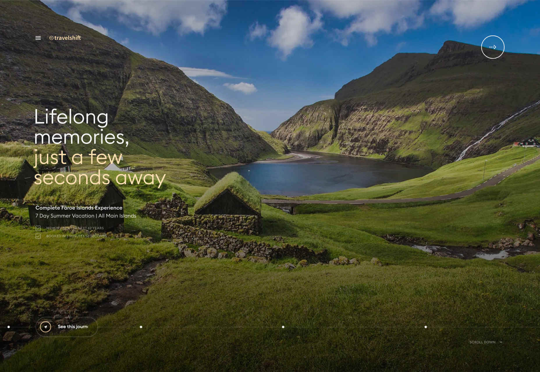
Travelshift
It’s never easy to reinvent navigation while maintaining great usability. Travelshift does an exceptional job of combining a simple navigation interaction, with beautiful animated transitions, to create one of the sites of the year.
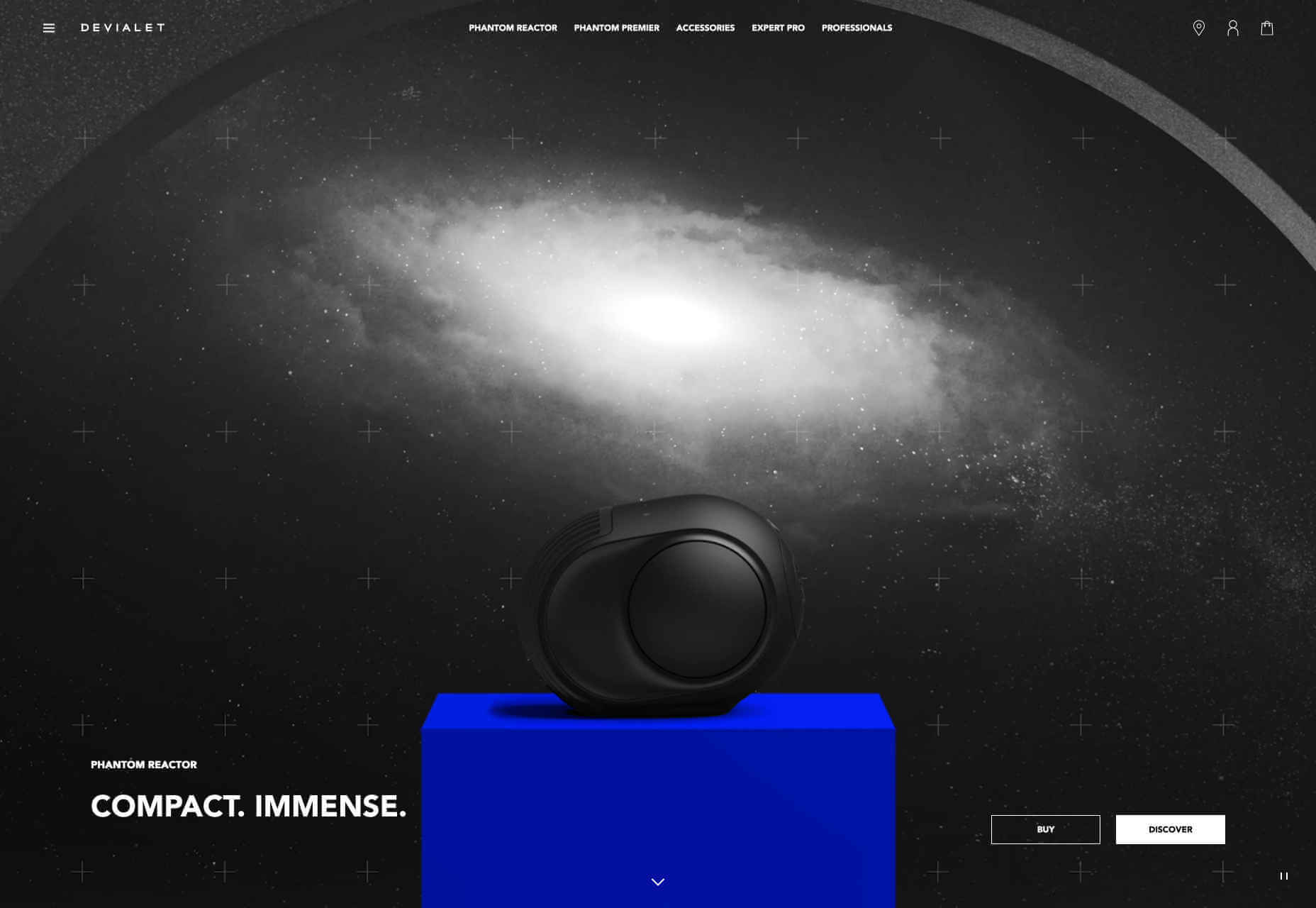
Devialet
Sound on the web is one of the least-liked technologies, with most people browsing with their sound off, and those that do enable it using tinny notebook speakers. So the designers of Devialet’s site had to present depth, range, and power in a visual way.
Studio Brave
More full screen video, this time from Studio Brave who wowed us in 2019 with some exceptional visuals to sell us on their portfolio. We even like the custom cursor, which is normally a huge no-no.
Once Upon a Time in Hollywood
One of the biggest films of the year is designed to hark back to the culture of 50 years earlier, and its awesome promo site transports you to the time of Woodstock and the moon landing.
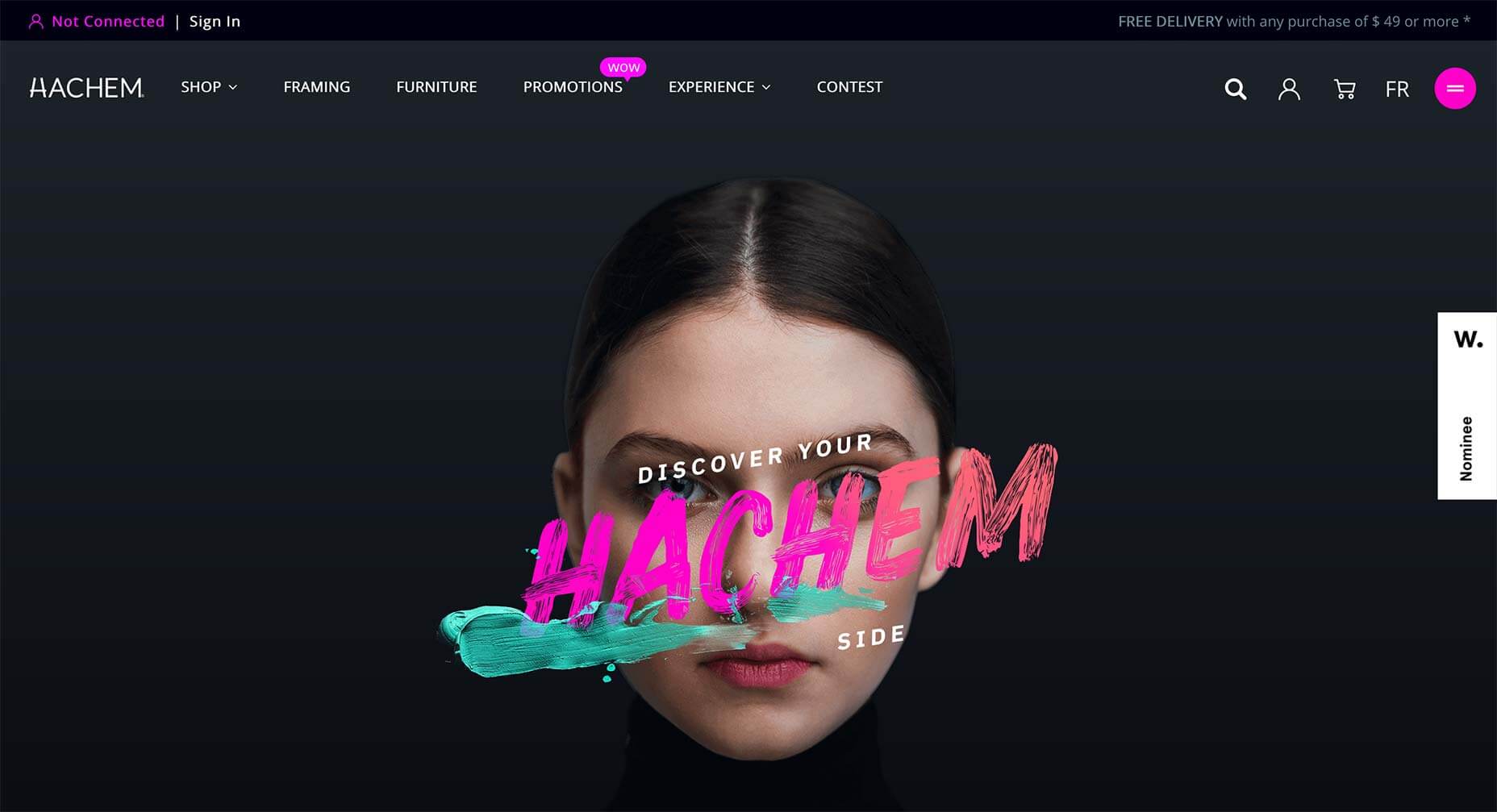
Hachem
2019 is the year that we abandoned minimalist grey and adopted bright, rich colors. The trend is all the more obvious when combined with dark mode. One of the best examples this year was the art supply store Hackem.
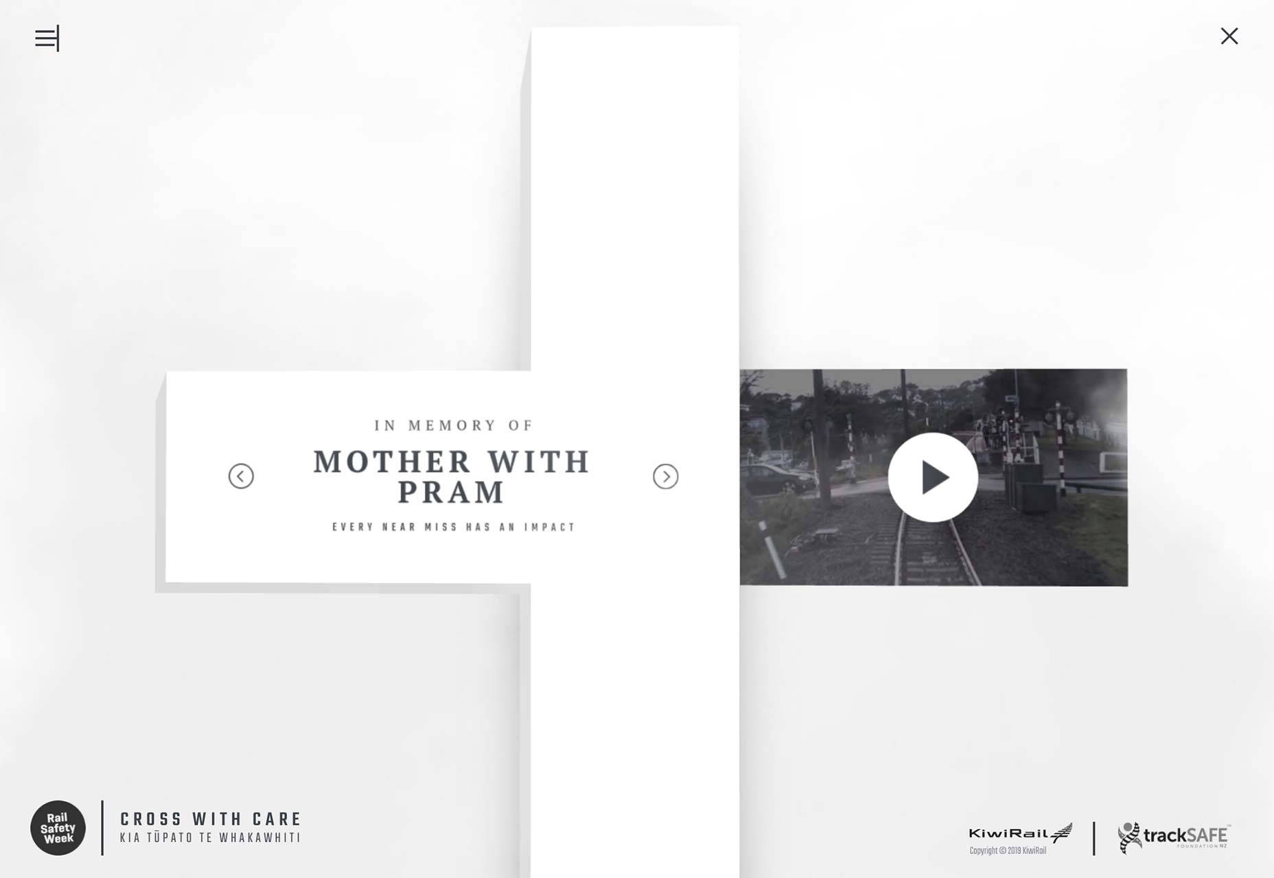
Near Miss Memorials
Not all sites abandoned minimalism in 2019. Near Miss Memorials is a public safety campaign site from New Zealand that adopts a suitably sombre mood.
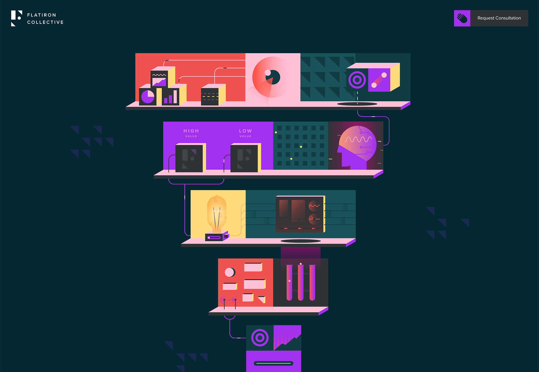
Flatiron Collective
As well as tons of video, we also saw a lot of vector animation in 2019. A great example is the Flatiron Collective site that uses animated illustrations to pitch services to business.
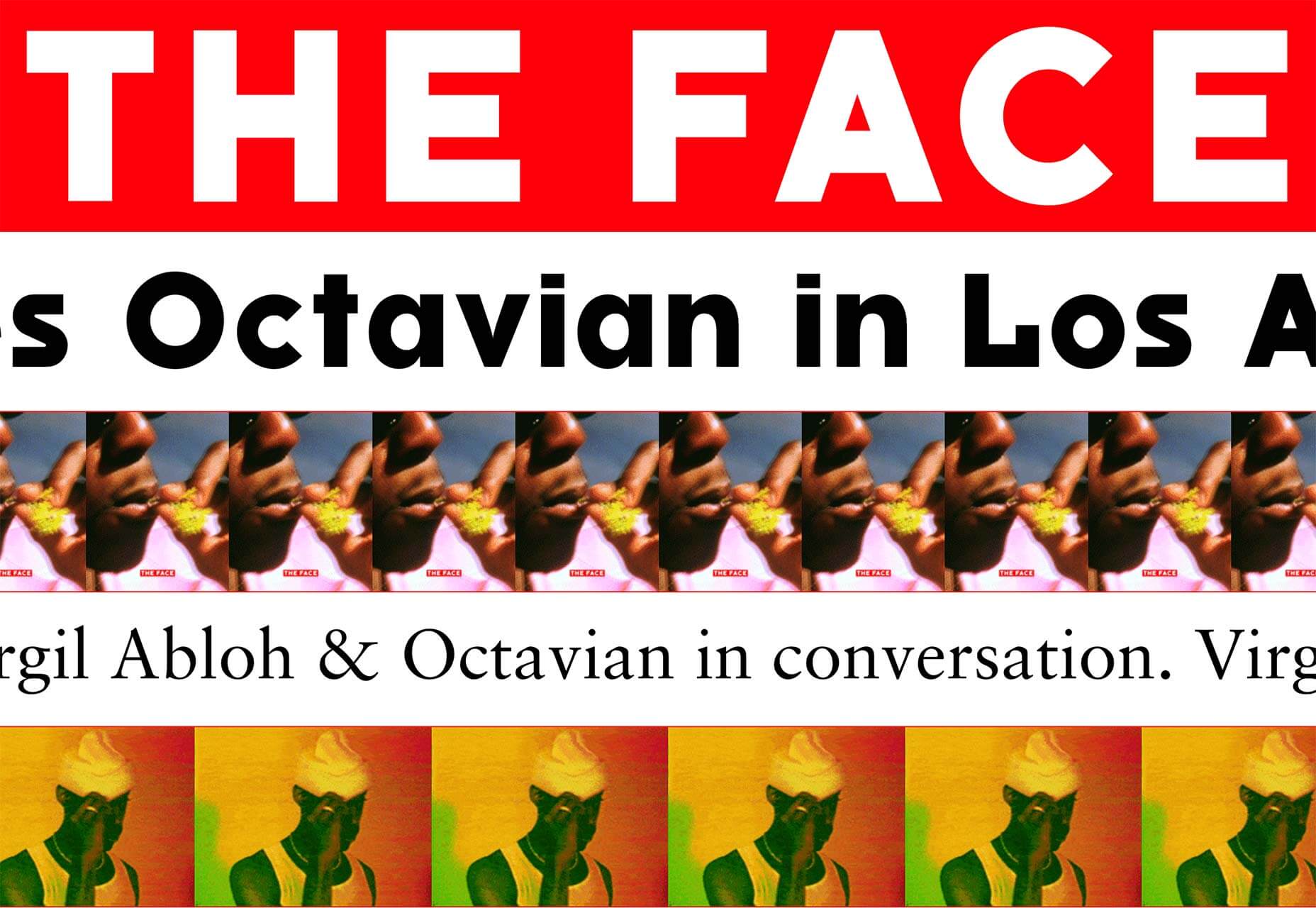
The Face
80s style bible The Face returned from publishing oblivion in 2019, with an online blog and plans for a print magazine. Its innovative approach to filling the page with repeat (not scaleable) images, is inspired.
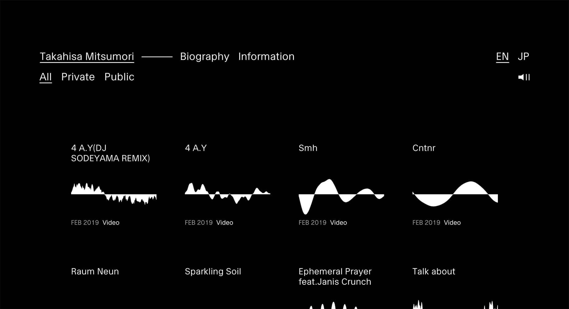
Takahisa Mitsumori
Berlin-based Japanese musician Takahisa Mitsumori released a site in 2019 that follows absolutely no trends, and presents a very minimal, almost Saville-esque set of visualizations of his work.
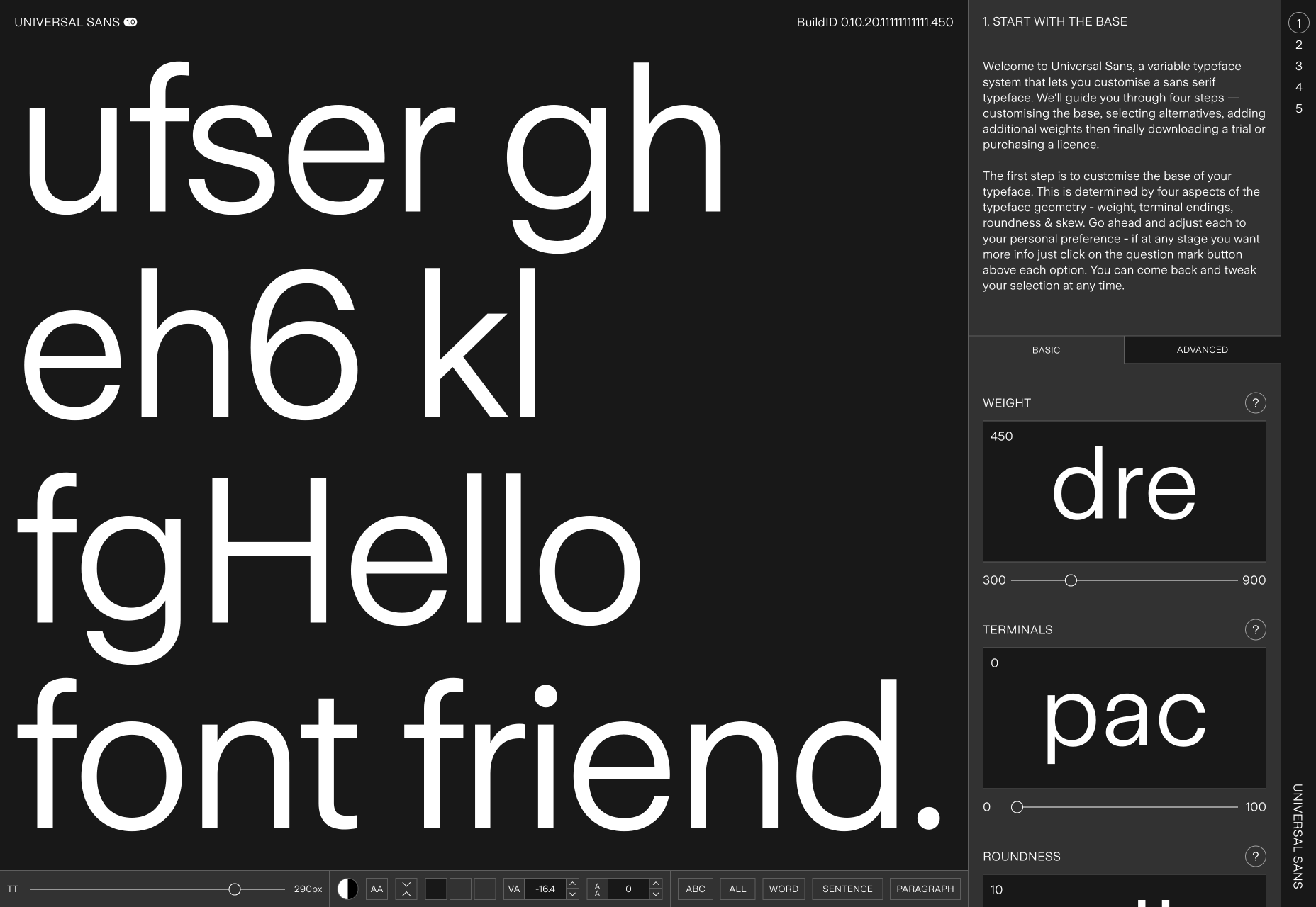
Universal Sans
Variable fonts were big news in 2019 and the awesome site for Universal Sans allows you to use the technology to adapt the font for your own purposes.
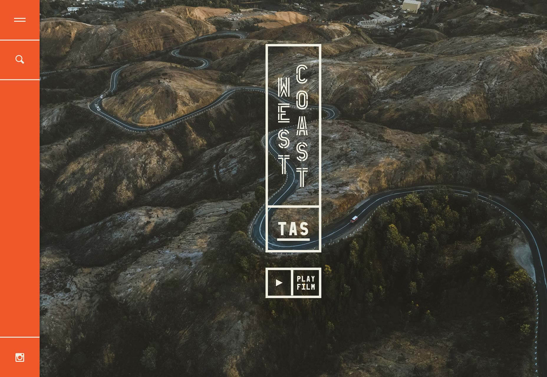
West Coast Tasmania
We loved this exceptional site for tourism in Western Tasmania. The colors and illustrations are great, and the photography is so inspiring it makes me want to book a trip right now.
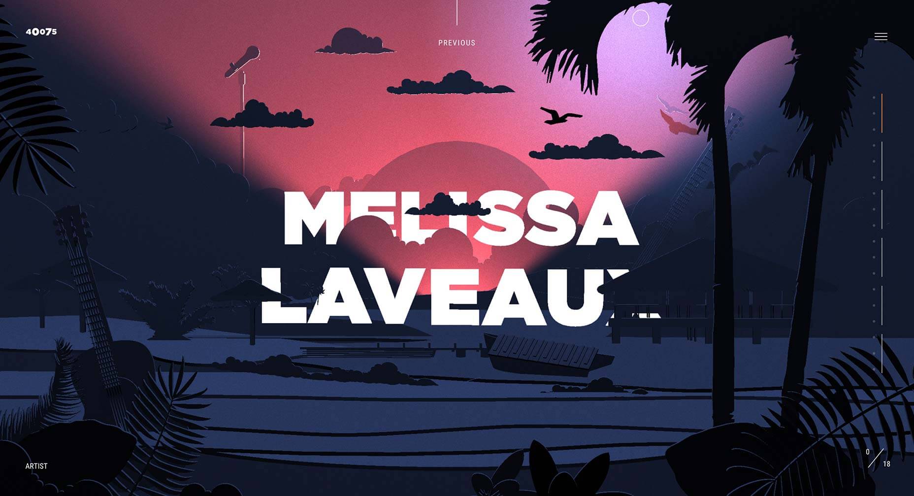
40075
2019 was a year of diverse musical influences. 40075 is an interactive experience designed to help you discover exciting new music by artists from Songhoy Blues to Gily Yalo.
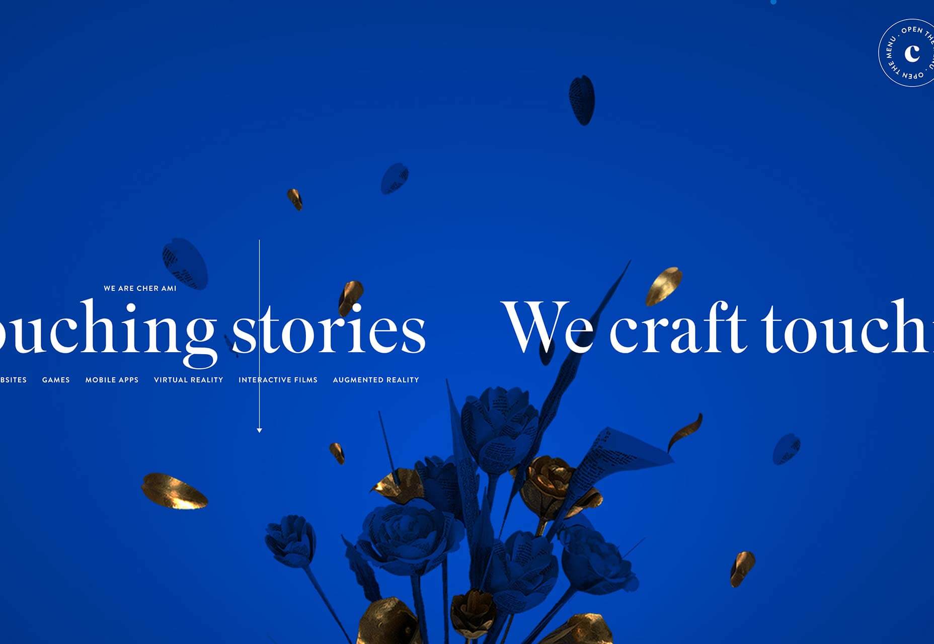
Cher Ami
One of the most vibrant sites of 2019 is Cher Ami. Packed with little details that make it stand out, like the angle of the fly-out menu, and dramatic transitions.
Kalfire W53/50R
We loved full-screen video in 2019, and the Kalfire W53/50R site has it in spades. Click through to the design page for more video. High-end production values like these are essential when selling luxury products.
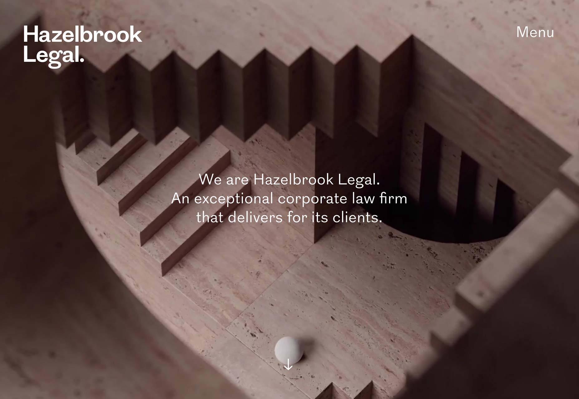
Hazelbrook Legal
As is to prove that the full screen video trend isn’t restricted to fashion labels and travel sites, Hazelbrook Legal uses a video of a marble ball navigating an Escher-style maze; a metaphor for the legal firm’s role.
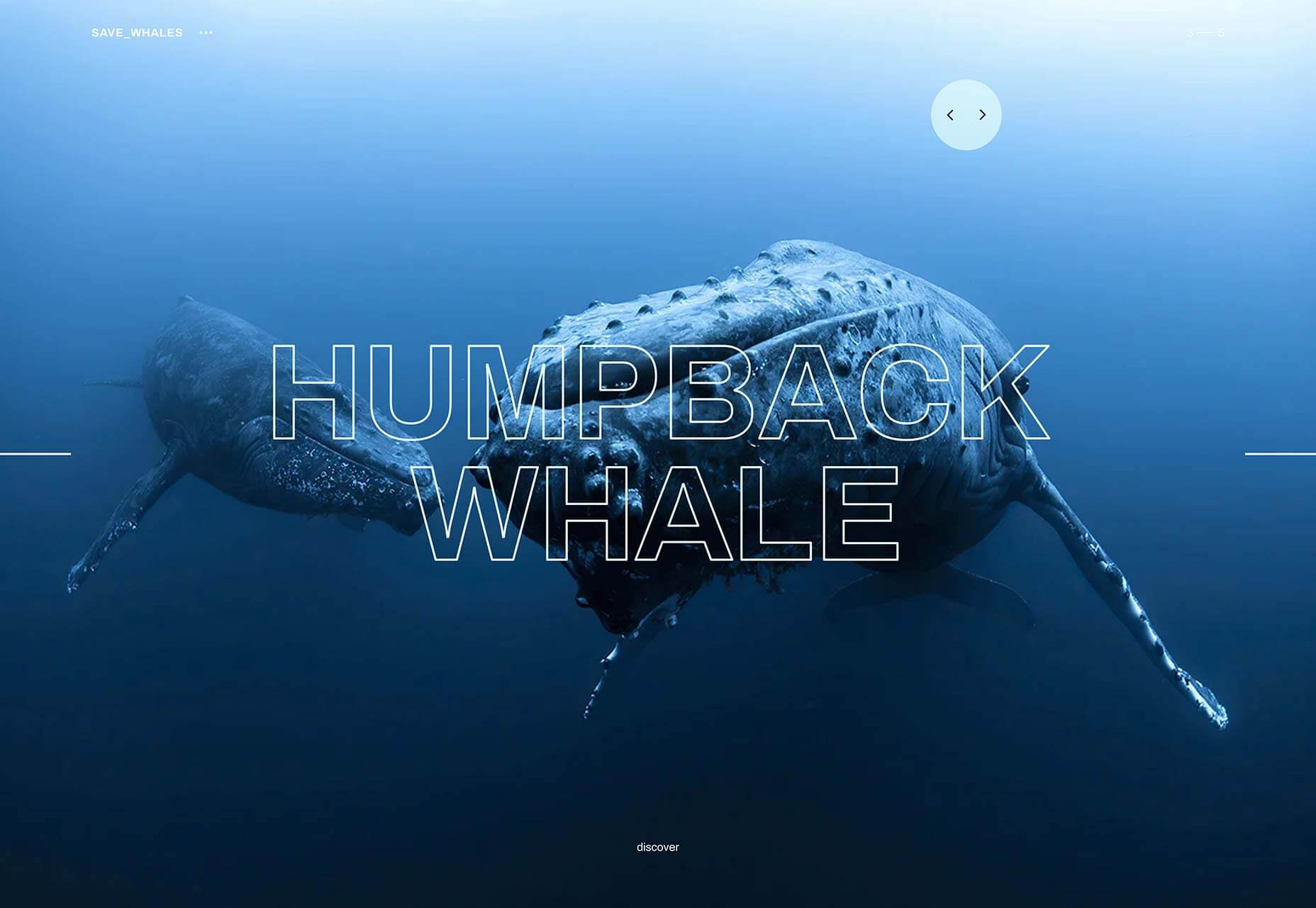
Save Whales
There’s no ignoring the deterioration of the natural world any longer. As we enter a new decade expect to see more inspiring sites like Save Whales, campaigning to protect ecosystems.
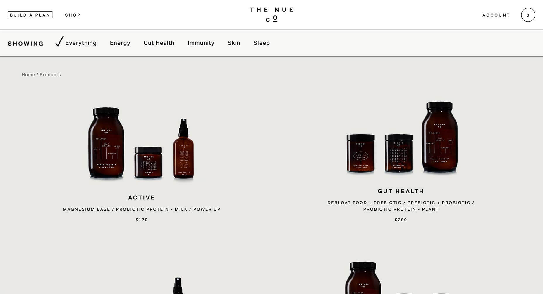
The Nue Co.
With so much color on the web this year, it’s startling when you encounter a black and white, high-contrast approach. The Nue Co. uses a little subtle color in its product images, but the whole site is mostly black and white, and all the more impactful for it.
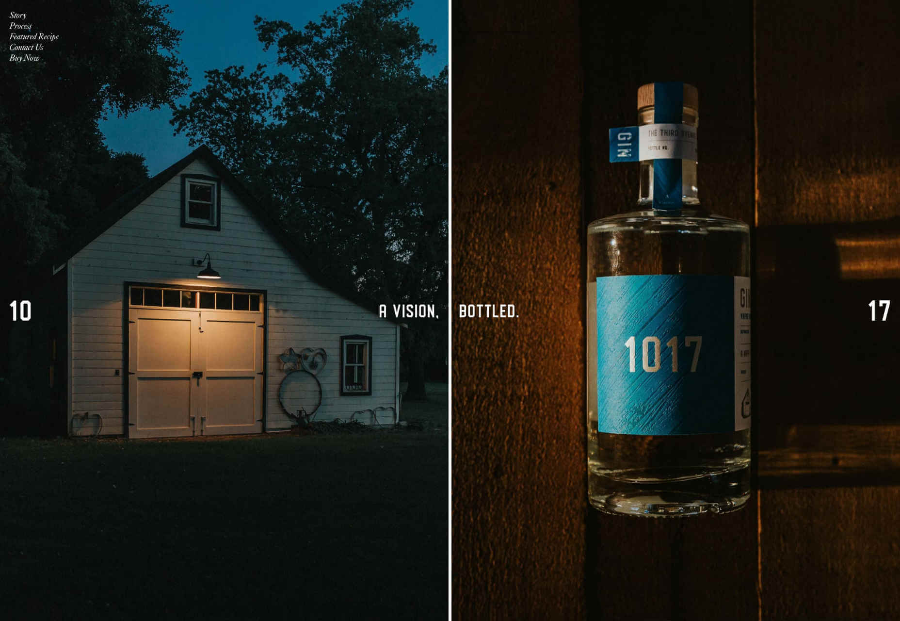
1017 Gin
1017 Gin’s site is a high-class mix of glossy magazine layout, and coffee-table book. The one-pager is understated, with just a nod to trends with undersized images. The way the page splits when you click ‘buy’, is lovely, because it’s unexpected.
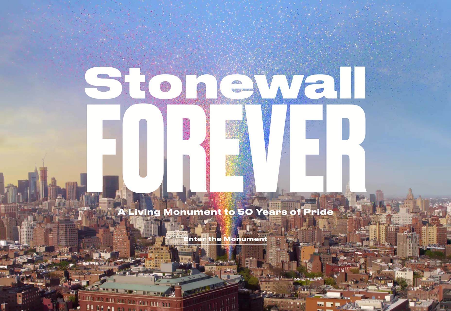
Stonewall Forever
2019 marked 50 years of Pride. Stonewall Forever describes itself as a living monument to the movement. The generated rainbow features stories from the early days of the LGBTQ rights movement.
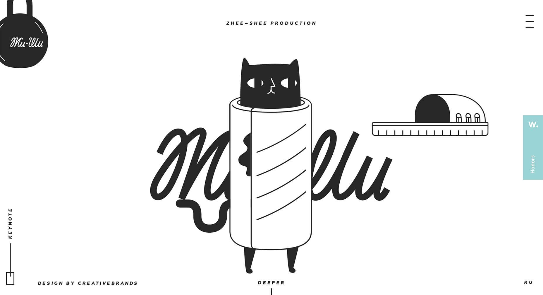
Zhee-Shee Production
More illustration from 2019, this time from Zhee-Shee Production. Many illustrators followed a similar style, derived from 2018’s trends, but these witty illustrations forge their own path.
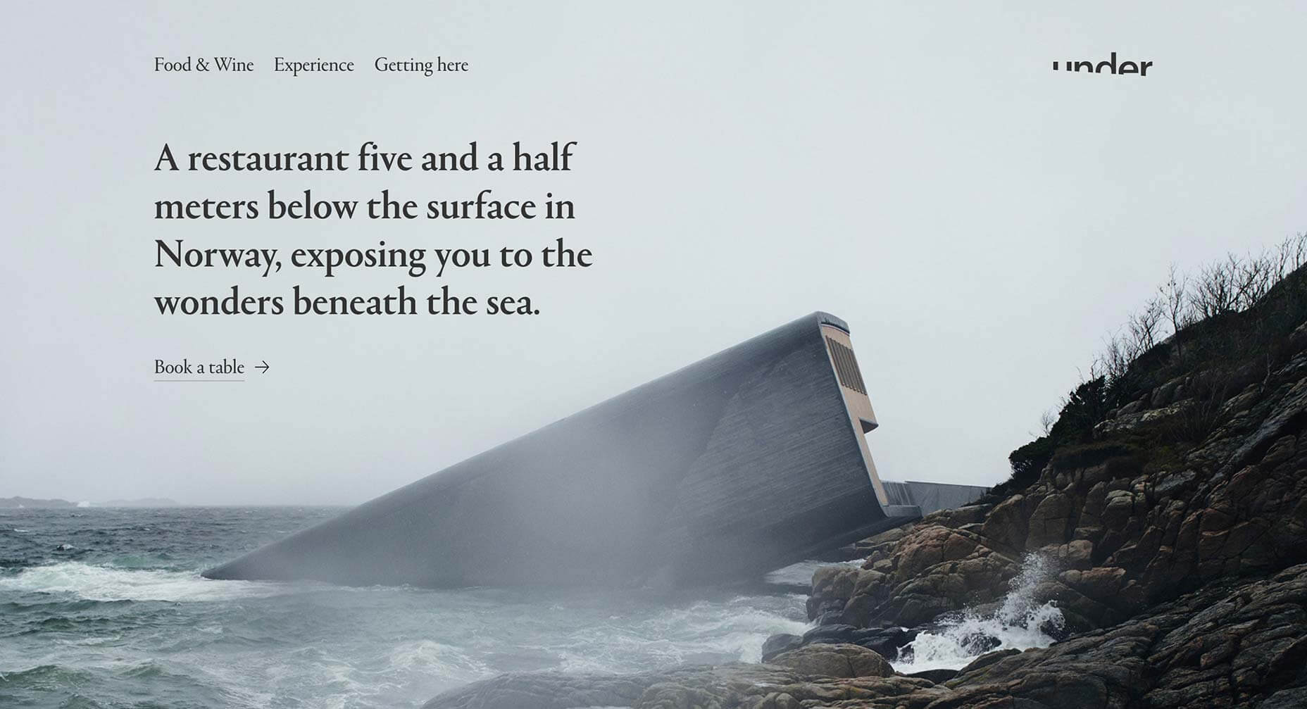
Under
Early on in 2019 we saw this site for the incredible Under restaurant in Norway. We love the Scandinavian aesthetic, proving that simplicity can sell luxury, and the logotype is inspired.
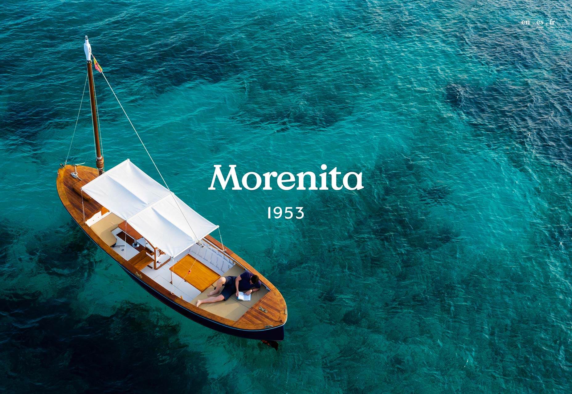
Morenita
As the Northern hemisphere shivers towards the end of 2019, this site for boat hire in the Balearics is an enticing prospect for Summer 2020.
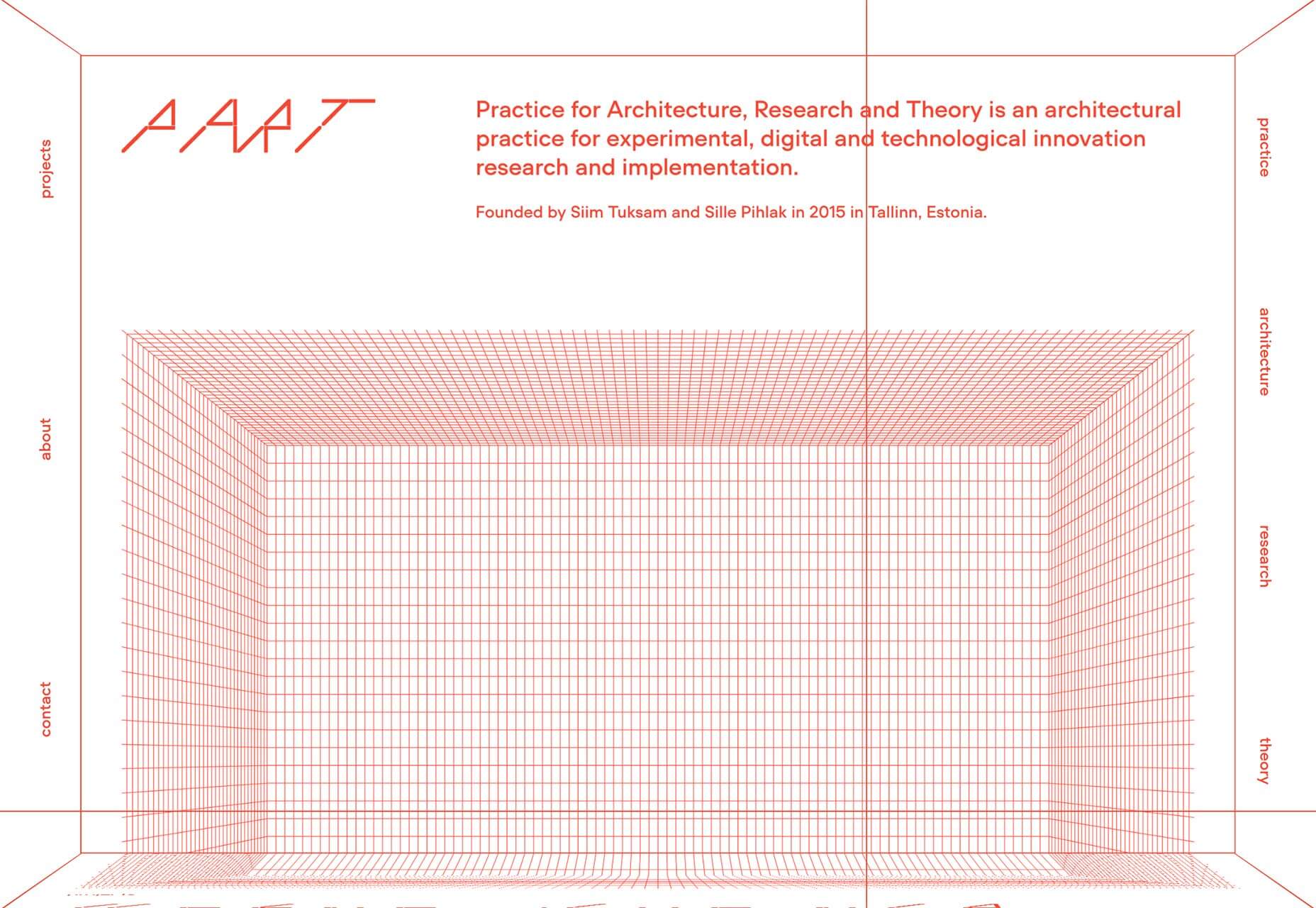
Part Architects
Mid-way through 2019, a new trend started to take hold; Brutalism. It’s a harsh, monotone, functional approach that is often deliberately ugly. Part Architects uses it to full effect.
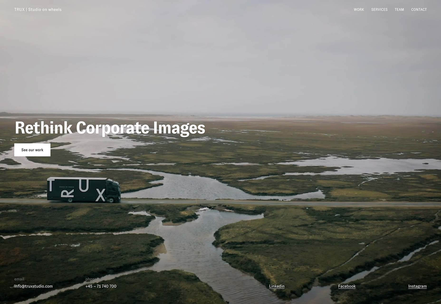
Trux Studio
More full screen video, this time being used to explain the innovative business of Denmark’s Trux Studio. Of course, it doesn’t hurt when you’re filming in such a beautiful landscape.
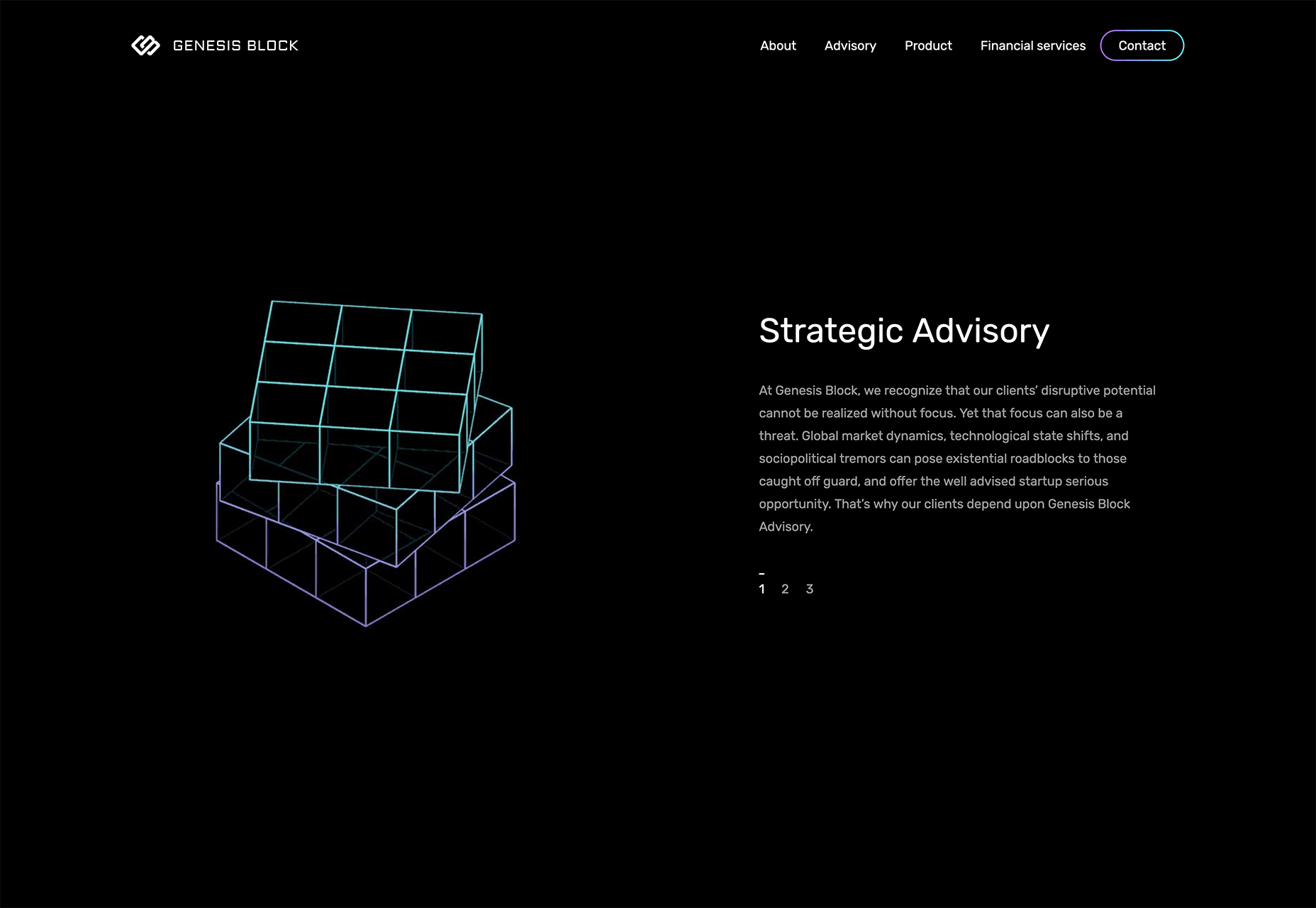
Genesis Block
2019 saw a wide range of business-to-business sites adopt a more design-led approach to their marketing. One such site is Genesis Block, a fintech site that uses line art, dark mode, and gradients.
The Frontier Within
The best websites are not just well designed, they blend information with experience to inform and inspire. The Frontier Within is one such site that illustrates the respiratory, circulatory, and nervous system to create a portrait of the human body.
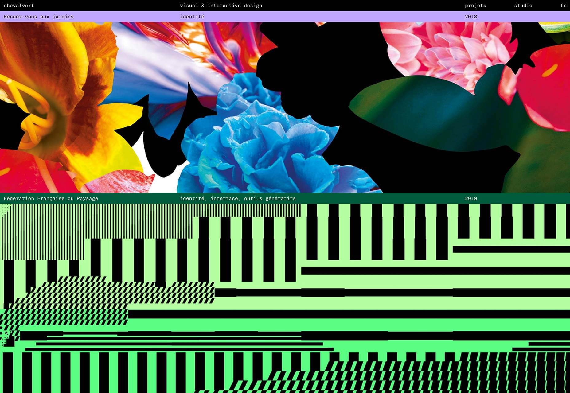
Chevalvert
Out of 2019’s Brutalist trend emerged a new trend, with more legs. Maximalism carried us through from July onwards and looks like continuing into 2020. Chevalvert’s site is a prime example.
Gyro
Another big trend in 2019 was over-sized typography. One of the best examples is Gyro, featuring an oversized logo that explodes and rotates when you cursor over it.
Marble
Marble tackles problems facing children around the world. Its delightful site features maze-like, over-sized text.
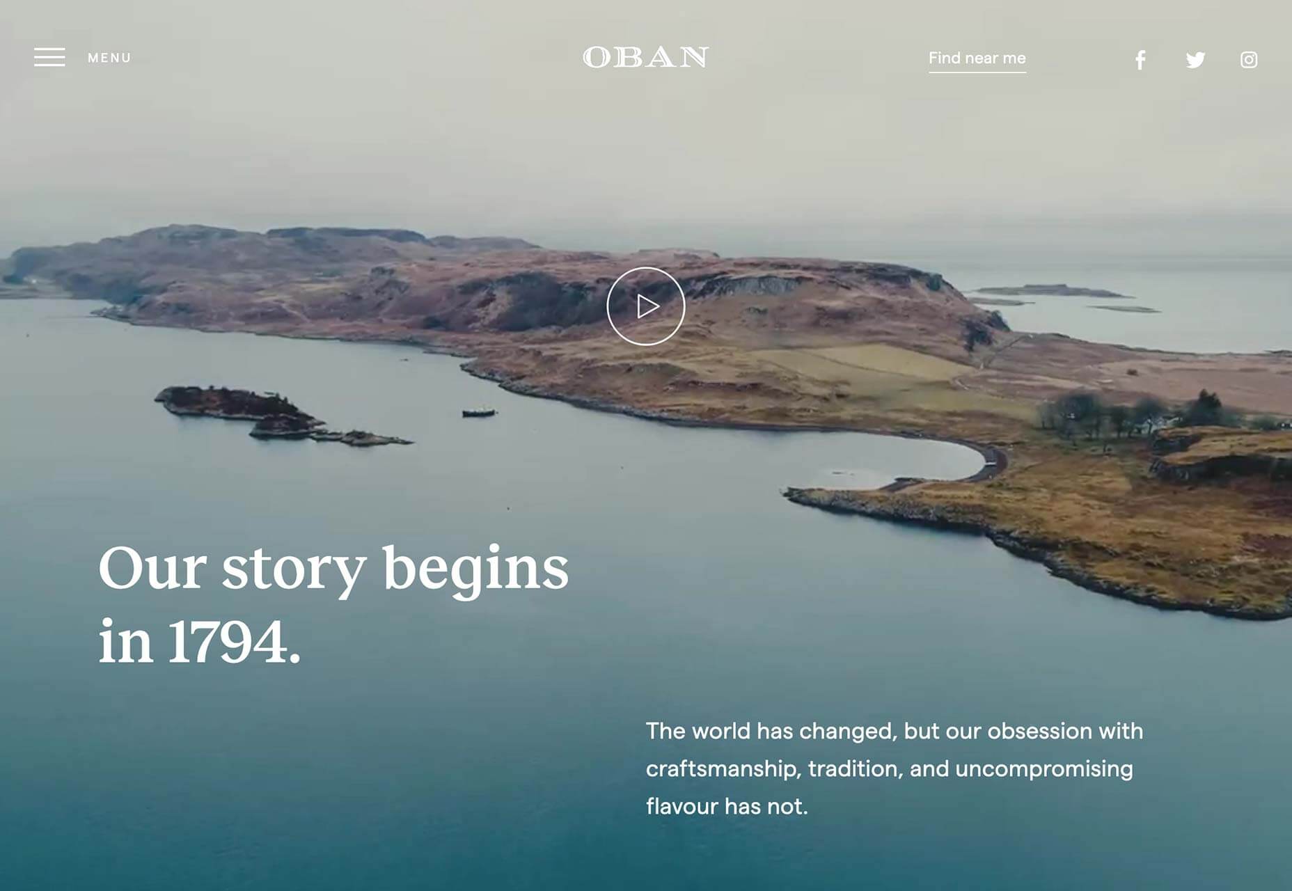
Oban Whisky
Another fullscreen video site, this time for Oban Whisky, a distillery in Western Scotland. The site combines beautiful video with modern typography to focus on heritage and brand values.
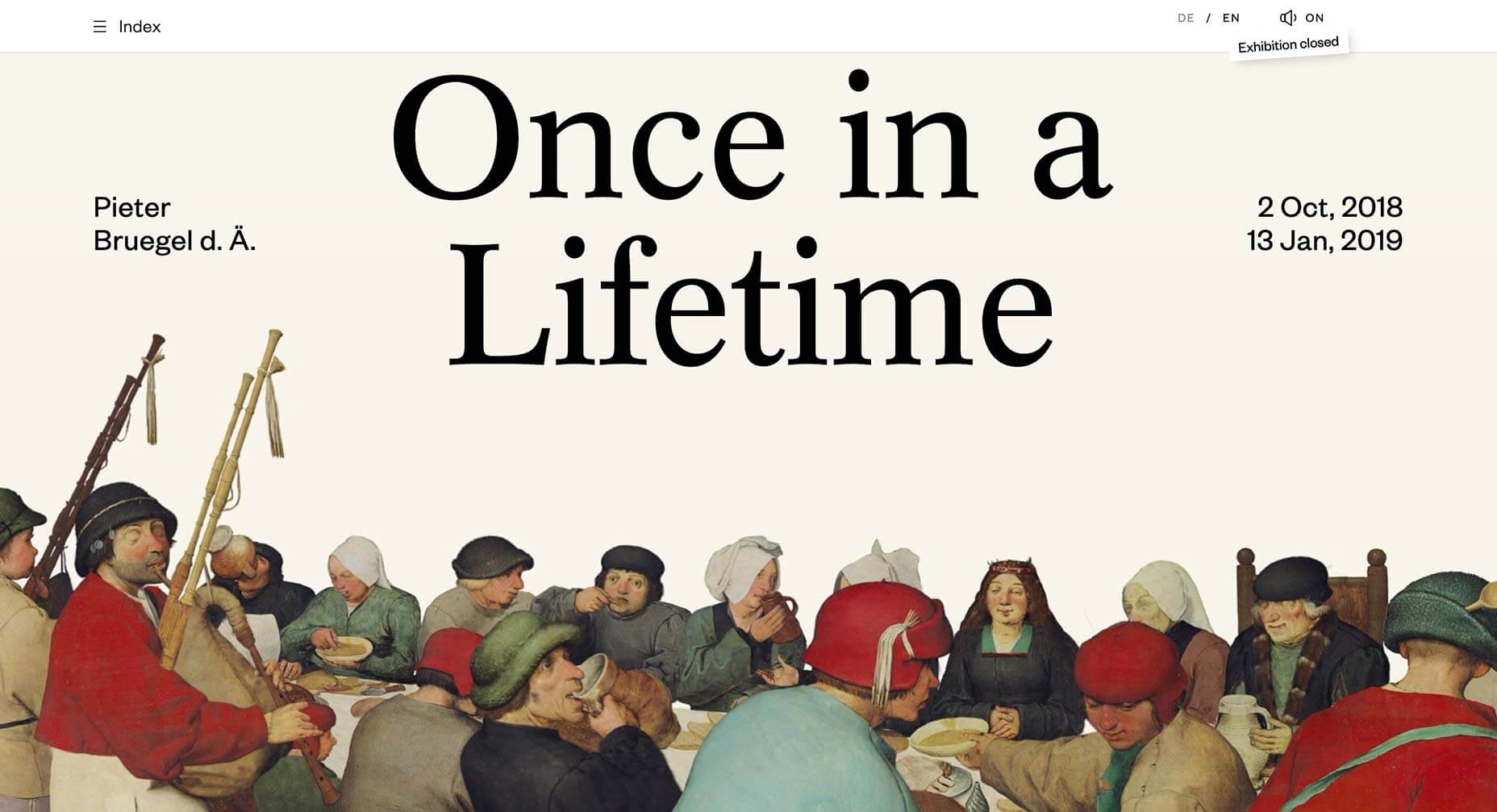
Bruegel: Once in a Lifetime
Animation was popular in 2019, but this site takes it a step further. It’s a site for an exhibition of work by the Flemish master Pieter Bruegel the Elder, in which his paintings are animated.
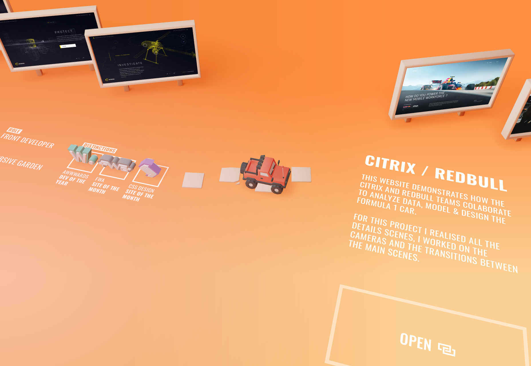
Bruno Simon
One of the most popular portfolio sites of the year was Bruno Simon‘s. It features a miniature RC truck that you drive through a 3D landscape to explore his portfolio.
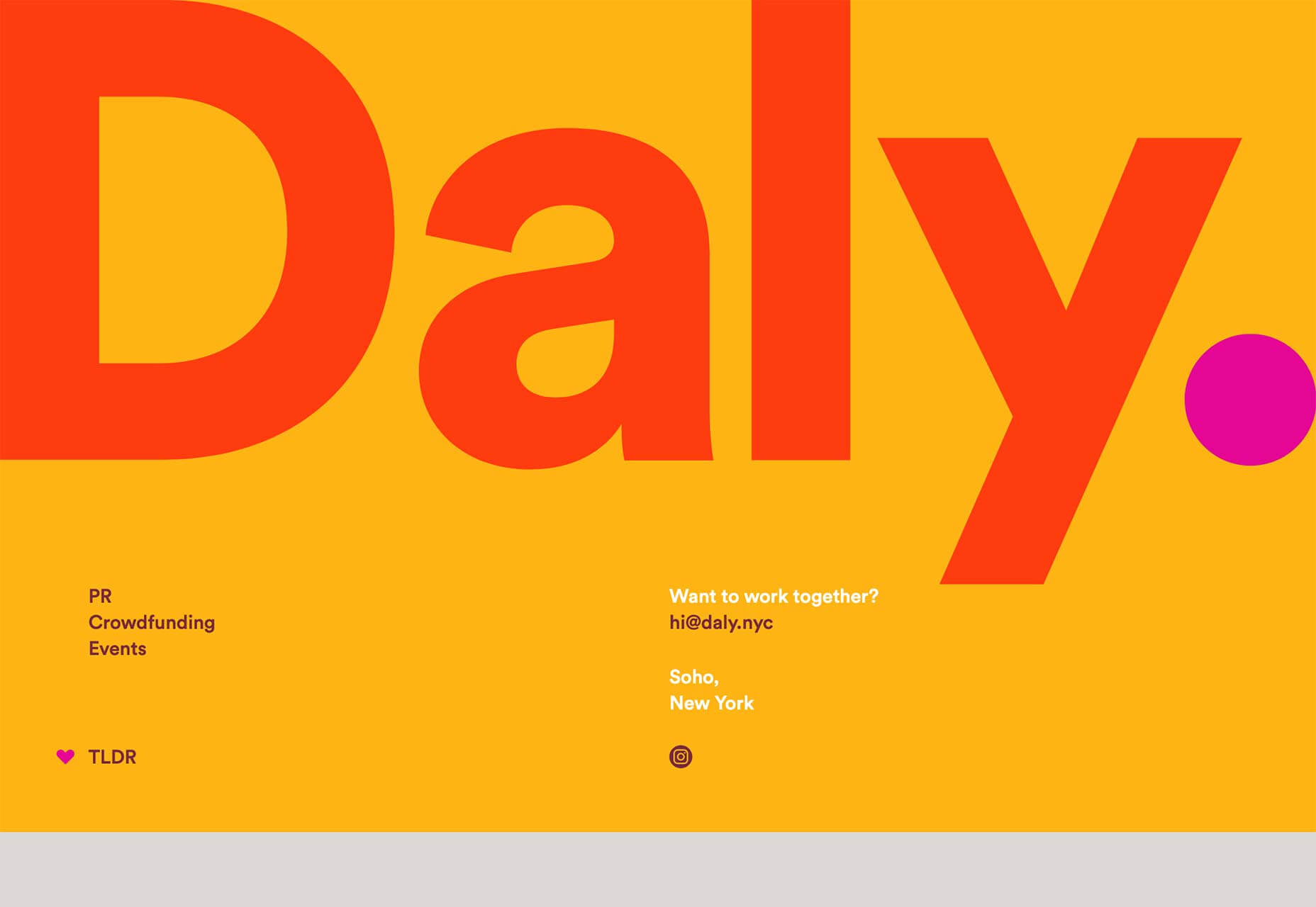
Daly
Daly is a very successful PR agency that launched a bold, colorful site in 2019. The highlighted period in the logotype is far from original, but I do love the way it follows the viewport as you scroll.
Gucci Marmont
3D has featured extensively in sites throughout 2019, and one of the most interesting examples was Gucci’s Marmont collection site, which mimicked 17th-century art in exhibition format.
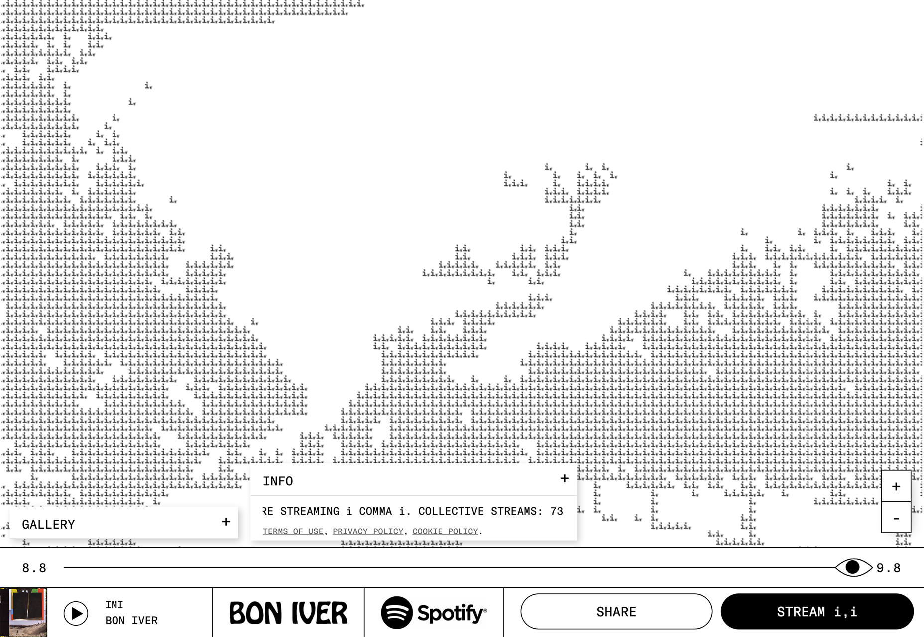
Bon Iver Visualizer
Data visualizations are growing increasingly sophisticated as computers get more and more powerful. This site, built with Spotify data, shows all the people currently streaming Bon Iver’s music.
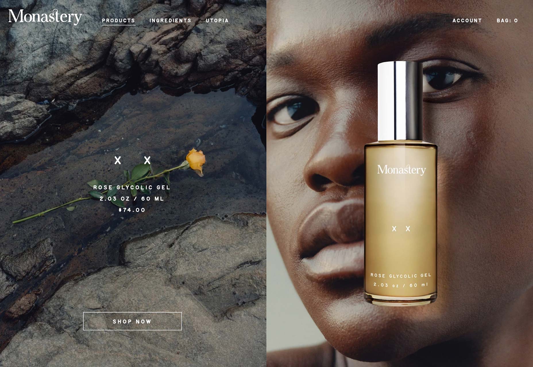
Monastery
As web designers get to grips with broad problems, they’re free to focus on small details, like the subtle blur added to Monestery‘s transition fades, creating a luxury brand experience.
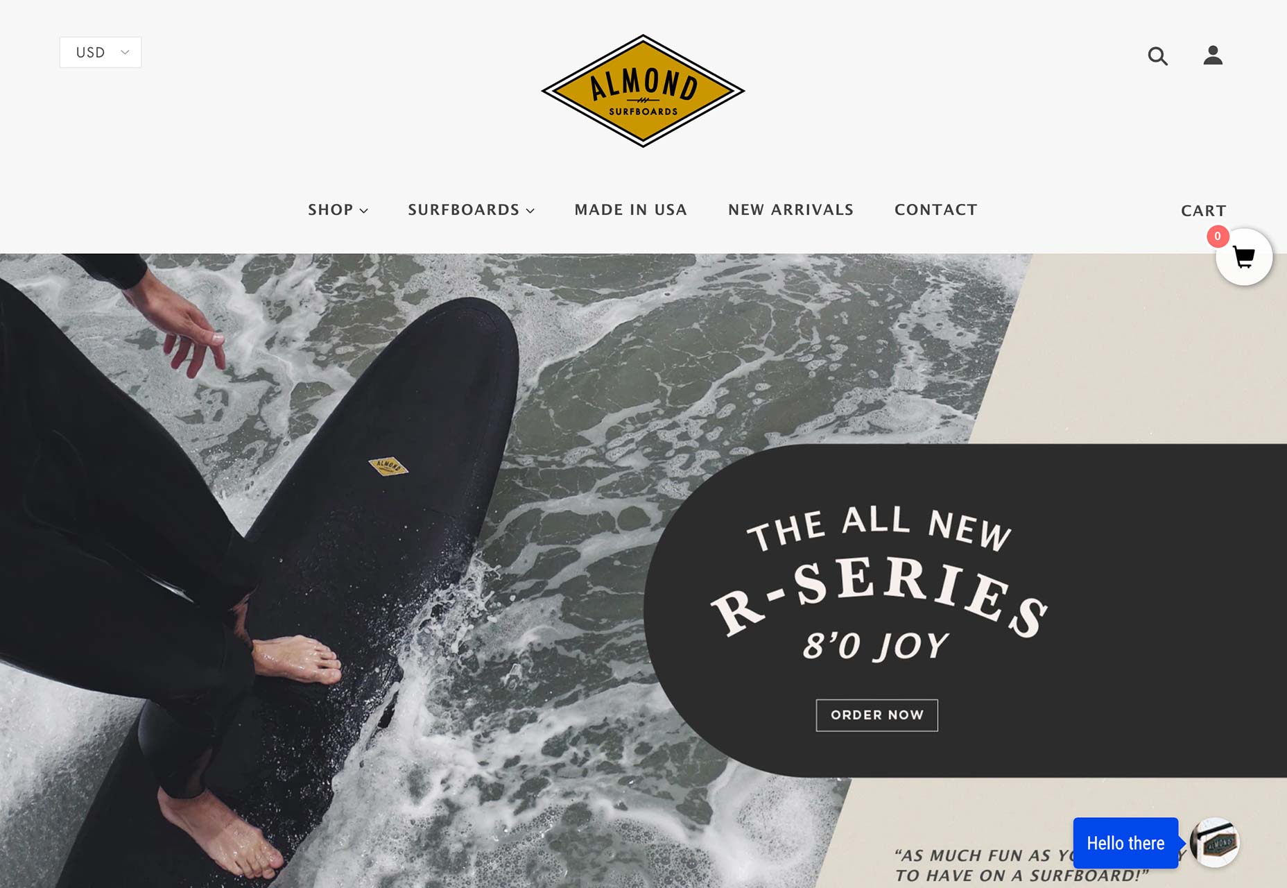
Almond Surfboards
The retro look is still in, in 2019. It will still be with us well into the 2020s. People love nostalgia it seems and Almond Surfboards does a great job of adding old-school credibility to its high-tech boards.
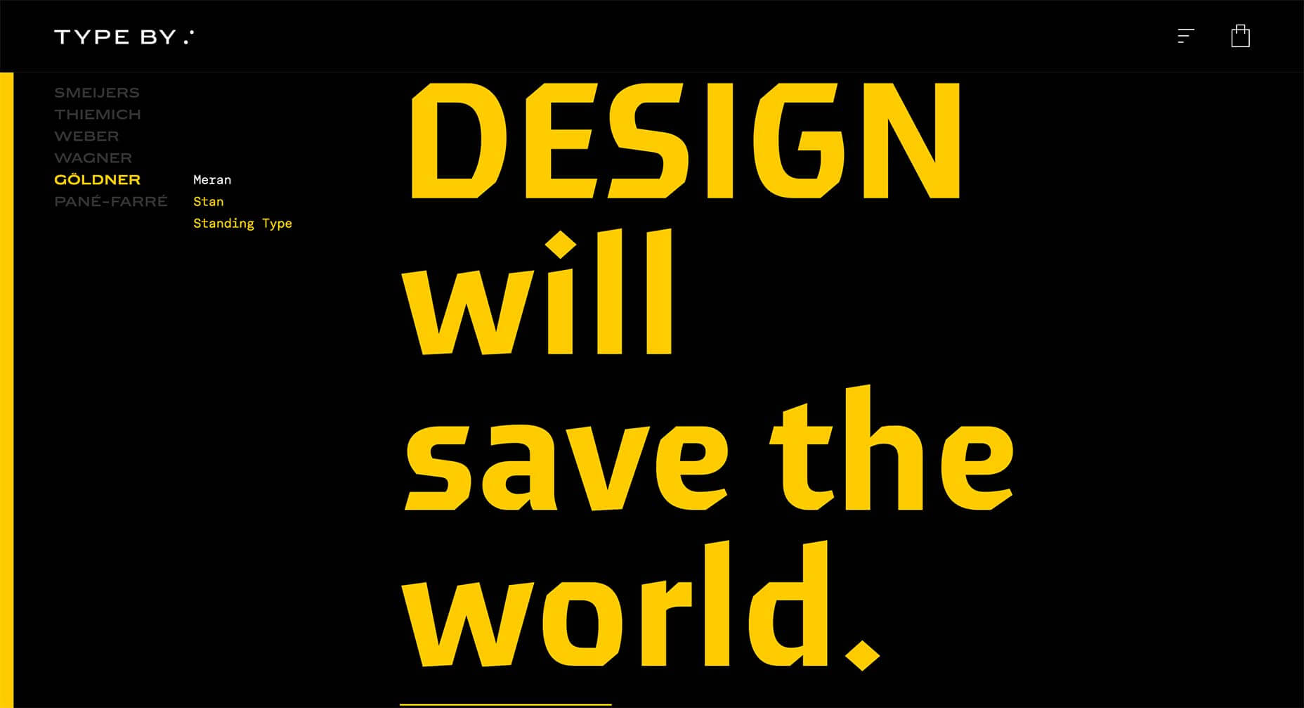
Type By
Type By is a new type foundry, that launched in 2019, so as you’d expect its site is text-only. We haven’t seen enough of this in 2019, but when done this well it’s very compelling.
Wolff Olins
Wolff Olins is a globally reknowned agency whose engagingly simple site charmed us this year. The post-Brutalist approach adopted by a large agency suggests it’s a trend with staying power.
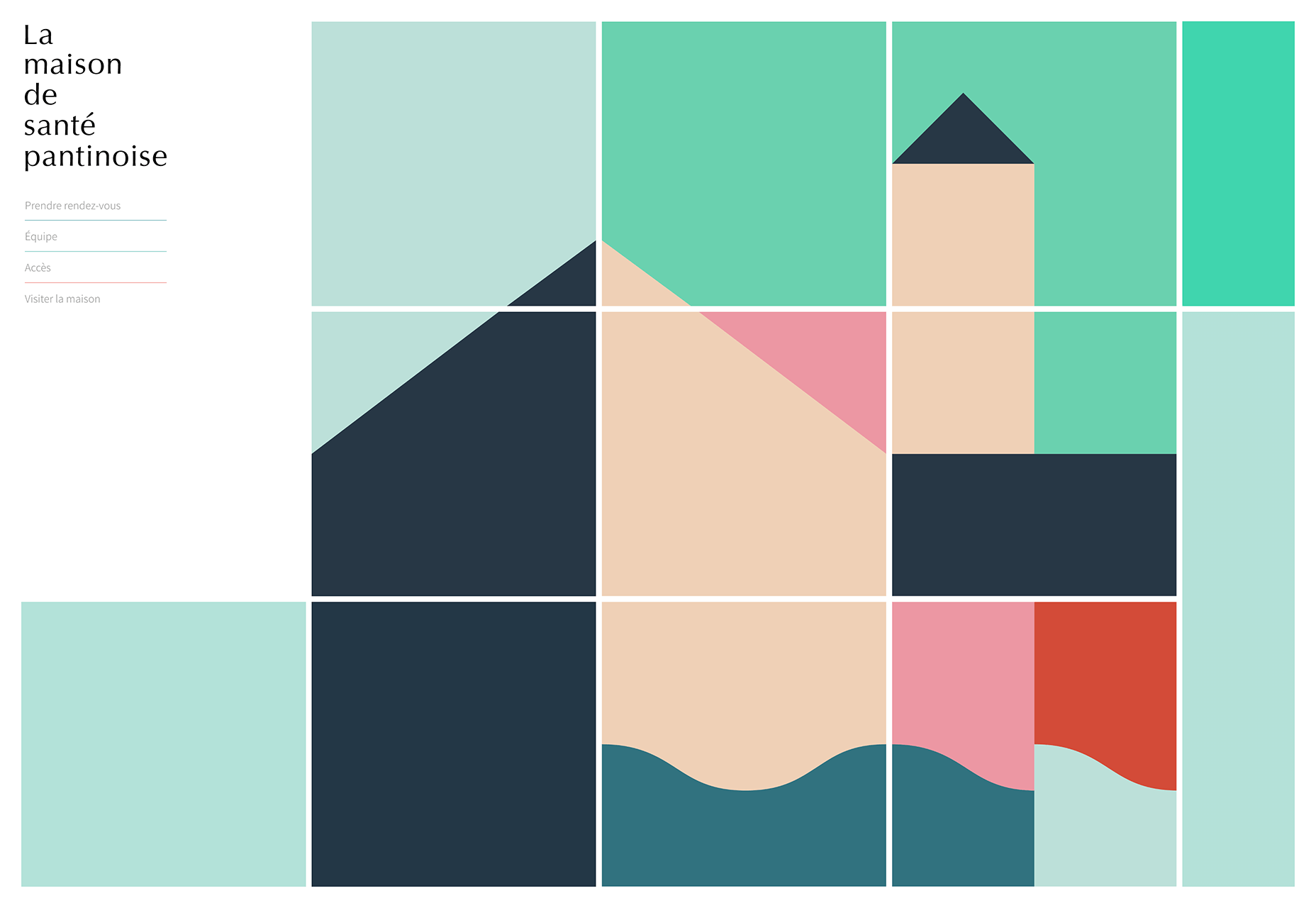
La Maison de Santé Pantinoise
Web design in 2019 wasn’t all about trends. Design is about creating something appropriate, and this site for a Parisian MD office is calming, and reassuring. The block animation sensitively illustrates the conditions that are covered.
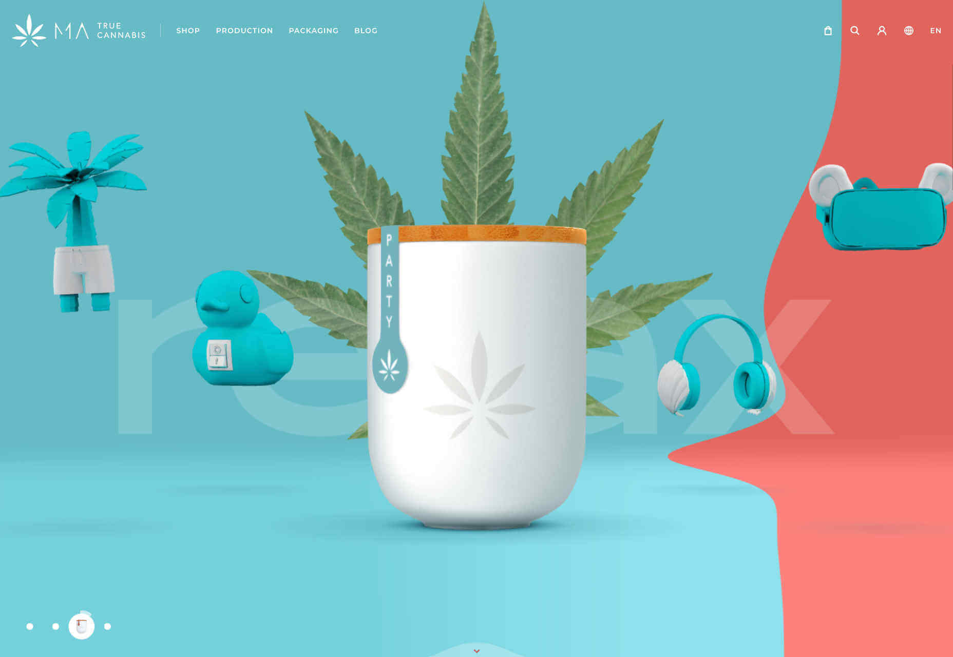
MA True Cannabis
Cannabis is increasingly acceptable in many countries, and its marketing is becoming increasingly sophisticated as a result. MA True Cannabis uses four ‘worlds’ to highlight some of the benefits of this naturally occurring, popular herb.
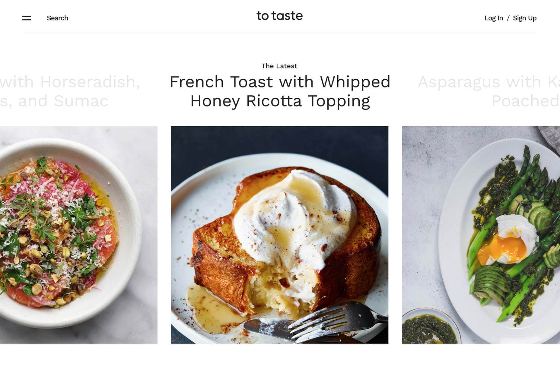
To Taste
To Taste was one of our very favorite recipe sites this year. It’s very easy to browse, and the mouth-watering photography is a clear guide to what your concoction was supposed to turn out like.
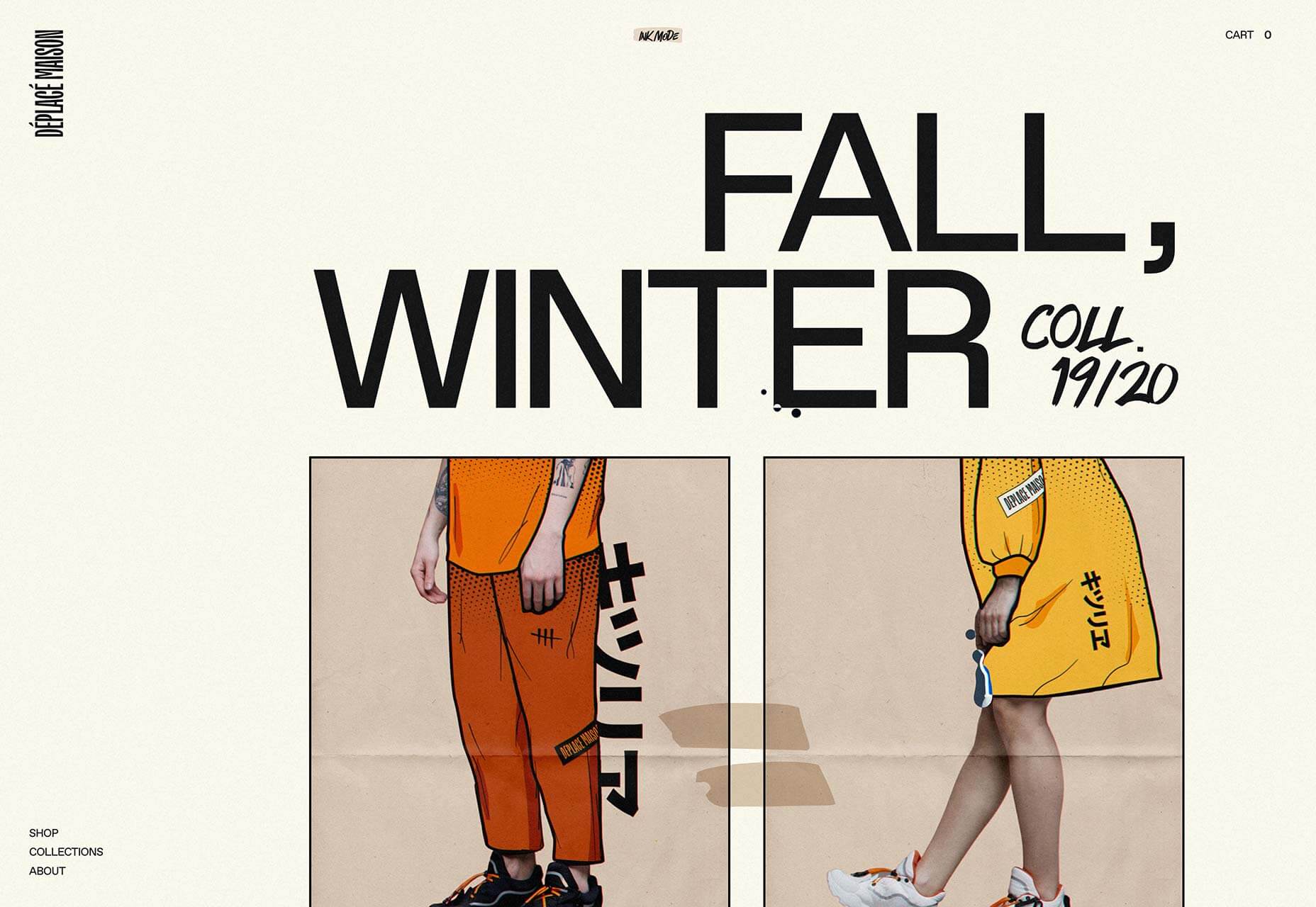
Déplacé Maison
Déplacé Maison‘s art direction evokes graphic novels. It’s an original aesthetic that is reinforced with lettering-style typography, for a completely bespoke look.
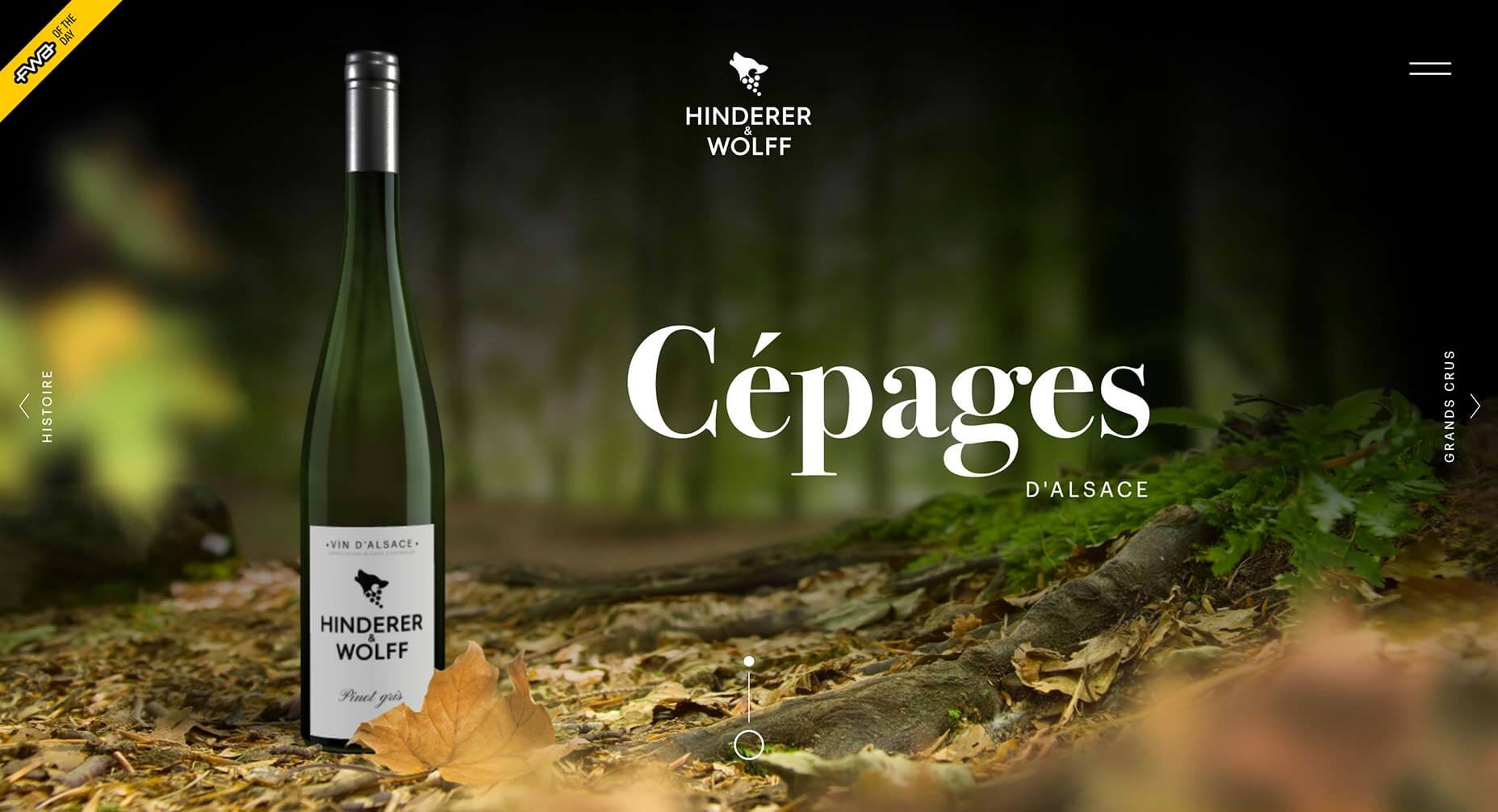
Hinderer & Wolff
There were dozens of elegant and sophisticated sites released for wine brands this year. One of our favorites is Hinderer & Wolff, because it’s a joy to explore.
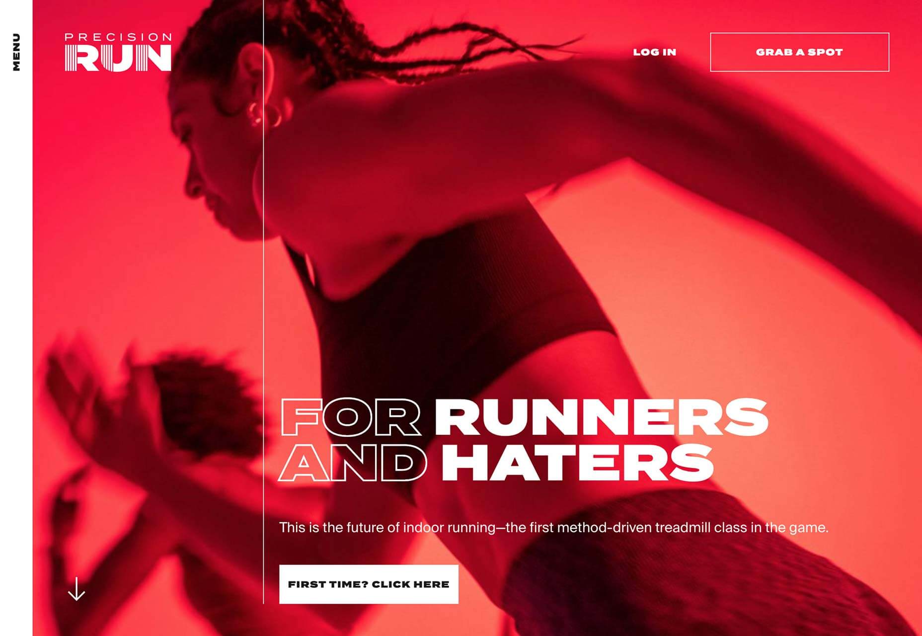
Precision Run
Outside of web design, one of the big trends in tech for 2019 was connected, indoor exercise. Precision Run is one of the leading pack, and its site is suitably high-energy.
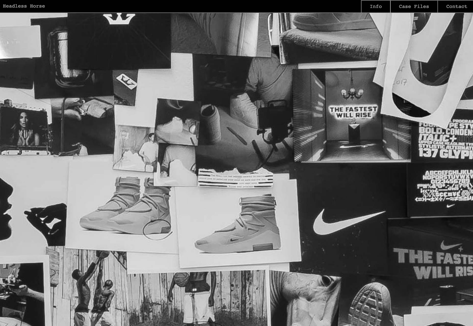
Headless Horse
With dozens of ways to browse a portfolio, it’s great to see that agencies are still finding new and exciting ways to present their work. Headless Horse‘s approach is effective because their client list is so familiar.
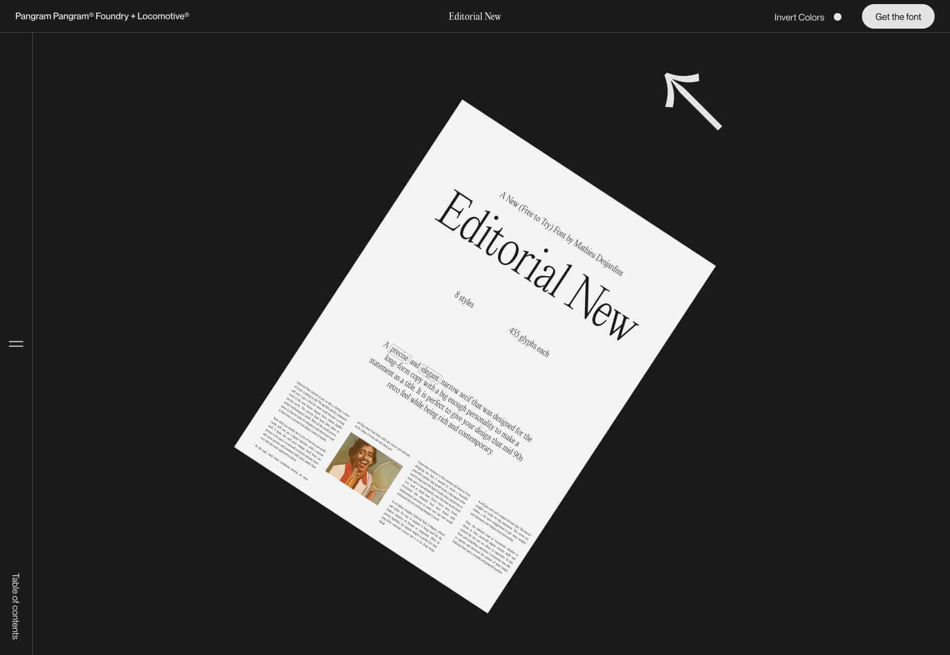
Editorial New
There’s been an increasing tendency among type designers to release entire websites to promote a single typeface. Joining this trend is Editorial New, a body text-appropriate typeface with a site that’s a joy to scroll through.
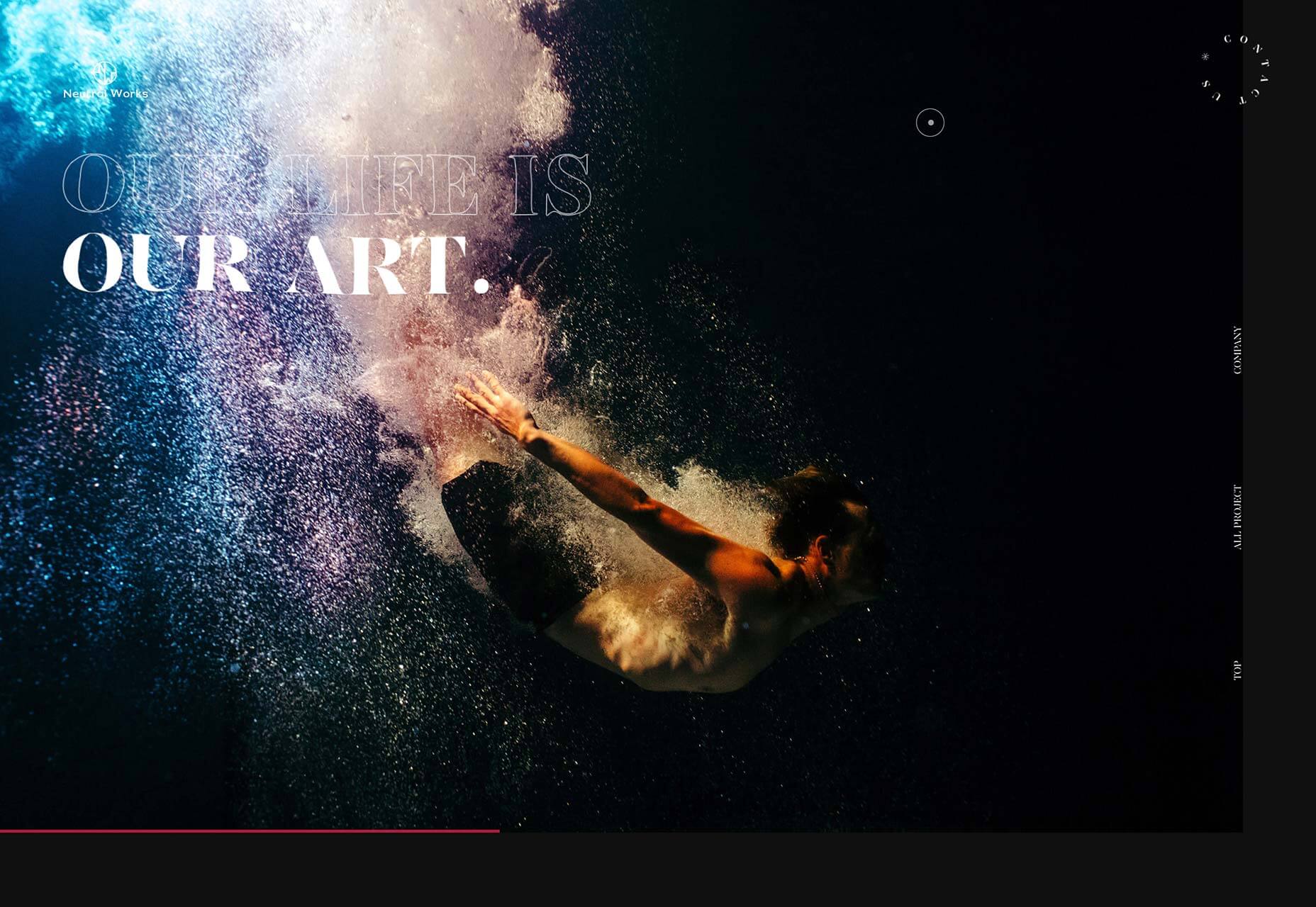
Neutral Works
One of the biggest design trends among developers in 2019 was liquid-style transitions. One of the best examples is Japan-based Neutral Works‘ portfolio.
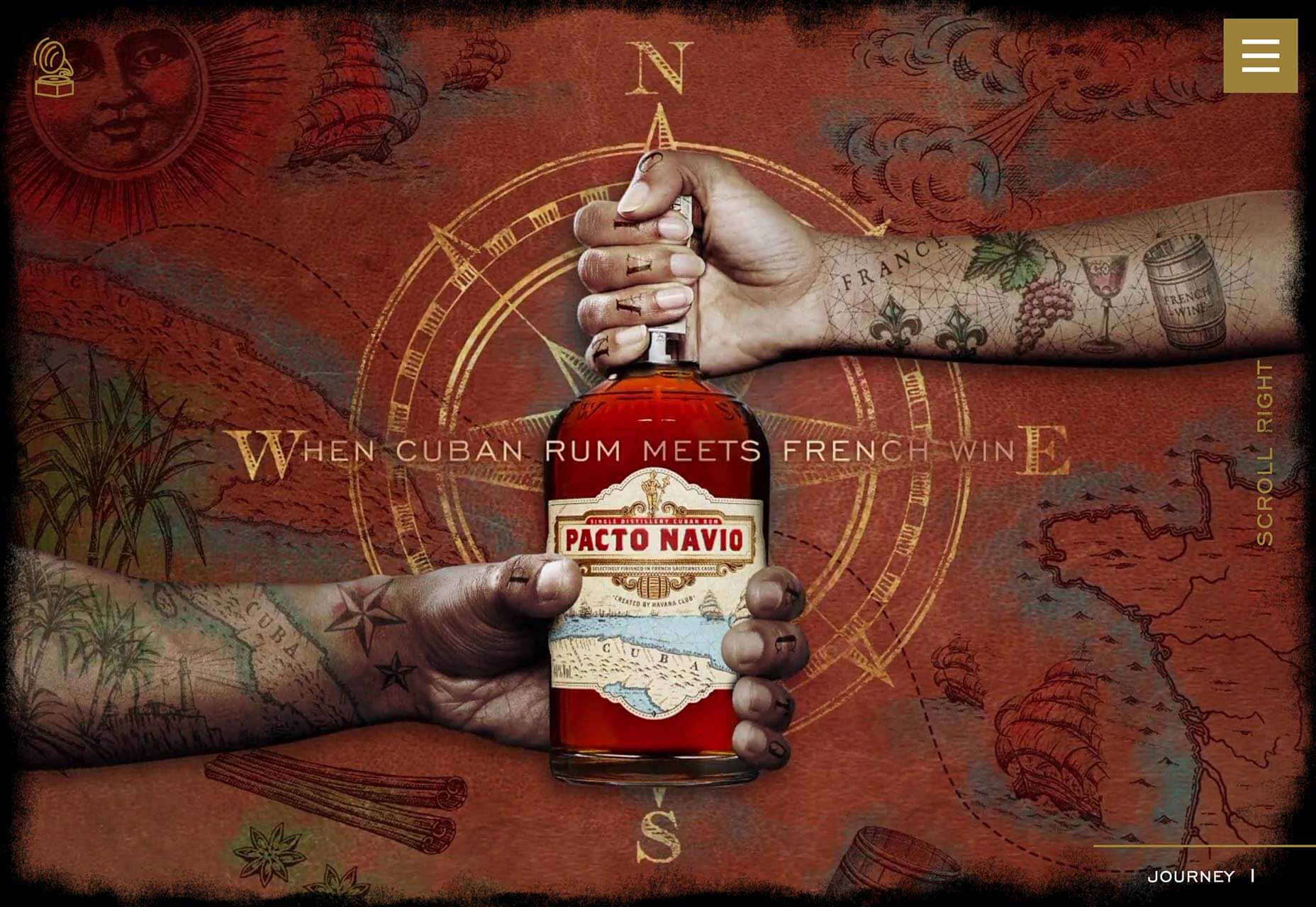
Pacto Navio
This beautifully art directed site is for Pacto Navio, a Cuban rum distilled near Havana. The brand illustrations give it a distinctly Caribbean flavor, and sell the brand perfectly.
Every week users submit a lot of interesting stuff on our sister site Webdesigner News, highlighting great content from around the web that can be of interest to web designers.
The best way to keep track of all the great stories and news being posted is simply to check out the Webdesigner News site, however, in case you missed some here’s a quick and useful compilation of the most popular designer news that we curated from the past week.
Note that this is only a very small selection of the links that were posted, so don’t miss out and subscribe to our newsletter and follow the site daily for all the news.
PNGDB.com – Download Millions of Free PNG Images
Free Vector Illustrations for Web Designers
15 Tools Web Designers Should Try in 2020
People with Cool Avatars
New Levi’s Logo is Infuriating Typophiles
Why You Shouldn’t Use Solid or Underlined Text Fields
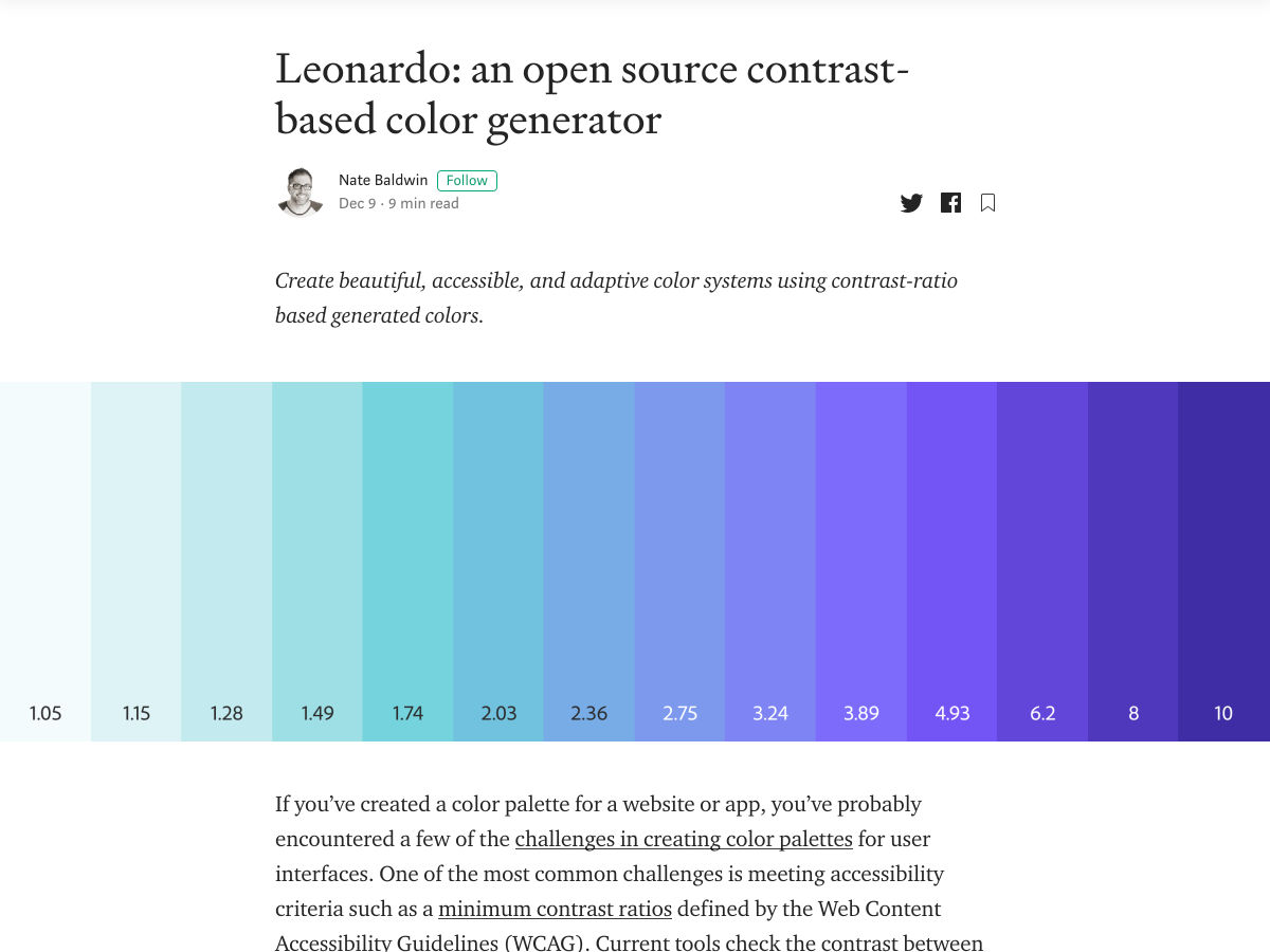
Leonardo: Contrast-based Color Generator
Accessibility Tips for Web Developers
17 Useful Tools for UI/UX Designers
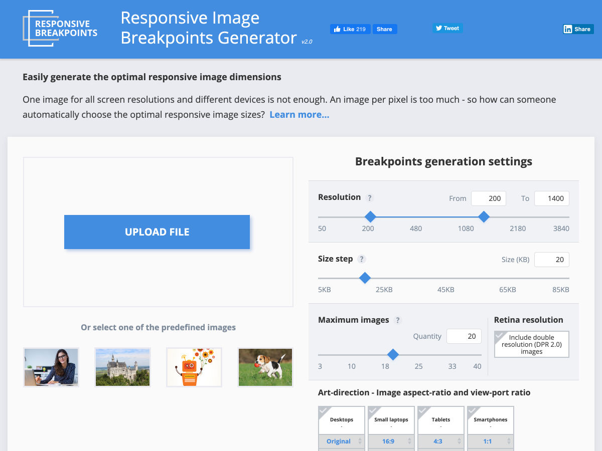
Responsive Breakpoints Generator
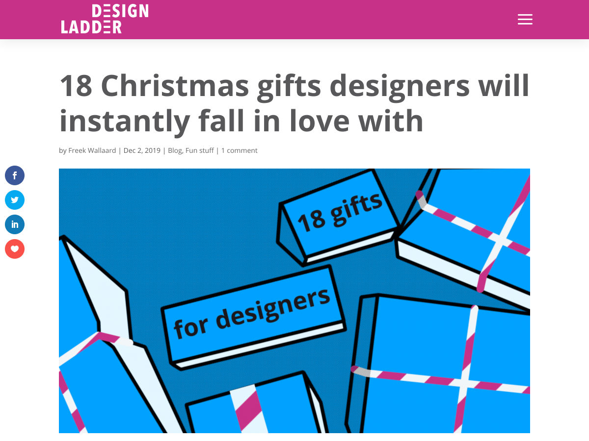
18 Christmas Gifts for Designers
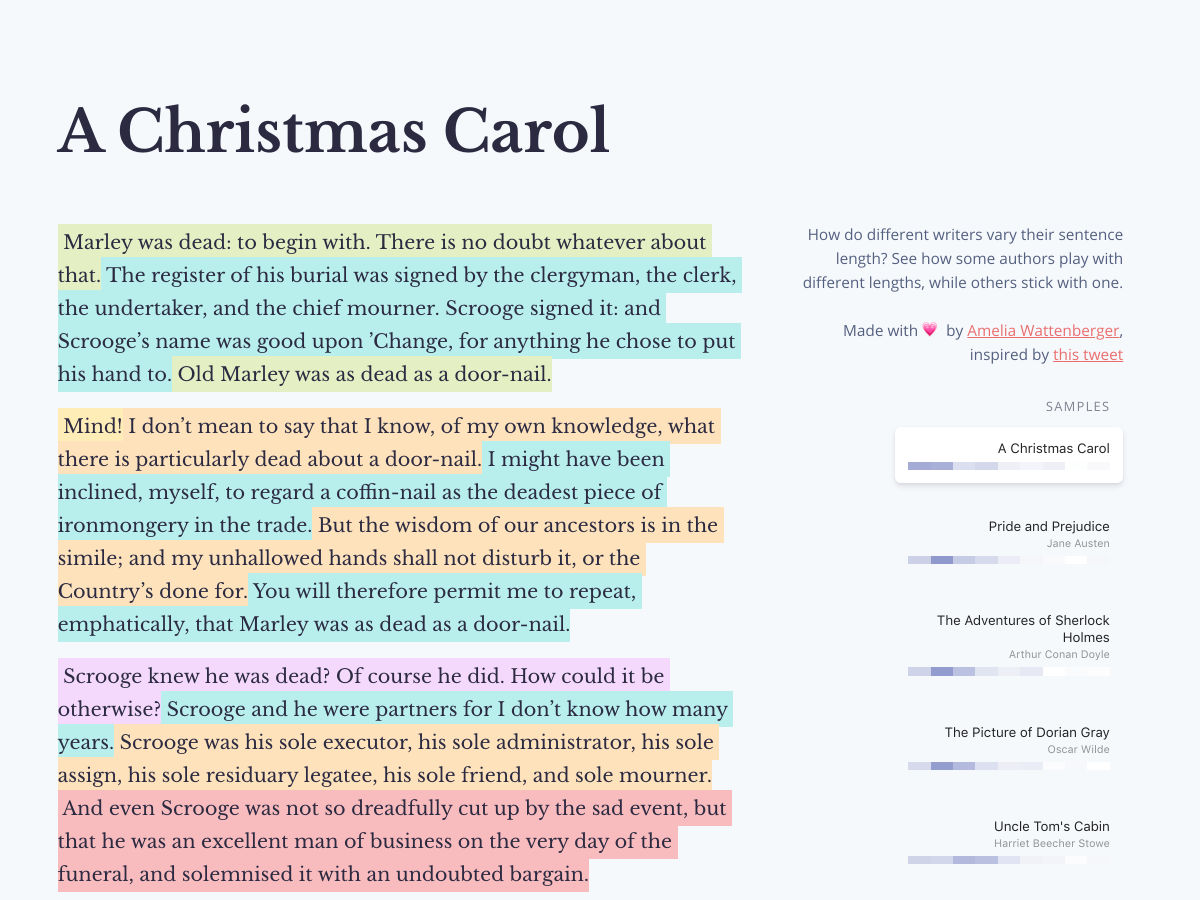
Sentence Lengths
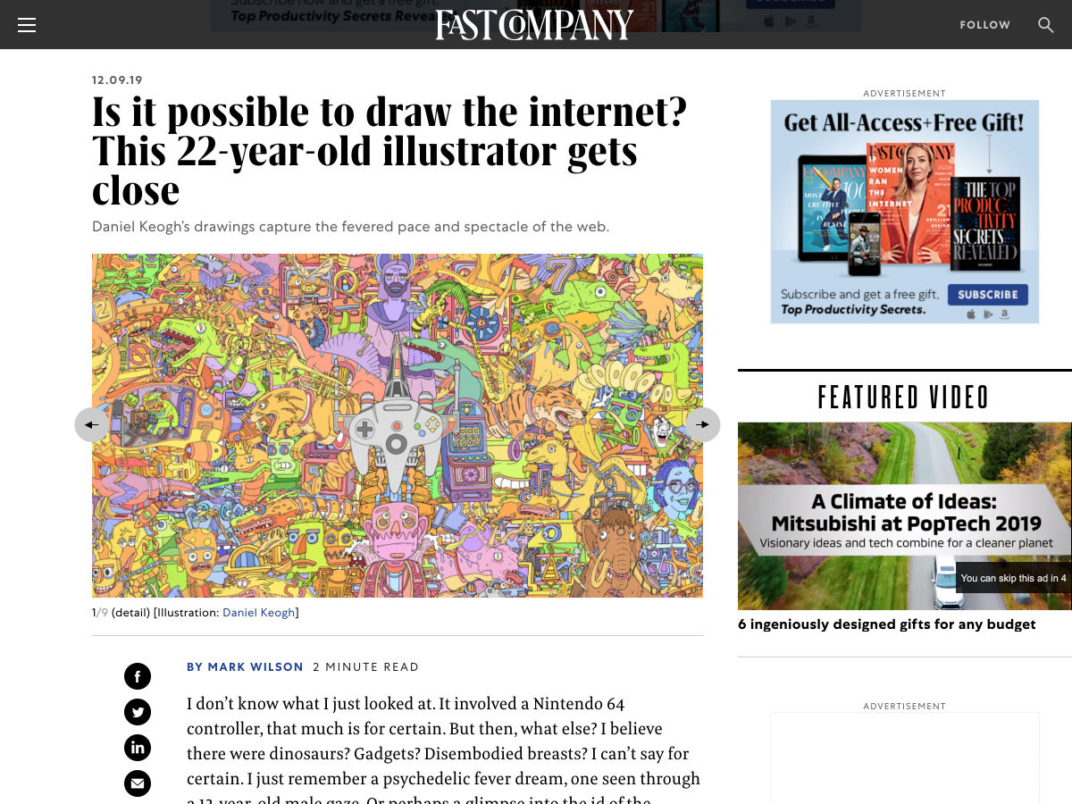
Is it Possible to Draw the Internet?
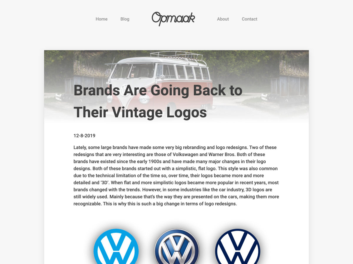
Modern Brands Going Back to their Vintage Logos
Why CSS HSL Colors are Better!
10 Ways to Make a Fully Personalized UI
Mental Models for Designers
Introducing Unsplash for Brands
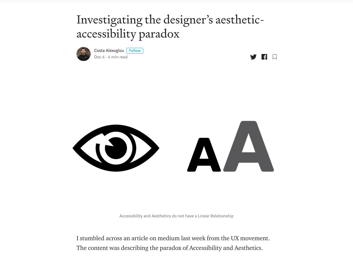
Investigating the Designer’s Aesthetic-Accessibility Paradox
Think You Can’t Escape Google? You Haven’t Seen Anything yet
Measuring User Experience with Usability Metrics
Why You Shouldn’t Ignore Smaller Web Design Projects
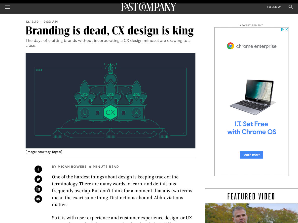
Branding is Dead, CX Design is King
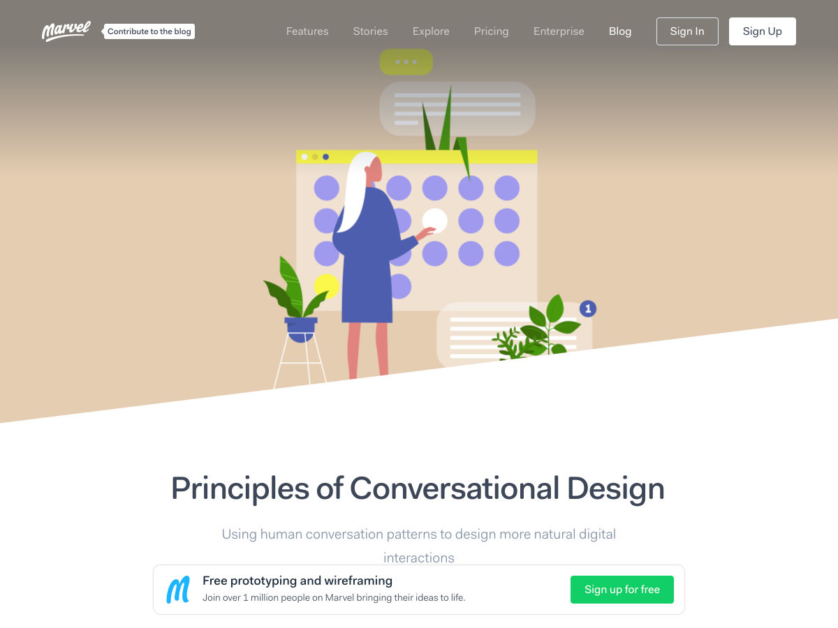
Principles of Conversational Design
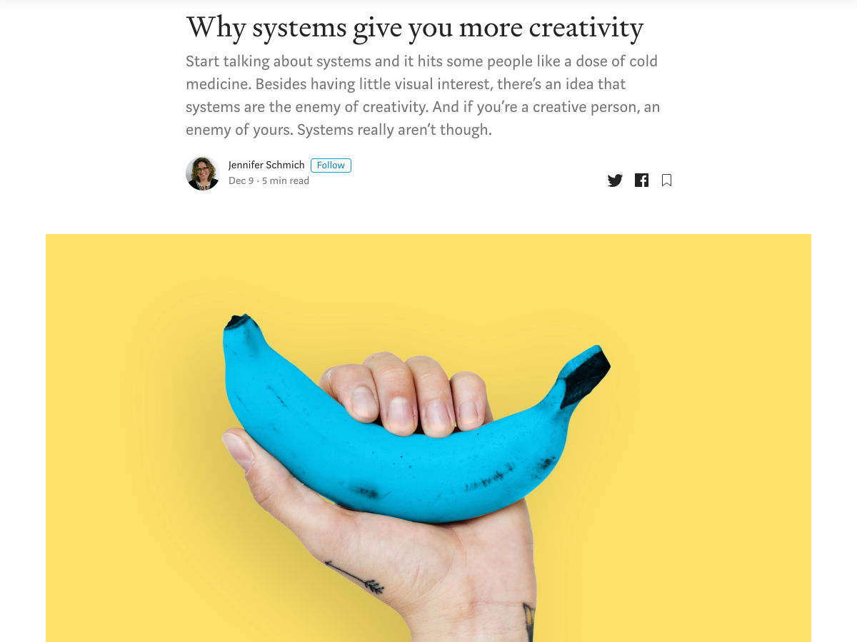
Why Systems Give You More Creativity
Want more? No problem! Keep track of top design news from around the web with Webdesigner News.
November 30th, the official “Blue Beanie Day,” has come and gone. I’m not sure I ever grokked the exact spirit of it, but I’ve written about what it means to me. Last year:
Web standards, as an overall idea, has entirely taken hold and won the day. That’s worth celebrating, as the web would be kind of a joke without them. So now, our job is to uphold them. We need to cry foul when we see a browser go rogue and ship an API outside the standards process.
Building off that, I’d add the need to prevent browsers from breaking things that have worked for half a decade, like iOS 13 did with CSS parallax.
Mainly, though, Blue Beanie Day is receding from view because our industry as a whole thinks less and less about accessibility (not that we ever had an A game on the subject), and talks less and less about progressive enhancement, preferring to chase the ephemeral goal posts of over-engineered solutions to non-problems.
It’s people who won the browser wars, so I suppose it’s fitting that people are going to let it slip away.
I think Adam’s first prediction is his boldest, even beyond his Hail Mary prediction. CSS grid is awesome and gap is perhaps one of its best qualities, but gapsuperseding spacing things out in other ways (e.g. margin) is a bold prediction indeed, especially with Firefox being the only browser supporting it in flexbox.
Most of the time you don’t really care about whether a user is actively engaged or temporarily inactive on your application. Inactive, meaning, perhaps they got up to get a drink of water, or more likely, changed tabs to do something else for a bit. There are situations, though, when tracking the user activity and detecting inactive-ness might be handy.
Let’s think about few examples when you just might need that functionality:
tracking article reading time
auto saving form or document
auto pausing game
hiding video player controls
auto logging out users for security reasons
I recently encountered a feature that involved that last example, auto logging out inactive users for security reasons.
Why should we care about auto logout?
Many applications give users access to some amount of their personal data. Depending on the purpose of the application, the amount and the value of that data may be different. It may only be user’s name, but it may also be more sensitive data, like medical records, financial records, etc.
There are chances that some users may forget to log out and leave the session open. How many times has it happened to you? Maybe your phone suddenly rang, or you needed to leave immediately, leaving the browser on. Leaving a user session open is dangerous as someone else may use that session to extract sensitive data.
One way to fight this issue involves tracking if the user has interacted with the app within a certain period of time, then trigger logout if that time is exceeded. You may want to show a popover, or perhaps a timer that warns the user that logout is about to happen. Or you may just logout immediately when inactive user is detected.
Going one level down, what we want to do is count the time that’s passed from the user’s last interaction. If that time period is longer than our threshold, we want to fire our inactivity handler. If the user performs an action before the threshold is breached, we reset the counter and start counting again.
This article will show how we can implement such an activity tracking logic based on this example.
Step 1: Implement tracking logic
Let’s implement two functions. The first will be responsible for resetting our timer each time the user interacts with the app, and the second will handle situation when the user becomes inactive:
resetUserActivityTimeout – This will be our method that’s responsible for clearing the existing timeout and starting a new one each time the user interacts with the application.
inactiveUserAction – This will be our method that is fired when the user activity timeout runs out.
let userActivityTimeout = null;

function resetUserActivityTimeout() {
  clearTimeout(userActivityTimeout);
  userActivityTimeout = setTimeout(() => {
    inactiveUserAction();
  }, INACTIVE_USER_TIME_THRESHOLD);
}

function inactiveUserAction() {
  // logout logic
}
OK, so we have methods responsible for tracking the activity but we do not use them anywhere yet.
Step 2: Tracking activation
Now we need to implement methods that are responsible for activating the tracking. In those methods, we add event listeners that will call our resetUserActivityTimeout method when the event is detected. You can listen on as many events as you want, but for simplicity, we will restrict that list to a few of the most common ones.
That’s it. Our user tracking is ready. The only thing we need to do is to call the activateActivityTracker on our page load.
We can leave it like this, but if you look closer, there is a serious performance issue with the code we just committed. Each time the user interacts with the app, the whole logic runs. That’s good, but look closer. There are some types of events that are fired an enormous amount of times when the user interacts with the page, even if it isn’t necessary for our tracking. Let’s look at mousemove event. Even if you move your mouse just a touch, mousemove event will be fired dozens of times. This is a real performance killer. We can deal with that issue by introducing a throttler that will allow the user activity logic to be fired only once per specified time period.
Let’s do that now.
Step 3: Improve performance
First, we need to add one more variable that will keep reference to our throttler timeout.
let userActivityThrottlerTimeout = null
Then, we create a method that will create our throttler. In that method, we check if the throttler timeout already exists, and if it doesn’t, we create one that will fire the resetUserActivityTimeout after specific period of time. That is the period for which all user activity will not trigger the tracking logic again. After that time the throttler timeout is cleared allowing the next interaction to reset the activity tracker.
We just created a new method that should be fired on user interaction, so we need to remember to change the event handlers from resetUserActivityTimeout to userActivityThrottler in our activate logic.
Now that we have our activity tracking logic implemented let’s see how can move that logic to an application build with Vue. We will base the explanation on this example.
First we need to move all variables into our component’s data, that is the place where all reactive props live.
Since we are using Vue and it’s reactive system, we can drop all direct DOM manipulations i.(i.e. document.getElementById("app").innerHTML) and depend on our isInactive data property. We can access the data property directly in our component’s template like below.
Last thing we need to do is to find a proper place to activate the tracking logic. Vue comes with component lifecycle hooks which are exactly what we need — specifically the beforeMount hook. So let’s put it there.
There is one more thing we can do. Since we are using timeouts and register event listeners on window, it is always a good practice to clean up a little bit after ourselves. We can do that in another lifecycle hook, beforeDestroy. Let’s remove all listeners that we registered and clear all timeouts when the component’s lifecycle comes to an end.
This example concentrates purely on detecting user interaction with the application, reacting to it and firing a method when no interaction is detected within specific period of time. I wanted this example to be as universal as possible, so that’s why I leave the implementation of what should happened when an inactive user it detected to you.
I hope you will find this solution useful in your project!
A standard copy-and-paste YouTube embed lands on your page as an which loads a big ol’ pile of other stuff to play that video. But the UX of it is still essentially an image and a play button. Click the play button and the video plays. You can build essentially the same thing with an anchor link wrapping an image!
Not long ago, we covered a very clever “lazy load” technique doing exactly this from Arthur Corenzan that was further improved by Remy Sharp and Adrian Roselli.
Paul Irish has tackled it as well with a web component:
Provide videos with a supercharged focus on visual performance. This custom element renders just like the real thing but approximately 224X faster.