Archive

Archive for December, 2019

Inclusive Components: Book Reviews And Accessibility Resources

December 13th, 2019 No comments
A picture of a black-and-white book cover standing on a wooden surface abd tilted to the side titled Inclusive Components, Accessible web interfaces, piece by piece, written by Heydon Pickering

Inclusive Components: Book Reviews And Accessibility Resources

Inclusive Components: Book Reviews And Accessibility Resources

Ari Stiles

2019-12-13T11:00:00+00:002019-12-13T13:08:02+00:00

Tuesday, December 3, was the official release date for Inclusive Components, and the reception has been overwhelmingly positive. The book is already an essential resource for accessibility experts and developers.

You Had Me At “Inclusive!”

As the book makes its way to offices, doorsteps, and accessibility meetups all over the world, here are just a few of the mentions we’ve seen so far.

A picture of a black-and-white book cover standing on a wooden surface abd tilted to the side titled Inclusive Components, Accessible web interfaces, piece by piece, written by Heydon Pickering

332 pages. Quality hardcover with a stitched binding and ribbon page marker. The eBook is available as PDF, ePUB and Amazon Kindle.

Q.) How do we build accessible buttons and dropdowns? Keyboard-friendly tooltips, tabs, and notifications? Inclusive accordions, sliders, data tables, and modals?

A.) “Inclusive Components,” by @heydonworks for @smashingmag Books.https://t.co/NGJ1dmL5KX #frontend #a11y

— zeldman (@zeldman) December 4, 2019

Ever wondered how to make a Toggle Button accessible?

This book has not only the solution to that issue but also! Free worldwide shipping ?

Yes yes yes, it even ships to Argentina for free ? https://t.co/yDaEulyOXT

— Eva Ferreira (@evaferreira92) December 3, 2019

Today @heydonworks‘ new book Inclusive Components comes out! In a world where lots of us are building design systems, gluing together JS component systems, and 97.8% of sites have accessibility issues, I can’t think of a more valuable topic for a book.https://t.co/kYg5ArTY8E

— Dave Rupert (@davatron5000) December 3, 2019

“While awareness of web accessibility has continually been increasing, the volume and types of errors on home pages suggests that awareness alone is not sufficient to ensuring a highly accessible web experience for users with disabilities […] Inclusive Components provides precisely the type of guidance, examples, and knowledge necessary to help web authors not only consider accessible interfaces, but actually implement them.”

Jared Smith, Associate Director of WebAIM

“[…] a practical approach to explaining how to build fully accessible UI components with a lot of examples. Understanding and embracing how to build accessible interfaces will improve the quality of our work, but more importantly, it can—sometimes drastically—improve the experience of our users in many ways.”

— Holger Bartel (Source)

So many of us want to build inclusive interfaces, but don’t know where to begin. Heydon’s book provides an entry point: he takes some of the most common interface patterns and shows the reader how to build them inclusively from the start.

Developers can benefit from this approach right away, but accessibility professionals and consultants also gain a valuable resource for working with clients and teams.

“I have found Heydon Pickering to me one of the very best communicators about the subject of digital accessibility. He brings clarity to complex issues and is compelling about how and why accessibility is critically important.”

— Sharron Rush, Executive Director of Knowbility

A photo of Sharon Russ

Sharron Rush, Knowbility

Sharron’s team runs Accessibility audits for existing sites and apps, and they often have to help clients establish new development approaches.

“The Knowbility team loves ‘Inclusive Components’ and highly recommends it to anyone who builds with accessibility in mind.”

Through step-by-step instructions and coding examples, the reader quickly sees how existing habits can change to become more inclusive.

Heydon also guested on the Smashing Podcast last week and summarized the book’s central theme:

“The idea was to both bring accessibility to design systems, but by the same token, think systemically when it comes to trying to address accessibility.”

In Case You Missed It: Heydon Pickering at Smashing

A Growing Library To Meet A Growing Need

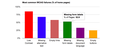
WebAIM conducted an accessibility analysis of the top million websites at the beginning of 2019—the WebAIM Million—and the results made a lot of developers and teams rethink their workflow. Accessibility and inclusion have always been important, but seeing all of the errors and bloat spelled out was enlightening.

A bar graph showing the categories and numbers of errors found during the WebAIM Million survey. Of the million homepages tested, 85% had Low Contrast, 68% had Missing alternative text, 58% had empty links, 52% had missing form labels, 33% had missing document language, and 25% had empty buttons.

The overall results from the WebAIM Million. 97.8% of the sites tested had detectable WCAG2 errors. (Source)

The demand for accessibility resources continues to grow as more companies decide to build sites, apps, and platforms that work for everyone. Inclusive Components is just one of many accessibility resources Heydon has created to help meet this demand:

Heydon’s new project with Andy Bell, Every Layout, takes the same modular approach to CSS as Inclusive Components does for interface patterns.

Where Shall We Go Next?

Smashing’s accessibility resource list continues to grow, too. In addition to the accessibility articles and videos we publish, the community regularly cites Adam Silver’s Form Design Patterns book as a valuable reference for building inclusive forms.

We also have some videos that you may like watching and listening to: Sara Soueidan held a talk on Applied Accessibility and Marcy Sutton once spoke about Garbage Components recorded live at SmashingConf in New York this past October. We’re sure you’ll find them useful!

We love advocating for an accessible web, but we’d like to know: What other accessibility resources would you like to see in the future? How can we help? Let us know in the comments section below.

Smashing Editorial(ra, il)
Categories: Others Tags:

How to Boost Customer Engagement with Video Marketing

December 13th, 2019 No comments

Simply defined, customer engagement is when a customer interacts with a brand through social media, mobile devices, or even direct communication. What makes customer engagement so important and necessary when it comes to marketing a clients’ business? Keeping in touch with your customers is critical and gives you insight on who your brand caters to and it’s a great tool for increasing your conversion rates.

What’s a good way to have good customer engagement? First things first, you’d need to make them pay attention.

Attention spans are dropping as time goes by. Although social media is one of the culprits for this, we can’t fully blame it on Instagram or Facebook. What we can do is accept that attention spans are growing smaller and find a way to adapt to the change.

Videos are great at grabbing attention for many reasons. First of all, our eyes are attracted to movement, so videos naturally draw peoples’ attention. According to research, video ads interest people more than a static ad. People are 27 times more likely to click on a video ad than a static one.

Secondly, videos do a great job of engaging viewers. So, not only do they attract attention, but they also retain it. Videos get 1200% more shares than text and images combined.

Most of the time we’ve read an entire page and totally forgot what we just read. We end up going back to re-read it. This is called regression, and happens mostly when we read written text. Studies show that viewers are able to retain 95% of a message in a video compared to the 10% when reading written text.

Videos make people want to share them on social media because they’re highly shareable and contain a lot of information minus the bulk. Also, our brains process visuals much quicker than text. Around 90% of the information transmitted to your brain is visual.

Here are 5 ways video marketing can help you increase customer engagement:

1. Keeps Your Audience Entertained

Whether you want to admit it or not, video is an entertaining medium to convey information with. We talked about how our brains are attracted to movement than static images.

It’s easier to follow a video than to read a whole book on a subject. When your audience is entertained, it means that customer engagement is in place.

A good example would be this ad by Melbourne’s Transportation System, Metro. They wanted to raise awareness about train safety and this video was entertaining, retained people’s attention and was catchy as well:

?

2. Keeps it Simple

There are some concepts and ideas that are too complicated to explain so they require both visuals and written text to convey the message. With a video, a brand can use both moving images and text to communicate with their customers.

It keeps the customers engaged and converts the complex message into something simple, digestible, and more interesting.

Michael Dublin from Dollar Shave Club created this commercial with a minimal budget and a simple idea— to save people from wasting so much money on razors. The video was simple but extremely engaging:

?

3. A Broader Reach

With video, you can reach out to different kinds of audiences on different platforms. This works really well, especially if you use free video hosting sites such as Youtube of Vimeo.

Youtube and Vimeo allow you to copy the embed code and share your video on a variety of platforms. You don’t have to worry about lagging or technical issues since these platforms are very reliable.

By posting your video on different platforms, you can reach out to audiences that aren’t on certain platforms. For example, people on Instagram might not have Facebook and vice versa. So posting your video on these platforms allows maximum reach.

Flossy Carter is an excellent example for this. He’s active on Instagram and shares snippets of his videos on his Instagram stories. He links them to his Youtube videos so his audience on Instagram also gets to see his newest videos:

?

4. Has Better Retention

We mentioned before that videos are great at keeping information retained. According to Hubspot, 80% of customers remember a video they viewed in the past month. Instead of a long textbook that’s boring and hard to remember, a video is a short narrative loaded with information.

The narrative engages viewers and leaves a memorable impression, making video an excellent storyteller. People are more likely to remember a story than a long list of facts.

Videos are also great learning aids for most people. Many people require visual aids to learn and 65% of people consider themselves visual learners. Videos accommodate this kind of learning style and help people retain information.

Shane Dawson has transformed his Youtube channel with long-form videos. His videos run for at least 20 minutes to 40 minutes. Despite the long durations, his videos rake in 20 million views on average:

?

5. Increases Buyer Intent

A marketing campaign’s success depends on its conversions. This is when people have expressed their interest in your product or service. Videos are good at pushing customers to purchase.

When customers watch a video of a product they are considering buying, it increases their buying intent by 97%. Also, 64% of customers are more likely to buy a product after watching a video about it.

Although, this doesn’t mean any video will do the job. You would need to create a video that meets the needs of your buyers. You can make videos that plug into the buyer’s pain points, answer their questions, or provide valuable information for them.

Apple has been really good at displaying their products’ features by using the actual product to make videos. For example, they recently made Selena Gomez’s new music video with an iPhone:

??

Source

Categories: Designing, Others Tags:

The Best of Logo Redesigns in 2019 – Our Top 8 Picks

December 13th, 2019 No comments

You know the saying, out with the old and in with the new!

And 2019 was definitely a big year of change.

With each new year, comes new changes, and we’re greatly anticipating next year’s big design changes.

But until then, we want to reminisce and talk about the best 8 logo redesigns in 2019.

There were some pretty big and iconic changes that happened this year, and we’re going to go over all of them.

Logo redesign is a common practice because no matter how good your logo looked when you created it, in most cases, it’ll become dated.

With new trends coming around every season, and with new things being implemented into a business, it’s hard for a logo to stay relevant and fresh.

So today, we’ll be going over the top 8 logo redesigns of 2019.

Let’s get into it.

Warner Bro’s

Warner Bro’s logo redesign was a shocker for all of us. After a century of having the same iconic logo, they decided it was time to make the logo a little more versatile.

With a new shade of blue, a little reshaping of the shield, and a new flat design, I can say that Warner Bro’s was definitely my favorite logo redesign of 2019.

What do you all think of the new design? Let us know in the comment section below what your first impressions were.

Volkwagen

[source]

Another recent and iconic logo redesign was from Volkswagen.

Volkswagen, being internationally renowned for its cars, definitely doesn’t need much of an introduction from us.

Volkswagen stated the following in their press release regarding the new logo.

“The new brand design marks the start of the new era for Volkswagen,” says Jürgen Stackmann, Member of the Brand Board of Management responsible for Sales, Marketing and After-Sales. “By formulating new content and with new products, the brand is undergoing a fundamental transformation towards a future with a neutral emission balance for everyone. Now is the right time to make the new attitude of our brand visible to the outside world.”

[source]

We’re happy with the steps that VW is taking to help the environment. And we also like the new flat and versatile design of the logo.

A new era, a new logo.

Firefox

When we heard that Firefox’s new logo was accidentally leaked via Twitter over the summer, we were actually thrilled.

With every new redesign Firefox goes through, it continues to get sleeker and sleeker.

The fox obviously had some grooming over the summer, as its coat is much smoother now. The gradient is very very similar to the old one, and now we can actually see the sly fox’s face.

Overall, we’re very pleased with the facelift that Mozilla underwent, and we’re looking forward to what they’ll put out next.

Grey Goose

Oh Grey Goose, you beautiful bottle of fun and joy.

Grey Goose also went through quite a surprising redesign this summer.

They left all their former, intricate designs behind and embraced minimalism in their design.

But not only did they embrace minimalism in their graphic design, but also in their wording.

And as we said in a previous article all about their redesign, this still rings true.

“From a marketing perspective, the shorter tagline that spells just ‘Vodka’ now instead of ‘World’s best tasting Vodka’ makes a lot of sense. Most people shop for alcohol based on the label. In recent years, more and more consumers will go for a more minimal tag.”

Minimalism is definitely a trend we’ve been seeing all throughout 2019.

Let’s see what we have up next.

Discovery Channel

[source]

Next up, it’s time to “discover” another logo redesign. See what I did there?

I need to stop.

Anywho, Discovery came up with a new logo design. They ditched the 3D world model and went for a flat design. They also shortened it by removing the stand alone D and just including the logo in the actual written word.

If I’m completely honest, I think I like the previous logo design better. What do you guys think?

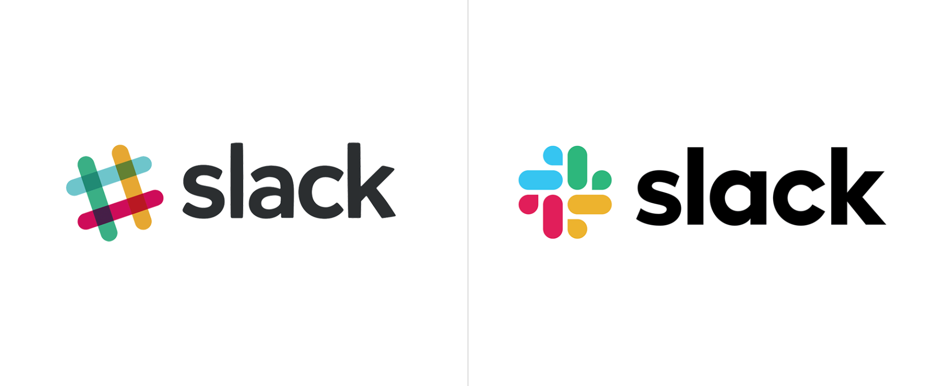
Slack

Alright, let’s cut them some “slack” with the new logo design.

I’m kidding you guys, I really like the new look of their logo. I really need to quit on these puns.

We all know and love Slack and loved the liveliness of their logo. I genuinely can say that I vouch for both logos! But let’s hear what Slack themselves have to say about it.

“Our first logo was created before the company launched. It was distinctive, and playful, and the octothorpe (or pound sign, or hash, or whatever name by which you know it) resembled the same character that you see in front of channels in our product.

It was also extremely easy to get wrong. It was 11 different colors—and if placed on any color other than white, or at the wrong angle (instead of the precisely prescribed 18º rotation), or with the colors tweaked wrong, it looked terrible. It pained us.

So here we are. Our in-house design and brand team, together with Michael Bierut and the team from Pentagram, worked to create a new and more cohesive visual identity. And we’re starting, today, with the logo. It uses a simpler color palette and, we believe, is more refined, but still contains the spirit of the original. It’s an evolution, and one that can scale easily, and work better, in many more places. “

[souce]

So there you have it!

Reebok

Whether you’re in dance, track, crossfit, or yoga, Reebok has the shoes for you.

They also went through quite a big design change this year.

The iconic Delta sign in their old logo has taken a back seat to the new design.

The new design is actually just a return of their design from 1990, with some nice tweaks.

Fox Entertainment

[source]

And finally, we come to our final logo redesign.

Some logo redesigns require an entire make-over, and others just need a little, teeny-tiny tweak.

Fox Entertainment went for a tiny little tweak.

The Entertainment text is the main change.

They changed the font and they also made it quite bold.

It definitely is more eye-catching now and looks a lot better.

Sometimes all you need is the smallest adjustment to make a huge difference!

And Finally…

We hope you guys enjoyed our collection of logo redesigns. We are looking forward to a brand new year and a new start in 2020.

Let us know what your favorite logo redesign of the year was!

Happy holidays!

Read More at The Best of Logo Redesigns in 2019 – Our Top 8 Picks

Categories: Designing, Others Tags:

Weekly Platform News: Strict Tracking Protection, Dark Web Pages, Periodic Background Sync

December 12th, 2019 No comments

In this week’s news: Firefox gets strict, Opera goes to the dark side, and Chrome plans to let web apps run in the background.

Let’s get into the news.

Firefox for Android will block tracking content

Mozilla has announced that the upcoming revamped Firefox for Android (currently available in a test version under the name “Firefox Preview”) will include strict tracking protection by default.

On the phone or tablet, most users care much more about performance and blocking of annoyances compared to desktop. Users are more forgiving when a site doesn’t load exactly like it’s meant to. So we decided that while Firefox for desktop’s default mode is “Standard,” Firefox Preview will use “Strict” mode.

Strict tracking protection additionally blocks “tracking content”: ads, videos, and other content with tracking code.

(via Mozilla)

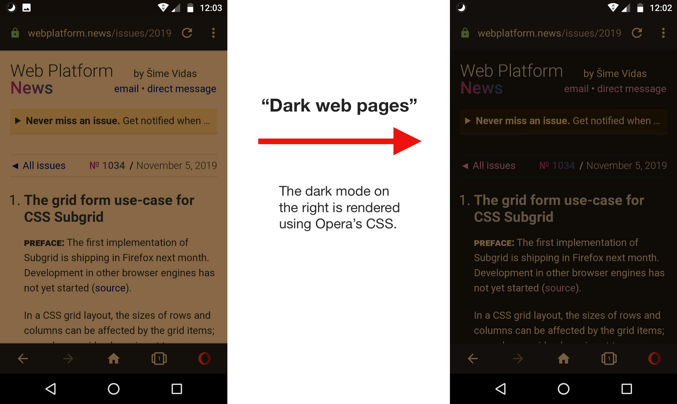
Opera adds option that renders all websites in dark mode

Opera for Android has added a “Dark web pages” option that renders all websites in dark mode. If a website does not provide dark mode styles (via the CSS prefers-color-scheme media feature), Opera applies its own “clever CSS changes” to render the site in dark mode regardless.

(via Stefan Stjernelund)

Periodic Background Sync is coming to Chrome

Google intends to ship Periodic Background Sync in the next version of Chrome (early next year). This feature will enable installed web apps to run background tasks at periodic intervals with network connectivity.

Chrome’s implementation restricts the API to installed web apps. Chrome grants the permission on behalf of the user for any installed web app. The API is not available outside of installed PWAs.

Apple and Mozilla are currently opposed to this API. At Mozilla, there are opinions that the feature is “harmful in its current state,” while Apple states multiple privacy and security risks.

(via Mugdha Lakhani)

More news…

Read more news in my weekly newsletter for web developers. Pledge as little as $2 per month to get the latest news from me via email every Monday.

More News ?

The post Weekly Platform News: Strict Tracking Protection, Dark Web Pages, Periodic Background Sync appeared first on CSS-Tricks.

Categories: Designing, Others Tags:

Dip Your Toes Into Hardware With WebMIDI

December 12th, 2019 No comments

Did you know there is a well-supported browser API that allows you to interface with interesting and even custom-built hardware using a mature protocol that predates the web? Let me introduce you to MIDI and the WebMIDI API and show you how it presents a unique opportunity for front-end developers to break outside the browser and dabble in the world of hardware programming without leaving the relative comfort of JavaScript and the DOM.

What are MIDI and WebMIDI exactly?

MIDI is a niche protocol designed for musical instruments to communicate with each other. It was standardized in 1983 and is maintained to this day by an organization consisting of music industry companies and representatives. It’s not wildly different than how the W3C dictates and preserves web standards, in some sense.

Photo by Jiroe on Unsplash

The WebMIDI API is the browser-based implementation of this protocol and allows our web applications to “speak” MIDI and communicate with any MIDI-capable hardware that might be connected to a user’s device.

Not a musician? Don’t worry! We’ll discover very quickly that this simple protocol designed for electronic musical instruments can be used to build fun, interactive, and completely non-musical things.

Why would I want to do this?

Great question. The shortest answer: because it’s fun!

If that answer isn’t satisfying enough for you I’ll offer this: Creating something that straddles the line between the physical world and virtual world we spend most of our days building things for is a good exercise in thinking differently. It’s an opportunity for creative tinkering and for considering and creating new user interfaces and experiences to navigate. I truly think this kind of playful exploration helps make us use different parts of our brains and makes us better developers in the long-haul.

What kind of things can I build?

Cellular Automata on a MIDI controller
Playing Go

Whack-a-mole
Mixing colors with hand motions

What do I need to get started?

Here are the prerequisites to start experimenting with WebMIDI:

A MIDI controller

This might be the trickiest part. You’ll need to procure a MIDI-capable piece of hardware to experiment with. You might be able to find something cheap on Craigslist, Amazon or AliExpress. Or — if you’re really ambitious and have an Arduino available — you can build your own (see the end of this article for more information about this).

A WebMIDI-capable browser

This browser support data is from Caniuse, which has more detail. A number indicates that browser supports the feature at that version and up.

Desktop

Chrome Opera Firefox IE Edge Safari
43 30 No No 76 No

Mobile / Tablet

iOS Safari Opera Mobile Opera Mini Android Android Chrome Android Firefox
No 46 No 76 78 No

As of this writing, according to caniuse.com it’s supported by approximately 73% of browsers, though most of the heavy-lifting is done by Chromium. Any Chromium-based browser will support WebMIDI—that includes Electron apps and the newer Chromium-based Microsoft Edge. It’s also supported on Opera and the Samsung Internet Browser. On Firefox it’s still being discussed but hopefully coming sooner than later.

Hello, WebMIDI

Once you’ve procured both of those things we can start writing some code! Working with the WebMIDI is not terribly different than working with other browser APIs like the Geolocation or MediaDevices APIs, if you’re familiar with either of those.

The high-level flow looks like this:

  • We detect availability of the WebMIDI API in the browser.
  • If detected, we request permission from the user to access it.
  • Once we’re granted permission, we now have access to additional methods to detect and communicate with any connected MIDI devices.

Let’s see that in action:

if ("requestMIDIAccess" in navigator) {
  // The Web MIDI API is available to us!
}

Now, assuming we’re in a WebMIDI-capable browser, let’s request access:

navigator.requestMIDIAccess()
.then((access) => {
  // The user gave us permission. Now we can
  // access the MIDI-capable devices connected
  // to the user's machine.
})
.catch((error) => {
  // Permission was not granted. :(
});

If the user gives us permission, we should now have access to the MIDIAccess interface. This helps us build a list of the devices that we can receive MIDI input from and send MIDI output to.

Let’s do that next. This is the code that goes inside the function we’re passing into then from the previous code snippet:

const inputs = access.inputs;
const outputs = access.outputs;

// Iterate through each connected MIDI input device
inputs.forEach((midiInput) => {
  // Do something with the MIDI input device
});

// Iterate through each connected MIDI output device
outputs.forEach((midioutput) => {
  // Do something with the MIDI output device 
});

You might be wondering what the difference is between a MIDI input and output device. Some devices are setup to only send MIDI information to the computer (these will be listed as inputs) and others can receive information from the computer (these will appear as outputs). It’s not uncommon that a device can be send and receive, so you will find it listed under both.

Now that we have code that can iterate through all the connected MIDI devices, there are basically only two things we’ll want to do;

  • If it’s an input device, we’ll want to listen for any incoming MIDI messages emitting from it.
  • If it’s an output device, we might want to send MIDI message to it.

The code for setting up an event listener to respond to any incoming MIDI messages from our input devices looks very similar to an event listener you might setup for other DOM events, except in this case, the event we’re listening for is the midimessage event:

input.addEventListener('midimessage', (event) => {
  // the <code>event object will have a data property
  // that contains an array of 3 numbers. For examples:
  // [144, 63, 127]
})

If we want to send a MIDI message to an output device the code we can do so like this;

outputsend([144, 63, 127]);

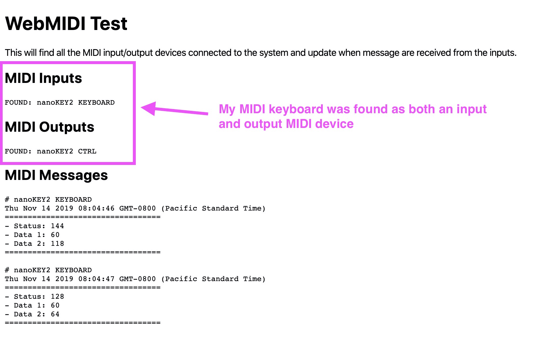
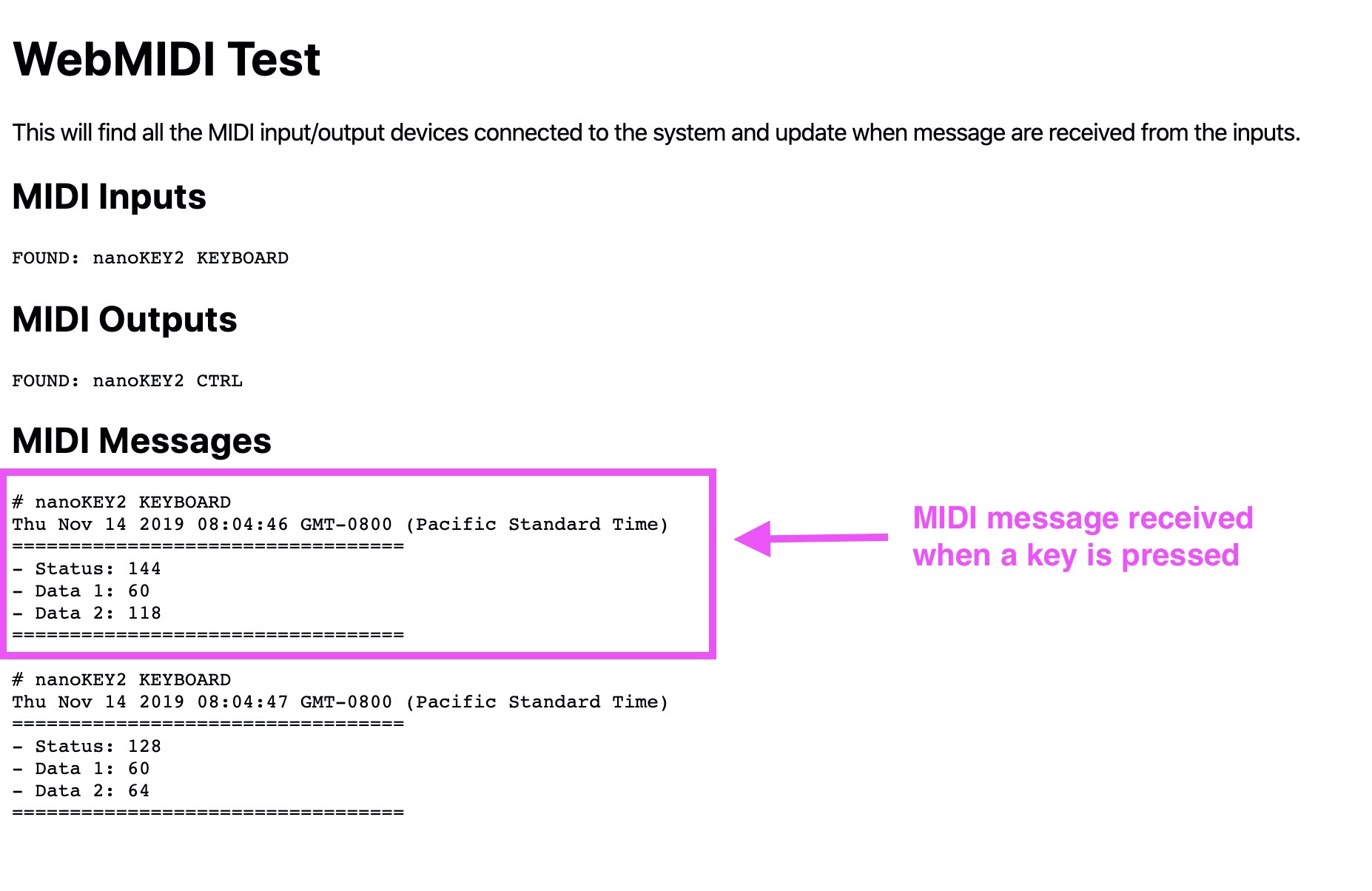
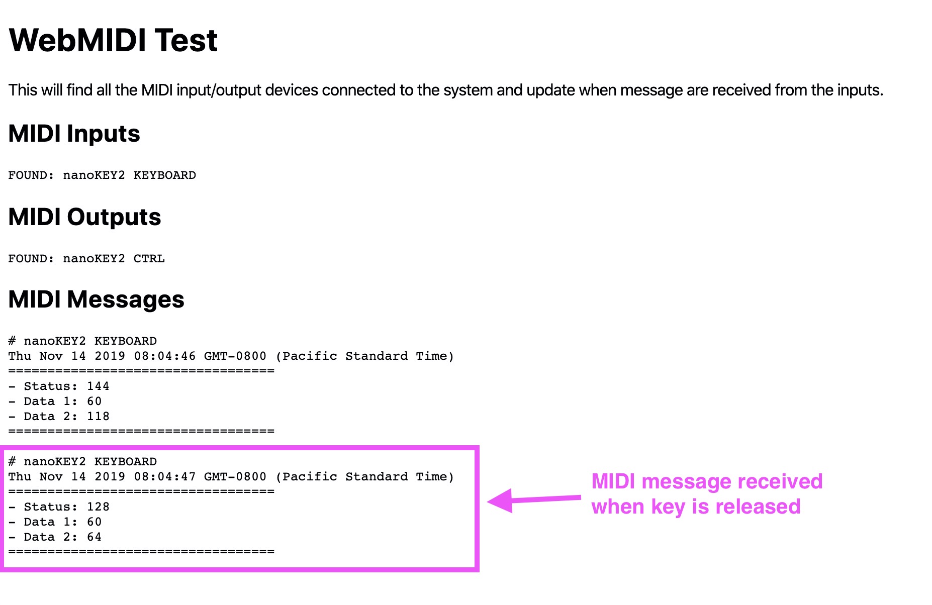
Here is a CodePen demo with most of this put together for you. It will let you know about all of the MIDI inputs and output devices connected to your system and show you incoming MIDI messages as they happen:

See the Pen
WebMIDI Basic Test
by George Mandis (@georgemandis)
on CodePen.

WebMIDI Test demo screenshot highlighting which MIDI input and output devices were found
WebMIDI Test demo screenshot highlighting MIDI messages received by one of the MIDI input devices. In this case, we’re seeing when a key on the MIDI keyboard is pressed.
WebMIDI Test demo screenshot highlighting MIDI messages received by one of the MIDI input devices. In this case, we’re seeing when a key on the MIDI keyboard is released.

You might be wondering a couple things at this point:

  • When you’re listening for the midimessage event, how do I make heads or tails of that three number array in event.data?
  • Why did you send an array of three numbers to your MIDI output device and why did you send those specific numbers?

The answer to both of these questions lies in further exploring and understanding how the MIDI protocol works and the problems it was designed to solve.

Anatomy of a MIDI message

When a MIDI controller “speaks” to another MIDI-capable device or computer, they are sending and receiving MIDI messages with one another. The protocol underlying this communication is fairly simple in practice but a little verbose when explained. Still, I’ll try.

Every MIDI message consists of three bytes consisting of 8-bits (0-255). Represented in binary, a message might look like this:

10010000 | 00111100 | 01111111

There are only two types of MIDI messages: Status and data. Every message will consist of one status byte and two data bytes.

The status byte is intended to communicate what kind of message is being delivered, including things like:

  • Note On
  • Note Off
  • Pitch Bend Change
  • Control/Mode Change
  • Program Change

…and many others.

If you’re coming at this from a non-musical background, these status messages might seem kind of strange, but don’t worry too much about it. The data byte is intended to provide more information and context to the status. To give an example, if I have a MIDI piano plugged into my machine and press a key to play a note, it would send a “Note On” status byte accompanied by data bytes indicating which note I played, and perhaps how hard I pressed it.

A status byte will always begin with the number 1 and data bytes with the number 0.

1x0010000 | 0x0111100 | 0x1111111
    ^status     ^data1      ^data2

For data bytes that leaves 7-bits to express the data in that byte. That gives us an integer range of 0-127.

For status bytes, the next 3-bits after the first describe the type of status message while the remaining 4-bits describe the channel. To break down our binary representation:

1x001x0000

How this translates into WebMIDI and JavaScript

As you may have guessed from the code samples earlier, with the WebMIDI API, we seldom have to deal with these binary representations directly. When we send and receive these messages in JavaScript we simply use arrays like this:

[144, 63, 127]

If you’re working with existing musical hardware, it’s helpful to have this deeper understanding of how and why the messages are structured the way they are. It’s helpful to know that receiving a 144 in your first byte means a note is being turned on in the first channel and that a 128 would indicate that a note is being turned off.

However, if we’re building non-musical experiences and creating our own hardware, these numbers can be repurposed to represent whatever you want!

What kind of hardware can I use?

Any MIDI-capable device that can be connected to your computer should also be accessible through the WebMIDI API. Devices that are capable of sending MIDI data to another MIDI-capable device are often called MIDI controllers. A common example would be a simple, piano-style keyboard like this Korg nanoKey2:

But they can vary widely in appearance and modes of interaction. Buttons are certainly common, but you might also find some that incorporate dials or pressure-sensitive pads like the AKAI LPD8:

Others use more abstract and interesting modes of interaction, including mapping motion or breath to MIDI signals. For example, this controller (The Hothand from Source Audio) uses three accelerometers to map hand gestures to MIDI messages:

Some controllers can both send and receive MIDI messages, allowing for you to have a true two-way conversation with the physical world. The Novation Launchpad is a classic example — buttons can be pressed to send messages and messages can also be received to dynamically change colors on the device:

Can I build my own hardware?

It turns out they’re not terribly difficult to build and you can find a lot of home-brewed MIDI controllers out in the wild. They can get much more elaborate in a hurry. Some can be downright bananas:

Bananas connected by wires to an Adafruit Circuit Playground programmed to function as a MIDI instrument

Building your own MIDI controller will take you a bit outside the world of JavaScript, but it’s still surprisingly accessible if you’re familiar with or interested in the Arduino platform. The Circuit Playground Classic from Adafruit is a great device to get started with and you can find starter code to flash to the device and make it into a multi-faceted MIDI controller here on GitHub.

Summary

The WebMIDI API is a low-barrier-to-entry way for front-end developers to start experimenting with basic hardware and software interactions. The implementation is relatively straightforward compared to some other hardware web APIs (like Bluetooth) and the MIDI standard is well-documented. There are lots of existing MIDI-capable devices out there to experiment or build cool things with, and if you really want to go all-out and start building your own custom MIDI hardware for your project, you can do that too.

Go out there and make something!

The post Dip Your Toes Into Hardware With WebMIDI appeared first on CSS-Tricks.

Categories: Designing, Others Tags:

Should Your Portfolio Site Be A PWA?

December 12th, 2019 No comments
Mutual Mobile PWA bottom sticky bar

Should Your Portfolio Site Be A PWA?

Should Your Portfolio Site Be A PWA?

Suzanne Scacca

2019-12-12T12:00:00+00:002019-12-12T20:36:54+00:00

This is going to seem like an odd thing to suggest, considering how much work is required to build a progressive web app instead of a responsive website. But, for many of you, your portfolio site should be built as a PWA.

There are a number of benefits to doing this, which I’ll outline below, but the bottom line is this:

If you want to spend less time looking for clients, applying to design gigs and convincing prospects to hire you, a PWA would be a wise investment for your business.

Why Do Web Designers Need to Build PWAs for Themselves?

If you’ve spoken to clients about building PWAs for their businesses, then you know the usual selling points:

A progressive web app is inherently fast, reliable and engaging.

But for a web designer or developer, there are other reasons to build a PWA for your business.

Reason #1: Show and Tell

When it comes to selling clients on a PWA, you have to remember that the concept is still relatively new, at least in terms of public awareness.

Remember when we made the shift from mobile “friendly” websites to responsive? You couldn’t just summarize what a responsive website was and then expect clients to be okay with paying more than they would for a non-responsive site. You had to actually show them the difference in terms of design and, more importantly, demonstrate the benefits.

More or less, I think consumers are familiar with responsive design today, even if they don’t know it by name. Just look at the statistics on how many more people visit websites on mobile devices or how Google rewards mobile-first sites. This wouldn’t be possible without responsive design.

For PWAs, it’s going to take some time for consumers to truly understand what they are and what value they add to the web. And I think that will naturally start to happen as more PWAs appear.

For now though, your prospects are going to need more than an assurance that PWAs are the future of the web. And they most definitely will need the benefits broken down into terms they understand (so that means no talk of service workers, caching or desktop presence).

One of the best ways to sell prospects on a PWA without overcomplicating it is to say, “Our website is a PWA.” Not only is this a great way to introduce the PWA as something they’re already familiar with, but it’s basically like saying:

We’re not trying to sell you some hot new trend. We actually walk the walk.

And when you do open up the conversation this way, their response should hopefully be something like:

Wow! I was wondering how you got XYZ to happen.

Take Mutual Mobile, for example.

Let’s say a prospective client found the PWA in search results and decided to poke around the portfolio to see what kind of work the consultancy had done in the past.

This is what they would see:

Mutual Mobile PWA bottom sticky bar

The Mutual Mobile PWA includes a social share sticky bar on the portfolio pages. (Source: Mutual Mobile) (Large preview)

In addition to the sticky header that keeps the logo ever-present along with the menu, there’s a new bottom bar that appears on this page.

This sticky bottom bar serves a number of purposes:

  • The number of shares works as social proof.
  • The quick links to social media encourage visitors to share the page with others, especially if they know someone who’s in need of a designer.
  • The email icon makes it easy to send a copy of the page to themselves or to someone else — again, serving as a referral or reminder that this page is worth following up on.

This isn’t the only place where the bottom bar appears on the Mutual Mobile site. As you might’ve guessed, it also shows up on the blog — a place where engagement and sharing should be happening.

Mutual Mobile blog with social share

The Mutual Mobile blog includes a sticky bottom banner with social share buttons and counts. (Source: Mutual Mobile) (Large preview)

I’m particularly fond of this use of the bottom bar considering how difficult it can be to place social share icons on responsive websites. Either they sit at the very top or bottom of the post where they’re not likely to be seen or they’re added in as a hovering vertical bar which can compromise the readability of the content.

This might seem like such an insignificant feature of a PWA to highlight, but it can make a huge difference if your responsive site (or that of your client) is lacking in engagement.

Plus, the fact that the bottom bar only appears at certain times demonstrates this company’s understanding of how PWAs work and how to make the most of their app-like features.

That said, you don’t want to use your PWA to brag about your progressive web app development prowess.

Instead, simply present your PWA as an example of what can be done and then explain the value in using PWA-specific features to increase engagement and conversions.

And if you have a story to tell about why you built a PWA for your business that you know the prospect can relate to, don’t be afraid to bring it up. Storytelling is a really powerful sales tactic because it doesn’t feel like you’re selling at all. It’s more genuine.

Reason #2: Create Something DIY Builders Can’t

I’ve tested most of the major drag-and-drop builders and I get why business owners would consider this seemingly more cost-effective DIY approach now. A few years ago? No way. But these technologies really are getting better in terms of being able to “design” a professional-looking website. (Speed, security and functionality are a whole other story though.)

Knowing this and knowing the direction the web is going in, it would be a wise move for web designers to start transitioning their businesses over to PWAs. Not completely, at first. There are still clients who will be willing to pay a web designer to build a website for them (instead of trying and doing it on their own).

But if you can start advertising progressive web app design or development services on your site and then turn your website into a PWA, you’d put yourself in a great position. Not only would you be seen as a forward-thinking designer, but you’d be poised to work with a higher quality of client down the road.

And for the time being, you’d have a PWA that’s sure to impress as it carefully straddles the line between the convenience of a website and the sleekness of a native app.

Let me show you an example.

This is the PWA for Build in Amsterdam:

A walkthrough of the Build in Amsterdam Cases pages. (Source: Build in Amsterdam)

It’s simple enough in terms of content. There are only pages for Cases (which pulls double duty as the home page), About and Contact. Really, with the quality of cases and context about those cases provided, that’s really all this digital agency needs.

If you do decide to turn your portfolio site into a PWA, consider doing something similar. With fewer pages and a focus on delivering only the most pertinent information, the experience will feel just as efficient and streamlined as a native app.

Back to Build in Amsterdam:

The design is incredibly engaging. Every time one of the Cases images is clicked, it feels as though visitors are entering a new portal.

While a clear top and bottom banner aren’t clearly present as they would be in a mobile app, it’s just as easy to get around this app.

The menu button, for instance, is always available. But notice how a new set of navigational options appear along the bottom as the prospect moves down the page:

Build in Amsterdam bottom navigation

Build in Amsterdam utilizes the bottom banner to add custom navigation to its PWA. (Source: Build in Amsterdam) (Large preview)

The conveniently placed Back and Forward arrows direct prospects to other work samples. The center button then takes them back to the home/Cases page.

It’s not just the addition of navigational buttons that makes this PWA unique. It’s the style of transition in and out of pages that makes it a standout as well.

So, if you’re looking to make a really strong impression with prospective clients now, build yourself a PWA that will knock their socks off from the get-go. The longer you keep your web presence on the cutting edge of design, the more likely you’ll be seen as a design authority in the not so distant future (when everyone’s finally caught onto PWAs).

Reason #3: Make Conversion Smoother

I bet you wouldn’t mind letting your site do more selling on your behalf.

While you can certainly outfit your responsive website with contact forms, how do you convince visitors to take the leap? For starters, messaging and design need to really speak to them, so much so that they think:

This sounds like a great fit. How do I get in touch?

But rather than leave them to open the navigation and locate the Contact page (if it’s even there, since many companies now hide it in their footer), your contact form should be just one simple click away.

It’s not as though you can’t do this with a website. However, it’s the extra style provided by a PWA that’s going to get you more attention and engagement in the long run.

Take the Codigo PWA, for example.

An example walkthrough from the Codigo home page to conversion. (Source: Codigo)

The above is a walkthrough from the home page to the Works page. The transition through these pages is smooth, stylish and sure to catch the attention of someone looking for a web designer who can shake things up for their brand.

Below each sample, prospects find big red Back and Forward buttons. This makes it easy to quickly navigate through various works. If they prefer to backtrack to the main page, they can use the “Back to Work” button that’s always available in the top-left corner.

Down past the big red buttons is where Codigo invites prospects to get in touch. This call-to-action isn’t done in a traditional manner though. Instead of one big CTA that says “Let’s Chat”, the options are broken up as follows:

  • Build
  • Co-incubate
  • Customize
  • Organize

This allows the agency to ask a specific set of questions based on what the prospect actually needs in terms of mobile app development. And, again, the transition between screens is highly engaging. What’s more, the transitions happen super fast, so there’s no lag time that causes prospects to wonder if that’s how slow their own app would be.

Overall, it’s setting a really strong impression for what a PWA can be.

As you know, PWAs integrate really well with the features of our phones, so don’t feel like you have to put all your focus into a contact form if a click-to-call, click-to-text or click-to-email button would be better. Just find the right CTA and then program your PWA to simplify and streamline those actions for you.

Wrapping Up

I know this probably wasn’t what you wanted to hear, especially when you’re already too busy trying to drum up and complete paid work for clients. But you know how it is:

It’s difficult finding time to work on your business because no one’s paying you to do it. But when you finally do, you’ll be kicking yourself for not doing it sooner.

And as we move into a new decade, there’s no better time than the present to look at your website and figure out what needs to be done in order to future-proof it. From what we know about the mobile-first web and how powerful PWAs are for engagement and conversion, that’s likely where your website is headed sooner or later. So, why not expedite things and get it done now?

Further Reading on SmashingMag:

Smashing Editorial(ra, yk, il)
Categories: Others Tags:

How I’ve Improved as a Web Developer (and a Person) in 2019

December 11th, 2019 No comments

We’re sliding into the roaring twenties of the twenty-first century (cue Jazz music ?). It’s important that you and I, as responsible people, follow the tradition of looking back on the past year and reflect on the things that went right and wrong in the hopes of becoming the best version of ourselves in the year ahead.

I never do New Year’s resolutions, except for when I was ten years old and wanted to open a local self-run detective agency by the end of the following year (Scooby Doo was in vogue those days.) But I do reflect on the past this time of year, perhaps as an instinctive response.

Over the years, I’ve improved as a web developer, on my own terms and on my own pace, while learning, unlearning, interpreting and executing what the web technology offers. This post is a reflection of my personal experiences from 2019 and the years before that. I’ll share things I’ve learned that might make us all better web developers heading into 2020. Personal experiences aren’t universal, of course, but it’s sometimes neat to get a look into the things other people are processing and learn vicariously through them.

So here we go.

I spent a lot of time in other people’s code

It was unavoidable because my very first professional project involved updating and upgrading an old application. It was only after some time that I realized I gained wisdom from navigating through code written by others, and also, I developed the guts to voluntarily read others’ code and really pay attention to what it’s doing.

It’s not unlike practicing good listening skills. Reading and understanding code written by someone else requires active attention and fighting the temptation to either zone out or inject your own opinion.

What you can try: GitHub is a great place to see a lot of projects. There are so many open source projects out there and they’re all readily available to look at and digest. I think many of us have experienced times when we simply grab a project or a tool without really getting under the hood and understanding what it’s actually doing or how it fits into our own work. Taking the time up front is an excellent way to not only learn new things, but to make better decisions in our day-to-day work as well. Don’t understand something? Open an issue in the repo and ask away!

I’d be remiss not to mention CodePen here. Not only can you search for just about any pattern, feature, or function, but it also offers collections of Pens and even topics, both of which are excellent for seeing how different people tackle similar ideas.

I tried new web standards even if I thought I’d never use them

It’s just my curiosity, but I think it has made me feel more comfortable in learning something new. That might be variable fonts, serverless, JAMstack, prefers-color-scheme , prefers-reduced-motion , and subgrid, among many others. Geez, we’ve seen a lot of new things in the last year or two, haven’t we?

What you can try: I think you’re already ahead of this by following sites like CSS-Tricks. There are many technical blogs and writers out there who share with their readers what’s new. Check out the list of people who have contributed to this blog — many of them have personal sites where they’re frequently sharing new things. A Book Apart is also a great resource for standards, especially for those of you who might enjoy a break from the screen. You can find so many gems there, from Expressive Web Design to The New CSS Layout.

I created an archive of my favorite code snippets

There were times when I’d think that I’d remember the oh-so-simple syntax of new code I tried… but it turns out simple things are easier to forget. So I decided to keep them neatly in a digital folder, like in the good ol’ times. This has allowed me to go back and reference code when questions or ideas pop up. Otherwise, I’d have to go back and research all over again.

What you can try: I personally don’t use tools, just save them in a file. That said, Gist is always a nice place to keep snippets. And, hey, CodePen lets you create your own collections as well!

Another idea is to leverage your browser’s bookmarks. Save links liberally. Organize them into logical groupings so they’re easy to find later.

I created an archive of my notes, flow diagrams, and other stuff I scribble on paper

I have a standard paper notepad at my office that I use to jot down everything from ideas for a project I’m working on, layout sketches and notes from things I read. It’s also the place where I often start work, much like the way Chris writes “pseudo code” heading into a code editor.

I have a habit of working out the visual aspects of a web application, and often, even the source code on paper. So, I keep those papers safe for when I might have to refer back. It has helped me out in a pinch.

What you can try: I would be a hypocrite if I recommend any of the online note taking tools, because I’ve never found them convenient, ironically. There are lots of physical notebook options out there. Moleskine is a popular one. Sarah Drasner recommended one when she wrote her own post on learning how to learn.

I recognized when someone’s teaching and I need to be a student

I used to have a bad habit: if someone’s explaining something about code that I might already be familiar with, I would process and interpret what they were saying based on my own personal experiences, way before I learned what they had to say first.

It could be a millennial thing or it could be an industry thing, but I’ve always found that people package everything as something that’s being shared, that somehow I’m sitting in a round table with them and we are dissecting things over a box of pizza. ?

I appreciate that people make their content inclusive because we’re all adults here. But it also has stopped me from genuinely learning what they were trying to teach. I skimmed through useful information, but never really cared about the context. On my worst days, I missed the point completely, all because my brain’s resources were divided trying to learn and analyze at the same time.

Active listening and learning has provided a bunch of benefits for me this past year. For example:

  • I hear what people are saying more clearly.
  • I retain what people share with me more easily.
  • It makes the people I’m interacting with feel at ease with me.
  • It opens my mind to new ideas and possibilities I may not have considered.

What you can try: When you want to learn from something, whether it’s an article, a tweet, a podcast episode, a documentation or something else, save it and use it. I learned to grow out of my bad habit this year and have found this to be my flow for learning and retaining from others:

  1. I learn something.
  2. I save it for later (in my archive!).
  3. I try it out when I have the time.
  4. I play around with it more and try improving on it, if needed.
  5. I eat my pizza.

I trusted my own judgement more

This might sound like the exact opposite of what I just said about active listening, but it’s more of a counter-balance to being overly reliant on others. Active listening doesn’t mean we can’t have our own opinions or even continue holding onto them. It simply means we hear and retain information that can inform our own opinions.

A good professional opinion could be such a blessing, but good or bad, the moment I found myself giving too much weight to other people’s opinions, like I’d read a blog post on someone’s development environment and think I have to do the same thing, or worse, that the way I do things is wrong, that’s a terrible feeling (hello Imposter Syndrome) and who needs more stress?

What you can try: Instead of automatically believing that anything you read is the golden standard, try putting up a little guard. In other words, instead of thinking, “This is how I should be doing it,” perhaps say, “Oh, so this is how this person does that.”

I started seeking others’ experiences that validates my own

I feel happy when I read or hear fellow web developers share their work experiences and find something that resonates with me on a personal level:

  • “I know! I couldn’t set it up the first time, too!”
  • “Yes, that framework made things slower for me, too!”
  • “No way! I tried to center a floating element, too!”

Seeing that I’m not the only one who makes mistakes or struggles in certain areas makes me feel okay for where my skills are at instead of seeing myself as an unskilled developer who’s prone to mistakes. Chris recently shared his thought process working with flexbox elements — that’s exactly the sort of thing I think we can all relate to.

What you can try: We all bear some responsibility here. Let’s make people feel good when asking questions, even if they seem obvious to us. Share your own mistakes and struggles. The web is a vast and constantly evolving space and we’re all starting from different places.

I made myself the only one who decides what to make on my off-work coding marathons

Like all of you, my learning curve involves coding during my non-working hours. It could be just a new code I’m trying out or a full on side-project.

Seeing others share their side projects inspires me… at least that’s what I want them to do. That hasn’t always been the case. They used to make me think I wasn’t doing enough. Not enough GitHub repos. Not enough open source contributions. Not enough self-imposed challenges. Not enough WordPress plugins. And, sorry Chris, not enough CodePen demos.

With experience, however, I’ve realized there’s only one human soul that can optimally select what I should be working on, based on my skills, my preferences, my necessities and my circadian rhythm – the ghost under my bed.

Once I understood that, every single awesome and crazy side project people share online truly inspires me — or at least makes me smile, which is even better.

What you can try: Be intentional with your personal time. Prioritize what you want to learn and decide the best way for you to learn it. This post by Jason Rodriguez outlines how he planned to level up his JavaScript skills. Chris shared a mountain of ideas for learning CSS. Sarah also has great tips on prioritizing your personal and professional time.

I stopped drinking coffee

This is not up for discussion, my dear reader. ?

What you can try: Masala Chai.

I started prioritizing my health

Here’s a very silly story. I sprained my wrists thrice in a month. I think it was a voodoo spell. The point is: it was getting harder for me to work.

I was a bit embarrassed to tell people I couldn’t work because I was injured, so I continued like nothing happened. Each time, the sprain would eventually go away because of the ointment I applied at home, but would return soon enough because I wasn’t properly resting it. At one point, the pain spread to my arms and I’d to immediately take my hands away from the keyboard and rest them on my lap. It scared me.

The next day, I started wearing a wrist cast (well, two) and informed my colleagues and technical director that I needed to take it slow.

I know this story sounds like a very simple and obvious thing — and it was a very simple thing indeed. But I learned an important lesson: Health comes first.

Our job description doesn’t come with health warning stickers, but there are consequences in reality.

What you can try: Take care of your health first. Physical or mental, chronic or acute, mild or severe, internal or external, when your health problems go away, it improves the quality of your life, personally and professionally. If you’re lucky enough to have good health insurance, use it. Schedule an annual physical exam. Listen to your body when it says it’s hungry, thirsty, or simply needs a rest.

I know, easier said than done. But it’s important nonetheless and something worth striving for.

I’ve started sharing my knowledge with others

Not in a way you might assume. I know the consensus is that we learn when we teach but I haven’t personally experienced that. I don’t learn while I teach. Instead, what I’ve done is focus on how someone I’m teaching could or should learn a particular thing.

  • “Start with the basics.”
  • “Read the documentation.”
  • “Try the demo then proceed to so and so.”

These are some of the statements I found myself repeating to those I’ve mentored.

Those same sentences echo back to me when I’ve to learn something new. When I teach, I pay attention to how it’s learned. And learning is the one skill that never goes out of date, especially in our line of work.

What you can try: I think you’ll probably have to wait a while before you could do this if you’re just starting out as a web developer, but if you’re even somewhat experienced and meet a wide-eyed newbie, don’t miss your chance to teach. Don’t be part of the dark matter. You can teach in a variety of ways, from blogging to making demos. That said, I’ve found real life person-to-person teachable moments to be the most effective.

I realized I can’t read a code once and understand it all. So I use comments.

Here’s my comment about comments: Take them seriously.

Sometimes I can’t even decipher the code that I’ve typed with my two bare hands.

Condensation is a key element of programming languages in addition to something that causes rain. We don’t write, “add one more sheep to the herd.” Instead, we write, i++. Expecting myself to remember and understand everything in one glance simply isn’t practical.

Using well-thought comments cuts back the time it takes me to know what’s happening in the code. This is why I’ve consciously paid attention to using comments this past year. There’s no cost to using them, so go nuts!

What you can try: Take time to go through your code and leave some useful comments each time you’ve coded a module or a feature that works, especially before moving onto what’s next.

I’m not taking working code for granted

I was told margin:auto would center an element. I was told to add return(0) to an onclick event handler. I was also told to use GUID for foreign keys.

I didn’t ask why or how those things worked at the time. I simply did as they said.

I, now, however, know how they work and why I had to use those code.

When I know the basics of a piece of code, it helps me to use the same code or the same logic in scenarios other than the one I learned about it in.

What you can try: Make a quick mental, physical, or digital reminder when you come across a code that you want to know more about. Then remember to go through that list first in your free time. Don’t be afraid to ask someone why code is used a certain way.

I try to mimic extroverted web developers

* takes a deep breath *

I’m an introvert.

My introversion is not so bad that people feel uncomfortable around me. I mean, everybody likes talking to introverts because they mostly listen, right?

Although most of my work is typing in front of a computer I inevitably have to meet people, like clients, users and team members.

Communication is important. And not just the bare minimum.

When you develop a really good relationship with who you work with, your workplace becomes fun. When you develop a good relationship with your users, your work becomes successful; and when you develop a good relationship with your clients, you get more work.

I found there’s no way around it: I had to talk from time to time. I had to put myself out there.

I look at my fellow web developers who are more extroverted for communication pointers. They talk beyond about work. They give their suggestions. They encourage feedback. They drink coffee. And I try to practice that.

What you can try: If you’re an extrovert, I’ve got nothing for you. If you’re an introvert, all I can say is try. And keep trying. And that’s all you ever need to do. We can’t change our personalities, but with some practice and time we’ll learn to manage them better. In fact, it might be worth getting a better understanding of your personality type. Susan Cain’s book Quiet is an interesting (and dense) take on introversion.

I take breaks

I hate this to be true, but I turn into a Shaman soon after I start coding. An unwilling Shaman who gets possessed. The spirit that takes over me likes to only code. It doesn’t like to eat, sleep, talk to people or check Instagram. It’s a very mean spirit.

That’s why I exorcise it regularly to not cloister myself from the world. I pay attention to someone calling me. I leave the desk for tea breaks. I let my laptop’s battery die so I won’t go near it during vacation. I even have a hobby.

I don’t know if taking breaks has improved my performance or not, because I don’t think the mean spirit lacks in performance. I just think it’s good for me to not be always possessed.

What you can try: For those of you with 9-5 job, I would recommend tea breaks at 11AM and 4PM (wow, that came out very specific) And for when you work at home, I suppose you’ll have more things to do, so choose for yourself when you want the break. I like to watch TV, that would be like my ideal break time.


And… that’s it. That’s all the spookiness I could fit into this post. I shared as much of my experience as I could, as well as suggestions you might find helpful. Hope you take something good from it. This might be my final post of the year, so I don’t want to miss this chance to wish you LOTS of good luck as you go into 2020. ?

The post How I’ve Improved as a Web Developer (and a Person) in 2019 appeared first on CSS-Tricks.

Categories: Designing, Others Tags:

Christmas Gifts for Graphic Designers

December 11th, 2019 No comments

Christmas is fun, but choosing gifts might become too overwhelming sometimes. You want to buy the best gift within your budget, and that may require a lot of research. It does not stop there, either. You are not just trying to buy the best item for the buck unless you are shopping for a robot.

Even in that case, you might not want to exterminate the whole human race. (Yes, Terminator, we are looking at you)

So, to save you from the trouble, we’ve put together a list of items that might be helpful if you are looking to buy gifts for graphic designers.

Here is the list:

  1. Wacom Inkling Digital Sketch Pen
  2. Adobe Creative Cloud
  3. Foldio2
  4. Wacom Intuos
  5. Cloud Storage
  6. Terrarium
  7. Meditation Applications
  8. iPad

1. Wacom Inkling Digital Sketch Pen

Source: Pinterest – https://www.pinterest.com/pin/8936899230086584/

Inkling enables you to draw your sketches on regular paper and records the drawing digitally. The images that you draw works with Photoshop, Illustrator, Sketchbook and various graphic design programs.

2. Adobe Creative Cloud

This one is obvious. It’ll make life easier for graphic designers. It can be used for cloud storage, Adobe software, and also accessing the huge Adobe library with a click.

3. Foldio2

Source: Orenge Monkie Kickstarter page https://www.kickstarter.com/projects/orangemonkie/foldio-2-bigger-and-smarter

If the designer you are buying the gift for interested in photography, you can buy Foldio2. It’s a portable photo studio box that works wonders. Foldio will also help them with taking photos of their designs. Getting quality photos for designs is quite important for the portfolio.

4. Wacom Intuos

Source: Apple https://www.apple.com/tr/shop/product/HLZS2B/A/wacom-intuos-bluetooth-grafik-tableti-orta-boy

This pen feels great and natural. It’s accurate and comes with three free downloadable software. It’s also beginner-friendly, so if your friend is just starting it might be a really good gift.

5. Cloud Storage

No storage will be too much storage for a graphic designer, so you might want to buy a cloud storage space from Dropbox, Google Drive or another cloud storage service.

6. Terrarium

Source: Unsplash @nielsenramon https://unsplash.com/photos/okvqMfl78YE

The workspace is quite important for graphic designers since they spend a lot of time there. Adding a terrarium might lighten up the work area a bit and make it easier to spend all those long hours.

7. Meditation Applications

Source: Unsplash @jareddrice https://unsplash.com/photos/NTyBbu66_SI

As aforementioned, since graphic designers spend a lot of hours behind a desk, meditating can help a lot. Not only it will help with professional life, but it will also help with their daily lives as well. So, if the designer you are buying the gift for does not meditate, you can purchase a subscription plan for meditation apps like Calm and Headspace. Make sure to tell them why every designer should meditate!

8. iPad

Source: @designmesk https://unsplash.com/photos/Rz3CmJpcLew

Designers and Apple products go way back. Even though designers need strong computing devices with powerful processors, RAM, and storage (preferably an SSD), and iPad does not provide that, it might be a good new toy for a graphic designer to use with a stylus. Don’t get me wrong, there are people out there who create wonders on an iPad, but I’m just speaking from a general standpoint. There are also many drawing and art apps for iPads they can choose to use!

Overall, there are many gifts for graphic designers you can buy. The gift ideas that are listed above consist of things that will make professional life easier for most of the graphic designers. You can also get personal!

Categories: Others Tags:

Freak Flags

December 11th, 2019 No comments

I don’t see image sprites used that much anymore, but it’s still a good technique for reducing downloaded decorative image assets when you have multiple on a page. The big idea is combining all the graphics into one and then shifting around the size and background-position to reveal one at a time.

Say you’re site needs dozens or hundreds of country flags — that’s a perfect opportunity for a sprite. Michael P. Cohen has built a generator site to help build just what you need.

My first thoughts was… why not SVG? Michael says:

Why not use SVG? Many flags adapt very well to this format. I’m a fan of SVG but it wasn’t the right tool for this. The problem is too many flags have a lot of detail in crests and icons and imagery, and those details quickly increase svg file sizes far more than they do for index color files.

Direct Link to ArticlePermalink

The post Freak Flags appeared first on CSS-Tricks.

Categories: Designing, Others Tags:

Just Sharing My Gulpfile

December 11th, 2019 No comments

Seemingly out of the blue, the Gulp processing I had set up for this site started to have a race condition. I’d run my watch command, change some CSS, and the processing would sometimes leave behind some extra files that were meant to be cleaned up during the processing. Like the cleanup tasks happened before the files landed in the file system (or something… I never really got to the bottom of it).

Nevermind about the specifics of that bug. I figured I’d go about solving it by upgrading things to use Gulp 4.x instead of 3.x, and running things in the built-in gulp.series command, which I thought would help (it did).

Getting Gulp 4.x going was a heck of a journey for me, involving me giving up for a year, then reigniting the struggle and ultimately getting it fixed. My trouble was that Gulp 4 requires a CLI version of 2.x while Gulp 3, for whatever reason, used a 3.x version. Essentially I needed to downgrade versions, but after trying a billion things to do that, nothing seemed to work, like there was a ghost version of CLI 3.x on my machine.

I’m sure savvier command-line folks could have sussed this out faster than me, but it turns out running command -v gulp will reveal the file path of where Gulp is installed which revealed /usr/local/share/npm/bin/gulp for me, and deleting it manually from there before re-installing the lastest version worked in getting me back down to 2.x.

Now that I could use Gulp 4.x, I re-wrote my gulpfile.js into smaller functions, each fairly isolated in responsibility. Much of this is pretty unique to my setup on this site, so it’s not meant to be some boilerplate for generic usage. I’m just publishing because it certainly would have been helpful for me to reference as I was creating it.

Things my particular Gulpfile does

  • Runs a web server (Browsersync) for style injection and auto-refreshing
  • Runs a file watcher (native Gulp feature) for running the right tasks on the right files and doing the above things
  • CSS processing
    • Sass > Autoprefixer > Minify
    • Break stylesheet cache from the templates (e.g.
    • Put style.css in the right place for a WordPress theme and clean up files only needed during processing
  • JavaScript processing
    • Babel > Concatenate > Minify
    • Break browser cache for the s
    • Clean up unused files created in processing
  • SVG processing
    • Make an SVG sprite (a block of s
    • Name it as a sprite.php file (so it can be PHP-included in a template) and put it somewhere specific
  • PHP processing
    • Update the Ajax call in the JavaScript to cache-bust when the ads change

Code dump!

const gulp = require("gulp"),
  browserSync = require("browser-sync").create(),
  sass = require("gulp-sass"),
  postcss = require("gulp-postcss"),
  autoprefixer = require("autoprefixer"),
  cssnano = require("cssnano"),
  del = require("del"),
  babel = require("gulp-babel"),
  minify = require("gulp-minify"),
  concat = require("gulp-concat"),
  rename = require("gulp-rename"),
  replace = require("gulp-replace"),
  svgSymbols = require("gulp-svg-symbols"),
  svgmin = require("gulp-svgmin");

const paths = {
  styles: {
    src: ["./scss/*.scss", "./art-direction/*.scss"],
    dest: "./css/"
  },
  scripts: {
    src: ["./js/*.js", "./js/libs/*.js", "!./js/min/*.js"],
    dest: "./js/min"
  },
  svg: {
    src: "./icons/*.svg"
  },
  php: {
    src: ["./*.php", "./ads/*.php", "./art-direction/*.php", "./parts/**/*.php"]
  },
  ads: {
    src: "./ads/*.php"
  }
};

/* STYLES */
function doStyles(done) {
  return gulp.series(style, moveMainStyle, deleteOldMainStyle, done => {
    cacheBust("./header.php", "./");
    done();
  })(done);
}

function style() {
  return gulp
    .src(paths.styles.src)
    .pipe(sass())
    .on("error", sass.logError)
    .pipe(postcss([autoprefixer(), cssnano()]))
    .pipe(gulp.dest(paths.styles.dest))
    .pipe(browserSync.stream());
}

function moveMainStyle() {
  return gulp.src("./css/style.css").pipe(gulp.dest("./"));
}

function deleteOldMainStyle() {
  return del("./css/style.css");
}
/* END STYLES */

/* SCRIPTS */
function doScripts(done) {
  return gulp.series(
    preprocessJs,
    concatJs,
    minifyJs,
    deleteArtifactJs,
    reload,
    done => {
      cacheBust("./parts/footer-scripts.php", "./parts/");
      done();
    }
  )(done);
}

function preprocessJs() {
  return gulp
    .src(paths.scripts.src)
    .pipe(
      babel({
        presets: ["@babel/env"],
        plugins: ["@babel/plugin-proposal-class-properties"]
      })
    )
    .pipe(gulp.dest("./js/babel/"));
}

function concatJs() {
  return gulp
    .src([
      "js/libs/jquery.lazy.js",
      "js/libs/jquery.fitvids.js",
      "js/libs/jquery.resizable.js",
      "js/libs/prism.js",
      "js/babel/highlighting-fixes.js",
      "js/babel/global.js"
    ])
    .pipe(concat("global-concat.js"))
    .pipe(gulp.dest("./js/concat/"));
}

function minifyJs() {
  return gulp
    .src(["./js/babel/*.js", "./js/concat/*.js"])
    .pipe(
      minify({
        ext: {
          src: ".js",
          min: ".min.js"
        }
      })
    )
    .pipe(gulp.dest(paths.scripts.dest));
}

function deleteArtifactJs() {
  return del([
    "./js/babel",
    "./js/concat",
    "./js/min/*.js",
    "!./js/min/*.min.js"
  ]);
}
/* END SCRIPTS */

/* SVG */
function doSvg() {
  return gulp
    .src(paths.svg.src)
    .pipe(svgmin())
    .pipe(
      svgSymbols({
        templates: ["default-svg"],
        svgAttrs: {
          width: 0,
          height: 0,
          display: "none"
        }
      })
    )
    .pipe(rename("icons/sprite/icons.php"))
    .pipe(gulp.dest("./"));
}
/* END SVG */

/* GENERIC THINGS */
function cacheBust(src, dest) {
  var cbString = new Date().getTime();
  return gulp
    .src(src)
    .pipe(
      replace(/cache_bust=d+/g, function() {
        return "cache_bust=" + cbString;
      })
    )
    .pipe(gulp.dest(dest));
}

function reload(done) {
  browserSync.reload();
  done();
}

function watch() {
  browserSync.init({
    proxy: "csstricks.local"
  });
  gulp.watch(paths.styles.src, doStyles);
  gulp.watch(paths.scripts.src, doScripts);
  gulp.watch(paths.svg.src, doSvg);
  gulp.watch(paths.php.src, reload);
  gulp.watch(paths.ads.src, done => {
    cacheBust("./js/global.js", "./js/");
    done();
  });
}

gulp.task("default", watch);

Problems / Questions

  • The worst part is that it doesn’t break cache very intelligently. When CSS changes, it breaks the cache on all stylesheets, not just the relevant ones.
  • I’d probably just inline SVG icons with PHP include()s in the future rather than deal with spriting.
  • The SVG processor breaks if the original SVGs have width and height attributes, which seems wrong.
  • Would gulp-changed be a speed boost? As in, only looking at files that have changed instead of all files? Or is it not necessary anymore?
  • Should I be restarting gulp on gulpfile.js changes?
  • Sure would be nice if all the libs I used were ES6-compatible so I could import stuff rather than having to manually concatenate.

Always so much more that can be done. Ideally, I’d just open-source this whole site, I just haven’t gotten there yet.

The post Just Sharing My Gulpfile appeared first on CSS-Tricks.

Categories: Designing, Others Tags: