The Auto-Flowing Powers of Grid’s Dense Keyword
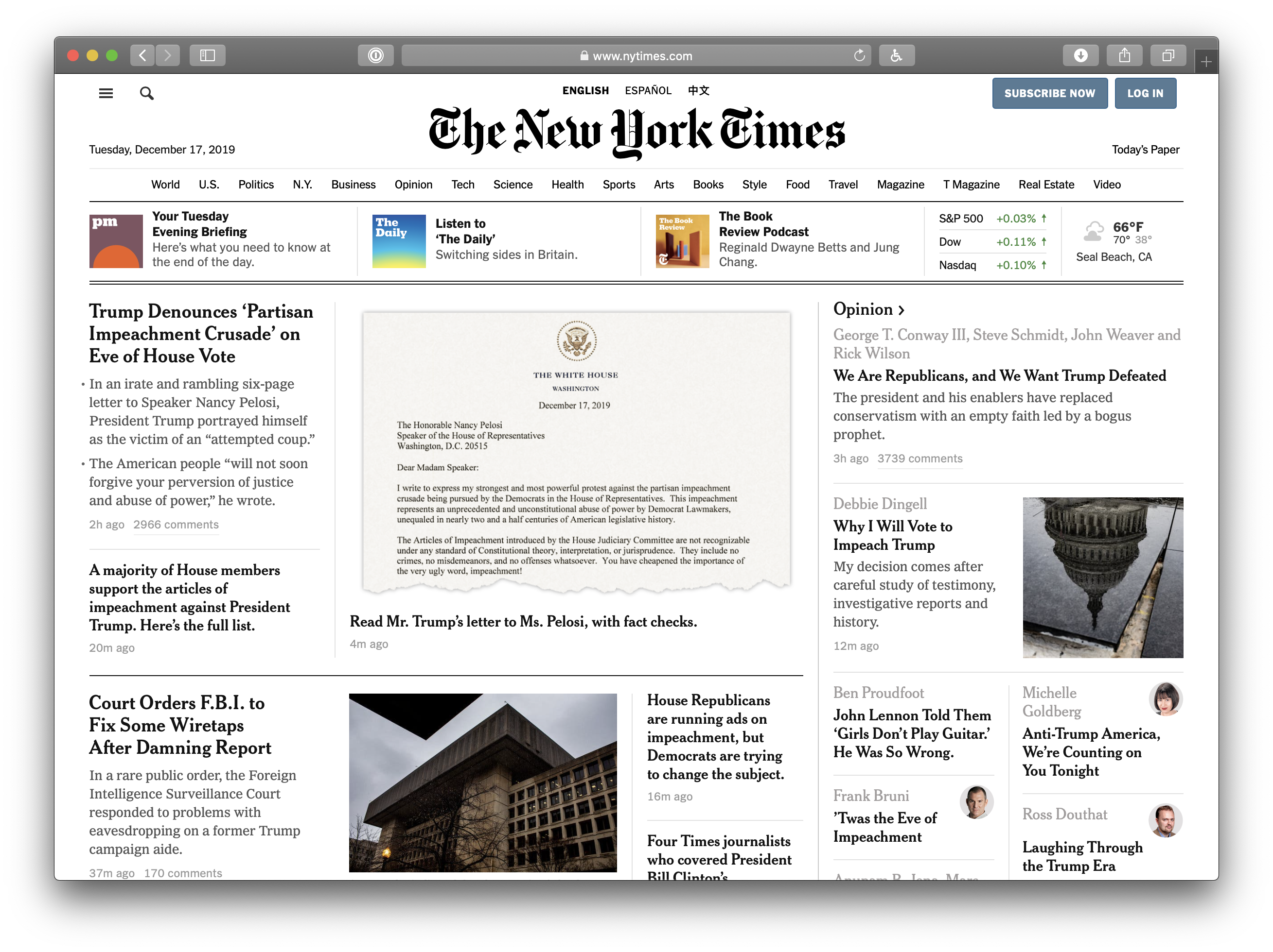
Let’s say we’re working on the homepage of a news website. You’re probably used to seeing some card-based content in a grid layout, right? Here’s a classic example, The New York Times:
Yeah, something like that.
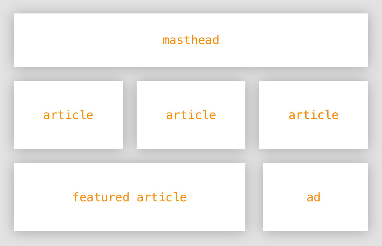
There are going to be some cards/elements/boxes/whatever that need to take up more space than others. A featured article comes to mind.

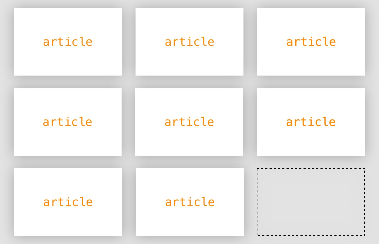
CSS Grid would be ideal here because we’re working in two directions: rows and columns. Plus, it has this baked-in feature that automatically places items on the grid based on available space. If we were to simply define grid on the parent element, and nothing else, each child would be assigned equal spaces according to how much available space is available on both the columns and rows.
In other words, there’s no need to be strict or explicit in where we tell our grid to place items.
A newspaper site can really benefit from this. Maybe the number of articles on the page will vary. Maybe advertisements will be displayed in some situations but not in others. Even if the content is unpredictable, CSS Grid can make the layout predictable by flowing items automatically into place.

Having nine stories that perfectly fit would be great, but maybe we only have eight one day. Oh well, CSS Grid has us covered to make sure items flow into cells evenly.
Where things might get a little sticky is when we have items that span multiple rows or columns. Let’s go back to that featured article idea and stipulate that it should span the last two columns of a row.
.article--featured {
  grid-column: 2 / span 2;
}
We might have six articles one day because, again, our content is a little unpredictable.
<div class="articles">
  <div class="article">1</div>
  <div class="article">2</div>
  <div class="article">3</div>
  <div class="article--featured">4</div>
  <div class="article">5</div>
  <div class="article">6</div>
</div>
No worries! We expect Grid’s auto-placement feature to work around that featured article for us. But when we drop that featured article in there, here’s what we get:
See the Pen
wvBgGPE by Geoff Graham (@geoffgraham)
on CodePen.
Hmm, that’s not what we had in mind. It would be so much better if the five articles flowed around the featured article.
What’s actually happening is that Grid takes the explicit placement of the featured article and places it where there is enough available space for it to take up the second and third columns after the articles preceding it in the source. That just so happens to be the second row and there just so happens to be an empty space in front of it because there are no other articles preceding it in the HTML. Grid places the featured article as its told and flows the rest of the items accordingly.
We can force Grid to ignore source order and flow the next available item around it, even if it is after the featured article in the HTML.
What’s the magic nugget with such powers? auto-placement: dense!
.articles {
  display: grid;
  grid-auto-placement: dense;
  grid-gap: 1em;
  grid-template-columns: repeat(3, 100px);
  grid-template-rows: repeat(3, 1fr);
}
See the Pen
grid-auto-flow: dense by Geoff Graham (@geoffgraham)
on CodePen.
There we go! Now we can rest assured that our layout will stay in tact, regardless of how much content is thrown at the grid.
See the Pen
grid-auto-flow: dense by Geoff Graham (@geoffgraham)
on CodePen.
The post The Auto-Flowing Powers of Grid’s Dense Keyword appeared first on CSS-Tricks.
