Can Best Practice Replace Design Research?
Heart-warming or not, co-creation with a client—the utopian ideal of shared vision—has its drawbacks. There are only so many times you can hear the words “brand strategy” before actually chewing your own face off. In the age of WordPress, Drupal and, dare I say it, Wix, it’s never been more tempting to pay lip-service to research and consultation. Instead of building a principles framework from scratch, why not roll out something from a template in a fraction of the time?
Well, in fact, there probably are situations where a simple WordPress-type approach will work really well. The trick is knowing when.
What Is “Best Practice” Anyway?
Well, exactly.
Even if you slept through design school, or didn’t go at all, you probably know the fundamentals already. And it’s true. If you stick to first principles, you won’t go far wrong. Here are some examples:
- Color and Contrast: 2-3 colors maximum, use contrast to highlight important elements;
- White Space: Use plenty of it, be consistent with proportions above and below;
- Layout: Symmetric Grid. Err…Always. Work ‘above the fold’;
- Typography: No more than 2-3 typefaces;
- Logo: Long, top left, always;
- Compexity vs Simplicity: Look for balance and visual interest;
- Visual Hierarchy: Use color, contrast, size and complexity to highlight important elements;
- Consistency: With all of the above, whatever you decide, be consistent;
- And so on…
One size, though, doesn’t fit all. By bending and even breaking the rules sometimes, you’ll create designs that stand out and, more importantly, meet the real requirements of the brief.
The One Unbreakable Rule
It’s pretty hard to find a “Best Practice” that really works in every situation, but here’s one:
No matter what you’re doing, make sure you know why you’re doing it.
And, just in case you were wondering, “err…because it looks pretty?” and “because it’s easier than what I probably ought to do instead…” aren’t really reasons.
There are clearly situations where a client—whatever they may think—is best served by a simple off-the-shelf approach. Particularly if their budget is more Scrooge than Soros. The thing is, you probably still need to go through a research process to find out whether that’s the case or not.
When And How To Go Off Piste
Before or just after accepting the job, you’ll likely need to do some research with the client. This process should focus on (you guessed it) brand strategy.
Ideally, in the first instance, you’ll build a design principles framework. Whatever decisions you make after that (whether you’re going to stick to the rules or break them) should be justified with reference to the framework.
Here are some examples of situations where you might consider deviating from “best practice”:
You Want to Send a Particular Message
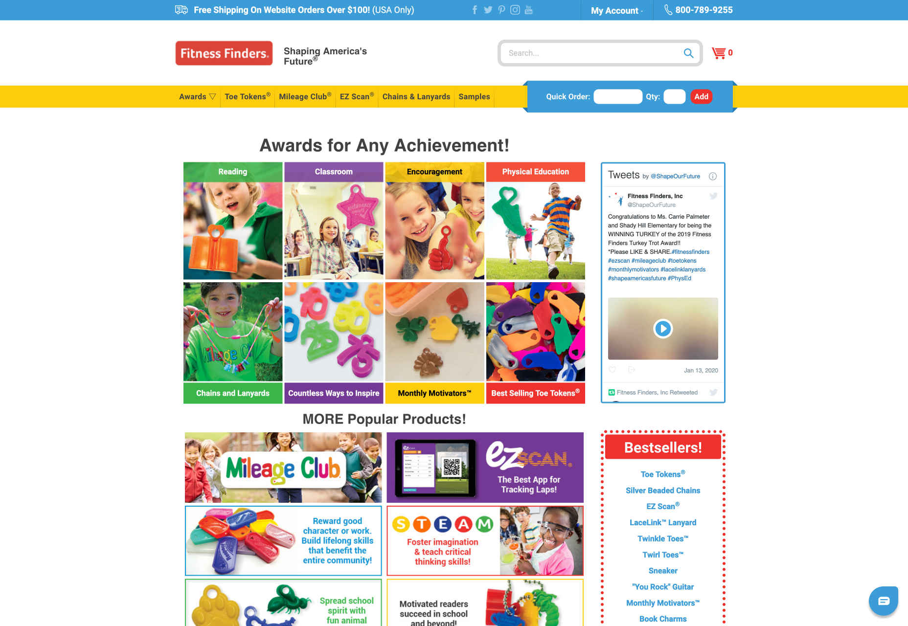
Take this site for a children’s fitness company, for example.
It clearly breaks all the rules about color and typeface, and a few more besides, but overall gives a sense of vibrance and playfulness, which of course is ideal for this market.
You Want to Draw Attention to Something
By ignoring the imperative to “work above the fold” and putting product and logo front and centre, candle manufacturer Waxxy draws the eye directly to their “product centred” philosophy and creates a sense of light and space:
Natale’s Clothing uses additional fonts and a broken grid layout to emphasise content and create a sense of being “out of the ordinary”.
You Want to Keep Things Clean
Legend has it, if you “put everything on the homepage” it’s good for SEO and easier for users. These days, though, there’s often a lot of information, and we prefer to have more space, even if it means a bit more browsing.
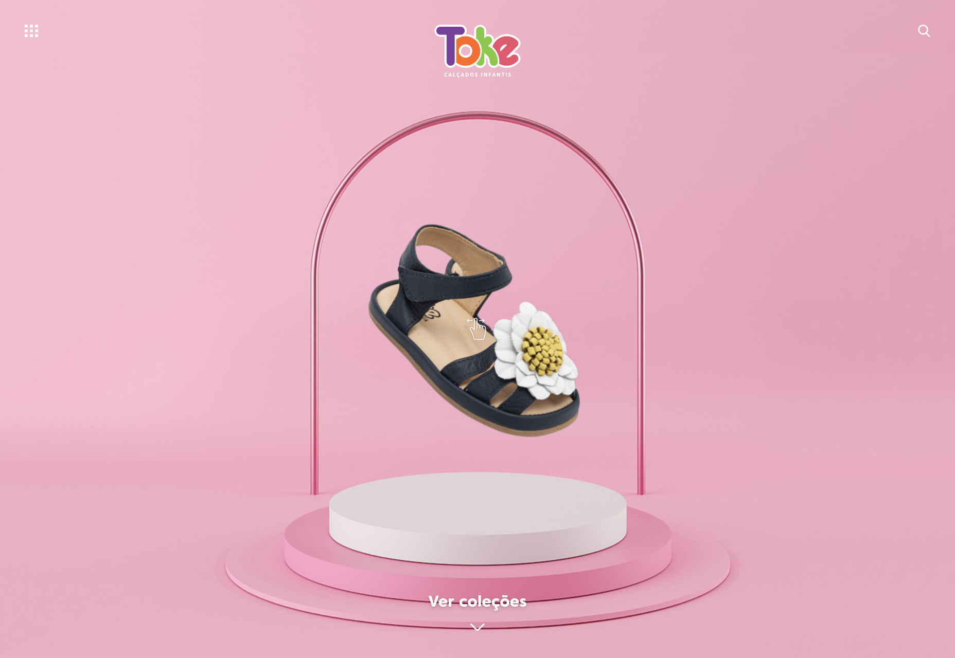
If you visit Toke’s site here, you’ll see that they break the animation taboo in a subtle and effective way as well.
These are just a few examples, there are many more. In each case the key questions to ask are:
- How does it meet the brief?
- How does it help brand strategy?
When To Stick To The Script
A big consideration here will likely be the client’s budget. With the best will in the world, you’re going to struggle to create a logo, design a custom typeface, and build a multi-page site from scratch on $800. If that’s what the client’s asking for, and can’t understand the limitations, maybe consider saying no!
If, on the other hand, there’s scope to negotiate, where budgets are small and, in situations where, for example, the client has a small number of products and/or services, a single page WordPress site will often be exactly what they need. Here it’s not a question of “doing the bare minimum” but rather “not doing too much”. Even so, there will probably be bespoke elements that you can change to better fit the strategy.
Another important moment to check yourself, is whenever you’re not sure if an idea works. If you can’t justify a decision with reference to your design principles framework—or at least with reference to the client’s brand strategy—then it’s probably best to err on the side of caution.
Research or Best Practice?
In a word, both.
There are definitely situations where a “first principles” approach will be exactly what the client needs. Particularly if their budget is small and their needs are simple. Even in this case, though, a great designer will take the time to understand (or help to develop) the brand strategy, and add whatever tweaks are necessary. Each client and each brand is unique, and a designer’s job, if you think about it, is to reflect just that.
When using a bespoke approach, breaking with convention can, as we’ve seen, produce interesting and stylish results. It’s important, though, that each decision makes sense, and can be linked back to the brand strategy. If it can’t, it probably shouldn’t be in the design.
And whatever you do, don’t chew your face off.
Featured image via Unsplash.


