Archive

Archive for January, 2020

Netlify High-Fives

January 14th, 2020 No comments

We’ve got Netlify as a sponsor around here again this year, which is just fantastic. Big fan. Our own Sarah Drasner is Head of DX (Developer Experience) over there, if you hadn’t heard. And if you haven’t heard of Netlify, well, you’re in for a treat. It’s a web host, but for your jamstack sites, which means it’s static hosting, encouraging you to pre-build as much of your site as you can, then use JavaScript and APIs to do whatever else you need to. Heck, they’ll help you build serverless functions and auth.

Here’s a couple of Netlify-related things swirling around in my life.

  • I added open authoring to our conference site. So now, anybody can go to the admin area, auth with GitHub, and submit a conference. No coding required. Dream come true, if you ask me. The same thing is live on the serverless site.
  • I enjoyed Bryan Robinson’s take on jamstack in 2020. It’s about the connection between services and the power that brings.
  • It’s interesting how even not-particularly jamstack-y software like WordPress can totally live a jamstack life, when you combine it with something like Gatsby.
  • I have a new microsite idea cooking. I really wanna build a site that showcases all the things you can (and probably should) be doing with your build process. It will explain them and provide resources, but the whole site will dogfood itself and do all those things. Stuff like:
    1. Process all it’s code, keeping compiled code out of the repo
    2. Build a sitemap
    3. Optimize all the images
    4. Check for broken links
    5. Run accessibility tests
    6. Check the performance budget
    7. Run unit test
    8. Run end-to-end tests
    9. Run visual regression tests
    10. Trigger notifications

Wouldn’t that last one be cool?! We’d do it all with build plugins, at least that’s how it works in my mind. If you have a strong desire to contribute, lemme know — maybe we can make it a community effort.

The post Netlify High-Fives appeared first on CSS-Tricks.

Categories: Designing, Others Tags:

Writing Your First Business Plan For Your Startup: Mistakes to Avoid

January 14th, 2020 No comments

Your business plan can be an exceptionally useful tool if you take the time and care to ensure it is complete, accurate, and well-thought-out.

Many entrepreneurs see a business plan as a required deliverable when pitching investors. It can certainly be used for that purpose, but it is also a valuable resource and road map for your business.

Of course, the value of your business plan depends entirely on its contents. If you write a fundamentally good business plan, it will be an asset to you as you launch your business. To do that, make a dedicated effort to avoid the following mistakes.

Failing to Produce a Polished Final Copy

Your business plan is a working document. In fact, you may find yourself making changes to it even after you launch your business. In spite of this, it’s important that you maintain quality and editorial standards for your document.

Obviously, if you plan to distribute your business plan to potential investors, it should be edited and printed on quality paper stock. Even if it is not, you should still take care that your business plan isn’t sloppily written and full of mistakes. This is one of your founding documents, and it’s imperative that you take it seriously.it takes very little time to proofread your document. Don’t forget to double-check your calculations for accuracy.

You Fail to Bolster Goals With a Strategy

Everybody wants their business to be the best and most successful of its kind. That is a lofty goal, but ultimately useless without a clear strategy behind it. In fact, that’s not even a fully formed idea. That lofty goal needs to be polished and honed until it is a well-thought-out objective. Then, you need to create a strategy to meet that objective.

That strategy should consist of action steps. Then, you must define who is responsible for these steps, when they should be finished, and which deliverables are required. Potential investors don’t need to know what you plan on accomplishing. They want to know how you plan on getting there.

You Don’t Show Any Skin in The Game

You cannot expect investors to take a risk with their assets by investing in your company if you’re not willing to take a financial risk yourself. It should be clear in your business plan that you are financially committed to your business as well as dedicating an adequate amount of time to its growth.

Your business plan should detail how much you’ve added to the pot financially to launch your business. If you have partners, that information should be included about them as well. You should also indicate what you have done to raise funds from other sources, and how much funding you have received from those efforts.

Your Plan is Too Vague

Investors fear the unknown. If your plan is not clear and detailed, potential investors will worry that you have not carefully considered everything. Avoid using vague terms, and back the claims you make with details, for example, if you say your product is revolutionary, you should be prepared to explain exactly why it’s revolutionary. Show your work, and provide data.

If you don’t plan to pitch your business plan to investors, you should still create a detailed business plan. This document will be a guide for you and your team going forward. You don’t want to have to fill in the blanks a year from now.

You Set Unrealistic Goals

Any good entrepreneur is excited about their business, and they hope for the best possible results. However, your business plan shoes reflect a realistic, conservative view.don’t overstate what you think you can accomplish in order to impress your investors. More importantly, don’t allow your business plan to become document peaceful thinking.

Your business plan should be honest above all Else. That means acknowledging current struggles, and struggles you might face in the future. It should contain information about your shortcomings and weaknesses, and about any threats to your success.

Your business plan should be positive, and you should share your goals. Just be certain that investors will see that those goals are based in reality, and that you have a plan of action to complete each goal.

Remember that you will never look bad for doing better than you predicted. You will look bad if you underperformed by failing to meet the goals established in your business plan.

Failing to Include a Statement of Purpose

Why are you starting your business? What problem will you be solving with your product or services? Who will your business help? The answers to these questions combined provide an answer to a more comprehensive question. What is your purpose in starting your business?

When it comes to maintaining your focus and motivation, having a clearly written statement of purpose can be a wonderful thing. In addition to that, it can provide clarity to potential investors about your reasons for starting your business, your commitment to it, and provide a framework for your business model. This is important enough that you might want to enlist Studyker to write a clear statement.

You Fail to Consider Potential Problems And Challenges

No business is going to launch without challenges. You may be up against established competitors. There may be questions about how you will obtain the supplies you need in order to fill the orders you anticipate. Whatever the case may be, don’t leave these things out of your business plan. Document them in as much detail as possible so that you are the best able to explore solutions.

You Show a Lack of Understanding of The Basics

A business plan is a document that contains a significant amount of information about your business. Some of this information might be unfamiliar to you. Others you may understand, but be unsure of how to find and communicate the information you need to. You may wonder:

  • What valuation is, and how you calculate it?
  • How to conduct a competitive analysis?
  • What a barrier to entry is, and how you can use it to your advantage?
  • How to calculate your financial projections?

If you lack business experience, you may struggle here. Unfortunately, these aren’t elements that you can ignore. Potential investors need this information, and they need it to be accurate. Fortunately, you may be able to get help. There are organizations such as the SBA that provide emerging entrepreneurs with the education and mentorship they need. You can take online courses designed for entrepreneurs, and follow successful entrepreneurs for inspiration.

Final Thoughts

Your business plan is a valuable document that will help you stay on the right path as you launch your business. As long as you avoid the mistakes listed above, you should be able to use your business plan to attract investors, and clearly communicate your vision.

Categories: Others Tags:

Understand Your Users with Positionstack

January 14th, 2020 No comments

One of the best things about the Internet is that it (mostly) doesn’t care where you are. The person you’re interacting with might be in Rio or Rhode Island, Bahrain or Birmingham. The Internet opens up the world.

But opening up the world doesn’t mean removing it. The geographic independence loved by users can be a real headache for businesses, because nearly all businesses are constrained by geography. For business, having an accurate picture of where your users are means understanding them, understanding your relationship to them, and can mean the difference between an enviable user experience, and a PR disaster.

Geocoding grants you Sherlock Holmes-like powers of deduction

One option for understanding a user’s location is Geolocation, which allows you to locate a user via their IP address; it’s not perfect because IP addresses are tricky things. Arguably a better option, thanks largely to the accuracy of the starting data, is Geocoding. Greater reliability than Geolocation makes Geocoding a more useful option for UX designers.

Geocoding grants you Sherlock Holmes-like powers of deduction, to seek out rich data about your users. But where do you start? One of the best ways is to integrate your site or app with positionstack.

What Are The Benefits of Geocoding?

It’s awesome that you can sell your band’s T-shirt to a fan in Vietnam, or ship a used car part to a mechanic in Siberia, but until 3D printing gets a lot more sophisticated there needs to be a way to move objects from Point A, to Point B; step 1 in that process is figuring out exactly where Points A and B are.

Shipping goods, with all the automatically calculated costs, isn’t the only reason you may want to know someone’s location. For example, it’s good manners to present prices in the local currency, or direct customers to a support line that speaks their language. And unfortunately, there are legal issues to consider: national and international bans exist on trading with some nations, accepting certain orders from some users could land you in hot water.

The key to a great user experience is gathering data about your users and then acting on it

One of the best features of a Geocode API like positionstack is that once your user has disclosed their location you can make an educated-guess at a whole lot more, from their probable first language, to their marketing preferences, and even the time they’re likely to come home from the office.

Imagine you’re offering a callback service on your website. Geocoding not only ensures you can pre-fill the international dialling code in the callback form, but it tells you the user’s timezone—essential if you don’t want to wake them up with a 4am sales pitch.

A user’s location also affects their outlook on the world. Go visit a major international company like Apple, Nike, or Pepsi, change your location on their site, and compare how brands with millions of research dollars pitch their wares differently in North America, France, Indonesia, or New Zealand. The key to a great user experience is gathering data about your users and then acting on it.

Why Choose positionstack?

With just a user’s physical address you can determine dozens of different characteristics that allow you to naturalize your site or app for users. Based on an address—even a partial address—positionstack can determine the user’s currency, dialling code, even their hours of daylight.

One of the best features of positionstack is its ability to translate an address into a latitude and longitude, then plot that position on a map that you can easily embed on your site. Nothing builds a connection like showing a user a place they recognize; it builds confidence, increases conversions, and ultimately means higher profits for you.

And that’s not all. positionstack enables both forward, and reverse geocoding. That means as well as finding a global position from an address, it can also find an address from a latitude and longitude. You can even perform batch queries (multiple searches) allowing you to narrow down addresses from an approximate location.

a super-reliable infrastructure, handling over a billion requests per day, with a typical response time of less than 100 milliseconds

As you can probably guess, any Geocoding API is only as useful as the data that underpins it. positionstack is run by apilayer, one of the most trusted names in APIs. It boasts a super-reliable infrastructure, handling over a billion requests per day, with a typical response time of less than 100 milliseconds. positionstack’s API is built on a database of more than two billion global locations, sourced from high-quality data sources, and it’s updated on a daily basis.

positionstack is also exceptionally easy to integrate into a site or app. There are code examples provided in PHP, Python, Nodejs, Go, Ruby, and jQuery—you can even use the service with vanilla JavaScript. Data is returned in XML, JSON, or GeoJSON formats.

Perhaps the most appealing feature of positionstack is that it’s completely free for use up to 10,000 API requests per month. So if you’re running a small site, or just getting started, you can make use of professional-grade data at zero cost. Once you’ve grown large enough to need it, premium subscriptions start at just $9.99 per month.

Head over to positionstack.com today, to get started with Geocoding for free.

[– This is a sponsored post on behalf of positionstack –]

Source

Categories: Designing, Others Tags:

How to Tap Into the Gig Economy

January 14th, 2020 No comments

The nature of employment has changed drastically over the last couple of decades. At the turn of the 21st century most employees were looking for full-time job stability. Now an increasing amount of employees are entering into the so-called ‘Gig Economy.’

The Gig Economy is a termed used to describe what many know as freelance work. It centers around the idea that employees do short ‘gigs,’ rather than working exclusively full time at a specific business. Perhaps the best embodiment of this new employment trend are companies like Uber and Lyft.

The numbers behind this trend are certainly impressive. In the United States alone, 36% of the workforce is in the gig economy in some way. An increasing amount of employees now prefer this type of work. This creates new opportunities and challenges for businesses.

So how can you take advantage of this growing trend? What are the benefits and potential barriers to working with ‘gig’ employees (aka freelancers)? These are some of the questions we explore below to help prepare you to tap into the Gig Economy.

Expectations

Before beginning work with freelancers it’s important to have the right expectations. There are some key differences between this type of work structure and the more traditional employee. Some things that you would expect from a 9-5 full-time employee are not realistic for freelancers, and vice versa.

What you can expect:

  • Expertise- Gig employees generally bring with them a high level of specialization in a relatively narrow field. This helps them to better market their skills for projects. It also means that you should be careful in selecting freelancers for clearly defined projects.
  • Efficiency- In the Gig Economy, workers succeed or fail on their ability to get things done in a timely and efficient manner. This makes freelancers generally efficient in meeting deadlines, creating quality products, etc.
  • Experience- Related to the first point, freelancers tend to have a depth of practical experience in their area of expertise. The nature of gig work helps in this regard. Moving from project to project in different organizations is a great way to build experience.

What you can’t expect:

  • Long-term Loyalty- The gig economy is one that values freedom and flexibility, meaning employees switch companies frequently. Therefore, you can’t expect long-term loyalty from freelancers. Once the job is done, they will likely move on to the next project.
  • No Real Generalists- At times you may need a wide range of experience, rather than strict specialization. Related to the points above, freelancers tend to be highly specialized. This means that if you need a generalist, you best turn elsewhere.
  • Affordability- Working with freelancers can save you money in some ways (see below). However, you should be ready to pay competitive rates for quality work. There is a myth that freelancers are cheap. This may be the case for some, but generally speaking lower wages equal lower quality work.

Benefits

Working with freelancers provides a high level of flexibility to both the employer and the employee. The structure of gig work encourages this adaptive approach. This makes freelancers a great fit for fast-paced organizations.

On the one hand, you can hire experts for specific limited tasks. This allows you to be more careful with how you use your human resources budget. On the other hand, employees are free to seek out short-term assignments that most align with their interests.

Apart from general flexibility, there are some key benefits to working with freelancers:

  • Cost Savings- Quality freelancers will rightly demand competitive compensation. You will be able to save on overhead costs like extra office space and utilities though. You will also be able to save on benefits.
  • Innovation- Bringing in experts from time to time can help spark innovation in your organization. Freelancers can help combat the ever-present challenge of ‘groupthink.’ Fresh ideas can unlock the creative potential in your other employees.
  • Employee Preference- An increasing amount of workers prefer the flexible work approach. A recent study shows that among millennials, 92% prefer remote work. This means that more and more talent may be moving to the freelance approach.

Barriers

When beginning work with gig employees you need to be realistic about the differences with full time employees. For example, a full-time team can easily gather to brainstorm, swap stories, and generally get to know each other. This process is much less likely to happen with gig employees.

Given the short-term nature of the Gig Economy, it’s important to be honest about certain barriers and challenges:

  • Collaboration Challenges- Efficient teamwork and collaboration takes time to build. Therefore, freelancers often struggle in this area. Communication and collaboration are, in fact, tied for the top struggle among remote workers in a recent study.
  • Management Challenges- Freelancers are generally used to working independently. This makes management a challenge as well. A lack of clear expectations (see below) often creates difficulty in this area.
  • Working Styles- Full-time teams have plenty of time and space to align their working styles. This isn’t the case with freelancers. This can lead to some friction with other team members interacting with freelancers.

How to Effectively Work with Freelancers

Now that we’ve laid out the expectations, benefits and barriers, it’s time to discuss how best to work with freelancers. Keeping all of the above in mind, here are a few simple steps to help you make the most of the gig economy.

The first step in working with freelancers is knowing where and how to engage them. Luckily there is an increasing amount of websites to help with this. These websites are marketplaces for finding freelance talent. They help make this process as smooth as possible.

Some of the most popular ones include:

  1. Upwork– One of the largest freelance marketplaces. Upwork offers features like collaborative spaces and invoice tools.
  2. Peopleperhour– A platform with around 1.5 million users. This makes Peopleperhour a highly competitive marketplace with a lot of competition in freelance offers.
  3. Fiverr– A platform where you can choose a freelancer by their finished products. Fiverr also helps freelancers upskill, making them more competitive.

These are just three of many options. Each website has its own focus, so do some research and find the right one for your sector and needs.

Once you’ve found and hired your freelancers, the next step is to consider how you will manage them. This can be a challenge since they will likely be working remotely.

The most important first step in management is to set up clear lines of communication. This can easily be done by employing the right communication tool. For example, instant messaging as a business solution can provide you with a secure platform to communicate with your freelancers.

It’s also crucial to set clear expectations for your work together from the beginning. Management challenges almost always comes back to a lack of clear expectations.

Try to answer some basic questions in this regard in order to avoid any misalignment:

  • What are the deadlines?
  • How often should the freelancer share updates?
  • Will you have periodic progress meetings?

These are a few of the questions you should be trying to answer. Provide your freelancer with the answers as well, and allow them to give their input. Once you agree, you’ll have a blueprint for your work together going forward.

In conclusion

The Gig Economy is growing at a rapid pace due to employee and employer demand. To take advantage of this trend, it’s crucial to understand it deeply.

Understanding the opportunities, challenges and barriers that the gig economy present is the first step to tapping into it. After that, it’s just a matter of knowing how to find, hire and manage freelancers. With all of this knowledge, you’re well on your way to making the gig economy work for you!

Categories: Others Tags:

7 Reasons to Invest in Content Marketing in the Real Estate Industry

January 14th, 2020 No comments

As the Internet has evolved, its road to dominance has been littered by many businesses that were caught flatfooted. When is the last time you called your stockbroker?

Do you even know what a stockbroker did? Did a travel agent book your last flight? And, how many malls did you visit this holiday season as you were finding that perfect gift? If you think that the real estate industry is immune to the long reach of the web, then start looking for another career because if you don’t have a great digital marketing plan, you’ll be left on the side of the road also.

I Gotta Call My Broker

In the old days—maybe 20 years ago (!)—most people bought stocks by calling their stockbroker on the phone. Stockbrokers had access to all of the real-time stock price quotes on their computer screens, but you didn’t. Just before the great digital transformation of the equity industry, you could buy this thing,

called a Quotron, that sort of gave you the same access to stock quotes that your stockbroker would have but for a very steep–at the time—price of $250 per month. The Internet quickly displaced this now-antiquated tool, and stockbrokers basically disappeared along with it.

I Need a Plane Ticket

Travel agents used to have the keys to the airline reservation systems, and at one time, airlines paid commissions of $25 per flight to travel agents that booked the flights. Travel agents had a computer that displayed the various flights available on a green-lettered black matrix-like display, and individuals had no access to the system. Again, the Internet quickly cut out the middleman, and while some specialty travel agents are still around, the industry has been decimated.

Meaning of That History Lesson

The real estate industry has also been affected by the Internet, as the MLS used to be the private playground of real estate pros. Now, there are ways for individuals to access MLS listings.

The six percent commission was also sacrosanct for years, but legit competitors have appeared, and national platforms like Redfin are continuing to attempt to lessen the clout of real estate brokers and agents.

Therefore, you need to get with the program or risk extinction. Yes, you need a website, yes it has be properly formatted, but to really make it work you need to invest in content–and marketing that content– for the following reasons:

Brand Definition

Your brand is who you are, what you do and why you do it better. In order to make that clear to potential clients and visitors to your site, you need examples of your knowledge. The easiest way to accomplish this is to have relevant content on your site like testimonials—of course–and articles about common real estate topics among them:

  • Down payment advice
  • Local property pricing trends
  • Interest rate updates
  • Financing with bad credit
  • Contract for deed options

Ranking

When someone searches for real estate agents on a search engine like Google, certain factors determine which sites will appear first. As you know Google utilizes ever-changing algorithms to rank sites, and one of the most important factors is fresh quality content. A good social media marketer will affirm that content is one of the most important ranking building blocks.

Trust

Simply, good quality articles will show that you are trustworthy. A site with four-year-old blogs about outdated subjects will not do anything for your ranking and you’ll probably find your site buried on page 10.

Expertise

If you’re online looking for a quality plumber, you want to be assured that the person you are going to let inside your house is an expert and can solve your problem. If you have a tub drain that continuously clogs and you find a site where the plumber explains in detail why this could happen and what can be done to repair and eventually prevent reoccurrence, you will be much more likely to contact that person for your repair.

When a potential home seller arrives at your site, he or she should find articles about everything they want to know form pricing to staging and financing to closing. If it looks like you know what you are talking about, you can be perceived as a real estate expert, and that will drive clients to your door.

Current

A nice site with quality content will tell your prospective clients that you understand technology and that you are on the cutting edge of your profession’s use of that technology. This is especially important if you are considering marketing to millennials.

On top of that, if you’re renting apartments, producing rent report content like this one can help you showcase local research and data to attract visitors.

Differentiation

A broker is a broker, right? Well, not to you maybe, but in the eyes of a potential client, is the company name on the for-sale sign in front of your home really important? The real estate business has become a commodity business—meaning that many people sell the same product, and that product is not generally perceived as different no matter who is selling it.

Quality content on your site change this perception and set you apart from the rest.

Carving Out Your Space

There may be 10 cupcake shops in your city, but one has lines around the block because they have figured out a way to make their business stand out. As a real estate professional, you need to do the same, and through the use of good quality content, you can let potential client know exactly what your niche is—whether it is single family homes, duplexes, difficult-to-finance deals or commercial property sales.

Bonus Tip

The easiest way to get great content for you site is to write it yourself—provided you have the talent and skill to be a blog author. You’ll also need to dedicate time to produce the articles. If you don’t have the skill or time, there are many places to buy content—just make sure the writing is worthy of your site’s quality.

Categories: Others Tags:

Best VR Apps In 2020

January 14th, 2020 No comments
Best VR Apps In 2020

Virtual Reality (VR) is a rather new, unexplored yet rapidly growing industry. While it’s mainly associated with games, that’s not all VR is about.

There are some really interesting VR apps that provide the user with an experience they cannot find on any other platform. Whether you have just bought an expensive VR headset or are just stepping into it by using your smartphone, there are numerous VR apps all suited for different tastes and people.

Let’s put on our VR headsets and dive right in! (Careful not to break anything in your living room)

Best VR Apps in 2020

Google Expeditions

Google Expeditions

Remember when Google Earth came out? Everyone was so eager to view their own homes, places they know and places they wanted to visit. Google expeditions carry this to the next level by allowing people to visit famous tourist attractions right from their living room. You can visit famous attractions such as the Eiffel Tower, or museums such as the Natural History Museum in London. The best part is you can tour around these locations in a full VR experience. You won’t need an expensive VR headset for Expeditions, just put your smartphone inside your Google Cardboard and dive into it.

Allumette

Allumette

While it debuted in 2016, Allumette still holds its relevance as the first VR short movie masterpiece. It’s a full VR Movie experience where you get to explore the story unfolding around you.The story takes place in a beautiful city floating among clouds filled with stop motion characters. You experience the story by walking around, peaking inside houses and following the main character. There’s no speaking in the movie, but there doesn’t have to be any. Allumette with every single one of its aspects is truly a masterpiece that anyone who is curious about VR should watch at least once.

Youtube/Netflix

Youtube/Netflix

Really? Youtube? You’d be surprised if we told you that Youtube is one of the leading VR platforms. There’s so much content to consume on Youtube that it was worth mentioning among the best VR apps you should check out. Same goes for Netflix as well. Just like Youtube, Netflix has been pumping out massive volumes of VR content without charging its users an extra penny. Experiencing your favorite TV shows by getting immersed in VR sounds and turns out great.

Beat Saber

Beat Saber

You’ve either heard of or played games like Guitar Hero, Tap Tap Legends. While they were immensely popular for their time, Beat Saber is what those games thrived to be. If you like music, light sabers and/or VR, (you probably like at least one) you have to try out Beat Saber. It’s not as popular as it’s predecessors, but that’s on VR really, not on the game. You simply wield two light sabers in a 3d tunnel where blocks come flying towards you. They are synced with the music that is playing and to fully play the song, you have to slice through these blocks at the right moment. Think of Guitar Hero, but instead of hitting the buttons on your guitar at the right time, you slice and dice with your cool light sabers. Now that’s what we’d call fun.

NYT VR

NYT VR

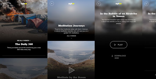
Probably one of our favorite apps in this list. New York Times has been actively working on its own VR content. As far as we have checked it, they have done an incredible job. Instead of experiencing news and articles by watching 2d videos or reading articles, you get the chance to dive right into them and experience them in a way that was unimaginable just a couple years ago.One of the greatest aspects of NYT VR is that it updates daily with new videos. Usually these videos are quite short. On average, you get to watch videos that are only a couple minutes long. But there are tons of them and all of them are done perfectly.

Quill

Quill

While not for everybody, Quill was the VR app that we got excited the most about. Quill is a VR illustration and animation app that helps designers and artists create stunning and living illustrations and stories. The creation part is done entirely in VR. So rather than designing your piece through an interface, you’re inside your illustration. Now that is as immersive as something can ever get. While Quill can be used through the entirety of your project, it’s also a great tool for concept design, pre-visualization and storyboarding. In simpler words, Quill is the wet dream of any visual artist.

Incell VR

Incell VR

Probably one of the most popular VR apps out there, Incell is an educational VR game that on paper helps you understand the human body by making you race through human cells. We say ‘on paper’ because it’s more of a racing game than an educational game. The game is playable in Google Cardboard or has a non-VR version which isn’t interesting at all. The game gives you different missions such as escaping from a virus, vaccinating a cell and it does it with some great humor that, for an educational game, it never gets boring. Incell is both a great game and a perfect entry point into VR games considering it’s quite easy to play. Above all else, it’s free.

Within

Within

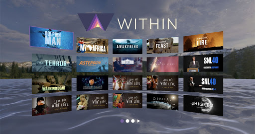
Within is an entire universe of VR that is waiting to be tapped into. It’s a platform where you can find VR experiences and stories from diverse settings. You can watch animated short movies, delve into peculiar adventures or watch documentaries created strictly for VR. Within provides a solid platform of VR content collected from VR content creators from all across the globe.

Aircar VR

Aircar VR

Aircar is an interesting one. It’s classified as a VR game. But, it’s not actually a game, it’s more like a demo. Don’t let that discourage you. It’s truly a magical experience. Aircar is not a fully completed because it has no objectives, progress or story. Other than that, its quality surpasses many other VR games.Aircar allows you to pilot a flying car in a Bladerunner inspired city and explore it. The environment, the ambiance of the game is truly unique and immersive. Nothing beats piloting through a cyberpunk inspired city at night while it’s raining. Best part is that it’s for free. So, there’s nothing stopping you from trying it out.

Kingspray Graffiti

Kingspray Graffiti

As you might have noticed by now, we love interesting and immersive VR apps over wave-based shooters which is the prevalent genre in VR. Kingspray is one of the VR games that stood out for us. Simply put, it’s a graffiti simulator. But it’s also much, much more than that. The environments, the controls, and the amount of detail truly are breathtaking. Getting started with the game is quite easy as it’s extremely intuitive. Especially the amount of effort put into making spraying as close to reality as possible has paid off. Kingspray Graffiti is an excellent way to get immersed and lose track of time.

Fulldive VR

Fulldive VR

While not necessarily a VR app, Fulldive is a great platform for anyone who wants to delve deeper into VR. Fulldive VR is a VR app and video platform designed specifically for mobile VR. There are tons of apps and videos to pick from. So, if you use your smartphone as your VR device Fulldive will probably be on your phone.

All in all, it is obvious that VR is an exciting field. Although many consider it to be in its infancy, the road ahead seems quite exciting. All of the VR apps we suggested above are quite unique and provide truly immersive experiences. So, what are you waiting for, go ahead and get immersed!

Categories: Others Tags:

Smashing Podcast Episode 7 With Amy Hupe: What Is A Government Design System?

January 14th, 2020 No comments
Amy Hupe

Smashing Podcast Episode 7 With Amy Hupe: What Is A Government Design System?

Smashing Podcast Episode 7 With Amy Hupe: What Is A Government Design System?

Drew McLellan

2020-01-14T05:00:00+00:002020-01-16T11:00:07+00:00

Have you ever wondered how design systems are used within a government? Also, if you’d want to document a design system the best way you could, how would you do it? I spoke to Design Systems advocate, Amy Hupe, who shares her advice and lessons learned.

Show Notes

Weekly Update

Transcript

Drew McLellan: She’s a Content Specialist and Design Systems Advocate who spent the last three years working as Senior Content Designer at the Government Digital Service. In that time, she’s led content strategy for the GOV.UK design system, including a straightforward and inclusive approach to documentation. She’s previously worked for consumer advocacy company, Which? where she wrote about everything from composting to conveyancing. And a new role for 2020 sees her take up as Project Manager for Babylon Health Design System, DNA.

Drew: She’s a skilled cook, an Instagrammer, and knows how to use language to make services accessible and inclusive. But did you know she once sang backing vocals for Billy Ray Cyrus? My smashing friends, please welcome Amy Hupe. Hello Amy. How are you?

Amy Hupe: I am smashing. Thank you.

Drew: So I wanted to talk to you today about the role of design systems within government organizations generally, but specifically the GOV.UK design system, which I know you’ve done a lot of work with. I guess first of all, what does the GOV.UK design system encompass? And what was your involvement with it while you were at GDS?

Amy: So it encompasses all kinds of things. So I think the most obvious representation of it is the kind of website side, which is GOV.UK/design-system. And there you’ll find all of the kind of documentation. So all of the design guidelines, and the components and patterns, and you’ll see some of the code, lots of examples and lots of advice on how to use it. But thinking kind of more broadly than that, it also encompasses things like the prototype kit, which is a prototyping tool that is used in government to make HTML and CSS prototypes. So quite high fidelity prototypes and it also has its own kind of front end framework, which is called GOV.UK Front End. So that’s all the code that they use to build the services.

Amy: But then I like to think of design systems more holistically. So as well as all of that stuff, there’s also all the processes that sit around it. So things like how people contribute to it and how people come to know that it exists. Things like adoption and awareness and all that sort of stuff. So all of the things that enable people to design and build services in government is how I would define it.

Drew: So what was your involvement while you were at GDS with that? Where did you slot into that system?

Amy: It all kind of happened by chance, I guess. So I joined as a content designer in January 2017, and my intention when I came to GDS was actually to join the Gov UK content teams. So I thought I was going in to start writing guidance for system, and that was my dream. That was what I wanted to do. Then I arrived on day one and got plunked into this little protect team, called the Service Manual Patterns and Tools team.

Amy: At that point the design system didn’t exist, but we had our design patterns and some bits and pieces knocking about in different places. There was an ambition to try and pull those things together. So I was put into that team as a content designer. I didn’t know what a design pattern was, didn’t know anything about code, didn’t know anything really about web design at all. All I really knew was content.

Amy: So it was a pretty steep learning curve and I spent the next six months to a year, I think, helping the team to prototype it and figure out how it would be organized and laid out and how we would write our guidance, and all that sort of stuff. Then, in the midst of all of that as well as working on the content, I also started to look into the contribution side. So how people would contribute to it and how people would come to discover it and, get in touch with us, and what we would do when they did get in touch with us to try and make it better.

Drew: So what does designing content in that sort of context to be involve? What were the sort of daily tasks you were tackling?

Amy: So all kinds of things really. I mean there were weeks at a time I think where I didn’t write a single word and it was more just going out to research and meeting our users and try sort of understand what it was that they wanted from a design system. So yeah, without getting too far into it, there had been attempts to make something like the GOV.UK design system before, which is how we ended up with this kind of slightly disparate set of resources.

Amy: For one reason or another, these things ended up quite spread out, and it was never really one of them that was seen as the central place to go for this stuff. So a lot of it, it was just trying to understand what had happened before and why those things hadn’t necessarily taken off in the way that we had hoped that they would. Trying to understand which bits of our existing landscape were working for people and which bits weren’t.

Amy: So a lot of it was going out with our research [inaudible 00:05:07], and sitting in user research interviews, and taking notes and talking to people, and just understanding what it was that they needed. Then there were days where I did actually get to sit at a keyboard and write some guidance about some stuff, which was nice too. But yeah, it was very different for me. As you mentioned in the intro, my background was working at Which? So it was much more a traditional editorial role and I was used to working on long form content, and just writing really long articles, and pieces. So yeah, it was quite a big change. It was a big leap from that.

Drew: So your users in this context are people who are working in different government organizations? Is that right? Different departments within the government?

Amy: Yeah. Yeah, that’s right. So people working in, I think there’s 25 different ministerial departments in government, and then there’s lots of agencies and local government departments as well. So we were trying to spread out and talk to a really wide range of people from across the civil service. So yeah, lots of traveling in those early days.

Drew: Do you think that designing or working on a design system for a government, essentially, is any different from a design system for a small company or a big sort of enterprise company?

Amy: I think so. I mean I think from what I can kind of gather from conversations I’ve had, and conferences I’ve been to and stuff, every design system is slightly different and the context is always slightly different, and government is no different in that respect. But yeah, I suppose some of the unique challenges to working on something for government, is first of all the scale of it. So the audience is probably the biggest that you could have because government is so big, and all the different kinds of departments and the geographical spread of those organizations. So the scale of it is definitely something that’s slightly different.

Amy: I think also the fact that it’s not commercially competitive. So we weren’t trying to keep everything under wraps. Everything was done in the open as far as possible. Yeah, it’s all run as a big open source project, which was a slightly unusual concept for me. It took me a little while to get used to that.

Amy: Certainly when we first released it, we would see bits of our guidance and code popping up in other people’s design systems. It took a little while for me to feel all right about that. I think at first I was like, “What’s going on? Why are these people taking our stuff?” But actually now, I really like that. I see that as a big compliment, and I think it’s really good to reuse what you can. But yeah, that’s a strange kind of world to enter when you’ve been used to working in a more commercial setting, I guess.

Drew: I suppose the fact that it’s a essentially publicly funded system, means that is uniquely suited to the public taking it and using it, but also worldwide did you see a lot of use outside of the UK?

Amy: Yeah, yeah, there’s been some really exciting projects across the world that have picked it up. So I know that the New Zealand government have used quite a lot of it. I’m not sure what stage they’re at the moment, but certainly I saw their early data design system and they really used a lot of our guidance and our code, our layouts and things. I think the Dutch government is also using the GOV.UK design system primarily as its first proof of concept. The Australian government started with all of our contribution guidelines and have sort of adapted them based on their research. So we’ve been able to take some of that stuff back in. Yeah, so it’s gone pretty global. It’s exciting.

Drew: Would you factor in the fact that people would be using it when making decisions about the sort of next phase of things? Would it factor into your decisions that it’s actually your audience suddenly isn’t just UK government, it actually could potentially be a worldwide audience?

Amy: It’s definitely a consideration and I think at times that definitely made us as a team quite nervous about certain things that we were doing because the our audience and the scope of it suddenly got much bigger when we were thinking about all the different people that were using it. But personally I think you can’t get too caught up in that primarily we are there to serve the UK government. So it’s not practical to consider all of the potential audiences for it. I kind of think it’s up to the teams to adapt it how they need to for their own, their own users. But yeah, definitely it does make you think quite carefully about just throwing things out there before they’re kind of ready tested and stuff.

Drew: So were there any other sort of surprises in working on this design system other than the fact that it was then taken and used more broadly than you’d initially expected? Did anything else spring out and surprise you about it?

Amy: One thing that definitely stood out to me was the range of people in our audience. So not just the size of the audience, but like the variation in people’s level of knowledge, their skills, their confidence, the different kinds of jobs that they did and the kind of contexts in which they were working. I think there’s definitely a lot of variation in there. I think my perception going in was that I had this vision of this like designer front end developer in my head, somebody who has lots of technical knowledge and actually that’s just one type of user. There are lots of other people like content designers and things weren’t necessarily an expected audience for it, but have turned out to be key users.

Amy: So I think, yeah, that that was definitely a surprise to me. Then thinking about how we could cater to all those people with such a broad set of needs with the design system was definitely quite a big challenge. Yeah, I think that was probably my biggest surprise. Then I guess alongside that just how much people had seen to adopt it as their own. So I think after we launched pretty quickly, I was really pleasantly surprised at how many people I would see going out on advocating for it within their own departments and teams and people trying to contribute to it and people getting in touch with us to ask how they could kind of adapt it for their own users. It felt really community owned from day one and that was not necessarily something I expected, but something that was ready really good to see.

Drew: I guess much of the role of a design system is as a way of sort of documenting the design decisions that have been made so that those decisions can be then implemented and understood, and used by people. So I guess a design system is as much as anything, a documentation artifact isn’t it? It’s taking those decisions that have been made and explaining them in a way that people can reuse them. How did you approach as a team they design system as a sort of documentation artifact? How did you document what you were doing?

Amy: So I think it was about getting as much as we could get in a really clear picture of what people needed from that documentation. So this comes back to that point that I made about it being quite a broad reaching audience because there’s a whole range of different needs that people talk about documenting a component or a pattern like it’s a kind of single task. But actually there are loads of different ways that you can do that and there are loads of different needs that you need to take into consideration. So we have people who, for example would just, they would say, “Oh I want to see the research behind this.” For some people that means a number. They want to know that it’s being used in 20 different services so that they can tell their product manager that it’s worth investing the time and the money in implementing it within their service.

Amy: And that’s for them it’s just about getting that evidence-based backing for the decision that they’re trying to kind of push through. But then there’s other people who really care about understanding the research and whether it’s appropriate for their context and what additional research they might need to fill in to fill any gaps that have been missed or perhaps that they are dealing with in their unique situation. So I think the approach was to try and understand all of those different needs and to try and get a sense of priority amongst those and understand like how we could cater to all of the various different requirements that people had from the documentation. It’s not just one kind of one thing that fits everybody.

Amy: So figuring out how to kind of address all of those needs and to signpost the content really well in a way that meant that people could skip over the bits that weren’t relevant for them as well. Because when you are trying to serve such a broad audience, obviously you end up providing quite a lot of information. So making sure it’s really well signposted and organized I think was quite key to what we were doing.

Drew: So am I right in understanding that different departments within the government aren’t actually compelled to adopt the design system? You actually have to effectively sell it into them and persuade them to use it?

Amy: Yeah, so it’s slightly complicated. So in government there’s something called the government service standard and it’s a standard which all government services with over a certain number of users are required to meet in order to get funding and then to go into Alpha and then Beta and then live. One of the points on the service standard ,I left three weeks ago and it’s already dropped out of my head to which number it is, but one of the points of the service standard, it talks about reusing patterns and components and trying to reuse what’s there already. So sort of under that point they are compelled to use it, but it’s loose and it depends on who the assessor is. It’s not sort of heavily mandated. We would all always sort of advocate for doing what’s best in the specific context rather than just reusing patterns out of the box for the sake of it to tick a point on a service assessment. So it’s difficult to force it. So the approach was always much more collaborative and it was always about building support and building advocacy for the design system not shoving it down people’s throats.

Drew: I guess to that end, one of the ways that you’ve managed to do that is by encouraging contribution. Is that right?

Amy: Yeah, definitely. So I’m a big fan of contribution to design systems. I think it’s something that’s really interesting and yeah, certainly in the team we did a lot of work to make it possible to contribute to the GOV.UK design system. One of the real kind of benefits that we saw from that was The net advocates for the design system increasing. So when you get somebody to contribute to it and they then feel kind of more invested in it and what we received, those people would then go out to their teams and they would become our best sales people almost because they’d feel like they had a little piece of it and they had sort of something to show people and they would then encourage more people to contribute. So that effect ends up being quite exponential. Yeah. So we put a lot of effort into making that possible.

Drew: What sort of things did you do to encourage contribution?

Amy: We started really early. So way before we had a public design system, we started to engage with people who we thought would be interested contributors. I should mention here, we had a brilliant service designer on the team. She joined us in, I’m not going to get the dates correct in any way at the moment, but I think she worked with us in the whole of sort of 2018 and her name’s Ignatia and she just did a fantastic job of going around and engaging people. So one of the things that she did was to go and identify all of the different patterns in government and all of the different variations of those patterns. So going out and kind of saying, okay, there’s, there’s 10 different ways to ask for an address in government. Let’s look at them all together and decide which we think is the most appropriate approach.

Amy: How can we consolidate these into one? She ran a big workshop to try and get people looking at those and doing that kind of consolidation as a team. I think definitely her approach to building collaboration in way before we actually released anything to the public really helped with that because it meant that people already have that kind of awareness of it and many people had already contributed to it in some fashion or another before we actually took it public. So put us a few steps ahead. So I think that was really important. And just persistence, like a lot of persistence from the whole team in kind of helping people to contribute. I think there’s an idea that if you get people to contribute to a design system that’s a pretty sweet gig cause you can just get people to do all the work for you.

Amy: And you just sit there and you make your level code fixes and everybody’s actually giving you all the good stuff. But actually as anyone who’s worked on a design system will know, it’s incredibly complex. It’s very difficult to make a centralized solution that works for multiple different teams, and really, unless you’ve worked on a design system, it’s not reasonable to expect anyone to really understand what that takes. So there’s a lot of hand holding. There’s a lot of work involved in supporting contributors to contribute, I think I said this before, but it probably takes longer, I think, to help somebody to contribute to a design system then it would to just make the thing yourself in the centralized team. But I think recognizing the value that it brings and being persistent in your efforts to make people aware of contribution and help them to do it, help them to feel kind of motivated to do it. I think, yeah, that that persistence was really sort of key to our, our success in that area.

Drew: And just practically speaking with managing those contributions from the community, were there any tools or processes or anything that helped with that?

Amy: Yeah, so we had quite a strict process, I would say. Strict in so far as maybe, strict is the wrong word, comprehensive is probably a better word. So yeah, we have a set of contribution criteria which are in the design system. So everything’s as open as possible so people know what to expect. So there’s a set of criteria that we developed with the various people from the government community outside of our team, so again, like trying to involve people in the creation of these processes I think is really important. So there’s a set of criteria that all contributions to the design system have to meet and to make sure that we were being fairly unbiased, I suppose, and fair in terms of making the decisions about whether things met those criteria or not, we enlisted the support of a working group, which was a panel of representatives from across government. All from kind of different departments and different disciplines and people with different levels of seniority.

Amy: So everybody would have a slightly different perspective on the contributions and we would get together with them once a month and ask them to review any new contributions and decide whether or not they had met the criteria. So yeah, it was a sort of process designed to try and democratize the design of the design system I suppose, and to make it representative and ensure that it wasn’t just our team sitting in the middle making all the decisions without really understanding how it would affect the teams using those things.

Amy: Yeah, that was our sort of process. One more post I should mention is there’s a community backlog on GitHub, which anybody can use it. You don’t have to work in government to go and see it. It’s accessible from the design system and it’s basically a place where we try to host all of the research and all of the experimental stuff and the examples that go into their components and patterns in the design system. So again, it’s about pushing for that transparency and working in the open as much as possible so that people can have a voice and they can influence things before they’ve actually been published.

Drew: And do you think that process has worked well? If you were embarking on the same thing again, do you think you’d adopt a similar process or is there anything that didn’t work?

Amy: I think I would adopt a similar process but perhaps go into with slightly different expectations. What I would say is maybe slightly more realistic expectations and having said what I said about how we think that contributing will make things easier and faster. I was definitely in that camp. I think I thought that there would be a spike of work in the beginning to get people familiar with contributing and then over time we’d be able to be more hands off and people would just get the hang of it and it would be fine. But actually that never really materialized. There was always a lot of work involved in helping people to contribute and as I say, I think that that’s sort of to be expected. I don’t think you can really get away from that, but I still think it’s valuable.

Amy: I still think it’s worth investing that time, but perhaps not with an idea that you’re going to speed things up or that you’re going to be able to scale quicker or more from having contribution. So yeah, I think the process worked well. I do think it needs to be tailored to different organizations, so I’m starting a new role on Monday funnily enough, I’m working on another design system and I don’t expect to be able to pick up that process and just move it over there. I think everything has to be tailored to the organization and the context that you’re dealing with, but there’s definitely elements of it that I would like to try and bring over. But yeah, with slightly tempered expectations, I think.

Drew: I’ve talked a couple of episodes ago with Hayden Pickering about designing components, particularly within a design system to be accessible. That’s something you’ve got a lot of experience with too, I believe. Obviously accessibility is really, really crucial when working within a government design system, but many of us would argue that it’s really, really crucial wherever you’re working. Do you think design systems play a role in the accessibility of a design or the implementation of a design?

Amy: So there’s a brilliant talk by Tatiana Mack about building inclusive design systems that touches on this and that was sort of really influential to me and she talks about the sort of multiplication effect of design systems. So we have, with design systems, we’re telling people what good looks like and we’re giving people kind of quick ways to implement what we’re telling people best practices is. So that can work either way. It can work really well if you give people good design and good accessible design, then you have the potential to multiply that accessible design and to make things more accessible and more inclusive by default.

Amy: If you make decisions that exclude people in a design system, in that centralized space, which becomes the start point for people designing services, then you really have the potential to proliferate that exclusionary design. So I definitely think that design systems play a role in promoting and multiplying accessibility. But I think that it all starts with the intention of the teams working on and using the design system to make that happen. A design system is really it’s just the kind of vehicle I suppose and the intention needs to be there to make things accessible.

Drew: One of the things that always fascinates me, particularly with design systems that have such a large and varied audience like the the GFI UK design system, is the process of proliferating changes across the system. So if you, for example, find an accessibility improvement that you could make in a particular pattern and you make it in the design system, how do you ensure that that gets rolled out across such a broad audience? Is that something you’ve got any experience with?

Amy: Yeah. So again, I think that we kind of in the GOV.UL design system team, we put a lot of consideration into how that would work. I have to be honest, a lot of it is to do with how it’s technically implemented and I’m definitely not the right person to talk so much about the technical aspect of the team. I find there’s sort of two camps with design systems and there’s a camp which is like let’s get stuff out there as quickly as possible. Let’s just make it open soon as we can and that will stop duplication of effort and multiplication of effort and then we can iterate it as we go along. Then I think that there’s a slightly more sort of let’s move a bit more slowly camp, which I think I’m in, which favors holding off on releasing stuff until you have a certain level of confidence in it.

Amy: And I think that’s quite important because I think that in general, if you’re designing products and services, then starting with the minimal thing and then iterating as you go I think works great, but I think when you’re building something central that’s designed for lots and lots of people to sort of reuse and give to lots of different audiences, you very quickly use control of the thing and the way that it’s being used. So I think that having a certain amount of confidence in something before you release it and having a kind of assurance process in place, that means that you’ve got some confidence that it’s accessible before it goes out there is quite key and then hopefully the thing is slightly more stable and I think that’s really important for trust. I think trust is quite important when we’re talking about making changes to design systems because if we’re releasing changes all the time, then that makes the system quite unstable to use and I think that that breaks down trust and then people aren’t so likely to install updates and things.

Amy: Whereas I think if you can show that you’re being considerate about what you’re releasing and you’re releasing changes only when necessary, then you have that Goodwill and then people are more willing to make updates and stuff I think. But yeah, I mean I know that a lot of work went into making sure that the update process was fairly smooth and easy to implement in the GPV.UK design system. I’m just not the right person to talk about it, I think.

Drew: So we talked briefly about documentation. If I was looking to document a design system and if I wanted to do a really good job of it, is there anything that you would advise me to do to make sure I was documenting stuff well?

Amy: I never think it’s possible to kind of just give a blanket statement here because it really does need to cater to like the specific audience that you’re dealing with. My thing is to always aim to be just a little bit more inclusive than you maybe feel that you need to be. So if you’re thinking about, especially in a smaller organization that’s maybe scaling, I think that you have to be just as considerate as your future audience and your potential audience as your current audience. So if you have a small organization and you’ve got 10 front end developers and they all know the same sort of stuff and they’re able to talk to each other and communicate fairly freely, then your documentation may not to be as comprehensive as it within the larger organization.

Amy: But I think that in order to help a design system scale and to make sure that it’s equipped to do that, you have to think about who might join the organization in the future and who do you need to kind of leave the door open for? Who do you need to make things clear to? So I think always aim to be a little bit clearer than you feel you need to be in the moment. I think really testing documentation a lot is useful, so there’s lots of different ways to test content and documentation and I think that it’s really important to go out and make sure that it makes sense to other people. I think Caroline Darret always says that if you understand it well enough to know it’s correct, then you know too much to say that it’s clear.

Amy: Have I said that correctly? If you know it well enough to know it’s correct, then you know it too well to say that it’s clear, that’s better I think. And I really sort of agree with that. I think that to write good documentation you have to have pretty good subject matter knowledge or you need to or you end up developing that subject matter knowledge over time and through the process of writing it. By the time you’ve got that subject matter knowledge, it’s really hard to judge whether or not you’ve conveyed it in a way that’s clear to somebody who doesn’t. So going out and testing it with people who don’t know the subject matter like you do and getting them to actually try and use it in a practical task I think is really important. Yeah, that that’s my sort of number one thing. You’ll learn way more by putting it in front of people then you’ll learn by reading around and looking at what other people have done I think.

Drew: And in doing that you’re obviously going to get feedback on that documentation. Do you have any suggestions for how you would approach fixing things based on that feedback? Is there anything specific that you’d be looking for in the feedback to understand how well your documentation had worked?

Amy: Yeah, I mean there’s a few things I think to watch out for. I think it’s is really important to separate preferences and people perhaps not liking the documentation from people actually not being able to use it. So I think any task-based testing with documentation is better because it might be that actually somebody complains their way through an entire guide but they still complete the task that you’ve set them. That’s not to say that that doesn’t matter. If they wanted to do the thing but they actually hated the process, then you of course need to take that into consideration. But I think that some people and I’m probably one of them just can’t help themselves and will start, especially if it’s a content designer, I think we can’t kind of ever quite put that content design mentality aside.

Amy: So I definitely have a tendency to start live editing stuff if I’m supposed to be participating as research candidate on it. So I think yeah, separating preference from actual kind of usability and blockers is quite important. I think that making sure that your really interrogating the need to make changes and to update things. I think sometimes if somebody is particularly engaged with a design system, depending on the sort of person they are, they can be quite vocal about how they think it could be better or how they think that how they would’ve done it perhaps or how it could be clearer. I think it can be quite, especially if you’re sort of trying to build Goodwill and you’re in that early stage with the design system, it can be quite tempting to just immediately respond to that feedback and do what they say or try and make it clearer.

Amy: But then you can end up building it too far in the direction of the loud minority and I think actually really saying like how many people have got this problem? What evidence do we have that this isn’t working for people? And does that warrant a kind of update? I think yeah, trying to resist the temptation to respond to every comment and bit of criticism that you receive is quite important too, yeah.

Drew: I suppose I’m a common theme here with design systems that enable consistent design and give you a reusable resource in your design and about accepting contributions that make those designs stronger and implementing accessible design choices and documenting your design to make it easy to access and use. It really all comes back to sort of inclusion, would you say that was fair that including people as much as possible?

Amy: Definitely. Yeah. I mean I think that a good design system is a representative design system and I don’t think it’s possible to achieve representation by acting on people’s behalf. I think you really need to try and involve people in the process as much as possible. I think often for people working on design systems and certainly it was the case for us at the GOV.UK design system, you tend to be one step removed from your organizations end users. So if you think for the GOV.UK design system, the people that the design system is ultimately there to serve are members of the public and citizens and people using government services. But we in our team, we’re really working directly with those people. Most of the time our direct users are people working in the civil service. So making sure that you’ve got really strong feedback loops between your direct users and then their users to ensure that it’s representative I think is really important and I think that’s where inclusion comes in and yeah, I completely agree. I think it’s a really central thing, like I can’t imagine how you could build a successful design system without a focus on that.

Drew: Is there anything else that you’d like to share with us about your work on the GOV.UK design system?

Amy: I think my sort of main takeaway from working on it is that, I hate using the word physical when I’m talking about anything on the web, but the the visual representation of a design system I think can end up being the thing that we all get really fixated on. We look at how it’s coded and we look at how it’s organized and what it looks like and how it’s documented and what the design is. I think that obviously that stuff is really important. I think that it’s the thing that you can look at and show people and share. So it’s easy to see why we get fixated on that. But I really think that the most important factor of it is the people. I think that having inclusive processes and making sure that you’re kind of fostering safe discussion spaces and that you’re giving people an opportunity to get involved in the work and to participate and feel motivated to help you with it and to feel this sense of ownership over it.

Amy: I think all of that stuff is really important and all of that stuff really happens outside of the code and outside of the documentation. So yeah, I think my key takeaway from working on the GOV.UK design system is how much of it is really just people work and not really anything to do with guidance and code.

Drew: Here’s at Smashing we’re all about learning. So what have you been learning lately?

Amy: Lately I’ve been learning a lot about productivity and focus. I think definitely towards the end of last year I became aware that I was really plate spinning and luckily I don’t think I smashed any of those plates but I found myself kind of working quite chaotically and moving around lots of different projects and saying yes to everything. So this year is the year that I want to really improve my focus. So I’m trying to learn a little bit about mindfulness and organization and how to say no to things strategically so that I don’t get overwhelmed and too distracted. I’ve started bullet journaling so I’ve really become the full 2020 cliche at this point. So that’s what I’m learning at the moment.

Drew: If you dear listener, would like to hear more from Amy, you can follow her on Twitter where she’s @Amy_Hupe or find her on the web at amyhupe.co.uk. Thanks for joining us today. Amy, do you have any parting words for us?

Amy: Stay cool. What? Why did I say that? Just came out, it just came out.

(dm, ra, il)
Categories: Others Tags:

Snowpack

January 14th, 2020 No comments

Snowpack. Love that name. This is the new thing from the Pika people, who are on to something. It’s a bundler alternative, in a sense. It runs over packages you pull from npm to make sure that they are ES module-compatible (native imports).

This is how I digest it. When you write a line of code like:

import React from "react";

That’s actually invalid JavaScript. It looks like a native import, but it isn’t. (It would start with a filepath character like ./ and end in .js to be valid.) It’s just an agreement from Big Bundler like, “Oh, I know what you mean. You mean I should go look in node_modules for this thing.” Then it goes and does it.

A lot of stuff on npm isn’t ready for ES modules. It’s in some other module format (e.g. CommonJS) and assumes you’ll be using a bundler with it. An assumption served them just fine for a while, but it’s an assumption that is starting to be a bit of a thorn for front-end developers.

UNPKG has had a feature where you could add ?module to the end of their URLs to get it to serve up an ES module-friendly version of the package, but it’s been in an experimental stage for a long time because, presumably, it’s a hard problem to solve. Which packages are ready for ES modules? Can they be processed to be ready on the fly?

Even the Pika CDN doesn’t solve the issues of packages that aren’t written to be used via ES modules. For example, since React isn’t written to be used with ES modules directly, so you just can’t (but you can still use it via tag).

Snowpack has apparently dealt with this. It runs its magic over the packages that you install (locally) and prepares them for ES module usage. So, after Snowpack has ran, now you can do this (which you haven’t been able to do before):

import React from '/web_modules/react.js';

Which is valid code for ES modules. Plus, if you run Babel anyway, you don’t even have to change that original line.

Hence their marketing/explanation:

1) Instead of bundling on every change, just run Snowpack once right after npm install.
2) Snowpack re-installs your dependencies as single JS files to a new web_modules/ directory.
3) Write code, import those dependencies via an ESM import, and then run it all in the browser.
4) Skip the bundle step and see your changes reflected in the browser immediately after hitting save.
5) Keep using your favorite web frameworks and build tools! Babel & TypeScript supported.

It’s kinda like you get native code splitting for free, and you’re just crossing your fingers that ES modules will be just as fast as bundling with that benefit. I’m optimistic. I think it’s early days and would be nervous on Big Production Stuff, but I also think native ES modules are probably the future.

The post Snowpack appeared first on CSS-Tricks.

Categories: Designing, Others Tags:

Animate Text on Scroll

January 13th, 2020 No comments

We covered the idea of animating curved text not long ago when a fun New York Times article came out. All I did was peek into how they did it and extract the relevant parts to a more isolated demo.

That demo is here:

See the Pen
Selfie Crawl
by Chris Coyier (@chriscoyier)
on CodePen.

@keyframers covered it much nicer than I did and made this video. (Seriously, it’s so clear and concise — it’s a great watch.)

I particularly like how quick’n’easy creating, exporting, optimizing, and integrating the actual SVG codes in their demonstration.

Their final demo:

See the Pen
SVG textPath Animation on Scroll Tutorial | Keyssentials: Web Animation Tips by @keyframers
by @keyframers (@keyframers)
on CodePen.

The post Animate Text on Scroll appeared first on CSS-Tricks.

Categories: Designing, Others Tags: