Archive

Archive for January, 2020

A Scandal in Bohemia

January 13th, 2020 No comments

I love that Paravel is so busy doing so much cool stuff they literally just forgot that they built this and are just now releasing it.

It’s a Sherlock Holmes story, but designed to be more interesting and immersive (even audio!) than just words-on-a-screen.

Direct Link to ArticlePermalink

The post A Scandal in Bohemia appeared first on CSS-Tricks.

Categories: Designing, Others Tags:

How to Animate on the Web With Greensock

January 13th, 2020 No comments

There are truly thousands of ways to animate on the web. We’ve covered a comparison of different animation technologies here before. Today, we’re going to dive into a step-by-step guide of one of my favorite ways to get it done: using GreenSock.

(They don’t pay me or anything, I just really enjoy using them.)

Why do I prefer Greensock to other methods? Technically speaking, it’s often the best tool for the job. It’s usage is extremely straightforward, even for complex movement. Here are a few more reasons why I prefer using it:

  • You can use them on DOM elements as well as within WebGL/Canvas/Three.js contexts.
  • The easing is very sophisticated. CSS animations are limited to two bezier handles for ease, meaning if you want, say, a bounce effect, you would have to make keyframes up and down and up and down for each pass. GreenSock allows multiple bezier handles to create advanced effects. A bounce is a single line of code. You can see what I mean by checking out their ease visualizer.
  • You can sequence movement on a timeline. CSS animations can get a little spaghetti when you have to coordinate several things at once. GreenSock remains very legible and allows you to control the timeline itself. You can even animate your animations! ?
  • It will perform some calculations under the hood to prevent strange cross-browser behavior as well as things that the spec dictates should be true aren’t — like the way that stacking transforms work.
  • It offers a lot of advanced functionality, in the form of plugins, that you can use if you’d like to take your work a step further — things like Morphing SVG shapes, drawing SVG paths, dragging and dropping, inertia, and more.

People sometimes ask me why I’d use this particular library over all of the other choices. It’s further along than most others — they’ve been around since the Flash was still a thing. This demo reel is pretty inspiring, and also gets the point across that serious web animators do tend to reach for this tool:

What follows is a breakdown of how to create movement on the web, distilled down to the smallest units I could make them. Let’s get started!

Animating a DOM element

Consider a ball that we with a

that’s styled with a border-radius value of 50%. Here’s how we would scale and move it with Greensock:

<div class="ball"></div>
gsap.to('.ball', {
  duration: 1,
  x: 200,
  scale: 2
})

See the Pen
Greensock Tutorial 1
by Sarah Drasner (@sdras)
on CodePen.

In this case, we’re telling GreenSock (gsap) to take the element with the class of .ball move it .to() a few different properties. We’ve shortened the CSS properties of transform: translateX(200px) to a streamlined x: 200 (note there’s no need for the units, but you can pass them as a string). We’re also not writing transform: scale(2). Here’s a reference of the transforms you might want to use with animations, and their corresponding CSS syntax:

x: 100 // transform: translateX(100px)
y: 100 // transform: translateY(100px)
z: 100 // transform: translateZ(100px)
// you do not need the null transform hack or hardware acceleration, it comes baked in with
// force3d:true. If you want to unset this, force3d:false
scale: 2 // transform: scale(2)
scaleX: 2 // transform: scaleX(2)
scaleY: 2 // transform: scaleY(2)
scaleZ: 2 // transform: scaleZ(2)
skew: 15 // transform: skew(15deg)
skewX: 15 // transform: skewX(15deg)
skewY: 15 // transform: skewY(15deg)
rotation: 180 // transform: rotate(180deg)
rotationX: 180 // transform: rotateX(180deg)
rotationY: 180 // transform: rotateY(180deg)
rotationZ: 180 // transform: rotateZ(180deg)
perspective: 1000 // transform: perspective(1000px)
transformOrigin: '50% 50%' // transform-origin: 50% 50%

Duration is what you might think it is: it’s a one-second stretch of time.

So, OK, how would we animate, say, an SVG? Let’s consider the same code above as an SVG:

<svg viewBox="0 0 500 400">
  <circle class="ball" cx="80" cy="80" r="80" />
</svg>
gsap.to('.ball', {
  duration: 1,
  x: 200,
  scale: 2
})

See the Pen
Greensock Tutorial 2
by Sarah Drasner (@sdras)
on CodePen.

From an animation perspective, it’s actually exactly the same. It’s grabbing the element with the class .ball on it, and translating those properties. Since SVGs are literally DOM elements, we can slap a class on any one of them and animate them just the same way!

Great! We’re cooking with gas.

Eases

I mentioned before that eases are one of my favorite features, let’s take a look at how we’d use them.

Let’s take the original ball. Maybe we want to try one of those more unique bounce eases. It would go like this:

gsap.to('.ball', {
  duration: 1.5,
  x: 200,
  scale: 2,
  ease: 'bounce'
})

See the Pen
Greensock Tutorial 3
by Sarah Drasner (@sdras)
on CodePen.

That’s it! This version of GreenSock assumes that you want to use ease-out timing (which is better for entrances), so it applies that as a default. All you have to do is specify “bounce” as a string and you’re off to the races.

You might have noticed we also lengthened the duration a bit as well. That’s because the ball has to do more “work” in between the initial and end states. A one-second duration, though lovely for linear or sine easing, is a little too quick for a bounce or an elastic ease.

Delays and Timelines

I mentioned that the default ease-out timing function is good for entrances. What about an ease-in or ease-in-out exit? Let’s do that as well.

gsap.to('.ball', {
  duration: 1.5,
  x: 200,
  scale: 2,
  ease: 'bounce'
})

gsap.to('.ball', {
  duration: 1.5,
  delay: 1.5,
  x: 0,
  scale: 1,
  ease: 'back.inOut(3)'
})

You might have noticed a few things happening. For example, we didn’t use bounce.in on the second-to-last line (ease: 'back.inOut(3)'). Instead, we used another ease called back for ease-in-out. We also passed in a configuration option because, as you can see with Greensock’s ease visualizer tool, we’re not limited to just the default configuration for that ease. We can adjust it to our needs. Neat!

You may have also noticed that we chained the animations using a delay. We took the length of the duration of the first animation and made sure the next one has a delay of that matches. Now, that works here, but that’s pretty brittle. What if we want to change the length of the first one? Well, now we’ve got to go back through and change the delay that follows. And what if we have another animation after that? And another one after that? Well, we’d have to go back through and calculate all the other delays down the line. That’s a lot of manual work.

We can offload that work to the computer. Some of my more complex animations are hundreds of chained animations! If I finish my work and want to adjust something in the beginning, I don’t want to have to go back through everything. Enter timelines:

gsap
  .timeline()
  .to(‘.ball', {
    duration: 1.5,
    x: 200,
    scale: 2,
    ease: "bounce"
  })
  .to(‘.ball', {
    duration: 1.5,
    x: 0,
    scale: 1,
    ease: "back.inOut(3)"
  });

See the Pen
Greensock Tutorial 4
by Sarah Drasner (@sdras)
on CodePen.

This instantiates a timeline and then chains the two animations off of it.

But we still have a bit of repetition where we keep using the same duration in each animation. Let’s create a default for that as an option passed to the timeline.

gsap
  .timeline({
    defaults: {
      duration: 1.5
    }
  })
  .to('.ball', {
    x: 200,
    scale: 2,
    ease: "bounce"
  })
  .to('.ball', {
    x: 0,
    scale: 1,
    ease: "back.inOut(3)"
  });

See the Pen
Greensock Tutorial 4
by Sarah Drasner (@sdras)
on CodePen.

That’s pretty cool! Alright, you are probably starting to see how things are built this way. While it might not be a big deal in an animation this simple, defaults and timelines in really complex animations can truly keep code maintainable.

Now, what if we want to mirror this motion in the other direction with the ball, and just… keep it going? In other words, what if we want a loop? That’s when we add repeat: -1, which can be applied either to a single animation or to the entire timeline.

gsap
  .timeline({
    repeat: -1,
    defaults: {
      duration: 1.5
    }
  })
  .to('.ball', {
    x: 200,
    scale: 2,
    ease: "bounce"
  })
  .to('.ball', {
    x: 0,
    scale: 1,
    ease: "back.inOut(3)"
  })
  .to('.ball', {
    x: -200,
    scale: 2,
    ease: "bounce"
  })
  .to('.ball', {
    x: 0,
    scale: 1,
    ease: "back.inOut(3)"
  });

See the Pen
Greensock Tutorial 5
by Sarah Drasner (@sdras)
on CodePen.

We could also not only make it repeat, but repeat and play back and forth, like a yoyo. That’s why we call this yoyo: true. To make the point clear, we’ll show this with just the first animation. You can see it plays forward, and then it plays in reverse.

gsap
  .timeline({
    repeat: -1,
    yoyo: true,
    defaults: {
      duration: 1.5
    }
  })
  .to('.ball', {
    x: 200,
    scale: 2,
    ease: "bounce"
  })

See the Pen
Greensock Tutorial 6
by Sarah Drasner (@sdras)
on CodePen.

Overlaps and Labels

It’s great that we can chain animations with ease, but real-life motion doesn’t exactly work this way. If you walk across the room to get a cup of water, you don’t walk. Then stop. Then pick up the water. Then drink it. You’re more likely to do things in one continuous movement. So let’s talk briefly about how to overlap movement and make things fire at once.

If we want to be sure things fire a little before and after each other on a timeline, we can use an incrementer or decrementer. If we take the followingexampxle that shows three balls animating one after another, it feels a little stiff.

gsap
  .timeline({
    defaults: {
      duration: 1.5
    }
  })
  .to('.ball', {
    x: 300,
    scale: 2,
    ease: "bounce"
  })
  .to('.ball2', {
    x: 300,
    scale: 2,
    ease: "bounce"
  })
  .to('.ball3', {
    x: 300,
    scale: 2,
    ease: "bounce"
  })

See the Pen
Greensock Tutorial 8
by Sarah Drasner (@sdras)
on CodePen.

Tbigns get smoother if we overlap the movement just slightly using those decrementers passed as strings:

gsap
  .timeline({
    defaults: {
      duration: 1.5
    }
  })
  .to('.ball', {
    x: 300,
    scale: 2,
    ease: "bounce"
  })
  .to('.ball2', {
    x: 300,
    scale: 2,
    ease: "bounce"
  }, '-=1')
  .to('.ball3', {
    x: 300,
    scale: 2,
    ease: "bounce"
  }, '-=1')

See the Pen
Greensock Tutorial 9
by Sarah Drasner (@sdras)
on CodePen.

Another way we can do this is to use something called a label. Labels make sure things fire off at a particular point in time in the playhead of the animation. It looks like this:.add('labelName')

gsap
  .timeline({
    defaults: {
      duration: 1.5
    }
  })
  .add('start')
  .to('.ball', {
    x: 300,
    scale: 2,
    ease: "bounce"
  }, 'start')
  .to('.ball2', {
    x: 300,
    scale: 2,
    ease: "bounce"
  }, 'start')
  .to('.ball3', {
    x: 300,
    scale: 2,
    ease: "bounce"
  }, 'start')

See the Pen
Greensock Tutorial 10
by Sarah Drasner (@sdras)
on CodePen.

We can even increment and decrement from the label. I actually do this a lot in my animations. It looks like this: 'start+=0.25'

gsap
  .timeline({
    defaults: {
      duration: 1.5
    }
  })
  .add('start')
  .to('.ball', {
    x: 300,
    scale: 2,
    ease: "bounce"
  }, 'start')
  .to('.ball2', {
    x: 300,
    scale: 2,
    ease: "bounce"
  }, 'start+=0.25')
  .to('.ball3', {
    x: 300,
    scale: 2,
    ease: "bounce"
  }, 'start+=0.5')

Whew! We’re able to do so much with this! Here’s an example of an animation that puts a lot of these premises together, with a bit of interaction using vanilla JavaScript. Be sure to click on the bell.

See the Pen
phone interaction upgrade
by Sarah Drasner (@sdras)
on CodePen.

If you’re looking more for framework-based animation with GreenSock, here’s an article I wrote that covers this in Vue, and a talk I gave that addresses React — it’s a couple of years old but the base premises still apply.

But there’s still so much we haven’t cover, including staggers, morphing SVG, drawing SVG, throwing things around the screen, moving things along a path, animating text… you name it! I’d suggest heading over to GreenSock’s documentation for those details. I also have a course on Frontend Masters that covers all of these in much more depth and the materials are open source on my GitHub. I also have a lot of Pens that are open source for you to fork and play with.

I hope this gets you started working with animation on the web! I can’t wait to see what you make!

The post How to Animate on the Web With Greensock appeared first on CSS-Tricks.

Categories: Designing, Others Tags:

Why do we have different programming languages?

January 13th, 2020 No comments

“But why do I have to learn Python?” She wailed, “I like Scratch!”

“I know,” I said, “But there are different programming languages for different sorts of tasks.”

“That’s stupid” she said

I can empathize with the little girl in Terence Eden’s story. In high school, I got super into Turbo Pascal. I felt like I could do a lot of stuff in it. Then I went to college. The first course I took was Java and the second was Assembly. I remember feeling so resentful. Why couldn’t I just program in the language I already felt comfortable with? I spent four years feeling that way and then changed majors. I’m a little more adventurous now with my language galavanting, but not terribly.

The answer to why we have different programming languages is because they do different things to some degree. There are indeed cases where something could have written the same way in multiple languages, and you picked the one that you prefer.

The real answer is that some programming nerd (in the most endearing way) thought they could make a better language that (likely) reflects modern needs and styles. So they did and convinced a bunch of other nerds that it was a good idea, allowing the language to gained steam. It’s a miracle of sorts.

We don’t see it on the client-side web because it would probably be easier to colonize Mars than get all the major browsers to ship an entirely new language. The web sees innovation through slow evolution and at the framework level.

Direct Link to ArticlePermalink

The post Why do we have different programming languages? appeared first on CSS-Tricks.

Categories: Designing, Others Tags:

An Introduction To React’s Context API

January 13th, 2020 No comments
Smashing Editorial

An Introduction To React’s Context API

An Introduction To React’s Context API

Yusuff Faruq

2020-01-13T11:30:00+00:002020-01-13T11:36:37+00:00

For this tutorial, you should have a fair understanding of hooks. Still, before we begin, I’ll briefly discuss what they are and the hooks we’ll be using in this article.

According to the React Docs:

Hooks are a new addition in React 16.8. They let you use state and other React features without writing a class.”

That is basically what a React hook is. It allows us to use state, refs and other React features in our functional components.

Let us discuss the two hooks we will encounter in this article.

The useState Hook

The useState hook allows us to use state in our functional components. A useState hook takes the initial value of our state as the only argument, and it returns an array of two elements. The first element is our state variable and the second element is a function in which we can use the update the value of the state variable.

Let’s take a look at the following example:

import React, {useState} from "react";

function SampleComponent(){
   const [count, setCount] = useState(0);
}

Here, count is our state variable and its initial value is 0 while setCount is a function which we can use to update the value of count.

The useContext Hook

I will discuss this later in the article but this hook basically allows us to consume the value of a context. What this actually means will become more apparent later in the article.

Yarn Workspaces

Yarn workspaces let you organize your project codebase using a monolithic repository (monorepo). React is a good example of an open-source project that is monorepo and uses Yarn workspaces to achieve that purpose. Learn more ?

Why Do We Need The Context API?

We want to build a “theme toggler” component which toggles between light mode and dark mode for our React app. Every component has to have access to the current theme mode so they can be styled accordingly.

Normally, we would provide the current theme mode to all the components through props and update the current theme using state:

import React from "react";
import ReactDOM from "react-dom";

function App() {
  return (
    <div>
      <Text theme= "blue" />
      <h1>{theme}</h1>
    </div>
  );
}

function Text({theme}) {
return(
  <h1 style = {{
     color: `${theme}`
  }}>{theme}</h1>
);
}

const rootElement = document.getElementById("root");
ReactDOM.render(<App />, rootElement);

In the code sample above, we created a Text Component which renders an h1 element. The color of the h1 element depends on the current theme mode. Currently, the theme is blue. We can toggle between blue and red themes by using state.

We will create a state called “theme” using the useState hook. The useState hook will return the current value of the theme and a function which we can use to update the theme.

So, let us create our theme state:

const [theme, setTheme] = React.useState("blue");

We will also add a button element to our App component. This button will be used to toggle the themes and it needs a click event handler. So, let us write the click event handler like so:

const onClickHandler = () => {
  setTheme();
}

Now, we want to set the new theme to Red if the current theme is Blue, and vice versa. Instead of using an if statement, a more convenient way to do this is with the help of the ternary operator in JavaScript.

setTheme( theme === "red"? "blue": "red");

So now, we have written our onClick handler. Let’s add this button element to the App component:

<button onClick = {onClickHandler}>Change theme</button>

Let us also change the value of the theme props of the Text component to the theme state.

<Text theme={theme}/>

Now, we should have this:

import React from "react";
import ReactDOM from "react-dom";

import "./styles.css";


function App() {
  const[theme, setTheme] = React.useState("red");

  const onClickHandler = () => {
  setTheme( theme === "red"? "blue": "red");
  }

  return (
    <div>
      <Text theme={theme}/>
      <button onClick = {onClickHandler}>Change theme</button>
    </div>
  );
}

function Text({theme}) {
return(
  <h1 style = {{
     color: `${theme}`
  }}>{theme}</h1>
);
}

const rootElement = document.getElementById("root");
ReactDOM.render(<App />, rootElement);

We can now toggle between our two themes. However, if this was a much larger application, it would be difficult to use the theme in deeply nested components and the code becomes unwieldy.

Introducing The Context API

Let me introduce the Context API. According to the React documentation:

“Context provides a way to pass data through the component tree without having to pass props down manually at every level.”

For a more in-depth definition, it provides a way for you to make particular data available to all components throughout the component tree no matter how deeply nested that component may be.

Let us look at this example:

const App = () => {
  return(
    <ParentComponent theme = "light"/>
  );
}

const ParentComponent = (props) => (
  <Child theme = {props.theme} />
)

const Child = (props) => (
  <Grandchild theme = {props.theme} />
)

const Grandchild = (props) => (
  <p>Theme: {props.theme}</p>
)

In the example above, we specified the application theme using a props in the ParentComponent called theme. We had to pass that props to all components down the component tree to get it where it is needed which is the GrandChild component. The ChildComponent had nothing to do with the theme props but was just used as an intermediary.

Now, imagine the GrandChild component was more deeply nested than it was in the top example. We would have to pass the theme props the same way we did here which would be cumbersome. This is the problem that Context solves. With Context, every component in the component tree has access to whatever data we decide to put in our context.

Let’s Get Started With Context

It’s time to replicate the theme toggling button we built at the beginning of the article with the Context API. This time, our theme toggler will be a separate component. We will build a ThemeToggler component which switches the theme of our React app using Context.

First, let us initialize our React app. (I prefer using create-react-app but you can use whatever method you prefer.)

Once you have initialized your React project, create a file called ThemeContext.js in your /src folder. You can also create a folder called /context and place your ThemeContext file in there if you want.

Now, let us move on.

Creating Your Context API

We will create our theme context in our ThemeContext.js file.

To create a context, we use React.createContext which creates a context object. You can pass in anything as an argument to React.createContext. In this case, we are going to pass in a string which is the current theme mode. So now our current theme mode is the “light” theme mode.

import React from "react";

const ThemeContext = React.createContext("light");
export default ThemeContext;

To make this context available to all our React components, we have to use a Provider. What is a Provider? According to the React documentation, every context object comes with a Provider React component that allows consuming components to subscribe to context changes. It is the provider that allows the context to be consumed by other components. That said, let us create our provider.

Go to your App.js file. In order to create our provider, we have to import our ThemeContext.

Once the ThemeContext has been imported, we have to enclose the contents of our App component in ThemeContext.Provider tags and give the ThemeContext.Provider component a props called value which will contain the data we want to make available to our component tree.

function App() {
  const theme = "light";
  return (
    <ThemeContext.Provider value = {themeHook}>
      <div>
      </div>
    </ThemeContext.Provider>
  );
}

So now the value of “light” is available to all our components (which we will write soon).

Creating Our Theme File

Now, we will create our theme file that will contain the different color values for both our light and dark themes. Create a file in your /src folder called Colors.js.

In Colors.js, we will create an object called AppTheme. This object will contain the colors for our themes. Once you are done, export the AppTheme object like so:

const AppTheme = {
    light: {
        textColor: "#000",
        backgroundColor: "#fff"
    },
    dark: {
        textColor: "#fff",
        backgroundColor: "#333"
    }
}

export default AppTheme;

Now it’s time to start creating our different React components.

Creating Our React Components

Let’s create the following components:

  • Header
  • ThemeToggler
  • MainWithClass
Header.jsx
import React from "react";
import ThemeToggler from "./ThemeToggler";

const headerStyles = {
    padding: "1rem",
    display: "flex",
    justifyContent: "space-between",
    alignItems: "center"
}
const Header = () => {
    return(
        <header style = {headerStyles}>
            <h1>Context API</h1>
            <ThemeToggler />
        </header>
    );
}

export default Header;
ThemeToggler.jsx

(For now, we will just return an empty div.)

import React from "react";
import ThemeContext from "../Context/ThemeContext";

const themeTogglerStyle = {
    cursor: "pointer"
}
const ThemeToggler = () => {
        return(
            <div style = {themeTogglerStyle}>
            </div>
    );
}

export default ThemeToggler;

Consuming Context With Class-Based Components

Here, we will use the value of our ThemeContext. As you may already know, we have two methods of writing components in React: through functions or classes. The process of use context in both methods is different so we will create two components to serve as the main section of our application: MainWithClass and MainWithFunction.

Let us start with MainWithClass.

MainWithClass.jsx

We will have to import our ThemeContext and AppTheme. Once that is done, we will write a class that returns our JSX from a render method. Now we have to consume our context. There are two methods to do this with class-based components:

  1. The first method is through Class.contextType.

    To use this method, we assign the context object from our ThemeContext to contextType property of our class. After that, we will be able to access the context value using this.context. You can also reference this in any of the lifecycle methods and even the render method.

    import React, { Component } from "react";
    import ThemeContext from "../Context/ThemeContext";
    import AppTheme from "../Colors";
    
    class Main extends Component{
        constructor(){
            super();
        }
        static contextType = ThemeContext;
        render(){
            const currentTheme = AppTheme[this.context];
            return(
                <main></main>
            );
        }
    
    }
    

    After assigning ThemeContext to the contextType property of our class, I saved the current theme object in the currentTheme variable.

    Now, we will grab the colors from the currentTheme variable and use them to style some markup.

    render() {
            const currentTheme = AppTheme[this.context];
            return (
                <main style={{
                    padding: "1rem",
                    backgroundColor: `${currentTheme.backgroundColor}`,
                    color: `${currentTheme.textColor}`,
    
                }}>
                    <h1>Heading 1</h1>
                    <p>This is a paragraph</p>
                    <button> This is a button</button>
                </main>
    

    That’s it! This method, however, limits you to consuming only one context.

  2. The second method is ThemeContext.Consumer that involves the use of a Consumer. Each context object also comes with a Consumer React component which can be used in a class-based component. The consumer component takes a child as a function and that function returns a React node. The current context value is passed to that function as an argument.

    Now, let us replace the code in our MainWithClass component with this:

    class Main extends Component {
        constructor() {
            super();
            this.state = {
            }
        }
        render(){
                   return(
                        <ThemeContext.Consumer>
                       {
                        (theme) => {
                            const currentTheme = AppTheme[theme];
                            return(
                                <main style = {{
                                    padding: "1rem",
                                    backgroundColor: `${currentTheme.backgroundColor}`,
                                    color: `${currentTheme.textColor}`,
                                
                                }}>
                                    <h1>Heading 1</h1>
                                    <p>This is a paragraph</p>
                                    <button> This is a button</button>
                                </main>
                            )
                           
                        }
                    }
                </ThemeContext.Consumer>
            );
        }
    
    }
    

    As you can see, we used the current value of our ThemeContext which we aliased as “theme” and we grabbed the color values for that theme mode and assigned it to the variable currentTheme. With this method, you can use multiple Consumers.

Those are the two methods of consuming context with class-based components.

Consuming Context With Functional Components

Consuming context with functional components is easier and less tedious than doing so with class-based components. To consume context in a functional component, we will use a hook called useContext.

Here is what consuming our ThemeContext with a functional component would look like:

const Main = () => {
    const theme = useContext(ThemeContext);
    const currentTheme = AppTheme[theme];
    return(
        <main style = {{
            padding: "1rem",
            backgroundColor: `${currentTheme.backgroundColor}`,
            color: `${currentTheme.textColor}`,
        
        }}>
            <h1>Heading 1</h1>
            <p>This is a paragraph</p>
            <button> This is a button</button>
        </main>
    );
}

export default Main;

As you can see, all we had to do was use our useContext hook with our ThemeContext passed in as an argument.

Note: You have to use these different components in the App.js file in order to see the results.

Updating Our Theme With The ThemeToggler Component

Now we are going to work on our ThemeToggler component. We need to be able to switch between the light and dark themes. To do this, we are going to need to edit our ThemeContext.js. Our React.createContext will now take an object resembling the result of a useState hook as an argument.

const ThemeContext = React.createContext(["light", () => {}]);

We passed an array to the React.createContext function. The first element in the array is the current theme mode and the second element is the function that would be used to update the theme. As I said, this just resembles the result of a useState hook but it is not exactly the result of a useState hook.

Now we will edit our App.js file. We need to change the value passed to the provider to a useState hook. Now the value of our Theme Context is a useState hook whose default value is “light”.

function App() {
  const themeHook = useState("light");
  return (
    <ThemeContext.Provider value = {themeHook}>
      <div>
        <Header />
        <Main />
        
      </div>
    </ThemeContext.Provider>
  );
}

Writing Our ThemeToggler Component

Let us now actually write our ThemeToggler component:

import React,{useContext} from "react";
import ThemeContext from "../Context/ThemeContext";

const themeTogglerStyle = {
    cursor: "pointer"
}
const ThemeToggler = () => {
    const[themeMode, setThemeMode] = useContext(ThemeContext);
    return(
        <div style = {themeTogglerStyle} onClick = {() => {setThemeMode(themeMode === "light"? "dark": "light")}}>
            <span title = "switch theme">
                {themeMode === "light" ? "🌙" : "☀️"}
            </span>
        </div>
    );
}

export default ThemeToggler;

Since the value of our theme context is now a hook whenever we call useContext on it, it will return an array. Using destructuring, we were able to grab the elements from the array. We then wrote an onClick event handler for our ThemeToggler. With that code, whenever the theme toggler is clicked, it will switch the theme of our application.

Now we will edit the different versions of our Main component.

Editing Our MainWithClass Component

  1. The version of the MainWithClass component that uses the Class.contextType method:
    import React, { Component } from "react";
    import ThemeContext from "../Context/ThemeContext";
    import AppTheme from "../Colors";
    
    class Main extends Component{
        constructor(){
            super();
        }
        static contextType = ThemeContext;
        render(){
            const currentTheme = AppTheme[this.context[0]];
            return(
                <main style={{
                    padding: "1rem",
                    backgroundColor: `${currentTheme.backgroundColor}`,
                    color: `${currentTheme.textColor}`,
    
                }}>
                    <h1>Heading 1</h1>
                    <p>This is a paragraph</p>
                    <button> This is a button</button>
                </main>
    
            );
        }
    
    }
    
  2. The version of the MainWithClass component that uses the ThemeContext.Consumer method:
    import React, { Component } from "react";
    import ThemeContext from "../Context/ThemeContext";
    import AppTheme from "../Colors";
    
    class Main extends Component {
        constructor() {
            super();
            this.state = {}
        }
        render() {
            return (
                <ThemeContext.Consumer>
                    {
                        ([theme]) => {
                            const currentTheme = AppTheme[theme];
                            return(
                                <main style = {{
                                    padding: "1rem",
                                    backgroundColor: `${currentTheme.backgroundColor}`,
                                    color: `${currentTheme.textColor}`,
                                
                                }}>
                                    <h1>Heading 1</h1>
                                    <p>This is a paragraph</p>
                                    <button> This is a button</button>
                                </main>
                            )
                           
                        }
                    }
                </ThemeContext.Consumer>
            );
        }
    
    }
    export default Main;
    

Editing Our MainWithFunction Component

The MainWithFunction Component should be edited as the following:

import React, { useContext } from "react";
import ThemeContext from "../Context/ThemeContext";
import AppTheme from "../Colors";


const Main = () => {
    const theme = useContext(ThemeContext)[0];
    const currentTheme = AppTheme[theme];
    return(
        <main style = {{
            padding: "1rem",
            backgroundColor: `${currentTheme.backgroundColor}`,
            color: `${currentTheme.textColor}`,        
        }}>
            <h1>Heading 1</h1>
            <p>This is a paragraph</p>
            <button> This is a button</button>
        </main>
    );
}

export default Main;

Conclusion

That’s it! We have succeeded in implementing two theme modes for our React app using the Context API.

In the process, we have learned:

  • What the Context API is and the problem it solves;
  • When to use the Context API;
  • Creating Context and consuming it in both functional and class-based components.

Further Reading on SmashingMag:

(dm, il)
Categories: Others Tags:

How Many Types of X Acronym Are There? And Does It Matter?

January 13th, 2020 No comments

One of the problems with coining a term like “user experience” or its acronym counterpart “UX” is that it opens up the floodgates for other trendy experience-related acronyms to enter the web design lexicon.

CX, DX, EX, HX, JX, PX, UX, (U)XD…

Is all of this really necessary though?

While I don’t think you need to go adding EX or JX to your vocabulary anytime soon, it’s still a good idea to educate yourself on what these X acronyms mean and how to use them to your advantage in business.

The X’s of Web Design and Marketing

The two most common experience acronyms in web design and marketing are UX and CX. What you may be surprised to learn, however, is that the “X” in these acronyms doesn’t always stand for “experience” nor does it always pertain to the end customer.

Let’s review what each of the X acronyms means and then we’ll talk about which ones you actually need to worry about and use.

Customer Experience (CX)

CX refers to the quality of interactions a customer has with a brand, from the very first encounter to their very last. As such, customer experience is the most important of all the X’s to monitor, measure, and maintain.

Think about all of the places where the CX could go off the rails:

  • A broken form on the website dissuades them from trying to connect with a brand;
  • A support representative fails to respond in a timely fashion, leaving the user feeling helpless;
  • The customer makes a purchase every month for two years, but has noticed a degradation in quality over time.

This is why it’s so important for businesses to have a game plan from Day 1 — especially one that ensures a consistent delivery of products and services throughout the lifetime of a customer relationship. Any misstep in CX could cost a brand a customer’s business and loyalty.

Digital Transformation (DX)

DX refers to a technological evolution within a company. Although it’s not a term you commonly hear thrown around, it’s happening around us all the time.

If you’ve ever made a digital shift within your own business (say, from one OS to another or from a manual process to one that’s automated), you know what far-reaching effects it can have. Your time, money, and sometimes even your clients can be impacted by the change if you don’t prepare for it in advance.

Imagine what happens when it’s not just a sole business owner or freelancer who’s affected by a digital transformation.

Emotional Experience (EX)

There are two ways in which “EX” may be used in design or marketing. This is one way.

Think of emotional experience as a subset of user experience. Instead of focusing on developing a clear set of steps that take a user through their journey, EX design and marketing focus on the elements that evoke strong emotions: Powerful color palettes; Nostalgic images; Messages of urgency.

Any time you build something with the intent of pulling on someone’s emotions, that’s emotional experience design — and it’s a really common thing we do today, even if we don’t all go referring to it as EX.

Employee Experience (EX)

This is the second use of EX you may encounter, though it’s not very likely unless you’re working in a digital agency environment. Even then, this is the kind of term that only corporate might use.

While it might not be a commonplace phrase, the concept is a good one to flesh out, whether you work in a team atmosphere or you have aspirations of hiring your own team someday. All employee experience really refers to is how team members feel about and respond to a work environment and their organization as a whole.

Essentially, EX is UX for an internal organization. And by researching what employees want, collecting feedback on how they feel, and reviewing data on their productivity and job satisfaction, companies can effectively improve the employee experience — which should have a trickle-down effect to CX.

Human Experience (HX)

I’ve heard it said that HX is all about taking UX and CX to a new level.

Even though they’re both meant to create a more pleasing end user experience, the belief is that there’s still too much focus on the technology instead of the humans we should be serving. That it’s only when we stop focusing on how technology can attract and convert and please more customers that we can fulfill the real purpose of a company.

While honesty, transparency, and ethics are the kind of ideals every brand should strive for, it’s not always realistic to prioritize them what with how difficult it is to convince users to convert. There’s just too much information competing for their attention right now. So, while it’s nice to think about being able to market and sell a company to human beings instead of generalizing them as “users” or “customers”, that’s just not feasible for newer and smaller companies.

That said, I think HX is still a worthwhile concept to keep in mind. While you might not be able to do much with it now, it can certainly be a game-changing differentiator once a brand has long been established.

Job Transformation (JX)

JX and DX go hand-in-hand.

Basically, as companies adopt more and more digital solutions, and those solutions become more complex (thanks in part to AI), jobs are going to change. So, rather than hire IT specialists who can manage on-site hardware and software, businesses will be looking for AI specialists and cloud service providers who can help them make the most of their all-digital operation.

Partner Experience (PX)

PX may refer to one of two things. For this one, the partner in the experience could be a business partner, product supplier, SaaS provider, etc. Basically, any third party who you have a relationship with.

As far as web design and marketing goes, PX can affect you in a number of ways.

For example, if you were to manage web hosting on behalf of your clients. You notice that their site’s gone offline, so you reach out to the customer support representative from the web hosting company, but they’re either non-responsive or have no clue what the heck is going on. Who do you think your client is going to be upset with? No matter how much you try to pass the buck, you’re the one who’s set yourself up as the go-between, so it’s going to fall on you.

Now, let’s say you’re a solo web designer and want to partner with a copywriter since clients keep asking for help in that area. In that case, PX could affect you in a similar fashion. If the writer were to fall short in their duties (or vice versa), not only would your relationship with them be compromised, but the relationship between you and the client would as well.

Bottom line: the relationships you have with partners and suppliers plays a critical role in your success, so you do need to spend time focusing on those experiences.

Public Experience (PX)

PX, in this instance, is more likely to be used by agencies that specialize in branding and market research. That’s because this one has to do with how a brand is perceived by society. And all of the other acronyms contribute to it.

For instance:

  • An employee believes they were unfairly fired and puts the company on blast on Facebook. It gets picked up by a major news source and the story goes viral.
  • A website is hacked the day before Black Friday, leaving thousands of users without a place to buy all of the gifts they were hoping to get on sale that holiday season.
  • A company releases a new app which parents are calling for a ban on because it reinforces unhealthy stereotypes.

From the product itself to how the company engages with the public, there are many ways in which the PX may be affected. While each of the contributors — including you the web designer — have to be cognizant of how their choices and actions may affect the public image of a brand, it’s more likely the branding team will need to worry about PX.

User Experience (UX)

You’re probably already familiar with UX. This is the term we use to describe how a user (visitor) feels as they walk through a website or app. And how each step they take and each interaction they make, adds up to an overall experience.

In order to “create” a user experience, designers, developers, writers, and marketers need to be able to step inside the shoes of their users and build a journey tailor-made for them. I’ll explain in more detail how that happens in the next point.

(User) Experience Design (UXD)

The subject of user experience design is a common one discussed here. Just recently, the following UXD topics have been explored:

UXD is a discipline that requires a lot of research, attention to detail, and testing. And the end result is a website or app that’s highly usable, accessible, and enjoyable. That’s because every element, step, and interaction has been carefully thought through. And not only that, the experience is constantly reevaluated, tested, and updated to continually serve the end user.

As far as you’re concerned, I’d say that UX/UXD is the most important acronym for you to concern yourself with.

Wrap-Up

The fact of the matter is, there’s a lot of value in accepting the underlying principles of these acronyms. However, I’m not sure we need to make “designer speak” sound any more complicated than it already is.

After all, your clients don’t want to hear you talk about how DX is affecting the way we build the UX of websites. They want real speak. They want to know what exactly you’re going to do for them; not spend extra time asking you to elaborate on what all of that design jargon means.

Plus, if you do get caught up in all of these “experiences”, you might not get anything done. What I’d suggest is to focus on the ones that matter:

UX — even if you’re not an official UX designer by trade — is incredibly important.

CX is another must, though the only CX you can fully control is your own. You’ll have to trust that the clients you work for will deliver the rest on their end.

I also think DX is a good one to keep in the corner of your mind.

Technological advancements aren’t going to stop anytime soon and you’re working in a field where the tools you use and the tech that affects your business are constantly changing. So, while you might not talk about “DX”, you do need to accept that it’s going to have a profound effect on how you work, how you develop processes, and what you’re able to do for clients.

Like I said earlier, the underlying concepts of each of these X acronyms are valid and do hold some value for you as a web designer. As you work on growing your business — by adding more services, hiring employees, upgrading your tech — it would serve you well to keep these in mind to ensure you maintain a positive experience across the board.

Featured image via Unsplash.

Source

Categories: Designing, Others Tags:

7 Technical SEO Tips For Bloggers To Boost Traffic

January 13th, 2020 No comments

There are thousands of blogs on the internet and trying to get yours to stand out can be really difficult. While your blog should be inviting and interesting to start with, that is not enough to survive today.

What you really need is a strong foundation in SEO or search engine optimization. If you aren’t familiar with SEO, it is essentially what websites use to guarantee that their pages will show up higher in a search engine results page. If you follow these 7 simple SEO tips by Stacey Wonder from Essaytigers, your pages will show up higher and will garner more traffic as a result:

1. Do Keyword Research:

One of the most valuable parts of SEO is to use keywords effectively. Think about what you do when you use a search engine. You type in a couple of words that you are interested in, and you get different pages with the keywords that you were interested in. Choosing the right keywords is the first step in getting more traffic to your page. But what keywords should you pick? Often times a good strategy is to enter your topic in google trends to see exactly what keywords people search for. Once you find some suitable keywords, make sure to use them in the title, headers, URL, at least once in the first few sentences, and sporadically throughout the blog post. Just make sure the keyword use makes sense, search engines will penalize your post if you overuse keywords enough that the post becomes meaningless.

2. Write Good Meta Descriptions

Meta descriptions are another important tool that you must use in order to drive traffic towards your page. A meta description is an HTML tag (usually one or two sentences) describing what the post is about. As an example, meta description in HTML code would look like this:

Writing the right meta description is key to getting people to click on your blog. When determining if your meta description is a qualitative one, think about the following questions:

  1. Does the reader know what my post is about?
  2. Is it written in an active voice?
  3. Can I include a call of action (encouraging the person to do something, likely to read your post)?
  4. Is my description unique compared to other posts?

If you’re still confused about what makes a good meta description, be sure to read some good ones to find inspiration.

3. Make Your Blog Mobile-Friendly

It is no secret that Google prioritizes mobile-friendly pages in search engine results. It has been like this since 2015, so if you still have not made your blog and website mobile-friendly you need to get up to speed quickly. You may be asking how exactly do you make a blog mobile-friendly? One way of becoming mobile-friendly is by using responsive design, or in other words designing your website to be able to adapt to whatever screen a reader is using. The core tenets of responsive design are flexible grids and resolutions based on screen size. You also want to make sure to not use flash player as that slows down the page, especially on mobile devices. You also want to make sure your website is easy to use, so make sure buttons and page links are sufficiently large.

4. Use Images With Alt Text

Text is not the only thing search engines look at when deciding what to put at the top of search results. They also look at images to determine how to rank web pages. The key is not to just include images, but to include them with alt text. For those unfamiliar with alt text, it is a description added to the HTML image tag in order to tell search engines what the image is about. The alt text is also what will display if the picture does not load or if the user moves their cursor over the image. If you were paying attention to the first tip, you probably already realized that alt text is the perfect place to include any appropriate keywords!

5. Use Unique Topic Tags

Topic Tags are what you use to filter different posts around a specific topic. Topic tags can be a great thing, as they inspire readers to check out your other posts on a similar topic. You have to be careful, however, because using the same topic tag too many times can get your website flagged for duplicate content. One idea is to use categories as a way to broadly classify your posts and reserve topic tags for describing specifically what the post is about. An example would be a blog on 401ks having a category of retirement and a topic tag of 401ks.

6. Use Intuitive URL Structures

While you want to use your keywords in your URLs, the website’s overall URL structure should be easy to understand. The URL structure is how the URLs of all of your posts are related. For example, let’s say an animal shelter is designing their own website. The URL for their dogs could be “www.pawrescue.com/find-a-dog”. Now let’s say the reader wants to instead look for a cat, it would be a huge missed opportunity to structure the cat rescue URL as “www.pawrescue.com/cats”. This is not intuitive and would prevent most readers from finding the cat pages easily. You want to be consistent in your URL structure to allow your users to navigate your posts more easily, so the better URL for the cat pages would be “www.pawrescue.com/find-a-cat”. You can apply the same thinking to your blog posts to allow readers to more easily navigate through your blog.

7. Update Your Blog Posts Regularly

One of the factors that search engines take into account is how “fresh” your blog post is. In most cases, search engines will prioritize posts that were recently posted or updated. Most bloggers take this to mean that they need to constantly churn out new posts in order to keep traffic up. While new posts are important, don’t forget your previous posts. One of the fastest and easiest ways to boost your traffic is to revise and update older blog posts. This will make them more “fresh” according to the search engine. Don’t just add in a word or two and try and pass it off as new, take the time to actually improve the post. Revisiting posts is a great way to find grammatical mistakes, replace older sources with newer ones, remove broken links, and make the post more relevant to the present day. Doing this for old posts will not only drive more users to your site, but it will also improve the content and boost a chance of users coming back to read more.

If you adhere to these simple tips, you’ll improve the user experience of your blog and boost more traffic to your site in no time.

Categories: Others Tags:

Why Social Media Needs Stronger Measures for Identity Verification?

January 13th, 2020 No comments

Social media has attracted a lot of audience in the past few years. The introduction of Facebook is considered to be one of the best inventions after television.

There was a time when Facebook was not more than cat and dog videos and pictures of our kids. And people use it just for entertainment and looked forward to receiving good news from their friends’ circle but now it seems too weird.

While users love social media because it keeps them connected with their friends all around the world, brands also started embracing it because of the valuable word of mouth and the interest people showed.

Social media is getting too powerful

Over the years, social media has gained a lot of traction and took human communication and interaction in a new dimension. According to research, there has been a worldwide growth of almost 3.5 billion social media users, in 2019. Our lives are no more private. With the online sharing of our information publicly on social media platforms, the person living in one corner of the world is fully aware of the happenings in the other corner.

As per Statista, in 2019, 79% of the population in the US has social media profiles, while in 2018 it was 77%. It equals approximately 247 million social media users in 2019 – close to 80% of the population of the U.S.

Anonymity on Social Media – A Loophole

Social media is getting more powerful with every passing day but a significant social media loophole – no accountability for user identity – is providing the opportunity to the bad boys out there to take advantage of people’s innocence and exploit the platforms. Creating fake accounts on social media is not rocket science, anyone can do that easily using bogus credentials. In fact, children have been taking advantage of this anonymity for years and creating profiles with fake information.

As a matter of fact, anyone can create a profile or a page with anyone’s name and there are no accountability measures for it. No one is required to prove their identity before marking their presence on social media. This has made social media one of the biggest threat vectors and is under increased scrutiny of the regulatory authorities. With children’s presence on social media, there have been multiple statements reporting the usage of dating apps and other age-restricted content by children as young as 8, 9 years.

The fake and bot accounts are creating fake news and news over social media, greatly impacting human life. While the efforts are being made by social media platforms, still no one can be assured of the credible and secure online experience.

Fake accounts, fake news

No one creates fake social media accounts out of the fun. Be it a child or an organized criminal, every person has some hidden motive behind the creation of a fake profile. Children usually create such accounts to dodge parental checks and use age-restricted apps. Whereas, fraudsters are using the bogus profile to trick the users and making some extra cash fulfilling their malicious intent.

Similarly, social media platforms such as Facebook, Twitter, and Youtube have become weapons of one person against another one. In fact, political parties are superficially using fake identities to spread rumours, hate and fake news against each other.

3 Common Social Media Scams

In this data-driven world, data is the new currency. Every information on who you are, where you live, what do you do, what you like, etc. holds a value. The more you make your data public, the more vulnerable you are to frauds. It’s very convenient for fraudsters to trick or manipulate you if they have access to your information.

Though businesses are investing in internet security, one thing can’t be overlooked – the social media scams that are the result of insufficient Facial Recognition. The common ways and scams through which criminals are attacking users include

1. Phishing

Phishing and other social media tactics prove to be a very beneficial source of income for fraudsters. Through various phishing techniques, scammers lure victims into exposing their personal information and account credentials. These stolen credentials are later on used by the criminals in account takeover fraud and identity theft. There have been many so many incidents in which the scammers pretend to be your friend and ask for financial help by playing emotional card.

Sometimes, scammers use phishing messages containing malicious links to exploit user accounts and systems. Since these messages are sent from your someone you know, hence opening the link causes malware to download inadvertently.

2. Romance Scams

With the increasing trend of dating apps and sites, fraudsters have got another platform to emotionally target real users. In such scams, the scammers register themselves with fake credentials and lure users into committing serious relationships. Once they had built trust, they start asking their partners for money. According to the report of the Federal Trade Commission, people lost around $143 million in 2018 due to romance scams, which is greater than any other consumer fraud loss.

Moreover, in some incidents, it is reported by the FBI that romance scammers are using online daters as money mules. Around 30% of the romance scam victims in 2018have been used as money mules.

3. Charity Frauds

Due to anonymity on social media, scammers are using it to their benefit and pretend to be a charity organization or representative by creating a fake page or profile respectively. It is quite to play with people’s emotions on social media. The scammers are continuously tricking users into transferring them funds for a good cause. And most people fell for such scams and end up losing their money.

Verified Digital Identities – The need of the hour

Social media is something that must continue to strive but the security of the platform users must be made better. The primary loophole in social media platforms is the “anonymity” only if we are able to overcome this limitation than social media can be secured. Digital identity verification is what social media needs. Will Burns, CEO of ideasicle.com said in his blog

“We can no longer just sit back and allow this to happen, nor can we expect the FBI or Justice Department to catch every fake person or every fake post. Some form of identity verification in social media would guarantee that every account is linked to a registered user.”

Integrating identity verification services with social media platforms can squash the misuse of platforms because of fake or stolen identities. Within seconds, the individuals can verify and authenticate their identities both at the time of signing up and logging in. Also, ID Validation plays a vital role in age verification of the user, hence restricting underage users from accessing these social platforms.

According to a study, minors are who are bullied online are nine times more likely to fall victim to identity theft. In addition, with the stringent COPPA requirements on online platforms, identity verification can facilitate social media to meet the compliance and save themselves from hefty fines.

Digital identity verification plays an important role in combating online trolling and hate speech spread by bot accounts on social media. With identity authentication, the bot, and fake accounts can be easily caught hence, enabling a credible social media experience for users.

Categories: Others Tags:

HIPAA Compliance Within Cloud Storage

January 12th, 2020 No comments

Cloud storage providers are also adapting to the latest standards by increasing the security and privacy of your files online. Acquiring HIPAA compliance is certainly a big step for any cloud storage provider.

What Is HIPAA Compliance?

HIPAA compliance or the Health Insurance Portability and Accountability Act was put into law by the US Congress back in 1996 during the Bill Clinton presidency. It has been since then updated to reflect all the new technology advancements. The act primarily serves as guidelines which protect sensitive patient information.

The act applies to various companies and organisations that operate in the US. Canada, for example, has their PIPEDA and EU has its Directive on Data Protection. All of these acts make sure that companies and organisations handle personally identifiable information and patient information responsibly and in a secure manner.

HIPAA Compliance Within Cloud Storage

The HIPAA applies to cloud storage providers as well. That is if they choose to provide HIPAA compliance to their customers. If you’re a personal user that doesn’t own a business the HIPAA compliance means pretty much nothing to you. It does convey a certain message though. The message is that the cloud storage provider in question truly went the extra mile to ensure the security and privacy of your files. It’s not enough that the provider provides the necessary software and infrastructure. They must also employ lawyers and other employees that oversee the HIPAA compliance, make sure everything is in accordance with the law and handle interactions with businesses that require HIPAA compliance.

Be careful though, most cloud storage providers don’t, in fact, provide HIPAA compliance to personal users. Well, you don’t need it in the first place so why should you care? HIPAA compliance means that your files are handled in a secure manner in accordance with the act. In some cases that means different handling of your files by the cloud storage provider.

The moral of the story, don’t fall for the “HIPAA Compliant” advertisement. In most cases, that is only provided to business users.

HIPAA Compliant Cloud Storage For Businesses & Organisations

If you are a company or an organisation that deals with sensitive patient information and you operate within the US you will require a safe place to store that data. HIPAA compliant cloud storage providers are one option.

Dangers

By moving that data to the cloud you’re ensuring the privacy and security of that data. It’s important to pick the right cloud storage provider that provides HIPAA compliance though. Why would you care about this though? Well, it turns out that it’s not the best idea to let some of that precious data reach the wider public or anyone unauthorised for that matter. Huge fines have been issued to companies and organisations that had a security breach on their record:

  • Feb 7th 2019: Cottage Health had to pay $3.000.000 in fines due to the failed implementation of security measures that would be sufficient to reduce risks and vulnerabilities to a reasonable and appropriate level.
  • Oct 16th 2018: Anthem had to pay $16.000.000 due to a data breach. The cyber-attackers got into their system via an employee that responded to a malicious e-mail and stole the ePHI of 79.000.000 individuals.
  • Feb 16th 2017: Memorial Healthcare Systems had to pay $5.500.000 due to lack of audit controls over their employees. The login credentials of a former employee have been used over the course of one year to access the ePHI of about 80.000 individuals. MHS is actually a nonprofit organisation and still, it was slammed for the breach of HIPAA.

These 3 fines were just some of the larger examples over the course of these 3 years. From 2015 to 2019 a total of 94,044,400 US dollars were taken by the U.S Department of Health and Human Services in the form of fines and settlements.

If you’re a business or an organisation you should really take the HIPAA compliance seriously. A fine like this one will not only bury you financially but also leave a big stain on your reputation, a stain that’s very hard to remove.

HIPAA Compliance As A Marketing Tool

We live in an era where privacy is pretty much non-existent unless you turn the switch off and live in a forest hut with no water and electricity. Well, you could have both but you know what I mean. The need for privacy is increasing year after year, with social media taking over the world, data breaches happening everywhere and various “spying” affairs popping up everywhere. HIPAA compliance can as such be used as a powerful marketing tool. Even if you only operate within Europe for example, go for a cloud storage that is HIPAA compliant and stick that “HIPAA Compliance Badge” on the front page of your business website. Ensure your customers that their data is safe with you and they will be much more inclined to interact with you and ultimately buy whatever it is you’re trying to sell.

How Does A Cloud Storage Ensure HIPAA Compliance?

HIPAA compliance is not an easy task for a cloud storage provider. They have to build their service from the ground up in a way to support this level of privacy. That can be achieved with numerous steps:

  • All of the sensitive ePHI (protected health information) must be encrypted (preferably with client-side encryption) both while files are being transferred and while they’re on their servers.
  • The cloud storage provider must implement a privacy policy that ensures all ePHI is handled in accordance with HIPAA.
  • Data centres must have restricted access and only available to trained personnel. People working there must be audited and supervised at all times.
  • In the case of a disaster, the cloud storage provider must ensure that no data is ever lost. Whether there’s a natural disaster or just a hard drive malfunctions it’s necessary that nothing is lost. That is achieved by having multiple data centres and multiple backups of a single file (redundancy system).

What Falls Under Your Responsibility As A Business Owner?

Uploading ePHI to the cloud storage comes with a few responsibilities. When things go out of control it’s important you won’t be the one standing there taking all the blame. Your business can in this case also be referred to as a covered entity.

  • You must sign a BAA (Business Associate Agreement) with the cloud storage provider. This document more or less puts all of the legal liability on the cloud storage provider and opens the cloud provider to revisions by the US federal government. The US federal government conducts audits and reviews of covered entities regularly. The document itself specifies all the terms, disclosures and obligations of both parties.
  • You must ensure that all computers and devices that have access to PHI are protected from unauthorised access.
  • You must protect login credentials to the cloud storage provider to the best of your abilities (oversight over your employees).
  • You must employ policies that describe how employees should handle the PHI and make sure those policies are enforced.

HIPAA Compliant Cloud Storage Providers

Many cloud storage providers offer HIPAA compliance such as:

  • OneDrive
  • Google Drive
  • Box
  • Sync.com
  • Tresorit

Having that golden certificate on their website is not enough though. Google Drive, for example, requires a number of steps from your side in order to make storing of PHI truly safe and HIPAA compliant. Feel free to check the best HIPAA compliant cloud storage article to find the best one that requires minimal effort.

Categories: Others Tags:

Popular Design News of the Week: January 6, 2020 – January 12, 2020

January 12th, 2020 No comments

Every week users submit a lot of interesting stuff on our sister site Webdesigner News, highlighting great content from around the web that can be of interest to web designers.

The best way to keep track of all the great stories and news being posted is simply to check out the Webdesigner News site, however, in case you missed some here’s a quick and useful compilation of the most popular designer news that we curated from the past week.

Note that this is only a very small selection of the links that were posted, so don’t miss out and subscribe to our newsletter and follow the site daily for all the news.

Design Trends 2020: Outside the Box

What are the 10 UX Trends for 2020?

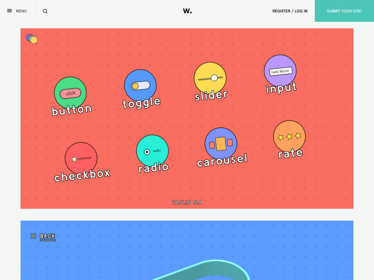
Flat UI and a Half

Designers React to the New PS5 Logo (and it’s not Pretty)

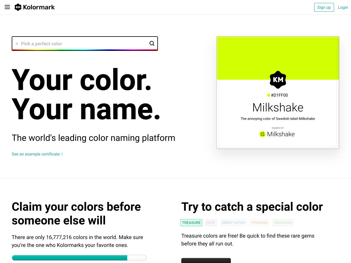
This Website Lets You Name a HEX Code

Notably – Create Markdown Content, Code Snippets and Text Notes

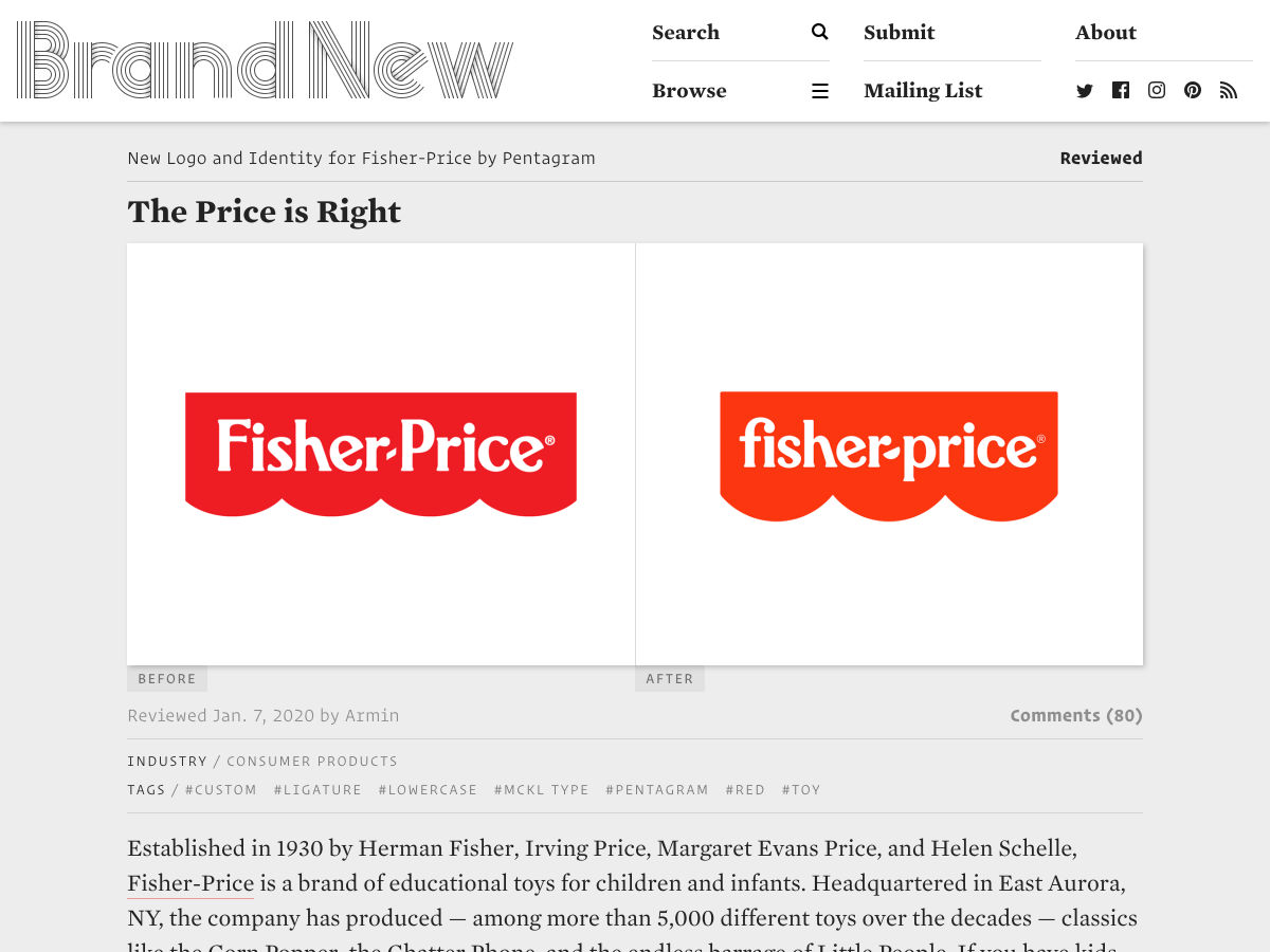
New Logo and Identity for Fisher-Price by Pentagram

2019: Projects of the Year

Design Resolutions

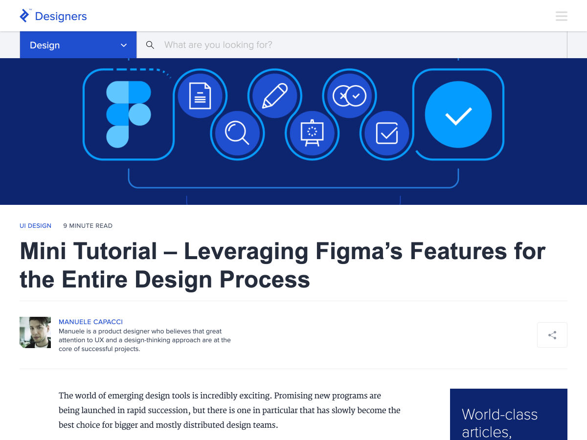
Figma’s Features for the Entire Design Process

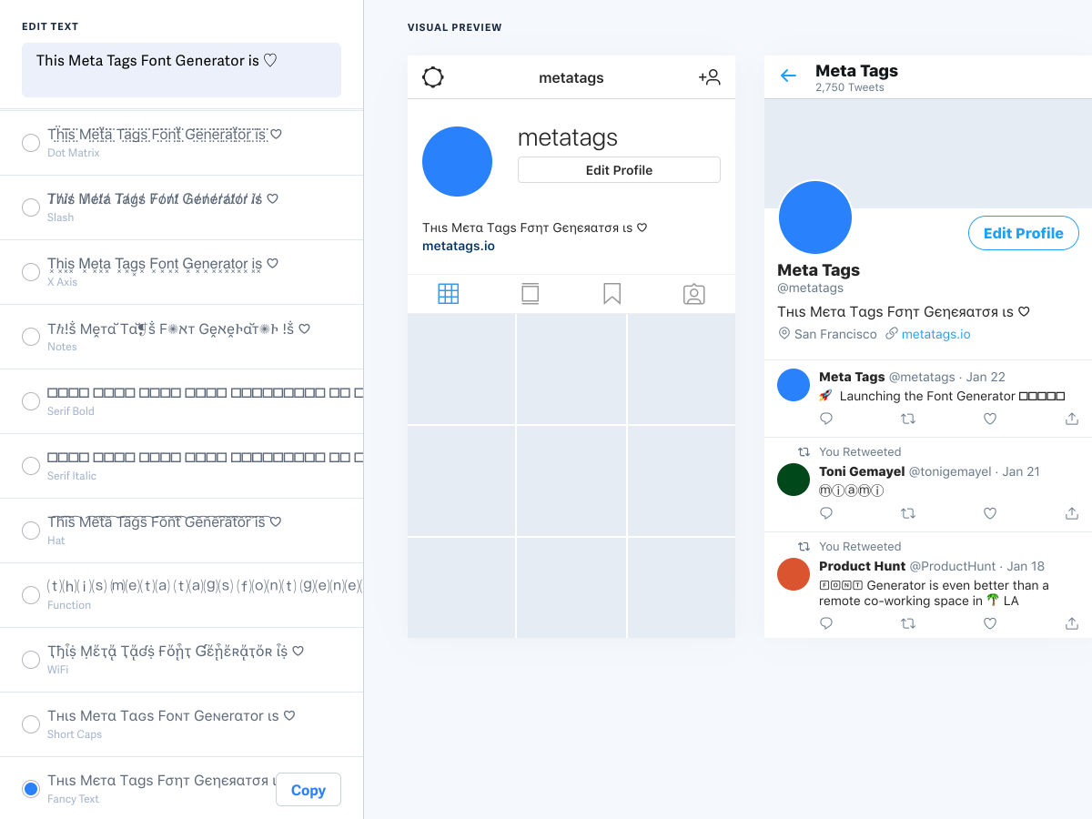
Instagram Font Generator

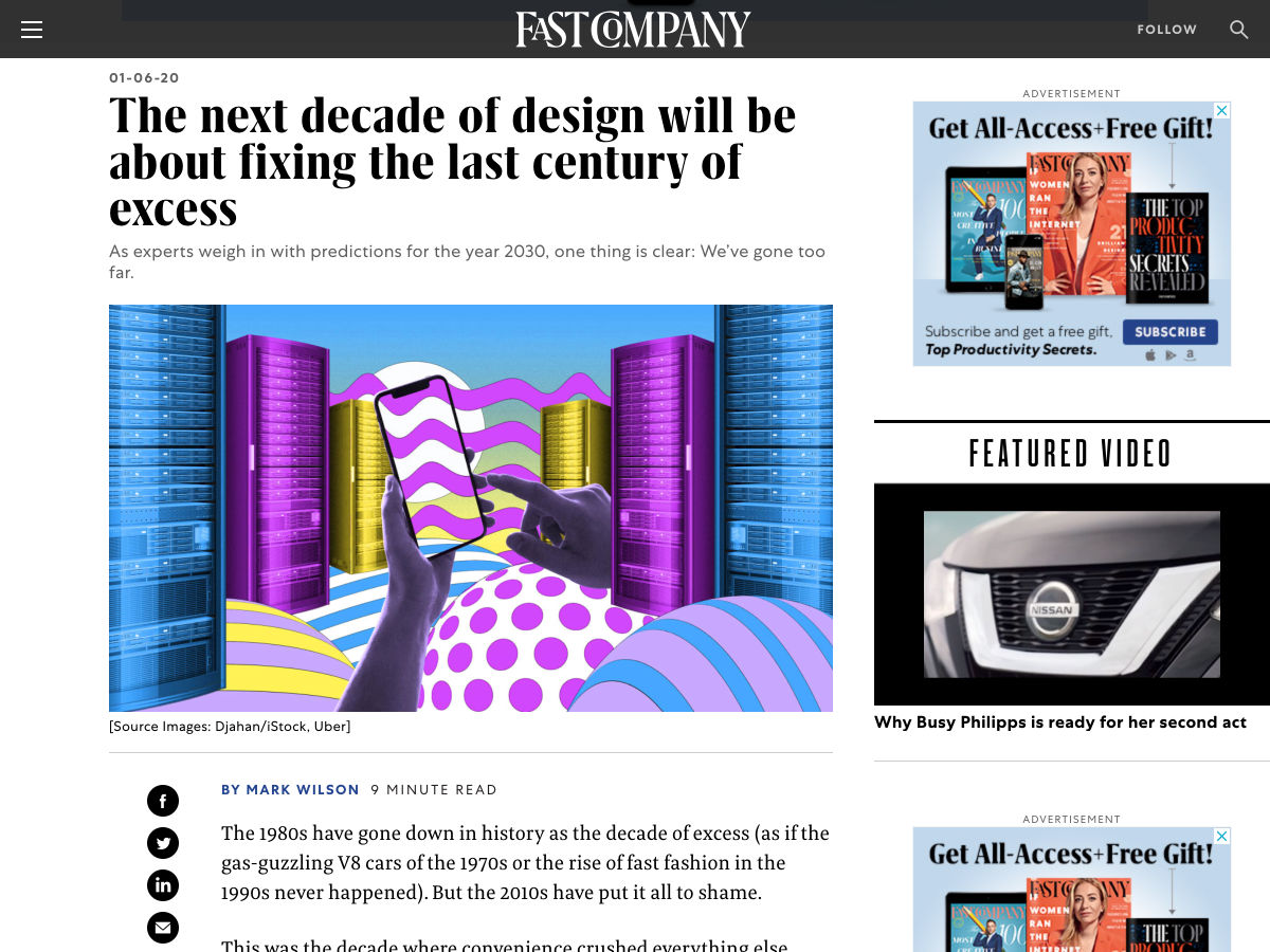
The Next Decade of Design will Be About Fixing the Last Century of Excess

Using the “Flywheel Effect” in Product Design

Neumorphism will not Kill the Skeuomorphism Star

Toyota’s Creepy New ‘Prototype Town’ is a Real-life Westworld

The End of “Someone”

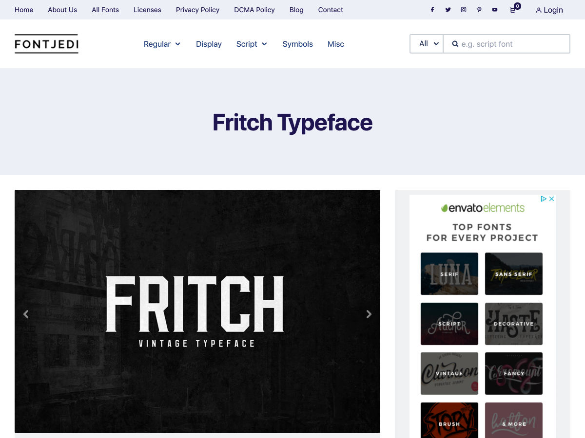
Fritch – Free Vintage Typeface

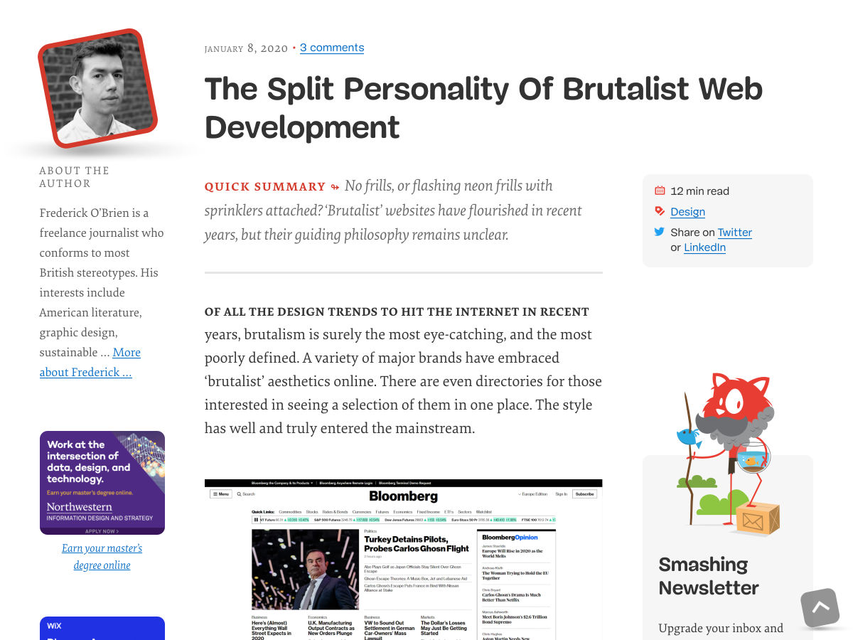
The Split Personality of Brutalist Web Development

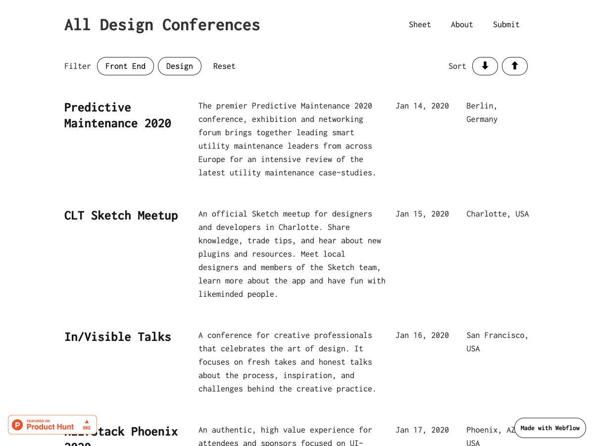
All Design Conferences

Anatomy of a Logo: The Star Wars Logo Evolution

6 Category Page Design Examples

Color Stuck? Try the Color Palette Finding Technique Graphic Designers Love

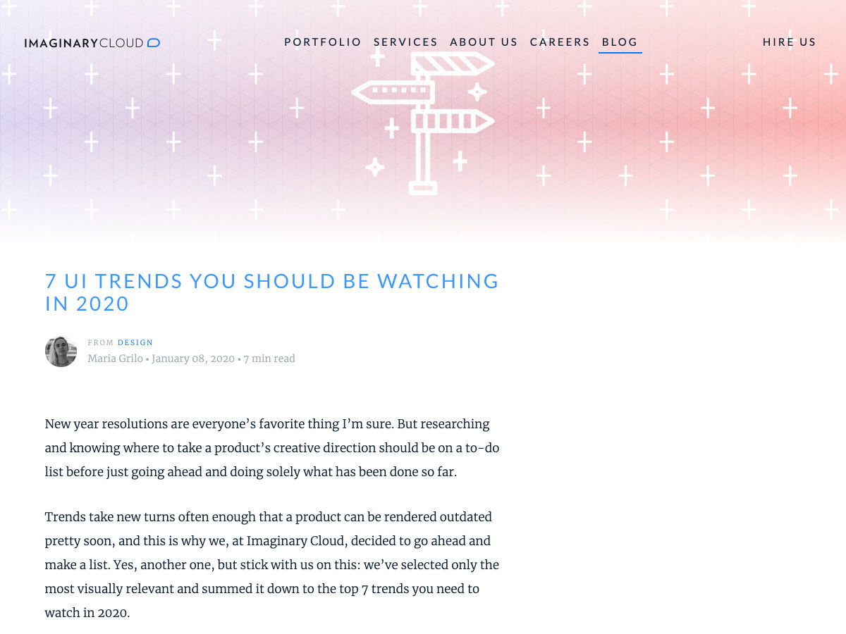
7 UI Trends to Watch in 2020

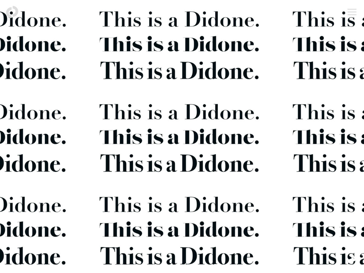
Here’s the Typography of the Next Decade

Designers Need to Get Paid. Let’s Ban ‘Exposure’ Once and for all

Want more? No problem! Keep track of top design news from around the web with Webdesigner News.

Source

Categories: Designing, Others Tags:

Re-creating the ‘His Dark Materials’ Logo in CSS

January 11th, 2020 No comments

The text logo has a slash cut through the text. You set two copies on top of one another, cropping both of them with the clip-path property.

What’s interesting to me is how many cool design effects require multiple copies of an element to do something cool. To get the extra copy, at least with text, we can sometimes use a pseudo-element. For more elaborate content, there is an element() function in CSS, but it’s limited to a prefixed property in Firefox. Still, it enables awesome stuff, like making a mini-map of long content.

You can style it differently with a pseudo-element, which was useful here. Might be cool to see a way to clone elements on a page and apply styling all through CSS… someday.

See the Pen
His Dark Materials TV series logo with CSS
by Michelle Barker (@michellebarker)
on CodePen.

Direct Link to ArticlePermalink

The post Re-creating the ‘His Dark Materials’ Logo in CSS appeared first on CSS-Tricks.

Categories: Designing, Others Tags: