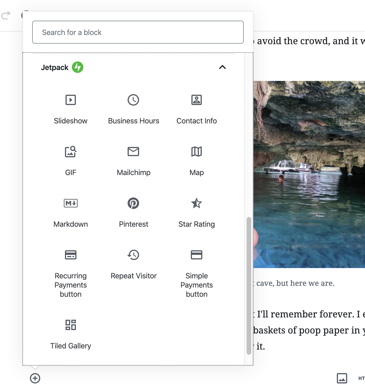
One of the many (many) useful things that Jetpack does is give you extra-fancy custom blocks in the WordPress block (AKA Gutenberg) editor: a slideshow, business hours, contact info, GIF, Mailchimp, Map, Markdown, Pinterest, Star Rating, Recurring Payments Button, Repeat Visitor, Simple Payments Button, Tiled Gallery. All of those sound useful to me, especially to use within totally arbitrary content wherever I want them.
I was just writing a blog post in the block editor the other day about a recent trip I took with my wife and friends to Tulum, Mexico. Being a travel blog post, of course it had images in it. Jetpack does a ton for me for those images:
Hosts them on a CDN
Optimizes them
Generates responsive image syntax
Lazy Loads them
That’s… pretty awesome.
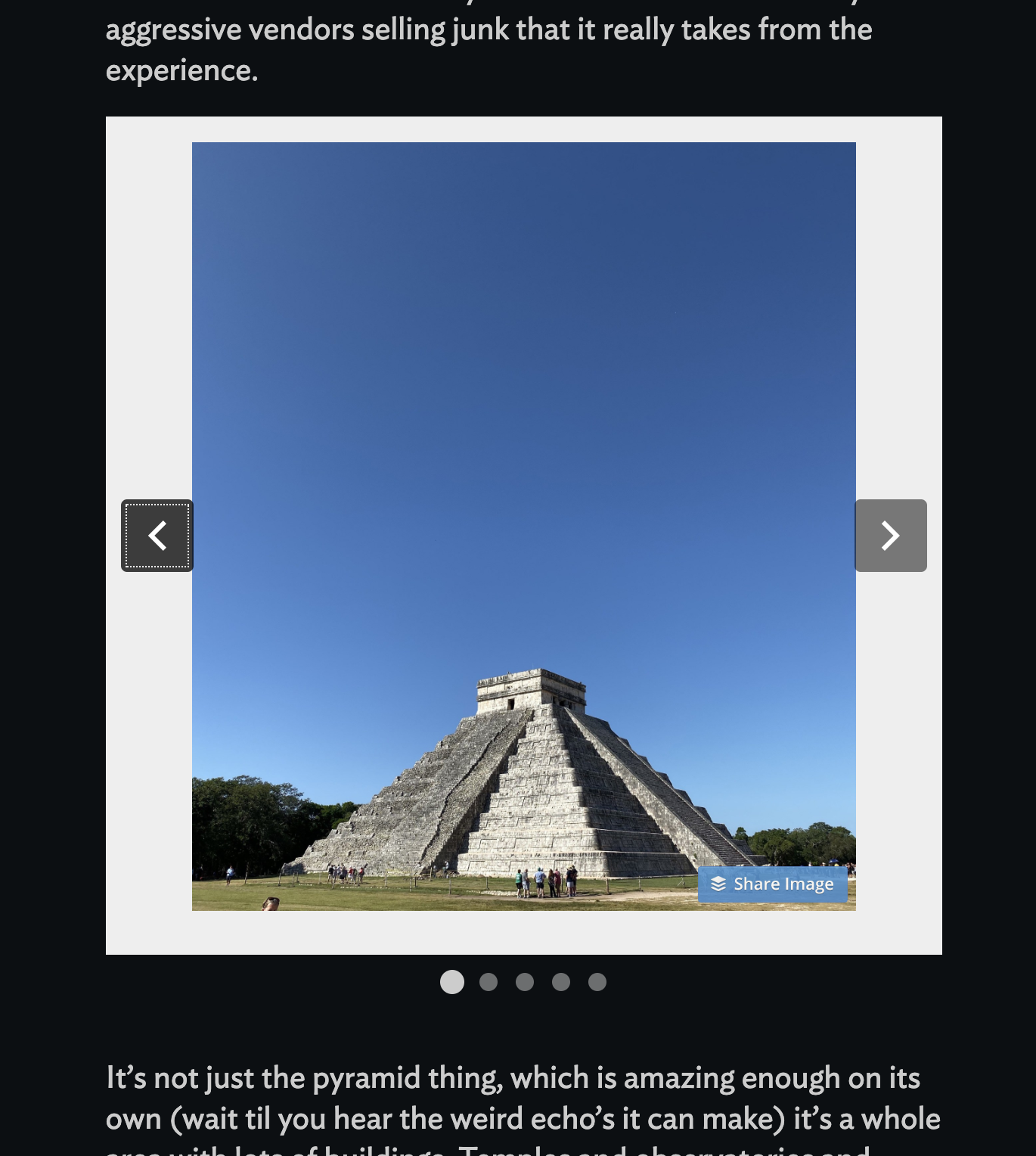
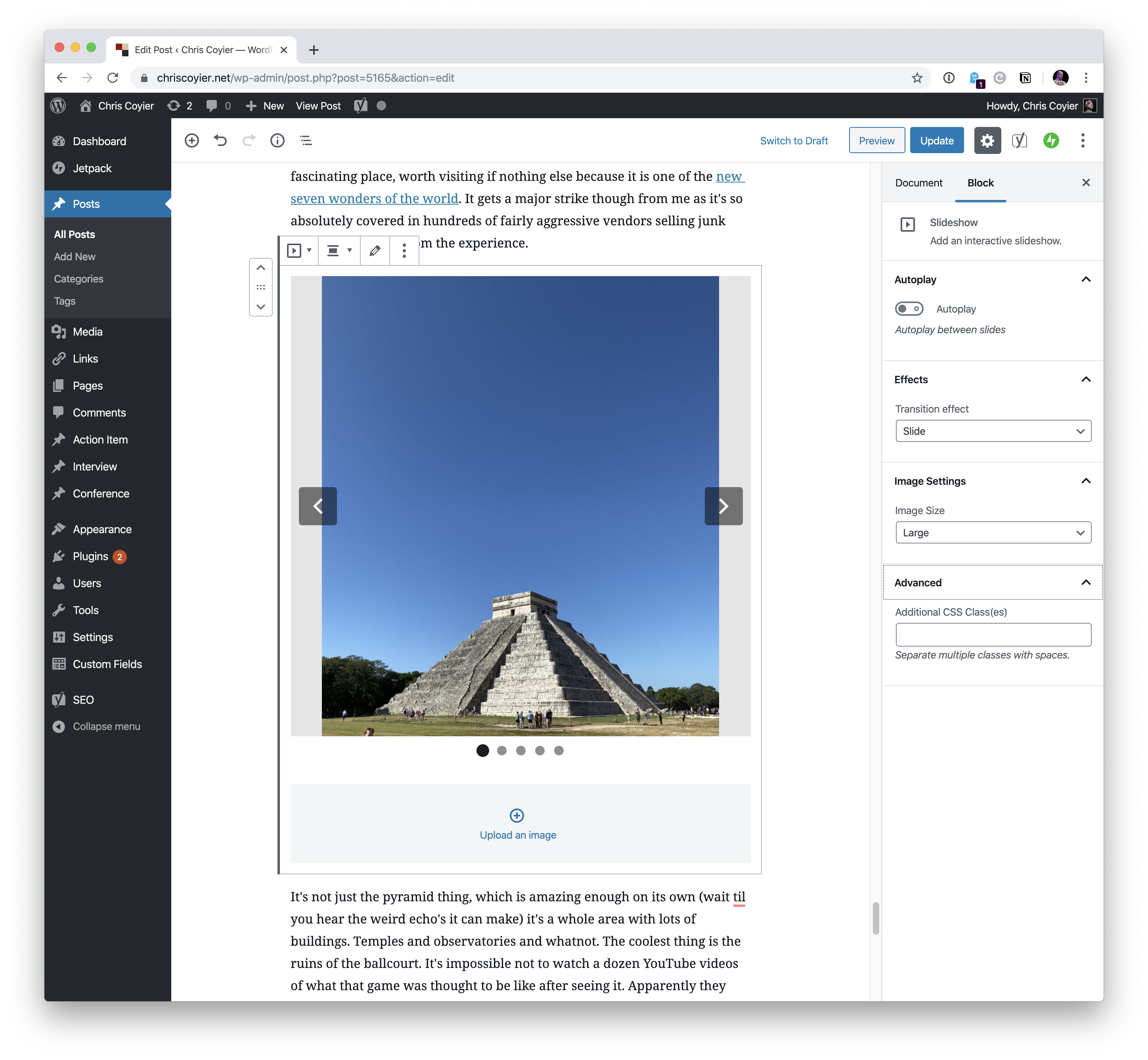
But it can do more. In some spots of the blog post, I went for a slideshow approach to save a little room on the page.
Which is entirely controlled as a fancy Gutenberg block:
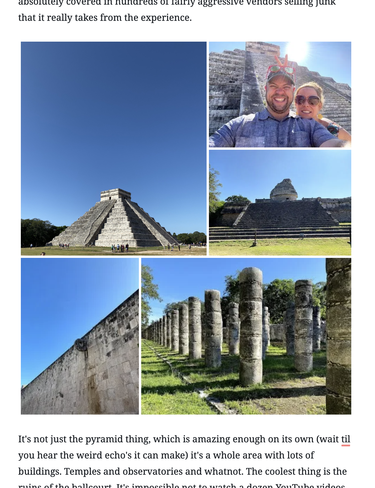
I could have gone for a tiled gallery as well, which is a fancier version of the built-in gallery block.
That’s an awful lot of helping out for posting and dealing with images.
Without proper planning, all the best and most enthusiastic ideas can come to a complete halt, or never even begin at all.
Proper planning and productivity tools can be life-changing and can help you and your career thrive this year.
If you’ve found yourself in a creative rut, then you’re in luck. We just shared our 5 tips and tricks on how to get and stay creative this year.
Once your creativity wheels are spinning, it’s time to make those creative ideas come to life.
5 Productivity Tools You Can’t Be Without in 2020
Alright, let’s talk about it! Here are the 5 productivity tools you need in your life this year.
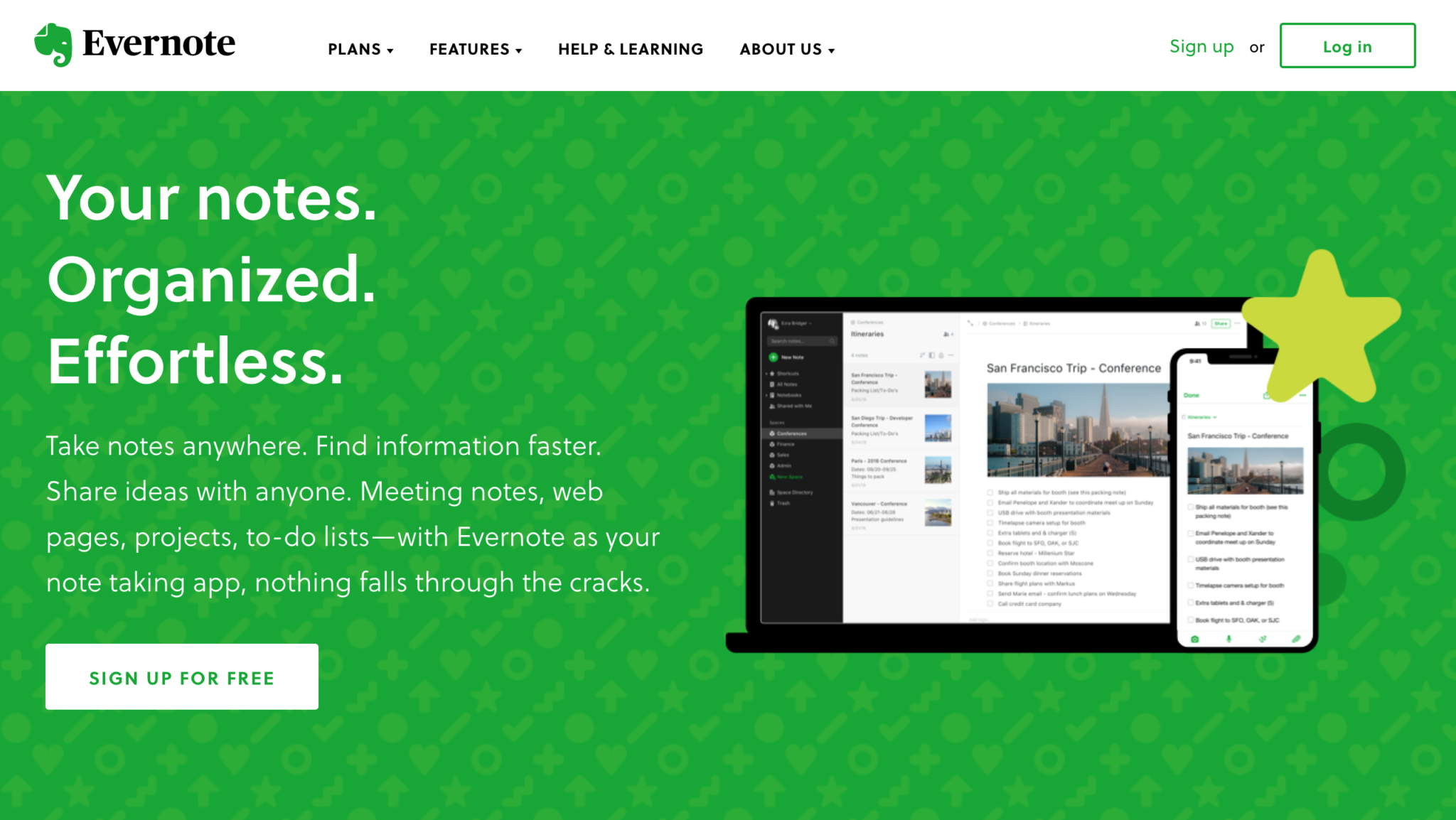
1. Evernote
Ah, Evernote. The place where all my best ideas go first, but not only. You can also capture and prioritize ideas, projects, and to-do lists. In this way, nothing will ever fall through the cracks.
Evernote helps you prioritize everything and focus on what matters most to you. From big business plans or projects to personal endeavors, you can organize and schedule the things that matter most.
You can also share your ideas with anyone using Evernote. Take voice memos, copy and paste images, make mental notes that make sense to you however you choose. It’s amazing.
Evernote offers you a free basic plan, and from there you can upgrade to premium or business. The prices are very affordable and definitely worth it in my opinion.
Check them out here: https://evernote.com/
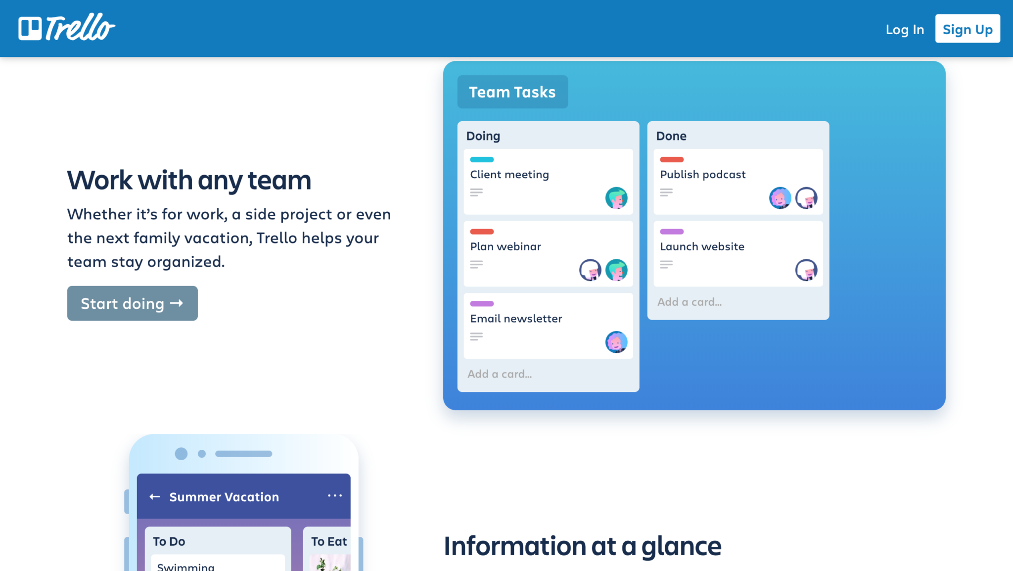
2. Trello
If you’re working closely with other designers on a team project, or you’re managing a team of designers, then Trello is a great app for you to consider using.
With most things on Trello being free, you can see the status of any project that any designer is working on.
You can set up tasks for yourself and others and set due dates and receive reminders via email or notifications on your phone.
Trello works on desktop, iOS, and Android.
Our team has personally used Trello and we swear by it. It helps you stay focused, and get things done in an organized and timely fashion.
Check them out here: https://trello.com/
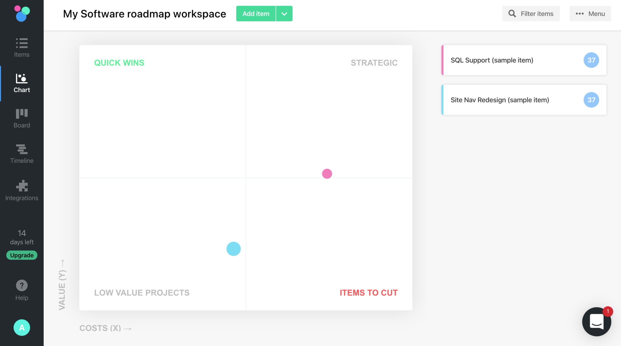
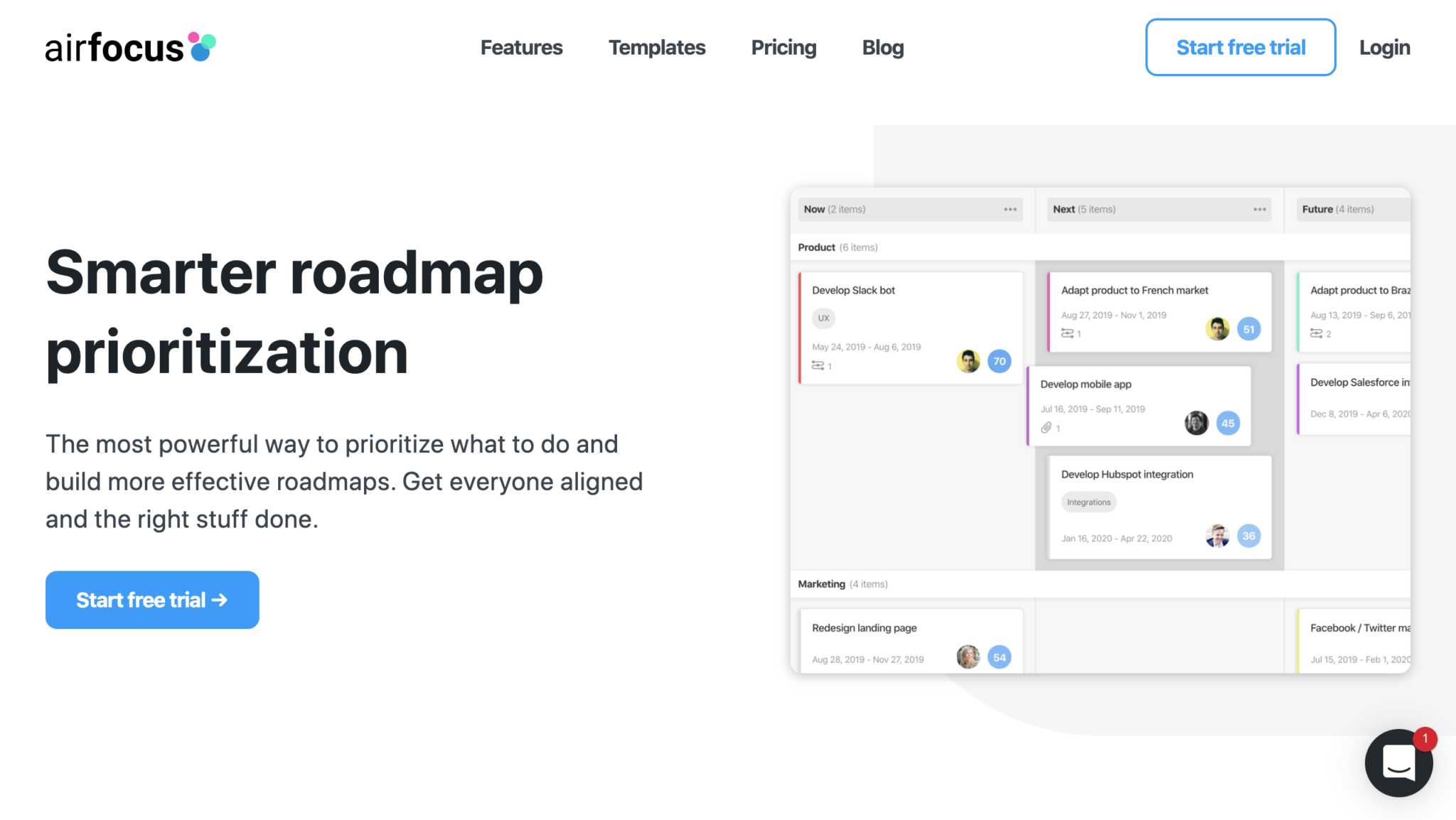
3. Airfocus
Next up on our list of productivity tools that you need to use in 2020 is airfocus.
Airfocus is a roadmapping prioritization tool that will help you glide through the year with ease.
Using airfocus is pretty much the most powerfulway you can prioritize what to do and you can build more effective roadmaps. If you have a whole team or are working with multiple designers, you can share views and have everyone aligned so that you can get the right stuff done on time.
They have tons of unique features, but my personal favorite is the chart view. Once you plug in all of your tasks, you can click on the chart view and see where each task and its priority falls.
You can use airfocus with your team for free for 14 days, and then once you fall in love with the product just like we have, you can upgrade your plan to a starter plan, team plan, or enterprise plan!
Check it out here: https://airfocus.com/
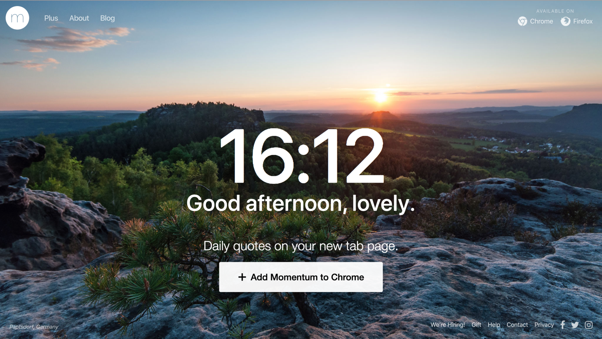
4. Momentum
Momentum is a personal dashboard designed to eliminate distraction and provide inspiration, focus, and productivity.
The internet is full of distractions. Social media and YouTube distract me daily if I’m completely honest.
We’ve all been there. You tell yourself, just one more meme. One more video. And then three hours have gone by and you haven’t been productive at all.
Momentum is the perfect solution for anti-procrastinating. Add the extension on Google Chrome or Firefox and be saved from all the sites that you lose hours upon hours on.
When you add Momentum to your browser, it will replace the new tab page with a personal dashboard that will show you your to-do list, the weather, and some inspiration.
Every time you open a new tab, you’ll be reminded of your goal for the day.
Try it out here: https://momentumdash.com/
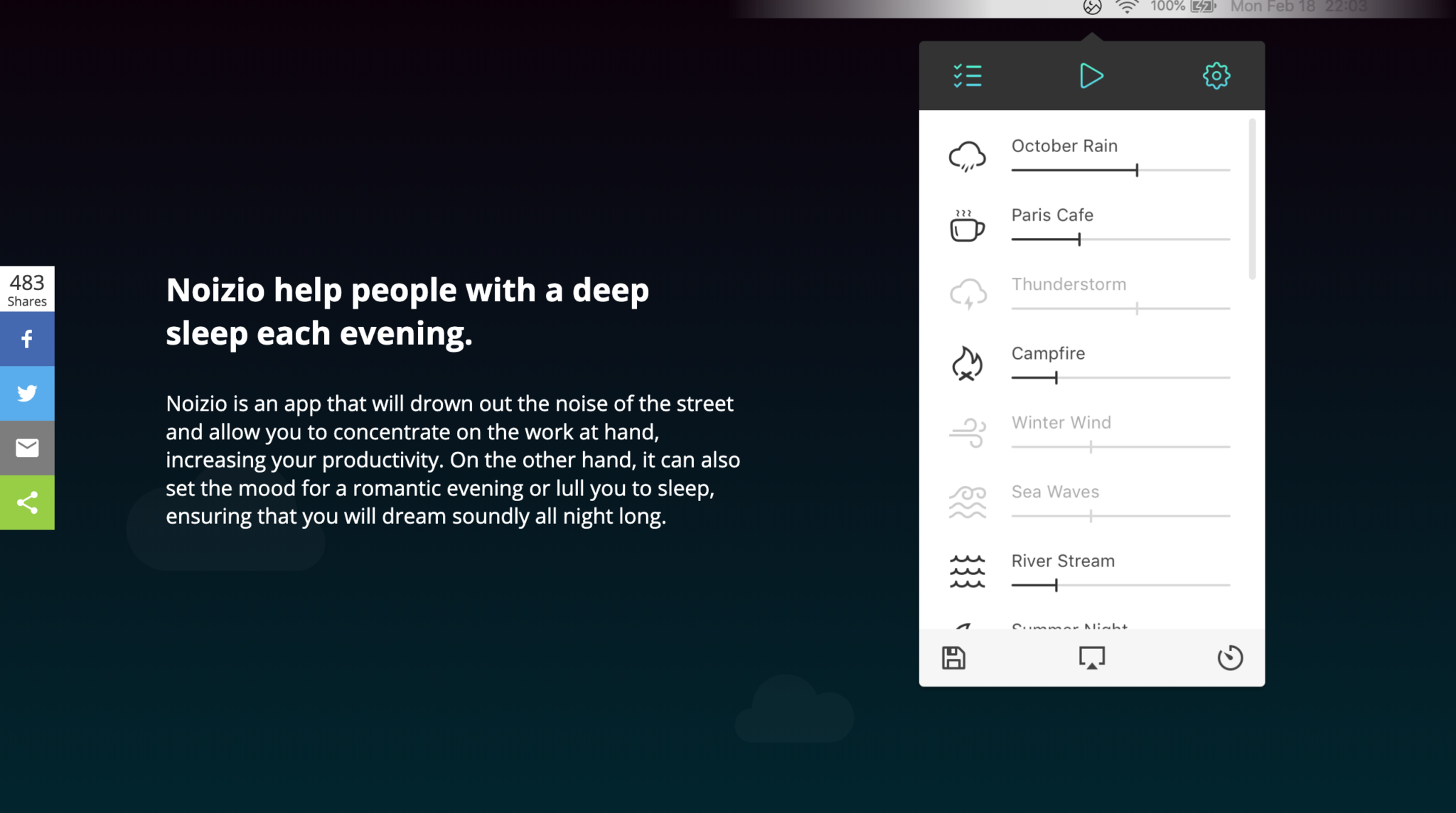
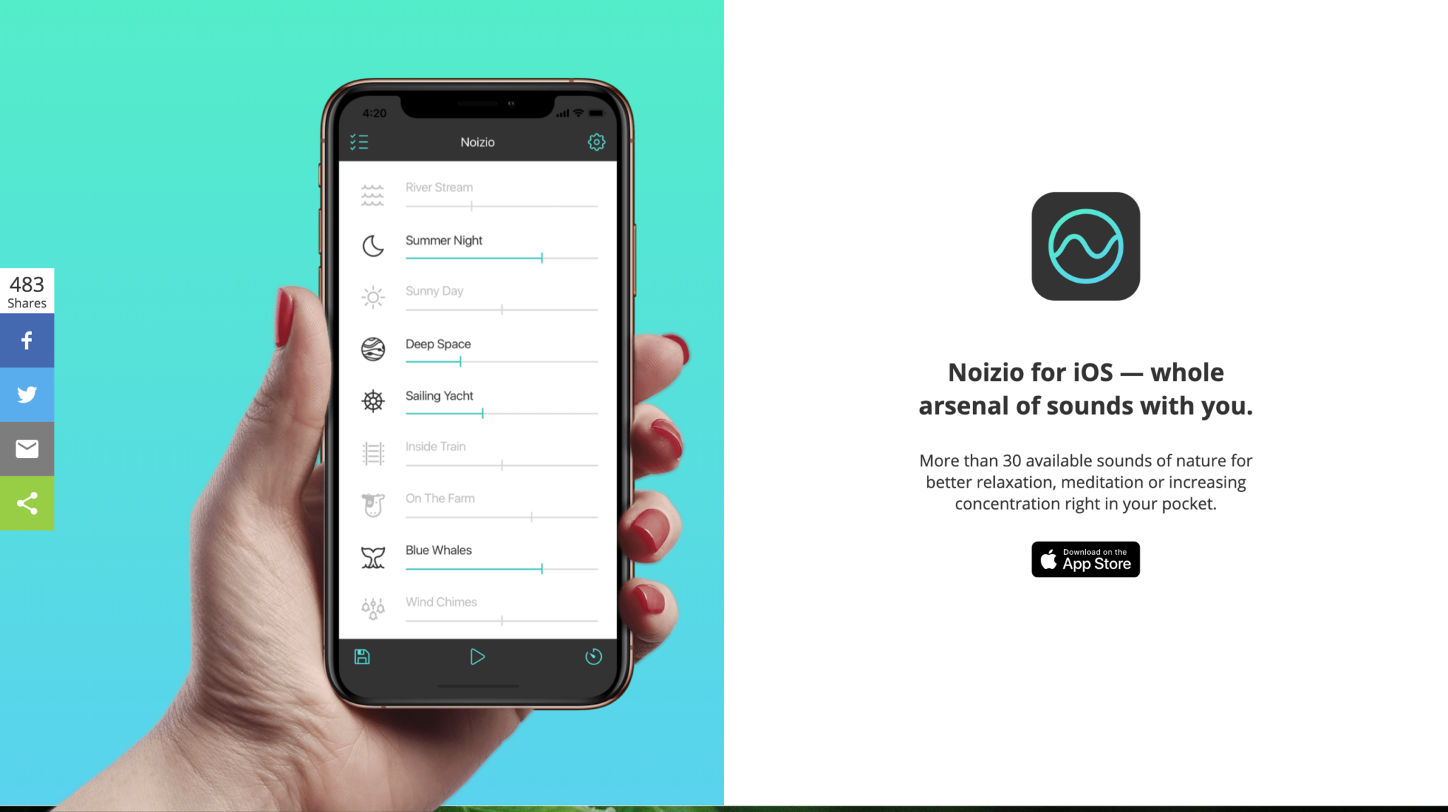
5. Noizio
And finally, we come to our last productivity app of the day. Noizio.
I love to listen to music when I’m working. It helps me stay focused.
But sometimes, I get sick of listening to the same songs every single day. Or in the other extreme, I’ll get to hype and lose focus and have my own karaoke time.
So here’s the solution. You can listen to the relaxing sounds of nature or places and adjust any sounds you want to be louder or quieter.
Not only will it make you more productive, but you can also use it to help you fall asleep sooner.
Try it out here: https://noiz.io/
Wrapping up
We hope you found these productivity apps interesting and helpful!
Let us know in the comments what you think about these apps and what other apps you guys use to stay productive during the work day.
Looking for the right plugins to install on your new WordPress site? The flexibility to use plugins to improve and enhance your site is undoubtedly one of WordPress’s best features.
But, it can be quite overwhelming to just get started. At the last count, there were over 54,000 WordPress plugins available on WordPress.org and thousands more from other plugin developers.
Though every website’s needs are unique, there are some features that every WordPress website should have, like:
Creative page building
Enhanced security and backups
Improved SEO ranking and performance
Intuitive customer forms
Better anti-spam protection
With so many free plugins available, choosing the right ones for your website can be quite tricky! We have researched over 100 “must-have” plugins for any new WordPress website and short-listed four of the top plugins.
Let’s get started.
1. WordPress Security Plugin
Be it a local blogging site or the official website of a large business corporation; no WordPress site is really safe from hackers and malware. Hackers are deploying a variety of online attacks, including malware, spyware, brute force attacks, and ransomware to compromise WordPress sites.
Is it so easy for WordPress sites to be hacked? Yes, these sites can be hacked for reasons as simple as weak admin passwords, use of outdated plugins or themes, or an insecure web host. Hackers do not differentiate between a large or small site, as long as there is a security loophole that they can exploit.
A successful malware attack can bring down your entire website in a matter of a few hours! Not only does it stop the flow of incoming website traffic, but malware infections can also result in data breaches and loss. That’s not all. It can take days to undo this damage and restore the website. This downtime can severely damage your brand’s credibility, the customer experience, and of course, your revenues.
WordPress security plugins are the best guard against this. Security plugins can perform complete website scanning to detect any malware on your site and also perform malware cleanup or removal in such a case.
We recommend that you invest in a security plugin like MalCare which is easy to install and configure – even for novice users. It offers a host of comprehensive security features at a very cost-effective price. These include:
Instant malware detection and removal
Advanced malware scanning to detect even latest malware
In-built firewall protection to block unwanted IP requests
In-built website hardening measures for added security
Easy to use for any novice WordPress user
2. SEO Plugin
Short for Search Engine Optimization, SEO management entails measures that can effectively improve the search engine ranking of your website. With a higher ranking, your website can attract more organic traffic originating from search engine result pages or SERPs. This can, in turn, increase brand recognition, customer engagement, and even conversions in the long run.
WordPress SEO plugins are specifically designed to boost your website’s ranking. Additionally, these plugins recommend SEO-friendly measures that are often overlooked by a new WordPress site owner. These typically include:
Fixing any broken links
Identifying web pages with the most (or least) user engagement
Recommending the right search keywords that can increase SEO traffic
Providing information about backlinks
Recommending a website restructuring strategy
With over 200 million downloads, Yoast SEO is the leader in the domain of SEO plugins. Launched in the year 2008, Yoast SEO has enabled millions of new WordPress sites to achieve a higher ranking on the Google search engine. Here are some of the features that make Yoast the preferred SEO plugin for WordPress installations:
Keyword optimization: Enables you to determine how well your web-pages and posts are optimized for selected keywords
Preview your website on the Google search engine result: Enables you to improve your website’s meta titles and descriptions
In-built readability check for every website page: Helps you decide on breaking paragraphs or other formatting elements.
Duplicate content detection
Regular updates to the plugin every two weeks
3. WordPress Backup Plugin
Besides a malware attack, your WordPress site can go down for several reasons. These include factors like accidental file deletion, an improper update, or even natural disasters that could affect your site’s servers. Be it any reason, website downtime – even for a few hours. can damage your user engagement, reduce incoming traffic, and tarnish your brand reputation.
A crashed website could cause a significant loss of customer confidence in your brand and thus eventually impact business sales and revenues. To prevent these calamities, major WordPress hosting companies offer quality backup services that can restore your website in the event of a crash or compromise.
Is it safe to rely entirely on backup services provided by hosting companies? No, It’s much safer to invest in a quality backup plugin on your own. You can install and configure a WordPress backup plugin just like any other plugin. Quite simply, it is the best guard against any data loss or website crash.
Among the most trusted backup solutions in the market today, is BlogVault. It has been successfully used to back up over 450,000 websites, even websites with up to 330GB of data.
Here are some of the features that make BlogVault our preferred backup solution:
Incremental backups: Do not overload the webserver and its bandwidth as only incremental changes are backed up after the first instance
Independent cloud-powered storage location that can be accessed 24/7
Support for backups of WordPress multisite networks
Access to around 90 days of backup archives
User-friendly backup and restore process
Add-on functionalities like website staging, migration, and management at no extra cost
4. Speed Optimization Plugin
Does your site load quickly on a desktop computer or smartphone? A majority of smartphone and desktop users expect a website to load up in around 2 to 4 seconds on their device. Slow websites contribute to higher bounce rates, lesser page views, and even customer conversions. As a new website owner, speed optimization is something you cannot ignore.
Luckily, WordPress users can choose from several speed optimization plugins that use a variety of techniques to improve website speed and overall performance. These include tried-and-tested measures like:
Browser caching
Lazy loading
Page and preload caching
Image compression
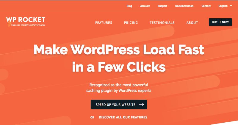
Easy to install and user-friendly, WP Rocket is among the best speed optimization plugins for WordPress sites. Its page caching can drastically reduce your website loading time and also improve your SEO. WP Rocket has a host of other features including:
Cache preloading that improves website indexing by search engine crawlers
Minification process for efficient compression of HTML, JavaScript, and CSS files
Lazy loading that loads images only in response to page scrolls by the user
Database optimization for faster retrieval of database files
Integration with a Content Delivery Network (CDN) for faster website loading.
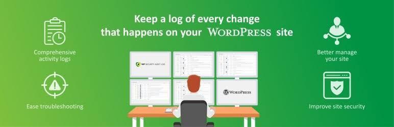
A Bonus Plugin: WP Security Audit Log
If you’re tempted to add another plugin to your site, our vote goes to WP Security Audit Log. Want to keep track of all the user activity on your website? Then this plugin is a must!
WP Security Audit Log is a complete user activity and monitoring plugin that works on a real-time basis. Among the highly-rated WordPress activity log tools, it ensures better user productivity, simplifies the troubleshooting of any website issues, and detects any suspicious activities that could cause security issues.
In Conclusion
Getting started with a new website is an exciting journey. From ensuring your site is always secure to create the best website experience for your users, and everything in between, there’s a lot to do. The right set of plugins can make all the difference. We hope this list of must-have WordPress plugins helps you jumpstart your journey.
The last decade has been the most innovative years of the Technology Industry!
The world was introduced with many revolutionary cognitive technologies that hold the potential of disrupting the world with its current and potential applications! Technology like Blockchain, IoT and AI saw its greatest years in terms of development.
But the Technology that has seen the most innovative applications in terms of Customer Engagement and has disrupted the way an advertiser reaches their target audience has been Augmented Reality (AR) and Virtual Reality (VR).
Current Augmented Reality Scenario:
While the world thought Augmented Reality is a far-fetched concept reserved for future, with the introduction of ARKit and Google’s ARCore and investment of Silicon Giants in the AR ventures, the technology is not just thriving with its unique and innovative applications, customers of the Retail industry are now expecting from Enterprises to introduce AR into their business processes!
For instance, 70% of consumers believe that Augmented Reality applications can help them in taking a better decision! And not just that, such as the impact of the technology that it is believed by the year of 2020; there will be 1 Billion Augmented Reality users across the world.
Impact of Augmented Reality on Retail Industry:
Retail Industry has been the biggest benefactor of the Augmented Reality Technology because not only its applications have helped them cater immersive retail buying experience to their customers, it has helped them in transforming different core business processes such as Advertising, Product Designing, Product Personalisation and many other such departments!
Major brands across the world are leveraging this technology and are using it to revolutionize different print media and are using AR-based applications to encourage customers in engaging more with their products and help them make informed decisions with complete customisation and product personalisation.
The reason why AR has been adopted by so many Retail brands is that applications of the technology in Retail are almost limitless and all you need is an idea with which you could dominate the target market.
Whether it is a product company like Furniture, Automobile, Fashion, Cosmetics and others or service providers like Real-estate, Gaming, Telecommunications or others, Augmented Reality can empower them with better Personalisation, Customisation and immersive buying experience. To help you understand how Augmented Reality can boost your Retail Business, below are the 5 Business Functions where AR can be implemented to boost the productivity and profitability of the business accompanied by respective Success Stories of AR implementation in that Business Function:
5 Business Functions where Retail Industry can best implement Augmented Reality:
Personalised Product Experiences with Augmented Reality:
With the help of Augmented Reality, retail product businesses can allow customers to design their own product and combos with the unlimited access to styles, colours and variants of the product. Industries like Automotive, Fashion, Cosmetics, Shoes and others can use AR to help their customers in customising their own product and then place a Customised order with the brand. They can also allow people to create different combos of products.
Similarly, service industry can also help their customers in knowing how the different services might look and feel to them and then allow them to choose the best fit for them.
For instance, buying cosmetics like Lipstick and Mascara can be confusing online as the users will not have a perfect idea as to how the product will look actually and for in-store customers, trying products like lipstick and mascara that are used by stranger people has always made them hesitant.
Providing a solution to that, MAC cosmetics stores installed AR-based mirrors in their store that allows users to see how their products like lipsticks and mascaras will look on them without trying the actual product! The same can be enabled with AR application for online buying and help customers try different variants and take what they personally feel is best for them.
Immersive Product Trials:
Augmented Reality can bring objects to life and help customers take Reliable Decisions after trying things virtually created products in their real setups! With the 3D imaging technology, customers can take a trial of products like shoes and apparels at their home and for industries like Home Décor and Furniture, they can distribute catalogues or create applications from which customers can try their virtual products and design in real spaces!
For instance, IKEA allows its customers to scan their wide-range of 2000+ products from their print catalogue by using the AR app and then test the live 3D version of the product in the space where they wish to get it involved!
Michael Valdsgaard, leader of digital transformation at Inter IKEA, the holding company for IKEA said that “Most people postpone a purchase of a new sofa because they’re not comfortable making the decision if they aren’t sure the colour is going to match the rest of the room or it fits the style,” he said. “Now, we can give them those answers in their hands, while letting them have fun with home furnishing for free and with no effort.” This AR implementation of IKEA helped them encourage “Reliable Buying” and gave them a huge boost in their sale.
Augmented Reality for Branding:
Imagine taking out the competition while promoting your product and gaining brand loyalists all at the same time while the potential customers have the time of their life and become your brand ambassador by sharing your Advertising Campaign and praising its creativity without any incentive!
While this seems like a fairy dream of an advertiser, with the use of Augmented Reality, one can create many such interesting campaigns and then use it to make their mark on the world!
For instance, Burger King used Augmented Reality to target their Competitor McDonald’s and also used the same to promote their Whooper burger. They created an AR application where they asked their customers to place the camera in front of any McDonald’s ad and watch it burn and then turn into a Free Whopper voucher! Then the customer can use that coupon to get their free Whooper from the nearest Burger King store. The campaign went viral and gave an amazing boost to their brand while targeting their biggest competition.
Employee Training and Efficiency:
Apart from excellent customer service and satisfactory user experience, Augmented Reality can also help Retail Manufacturers in curbing their Workplace accidents and can also train their employees with immersive virtual experiences.
According to a recent study, 40% of employees who receive poor training will leave their workspace in the first year of employment! And the workplace accidents in manufacturing can not only shut the whole line production but can also result in serious injury to an employee working on the machines!
With the help of AR and VR, organisations can create Virtual Training grounds where they can train their employees and help them gain the idea of the functionality of the machines and the workspace without the real-world risks. You can also create virtual scenarios of what happens in terms of shut-down or failures and how employees can tackle those situations.
Customer Engagement and Brand Recall:
Retail Giants have spent millions of rupees in Outdoor and Media Advertisements to ensure that their customers have a brand recall and these conventional methods might be effective in a long time, but they also have a high risk of ignorance and they can put a big dent in their marketing budget!
But with cognitive and immersive Technologies like Augmented Reality, brands can make Brand Recall really exciting and increase customer engagement with the brand with unique AR implementations!
Remember the game Pokemon Go and the way it made the whole world come on streets with its game that was based on Geo-location and Augmented Reality, similarly retail brands can use the same to create real-life reminders and pop-ups and can also prompt users to make purchases at random time and places.
For instance, brand name Airwalk used Geo-location and Augmented Reality to create an invisible pop-up store to sell their limited edition shoes, Airwalk Jim. They created an AR app that allowed users to buy their Airwalk Jim from anywhere at any time with their virtual store.
The users can get access to real life like 3D store right at any location and can actually make the purchase from their eCommerce platform then and there! This campaign not only helped them sell their product in the fastest way possible, but it also made Brand Recall value high by creating the best possible way of Customer Engagement.
Thus, gaining the right traction for your brand at the right price can be attained by employing Augmented Reality for your business. And to get the right Augmented Reality consultancy and development that can best help your brand, you need a reliable AR App Development Company that has an extended Augmented Reality App for Retailer and Shopping Mall and has AR developers that have immense experience in the Retail Domain.
A few days ago, I was having a chat with some friends, one of whom asked me the difference between
and in HTML. This is one of the eternal mysteries of web development, up there with “why is it white-space: nowrap, not white-space: no-wrap?” and “why is CSS ‘gray’ a darker color than ‘darkgray’?”.
I gave my usual answer: think of
not just as a newspaper article, or a blog post, but as an article of clothing — a discrete entity that can be reused in another context. So your trousers are an article, and you can wear them with a different outfit; your shirt is an article, and can be worn with different trousers; your knee-length patent leather stiletto boots are an article (you wouldn’t wear just one of them, would you?).
“The article element represents a complete, or self-contained, composition in a document, page, application, or site and that is, in principle, independently distributable or reusable, e.g. in syndication. This could be a forum post, a magazine or newspaper article, a blog entry, a user-submitted comment, an interactive widget or gadget, or any other independent item of content.”
So a homepage with a list of blog posts would be a element wrapping a series of
elements, one for each blog post. You would use the same structure for a list of videos (think YouTube) with each video being wrapped in an , a list of products (think Amazon) and so on. Any of those s is conceptually syndicatable — each could stand alone on its own dedicated page, in an advert on another page, as an entry in an RSS feed, and so on.
Apple’s WatchOS contains Reader which uses the
element to know the primary content of your page. Apple says:
“We’ve brought Reader to watchOS 5 where it automatically activates when following links to text-heavy web pages. It’s important to ensure that Reader draws out the key parts of your web page by using semantic markup to reinforce the meaning and purpose of elements in the document. Let’s walk through an example. First, we indicate which parts of the page are the most important by wrapping it in an article tag.”
with HTML5 microdata helps Reader construct the optimal display for small watch screens:
“Specifically, enclosing these header elements inside the article ensure that they all appear in Reader. Reader also styles each header element differently depending on the value of its itemprop attribute. Using itemprop, we’re able to ensure that the author, publication date, title, and subheading are prominently featured.”
So What About
?
My usual advice continues: don’t bother with
or worry about how it differs from . It was invented as a generic wrapper for headings so that the browser could determine the HTML5 document outline.
The what? The document outline algorithm is a way to use only one heading tag —
— and have it magically “become” the correct level of heading (e.g. turn into an , , etc.), depending on how deeply it’s nested in HTML5 sectioning elements:, , and so on.
So, for example, here’s what you’ve typed into your CMS:
<h1>My Fabulous article</h1>

<p>Lorem Ipsum Trondant Fnord</p>
This works brilliantly when shown as a standalone article. But what about on your homepage, which is a list of your latest articles?
<h1>My latest posts</p>

<article>

  <h1>My fabulous article</h1>

 <p>Lorem Ipsum Trondant Fnord</p>

</article>

<article>

  <h1>Another magnum opus</h1>

  <p>Magnum solero paddlepop</p>

</article>
In this example, according to the specification, the
s inside the elements “become” logical s, because , like , is a sectioning element.
. At one point, the JAWS screen reader attempted to implement the document outlining algorithm (in IE, but not on Firefox) but implemented it buggily. It seems that browser developers simply aren’t interested (more sordid details in the Further Reading section for true anoraks).
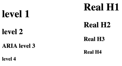
“But,” interjected another friend in the conversation, “now browsers display different sizes of font depending on how deeply the
is nested in s”, and proceeded to prove it. Mind blown!
s, nested in sections; the right column shows a, , , , with no nesting. The Firefox screenshot shows that the nested s default to the same font as the traditional … tags:
The results are the same in Chrome, Chromium derivatives such as Edge beta for Mac, and Safari on Mac.
So does this mean that we should all happily start using
as our only heading element, nesting it in s?
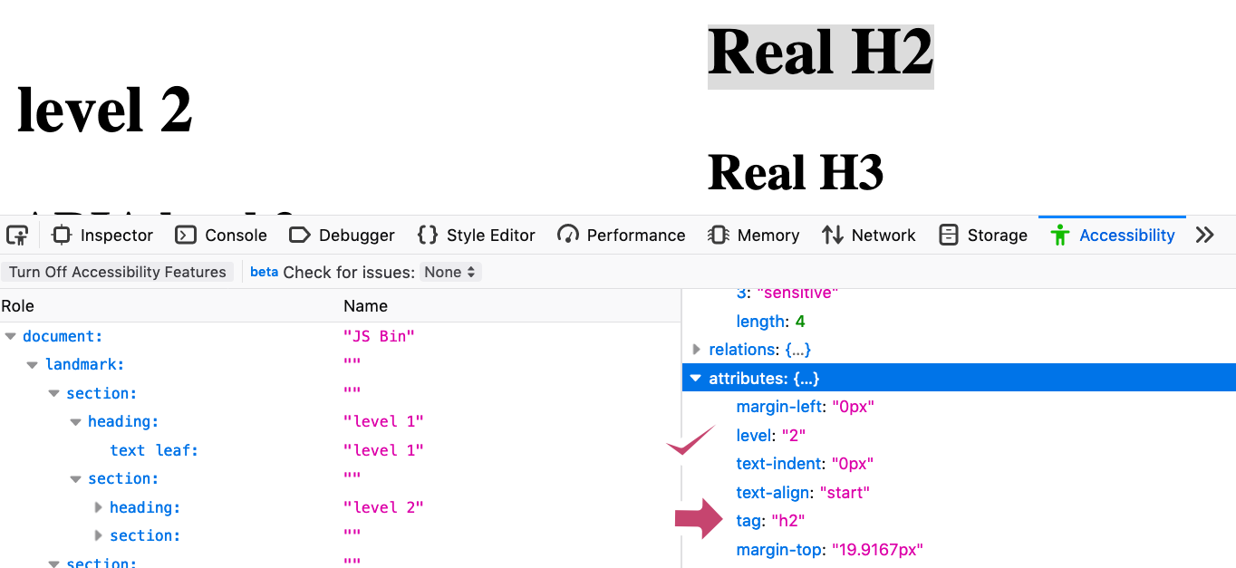
No. Because this is only a change in the visual styling of the h1s. If we crack open the Firefox Accessibility inspector in devtools, we can see that the text “level 2” is styled to look like an H2, but is still set at “level 1” — the Accessibility Tree hasn’t been changed to be level 2.
Firefox’s Accessibility Inspector shows that a nested appears visually the same as an but its aria-level is incorrectly set to “1”, not “2” (Large preview)
Compare this with the Real H2 in the right column:
Firefox’s Accessibility Inspector shows that a real has a computed aria-level of “2”, which is correct (Large preview)
This shows the accessibility tree has been correctly informed that this is a level 2 heading. In fact, Mozilla did try communicating the computed level to the accessibility tree:
“We experimented a bit with that… but had to revert it because people in our a11y team complained about too many regressions (accidentally lowering
levels and such).”
For assistive technology users, a proper hierarchy of headings is vital. As the eighth WebAIM screenreader user survey shows,
“The usefulness of proper heading structures is very high, with 86.1% of respondents finding heading levels very or somewhat useful.”
Therefore, you should continue to use
until , and ignore section.
Never Say Never
“But..” you might now be spluttering indignantly, “there’s a
element right on this very page!”. And you would be right, dear reader. The “quick summary” is wrapped in a , for accessibility reasons. When screen reader user Léonie Watson gave her webinar “How A Screen Reader User Accesses The Web”, she pointed out an area where Smashing Magazine’s markup could be tweaked to make her experience better.
As you can see from the screenshot, Smashing articles are preceded by a quick summary, followed by a horizontal line separating the summary from the article proper.
The Smashing “Quick Summary” is separated from its full article by a horizontal line. (Large preview)
But the separator is purely decorative, so Léonie couldn’t tell where the summary ends and the article begins. She suggested a fix: we wrapped the summary in a
element:
<section aria-label="quick summary">

    Summary text

</section>
In most screen readers, a
element isn’t announced unless it has an accessible name. In this case, the text of the aria label. Now, her screen reader announced “Quick summary region”, and after the summary “Quick summary region end”. This simple markup also makes it possible for a screen reader user to jump over the summary if they want to.
“As a rule of thumb, if you label something via aria-label or aria-labelledby, make sure it has a proper widget or landmark role.”
So rather than use
, we chose as that has a built-in role of region and Bruce’s infallible law of ARIA™ applies: built-in beats bolt-on. Bigly.
Conclusion
Hopefully, you’ve come away with these take-homes:
Don’t use loads of s. Make the main heading of your page, then use , , , etc. in a proper hierarchy without skipping levels.
can be used with aria-label to signal to a screen reader user where a particular sub-part of an article begins and ends. Otherwise, forget about it, or use another element, such as or
.
, , and are very useful for screen reader users, and entirely transparent to those who don’t use assistive technology. So use them.
isn’t just for blog posts — it’s for any self-contained thing. It also helps WatchOS display your content properly.
I gratefully acknowledge Léonie Watson‘s help writing this article. Any errors are totally her fault.
Further Reading
“Headings And Sections,” HTML 5.2
W3C Recommendation (14 Dec. ’17)
Note its warning: “There are currently no known native implementations of the outline algorithm … Therefore the outline algorithm cannot be relied upon to convey document structure to users. Authors should use heading rank (h1-h6) to convey document structure.”
Now I want to push that “Menu” item to the far right. That’s where auto margins come in. If I put a margin-left: auto; on it, it’ll push as far away as it possibly can on that row.
Actually, you might consider margin-inline-start: auto; instead and start using logical properties everywhere so that you’re all set should you need to change direction.
Also, note that auto margins work in both directions as long as there is room to push. In this example, it’s not alignment that is moving the menu down, it’s an auto margin.
I’m probably in the minority on this, but I’ve never ever built one of those “This site uses cookies, here’s some kind of explanation of why, and please click this OK button to accept that” bars that feels like they are on half of the internet.
Most of us just tediously click “yes” and move on. If you reject the cookie tracking, sometimes, the website won’t work. But most of the time, you can just keep browsing. They’re not too different from the annoying pop-up ads we all ignore when we’re online.
I’m extra-ignorant in that don’t even really get why they exist, despite being a professional web site builder.
Emily does a good job of rounding up the answer. It’s probably about what you think it is: a better safe than sorry play. Better annoy some users than get sued out of existence.
It’s also interesting that it’s not just one particular regulation that has people doing this. GDPR is a big one (despite being fairly light on mentions of cookies at all), but it’s really a couple of different regulations, including likely-upcoming ones, that have people implementing these obnoxious pop-ups.
I’m probably the weirdo that would rather get sued than show a fricking cookie banner.
Speaking of cookies though, and things that I’m ignorant about, I asked this question not long ago:
What does your brain assume a “Remember me?” checkbox is doing?
My brain didn’t have an answer at the time. If I was pressed on it, I’d probably answer that it’s just snake oil, and that those checkboxes don’t actually do anything.
From the thread, the answer seems to be that most sites use cookies to store your logged-in user session. Cookies have expiration dates. The “Remember me?” option makes the cookie have a longer expiration date than if you didn’t check it.
The whole thread there is pretty fun. Lots of useful things and lots more jokes. I’m on board with the idea that anytime you check that box, some server, somewhere, plays this.
If you want to create fantastic and unique visual experiences on the web, you will eventually need two elements to overlap or exist in the same place. You may even just need them to be positioned near or next to each other. Let’s go over two different ways to accomplish this, one with the position property and one with CSS Grid.
Method 1: Using the Position Property
You may already know that position: absolute; will place something absolutely on the page wherever you want it to be. In this case, we’re absolutely positioning the child to the top-left of the page. No matter where the parent is, the child will be placed in that corner, absolutely.
But this is very brittle! What if you were to place something on the page and then something else comes along after it? Maybe you have an icon within a navigation that you always want in the top-left corner, but a third party comes in and puts in a banner ad. (I’m not advocating for banner ads, but they do exist.) This pushes the navigation down and now the icon is out of place.
Or, let’s say you want to make a self-contained component that you can use in multiple places. You need it to be reusable and work within its own context, no matter where you use it.
If we put position: relative; on the parent element, anything inside of it with position: absolute; will be placed absolutely, relative to that containing unit!
We can use this same premise if we wanted to stack two elements on top of each other. Here, we’ll have two child elements stacked on top of one another and set apart by 150 pixels. We’ll see that they’re now contained in that same parent and stay positioned inside it.
This is a little old school, but I’ve been using it for years and I still reach for it. It works consistently across browsers and can help you achieve even the strangest and unique placements.
Method 2: Using CSS Grid
Another nice way of overlapping elements, stacking them, or modifying their placement is CSS Grid, depending on how far back you need to support (which you can check with caniuse).
We can place something where we need it in the container like this:
If you find this technique difficult to visualize, I’ve created a CSS Grid Generator that hopefully helps see things more clearly.
There are so many places to use these techniques! You can stack, layer and offset elements. You can make navigations, footers. You can create just about any type of layout where you want to have more fine-grain control of how elements are placed on a page.
[…] folks can’t talk about real design systems problems because it will show their company as being dysfunctional and broken in some way. This looks bad for their company and hence looks bad for them. But hiding those mistakes and shortcomings by glossing over everything doesn’t just make it harder for us personally, it hinders progress within the field itself.
I’ve always tried to be super open about the things I do, good and bad. However, even the outlets I have, like CodePen Radio where we talk about the rollercoaster of running a software business, there are still things I’ve held back because they just aren’t a good look. Often, the trick is to let some time pass so that it can be a retrospective later if there’s hesitance to post about the bad today.
Or for me, as a graphic designer, new year, new designs.
Just like writers, sometimes we get a major creativity block.
It’s hard to be creativity 24/7, especially when your job depends on it.
Sometimes the ideas will just come to you out of the blue, and other times, it comes down to discipline and trial + error.
Today we’re going to go over 5 different ways you can boost your creativity and thrive as a graphic designer in 2020.
5 Ways to Boost Your Creativity as a Graphic Designer in 2020
So let’s get right into the nitty-gritty of it, shall we?
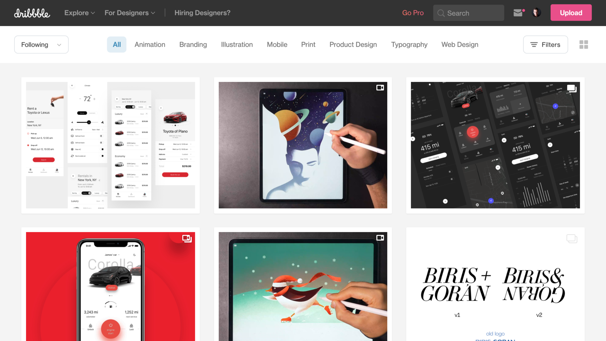
1. Read Loads of Design Blogs
From Dribbble to Behance, and back to Dribbble, you need to be on these websites daily.
The internet has so much to offer us. From people who love to design using flat-design, to incredible 3D art, you’ll find just the thing you’re looking for.
Just scrolling through these design websites will surely inspire you and you’re bound to find designs that you admire and would like to recreate with your own twist and style.
It’s like being on the Instagram of Design. And speaking of Instagram…
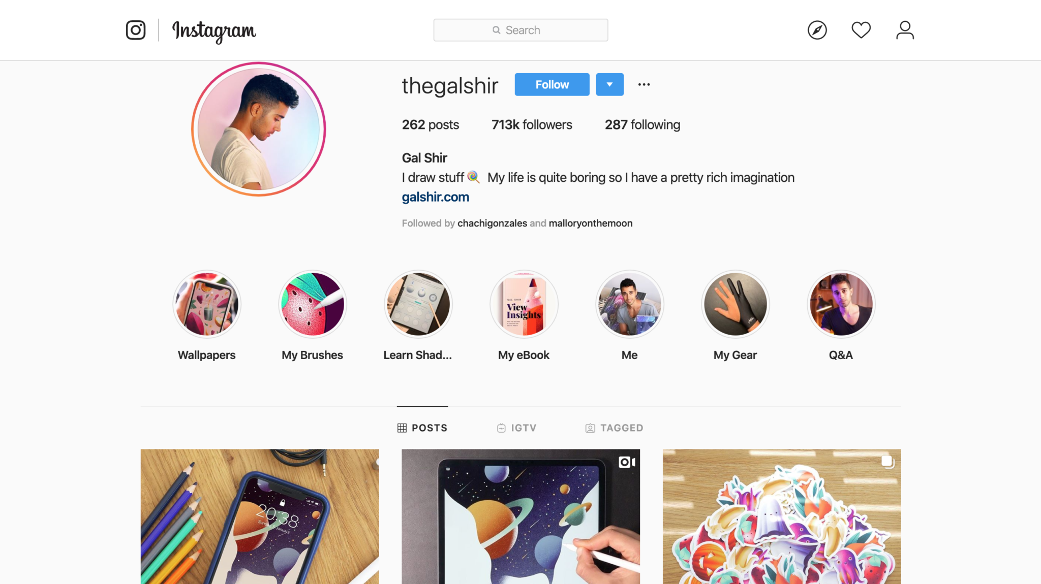
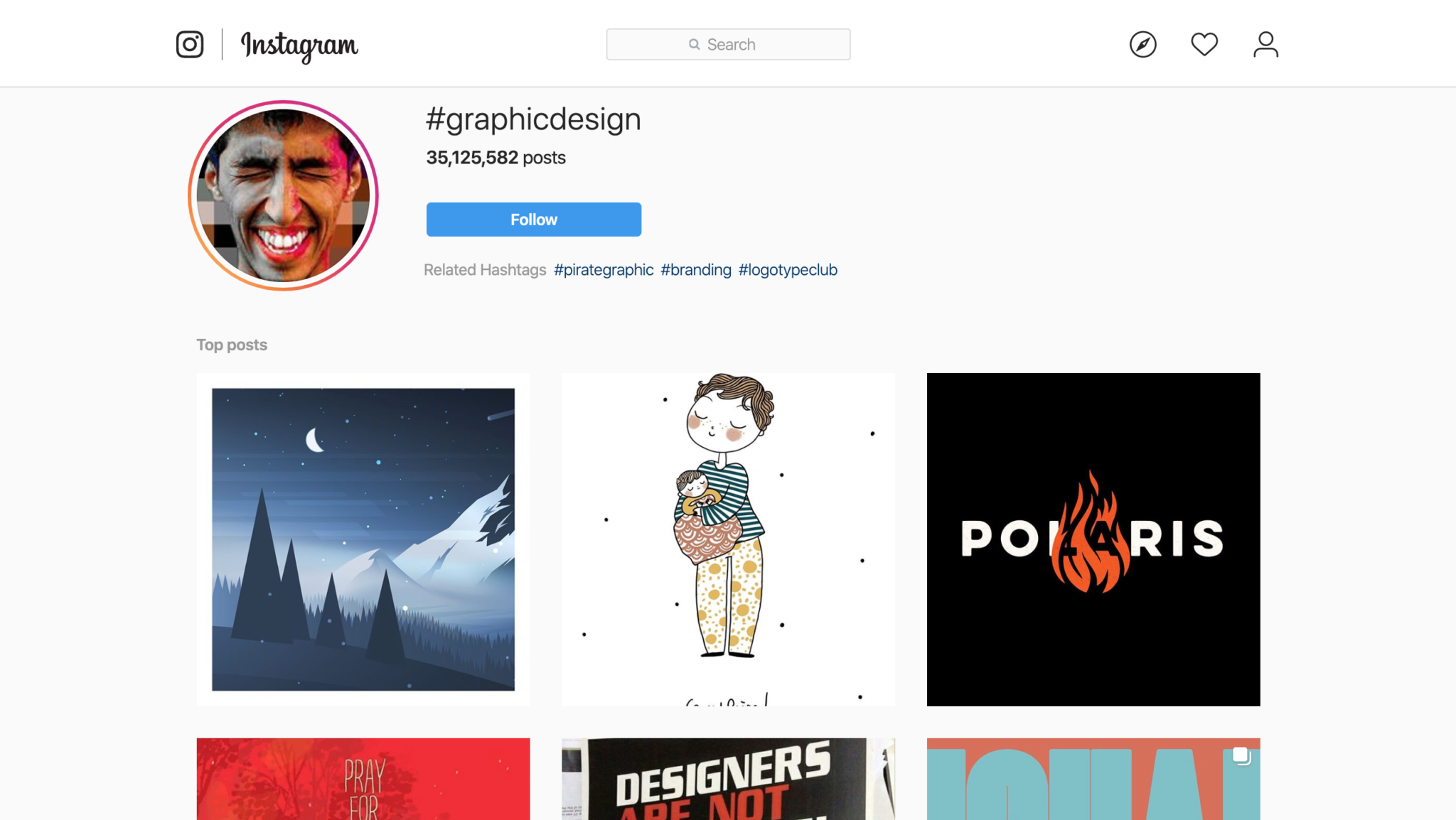
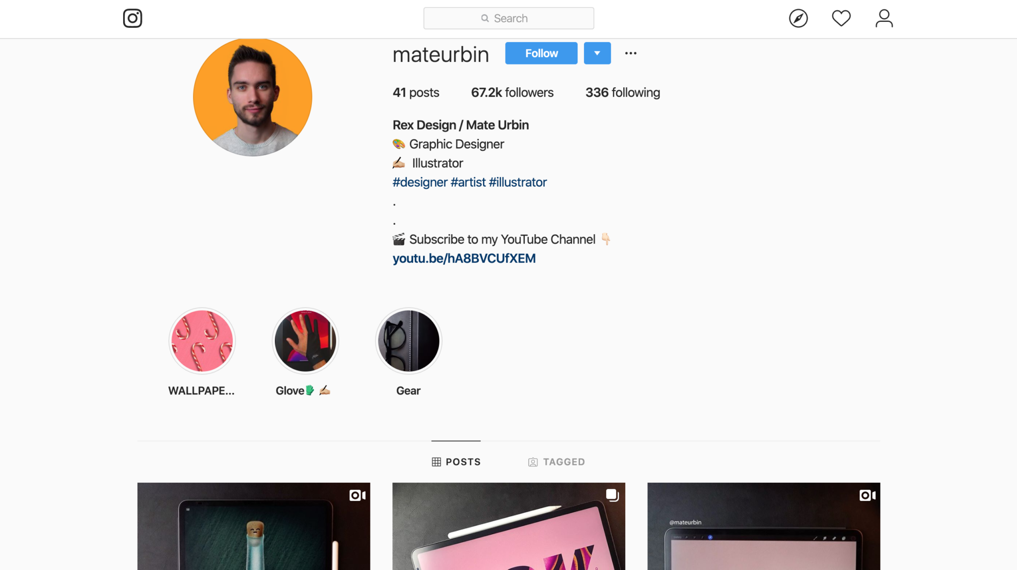
2. Follow People and Designers Who Inspire You
You don’t have to be on a designated graphic design website to find your inspiration and creativity.
Social media platforms are a great place for you to find that spark of creativity that you’re desperately looking for.
Search for design trends and styles via hashtags and find people who just simply inspire you.
Follow people who have different styles than you.
If you always keep yourself limited to the style that you’re comfortable with, you risk not growing any further than you’ve come.
Follow hundreds of designers, and over time, find out who are some of your favorite designers and unfollow the rest.
Great websites and apps to use would include Instagram, Pinterest, Tumblr, and more.
3. A Design a Day Keeps Creativity at Bay
You’ve heard the saying, “An apple a day keeps the doctor away.”.
Well people, I’m taking it one step further and tweaking this little saying to, “A design a day keeps creativity at bay.”
Practice makes perfect.
And that doesn’t exclude designing.
Even if you don’t have a lick of creativity left in you, design something. Draw something, do something cool with typography. Take 5 minutes to create something, or take 2 hours.
It doesn’t matter what you do, as long as you just keep designing.
The more you practice, the more creativity will come to you.
In my experience, not every time will one of my daily designs become a masterpiece, but it turns into a discipline, which in the long-haul will only make me a better person and designer.
It’s definitely something I recommend every design to at least try.
Try for a month and let us know in the comments how it goes for you!
4. Back to Basics: Keep a Sketchbook
Sometimes, you’ll just be enjoying a book or coffee in the middle of town, without your laptop or tablet, and you just have this brilliant design idea come to mind.
You’ve got to jot it down, and quick.
Go back to basics and carry a little sketch pad with you so that you’re always prepared to jot down your next great idea.
Whether you’re on a walk and you see something in nature that inspires you, or you’re looking through a classic magazine and see a beautiful design trend that you want to bring back, keep that sketchbook with you and use it to your advantage.
5. Challenge Yourself
Finally and most importantly, challenge yourself.
Growth never happens when you’re comfortable.
It happens when you push yourself outside the box.
So this year, challenge yourself.
Challenge yourself to one design a week that doesn’t necessarily fit your style, or try a new design trend you never tried before because you were scared of failure.
Watch yourself grown and thrive daily.
Wrapping up
Take 2020 into your own hands and make this your year to thrive and grow.
We wish you all this best in 2020 and we’re excited to see what all this year holds for each of us.
We hope you enjoyed our 5 tips to boost creativity. What are some things you do when you’re feeling like you’re stuck in rut? Let us know in the comment section below.

 the
the