Archive

Archive for January, 2020

Understanding CSS Grid: Creating A Grid Container

January 3rd, 2020 No comments
A single column grid with five rows

Understanding CSS Grid: Creating A Grid Container

Understanding CSS Grid: Creating A Grid Container

Rachel Andrew

2020-01-03T11:30:00+00:002020-01-03T15:06:02+00:00

This is the start of a new series here at Smashing Magazine concentrating on CSS Grid Layout. While Grid has been available in browsers since 2017, many developers won’t have had a chance to use it on a project yet. There seem to be a lot of new properties and values associated with CSS Grid Layout. This can make it seem overwhelming. However, quite a lot of the specification details alternate ways to do things, meaning that you don’t have to learn the entire spec to get started. This series aims to take you from grid novice to expert — with lots of practical usage tips along the way.

This initial article will cover what happens when you create a grid container and the various properties that you can use on the parent element to control that grid. You will discover that there are several use cases that are fulfilled only with the properties that you apply to the grid container.

In this article, we will cover:

  • Creating a grid container with display: grid or display: inline-grid,
  • Setting up columns and rows with grid-template-columns and grid-template-rows,
  • Controlling the size of implicit tracks with grid-auto-columns and grid-auto-rows.

Overflow And Data Loss In CSS

CSS is designed to keep your content readable. Let’s explore situations in which you might encounter overflow in your web designs and how CSS has evolved to create better ways to manage and design around unknown amounts of content. Read article ?

Creating A Grid Container

Grid, like Flexbox, is a value of the CSS display property. Therefore to tell the browser that you want to use grid layout you use display: grid. Having done this, the browser will give you a block-level box on the element with display: grid and any direct children will start to participate in a grid formatting context. This means they behave like grid items, rather than normal block and inline elements.

However, you may not immediately see a difference on your page. As you haven’t created any rows or columns, you have a one-column grid. Enough rows are being generated to hold all of your direct children, and they are displaying one after the other in that single column. Visually they look just like block elements.

You will see a difference if you had any string of text, not wrapped in an element, and a direct child of the grid container, as the string will be wrapped in an anonymous element and become a grid item. Any element which is normally an inline element, such as a span, will also become a grid item once its parent is a grid container.

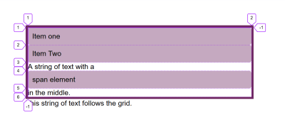
The example below has two block-level elements, plus a string of text with a span in the middle of the string. We end up with five grid items:

  • The two div elements,
  • The string of text before the span,
  • The span,
  • The string of text after the span.

See the Pen Grid Container: Direct children and strings of text become grid items by Rachel Andrew (@rachelandrew) on CodePen.

See the Pen Grid Container: Direct children and strings of text become grid items by Rachel Andrew (@rachelandrew) on CodePen.

If you inspect the grid using the Firefox Grid Inspector, you can see the five-row tracks that have been created for the items.

A single column grid with five rows

The Grid Inspector is useful to help you see how many rows have been created

You can also create an inline grid by using display: inline-grid; in this case, your grid container becomes an inline-level box. However, the direct children are still grid items and behave in the same way as grid items inside a block-level box (it is only the outer display type). That is why the grid container behaves the way it does above when it is alongside other boxes on the page.

This next example has a grid followed by a string of text, as this is an inline-level grid, the text can display alongside it. Inline-level things do not stretch to take up all the space in the inline dimension in that way that block-level things do.

See the Pen Grid Container: inline-grid by Rachel Andrew (@rachelandrew) on CodePen.

See the Pen Grid Container: inline-grid by Rachel Andrew (@rachelandrew) on CodePen.

Note: In the future, we will be able to better describe our layout by using display: block grid in order to create our block-level container, and display: inline grid to create an inline-level container. You can read about this change to the display specification in my article, “Digging Into The DIsplay Property: The Two Values Of Display”.

Columns And Rows

To get something that looks like a grid, we will need to add columns and rows. These are created using the grid-template-columns and grid-template-rows properties. These properties are defined in the spec as accepting a value called a track-list.

These properties specify, as a space-separated track list, the line names and track sizing functions of the grid. The grid-template-columns property specifies the track list for the grid’s columns, while grid-template-rows specifies the track list for the grid’s rows.

Some valid track-list values are as follows:

grid-template-columns: 100px 100px 200px; Creates a three-column grid: The first column is 100px, the second 100px, the third 200px.
grid-template-columns: min-content max-content fit-content(10em) Creates a three-column grid: The first column is the min-content size for that track, the second the max-content size. The third is either max-content unless the content is larger than 10em, in which case it is clamped to 10em.
grid-template-columns: 1fr 1fr 1fr; Creates a three-column grid using the fr unit. The available space in the grid container is divided into three and shared between the three columns.
grid-template-columns: repeat(2, 10em 1fr); Creates a four-column grid with a repeating pattern of 10em 1fr 10em 1fr as the track-list in the repeat statement is repeated twice.
grid-template-columns: repeat(auto-fill, 200px); Fills the container with as many 200px columns as will fit leaving a gap at the end if there is spare space.
grid-template-columns: repeat(auto-fill, minmax(200px, 1fr)); Fills the container with as many 200px columns as will fit then distributes the remaining space equally between the created columns.
grid-template-columns: [full-start] 1fr [content-start] 3fr [content-end] 1fr [full-end]; Creates a three-column grid: The first and third columns have 1 part each of the available space while the middle column has 3 parts. The lines are named by putting line names in square brackets.

As you can see there are many ways to create a track listing! Let’s have a look at exactly how these all work, with a few tips in terms of why you might use each one.

Using Length Units

You can use any length units, or a percentage to create your tracks. If the size of the tracks adds up to less than is available in the grid container, then by default the tracks will line up at the start of the container and the spare space will go to the end. This is because the default value of align-content and justify-content is start. You can space out the grid tracks, or move them to the end of the container using the alignment properties, which I explain in detail in my article “How To Align Things In CSS”.

See the Pen Grid Container: length units by Rachel Andrew (@rachelandrew) on CodePen.

See the Pen Grid Container: length units by Rachel Andrew (@rachelandrew) on CodePen.

You can also use the keywords min-content, max-content and fit-content(). Using min-content will give you a track that is as small as it can be without causing overflow. Therefore, when used as a column size, the content will softly wrap wherever possible. The track becoming the size of the longest word in the column or largest fixed-size element.

Using max-content will cause the content to not do any soft-wrapping at all. In a column, any string of text will unwrap which may cause overflow.

The fit-content keyword can only be used by passing in a value. That value becomes the max that this track will grow to. Therefore, the track will act like max-content with the content unwrapping and stretching out until it hits the value you passed in. At that point, it will start wrapping as normal. So your track may be smaller than the value you pass in, but never larger.

See the Pen Grid Container: min-content, max-content, fit-content() by Rachel Andrew (@rachelandrew) on CodePen.

See the Pen Grid Container: min-content, max-content, fit-content() by Rachel Andrew (@rachelandrew) on CodePen.

You can find out more about sizing in Grid and other layout methods in my article “How Big Is That Box? Understanding Sizing In CSS Layout”.

If you end up with tracks that take up more space than you have in your container, they will overflow. If you use percentages then, as with percentage-based float or flex layouts, you will need to take care that the total percentage is not more than 100% if you want to avoid overflow.

The fr Unit

Grid Layout includes a method that can save you calculating percentages for yourself — track sizing with the fr unit. This unit isn’t a length, and therefore can’t be combined with calc(); it is a flex unit and represents the available space in the grid container.

This means that with a track-list of 1fr 1fr 1fr; the available space is divided into three and shared evenly between the tracks. With a track-list of 2fr 1fr 1fr, the available space is divided into four and two parts are given to track one — one part each to tracks two and three.

See the Pen Grid Container: fr by Rachel Andrew (@rachelandrew) on CodePen.

See the Pen Grid Container: fr by Rachel Andrew (@rachelandrew) on CodePen.

Something to watch out for is that what is being shared out by default is available space which is not the total space in the container. If any of your tracks contain a fixed-size element or a long word that can’t be wrapped, this will be laid out before the space is shared out.

In the next example, I removed the spaces between the words of ItemThree. This made a long unbreakable string so space distribution happens after the layout of that item has been accounted for.

See the Pen Grid Container: fr with larger content by Rachel Andrew (@rachelandrew) on CodePen.

See the Pen Grid Container: fr with larger content by Rachel Andrew (@rachelandrew) on CodePen.

You can mix the fr unit with fixed length tracks, and this is where it becomes very useful. For example, you could have a component with two fixed-sized columns and a center area that stretches:

See the Pen Grid Container: mixing fr units and fixed-size tracks by Rachel Andrew (@rachelandrew) on CodePen.

See the Pen Grid Container: mixing fr units and fixed-size tracks by Rachel Andrew (@rachelandrew) on CodePen.

You can have a component with one track set to fit-content(300px) and the other to 1fr. This makes for a component that can have something smaller than 300px in the first track, in which case it only takes the space it needs and the fr unit expands to take up the rest of the space.

If you add something larger (such as an image with max-width: 100%), the first track will stop growing at 300px and the fr unit takes the rest of the space. Mixing the fr unit with fit-content is a way to make some very flexible components for your site.

See the Pen Grid Container: mixing fr and fit-content() by Rachel Andrew (@rachelandrew) on CodePen.

See the Pen Grid Container: mixing fr and fit-content() by Rachel Andrew (@rachelandrew) on CodePen.

The repeat() Function

Using repeat() in your track-list can save typing out the same value or values over and over again. For example the following two lines are the same:

grid-template-columns: 1fr 1fr 1fr 1fr 1fr 1fr 1fr 1fr 1fr 1fr 1fr 1fr;
grid-template-columns: repeat(12, 1fr);

When using repeat() the value before the column is the number of times to repeat the track-list that comes after the comma. That track-list can be multiple values. This means you can repeat a pattern of tracks.

You can use the repeat() function for part of a track-list. For example, the following line would give you a 1fr track, 3 200px tracks, and a final 1fr track.

grid-template-columns: 1fr repeat(3,200px) 1fr

In addition to a number before the comma to indicate a fixed number of times to repeat the pattern, you can also use the keywords auto-fill or auto-fit. Using one of these keywords means that instead of a fixed number of tracks, your grid container will be filled with as many tracks as will fit.

See the Pen Grid Container: auto-fill by Rachel Andrew (@rachelandrew) on CodePen.

See the Pen Grid Container: auto-fill by Rachel Andrew (@rachelandrew) on CodePen.

Using a fixed-length unit means that, unless the container is able to be exactly divided by that size, you will end up with some spare space remaining. In the example above my container is 500px wide, so I get two 200px tracks plus space at the end.

We can use another grid function to make the value a minimum, with any spare space distributed across all of the tracks. The minmax() function takes a minimum and a maximum size. With a minimum of 200px and a max of 1fr, we get as many 200px tracks as will fit and because the max is 1fr, which we already know will share out the space evenly, the extra is distributed across the tracks.

See the Pen Grid Container: auto-fill and minmax() by Rachel Andrew (@rachelandrew) on CodePen.

See the Pen Grid Container: auto-fill and minmax() by Rachel Andrew (@rachelandrew) on CodePen.

I mentioned there are two possible keywords: auto-fill and auto-fit. If you have enough content to fill the first row of cells, then these will behave in exactly the same way. If, however, you do not (e.g. if we remove all but one item inside the container above), then they behave differently.

Using auto-fill will maintain the available track sizing even if there is no content to go into it.

See the Pen Grid Container: auto-fill and minmax() with one item by Rachel Andrew (@rachelandrew) on CodePen.

See the Pen Grid Container: auto-fill and minmax() with one item by Rachel Andrew (@rachelandrew) on CodePen.

If, instead, you use auto-fit, the empty tracks will be collapsed:

See the Pen Grid Container: auto-fit and minmax() with one item by Rachel Andrew (@rachelandrew) on CodePen.

See the Pen Grid Container: auto-fit and minmax() with one item by Rachel Andrew (@rachelandrew) on CodePen.

By using the Firefox Grid Inspector, you can see that the tracks are still there, but have been collapsed to zero. The end line of our grid is still line 3 as we can fit two tracks.

A single grid item fills the container, the grid inspector highlights the column lines

The track is still there but collapsed

Named Lines

My final example above used the named lines approach. When using Grid. you always have line numbers, however, you can also name the lines. Lines are named inside square brackets. You can have multiple names for one line; in that case, a space separates them. For example, in the following track-list, all of my lines have two names.

grid-template-columns: [main-start sidebar-start] 1fr [sidebar-end content-start] 4fr [content-end main-end]

You can name your lines anything that you like, except the word span as that is a reserved word due to being used when placing items on the grid.

Note: In the next article in this series, I’ll be talking more about line-based placement and how named lines are used. In the meantime, read my article on “Naming Things in CSS Grid Layout” to help you learn more on the topic.

The Explicit vs The Implicit Grid

When creating a grid using grid-template-columns and grid-template-rows with a track-list, you are creating what is referred to as the explicit grid. This is the grid you have defined which has the sizing you have chosen for each track.

If you have more items than will fit, or place an item so it falls outside of the bounds of the grid you have created, Grid will create tracks in the implicit grid. These implicit tracks will be auto-sized by default. We saw this implicit grid in action when I declared display: grid on the parent element and grid created rows, one for each item. I didn’t define these rows, but as there were grid items, the row tracks were created to give them somewhere to go.

You can set a size for implicit rows or columns by using the grid-auto-rows or grid-auto-columns properties. These properties take a track-listing, so if you want all implicit columns to be at least 200 pixels tall but grow if there is more content, you could use the following:

grid-auto-rows: minmax(200px, auto)

If you want the first implicit row to be auto-sized, and the second to be min-content sized, and so on (until all of the grid items have been accommodated), you can pass in multiple values:

grid-auto-rows: auto 100px

See the Pen Grid Container: grid-auto-rows by Rachel Andrew (@rachelandrew) on CodePen.

See the Pen Grid Container: grid-auto-rows by Rachel Andrew (@rachelandrew) on CodePen.

Using A Grid With Auto-Placement

Creating a grid (and allowing the browser to auto-place items) gets you a long way in terms of the useful patterns you can achieve. We have not yet looked at placing items on the grid, but many layouts that make use of Grid don’t do any placement. They simply rely on placing the items in source order — one in each grid cell.

If you are new to CSS Grid, then playing with different track sizes and seeing how the items place themselves into the cells you create is a great way to start.

(il)
Categories: Others Tags:

Design From the Beach: How to Work and Travel

January 3rd, 2020 No comments

Are you experiencing full wanderlust with a side order of burnout in the first week of the new year? Has the post-holiday gloom got you down? Are you starting a new decade in your office, wondering if you’ll make it to the next? Would you love to see a bit of the world before you’re too old to enjoy it?

Here’s the good (great) news: one of the best things about being a web professional is that we can pretty much work from anywhere — as long as there is solid Wi-Fi.

So, with this unmatched sense of utility, it begs the question: why not take advantage of that rare freedom?

A change of scenery can mean a lot, especially if you’re starting to feel worn-out in your current situation. Novelty has been highlighted as one of the key features needed to keep people motivated and engaged in their work. And, if novelty can’t easily be found in your career — it can definitely be found in your environment; that’s where travel gets its appeal.

Short-term vacations are often not enough to diminish pent up stress and tick that novelty box. It’s no secret that, upon return, the recuperative benefits of vacation quickly give way to the same level of work burnout experienced before the trip, regardless of whether you’re working for yourself or someone else. The better way to deal with this situation is to figure out how to integrate the short-term novelty and relaxation of going on vacation into an everyday practice. Meditation is the oft-cited means to achieve this end. However, if you haven’t quite yet reached the ability to meditatively separate yourself from all your worldly desires and anxieties like a zenmaster — a cowork/travel programme might be a more attainable solution.

There are a wide variety of ways to get you the environmental novelty you need (perhaps without leaving the friendly confines of your own country), and still allow you to maintain a healthy work/life balance.

From snazzy offices in Silicon Valley to cozy hideaways located mere steps away from the beaches of Phuket, the opportunities are indeed endless. Here are just a few good options available to you:

Work Abroad Programmes

Sometimes the idea of going abroad by yourself seems like more trouble than it’s worth. Navigating more complex items like long-term housing, tours to remote locations, extended visa arrangements, or cultivating a new support network, can feel quite daunting.

Over the years, numerous work abroad programmes have popped up to help you get all your arrangements in order. Similar to the structure of study abroad programmes for university students, these programmes help you minimise planning and organisational stress, and maximise your interaction with the local scene. Instead of being study-based, work abroad programmes typically consist of a mix of coworking and structured outings/itineraries to help you build a balance between work and travel.

Remote Year

From flights and accommodations to travel activities and professional events, Remote Year is a programme which does it all. Choose from 4, 6 or 12 month options which include extended stays in spectacular spots like Cape Town, Medellín, Split, Chiang Mai, and many other less conventional destinations.

WiFi Tribe

If you’re looking for a more laid back type of programme, WiFi Tribe is exactly what it says on the tin, a tribe. Every 4 weeks, programme participants move to a new location where they will be provided with accommodations and guaranteed speedy wi-fi (with backups). Its low cost is due to the travel activities only being those that the tribe decides upon — and even those are entirely optional. There are also discounts for going to multiple “chapters” or locations. 2020 destinations include Florionapolis, Lima, Bocas Del Toro, Laz Pas, and many more.

Venture With Impact

Helping others can be a big boost to your system when you’re feeling low and burnt-out. Use your powers for good with Venture With Impact‘s skills-based volunteering programme. Assist local non-profits using the expertise you’ve garnered from your career or elsewhere. They offer 30-day retreats to locations like Chiang Mai, Lisbon, Medellín, and San Miguel de Allende. Relax, enjoy the local life, and participate in some do-goodery, all without quitting your “day job”.

Be Unsettled

Be Unsettled was created to help liberate individuals from stagnation in their work/life habits. What better way to do that than by setting them up in a beautiful new environment like Playa Santana or Buenos Aires? Featuring goal sessions, workshops, and weekend adventures — all with the flexibility to do what you want, when you want to do it. Guests are also allowed for a period of up to 5 days — which is a huge perk if you have friends wanting to tag along for a bit.

Professional Development

Looking for a little more than just travel/work? There are programmes which offer professional development training in addition to the typical work abroad lifestyle. These mostly include the general “accommodation and planned tours” type setup, but also add in a healthy, yet relaxed dose of lectures, 1-on-1 mentoring, and hands-on experiences geared toward helping you further your career or business.

Hacker Paradise

Hacker Paradise prides itself on giving you a taste of everything — but at your own pace, and in balance with your workload. HP’s workshop highlights include “How to not do crappy design” and “Marketing and advertising for dummies”. The programme also includes its fair share of travel and social opportunities as well. Locations rotate, and upcoming destinations in 2020 include Athens, Bali, and Montevideo.

Startup Basecamp

Based in San Francisco, Startup Basecamp is a Silicon Valley focused coworking/coliving space that functions like a short-term startup incubator. With professional development offerings geared towards tech professionals, this could be a place to finally launch that great idea you’ve been mulling over in the back of your head.

Wifly Nomads

Curious about moving to a full-time remote lifestyle? Wifly Nomad‘s programme not only sets up prime accommodations in an excellent tropical location (Bali), but it also teaches you how to jumpstart and thrive as a remote worker. Through teachings and workshops on the digital nomad lifestyle, their programmes are set to help you navigate the transition to exclusively working remotely.

Cowork Paradise

Cowork Paradise is an elite, 3-week entrepreneurial retreat programme set in Bali for individuals raking in $250k+ per annum. This programme is structured to get high-powered entrepreneurs out of their stagnated comfort zones, encouraging development and networking with other successful higher-ups.

Coworking/Coliving Abroad

For those of us who wish for more autonomy, or who have a bit more confidence in solo treking, there are coworking/coliving opportunities available in just about every type of destination imaginable. These offer a (sometimes) cheaper, less regimented alternative to the more structured work abroad programmes.

Cowork/colive spaces provide longer-term housing in an environment conducive to networking, often still being excellent resources for local travel related questions and supplying great Wi-Fi to boot. This gives you the perfect opportunity to work and socialise with other motivated and members of the remote workforce — only with a more freestyle approach to travel and daily itineraries. These types of spaces may also be better options if you happen to have a partner or significant other who is down for the adventure:

Selina

Selina is a hospitality network full of beautiful boutique accommodations that double as coworking/community centers across the world. Set up in fantastic locations in cities like Lima, Rio de Janeiro, Cartagena, Puerto Viejo, and Antigua, Selina is there to help you find a deeper connection with the world.

Roam

Boasting about its “strong and battle-tested internet connection” and sturdy Eames chairs, Roam is a collection of high-end and artistically designed cowork/colive spaces featured in top cities like Tokyo, London, and Miami. Roam’s offerings include private rooms with private bathrooms at a reasonable price, while still encouraging community and connection with its shared spaces and events.

Stash Phuket

A quaint and cozy space, Stash is located just minutes from the beach in Phuket, Thailand. With friendly staff ready to help you get into the groove of the Thai lifestyle, this accommodation also doubles as a stylish and peaceful work/coliving environment. Besides their extremely reasonable monthly stay prices of around €447 (approximately $478) for a private room and free scooter pickups, the benefits of Stash also include petting their resident cat free of charge. (Technically, it’s listed as priceless, which I assume means free.)

Sun and Co

Located in Javea, Spain, Sun and Co focuses on boosting your productivity and your connections with its high speed internet and curated shared spaces. The choice for team retreats of companies like Google and Shopify, this coliving facility offers a lovely living space in a gorgeous area. Just a walk from breathtaking Spanish beaches, Sun and Co features the peak of coastal coliving in Spain.

Playworking

Playworking is a beautifully inspired coliving space in peaceful Montenegro, located quite close to restaurants, shops, and the crystal blue waters of the Adriatic Sea. With a variety of cozy and open-air shared work spaces, as well as their aesthetic, yet reasonable rooms, it could serve as the perfect backdrop to achieve both the relaxation you need to recharge — and the motivation you need to get work done.

Hub Fuerteventura

A space to reconnect with people, land, and purpose — Hub Fuerteventura is a cozy, tropical, coliving haven in the Canary Islands. Offerings include bicycles for use during your stay, as well as weekly meetups and free surf lessons.

BednDesk

An oasis just off the coast of Spain, Mallorca and The Balearic Islands where BednDesk is situated, is the ideal environment for cycling, hiking, and so much more. Alternate between lounging at the beach and working in their inviting shared workspace. Enjoy the Meditteranean lifestyle from a new perspective.

Outsite

With multiple locations across the USA, primarily in California, and in international cities like Bali, San Juan, Tulum, and Biarritz — Outsite offers modern, yet homey spaces that promote that beach-work, relax-play dichotomy. Their spaces are orchestrated to encourage social interaction, while also giving you the freedom and space to do your own thing.

Featured image via Unsplash.

Source

Categories: Designing, Others Tags:

Thank You (2019 Edition)

January 2nd, 2020 No comments

One of our yearly traditions here is to thank all y’all CSS-Tricks readers at the passing of a new year. It means a lot to me that people come here and read the words I write, and the words of all our staff and guest authors that contribute here as well.

Thank you!

Plus, we dig into the numbers this time of year. I’ve always tried to be open about the analytics on this site. Looking at them year after year always serves up a good reminder: niche blogging is a slow game. There’s no hockey-stick growth around here. Never has been, never will be. The trick is to build slowly over time, taking care of the site, investing in it, working hard, and with some luck, numbers trend upward. This year, overall traffic didn’t even do that. Sometimes you gotta fight for what you’ve got! Growth came in other areas though. Let’s take a gander.

It was January 1st, 2019 that the current design of this site (v17) debuted, so this entire year overlaps perfectly with that. I’ll certainly be tempted to release major iterations with that same timing in the future for comparison sake.

Overall numbers

Google Analytics is showing me 90.3 million pageviews, which is a bit of a decline from 2018 at over 91 million. A 1% decline. Not a big problem, but of course I’d way rather see a 1% increase instead. We’ll take that as a kick in the butt to produce a stronger year of content to hopefully more than win it back.

Looks like we published 726 articles over the year, which includes link posts and sponsored links. A good leap from 636 last year and 595 the year before that. Clearly quantity isn’t the trick to traffic for us.

I don’t know that we’ll slow down necessarily. I like the fact that we’re publishing multiple times a day with noteworthy links because I like to think of us as a timely industry publication that you can read like a daily or weekly newspaper in addition to being an evergreen reference. I don’t think we’ll invest in increasing volume, though. Quality moves the needle far more than quantity for this gang.

There is a bunch of numbers I just don’t feel like looking at this year. We’ve traditionally done stuff like what countries people are from, what browsers they use (Chrome-dominant), mobile usage (weirdly low), and things like that. This year, I just don’t care. This is a website. It’s for everyone in the world that cares to read it, in whatever country they are in and whatever browser they want to. We still track those numbers (because Google Analytics automatically does), so we can visit them again in the future and look historically if it gets interesting again. Taking a quick peak, however, it’s not much different than any other year.

Performance numbers are always fascinating. Google Analytics tells me the average page load time is 5.32s. On my fast home internet (even faster at the office), the homepage loads for me in 970ms, but it’s more like 30 seconds when throttled to “Slow 3G.” “Fast 3G” is 8 seconds. Sorta makes sense that most visitors are on faster-than-3G connections since the traffic is largely skewed toward desktop. No cache, we’re talking 54 requests (including ads) and 770KB (fits on a floppy). It’s good enough that I’m not itching to dig into a performance sprint.

Top posts of the year

You’d think we would do a section like this ever year, but because of our URL structure, I haven’t had easy access to figure this out. Fortunately, in March 2019, Jacob Worsøe helped us add some Custom Dimensions to our Google Analytics so we can track things like author and year with each pageview.

That means we can find things, like the most popular articles written in 2019, rather than just the most popular articles looked at in 2019 — regardless of when they were was written. Here’s a graph Jacob sent:

Here’s that list in text:

  1. The Great Divide
  2. Change Color of SVG on Hover
  3. New ES2018 Features Every JavaScript Developer Should Know
  4. An Introduction to Web Components
  5. Where Do You Learn HTML & CSS in 2019?
  6. The Many Ways to Change an SVG Fill on Hover (and When to Use Them)
  7. Look Ma, No Media Queries! Responsive Layouts Using CSS Grid
  8. How to Section Your HTML
  9. Prevent Page Scrolling When a Modal is Open
  10. CSS Animation Libraries

8.25% of traffic came from articles written this year. If you look at where these articles fall on the list of all URLs in 2019 (not just those published in 2019), the top article starts at #75! Hard to compete with older articles that have had time to gather SEO steam. This kind of thing makes me want to get re-focused on referential content even more.

Interesting that our top article was editorial, but everything else is referential. I like a little editorial here and there, but clearly our bread and butter is how-to technical stuff.

Search

There are two aspects of search that are interesting to me:

  1. What do people search for right here on the site itself?
  2. What search terms do people use on Google to find this site?

On-site search is handled by Jetpack’s Elasticsearch feature, which I’m still quite liking (they are a sponsor, but it’s very true). This also means we can track its usage pretty easily using the analytics on my WordPress.com dashboard. I also installed a Search Meter plugin to track search form entries. I can look at Google searches through the SiteKit plugin, which pulls from Google Search Console.

Here are all three, with duplicates removed.

Jetpack Search Data Search Meter Search Data Google Search Data
1 amazon (?!) flexbox flexbox
2 flexbox grid css grid
3 css tricks flex css tricks
4 flexbox guide animation css important
5 css grid svg css triangle
6 css flex position mailto link
7 grid guide css grid vertical align css
8 css important css css comment
9 the great divide border css shapes
10 css shapes background css background image opacity

There is a bit of a fat head of traffic here with our top 10 pages doing about 10% of traffic, which syncs up with those big searches for stuff like flexbox and grid and people landing on our great guides. If you look at our top 100 pages, that goes out to about 38% of traffic, and articles past that are about 0.1% of traffic and go down from there. So I’d say our long tail is our most valuable asset. That mass of articles, videos, snippets, threads, etc. that make up 62% of all traffic.

Social media

It’s always this time of year I realize how little social media does for our traffic and feel stupid for spending so much time on it. We pretty much only do Twitter and it accounts for 1% of the traffic to this site. We still have a Facebook page but it’s largely neglected except for auto-posting our own article links to it. I find value in Twitter, through listening in on industry conversations and having fun, but I’m going to make a concerted effort to spend less time and energy on our outgoing social media work. If something is worth tweeting for us, it should be worth blogging; and if we blog it, it can be auto-tweeted.

But by way of numbers, we went from 380k followers on @css to 430k. Solid growth there, but the rate of growth is the same every year, to the point it’s weirdly consistent.

I also picked up an Instagram account this year. Haven’t done much there, but I still like it. For us, I think each post on Instagram can represent this little opportunity to clearly explain an idea, which could ultimately turn into a nice referential book or the like someday. A paultry 1,389 followers there.

Newsletter

I quite like our newsletter. It’s this unique piece of writing that goes out each week and gives us a chance to say what we wanna say. It’s often a conglomeration of things we’ve posted to the site, so it’s an opportunity to stay caught up with the site, but even those internal links are posted with new commentary. Plus, we link out to other things that we may not mention on the site. And best of all, it typically has some fresh editorial that’s unique to the newsletter. The bulk of it is done by Robin, but we all chip in.

All that to say: I think it’s got a lot of potential and we’re definitely going to keep at it.

We had the biggest leap in subscribership ever this year, starting the year at 40k subscribers and ending at 65k. That’s 2.5× the biggest leap in year-over-year subscribers so far. I’d like to think that it’s because it’s a good newsletter, but also because it’s integrated into the site much better this year than it ever has been.

Comments

Oh, bittersweet comments. The bad news is that I feel like they get a little worse every year. There is more spam. People get a little nastier. I’m always teetering on the edge of just shutting them off. But then someone posts something really nice or really helpful and I’m reminded that we’re a community of developers and I love them again.

4,710 approved comments. Up quite a bit from 3,788 last year, but still down from 5,040 in 2017. Note that these are approved comments, and it’s notable that this entire year we’ve been on a system of hand-approving all comments before they go out. Last year, I estimated about half of comments make it through that, and this year I’d estimate it at more like 30-40%. So, the straight-up number of comments isn’t particularly interesting as it’s subject to our attitude on approval. Next year, I plan to have us be more strict than we’ve ever been on only approving very high-quality comments.

I’m still waiting for WordPress to swoon me with a recommitment to making commenting good again. 😉

Forums

There were a couple of weeks just in December where I literally shut down the forums. They’ve been teetering on end-of-life for years. The problem is that I don’t have time to tend to them myself, nor do I think it’s worth paying someone to do so, at least not now. Brass tacks, they don’t have any business value and I don’t extract enough other value out of them to rationalize spending time on them.

If they just sat there and were happy little forums, I’d just leave them alone, but the problem is spam. It was mostly spam toward the end, which is incredibly tedious to clean up and requires extra human work.

I’ve kicked them back on for now because I was informed about a spam-blocking plugin that apparently can do incredible work specifically for bbPress spam. Worth a shot!

Interestingly, over the year, the forums generated 7m pageviews, which is 7.6% of all traffic to the site. Sorta makes sense as they are the bulk of the site URLs and they are user-generated threads. Long tail.

Goal review

? Polish this new design. Mixed feelings. But I moved the site to a private GitHub repo half-way through the year, and there have been 195 commits since then, so obviously work is getting done. I’ll be leaving this design up all of 2020 and I’d like to make a more concerted effort at polish.

? Improve newsletter publishing and display. Nailed this one. In March, we moved authoring right here on the site using the new Gutenberg editor in WordPress. That means it’s easier to write while being much easier to display nicely on this site. Feels great.

?? Raise the bar on quality. I’m not marking it as a goal entirely met because I’m not sure we changed all that much. There was no obvious jump upward in quality, but I think we do pretty good in general and would like to see us continue to hold steady there.

? Better guides. We didn’t do all that much with guides. Part of the problem is that it’s a little confusing. For one thing, we have “guides” (e.g. our guide to flexbox) which is obviously useful and doing well. Then there are “Guide Collections” (e.g. our Custom Properties Guide) which are like hand-picked and hand-ordered selections of articles. I’m not entirely sure how useful those hand-curated guides are, especially considering we also have tag pages which are more sortable. The dudes with the biggest are the hand-written articles-on-steroids types, so that’s worth the most investment.

New goals

100k on email list. That would be a jump of 35k which is more than we’ve ever done. Ambitious. Part of this is that I’m tempted to try some stuff like paid advertising to grow it, so I can get a taste for that world. Didn’t Twitter have a special card where people could subscribe right from a Tweet? Stuff like that.

Two guides. The blog-post-on-steroids kind. The flexbox one does great for us, traffic-wise, but I also really enjoy this kind of creative output. I’ll be really sad if we can’t at least get two really good ones done this year.

Have an obvious focus on how-to referential technical content. This is related to the last goal, but goes for everyday publishing. I wouldn’t be mad if every darn article we published started with “How To.”

Get on Gutenberg. The new WordPress block editor. This is our most ambitious goal. Or at least I think it is. It’s the most unknown because I literally don’t know what issues we’re going to face when turning it on for more than a decade’s worth of content that’s been authored in the classic editor. I don’t think it’s going to hurt anything. It’s more a matter of making sure:

  1. authoring posts has all the same functionality and conveniences as we have now,
  2. editing old posts doesn’t require any manual conversion work, and
  3. it feels worth doing.

But I haven’t even tried yet, so it’s a don’t-know-what-I-don’t-know situation.


Again, thanks so much!

I was thinking about how stage musicians do that thing where they thank their fans almost unfailingly. Across any genre. Even if they say hardly anything into a microphone during the performance, they will at least thank people for coming, if not absolutely gush appreciation at the crowd. It’s cliché, but it’s not disingenuous. I can imagine it’s genuinely touching to look out across a room of people that all choose to spend a slice of their lives listening to you do your thing.

I feel that way here. I can’t see you as easily as looking out over a room, but I feel it in the comments you post, the emails you send, the tweets you tagged us in, and all that. You’re spending some of your life with us and that makes me feel incredibly grateful. Cheers.

?

The post Thank You (2019 Edition) appeared first on CSS-Tricks.

Categories: Designing, Others Tags:

Neal.fun

January 2nd, 2020 No comments

Hats off to Neal Agarwal for some stellar interactive work lately, like The Deep Sea, a vertical scrolling experience to help us understand the depth of the oceans, and The Size of Space, a side-scrolling experience to help us understand the size scale of things in the universe (check out Josh Worth’s similar take on distance).

But mostly, way to rock that .fun TLD.

Direct Link to ArticlePermalink

The post Neal.fun appeared first on CSS-Tricks.

Categories: Designing, Others Tags:

How to Build Your Resume on npm

January 2nd, 2020 No comments

Just yesterday, Ali Churcher shared a neat way to make a resume using a CSS Grid layout. Let’s build off that a bit by creating a template that we can spin up whenever we want using the command line. The cool thing about that is that you’ll be able to run it with just one command.

I know the command line can be intimidating, and yes, we’ll be working in Node.js a bit. We’ll keep things broken out into small steps to make it easier to follow along.

Like many projects, there’s a little setup involved. Start by creating an empty folder in your working directory and initialize a project using npm or Yarn.

mkdir your-project && cd "$_"

## npm
npm init

## Yarn
yarn init

Whatever name you use for “your-project” will be the name of your package in the npm registry.

The next step is to create an entry file for the application, which is index.js in this case. We also need a place to store data, so create another file called data.json. You can open those up from the command line once you create them:

touch index.js && touch data.json

Creating the command line interface

The big benefit we get from creating this app is that it gives us a semi-visual way to create a resume directly in the command line. We need a couple of things to get that going:

  • The object to store the data
  • An interactive command line interface (which we’ll build using the Inquirer.js)

Let’s start with that first one. Crack open data.json and add the following:

{
  "Education": [
    "Some info",
    "Less important info",
    "Etc, etc."
  ],
  "Experience": [
    "Some info",
    "Less important info",
    "Etc, etc."
  ],
  "Contact": [
    "A way to contact you"
  ]
}

This is just an example that defines the objects and keys that will be used for each step in the interface. You can totally modify it to suit your own needs.

That’s the first thing we needed. The second thing is the interactive interface. Inquirer.js will handle 90% of it., Feel free to read more about this package, cause you can build more advanced interfaces as you get more familiar with the ins and outs of it.

yarn add inquirer chalk

What’s that chalk thing? It’s a library that’s going to help us customize our terminal output by adding some color and styling for a better experience.

Now let’s open up index.js and paste the following code:

#!/usr/bin/env node

"use strict";

const inquirer = require("inquirer");
const chalk = require("chalk");
const data = require("./data.json");

// add response color
const response = chalk.bold.blue;

const resumeOptions = {
  type: "list",
  name: "resumeOptions",
  message: "What do you want to know",
  choices: [...Object.keys(data), "Exit"]
};

function showResume() {
  console.log("Hello, this is my resume");
  handleResume();
}

function handleResume() {
  inquirer.prompt(resumeOptions).then(answer => {
    if (answer.resumeOptions == "Exit") return;

    const options = data[`${answer.resumeOptions}`]
    if (options) {
      console.log(response(new inquirer.Separator()));
      options.forEach(info => {
        console.log(response("|   => " + info));
      });
      console.log(response(new inquirer.Separator()));
    }

    inquirer
      .prompt({
        type: "list",
        name: "exitBack",
        message: "Go back or Exit?",
        choices: ["Back", "Exit"]
      }).then(choice => {
        if (choice.exitBack == "Back") {
          handleResume();
        } else {
          return;
        }
      });
  }).catch(err => console.log('Ooops,', err))
}

showResume();

Zoikes! That’s a big chunk of code. Let’s tear it down a bit to explain what’s going on.

At the top of the file, we are importing all of the necessary things needed to run the app and set the color styles using the chalk library. If you are interested more about colors and customization, check out chalk documentation because you can get pretty creative with things.

const inquirer = require("inquirer");
const chalk = require("chalk");
const data = require("./data.json");

// add response color
const response = chalk.bold.blue;

Next thing that code is doing is creating our list of resume options. Those are what will be displayed after we type our command in terminal. We’re calling it resumeOptions so we know exactly what it does.

const resumeOptions = {
  type: "list",
  name: "resumeOptions",
  message: "What do you want to know",
  choices: [...Object.keys(data), "Exit"]
};

We are mostly interested in the choices field because it makes up the keys from our data object while providing us a way to “Exit” the app if we need to.

After that, we create the function showResume(), which will be our main function that runs right after launching. It shows sorta welcome message and runs our handleResume() function.

function showResume() {
  console.log("Hello, this is my resume");
  handleResume();
}

OK, now for the big one: the handleResume() function. The first part is a conditional check to make sure we haven’t exited the app and to display the registered options from our data object if all is good. In other words, if the chosen option is Exit, we quit the program. Otherwise, we fetch the list of options that are available for us under the chosen key.

So, once the app has confirmed that we are not exiting, we get answer.resumeOptions which, as you may have guessed, spits out the list of sections we defined in the data.json file. The ones we defined were Education, Experience, and Contact.

That brings us to the Inquirer.js stuff. It might be easiest if we list those pieces:

Did you notice that new inquirer.Separator() function in the options output? That’s a feature of Inquirer.js that provides a visual separator between content to break things up a bit and make the interface a little easier to read.

Alright, we are showing the list of options! Now we need to let a a way to go back to the previous screen. To do so, we create another inquirer.prompt in which we’ll pass a new object, but this time with only two options: Exit and Back. It will return us the promise with answers we’ll need to handle. If the chosen option will be Back, we run handleResume() meaning we open our main screen with the options again; if we choose Exit, we quit the function.

Lastly, we will add the catch statement to catch any possible errors. Good practice. 🙂

Publishing to npm

Congrats! Try running node index.js and you should be able to test the app.

That’s great and all, but it’d be nicer to make it run without having to be in the working directly each time. This is much more straightforward than the functions we just looked at.

  1. Register an account at npmjs.com if you don’t have one.
  2. Add a user to your CLI by running npm adduser.
  3. Provide the username and password you used to register the npm account.
  4. Go to package.json and add following lines:
    "bin": {
      "your-package-name": "./index.js"
    }
  5. Add a README.md file that will show up on the app’s npm page.
  6. Publish the package.
npm publish --access=public

Anytime you update the package, you can push those to npm. Read more about npm versioning here.

npm version patch // 1.0.1
npm version minor // 1.1.0
npm version major // 2.0.0

And to push the updates to npm:

npm publish

Resume magic!

That’s it! Now you can experience the magic of typing npx your-package-name into the command line and creating your resume right there. By the way, npx is the way to run commands without installing them locally to your machine. It’s available for you automatically, if you’ve got npm installed.

This is just a simple terminal app, but understanding the logic behind the scenes will let you create amazing things and this is your first step on your way to it.

Source Code

Happy coding!

The post How to Build Your Resume on npm appeared first on CSS-Tricks.

Categories: Designing, Others Tags:

Adding Dynamic And Async Functionality To JAMstack Sites

January 2nd, 2020 No comments
Beginner question. Is JAM useful for applications or only for websites?

Jason Lengstorf:

Here’s an incomplete list of things that I’ve repeatedly heard people claim the JAMstack can’t handle that it definitely can:

  • Load data asynchronously
  • Handle processing files, such as manipulating images
  • Read from and write to a database
  • Handle user authentication and protect content behind a login

There is still a misconception that JAMstack = use a static site generator and that’s it, despite the fact that almost every article I’ve ever read about JAMstack gets into how it’s about pre-rendering what you can, and using client-side JavaScript and APIs to do the rest.

Phil laid that out very nicely for us recently.

This misconception seems very real to me. I hear it regularly. As I was writing this, I saw this question posted on Reddit.

I’ll spare you from a speech about the uselessness of trying to distinguish between “apps” and “sites” but I think this helps make the point that there is plenty of confusion out there.


If you’re in a festive mood…

Tim Chase got creative and wrote this tongue-in-cheek poem. It’s obviously a joke but its assumption comes from the exact other angle, that JAMstack requires client-side JavaScript to do anything:

I do not like that stack that’s JAM
I do not like it, Sam-I-am.
I will not run it for a spell,
I will not use your GraphQL.
I will not run it over QUIC
No, Sam-I-am, it makes me sick.
Listen how it makes me cough
It does not work with JS off.

And Phil responded:

These thoughts make sense, I must agree
Except you really don’t need all three
It’s up to you. For you to choose.
JavaScript’s just an option you might use.
And if you do, success might be
From enhancing things progressively.

A JAMstack site might seem reliant
On doing everything in the client
In fact though, it depends on what
Requirements and use-cases you have got
The biggest key though, to remember
Is to serve things statically, and pre-render.

Direct Link to ArticlePermalink

The post Adding Dynamic And Async Functionality To JAMstack Sites appeared first on CSS-Tricks.

Categories: Designing, Others Tags:

How To Decide Which PWA Elements Should Stick

January 2nd, 2020 No comments
Lancome sticky bars

How To Decide Which PWA Elements Should Stick

How To Decide Which PWA Elements Should Stick

Suzanne Scacca

2020-01-02T12:30:00+00:002020-01-02T19:36:30+00:00

As the number of website visitors and shoppers grows on mobile, it’s important to consider how small additions to your design will encourage them to do more than just research and browse. One of the elements I think mobile designers — for PWAs and mobile websites — need to do more with is the sticky bar.

What exactly do I mean by “more”? Well, I mean using the fixed navigation bar at the top or bottom of a mobile site for more than just navigation or branding.

Today, I’m going to show you some creative uses for sticky elements in mobile design, so you can help more of your visitors to take action.

Sticky Element Inspiration For Mobile Design

Think about the main challenge we face when it comes to mobile. While users are more than willing to take their first steps on a website or PWA from their mobile devices, conversion often happens on desktop (if they remember to do it at all).

When used properly, fixed elements can encourage more mobile visitors to take action right where they are. And this works for all kinds of websites.

1. Make the Top Sticky Bar Useful

The sticky bar at the top of your mobile site shouldn’t just be there for branding.

That said, I get that it can be tricky using that space when the logo may end up comprising a good chunk of that space. But if you design it thin enough, you can stack another banner beside it. Just make sure it’s useful.

The Lancome PWA is an interesting example because it simultaneously does this well and poorly:

Lancome sticky bars

Lancome has three sticky bars at the top of its PWA. (Source: Lancome) (Large preview)

There are three sticky bars at the top of the PWA:

  • A banner promoting a special offer,
  • A standard navigation bar,
  • A secondary navigation bar with shop categories.

The two navigation bars are great. Together, they don’t take up too much space and they make it much easier for users to find what they’re looking for and to complete their purchases. However, that promotional banner is not very well executed.

For starters, it’s too big and demands too much attention. Secondly, there’s no way to dismiss the message. It just stays there, stuck to the top of the PWA, no matter where the visitor goes.

If you’re going to use a sticky bar to promote an offer — no matter its size — give your users the option to move it out of the way if it’s irrelevant or if they’ve already collected the pertinent details from it.

George.com is another e-commerce web app that takes advantage of the top sticky bar. This one, however, doesn’t waste the space with distracting elements.

George.com sticky navigation and search

George.com uses a standard navigation bar and sticky search bar on its PWA. (Source: George.com) (Large preview)

On the home page, George.com attaches a sticky and voice-enabled search bar to the top of the page. This is great as it caters to a number of visitor types:

  • Visitors that prefer to use the standard navigation from the menu.
  • Visitors that prefer to type a quick search to the exact item they need.
  • Visitors that want to use their voice to search for something.

It checks off all the boxes.

In addition to providing a great search experience for its store, George.com also customizes this sticky element as visitors go deeper into the site:

George.com sticky Sort and Filter

George.com provides shoppers with a sticky Sort and Filter bar. (Source: George.com) (Large preview)

As shoppers peruse product pages, the sticky search bar becomes a Sort and Filter bar that follows them down the page. For big online stores, this is a useful tool so mobile users don’t have to scroll all the way to the top to adjust their search results.

The top sticky bar isn’t just useful for e-commerce stores as you’ll see in the rest of the examples in this article. However, when it comes to mobile, there’s a greater opportunity for e-commerce sites to pack extra value into this space, so take advantage of it.

2. Add a Bottom Navigation Bar with Quick-Tap Actions

Okay, so we’ve established what makes for a good sticky top bar. But what about a bottom bar? Is it even necessary?

One of the benefits of designing a PWA instead of a mobile site is that we can give it the top and bottom wrapper. But it’s not always needed. I’d say as a general rule of thumb to include a bottom bar when there are commonly used actions you want users to have easy access to.

Let’s start with an example that’s a mix of the good and the eh: Twitter.

Twitter sticky bottom navigation bar

Twitter places its sticky navigation bar on the bottom of the PWA. (Source: Twitter) (Large preview)

Twitter has chosen a different placement for its navigation bar. While the sticky bar at the top provides a place to access user settings, the bottom is for:

  • Visiting one’s news feed;
  • Searching for posts, people, hashtags, etc.;
  • Checking on notifications and direct messages.

For a social media app, this design makes a lot of sense. It’s not as though users are going to spend much time updating their settings, so why not put it out of the thumb zone and keep the regularly used elements within reach?

The issue I take with Twitter’s sticky elements is the click-to-tweet button (the big blue button in the bottom-left). While it’s not high enough to cover content being read at the top of the page, it does cover part of it down below.

It’s awfully reminiscent of those floating social icons that used to cover content on mobile. You don’t really see that anymore and I think it was for that exact reason.

If you’re thinking about adding a free-standing sticky element of your own to your site, make sure it doesn’t cover any content. Twitter may be able to get away with it, but your brand might not.

As for other examples of bottom bars, let’s turn our attention to the Weather Channel PWA:

Weather Channel PWA sticky bars

The Weather Channel PWA uses both a sticky top and bottom bar. (Source: Weather Channel) (Large preview)

What’s nice about the top bar, in particular, is that it prioritizes the user experience instead of its own branding. Once a visitor enters their location, the rest of the site’s content is personalized, which is great.

As for the bottom navigation, Weather Channel has done a really nice job with this. Similar to how Twitter places commonly used buttons in its bottom bar, the same idea is present here. After all, it’s not as though Weather Channel visitors are coming to the site to read about Dover Federal Credit Union. They want to get precise predictions for upcoming weather.

Now, the two examples above show you how to use the bottom navigation bar as a permanent fixture on a mobile site. But you can also use it as a custom feature on your internal pages as job search site The Muse does:

The Muse bottom sticky bar

The Muse uses a sticky bar to shortcut various actions visitors might want to take. (Source: The Muse) (Large preview)

This bottom sticky bar appears only on job listings pages. Notice how it doesn’t just say “Apply”.

I’m willing to bet The Muse designer spent time studying its user journey and how frequently job seekers actually apply for a position the first time they see it. By including “Email Myself” and “Save” buttons in this action bar, it addresses the fact that job seekers might need time to mull the decision over or to prepare the application before filling it out.

So, while you can certainly use a sticky bottom bar as a type of secondary navigation for commonly-clicked pages, I’d also suggest looking at it the way The Muse has: by designing a sticky bar that’s tailor-made for your own user’s journey.

3. Simplify Order Customization with Sticky Elements

Remember the days when you’d have to call up your local restaurant to place an order for delivery or when, gulp, you had to actually visit a store to buy something? Online ordering is an amazing thing — but it could be even better if we set up our mobile sites and PWAs the right way for it.

Again, I want to start with an example that kinda gets it right.

This is the PWA for MINI USA:

MINI USA PWA car customization

Users customize their Mini Cooper on a page with an oversized sticky element. (Source: MINI USA) (Large preview)

This is what users go through when they want to customize their car before purchasing. Looking at it from this screenshot, it looks nice. You can see the car in its customized state along with the updated price.

However, that entire section — down to the “Review” and “Save” buttons — is fixed. That means that all customization takes place on about a third to a quarter of the screen down below. It’s not an easy customization experience, to say the least.

While the customization screen needs some work, it’s the final Review screen that is done nicely:

MINI USA sticky action bar

The MINI USA Review page adds a sticky action bar to the bottom. (Source: MINI USA) (Large preview)

Here the top bar has gone back to a normal size while a new action bar has been added to the bottom. This is similar to what The Muse does to streamline the next steps with job applicants. In this case, MINI gives potential customers the ability to choose one of a number of options, even if they don’t lead to an immediate sale.

There are other types of PWAs and mobile sites that can and should simplify the online ordering process. Like MINI, Uber Eats uses custom sticky elements to help users put together their orders.

Uber Eats sticky menu

Uber Eats includes a top menu navigation bar in its PWA. (Source: Uber Eats) (Large preview)

When a user has selected a restaurant to order from, a sticky menu bar appears at the top of the page. This is especially useful for lengthy menus as well as to help users quickly navigate to the kind of food they’re jonesing for.

Assuming the user has found an item they want, the next page removes the top sticky bar and adds an “Add to Order” button/bar instead.

Uber Eats “Add to Order” button

Uber Eats places an “Add to Order” button at the bottom of its web app. (Source: Uber Eats) (Large preview)

This way, the distraction of other menu categories is gone and now the user only has to focus on customizing the selected item before placing it in the cart.

Again, what this comes down to is being able to predict your users’ steps before they even get there. You can use either the top or bottom navigation to aid in this process, but it’s best to place initial steps in a sticky top bar and later steps at the bottom as they near conversion.

4. Display “Sidebar” Widgets On Digital Publications

Without a sidebar on mobile, you might try to tuck the widgets that would otherwise be there at the bottom of your content. But unless you know that your content is going to be read all the way through and that visitors will keep scrolling for more, there’s no guarantee they’ll see anything you put down there.

So, when it makes sense to do so, use sticky bars to add only the most essential sidebar-esque content.

Let’s take Inc., for example.

nc.'s sticky bars and elements

Inc.’s PWA comes with a sticky subscription bar, banner ad and secondary hamburger menu. (Source: Inc.) (Large preview)

There are three sticky elements that appear around Inc.’s articles:

  • A subscription form (which can be dismissed),
  • A banner ad (which cannot),
  • A floating hamburger menu.

The first two elements are fine since at least one of them is dismissible. However, the floating hamburger menu is problematic since it covers part of the content. Considering this is a content-centric site, it’s probably not a good idea to cover any part of the page.

The only way we might be able to excuse the placement of this fixed element is if it were to add extra value to the content. However, all it does is give readers more articles to read:

Inc. floating hamburger menu

Inc.’s floating hamburger menu contains more articles to read. (Source: Inc.) (Large preview)

The goal on any content website is to get visitors to actually read the content. But if you’re presenting them with other options straight away, you’re only giving them more content to get distracted by.

The concept of this floating menu is a good one, but the execution isn’t great. I’d recommend displaying it as visitors get at least 75% of the way down the page. That way, it only comes into view when they should be looking for related content to read.

As for publications that get the sticky elements right, look for ones that keep it simple.

The New Yorker, for instance, does a nice job of using the sticky navigation bar and a darker, less distracting bottom bar to promote its subscriptions:

The New Yorker sticky bars

The New Yorker uses sticky bars to promote its paid subscriptions. (Source: The New Yorker) (Large preview)

If it’s important to you to get subscribers for your publication — especially paid ones — this is a good way to make use of the fixed bars on mobile.

If, instead, you’re more focused on getting the word out about your content, then a sticky bar like the one The Billings Gazette uses would be better:

The Billings Gazette sticky social bar

The Billings Gazette prioritizes sharing over subscribing of its content. (Source: The Billings Gazette) (Large preview)

This is really well done. Social media sharing options are limited to the ones that make the most sense for mobile users. The same goes for the other share options here: WhatsApp, text, and email. When clicked, the corresponding app opens, so readers don’t have to use their browser sharing options or copy-and-paste the link.

In all honesty, I’m not sure it should be an either/or. I think you could use the top bar to promote your subscription so long as it’s easy to dismiss. Then, the bottom bar could be used for sharing links. Just make sure one of the bars moves out of the way so you can maximize the reading space.

Wrapping Up

Bottom line? It’s time to start using your sticky mobile elements for more than just storage of a logo, hamburger menu or search bar.

As we’ve seen here today, the key is to figure out what your users need most from you. Then, use your sticky elements to build a shortcut that makes a difference in their experience.

(ra, yk, il)
Categories: Others Tags:

New Year, New Job? Let’s Make a Grid-Powered Resume!

January 1st, 2020 No comments

Many popular resume designs are making the most of the available page space by laying sections out in a grid shape. Let’s use CSS Grid to create a layout that looks great when printed and at different screen sizes. That way, we can use the resume online and offline, which might come in handy during the new year!

First, we will create a resume container, and our resume sections.

<article class="resume">
  <section class="name"></section>
  <section class="photo"></section>
  <section class="about"></section>
  <section class="work"></section>
  <section class="education"></section>
  <section class="community"></section>
  <section class="skills"></section>
</article>

To start using Grid, we add display: grid to our outer resume element. Next, we describe how things should be placed on the grid. In this case, we will specify two columns and four rows.

We are using the CSS Grid’s fr unit to specify how many fractions on the available space to give. We will give the rows equal space (1fr each), and make the first column two times wider than the second (2fr).

.resume {
  display: grid;
  grid-template-columns: 2fr 1fr;
  grid-template-rows: 1fr 1fr 1fr 1fr;
}

Next we will describe how these elements should be placed on the grid by using the grid-template-area property. First we need to define a named grid-area for each of our sections. You can use any name but here we will use the same name as our sections:

.name {
  grid-area : name;
}

.photo {
  grid-area : photo;
}

/* define a grid-area for every section */

Now comes the fun part, and one that makes changing the design a breeze. Place the grid areas in the grid-template-areas property how you want them to be laid out. For example, here we will add the name section at the top left of the the grid-template-area to place our name at the top left of the resume. Our work section has a lot of content so we add it twice, meaning that it will stretch over two of the grid cells.

.resume {
  grid-template-areas:
    "name photo"
    "work about"
    "work education"
    "community skills";
}

Here’s what we have so far:

See the Pen
grid resume lines
by Ali C (@alichur)
on CodePen.

The CSS Grid specification provides many useful properties for sizing and laying things out on the grid and well as some shorthand properties. We are keeping things simple in this example by showing one possible method. Be sure to check out some of the great resources out there to learn how best to incorporate CSS Grid in your project.

Adjusting layout

grid-template-areas make it very easy to change your layout. For example, if you think an employer will be more interested in your skills section than your education you can switch the names in grid-template-areas and they will swap places in your layout, with no other changes required.

.resume {
  grid-template-areas:
    "name photo"
    "work about"
    "work skills"  /* skills now moved above education */
    "community education";
}

See the Pen
grid resume swapping sections
by Ali C (@alichur)
on CodePen.

We can achieve a popular resume design where the thin column is on the left with minimal CSS changes. That’s one of the nice things about grid: We can rearrange the named grid areas to shift things around while leaving the source order exactly where it is!

.resume {
  grid-template-columns: 1fr 2fr;
  grid-template-areas:
    "photo education"
    "name work"
    "about work"
    "skills community";
}

See the Pen
grid resume left design
by Ali C (@alichur)
on CodePen.

Dividing columns

Perhaps you want to add personal references to the mix. We can add a third column to the grid template and slip those into the bottom row. Note that we also need to change the column units to equal fractions then update the template areas so that certain elements span two columns in order to keep our layout in place.

.resume {
  grid-template-columns: 1fr 1fr 1fr;
  grid-template-areas:
    "name name photo"
    "work work about"
    "work work education"
    "community references skills";
}

See the Pen
grid resume split columns
by Ali C (@alichur)
on CodePen.

The gap between sections can be controlled with the grid-gap property.

Making it responsive

For small screens, such as a mobile device, we can display the resume sections in a single full-width column.

grid-template-columns: 1fr;
grid-template-areas:
  "photo"
  "name"
  "about"
  "work"
  "education"
  "skills"
  "community"
  "references"
}

Then we can use a media query to change the layout for wider screens.

@media (min-width: 1200px) {
  .resume {
    grid-template-areas:
      "name photo"
      "work about"
      "work education"
      "community skills";
  }
}

Additional breakpoints can be added in between. For example, on medium screens like a tablet, we might want everything in a single column, but the personal and image sections to sit side-by-side at the top.

@media (min-width: 900px) {
  .resume {
      grid-template-columns: 2fr 1fr;
      grid-template-areas:
        "name image"
        "about about"
        "work work"
        "education education"
        "skills skills"
        "community community"
        "references references"
  }
}

Planning for single-page printing

If you want your resume to print nicely to a single piece of physical paper, there are a few things to keep in mind. The hardest challenge is often cutting down the number of words so that it fits on one page.

Avoid reducing the font size to squeeze more information, as it may become hard to read. One trick is to add a temporary size constraint to your resume element just while while you are developing.

.resume {
  /* for development only */
  width : 210mm;
  height: 297mm;
  border: 1px solid black;
}

By making this A4 paper-sized border it will be clearer to see if the sizes are too small, or the content spills out of the border, indicating it would print onto a second page.

You can provide printing CSS to hide things, like the date and page numbers, that the browser may insert.

@media print {
  /* remove any screen only styles, for example link underline */
}

@page {
  padding: 0;
  margin: 0cm;
  size: A4 portrait;
}

One thing to note is that different browsers may render your resume with different fonts that can vary slightly in size. If you want a very precise printed resume, another option is to save it as a PDF and provide a download link on your site.

Browser support

CSS Grid has good support in modern browsers.

Internet Explorer (IE) supports an older version of the CSS Grid specification using prefixes. For example grid-template-columns is written as -ms-grid-columns. Running the code through an Autoprefixer can help with adding these prefixes, but manual changes and thorough testing will be required because in the old specification some properties behave differently and some do not exist. It’s worth checking out Daniel Tonon’s article on how Autoprefixer can be configured to make things work as well as possible.

An alternative approach to autoprefixer is to provide a fallback, for example by using a float layout. Browsers that don’t recognize CSS Grid properties will display using this fallback. Regardless of whether you need to support IE, a fallback is sensible for ensuring (potentially unknown) browsers that don’t support CSS Grid still display your content.


Even if you’re not ready to host an online resume, it is still fun to play around with CSS Grid, explore different layouts, generate a great looking PDF, and learn an awesome part of CSS at the same time.

Happy job hunting!

The post New Year, New Job? Let’s Make a Grid-Powered Resume! appeared first on CSS-Tricks.

Categories: Designing, Others Tags:

PSA: It’s That Time to Update the Copyright Year on Your Site

January 1st, 2020 No comments

Every year about this time I see articles going around reminding people how to update the copyright on their websites. Usually somewhere in the footer. You know, a line like:

© Copyright 2007-2019 CSS-Tricks

I am very absolutely not a lawyer, but this is how I understand it:

  • You don’t actually need that if your goal is copyrighting blog posts. Blog posts are copyrighted (in the United States) the second you publish them, with or without a copyright notice. You just can’t sue anybody over infringement unless you register the copyright.
  • People say it may “defer” infringements (but I don’t buy it).
  • People say it may win you greater settlements should you sue and win (but I wouldn’t even know where to begin fact-checking that).

Personally, I usually don’t bother with it, but don’t take that advice. I feel like it’s usually included for a bit of swagger like, “lookie how long we’ve been around.” In that same tune, if you’re doing it, it makes a lot of sense to keep it up to date because having the incorrect or an outdated date definitely makes your site look stale.

So, sure, rock your or whatever you need to do to keep it up to date. Just be careful: I just saw a site going around that recommended an inline JavaScript document.write() technique. That’s probably not the worst thing in the world since it’s just injecting a string, but it’s usually something to avoid for various reasons, and I’d way rather see you do it server-side or pre-rendered.

The post PSA: It’s That Time to Update the Copyright Year on Your Site appeared first on CSS-Tricks.

Categories: Designing, Others Tags:

Does Diversity in Photos Affect UX?

January 1st, 2020 No comments

Inclusive web design is more than just building a website that’s accessible for impaired individuals. Inclusivity means creating an environment (physical or digital) that’s welcoming of all people regardless of their: Age; Race; Ethnicity; Gender; Sexual orientation; Socioeconomic status; Body shape; Physical or mental impairment; And so on…

But let’s be honest: it’s not always easy to find photos that feel inclusive — whether they come from stock photo websites or your clients.

Today, I’m going to examine the state of diversity in stock photography and then I’m going to provide you with some alternative options so you don’t feel as stifled or limited by what you’ve traditionally worked with.

Is Diversity in Website Imagery Still an Issue?

There was a time when this was the kind of imagery we were accustomed to on the web:

?

But this video of Emilia Clarke (and Vanity Fair) poking fun at business stock photography was only just filmed in 2018. So, does that mean we still have a problem on our hands when it comes to the quality and diversity of stock photography?

Cheesiness aside, there does still appear to be a systemic problem with diversity when it comes to stock photography.

I went to the most popular stock photography sites and ran a search for “business”. These were some of the photos from the first page of results:

Adobe Stock

iStock

Pexels

Pixabay

Unsplash

I think some of these sites are doing a much better job than they were in the past in terms of aggregating diverse-looking photos.

That said, there’s still a lot of white-washing here. And, not just that, but look at the focus of many of these seemingly diverse photos. Many of the speakers, bosses, handshakes, people looking over others’ shoulders… are white men.

Then, there’s the office spaces themselves that don’t quite look diverse either. I mean, you know this. I know this. Right now, I’m working from the kitchen of an Airbnb I’m renting for four months. What does your work environment look like? Does it look similar to those sleek high rises or swanky coffee shops often featured in stock photos?

Part of the problem may be that marketers are only just starting to make a concerted effort towards more diverse representation.

A Shutterstock survey from 2017 asked marketers in the US, UK, and Australia about inclusion of diverse visuals in their campaigns. Each market was asked different questions with the exception of the following:

Is it important to represent modern day society in marketing imagery?

These were the responses:

  • US: 41%
  • UK: 51%
  • Australia: 45%

On average, the responses in the survey averaged somewhere between 40% and 55% when asked about whether they were featuring more women, racially diverse models, non-traditional families, etc.

But is it enough to have 50% of marketers working towards a more diverse web?

You saw the photo samplings from above. I think a lot of people are really trying to be more inclusive as they build websites and marketing campaigns. But without good enough source material to start with, it could be a struggle. So, let me present you with some alternatives.

Option 1: Expand Your Stock Photo Repository

Unless you’re building a website for a SaaS or a newspaper, how likely is it you’ll be able to get away without using images? Not very likely.

If you rely on popular sites whose repositories still contain images from 2010, it’s time to shake things up. Here are some stock photo sites that have gone out of their way to build a collection of diverse imagery for the web.

When possible, I searched for “business” to give you a sense for how each of these sites compare to the ones I showed you before:

CreateHer Stock

Getty Images ShowUs Project (with Dove and Girlgaze)

Jopwell Collection

Nappy

TONL

Option 2: Try Some UGC

Visitors go to websites and hope to see something they can identify with. That doesn’t mean that every image you choose has to be 100% diverse. That would be impossible.

But what may be more feasible is to leverage user-generated content (UGC) to provide a more diverse and realistic set of photos for your website.

Of course, this assumes that the website you’re building is for a company that already exists and is out there selling their product or service. If that’s the case, that’s great.

Hop on social media — Instagram and Pinterest would be good places to start — and see if you can locate some high-quality photos for the site (with permission to use them, of course). If the company has an avid fan base, it shouldn’t be too difficult to find tagged photos. For example, a brand like Sephora could go to its tagged photos on Instagram and find a smattering of diverse faces and environments:

Now, if you’re building a website for a brand new company, you can still use UGC to your advantage.

In that case, you’d turn to social media. However, look for photos that the competition (big or small) has been tagged in. What does their user base look like? What sort of environments do they appear in? Are there any insights or inspiration you can take away from these photos that would help you pick stock photos that well-represent the audience you’re targeting?

The customer base you’re targeting is already out there talking about the brands they like and showing off their happy purchases, events they’ve attended, etc. Why not use this publicly available information to find out more about who exactly the website should represent?

Wrap-Up

Of course, it’s not all on you to create an inclusive looking or sounding website. Your clients have to prioritize diversity internally — and that’s certainly not up to you to fix. But what you can do is focus on how the images you choose for your site play into the overall image of the brand.

Start by broadening your search for stock photography. If clients provide you with photos, have a discussion with them about diversity and provide tips on how to shake things up if their visuals come in lacking it. And, again, don’t be afraid to do some research on social media and see if UGC can be of some help!

Source

Categories: Designing, Others Tags: