Archive

Archive for January, 2020

aviationstack

January 28th, 2020 No comments

(This is a sponsored post.)

I wonder how many startup ideas have something to do with air travel? ?

It’s such a big industry with so many pain points its no wonder that it inspires ideas for building new products. Here’s the thing about a lot of startup ideas: you need data. Chances are, you need good to get that data and do interesting things in ways that nobody has done as well as you are going to do.

So if your thing is about air travel, you’re in luck, because there is a great API you can use with all the data you’ll need: aviationstack.

You can test out the API for free for up to 500 requests, then jump up to whatever plan you need for what you are building. You can scale up anytime.

Here’s their code snippet for jQuery, showing how you can ask for flights in real time:

$.ajax({
  url: 'https://api.aviationstack.com/v1/flights',
  data: {
    access_key: 'YOUR_ACCESS_KEY'
  },
  dataType: 'json',
  success: function(apiResponse) {
    if (Array.isArray(apiResponse['results'])) {
      apiResponse['results'].forEach(flight => {
        if (!flight['live']['is_ground']) {
          console.log(`${flight['airline']['name']} flight ${flight['flight']['iata']}`,
            `from ${flight['departure']['airport']} (${flight['departure']['iata']})`,
            `to ${flight['arrival']['airport']} (${flight['arrival']['iata']}) is in the air.`);
        }
      });
    }
  }
});

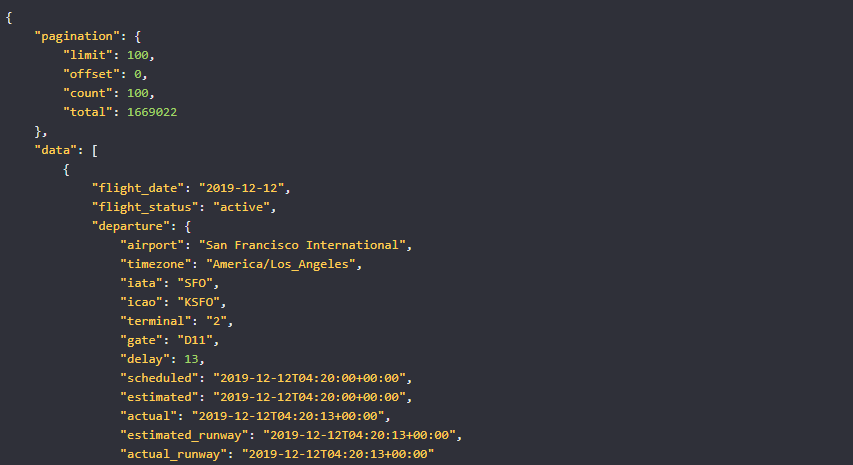
That’ll get you a bunch of JSON back to do with what you will. Example:

{
  "pagination": {
    "limit": 100,
    "offset": 0,
    "count": 100,
    "total": 1669022
  },
  "data": [
    {
      "flight_date": "2019-12-12",
      "flight_status": "active",
      "departure": {
        "airport": "San Francisco International",
        "timezone": "America/Los_Angeles",
        "iata": "SFO",
        "icao": "KSFO",
        "terminal": "2",
        "gate": "D11",
        "delay": 13,
        "scheduled": "2019-12-12T04:20:00+00:00",
        "estimated": "2019-12-12T04:20:00+00:00",
        "actual": "2019-12-12T04:20:13+00:00",
        "estimated_runway": "2019-12-12T04:20:13+00:00",
        "actual_runway": "2019-12-12T04:20:13+00:00"
      },
      "arrival": {
        "airport": "Dallas/Fort Worth International",
        "timezone": "America/Chicago",
        "iata": "DFW",
        "icao": "KDFW",
        "terminal": "A",
        "gate": "A22",
        "baggage": "A17",
        "delay": 0,
        "scheduled": "2019-12-12T04:20:00+00:00",
        "estimated": "2019-12-12T04:20:00+00:00",
        "actual": null,
        "estimated_runway": null,
        "actual_runway": null
      },
      "airline": {
        "name": "American Airlines",
        "iata": "AA",
        "icao": "AAL"
       },
       "flight": {
         "number": "1004",
         "iata": "AA1004",
         "icao": "AAL1004",
         "codeshared": null
       },
       "aircraft": {
         "registration": "N160AN",
         "iata": "A321",
         "icao": "A321",
         "icao24": "A0F1BB"
       },
       "live": {
         "updated": "2019-12-12T10:00:00+00:00",
         "latitude": 36.28560000,
         "longitude": -106.80700000,
         "altitude": 8846.820,
         "direction": 114.340,
         "speed_horizontal": 894.348,
         "speed_vertical": 1.188,
         "is_ground": false
       }
     }, 
    [...]
  ]
}

This API is made by apilayer, which seems like a darn smart idea for a company. They make really specific APIs for all sorts of developer tasks.

Direct Link to ArticlePermalink

The post aviationstack appeared first on CSS-Tricks.

Categories: Designing, Others Tags:

We are Hiring Copy

January 28th, 2020 No comments
we_are_hiring

Design Sojourn is an exciting strategic design consultancy passionate in helping our clients leverage on Design Led Innovation to make people’s lives better.
We have openings for Designers or Design Researchers with a strong background in Ethnographic Design Research.

Designer or Senior Designer
– Background in design from any discipline. Degree or diploma accepted.
– At least 5+ years or 8+ years (Senior) with relevant experience.
– Possesses a strong portfolio of projects underpinned by ethnographic research.
– Exhibits a good command of the technical design skills such as sketching, illustration, rendering, 3D CAD (optional) etc. in any combination.
– Please send an introduction of yourself via our contact page. Links to an online CV and/or online portfolio are highly recommended. Shortlisted candidates will be notified by email.
– Unfortunately due to local employment laws, we can only accept applications from Singaporeans and PRs. This role is based in Singapore.
We look forward to your wonderful introductions!

The post We are Hiring Copy appeared first on Design Sojourn. Please click above if you cannot see this post.

Categories: Designing, Others Tags:

How to Optimize Social Media Marketing Campaigns for Better Engagement

January 28th, 2020 No comments

Social media has over 3.484 billion active users. To market to this massive audience, many brands have accounts on social media as well. However, it’s important to know if it’s effective enough.

Today, social media platforms are evolving faster than the phases of the moon. Optimizing your brand’s online presence requires you to go beyond simply publishing content.

If you want to make the most out of your social campaigns, you should ask yourself:

  • Are your campaigns helping you build relationships with your audience?
  • Does your social media strategy encourage conversations and conversions?
  • Are you using the right social media management tools?

While creating quality content is paramount, increasing your social media engagement is not child’s play. You need to have strategies in place to grow your presence on these platforms.

Let’s discuss four strategies that can help boost your social media engagement like never before.

Strategies to Optimize Social Media Marketing Campaigns

1. Use the Power of Visuals to Your Advantage

First impressions matter. To benefit from the social platforms, which are saturated with content today, your content needs to stand out. Aesthetically pleasing visuals and good design may be just the instruments you need to create a scroll-stopping experience.

Not only do they help pique the readers’ interest, but they also make it easy for them to absorb the information.

For example, Airbnb promises comfortable and fun travelling experiences through pleasing imagery. Most of their social media content showcases people making the most of their lives on vacations using their services.

Impressive images can help you build curiosity and make people want to learn more about their behind-the-scenes story.

Visual content is a gold mine you should tap into. Here are a few ways through which you can ace visual content marketing for better engagement.

  • Be consistent: Having a set brand tone and consistency helps increase your credibility. For example, a social media feed that only uses pastel shades would work much better than one that’s all mixed up.
  • Avoid using stock images: In a world that’s ever-digitizing, it isn’t too difficult to tell the difference between a stock image and an original one. Authentic photos don’t just make for valuable content but are also a treat for the eyes.
  • Get creative: Leveraging visual content marketing does not end at image-heavy content. You should also consider using infographics, videos, memes, and other forms of visual content to promote your brand on social media. Try finding what your target consumers like, and give them more of that.

Good visual content can convey a thousand words using just a few.

2. Get Your Timing Right

When is your audience most likely to be online? Your content could be top-notch, but a total waste, if not timed well. According to a study, the best time to post on social media, in general, is between 9 am and 12 pm on the first three days of the workweek.

However, the truth is, there is no magic formula to find the perfect time to post. Each brand has a unique product, audience, and strategy. For a brand targeting teenagers, it would probably make sense to post late at night. On the other hand, a brand catering to football fans could largely benefit from posting (more) during ongoing football matches.

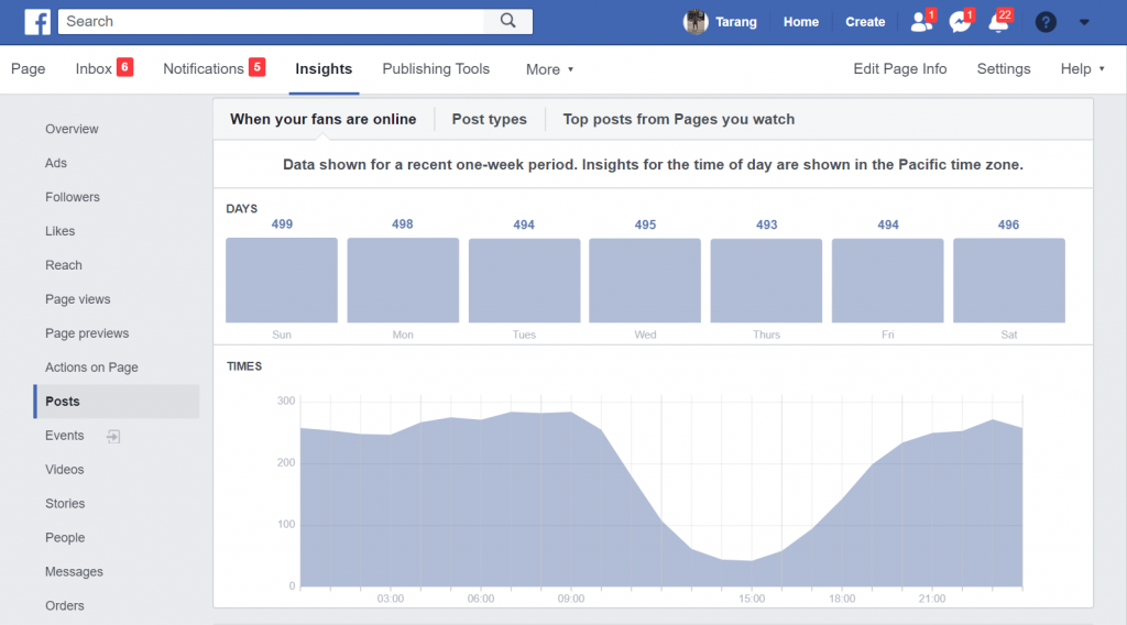
You can use social media marketing tools such as Facebook Insights to figure out the times when most of your target audience is online. This can help you figure out the right time to publish your content.

Alternatively, here’s how you can determine the best timing and frequency to post for your brand:

  1. Rely on rudimentary data: If you’re just starting off, the chances are that you won’t have enough data to base your strategy on. However, some basic market research can guide you.

    Knowledge about your audience demographics and product type can go a long way for starters.

    For example, if you’re promoting your product on LinkedIn, posting during working hours on weekdays might be a good idea as the weekend is the worst time to post on the platform. Additionally, consider time zones. Refrain from posting at times when your audience will most likely be asleep.

  2. Start posting: Now is the time to put your hypotheses to test. Start posting content based on the information you have and observe the results. Is there a particular frequency of posting that maximizes engagement? Which hour of the day generates the best results?

    Posting the same piece of content at different times can also help you determine the best time to post your content.

  3. Curate a strategy: Based on your observations, generate a strategy. 3-4 weeks of experimentation should give you enough insights into the timings and frequency that work best for you.

While narrowing down on an accurate posting schedule is difficult, it is of prime importance. It truly makes for one of the most effective ways to increase your traffic.

3. Employ the Right Social Media Engagement Tools

You don’t have to take it all on yourself. There’s an ocean of social media engagement tools you can choose from to optimize your campaigns. Whether your business is small, medium-sized, or large, a tool that fits your needs is easy to find.

These social media tools can help simplify tasks like:

  • Hashtag research: Using hashtags helps businesses go beyond just their followers and reach out to those interested in the topic. Several tools offer in-depth insights into hashtags and help you find relevant, engaging, and trending hashtags.
  • Campaign tracking: This helps measure the impact of your campaign. You can track multiple metrics like the number of link clicks, engagements, reach, and click-through rates.
  • Competitor research: Eyeing your competitors’ activity is significant when it comes to social media. It helps you become aware of the latest trends and identify gaps in your marketing strategy.
  • Social media listening: Without social media listening, your marketing strategy is incomplete. In addition to analyzing how many people are talking about your business, through these tools, you can also understand what they want.
    With marketers prioritizing the evaluation of online mood and sentiment, a number of social listening tools are gaining traction.

4. Host Giveaways and Contests

While you may be churning out amazing informational content for your audience, it’s always good to shake things up a little, every once in a while. A great way of doing so is by hosting contests and giveaways.

In addition to being a foolproof way of growing your following, these contests help increase your brand awareness with minimal effort.

As per a recent survey, nearly 66.8% of marketers host giveaways on multiple platforms. Additionally, 45.5% of them use both Facebook and Instagram to organize giveaways. These campaigns can generate a lot of buzz on social media if the prize you’re giving away is valuable enough.

For instance, LEGOLAND California Resort recently organized a fun giveaway. It not only helped promote its 20th birthday but also got over 6000 likes and 1000 comments.

Online contests are great ways to foster entertainment, introduce a new product, and especially boost social media engagement.

Depending on your brand and audience preferences, you could try any of the following contest ideas:

  • Tag a friend: Followers need to tag their friends in the comments section for a chance to win. This brings a hoard of people to your post and boosts your brand’s exposure.
  • Post a selfie: Ask followers to post a selfie (of them using a product), along with a contest-specific hashtag. This can not only help you promote the product, but also generate engagement and sales.
  • Comment to win: This is the simplest, safest, yet one of the most effective ways to boost engagement. Have your followers comment on a particular post, pick a random winner, and boom – you just ran a giveaway.

Conclusion

Social media’s massive audience provides you with a great opportunity to promote your brand. You should incorporate loads of visuals into your content to make it more attractive and engaging.

It’s also necessary to get the time of posting your content right to ensure that it creates the maximum impact on your target audience. You should also incorporate the use of tools to simplify social media marketing. Lastly, host giveaways every once in a while to give a boost to your marketing efforts.

What are your favourite ways to boost online engagement? Tell us in the comments below.

Categories: Others Tags:

Aviationstack: Real-time flight data, from the ground

January 28th, 2020 No comments
aviation stack real time flight tracker

Isn’t it cool that we’ve come so far in technology that we’re able to not only fly from one side of the globe to the other in a matter of hours but track the airplane that does it from the ground? It may seem like a tall order, but there’s a tool out there that makes it possible.

Aviationstack is a free, real-time flight status and global aviation data API. But how does it work and what can you expect from it? Prepare for take-off.

aviation stack real time flight tracker

How does Aviationstack work?

Although it may sound complicated, I can assure you that it’s not. Once you sign up and receive your API key, you simply attach the access_key parameter to any valid API endpoint URL.

Once all is said and done, you can request real-time data for any flight at any time. Everything will be displayed in a simple, easy-to-read JSON format. This is something like what you can expect to see:

aviation stack real time flight tracker

Of course, this is a very simplified example. Aviationstack is capable of displaying all kinds of information on flights worldwide.

Features

Aviationstack comes with loads of helpful features, some you may have never even known you needed. Here’s what you have to look forward to:

  • Live flight tracking
  • Historical flight data
  • Airline route lookup
  • Airport lookup
  • Airline lookup
  • Airplane lookup
  • City lookup
  • Country lookup
  • Aviation tax lookup
  • And more

As you can see, you can get basically any bit of information you need about any flight at any time. They boast quite an extensive list of flights, airlines, and related things that they can track with the press of a button.

aviation stack real time flight tracker

How can you get Aviationstack?

Aviationstack can be used on a personal or commercial level. That being said, the free version is for personal use only, so keep that in mind.

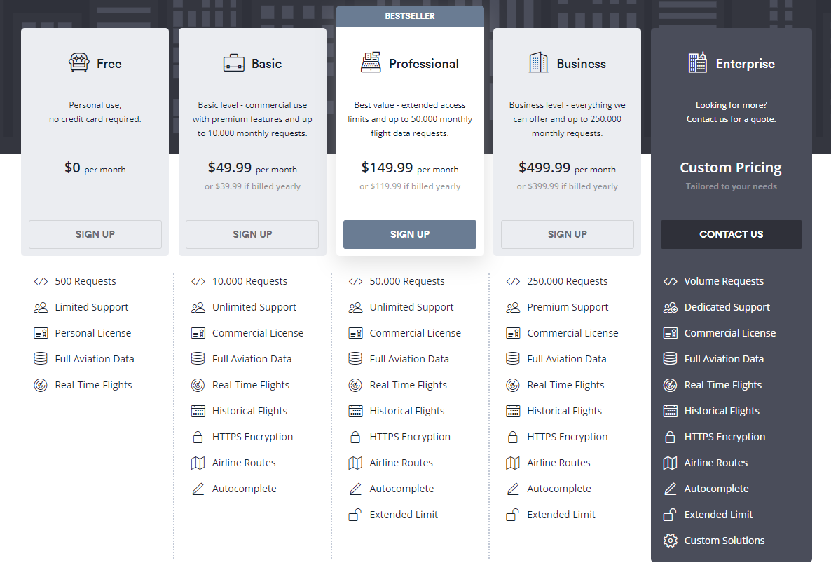
Depending on your needs, there are a few packages that you can snag. On their pricing page, they list 5 pricing options, including the free one. As the plans scale up, the number of flights you can track monthly scales up, too.

aviation stack real time flight tracker

If Aviationstack looks like something that would be of us to you, then you’re going to get a killer deal. For the price and performance, there’s simply nothing else like it on the market. That’s certainly what the 5,000+ trusted companies around the world have come to find out.

To top it all off, Aviationstack is easily integrated. Any language, framework, and application is setup and running within minutes with their straightforward documentation and interactive endpoints.

aviation stack real time flight tracker

The conclusion

There’s only one conclusion to draw from this review: Aviationstack is a powerful flight data API that is the best (by far) on the market.

With the amount of data you can gather on any flight in any country at any time, the price is more than manageable, too.

Check it out, poke around their main page, and give the free trial a spin. You won’t be disappointed.

Read More at Aviationstack: Real-time flight data, from the ground

Categories: Designing, Others Tags:

Positionstack: The Best Geocoding API in the World

January 28th, 2020 No comments
position stack geocoding api

I think it’s safe to say that there are many benefits to geocoding. But it’s not always easy to find a tool that allows you to geocode easily and reliably. That is, of course, until now.

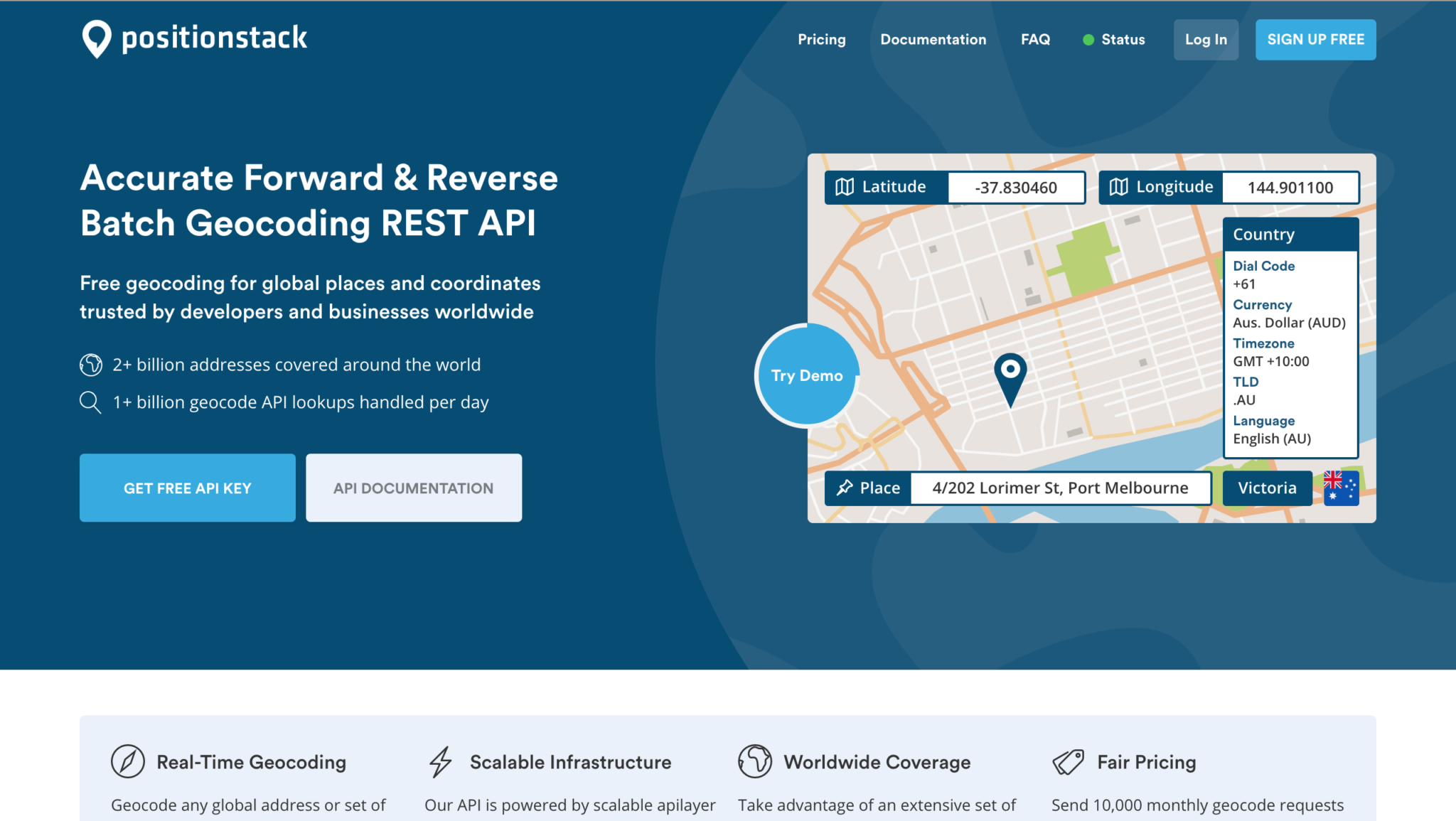
Positionstack is the world’s best forward and reverse geocoding API. I know that’s a big claim, but let’s talk about this a little bit.

position stack geocoding api

What is geocoding used for?

At its core, geocoding is simply a list of coordinates. But, it’s what you do with those coordinates that really matters. Geocoding provides very useful data for businesses worldwide. Of course, this completely depends on the company, but here are a few uses for geocoding:

  • Identifying geographic patterns

This is a simple concept. But gathering many addresses/coordinates could reveal some sort of pattern that businesses can take advantage of, whether it’s in marketing or sales in general.

  • Targeted marketing strategies

Speaking of marketing, geocoding can help you gather customer data in order to better implement targeted marketing strategies.

  • Government uses

The government uses geocoding to track developmental and population growth. They take this data into consideration when deciding whether or not to build a school, public parks, and so on.

How Positionstack makes geocoding easy

In the past, geocoding has been a rather drawn-out process. Now, with the aid of Positionstack’s API, it’s as simple as typing in an address.

But Positionstack also does reverse geocoding. What does that mean? Well, instead of using an address to get coordinates, you can use coordinates to get a real address.

To put it simply: Positionstack is light-weight, scalable, and easy to use. Plus, it’s easy to integrate.

Features

So what kind of features can you expect from Positionstack? The answer might be surprising. Here’s what you have to look forward to:

  • Real-time forward/reverse geocoding
  • Batch requests
  • Embeddable maps
  • JSON, XML, and GeoJSON
  • Multiple languages
  • Worldwide coverage

The API is powered by a cloud infrastructure, which means it’s able to handle billions of requests at once. The average response time for each request is only 10-100ms. That’s lightning-fast.

The JSON format

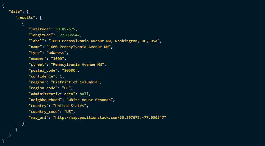
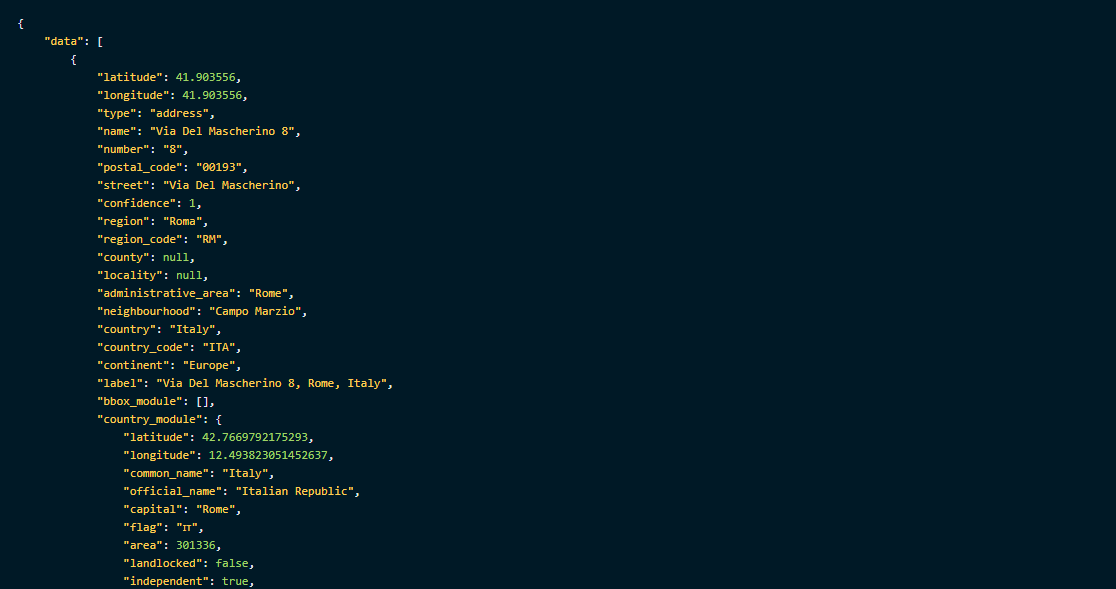
Whether you’re familiar with JSON format or not, it’s incredibly easy to use and understand. I think you’ll honestly be surprised at the amount of data that you can get with one simple address. Take a look at this:

position stack geocoding api

These are the coordinates to a McDonald’s in Vatican City. But, if you take a closer look, there’s a lot more data than just latitude and longitude.

As you scroll down, you can see the exact street, postal code, region, country, and even continent. Scroll even further down, and you will even find information on the currency used at said location:

To say that Positionstack is all-inclusive might be an understatement. With nothing but an address or coordinates, you can get more information about a location than you probably thought you needed.

The conclusion

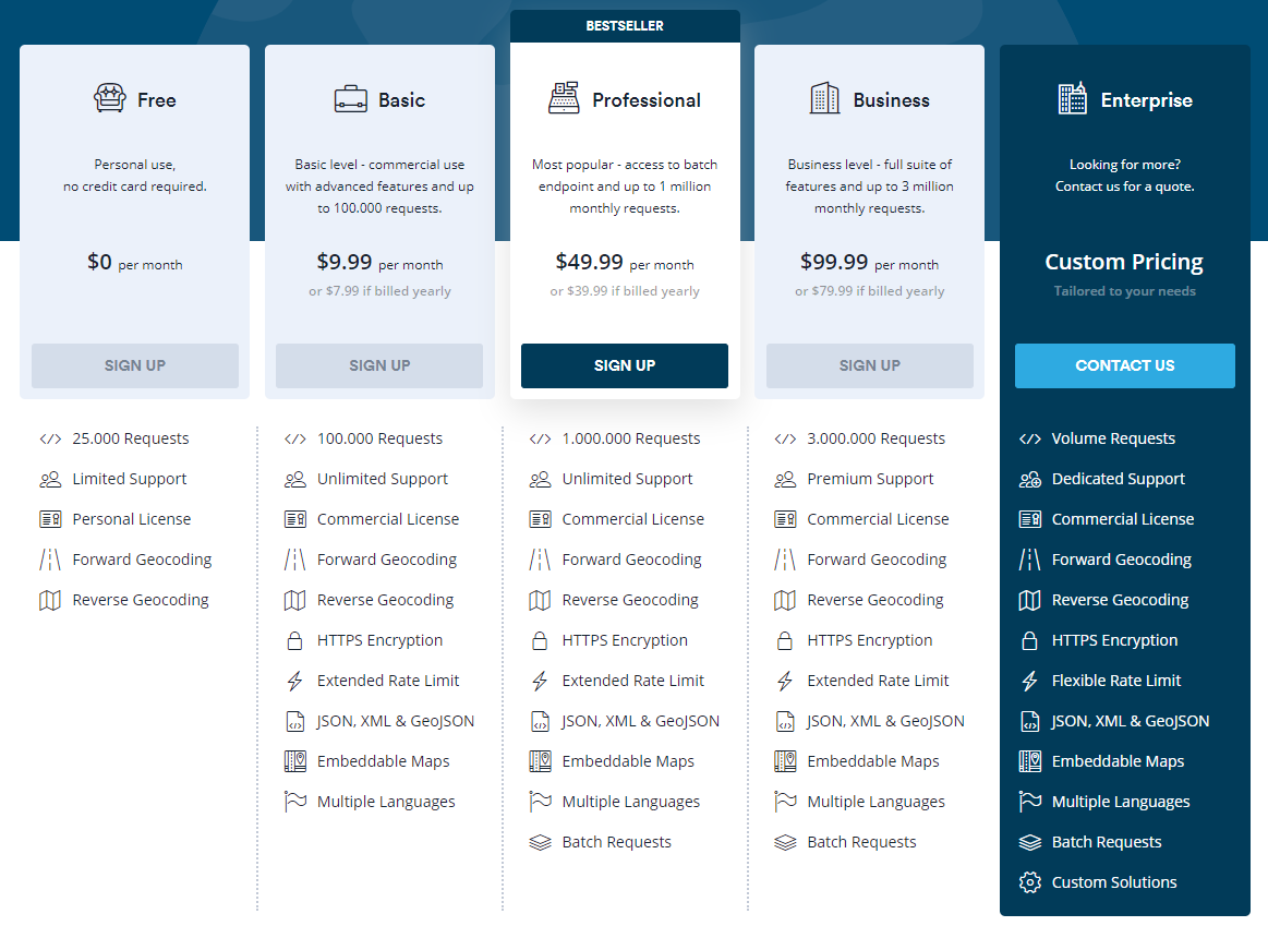
One of the things I like most about Positionstack is how affordable it is. With the most powerful geocoding API on the market, you would expect a hefty price tag, but that couldn’t be further from reality.

position stack geocoding api

No matter the scale of your business, you will definitely find a plan that works for you. Even if you just want to try it out, there’s a free version that gives you a good taste of what the Positionstack API is capable of. Go and check it out.

Read More at Positionstack: The Best Geocoding API in the World

Categories: Designing, Others Tags:

14 WordPress Themes You Should Start Using in 2020

January 28th, 2020 No comments

Even web designers who prefer to design websites from scratch eventually look for frameworks, past work, or shortcuts. That way they speed up their workflow.

And there are also those times when it’s hard to find the right template. You need help to create a special page and you feel compelled to build it from scratch.

It only makes sense to take full advantage of drag and drop, front-end editing, design modules, customizable demos, and other shortcuts. They will save you time. Also, they produce a quite similar quality and performance to the one you could achieve by building a website from scratch.

Another example of not wanting to start from scratch is when the website you want to build addresses a function or area that you’re not particularly familiar with. It could be a directory website, adding a knowledge base feature to an existing one, or even a performance feature like SEO.

If you can find a theme that promises to do the heavy lifting for you – grab it!

Just so you don’t get burned in the process, make sure the chosen theme is tops in its class – like the 14 presented here.

1. ListingPro

Perhaps building directory websites is your thing. But this is a design area in which most web designers aren’t all that familiar. And even if you’re quite good at it, ListingPro might just make your efforts that much more satisfying, and save you time while doing so.

And, if you’ve been relying on plugins to patch a design together, ListingPro is the only all-in-one WordPress directory solution on the market. It lets you get the job done without needing additional plugins, or any coding knowledge for that matter.

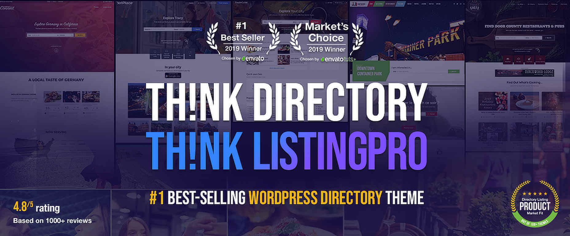
This #1 best-seller offers a comprehensive set of directory features and functions including –

  • Advanced Search
  • Ratings and Reviews
  • Front-end Listing Submission
  • Events and Ads Management
  • Pricing Plans including Stripe and PayPal
  • Built in Checkout that does not require WooCommerce
  • Listing Owner Dashboards
  • API support for autofill listing submissions

ListingPro is Elementor and WPBakery supported, and offers total design flexibility. It also provides 3 pre-built directory websites to kickstart a project.

Fantastic Theme and excellent customer service. Recently interacted with the support team member. All issues resolved quickly.Very fast turnaround.

– somymon80

Click here to learn even more about ListingPro.

2. BeTheme – Responsive Multi-Purpose WordPress Theme

One way to save design time is to have the necessary tools right at your fingertips. Another is a special feature that does much of the heavy lifting for you to get a website design project off the ground.

BeTheme does both; and it usually doesn’t matter what the purpose of your website is.

BeTheme, the biggest WordPress theme of them all is an ideal choice whether you’re planning your first website design project or you’re and advanced web designer.

As for the tools, BeTheme’s 40 core features supply everything you’ll need. They include:

  • Muffin Builder drag and drop page builder
  • Administration Panel for unlimited design options
  • Shortcode Generator and shortcodes
  • Layout Generator – create a page almost from scratch

As for the heavy lifting there’s the library of 500+ pre-built websites covering 30 industry sectors, all website types, and multiple business and personal niches.

These pre-built websites

  • are professionally crafted and attractive
  • are responsive and customizable
  • contain basic UX functionality

i.e., everything needed to get any project off to a lightning fast start

This Theme has great design quality and is very easy to get around. No technical skills needed in web development.

– syllabus

Click here; see if BeTheme is the time-saver you’re looking for.

3. Kalium

One way to build a website quickly and without unnecessary hassle is to import the content you need. Perhaps starting with a demo. Then, doing the necessary customizing and tweaking to get what you want.

Kalium provides a helpful selection of high-quality pre-made concept demos you can import. Plus you can import theme options, pages, sliders, widgets, or whatever else you need.

In addition to the pre-made concept demos the package includes

  • WPBakery, Revolution Slider, and Layer Slider
  • Product Filter Plugins
  • Shortcodes
  • A large and comprehensive font library
  • A powerful header builder
  • 30+ portfolio types and unique styles
  • Full eCommerce support
  • 16+ languages and RTL support

This top-selling theme offers free lifetime updates and excellent customer support. Plus it is fully responsive and GDPR compliant.

I’ve been using this theme for years now and it has been so flexible and adaptable as my business grows and my style evolves. There are lots of great themes like this that offer easy and quick customization but what I think really sets this one apart is the CUSTOMER SERVICE!!! The support team is beyond amazing – always answers questions promptly and are extremely helpful, saving me hours of time and headaches! Can’t say enough good things about this theme!

– itsmemissyxo

Click here to learn more.

4. TheGem – Creative Multi-Purpose High-Performance WordPress Theme

When you apply your creative talents to building a website from scratch it still takes time. When you have an assortment of tools to help, it takes less time. If you have the ultimate toolbox at your fingertips, i.e. TheGem, you might surprise yourself how easily your workflow speeds up. With the release of TheGem 4.0 it gets even better. 40,000 customers agree.

Awesome and fast Support! 🙂 Thank You!

– Nhecker

Click here to check out this awesome toolbox.

5. Total Theme

Plugins can boost you up or drag you down. It often depends on your site’s needs. Total will definitely boost you up and never drag you down. Total does not require a ton of 3rd party plugins to use all of the theme’s features, including:

  • Over 40 premade demos together with a one-click importer
  • More than 500 built-in styling options and 100+ drag and drop WPBakery modules

More than 41,000 happy customers will attest to this.

I work with TOTAL for years now and I’m still impressed by its support and documentation. If you have a theme to choose, TOTAL is the one (and only)! 😉

– spotmedias

Click here to learn more about Total.

6. Uncode – Creative Multiuse WordPress Theme

60,000+ sales to date make Uncode an Envato top seller. When this creative, pixel-perfect theme was designed, it was done so with an extraordinary amount of attention to detail.

Uncode is ideal for agencies, bloggers, and entrepreneurs. It is also ideal for building magazine and portfolio websites.

The best way to see what this WordPress theme could do for you is to visit the site and browse Uncode’s showcase of user-designed websites. You’ll be impressed.

Best Customer Support experience I have ever had. I had a hard time understanding the mobile and tablet customizations and have been helped out by their customer support team dozens of times. They are always friendly and helpful, and I love my site.

– oximedical

Browse the user-designed websites, and enjoy.

7. Schema

This fully responsive, ultra-fast theme has all the tools and elements to qualify as a “perfect” theme. Perfect or not, but certainly close to it, Schema has a feature that is lacking in most themes. This feature resolves a problem most web designers have and can save you a ton of time.

It’s the ability to make a website more SEO friendly than you might have thought possible.

Schema even guides the search engines through your site to show it off and get the best ratings.

Schema is one of the fastest themes around, I highly recommend it.

– Rashmi

Click here if SEO has become a constant challenge for you.

8. KnowAll

One way to make a good website a great one and drive up conversions is to replace a run-of-the-mill FAQ section with a knowledge base. It is a resource which most visitors will find extremely helpful.

With KnowAll, you can implement

  • Live search that provides instant answers and suggests related content
  • Feedback and action analytics that enable continuous improvement of the site

And you don’t have to do it from scratch.

Click here to learn more about this premium knowledge base solution.

9. Avada

When you invest in the #1 top selling theme of all time you can be pretty sure you’ve made a good decision. Avada‘s collection of pre-built websites, demos, partial demos, and a huge array of supporting design elements ensures you have the material you need to build a top-quality website rather quickly.

  • Avada’s Fusion Builder is drag and drop.
  • The Dynamic Content System gives you unparalleled flexibility.
  • This premium theme integrates flawlessly with WooCommerce.

Everything works great with this theme!

– SiliconWaelder

Click here to learn more.

10. Neve

Neve is a multi-purpose theme that comes with ready-made designs for for startups, agencies, eCommerce shops, blogs and more. Other good reasons to check Neve out:

  • Neve loads crazy-fast and receives top scores on Page Speed Insights and GT Matrix performance tests
  • It is compatible with most popular page builders (Elementor, Brizy, Beaver Builder, Visual Composer, SiteOrigin, Divi), including Gutenberg
  • It comes with +50 ready-made starter sites
  • Neve is AMP optimized, responsive and 100% mobile ready

This theme is just great, totally customizable and perfectly integrated with Gutenberg.

aless81 (@aless81) on WordPress.org

Click here to discover even more about Neve.

11. Movedo

This premium quality theme by a top-rated author features a clean, modern design, amazing responsive options, great flexibility, and more than a few out-of-this-world automations and parallax effects.

They include mouse move, scrolling move, and column move. Movedo also features a Knowledge Base with a quick search option, plus it is designed for easy browsing.

To sum it up – Movedo rocks!

Great theme, overall astonishing functions and page builder, also the support is tremendous.

– cedzufrei

To see what dynamic parallax can do for your websites simply click here.

12. XStore | Responsive Multi-Purpose WooCommerce WordPress Theme

If you’re in an eCommerce frame of mind, don’t bother to look further for a solution. Describing XStore‘s features can be short and sweet.

First, there is the single product page builder, a powerful header builder, and $300+ worth of premium plugins.

Second, there are 80 good-to-go shops.

Building your own eCommerce store could hardly be easier.

Fast response! Polite! Work hard! Thank you! You should definitely choose! This template is the best of many themes!!!

– KUNOICHIjp

Click here to see all the details.

13. Pofo – Creative Portfolio, Blog and eCommerce WordPress Theme

If you have building a portfolio website in mind, Pofo is the right choice. This modern and creative design theme is the ideal tool for creating business, agency, and personal portfolio websites.

This is especially true if you wish to incorporate blogging and eCommerce into your sites.

Pofo is fast, flexible, and customizable with 200+ demo pages, 25+ homepages, and 150 pre-built elements to work with.

While everything is great about this theme, from Design Quality to Flexibility. The main reason why I’m using this theme for 5 websites, is the Customer Support. This is absolutely perfect. Within time, friendly, professional. Sending CSS codes. I love working with this Pofo theme.

– studiojas

Click here to learn more.

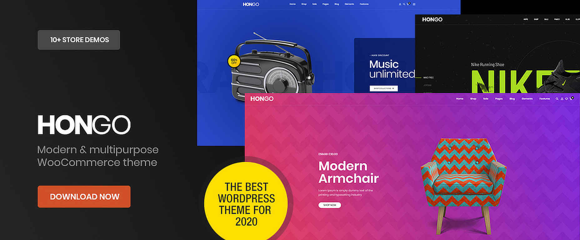
14. Hongo – Modern & Multipurpose WooCommerce WordPress Theme

This modern, multi-purpose theme was specially created with WooCommerce stores, blogs, and company websites in mind. Hongo‘s package includes WPBakery, Revolution Slider, and an impressive collection of out of the box premium features. The collection includes comparing products, quick view, product videos, and 11 ready store demos.

Hongo also provides users with quality online documentation. Its customer support enjoys high ratings.

Simply the great designs and best theme for WooCommerce, loading fast, customizable and easy to use with the detailed documentation. Their support team is technically sound and very kind to guide wherever needed. We have bought some other themes from ThemeZaa now and they have never let us down, thanks!

– diyaatps

Click here to learn more about this new and modern theme.

*****

Now that you’ve seen 14 possible ways to make your website building adventures easier, we hope you’ve been able to drill down to one or more that makes perfect sense to you.

We would appreciate it if you would share this article with a friend or with your social media group.

[– This is a sponsored post on behalf of BawMedia –]

Source

Categories: Designing, Others Tags:

The Science and Hacks for Making them Stick [Infographic]

January 28th, 2020 No comments

Many people make New Year Resolutions in the hope of making true, lasting change in their life. However, only 4% of us succeed in actually achieving those resolutions. Despite centuries of practice, dating as far back as Babylonian times, our ability to achieve our resolutions is lacking. Why is that?

Check out the following infographic from Reservations.com to learn the history, statistics, and most importantly some key hacks surrounding New Years Resolutions.

Categories: Others Tags:

How Smashing Magazine Manages Content: Migration From WordPress To JAMStack

January 28th, 2020 No comments
Smashing Editorial

How Smashing Magazine Manages Content: Migration From WordPress To JAMStack

How Smashing Magazine Manages Content: Migration From WordPress To JAMStack

Sarah Drasner

2020-01-28T10:00:00+00:002020-01-28T16:36:35+00:00

Every time developers talk about WordPress, their market share percentage changes. “20% of all sites are on WordPress!” “40% of all sites are on WordPress!” Whatever the percentage is, the message is the same: in terms of adoption, WordPress is MASSIVE.

So why, with that kind of adoption, would a site that’s using WordPress consider moving to JAMstack? In this two-part article series, we’ll cover what an actual WordPress migration looks like, using a case study of the very site you’re reading from right now.

We’ll talk through the gains and losses, the things we wish we knew earlier, and what we were surprised by. And then we’ll follow it up with a technical demonstration of one possible migration path, not off WordPress completely, but how you can serve decoupled WordPress so that you can have the best of both worlds: a JAMstack implementation of WordPress that gives you all the power of their dashboard and functionality, with better performance and security.

Let’s dig in!

Why?

In 2015, Netlify co-founder Mathias Biilmann and Smashing founder Vitaly Friedman talked shop. As JAMStack architecture started making rounds, Smashing has got more interested in the idea of the stack. Vitaly and Markus (former managing director at Smashing) asked Matt what would happen if Smashing migrated from their traditional WordPress/LAMPstack site to a JAMstack architecture.

As an experiment, Matt scraped all the HTML from Smashing and hosted it on Netlify, delivering the content statically from a CDN. The results were compelling — the static version is more than six times as fast on average!

This type of architecture works so well in part because pages aren’t being compiled on-demand as you visit them. Since you’re serving pre-built content directly from a Content Delivery Network, the site is already “there” and ready for the user.

Since you’re serving via CDN, you can also distribute the content across the globe — closer to potential visitors. There’s no central point of origin, which is vital in the case of any online publication that wants to be fast for all of its readers.

So the stage was set. Smashing Magazine migrated to the JAMstack — to Netlify as a platform in particular. In its 10 years of operation, Smashing had grown from a small online publication to a massive WordPress blog, selling things like books, conference tickets, and workshops.

There were a few pieces of this site:

  • WordPress blog
  • Rails jobs board
  • Shopify store
  • Another CMS for the conference site

When Netlify first began the migration, the site was suffering some performance issues, weighed down by 20K comments and thousands of articles. Smashing was also interested in authentication as part of a new subscription plan, as well as a redesign for a more modern look.

Reliability

Smashing regularly achieves what other platforms dream of: articles shared widely through an enormous community. However, when a tipping point of virility was reached for a post, Smashing regularly had issues with outages. To mitigate this, the heavy use of WordPress plugins were introduced into their stack, but they still struggled to retain good uptime metrics.

Moving to Netlify allowed the Smashing team to avoid getting database connection errors and not worry about downtime even when an article saw a huge amount of traffic. Why? Because when serving without a server, the prebuilt content doesn’t have to be generated and served — it already exists, ready to be viewed. Nothing is being requested on the spot except for the entire, static page.

Serving via CDN also allowed Smashing to sleep a little easier in terms of security. wp-login.php has long been a source of security holes and attack vectors. Prebuilt content can not be accessed in the same way and security holes are not as ubiquitous.

Cache Invalidation

Smashing had cycled through every WordPress caching plugin, with varied results and a lot of problems. Vitaly Friedman of Smashing mentions,

“The main issues we had were related to ‘Error Establishing Database Connection’ that we kept having every other week, and we literally tried every single WordPress caching plugin out there. The performance was pretty OK (overall), but we were looking to improve it further. Plus, we did want to launch Membership and connect all the different offerings — conferences, job posts, articles, books, eBooks — with one single platform, and it was remarkably difficult to achieve with WordPress in play.”

Moving to Netlify allowed the Smashing team to see instant cache invalidation while also serving cached and performant content, with no extra overhead.

When you deploy a site, HTML files are hosted on Netlify’s CDN. It’s optimized for a high cache-hit rate, and fast time to first byte, while being able to instantly invalidate all HTML files that have changed. Netlify also fingerprints all links to assets like CSS files, images, fonts, or JS files, and serves Smashing with caching headers that cache them forever. The fingerprinting guarantees they’re unique, and that if you update a new version, the newer version is served instead.

Workflow

Looking at the existing setup, one large reason for the migration was simply to unify the existing properties. Having to context shift between all of these different tech stacks and setups became a hard maintenance problem that tasked the engineers.

When previously their infrastructure was split up among so many different systems, this migration process also unified everything, keeping the main site, the conference site, the subscriptions and e-commerce section all working together instead of maintained separately with different stacks. This helped keep development costs low and developer experience working on all properties consistently.

The WordPress migration piece proved to be the largest and most delicate. Netlify tried to export the data from the WP exporter, only to find that the content had embeds that needed to be preserved, or at times were altered by plugins. In order to maintain parity with what was on the site, a series of scrapers were written, broken down by articles, assets, comments, and the homepage.

Once that was written and transformed, it was loaded into a new repo in GitHub, and Netlify CMS was used instead. What makes Netlify CMS unique is that it’s lightweight, and integrates content editors into a Git workflow — meaning it will literally pull and serve markdown files from a git repo instead of a database. In addition, Netlify CMS is platform agnostic and works with (almost) all static site generators and sites stored in GitHub.

At that time, Sara Soueidan worked for Smashing as a freelance front-end developer on their redesign. She created a library of components to build out the front-end architecture and remarked how much more simple it was to work with because she was working directly in git, even when working with the CMS.

“Everything that I pushed to the repository is being directly applied to the pattern library which means that you don’t have to maintain two different sets of components… this type of continuity was great! All I have to do is write HTML, CSS, and JavaScript and push to the repo and everything works like magic. The workflow was fantastic.”

All of this said, Netlify CMS can sometimes be too lightweight for such a high traffic and scale use case. Smashing regularly has guest authors and a full editorial staff. Some of the rich features WordPress offers are really helpful for these kinds of highly collaborative environments.

That’s why in the following tutorial, we’ll walk you through a headless model, where you can still reap the benefits of the WordPress dashboard for content creators, but use WordPress via API and have the development rely on a git-centric workflow that easy for developers to maintain as well. Stay tuned!

Framework Choices

In the initial prototype that Matt Biilmann created, he wrote everything in minimal Preact, paired with Hugo, as he was very focused on performance. He just used props and kept everything very lightweight. As he passed the project off to be maintained by Smashing’s developer, Ilya Pukhalski, he found that Preact was lacking some features they were missing to tap into React’s ecosystem. Eventually, the benefits of Redux and other libraries outweighed the cost.

Reflecting now, Matt says he would have used Vue, which didn’t have quite the market share at the time (I swear I didn’t prompt him to say that). I asked the obvious question: why not Svelte? As performance-minded folks tend to reach for that library. He mentioned that Svelte doesn’t quite have the ecosystem Vue has yet.

When Matt reflects on whether or not he would have still used Hugo, he says that he loves Hugo, but what he found difficult for this project in particular was that it didn’t have enough of a plugin system — creating banner ads and things of that nature were not programmable enough with Hugo and he needed to inject scripts to accomplish it. These scripts tended to slow the build process down. That said, we still use Hugo for our own site at netlify.com and love it — this caveat is extremely particular to the needs of Smashing’s site in particular.

If he could do it again, he might choose either Eleventy, which has rich capabilities in terms of creating plugins and other extendable scripts. Or, if he was using Vue, Nuxt would have offered him some nice plugin capabilities while allowing being a good choice for that framework, offering server-side rendering, routing, and static generation.

Building Large Sites

There was one problem that emerged working with a site as large as Smashing and maybe you can already figure out what it is, we just touched on it. It’s true that with any large site of prebuilt pages served on a CDN, the performance is still great because we’re not building anything on the fly for the users.

But that benefit can only happen if the site is pre-built, and that process can be time-consuming. While more traditional sites will build the pages when you request them, we’re literally creating every single page in advance just in case the user might need it. It makes the performance super fast! But that time is now offloaded to development and publishing time — creating every page can take time.

This is not so much of an issue with smaller sites, but at Smashing Magazine’s scale, we need to think about that time a bit more, especially so that people can keep productivity high while actively daily creating content.

What Netlify did was create a large /production-articles folder which carried the bulk of the many 1000s of articles they were already hosting. Then, made a separate working directory called content/articles where the articles that were actively being created and edited could be placed.

This build process meant that everyone who was working on the site was working with a smaller batch of articles for local development, unhindered by waiting for the entire build. This process was managed by a gulp task to prepare the production articles, and freed Hugo up to only handle what was actively being worked on.

One of the cons of this approach is that it does still require the entire build to be run, making the process slow. At a smaller publication, this would likely matter less but at Smashing’s scale, it does slow down the publication process.

Open-Source APIs

In the beginning, we mentioned that among other things, Smashing was interested in migrating their existing e-commerce solution, handle comments outside of WordPress, and add functionality for auth. All of these pieces of functionality were built with open-source solutions that Netlify maintains, breaking them out into stateless APIs:

  • GoTell
    An API and build tool for handling large amounts of comments.
  • GoCommerce
    A small Go-based API for e-commerce sites that handles orders and payments.
  • GoTrue
    A small open-source API written in Golang that can act as a self-standing API service for handling user registration and authentication for projects. It’s based on OAuth2 and JWT and will handle user signup, authentication, and custom user data.

Each one of these pieces required migration and unique factors of their own, and while they’re out of scope for this article, they’re all covered in a free book Matt co-wrote called “Modern Web Development on the JAMstack”. We’ll also do some deep dives like this one — with usable examples — into search, and authentication, in subsequent posts.

Conclusion

The migration went swimmingly. Smashingly? Er… it went well. Smashing wasn’t penalized for its own success — when a popular article came along, they could serve the content consistently, no longer bailing over large loads. Along with this, the movement to a JAMstack infrastructure brought better performance and security.

Markus Seyfferth, former CEO of Smashing Magazine, noted:

“The time to first load is so much faster than before… before we had to wait for the HTML file being served for 800ms and now it’s 80ms.”

This process was successful and like any great engineering project, lessons were learned along the way. In this next article in this series, we’ll run through a tutorial and demo for what we would recommend given what we’ve learned. If you’d like to modernize your WordPress development and reap the performance and security benefits of JAMstack, read on!

(ra, vf, il)
Categories: Others Tags:

Smashing Podcast Episode 7 With Stephanie Stimac And Aaron Gustafson: What’s New In Microsoft Edge?

January 28th, 2020 No comments
A photo of Aaron Gustafson on the left, and Stephanie Stimac on the right

Smashing Podcast Episode 7 With Stephanie Stimac And Aaron Gustafson: What’s New In Microsoft Edge?

Smashing Podcast Episode 7 With Stephanie Stimac And Aaron Gustafson: What’s New In Microsoft Edge?

Drew McLellan

2020-01-28T05:00:00+00:002020-01-28T07:47:01+00:00

In this episode of the Smashing Podcast, I’m talking to Microsoft’s Aaron Gustafson and Stephanie Stimac to find out more about the brand new version of Microsoft Edge and how it’s affecting web developers worldwide as well as its impact on the web.

Show Notes

Weekly Update

Transcript

Drew McLellan: She’s a program manager and user researcher with the Microsoft Edge Developer Experiences Team where amongst other things she connects with web developers to identify problems in the web platform that they need solutions for to improve their day to day workflows.

Drew: He’s a web standards advocate, again with Microsoft, where he works closely with the Edge Browser Team as well as working with partners on progressive web apps and takes a focus on cross platform compatibility.

Drew: Together, they’re part of The Web We Want Team, which is a cross-browser vendor project to open a dialogue with web developers to help shape the future development of the web platform.

Drew: So we know they’re both from Microsoft, they’re both dedicated to making the web better for all of us, but did you know their most recent Web We Want meet up was hosted in a hot air balloon outside the Earth’s atmosphere before jumping back down to earth in the style of Felix Baumgartner.

Drew: My Smashing Friends, please welcome Stephanie Stimac and Aaron Gustafson.

Drew: Hello Stephanie, hello Aaron, how are you?

Aaron Gustafson: I’m smashing.

Stephanie Stimac: I am also smashing.

Drew: I wanted to talk to you today about some very interesting developments that have been going on with the Microsoft Edge browser. I guess most of us will know that Edge is traditionally the Windows 10 browser that replaced the much beloved Internet Explorer. Probably the first thing that we should note is the Edge isn’t exclusive to Windows 10 anymore, is it?

Aaron: Correct.

Stephanie: You can find Edge on Windows 10 and Mac OS. And then I’m not sure if it’s available on Windows Seven yet.

Aaron: Yeah, I believe it’s available on Windows Seven and Windows Eight now as well. And then of course there’s the mobile clients too for iOS and for Android.

Drew: So pretty much every modern platform.

Stephanie: Yep.

Aaron: Except for Linux, hopefully coming soon.

Drew: So even Linux desktop users can get in on the action.

Aaron: Eventually, that’s the hope.

Drew: Fantastic. So as far as I understand it, and correct me if I’m wrong here, but Edge was technically a continuation of the Internet Explorer code base, is that fair to say?

Aaron: Yeah, when Edge first started, it was basically kind of rip out all of the stuff that we realized was just kind of lagging around, things that had been proprietary and stuff like that. All of the old browser helper objects and activeX stuff and things like that. So it was massively gutted. It was kind of a chance for the team to really get rid of a lot of the legacy baggage and focus on the standard stuff. And so it was a continuation of the old Triton engine, but kind of refactored and made into the Edge HTML engine.

Drew: So it was like a massive home renovation inside the code base.

Aaron: Yeah, take it to the studs.

Drew: So I guess the biggest change that I want to talk about with the very newest version of Edge is that even more of those sort of older guts have been ripped out and replaced. And there’s a new rendering engine that’s been installed. Now I’m a little conscious of using jargon and people who aren’t maybe so familiar with the workings of browsers might not be completely happy with, what do we mean by a rendering engine. I think some of us who’ve been around and working on the web a long time will have picked up that information, even if we’re not working directly with the internals of browsers. But somebody who’s perhaps newer to web development might not understand, what do we mean by a rendering engine. So, what is a rendering engine inside a browser? And which bits aren’t a rendering engine?

Aaron: Well, there’s a bunch of different parts to a browser. The rendering engine is what we typically think of when we’re talking about what’s being actually painted to the screen and sort of the interactive layer of things. And so in the Chromium world, that is the Blink rendering engine.

Aaron: And then there’s the WebKit rendering engine, which is what runs Safari. And that was based on the KHTML rendering engine, which ran Konquerer back in the early days.

Aaron: The Trident rendering engine I mentioned before was the one on Internet Explorer for Windows. Tantek Celik had made the Tasman rendering engine as part of the team that was working on IE5 for Mac.

Aaron: So there are all these different rendering engines out there. And in fact I think there was a new one that Peter Paul Cox was just talking about called Flow. That’s like a multi-threaded rendering engine that’s based on SVG or something like that. And there’s a forthcoming browser for that that was designed for set top boxes, really low powered devices.

Aaron: But yeah, the rendering engines, taking all of your information and painting it to the screen. And then you’ve got your sort of underlying JavaScript engines as well. So v8 in the case of the kind of Chromium stack. And there are a bunch of different ones for that as well.

Drew: So when we say that the old rendering engine Trident, that came from IE and has been in Edge has been replaced. We’re actually talking about the bit that paints stuff to the screen and also associated things like the JavaScript engine. Is that fair?

Aaron: Yeah, in the case of the new Edge version, basically none of the underpinnings of old Edge are there. The Chromium project is an open source project that runs Chrome and Brave and a bunch of other, Opera and such. And that project includes the rendering engine, it includes the JavaScript engine, it includes all of the UI. It also includes the build process and all of that sort of stuff for actually creating the browser.

Aaron: And so we basically have the Chromium project, became the basis for the new Edge. And so we had to go through the process of making it look like Edge and adding in the functionality that we needed in terms of synchronization, using Microsoft accounts, all of that sort of stuff.

Aaron: So the new Edge does not share any lineage in kind of the traditional sense with the old Edge, which was Edge HTML, which inherited from Trident and so on and so forth. And you can keep going all the way back to Mosaic for most of these.

Aaron: But yeah, so now the new Edge is Chromium, which is based on WebKit before it, which is based on KHTML and so on and so forth. So it’s a completely different lineage than the previous one.

Drew: So, I mean, that’s a massive change isn’t it, for Microsoft to no longer have a browser that’s originated in its own code. But is actually taking an open source project and creating its own browser from that. Which I guess is similar to what Apple did back in the day with WebKit. What, was it KHTML they … ?

Aaron: Yeah, it was Konqueror was the … with a K.

Drew: Yes, Konquerer, so they took that open source project and that became Safari. And so Microsoft is doing a similar thing with the Chromium project and has made Edge out of it?

Aaron: Correct.

Drew: If I’m sat down in front of Edge as a web developer, what that I’m looking at is unique to Edge, what would I be seeing that I wouldn’t see if I was sat down in front of Chrome for example?

Stephanie: A lot of the features right now in this first stable release are consumer focused. So, there’s Collections which is coming out, which is a pretty cool way to pull stuff from the web into individual collections, hence the name. And you’re able to take that data and kind of put it into a side pane and then export it out to Word and Excel I believe. I’ve been using it for design projects and other things. It’s just cool for gathering resources.

Stephanie: And then one of the other features for Enterprise customers, and it’s only available on Windows, is IE mode. So that will actually render Internet Explorer within a tab in Edge for people who still need those pages that rely on old technology. So that’s pretty cool.

Stephanie: And then in terms of developer tooling, everything right now is the same. I know we have some stuff upcoming that is going to get ported up to Chromium, but there’s a cool 3D DOM viewer that’s in the works and the team’s been iterating on. And there are some other tools that don’t exist in Chrome yet that are coming. So that’s exciting.

Drew: So that’s a big deal for web developers, isn’t it? Because I think typically people get used to using a set of developer tools in their browser of choice and quite often frankly that is Chrome these days for a lot of web developers. So to be able to go across to Edge and find a very similar set of developer tools has to be quite a draw, do you think?

Aaron: Yeah, I think so. I mean it’s the sort of thing where you’re going to have the exact same tool set. We’re built on top of Chromium, including all of the dev tooling. We have been making a lot of investments in, as Stephanie was talking about, with the 3D DOM viewer. We’ve been making a lot of investments in terms of improving the overall accessibility of the dev tools, adding new tools into it, working on internationalization of the dev tools.

Aaron: And as Stephanie mentioned, the vast majority of the work that we’re doing, basically anything that is not UI specific to Edge or that involves our sync platform or things like that, all of that is being up streamed into Chromium. So the fixes that we make, the improvements that we make for accessibility are going to make Chrome better, are going to make Brave better, Opera better. They’re even going to make Electron better.

Aaron: So, it’s really neat to be kind of part of that larger ecosystem. And to be able to have impact beyond our own browser. And so dev tools has been an area we’ve been making a lot of investment. We’ve been doing a lot of work with partners in the Chrome team on progressive web apps as well. And trying to figure out what do progressive web apps, or what should they look like in desktop environments, because a lot of the focus has been on mobile.

Aaron: And then there’s also been a lot of work between the Dev Tools Team and the folks working on VS Code to make those tools work better together. So that you can basically access the dev tools from the browser from within VS code while you’re debugging your pages. And everything is kind of connected, like being able to click on a style rule in the Edge dev tools actually it will take you to that line in VS code in your style sheet. Which is mind blowing, it’s really cool stuff.

Drew: That sounds really exciting. I know VS Code is something that seems to be gaining an awful lot of traction in the web development community. I think it’s actually brought a lot of people back to Microsoft Tools who might have drifted away over the years. Certainly feels like a different era of Microsoft, as does this sort of embracing of open source and the new version of Edge. It all seems quite exciting and quite refreshing from a web development point of view.

Drew: Also from that point of view it seems like this is a really great convenience for web developers because if some of the major browsers, Chrome and Edge in particular and you mentioned Brave and Opera, what have you, are all using the same rendering engine, presumably that cuts down on masses of compatibility problems and browsers that don’t need to be tested in lots of different places. It should all just work the same, is that fair?

Stephanie: Yep.

Drew: Amazing.

Aaron: That’s the dream, right?

Drew: That is always the dream. It does raise a little bit of a concern though doesn’t it in the reduction of sort of healthy competition in the marketplace. Whereas we had Microsoft pushing their browser forward, Google pushing their browser forward. Apple hopefully ideally pushing their browser forward, Opera and all the other players. And that sort of creates this atmosphere of healthy competition where everyone’s trying to keep up with each other and trying to make improvements. If a lot of big players are all using the same rendering engine does that healthy competition suffer?

Aaron: This is something that I definitely have, having been a long time web standards person, kind of struggle a bit with, I don’t think … I totally get the business justification for it. From Microsoft’s standpoint it made a lot of sense. And from a front end dev perspective it’s nice to not have to cater to a bunch of different engines.

Aaron: I mean, on the whole, those of us who’ve been working on the web for a long time, have certainly seen a lot of convergence in terms of rendering. We don’t have as many problems as we had say back in the Netscape 4.7 days where we had just like, you know, I knew companies that were creating unique style sheets for each different browser which was just untenable.

Aaron: But I think what’s kind of different now is that back in the original browser wars you had all of these proprietary engines and everybody was kind of in a game of one-upsmanship in terms of trying to ship new platform features and new JavaScript features. Or in the case of Microsoft reverse engineering JavaScript in order to create J Script and trying to figure out how to fit it all together.

Aaron: But now we have the ability to actually work together in open source projects and still have the dialogue and still, I don’t know, fights not the right word, but to have serious discussions about the impact of different approaches. And to disagree with each other. And to really work on making specs really good. And to also have competing approaches to the underlying code within the context of say a Chromium project or WebKit or something of that nature or Mozilla in the Firefox space.

Aaron: So yes, on one hand we did lose another rendering engine. And I felt that same pain when Opera decided to go to Chromium. But I do feel somewhat heartened being inside Microsoft and seeing how committed we are to actually participating in the Chromium project in a meaningful way. And not just kind of sitting back and just accepting everything that comes downstream from Chromium, but actually kind of vetting what’s going into the platform and participating in that.

Aaron: So I’m a little bit heartened by that and feel like we’re not just there to take from that project and just accept whatever gets passed down by all of the different people who have a stake in that project. But to actually be collaborating in there as well.

Aaron: I think we still need to figure out what this means for standards bodies in terms of interoperable implementations. Because basically if you’ve got some browsers that decide they don’t want to implement something, they can totally stop something from becoming a standard. Even if all of the developers in the world wanted it.

Aaron: And it may not be anything like where they don’t agree with it. They just may not have the bandwidth to build the feature. Everybody’s pressed for staff and such.

Drew: I guess really the collaboration on the web as a platform has just moved locations from everybody agreeing to implement things the same in their individual code bases to some major players working together on the same code base essentially.

Drew: I mean, you mentioned briefly disagreements and obviously that’s something that could be a concern, I guess, in any open source project. But do we know how that will work, if developers from Google, for example, want to implement a feature and developers from Microsoft really don’t want to see that implemented. Do they just fight it out over GitHub issues?

Aaron: I mean, a lot of this stuff does happen in the open, either on GitHub issues or in the Crbug, which is the bug tracker for Chromium. I am not a browser engineer so I don’t know all of the details of the internals, but I believe there are a lot of things that we can basically turn off if we don’t want them.

Aaron: And I know Google has been working on sort of cleaning up or doing some housekeeping within the Chromium project to extract more of the Google related services and such up to the layer of converting it from Chromium to Chrome.

Aaron: And so we have a similar process taking Chromium and turning it into Edge. And obviously, we wouldn’t want to check in the design of the Edge UI for instance. Or the Collections thing, which is more of a UI user focus thing that Stephanie was mentioning, we’re not up streaming those into Chromium. Those exist in kind of the UI portion.

Aaron: So, as far as I understand it, as features come out of Chromium we have the ability to kind of turn off certain things that we may or may not like. And I know Brave does the same sort of thing because they have a much different approach to privacy than say Google does. And we may have a slightly different take than either of them or what have you.

Aaron: So I think there’ll be kind of things that happen at different points. Some of which will be kind of where the project gets converted into the browser from the open source project. Some of it will be within the standards organizations or interest groups within the standards organizations and so on.

Drew: And I guess it works the other way as well, doesn’t it? You mentioned a browser not having enough engineers on hand to develop a particular feature, traditionally the way things have worked within standards bodies is that we need multiple different implementations before something is accepted as part of the standard. Obviously that needs to be figured out if there aren’t that many implementations available to actually test with.

Drew: But, for example, if Microsoft wanted to implement a feature and Google decided that they just didn’t have the resources to implement that feature, it wasn’t high enough on their priority list, well, potentially they’re going to get it for free anyway because it just gets up streamed into the open source project. And then they can access it and all their users benefit without any of their engineers particularly needing to spend a significant time developing that.

Drew: I mean, if Mozilla decided that they were going to do the same with Firefox and just adopt the Chromium project, do you think that would be a problem for the web?

Stephanie: I mean, I would say yeah, because then we’re in this browser monoculture and honestly, I love Firefox. Firefox has some great tooling that Chromium doesn’t have. That would be, I think, really terrible to lose. And it’s kind of nice to have sort of an independent browser out there still fighting for the open web. I mean, we’re fighting for the open web too, but I think what Firefox is doing is still important.

Aaron: I mean, I kind of wonder what would happen if, let’s say, whether it’s Chromium or whether it’s WebKit or some fork of an existing open source project, what if a standards body kind of controlled the rendering engine and the JavaScript engine. And all of the browser makers were contributing to the development and kind of the ongoing creation of that. Would that necessarily be a bad thing or would it be a good thing? I don’t know. I don’t know what the answer is to that, but it’s kind of an interesting prospect that if … Browsers are not inexpensive and inconsequential to build, and especially rendering engines. It’s going to be probably relatively unlikely that we’re going to see a whole lot of new rendering engines and big investments in that area. Because so many companies have shifted to focusing on their services.

Aaron: With Apple, with all of its iCloud and its whole ecosystem. And Mozilla has been doing some similar things with their acquisition of Pocket and such. And then certainly there’s the Google suite of products, the Microsoft suite of products, etc. And Brave is focused around privacy and the basic attention token and that sort of thing. Everybody kind of has their little ecosystem of things.

Aaron: And so, I don’t know that there’s going to be a whole lot of interest in building out a new rendering engine and a new JavaScript engine to challenge the ones that are there. So, it’s kind of a question of will there continue to be kind of a consolidation. And if more people are actively interested in the ongoing development, and kind of having those difficult conversations about where the engine is going and where the web platform is going, could that be a good thing, I don’t know. It’s kind of an interesting thought experiment though.

Drew: It really is. The new Edge sounds really exciting. I’ve been playing around a little bit with the betas and enjoying that. How long do you think it will take for this new version to roll out to the world? Because it’s, I mean, only just been released this month, hasn’t it, we’re January 2020.

Aaron: Yep, January 15th, it went to general audience basically. So, we’ve had the Canary dev and beta versions. Gosh, when did we start rolling this out, Stephanie, do you remember?

Stephanie: I’m going to say six months ago, but I honestly, I’m just throwing that out there. I feel like I’ve been using Canary as my daily driver for what feels like months.

Aaron: Yeah, I think we’re kind of skewed because we started using it internally for a bit before we started to open it up to the public. But yeah, I think I want to say we started sharing it at Build last year, which would have been May, I think is when the Canary, and maybe the diversion route, I don’t remember if beta was out then. But yeah, the fully stable version came out on the 15th.

Drew: So, you’re both involved in a project called The Web We Want, which is a sort of initiative between lots of different browser makers, is that right?

Stephanie: Yeah, so The Web We Want, I think Aaron started it last June or so and we started talking about it. And yeah, The Web We Want is basically an initiative and Aaron and I have been the primary ones kind of running it, but we’ve had interest from other browser vendors and folks who work on those teams.

Stephanie: And it’s basically just a way to gather feedback from developers about problems that they’re having on the web. Because we, as people who build the browser, can kind of focus on those new shiny things that we want to implement. But developers, as we’ve come to see through this initiative, there’s a lot of stuff that they’re still struggling to build that isn’t native in the browser. That probably should have been solved by now, but hasn’t.

Stephanie: And so that’s kind of what the initiative is all around, finding out what those problem areas are and then taking those back to browsers and standards bodies if it’s that sort of problem.

Drew: So, what sort of form does that take? Is it something you do in person or is it all online?

Stephanie: So, we have two components to it. So you can go to webwewant.fyi and you can fill out a form with your problem and your use case that you’ve encountered on the web. And then Aaron and I have been, I think we went, well, I think we’ve hosted six or seven events within a conference or a meet up.

Stephanie: And so the form that that takes is we usually have a 45 minute to hour long session at a conference we’re partnering with. And we give people who have submitted their problems that they’ve encountered on the web a chance to present those to a panel of judges who are usually industry experts.

Stephanie: And in between we usually have four or five of those problems presented during a session. And in between each of those we have our panel of judges kind of talk about the problem space that’s being presented. And whether or not it’s an interesting problem space. Or if they think it would be useful for browser vendors to go work on that.

Stephanie: And then at the end of that session we have our judges pick what they think is the most pressing problem to go and fix. And we also have an audience component, so the audience for the session also gets to vote on what they think is the most pressing thing that browser vendors should go fix.

Stephanie: And then we take that data back to our teams. And we’re currently in the process of figuring out how to disperse that out among the different browser teams.

Drew: Are there any sort of standouts, suggestions that you remember that have particularly stuck with you?

Stephanie: So, there’s been a couple, the one that keeps sticking out for me though is HTML Controls keep coming up. And that’s sticking out for me because I’m working on a talk right now that involves HTML Controls and how just not being able to style them or extend them is an issue. And so it’s kind of cool to see that feedback reiterated even more.

Stephanie: There’s been some really interesting, there was one for a source view order or source order viewer in the dev tools that had to do with, I believe, seizes grid content and seeing, because you can kind of move things out of order, and having that kind of identify how things flow through the DOMs. So, I think that would be a really cool thing to get implemented in the dev tools.

Aaron: Yeah, there’s been a lot of accessibility related submissions which has been really neat. Another one that was dev tools and accessibility related was actually, rather than sort of relegating accessibility testing to its own part of the, was it the audits tab, I think it’s where it currently, like lighthouse does some accessibility testing, or you could use web hint or accessibility insights and such.

Aaron: The idea of this is to actually start capturing some of the low hanging fruit in terms of accessibility errors and bubbling that up in the console for instance. So, if it sees that you have some images that are missing alt text or some really tiny fonts or not enough contrast, it could actually throw those as errors in the console. And that tends to be where a lot of developers are checking to see if their stuff is operating properly. So that would make it a little bit more obvious to folks that they have accessibility issues that they need to address.

Aaron: And you could see some similar ways to incorporate that into the Dom viewer or the CSS inspector tools where it could flag something as being too low contrast or highlight an element as having some accessibility issue that’s known. That sort of thing would be pretty interesting.

Stephanie: Yeah, I want to piggyback off that. There was actually a really interesting one presented at View Source in Amsterdam last year. It was around the browser automatically fixing certain types of accessibility issues for you. And just with color and contrast or maybe certain fonts being unreadable. And the proposal and the case study presented was really, really well thought out. But it also kind of poses this interesting question of if the browser starts to fix things for you as a developer, are you going to write bad code because you don’t have to worry about it.

Stephanie: So it was interesting because the ideas that he put forward and kind of demoed were really cool. But that’s kind of what does that mean for developers so, are they going to get lazy. So, I’ve seen some cool stuff come out of it.

Drew: So I guess it’s still pretty early days, isn’t it, for the initiative. So I guess we’ve not seen anything go as far as actually reaching even early development stages with any browsers. Do you know what that process will look like, you said you were still sort of trying to figure it out, is that right?

Aaron: Yeah, we’re all still trying to figure it out, but we do have the right people involved. We’ve got folks from Mozilla and from Google and from Igalia as well, they were the ones who did a lot of the grid work and they’re very familiar with how all of this standard stuff works. In fact, I think they’re doing Methanol right now, doing the implementation for WebKit.

Aaron: So yeah, we’ve got a bunch of people on board that are keen to work on this and keen to see it be successful. And the W3C is paying attention to it as well, which is cool.

Stephanie: So, for us right now, we’ve taken the, I think we have 12 top, we took the winners from each event last year, and I’ve kind of bucketed them out into their specific categories. So some are dev tools focused, some are HTML, web platform focused. And then I can’t remember what the third category was, it was just kind of general.

Stephanie: And so on the Edge side we’re starting to at least look into, I’ll have a couple of Twitter surveys going out actually hopefully sometime soon to help gather more feedback to validate that these are problem spaces that we should invest time in. And then hopefully we’ll go from there. So I’m hoping sometime this year we’ll start to see some sort of progress. But it is a little bit slow at the moment.

Drew: It’s great because the web actually is a very collaborative platform. And I think as a web developer just building sites on the day to day, you forget that there’s actually ways to feed back into the process and ways to make your voice heard. And I think this sounds like a really great, easy way to make your voice heard.

Drew: If any of our listeners wanted to come along to a Web We Want session, are there any coming up?

Stephanie: There are a couple, so let me pull up my list here. So, well, Open Source Festival in Lagos, Nigeria. Aaron and I won’t be there, but they’re actually running that event independently.

Stephanie: And then I will be at SF HTML5 in San Francisco at the end of March. I believe that’s free, but don’t quote me on that. I have to check. So if you’re in the San Francisco area, we’re running it there.

Stephanie: And then SmashingConf San Francisco in April. We will be running it there.

Stephanie: And hopefully TBD, still looking at SmashingConf Austin.

Stephanie: And I believe that’s all we have on the calendar right now. But, going to do a little plug here, if you run a conference or a meet up and would like this community focused session to be run there, please reach out because it’s really cool.

Drew: Of course, the SmashingConfs are the best ones to go to we think here.

Stephanie: Yes, yes they are.

Drew: So, to me that sounds all really, really exciting. And I’m heartened to see all the big browser makers actually coming together and backing that sort of initiative to get out and to talk to web developers, talk to the people who are actually solving these sort of everyday problems, building websites and apps for their clients and for their companies.

Drew: I think it’s really important to actually listen to the people who are at the coalface doing the work.

Drew: I normally ask at the sort of end of these episodes, what have you been learning lately? Because we’re all about learning stuff here at Smashing, but really with Web We Want, I think you must be learning all these things all the time by speaking to web developers. So I really think we’ve covered masses there.

Drew: Is there anything else that you wanted to mention about Web We Want or about the new version of Edge that we hadn’t talked about?

Aaron: I just think if folks have ideas, even just the germ of an idea, some cow path that you think should be paved for the web, reach out to us, let us know. We’re happy to also work with you on kind of refining the submission. So, in a lot of cases we’ll get a submission that’s kind of a germ of an idea. It’s not perfectly articulated or anything like that. And we work with those authors to make sure that we kind of capture what it is that they’re looking to put out there. So, don’t worry about your grammar or your spelling or anything like that. It’s not like we just post it up as soon as you send it, we’ll look at it, review it.

Aaron: And in some cases people have suggested things that actually exist, in which case we tell them, hey, you can actually do that and here’s a way to do that. So we can, it’s a little bit of stack overflow as well. Because he can tell you if there’s something that you can do that already with standards.

Aaron: But yeah, I mean, we want any and all ideas on how we can improve the web. Hopefully they’re actionable ideas. In some cases we get like, the web is too hard. And it’s like, you know, I feel you, but, you know, not something browser vendors can really solve.

Aaron: But yeah, I mean, we want to know what is it that you’re doing, where you’re running into problems. We have the kind of saying, if you could wave a magic wand and fix something on the web, what would it be?

Aaron: And yeah, so you can can hit us up via the forum. Stephanie mentioned webwewant.fyi. Or we’re webwewantfyi on Twitter. Yeah, please reach out.

Stephanie: I will also pile on just to talk something about Edge that also, the team is super hungry and eager to get feedback from all of our users. So if you’re in Edge and there’s something you don’t like or there’s something you love, there’s a little feedback icon you can click. All of the teams see that feedback and are looking at it. And if you have a problem are very proactive and engaging. And you can always ping MS Edge Dev on Twitter if you have a problem and it hasn’t been addressed yet. So trying to be super proactive and really build a browser that not only developers want to use, but the world.

Drew: If you, dear listener, would like to hear more from Aaron or Stephanie, you can follow them on Twitter where he’s @AaronGustafson and she’s @seaotta. You can find The Web We Want at webwewant.fyi.

Drew: Thank you for joining us today Aaron and Stephanie, do you have any parting words?

Stephanie: Thanks.

Aaron: Adios.

Smashing Editorial(dm, ra, il)
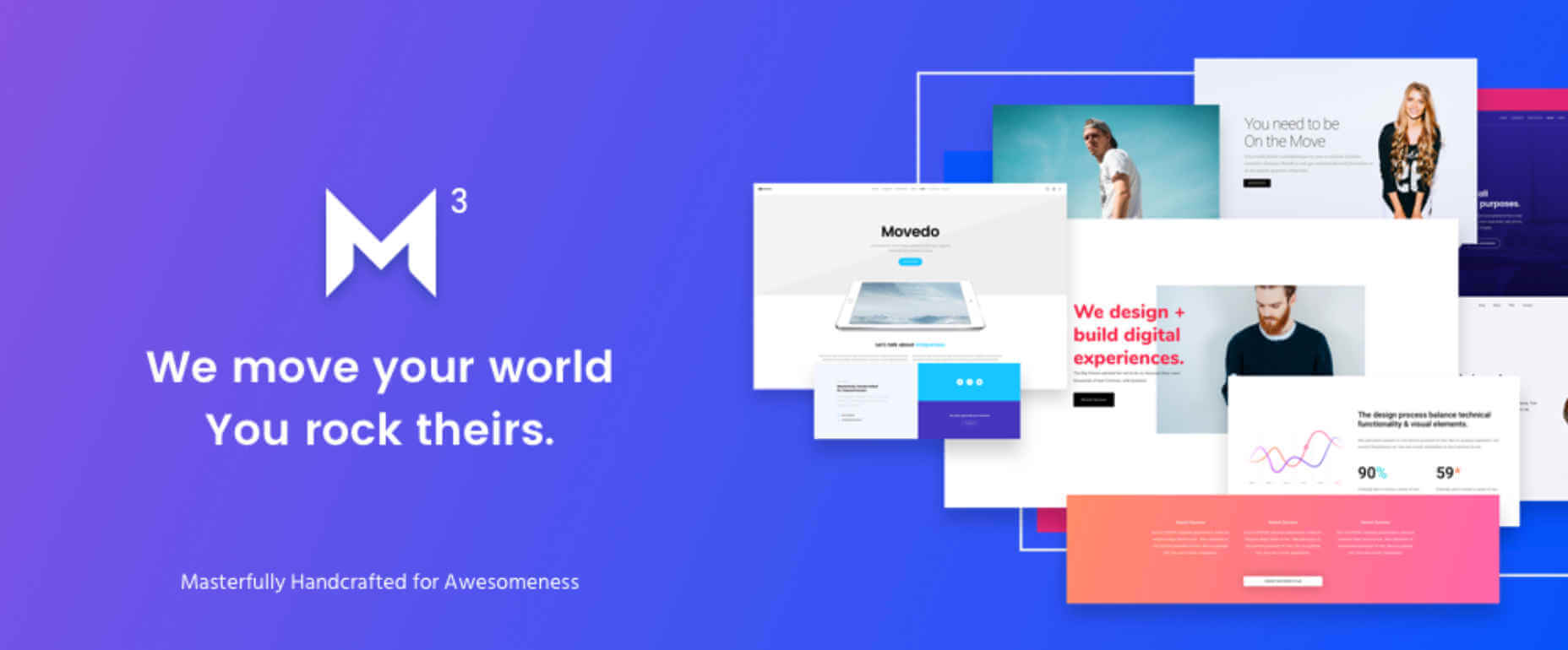
Categories: Others Tags:

What does “revert” do in CSS?

January 28th, 2020 No comments

Miriam Suzanne has a Mozilla Developer video on the subject. The revert value is fairly new, supported in Firefox and Safari, but not yet in Chrome-world. We’ve already got a couple of related keywords that work on any property which are meant to help control inheritance and reset values.

The difference is small, but important: unset allows inheritance, while initial does not.

Miriam makes the case that revert is actually the most useful of them because it “takes user and user-agent styles into consideration.”

I don’t disagree. But (and I hate to say this) I do think we need a fourth option, one that has the forcing power of initial, but the UA stylesheet respect of revert. Something like…

.button {
  all: default; /* Not real! */

  /* New styles starting from UA base */
}

These keywords work with any property, but I think using all is the most compelling. It’s a way to wipe out all styles on an element to start with a blank slate. That said, none of the three options is quite good enough for that use case. The unset and revert values aren’t good enough because they still allow inheritance and so doesn’t wipe out styles well enough. The initial value is too strong in that it wipes out defaults you might not expect, like making a

inline instead of block.

The post What does “revert” do in CSS? appeared first on CSS-Tricks.

Categories: Designing, Others Tags: