Archive

Archive for January, 2020

Oscars 2020: Oscars in Illustrations

January 22nd, 2020 No comments
Oscars 2020

Get ready movie buffs and cinephiles because the 92nd Academy Awards are just around the corner. There is now less than a month left for the short, buff and golden guy to find himself in somebody’s hands.

The nominees for the Oscars 2020 were announced last week and people have already started their own “And the Oscar goes to..”s among themselves. It’s going to be a tough year to guess who is going to win what with so many beautiful pieces like Joker, Parasite, The Irishman, Marriage Story, etc. The bets are on and folks are waiting for the big night over at the Dolby Theatre to see who will actually take home the Oscar statuette.

Oscars 2020

The Oscar winner contests have started already with attractive prizes on the end. JotForm is giving away a cool iPad Mini for guessing the most Oscar wins correctly, you can test your movie skills and win an iPad Mini with the form below

There have been many mind-blowing movies that won some hardware throughout history. An amazing designer from Mumbai, India, Nirav Khant, (Dribbble, Instagram) went through the alphabet & numbers with the related movie title and created amazing illustrations.

Let’s enjoy his great artwork!

Oscar Illustrations for letters through A-Z

The Artist

The Artist
Source: Dribbble

Ben-Hur

Ben-Hur
Source: Dribbble

Chicago

Chicago
Source: Dribbble

Dunkirk

Dunkirk
Source: Dribbble

E.T. the Extra-Terrestrial

E.T. the Extra-Terrestrial
Source: Dribbble

Forrest Gump

Forrest Gump
Source: Dribbble

Gandhi

Gandhi
Source: Dribbble

The Hurt Locker

The Hurt Locker
Source: Dribbble

Inception

Inception
Source: Dribbble

Jurassic Park

Jurassic Park
Source: Dribbble

King Kong

King Kong
Source: Dribbble

The Lord of the Rings: The Return of the King

The Lord of the Rings: The Return of the King
Source: Dribbble

Mad Max: Fury Road

Mad Max: Fury Road
Source: Dribbble

No Country for Old Men

No Country for Old Men
Source: Dribbble

On the Waterfront

On the Waterfront
Source: Dribbble

Pan’s Labyrinth

Pan's Labyrinth
Source: Dribbble

The Queen

The Queen
Source: Dribbble

Rocky

Rocky
Source: Dribbble

Schindler’s List

Schindler's List
Source: Dribbble

Titanic

Titanic
Source: Dribbble

Unforgiven

Unforgiven
Source: Dribbble

Vice

Vice
Source: Dribbble

Whiplash

Whiplash
Source: Dribbble

X-Men: Days of Future Past

X-Men: Days of Future Past
Source: Dribbble

Yankee Doodle Dandy

Yankee Doodle Dandy
Source: Dribbble

Zootopia

Zootopia
Source: Dribbble

Oscar Illustrations for numbers through 0-9

Zero Dark Thirty

Zero Dark Thirty
Source: Dribbble

One Flew Over the Cuckoo’s Nest

One Flew Over the Cuckoo's Nest
Source: Dribbble

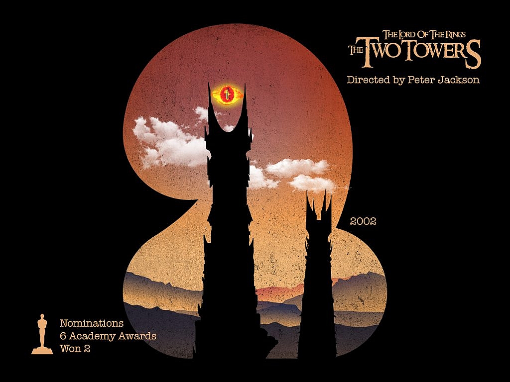
The Lord of the Rings: The Two Towers

The Lord of the Rings: The Two Towers
Source: Nirav Khant Dribbble

Three Billboards Outside Ebbing, Missouri

Three Billboards Outside Ebbing, Missouri
Source: Nirav Khant Dribbble

Born on the Fourth of July

Born on the Fourth of July
Source: Nirav Khant Dribbble

Five Easy Pieces

Five Easy Pieces
Source: Nirav Khant Dribbble

The Sixth Sense

The Sixth Sense
Source: Nirav Khant Dribbble

Se7en

Se7en
Source: Nirav Khant Dribbble

The Hateful Eight

The Hateful Eight
Source: Nirav Khant Dribbble

District 9

District 9
Source: Nirav Khant Dribbble

What do you think about these amazing illustrations about the all-time great Oscar winners? Who you got for Oscars 2020? Feel free to share your thoughts in the comments section below 🙂

Food photo created by freepik – www.freepik.com

Categories: Others Tags:

How Much Does a Domain Cost & How to Get One

January 22nd, 2020 No comments

If you are planning to build a website, then the first two things you need to purchase, a domain and web hosting.

A domain name is your website’s address on the internet and web hosting where all your website’s files are stored.

There are over hundreds of domain extensions available. The cost of a domain name depends on extensions which are called top-level domain. These domain extensions are used for different purposes. For example, a .com domain is mostly used by commercial businesses, the .org domain is used for no-profit organizations.

Before registering a domain, you need to know the difference between domain extensions, for example, .net vs .com.

In this article, we will discuss what is a domain, how much does a domain cost and how to get a domain name.

Don’t have a website yet? Read our guide on how to start a website in a few minutes.

What’s in a Domain Name?

Each of the domain names contains two parts: the top-level domain; another one is the second-level domain.

As an example, in “Apple.com,” “.com” is the top-level domain, “Apple” is the second-level domain.

Let me explain:

The top-level domain: The top-level domain, also known as a domain extension, is a part that comes after the dot. The most popular domain extensions are .com, .org, .net, etc.

These domain extensions are used for different purposes, for example, .org extension is used for non-profit organizations, .edu is used by educational websites.

However, if your business is located locally, you can use country-specific extensions, such as .us for the United States, .co.uk for the United Kingdom, etc.

Second-level domain: The second-level domain is found before the dot sign. This is basically your website’s address. For example, in the domain “Apple.com”, “Apple” is the second-level domain.

Now, let’s see how to get a domain name.

How to Get a Domain Name (Step by Step Guide)

Getting a domain name is a very straightforward process. First, you need to choose a domain name that you want to use for your website. Then, purchase your domain from a domain registrar.

A .com domain costs around $10-$14 per year. And you need to pay $9 per month for web hosting. It’s expensive for beginners who are just getting started.

Fortunately, Bluehost offers a free domain registration with their hosting plans. The best thing about Bluehost is that its hosting plans are so cheap and it starts from only $2.95 per month.

Here is the step by step guide how to register a domain:

Choose a domain registrar: The first thing you need to check their domain prices. We recommend you to register your domain name with popular registrars like Bluehost, NameCheap, Domain, etc.

Search for a domain name: Most of the popular domain registrars offer a domain name availability checker tool, such as the one from Bluehost, which you can utilize to determine if a domain is available to register.

The advantage of the accessibility checker is that it will provide you suggestions for alternate domain names if yours is currently taken.

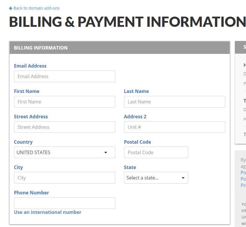
Enter your contact details: Once you select a domain, you need to enter your contact details such as your name, address, email, phone number. Each individual needs to enter their contact details in order to complete their account for the general public “WHOIS” database.

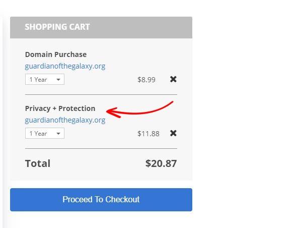
During domain registration, you can add domain privacy so that your contact details wouldn’t be visible to anyone.

Pay for your domain: Generally, a domain costs around $8-$14 for a year. It depends on the web hosting or registrar; you may be able to obtain a domain totally free by purchasing a web hosting plan from Bluehost.

Link domain and your web hosting: This step is for those who bought a domain and web hosting separately. For this, you need to link your domain with your web hosting.

Go to the domain manager, enter the CNAME details that you received from your web hosting. If you can’t find your CNAME records, you can ask your web hosting company.

If you bought a domain and hosting from the same company, you don’t need to link anything.

Install a CMS: Once purchased, you need to install a CMS like WordPress to make sure the website is working under your acquired domain. To do so, open a browser window as well as enter your domain.

Cost of a Domain Name

On average, domain name expenses are $8-$ 14, depending on several factors.

Top-level domain: Generally, high-level domains are much pricier than others. As an example, .com domains are usually much more costly than .info or.co domain names.

Most popular names: Sometimes the domain prices also depend on the most popular names. These domains are called premium domains which cost $1000-$500000.

If you find a domain that is too expensive, consider choosing another name or go with other extensions.

Domain registration time-length: Usually, signing up a domain name for one-year expenses in between $6 and $16. Registering for a longer period will lower month-to-month prices. When registering your domain, try to sign up for a couple of years for a bigger discount.

Add-ons: During domain registration, you will be asked to add add-ons such as privacy protection. And of course, you need to pay an extra fee for that.

Getting a domain that somebody owns: It is possible to get a domain that is currently owned by somebody else in a bidding process, but this will cost you a lot.

Domain discount: Sometimes domain registrars offer massive discounts on certain domains. For example, GoDaddy offers a .com domain at just 99 cents throughout a special discount, where the regular price is around $14.

What’s the difference between a domain and a website?

A domain name is basically your website address on the internet. This is what people type on their web browser to reach a website. For example, Apple.com is a domain name.

On the other hand, a website is a collection of webpages organized together in a single domain name.

Read, top 10 Best web hosting reviews

Conclusion

There is no doubt that domain names are very important for your business’s success on the internet.

A top-level domain usually costs around $8-$20 per year, where you can save a lot of money if you buy a domain and hosting together. In this case, Bluehost offers the best price and they also offer free domain registration with their hosting package.

In this article, we have shared what is a domain, how much does a domain cost and how to get a domain name.

Did we miss any steps or do you have any recommendations? Do let us know in the comment section.

Categories: Others Tags:

How To Pass Data Between Components In Vue.js

January 22nd, 2020 No comments
Smashing Editorial

How To Pass Data Between Components In Vue.js

How To Pass Data Between Components In Vue.js

Matt Maribojoc

2020-01-22T13:00:00+00:002020-01-22T16:09:20+00:00

Sharing data across components is one of the core functionalities of VueJS. It allows you to design a more modular project, control data scopes, and create a natural flow of data across your app.

Unless you’re creating your entire Vue app in one component (which wouldn’t make any sense), you’re going to encounter situations where you need to share data between components.

By the end of this tutorial, you will know three ways to get this done.

Okay — let’s get right into it!

Building An App With Nuxt

With Spotify, your friends can check out what you’re jamming to. What if the rest of the Internet could experience your algo-rhythm, too? Learn how to compose your own app to share what you’re listening to on Spotify using Vue.js and Nuxt. ?

1. Using Props To Share Data From Parent To Child

VueJS props are the simplest way to share data between components. Props are custom attributes that we can give to a component. Then, in our template, we can give those attributes values and — BAM — we’re passing data from a parent to a child component!

For example, let’s say we’re working on a user profile page and want to have a child component accept a username prop. We’ll need two components.

  1. The child component accepting the prop, let’s call this AccountInfo.vue.
  2. The parent component passing the prop, let’s call this ProfilePage.vue.

Inside AccountInfo.vue, we can declare the props it accepts using the props option. So, inside the component options, let’s make it look like the following.

// AccountInfo.vue

<template>
 <div id='account-info'>
   {{username}}
 </div>
</template>
 
<script>
export default {
 props: ['username']
}
</script>

Then, to actually pass the data from the parent (ProfilePage.vue), we pass it like a custom attribute.

// ProfilePage.vue
 
<account-info username='matt' />

Now if we load our page, we can see that our AccountInfo component properly renders the value passed in by its parent.

As when working with other VueJS directives, we can use v-bind to dynamically pass props. For example, let’s say we want to set the username prop to be equal to a variable. We can accomplish this by using shorthand for the v-bind directive (or just : for short). The code would look a little like this:

<template>
 <div>
   <account-info :username="user.username" />
 </div>
</template>
 
<script>
import AccountInfo from "@/components/AccountInfo.vue";
 
export default {
 components: {
   AccountInfo
 },
 data() {
   return {
     user: {
       username: 'matt'
     }
   }
 }
}
</script>

This means that we can change our data and have any child props using that value will also update.

Tip: Always Verify Your Props

If you’re looking to write clearer Vue code, an important technique is to verify your props. In short, this means that you need to specify the requirements for your prop (i.e. type, format, and so on). If one of these requirements is not met (e.g. if the prop is passed an incorrect type), Vue will print out a warning.

Let’s say we want our username prop to only accept Strings. We would have to modify our props object to look like this:

export default {
 props: {
   username: String
 }
}

Verifying props is essential when working in large-scale Vue apps or when designing plugins. It helps ensure that everyone is on the same page and use props the way that they were intended.

For a full list of the verifications we can include on props, I’d definitely recommend checking out the official documentation for an in-depth review.

Tip: Follow Prop Naming Conventions

According to the VueJS style guide, the best way to name your props is by using camelCase when declaring them in your script and kebab-case when referencing them in template code.

The reasoning behind this is actually quite simple. In Javascript, camelCase is the standard naming convention and in HTML, it’s kebab-case.

So, Vue recommends that we stick to the norms of each language. Thankfully, Vue is able to automatically convert between the two styles so there’s no additional setup for developers.

// GOOD
<account-info :my-username="user.username" />
props: {
   myUsername: String
}
 
// BAD
<account-info :myUsername="user.username" />
props: {
   "my-username": String
}

2. Emitting Events To Share Data From Child To Parent

Now that we have data passing down the hierarchy, let’s pass it the other way: from a child component to a parent. We can’t use props, but we can use custom events and listeners.

Every Vue instance can call a .$emit(eventName) method that triggers an event. Then, we can listen for this event in the same way as any other, using the v-on directive.

Creating a Custom Event

Let’s build on our user profile example by adding a button that changes the username. Inside our child component (AccountInfo.vue), let’s create the button.

Then, when this button is clicked, we’ll emit an event called changeUsername.

<template>
 <div id='account-info'>
   <button @click='changeUsername()'>Change Username</button>
   {{username}}
 </div>
</template>
 
<script>
export default {
 props: {
   username: String
 },
 methods: {
   changeUsername() {
     this.$emit('changeUsername')
   }
 }
}
</script>

Inside the parent, we handle this event and change the user.username variable. Like we were discussing earlier, we can listen to events using the v-on directive or “@” for short.

<template>
 <div>
   <account-info :username="user.username" @changeUsername="user.username = 'new name'"/>
 </div>
</template>

Let’s try it out. You should see that when you click the button, the username changes to “new name”.

Tip: Custom Events Can Accept Arguments

The most common use case for passing arguments to your events is when you want a child component to be able to set a specific value for its prop. You never want to directly edit the value of a prop from the component itself.

However, luckily we can use pass arguments with our custom events to make the parent component change values.

Let’s say we want to modify the changeUsername event so that we can pass it a value.

The $emit method takes an optional second parameter for arguments. So all we do is add our new username value after the name of our event.

this.$emit('changeUsername', 'mattmaribojoc')

Then, in our parent component, we can either access these values inline by using a special $event variable, or we can write a handler method that takes a parameter.

<account-info :username="user.username" @changeUsername="user.username = $event"/>
 
OR 
 
<account-info :username="user.username" @changeUsername="changeUsername($event)"/>
 
export default {
...
methods: {
   changeUsername (username) {
     this.user.username = username;
   }
}
}

3. Using Vuex To Create An Application-Level Shared State

Okay — we know how to share data between parents/children, but what about other components? Do we have to create an extremely complex hierarchy system if we want to pass data?

Thankfully not. The wonderful Vuex state management library has been simplifying developers’ lives for years. In short, it creates a centralized data store that is accessible by all components.

In the methods we used previously (props / emitting events), each component has its own data state that we then share between components. However, Vuex lets us extract all the shared data into a single state that each component can access easily. This shared state is called a store.

Let’s try it out.

Because Vuex is separate from the core code of Vue, we’ll first have to install and import it into our project. First, we’ll have to run npm install vuex --save inside our project CLI.

Then, create a src/store folder with an index.js file that contains the following code.

// store/index.js
 
import Vue from "vue";
import Vuex from "vuex";
 
Vue.use(Vuex);
 
export default new Vuex.Store({
 state: {},
 getters: {},
 mutations: {},
 actions: {}
});

To include this in our root Vue instance, we have to import our store/index.js file and pass it in our Vue constructor.

// main.js
 
import store from "./store";
 
new Vue({
  store,
  ...

Accessing Vue Store Inside Components

Since we added our Vuex store onto our root Vue instance, it gets injected into all of the root’s children. If we want to access the store from a component, we can via this.$store.

Now, let’s dive into the specifics of each of the four parts of a Vuec store.

1. State

The Vuex state is an object that contains application-level data. All Vue instances will be able to access this data.

For our store, let’s create a user object that stores some more user profile data.

export default new Vuex.Store({
 state: {
   user: {
     username: 'matt',
     fullName: 'Matt Maribojoc'
   }
 },
 getters: {},
 mutations: {},
 actions: {}
});

We can access this data inside any instance component like this.

mounted () {
   console.log(this.$store.state.user.username);
},

2. Getters

We use Vuex getters to return a modified value of state data. A good way to think of getters is to treat them like computed properties. For example, getters, like computed properties, cache their results and only re-evaluate when a dependency is modified.

Building onto our earlier store, let’s say we want to make a method that returns a user’s first name based off the full name attribute.

getters: {
   firstName: state => {
     return state.user.fullName.split(' ')[0]
   }
 }

Vuex getter properties are available to components on the store.getters object.

mounted () {
   console.log(this.$store.getters.firstName);
}
Tip: Know the Default Getter Arguments

By default, Vuex getters accept two arguments.

  1. state — the state object for our application;
  2. getters — the store.getters object, meaning that we can call other getters in our store.

Every getter you declare will require the first state argument. And depending on how you design your code, your getters can reference each other using the second ‘getters’ argument.

Let’s make a last name getter that simply removes our first name value from our full name state property. This example would require both the state and getters objects.

lastName (state, getters) {
     return state.user.fullName.replace(getters.firstName, '');
}
Tip: Pass Custom Arguments to Vuex Getters

Another cool feature of getters is that we can pass them custom arguments by making our getter return a method.

prefixedName: (state, getters) => (prefix) => {
     return prefix + getters.lastName;
}
 
// in our component
console.log(this.$store.getters.prefixedName("Mr."));

3. Mutations

Mutations are the only way to properly change the value of the state object. An important detail to note is that mutations must be synchronous.

Like getters, mutations always accept the Vuex state property as their first argument. They also accept a custom argument — called a payload — as the second argument.

For example, let’s make a mutation to change a user’s name to a specific value.

mutations: {
   changeName (state, payload) {
     state.user.fullName = payload
   }
},

Then, we can call this method from our component using the store.commit method, with our payload as the second argument.

this.$store.commit("changeName", "New Name");

More often than not, you are going to want your payload to be an object. Not only does this mean that you can pass several arguments to a mutation, but also, it makes your code more readable because of the property names in your object.

changeName (state, payload) {
     state.user.fullName = payload.newName
}

There are two different ways to call mutations with a payload.

  1. You can have the mutation type as the first argument and the payload as the second.
  2. You can declare pass a single object, with one property for the type and another for the payload.
this.$store.commit("changeName", {
       newName: "New Name 1",
});
 
     // or
 
 this.$store.commit({
       type: "changeName",
       newName: "New Name 2"
});

There isn’t a real difference between how the two work so it’s totally up to personal preference. Remember that it’s always best to be consistent throughout your entire project, so whichever one you choose, stick with it!

4. Actions

In Vuex, actions are fairly similar to mutations because we use them to change the state. However, actions don’t change the values themselves. Instead, actions commit mutations.

Also, while Vuex mutations have to be synchronous, actions do not. Using actions, we can call a mutation after an API call, for example.

Whereas most of the Vuex handlers we’ve seen accept state as their main parameter, actions accept a context object. This context object allows us to access the properties in our Vuex store (e.g. state, commit, getters).

Here’s an example of a Vuex action that waits two seconds and then commits the changeName mutation.

actions: {
   changeName (context, payload) {
     setTimeout(() => {
       context.commit("changeName", payload);
     }, 2000);
   }
}

Inside our components, we use the store.dispatch method in order to run our function. We pass arguments just like we did with mutations. We declare the type and we pass any custom arguments in the second argument.

this.$store.dispatch("changeName", {
      newName: "New Name from Action"
});

Wrapping Up

Now, you should know three different ways to share data across components in VueJS: props, custom events, and a Vuex store.

I hope this tutorial helped give you some more insight into some different Vue methods and best practices. Let me know how you’ve implemented them into your projects!

Further Reading

If you’re interested in going even deeper into the technical side/capabilities of each technique, here are some great places to start.

(dm, yk, il)
Categories: Others Tags:

28 Droste Effect Examples

January 22nd, 2020 No comments
Droste effect

The Droste Effect is used to classify images or photos that are recurring within themselves. On paper, this goes on forever but in reality, it only goes as far as the resolution allows.

The term stems from the Dutch Cacao brand with the same name. In 1904, the Droste used an image of a nun holding a tray of hot cacao and a box of Droste Cacao which had the same image on it. It was created by the artist Jan Misset. It quickly became the signature design of the company and later on any recurring image or photo was called as Droste.

Interestingly, it wasn’t the first time recurring imagery was used but the Droste Powder Cacao was when it was first named. The Droste effect was used in some art pieces in medieval periods as well.

Famous Droste Powder Cacao package

Creating the Droste Effect used to be a little complicated but thanks to tools like Photoshop it’s relatively simple to do. There are some tools other than Photoshop dedicated to the Droste effect but usually, they also break the images and the outcome is less than ideal compared to Droste Effects created with Photoshop.

Spiraling Droste Examples

Source:
Source: Flickr
Source: Flickr
Source: Flickr
Source: Flickr
Source: Flickr
Source: Flickr
Source: Flickr
Source: Flickr
Source: Flickr
Source: Flickr

Plain Droste Effect

Source: Flickr
Source: Flickr
Source: Flickr
Source: Flickr
Source: Flickr
Source: Flickr
Source: Flickr
Source: Flickr
Source: Flickr
Source: Flickr
Source: Flickr
Source: Flickr
Source: Flickr
Source: Flickr
Source: Flickr

Bonus for Classic Rock Lovers: Pink Floyd’s First Double Album from 1969 Ummagumma’s Cover

Source: Pinterest

Categories: Others Tags:

What Does 5G Mean for Web Designers?

January 22nd, 2020 No comments

However, 5G isn’t just set to have an impact on mobile browsing. Changes in mobile connectivity will have an impact on web design too.

As a web designer, it’s up to you to consider how the latest connectivity tools will impact the way users browse the web. Additionally, you may find that you have more space to explore the advantages of using larger content (like 4K video) within a client’s website.

Here’s how you can prepare for the fifth generation of mobile browsing.

5G: What’s All The Excitement About?

Before you can understand how 5G is going to transform your web design process, you’ll need to gain a better understanding of the technology overall.

5G is the fifth generation of mobile technology. It promises faster data upload and download speeds, more stable connections, and wider coverage overall. Compared to 4G, 5G can deliver speeds 10 to 20 times faster in real-world conditions. That means that users can load pages and files in a fraction of a second.

5G was created to handle the growing volume of data in the current environment. As video and music streaming increases, existing spectrum bands are increasingly congested. People are struggling to get the connectivity that they need. With 5G, we can create a more efficient mobile internet.

5G isn’t just about speed though. One of the biggest benefits of this new technology is the fact that it can offer dramatically reduced latency. In other words, there’s minimal time delay between a website sending information to a phone, and that data arriving where it needs to be. That’s even true for a site like this that’s full of rich content.

It’s the lack of latency that could potentially transform each web design strategy through incredible user flow.

What Does 5G Mean for Website Design?

So, how will 5G impact the way that you design client websites?

The most obvious changes come from the increased data transfer speeds (lower latency).

When you don’t have to worry about lag on a website disrupting the user experience, you can experiment with a lot more content. Introducing complex visual elements to your site becomes simpler.

We’re not just talking about image-heavy sites either, things like that already exist. Designers often use 4G image optimization technology like IMGIX to ensure that those websites work well on a smartphone and other mobile devices. Alternatively, 5G’s capabilities will see websites taking greater advantage of video. Not just any video, 4K content. While 4K video has been around on the web for a while, it hasn’t been used much by web designers. That’s because the loading times are often astronomical – particularly on mobile connections.

However, 5G could see 4K becoming a much more common feature. You could embed it into the background of your site or introduce it instead of a hero image.

Let’s take a closer look at how 5G could permit web designers to create some truly unique and impressive designs for their clients.

1. Videos Will Stream Faster

As mentioned above, one of the main ways that 5G will affect web design is that it will allow videos to stream much faster.

Experts predict that 5G wireless technology will be anywhere between 10 and 100 times faster than what we have right now. It could even be more reliable than running the cable directly into your home.

For web designers, this means that the opportunities are practically endless.

There’s no limit to what you could do with video, from immersive background content to videos on the home page of a site that highlights a product or service.

While designers can set videos not to play automatically to accommodate those with slower connection speeds, the opportunity will be there to deliver rich content immediately to visitors. Check out the background images for Kuhl & Han, for instance, and imagine how amazing they could be with 5G:

2. Stronger Mobile Experiences

Mobile responsivity is already crucial to frictionless UX.

Today’s consumers are spending much more time on their smartphones. That means that designers need to think carefully about how websites are accessed on the go.

However, when 5G becomes more commonplace, there will be even more demand for stronger mobile experiences. You’ll need to think about how you can adapt your website to show up seamlessly whether your audience is using a set of smart glasses or just their phone.

The good news is that 5G should ensure that there doesn’t need to be as much of a gap between the experiences that people get on a desktop and those available on their mobile devices.

Designers should be able to create a consistent UX for customers wherever they are in the age of 5G.

3. Virtual and Augmented Reality

Finally, VR (Virtual Reality) and AR (Augmented Reality) have already begun to gain traction in recent years. Designers have begun to experiment with tools that allow them to place 3D videos into websites, or AR apps into product pages.

With an augmented reality app on a website, you could allow visitors to place piece of furniture in the environment of their living room or bedroom. This means that more customers can see what an investment will look like before they buy.

With virtual reality in the future, customers may even be able to step into a scene on your website and walk through a room decorated with your products.

Up until now, AR and VR have mostly been used by app developers to deliver more exciting gaming experiences. However, with 5G on the horizon, there’s nothing to stop web designers from creating immersive user experiences on a website too.

5G’s enhanced speed and reduced latency will open the door to unlimited new experiences. Users could even scan a QR code using a company’s website and unbox an item when they’re in-store with the app on their phone.

What to Remember When Designing for 5G

The arrival of 5G could bring a lot of exciting opportunities to today’s web designers. However, it’s important to remember that there are some challenges to overcome too.

For instance, the first thing that web designers need to know is that not all of the users visiting a website will have 5G right away. Although mobile operators are planning on delivering more 5G connections in 2020 and beyond – there’s a long way to go before it’s mainstream.

The technology is still in the early stages and will be available in only the biggest cities and towns, to begin with. Once the towers have been built to send out 5G signals, cell phones need to adapt and create the right chips to handle these new lightning-fast capabilities.

Carriers are still working on perfecting the systems that they’ll use to capture higher speeds and use them properly. There are even concerns about the health aspects of 5G, and whether exposure to a new frequency is bad for us in the long-term.

Once locations have begun to embrace 5G properly, and mobile developers have rolled out the right tech, you’ll also need to wait for customers to buy new phones. The new connections won’t work with old 4G enabled devices.

That means that we’re likely to have a combination of 5G and 4G users accessing the same website designs for a long time before 5G becomes wide-spread.

Getting Ready for 5G

While it’s essential for web designers to understand and adapt to the new potential that 5G has to offer, that doesn’t mean catering exclusively to 5G. Remember: There are parts of the world in which 3G is not only standard, but relatively new. Focusing too much on this new technology will put any user that isn’t capable of accessing those speeds at a serious disadvantage.

Instead, you’ll deliver better experiences overall if you still focus the majority of your efforts on 4G and typical connections for a while. Explore the opportunities that 5G has to offer and consider implementing more things like 4k videos and VR experiences over time.

However, as you introduce web design elements intended for 5G users remember to make them optional. Don’t start videos playing automatically, or make it impossible to browse a website unless you have access to AR.

We’ll be living in a world of hybrid connectivity for a while…

Source

Categories: Designing, Others Tags:

4 Tips on How to Simplify Your Website Design And Win Over New Customers

January 22nd, 2020 No comments

We’ve all seen a website so busy and unorganized that it literally makes every fiber in your being cringe.

I’m talking 0 effort in maintaining a color scheme, fonts galore, tons of pictures everywhere, no organization, and just terrible design overall.

That’s why today we’re going to go over 4 tips that explain how you can simplify your website and win over new customers!

4 Changes You Can Implement Today to Simplify Your Website Design and Make It Better

You will lose clients faster than the speed of light with a terribly cluttered website design.

I mean, just take a look at the next two examples I’m gonna show you.

So here we have a busy website, with no specific focal point, and you don’t really know where to look, and it immediately stresses you out. You lose the client because he clicks off your site.

But then, we compare it to this…

[source]

When I look at this minimalist website design, especially compared to the other, my eyes are immediately set to ease. It’s literally like the inner designer in me just had the most amazing glass of wine and I’m just enjoying myself, admiring the design.

Alright, enough comparisons. Let’s just get things rolling over here.

Into the 4 tips we dive!

1. Simplify the Text

[source]

The most important page of all your website will be your homepage.

It’s the page that will set the tone for the rest of your site.

So it’s important that you get across what you’re trying to say quickly, efficiently, and simply.

There’s no need to clutter your website by writing so much text.

Most people just skim your website anyway! So, write your main text in bold headlines, add some details below, but not too much.

Only a small percentage of people will read the entire thing, so use your headlines to your advantage wisely!

2. Stick To A Color Scheme

[source]

A good color scheme always warms my heart, like grandma’s homemade apple pie on a summer’s day.

Maintaining a color scheme amongst your text, background elements, and images will automatically make you look more organized.

By using a color scheme, you can also bring focus to certain elements and manipulate the eye to go where you want it to.

By no means do you ever want a green font on a bright red background with orange and silver elements floating around the background. Unless you want you website to look like Christmas got a little wild at the Christmas staff party and vomited all over your website.

Go online or on any design inspiration website and type in popular color schemes on 2020, or color palettes, and save time and effort by finding beautiful palettes!

3. Limit Your Homepage To The Essentials

[source]

This kinda goes hand in hand with our first tip about limiting text.

Limit everything on the homepage and only keep what is essential.

Ask yourself, “What am I trying to achieve with this website and the homepage? What am I trying to show the customer?”

When you find the answer to that question, design your homepage accordingly.

Don’t add secondary/tertiary elements to the first bit of the homepage.

That’s what your menu tab and other secondary pages are for!

And speaking of menu tabs…

4. Scale Down Your Menu Tabs

[source]

For the love of simple design, keep your menu bar clean.

You don’t need a menu tab for ?every ?single ? element ?of your website.

We’ve seen this way too many times than we’d personally like to admit, but some people give you the option of clicking on 20 different tabs.

As an alternative, create drop-down menu tabs where you have subcategories.

This will keep things squeaky-clean and peaceful for the eyes to look at.

No one will be frantically looking around for what they’re trying to find.

When things on your site and aesthetically pleasing and well-organized, your sales will go up.

And That’s It!

I hope you found these 4 simple tips helpful and inspiring for your next minimalist website design.

Until next time,

Keep it simple and stay creative, folks!

Read More at 4 Tips on How to Simplify Your Website Design And Win Over New Customers

Categories: Designing, Others Tags:

Oscars 2020: Oscars in Illustrations

January 22nd, 2020 No comments
Oscars 2020

Get ready movie buffs and cinephiles because the 92nd Academy Awards are just around the corner. There is now less than a month left for the short, buff and golden guy to find himself in somebody’s hands.

The nominees for the Oscars 2020 were announced last week and people have already started their own “And the Oscar goes to..”s among themselves. It’s going to be a tough year to guess who is going to win what with so many beautiful pieces like Joker, Parasite, The Irishman, Marriage Story, etc. The bets are on and folks are waiting for the big night over at the Dolby Theatre to see who will actually take home the Oscar statuette.

Oscars 2020

The Oscar winner contests have started already with attractive prizes on the end. JotForm is giving away a cool iPad Mini for guessing the most Oscar wins correctly, you can test your movie skills and win an iPad Mini with the form below

There have been many mind-blowing movies that won some hardware throughout history. An amazing designer from Mumbai, India, Nirav Khant, (Dribbble, Instagram) went through the alphabet & numbers with the related movie title and created amazing illustrations.

Let’s enjoy his great artwork!

Oscar Illustrations for letters through A-Z

The Artist

The Artist
Source: Dribbble

Ben-Hur

Ben-Hur
Source: Dribbble

Chicago

Chicago
Source: Dribbble

Dunkirk

Dunkirk
Source: Dribbble

E.T. the Extra-Terrestrial

E.T. the Extra-Terrestrial
Source: Dribbble

Forrest Gump

Forrest Gump
Source: Dribbble

Gandhi

Gandhi
Source: Dribbble

The Hurt Locker

The Hurt Locker
Source: Dribbble

Inception

Inception
Source: Dribbble

Jurassic Park

Jurassic Park
Source: Dribbble

King Kong

King Kong
Source: Dribbble

The Lord of the Rings: The Return of the King

The Lord of the Rings: The Return of the King
Source: Dribbble

Mad Max: Fury Road

Mad Max: Fury Road
Source: Dribbble

No Country for Old Men

No Country for Old Men
Source: Dribbble

On the Waterfront

On the Waterfront
Source: Dribbble

Pan’s Labyrinth

Pan's Labyrinth
Source: Dribbble

The Queen

The Queen
Source: Dribbble

Rocky

Rocky
Source: Dribbble

Schindler’s List

Schindler's List
Source: Dribbble

Titanic

Titanic
Source: Dribbble

Unforgiven

Unforgiven
Source: Dribbble

Vice

Vice
Source: Dribbble

Whiplash

Whiplash
Source: Dribbble

X-Men: Days of Future Past

X-Men: Days of Future Past
Source: Dribbble

Yankee Doodle Dandy

Yankee Doodle Dandy
Source: Dribbble

Zootopia

Zootopia
Source: Dribbble

Oscar Illustrations for numbers through 0-9

Zero Dark Thirty

Zero Dark Thirty
Source: Dribbble

One Flew Over the Cuckoo’s Nest

One Flew Over the Cuckoo's Nest
Source: Dribbble

The Lord of the Rings: The Two Towers

The Lord of the Rings: The Two Towers
Source: Nirav Khant Dribbble

Three Billboards Outside Ebbing, Missouri

Three Billboards Outside Ebbing, Missouri
Source: Nirav Khant Dribbble

Born on the Fourth of July

Born on the Fourth of July
Source: Nirav Khant Dribbble

Five Easy Pieces

Five Easy Pieces
Source: Nirav Khant Dribbble

The Sixth Sense

The Sixth Sense
Source: Nirav Khant Dribbble

Se7en

Se7en
Source: Nirav Khant Dribbble

The Hateful Eight

The Hateful Eight
Source: Nirav Khant Dribbble

District 9

District 9
Source: Nirav Khant Dribbble

What do you think about these amazing illustrations about the all-time great Oscar winners? Who you got for Oscars 2020? Feel free to share your thoughts in the comments section below 🙂

Food photo created by freepik – www.freepik.com

Categories: Others Tags:

Edgium

January 22nd, 2020 No comments

January 15th, 2020 was the day Microsoft Edge went Chromium. A drop in browser engine diversity. There is a strong argument to be made that’s not good for an ecosystem. Looked at another way, perhaps not so bad:

Perhaps diversity has just moved scope. Rather than the browser engines themselves representing diversity, maybe forks of the engnies we have left can compete against each other. Maybe starting from a strong foundation is a good place to start innovating.

It’s awesome when browsers compete on features that are great for users but don’t affect web standards. Great password managers, user protection features, clever bookmarking ideas, reader modes, clean integrations with payment APIs, free VPNs, etc.

That’s sort of the road that Opera went down when they went Chromium, then they turned into a payday loan company. (WTF, right?!) The layoffs at Mozilla don’t seem dire, but don’t signal anything particularly good either.

I’d say it’s also significant that Microsoft’s deprecated engines were not open source while Chromium is. While it may be in Google’s hands, open source is still a good thing and opens the door to outside involvement, which had done great things, like bringing us CSS grid.

Jeremy Keith, paraphrasing Amber Wilson:

The bar of unity is being raised. Now, a number of separate browser makers—Google, Samsung, Microsoft—not only collaborate on standards but also on implementation, sharing a codebase.

So these browsers are still competing, but the competition is no longer happening at the level of the rendering engine.

Jeremy isn’t convinced though. We’re down to essentially a two-party political system, but with one side having a crushing majority.

Checks and balances exist, but they’re in peril.

Just as the world is pouring one out for dying browsers, a new totally-from-scratch browser comes out of nowhere: Flow. PPK has an interview with the creator, Piers Wombwell. It’s not open source. You can’t even download it. But it exists! If I was a betting man I would have lost a lot of money on a bet that nobody would ever seriously try to take on building another browser from scratch.

I’m not even sure what I think about all this. Part of me thinks about Walmart. I feel like I’ve spent the last 25 years listening to everyone around me be so mad about Walmart. They open up on the outskirts of an old town and sell their cheap shoes and cheap bikes and the nice little shoestore and long-standing bike store downtown go out of business. The face of business just kind of changed. The face of browsers has changed too, and I don’t have the energy to be mad about it for another 25 years. That’s not to excuse companies that have done and do foul crap, it’s more to say all this is complicated and tiring.

The post Edgium appeared first on CSS-Tricks.

Categories: Designing, Others Tags:

Searching the Jamstack

January 22nd, 2020 No comments

Here’s Raymon Camden on adding site search functionality to a site that is statically hosted. A classic trick! Just shoot ’em to Google and scope the results to your site:

<form action="https://www.google.com/search" method="get">
    <input type="search" name="q" value="site:https://www.raymondcamden.com " autofocus size="50">
    <input type="submit" value="Search">
</form>

I’d probably use JavaScript to inject that site: stuff before sending them over just so the search field doesn’t have that weird prefilled stuff in there, which might be off-putting. We covered that here.

Raymond then gets into Google Custom Search Engines, which is their product to provide scoped search on your own site. It’s desirable because it’s Google’s search for your own site. Whatever you might think of Google, they have great search results. That’s the thing. Even if you aren’t a Jamstack site and can freely use your own server to query content on your site, chances are your search results aren’t as good as Google’s.

Say you reach for another search solution… Solr, Lunr, ElasticSearch, Algolia. They are all kinda nice in their own way. The trick is making sure they have enough data for them to return good results, beyond just the content. You’ll never have an entire internet’s worth of backlinks to leverage, but ideally, you can factor in analytics data at the very least.

Direct Link to ArticlePermalink

The post Searching the Jamstack appeared first on CSS-Tricks.

Categories: Designing, Others Tags: