Archive

Archive for February, 2020

Building an Images Gallery using PixiJS and WebGL

February 12th, 2020 No comments

Sometimes, we have to go a little further than HTML, CSS and JavaScript to create the UI we need, and instead use other resources, like SVG, WebGL, canvas and others.

For example, the most amazing effects can be created with WebGL, because it’s a JavaScript API designed to render interactive 2D and 3D graphics within any compatible web browser, allowing GPU-accelerated image processing.

That said, working with WebGL can be very complex. As such, there’s a variety of libraries that to make it relatively easier, such as PixiJS, Three.js, and Babylon.js, among others.We’re going to work with a specific one of those, PixiJS, to create a gallery of random images inspired by this fragment of a Dribbble shot by Zhenya Rynzhuk.

This looks hard, but you actually don’t need to have advanced knowledge of WebGL or even PixiJS to follow along, though some basic knowledge of Javascript (ES6) will come in handy. You might even want to start by getting familiar with the basic concept of fragment shaders used in WebGL, with The Book of Shaders as a good starting point.

With that, let’s dig into using PixiJS to create this WebGL effect!

Initial setup

Here’s what we’ll need to get started:

  1. Add the PixiJS library as a script in the HTML.
  2. Have a element (or add it dynamically from Javascript), to render the application.
  3. Initialize the application with new PIXI.Application(options).

See, nothing too crazy yet. Here’s the JavaScript we can use as a boilerplate:

// Get canvas view
const view = document.querySelector('.view')
let width, height, app

// Set dimensions
function initDimensions () {
  width = window.innerWidth
  height = window.innerHeight
}

// Init the PixiJS Application
function initApp () {
  // Create a PixiJS Application, using the view (canvas) provided
  app = new PIXI.Application({ view })
  // Resizes renderer view in CSS pixels to allow for resolutions other than 1
  app.renderer.autoDensity = true
  // Resize the view to match viewport dimensions
  app.renderer.resize(width, height)
}

// Init everything
function init () {
  initDimensions()
  initApp()
}

// Initial call
init()

When executing this code, the only thing that we will see is a black screen as well as a message like this in the if we open up the console:
PixiJS 5.0.2 - WebGL 2 - http://www.pixijs.com/.

We are ready to start drawing on the canvas using PixiJS and WebGL!

Creating the grid background with a WebGL Shader

Next we will create a background that contains a grid, which will allow us to clearly visualize the distortion effect we’re after. But first, we must know what a shader is and how it works.I recommended The Book of Shaders earlier as a starting point to learn about them and this is those concepts will come into play. If you have not done it yet, I strongly recommend that you review that material, and only then continue here.

We are going to create a fragment shader that prints a grid background on the screen:

// It is required to set the float precision for fragment shaders in OpenGL ES
// More info here: https://stackoverflow.com/a/28540641/4908989
#ifdef GL_ES
precision mediump float;
#endif

// This function returns 1 if `coord` correspond to a grid line, 0 otherwise
float isGridLine (vec2 coord) {
  vec2 pixelsPerGrid = vec2(50.0, 50.0);
  vec2 gridCoords = fract(coord / pixelsPerGrid);
  vec2 gridPixelCoords = gridCoords * pixelsPerGrid;
  vec2 gridLine = step(gridPixelCoords, vec2(1.0));
  float isGridLine = max(gridLine.x, gridLine.y);
  return isGridLine;
}

// Main function
void main () {
  // Coordinates for the current pixel
  vec2 coord = gl_FragCoord.xy;
  // Set `color` to black
  vec3 color = vec3(0.0);
  // If it is a grid line, change blue channel to 0.3
  color.b = isGridLine(coord) * 0.3;
  // Assing the final rgba color to `gl_FragColor`
  gl_FragColor = vec4(color, 1.0);
}

This code is drawn from a demo on Shadertoy, which is a great source of inspiration and resources for shaders.

In order to use this shader, we must first load the code from the file it is in and — only after it has been loaded correctly— we will initialize the app.

// Loaded resources will be here
const resources = PIXI.Loader.shared.resources

// Load resources, then init the app
PIXI.Loader.shared.add([
  'shaders/backgroundFragment.glsl'
]).load(init)

Now, for our shader to work where we can see the result, we will add a new element (an empty Sprite) to the stage, which we will use to define a filter. This is the way PixiJS lets us execute custom shaders like the one we just created.

// Init the gridded background
function initBackground () {
  // Create a new empty Sprite and define its size
  background = new PIXI.Sprite()
  background.width = width
  background.height = height
  // Get the code for the fragment shader from the loaded resources
  const backgroundFragmentShader = resources['shaders/backgroundFragment.glsl'].data
  // Create a new Filter using the fragment shader
  // We don't need a custom vertex shader, so we set it as `undefined`
  const backgroundFilter = new PIXI.Filter(undefined, backgroundFragmentShader)
  // Assign the filter to the background Sprite
  background.filters = [backgroundFilter]
  // Add the background to the stage
  app.stage.addChild(background)
}

And now we see the gridded background with blue lines. Look closely because the lines are a little faint against the dark background color.

CodePen Embed Fallback

The distortion effect

Our background is now ready, so let’s see how we can add the desired effect (Cubic Lens Distortion) to the whole stage, including the background and any other element that we add later, like images. For this, need to create a new filter and add it to the stage. Yes, we can also define filters that affect the entire stage of PixiJS!

This time, we have based the code of our shader on this awesome Shadertoy demo that implements the distortion effectusing different configurable parameters.

#ifdef GL_ES
precision mediump float;
#endif

// Uniforms from Javascript
uniform vec2 uResolution;
uniform float uPointerDown;

// The texture is defined by PixiJS
varying vec2 vTextureCoord;
uniform sampler2D uSampler;

// Function used to get the distortion effect
vec2 computeUV (vec2 uv, float k, float kcube) {
  vec2 t = uv - 0.5;
  float r2 = t.x * t.x + t.y * t.y;
  float f = 0.0;
  if (kcube == 0.0) {
    f = 1.0 + r2 * k;
  } else {
    f = 1.0 + r2 * (k + kcube * sqrt(r2));
  }
  vec2 nUv = f * t + 0.5;
  nUv.y = 1.0 - nUv.y;
  return nUv;
}

void main () {
  // Normalized coordinates
  vec2 uv = gl_FragCoord.xy / uResolution.xy;

  // Settings for the effect
  // Multiplied by `uPointerDown`, a value between 0 and 1
  float k = -1.0 * uPointerDown;
  float kcube = 0.5 * uPointerDown;
  float offset = 0.02 * uPointerDown;
  
  // Get each channel's color using the texture provided by PixiJS
  // and the `computeUV` function
  float red = texture2D(uSampler, computeUV(uv, k + offset, kcube)).r;
  float green = texture2D(uSampler, computeUV(uv, k, kcube)).g;
  float blue = texture2D(uSampler, computeUV(uv, k - offset, kcube)).b;
  
  // Assing the final rgba color to `gl_FragColor`
  gl_FragColor = vec4(red, green, blue, 1.0);
}

We are using two uniforms this time. Uniforms are variables that we pass to the shader via JavaScript:

  • uResolution: This is a JavaScript object thaincludes {x: width, y: height}. This uniform allows us to normalize the coordinates of each pixel in the range [0, 1].
  • uPointerDown: This is a float in the range [0, 1], which allows us to animate the distortion effect, increasing its intensity proportionally.

Let’s see the code that we have to add to our JavaScript to see the distortion effect caused by our new shader:

// Target for pointer. If down, value is 1, else value is 0
// Here we set it to 1 to see the effect, but initially it will be 0
let pointerDownTarget = 1
let uniforms

// Set initial values for uniforms
function initUniforms () {
  uniforms = {
    uResolution: new PIXI.Point(width, height),
    uPointerDown: pointerDownTarget
  }
}

// Set the distortion filter for the entire stage
const stageFragmentShader = resources['shaders/stageFragment.glsl'].data
const stageFilter = new PIXI.Filter(undefined, stageFragmentShader, uniforms)
app.stage.filters = [stageFilter]

We can already enjoy our distortion effect!

CodePen Embed Fallback

This effect is static at the moment, so it’s not terribly fun just yet. Next, we’ll see how we can make the effect dynamically respond to pointer events.

Listening to pointer events

PixiJS makes it’s surprisingly simple to listen to events, even multiple events that respond equally to mouse and touch interactions. In this case, we want our animation to work just as well on desktop as on a mobile device, so we must listen to the events corresponding to both platforms.

PixiJs provides an interactive attribute that lets us do just that. We apply it to an element and start listening to events with an API similar to jQuery:

// Start listening events
function initEvents () {
  // Make stage interactive, so it can listen to events
  app.stage.interactive = true

  // Pointer & touch events are normalized into
  // the `pointer*` events for handling different events
  app.stage
    .on('pointerdown', onPointerDown)
    .on('pointerup', onPointerUp)
    .on('pointerupoutside', onPointerUp)
    .on('pointermove', onPointerMove)
}

From here, we will start using a third uniform (uPointerDiff), which will allow us to explore the image gallery using drag and drop. Its value will be equal to the translation of the scene as we explore the gallery. Below is the code corresponding to each of the event handling functions:

// On pointer down, save coordinates and set pointerDownTarget
function onPointerDown (e) {
  console.log('down')
  const { x, y } = e.data.global
  pointerDownTarget = 1
  pointerStart.set(x, y)
  pointerDiffStart = uniforms.uPointerDiff.clone()
}

// On pointer up, set pointerDownTarget
function onPointerUp () {
  console.log('up')
  pointerDownTarget = 0
}

// On pointer move, calculate coordinates diff
function onPointerMove (e) {
  const { x, y } = e.data.global
  if (pointerDownTarget) {
    console.log('dragging')
    diffX = pointerDiffStart.x + (x - pointerStart.x)
    diffY = pointerDiffStart.y + (y - pointerStart.y)
  }
}

We still will not see any animation if we look at our work, but we can start to see how the messages that we have defined in each event handler function are correctly printed in the console.

Let’s now turn to implementing our animations!

Animating the distortion effect and the drag and drop functionality

The first thing we need to start an animation with PixiJS (or any canvas-based animation) is an animation loop. It usually consists of a function that is called continuously, using requestAnimationFrame, which in each call renders the graphics on the canvas element, thus producing the desired animation.

We can implement our own animation loop in PixiJS, or we can use the utilities included in the library. In this case, we will use the add method of app.ticker, which allows us to pass a function that will be executed in each frame. At the end of the init function we will add this:

// Animation loop
// Code here will be executed on every animation frame
app.ticker.add(() => {
  // Multiply the values by a coefficient to get a smooth animation
  uniforms.uPointerDown += (pointerDownTarget - uniforms.uPointerDown) * 0.075
  uniforms.uPointerDiff.x += (diffX - uniforms.uPointerDiff.x) * 0.2
  uniforms.uPointerDiff.y += (diffY - uniforms.uPointerDiff.y) * 0.2
})

Meanwhile, in the Filter constructor for the background, we will pass the uniforms in the stage filter. This allows us to simulate the translation effect of the background with this tiny modification in the corresponding shader:

uniform vec2 uPointerDiff;

void main () {
  // Coordinates minus the `uPointerDiff` value
  vec2 coord = gl_FragCoord.xy - uPointerDiff;

  // ... more code here ...
}

And now we can see the distortion effect in action, including the drag and drop functionality for the gridd background. Play with it!

CodePen Embed Fallback

Randomly generate a masonry grid layout

To make our UI more interesting, we can randomly generate the sizing and dimensions of the grid cells. That is, each image can have different dimensions, creating a kind of masonry layout.

Let’s use Unsplash Source, which will allow us to get random images from Unsplash and define the dimensions we want. This will facilitate the task of creating a random masonry layout, since the images can have any dimension that we want, and therefore, generate the layout beforehand.

To achieve this, we will use an algorithm that executes the following steps:

  1. We will start with a list of rectangles.
  2. We will select the first rectangle in the list divide it into two rectangles with random dimensions, as long as both rectangles have dimensions equal to or greater than the minimum established limit. We’ll add a check to make sure it’s possible and, if it is, add both resulting rectangles to the list.
  3. If the list is empty, we will finish executing. If not, we’ll go back to step two.

I think you’ll get a much better understanding of how the algorithm works in this next demo. Use the buttons to see how it runs: Next will execute step two, All will execute the entire algorithm, and Reset will reset to step one.

CodePen Embed Fallback

Drawing solid rectangles

Now that we can properly generate our random grid layout, we will use the list of rectangles generated by the algorithm to draw solid rectangles in our PixiJS application. That way, we can see if it works and make adjustments before adding the images using the Unsplash Source API.

To draw those rectangles, we will generate a random grid layout that is five times bigger than the viewport and position it in the center of the stage. That allows us to move with some freedom to any direction in the gallery.

// Variables and settings for grid
const gridSize = 50
const gridMin = 3
let gridColumnsCount, gridRowsCount, gridColumns, gridRows, grid
let widthRest, heightRest, centerX, centerY, rects

// Initialize the random grid layout
function initGrid () {
  // Getting columns
  gridColumnsCount = Math.ceil(width / gridSize)
  // Getting rows
  gridRowsCount = Math.ceil(height / gridSize)
  // Make the grid 5 times bigger than viewport
  gridColumns = gridColumnsCount * 5
  gridRows = gridRowsCount * 5
  // Create a new Grid instance with our settings
  grid = new Grid(gridSize, gridColumns, gridRows, gridMin)
  // Calculate the center position for the grid in the viewport
  widthRest = Math.ceil(gridColumnsCount * gridSize - width)
  heightRest = Math.ceil(gridRowsCount * gridSize - height)
  centerX = (gridColumns * gridSize / 2) - (gridColumnsCount * gridSize / 2)
  centerY = (gridRows * gridSize / 2) - (gridRowsCount * gridSize / 2)
  // Generate the list of rects
  rects = grid.generateRects()
}

So far, we have generated the list of rectangles. To add them to the stage, it is convenient to create a container, since then we can add the images to the same container and facilitate the movement when we drag the gallery.

Creating a container in PixiJS is like this:

let container

// Initialize a Container element for solid rectangles and images
function initContainer () {
  container = new PIXI.Container()
  app.stage.addChild(container)
}

Now we can now add the rectangles to the container so they can be displayed on the screen.

// Padding for rects and images
const imagePadding = 20

// Add solid rectangles and images
// So far, we will only add rectangles
function initRectsAndImages () {
  // Create a new Graphics element to draw solid rectangles
  const graphics = new PIXI.Graphics()
  // Select the color for rectangles
  graphics.beginFill(0xAA22CC)
  // Loop over each rect in the list
  rects.forEach(rect => {
    // Draw the rectangle
    graphics.drawRect(
      rect.x * gridSize,
      rect.y * gridSize,
      rect.w * gridSize - imagePadding,
      rect.h * gridSize - imagePadding
    )
  })
  // Ends the fill action
  graphics.endFill()
  // Add the graphics (with all drawn rects) to the container
  container.addChild(graphics)
}

Note that we have added to the calculations a padding (imagePadding) for each rectangle. In this way the images will have some space among them.

Finally, in the animation loop, we need to add the following code to properly define the position for the container:

// Set position for the container
container.x = uniforms.uPointerDiff.x - centerX
container.y = uniforms.uPointerDiff.y - centerY

And now we get the following result:

CodePen Embed Fallback

But there are still some details to fix, like defining limits for the drag and drop feature. Let’s add this to the onPointerMove event handler, where we effectively check the limits according to the size of the grid we have calculated:

diffX = diffX > 0 ? Math.min(diffX, centerX + imagePadding) : Math.max(diffX, -(centerX + widthRest))
diffY = diffY > 0 ? Math.min(diffY, centerY + imagePadding) : Math.max(diffY, -(centerY + heightRest))

Another small detail that makes things more refined is to add an offset to the grid background. That keeps the blue grid lines in tact. We just have to add the desired offset (imagePadding / 2 in our case) to the background shader this way:

// Coordinates minus the `uPointerDiff` value, and plus an offset
vec2 coord = gl_FragCoord.xy - uPointerDiff + vec2(10.0);

And we will get the final design for our random grid layout:

CodePen Embed Fallback

Adding images from Unsplash Source

We have our layout ready, so we are all set to add images to it. To add an image in PixiJS, we need a Sprite, which defines the image as a Texture of it. There are multiple ways of doing this. In our case, we will first create an empty Sprite for each image and, only when the Sprite is inside the viewport, we will load the image, create the Texture and add it to the Sprite. Sound like a lot? We’ll go through it step-by-step.

To create the empty sprites, we will modify the initRectsAndImages function. Please pay attention to the comments for a better understanding:

// For the list of images
let images = []

// Add solid rectangles and images
function initRectsAndImages () {
  // Create a new Graphics element to draw solid rectangles
  const graphics = new PIXI.Graphics()
  // Select the color for rectangles
  graphics.beginFill(0x000000)
  // Loop over each rect in the list
  rects.forEach(rect => {
    // Create a new Sprite element for each image
    const image = new PIXI.Sprite()
    // Set image's position and size
    image.x = rect.x * gridSize
    image.y = rect.y * gridSize
    image.width = rect.w * gridSize - imagePadding
    image.height = rect.h * gridSize - imagePadding
    // Set it's alpha to 0, so it is not visible initially
    image.alpha = 0
    // Add image to the list
    images.push(image)
    // Draw the rectangle
    graphics.drawRect(image.x, image.y, image.width, image.height)
  })
  // Ends the fill action
  graphics.endFill()
  // Add the graphics (with all drawn rects) to the container
  container.addChild(graphics)
  // Add all image's Sprites to the container
  images.forEach(image => {
    container.addChild(image)
  })
}

So far, we only have empty sprites. Next, we will create a function that’s responsible for downloading an image and assigning it as Texture to the corresponding Sprite. This function will only be called if the Sprite is inside the viewport so that the image only downloads when necessary.

On the other hand, if the gallery is dragged and a Sprite is no longer inside the viewport during the course of the download, that request may be aborted, since we are going to use an AbortController (more on this on MDN). In this way, we will cancel the unnecessary requests as we drag the gallery, giving priority to the requests corresponding to the sprites that are inside the viewport at every moment.

Let’s see the code to land the ideas a little better:

// To store image's URL and avoid duplicates
let imagesUrls = {}

// Load texture for an image, giving its index
function loadTextureForImage (index) {
  // Get image Sprite
  const image = images[index]
  // Set the url to get a random image from Unsplash Source, given image dimensions
  const url = `https://source.unsplash.com/random/${image.width}x${image.height}`
  // Get the corresponding rect, to store more data needed (it is a normal Object)
  const rect = rects[index]
  // Create a new AbortController, to abort fetch if needed
  const { signal } = rect.controller = new AbortController()
  // Fetch the image
  fetch(url, { signal }).then(response => {
    // Get image URL, and if it was downloaded before, load another image
    // Otherwise, save image URL and set the texture
    const id = response.url.split('?')[0]
    if (imagesUrls[id]) {
      loadTextureForImage(index)
    } else {
      imagesUrls[id] = true
      image.texture = PIXI.Texture.from(response.url)
      rect.loaded = true
    }
  }).catch(() => {
    // Catch errors silently, for not showing the following error message if it is aborted:
    // AbortError: The operation was aborted.
  })
}

Now we need to call the loadTextureForImage function for each image whose corresponding Sprite is intersecting with the viewport. In addition, we will cancel the fetch requests that are no longer needed, and we will add an alpha transition when the rectangles enter or leave the viewport.

// Check if rects intersects with the viewport
// and loads corresponding image
function checkRectsAndImages () {
  // Loop over rects
  rects.forEach((rect, index) => {
    // Get corresponding image
    const image = images[index]
    // Check if the rect intersects with the viewport
    if (rectIntersectsWithViewport(rect)) {
      // If rect just has been discovered
      // start loading image
      if (!rect.discovered) {
        rect.discovered = true
        loadTextureForImage(index)
      }
      // If image is loaded, increase alpha if possible
      if (rect.loaded && image.alpha < 1) {
        image.alpha += 0.01
      }
    } else { // The rect is not intersecting
      // If the rect was discovered before, but the
      // image is not loaded yet, abort the fetch
      if (rect.discovered && !rect.loaded) {
        rect.discovered = false
        rect.controller.abort()
      }
      // Decrease alpha if possible
      if (image.alpha > 0) {
        image.alpha -= 0.01
      }
    }
  })
}

And the function that verifies if a rectangle is intersecting with the viewport is the following:

// Check if a rect intersects the viewport
function rectIntersectsWithViewport (rect) {
  return (
    rect.x * gridSize + container.x <= width &&
    0 <= (rect.x + rect.w) * gridSize + container.x &&
    rect.y * gridSize + container.y <= height &&
    0 <= (rect.y + rect.h) * gridSize + container.y
  )
}

Last, we have to add the checkRectsAndImages function to the animation loop:

// Animation loop
app.ticker.add(() => {
  // ... more code here ...

  // Check rects and load/cancel images as needded
  checkRectsAndImages()
})
CodePen Embed Fallback

Our animation is nearly ready!

Handling changes in viewport size

When initializing the application, we resized the renderer so that it occupies the whole viewport, but if the viewport changes its size for any reason (for example, the user rotates their mobile device), we should re-adjust the dimensions and restart the application.

// On resize, reinit the app (clean and init)
// But first debounce the calls, so we don't call init too often
let resizeTimer
function onResize () {
  if (resizeTimer) clearTimeout(resizeTimer)
  resizeTimer = setTimeout(() => {
    clean()
    init()
  }, 200)
}
// Listen to resize event
window.addEventListener('resize', onResize)

The clean function will clean any residuals of the animation that we were executing before the viewport changed its dimensions:

// Clean the current Application
function clean () {
  // Stop the current animation
  app.ticker.stop()
  // Remove event listeners
  app.stage
    .off('pointerdown', onPointerDown)
    .off('pointerup', onPointerUp)
    .off('pointerupoutside', onPointerUp)
    .off('pointermove', onPointerMove)
  // Abort all fetch calls in progress
  rects.forEach(rect => {
    if (rect.discovered && !rect.loaded) {
      rect.controller.abort()
    }
  })
}

In this way, our application will respond properly to the dimensions of the viewport, no matter how it changes. This gives us the full and final result of our work!

CodePen Embed Fallback

Some final thoughts

Thanks for taking this journey with me! We walked through a lot but we learned a lot of concepts along the way and walked out with a pretty neat piece of UI. You can check the code on GitHub, or play with demos on CodePen.

If you have worked with WebGL before (with or without using other libraries), I hope you saw how nice it is working with PixiJS. It abstracts the complexity associated with the WebGL world in a great way, allowing us to focus on what we want to do rather than the technical details to make it work.

Bottom line is that PixiJS brings the world of WebGL closer for front-end developers to grasp, opening up a lot of possibilities beyond HTML, CSS and JavaScript.

The post Building an Images Gallery using PixiJS and WebGL appeared first on CSS-Tricks.

Categories: Designing, Others Tags:

Neumorphism.io

February 12th, 2020 No comments

I was sort of making fun of neumorphism the other day. I don’t actually care that much. I mostly just think it only works on some flat colored backgrounds, mostly really light colors, and somehow that feels weirdly limiting. (nope, sure, sure, nope ????).

Anyway, I think this “generator” from Adam Giebl (Adam Gieblio maybe?) is really quite cool.

Direct Link to ArticlePermalink

The post Neumorphism.io appeared first on CSS-Tricks.

Categories: Designing, Others Tags:

Importance of a WordPress Theme Niche for your Website

February 12th, 2020 No comments

Everybody wants to become the best in their industry offline, as well as online. For example, if you’re selling baby clothes online, then you probably want to be the best selling or the most appreciated eShop.

If you have a travel blog, you definitely want to be an influencer for other travelers. Also, if your website is all about tech, number one is what you’re aiming for.

So, it’s time to niche down and amaze the online environment with a great website! This article will show you some insights on the importance of a WordPress theme niche for your website, based on well-known templates. Read the entire article to figure out how and where to search for such a niche theme.

Best WordPress Themes on Envato, ThemeForest market

Where can you find some popular premium niche WordPress themes? Well, the

Envato is the largest online market that helps authors sell their WordPress themes, templates & plugins, as well as motion graphics, stock music, and audio tunes, graphics, and other digital assets. ThemeForest is a marketplace, part of the Envato group, that millions of people worldwide trust and choose instead of others. There are multiple WordPress theme categories, so you can search through thousands of different templates.

According to Themeforest’s weekly report, these are the most popular nine WordPress Themes, and best selling in their niche:

1. Avada – Corporate

With over 573,000 sales, Avada is the best selling multi-purpose template. It generally fits any website. However, it depends on what kind of features you are looking for in a theme. Avada includes 58 pre-built websites, a frontend page builder, it’s WooCommerce compatible, and also RTL ready.

2. BeTheme – Business

BeTheme is a well-suited template for the business industry. With a lot of features, a backend page editor, the BeTheme is not so beginner-friendly and has a steep learning curve. On the other hand, the template is compatible with many other popular plugins, and it can be a good start.

3. Newspaper – News Editorial

Developed by tagDiv, Newspaper is the best selling news WordPress theme, with over 90,000 sales. News and editorial oriented, Newspaper is an intuitive, flexible, and responsive theme. It uses a custom-tailored page builder for the frontend, called tagDiv Composer, various lightweight demo designs, and a gallery of pre-made page and posts layouts, ready to be imported within a click. The theme also includes a header and a footer builder. Newspaper is compatible with AdSense, WPML, and other popular plugins.

4. Flatsome – WooCommerce

Flatsome is the most popular theme for an eCommerce website. It has built-in features, specially created for the WooCommerce industry. You can design any online shop using drag and drop features and the page builder for the frontend. It includes a built-in slider, banner system, image grids, and a custom product builder. Furthermore, there’s a cart dropdown, wishlist, and an option for a quick view.

5. Bridge – Creative

The creative and responsive Bridge theme is compatible with both WP Bakery and Elementor page builders and comes with a set of 450 demo layouts you can import on your website.

Magazine, listing, music, education, and travel modules are also incorporated in Bridge. The author advertises as a theme with “tons of powerful options”, which might be uncomfortable for a new user.

6. Salient – Portfolio

Salient is a responsive and retina ready WordPress template that comes packed with the WPBakery page builder, demos, different header layouts, page transitions, parallax effects, and more tools to build your online portfolio. Also, Salient has a Theme Options panel where you can configure your general website settings.

7. Education WordPress Theme Eduma – Education

If you’re looking for an education-related WordPress theme, Eduma might be your choice. Education WP is made for the educational industry, such as for LMS, training center, online courses, college, academy, university, school, or kindergarten websites.

8. RealHomes – Real Estate

The most appreciated real estate WordPress theme is the RealHomes by InspiryThemes author. Launched in 2013, RealHomes has a great properties management system, a CRM (Customer Relationship Management), and other useful features. Furthermore, it’s customizable with the Elementor plugin. You can check out this great article to discover more real estate themes.

9. REHub – Blog Magazine

REHub is a premium WordPress theme for affiliate, coupon, directory, or social websites. It includes a popular frontend page builder, multi-vendor options for WooCommerce, product comparisons, user reviews, and many more tools.

Your Site Functionality is More than Visual Appearance

For sure, there are other markets where you could get lucky, but on ThemeForest, you get to read authentic comments and user reviews. It’s been a controlled market for so many years. A niche theme brings functionality on your website, and it means more than just visual appearance. It refers to how intuitive the interface is, and if it has features that can help you create a pleasant user experience on your website. So, you should also pay attention to the specific features that make the magic work on your site, in your domain of activity.

Constant Updates and Supportive Team

Another thing to look up when searching for your niche WordPress theme is how often the product is updated and maintained. A professional theme is sustained in time, and the author is entirely dedicated to develop and improve the product.

Summing Up

The appearance of your website is more than just the aesthetic. You need to have a perfectly functional site, with the best UX and UI practices. A WordPress theme designed for a specific market defines what a niche template actually is. It’s only up to you to get the full benefit of what the template offers to create an amazing website in your domain. It’s best to focus on a WordPress theme niche rather than choosing something that never meets your expectations. So, first decide if your website is about news, travel, architecture, sports, tech, and anything else in between.

Afterward, look out for the WordPress theme that best fits your vision and start your online journey.

Background psd created by freepik – www.freepik.com

Categories: Others Tags:

Three Strategies for Repeat Business – [Infographic]

February 12th, 2020 No comments

Driving customer loyalty is one of the most value-driven marketing campaigns for a business to employ. That’s because a 2% increase in customer retention can lower business costs by 10%, according to Fundera.

The challenge, then, is how to curate loyalty with existing customers.

Begin from the start of the customer journey, and determine the monetary value of the MQL in question. If you see the customer as potential repeat business, you’ll want to tailor your pitch to create more value. Do some extra homework on this prospect’s potential pain points, and determine how your product or service can solve this.

Next, and perhaps most important, is to follow-through with your promises. If your product or service does not drive the promised KPI’s, it’s likely the customer in question will not be back for a repeat purchase. This plays a part in the final invoice as well. Hidden fees may turn a prospect off if not discussed upfront. Consider detailing the service and all additional fees for your client before signing the final contract.

Additionally, consider the values of your business. Find clients who share the same beliefs. 87% of consumers will make their purchase decisions solely based on what a company advocates for. This is especially true if your prospect market consists of millennials and gen Zers.
Learn more about how to make your clients love you with this roadmap, courtesy of Fundera:

Categories: Others Tags:

Understanding CSS Grid: Grid Template Areas

February 12th, 2020 No comments
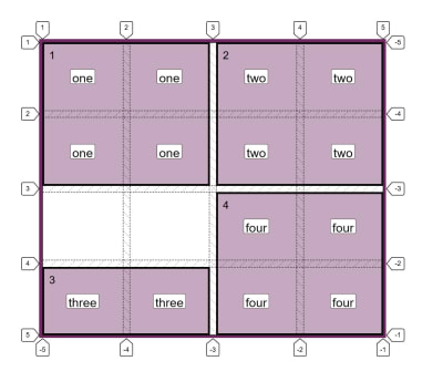
A grid of four items with the Firefox Grid Inspector highlighting the lines

Understanding CSS Grid: Grid Template Areas

Understanding CSS Grid: Grid Template Areas

Rachel Andrew

2020-02-12T11:30:00+00:002020-02-12T16:07:52+00:00

When using CSS Grid Layout, you can always place items from one grid line to another. However, there is an alternate way of describing your layout, one that is visual in nature. In this article, we will learn how to use the grid-template-areas property to define placement on the grid and find out how the property really works.

In case you missed the previous articles in this series, you can find them over here:

Describing Layout With grid-template-areas

The grid-template-areas property accepts one or more strings as a value. Each string (enclosed in quotes) represents a row of your grid. You can use the property on a grid that you have defined using grid-template-rows and grid-template-columns, or you can create your layout in which case all rows will be auto-sized.

The following property and value describe a grid with four areas — each spanning two column tracks and two row tracks. An area is caused to span multiple tracks by repeating the name in all of the cells that you would like it to cover:

grid-template-areas: "one one two two"
                     "one one two two"
                     "three three four four"
                     "three three four four";

Items are placed into the layout by being named with an indent using the grid-area property. Therefore, if I want to place an element with a class of test into the area of the grid named one, I use the following CSS:

.test {
  grid-area: one;
}

You can see this in action in the CodePen example shown below. I have four items (with classes one to four); these are assigned to the relevant grid area using the grid-area property and therefore display on the grid in the correct boxes.

See the Pen Simple grid-template-areas example by Rachel Andrew (@rachelandrew) on CodePen.

See the Pen Simple grid-template-areas example by Rachel Andrew (@rachelandrew) on CodePen.

If you use the Firefox Grid Inspector, then you can see the area names and the grid lines demonstrating that each item does indeed span two row and two column tracks — all without doing any line-based positioning on the item itself.

A grid of four items with the Firefox Grid Inspector highlighting the lines

Each items spans two rows and two columns

Rules For Using grid-template-areas

There are a few rules when creating a layout in this way. Breaking the rules will make the value invalid and therefore your layout will not happen. The first rule is that you must describe a complete grid, i.e. every cell on your grid must be filled.

If you do want to leave a cell (or cells) as empty space, you do this by inserting a . or series such as ... with no space between them.

Therefore, if I change the value of grid-template-areas as follows:

grid-template-areas: "one one two two"
                     "one one two two"
                     ". . four four"
                     "three three four four";

I now have two cells with no content in them. Item three only displays in the last row of the grid.

One item now only spans one row with the Firefox Grid Inspector highlighting the lines

There is now whitespace in the grid

You can only define each area once, meaning that you can’t use this property to copy content into two places on the grid! So the following value would be invalid and cause the entire property to be ignored as we have duplicated the area three:

grid-template-areas: "one one three three"
                     "one one two two"
                     "three three four four"
                     "three three four four";

You can’t create a non-rectangular area, so the property can’t be used to create an ‘L’ or ‘T’ shaped area — making the following value also invalid:

grid-template-areas: "one one two two"
                     "one one one one"
                     "three three four four"
                     "three three four four";

Formatting The Strings

I like to display the value of grid-template-areas as I have above (with each string representing a row below the row before). This gives me a visual representation of what the layout will be.

To help with this, it is valuable to add additional whitespace characters between each cell, and also to use multiple . characters denoting empty cells.

In the value below, I have used multiple whitespace characters between smaller words, and also multiple . characters so the empty cells line up:

grid-template-areas: "one   one   two  two"
                     "one   one   two  two"
                     "..... ..... four four"
                     "three three four four";

That said, it is also completely valid to have all of the strings on one line, so we could write our example as follows:

grid-template-areas: "one one two two" "one one two two" "three three four four" "three three four four";

Explaining grid-template-areas And grid-area

The reason that each area needs to be a complete rectangle is that it needs to be the same shape that you could create by using line-based placement. If we stick with our example above, we could make this layout with grid lines as in the next CodePen. Here I have created my grid as before. This time, however, I used grid lines to create the positioning using the longhand grid-column-start, grid-column-end, grid-row-start and grid-row-end properties.

See the Pen Grid Line placement by Rachel Andrew (@rachelandrew) on CodePen.

See the Pen Grid Line placement by Rachel Andrew (@rachelandrew) on CodePen.

Note: If you read my previous article “Understanding CSS Grid: Grid Lines” you will know that it is possible to use grid-area as a shorthand for declaring all four lines at once.

This means that we could also create our layout with the following order of lines:

  • grid-row-start
  • grid-column-start
  • grid-row-end
  • grid-column-end
.one {
  grid-area: 1 / 1 / 3 / 3;
}

.two {
  grid-area: 1 / 3 / 3 / 5;
}

.three {
  grid-area: 3 / 1 / 5 / 3;
}

.four {
  grid-area: 3 / 3 / 5 / 5;
}

The grid-area property is interesting as it can take line numbers and line names. It is also important to understand the different way it behaves when in each mode.

Using grid-area With Line Numbers

If you use the grid-area property with line numbers, then the lines are assigned in the order described above.

If you miss off any values — therefore providing 1, 2 or 3 line numbers — missing values are set to auto which means that the area will span 1 track (that being the default). So the following CSS would place an item grid-row-start: 3 with all other values set to auto, therefore, the item would be auto-placed in the first available column track, and span one row track and one column track.

grid-area: 3;

Using grid-area With Idents

If you use an ident (which is what a named area is called in Grid Layout), then the grid-area property also takes four lines. If you have named lines on your grid as described in “Understanding CSS Grid: Creating A Grid Container”, then you can use these named lines in the same way as numbered lines.

However, what happens when you miss off some lines is different to when you use idents and not numbers.

Below, I have created a grid with named lines and used grid-area to place an item (missing off the final value):

.grid {
  display: grid;
  grid-template-columns:
      [one-start three-start] 1fr 1fr
      [one-end three-end two-start four-start] 1fr 1fr [two-end four-end];
  grid-template-rows:
    [one-start two-start] 100px 100px
    [one-end two-end three-start four-start] 100px 100px [three-end four-end];;
}

.two {
  grid-area: two-start / two-start / two-end;
}

This means that we are missing the line name for grid-column-end. The spec says that in this situation, grid-column-end should use a copy of grid-column-start. If grid-column-end and grid-column-start are identical, then the end line is thrown away, and essentially the value is set to auto so we span one track as in the numbered version.

The same thing happens if we miss off the third value grid-row-end; it becomes the same as grid-row-start and therefore becomes auto.

Take a look at the next CodePen example of how each grid-area is used and how this then changes the layout of the item:

See the Pen Missing idents in grid-area by Rachel Andrew (@rachelandrew) on CodePen.

See the Pen Missing idents in grid-area by Rachel Andrew (@rachelandrew) on CodePen.

This then explains why grid-area works with a single value ident representing an area name.

When we create a named area with the grid-template-areas property, the edge of each area can be referenced by a line name which is the same as the area name you used. In our case, we could take our area named one and place our item using named lines as follows:

.one {
  grid-row-start: one;
  grid-row-end: one;
  grid-column-start: one;
  grid-row-end: one;
}

If the line is a -start line, then one resolves to the start end of the column or row. If it is an -end line, then one resolves to the end line of the column or row.

This means that when we say grid-area: one, we have omitted the last three values for the grid-area shorthand; they all end up being copies of the first value — all in our case become one and the item is placed just as with our longhand usage.

The way that naming works in Grid Layout is clever and enables some interesting things, which I have written about in my previous articles “Naming Things In CSS Grid Layout” and “Editorial Design Patterns With CSS Grid And Named Columns”.

Layering Items When Using grid-template-areas

Only one name can occupy each cell when using grid-template-areas, however, you can still add additional items to the grid after doing your main layout in this way. You can use the line numbers as usual.

In the below CodePen example, I have added an additional item and positioned it using line-based positioning over the items already positioned:

See the Pen Placing an item with line numbers by Rachel Andrew (@rachelandrew) on CodePen.

See the Pen Placing an item with line numbers by Rachel Andrew (@rachelandrew) on CodePen.

You can also use lines names defined when creating your usual columns or rows. Even better, you’ll have some line names created by the formation of the areas. We’ve already seen how you can get four line names with the name of the area. You also get a line on the start edge of each area with -start appended to the name of the area, and a line at the end edge of each area with -end appended.

Therefore, the area named one has start edge lines named one-start and end edge lines named one-end.

You can then use these implicit line names to place an item on the grid. This can be useful if you are redefining the grid at different breakpoints as long as you always want the placed item to come after a certain line name.

See the Pen Placing an item with implicit line names by Rachel Andrew (@rachelandrew) on CodePen.

See the Pen Placing an item with implicit line names by Rachel Andrew (@rachelandrew) on CodePen.

Using Grid Template Areas In Responsive Design

I often work with building up components in a component library and I find that using grid-template-areas can be helpful in terms of being able to see exactly what a component will look like from the CSS. It is also very straightforward to redefine the component at different breakpoints by redefining the value of grid-template-areas sometimes in addition to changing the number of available column tracks.

In the CSS below, I have defined a single column layout for my component. Next, at a minimum width of 600px, I redefine the number of columns and also the value of grid-template-areas in order to create a layout with two columns. The nice thing about this approach is that anyone looking at this CSS can see how the layout works!

.wrapper {
  background-color: #fff;
  padding: 1em;
  display: grid;
  gap: 20px;
  grid-template-areas:
    "hd"
    "bd"
    "sd"
    "ft";

}

@media (min-width: 600px) {
  .wrapper {
    grid-template-columns: 3fr 1fr;
    grid-template-areas:
      "hd hd"
      "bd sd"
      "ft ft";
  }
}

header { grid-area: hd; }
article {grid-area: bd; }
aside { grid-area: sd; }
footer { grid-area: ft; }

Accessibility

You need to be aware when using this method that it is very easy to move things around and cause the problem of disconnecting the visual display from the underlying source order. Anyone tabbing around the site, or who is watching the screen while having the content spoken, will be using the order that things are in the source. By moving the display from that order, you could create a very confusing, disconnected experience. Don’t use this method to move things around without also ensuring that the source is in a sensible order and matching the visual experience.

Summary

That’s the lowdown on using the grid-template-area and grid-area properties to create layouts. If you haven’t used this layout method before, give it a try. I find that it is a lovely way to experiment with layouts and often use it when prototyping a layout — even if for one reason or another we will ultimately use a different method for the production version.

Overflow And Data Loss In CSS

CSS is designed to keep your content readable. Let’s explore situations in which you might encounter overflow in your web designs and how CSS has evolved to create better ways to manage and design around unknown amounts of content. Read article ?

(il)
Categories: Others Tags:

5 Web Design Trends For 2020 That Are Here To Stay With Us

February 12th, 2020 No comments

We are always looking for ways to improve our skills and services and what we create. Sometimes that desire to improve is a conscious one. Most of the time it’s in the back of our minds, yet active.

Short term results can be OK, but good long term results are what you want if you are to grow in your profession. In terms of web design, that means subscribing to, and adhering to, design trends that have staying power.

You might have to stray from your comfort zone a bit to ensure your website users are engaged and allowed to remain in theirs.

And “What’s in it for me?” you might ask?

It’s not about you – but you’ll do just fine.

Browse BeTheme’s collection of 500+ pre-built websites to see what we’re talking about. These professionally-crafted design aids have precisely what we’re talking about – staying power.

Trend #1: Skip The Urge To Overkill. It’s Better To Take A Minimalist Navigation Approach

Web designers didn’t so much lead the way into minimalist nav design approaches as were pushed into it because of mobile design requirements. One result is that websites viewed on desktops have over time become much easier to navigate.

It’s something like trying to shorten sentences when writing, where you find you can convey as much information in fewer words and even do it better.

In the case of mobile navigation, it’s a matter of working with fewer links and less allowable space. Designers addressed the issue by limiting the number of pages in the primary menu and relegating links to sidebars or footers.

The result? An equally effective but much cleaner design.

BeRepair is an excellent example. This pre-built website tucked its nav menu neatly away beneath the hamburger menu icon.

Open the pop-out menu and you’ll see a good example of the increasingly popular less-is-more design trend with the easy-to-navigate links in a sea of white space.

BeGarden’s non-traditional navigation also benefits from the minimalist approach it utilizes in its left-aligned menu.

Trend #2: Use White Space To Add Greater Emphasis To Your Message

Brevity rules here. It’s all about doing more with less.

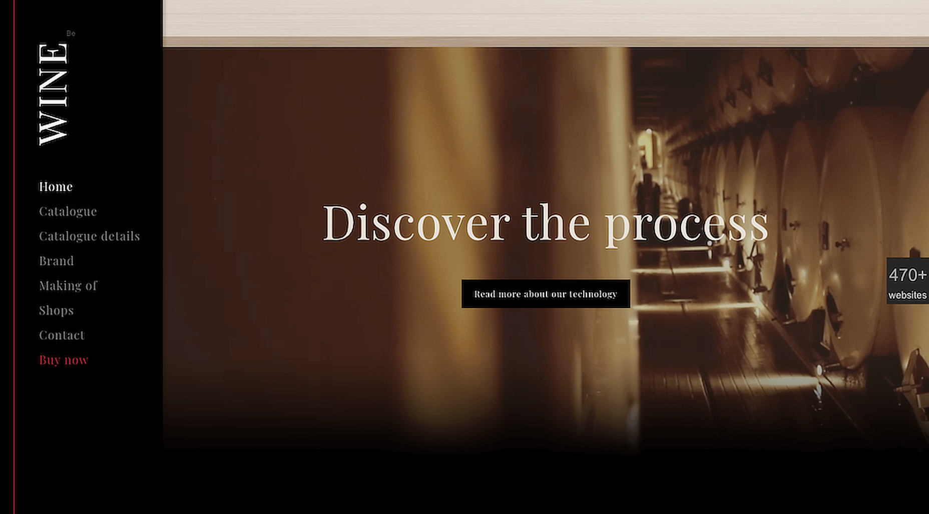
This even applies to videos; as illustrated at the bottom of this BeWine pre-built website.

The BeWeddingPlanner site demonstrates the power simple imagery can have in telling your brand’s story.

This example also shows how extremely effective a bare minimum of text can be.

Trend #3: Give Visitors A Human Face To Connect To

Avoid a “reader board” website design approach. Give your site a personality.

Adding warmth to your site is almost always effective. BeEcoFood’s lively header coveys a warm, personal message.

BeCatering also does a good job of adding a human touch. Doesn’t it appear as if the food is being prepared just for you?

Trend #4: Use Common-Sense, Universally-Accepted Typography To Create A Harmonious Viewer Experience

The point here is that not all font styles are 100% browser or device friendly. You need to test them or stick with sans-serif fonts like Arial and Tahoma, or a serif font like Times New Roman. There are others of course, so you should consider doing a little research.

Make it a point to pick a web-safe font so you can devote your creativity to other tasks. BeParty’s animation for example.

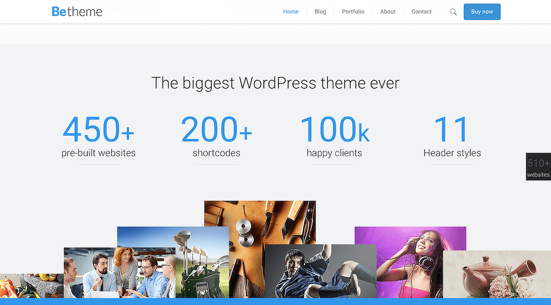
Or, an attention-getting design like you see on BeTheme’s website page with its minimal text, generous white space, and appealing and informative imagery.

Trend #5: Dark Mode Is Here To Stay. Don’t Just Try To Live With It, Embrace It

The dark mode trend is relatively new. It’s also very popular. So much so that it’s easy to see why it definitely has staying power.

It’s easy on user’s eyes; a good thing since it appears to these same users will be spending even more time looking at their screens and not less.

Although darker websites tend to be popular, good design dictates it is accomplished in the proper contexts. As is the case with this powerful BeBoxing hero image.

In this BeHosting example note how the dark mode trend can be used to make a site’s key messages dramatically stand out in a delightfully pleasing way.

Which Web Design Trends Are You Thinking Of Adopting This Year?

The nice thing about the 5 trends discussed in this article is that you won’t be wasting time and energy in investing in any of them as none show any signs of becoming a passing fad.

When traffic and/or conversions start to drop off it may be because a design trend has stopped working for you; in which case it’s time to try something else.

That should never be a problem if you stay focused on those design trends that aren’t going away any time soon. That will always be the case whenever you select one of BeTheme’s 500+ pre-built websites for the foundation for your web design.

[– This is a sponsored post on behalf of BeTheme –]

Source

Categories: Designing, Others Tags:

How To Utilize AI In App Development – Proven Ways

February 12th, 2020 No comments

In 2020’s competitive world, Artificial Intelligence has become a buzz word with great exploration and immense growth in the business world.

The Innovator of mobile app development landscape are constantly trying to introduce some new and exciting features in their mobile app, making them future-ready.

However, the avant-garde mobile app development company is providing a lending hand to their developers to make a cut-throat competition with a streamlined process for their users. And, the inception of AI not just reformed the industry for retailers but customers as well.

Starting from the beginning, mobile apps have deeply impacted user lives. Utilizing them from the very first thing in the morning to the last thing in the night, it has revolutionized every aspect of the user’s brio by empowering with the user’s fingertips.

Alike, AI-enabled chips have a significant impact on the user’s interactions with smart devices. And, as far the mobile app industry is concerned with the distinctive yet versatile nature of AI, it has opened a totally new world of innovations and opportunities. Moreover, Artificial Intelligence helps to create unique apps for different industries, establishing exclusive user interactions with smart apps.

“As Per The Latest Reports From STATISTA, The Artificial Intelligence witnessed an upsurge of 154% in the global market in 2019 and is predicted to reach $ 89 billion by 2025.”

It is interesting to see how AI is crafting its top niche as the next big things the world has ever know. Today, many pioneers app development company are not opting for this technology but are more focused on bringing this technology in the hands of the people.

In clear words, they are looking to introduce it through mobile apps.

AI – Marking The New Paradigms In App Development Landscape

Undeniably, AI has a wide-ranging multi-dimensional impact on the app development industry, that drifted the mobile app developers from the conventional approaches to experiment with AI in their upcoming mobile apps. Out-setting the footsteps as a buzz word to perform intellective functions expected from humans.

Thus, AI technology abreast the competition by proving itself as a significant helpful for countless apps. The businesses nowadays are integrating AI with their solutions to deliver impeccable data-centric services:

  • Sketch deep insights about user
  • Find and fix behavioral pattern issues
  • Get a lot of user data and information
  • Analyze the user data pattern
  • Provide better customization

Now, let us get straight to

How AI Features Have A Long Way In Simplifying the User’s Life With Mobile Apps

1. Streamlining The Searching Process

With the inception of AI, it has turned more intuitive and troublesome for mobile users to engage in a searching process, spelling corrections, performing on suggestions, and add a voice search option when the AI technology is integrated into the search engines.

In one thought, inculcating Artificial Intelligence to an Android app can invariably help to scrutinize the searching process for mobile users. This proves to be more or less of a priority while you hire app developer looking at the same route.

2. Video or Audio Recognization

In the present scenarios, it is becoming more and more popular to find an app with in-built chatbots. The Apple Siri is one such example.

Precisely talking, most of the app development companies use AI to simplify the authentication process with the use of fingerprint or retina scan or while for some, it is used for an entertainment purpose like Snapchat. However, there are numerous ways through which AI technologies can be used to enhance audio and video recognization capabilities in a mobile device.

3. Study The Behavioral Pattern

One of the usual ways of implementing AI technology in Android app development is by integrating algorithms that hold the potential to analyze the user behavior pattern and also make the suitable recommendations for them by searching for requests.

To be sure, by providing customized services and products, the customer experience can be amplified which directly leads to a successful sales process. These are some of the technology methods that are commonly used in the E-commerce online sector.

To get a better understanding of the AI technology, I have penned down the uses cases of this buzzing word.

a. Starbucks include cloud-based Digital Flywheel program

The famous brand “Starbucks” integrate the cloud-based digital program braced by Artificial Intelligence. This technology helps in suggesting a customized schedule for its users, which is based upon user activist in history.

b. Amazon Re-invented it’s working process around Artificial Intelligence

The blend of AI technology with deep learning understand the recommendations problems and outcomes accompanied by amazing services based on the client’s purchasing history and behaviour.

Such AI-empowered solutions provide a number of solutions to the mobile app development companies, especially Android app development company to create and curate un-paralleled user experience by incorporating AI technology in their apps.

Why AI Is the Top Choice For Various Industry Verticals?

The AI-enabled chips help in analyzing and evaluating the promising trends in the technology to investigate the industry and user’s history. Including such solutions helps to clutch all the required data and eliminates maximum errors of any miscellaneous errors.

In the upcoming years, it’s predicted to grow more than 30% as all the companies are solely dependent on AI technology to boost the revenue rate. Moreover, AI solutions prove as a significant boon to take better business decisions with proven marketing strategies to uphold the sales rate.

#Reason 1: Advancement In Search Experience

As everyone knows, AI improvises the user experience while looking for user’s related objects. Undoubtedly, this technology adds a new way to suggest the user with new and innovative options while the searching is ongoing.

The amalgamation of image recognization feature in AI mobile apps with ML took the user experience that is second to none in the industry. New trends have been set after the voice recognization technology advancement incorporated into the system.

#Reason 2: Predict Marketing

What the marketers work on?

Simply, marketers work on the data, and this makes sure they collect data, maintain and analyze the huge chunks of data. It takes the reckless amount of data to maintain customer satisfaction.

Therefore, AI comes in the big picture to deal with the client’s data, resulting in enhanced sales. AI-empowered apps support in researching and analyzing the market trends.

#Reason 3: Safeguard Your App

With the upsurging rate of cyber-crimes, any mobile app development company want to pay special attention to the use of AI for the apps security concerns. Its sole purpose is to offer a fast and secure authentication process.

In fact, AI can be effectively inculcated in conjunction with an exclusive array of recognization types to validate the user identification and authentication. This is an appropriate decision for building e-commerce apps and other related personality apps.

#Reason 4: Mining The Big Data

It is predicted for any mobile app development company which is looking for a reliable and experienced Artificial Intelligence (AI) technology partner to understand what mining big data is all about and how helpful is it now.

Just to know, this is a promising field which has a long way in helping to improve the process of acquiring precise and accurate information by analyzing the different types of data.

The Final Thoughts: After all, it’s all about improving business growth, professional relations, and expectations. Thus, you look to hire mobile app developers that are well-versed with AI technologies and their related fields.

As AI is a worth-the-value investment and an important contributor to the mobile app industry. There are numerous benefits of the AI technology in the app industry, with many awaited yet extensive AI-powered apps.

If we talk about today’s Artificial Intelligence trend, the most Google topic is AI with Machine Learning to deliver an amazing on-device experience for its user. Mobile app development companies are leveraging the benefits of AI for their client-retention.

With time, harnessing the AI technology and its benefits will be an affordable option to the businesses from any vertical and of any size to fit precisely and accurately in the technology-driven world.

Lastly, it’s undeniable to say, and the future is now as AI has already changed the face of the technology. It has enhanced everything right from the toothbrush to the smart cars, televisions, and voice-oriented assistant booking your appointment. Now, AI is genuinely used for enhancing the quality and performance with matching their footsteps with the app development and technology.

So, if you are beginning to integrate this technology in your app, start right with Your Free Estimation with the experts.

After all, staying ahead of the curve matters.

Categories: Others Tags:

Web Design Mistakes You Want to Avoid in 2020

February 12th, 2020 No comments
Web Design Mistakes

When it comes to creating and maintaining a website, the first thing that comes to any person’s mind is a site’s design. Well, design matters indeed, moreover, it can even influence your website’s traffic, which in turn has an impact on the amount of money you make. In fact, a decent layout makes any website look more professional and trustworthy, which attracts more visitors and affects your website’s conversion.

So what are the common mistakes that can actually bring your site down and how to avoid those? Keep reading to find it out.

Web Design Trends

First things first, in order to avoid some basic mistakes, you have to keep up with the main trends, so let us have a brief look at those.

Minimalism

Minimalism

Well, this very trend has been around in web design and not only for quite a while and it will be popular for a long time in the future as well. As a matter of fact, minimalistic design does not distract the visitors from the content you display on your website and is generally lovely. There is a huge amount of minimalistic web templates on various marketplaces such as MasterBundles, Envato or TemplateMonster, so why don’t you take a look at those?

B&W

Black & White

Black and white is actually the ultimate classic, which means if you want to create a truly classy and elegant website, you have to consider such a color scheme. Certainly, these colors would not work for every type of a website, but if you are going to launch a classy online store, a fancy blog, or an elegant portfolio site, this is definitely the way to go for you. So you can try and find some sophisticated B&W WordPress themes here.

Geometry

Another popular trend of the upcoming year is the usage of geometrical forms and patterns. The shapes and colors can vary from theme to theme, but what makes this trend so important is the fact that it is pretty universal and will surely suit any site. You can use these shapes on the backgrounds, banners, logos, etc. Besides, geometrical patterns will give your website a cool futuristic look, so why don’t you give it a shot?

Large Fonts

Yes, large fonts are going to be a huge trend in 2020. In fact, fonts have always been an essential part of web design since they have this ultimate power to either make a site stunning or simply awful. In other words, you definitely want to keep up with the latest font trends because they really are of extreme importance. Well, and at the moment large font sizes are cool, so go ahead and use them. If you don’t know where to get the fanciest and the trendiest fonts, check out MasterBundels.

Animations

Contemporary users get sick of websites that look pretty much the same, so living up your site with some animation effects might be a good idea. Speaking about these effects, perhaps the most exciting and fun one is user-triggered animation. Basically, these are the animations that happen after a user clicks on a particular spot or move the mouse. This very type of animation makes any website fun to be on and thus attracts more visitors, so do not hesitate and try it out.

Web Design Mistakes

Well, since we have figured out some of the most popular trends, it’s the very time to move on to the common mistakes you definitely want to avoid while launching or updating your website.

Cluttering

The very first thing you have to know before getting any sort of a site is the fact that it has to be user-friendly. People should be able to easily find the necessary categories or and other stuff they need. That is why you have to follow the KISS strategy, which is pretty much about keeping things simple. Don’t clutter your site with a whole bunch of images, animations, or bright colors and just keep it neat and clean.

Poor Content

Speaking about poor content, we don’t actually mean the quality of the blog posts or product descriptions on your website. We want to point out the way it is designed. Product descriptions have to be short, clear, and easy to comprehend. The users have to be able to easily find the price, reviews, and images. In terms of blog posts, they have to be readable and conveniently located on a page. So pay attention to the fonts, layouts, and buttons you use since they have to make your website’s content easy to digest.

Too Many Ads

Advertisements are a good way to earn some money, but they also can make your site incredibly ugly and simply insufferable. So don’t put too much ads and if you do include them, put them into the right places. Make sure that advertisements do not cover any content you display on your website as well as they don’t distract your visitors too much. If you can afford it, try to eliminate any external ads at all.

Missing Contact Information

Contact info not only makes your company seem to be trustworthy but also makes it easier for potential customers to make an order or ask you some questions about the goods you sell. In other words, missing this extremely important for every kind of business section or having it in an inconvenient place is a huge mistake. So make sure you have a contact info section as well as that it is easy to find.

Unresponsive Design

Responsive design is basically a feature that makes a website flawlessly work on all the devices. Well, since more and more people prefer surfing the internet using their phones, responsive design becomes a great deal. So while choosing a web template, double-check whether it is fully responsive and cross-browser compatible.

Final Word

Building or updating a website is actually a big deal that requires a lot of energy and efforts. Hopefully, knowing all these latest trends and main mistakes to avoid, this process would be a least a little bit easier for you. So go through these trends and common mistakes in web design once again and get ready to launch or upgrade your website. If you want to find out more about the world of web design, make sure to check out our blog.

Do you know any other design mistakes developers do as well as the ways to avoid them? Let us know in the comment section down below!

Categories: Others Tags:

The Hooks of React Router

February 11th, 2020 No comments

React Router 5 embraces the power of hooks and has introduced four different hooks to help with routing. You will find this article useful if you are looking for a quick primer on the new patterns of React Router. But before we look at hooks, we will start off with a new route rendering pattern.

Before React Router 5

// When you wanted to render the route and get router props for component
<Route path="/" component={Home} />


// Or when you wanted to pass extra props
<Route path="/" render={({ match }) => <Profile match={match} mine={true} />}>

When using the component syntax, route props (match, location and history) are implicitly being passed on to the component. But it has to be changed to render once you have extra props to pass to the component. Note that adding an inline function to the component syntax would lead to the component re-mounting on every render.

After React Router 5

<Route path="/">
  <Home />
</Route>

Note that there is no implicit passing of any props to the Home component. But without changing anything with the Route itself, you can add any extra props to the Home component. You can no longer make the mistake of re-mounting the component on every render and that’s the best kind of API.

But now route props are not being passed implicitly, so how do we access match, history or location? Do we have to wrap all components with withRouter? That is where the hooks steps in.

Note that hooks were introduced in 16.8 version of React, so you need to be above that version to use them.

useHistory

  • Provides access to the history prop in React Router
  • Refers to the history package dependency that the router uses
  • A primary use case would be for programmatic routing with functions, like push, replace, etc.
import { useHistory } from 'react-router-dom';

function Home() {
  const history = useHistory();
  return <button onClick={() => history.push('/profile')}>Profile</button>;
}

useLocation

  • Provides access to the location prop in React Router
  • It is similar to window.location in the browser itself, but this is accessible everywhere as it represents the Router state and location.
  • A primary use case for this would be to access the query params or the complete route string.
import { useLocation } from 'react-router-dom';

function Profile() {
  const location = useLocation();
  useEffect(() => {
    const currentPath = location.pathname;
    const searchParams = new URLSearchParams(location.search);
  }, [location]);
  return <p>Profile</p>;
}

Since the location property is immutable, useEffect will call the function every time the route changes, making it perfect to operate on search parameters or current path.

useParams

  • Provides access to search parameters in the URL
  • This was possible earlier only using match.params.
import { useParams, Route } from 'react-router-dom';

function Profile() {
  const { name } = useParams();
  return <p>{name}'s Profile</p>;
}

function Dashboard() {
  return (
    <>
      <nav>
        <Link to={`/profile/ann`}>Ann's Profile</Link>
      </nav>
      <main>
        <Route path="/profile/:name">
          <Profile />
        </Route>
      </main>
    </>
  );
}

useRouteMatch

  • Provides access to the match object
  • If it is provided with no arguments, it returns the closest match in the component or its parents.
  • A primary use case would be to construct nested paths.
import { useRouteMatch, Route } from 'react-router-dom';

function Auth() {
  const match = useRouteMatch();
  return (
    <>
      <Route path={`${match.url}/login`}>
        <Login />
      </Route>
      <Route path={`${match.url}/register`}>
        <Register />
      </Route>
    </>
  );
}

You can also use useRouteMatch to access a match without rendering a Route. This is done by passing it the location argument.

For example, consider that you need your own profile to be rendered at /profile and somebody else’s profile if the URL contains the name of the person /profile/dan or /profile/ann. Without using the hook, you would either write a Switch, list both routes and customize them with props. But now, using the hook we can do this:

import {
  Route,
  BrowserRouter as Router,
  Link,
  useRouteMatch,
} from 'react-router-dom';

function Profile() {
  const match = useRouteMatch('/profile/:name');

  return match ? <p>{match.params.name}'s Profile</p> : <p>My own profile</p>;
}

export default function App() {
  return (
    <Router>
      <nav>
        <Link to="/profile">My Profile</Link>
        <br />
        <Link to={`/profile/ann`}>Ann's Profile</Link>
      </nav>
      <Route path="/profile">
        <Profile />
      </Route>
    </Router>
  );
}

You can also use all the props on Route like exact or sensitive as an object with useRouteMatch.

Wrapping up

The hooks and explicit Route comes with a hidden advantage in itself. After teaching these techniques at multiple workshops, I have come to the realization that these help avoid a lot of confusion and intricacies that came with the earlier patterns. There are suddenly far fewer unforced errors. They will surely help make your router code more maintainable and you will find it way easier to upgrade to new React Router versions.

The post The Hooks of React Router appeared first on CSS-Tricks.

Categories: Designing, Others Tags:

How to Fetch and Parse RSS Feeds in JavaScript

February 11th, 2020 No comments

Say you have an RSS feed like this one. The goal is to request that RSS feed, parse it, and do something useful with the data in it. RSS is XML, and XML is arguably not as easy to work with than JSON. While a lot of APIs offer JSON responses, it’s less typical for RSS, although it does exist.

Let’s get it done.

First, it’s probably smart to validate the feed. That way you know at least you’re working with a working response.

Then we’ll need to make a network request to the URL the RSS feed lives at. Let’s use JavaScript’s native fetch API since that’s the most widely applicable. It definitely works in the browser, and it looks like Node has a very popular implementation.

What we’ll do is:

  1. Call the URL
  2. First parse the response as text
  3. Then parse the text with DOMParser()
  4. Then use the data like we would if we had a normal DOM reference
const RSS_URL = `https://codepen.io/picks/feed/`;

fetch(RSS_URL)
  .then(response => response.text())
  .then(str => new window.DOMParser().parseFromString(str, "text/xml"))
  .then(data => console.log(data))

We can do our work in that function. RSS is sorta like HTML in that it is nested elements. Our data will be something like this:

<rss>
  <channel>
    <title>Feed Title</title>
    <item>
       <link>https://codepen.io/billgil/pen/ewqWzY</link>
       <title>A sad rain cloud</title>
       <dc:creator>Bill Gilmore</dc:creator>
    </item>
    <!-- a bunch more items -->
  </channel>
</rss>

So, we can querySelectorAll for those elements and loop over them to do what we please. Here, I’ll make a bunch of

elements as a template and then plop them onto a webpage:

fetch(RSS_URL)
  .then(response => response.text())
  .then(str => new window.DOMParser().parseFromString(str, "text/xml"))
  .then(data => {
    console.log(data);
    const items = data.querySelectorAll("item");
    let html = ``;
    items.forEach(el => {
      html += `
        <article>
          <img src="${el.querySelector("link").innerHTML}/image/large.png" alt="">
          <h2>
            <a href="${el.querySelector("link").innerHTML}" target="_blank" rel="noopener">
              ${el.querySelector("title").innerHTML}
            </a>
          </h2>
        </article>
      `;
    });
    document.body.insertAdjacentHTML("beforeend", html);
  });

Here’s a demo of that working:

CodePen Embed Fallback

I’ve always thought jQuery made for a nice Ajax library, plus it has some helpers all around. This is how you’d do it in jQuery.

const RSS_URL = `https://codepen.io/picks/feed/`;

$.ajax(RSS_URL, {
  accepts: {
    xml: "application/rss+xml"
  },

  dataType: "xml",

  success: function(data) {
    $(data)
      .find("item")
      .each(function() {
        const el = $(this);

        const template = `
          <article>
            <img src="${el.find("link").text()}/image/large.png" alt="">
            <h2>
              <a href="${el
                .find("link")
                .text()}" target="_blank" rel="noopener">
                ${el.find("title").text()}
              </a>
            </h2>
          </article>
        `;

        document.body.insertAdjacentHTML("beforeend", template);
      });
  }
});
CodePen Embed Fallback

If you’re going to do this for real on a production site, I’d say it’s a smidge weird to rely on a third-party API (and I consider RSS an API) to render important stuff on your site. I’d probably make the request server-side on some kind of timer (CRON), cache it, then have your front-end use data from that cache. Safer and faster.

The post How to Fetch and Parse RSS Feeds in JavaScript appeared first on CSS-Tricks.
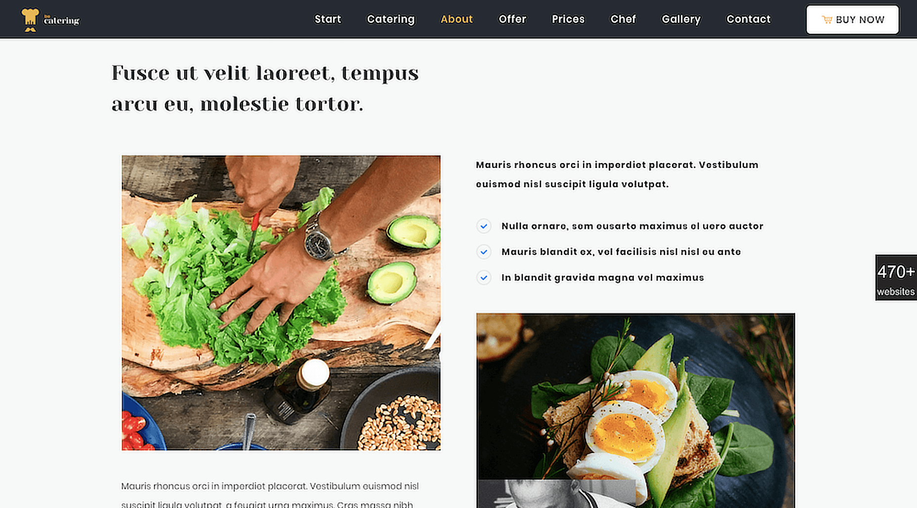
Categories: Designing, Others Tags: