Archive

Archive for February, 2020

12 Best Free UX/UI Prototyping Tools for Web/App Designers in 2020

February 6th, 2020 No comments

A good prototyping tool can not only bring your design idea into life with ease. It also helps you to test, demonstrate, iterate and share your design ideas with your teams and stakeholders effortlessly.

However, there are so many prototyping tools out there with different levels of functions. To find the most suitable prototyping tool can be time-consuming.

To help you out, we will introduce 12 of the best free prototyping tools in 2020, including their pros and cons, prices, and compatible platforms, for you and your team to choose the perfect prototyping tool with ease.

First, how to choose the right prototyping tool?

Before getting started to evaluate prototyping tools on the market one by one, you should firstly know how to choose the right prototyping tool.

Here are key factors that you should consider while choosing a UX/UI prototyping tool:

1. Figure out what you or your team need

Which tool you will finally choose often depends on what you or your team really need. So, the first thing for you now is to figure out your purpose for choosing a prototyping tool.

For example, if you merely want to draw out your design ideas and iterate on your own, you only need a free prototyping tool with simple UI elements and basic prototyping features.

But, if you want to make a high-fidelity prototype to test your final product and iterate with your whole team, a high-fidelity prototyping tool with a powerful collaboration feature is exactly what you need.

So, before checking different prototyping tools on the market, it is better for you to make a list of all your or your team’s needs.

2. What key features will it offer?

While choosing from various prototyping tools, you should remember to check their key features carefully based on your requirement list. If one or two of them can meet your needs perfectly, it would be great. If not, also don’t be sad. You still have other factors to consider yet.

3. Will you need to collaborate with your team?

Team collaboration is essential for product teams to create a brilliant web/app prototype these days. So, while choosing a prototyping tool, you should also check whether it supports team collaboration and management.

A good prototyping tool often makes it easy to share a project and get feedback quickly. Any changes about the projects sometimes will also be synced to the whole team instantly.

4. How long will it take to learn and use the tool?

The learning curve of a prototyping tool also matters. A tool with an easier learning curve is a better choice for you and your team to get started quickly.

So, before making a decision, it is best for you to download and give the tool a try for checking its learning curve.

5. How much will it cost?

The cost is the most important factor you should take into consideration. No matter whether you will choose a monthly, yearly or perpetual payment plan, the tool that suits your best is the right one for you. You should always compare prices of different tools and never be blinded by their features or prices.

6. Does it provide instant after-sale service?

While using a prototyping tool, it is quite possible to encounter some usage problems or bugs. These days, the after-sale support becomes very important. So, before making a decision, you should consult about the after-sale support service clearly.

Overall, we hope these main factors will help you choose a perfect prototyping tool quickly.

12 Best free UX/UI prototyping tools you should know in 2020

1. Sketch – Create high-fidelity prototypes with super details on Mac
sketch

Price: 30-day free trial; 99$ for a one-year license
Platform: Mac
Make prototypes for: Websites & iOS/Android apps

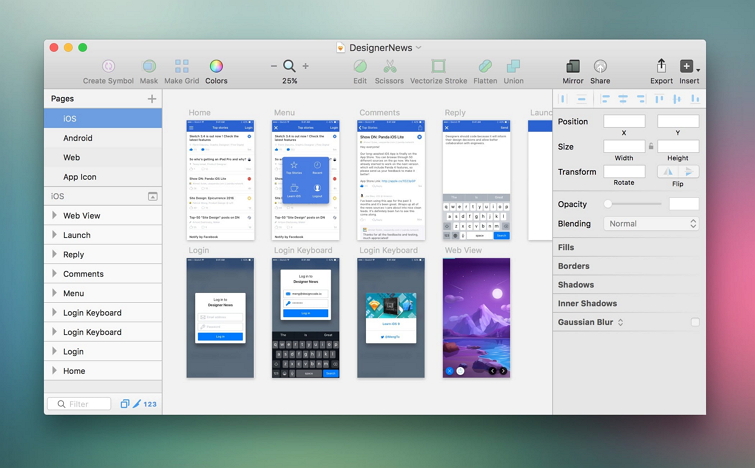
Sketch is a vector-based design tool that allows you to create high-fidelity web/app prototypes and polish the interface details with ease. With simple geometric elements, color tools, Mac-like toolbar, you can learn it fast even when you’ve never used it before.

Moreover, as one of the most widely-used design tools for UI/UX designers, there are also many plugins created to improve your prototypes and streamline your design process.

For example, with iDoc plugin for Sketch, you can easily export your web/app designs and assets to iDoc for online previewing, commenting, collaborating and handoff.

Pros:

  • Rich tools to create high-fidelity interfaces
  • Offer useful collaboration feature, such as Sketch Cloud syncing and sharing
  • Work well with Illustration assets
  • Use its Symbol feature to design UI assets and elements for reuse

Cons:

  • Mac only
  • One device per license
  • Not so good to create a fully interactive web/app prototype
  • Limited collaboration features

So, it is good to create high-fidelity prototypes with simple animations at the very early design stage.

2. PS – Create static prototypes with super details on Windows
ps

Price: 7-day free trial; 239.88$ for a one-year license
Platform: Windows
Make prototypes for: Websites & iOS/Android apps

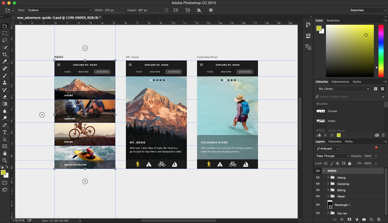
Adobe Photoshop, a professional pixel-based photo editing tool, is also another widely-used design tool for UI/UX designers to build web/app prototypes with super details. It offers many photo, video and photography editing tools, allowing you to draw out your web/app interface from very tiny layers.

Pros:

  • Offer rich cutting-edge tools, such as drawing and typography tools
  • Integrate with many famous image, video and design tools
  • Support 3D design capacity
  • Provide synced libraries and Cloud documents

Cons:

  • A high learning curve
  • No design collaboration feature
  • Raw updates or untested Beta Versions

So, at the very early design stage, PS is perfect for you to create static prototypes, and present your design ideas to other team members, clients and stockholders.

3. Adobe XD – Create simple, animated prototypes for webs/apps
Adobe XD

Price: Free version(1 project, 2GB Cloud storage); $9.98 per month
Platform: Windows & Mac
Make prototypes for: Mobiles & Websites

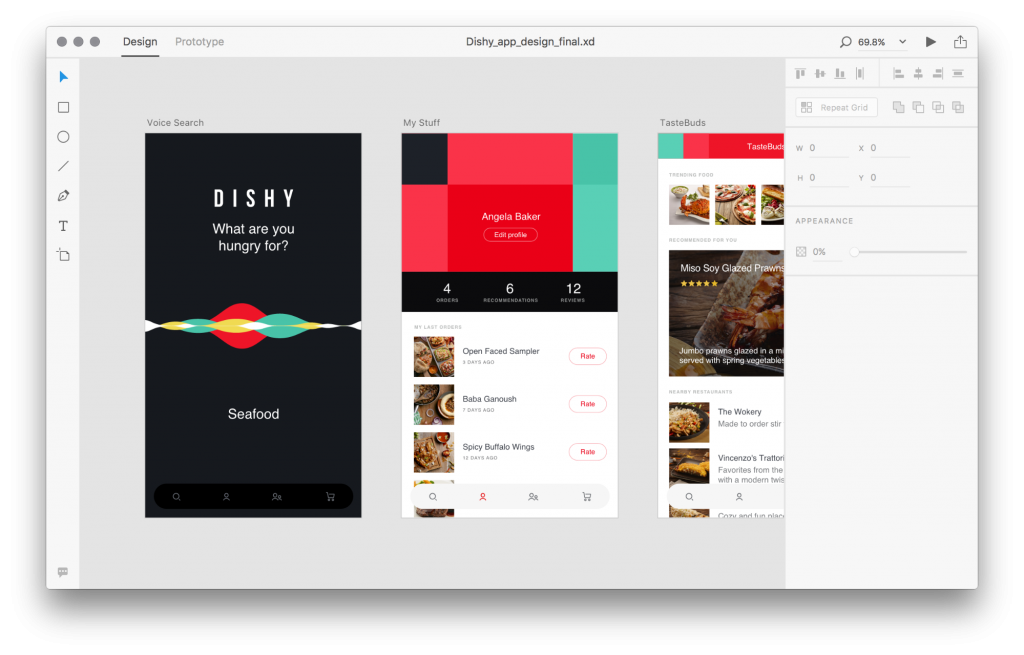
Adobe XD is a UX prototyping tool that allows you to quickly create designs for your websites, mobile apps and voice interfaces without codes. It also supports collaborating with files and sharing in a view-only mode.

Pros:

  • Minimal and easy-to-use interface
  • Time-saving features like symbols and grids
  • Allow you to link pages with drag-and-drop
  • Work with plenty of plugins and app integration, like Photoshop
  • Support simple voice interactions
  • Free for Creative Cloud users

Cons:

  • It helps making interactions between pages only
  • No customized shapes to create your desired web/app interfaces
  • No way to get CSS codes

So, it is best for you to create a simple, animated mobile app prototype for better design collaboration.

4. Balsamiq – Create simple wireframes and prototypes with clicks
balsamiq

Price: 30-day free trial; $9 per month
Platform: Windows & Mac
Make prototypes for: Mobiles & Websites

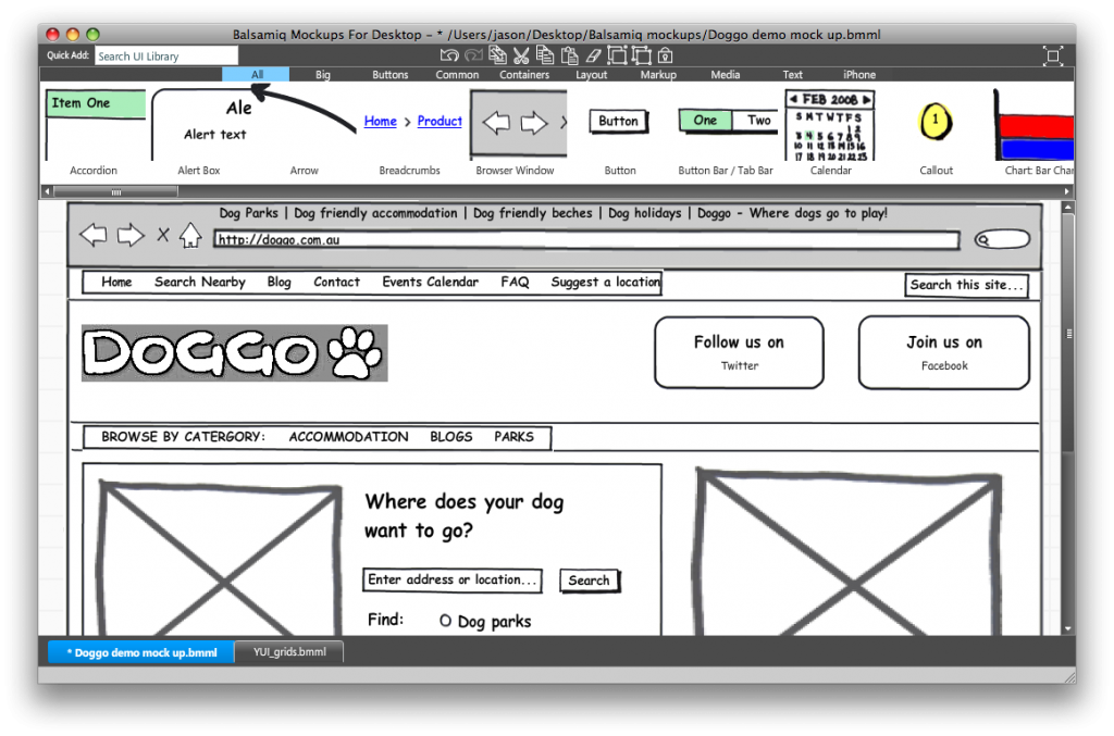
Balsamiq is a rapid wireframing tool that allows you to create web/app wireframes and low-fidelity prototypes with simple clicks. It reproduces the experience of sketching everything on a notepad or whiteboard by using a computer.

Pros:

  • Provide hundreds of built-in UI components and icons
  • Drag and drop to create simple prototypes
  • Link pages to make simple interactions
  • Share your designs with PDF or PNG images
  • Integrate with Confluence and JIRA

Cons:

  • Focus on the main structures and contents of webs/apps only
  • Limited sharing and collaborating features
  • Limited interactive prototyping

So, it is good to visualize and iterate your design ideas quickly on your own at the very early design stage.

Of course, if you love the feeling of drawing everything out on a notepad or whiteboard, this tool is also perfect for you.

5. Mockplus – Create fully interactive web/app prototypes easier and faster
Mockplus

Price: 7-day free trial; $199 for a one-year license
Platform: Windows & Mac
Make prototypes for: Mobiles & Websites

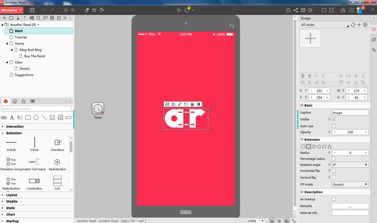
Mockplus is a rapid prototyping tool that allows you to translate your design ideas into fully interactive prototypes, test, share and iterate within minutes. It offers both personal and collaboration projects to create all possible web/app prototypes based on different purposes.

My favorite aspect of this tool is its easy-to-use interface. Everything can be done with simple clicks or drag-and-drop.

Pros:

  • Clean and easy-to-use interface
  • Powerful web/app component, component style, icon and template libraries
  • Rich UI animation, transition and interaction options
  • Support team collaboration and management
  • Integrate with Sketch and iDoc (an online design collaboration platform)
  • 8 ways to preview, share and test prototypes on computers and mobiles

Cons:

  • Some users think it is a little bit laggy while in use

If you want to visualize your design ideas quickly and work with your team to test, share, get feedback and iterate in one tool, Mockplus is ideal for you to streamline your entire prototyping process.

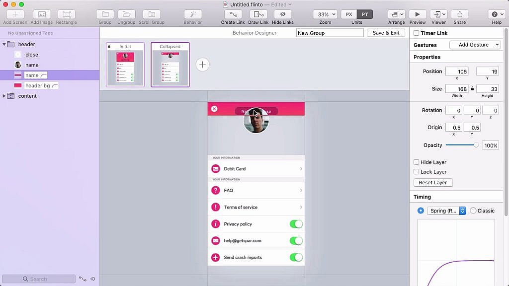
6. Flinto – Create clickable prototypes on Mac
Flinto

Price: 14-day free trial; $99 for a one-year license
Platform: Mac
Make prototypes for: Mobiles & Websites

Flinto is a Mac app that allows designers to create animated and clickable web/app prototypes quickly. With rich transitions, animations, gestures, it is good to create a fully interactive prototype.

Pros:

  • Support 3D transformation
  • Provide rich transitions, animations and gestures
  • Support creating scrolling area with clicks
  • Offer powerful drawing tools to create simple prototype with ease
  • Allow you to import design from Sketch and Figma
  • Export prototypes as videos or GIF for sharing

Cons:

  • Mac only

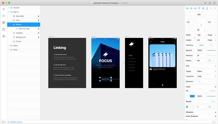
7. Framer x – Create interactive, high-fidelity prototypes on Mac
Price: 14-day free trial; $12 for a one-month license
Platform: Mac
Make prototypes for: Mobiles & Websites

Framer x is a new prototyping tool that allows you to bring ideas into life. Prototyping and creating interactions are super easy. Moreover, what makes this tool special is that it allows you to write React components. So, if you are React fans, this tool is a good option.

Pros:

  • Provide an extensive component library
  • Rich community support, like Dropbox, SnapChat, Twitter, etc
  • Support 3D effects or momentums
  • All component or prototype related codes can be directly used

Cons:

  • Mac only

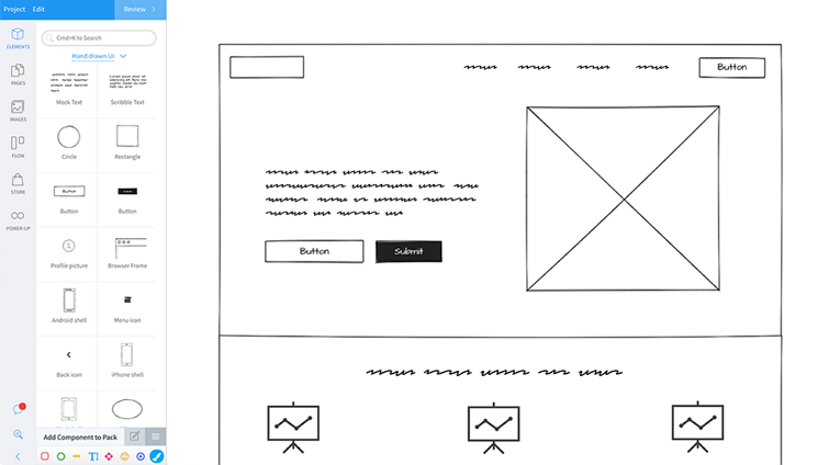
8. MockFlow – Create rough wireframes or sitemaps quickly online
MockFlow

Price: Free version: (1 project, 2 reviewers per project) ; $14 for a one-month license
Platform: Mac & Windows
Make prototypes for: Mobiles & Websites

MockFlow is an online wireframing tool that allows you to design and collaborate user interfaces and user flows easily. You can get access to thousands of pre-built components and layouts to make any web/app UIs quickly. It is ideal to create a raw sitemap or main structures of your web/app at the brainstorming stage.

Pros:

  • A powerful pre-built component and layout library
  • Support design online sharing, commenting and approving
  • Integrate with many leading apps for better collaboration, like Slack, Trello, Confluence, etc

Cons:

  • No way to add animations or interactions

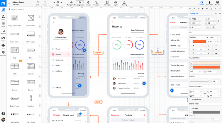
9. Moqups – Create wireframe, diagrams and prototypes online
Moqups

Price: 30-day free trial; $20 for a one-month license
Platform: Mac & Windows
Make prototypes for: Mobiles & Websites

Moqups is a web-based prototyping tool that helps you create wireframes, mockups, diagrams and prototypes, share and collaborate with your team in real-time.

Pros:

  • A comprehensive library of widgets and smart-shapes
  • A built-in library with hundreds of pre-designed icon
  • Drag and drop elements to create your prototypes
  • Rich font and styling options
  • Organize your projects easily
  • Integrate with tools, like Dropbox, Google Drive and Slack

Cons:

  • Limited hotspots so that you cannot make fully interactive prototypes.
  • There is a learning curve
  • A little bit laggy for some users

10. Axure – Create professional and real-life prototypes
Price: 30-day free trial; $29 for a one-month license
Platform: Mac & Windows
Make prototypes for: Mobiles & Websites

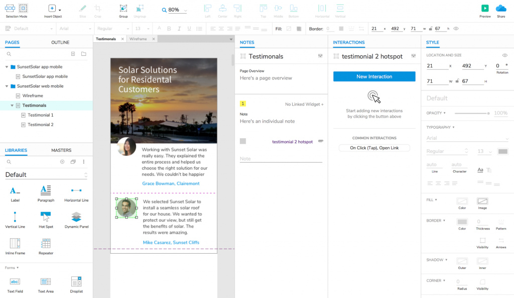
Axure is used by most UI/UX designers to create professional and real-life prototypes. It offers powerful and comprehensive features to create dynamic contents, conditional flows, animations, adaptive view and more. Product team can also comment and collaborate designs online.

Pros:

  • Powerful component libraries to create prototypes from scratch
  • Rich animation options to make smart interactions
  • Create prototypes in different fidelity levels with ease
  • Build interactions from Sketch assets
  • Easily share and gather feedback

Cons:

  • Work slowly with large files or images
  • It is complicated for design beginners to learn and use

11. InVision – Import images and create prototypes collaboratively online
Price: Free version (1 prototype); $15 for a one-month license
Platform: Mac & Windows
Make prototypes for: Mobiles & Websites

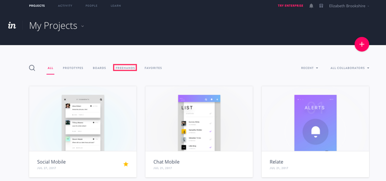
InVision is a popular prototyping tool that focuses more on design collaboration. While using, you can easily import your designs from Sketch or PS, and add transitions/animations to create interactive prototypes. And then, other team members can comment on screens and leave feedback.

Pros:

  • Provide advanced transitions and animations
  • Share prototype links to get feedback
  • Comment and leave feedback rightly on design pages
  • Integrate with Sketch and PS

Cons:

  • Lack tools to create interface details
  • A little bit difficult to get started at first time

12. Zeplin – Create interactions, collaborate and handoff online
Zeplin

Price: Free version (1 prototype); $17 for a one-month license
Platform: Mac & Windows
Make prototypes for: Mobiles & Websites

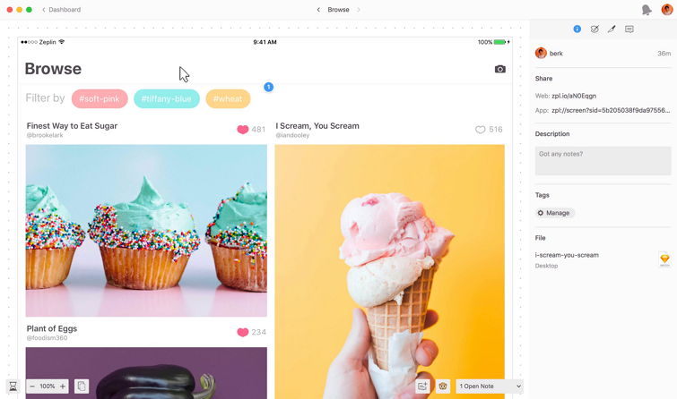
Zeplin is a design tool that allows you to upload web/app designs, add simple interactions, collaborate and handoff designs online with your team. In comparison with the above mentioned prototyping tools, Zeplin focuses more on design collaboration and handoff process between designers and developers.

So, if you or your team mean to create prototypes, iterate, test, collaborate and handoff them to developers online, this tool is ideal for you.

Pros:

  • Easy to import images and link them as you wish
  • Automatically generate design resources, like specs and assets
  • Comment on designs and leave feedback
  • Unify and reuse design systems online
  • Download assets in one click
  • Inspect and export code snippets with ease

Cons:

  • It does not offer any tools to create prototypes from scratch. You need to use other design tools, like PS or Sketch, to make interface details and import them for later collaboration and handoff.

Wrap Up

Those are 12 of the best free prototyping tools in 2020 that you should try. We hope they can simplify your design process and help you create a great product smoothly.

Categories: Others Tags:

Browser Version Release Spectrum

February 5th, 2020 No comments

Whenever a browser upgrades versions, it’s a little marketing event, and rightly so. Looks like for Firefox it’s about once a month, Chrome is ~6 weeks, and Safari is once a year.

Chrome 80 just dropped, as they say, and we get a video and blog post. What strikes me about releases like this these days is that there isn’t big flagship features that we’re all collectively interested in as developers. Maybe a little great divide stuff going on, but more broadly, just different front-end developers (the people who care about browsers) work on different things and so care about different things.

Let me try to illustrate that with a feature rundown of this release:

  • Content Indexing is a way to access metadata of files your browser has cached (that you specifically cached). Seems like a great idea, but I’ve never really dealt with offline stuff like this seriously so it’s not really in my wheelhouse.
  • Web Workers can use ES modules now. That’s cool, I didn’t even know they couldn’t.
  • Optional chaining in JavaScript, like obj?.name?.first. Love it. Super useful. Probably the feature that most JavaScript developers are applauding. But Chrome is first out of the gate here, so if you’re into it, you’d better be Babel-ing. We also get ?? .
  • Origin Trials are like feature flags I guess, except you opt-in from a website and not just on your local browser. Totally new to me, but sounds like they have been effective in gathering and refining new APIs.
  • Periodic background sync. Jeremy laid out how useful this in his article where he called it “silent push”. You can also schedule notifications, making them more resilient to offline situations.
  • HTTP content tries to auto-upgrade to HTTPS if the site is HTTPS. Great idea. I use the Cloudflare setting for this, but makes sense it moves to the browser level.
  • JavaScript can gzip streams. I understand what gzip is, but feel like this is over my head. There is a bunch of other stuff totally outside my wheelhouse too, like Decoding Encrypted Media and others.
  • Contact Picker API. Very much like this, in the same way I like the Web Payments API. If I can build a UI that helps users fill out forms faster and more accurately, that’s great. That’s why I use 1Password. I use it just as much for filling out address and credit card forms as I do for passwords.
  • SameSite cookies. Scares me. I know that we need to update our cookies on CodePen to make sure it has this value but I haven’t researched it deep enough yet, and 80 is already shipping.
  • Actual CSS stuff! line-break: anywhere; and overflow-wrap: anywhere; I can’t seem to grok the difference. This stuff is already very complicated.
  • Nothing HTML related. Poor HTML never gets nuthin’.

And then the two that really caught my eye!

  • SVG favicons. Awesome. We already ship one for CodePen because it looks so nice on Safari. Although Safari supports it with and Chrome is supporting it with so I’m not quite sure what to do there. I guess since Firefox supports SVG with rel="icon", just ship SVG for both?
  • Text fragments. How cool. I had no idea this was coming. People have been talking about this for at least a decade. The idea is linking to things on a page without needing a name or id to link down to, just using text. The syntax is funky:
https://site.com/#:~:text=Links to first occurance of this text.

Here’s a video from Stefan Judis:

Text fragments will soon be available in Chromium land. You can then use `#:~:text=` to highlight certain text. ?

? Chrome status: https://t.co/e60xiQoQoT
? Spec: https://t.co/t02TFfGO2X#devsheets

Video alt: Usage of text fragments to highlight text on wikipedia pic.twitter.com/W5tUYZk8NY

— Stefan Judis (@stefanjudis) February 5, 2020

Especially notable to me: it links you to the middle of the page, not headbutting the top. I much prefer this.

The post Browser Version Release Spectrum appeared first on CSS-Tricks.

Categories: Designing, Others Tags:

HTTPS is Easy!

February 5th, 2020 No comments

I’ve been guilty of publicly bemoaning the complexity of HTTPS. In the past, I’ve purchased SSL certificates from third-party vendors and had trouble installing them. I’ve had certificates expire and had to scramble to fix them. I’ve had to poke and prod hosting companies to help me ensure things were going to renew correctly, and left unsatisfied.

But I’d say in the last few years, this has really chilled out. CSS-Tricks went HTTPS around five years ago, so we’re well past any struggles with insecure content or anything like that. These days my host (and sponsor) Flywheel makes it a flip of a switch in their admin, so it’s entirely no-brainer. The things I have on Netlify are automatically HTTPS. I also tend to put Cloudflare in front of everything, because of all the flip-switch security and performance things they offer, mostly for free. HTTPS is just getting a lot easier.

The name of this blog post is the name of this little microsite project from Troy Hunt: HTTPS is Easy! It’s a four-part series of five-minute videos walking through the process of adding enterprise-grade security to a site quickly and for free with Cloudflare. It almost feels like an ad for Cloudflare, and I could care less if it is, but Troy says:

[…] this isn’t a commercial activity on my behalf; Cloudflare didn’t engage me to create this and it’ll come as a surprise to them the first time they see it.

It really is easy and free, so I feel like I’m doing my duty here in making up for past complaints about HTTPS.

Part of what helps me feel more confident is minimizing the number of setups I have for different things. All my WordPress sites are on Flywheel — they aren’t scattered around, so I don’t have to learn multiple systems. All my deployment is through Buddy. All my domains are on a single registrant, so what I learn in managing one domain is useful for all of them. All my sites run through Cloudflare, so I feel confident in my management skills there. This kind of consolidation is good at keeping my stress levels low.

The post HTTPS is Easy! appeared first on CSS-Tricks.

Categories: Designing, Others Tags:

Native Image Lazy Loading in Chrome Is Way Too Eager

February 5th, 2020 No comments

Interesting research from Aaron Peters on :

On my 13 inch macbook, with Dock positioned on the left, the viewport height in Chrome is 786 pixels so images with loading="lazy" that are more than 4x the viewport down the page are eagerly fetched by Chrome on page load.

In my opinion, that is waaaaay too eager. Why not use a lower threshold value like 1000 pixels? Or even better: base the threshold value on the actual viewport height.

My guess is they chose not to over-engineer the feature by default and will improve it over time. By choosing a fairly high threshold, they ran a lower risk of it annoying users with layout shifts on pages with images that don’t use width/height attributes.

I think this unmerged Pull Request is the closest thing we have to a spec and it uses language like “scrolled into the viewport” which suggests no threshold at all.

Direct Link to ArticlePermalink

The post Native Image Lazy Loading in Chrome Is Way Too Eager appeared first on CSS-Tricks.

Categories: Designing, Others Tags:

CSS4 is a Bad Idea

February 5th, 2020 No comments

Louis Lazaris, reacting to the idea of CSS4:

The reason “CSS3” worked is because it was real. It was the successor to “CSS2.1”. Everything after CSS2.1 was considered to be under the umbrella of “CSS3”.

The gist is that CSS4 isn’t real, so won’t work, and we don’t need it anyway. Perhaps I overestimate the power of marketing, but I’d wager Louis underestimates it a bit. When an idea takes hold, basis in truth or not, it has tremendous power and money follows. See: politics and pet rocks.

Amelia Bellamy-Royds pointed out that there is a real thing we could point to, and those are “CSS Snapshots” that the working group produces that could be marketed as yearly versions. Like we have ES2019, we could have CSS2020.

Direct Link to ArticlePermalink

The post CSS4 is a Bad Idea appeared first on CSS-Tricks.

Categories: Designing, Others Tags:

Creating an Editable Webpage With Google Spreadsheets and Tabletop.js

February 5th, 2020 No comments

Please raise your hand if you’ve ever faced never-ending content revision requests from your clients. It’s not that the changes themselves are difficult, but wouldn’t it be less complicated if clients could just make the revisions themselves? That would save everyone valuable time, and allow you to turn your attention to more important tasks.

In the case where the site is built on the flat files (e.g. HTML, CSS and JavaScript) instead of a CMS (e.g. WordPress), you’ll need some other sort of solution to edit the content without directly editing those files.

Tabletop.js allows us to use Google Spreadsheets as a sort of data store, by taking the spreadsheet and making it easily accessible through JavaScript. It provides the data from a Google Spreadsheet in JSON format, which can then use in an app, like pulling data from any other API. In this article, we’ll be adding data to a spreadsheet then setting up Tabletop so that it can pull data from the data source to our HTML. Let us get straight to the code!

This article is going to be based off a real-world site I built when I was initially trying to wrap my head around Tabletop. By the way, I always advise developers to build applications with any form of technology they’re trying to learn, even after watching or reading tutorials.

We’ll be using the demo I made, with its source code and spreadsheet . The first thing we’ll need is a Google account to access the spreadsheet.

Open a new spreadsheet and input your own values in the columns just like mine. The first cell in on each column been the reference that’ll be used later in our JavaScript, and the second cell been the actual content for the website.

Next up, we’ll publish the data to the web by clicking on File ? Publish to the web in the menu bar.

A link will be provided, but it’s technically useless to us, so we can ignore. The important thing is that the spreadsheet (and its data) is now publicly accessible so we can fetch it for our app.

That said, there is a link we need. Clicking the big green “Share” button in the upper-right corner of the page will trigger a modal that provides a sharable link to the spreadsheet and lets us set permissions as well. Let’s grab that link and set the permissions so that anyone with the link can view the spreadsheet. That way, the data won’t inadvertently be edited by someone else.

Now is the time to initialize Tabletop in our project. Let’s link up to their hosted minified file. Similarly, we could copy the raw minified code, drop it into our own script file and host it ourselves.

Here’s the document file linked up to Tabletop’s CDN and with code snagged from the documentation.

<script src='https://cdnjs.cloudflare.com/ajax/libs/tabletop.js/1.5.1/tabletop.min.js'></script>

<script type='text/javascript'>    
  var publicSpreadsheetUrl = 'https://docs.google.com/spreadsheets/d/1sbyMINQHPsJctjAtMW0lCfLrcpMqoGMOJj6AN-sNQrc/pubhtml';

  function init() {
    Tabletop.init( {
      key: publicSpreadsheetUrl,
      callback: showInfo,
      simpleSheet: true 
    } )
  }

  function showInfo(data, tabletop) {
    alert('Successfully processed!')
    console.log(data);
  }

  window.addEventListener('DOMContentLoaded', init)
</script>

Replace the publicSpreadsheetUrl variable in the code with the sharable link from the spreadsheet. See, told you we’d need that!

Now to the interesting part. Let’s give the HTML unique IDs and leave them empty. Then, inside the showInfo function, we’ll use the forEach() method to loop through each spreadsheet column while equating it with the corresponding ID.innerHTML method which, in turn, loads the spreadsheet’s data into the HTML tag through the ID.

function showInfo(data, tabletop) {
  data.forEach(function(data) {
    header.innerHTML = data.header;
    header2.innerHTML = data.header2;
    body.innerHTML = data.body;
    body2.innerHTML = data.body2;
    body3.innerHTML = data.body3;
    body4.innerHTML = data.body4;
    body5.innerHTML = data.body5;
    body6.innerHTML = data.body6;
    body7.innerHTML = data.body7;
    body8.innerHTML = data.body8;
    body9.innerHTML = data.body9;
    body10.innerHTML = data.body10;
    body11.innerHTML = data.body11;
    body12.innerHTML = data.body12;
    body13.innerHTML = data.body13;
    body14.innerHTML = data.body14;
    body15.innerHTML = data.body15;
    body16.innerHTML = data.body16;
    body17.innerHTML = data.body17;
 });
}
window.addEventListener('DOMContentLoaded', init)

This is a section of HTML from my demo showing the empty tags. This is a good way to go, but it could be abstracted further but creating the HTML elements directly from JavaScript.

<!-- Start Section One: Keep track of your snippets -->
<section class="feature">
  <div class="intro-text">
    <h3 id="body"></h3>
    <p id="body2">
      
    </p>
  </div>
  <div class="track-snippets">
    <div class="snippet-left"><img src="img/image-computer.png" alt="computer" /></div>
    <div class="snippet-right">
      <div>
        <h4 id="body3"></h4>
        <p id="body4">
        </p>
      </div>
      <div>
        <h4 id="body5"></h4>
        <p id="body6"></p>
      </div>
      <div>
        <h4 id="body7"></h4>
        <p id="body8">
        </p>
      </div>
    </div>
  </div>
</section>

Hey, look at that! Now we can change the content on a website in real-time by editing the content in the spreadsheet.

The post Creating an Editable Webpage With Google Spreadsheets and Tabletop.js appeared first on CSS-Tricks.

Categories: Designing, Others Tags:

Select an Element with a Non-Empty Attribute

February 5th, 2020 No comments

Short answer:

[data-foo]:not([data-foo=""] {

Longer answer (same conclusion, just an explanation on why we might need this):

Say you have an element that you style with a special data-attribute:

<div data-highlight="product">
</div>

You want to target that element and do special things when highlighting.

[data-highlight] {
  font-size: 125%; 
}

[data-highlight="product"] img {
  order: 1;
}

That data-type attribute is part of a template, so it can have any value you set.

<div data-highlight="{{ value }}">
</div>

And sometimes there is no value! So the output HTML is:

<div data-highlight="">
</div>

But this can be tricky. See in that first CSS block above, we’re wanting to target all elements with the data-highlight attribute, buttttt, we actually only wanna do it if it has a value. If the value is blank, we want to just skip any special styling at all.

In a perfect world, we’d just remove the data-attribute from the HTML template when there is no value. But a lot of templating languages, on purpose, don’t allow logic in them that would help us put-or-not-put that attribute entirely.

Instead, we can solve it with CSS:

[data-highlight]:not([data-highlight=""] {
  font-size: 125%; 
}

[data-highlight="product"] img {
  order: 1;
}

The post Select an Element with a Non-Empty Attribute appeared first on CSS-Tricks.

Categories: Designing, Others Tags:

Best practices for building a multilingual website

February 5th, 2020 No comments

With the globalization of web-based services and e-commerce shipping across the world, it’s important to attract as many consumers to your website as possible.

As such, building your website with localization in mind from scratch will ensure that you can easily modify your language selection without additional web development or adjustments to your CMS or plugins.

According to Shutterstock, 60% of global consumers rarely or never buy items from English-only websites, while 80% of marketers across the US, UK, Germany and France agree that localization is an essential addition for positioning business on the local market. In addition, findings published by 90 Seconds indicate that 86% of localized advertisement outperforms English content in click-through and conversion rates, with content that is locally targeted gaining up to six times the engagement of content which was created universally in a single language.

Whether you already have an established audience and business model or are looking for ways to build your website with multilingual functionality from day one, the choice to do so will benefit your brand either way. With that said, let’s take a look at some of the best practices for building a multilingual website, as well as how you can benefit from doing so in the first place.

Benefits of Building a Multilingual Website

Let’s tackle the benefits of creating a multilingual website for your brand before we jump into the guidelines themselves. At its core, content localization represents the process of adding different languages to your website’s User Experience (UX) design. While you may have success on the local French market, for example, German, Italian or Greek consumers won’t be attracted by French-only content and use your services.

By that logic, the better your selection of website languages, the better your odds will be at positioning your business on local markets across the globe. Utilizing specialized platforms such as The Word Point for your day-to-day content localization will also ensure that all of your followers have access to new content and product information regardless of which language among your featured ones is their native.

Doing so will allow you to build public awareness of your brand and products, thus competing with local businesses and gaining revenue from multiple worldwide sources as a result. Creating a multilingual environment for your website is not merely a passing trend in today’s day and age – it is a competitive necessity which will give your business a fighting chance on the global market and ensure that you are noticed by promising B2C and B2B stakeholders respectively.

Best Multilingual Website Design Practices

1. Create a Universal Template

In terms of building a website with multilingual functionality in mind, it’s always best to start from scratch. Different languages have drastically different structures, word lengths and vocabularies, meaning that a single sentence can take up varying amounts of space on your layout.

This can be especially problematic for your header/footer, navigation bar and subsequent internal pages as well as their individual posts or products. Simply put, you should leave abundant space for each language to be able to fit into your layout from the get-go. Don’t design your website with English in mind exclusively – leave white space available for subsequent modifications and additions to avoid overly complex web design changes down the line.

2. Emphasize your UX Features

Given the fact that your website will be multilingual, you should let your visitors know about that fact on multiple occasions. Make sure that language-switch options are clearly available and highlighted, whether on your header, footer or as a pop-up window which will greet each visitor on your landing page. Likewise, you should make a conscious choice between presenting your visitors with language titles vs. their flags as icons. This is an important accessibility decision given that some visitors are bound to be color-blind or of poor eyesight.

Don’t hide the fact that you have multiple languages available for use as many users are less than tech-savvy and will simply abandon your page if they are greeted by English by default. You can go an extra mile and ask your international consumers to rate and give feedback on your localized content, allowing for greater communication between you, as well as providing you with valuable information on what your audiences really want.

3. Multilingual SEO

In order to achieve global visibility via popular search engines such as Bing and Yahoo, you should optimize your site according to different SEO standards. Search Engine Optimization (SEO) is a system of algorithms managed by Google, used to rank the value and accessibility of different websites compared to individual search queries.

Given the multilingual nature of your website, you should strive to implement as many local SEO trends as possible on a constant basis. Tools such as Google Keyword Planner and SEM Rush will enable you to stay in touch with what works and doesn’t work in relation to your niche and language choices – stay relevant and your audiences will have a much easier time finding you across the globe.

4. Take Font Compatibility into Consideration

As we’ve stated previously, languages with different roots will require different approaches to layout spacing in order to function properly. That same rule applies for the choice of fonts you utilize in your web design. While custom font choices can indeed make your site unique, there is a good reason for universal web design standards to exist as dictated by W3.

To avoid incompatibility and poor UX, you can refer to Google Fonts as a go-to platform for universal fonts which will be compatible with a plethora of languages and their alphabets. That way, all of your consumers will enjoy the same level of UX regardless of their location and language choice, ensuring your own business’ high professionalism and accessibility going forward.

5. Be Mindful of Content Inclusivity

Lastly, depending on the type of website you will run and the business model you intend to enforce, you should be mindful of inclusivity and social awareness of anything you post. Audiences from the US, China, Russia and Spain, for example, will have drastically different worldviews, lifestyles and opinions.

As such, you should be careful of which statements you make and whether or not you affiliate with any global, political, religious or other organizations. When it comes to running a revenue-based online business, it’s best to stay neutral and respect everyone as equals without siding with anyone audience or language user base. Make your website all about professional product and service provision and advertise your business as such – this will help your odds on the global market considerably.

In Summary

Investing time and resources into building a multilingual website for your brand is always a good idea, regardless of how well your business is performing at the moment. Make sure not to overstretch yourself, however, and only focus on languages which you are sure of in terms of your existing audience.

When it comes to the right choice of languages, there is no secret method to do so without a hitch. However, building a stable framework and swapping languages in and out over time will allow you to strike the perfect combination for your business over time.

Categories: Others Tags:

3 Lessons UX Designers Can Take From Netflix

February 5th, 2020 No comments

If we look at this from a design perspective, there’s definitely something about the way the user experiences are designed that makes them more attractive than other movie or TV viewing options. Especially Netflix.

Today, I want to put the spotlight on Netflix and give you 3 lessons you can take away from the platform’s design and features.

1. Make Onboarding Painless

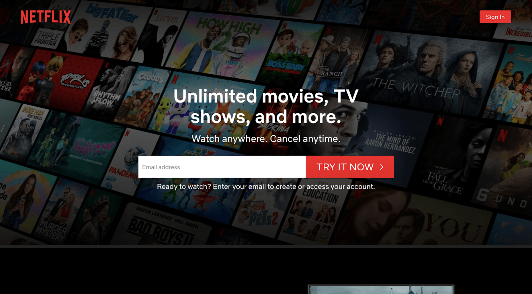
Obviously, Netflix is a household name, so it doesn’t need to mince words on its website.

While you won’t be able to get away with a navigation-less website, what you can do to emulate the Netflix UX is to deliver just as brief and benefits-driven of a message above-the-fold.

Unlimited movies, TV shows, and more. Watch anywhere. Cancel anytime.

It perfectly sums up what users get while also taking the risk and fear out of it with “Cancel anytime.” Can you do the same? Totally.

While you’re at it, build a shortcut to the conversion point (e.g. newsletter subscription, SaaS purchase, schedule an appointment, etc.) in the same banner. Most of your visitors will need some time to educate themselves, but this will at least shorten the signup process for those who are ready to take action.

When that happens, make sure your conversion funnel is streamlined, too.

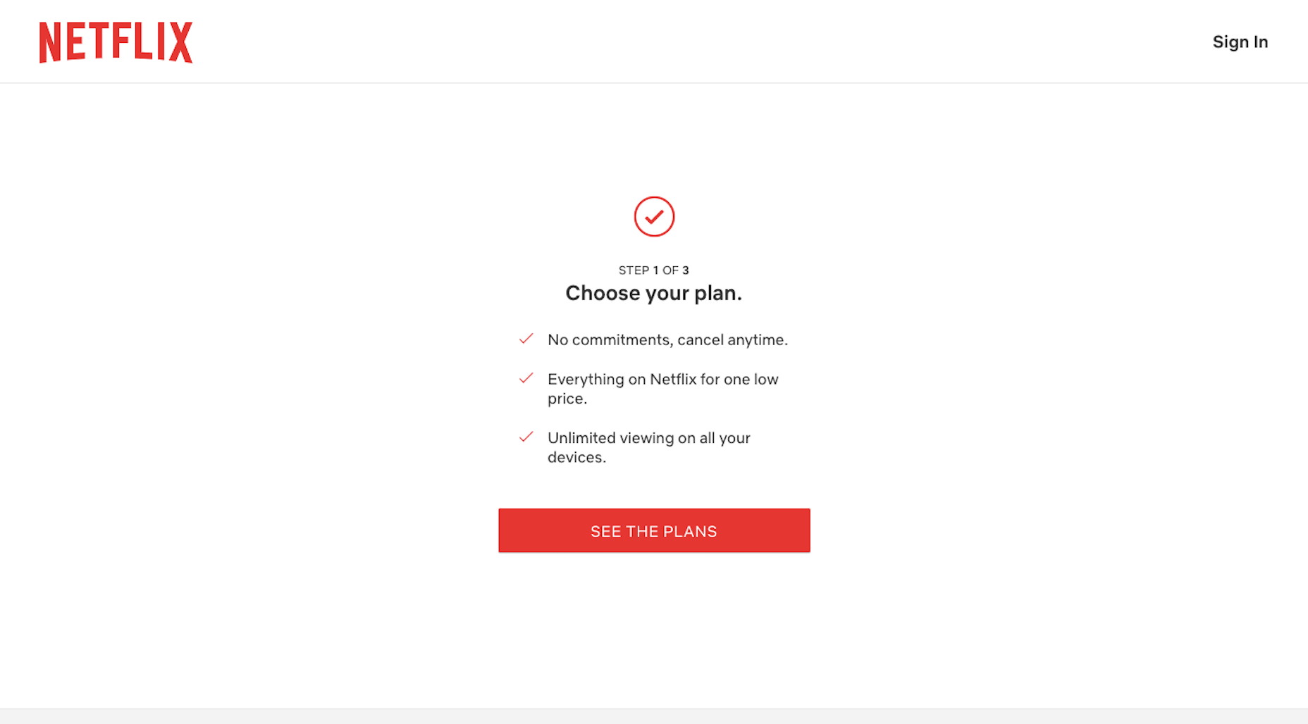
In the first step of Netflix’s signup process, it lets customers know how many steps there are while reiterating the benefits. The interface is distraction-free and easy to follow.

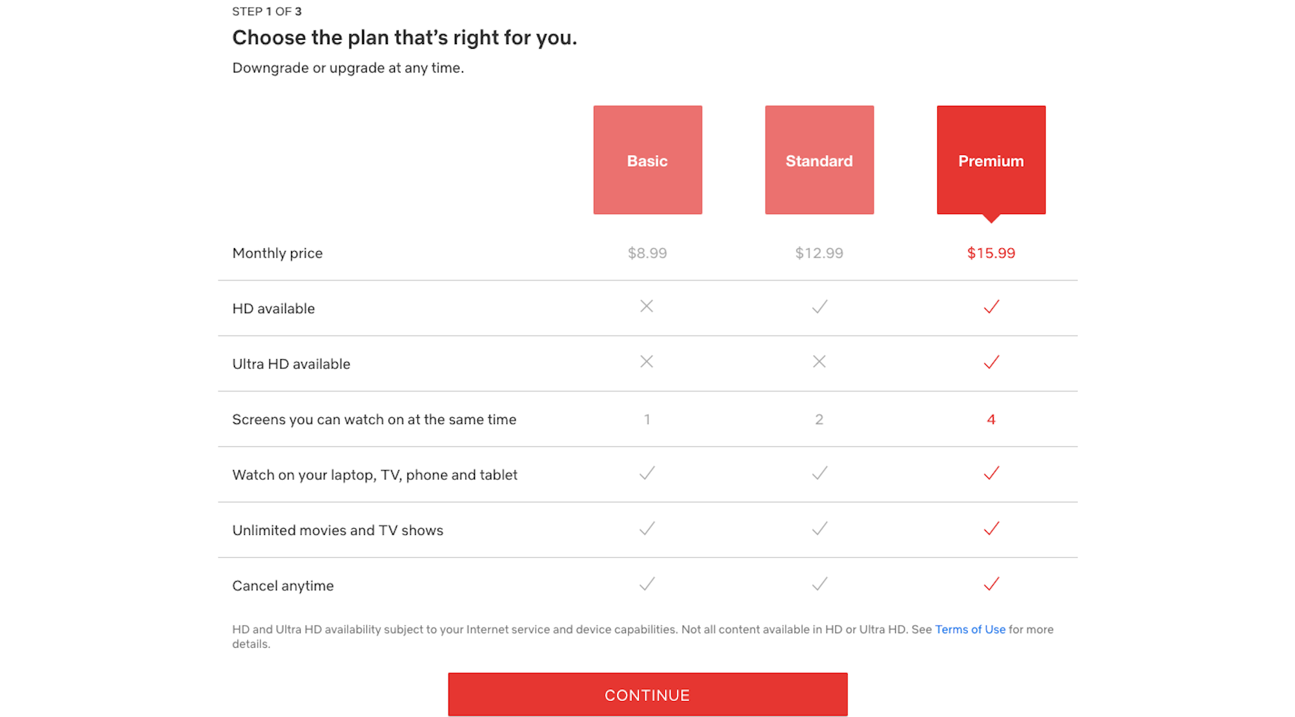
Next, users see plan options. Again, the UI is simple and easy to follow. The table comparing the features and value of each plan is a nice touch, too.

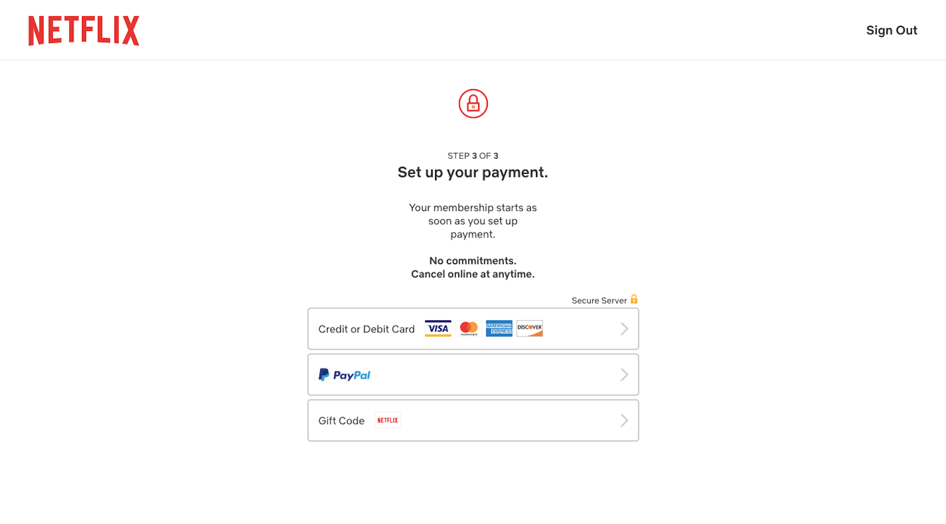
The final step is just as minimally designed. With a clean and clear interface, and a benefits-driven message, there’s no reason a user should have any problems getting through this process nor should they have any doubts along the way.

2. Use Your Data to Create a More Personal UX

Every year, it seems like we have a new law that sends web designers and business owners scrambling to strengthen their website privacy and security policies. And while it might feel like we’re losing control over all that big data we’ve gained access to in recent years, that’s not really the case.

What’s happening is that consumers want businesses to more carefully protect their data. Plain and simple.

There’s nothing in these laws that’s telling us to stop collecting user data. If that happened, I think consumers would be just as outraged. Personalization is one of those things consumers actually look for in the user experience — and the better a website can deliver on it, the more loyal they’ll be as customers.

As far as being responsible with user data, that’s up to you and your clients to manage. As for using the data you’re given, Netflix has shown us a number of ways to use only the most necessary data points to create a very personal experience.

First, you need to start collecting data that’ll help you refine the experience. Netflix empowers customers to help with this here:

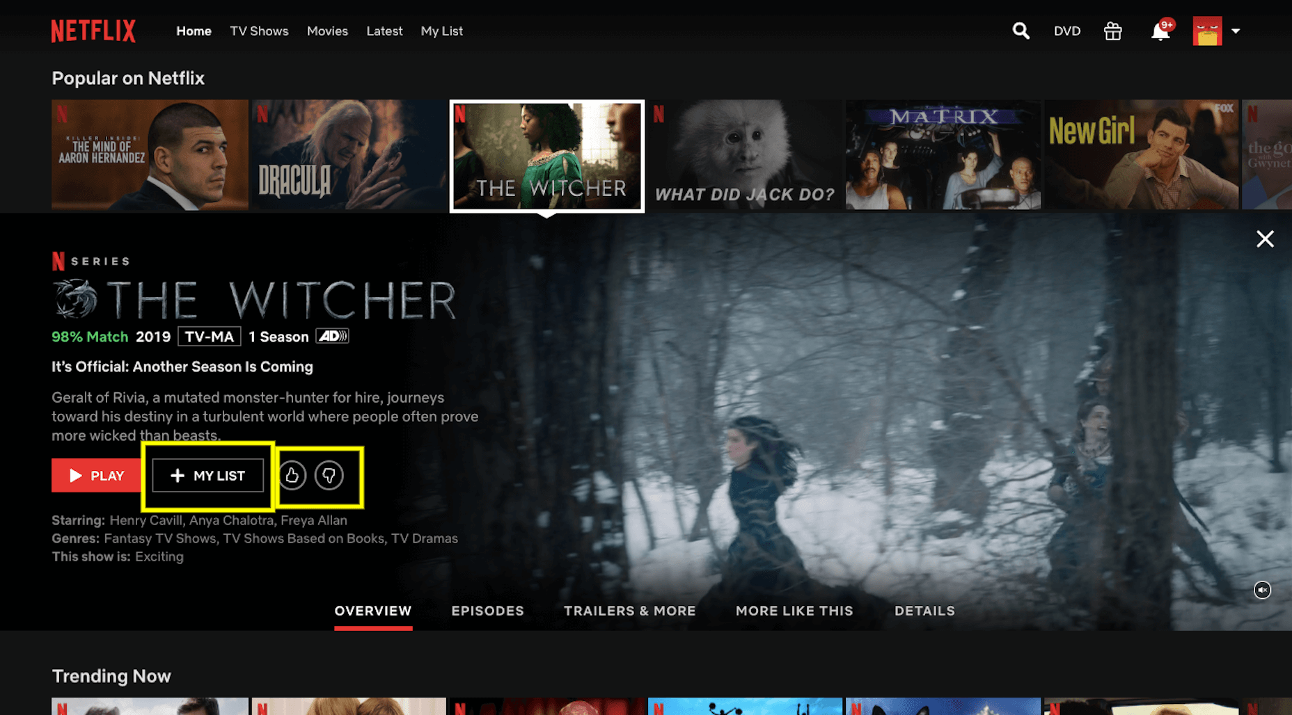
With each movie or show’s page, users can:

  • Add it to their personal viewing list;
  • Rate it with a thumbs up or thumbs down.

Netflix uses this information to provide helpful recommendations throughout the platform.

The first spot it does this is here:

When customers are rooting around for a new movie or show to watch, this percentage should give them a clue as to how much they’ll like or dislike it. This, in turn, encourages them to rate more programs so that Netflix’s ranking algorithm can become more attuned to their preferences.

The second spot Netflix provides personalized recommendations is the main page. It actually uses this page in a couple of ways to deliver custom suggestions to users.

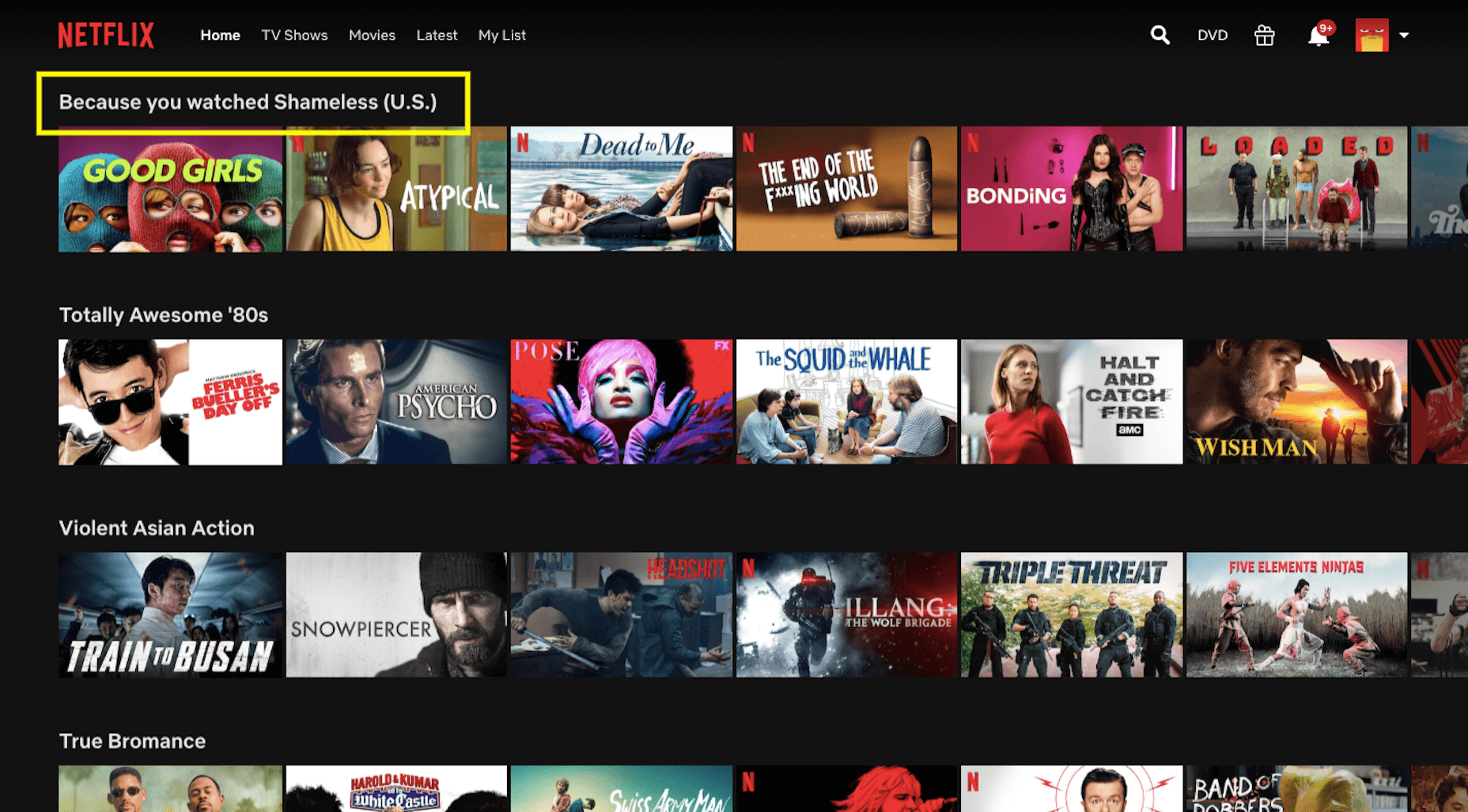
The first is with “Because You Watched” categories:

If a user spends enough time with a particular product, service, or content on your site, there’s a good chance they’ll like similar ones. So, this is a great way to build those suggestions into the UX.

The other way Netflix uses this page to deliver a personalized experience is through its categories. Note the categories I was shown above:

  • Totally Awesome 80’s;
  • Violent Asian Action;
  • True Bromance.

I have a history of watching movies and shows in these highly specific categories, so it’s pretty awesome to see these aggregated lists ready to go for me. If you can deliver a tailor-made list of recommendations, you’ll find it much easier to keep customers engaged with your product.

3. A/B Test All New Features

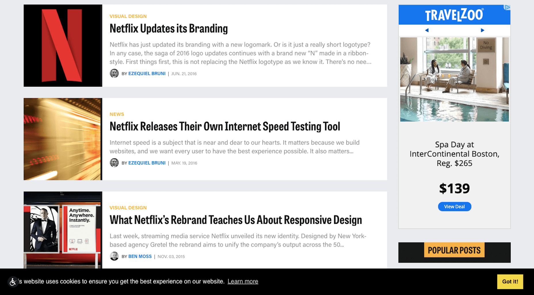
I’ve been a Netflix customer since 2007, so I’ve seen it go through a ton of changes over the years. WebDesigner Depot has, too:

From branding to layouts, and pricing to features, Netflix always seems to be switching things up. But here’s the thing: Netflix always implements changes that are meant to enhance the user experience. And when they don’t? It simply rolls the platform back to the way its customers preferred it.

One of the first times I remember this happening was with Max, Netflix’s talking bot:

This wasn’t a feature that was shoved onto users. It would sit in its dedicated space, waiting to be interacted with. Max would then welcome you back and ask what you’re in the mood to watch. You could pick a genre or you could let the bot provide recommendations based on how you rate other movies.

In all honesty, I was on the fence about Max. It was entertaining and I loved finding hidden gems through it. However, there were too many nights where I’d use Max hoping to find the perfect movie… only to abandon it and find something on my own.

That’s why it was no surprise when Max quietly slipped away. I have a feeling other users were just as ambivalent about it as I was.

There are a number of lessons, UX or otherwise, you can take away from this:

  • Be careful of trying the latest AI fads, they’re just too costly to invest in without hard data that proves that’s what your users want;
  • Give a new feature enough time to build up steam and provide you with reliable metrics — I remember Max being available for about six months, that’s more than enough time to gather user feedback and decide if a feature is worth keeping or not;
  • Personalization is great, but not necessarily if it’s at the expense of your customers’ time, sometimes the simpler feature is better.

Max isn’t the only example of Netflix playing around with its features. Do any of you recognize this?

This appears when the opening credits and theme song play at the start of a TV show. There’s really not a lot of value in sitting through this every time, and I’m willing to bet that Netflix saw that most of its users were manually fast-forwarding through them when it decided to try out this feature.

Here’s another recent feature that I think has some staying power:

While streaming services are responsible for the epidemic of binge-watching, it’s not necessarily in their best interest to allow customers to do so. Think of this “Are you still watching?” wake-up call as a form of ethical design.

This feature has been around for over a year, and it’s still going strong.

Bottom line? It’s really important to research your users when you’re in the process of building a website. However, there’s nothing more valuable than real user input from a live website.

Whether you plan to roll out a new feature or simply want to test the validity of one that exists, don’t run on assumptions. Use the new data coming in every day to further improve your design and features.

Invaluable Lessons UX Designers Can Take from Netflix

Although Netflix’s market share is slowly being chipped away at by the competition, it continues to reign supreme when it comes to streaming video services. I don’t see that changing anytime in the future either, considering how how long it’s demonstrated its willingness to innovate alongside evolving consumer needs.

And that’s really the key point I want to make in this post. While I could’ve pointed out its dramatic color palette or use of a responsive layout, we already are familiar with these concepts. The most important UX lessons we should be taking away from Netflix are the ones here.

Source

Categories: Designing, Others Tags:

Magic Flip Cards: Solving A Common Sizing Problem

February 5th, 2020 No comments
How the standard flip card implementation fails with longer back content

Magic Flip Cards: Solving A Common Sizing Problem

Magic Flip Cards: Solving A Common Sizing Problem

Dan Halliday

2020-02-05T10:30:00+00:002020-02-05T12:06:34+00:00

What are the chances your next client will use the word interactive while introducing their project? In my experience, the answer is 100%, so I’m always looking for robust CSS techniques to help me deliver the various features and effects that come up when discussing this goal.

A little piece of interactivity I’m asked to implement again and again is flip cards — blocks of content that turn about when hovered or tapped to reveal content on their reverse side. It’s a neat effect that encourages playful browsing, and another way to show more information without navigating away from the page. But the standard method has a problem when it comes to accommodating different card content lengths.

In this tutorial, we’re going to build a flip card grid which solves that problem with some CSS basics — transforms, flex, and grid. You’ll need to be familiar with these, and it will help to have a good grasp of CSS positioning techniques. We will cover:

  • How flip cards are usually implemented using absolute positioning;
  • The sizing problem that absolute positioning introduces; and
  • A general solution for automatic sizing of overlaid content.

Creating A Basic Flip Card

With good modern browser support for three-dimensional transforms, creating a basic flip card is relatively straightforward. The usual method is to place the front and back card faces in a parent container, and absolutely position the back face so it can match the size of the front face. Add an x-axis transform to the back face to make it appear reversed, add another to the card itself on hover, and we’re in business.

cards {
  display: grid;
}

.card {
  perspective: 40rem;
}

.card-body {
  transform-style: preserve-3d;
  transition: var(--time) transform;
  
  .card:hover & {
    transform: rotateX(-180deg);
  }  
}

.card-front, .card-back {
  backface-visibility: hidden;
}

.card-back {
  position: absolute;
  top: 0; right: 0; bottom: 0; left: 0;
  transform: rotateX(-180deg);
}

A standard flip card implementation using absolute positioning (see the Pen “[Magic Flip Cards 1: The Standard Implementation](https://codepen.io/smashingmag/pen/JjdPJvo)” by Dan Halliday)

A standard flip card implementation using absolute positioning (see the Pen “Magic Flip Cards 1: The Standard Implementation” by Dan Halliday)

What Could Go Wrong?

Our standard solution has a big problem, though: it doesn’t work when the back face needs more space than the front face provides. Giving the card a large, fixed size is one solution, but that approach is also guaranteed to fail at some point for some set of screen sizes.

How the standard flip card implementation fails with longer back content

This is how the standard flip card implementation fails with longer back content. (Large preview)

Design comps naturally feature neat-looking boxes with text that fits perfectly. But when starting development, it can be hard to get a page and card layout that works for the real content. And when displaying dynamic content from a CMS, it can be impossible! Even with word or character limits, there’s often no solution that works reliably across all devices.

How the standard flip card implementation fails with longer back content (see the Pen “[Magic Flip Cards 2: How Absolute Positioning Fails](https://codepen.io/smashingmag/pen/QWbLMLz])” by Dan Halliday)

How the standard flip card implementation fails with longer back content (see the Pen “Magic Flip Cards 2: How Absolute Positioning Fails” by Dan Halliday)

We should always strive to create layout implementations that tolerate a wide range of content lengths. But it’s not easy! I’ve often had occasion to fall back to using fixed sizing and position, whether due to time constraints, insufficient browser support, a weak reference design, or just my own inexperience.

Over the years, I’ve learned that a good iterative process and healthy dialogue with the designer can help a lot when wrangling these issues, and often you can meet somewhere in the middle to get a robust layout with some interactivity. But back to the task at hand — can it be done?

Thinking Outside the Box

In fact, it is possible to size the cards based on both the front and back content, and it’s not as hard as it seems at first. We just need to be methodical and persistent!

Constraining the Problem

Let’s start by making a list of our layout’s requirements. Trying to write down precisely what you want might seem like a chore, but it’s a great way to uncover constraints that can be simplified to solve a problem. Let’s say:

  • We want to see one or more rectangular cards, arranged in a single-column or multi-column grid;
  • We want the cards to flip over on hover or tap to reveal a second set of content on the back face;
  • We want the cards to always be big enough to show all their front and back content, regardless of content length or styling; and
  • In the case of multiple columns, ideally, we want all the cards to be the same size so that the rows align nicely.

Thinking through these requirements, we can notice a couple of things that simplify the problem:

  • If the cards are going to be presented in a grid, we have a constraint on their width — that is, their widths are functions of the viewport or grid container rather than their own content;
  • Given that we know a card’s width (as a percentage of its parent, at least), we’ve solved for the horizontal dimension and we just need to have the card’s height expand to fits the taller of its front or back face; and
  • If we can do that and each card is vertically self-sized, we can use CSS Grid‘s grid-auto-rows to make all rows of cards as tall as the tallest card.

Figuring Out The Card Trick

So, how do we self-size the cards? Now we’ve simplified our problem, we’re within reach of the solution.

Forget, for a moment, the idea of putting content on top of other content, and focus on our new requirement: a parent that is as tall as its tallest child. That’s easy! Using columns, we can cause a parent to expand to the height of its tallest child. Then, we just need to employ a little sleight of hand to get the children aligned:

  1. Set the children to be the same width as their parent
  2. Allow the second child to overflow to the right
  3. Transform it leftwards back into its proper place
.cards {
  display: grid;
}

.card-body {
  display: flex;
}

.card-front, .card-back {
  min-width: 100%;
  mix-blend-mode: multiply; // Preview both faces
}

.card-back {
  transform: translate(-100%, 0);
}

Vertical sizing by fixed horizontal overflow (see the Pen “[Magic Flip Cards 3: Vertical Sizing by Fixed Horizontal Overflow](https://codepen.io/smashingmag/pen/ExjYvjP])” by Dan Halliday)

Vertical sizing by fixed horizontal overflow (see the Pen “Magic Flip Cards 3: Vertical Sizing by Fixed Horizontal Overflow” by Dan Halliday)

If this approach seems obvious, rest assured that I spent many hours going through some really terrible ideas before thinking of it. At first, I had planned to print a hidden duplicate version of the back face text inside the front face to expand the card to the correct size. And when I did think of using column overflow, I was originally cropping the right-hand column using overflow:hidden, and transforming it only at the last moment when the hover started, as I hadn’t yet realized I could just keep it transformed from the beginning and use another method such as opacity or backface-visibility to turn it on and off as needed.

In other words, obvious solutions are the result of hard work! If you feel like you’ve been bashing your head against your desk for hours on a layout problem, it is important to take a step back and decide whether you are spending your client’s time wisely: whether to suggest they alter the design, and whether to pursue the solution in your own time as a learning exercise when the pressure’s off. But when you do come up with simple methods, never feel stupid because it took a long time. Now, let’s review our complete solution.

.cards {
  display: grid;
}

.card {
  perspective: 40rem;
}

.card-body {
  display: flex;
  transform-style: preserve-3d;
  transition: var(--time) transform;

  .card:hover & {
    transform: rotateX(-180deg);
  }
}

.card-front, .card-back {
  backface-visibility: hidden;
  min-width: 100%;
}

.card-back {
  transform: rotateX(-180deg) translate(-100%, 0);
}

The complete magic flip cards solution (see the Pen “[Magic Flip Cards 4: The Complete Solution](https://codepen.io/smashingmag/pen/xxGKLZO])” by Dan Halliday)

The complete magic flip cards solution (see the Pen “Magic Flip Cards 4: The Complete Solution” by Dan Halliday)

Are There Any Caveats?

The solution works well generally, with just a few minor caveats to bear in mind:

  • The cards must be present in a grid layout or in some other context where their widths are not content-dependent.
  • Cards require a content wrapper of some sort (our card-body) so that the hover area doesn’t change during animations. If the card itself is animated, you’ll see some glitching as the animation rapidly stops and restarts.
  • Styling such as backgrounds and box-shadows are best placed directly on the front and back faces, as any effects on the card itself will not be animated. Beware of styling such as box-shadows on the card body, as naturally they will get flipped upside down.
  • Cards’ front and back faces need their box-sizing property set to border-box if they have their own padding, owing to their min-width requirement, otherwise they will overflow.
  • Safari still requires -webkit-backface-visibility, in its vendor-prefixed form.

Adding Some Polish

Now we’ve solved the hard problem, let’s look at a couple of tweaks we can make to get the whole interaction working as smoothly as possible.

First, check whether the cards overlap while flipping. This will depend on whether you’re using multiple columns, the width of the column gutter, the orientation of the flip, and the perspective value of the card, but it is likely to happen. You can increase the duration of the animation to see things more clearly. When hovering, it looks unnatural for the hovered card to flip underneath its later neighbors, so we need to put it on top using z-index. Easy enough, but watch out! We need to wait until the outgoing animation is complete before restoring the z-index. Enter transition-delay:

.card {
  transition: z-index;
  transition-delay: var(--time);
  z-index: 0;
  
  &:hover {
    transition-delay: 0s;
    z-index: 1;
  }
}

Next, consider creating an active state for the cards. I usually try and make cards like these link to somewhere relevant — even if not specified by the designer — as elements with hover effects like this feel very tappable so it’s good to provide a destination for readers who try their luck. I like a short, subtle scale transform, as it works reasonably well whether or not the second half of the animation is cut off by loading of the destination page (I’d love for browsers to complete in-flight animations cleanly before navigation, though I’m sure that would be far more difficult to implement in practice than it sounds).

This is also a great opportunity to think about how accessible our cards’ back content is. Our markup is concise and well-ordered so we’ve covered screen readers and other use cases that ignore styling, but how about keyboard users? If we’re going to make the cards themselves anchors, they will receive focus as keyboard users tab through the page. Let’s reuse the card’s hover state as a focus state, and the back content will appear naturally during keyboard browsing.

.card {
  transition: z-index, transform calc(var(--time) / 4);
  transition-delay: var(--time), 0s;
  z-index: 0;
  
  &:hover {
    transition-delay: 0s;
    z-index: 1;
  }

  &:active {
    transform: scale(0.975);
  }
}

.card-body {
  .card:hover &, .card:focus & {
    transform: rotateX(-180deg);
  }
}

Finally, don’t forget that now the card automatically scales to fit its content, you can use pretty much any alignment and spacing techniques you like inside the front and back containers. Use flex alignment to center titles, add padding, even put another grid inside the card. This is the beauty of good layout solutions that scale with their content — reduced coupling of children to parents, and the modularity that allows you to focus on one thing at a time.

.card-front, .card-back {
  display: flex;
  align-items: center;
  background-color: white;
  box-shadow: 0 5px 10px black;
  border-radius: 0.25rem;
  padding: 1.5rem;
}

Wrapping Up

I hope you find this CSS technique useful! Why not try some variations on the animation, such as a scale effect, or a simple cross-fade? The technique isn’t limited to the cards form factor either. It can be used anywhere where the responsibility for vertical sizing falls to more than one element. Imagine a magazine website featuring large photographs with overlaid captions — you could use it to accommodate both images with tall aspect ratios, and long dynamic text.

Above all, remember the benefits of taking some time to really think hard about whether there’s a way of implementing a design that looks as if it would only work with fixed sizing and position. Often, there is, and no matter how tricky the problem may seem at first, writing down all your requirements, putting some time aside to create a minimal test case, and stepping through it methodically is always the best bet.

(ra, il)
Categories: Others Tags: