Archive

Archive for February, 2020

How to Create an Animated Countdown Timer With HTML, CSS and JavaScript

February 3rd, 2020 No comments

Have you ever needed a countdown timer on a project? For something like that, it might be natural to reach for a plugin, but it’s actually a lot more straightforward to make one than you might think and only requires the trifecta of HTML, CSS and JavaScript. Let’s make one together!

This is what we’re aiming for:

CodePen Embed Fallback

Here are a few things the timer does that we’ll be covering in this post:

  • Displays the initial time remaining
  • Converts the time value to a MM:SS format
  • Calculates the difference between the initial time remaining and how much time has passed
  • Changes color as the time remaining nears zero
  • Displays the progress of time remaining as an animated ring

OK, that’s what we want, so let’s make it happen!

Step 1: Start with the basic markup and styles

Let’s start with creating a basic template for our timer. We will add an svg with a circle element inside to draw a timer ring that will indicate the passing time and add a span to show the remaining time value. Note that we’re writing the HTML in JavaScript and injecting into the DOM by targeting the #app element. Sure, we could move a lot of it into an HTML file, if that’s more your thing.

document.getElementById("app").innerHTML = `
<div class="base-timer">
  <svg class="base-timer__svg" viewBox="0 0 100 100" xmlns="http://www.w3.org/2000/svg">
    <g class="base-timer__circle">
      <circle class="base-timer__path-elapsed" cx="50" cy="50" r="45" />
    </g>
  </svg>
  <span>
    <!-- Remaining time label -->
  </span>
</div>
`;

Now that we have some markup to work with, let’s style it up a bit so we have a good visual to start with. Specifically, we’re going to:

  • Set the timer’s size
  • Remove the fill and stroke from the circle wrapper element so we get the shape but let the elapsed time show through
  • Set the ring’s width and color
/* Sets the containers height and width */
.base-timer {
  position: relative;
  height: 300px;
  width: 300px;
}

/* Removes SVG styling that would hide the time label */
.base-timer__circle {
  fill: none;
  stroke: none;
}

/* The SVG path that displays the timer's progress */
.base-timer__path-elapsed {
  stroke-width: 7px;
  stroke: grey;
}

Having that done we end up with a basic template that looks like this.

Step 2: Setting up the time label

As you probably noticed, the template includes an empty that’s going to hold the time remaining. We will fill that place with a proper value. We said earlier that the time will be in MM:SS format. To do that we will create a method called formatTimeLeft:

function formatTimeLeft(time) {
  // The largest round integer less than or equal to the result of time divided being by 60.
  const minutes = Math.floor(time / 60);
  
  // Seconds are the remainder of the time divided by 60 (modulus operator)
  let seconds = time % 60;
  
  // If the value of seconds is less than 10, then display seconds with a leading zero
  if (seconds < 10) {
    seconds = `0${seconds}`;
  }

  // The output in MM:SS format
  return `${minutes}:${seconds}`;
}

Then we will use our method in the template:

document.getElementById("app").innerHTML = `
<div class="base-timer">
  <svg class="base-timer__svg" viewBox="0 0 100 100" xmlns="http://www.w3.org/2000/svg">
    <g class="base-timer__circle">
      <circle class="base-timer__path-elapsed" cx="50" cy="50" r="45"></circle>
    </g>
  </svg>
  <span id="base-timer-label" class="base-timer__label">
    ${formatTime(timeLeft)}
  </span>
</div>
`

To show the value inside the ring we need to update our styles a bit.

.base-timer__label {
  position: absolute;
  
  /* Size should match the parent container */
  width: 300px;
  height: 300px;
  
  /* Keep the label aligned to the top */
  top: 0;
  
  /* Create a flexible box that centers content vertically and horizontally */
  display: flex;
  align-items: center;
  justify-content: center;

  /* Sort of an arbitrary number; adjust to your liking */
  font-size: 48px;
}

OK, we are ready to play with the timeLeft value, but the value doesn’t exist yet. Let’s create it and set the initial value to our time limit.

// Start with an initial value of 20 seconds
const TIME_LIMIT = 20;

// Initially, no time has passed, but this will count up
// and subtract from the TIME_LIMIT
let timePassed = 0;
let timeLeft = TIME_LIMIT;

And we are one step closer.

Right on! Now we have a timer that starts at 20 seconds… but it doesn’t do any counting just yet. Let’s bring it to life so it counts down to zero seconds.

Step 3: Counting down

Let’s think about what we need to count down the time. Right now, we have a timeLimit value that represents our initial time, and a timePassed value that indicates how much time has passed once the countdown starts.

What we need to do is increase the value of timePassed by one unit per second and recompute the timeLeft value based on the new timePassed value. We can achieve that using the setInterval function.

Let’s implement a method called startTimer that will:

  • Set counter interval
  • Increment the timePassed value each second
  • Recompute the new value of timeLeft
  • Update the label value in the template

We also need to keep the reference to that interval object to clear it when needed — that’s why we will create a timerInterval variable.

let timerInterval = null;

document.getElementById("app").innerHTML = `...`

function startTimer() {
  timerInterval = setInterval(() => {
    
    // The amount of time passed increments by one
    timePassed = timePassed += 1;
    timeLeft = TIME_LIMIT - timePassed;
    
    // The time left label is updated
    document.getElementById("base-timer-label").innerHTML = formatTime(timeLeft);
  }, 1000);
}

We have a method that starts the timer but we do not call it anywhere. Let’s start our timer immediately on load.

document.getElementById("app").innerHTML = `...`
startTimer();

That’s it! Our timer will now count down the time. While that’s great and all, it would be nicer if we could add some color to the ring around the time label and change the color at different time values.

Step 4: Cover the timer ring with another ring

To visualize time passing, we need to add a second layer to our ring that handles the animation. What we’re doing is essentially stacking a new green ring on top of the original gray ring so that the green ring animates to reveal the gray ring as time passes, like a progress bar.

Let’s first add a path element in our SVG element.

document.getElementById("app").innerHTML = `
<div class="base-timer">
  <svg class="base-timer__svg" viewBox="0 0 100 100" xmlns="http://www.w3.org/2000/svg">
    <g class="base-timer__circle">
      <circle class="base-timer__path-elapsed" cx="50" cy="50" r="45"></circle>
      <path
        id="base-timer-path-remaining"
        stroke-dasharray="283"
        class="base-timer__path-remaining ${remainingPathColor}"
        d="
          M 50, 50
          m -45, 0
          a 45,45 0 1,0 90,0
          a 45,45 0 1,0 -90,0
        "
      ></path>
    </g>
  </svg>
  <span id="base-timer-label" class="base-timer__label">
    ${formatTime(timeLeft)}
  </span>
</div>
`;

Next, let’s create an initial color for the remaining time path.

const COLOR_CODES = {
  info: {
    color: "green"
  }
};

let remainingPathColor = COLOR_CODES.info.color;

Finally, let’s add few styles to make the circular path look like our original gray ring. The important thing here is to make sure the stroke-width is the same size as the original ring and that the duration of the transition is set to one second so that it animates smoothly and corresponds with the time remaining in the time label.

.base-timer__path-remaining {
  /* Just as thick as the original ring */
  stroke-width: 7px;

  /* Rounds the line endings to create a seamless circle */
  stroke-linecap: round;

  /* Makes sure the animation starts at the top of the circle */
  transform: rotate(90deg);
  transform-origin: center;

  /* One second aligns with the speed of the countdown timer */
  transition: 1s linear all;

  /* Allows the ring to change color when the color value updates */
  stroke: currentColor;
}

.base-timer__svg {
  /* Flips the svg and makes the animation to move left-to-right */
  transform: scaleX(-1);
}

This will output a stroke that covers the timer ring like it should, but it doesn’t animate just yet to reveal the timer ring as time passes.

To animate the length of the remaining time line we are going to use the stroke-dasharray property. Chris explains how it’s used to create the illusion of an element “drawing” itself. And there’s more detail about the property and examples of it in the CSS-Tricks almanac.

Step 5: Animate the progress ring

Let’s see how our ring will look like with different stroke-dasharray values:

What we can see is that the value of stroke-dasharray is actually cutting our remaining time ring into equal-length sections, where the length is the time remaining value. That is happening when we set the value of stroke-dasharray to a single-digit number (i.e. 1-9).

The name dasharray suggests that we can set multiple values as an array. Let’s see how it will behave if we set two numbers instead of one; in this case, those values are 10 and 30.

stroke-dasharray: 10 30

That sets the first section (remaining time) length to 10 and the second section (passed time) to 30. We can use that in our timer with a little trick. What we need initially is for the ring to cover the full length of the circle, meaning the remaining time equals the length of our ring.

What’s that length? Get out your old geometry textbook, because we can calculate the length an arc with some math:

Length = 2πr = 2 * π * 45 = 282,6

That’s the value we want to use when the ring initially mounted. Let’s see how it looks.

stroke-dasharray: 283 283

That works!

OK, the first value in the array is our remaining time, and the second marks how much time has passed. What we need to do now is to manipulate the first value. Let’s see below what we can expect when we change the first value.

We will create two methods, one responsible for calculating what fraction of the initial time is left, and one responsible for calculating the stroke-dasharray value and updating the element that represents our remaining time.

// Divides time left by the defined time limit.
function calculateTimeFraction() {
  return timeLeft / TIME_LIMIT;
}
    
// Update the dasharray value as time passes, starting with 283
function setCircleDasharray() {
  const circleDasharray = `${(
    calculateTimeFraction() * FULL_DASH_ARRAY
  ).toFixed(0)} 283`;
  document
    .getElementById("base-timer-path-remaining")
    .setAttribute("stroke-dasharray", circleDasharray);
}

We also need to update our path each second that passes. That means we need to call the newly created setCircleDasharray method inside our timerInterval.

function startTimer() {
  timerInterval = setInterval(() => {
    timePassed = timePassed += 1;
    timeLeft = TIME_LIMIT - timePassed;
    document.getElementById("base-timer-label").innerHTML = formatTime(timeLeft);
    
    setCircleDasharray();
  }, 1000);
}

Now we can see things moving!

Woohoo, it works… but… look closely, especially at the end. It looks like our animation is lagging by one second. When we reach 0 a small piece of the ring is still visible.

This is due to the animation’s duration being set to one second. When the value of remaining time is set to zero, it still takes one second to actually animate the ring to zero. We can get rid of that by reducing the length of the ring gradually during the countdown. We do that in our calculateTimeFraction method.

function calculateTimeFraction() {
  const rawTimeFraction = timeLeft / TIME_LIMIT;
  return rawTimeFraction - (1 / TIME_LIMIT) * (1 - rawTimeFraction);
}

There we go!

Oops… there is one more thing. We said we wanted to change the color of the progress indicator when when the time remaining reaches certain points — sort of like letting the user know that time is almost up.

Step 6: Change the progress color at certain points of time

First, we need to add two thresholds that will indicate when we should change to the warning and alert states and add colors for each of that states. We’re starting with green, then go to orange as a warning, followed by red when time is nearly up.

// Warning occurs at 10s
const WARNING_THRESHOLD = 10;
// Alert occurs at 5s
const ALERT_THRESHOLD = 5;

const COLOR_CODES = {
  info: {
    color: "green"
  },
  warning: {
    color: "orange",
    threshold: WARNING_THRESHOLD
  },
  alert: {
    color: "red",
    threshold: ALERT_THRESHOLD
  }
};

Now, let’s create a method that’s responsible for checking if the threshold exceeded and changing the progress color when that happens.

function setRemainingPathColor(timeLeft) {
  const { alert, warning, info } = COLOR_CODES;

  // If the remaining time is less than or equal to 5, remove the "warning" class and apply the "alert" class.
  if (timeLeft <= alert.threshold) {
    document
      .getElementById("base-timer-path-remaining")
      .classList.remove(warning.color);
    document
      .getElementById("base-timer-path-remaining")
      .classList.add(alert.color);

  // If the remaining time is less than or equal to 10, remove the base color and apply the "warning" class.
  } else if (timeLeft <= warning.threshold) {
    document
      .getElementById("base-timer-path-remaining")
      .classList.remove(info.color);
    document
      .getElementById("base-timer-path-remaining")
      .classList.add(warning.color);
  }
}

So, we’re basically removing one CSS class when the timer reaches a point and adding another one in its place. We’re going to need to define those classes.

.base-timer__path-remaining.green {
  color: rgb(65, 184, 131);
}

.base-timer__path-remaining.orange {
  color: orange;
}

.base-timer__path-remaining.red {
  color: red;
}

Voilà, there we have it. Here’s the demo again with everything put together.

CodePen Embed Fallback

The post How to Create an Animated Countdown Timer With HTML, CSS and JavaScript appeared first on CSS-Tricks.

Categories: Designing, Others Tags:

Get Moving (or not) with CSS Motion Path

February 3rd, 2020 No comments

We just linked up the idea that offset-path can be cleverly used to set type on a path. Don’t miss Michelle Barker’s experimentation either, with drawing paths or animating text along a path.

Dan Wilson has also been following this tech for quite a while and points out why the sudden surge of interest in this:

With the release of Firefox 72 on January 7, 2020, CSS Motion Path is now in Firefox, new Edge (slated for a January 15, 2020 stable release), Chrome, and Opera (and other Blink-based browsers). That means each of these browsers supports a common baseline of offset-path: path(), offset-distance, and offset-rotate.

Dan’s post does a great job of covering the basics, including some things you might not think of, like the fact that the path itself can be animated.

Direct Link to ArticlePermalink

The post Get Moving (or not) with CSS Motion Path appeared first on CSS-Tricks.
Categories: Designing, Others Tags:

The Future of User Experience (UX): 5 Trends for 2020 and Beyond

February 3rd, 2020 No comments

As technology evolves, user experience (UX) has come to play an important role in determining the success or failure of your business.

For this reason, UX should be evaluated regularly through metrics like the net promoter score (NPS) to measure your users’ likelihood to recommend your product, service or experience to their peers.

As modern consumers want to discover new ways to make their lives easier, businesses need to offer them solutions that will not only help them solve problems but also give them a rewarding experience that will stay with them throughout their user journey.

While advancements like those shown in the hit TV series Black Mirror are still far away from us, certain developments in UX design have allowed us to take a glimpse into a future that will change UX forever.

Before delving into the best trends you need to know to give better user experiences, let’s take a look at the importance of UX for modern businesses.

Why Is UX Important for Businesses?

When we talk about UX we refer to a user’s interaction, unique feelings, and experiences with a specific product, website, app or service.

According to the definition of UX, to achieve the best possible experience “there must be a seamless merging of the services of multiple disciplines, including engineering, marketing, graphical and industrial design, and interface design.”

However, apart from the seamless merging of your operations, taking into account user feedback and incorporating user suggestions into your design will offer you the unique opportunity to create great UX.

As technology and society evolve, more needs are bound to emerge and for that reason businesses with optimized UX designs are those who will, inevitably, win more users and have more conversions.

To see how important UX is for businesses, let’s take a look a some of the benefits of investing in UX design:

Increase Conversion Rate

Boosting conversions is one of the challenges that old and new online businesses want to achieve when they use technology to promote new products or services.

As experience has shown us, high-converting pages are those that deliver unique experiences.

For example, when you create a landing page for a new product, UX design can increase the effectiveness of your CTAs, capture leads easier and improve your lead generation funnel.

To convert more, you need to make your visitors realize the value of your pages and the best way to do it is by delivering the most advanced UX design that will make them want to interact with you more.

Improve Return-on-Investment (ROI)

Investing in UX design is not only the best way to increase the number of new users but also one of the most cost-effective techniques.

With the ROI of every dollar invested in UX design ranging from $10 to $100, it is absolutely necessary to deliver amazing experiences whether you promote higher-end products or not.

As users value the effort put into user-friendly designs, investing in improving your website or mobile app UX design will help you turn them into loyal supporters, cost you less in improvements and let you enjoy the benefits of a high-converting page or application.

Distinguish Your Business

Since there are hundreds of companies out there selling similar products or services with similar features and prices, you need to find a way to distinguish yourself from the crowd and be as innovative as possible.

As the execution stage of every project lifecycle can determine the success of your end result, finding ways to deliver unique UX designs and user-friendly interfaces will help you capture more users and convert them into loyal supporters.

By creating functional interfaces you will be able to establish yourself as a business that values user satisfaction and be your powerful weapon to enhance your conversion rate and landing page optimization.

Now Let’s Take A Look At The Top 5 UX Trends You Need To Know For The Future

1. The Age of Material Design

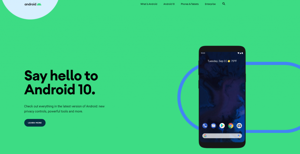
Material design is Google’s design language that supports onscreen touch experiences through rich features and realistic motions that imitate real-world objects.

Through this design language, UX designers can employ 3D effects, realistic lighting, and animation to deliver first-class experiences that will grab users’ attention.

While the famous flat design has provided users with clean and minimalist pages that convert, the material design offers a three-dimensional setup that will make your pages and applications more interactive.

Equipping your campaigns with realistic features and animations will help you combine your content with graphic design in a way that will highlight the benefits of your product or service and incentivize users to click on your CTAs.

Here’s an example from Android:

2. The Impact of Microcopy

Microcopy is like your MicroSD card.

Despite being tiny, its capabilities are tremendous compared to its size.

While microcopy might be just small bits of information found on an interface, its conversion power is immense since these little pieces of information will guide a user through a process.

For example, image filling an extensive subscription form only to find out that when you click on the subscribe button it won’t let you proceed.

While the red box indicator can help you discover what’s wrong, sometimes this indicator isn’t enough to discover what the user has to do to proceed.

The frustration caused by the lack of hints can discourage a user who will eventually give up on subscribing.

Microcopy, in this case, can help you clarify things and assist users, minimizing frustrations and increasing the efficiency of your forms.

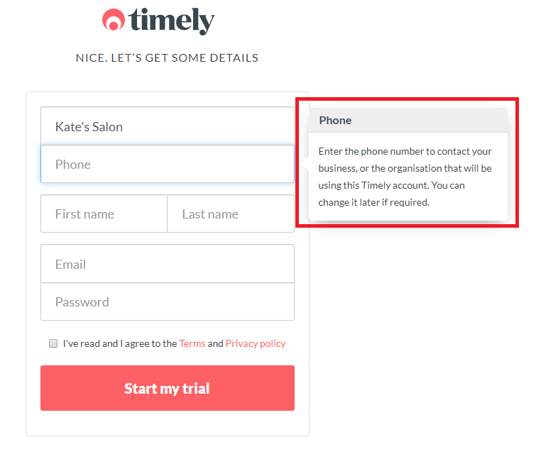
For instance, here’s an example from Timely:

Here, the microcopy is meant to solve any possible confusion and explain why you need to enter your phone.

By clearing any doubts or misconceptions about your products or services you can incentivize new users to click on your CTA a lot more effectively since they’ll know exactly what they will get..

And to effectively enhance your users’ experience and turn them into loyal supporters of your applications, you should also consider using a variety of UX design tools like Analytics, A/B Testing, and Heatmapping Tools.

3. Display the Future with Augmented Reality (AR)

Back in 2016, Pokemon GO took the world by storm with its new Augmented Reality features.

While that’s the point where the majority of users truly got acquainted with AR, truth is that AR and its exceptional capabilities have been used in various fields apart from gaming.

As one of the most impressive UX design trends, companies have leveraged it to give users a taste of what the future holds, help them solve problems and get them to convert.

For instance, IKEA has an app called IKEA Place built on the Apple AR Kit that allows users to envision and build their ideal home through AR.

While placing furniture around and resizing objects isn’t as thrilling as catching Pokemon, brands like IKEA have realized that using AR not only does not only boost the furniture-buying intent but also solves one of the greatest buyer problems in history: which piece of furniture is right for my house?

Giving fast solutions to big user pain points is the most efficient way to increase your company’s engagement and promote your growth using technology that can give you endless possibilities.

4. Personalized User Interfaces

Personalization is all about tailoring a product or a service to accommodate specific individuals with specific needs and preferences.

As UX primarily focuses on delivering amazing experiences that will make a user feel unique, personalizing your interfaces and giving users something more than the generic version of your product or service can work miracles.

While customization is all about enabling a user to make changes to their experience by configuring certain elements like changing colours or backgrounds, personalization is done by the system in use through a series of processes that draw information from the users’ preferences and online behaviour.

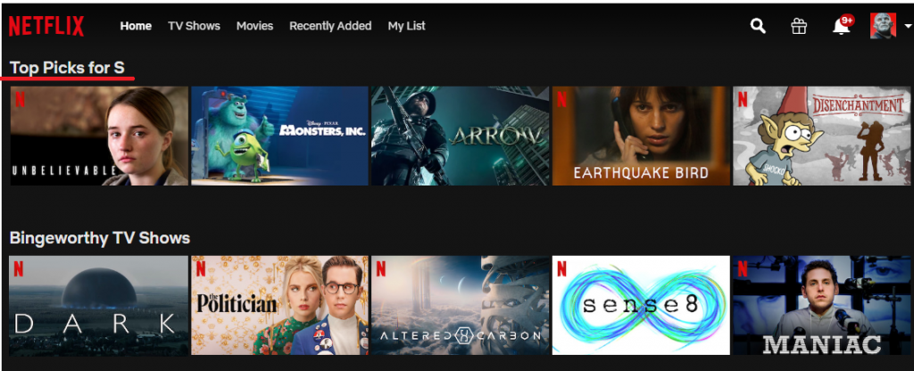
A prime example of interface personalization is Netflix’s targeted suggestions based on watching history.

Here’s an example from my account:

5. Hey Alexa, How Can I…

Alexa, Siri, Cortana, and Google Assistant are some of the most popular voice-controlled assistants that have the ability to answer questions and even connect your entire life with a simple voice command.

As the technology of the future, voice-activated interfaces can take down specific boundaries and offer users an easier way to interact.

According to a report by eMarketer, 111.8 million people in the US will use a voice assistant at least monthly, which equals to 39.4% of internet users and 33.8% of the total population.

Since mobile devices have become a vital part of our daily lives, VUIs will offer the opportunity to take advantage of our devices to solve common problems without even having to type them down.

Portrait of a happy woman using the voice recognition of the phone standing in kitchen of a house

Despite having numerous benefits, there are still certain limitations that make their full implementation and adoption a bit difficult.

For instance, one of the greatest VUI challenges is the lack of accuracy of certain voice commands and lack of privacy in public places.

Nevertheless, investing in VUI design can help you find smarter solutions to increase accessibility and functionality and deliver a seamless experience your users will be able to control with a simple voice command.

Takeaway

While the benefits of having amazing UX designs are plenty, increasing your conversions, improving your ROI and distinguishing yourself in the marketing arena will help you grow your business beyond measure.

So, to step up your business game you need to embrace the current changes in design, leverage the power of microcopy, experiment with augmented reality, consider VUIs and personalize the user experience to get more satisfied users who will support you unconditionally.

Keeping up with the latest UX design trends will help you discover what works best with your users and how you can keep them happy and engaged with your company, so next time you plan your next UX design, spare a few moments to get yourself familiar with the latest UX trends and rock your way to the top.

Categories: Others Tags:

Top 5 Ways to Use Social Proof to Boost your Sales

February 3rd, 2020 No comments

Social proof is a psychological phenomenon which digital marketers use as a tactic to improve CRO (Conversion Rate Optimization) by helping worried minds of customers.

In general, the more people perform certain actions (buying a service or product), this creates a high influence on society or a particular group of people. Likewise, search engines rank high those with high social proof such as tweets on Twitter.

Social proof is indispensable for an online business, an eCommerce website or brand to gain widespread visibility across the Internet.

  • It makes you visible.
  • It helps you generate more revenue.
  • It makes you stand out of the crowd.

Therefore, I’m going to share the top 5 ways to use social proof to boost your sales.

Rest assured: They are tried-and-tested, and they will bring desired results for you.

Let’s start…

1. Display testimonials on your website

Displaying testimonials on your website is a great way of showing customers’ shouts-outs.

While gathering testimonials, make sure that you’re highlighting all the pain points of your buyer personas. Many of your prospects look at your testimonials to find the element of relatability.

It will be better to feature customers from all demographics and varying buyers’ personas to attract qualified leads. Because relying on just limited type of testimonials won’t help you reach of credibility and worth which you deserve.

Example:

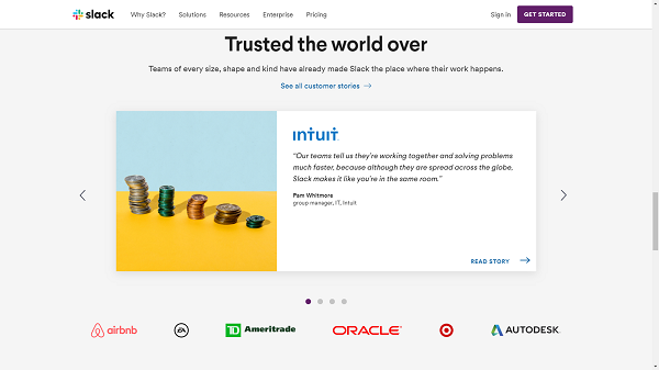
At the bottom of the landing page, Slack has included logos of prominent and well-known customers i.e. AirBnB, Ameritrade, Intuit, AutoDesk, and Target. It is a form of expert user proof When one knows that such great organizations are benefitting from Slack, that customer will most likely feel more driven to try Slack in his organization.

2. Share milestones

To be grateful to users and follower milestones is another quick way to create social proof. Celebrating when you’ve reached the milestone is a fun occasion. It is a great time to be thankful to people who helped you to achieve your goal.

Below are some of the examples of milestones you can celebrate with your audience:

  • When you’ve reached X users.
  • When you’ve reached X customers.
  • When you’ve reached X downloads of your app.
  • When you’ve reached X followers on your social media profiles
  • When you’re engaged in anniversaries
  • A brand can share its stories of financial and emotional contribution to the betterment of society on social media platforms.

Example:

3. Mention the size of your customer base in your bio

Well, if you want to boost sales with solid social proof, then you should the size of your customer base in your profile bi, luckily enough, if you already have a large customer base, it will definitely help in your favour. Mentioning the size of your customer base in your bio is one good example of crowd social proof. Because when people see that many others are using the same product of yours, they will most likely to get a positive first impression of that specific product.

Not just the size of your customer base, there are a few other stats you can mention:

  • You can mention the number of countries your companies serve or your customers are (e.g. in 100+ countries)
  • Number of goods sold every day, week, month, or year
  • Rating or number of recommendations given ( For example, 100+ 5-Star ratings on Yelp)

Example:

a) Turkish Airlines

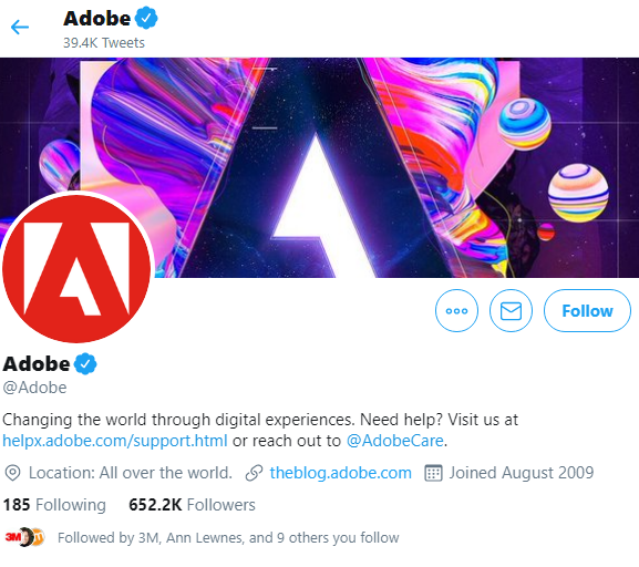
Companies like Turkish Airlines and Adobe include the size of their customer base and the number of countries their customers are in their Twitter bio.

b) Adobe

4. Always Be Responsive

Being responsive to your followers on social networking platforms, you enhance your social proof which will help you to drive maximum sales.

Take an example of Facebook, you can choose to show how responsive you’re on Messenger. Likewise, if you provide customer support on Twitter, you can show the time period when you’re most active and responsive.

Actually, this practice encourages people (your followers) to message and connect with you — knowing that they will get a quick response from you. As a result, it will help you generate more leads for your business.

Here’s how you can set it up for Facebook and Twitter:

– Facebook: Go to your Page settings on Facebook, select the “ Messaging” tab. Now scroll down to “Response Assistant”, and select the best response time that represents how fast you reply to messages. You can also set it to update automatically.

– Twitter: Go to business.twitter.com and set up your Twitter account to be more responsive to your followers. Not only can you set responsive hours but also customize a welcome message when you get direct messages from your followers.

Example:

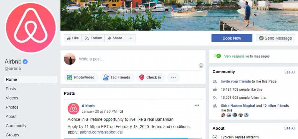
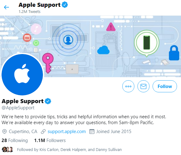
Especially those businesses with support Twitter account, use this feature. Some use Facebook for a similar purpose. Airbnb is a big example here for Facebook – It is very responsive to messages and Apple Support on Twitter which is available to help followers from 5am – 8pm Pacific.

a) Airbnb

b) Apple Support

5. Display Social Share Count

Showing the number of social share count is helpful for strengthening social proof. People like to give special attention to an article that has been shared greatly.

Same way, lower social share count can have a negative effect as well. People may think that the article or blog isn’t worthy, even if it’s well-written.

Example:

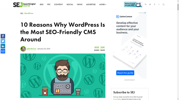
Search engine journal that displays the share count of articles on its blog. With a good number of shares for almost all of their articles, they are able to generate social proof that they are reliable and they share information worthy-mentioning.

Final Words:

Social proof guarantees quick ROI. It consolidates your presence as a reliable source. On top of everything, you gain momentum as a business.

Therefore, if you want to win big; you’ll have to plan and execute big to achieve your targets which you desire most.

By this, not only will you improve but also avail opportunities for growth and increased revenue.

So, these are the top 5 ways to boost your sales with social proof:

1- Share testimonials of happy clients.
2- Mention milestones you achieved.
3- Show your customer base in your bio.
4- Always be responsive.
5- Don’t forget the social share count.

In the end,

If you’ll use these 5 ways tactfully, they are surefire solutions to help you escalate your conversion rate. And, you can improve your online presence for greater viability and effectiveness in your targeted audience. Though social may come in varying sizes and shapes but with these ways which I discussed here, they can help any business get started in marketing and can also help in generating more ideas.

Categories: Others Tags:

7 Best SEO Plugins For Your WordPress Website

February 3rd, 2020 No comments

WordPress is one of the most popular websites in use today, WordPress is powering one-third of the top 10 million websites.

The primary reason being its accessibility and open source feature. Apart from that the ease of customization, the search engine friendliness and security, etc contribute to its fame. But only launching a WordPress website is just not enough to make it known on the internet.

When a user searches for a particular topic on the internet, the search engine robots or spiders crawl through various websites to bring up the most relevant results. So, a website’s visibility will depend on how easily a search engine bot can crawl through it. Since there are millions of WordPress website users, it is thus essential to do something more to make your website crawlable, and an SEO plugin does just the thing.

The Need for SEO Plugins

SEO plugins empower webmasters to make improvements in website coding elements and structure to make it easily crawlable for the search engine bots. When you use an SEO plugin in WordPress sites, you can enhance specific SEO elements and thus increase the visibility of your website. For example, if you are using a plugin like Yoast SEO, then you will be able to work on the meta description templates, optimize AMP messages, etc. Similarly, there are many other aspects that SEO plugins can help you with like social media sharing, XML site map and other canonical elements.

Now, the real problem is when you have to choose from hundreds of plugins, the one that suits you. There are more than 50000 plugins in WordPress.org. And if you are new to plugins in SEO, you are just sea-fishing. Further using plugins of similar kinds creates complications in your website and can harm your website rankings. So, you have to be prudent when it comes to choosing the right plugin for your WordPress website.

Here we have given the 7 best SEO plugins that stem from the long-running experience and success of users over time:

1. Yoast SEO

A five million active user base makes it the most popular SEO plugin of the time. Now, when it comes to Yoast, there’s a lot to tell about as it has the makings of a comprehensive SEO plugin. You can create an XML sitemap, double-check your Webmaster Tools like Google, Bing, Baidu, Yandex, develop the exciting title and meta description templates, optimize AMP pages and much more.

It adds an SEO box to all your website pages including your posts. There is also an option to customize the title tags, meta descriptions, Open Graph Tags, canonicals, meta robots tags. The optimization feature though in its nascent stage adds to your analytical capability by deciding on how well the target keyword fits well with your current SEO work. It also checks for the readability of your content and its usefulness by providing a Flesch Reading Score, in addition to evaluation of sentence lengths, subheadings etc.

2. Rank Math

A one plugin solution fitting all websites is a Utopian idea. Analyzing your needs is the best way to arrive at the right plugin. If you are managing one of those websites that needs more effort on the SEO side and yet cannot spare time for it, then Rank math is the right plugin for you. Smart automation is a compelling feature of this plugin that brings the entire power of an SEO team at your fingertips. The outstanding features of Rank Math are that it helps in Google Search Console integration, supports redirections (301, 302, 307, 410, 451), packs rich markup of snippets (about 14 types) and card previews for social media site like Facebook, Twitter, etc. Further, the intelligence of Rank Math is such that it monitors the 404 error hitting the visitors close enough to tell you about the URLs and the number of hits as well.

3. All in One SEO Pack

It looks quite similar to Yoast SEO in functionality yet packs a host of exciting features that are wanting in Yoast.

Some of those features include a very user-friendly interface that helps you edit robots.txt file, editing, blocking the “bad bots”, referral spam, site links search box markup feature, generating meta description automatically, etc.

4. Easy Table of Content

Google updates are one of the driving factors in determining the content in the SEO game. The latest update, the Google Bert update is already setting new benchmarks for content simplicity and clarity.

The utility of Easy Table of Contents comes in making your blogs and large content sections more readable to the users. It adds a table of contents to your pages and posts and makes them super navigable. Hence, users can peruse long passages with ease and increases the SEO metrics like time on page, bounce rate and dwell time, among other factors.

Besides being highly customizable, it can also jump the links in SERP to push up your clickthrough rate (CTR). Further, it helps you insert headers at the right places all depending on your preferences.

5. Broken Link Checker

It is one of the finest tools in WordPress that checks for broken links in your website. It keeps an eye for both internal and external links. And in case it finds any such bad links it alerts you on the HTTP status code, the anchor text, the source of that link and much more.

The Broken Link Checker runs in the background all the time and keeps on parsing for broken links in real-time. Whenever it finds any broken link, it immediately raises the flag through e-mail. Its most stunning feature is the ability to fix links in a few seconds, no matter how extensive the number of bad links. Just an “unlink” button press delinks the dead link from your post, that’s how easy it is. And in case you want to supplement the dead link with a fresh one you need not go into the post at all, it can be easily swapped.

6. Shortpixel

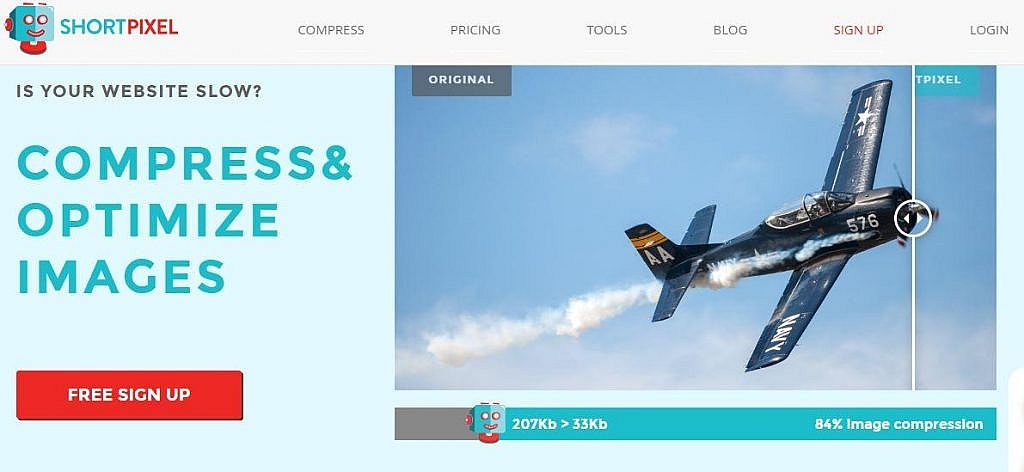
Shortpixel is one of the best tools to compress and optimize images on your WordPress website. It is an indispensable tool because images can slow down your site if they are not appropriately optimized. Image loading speed is a notable ranking factor; hence ShortPixel is a must-have tool.

Easy to use and install, it optimizes your images that you update now and also those that come up in future. Supporting Retina 2X images and other compression options like lossy, glossy and lossless it carries many capabilities in a plugin of its size. Compatible with JPG, PNG, GIF, PDF documents it also converts files to WebP.

7. Redirection

Life was never comfortable fixing 301 redirects, especially when you are migrating to a new domain and have to be very particular about nourishing the new site with all the previously built links.

But Redirection comes as heaven send a gift to the SEO managers around the world. It is a simple plugin that makes 301 redirects, and it is also straightforward to use as well. All you have to do is enter the source URL and the target URL and hit the “add redirect” button.

Besides providing advanced users with regex matching for redirects, it is free to use.

These are the best SEO plugins which you need to consider for your new WordPress website with an eye for duplication of efforts. The plugin market is a vast ocean today, from plugins that are capable of creating a mobile app from a WordPress website to those that check the health of your website. In order to stay ahead in the SEO game you need to keep track of the latest additions. And always remember when it comes to plugin “easy is right.”

Categories: Others Tags:

3 Essential Design Trends, February 2020

February 3rd, 2020 No comments

Designers are embracing big, bold concepts with oversized elements, bright color, and even a little rule-breaking. (The best part? Most of these trends seem to overlap somewhat.) Here’s what’s trending in design this month.

Homepage Headline Heroes

Homepage hero areas are shifting again from website entryways with plenty of text, CTAs, and options for users, to simple displays with big headlines (and maybe not much else).

Use of oversized headlines and text elements make it clear from the start what a website or design is about, but doesn’t provide a lot of opportunity for users to explore without scrolling. And that might be okay. Thanks to mobile dominance, users have become accustomed to the scroll. It may even be shifting to the preferred method of digesting content. (Even more than clicks or taps.)

Scroll is fast and allows users to glance at content and information with little delay or interaction.

Each of the website examples below are designed for just that:

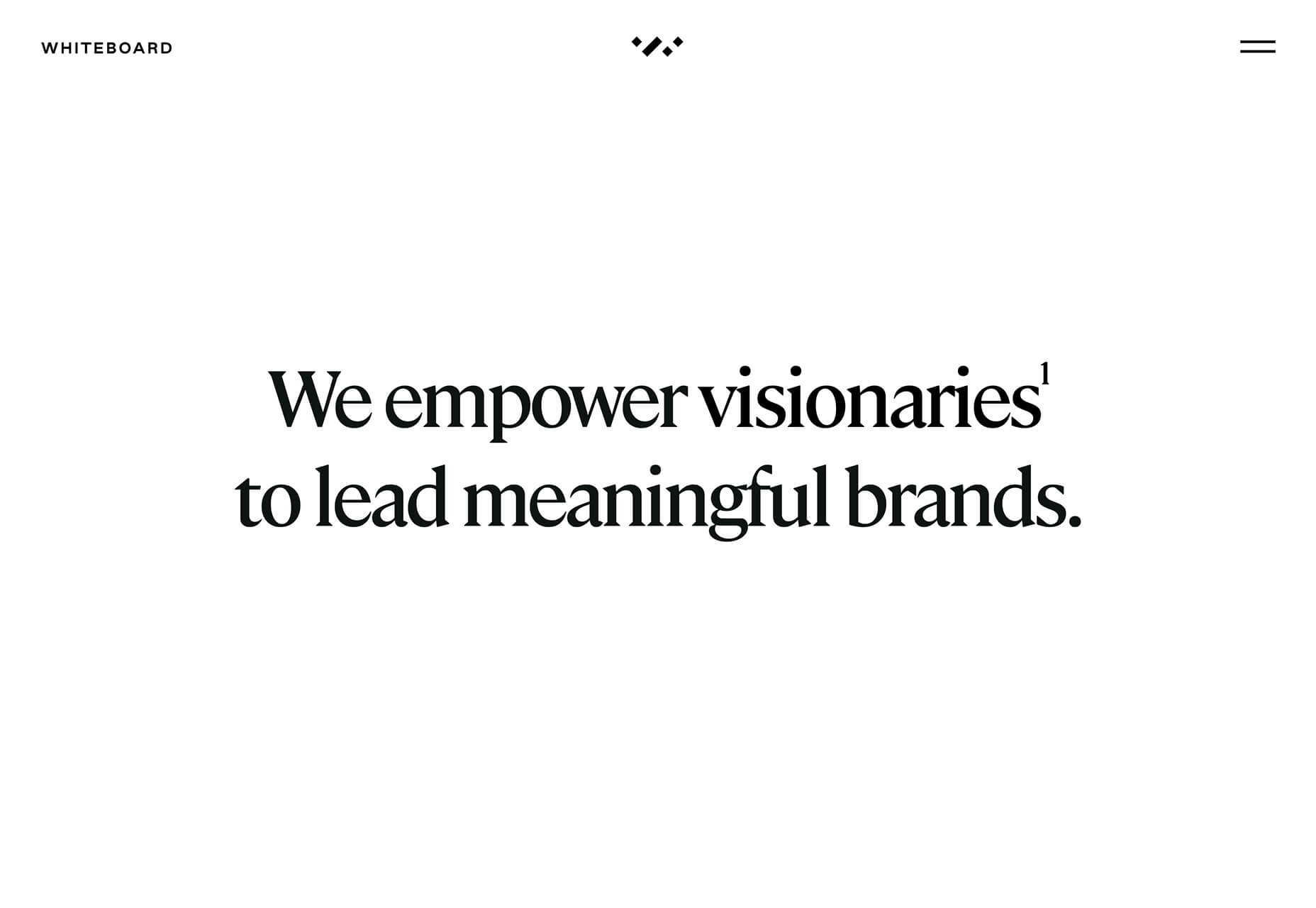
Whiteboard opens with a large headline that encompasses their vision statement and nothing else. On scroll you get access to projects and a deeper dive into information about the brand.

Self-Evident Poems doesn’t actually scroll but moves into prompts for usability. It’s rooted in the same homepage headline hero area that’s designed to draw you into the content.

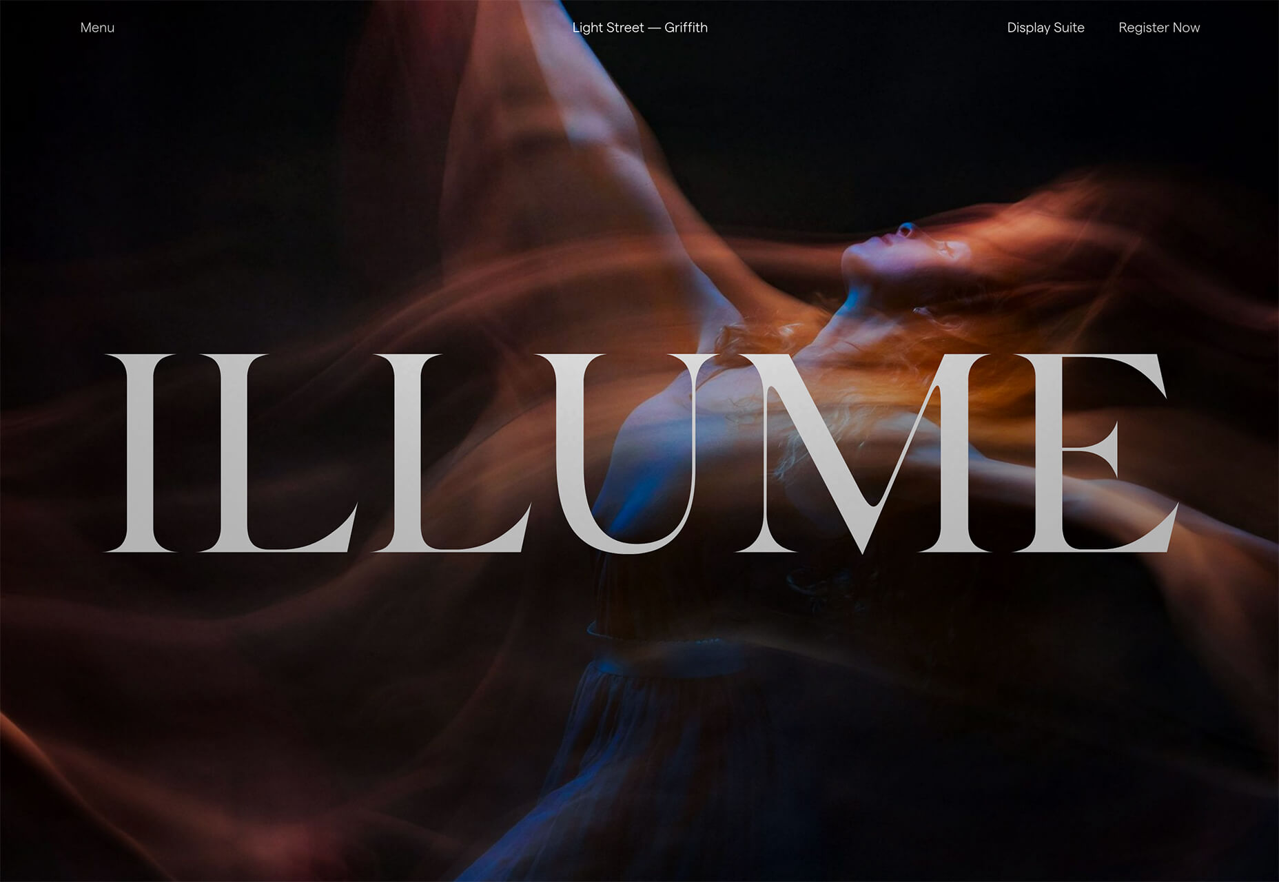
Illume has additional content below the scroll beneath a giant headline in the hero area. What this design does differently is that it does include some imagery, although it is still secondary to the text because of typography size.

Peachy Tones

Beat the Winter blues with a dose of Spring color! Peachy tones seem to be everywhere.

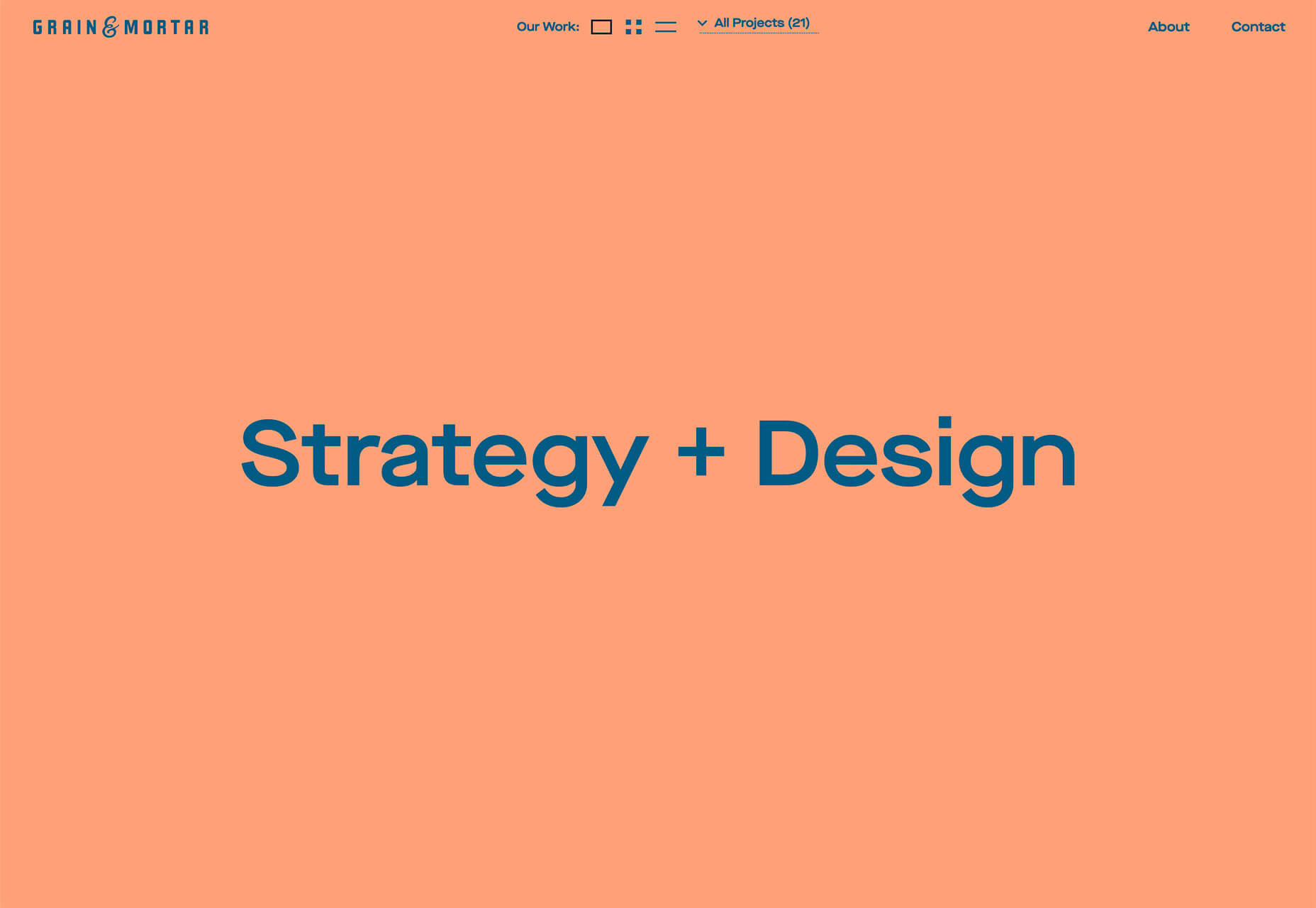
While this trend might be an evolution from other bright colors such as pinks and oranges that have been popular, it has a lot of practical application. Use it as a dominant color such as Grain & Mortar, and Monokai, or to create an accent like Kevin van der Wijst’s portfolio.

Peachy tones provide plenty of options and can be more pinkish or push toward orange. The color can be highly saturated or fairly pale. The nice thing about peachy tones is that they aren’t that overpowering, and work equally well as background or foreground color. Peach can get a little tricky when used for typographic elements, depending on the font style and contrasting elements.

Larger swaths of peach tend to stand up against other elements better than tiny ones. Note that even as an accent in the featured portfolio below, peach tones encompass a significant portion of the canvas. (You might also want to click through and play with that design, which also includes cool liquid animation. You can even make the peach area take up most of the screen.)

Outline Fonts

This trend is exploding in use from small projects to big brands. Outline fonts are a big deal. It’s one of those trends that you would shake your head at and say “no way” if you didn’t see it in action … and used so well.

Outline fonts can be a challenge. They create an effect that’s almost the opposite of the oversized typography in another trend mentioned here. But they do create an eye-catching effect that draws you into the words on screen.

Outline fonts are almost always paired with the same font filled. It creates and yin and yang effect that can help keep users reading longer and engaging with content. The contrast between and outline and filled font also put specific emphasis on the bolder element in the lettering pair.

The trick to making it work is not to get too crazy with the design and design outline fonts so that there’s plenty of contrast for the letters to remain readable.

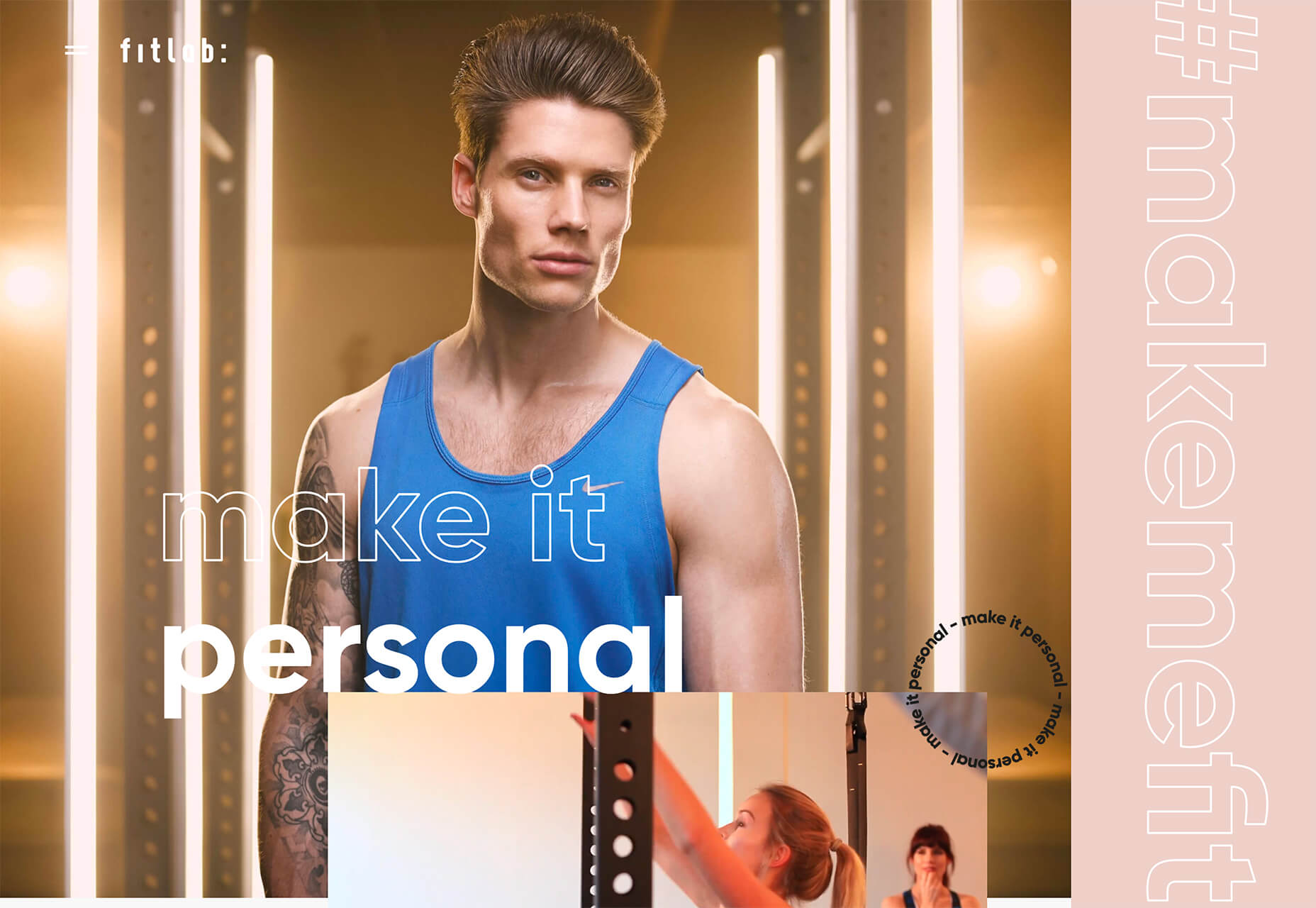
Fitlab is the busiest of the examples of this trend with multiple use of outline fonts and even a quick-moving video roll. Put it all together and the emphasis is on “personal” training. It works.

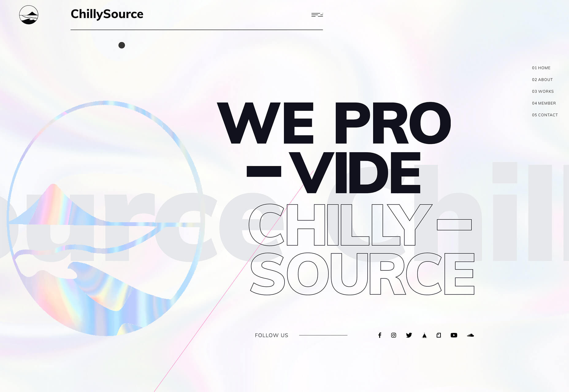
Chilly Source uses an outline font for its brand name so that you get another intro to it without too much brand in your face. (The name is mentioned three time on the homepage.)

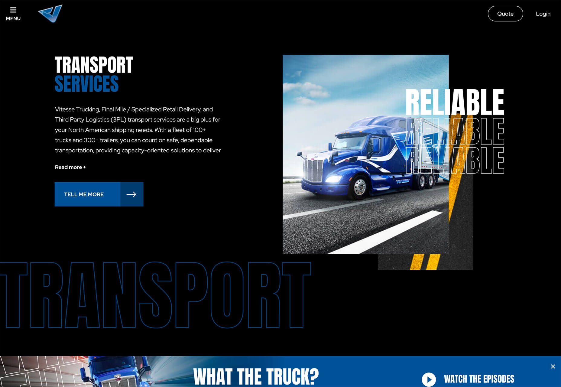
Vitesse Trucking uses outline text to tell you what they do throughout the design. Text is information but also serves as an art element with movement in the parallax-style scrolling design. Outline type elements mirror smaller filled words and even include some layering and overlays to keep the eyes moving. It’s an interesting use of this trend in an industry where you might not expect it.

Conclusion

I’ll be the first to admit, you probably won’t find me designing with a lot of peachy coloring. While it works for these projects, it’s not a favorite of mine.

On the flip side, I adore all the outline font options. It’s funky and provides depth to text elements that we haven’t seen a lot of. How about you? What design trends can you see yourself using in the coming months?

Source

Categories: Designing, Others Tags:

An Interview With Zach Leatherman: A SmashingConf Austin Speaker

February 3rd, 2020 No comments
Smashing Editorial

An Interview With Zach Leatherman: A SmashingConf Austin Speaker

An Interview With Zach Leatherman: A SmashingConf Austin Speaker

Rachel Andrew

2020-02-03T10:30:00+00:002020-02-03T14:18:35+00:00

We are so excited to be bringing SmashingConf to a new city this year. We’re bringing you SmashingConf Austin and we have a fantastic line-up of speakers.

Check out this post, where we introduce our new venue of Austin and share an interview with Miriam Suzanne. This time we have an interview with Zach Leatherman.

Zach will be talking about type and font performance at SmashingConf Austin. See you there?

Zach is no stranger to the Smashing stage, and if you want to find out more about web fonts and loading strategies, you can watch his talk from SmashingConf London 2018, paired with a talk by Monica Dinculescu from SmashingConf Barcelona, “Web Fonts And Performance: SmashingConf Videos“.

Also, take a look at some of the resources that Zach has made available on the subject in his archive of posts about web fonts. There is plenty to get you started, and I think you can agree that there is no-one better to help us understand the current state of font loading while we are in Austin!

Tickets Are On Sale Now!

If you want to join in the fun, tickets are on sale. Last year, we sold out three of our conferences well before the conference date, and popular workshops also fill up fast. Just saying!

(il)
Categories: Others Tags:

7 Ways to Create a Killer Marketing Video [Infographic]

February 3rd, 2020 No comments

Video has rapidly become one of the leading content formats of this digital age. In fact, more video content is uploaded in 30 days than major television networks in the United States have created in over 30 years.

This can be owed to the fact that people no longer rely on television for entertainment. Gone are the days when people have to schedule their days around their favourite shows. They can watch TV shows, movies, and videos on their mobile devices whenever they want.

One-third of all internet users around the world use YouTube, and more than 3 billion videos are watched each day. That doesn’t even include video consumption on social media, websites, and other video streaming platforms.

It’s amazing how consumers demand more video content nowadays, which is why marketers need to up their video marketing strategy and succumb to the demands of their audience.

Yes, a lot of videos have gone viral without even so much of an effort other than for the video owner to tap the record button on their smartphones. However, it’s not the same for businesses. Marketing videos have a specific target audience with a particular brand message. There are strategies and techniques to follow for a video to reach its target audience and make its mark on the world wide web. Check out this infographic to learn the different tips and tricks in creating a killer marketing video.

Categories: Others Tags:

Full Stack Panic

February 1st, 2020 No comments

A new podcast from Sean Fioritto inspired by Joel Califa’s term “Full Stack Anxiety”.

… the little voice in your head says … “I should know all of this. Do I even know what I’m doing?” Why do web developers the world over feel like this?

There is an episode with Joel talking about it as well as other interesting angles like an episode with psychologist Dr. Sherry Walling.

The overall vibe is that of catharsis in that, hopefully, none of this matters as much as it seems like it might. I’d like to think we try to deliver that, through a bit of levity, on ShopTalk Show as well.

Oh hey and Panic started a podcast too, a must-subscribe from me as a long-time fan of all their interesting work.

Direct Link to ArticlePermalink

The post Full Stack Panic appeared first on CSS-Tricks.

Categories: Designing, Others Tags: