Archive

Archive for February, 2020

Moving from Vanilla JavaScript to a Reusable Vue Component

February 17th, 2020 No comments

I recently wrote an article explaining how you can create a countdown timer using HTML, CSS and JavaScript. Now, let’s look at how we can make that a reusable component by porting it into Vue using basic features that the framework provides.

Why do this at all? Well there are few reasons, but two stand out in particular:

  • Keeping UI in sync with the timer state: If you look at the code from the first post, it all lives in the timerInterval function, most noticeably the state management. Each time it runs (every second) we need to manually find the proper element on our document — whether it’s the time label or the remaining time path or whatever — and change either its value or an attribute. Vue comes with an HTML-based template syntax that allows you to declaratively bind the rendered DOM to the underlying Vue instance’s data. That takes all the burden of finding and updating proper UI elements so we can rely purely on the component instance’s properties.
  • Having a highly reusable component: The original example works fine when only one timer is present on our document, but imagine that you want to add another one. Oops! We rely the element’s ID to perform our actions and using the same ID on multiple instances would prevent them from working independently. That means we would have to assign different IDs for each timer. If we create a Vue component, all it’s logic is encapsulated and connected to that specific instance of the component. We can easily create 10, 20, 1,000 timers on a single document without changing a single line in the component itself!

Here’s the same timer we created together in the last post, but in Vue.

Template and styles

From the Vue docs:

Vue uses an HTML-based template syntax that allows you to declaratively bind the rendered DOM to the underlying Vue instance’s data. All Vue.js templates are valid HTML that can be parsed by spec-compliant browsers and HTML parsers.

Let’s create our component by opening a new file called BaseTimer.vue. Here’s the basic structure we need for that:

// Our template markup will go here
<template>
// ...
</template>

// Our functional scripts will go here
<script>
// ...
</script>

// Our styling will go here
<style>
// ...
</style>

In this step, we will concentrate on the and sections. Let’s move our timer template to the section and all our CSS to section. The markup mostly consists of SVG and we can use the exact same code we used from the first article.

<template>
  // The wrapper for the timer
  <div class="base-timer">

    // This all comes from the first article
    <svg class="base-timer__svg" viewBox="0 0 100 100" xmlns="http://www.w3.org/2000/svg">
      <g class="base-timer__circle">
        <circle class="base-timer__path-elapsed" cx="50" cy="50" r="45"></circle>
        <path
          id="base-timer-path-remaining"
          stroke-dasharray="283"
          class="base-timer__path-remaining ${remainingPathColor}"
          d="
            M 50, 50
            m -45, 0
            a 45,45 0 1,0 90,0
            a 45,45 0 1,0 -90,0
          "
        ></path>
      </g>
    </svg>

    // The label showing the remaining time
    <span
      id="base-timer-label"
      class="base-timer__label"
    >
      ${formatTime(timeLeft)}
    </span>

  </div>
</template>

// "scoped" means these styles will not leak out to other elements on the page
<style scoped>
.base-timer {
  position: relative;
  width: 100px;
  height: 100px;
}
</style>

Let’s have a look at the template we just copied to identify where we can use our framework. There are few parts that are responsible for making our timer count down the time and show the remaining time.

  • stroke-dasharray: A value passed to the SVG element that is responsible for holding the remaining time.
  • remainingPathColor: A CSS class responsible for changing the color of the timer’s circular ring, giving is a way to visually indicate that time is running out.
  • formatTime(timeLeft): A value responsible for showing how much time is left inside the timer

We can control our timer by manipulating those values.

Constants and variables

OK, let’s go down to our section and see what Vue gives us out of the box to make our life easier. One thing it lets us do is define our constants up front, which keeps them scoped to the component.

In the last post, we spent a little time tweaking the stroke-dasharray value to make sure the animation of the timer’s top layer (the ring that animates and changes color as time progresses) is perfectly in line with its bottom layer (the gray ring that indicates past time). We also defined “thresholds” for when the top layer should change colors (orange at 10 remaining seconds and red at five seconds). We also created constants for those colors.

We can move all of those directly into the section:

<script>
// A value we had to play with a bit to get right
const FULL_DASH_ARRAY = 283;
// When the timer should change from green to orange
const WARNING_THRESHOLD = 10;
// When the timer should change from orange to red
const ALERT_THRESHOLD = 5;

// The actual colors to use at the info, warning and alert threshholds
const COLOR_CODES = {
  info: {
    color: "green"
  },
  warning: {
    color: "orange",
    threshold: WARNING_THRESHOLD
  },
  alert: {
    color: "red",
    threshold: ALERT_THRESHOLD
  }
};

// The timer's starting point
const TIME_LIMIT = 20;
</script>

Now, let’s have a look at our variables:

let timePassed = 0;
let timeLeft = TIME_LIMIT;
let timerInterval = null;
let remainingPathColor = COLOR_CODES.info.color;

We can identify two different types of variables here:

  1. Variables in which the values are directly re-assigned in our methods:
    • timerInterval: Changes when we start or stop the timer
    • timePassed: Changes each second when the timer is running
  2. Variables in which the values change when other variables change:
    • timeLeft: Changes when the value of timePassed changes
    • remainingPathColor: Changes when the value of timeLeft breaches the specified threshold

It is essential to identify that difference between those two types as it allows us to use different features of the framework. Let’s go through each of the type separately.

Variables in which values are directly re-assigned

Let’s think what we want to happen when we change the timePassed value. We want to calculate how much time is left, check if we should change the top ring’s color, and trigger re-render on a part of our view with new values.

Vue comes with its own reactivity system that updates the view to match the new values of specific properties. To add a property to Vue’s reactivity system we need to declare that property on a data object in our component. By doing that,Vue will create a getter and a setter for each property that will track changes in that property and respond accordingly.

<script>
// Same as before

export default {
  data() {
    return {
      timePassed: 0,
      timerInterval: null
    };
  }
</script>

There are two important things we need to remember.

  1. We need to declare all reactive variables in our data object up front. That means if we know that a variable will exist but we don’t know what the value will be, we still need to declare it with some value. If we forgot to declare it in data it will not be reactive, even if it is added later.
  2. When declaring our data option object, we always need to return a new object instance (using return). This is vital because, if we don’t follow this rule, the declared properties will be shared between all instances of the component.

You can see that second issue in action:

Variables in which values change when other variable change

These variables rely on the value of another variable. For example, timeLeft relies purely on timePassed. In our original example that uses vanilla JavaScript, we were calculating that value in the interval that was responsible for changing the value of timePassed. With Vue, we can extract that value to a computed property.

A computed property is a function that returns a value. These values are bound to the dependency values and only update when required. Even more importantly, computed properties are cached, meaning they remember the values that the computed property depends on and calculate the new value only if that dependent property value changed. If the value does not change, the previously cached value is returned.

<script>
// Same as before

computed: {
    timeLeft() {
      return TIME_LIMIT - this.timePassed;
    }
  }
}
</script>

The function passed to the computed property must be a pure function. It can’t cause any side effects and must return a value. Also, the output value must only be dependent on the values passed into the function.

Now, we can move more logic to computed properties:

  • circleDasharray: This returns a value previously that is calculated in the setCircleDasharray method.
  • formattedTimeLeft: This returns a value from the formatTime method.
  • timeFraction: This is an abstraction of the calculateTimeFraction method.
  • remainingPathColor: This is an abstraction of the setRemainingPathColor method.
<script>
// Same as before

computed: {
    circleDasharray() {
      return `${(this.timeFraction * FULL_DASH_ARRAY).toFixed(0)} 283`;
    },

    formattedTimeLeft() {
      const timeLeft = this.timeLeft;
      const minutes = Math.floor(timeLeft / 60);
      let seconds = timeLeft % 60;
      if (seconds < 10) {
        seconds = `0${seconds}`;
      }
      return `${minutes}:${seconds}`;
    },

    timeLeft() {
      return TIME_LIMIT - this.timePassed;
    },

    timeFraction() {
      const rawTimeFraction = this.timeLeft / TIME_LIMIT;
      return rawTimeFraction - (1 / TIME_LIMIT) * (1 - rawTimeFraction);
    },

    remainingPathColor() {
      const { alert, warning, info } = COLOR_CODES;
      if (this.timeLeft <= alert.threshold) {
        return alert.color;
      } else if (this.timeLeft <= warning.threshold) {
        return warning.color;
      } else {
        return info.color;
      }
    }
  }
</script>

We now have all the values we need! But now we need to put them to use in our template.

Using data and computed properties in the template

Here’s where we left off with our template:


<template>
  <div class="base-timer">
    <svg class="base-timer__svg" viewBox="0 0 100 100" xmlns="http://www.w3.org/2000/svg">
      <g class="base-timer__circle">
        <circle class="base-timer__path-elapsed" cx="50" cy="50" r="45"></circle>
        <path
          id="base-timer-path-remaining"
          stroke-dasharray="283"
          class="base-timer__path-remaining ${remainingPathColor}"
          d="
            M 50, 50
            m -45, 0
            a 45,45 0 1,0 90,0
            a 45,45 0 1,0 -90,0
          "
        ></path>
      </g>
    </svg>
    <span
      id="base-timer-label"
      class="base-timer__label"
    >
        ${formatTime(timeLeft)}
    </span>
  </div>
</template>

Let’s start with formatTime(timeLeft). How we can dynamically bind the rendered value to our formattedTimeLeftcomputed property?

Vue uses HTML-based template syntax that allowsus to declaratively bind the rendered DOM to the underlying data of the Vue instance. That means all properties are available in the template section. To render any of them, we use text interpolation using the “Mustache” syntax (double curly braces, or {{ }}).

<span
  id="base-timer-label"
  class="base-timer__label"
>
  {{ formattedTimeLeft }} 
</span>

Next will be stroke-dasharray. We can see we don’t want to render that value. Instead, we want to change the value of the attribute. Mustache cannot be used inside HTML attributes, but fear not! Vue comes with another way: the v-bind directive. We can bind a value to an attribute like this:

<path  v-bind:stroke-dasharray="circleDasharray"></path>

To facilitate the usage of that directive, we can also use a shorthand.

<path  :stroke-dasharray="circleDasharray"></path>

The last one is remainingPathColor, which adds a proper class to an element. We can do that using the same v-bind directive as above, but assign the value to the class attribute of an element.

<path  :class="remainingPathColor"></path>

Let’s have a look at our template after changes.

<template>
  <div class="base-timer">
    <svg class="base-timer__svg" viewBox="0 0 100 100" xmlns="http://www.w3.org/2000/svg">
      <g class="base-timer__circle">
        <circle class="base-timer__path-elapsed" cx="50" cy="50" r="45"></circle>
        <path
          :stroke-dasharray="circleDasharray"
          class="base-timer__path-remaining"
          :class="remainingPathColor"
          d="
            M 50, 50
            m -45, 0
            a 45,45 0 1,0 90,0
            a 45,45 0 1,0 -90,0
          "
        ></path>
      </g>
    </svg>
    <span class="base-timer__label">{{ formattedTimeLeft }}</span>
  </div>
</template>

We have our template ready, we moved all variables to data or computed, and we got rid off most of the methods by creating corresponding computed properties. We are still missing one vital part, though: we need to start our timer.

Methods and component lifecycle hooks

If we look at our startTimer method, we can see that all the calculations, changes in attributes, etc. happen in the interval.

function startTimer() {
  timerInterval = setInterval(() => {
    timePassed = timePassed += 1;
    timeLeft = TIME_LIMIT - timePassed;
    document.getElementById("base-timer-label").innerHTML = formatTime(
      timeLeft
    );
    setCircleDasharray();
    setRemainingPathColor(timeLeft);
    if (timeLeft === 0) {
      onTimesUp();
    }
  }, 1000);
}

Since we’ve already moved all that logic into the computed property, all we need to do in our timerInterval is change the value of timePassed — the rest will happen magically in the computed properties

<script>
// Same as before

methods: {
  startTimer() {
    this.timerInterval = setInterval(() => (this.timePassed += 1), 1000);
  }
}
</script>

We have the method ready, but we still don’t call it anywhere. Each Vue component comes with a series of hooks that allows us to run a specific logic within a specific period of the component’s lifecycle. These are called lifecycle hooks. In our case, as we want to call our method immediately when the component gets loaded. That makes mounted the lifecycle hook what we want.

<script>
// Same as before

mounted() {
  this.startTimer();
},

// Same methods as before
</script> 

That’s it, we just turned our timer into a consistent and reusable component using Vue!

Let’s say we now want to use this component in another component. That requires a few things:

  1. First, we import the component.
  2. Next, we register the component.
  3. Finally, we instantiate the component in the template.
// App.vue

import BaseTimer from "./components/BaseTimer"

export default {
  components: {
    BaseTimer
  }
};

That’s a wrap!

This example shows how we can move a component from vanilla JavaScript to a component-based front-end framework, like Vue.

We can now treat the timer as a standalone component where all the markup, logic and styling is contained in a way that won’t leak out to or conflict with other elements. Components are often children of a larger parent component that assembles multiple components together — like a form or perhaps a card — where the parent’s properties can be accessed and shared. Here’s an example of the timer component where it’s taking orders from a parent component

I hope I got you interested in Vue and the power of components! I’d encourage you to go to Vue docs to get more detailed description of the features we used in our example. There’s so much Vue can do!

The post Moving from Vanilla JavaScript to a Reusable Vue Component appeared first on CSS-Tricks.

Categories: Designing, Others Tags:

Blame the implementation, not the technique

February 17th, 2020 No comments

I’m not sure we’ve gotten much better at this since Tim Kadlec wrote this in 2012:

Stop me if you’ve heard this one before.

“Responsive design is bad for performance.”
“User agent detection is bad. Don’t segment the web.”
“Hybrid apps don’t work as well as native apps.”
“CSS preprocessors shouldn’t be used because they create bloated CSS.”

… Find out for yourself if the tool is really where the blame should be placed.

I’m sure there is some psychological concept that explains why we transfer blame from the offending thing to what we perceive to be the cause.

Sometimes we’re good at this. Remember the AMP letter:

The AMP format is not in itself, a problem, but two aspects of its implementation…

Or the fact that accessibility issues aren’t React’s fault. Pointing at the tools makes it harder to talk about the real problems that need to be resolved.

Sometimes I’m not so good at this. I’m linking to Tim here in an effort to help me remember this.

Direct Link to ArticlePermalink

The post Blame the implementation, not the technique appeared first on CSS-Tricks.

Categories: Designing, Others Tags:

What To Do If People Hate Your Brand Mascot

February 17th, 2020 No comments
TinyPNG website 2014

What To Do If People Hate Your Brand Mascot

What To Do If People Hate Your Brand Mascot

Suzanne Scacca

2020-02-17T13:00:00+00:002020-02-17T20:09:50+00:00

There are a number of reasons why businesses decide to use mascots to represent their brands:

  • They want there to be a friendly and reliable face to welcome visitors to the site.
  • They know they need something more than an inventory of products to make an emotional connection with shoppers.
  • They want a strong and recognizable personality that can tie all of their marketing channels together.

While it’s clear that mascots can be invaluable for the business-consumer connection, there’s a very thin line between mascots turning customers into loyal advocates and sending prospects running away in fear.

If you’re struggling to get traction on an existing website and fear the mascot might have something to do with it, this post is for you. You should also keep reading if you’re designing a mascot from-scratch and aren’t sure how to create something your audience will fall in love with.


There’s a very thin line between brand mascots turning customers into loyal advocates and sending prospects running away in fear.

Things You Can Do to Create a Brand Mascot People Love

Not everyone is going to get as lucky as TinyPNG, which has had the same brand mascot for years.

This was the mascot that sat at the top of the page in 2014:

TinyPNG website 2014

A snapshot of the TinyPNG website in 2014 with its panda mascot. (Image source: TinyPNG) (Large preview)

Here it is again in 2017, only it’s a bit brighter and larger in size:

TinyPNG website 2017

A snapshot of the TinyPNG website in 2017 with its panda mascot. (Image source: TinyPNG) (Large preview)

The mascot also started appearing with a crown on the bottom right. This callout encouraged users to subscribe to the Pro tool.

To this day, the website continues to use the mascot in this manner (and with nearly the same layout and content):

TinyPNG website 2020

A snapshot of the TinyPNG website in 2020 with its panda mascot. (Image source: TinyPNG) (Large preview)

The panda mascot works for a number of reasons. It looks very happy, for one. Also, it’s got a welcoming presence, like “Hey, I’m just chilling here, eating my bamboo. Feel free to upload your images whenever.” And it’s downright adorable.

But not every seemingly happy, friendly or cute brand mascot works out this well. Mascots are a subjective thing. It’s like they always say: beauty is in the eye of the beholder.

So, if your audience doesn’t interpret the attractiveness, humor or personality of the mascot as the original creators did, it’s going to be a problem for the business as a whole.

Let’s take a look at what your options are if you suspect that your client’s brand mascot isn’t as adored as they hoped it would be.

Option #1: Modernize It

The first thing to think about is whether or not the mascot is worth salvaging. Is there anything good about the mascot or its personality… or should you start over?

Don’t just go based on your gut. Do some market research and throw some user surveys out there. Maybe message old customers of your client or do a poll on Twitter. You need to know why the mascot isn’t hitting the mark.

Once you’ve nailed down what’s wrong, it’s time to redesign it. Let’s look at some websites that have given their mascots facelifts over the years, starting with HostGator:

HostGator website 2012

A snapshot of the HostGator website from 2012 with its alligator mascot logo and imagery. (Image source: HostGator) (Large preview)

This is what the HostGator website looked like in 2012. The alligator mascot had a heavy presence in the header of the website. His head also appears to be peaking out of the main banner.

Fast forward to 2017 and we see a different side of the HostGator mascot:

HostGator website 2017

A snapshot of the HostGator website from 2017 with its mascot slightly revamped. (Image source: HostGator) (Large preview)

For starters, the alligator in the logo is much smaller, so we can now see the entire body. This gives it a more human-like feeling as opposed to the bottomless gator which more closely resembles a puppet.

The mascot in the main banner is designed the same way it’s always been designed (including the facial expression). However, it’s now donning winter gear for a seasonal touch.

Since then, HostGator has given its mascot a major touchup:

HostGator website 2020

A snapshot of the HostGator website in 2020 with a redesigned alligator mascot. (Image source: HostGator) (Large preview)

Do you know what this redesign looks like to me? It looks like the CGI used in The Irishman.

The Irishman CGI touchup Joe Pesci

Vulture magazine shares a side-by-side look at CGI in the movie The Irishman from Netflix. (Image source: HostGator) (Large preview)

I’m not sure if that was the intention behind HostGator’s mascot redesign, but I’m going to assume that there was some user feedback that suggested that a softer and less intimidating mascot would perform better.

Another website that’s given its well-known mascot a touch-up is Chuck E. Cheese.

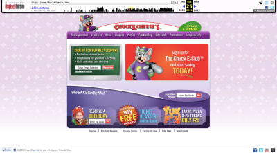
This was the Chuck E. Cheese website in 2011:

Chuck E. Cheese website 2011

A snapshot of the Chuck E. Cheese website from 2011 with its cartoon mouse mascot (Image source: Chuck E. Cheese) (Large preview)

Not even a decade ago, the Chuck E. Cheese website and its mascot looked like something out of Nickelodeon. Obviously, a design like this would’ve needed an upgrade no matter what considering how much web design has changed.

This is what the website looks like today:

Chuck E. Cheese website 2020

A snapshot of the Chuck E. Cheese website in 2020 without a mascot. (Image source: Chuck E. Cheese) (Large preview)

Gone are the crazy color palette and illustrations. Today, the website is much more subdued and customer-centric.

That said, the mascot pops up from time-to-time. Obviously, though, it’s undergone a much-needed redesign:

Chuck E. Cheese mascot 2020

The Chuck E. Cheese mascot in 2020. (Image source: Chuck E. Cheese) (Large preview)

The new mascot is still a buck-toothed mouse with a welcoming smile and wave. However, it looks more on par with the kinds of animations you’d see coming out of Pixar than old Saturday morning cartoons.

Even if there’s nothing necessarily wrong with the mascot your website is using, it might be worth looking at upgrading it so it better fits with the times as Chuck E. Cheese has done.

Option #2: Change The Tone Of It

Mascots can be really helpful at getting a brand’s message across — over and over again. However, there may be times when the kind of mascot you’ve chosen (or a lack of one) actually stands in the way of the message you’re trying to convey.

Take the old GEICO mascot: the caveman.

GEICO website 2005 - caveman

A snapshot of the GEICO website in 2005 when it featured the caveman mascot. (Image source: GEICO) (Large preview)

I don’t know that there was anything wrong with the caveman advertisements. They were smart and funny and were lauded for taking on the subject of political correctness.

That said, GEICO’s customer data must’ve told them that a change-up was needed. Maybe the messaging was too serious or the humor went over some people’s heads.

So, they scrapped the caveman mascot for an animated Cockney-accented gecko:

GEICO website 2020 - gecko

A snapshot of the GEICO website in 2020 with its gecko mascot. (Image source: GEICO) (Large preview)

Whereas the cavemen were always offended and storming off whenever someone would say “It’s so easy a caveman could do it”, this anthropomorphic mascot is a much more lighthearted figure in the GEICO landscape. The gecko is always there, ready to provide tips on how to get the most with GEICO.

In other words, it might not be enough to change your mascot to an adorable critter. You might also need to switch up your messaging, too.

While I was writing my last article on mobile storytelling, I did some digging into the alcohol industry. One company, in particular, stood out for its use of a human mascot and storyteller: Aviation Gin.

Now, what I hadn’t covered in that write-up was the fact that Aviation Gin has been around for a while. It was founded in the mid-2000s, long before current co-owner and mascot Ryan Reynolds had anything to do with it.

This was the Aviation Gin website in 2007:

Aviation Gin website 2007

A snapshot of the Aviation Gin website from 2007. (Image source: Aviation Gin) (Large preview)

Granted, these are the early days of the web, so we can’t expect much in the way of design. However, as far as mascots go, there are none to be seen. Unless you count the actual bottle of Aviation Gin.

Nearly 10 years later, Aviation Gin was still rocking the product-centric design:

Aviation Gin website 2016

A snapshot of the Aviation Gin website in 2016. (Image source: Aviation Gin) (Large preview)

It was still very simple in design and the bottle of gin remained the sole focus. Aside from some industry awards, Aviation Gin wasn’t the media darling it is now.

In 2018, Ryan Reynolds bought shares in the company and changed the whole tone of the brand:

Aviation Gin website 2020

A snapshot of the Aviation Gin website in 2020 featuring Ryan Reynolds. (Image source: Aviation Gin) (Large preview)

Today, Ryan Reynolds has become the face of Aviation Gin, pushing it at every turn on his social media. It hasn’t changed the direction of the company itself, but by having a human mascot like Reynolds on its side, the message (and likely the audience, too) has changed.

It’s also opened the brand up to bigger opportunities, like Reynolds’ latest announcement about their partnership with the Westminster Kennel Club Dog Show:

So, if you have a website that performs just “okay” with its audience, a change of tone and pace might be needed. And if you don’t have a mascot yet or one that’s not a good fit, creating one that’s well-designed for a modern-day audience might be exactly what you need.

Option #3: Minimize Its Presence On The Website

Let’s say the mascot’s design and the message it brings with it isn’t the problem. What you suspect is that it’s the amount of space given to it that’s the problem.

This is easy enough to confirm with A/B testing. You’ll just need to study your heatmaps as well as your user personas to come up with some hypotheses about where your mascot should or should not be on the site.

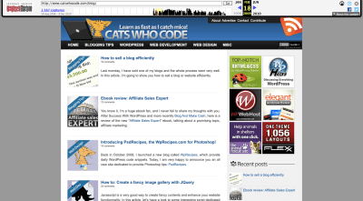
Let’s use Cats Who Code as an example. This was the website back in 2009:

Cats Who Code website 2009

A snapshot of the Cats Who Code website in 2009 with cat logo and imagery. (Image source: Cats Who Code) (Large preview)

Back then, cats were quite prevalent on the site, from the laptop-using cat in the header to the cats in the blog images. What’s more, the tagline of the site “Learn as fast as I catch mice!” made it perfectly clear that the kind of “cats” referred to here wasn’t referring to hip or cool cats. It really was referring to the furry pet.

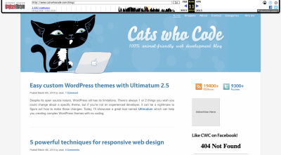
Skip ahead to 2014 and the cat mascot and tagline has received a makeover:

Cats Who Code website 2014

A snapshot of the Cats Who Code website from 2014 with a new mascot. (Image source: Cats Who Code) (Large preview)

For starters, the mascot has gone from a small tabby to a large black-and-white cat. In addition, the website’s tagline now reads “100% animal-friendly web development blog”. Those are both pretty significant changes.

Now, let’s look at the website in the present day:

Cats Who Code website 2020

A snapshot of the Cats Who Code website in 2020. (Image source: Cats Who Code) (Large preview)

The cat mascot no longer exists in its previous iterations. Now, it’s relegated to a small cat-like icon with code brackets where its face used to be. The website’s cat-friendly messaging is gone, too.

Whether it’s because the cat imagery was distracting or people didn’t like it, this website has undergone a drastic change. Everything is now very buttoned-up.

Another brand that cut back on the appearance of its mascot is Green Giant.

This was the website in 2013:

Green Giant website 2013

A snapshot of the Green Giant website and its mascot in 2013. (Image source: Green Giant) (Large preview)

The jolly green giant mascot is front-and-center on the home page. This is in addition to all the small appearances it makes in every product featured on the site.

In 2016, however, the giant’s likeness was removed from the hero banner and moved up to the logo:

Green Giant website 2016

A snapshot of the Green Giant website in 2016 with the mascot in the logo. (Image source: Green Giant) (Large preview)

It looks like the company was experimenting here, trying to see if moving the mascot’s face to the logo would give them more room to allow their products to shine.

In 2020, though, there’s barely any trace of the mascot left:

Green Giant website 2020

A snapshot of the Green Giant website in 2020. (Image source: Green Giant) (Large preview)

The mascot is gone from the logo as well as the hero image… sort of. It’s subtle, but the mascot’s shadow remains.

The website now appears to be more focused towards sustainability and its mission to contribute to a better world. In that sense, it’s completely justified why the mascot and even the blatant pushing of its products would be moved out of the way.

So, if you feel like your mascot might be getting in the way of getting your point across or perhaps the brand has evolved in a way where a cartoonish figure no longer fits, test out other ways to keep your mascot but in a very lowkey way.

Option #4: Lean Into The Creepiness/Weirdness/Ugliness

One other option you have is to lean into it.

Obviously, you shouldn’t go this route if customers find the mascot to be offensive or boring. If it’s just not working and there’s no way to turn the situation around, just scrap the mascot altogether. You’ll be better off focusing on strengthening your content and building trust that way than to push an already delicate situation.

That said, if you feel like people are reacting negatively to the mascot because of how novel or different it is, then you might want to go crazy with it and see what happens. Before I show you an example of a website that does this, I’m going to show you a real-world example of a sports mascot that turned haters into the biggest of fans.

I was living outside of Philadelphia around the time the Flyers hockey team introduced their new mascot Gritty. It didn’t go over well — at first.

This is how they introduced Gritty:

Philadelphia Flyers Gritty mascot

The Philadelphia Flyers introduce their mascot Gritty on Twitter. (Image source: Twitter) (Large preview)

Here are some of the initial responses people had to the creature with the giant beer gut and flaming-orange googly eyes:

@shocks23 speculated about its origins:

Twitter speculation about Gritty mascot

Twitter user @shocks23 suspects the Flyers’ mascot has a seedy past. (Image source: Twitter)

@aclee_clips expressed fear:

Twitter user scared of Gritty

Twitter user @aclee_clips is horrified by the Philadelphia Flyers’ new mascot. (Image source: Twitter)

And, like so many others, @mirtle was shocked and confused:

Twitter user confused about Gritty mascot

Twitter user @mirtle expresses confusion about Philadelphia Flyers’ mascot. (Image source: Twitter)

However, this isn’t a story of a brand mascot that failed.

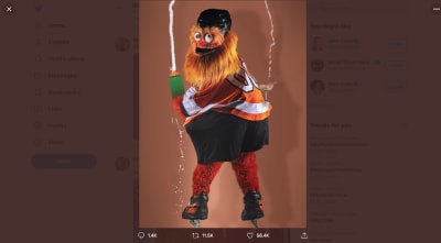
The city of Philadelphia (along with the rest of the world) eventually fell in love with Gritty after it posed Kim Kardashian-like with a champagne bottle and entered the arena on a wrecking ball Miley Cyrus-style.

Gritty the mascot meme

Flyers mascot Gritty gets cheeky by posing with a champagne glass on his bum. (Image source: Twitter)

Over the past couple of years, Gritty has worked very hard to win the hearts of consumers bringing a fun and lighthearted approach to everything it does both on the ice as well as off. And win the hearts it has.

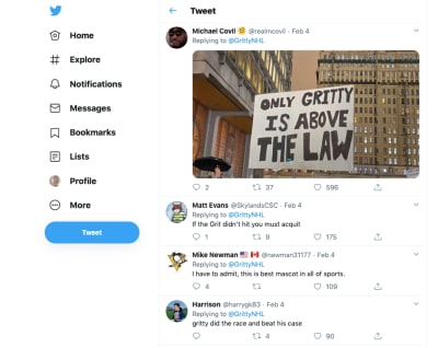
Take, for instance, an incident that happened earlier this year when Gritty was accused of hitting a child at a game. The accusation was investigated and Gritty was cleared of the charges. Through it all, fans had the mascot’s back.

Twitter users love team mascot Gritty

Twitter users love Gritty even in the face of scandal. (Image source: (Image source: Twitter)

If you can create a mascot with the right kind of personality, message and purpose, your website and brand will be able to experience this kind of die-hard fandom and support.

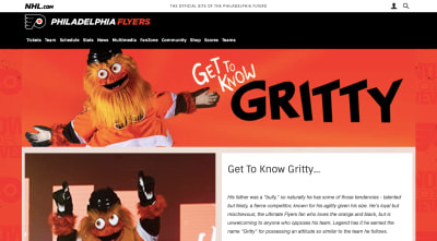
That said, this is social media we’re talking about. While the Flyers’ have gone all-in on showing off Gritty in the most awkward of situations or while humorously riffing on pop culture, the website itself only has one page where the mascot appears:

Get to Know Gritty fan page

The Get to Know Gritty fan page on the Philadelphia Flyers website. (Image source: Philadelphia Flyers (Large preview)

So, leaning into an awkward/strange/nightmare-inducing mascot might not be right for every site. Here’s one very well-known example where it was the right call:

This is the Mucinex website from 2010:

Mucinex website 2010

A snapshot of the Mucinex website in 2010 featuring its fat, green mucus mascot. (Image source: Mucinex) (Large preview)

If you ask me, this is one of the grossest mascots ever created. It’s literally mucus in human-like form. And yet, it works somehow because it’s done in a humorous manner.

In 2015, Mr. Mucus took on a sweaty and ill-looking appearance:

Mucinex website 2015

A snapshot of the Mucinex website in 2015 with its mucus mascot. (Image source: Mucinex) (Large preview)

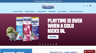
This is the only look we get at Mr. Mucus on the website and I’m not sure it worked out very well for the brand. That may be because the mascot resembles Jabba the Hutt instead of a fun-loving mucus ball you want to watch walk down the aisle with Mrs. Mucus.

Nevertheless, the company pushed forward with the mascot, giving it even more airtime. The 2020 version of the website has Mr. Mucus appearing in various states:

Mucinex website 2020 - Mr. Mucus nervous

The Mucinex 2020 website shows off Mr. Mucus in different states. This is the mascot nervous about shipping. (Image source: Mucinex) (Large preview)

This looks similar to the Mr. Mucus we saw in 2015. However, something about the messaging in this banner gives his facial expression and clammy skin a different vibe this time around. It says, “Please don’t order this cold medicine. I don’t want to go away!”

In another banner image, we see Mr. Mucus rocking a dad bod alongside a message about working out:

Mucinex website 2020 - Mr. Mucus dad bod

The Mucinex 2020 website shows off Mr. Mucus in different states. This is the mascot with its dad bod. (Image source: Mucinex) (Large preview)

The mascot is still pretty gross, but there’s no denying how funny this image is. And then you have this banner that’s targeted at cold remedies for kids:

Mucinex website 2020 - Mr. Mucus kid

The Mucinex 2020 website shows off Mr. Mucus in different states. This is the mascot in kid form. (Image source: Mucinex) (Large preview)

I’m not sure if this is supposed to be Mr. Mucus as a kid or the child he had with Mrs. Mucus, but it’s another creative adaptation of the mascot.

According to CBC, Mucinex made a ton of money after launching its Mr. Mucus campaign in 2004, more than doubling its profits. And despite Mr. Mucus being one of the most recognizable mascots, it is also one of the least liked, too.

In this case, being hated was a good thing. Mucinex wanted its customers to be disgusted by Mr. Mucus. The whole purpose of the company is to help people fight off phlegmy throats and stuffed noses.

So, before you throw your hated mascot away, think about where the hate is coming from and if you can make it work to your advantage in another way.


If you can create a mascot with the right kind of personality, message and purpose, your website and brand will be able to experience this kind of die-hard fandom and support.

Wrapping Up

If your website could benefit from a little levity, a mascot would be a fantastic way to draw visitors into the content of your website as well as into the brand’s story. That doesn’t mean that every mascot should draw laughs or be shocking. There are plenty of recognizable and well-loved mascots that have subdued personalities. It’s all about working with the personality of your brand and fitting a mascot to it.

Further Reading on SmashingMag:

(ra, il)
Categories: Others Tags:

How to Sell Stock Photos

February 17th, 2020 No comments
how to sell stock photos

If you are interested in photography, and you think you are good at it, you can earn a passive income by selling stock photos. How to sell stock photos is the first question that comes to mind, but don’t worry, we got you covered.

First impressions have always been important, and usually, the first impression you get for your product and work is through a visual. So businesses all around the world put so much time and effort into having the best visual to get attention. Without the imagery, people are likely to ignore your product or content.

Not every business out there can afford to commission a professional photographer yet alone having an in-house photographer to shoot photographs for them exclusively. So more and more businesses are turning to stock photography, so there’s a huge market.

What is Stock Photography?

Stock photographs are photographs that the photographers make available for sale to be used for commercial or personal purposes. Most stock photos are sold through Stock Photography websites, like Shutterstock and Getty Images.

Customers pay a fee to buy the rights to a certain stock photograph they want, and they incorporate it into their projects. The fee is split between the artist that took the photo and the agency or the stock photography service the artist uses. Photographers usually retain their copyright on the photograph.

How to Sell Stock Photos on the Web

There are many platforms that you can use to sell your stock photos online. Here are some of the most popular ones:

Getty Images

how to sell stock photos

Getty Images is probably the most popular imagery website. It’s known for having the best quality and highest standards for its imagery. You have the potential to make a lot of money since a high res image costs around $500. And through the most popular contract option between the artist and Getty Images, the artist gets %20. It’s probably the most you can earn through a single stock photo on the web.

Also, Getty is known for having the best quality, so if your work gets accepted and even gets sold on there, it could motivate you to keep shooting and boost your ego.

There is one downside though, the work you put on Getty Images can’t be sold elsewhere. That’s where iStock comes into play.

iStock

how to sell stock photos

iStock is a part of Getty Images. Almost everything is the same with Getty Images since they are associated. The great thing about iStock is though, the photographs you sell on it are not exclusive. That means you can sell them anywhere. But don’t expect to receive much, it’s a microstock platform. You can opt in to make your photo exclusive, on iStock which will increase the percentage you get from the sale. For the base sale, you get around %15. And for the exclusive photo sale, you get around %40.

Everyone can’t afford to spend $500 on a stock photo, and the photos on iStock go for much lower prices. Hence, there is a bigger customer network that you can sell your art to. If you don’t make your photo exclusive, expect to earn around 20¢ – 50¢ per sale, because most of the sales come from the “premium” accounts and you earn much less.

Shutterstock

how to sell stock photos

Shutter stock is extremely popular. When you search the web for an image, chances of stumbling upon a Shutterstock photo is quite high. They offer high-quality photographs for cheap prices, so they have a massive customer base and traffic. There are no exclusivity options, so you can sell your photos on other non-exclusive platforms. Don’t expect to earn a lot though, you are likely to earn around $0.25 for a download.

Adobe Stock

how to sell stock photos

Adobe Stock is one of the news stock photography platforms, it got launched back in 2015. It is fully integrated with Adobe CC software, so it really speeds up your workflow. If you want to add your photo to the Adobe Stock, all you need to do is drag and drop the photo in the Adobe Stock publishing field and it’ll be automatically uploaded. You’ll just enter a title and a couple of keywords for the customers to find your work easily.

It speeds up the whole process for the customers as well. They can test the content within Adobe software like Adobe Photoshop and InDesign. If you want to learn more about how to use Adobe Stock both as a creator and a customer, make sure to check out Adobe Stock: The Best Stock Photo Provider.

Adobe Stock is a microstock platform as well, but the earnings you get for a photo is not that bad. It’s almost certain that you’ll earn much more on Adobe Stock for a single photo than on Shutterstock.

There are many other platforms that you can try. These are the ones that are most popular nowadays. If your photo gets rejected, don’t bring yourself down. No matter how small, having a passive income is great. Try submitting it to another platform. You just have to start from somewhere. Selling your art online is a process, and you just have to keep going.

Categories: Others Tags:

The Latest Research for Web Designers, February 2020

February 17th, 2020 No comments

In the following roundup of the latest research for web designers, I’ve included reports and surveys that shed light on: The battle between mobile and desktop, Why so many websites keep getting hacked, What’s keeping ecommerce business owners awake at night, and What Google is now saying about mobile-first indexing.

Hootsuite Puts a Spotlight on Mobile

Although Hootsuite is a social media marketing tool, its Digital 2020 report (created in conjunction with We Are Social) reveals much more about the state of marketing as a whole than just social media.

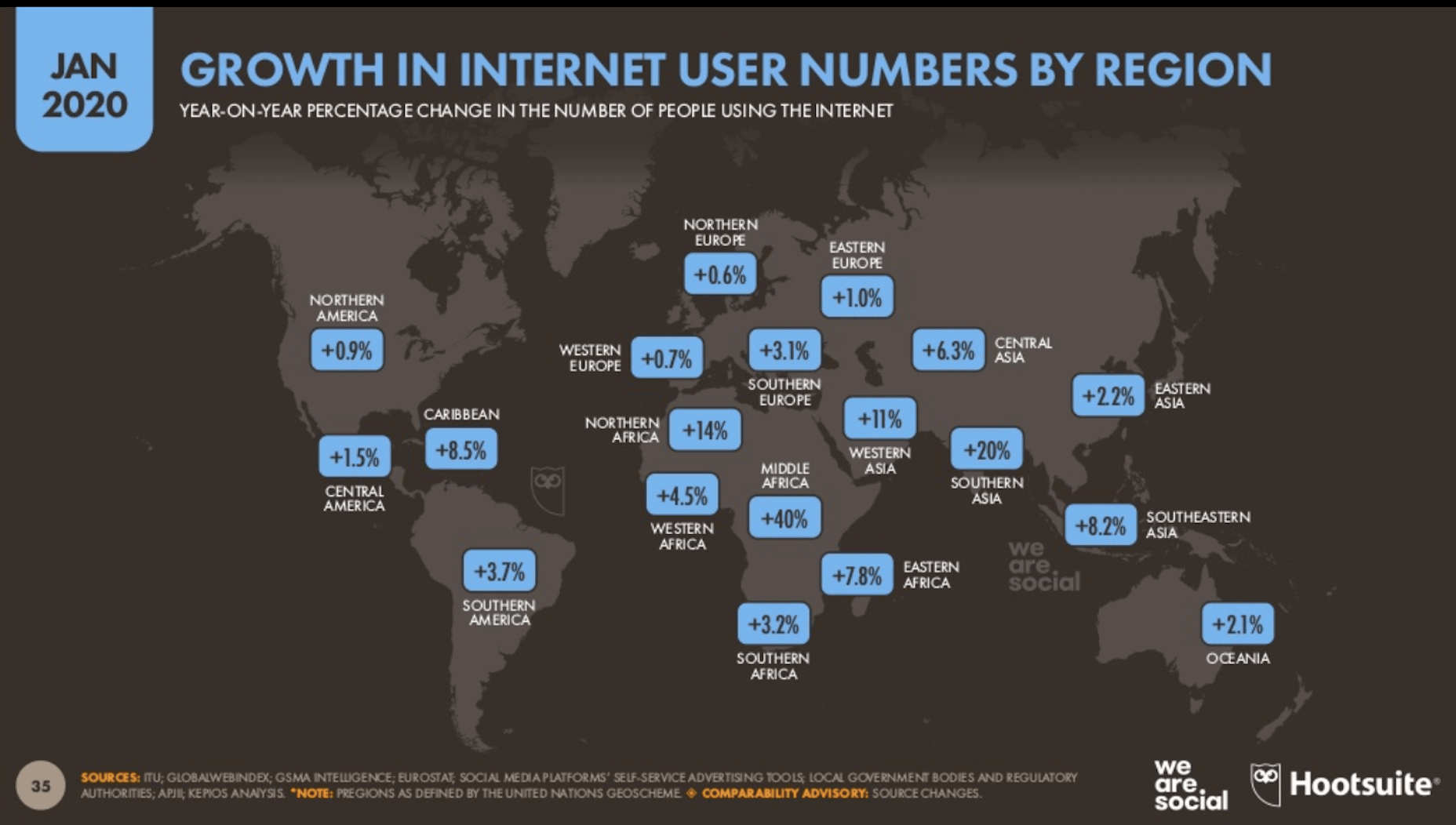
As of January 2020, the total number of users has reached 4.5 billion. That’s a 7% growth from the same period in 2019.

A huge contributor of that growth is the increased adoption of Internet-connected devices all around the world:

This graphic alone demonstrates why it’s crucial for websites to be able to cater to a global user base and not just those in developed nations.

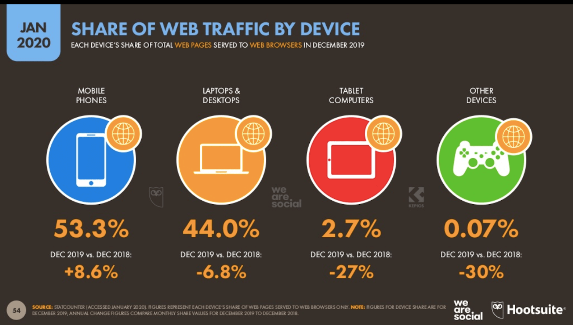
Another telling statistic from this report shows how much more Internet users are coming to rely on their mobile phones:

Between December 2018 and December 2019, there was an 8.6% leap in the amount of mobile web traffic. Laptops and desktops shrunk in popularity during that same timeframe as did tablets, which saw a massive dip in usage.

It’s not just the amount of traffic on mobile vs. web that’s seen changes either. It’s the amount of time users spend on those devices. As a whole, consumers spend 6 hours and 43 minutes online every day; 3 hours and 22 minutes of which is from their mobile devices.

Key Takeaway

If you’re not already building progressive web apps for clients, 2020 may be the perfect time to learn how to do so. Not only do they provide a superior experience for mobile users, but they also are capable of serving users who may not have the best Internet connectivity or live in close proximity to your web servers.

Sucuri Reveals What Was Going on with Hacked Sites in 2019

The Sucuri Hacked Website Threat Report just came out with some interesting data on the state of web security.

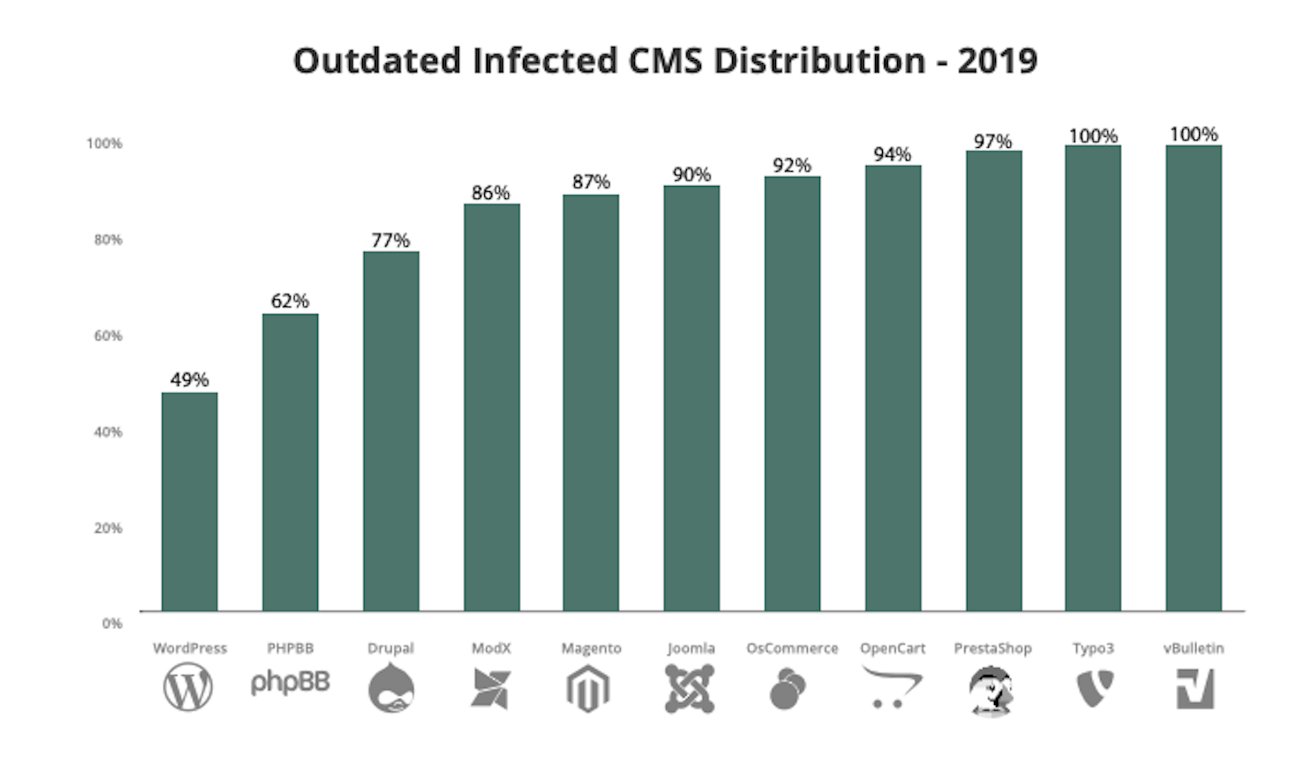
Let’s start by looking at the integrity of the content management systems web designers commonly use:

Out of all the infected websites Sucuri found last year, 56% of them had an outdated CMS. As you can see above, some users do a better job of protecting their core by updating their CMS technology. Others… not so much.

It’s not just content management systems that users are failing to update either. More than two-thirds have websites using PHP versions that are no longer supported (i.e. 5.x and 7.0).

Then, there’s the fact that websites with vulnerabilities weren’t just found to have one vulnerability. 44% of vulnerable websites had at least two vulnerable components and 10% had four or more.

Considering this, it’s no surprise that once-infected websites have a tendency to be reinfected.

Key Takeaways

On average, Sucuri cleaned up 147 files and 232 database entries for every malware infection detected. Even if those numbers are improvements from previous years, think about how costly the cleanup is going to be for your clients if or when that happens to them.

So, rather than focus strictly on web design or development in the coming years, start thinking about how you can weave website security into the mix. Whether you want to provide maintenance services for live websites or you want to build security measures into a websites in development, it’s up to you.

But something needs to be done to fix this systemic issue.

A Better Lemonade Stand Shares Results from eCommerce Survey

For those of you working with ecommerce clients (or who want to), this survey from A Better Lemonade Stand is one to pay close attention to.

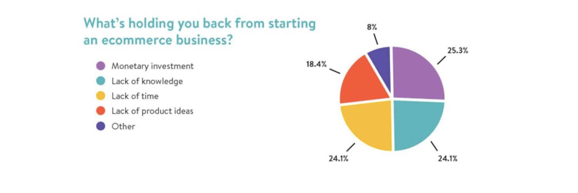
Right off the bat, the survey reveals that 62.1% of people who want to start an ecommerce business have yet to do so. As for why they haven’t, there are a variety of reasons given:

Pay close attention to these reasons as you can use them to sell your ecommerce design services as a solution:

  • The monetary investment
  • A lack of know-how
  • A lack of time to do so

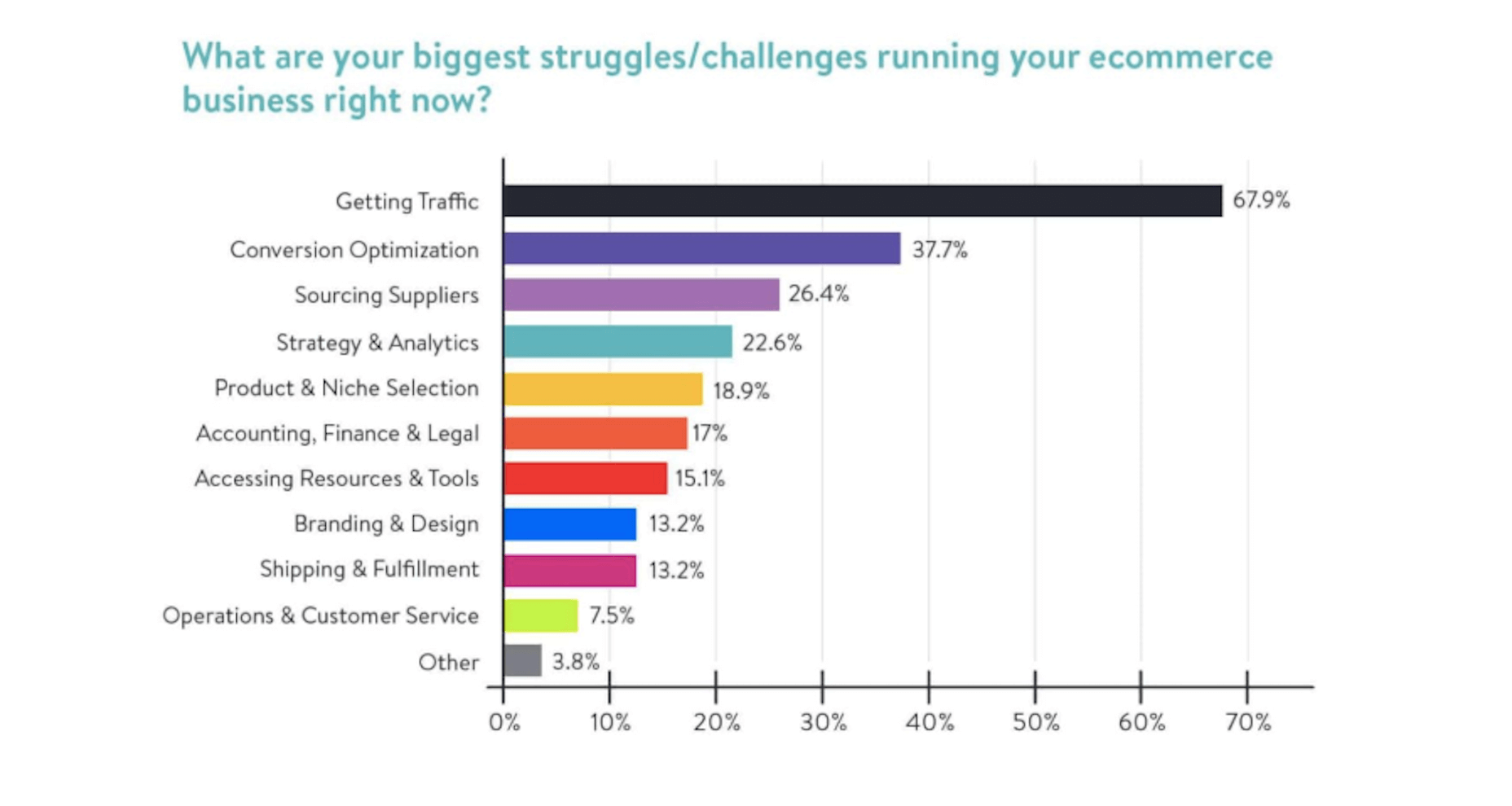
You can also use survey data from current ecommerce owners to better position your business before prospective clients:

Here you can see what ecommerce business owners report as their biggest struggles. Five of the top ten you can easily help them out with:

  • Getting traffic
  • Conversion optimization
  • Strategy & analytics
  • Branding & design
  • Operations & customer service (through the website, at least)

Key Takeaway

You can present ecommerce business owners in the making with a cost-effective done-for-you option as well as proof of how quickly you can get them an ROI (like with a case study) if they’re really worried about cost. They need to see how your expertise will save them time and make them more money in the long run.

The same goes for clients with existing businesses. You now know what their top concerns are. If you see a flailing ecommerce site, use this knowledge to get the conversation started and to pose your own solution. Again, just make sure you have proof to back up what you promise to do.

Google Updates Mobile-First Indexing Best Practices

Think you know all that you need to know to design a mobile-first website? Well, Google just updated its mobile-first indexing best practices.

Here’s a high-level overview of what the new best practices state:

  • If you’re using the robots metatag, make sure it’s the same for mobile and desktop.
  • Use the same URLs for your mobile and desktop sites.
  • Use the same content on mobile as you do on desktop. If you think there should be less content on mobile, just make sure that whatever is desktop-only isn’t critical for Google or visitors to know about as it won’t factor into indexing at all.

In other words, Google is strictly using mobile for the purposes of indexing. If you do anything that compromises what Google can scan on your mobile website, your rank will suffer as a result.

By keeping things consistent between mobile and desktop, you can reduce the chance of any issues arising.

Be sure to check out the full report for all of Google’s new recommendations. There’s information in there about what kinds of image and video formats to use along with information on lazy loading.

Key Takeaway

If you were adhering to Google’s former guidelines, it’s a good time to check back in with what it’s currently recommending. You may need to reconnect with old clients to let them know about the changes and to provide them with an update strategy.

Wrap-Up

There’s always new industry or consumer research that can help you do better work for your clients and make more money in the process. It’s just not always easy to keep your eyes peeled for it when you’re trying to focus on your job.

If you stay tuned to WebDesigner Depot each month, though, you’ll get a roundup of the latest research for web designers to give you a hand.

Featured image via Unsplash.

Source

Categories: Designing, Others Tags:

Listen to your web pages

February 16th, 2020 No comments

A clever idea from Tom Hicks combining MutationObserver (which can “observe” changes to elements like when their attributes, text, or children change) and the Web Audio API for creating sounds. Plop this code into the console on a page where you’d like to listen to essentially any DOM change to hear it doing stuff.

I played with it on my serverless site because it’s an SPA so there is plenty of DOM activity as you navigate around.

const audioCtx = new (window.AudioContext || window.webkitAudioContext)()
const observer = new MutationObserver(function(mutationsList) {
  const oscillator = audioCtx.createOscillator()

  oscillator.connect(audioCtx.destination)
  oscillator.type = "sine"
  oscillator.frequency.setValueAtTime(
    Math.log(mutationsList.length + 5) * 880,
    audioCtx.currentTime,
  )

  oscillator.start()
  oscillator.stop(audioCtx.currentTime + 0.01)
})

observer.observe(document, {
  attributes: true,
  childList: true,
  subtree: true,
  characterData: true,
})  

Looks like Tom is experimenting with other audio… what should we call them? Auralizations? Like this sweep-swoop one. There is already a browser extension for it, which includes sounds for network activity happening.

Direct Link to ArticlePermalink

The post Listen to your web pages appeared first on CSS-Tricks.

Categories: Designing, Others Tags:

Popular Design News of the Week: February 10, 2020 – February 16, 2020

February 16th, 2020 No comments

Every week users submit a lot of interesting stuff on our sister site Webdesigner News, highlighting great content from around the web that can be of interest to web designers.

The best way to keep track of all the great stories and news being posted is simply to check out the Webdesigner News site, however, in case you missed some here’s a quick and useful compilation of the most popular designer news that we curated from the past week.

Note that this is only a very small selection of the links that were posted, so don’t miss out and subscribe to our newsletter and follow the site daily for all the news.

Avoid these 10 UX Design Fails

15+ Best Sites to Download Mockups

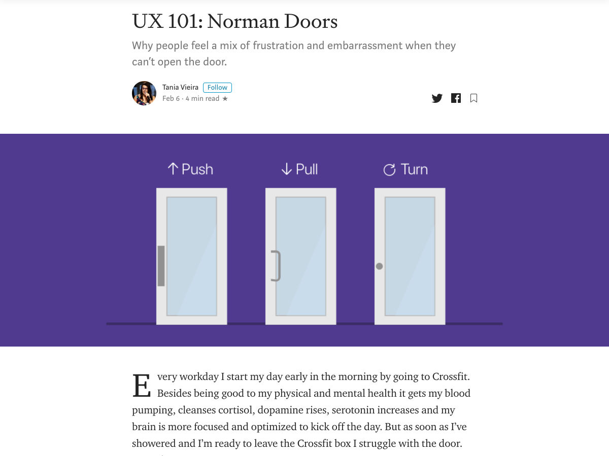
UX 101: Norman Doors

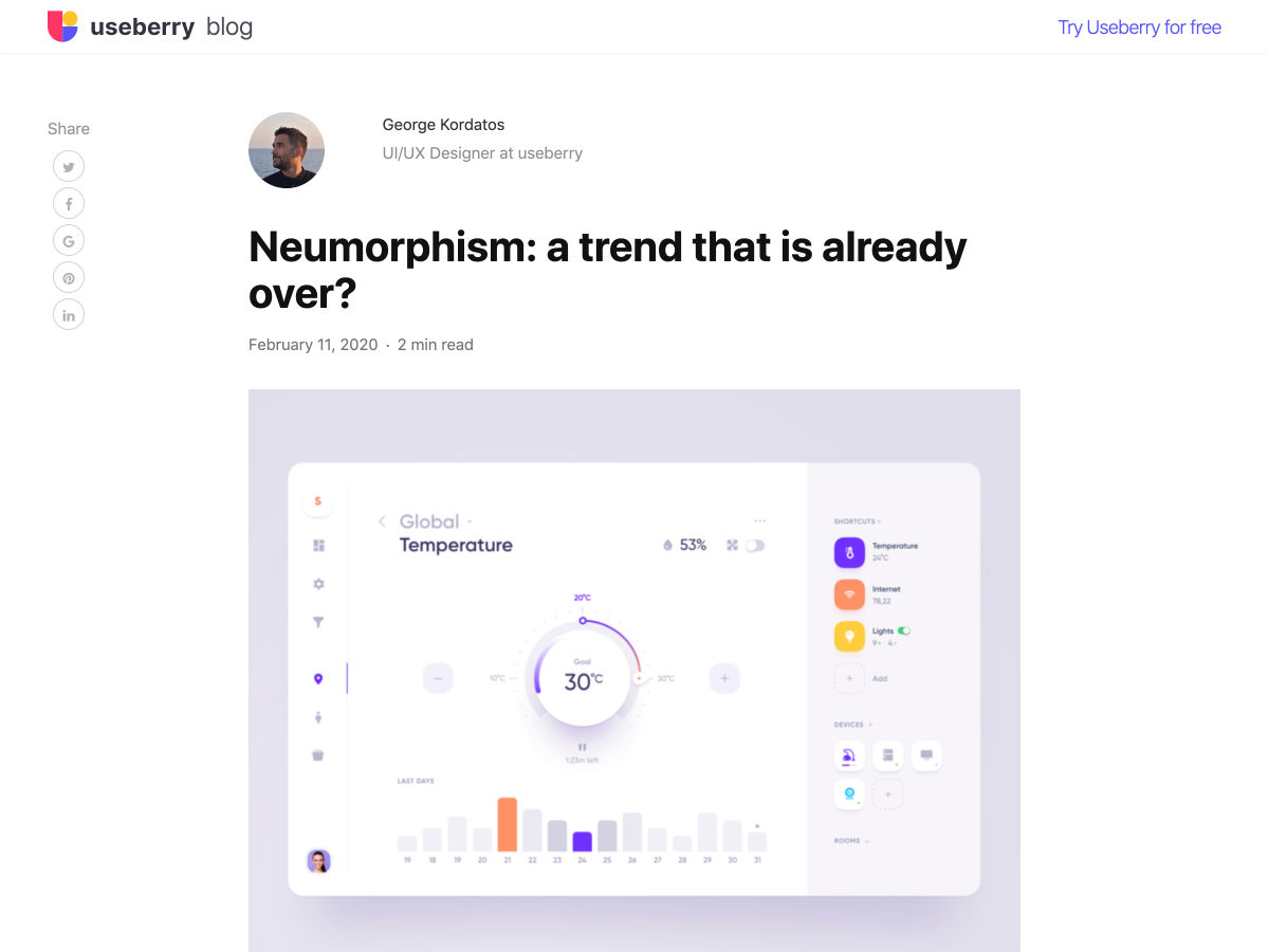
Neumorphism: A Trend that is Already Over?

A New Approach to Color (inspired by Dark Mode) in Our Design System

Drop.lol – Easy WebRTC File Transfer

Preloader Design Tips and Inspirations

Google Earth Just Released 1,000 Beautiful Wallpapers You Can Download for Free

How Deceptive UX Patterns Trick You into Doing What Companies Want

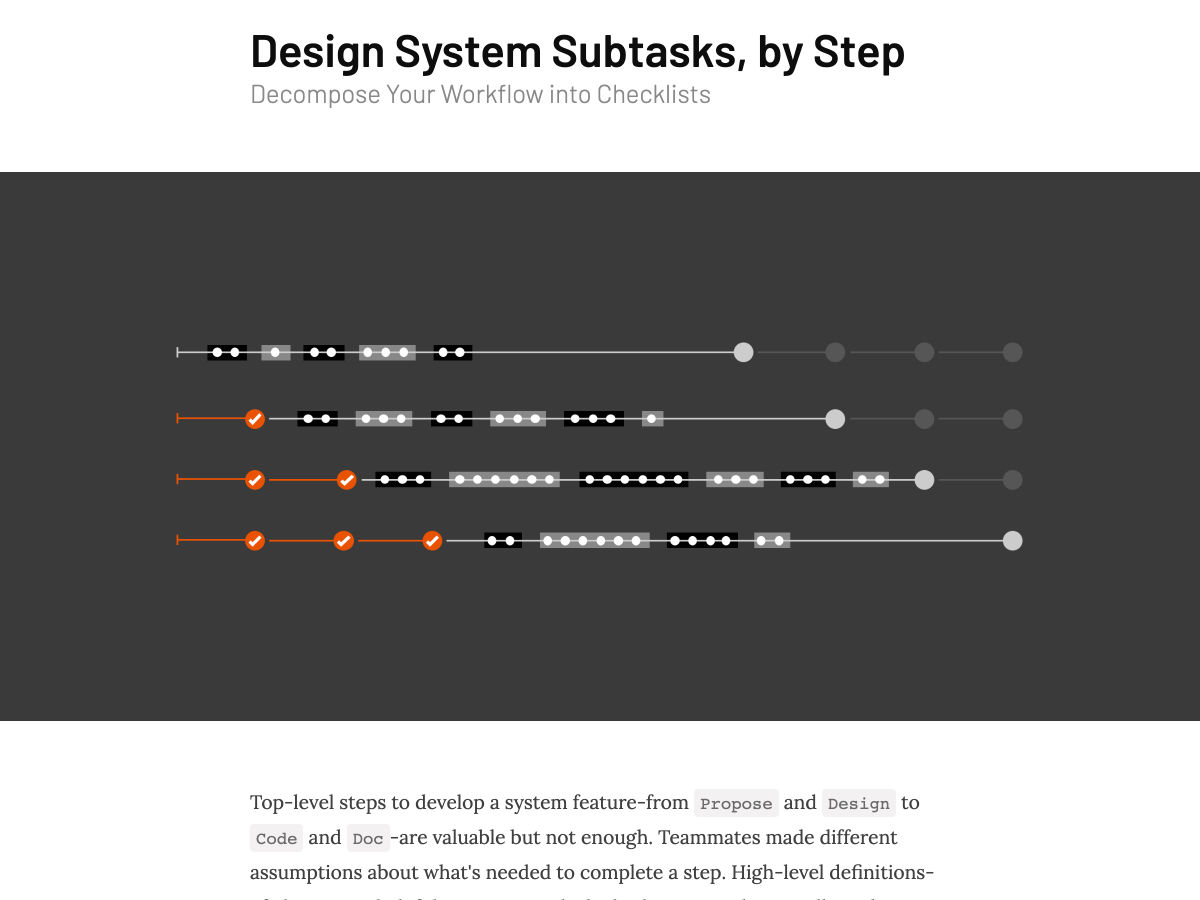
Design System Subtasks, by Step

UX Debt 101

How to Automate your Workspace and Write Less Code

Google Maps is Turning 15! Celebrate with a New Look and Features

Sketch 63 — What’s New?

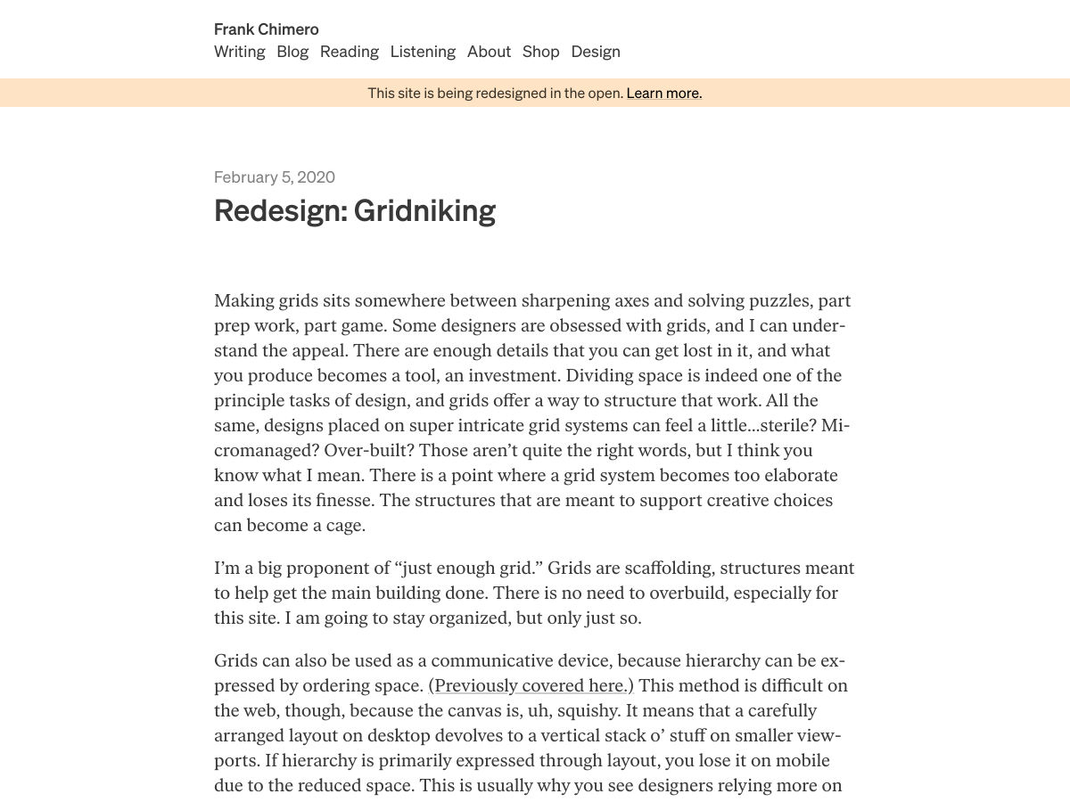
Redesign: Gridniking

Youtube Tag Generator

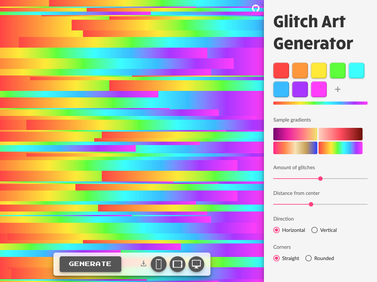
Glitch Art Generator

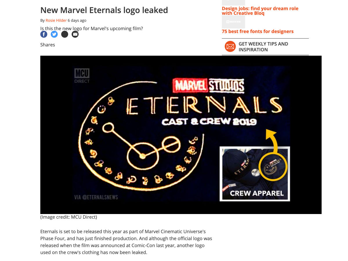
New Marvel Eternals Logo Leaked

Brandless, the Pioneering Amazon Alternative, Shuts Down

A Dark Web Tycoon Pleads Guilty, but How was He Caught?

Facebook Buys AR Startup Building a 1:1 Digital Map of the Physical World

How to Save on Business Expenses as a SaaS Company

The Case of the Stolen Domain Names

Our Obsession with ‘Color Trends’ is Killing the Planet

Forecasting the Future of Design

Want more? No problem! Keep track of top design news from around the web with Webdesigner News.

Source

Categories: Designing, Others Tags:

“CSS4” Update

February 15th, 2020 No comments

Since I first chimed in on the CSS4¹ thing, there’s been tons of more discussion on it. I’m going to round up my favorite thoughts from others here. There is an overwhelming amount of talk about this, so I’m going to distill it here down as far as I can, hopefully making it easier to follow.

  • Jen Simmons kicked off a discussion on GitHub under the CSS Working Group draft repo. The best we have for developers trying to stay current on CSS right now is “just keep up” and that’s not working. Better to “draw a line” around certain things and say “Here, this. This part is ready. This part is done.”
  • Michelle Barker says it’s hard to prioritize what to learn without guidance.
  • Nicole Sullivan thinks if developers can “tick the checkbox” of CSS4, it would “drive developers to upgrade their skills, businesses to upgrade their tech stacks, and browsers to focus on cross-browser compat.”
  • Dave Rupert sees value in the Perceived Velocity through Version Numbers.
  • Natalya Shelburne says that, in “a time-scarce world”, engineers she works with don’t feel like new CSS is production-ready and don’t prioritize learning it.
  • Rachel Andrew thinks that the browser support of features, particularly the complex and nuanced nature of subfeatures, is a barrier. Since we don’t know anyone else’s browser support requirements, it’s irresponsible to suggest blanket features to learn/use.
  • Brian Kardell brought up that JavaScript is “versioned” yearly and it seems to work over there (Although Shawn Wang rightly mentioned that we should probably be asking them what has worked and what hasn’t). Personally, I prefer the idea of CSS2020 over CSS4 (I just like the synchronicity with JavaScript), and Brain Kardell thinks just because we use a year in the name doesn’t mean we have to do it every year. Chen Hui Jing mentioned that Babel throws a wrench in things a bit. Polyfilling new JavaScript is a different beast than polyfilling new CSS and that affects expectations.
  • Miriam thinks we need to settle on a list of features, but that it should be criteria-based. I suppose criteria would be status of spec, browser support (“2 major browsers” is the most common theme), and some kind of importance modifier. My first article took a stab at a feature list and here’s another thought. PPK agrees that flexbox is too old, and favors grid and custom properties. Timothy Miller has a few ideas.
  • fantasai doesn’t think this message should come from the CSSWG.
  1. The more we keep calling it CSS4, the harder it will be to call it anything else. If that’s how it shakes out, fine, but my preference is to mimic JavaScript “versioning”. I’m going to stop calling it CSS4 after this until a name settles in better.

The post “CSS4” Update appeared first on CSS-Tricks.

Categories: Designing, Others Tags:

Creating a Details Element That Opens But Never Closes

February 15th, 2020 No comments

The

and

elements in HTML are useful for making content toggles for bits of text. By default, you see the

element with a toggle triangle (??) next to it. Click that to expand the rest of the text inside the

element.

But let’s say you want to be able to click it open and that’s that. Interactivity over. I saw this used in one of those “Read more” article designs, where you click that “Read more” button and the article expands, but there is no going back.

I’ll preface this by saying that I’m not sure that this is a great idea in general. Removing controls just doesn’t feel great, nor does slapping too much important content within a

element. But, hey, the web is a big place and you never know what you might need. The fact that this can be done in a few lines of HTML/CSS is compelling and might reduce the need for heavier solutions.

The main trick here is to hide the summary when details is open.

details[open] summary {
  display: none;
}

That’s it really.

CodePen Embed Fallback

The post Creating a Details Element That Opens But Never Closes appeared first on CSS-Tricks.
Categories: Designing, Others Tags:

While You Weren’t Looking, CSS Gradients Got Better

February 14th, 2020 No comments

One thing that caught my eye on the list of features for Lea Verou’s conic-gradient() polyfill was the last item:

Supports double position syntax (two positions for the same color stop, as a shortcut for two consecutive color stops with the same color)

Surprisingly, I recently discovered most people aren’t even aware that double position for gradient stops is something that actually exists in the spec, so I decided to write about it.

According to the spec:

Specifying two locations makes it easier to create solid-color “stripes” in a gradient, without having to repeat the color twice.

I completely agree, this was the first thing I thought of when I became aware of this feature.

Let’s say we want to get the following result: a gradient with a bunch of equal width vertical stripes (which I picked up from an earlier post by Chris):

Desired gradient result.

The hex values are: #5461c8, #c724b1, #e4002b, #ff6900, #f6be00, #97d700, #00ab84 and #00a3e0.

Let’s first see how we’d CSS this without using double stop positions!

We have eight stripes, which makes each of them one-eighth of the gradient width. One eighth of 100% is 12.5%, so we go from one to the next at multiples of this value.

This means our linear-gradient() looks as follows:

linear-gradient(90deg, 
             #5461c8 12.5% /* 1*12.5% */, 
  #c724b1 0, #c724b1 25%   /* 2*12.5% */, 
  #e4002b 0, #e4002b 37.5% /* 3*12.5% */, 
  #ff6900 0, #ff6900 50%   /* 4*12.5% */, 
  #f6be00 0, #f6be00 62.5% /* 5*12.5% */, 
  #97d700 0, #97d700 75%   /* 6*12.5% */, 
  #00ab84 0, #00ab84 87.5% /* 7*12.5% */, 
  #00a3e0 0)

Note that we don’t need to repeat stop position % values because, whenever a stop position is smaller than a previous one, we automatically have a sharp transition. That’s why it’s always safe to use 0 (which is always going to be smaller than any positive value) and have #c724b1 25%, #e4002b 0 instead of #c724b1 25%, #e4002b 25%, for example. This is something that can make our life easier in the future if, for example, we decide we want to add two more stripes and make the stop positions multiples of 10%.

Not too bad, especially compared to what gradient generators normally spit out. But if we decide one of those stripes in the middle doesn’t quite fit in with the others, then changing it to something else means updating in two places.

Again, not too bad and nothing we can’t get around with a little bit of help from a preprocessor:

$c: #5461c8 #c724b1 #e4002b #ff6900 #f6be00 #97d700 #00ab84 #00a3e0;

@function get-stops($c-list) {
  $s-list: ();
  $n: length($c-list);
  $u: 100%/$n;
	
  @for $i from 1 to $n {
    $s-list: $s-list, 
             nth($c-list, $i) $i*$u, 
             nth($c-list, $i + 1) 0
  }

  @return $s-list
}

.strip {
  background: linear-gradient(90deg, get-stops($c)))
}

This generates the exact CSS gradient we saw a bit earlier and now we don’t have to modify anything in two places anymore.

See the Pen by thebabydino (@thebabydino) on CodePen.

However, even if a preprocessor can save us from typing the same thing twice, it doesn’t eliminate repetition from the generated code.

And we may not always want to use a preprocessor. Leaving aside the fact that some people are stubborn or have an irrational fear or hate towards preprocessors, it sometimes feels a bit silly to use a loop.

For example, when we barely have anything to loop over! Let’s say we want to get a much simpler background pattern, such as a diagonal hashes one, which I’d imagine is a much more common use case than an over-the-top rainbow one that’s probably not a good fit on most websites anyway.

Screenshot. Shows a pattern of diagonal light grey hashes on a white background.
Desired hashes result

This requires using repeating-linear-gradient() and this means a bit of repetition, even if we don’t have the same long list of hex values as we did before:

repeating-linear-gradient(-45deg, 
    #ccc /* can't skip this, repeating gradient won't work */, 
    #ccc 2px, 
    transparent 0, 
    transparent 9px /* can't skip this either, tells where gradient repetition starts */)

Here, we cannot ditch the first and last stops because those are precisely what indicate how the gradient repeats within the rectangle defined by the background-size.

If you want to understand why it’s better to use repeating-linear-gradient() instead of a plain old linear-gradient() combined with the proper background-size in order to create such hashes, check out this other article I wrote a while ago.

This is precisely where such feature comes to the rescue — it allows us to avoid repetition in the final CSS code.

For the rainbow stripes case, our CSS becomes:

linear-gradient(90deg, 
    #5461c8 12.5%, 
    #c724b1 0 25%, 
    #e4002b 0 37.5%, 
    #ff6900 0 50%, 
    #f6be00 0 62.5%, 
    #97d700 0 75%, 
    #00ab84 0 87.5%, 
    #00a3e0 0)

And to recreate the hashes, we only need:

repeating-linear-gradient(-45deg, 
    #ccc 0 2px, 
    transparent 0 9px)

See the Pen by thebabydino (@thebabydino) on CodePen.

What about support? Well, glad you asked! It actually happens to be pretty good! It works in Safari, Chromium browsers (which now includes Edge as well!) and Firefox. Pre-Chromium Edge and maybe some mobile browsers could still hold you back, but if you don’t have to worry about providing support for every browser under the sun or it’s fine to provide a fallback, go ahead and start using this!

The post While You Weren’t Looking, CSS Gradients Got Better appeared first on CSS-Tricks.

Categories: Designing, Others Tags: