Archive

Archive for March, 2020

How to Create a “Skip to Content” Link

March 17th, 2020 No comments

Skip links are little internal navigation links that help users move around a page. It’s possible you’ve never actually seen one before because they’re often hidden from view and used as an accessibility enhancement that lets keyboard users and screen readers jump from the top of the page to the content without have to go through other elements on the page first.

In fact, you can find one right here on CSS-Tricks if you crack DevTools open.

In my opinion, the best way to implement a skip link is to hide it and then bring it into view when it is focused. So, let’s say we have a link in the HTML:

<a class="skip-to-content-link" href="#main">Skip to content</a>

…we can give it an absolute position and translate it off the screen:

.skip-to-content-link {
  left: 50%;
  position: absolute;
  transform: translateY(-100%);
}

Then we can bring it back into view when it’s in focus and style it up a bit in the process:

.skip-to-content-link {
  background: #e77e23;
  height: 30px;
  left: 50%;
  padding: 8px;
  position: absolute;
  transform: translateY(-100%);
  transition: transform 0.3s;
}

.skip-to-content-link:focus {
  transform: translateY(0%);
}

This will hide our link until it is focused and then put it into view when it becomes focused.

CodePen Embed Fallback

Now, allow me to elaborate, starting with this quote from Miles Davis:

Time isn’t the main thing. It’s the only thing.

As I sit down to write this article in a rainy Ireland, I think of the challenge that many users face as they use the web that I take for granted. We put so much thought into creating a great user experience without thinking of all our users and how to meet their needs. Admittedly, a skip link was something I had never heard of until completing a course on Frontend Masters by Marcy Sutton. Since learning the power and simplicity of using a skip link, I decided to make it my mission to spread more awareness — and what platform better than CSS-Tricks!

A solution is an answer to a problem, so what’s the solution for helping keyboard users and screen readers find the content of a page quickly? In short, the solution is time. Giving users the ability to navigate to parts of our website that they are most interested in gives them the power to save valuable time.

Take the Sky News website as an example. It offers a “Skip to content” button that allows users to skip all the navigation items and jump straight to the main content.

You can see this button by navigating to the top of the page using your keyboard. This is similar to the implementation shown above. The link is always in the document but only becomes visible when it’s in focus.

This is the type of skip link we are going to create together in this post.

Our sample website

I built a sample website that we will use to demonstrate a skip link.

CodePen Embed Fallback

The website has a number of navigation links but, in the interest of time, there are only two pages: the home page and the blog page. This is all we need to see how things work.

Identifying the problem

Here’s the navigation we’re working with:

In total, we have eight navigation items that a keyboard user and screen reader must tab through before reaching the main content below the navigation.

That’s the problem. The navigation may be irrelevant for the user. Perhaps the user was given a direct link to an article and they simply want to get to the content.

This is a perfect use case for a skip link.

Creating the link

There are a couple of approaches to creating a Skip to content link. What I like to do is similar to the Sky News example, which is hiding the link until it is focused. That means we can drop the link at or near the top of the page, like inside the

element.

<header>
  <a class="skip-link" href='#main'>Skip to content</a>
  <!-- Navigation-->
</header>

This link has a .skip-link class so we can style it. Thehref attribute points to #main, which is the ID we will add to the element that comes further down the page. That’s what the link will jump to when clicked.

<header>
  <a class="skip-link" href='#main'>Skip to content</a>
  <!-- Navigation-->
</header>


<!-- Maybe some other stuff... -->


<main id="main">
  <!-- Content -->
</main>

Here’s what we have if we simply drop the link into the header with no styling.

CodePen Embed Fallback

This does not look great, but the functionality is there. Try navigating to the link with your keyboard and pressing Enter when it’s in focus.

Now it’s time to make it look pretty. We must first fix the positioning and only show our skip link when it is in focus.

.skip-link {
  background: #319795;
  color: #fff;
  font-weight: 700;
  left: 50%;
  padding: 4px;
  position: absolute;
  transform: translateY(-100%);
}

.skip-link:focus {
  transform: translateY(0%);
}

The magic here is in the transform property, which is hiding and showing our skip link depending on whether it is focused or not. Let’s make it look a little nicer with a quick transition on the transform property.

.skip-link {
  /* Same as  before */
  transition: transform 0.3s;
}

It will now transition into view which makes that bit better.

You should now (hopefully) have what I have below:

Live Demo

As you can see, the skip link bypasses the navigation and jumps straight down to the element when clicked.

It’s OK to use more than one link!

Right now, the link only serves one purpose and that is skip to the content of our website. But we don’t have to stop there.

We can go even further and create a skip link that has more options, such as a way to jump to the footer of the site. As you might imagine, this is quite similar to what we’ve already done.

Let’s make the blog page of the example site a little more usable by using multiple skip links. It’s common for blogs to use AJAX that loads in more posts when reaching the bottom of the page. This can make it very difficult to get to the footer of the website. That’s the problem we want to solve in this case.

So let’s add a second link that bypasses all that auto-loading business and jumps the user straight to a #footer element on the page.

<div class="skip-link" >
  Skip to <a href='#main'>content</a> or <a href='#footer'>footer</a>
</div>

We also need to amend our CSS a little and use the :focus-within pseudo selector.

.skip-link {
  transform: translateY(-100%);
}

.skip-link:focus-within {
  transform: translateY(0%);
}

This is saying if anything within our .skip-link element has focus, then we show it. Sadly, neither Internet Explorer nor Opera Mini support focus-within, but its coverage is pretty darn good and there is a polyfill available.

This browser support data is from Caniuse, which has more detail. A number indicates that browser supports the feature at that version and up.

Desktop

Chrome Firefox IE Edge Safari
60 52 No 79 10.1

Mobile / Tablet

Android Chrome Android Firefox Android iOS Safari
80 68 No 10.3

Last thing we need to do is make sure there’s an ID on our footer element so the link has something to jump to.

<footer id="footer">

Here’s what this gives us:

If we wanted to go one step further (and I’d encourage it), we could style each link a little differently so users can distinguish between the two. Both links in this example are plain white which works great for a single button that does a single thing, but it’d be clearer that we’re dealing with two links if they were presented differently.

Jumping to conclusions

Are you using skip links on your site? Or, if not, does this convince you to use one? I hope it’s clear that skip links are a great value add when it comes to the accessibility of a site. While it’s not a silver bullet that solves every accessibility need, it does solve some use cases that make for a much more polished user experience.

Here are some prominent sites that are using this or a similar technique:

The post How to Create a “Skip to Content” Link appeared first on CSS-Tricks.

Categories: Designing, Others Tags:

15 Things to Improve Your Website Accessibility

March 17th, 2020 No comments
DevTools showing the DOM of a "read more" link with no context.

This is a really great list from Bruce. There is a lot of directly actionable stuff here. Send it around to your team and make it something that you all go through together.

Here’s a little one that prodded me to finally fix…

Most screen readers allow the user to quickly see a list of links on a page [..] However, if every link has text saying “Click here” or “Read more”, with nothing else to distinguish them, this is useless. The easiest way to solve this is simply to write unique link text, but if that isn’t possible, you can over-ride the link text for assistive technology by using a unique aria-label attribute on each link.

I had links like that right here on CSS-Tricks. Some of them are automatically created by WordPress itself, not something I hand-coded into a template. When you show the_excerpt of a post, you get a “read more” link automatically, and aside from getting your hands dirty with some filters, you don’t have that much control over it.

Fortunately, I already use a cool plugin called Advanced Excerpt. I poked into the settings to see if I could do something about injecting the post title in there somehow. Lookie lookie:

A setting for Advanced Excerpt that does screen reader links.

That screen-reader-text class is exactly what I already used for that kind of stuff, so it was a one-click fix!

Much nicer DOM now for those links:

Direct Link to ArticlePermalink

The post 15 Things to Improve Your Website Accessibility appeared first on CSS-Tricks.

Categories: Designing, Others Tags:

WooCommerce 4.0 & WooCommerce Payments Beta

March 17th, 2020 No comments

Y’all know WooCommerce: it’s a plugin for WordPress that adds robust eCommerce functionality to your site. Notably, like WordPress itself, it’s open-source and free. You only pay for things if you need things like special plugins that extend functionality.

This is a huge month for WooCommerce! Two major releases:

WooCommerce is a major upgrade, to the point that there are things that aren’t compatible just yet. You should do all the normal best practices when upgrading, like making backups and testing on staging first. Once you’ve upgraded, you get:

  • New admin: You don’t need the separate admin plugin anymore, it’s baked right in! So you get very nice detailed reporting of just about any aspect of your sales performance. Stuff like comparing year-of-year sales and full customization of reports.
  • New onboarding: If you already use WooCommerce, you’re already all set, but for new users, you’ll be walked through setup in a much more clear way. Like a multi-step wizard that asks you questions about your business and gets things configured correctly.
  • Behind the scenes: A crucial bit to WooCommerce is the Action Scheduler and a change in 4.0 is moving that work to the database level for much better performance. For example, if you sell subscriptions, this is the thing that runs that updates all your users subscriptions and keeps them in the correct state and updates all the admin data.

If you’d like to read more about the 4.0 release…

WooCommerce Payments (Beta)

This is a brand new (free) plugin from WooCommerce. Funny name, right? Of course, WooCommerce could already take payments. If you wanted to take credit cards, your best bet was the Stripe plugin, as it worked great and also opened doors for taking Apple Pay, Google Pay, and others.

With WooCommerce Payments the entire payments experience is moved right into your WooCommerce dashboard. You go through a little onboarding experience as you activate it and then you’ve got a whole new area of your dashboard dedicated to payments.

This video does a good job of showing it off:

You can:

  • See all the payments
  • See deposits to your bank
  • Process refunds
  • Deal with your disputes

And all that type of stuff directly on your dashboard, rather than having to hop over to some other payment dashboard elsewhere to do things. It’s a totally custom-designed experience just for WooCommerce.

Want in? If you’re in the U.S., here’s a special link to skip the beta invite process and download the plugin. It’s not available quite yet for the rest of the world, but you can still sign up for the beta to help signal interest in your region.

What do we use it all for?

Here at CSS-Tricks, in the past, we’ve used WooCommerce for selling merchandise like t-shirts and the like. We’re not doing that at the moment, but maybe we will someday again! WooCommerce is still on the site and upgrading to 4.0 was painless for me.

Lately, I’ve been more interested in what it might be like to have memberships again. And actually, to be accurate, subscriptions to memberships, as those are different things and it took me a minute to wrap my brain around that. They are both separate plugins but work together:

So if you wanted a membership that you charged on a monthly or annual basis for (rather than a one-off cost membership), you use both plugins. Memberships deal with locking down the content and they expire at the end of a term. A subscription can keep a membership going by extending the membership upon recurring payments.

I’m still learning how all this can work, but here’s a whirlwind tour.

With the Memberships plugin in place, I can create a Membership plan for the site. Notice that’s it’s “subscription tied” to a length of time, thanks to the Subscription plugin.

Now say I publish something that I’d like to lock down to members. In the “Advanced Panels” area after the editor, there will be a content restriction area that comes from the Membership plugin.

I can choose to lock down content at the fine-grained post/page level if I like. I can also do whole hierarchies of pages or categories or custom post types or the like.

Now if I was to view that page as someone who wasn’t a member (and by the way, the User Switching plugin is nicely integrated so you can preview the site as people of different plans) I would see only an expert of the post and the rest of it hidden with a content-locked message.

From there, of course, the user could proceed with purchasing a membership to unlock the content.

I really like how easy this all is to set up and how well integrated into WordPress it is. Of course it is, that’s why WooCommerce is the most popular eCommerce platform out there.

The post WooCommerce 4.0 & WooCommerce Payments Beta appeared first on CSS-Tricks.

Categories: Designing, Others Tags:

How Indigo.Design Usability Testing Takes The Guesswork Out Of Web Design

March 17th, 2020 No comments
Indigo.Design dashboard with prototypes and usability tests

How Indigo.Design Usability Testing Takes The Guesswork Out Of Web Design

How Indigo.Design Usability Testing Takes The Guesswork Out Of Web Design

Suzanne Scacca

2020-03-17T12:30:00+00:002020-03-18T12:07:40+00:00

Usability is critical for a website’s success, but it can be difficult to nail down in early design and development stages without a little help.

It’s not as though the research and preparation you do for a new site won’t give you insights on how to build something that’s both beautiful and functional. And having a rock-solid design system and designer-developer handoff will certainly help you bring quality control and consistency to your site.

However, it’s not always enough.

While you can make research-backed assumptions about how visitors will respond to your website or app, it’s all theory until you get it into the hands of real users.

Today, I want to look at the process of usability testing: what it is, when you should use it and how to generate data-backed insights while developing your website using Indigo.Design.

What Is Usability Testing?

Usability testing is a method used to evaluate how easy it is to get around a website or app and to complete specific tasks.

It puts the focus on what people do rather than collect opinions on how they like the design. In other words, usability testing allows you to gather behavioral feedback to make sure the site actually does what it’s supposed to do.

To conduct a usability test, you need to put your site or app in the hands of target users. The data collected from these tests will then help you reshape the site into something that’s streamlined and better tailored to your users’ preferred journey.

Moderated Vs Unmoderated Usability Testing

There are a couple of ways to approach this:

Moderated Unmoderated
Type of test One-on-one Self-guided
The process Moderator engages the users as they walk through the session Users follow instructions and the analytics tool maps their session
Test group size Small Small to large
Use cases Highly specialized domains (e.g. doctors, accountants) Geographically dispersed audience
Web development stage Prototyping and onward Prototyping and onward

It’s okay if it’s not possible or feasible to run moderated tests on your website or app. With Indigo.Design, you can conduct either kind of test to painlessly gather accurate, quantifiable data from your users and take the guesswork out of design.


Usability testing allows you to gather behavioral feedback to make sure the site actually does what it’s supposed to do.

Usability Testing With Indigo.Design

You can start conducting usability tests as early as the prototyping stage. And, really, minimum viable products are the best kinds of websites and apps to test as it’s cheaper to iterate while you’re still in development. Plus, user feedback at this early stage will keep you from wasting time building out features or content that users don’t want or need.

To be clear, we’re not talking about soliciting opinions from stakeholders. What we need to know is whether or not real users can use your website or app successfully.

Just keep in mind that you need to bring a workable prototype to the table. That means:

  • A prototype that’s rich enough to support the usability tasks you’re going to test.
  • A medium-fidelity solution that strikes the right balance between empty-shell-of-a-website and ready-for-launch. It might not be pretty, but it has to be interactive.

Once you’ve gotten your product to this point, you can start usability testing:

1. Add Your Prototype To Indigo.Design

Adding prototypes to Indigo.Design is easy. You have two options:

Indigo.Design dashboard with prototypes and usability tests

The Indigo.Design “My Projects” dashboard where prototypes are uploaded and usability tests conducted. (Image source: Indigo.Design) (Large preview)

The first option is to upload a prototype from your computer. The following file formats are accepted:

  • PNG,
  • JPG,
  • GIF,
  • Sketch.

The second option is to add the Indigo.Design plugin to Sketch and sync your prototypes to the cloud. If you’re going to use this tool to simplify handoff, this plugin is going to be a huge time saver.

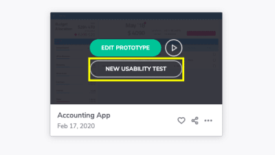
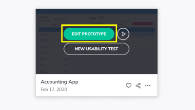
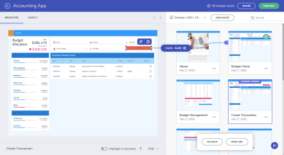
Once your prototype is loaded, hover over it and click “Edit Prototype”.

Indigo.Design edit prototype button

Indigo.Design users can edit prototypes with one click. (Image source: Indigo.Design) (Large preview)

If you haven’t yet confirmed that all interactions are properly set up inside Sketch, you can do that from within the Indigo.Design cloud and edit your interactions there:

Indigo.Design prototype editing and interaction setup

Indigo.Design users can verify their medium-fidelity prototypes are interactive before usability testing. (Image source: Indigo.Design) (Large preview)

If the interactions aren’t properly set up, take care of that now. Create the hotspot on the interface on the left and then drag it to the corresponding card on the right to create an interaction.

2. Create A New Usability Test

From the same dashboard where prototypes are uploaded, you’ll begin your first usability test. You can do this from one of two places.

You can hover over the prototype you want to test and create a new one:

Indigo.Design new usability test button

Indigo.Design users can begin new usability test for uploaded prototypes. (Image source: Indigo.Design) (Large preview)

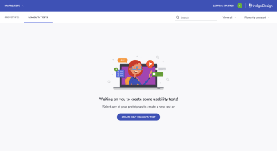
The other option is to go to the Usability Tests tab and begin the test there:

Indigo.Design usability tests dashboard

Indigo.Design “Usability Tests” dashboard where usability tests are created and managed. (Image source: Indigo.Design) (Large preview)

This is where you will eventually go to manage your usability tests and to review your test results, too.

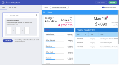
With your new usability test initiated, this is what you’ll first see:

Indigo.Design usability test: create task

An Indigo.Design usability test. First step is to create a task. (Image source: Indigo.Design) (Large preview)

Essentially, what you need to do with this tool is:

Determine which “tasks” you want to test. These should be important steps that get your users to complete desired goals (theirs and yours).

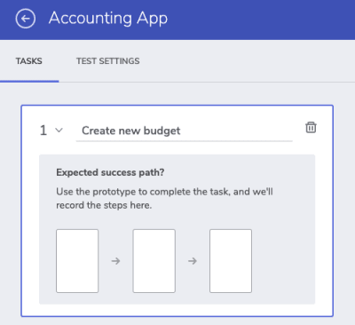
For example, with this being a finance management app, I expect users to primarily use this to create new budgets for themselves. So, that’s the first task I want to test:

New task “Create new budget” for usability test

Adding a new task to the Indigo.Design usability test. (Image source: Indigo.Design) (Large preview)

To create the “expected success path”, you must interact with your prototype exactly as you’d expect and want your users to on the live product.

Here’s an example of what the “create new budget” path might look like and how to build it out:

A quick walk-through of how to set up a new task and success path in Indigo.Design. (Image source: Indigo.Design)

Walk through your website or app on the right part of the screen.

When you’re done, confirm your work on the left before moving on to create other tasks you’ll be including in the test.

3. Put The Finishing Touches On Your Test

Creating tasks alone won’t be enough to gather the kind of data you want from your users.

For instance, if this is an MVP, you might want to explain that the experience may feel a little rough or to provide background on the solution itself (why you’ve built it, what you’re looking to do with it) so they’re not distracted by the design.

Don’t worry about your users misplacing these details in their email invitation. There’s a place to include these notes within the context of your usability test.

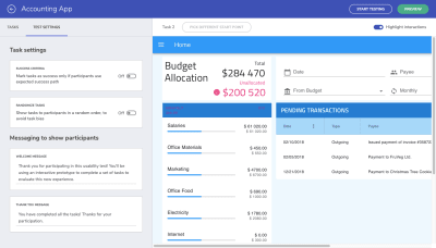
Go to the “Test Settings” tab:

Usability test - Welcome message, Thank You message

Usability tests in Indigo.Design come with room to add a Welcome and Thank You message. (Image source: Indigo.Design) (Large preview)

Under “Messaging to show participants”, this gives you the opportunity to include a welcome message with your test. This can be a blanket welcome statement or you can provide more context on the tasks if you feel it’s needed.

The thank-you statement is also useful as it provides an end-cap to the test. You can either thank them for their time or you can provide them with the next steps or information on what to expect about the product (maybe there are more usability tests to come).

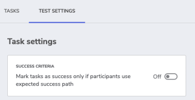
Before I move on, I want to quickly call your attention to the “Success Criteria” toggle at the top of this section:

Indigo.Design usability test settings - success criteria

Indigo.Design usability test settings allow users to set strict success criteria. (Image source: Indigo.Design) (Large preview)

When enabled, this setting only allows for two results:

  • Pass
  • Fail

I’d say that you should leave this toggle set to “Off” if you want this tool to help you detect alternative paths. I’ll show you what that means in just a little bit.

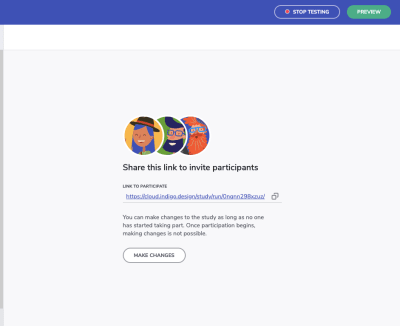
For now, it’s time to grab your usability test link and start sharing it with your participants. When you click the “Start Testing” button in the top-right corner of your screen, you’ll see this:

Indigo.Design usability test link

When you’re ready to start your usability test, click “Start Testing” and get your link. (Image source: Indigo.Design) (Large preview)

Copy this link and start sharing it with your participants.

If they’re Chrome users, they’ll be asked to install a browser extension that records their screen, microphone, and camera. They can enable or disable any of these.

The user will then step inside the test:

An example of a user walking through an Indigo.Design usability test. (Image source: Indigo.Design)

Once you’ve collected all the data you need, click the “Stop Testing” button in the top-right corner of the screen and start reviewing the results.

4. Review Your Usability Test Results

Your test results can always be found under your Usability Tests dashboard in Indigo.Design.

Indigo.Design usability test overview

An overview of a usability test’s results while it’s still in progress. (Image source: Indigo.Design) (Large preview)

If you’re logging into the platform, you’ll find an overview of all your test results, past and present.

You can get a more in-depth look at your results by opening the test:

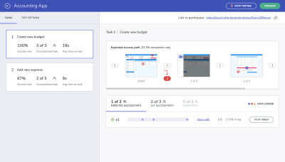
Indigo.Design usability test results

Indigo.Design usability test results by task. (Image source: Indigo.Design) (Large preview)

On the left, you’ll see your test results by task. They’re broken up into:

  • Success rate: The percentage of users that took the exact steps you defined for the task.
  • Accomplished task: The number of users that completed the task. If you didn’t enable “Success Criteria”, this result will show all users who took the expected success path as well as alternative success paths.
  • Avg. time on task: The amount of time it took users to get through the task.

From this alone, you can tell quite a bit about the path you’ve laid before your users and how well-tuned it is to their mindsets and needs.

However, the right side of the screen gives us a better look at where things may have gone awry and why:

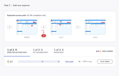
Indigo.Design test results — success path

Indigo.Design provides users to see what happened along the paths of their test subjects. (Image source: Indigo.Design) (Large preview)

The top part of the screen shows us the original steps we laid down. Anywhere there’s a red mark and a number in red is where our test subjects deviated from that path.

This is much more effective than heatmap testing which only really gives us a general idea of where the users’ focus is. This clearly shows us that there’s something either wrong with the layout of the page or perhaps the content itself is poorly labeled and confusing.

Let’s look a bit closer at the bottom of the screen and the path data we have to play with:

  • Blue circles signify expected interactions,
  • Red diamonds signify unexpected interactions,
  • Orange squares signify that the participant requested help.

Expected success path in usability test

Data on how many users took the expected success path in a usability test. (Image source: Indigo.Design) (Large preview)

This shows us what the expected success path looked like and how long it took to complete on average.

You can click on the stats for “Alt. Success Path” and “Failed Path” to view how things went for your other participants:

Alternative success path in usability test

Data on how many users took the alternative success path in a usability test. (Image source: Indigo.Design) (Large preview)

When we allow leeway in terms of success criteria, we get a chance to see the alternative success paths.

This is useful for a couple of reasons. First, if there are enough users who took the same route and there were more of them than those on the success path, it might be worth reshaping the pathway entirely. If the alternative route is more logical and efficient, it would make sense to get rid of the path less traveled.

Failed path in usability test

Data on how many users failed to complete a task in the usability test. (Image source: Indigo.Design) (Large preview)

Secondly, the alternative success path along with the failed path shows us where friction occurs along the way. This enables us to see where our users’ breaking points really are. Not that we ever want to push our users to the edge, but it’s good to have a sense of what kinds of interactions just don’t work.

For instance, let’s say one of the buttons requires a right-click instead of a regular click. I know this is something I’ve encountered in some tools and it drives me nuts because it’s almost always unexpected and counterintuitive. I wouldn’t abandon the experience over it, but your users might.

So, by comparing the alternative success path with the failed path, you can figure out what these kinds of deal-breakers are much more easily.

Look A Little Deeper

I know the numbers and pathway steps are really important to look at but don’t forget to study the other information left behind by your participants.

For instance, if your users enabled browser recording, you can “Play Video” and watch them actually go through it.

If not, you can still use the “View path” link to watch the actual steps they took (if they weren’t the expected blue-circle steps).

Indigo.Design usability test review options

Indigo.Design allows users to keep tabs on what test subjects did or didn’t do to complete a task. (Image source: Indigo.Design) (Large preview)

This is what you’ll see for each of your test subjects:

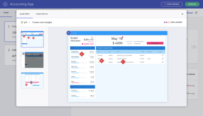
Indigo.Design Click Path and Video Replay to watch step-by-step tests

Indigo.Design users can view every step their test subjects took by viewing the “Click Path” or watching the “Video Replay”. (Image source: Indigo.Design) (Large preview)

This particular view might be more useful to you than video since you can track the actual clicks on each static page. Not only do you see every part of the website where they clicked, but you also see in which order they made those clicks.

And like I said before, if you can identify trends where these alternative success paths or failed paths took your users, you can more quickly stamp out issues in your web design. It’s only when those clicks are all over the place or users give up on completing any of the tasks that you have a real problem.

Wrapping Up

Using a design system does not automatically imply good usability. You need to be able to design more than just consistently beautiful UIs.

That’s what’s so nice about the solution we’ve just looked at. With usability testing built into Indigo.Design, the focus isn’t just on shipping pixel-perfect websites. Whether you plan on doing moderated or unmoderated usability testing, you now have a tool that can accurately map your users’ journeys and the difficulties they would otherwise face.

Smashing Editorial(ra, il)
Categories: Others Tags:

How to Create Content Access Levels in WordPress

March 17th, 2020 No comments

Content access levels refer to sets of content permission allowing you to decide which content your members could or couldn’t see.

It helps deliver premium content to your members and customers easily. You can also ask users to pay and upgrade their member levels to view restricted content.

Membership plugins instantly come to mind when you seek out a WordPress access levels solution. Do you know that you can also manage users’ access permission with a password protection plugin?

In this tutorial, we will look at how to create WordPress access levels using both membership plugin and password protection plugin, namely Simple Membership and Password Protect WordPress (PPWP) Pro.

Create Access Levels Using Simple Membership Plugin

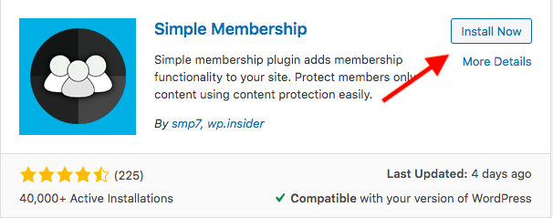
Installed on over 40 thousand WordPress sites and receiving a 4.4-star rating, Simple Membership clearly solves a problem when it comes to creating and controlling the content accessibility.

Once registering and becoming a member on your website, visitors will be assigned membership levels. To start using the plugin to add access levels for these members, you need to take the following 3 steps:

Step 1: Install the Simple Membership plugin

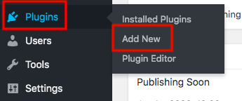
1- Go to Add New under Plugins in your WordPress admin dashboard

2- Type “simple membership” in the keyword box

3- Click Install and Activate buttons

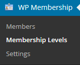
Upon installation and activation, the plugin will be inserted directly into your admin navigation menu.

Step 2: Add a new membership level

1- Head to WP Membership in the left sidebar

2- Choose the Membership Levels section

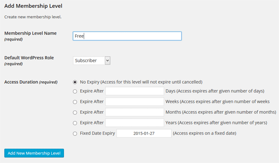
3- Click on Add New

4- Fill the new level’s details such as its name and the access duration then choose the default role

The duration time controls how long members of that default level have access to the protected content. You can generate numerous membership levels on your WordPress site, e.g. Customer, Shop Manager, and SEO Editor.

Step 3: Protect pages and posts using Simple Membership plugin

The next step is securing your content and authorizing members of specific levels to access it.

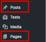
1- Visit Pages or Posts and choose your desired post or page

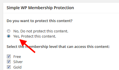
2- Find the Simple WP Membership Protection section at the bottom of the post’s edit screen

3- Tick on “Yes, Protect this content” option

4- Select the membership levels granted access to this content

5- Save your changes

Now, your private post becomes visible to logged-in users with the right membership levels only. Others will see a message saying that the content is protected when attempting to view it. They must upgrade their membership in order to access the post.

Besides membership plugins, you can also create and modify access levels for users with password protection plugins.

Why Creating WordPress Access Levels with Password Protection Plugins

When you use a password protection plugin to create access levels, users don’t have to sign up or log in to see the secure content. They just need to enter the correct password and unlock the protected pages or posts.

It makes sense when online course providers create membership websites since they help control students, manage teachers, and secure learning materials. For small businesses, it’s too complicated to create a membership site and take a bunch of settings and configurations

There are not many password protection plugins providing content access level functionality. Password Protect WordPress Pro proves the most powerful tool. Those using the higher-level password are able to unlock the lower level content.

You can both modify permission levels for your content and edit passwords in only one place too.

There are 3 steps you need to take when using the plugin to apply access levels to your content. Firstly, set up category access levels. Then, password protect levels. Finally, manage your passwords.

How to Create Content Access Levels Using Password Protect WordPress (PPWP) Pro

Organize your categories by levels

Instead of securing and assigning levels to individual posts, you can sort them by categories, get up these categories by levels, then password protect these levels.

Not all categories are equal in value. Some low-level categories can be offered for free whereas other higher-level ones ask for users’ payment or subscriptions. Those having access to the higher-level category are definitely able to view all content in lower-level categories too.

Before you start creating access levels for categories, download and install Password Protect WordPress (PPWP) Pro plugin and its Password Access Levels extension.

To assign permission levels to your categories, firstly, create a base including all categories that you want to restrict access to. These 6 steps show you how to do that:

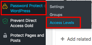
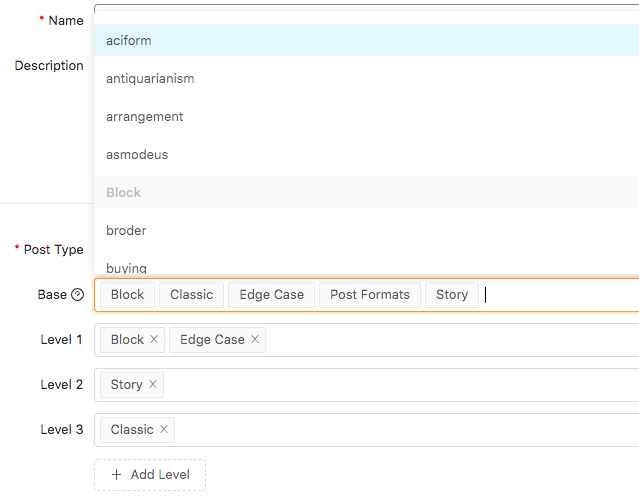
1- Head to the Access Levels section under Password Protect WordPress menu and open a popup screen

2- Click “Add New”

3- Fill in the form with the base name as well as its description

4- Select the post type. It can be Posts, Products, or any custom post types.

5- Choose base categories from a dropdown list

6- Set a level for each category. In the example above, Classic category will have a higher level than Story or Block categories.

Once unlocking the Classic category, users are allowed to view all content in Story or Block category without having entering passwords.

You should notice that each category must belong to a level only. Additionally, if you don’t set levels to any category in the base list, it will be assigned the Level 0 – the lowest level – by default.

It’s possible for you to choose WooCommerce product categories or any other custom post type categories and assign access levels to them.

After setting levels for base categories, start password protecting them in the Manage Password tab.

Password protect multiple Post & WooCommerce Product categories

Other password protection plugins permit you to lock one category at a time. Access Levels extension, meanwhile, enables you to password protect various categories at the same time by levels. In other words, if you shield a level with a password, all categories belonging to that level will be protected simultaneously.

To password protect WordPress post or WooCommerce product categories by levels, follow the guide below:

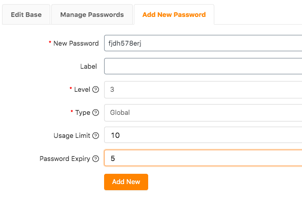
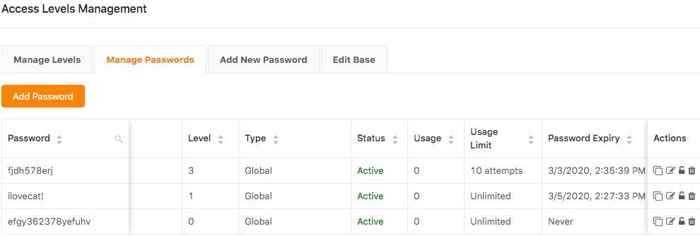
1-Go to the Add New Passwords tab in the Access Level popup screen

2- Enter your password

3- Fill in the level of which you want to password protect categories

4- Decide password types. Global passwords mean any person with this password can see the private categories. In case you choose password roles, only certain roles using that password are able to open the content.

5- Provide password usage limits, which will be explained in below

6- Type password expiration time in the Password Expiry box

From the example above, all posts within level 3 categories are secure with a password now. When users enter the password to unlock one of these posts, they can access other posts in that category as well as posts of categories in levels 1 and 2 automatically.

Once adding a new post to a protected category, the post will have the protection you specified for that category. This post will have the same passwords as other posts in the category as well as posts in other categories of the same level.

Manage your passwords

The ultra-cool is that you can manage and customize your password easily using PPWP Pro.

Expire passwords by usage or date

You can set usage limits or expiration time for each password. This means your passwords will become invalid after a certain usage or a period of time. It proves useful in many cases. You can provide users with the password for free in a given time then expire it. Users should pay in order to keep accessing your premium content.

Set multiple passwords per level

Password Protect WordPress Pro enables you to create as many passwords for a level as you would like to. So you can set different passwords and share with your users.

What’s more, you can apply user roles for passwords. While the global passwords authorize all types of users to enter the password form, user role passwords let specifically logged in user roles to view the private content.

Make Use of WordPress Content Access Levels

Access levels allow you to deliver premium content to users efficiently. You can create access levels for your WordPress content using either membership plugins or password protection plugins.

Simple Membership helps restrict non-logged in members from accessing your private content. However, setting up a membership website and creating member levels might take you a lot of time.

Password Protect WordPress Pro and its Access Levels extension make it easy for you to create levels for categories and then password protect them. Those who can open content in a category are able to see the content of other categories of the same level as well as lower levels. You can password protect a level with various passwords as well as managing all your settings in one place.

Still have a burning question about how to create content access levels on your WordPress site? Just say the words in the comment section below!

Categories: Others Tags:

Best WordPress Lead Generation Plugins

March 17th, 2020 No comments

In any build, using the right tools is probably one of the most crucial elements that can determine whether it will be done correctly and excellently.

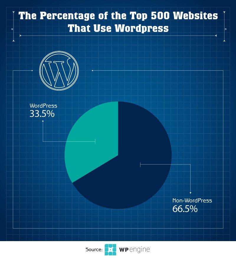
Every webmaster should build with the proper tools to create a website for success. Many website developers, both amateurs and professionals, turn to the most popular CMS platform, WordPress, in building their website. With more than 55,000 plugins in its hugely extensive library, WordPress leads other CRM brands in giving the most options for customization without the fuss. WordPress works even for beginners because you need not know coding or an impressive backend experience to create a stunning WordPress site. As a matter of fact, among the top 500 websites, 33.5% are WordPress users.

But a site should be beyond stunning. There is more to a website than its design, functionality, and content. While all these things are direly important too, and can even make or break the success of your website. All these elements, though, need to point to a clear goal—leads generation and conversion. If nobody can find the website, then how can they ever convert from mere visitors to avid patrons?

What is Lead Generation and What Good is it For Websites?

Lead generation aims to gain people’s attention and get them interested in your brand or business, with the aim of converting them into subscribers and customers. It uses strategies such as building an email list, lead magnets, contact forms, and landing pages. SEO strategies are successful if they can bring the people into your website, cause them to stay, and finally urge them to buy.

The websites that these consumers look for add value to their lives by being able to give some solutions to their latest search intent. The market is fickle, and the trends continually change and adapt to the ever-evolving market, so webmasters look or CMS platforms that can deliver a lot of customization options, produce mobile-responsive content, fully integrated with email service. Here are some of the best WordPress plugins for a lead generation this 2020 that meet these demands:

Yoast SEO

Yoast SEO is a CMS platform that helps you attract traffic to your website by optimizing your site for search engines. SEO experts love Yoast because they don’t have to think about all the backend requirements to optimize the site. They can focus more on front-facing aspects of the website, like the right keywords to get the right visitors and convert them into leads customers.

OptinMonster

OptinMonster is an optin form builder tool that helps you build multiple types of forms such as lightbox popups, floating bars, slide-ins, and sidebar forms, for your website. It’s one of the most popular lead generation software that integrates your forms with email marketing tools such as Mailchimp, AWeber, InfusionSoft, Constant Contact, and GetResponse. It has an Exit-Intent Technology that pops up upon the visitor’s sign out or exit, to discourage cart abandonment, or to at least get their email or click a social share button. Other features include A/B testing, page-level targeting, and built-in analytics that webmasters find very useful and convenient. OptinMonster works on every website, like WordPress, Shopify, HTML, and others.

JotForm oEmbed

JotForm oEmbed is another tool for making contact forms that can be fully integrated with email marketing tools. It is easy-to-use for newsletter signup form creation and to continue building your newsletter’s email list. You can boost your email list by creating signup forms to join your mailing list, or through an email signup checkbox to your regular contact forms for a more automated system of adding contacts to your list. You can also embed your lead generation on any page of your WordPress site.

Thrive Leads

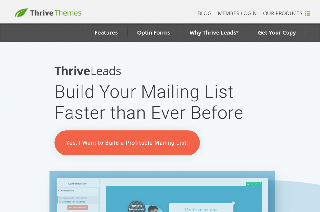
Thrive Leads boast of helping you build your mailing list fast, right from your website. It comes with a simple drag and drop editor to create optin forms, and allows you to choose what kind of forms you want to build—popup lightbox, 2-step optin forms, sticky horizontal forms, just to name a few. You can do A/B testing of your forms; however, it has fewer targeting options than Optin Monster and may cause web slowdowns if it’s not compatible with your web host.

MailChimp for WordPress

MailChimp for WordPress is created by a WordPress plugin company called IberiCode, which allows you to add more subscribers in your email list beyond 2000 subscribers directly from your WordPress website. You can make basic optin forms or integrate them into your comments, contacts, or checkout forms. It offers both paid and free additional features like MailChimp Top Bar, MailChimp User Sync, Captcha, and MailChimp Activity.

LiveChat Inc.

Adding a chatbox on your website is made easy by LiveChat. It enables you to be “there” for your visitors right away, assist immediately, and propel conversions more successfully. It works well for visitors because issues can be resolved in no time. It can also be integrated with email marketing tools, so it’s easy to get information from your potential leads for quick follow up.

Yoast Comment Hacks

Make your blog more engaging by adding a way for them to interact with you and other readers quickly. You can immediately answer questions, encourage healthy discussions, making your readers engage with you on a more personal level. It helps you build trust and establish authority all at the same time, especially if readers are leaving positive comments on your page. It helps for better chances of lead conversion and sales.

Conclusion: Make Lead Generation a Priority

Don’t be too focused on just the aesthetics of your website. What good is a well-designed kitchen if no one is ever going to cook in it, and no food gets served through it? What good is a mall with all the best shops in the world, if nobody ever drives by to shop? It’s the same with your website. You need people to find your site, people consuming the content on your website, and people converting from mere observers to active buyers. It is not impossible to have thousands in website traffic, sales, and repeat orders coming from your newsletters and visitors on your website and social media pages getting hooked into your website if you build things correctly. Build your website with the right tools to get to the right people and get the most conversions in your target niche. Make lead generation a priority today.

Categories: Others Tags:

CSS X

March 16th, 2020 No comments

My name appears in an article from Bert Bos (co-author of the original CSS spec), so I’ll consider that a life accomplishment. Berts makes the point that CSS has evolved and the working group versions things, but the working group hasn’t been and doesn’t really plan to be involved in these big named banner releases like CSS3 was. He thinks this can be something the community just rallies up:

Every three years of so, some people should pick a couple of interesting new modules that were added in that period and start writing about them, under the heading ‘CSS 4′, then ‘CSS 5′, etc. ‘CSS X’ is defined as those two or so modules, plus whatever was in the previous version and a loosely defined set of other modules.

I dig that. Maybe the new community group will nail it. Someone has gotta just grab the bull the horns and declare it and see if it sticks. Then let’s do it again in a few years.

Direct Link to ArticlePermalink

The post CSS X appeared first on CSS-Tricks.
Categories: Designing, Others Tags:

Stop Using “Dropdown”

March 16th, 2020 No comments

Adrian Roselli notes that it might actually mean:

  • A menu
  • An ARIA Listbox, Combobox, Menu, or Disclosure Widget
  • An input with a
  • An input with autocomplete
  • A
    block
  • An accordion
  • Flyout navigation

In my own usage, I tend to mean “A UI pattern where you click/tap a small thing and a big thing opens.” An aria-expanded situation, like, say, the user avatar on CodePen that you click to expand user-specific actions and navigation. “Menu” feels right to me, although I’m not sure that’s much of an improvement.

I take the point. Dropdown doesn’t actually mean anything and that ambiguity may hurt conversation and understanding.

Direct Link to ArticlePermalink

The post Stop Using “Dropdown” appeared first on CSS-Tricks.
Categories: Designing, Others Tags:

How to Make Repeating Border Images

March 16th, 2020 No comments

I just saw this cool little site from Max Bittker: broider. You design an image on a 9-slice grid (except the middle part) and it will produce an image for you to use with border-image along with the CSS to copy and paste.

Check out my little design:

CodePen Embed Fallback

The areas of the image ultimately output to a base64 PNG file with the designs in each area. For example, if you just drew in the top-center quadrant, the generated PNG looks like this:

Which gives you a single border like this, which might be just what you want:

CodePen Embed Fallback

On the new ShopTalk Show website, we have a similar effect in a few places, like this:

We did that in a slightly different way. Rather than border-image, we used a background-image and background-repeat: round; That way we could use an image in pretty much the same way, only we had to take the extra step of placing an “inner” element in order to knock out the middle (so it fakes a border).

Like this:

CodePen Embed Fallback

Looking at it now, we probably should have just used border-image, as it can do the same thing and is a bit cleaner. Our Almanac page has more examples.

The post How to Make Repeating Border Images appeared first on CSS-Tricks.
Categories: Designing, Others Tags: