Archive

Archive for March, 2020

PayPal for Nonprofits

March 12th, 2020 No comments
PayPal for Nonprofits

Nonprofits need patrons of all ages, sizes, locations, and giving levels in order to effect real change.

However, many nonprofits are stuck using old methods of donor acquisition, such as canvassing and phone calls. While traditional methods still work, technology is giving nonprofits a greater reach. Since 2016, online giving has experienced growth of 17 percent, and that number continues to grow. As new technology emerges to make online giving easier, nonprofits that want to reach new donors are turning to more modern methods of attracting donors.
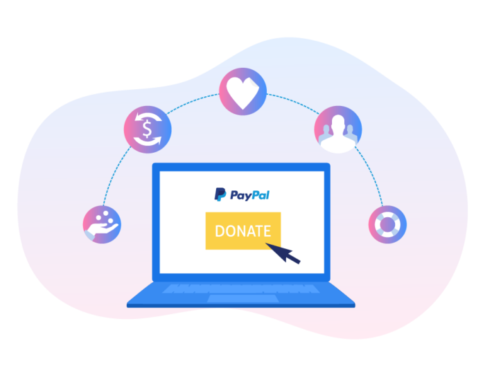
All organizations, both for-profit and nonprofit, are facing the challenge of staying relevant and financially solvent in an environment of rapid change. To keep up, you need to reach an online, mobile, and connected audience.

But how do you go about doing this?

PayPal’s worldwide payment system and JotForm’s easy-to-create forms can work together to help your nonprofit reach more donors. You’ll be able to spend less time on busywork and more time doing good.

This guide shows how PayPal can help nonprofits meet their needs.

Summary of the Guide to Paypal for Nonprofits

  • The challenges nonprofits face
  • How PayPal is impacting the nonprofit sector
  • Why you should use PayPal to accept donations
  • How ease of use promotes giving
  • Charity rates for nonprofits
  • Getting even more value from PayPal with better forms
  • Getting started with PayPal and JotForm
  • How JotForm and PayPal make helping others easy

The challenges nonprofits face

“The networked world around us has placed donors squarely in the role of key navigators of their own philanthropic course.” — Charitable Giving Report: How Fundraising Performed in 2018

It’s no secret that nonprofits face daily challenges, including issues with staffing and funding. Nonprofits can be highly complex, especially when it comes to finances. You’re expected to run your charity like a business, but how do you sustain operations with a smaller, less reliable budget than your for-profit counterparts? And on top of money worries, you have to keep up with technological changes.

Giving across mobile and the web?

Traditionally, fundraising was heavily location based. Giving was done at a prearranged time and place, like an auction or a dinner. In contrast, philanthropy now occurs anywhere, anytime. More than 20 percent of PayPal donations are made using a mobile device. Nonprofits need to reach this audience of smartphone and tablet users. However, staffing pressures cause many nonprofits to struggle with upskilling and modernizing their organizations.

Lack of IT skills

Every organization needs information technology (IT) skills, yet IT teams in nonprofits are a third of the size of teams at equivalent for-profit firms. Lacking dedicated IT staff, most nonprofits have to get by with little or nothing at all. In fact, Microsoft reports that of the 4 million charitable nonprofits around the world, 98 percent have fewer than 50 people on staff, and half have no IT budget.

“The … nonprofit sector is resilient, collaborative, innovative, and determined to address the most complex and enduring problems in our country.” — leader of a human services nonprofit in Minnesota

Financial management pressures

Demand for the services nonprofits provide is rising. Eighty-six percent of nonprofits say they’re facing higher demand. However, more than half of nonprofits say they can’t meet that demand. In low-income communities, that number shoots up to 65 percent. Meanwhile, nonprofits are struggling financially. In 2017, only half of nonprofits achieved an operating surplus, and only a quarter had cash on hand to last more than six months.

Technology adoption pressures

For-profit companies that are flush with resources can afford to take risks, such as investing in research and development or buying new technology. Nonprofits with less cash need to take lower-risk options. As a result, nonprofits are less likely to keep up with the latest technology. Many fall behind in technology adoption, leaving them vulnerable to a variety of problems.

Slow or reduced payments

Unpredictable payment schedules can severely impact a nonprofit’s viability. When their cash flow isn’t consistent, charities often have to dip into their reserves. Sixty-two percent of nonprofits report “financial sustainability” as their top operational/financial challenge. One in five also report “cash reserves” and “cash flow” as major concerns.

In light of these challenges, how are advances in technology affecting the nonprofit sector?

How PayPal is impacting the nonprofit sector

What is PayPal?

PayPal is a global electronic payment system. Based in the United States, the company handles money exchanges as an alternative to checks, money orders, and other electronic cash options.

Initially, PayPal found success as an online wallet. Users were able to securely and easily dip into their funds and shop online. PayPal partnered closely with auction sites like eBay, and transactions were often “one click.” This type of transaction — where users don’t have to type in financial information — offers security, speed, and ease of use.
How large is PayPal’s influence?

In 2018, PayPal processed $578 billion in payments. For comparison, in 2018, Apple was worth about $1 trillion and Facebook was estimated at around $500 billion. The amount of payments PayPal processes each year is truly staggering.

PayPal handled $7.3 billion in donations for nonprofits during 2016. The company operates in more than 200 countries and has over 8 million users. This global reach means PayPal is able to cover all donors, big and small.

PayPal also handles donations of all sizes. The average donation processed by the service in 2016 was about $80. However, people have donated as little as $1 and up to more than $200,000 through the web service.

PayPal not only processes donations for nonprofits, but it also gives to nonprofits:

  • PayPal’s Giving Fund is a unique systemthatembeds charitable giving into otherwise commercial transactions. Users of PayPal, eBay, Humble Bundle, GoFundMe, and other sites are prompted at checkout to add a gift to their favorite charity. The platform raised more than $7 billion last year, benefiting tens of thousands of charities. In December, PayPal added one percent to all donations delivered through the fund.
  • During the worldwide Giving Tuesday initiative, which occurs the first Tuesday after Thanksgiving, PayPal partnered with Facebook to match donations made through its service, dollar-for-dollar, up to a total of $7 million.
  • From Hurricanes in the U.S. to earthquakes in Mexico, severe natural disasters occur around the world every year. In addition to making cash donations to global aid agencies, PayPal harnesses its platform to reach donors and collect funds. In 2017, PayPal raised a combined $55 million for organizations providing relief.
  • PayPal also boosts charitable contributions from staff. Each employee is able to receive up to $2,500 in matching charitable contributions annually. For every hour of volunteer service donated by employees, PayPal donates $10 to a nonprofit of the employee’s choosing, up to $500. Throughout 2017, PayPal employees contributed more than 20,000 volunteer hours, and the company gave nearly $1.7 million in matching gifts to nonprofit organizations.

Let’s take a deeper look at PayPal’s size, reputation, and results in working with nonprofits.

Why you should use PayPal to accept donations

PayPal’s multibillion-dollar size means it can reach both domestic and international audiences.

A few facts from 2017 illustrate PayPal’s sheer size. In that one year, PayPal handled

  • $451 billion in total payments
  • $155 million in mobile payments, which is significant for nonprofits looking to attract younger donors
  • 7.6 billion individual payments
  • 230 million active customer accounts

Along with its immense size, PayPal has built trust among consumers. Research shows that the PayPal seal is one of the most respected indications of online security. In fact, 28 percent of donors surveyed said they wouldn’t have made a payment if not for the PayPal option.

Many nonprofits are already benefiting from the trust consumers have in PayPal. Currently, more than 600,000 nonprofits use PayPal, and the company handles $10 billion in payment volume for nonprofits. Additionally, PayPal initiatives can increase donations to nonprofits.

For microlender Kiva, PayPal’s 2016 and 2017 lending campaigns saw impressive results:

  • Over 20,000 PayPal customers and employees made nearly $1.5 million in loans.
  • More than 60 percent were first-time lenders.
  • Kiva estimates these first-time lenders will eventually contribute $7.7 million combined in loans during their lifetime on the platform.
  • During the 2016 campaign, PayPal offered participants an additional $25 credit so they could make a second loan.

With its dominant global reach, PayPal has the power to directly boost your fundraising results. But is it really that easy to donate via PayPal?

How ease of use promotes giving

PayPal has built ease of use into its DNA. The service was originally intended as an easier and more secure alternative to money orders or checks. Founded in 1998, the payment processor comes with a bevy of features developed over its 20 years in business:

  • One-click transactions. PayPal calls this feature One Touch. When you check out using the same device and browser, you don’t even need to enter your email or password. Simply review your details and pay at millions of PayPal merchants. One Touch comes with PayPal’s fraud and purchase protection. It also offers a comprehensive set of cybersecurity and insurance features.
  • Using any of PayPal’s payment services, donors do not have to divulge their full financial information to organizations. Instead, they merely click one button or provide their PayPal login and password, letting PayPal complete the hard work of the transaction.
  • PayPal is mobile-first. This is important because the percentage of donations made on mobile devices has risen steadily in the past few years: from 9 percent in 2014 to 24 percent in 2018. To attract younger demographics that prefer mobile, you need to meet them where they are.
  • PayPal offers recurring donations. While every donation is worthwhile, make it your goal to convert a one-off donor into a recurring donor. The lifetime value of a recurring donor is much higher than a one-time donor because you don’t spend as much time reaching out, explaining your cause, and worrying about revenue.
  • PayPal has a truly global reach. Why is this important? Because PayPal has access to more than 200 world markets, your donors can use just about any currency. Thirty-one percent of worldwide donors give to organizations located outside of their country of residence. Think about where your charitable organization could expand.
  • PayPal isn’t just an online service. PayPal Here is point-of-sale technology that allows payments to be made using a phone or tablet. Eighty-nine percent of consumers become frustrated when they have to deal with more than one touchpoint to accomplish a sale. Make donating easy so your donors don’t turn away in frustration.
  • People without PayPal accounts can still use a debit or credit card on PayPal platforms. Many people don’t use PayPal, either because it’s not their trusted bank or they’re not up to date with the latest technology. In a world of so many custom financial products, you need to offer as many options as possible to potential donors.
  • PayPal offers a range of products. Without going into detail, there are a number of PayPal products available to organizations, such as PayPal Payments Standard and PayPal Express Checkout. These two solutions let donors complete their transactions on the PayPal website. Although the payment process starts and ends on your organization’s website, your organization receives no financial information from individual donors. Organizations that want transactions to occur on their websites can opt for the more expensive PayPal Payments Pro.

Not only is PayPal easy to use, but its global reach, variety of products, and multiple forms of payment increase your nonprofit’s legitimacy in the minds of potential supporters.

In addition, PayPal partners with several other fundraising software providers, such as blackbaud, Network for Good, Classy, and Fundrazr. These partnerships open the door to new avenues of fundraising, like crowdfunding.

Do you have a worthy cause but no platform on which to raise funds? These crowdsourcing platforms and fundraising technology integrate with PayPal and social media. They bring together all your web presence metrics, donor accounts, and social media performance into one powerful widget.

While PayPal has plenty of exciting features and partners, it also has a financial incentive — lower fees for charities.

Charity rates for nonprofits

Commercial businesses vs 501(c)(3) organizations

The standard rate for a PayPal nonprofit business account is 2.9 percent plus 30 cents per domestic transaction. For example, if someone donated $100 to a business or non-registered charity through PayPal, the organization would receive $96.80.

However, PayPal offers a lower rate if you qualify as a 501(c)(3) organization. If your nonprofit meets the Internal Revenue Service definition of a 501(c)(3) charitable organization, you can receive a discounted charity rate of 2.2 percent plus 30 cents per domestic transaction through PayPal. If your organization receives more than $100,000 a month, the percentage drops to 1.9 percent. From a $100 donation, for example, a minimum of $97.50 would end up in the charity’s PayPal account.

In addition to the charity rate, reasons to choose PayPal for your nonprofit include faster transfer time and cheaper fees. PayPal advertises that the money is available in your account within minutes of completing the transaction. Transferring the funds from your PayPal account to a checking account incurs no fees, and the solution is cheaper than processing checks or credit cards.

Based on large-scale research among U.S.-based organizations conducted in 2016, PayPal found that

  • Ninety-eight percent of charities accept checks, 92 percent accept cash, 73 percent accept cards, 59 percent accept digital wallet, and 14 percent accept payments from third-party platforms, like Text-to-Give or Facebook.
  • For a single $100 donation by a first-time donor, the cheapest method of payment is by check. The processing fee on a $100 donation is $3.61 if paid by check, $4.25 by credit card, and $4.15 by digital wallet. However, digital wallet donations are less costly for smaller denomination donations, like $50. Digital wallet is also better for solving problematic transactions and encouraging repeat donations.

How can your nonprofit make sure it gets the discounted rate?

Follow the steps below:

  • To apply, you’ll need
    • Your nonprofit’s employer identification number, or EIN
    • Documentation of your organization’s 501(c)(3) status
    • A bank statement or voided check for each bank account linked to your PayPal account
  • When you sign up for a PayPal business account, select “nonprofit” for your business type and category. After you provide your organization’s bank account information, PayPal can transfer funds to your account.

What other features or advantages are there?

Using PayPal’s reporting and dashboard functions, you get access to powerful, actionable information. You can analyze revenue sources, automate time-consuming bookkeeping tasks, and accurately settle and reconcile transactions.

Your organization can also view a real-time transaction log on its PayPal account. The log displays the transaction date, payer name, mailing address, email address, and gross and net transaction amounts. This information is invaluable for building a database of supporters.

Getting even more value from PayPal with better forms

Your donors are impressed by your website. Perhaps they’ve even attended one of your events. With their credit card at the ready, they’re viewing your online donation form. Will they be able to fill it in quickly, or do they have to jump through too many hoops?

An online form must strike a balance:

  • On one hand, you want to extract maximum value: a higher donation, more personal data, a recurring contribution, and shares to a donor’s social network.
  • On the other hand, you don’t want to scare away potential donors with onerous requirements. You need a clean, easy, simple solution.

Electronic forms have been around since the internet and commerce collided in the ’90s, yet much has changed since then. For example, almost a third of online commerce is now done on mobile devices. You need a form that your mobile-connected donors can easily use, and you need a solution that is best-in-class, adaptable, and fast.

Why you should use JotForm for your donation forms

JotForm offers many features to assist your nonprofit. Here are some of the basics:

  • No fees are charged for up to 100 form submissions per month. A small monthly charge is assessed over that amount.
  • Nonprofits get a 50-percent discount.
  • Creating a donation form takes minutes.
  • JotForm integrates with scores of payment options, including PayPal.
  • Transactions are safe and secure and require little work on your end.
  • You can host the form on your site, meaning fewer people have to leave your website.
  • You can share your form as a link.

Design options

In terms of visual design, JotForm has worked hard to make its platform both easy to use and powerful:

  • The Form Builder is mobile optimized, meaning it will work wherever your donor is and on whatever device they prefer.
  • JotForm is extremely easy to use. Drag-and-drop tools allow you to create a form that offers a number of options for collecting money, including subscriptions, products, or donations of varying amounts.
  • Worried about integrating JotForm with PayPal? Simply enter your PayPal account details, and JotForm takes care of the rest. Customer support is available to help you with any questions.
  • You have the option of including One Touch, one-click payment, payment onsite, or a PayPal popup, depending on what you prefer and which PayPal service you use.
  • You can use your nonprofit’s brand and signature style, giving the form a sleek, distinct look that fits in with the rest of your website.
  • The backend has form analytics for those who want to dive deeper into how their form is being used.

Extra tip: Give your donate button superpowers

Using simple, easy-to-use templates, we’ll make sure you get a great “donate” button. Why is this so important?

You want to encourage website users to donate without feeling like they’re getting a sales pitch. How do you do this in a way that complements your beautiful website? Finding this balance requires evaluating size, visual balance, taste, and color.

Here’s an example of how that might look:
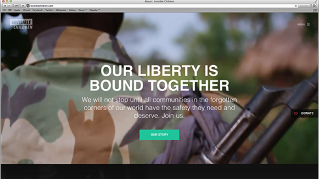
Donate button

See the donate button? It’s not buried in a menu or standing out too much. In fact, Invisible Children got the prominence of the donate button just right.

Along with the size, consider the location and visibility. As you scroll down Invisible Children’s page, the donate button stays anchored on the side. Its location to the right indicates forward movement and progression. The semi-transparent button harmonizes with the captivating video display. It stands out without overpowering the page’s content.

These details may seem rather insignificant, but the aesthetic of your website and forms can influence a donor’s opinion about your organization. By paying attention to the details, you can improve your reputation in the minds of current and future patrons.

Forms that match your website

With more than 10,000 free templates, JotForm is sure to have something that fits your nonprofit’s look.

If you don’t want to use a template, you can start with a blank slate and build a personalized form from scratch. Drag and drop the various fields into your form from the sidebar. You can include event registrations, volunteer registrations, or donation entries as you go.

Whether you’re holding an auction, throwing a party, or gathering volunteers, you can design a form that suits your purpose.

Getting started with PayPal and JotForm

JotForm allows you to use a variety of PayPal tools, so you can sell products, offer subscriptions, or collect donations in custom amounts through your form. Your nonprofit then receives funds in its PayPal account.

Integrating your form with PayPal Standard is easy and only takes a few steps:

1. Add PayPal to your form from the Payments tab on the left under the Form Elements menu.
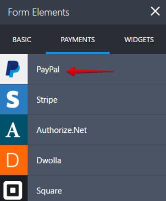
form elements

2. In the payment wizard, enter your PayPal account details.
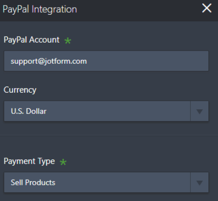
paypal integration

3. Choose whether you will sell products, sell subscriptions, collect custom amounts, or collect donations.
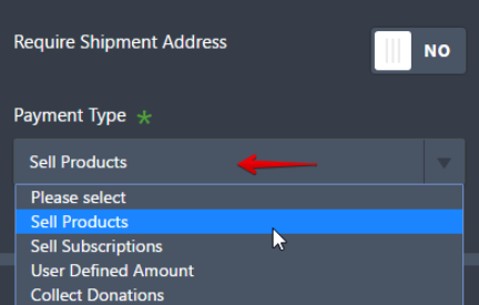
payment type

4. Assuming that you want to collect donations, continue to the next page.

Enter the details, including the type of donation, the amounts, and any extra details you want to collect, such as the donor’s email or address.

5. Save, and you’re ready to start raising funds.

Be sure to test your PayPal payment form before it goes live. Check out our How to test your PayPal payment form guide for more information. If you have questions, we have multiple ways to help. You can quickly check our FAQs, read over the User Guide, or contact support.

Using JotForm in other applications

While most people will find your donation form via your website, you can make the form available through other channels.

Using JotForm, you can set up your form as a standalone entity. It won’t have the restrictions of an embedded button, and the form can be accessed from anywhere. For example, you could add the form link to an email campaign or share it on social media.

Using these tools is a breeze with JotForm’s simple and powerful integration tools.

JotForm caters to all types of organizations

Businesses of any size can use JotForm’s online Form Builder. Signing up is free and simple. Nonprofits that want to get started quickly can use one of the many form templates.

Organizations that need a custom form can build one with JotForm’s drag-and-drop elements and integrations. JotForm’s analytics show who uses your form and what works. Data is stored securely for you to retrieve, share, or export to a document or spreadsheet.

If your requirements are more complex than the average user, JotForm can accommodate them. You can connect your online forms with hundreds of applications by integrating with IFTTT, a free, online applet creator. This integration allows you to create actions within other services using the responses submitted in JotForm forms.

This applet feature brings new levels of connectivity. When a user submits a form, applets can trigger other actions, such as

  • Creating notes in OneNote or Evernote
  • Sending text messages
  • Posting messages in Slack

The only limit is your imagination.

How JotForm and PayPal make helping others easy

JotForm and PayPal make helping others easy
“Donors don’t give to institutions. They invest in ideas and people in whom they believe.” — G.T. Smith

As a nonprofit, you don’t want hassles when it comes to fundraising. You just want to do good.

Navigating online fundraising can be tricky. Technological advances have opened new doors and revenue streams. Initiatives like crowdfunding, social media, and microlending bring opportunities. However, they also bring pain points that require additional technical knowledge and effort to solve.

If it sounds complicated, you might be tempted to avoid all the confusion and opt out of web fundraising entirely. However, you don’t want to stop raising money because of a knowledge gap. More and more of your donors are moving online, and you need to follow. To make this transition easier for everyone, get the right tools to quickly and simply raise necessary funds.

By working with PayPal and JotForm, you have a better chance at success. Let the tech companies take care of security, donor insight gathering, and reaching out. Using the right form and the right financial platform, you can drastically streamline your process and make donating easier.

Why not give it a try? You could boost funds and make your life easier while doing it.
Categories: Others Tags:

Accessible SVGs: Inclusiveness Beyond Patterns

March 12th, 2020 No comments
House icon used in demo with light outline vs dark outline

Accessible SVGs: Inclusiveness Beyond Patterns

Accessible SVGs: Inclusiveness Beyond Patterns

Carie Fisher

2020-03-12T11:30:00+00:002020-03-12T15:07:49+00:00

Scalable Vector Graphics (SVGs) became a W3C open standard in 1999 — back when the new tech hotness was the Blackberry phone, Napster first invaded college dorms, and the Y2K bug sparked fear in us all. Fast forward to our modern digital world and you’ll notice that while the other tech trends have waned, SVGs are still around and thriving. This is partly due to SVGs having a small footprint for such high visual fidelity, in a world where bandwidth and performance matter more than ever — especially on mobile devices and situations/locations where data is at a premium. But also because SVGs are so flexible with their integrated styles, interactivity, and animation options. What we can do with SVGs today goes way beyond the basic shapes of yesteryear.

If we focus on the accessibility aspect of SVGs, we have come a long way as well. Today, we have many robust patterns and techniques to help us optimize inclusiveness. This is true regardless if you are creating icons, simple images, or more complex images. While the specific pattern you decide to use might vary depending on your particular situation and targeted WCAG conformance level — the reality is, most people stop there, focusing on code compliance and not actual end-users and their needs. If true inclusiveness lies beyond patterns — what other factors should we consider when designing and developing accessible SVGs?

Styling And Animating SVGs With CSS

Why is it so important to optimize your SVGs? Also, why even put in the effort to make them accessible? Sara Soueidan explais why and also how to style and animate with CSS. Read article ?

SVG Color And Contrast

The primary focus of accessible SVGs is screen readers compliance — which is only part of the issue and part of the solution. Globally, people with low-vision and color blindness outnumber the people who are blind 14:1. We are talking a staggering 546 million in total (246 million low-vision users plus 300 million colorblind users) vs. 39 million users who are legally blind. Many people with low-vision and colorblindness do not rely on screen readers, but may instead use tools like browser resizing, customized stylesheets, or magnification software to help them see what is on the screen. To these 546 million people, screen reader output is probably not as important to them as making sure the color and contrast is great enough that they can see the SVG on the screen — but how do we go about checking for this?

Tools And Checks

The very first step you should take when designing your SVG color palette is to review the WCAG color contrast ratio guidelines. While SVGs and other icons were exempt from color contrast ratio requirements not too long ago (when targeting WCAG AA compliance), the recent update to the WCAG 2.1 guidelines have made it so all essential non-text imagery must adhere to a contrast ratio of at least 3:1 against adjacent colors. By essential, it means if your SVG was to vanish, would it fundamentally change the information or functionality of the content? If you can answer “no,” then you are likely exempt from this guideline. If you can answer “yes” or “maybe,” then you need to make sure your SVG color contrast ratios are in check.

House icon used in demo with light outline vs dark outline

House icon used in demo with light outline vs dark outline — which is more accessible? (Large preview)

One example of an essential non-text image is an SVG icon used as a CTA button or link — such as we see in this home button. In this SVG, we see a line drawing of a house with no visual text. When we look into the code, we see the text “Home” in a span with a class called “sr-only” (screen reader only) on it. This class, along with the related CSS, hides the span text from sighted users, but not from AT users (this is just one example of an accessible image/graphic pattern).

This is a good first step, but choosing the correct SVG pattern is one piece of the puzzle — another piece is the color contrast between the icon and its background. Going back to the example, at first glance it seems like both SVGs could be accessible. Yet, when using a color contrast tool and testing the house icon against its background, we see the first SVG fails compliance with a color contrast ratio of 2:1 between the stroke (#8f8f8f) and the background (#cccccc), while the second SVG passes with a color contrast ratio of 3:1 between the stroke (#717171) and the background (#cccccc). By using the same accessible pattern, but taking an extra step and changing the stroke color to something a bit darker, we made our SVG more inclusive to a wider range of abilities.

To check for accessible color contrast ratios, there are many tools available for use. For a quick color contrast spot check, you could use the Contrast Checker in Chrome DevTools. For checking color contrast on non-coded designs, check out the Colour Contrast Analyser tool. And for a full-color palette review, A11y Color Palette is a great way to help you see which color combinations are the most accessible. Of course, make sure you try out a few of the tools and pick whatever works best for you and your team — the best tool is the one you actually use.

Light/Dark Mode

Beyond checking for color contrast ratios, you should also consider the increasingly popular and supported media query called @prefers-color-scheme that allows a user to choose a light or dark themed version of the website or app they are visiting. While this media query does not replace checking for color contrast ratios, it can give your users more choice when it comes to the overall experience of your website or app.


Allowing your users to choose their experience is always better than assuming you know what they want.

As with other media queries, to see the light/dark theme changes, the website or app developer must add additional code targeting the query. Going back to the house icon example from earlier, you can see in the following code that the SVG’s stroke, fill, and background colors are controlled by the CSS. Since these style elements are externally controlled and not hard-coded in the SVG markup, we can add a few extra lines of CSS to make the SVG work in a dark theme.

Light/default mode:

House icon used in demo with a light background

House icon used in demo with a light background (Large preview)
body {
  background: #cccccc;
}

.nav-home1 {
  stroke: #8f8f8f;
}

.nav-home2 {
  stroke: #717171;
}

#home-svg1,
#home-svg2 {
  fill: #64b700;
}

#home-door-svg1,
#home-door-svg2 {
  fill: #b426ff;
}
Dark mode:

House icon used in demo with a dark background

House icon used in demo with a dark background (Large preview)
@media (prefers-color-scheme: dark) {
  
  body {
    background: #333333;
  }

  .nav-home1 {
    stroke: #606060;
  }

  .nav-home2 {
    stroke: #7C7C7C;
  }
}

See the Pen Light/Dark mode with SVGs by Carie Fisher.

See the Pen Light/Dark mode with SVGs by Carie Fisher.

As this example shows, setting up your designs to use CSS to control style elements means that creating a dark theme version of your SVG can be relatively simple. Conversely, if you have hard-coded styles into the SVG markup, you may need to reimagine your SVG in a way that allows CSS to have more control over the design. Or you may want to consider creating a completely new dark version of your SVG and swap out the light version when the theme preferences change. Just remember, if you do plan to show/hide different images based on the user mode, you also need to hide the nonvisible SVG from AT users!

Note: in this particular example, the default theme was already light so it made sense to also make that the default experience and build a dark theme for an alternate experience. Otherwise, if we started with a dark theme, we could have done the opposite making the dark theme the default experience and using @media (prefers-color-scheme: light) to create a light theme.

In the next example, we are looking at a more complex SVG with both light and dark mode versions via the @prefers-color-scheme media query. Our friend Karma Chameleon (in SVG form) has both a dark theme and a light/default theme. By changing your light/dark preference settings (Mac OS + Win OS dark mode settings) and navigating to a browser that supports @prefers-color-scheme media query, you can see the environment change. In the light/default mode, Karma Chameleon is sitting on a branch in a green forest surrounded by a fluttering red butterfly. In dark mode, she is sitting on a branch in space with a blue rocket zooming past. In both environments, her colors automatically change and her eyes move around.

See the Pen [Light/Dark mode + reduced motion with SVGs (Karma Chameleon)](https://codepen.io/smashingmag/pen/rNVJyoj) by Carie Fisher.

See the Pen Light/Dark mode + reduced motion with SVGs (Karma Chameleon) by Carie Fisher.

In the light/default mode, Karma Chameleon is sitting on a branch in a green forest surrounded by a fluttering red butterfly. In both environments, her colors automatically change and her eyes move around.

Karma Chameleon in light mode. (Large preview)

In dark mode, she is sitting on a branch in space with a blue rocket zooming past. In both environments, her colors automatically change and her eyes move around.

Karma Chameleon in dark mode. (Large preview)

Color And Contrast Accessibility

While the above examples are fun ways to show what you can do with color and contrast and the @prefers-color-scheme media query, there are some really great real-world reasons to consider adding a dark theme including:

  • Dark themes are helpful to people with photophobia, or light sensitivity. People with photophobia can trigger headaches and migraines when they view a website or app that is too bright.
  • Some people find the text on a website or app easier to read in dark mode while others might find lighter themes are easier to read — it essentially comes down to giving your user a choice and allowing them to set their preference.
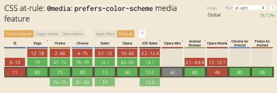
  • Unlike some other color or contrast based media queries like @inverted-colors (currently only supported by Safari) and @forced-colors (developed by Edge/IE engineers with Chromium support coming soon), the browser support is pretty universal for @prefers-color-scheme — so this media query is useful out of the box today and it should be sticking around for awhile. Plus with the recent changes to MS Edge using Chromium under the hood, there is even more support for this media query going forward (R.I.P. -ms-high-contrast-mode).

Graph showing which browsers utilize the CSS at-rule: @media: prefers-color-scheme media feature - IE and Opera mobile being the only major non-supporting browsers at this time.

Graph showing which browsers utilize the CSS at-rule: @media: prefers-color-scheme media feature. (Large preview)

SVG Animation

In conjunction with color and contrast, how your SVG moves on the screen is another aspect to consider when designing and developing with inclusiveness in mind. The WCAG motion guidelines are clear: non-essential moving, blinking, or scrolling information that starts automatically, lasts more than five seconds, and is part of other page elements must allow the user to pause, stop, or hide it. But why do we need this rule?

For some users, moving, blinking, or scrolling content can be very distracting. People with ADHD and other attention deficit disorders might be so distracted by your animated SVGs they forget why they even went to your website/app in the first place. While for other people, motion can trigger physical reactions. For example, people with vestibular issues can become nauseous and dizzy when viewing movement. While others can be triggered to have a seizure when viewing content that flashes or is bright — a situation you obviously want to avoid.


While we all like being “delighted” with interesting website and app features — we need to strike a balance between being creative versus distracting (or harming) our users during their interaction with moving content.

Manual/Auto Stop

Since SVG animations, like other moving content, must not auto-play for more than five seconds, you must create a way for users to pause or stop the animation. One way to do this is to create a JS toggle button to play/pause the animation.

If your SVG is large or is the main feature of your website (e.g. animations that pop in and out as you scroll down a page) a pause/play button at the top of the screen might be a realistic option to control the entire experience of the page. If your SVGs are smaller in scale or related to user input (e.g. an animation happens when a user submits a form), a pause/play button might not be realistic for each individual image, so an alternative option is to code the animation to stop at five seconds vs. playing it on an infinite loop.

Reduced Motion

In addition to using a pause/play option or creating a finite animation loop, you may also consider adding @prefers-reduced-motion media query to address the animation in your SVGs. Similar to the light/dark theme example, the @prefers-reduced-motion media query checks the user’s settings for motion restrictions and then implements a visual experience based on their preference. In the case of @prefers-reduced-motion, a user can choose to minimize the amount of animation or motion they see.

In the following example, the animated SVG “writes out” a word as the page loads — this is its default animation. In the reduced motion version, the SVG is stationary and the word loads without the animation. Depending on the complexity of your SVG animation and how you want the reduced motion experience to look, the amount of extra code involved can vary.

See the Pen [Reduced motion with SVGs](https://codepen.io/smashingmag/pen/dyodvqm) by Carie Fisher.

See the Pen Reduced motion with SVGs by Carie Fisher.
Default motion:
The default motion version of the text script (Large preview)
.svg-color {
  stroke: #ff4b00;
}

#a11y-svg {
  stroke-linecap: round;
  padding: 0.25rem;
  stroke-dasharray: 1000;
  stroke-dashoffset: 0;
  -webkit-animation: dash 5s linear forwards;
  animation: dash 5s linear forwards;
  overflow: visible;
  font-size: 100px;
  height: 0;
  margin: 10rem 0 5rem;
  position: relative;
}

#a11y-svg-design {
  cursor: pointer;
  stroke-width: 2px;
}

@-webkit-keyframes dash {
  from {
    stroke-dashoffset: 1000;
    fill: transparent;
  }

  to {
    stroke-dashoffset: 0;
    fill: #ff4b00;
  }
}
Reduced motion:

Still screenshot of the word accessibility in orange with no movement.

The reduced motion version of the text script. (Large preview)
@media (prefers-reduced-motion: reduce) {
  #a11y-svg {
    animation: none;
    fill: #ff4b00;
  }
}

Keep in mind, having @prefers-reduced-motion code in place is one step in making your SVGs more accessible, but you also need to consider the way the motion is reduced. For example, let’s say you create a slowed-down version of your SVG animation using @prefers-reduced-motion. However, the slower version is on an infinite loop so the animation lasts more than five seconds, which violates one part of the WCAG rules on motion. If you instead create a reduced motion version of your animated SVG that stops the animation at five seconds, then it would pass that part of the rule. This subtle code change equals two completely different user experiences.

In the next example, Karma Chameleon is back with a @prefers-reduced-motion media query and related code. By changing your motion settings (Mac, Win, Android, and iOS settings) and using a browser that supports @prefers-reduced-motion media query, you can see the animation change. In the light mode with reduced motion, Karma Chameleon in a forest with a stationary red butterfly. In dark mode with reduced motion, she is in space with a stationary blue rocket in the background. In both environments, her colors and eyes are also stationary, as the original SVG animation is completely removed.

See the Pen [Light/Dark mode + reduced motion with SVGs (Karma Chameleon)](https://codepen.io/smashingmag/pen/rNVJyoj) by Carie Fisher.

See the Pen Light/Dark mode + reduced motion with SVGs (Karma Chameleon) by Carie Fisher.

In light mode + reduced motion, Karma Chameleon is in a forest with a stationary red butterfly. In both environments, her colors and eyes are also stationary, as the original SVG animation is completely removed.

Karma Chameleon in light mode + no movement. (Large preview)

In dark mode + reduced motion, Karma Chameleon is in space with a stationary blue rocket in the background. In both environments, her colors and eyes are also stationary, as the original SVG animation is completely removed

Karma Chameleon in dark mode + no movement. (Large preview)

Animation Accessibility

From an accessibility standpoint, there are some great reasons to consider limiting the movement on your screen or providing alternative animations in your SVGs including:

  • Less is more! Keeping your SVG animations simple for people with cognitive and attention disorders can help with your overall user experience. This is especially true for SVGs critical to the content or functionality of your website or app — such as navigation, buttons, links, or any animation triggered by user input.
  • Don’t make people sick! Some people with seizure, vestibular, and vision disorders can trigger physical reaction by motion in your SVGs, so please be responsible with your designs and code. Note: you should double-check any animated SVGs that could be problematic in the flashing/blinking area, by using the free Photosensitive Epilepsy Analysis Tool (PEAT) to ensure you don’t trigger seizures with your content.
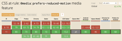
  • Most major browsers now support @prefers-reduced-motion media query both on desktop and mobile devices — meaning that more people can limit their exposure to unwanted movement on their screens. Unlike the media query @prefers-color-scheme which has a lot of competitors, there is currently no other motion reducing media query available.

Graph showing which browsers utilize the CSS at-rule: @media: prefers-reduced-motion media feature - IE and Opera mobile being the only major non-supporting browsers at this time; globally accepted 82.47%

Graph showing which browsers utilize the CSS at-rule: @media: prefers-reduced-motion media feature (Large preview)

Wrapping Up

Color, contrast, and animation is at the heart of every SVG. Studies report that these visual elements hold intrinsic meaning, contribute to brand recognition, and are tied to a company’s perceived value — making SVGs a very large area where designers and developers can have a direct and immediate impact on our users.

But it is also important that we don’t just think of SVG accessibility as something to help “other people” — because who hasn’t found themselves in a situation where they have to battle glare on a device screen? Or you have a migraine and SVGs keep floating on and off the screen making you sick instead of “delighted”. Or maybe you visit a website in a low-light setting and the text is hard to read due to the gray-on-gray color scheme?

With the use of accessibility tools, WCAG guidelines, and the continued addition and support of new CSS media queries to allow for more choice, we can impact all people in a more responsible and inclusive way.


For true digital inclusivity is understanding that every single one of us can benefit from more accessible designs and code.

(dm, yk, il)
Categories: Others Tags:

Careful with Nested `display: grid; height: 100%;`

March 11th, 2020 No comments

It’s not every day you can feel CSS be slow at something. Reddit user jgbbrd discovered nesting grid containers that all have 100% height can cause many-seconds of rendering delay. Probably not something you’ll ever have to worry about, but still, interesting. From the comments:

  • What a funny use of the NSFW tag!
  • This is not an issue when using 100vh instead.

Direct Link to ArticlePermalink

The post Careful with Nested `display: grid; height: 100%;` appeared first on CSS-Tricks.

Categories: Designing, Others Tags:

How to Make a Line Chart With CSS

March 11th, 2020 No comments

Line, bar, and pie charts are the bread and butter of dashboards and are the basic components of any data visualization toolkit. Sure, you can use SVG or a JavaScript chart library like Chart.js or a complex tool like D3 to create those charts, but what if you don’t want to load yet another library into your already performance-challenged website?

There are plenty of articles out there for creating CSS-only bar charts, column charts, and pie charts, but if you just want a basic line chart, you’re out of luck. While CSS can “draw lines” with borders and the like, there is no clear method for drawing a line from one point to another on an X and Y coordinate plane.

Well, there is a way! If all you need is a simple line chart, there’s no need to load in a huge JavaScript library or even reach for SVG. You can make everything you need with just CSS and a couple of custom properties in your HTML. Word of warning, though. It does involve a bit of trigonometry. If that didn’t scare you off, then roll up your shirt sleeves, and let’s get started!

Here’s a peek at where we’re headed:

CodePen Embed Fallback

Let’s start with the baseline

If you are creating a line chart by hand (as in, literally drawing lines on a piece of graph paper), you would start by creating the points, then connecting those points to make the lines. If you break the process down like that, you can recreate any basic line chart in CSS.

Let’s say we have an array of data to display points on an X and Y coordinate system, where days of the week fall along the X-axis and the numeric values represent points on the Y-axis.

[
  { value: 25, dimension: "Monday" },
  { value: 60, dimension: "Tuesday" },
  { value: 45, dimension: "Wednesday" },
  { value: 50, dimension: "Thursday" },
  { value: 40, dimension: "Friday" }
]

Let’s create an unordered list to hold our data points and apply some styles to it. Here’s our HTML:

<figure class="css-chart" style="--widget-size: 200px;">
  <ul class="line-chart">
    <li>
      <div class="data-point" data-value="25"></div>
    </li>
    <li>
      <div class="data-point" data-value="60"></div>
    </li>
    <li>
      <div class="data-point" data-value="45"></div>
    </li>
    <li>
      <div class="data-point" data-value="50"></div>
    </li>
    <li>
      <div class="data-point" data-value="40"></div>
    </li>
  </ul>
</figure>

A couple notes to glean here. First is that we’re wrapping everything in a

element, which is a nice semantic HTML way of saying this is self-contained content, which also provides us the optional benefit of using a
, should we need it. Secondly, notice that we’re storing the values in a data attribute we’re calling data-value that’s contained in its own div inside a list item in the unordered list. Why are we using a separate div instead of putting the class and attribute on the list items themselves? It’ll help us later when we get to drawing lines.

Lastly, note that we have an inlined custom property on the parent

element that we’re calling --widget-size. We’ll use that in the CSS, which is going to look like this:

/* The parent element */
.css-chart {
  /* The chart borders */
  border-bottom: 1px solid;
  border-left: 1px solid;
  /* The height, which is initially defined in the HTML */
  height: var(--widget-size);
  /* A little breathing room should there be others items around the chart */
  margin: 1em;
  /* Remove any padding so we have as much space to work with inside the element */
  padding: 0;
  position: relative;
  /* The chart width, as defined in the HTML */
  width: var(--widget-size);
}


/* The unordered list holding the data points, no list styling and no spacing */
.line-chart {
  list-style: none;
  margin: 0;
  padding: 0;
}


/* Each point on the chart, each a 12px circle with a light border */
.data-point {
  background-color: white;
  border: 2px solid lightblue;
  border-radius: 50%;
  height: 12px;
  position: absolute;
  width: 12px;
}

The above HTML and CSS will give us this not-so-exciting starting point:

Well, it sort of looks like a chart.

Rendering data points

That doesn’t look like much yet. We need a way to draw each data point at its respective X and Y coordinate on our soon-to-be chart. In our CSS, we’ve set the .data-point class to use absolute positioning and we set a fixed width and height on its parent .css-chart container with a custom property. We can use that to calculate our X and Y positions.

Our custom property sets the chart height at 200px and, in our values array, the largest value is 60. If we set that data point as the highest point on the chart’s Y axis at 200px, then we can use the ratio of any value in our data set to 60 and multiply that by 200 to get the Y coordinate of all of our points. So our largest value of 60 will have a Y value that can be calculated like this:

(60 / 60) * 200 = 200px 

And our smallest value of 25 will end up with a Y value calculated the same way:

(25 / 60) * 200 = 83.33333333333334px

Getting the Y coordinate for each data point is easier. If we are spacing the points equally across the graph, then we can divide the width of the chart (200px) by the number of values in our data array (5) to get 40px. That means the first value will have an X coordinate of 40px (to leave a margin for a left axis if we want one), and the last value will have an X coordinate of 200px.

You just got mathed! ?

For now, let’s add inline styles to each of the divs in the list items. Our new HTML becomes this, where the inline styles contain the calculated positioning for each point.

<figure class="css-chart">
  <ul class="line-chart">
    <li>
      <div class="data-point" data-value="25" style="bottom: 83.33333333333334px; left: 40px;"></div>
    </li>
    <li>
      <div class="data-point" data-value="60" style="bottom: 200px; left: 80px;"></div>
    </li>
    <li>
      <div class="data-point" data-value="45" style="bottom: 150px; left: 120px;"></div>
    </li>
    <li>
      <div class="data-point" data-value="50" style="bottom: 166.66666666666669pxpx; left: 160px;"></div>
    </li>
    <li>
      <div class="data-point" data-value="40" style="bottom: 133.33333333333331px; left: 200px;"></div>
    </li>
  </ul>
</figure>
We have a chart!

Hey, that looks a lot better! But even though you can see where this is going, you still can’t really call this a line graph. No problem. We only need to use a little more math to finish our game of connect-the-dots. Take a look at the picture of our rendered data points again. Can you see the triangles that connect them? If not, maybe this next picture will help:

Why is that important? Shhh, the answer’s coming up next.

Rendering line segments

See the triangles now? And they’re not just any old triangles. They’re the best kind of triangles (for our purposes anyway) because they are right triangles! When we calculated the Y coordinates of our data points earlier, we were also calculating the length of one leg of our right triangle (i.e. the “run” if you think of it as a stair step). If we calculate the difference in the X coordinate from one point to the next, that will tell us the length of another side of our right triangle (i.e. the “rise” of a stair step). And with those two pieces of information, we can calculate the length of the magical hypotenuse which, as it turns out, is exactly what we need to draw to the screen in order to connect our dots and make a real line chart.

For example, let’s take the second and third points on the chart.

<!-- ... --> 


<li>
  <div class="data-point" data-value="60" style="bottom: 200px; left: 80px;"></div>
</li>
<li>
  <div class="data-point" data-value="45" style="bottom: 150px; left: 120px;"></div>
</li>


<!-- ... -->

The second data point has a Y value of 200 and the third data point has a Y value of 150, so the opposite side of the triangle connecting them has a length of 200 minus 150, or 50. It has an adjacent side that is 40 pixels long (the amount of spacing we put between each of our points).

That means the length of the hypotenuse is the square root of 50 squared plus 40 squared, or 64.03124237432849.

The hypotenuse is what we need to draw our line graph

Let’s create another div inside of each list item in the chart that will serve as the hypotenuse of a triangle drawn from that point. Then we’ll set an inline custom property on our new div that contains the length of that hypotenuse.

<!-- ... -->


<li>
  <div class="data-point" data-value="60"></div>
  <div class="line-segment" style="--hypotenuse: 64.03124237432849;"></div>
</li>


<!-- ... -->

While we’re at it, our line segments are going to need to know their proper X and Y coordinates, so let’s remove the inline styles from our .data-point elements and add CSS custom properties to their parent (the

  • element) instead. Let’s call these properties, creatively, --x and --y. Our data points don’t need to know about the hypotenuse (the length of our line segment), so we can add a CSS custom property for the length of the hypotenuse directly to our .line-segment. So now our HTML will look like this:

    <!-- ... -->
    

    <li style="--y: 200px; --x: 80px">
      <div class="data-point" data-value="60"></div>
      <div class="line-segment" style="--hypotenuse: 64.03124237432849;"></div>
    </li>
    

    <!-- ... -->

    We’ll need to update our CSS to position the data points with those new custom properties and style up the new .line-segment div we added to the markup:

    .data-point {
      /* Same as before */
    

      bottom: var(--y);
      left: var(--x);
    }
    

    .line-segment {
      background-color: blue;
      bottom: var(--y);
      height: 3px;
      left: var(--x);
      position: absolute;
      width: calc(var(--hypotenuse) * 1px);
    }
    We have all of the parts now. They just don’t fit together correctly yet.

    Well, we have line segments now but this isn’t at all what we want. To get a functional line chart, we need to apply a transformation. But first, let’s fix a couple of things.

    First off, our line segments line up with the bottom of our data points, but we want the origin of the line segments to be the center of the data point circles. We can fix that with a quick CSS change to our .data-point styles. We need to adjust their X and Y position to account for both the size of the data point and its border as well as the width of the line segment.

    .data-point {
      /* ... */
    

      /* The data points have a radius of 8px and the line segment has a width of 3px, 
        so we split the difference to center the data points on the line segment origins */
      bottom: calc(var(--y) - 6.5px);
      left: calc(var(--x) - 9.5px);
    }

    Secondly, our line segments are being rendered on top of the data points instead of behind them. We can address that by putting the line segment first in our HTML:

    <!-- ... -->
    

    <li style="--y: 200px; --x: 80px">
        <div class="line-segment" style="--hypotenuse: 64.03124237432849;"></div>
        <div class="data-point" data-value="60"></div>
    </li>
    

    <!-- ... -->

    Applying transforms, FTW

    We’ve almost got it now. We just need to do one last bit of math. Specifically, we need to find the measure of the angle that faces the opposite side of our right triangle and then rotate our line segment by that same number of degrees.

    How do we do that? Trigonometry! You may recall the little mnemonic trick to remember how sine, cosine and tangent are calculated:

    • SOH (Sine = Opposite over Hypotenuse
    • CAH (Cosine = Adjacent over Hypotenuse)
    • TOA (Tangent = Opposite over Adjacent)

    You can use any of them because we know the length of all three sides of our right triangle. I picked sine, so that that leaves us with this equation:

    sin(x) = Opposite / Hypotenuse

    The answer to that equation will tell us how to rotate each line segment to have it connect to the next data point. We can quickly do this in JavaScript using Math.asin(Opposite / Hypotenuse). It will give us the answer in radians though, so we’ll need to multiply the result by (180 / Math.PI).

    Using the example of our second data point from earlier, we already worked out that the opposite side has a length of 50 and the hypotenuse has a length of 64.03124237432849, so we can re-write our equation like this:

    sin(x) = 50 /  64.03124237432849 = 51.34019174590991

    That’s the angle we’re looking for! We need to solve that equation for each of our data points and then pass the value as a CSS custom property on our .line-segment elements. That will give us HTML that looks like this:

    <!-- ... -->
    

    <li style="--y: 200px; --x: 80px">
      <div class="data-point" data-value="60"></div>
      <div class="line-segment" style="--hypotenuse: 64.03124237432849; --angle: 51.34019174590991;"></div>
    </li>
    

    <!-- ... -->

    And here’s where we can apply those properties in the CSS:

    .line-segment {
      /* ... */
      transform: rotate(calc(var(--angle) * 1deg));
      width: calc(var(--hypotenuse) * 1px);
    }

    Now when we render that, we have our line segments!

    Well, the line segments are definitely rotated. We need one more step.

    Wait, what? Our line segments are all over the place. What now? Oh, right. By default, transform: rotate() rotates around the center of the transformed element. We want the rotation to occur from the bottom-left corner to angle away from our current data point to the next one. That means we need to set one more CSS property on our .line-segment class.

    .line-segment {
      /* ... */
      transform: rotate(calc(var(--angle) * 1deg));
      transform-origin: left bottom;
      width: calc(var(--hypotenuse) * 1px);
    }

    And, now when we render it, we finally get the CSS-only line graph we’ve been waiting for.

    At last! A line graph!

    Important note: When you calculate the value of the opposite side (the “rise”), make sure it’s calculated as the “Y position of the current data point” minus the “Y position of the next data point.” That will result in a negative value when the next data point is a larger value (higher up on the graph) than the current data point which will result in a negative rotation. That’s how we ensure the line slopes upwards.

    When to use this kind of chart

    This approach is great for a simple static site or for a dynamic site that uses server-side generated content. Of course, it can also be used on a site with client-side dynamically generated content, but then you are back to running JavaScript on the client. The CodePen at the top of this post shows an example of client-side dynamic generation of this line chart.

    The CSS calc() function is highly useful, but it can’t calculate sine, cosine, and tangent for us. That means you’d have to either calculate your values by hand or write a quick function (client-side or server-side) to generate the needed values (X, Y, hypotenuse and angle) for our CSS custom properties.

    I know some of you got through this and will feel like it’s not vanilla CSS if it requires a script to calculate the values — and that’s fair. The point is that all of the chart rendering is done in CSS. The data points and the lines that connect them are all done with HTML elements and CSS that works beautifully, even in a statically rendered environment with no JavaScript enabled. And perhaps more importantly, there’s no need to download yet another bloated library just to render a simple line graph on your page.

    Potential improvements

    As with anything, there’s always something we can do to take things to the next level. In this case, I think there are three areas where this approach could be improved.

    Responsiveness

    The approach I’ve outlined uses a fixed size for the chart dimensions, which is exactly what we don’t want in a responsive design. We can work around this limitation if we can run JavaScript on the client. Instead of hard-coding our chart size, we can set a CSS custom property (remember our --widget-size property?), base all of the calculations on it, and update that property when the container or window either initially displays or resizes using some form of a container query or a window resize listener.

    Tooltips

    We could add a ::before pseudo-element to .data-point to display the data-value information it contains in a tooltip on hover over the data point. This is a nice-to-have sort of touch that helps turn our simple chart into a finished product.

    Axis lines

    Notice that the chart axises are unlabeled? We could distribute labels representing the highest value, zero, and any number of points between them on the axis.

    Margins

    I tried to keep the numbers as simple as possible for this article, but in the real world, you would probably want to include some margins in the chart so that data points don’t overlap the extreme edges of their container. That could be as simple as subtracting the width of a data point from the range of your y coordinates. For the X coordinates, you could similarly remove the width of a data point from the total width of the chart before dividing it up into equal regions.


    And there you have it! We just took a good look at an approach to charting in CSS, and we didn’t even need a library or some other third-party dependency to make it work. ?

    The post How to Make a Line Chart With CSS appeared first on CSS-Tricks.

  • Categories: Designing, Others Tags:

    Sass !default and themeable design systems

    March 11th, 2020 No comments

    This is a great blog post from Brad Frost where he walks us through an interesting example. Let’s say we’re making a theme and we have some Sass like this:

    .c-text-input {
      background-color: $form-background-color;
      padding: 10px
    }

    If the $form-background-color variable isn’t defined then we don’t want the background-color to be outputted in our CSS at all. In fact, we want our output to look like this instead:

    .c-text-input {
      padding: 10px;
    }

    See? No background-color property. As Brad shows, that’s possible today with Sass’s !default flag. You can use it like this as you’re setting up the variable:

    $form-background-color: null !default;
    
    .c-text-input {
      background-color: $form-background-color; /* this line won't exist in the outputted CSS file */
      padding: 10px;
    }
    
    $form-background-color: red;
    
    .c-text-input-fancy {
      background-color: $form-background-color; /* this line will be “red” because we defined the variable */
      padding: 10px;
    }

    It’s a really useful thing to remember if you want to ensure your CSS is as small as it can be while you’re creating complex themes with Sass.

    Direct Link to ArticlePermalink

    The post Sass !default and themeable design systems appeared first on CSS-Tricks.

    Categories: Designing, Others Tags:

    Fluid Width Video

    March 11th, 2020 No comments
    breakout

    IN A WORLD of responsive and fluid layouts on the web, ONE MEDIA TYPE stands in the way of perfect harmony: video. There are lots of ways in which video can be displayed on your site. You might be self-hosting the video and presenting it via the HTML5 tag. You might be using YouTube, Vimeo, or some other video provider that provides code to display videos. Let’s cover how to make them all fluid width while maintaining an appropriate height based on their aspect ratio.

    In each of these video-embedding scenarios, it is very common for a static width and height to be declared.

    <video width="400" height="300" controls ... ></video>
    
    <iframe width="400" height="300" ... ></iframe>
    
    <!-- maybe even super old school -->
    <object width="400" height="300" ... />
    <embed width="400" height="300" ... />

    Guess what? Declaring static widths isn’t a good idea in fluid width environments. What if the parent container for that video shrinks narrower than the declared 400px? It will bust out and probably look ridiculous and embarrassing.

    Simple and contrived, but still ridiculous and embarassing.

    So can’t we just do this?

    <video width="100%" ... ></video>

    Well, yep, you can! If you are using standard HTML5 video, that will make the video fit the width of the container. It’s important that you remove the height declaration when you do this so that the aspect ratio of the video is maintained as it grows and shrinks, lest you get awkward “bars” to fill the empty space (unlike images, the actual video maintains it’s aspect ratio regardless of the size of the element).

    You can get there via CSS (and not worry about what’s declared in the HTML) like this:

    video {
      /* override other styles to make responsive */
      width: 100%    !important;
      height: auto   !important;
    }
    CodePen Embed Fallback

    Video (YouTube, Vimeo, etc.)

    Our little trick from above isn’t going to help us when dealing with video that is delivered via . Forcing the width to 100% is effective, but when we set height: auto, we end up with a static height of 150px1, which is far too squat for most video and makes for more R&E (Ridiculous and Embarrassing).

    CodePen Embed Fallback

    Fortunately, there are a couple of possible solutions here. One of them was pioneered by Thierry Koblentz and presented on A List Apart in 2009: Creating Intrinsic Ratios for Video. With this technique, you wrap the video in another element which has an intrinsic aspect ratio, then absolute position the video within that. That gives us fluid width with a reasonable height we can count on.

    <div class="videoWrapper">
      <!-- Copy & Pasted from YouTube -->
      <iframe width="560" height="349" src="http://www.youtube.com/embed/n_dZNLr2cME?rel=0&hd=1" frameborder="0" allowfullscreen></iframe>
    </div>
    .videoWrapper {
      position: relative;
      padding-bottom: 56.25%; /* 16:9 */
      height: 0;
    }
    .videoWrapper iframe {
      position: absolute;
      top: 0;
      left: 0;
      width: 100%;
      height: 100%;
    }
    CodePen Embed Fallback

    There is a clever adaptation of this that allows you to adjust the aspect ratio right from the HTML, like:

    <div class="videoWrapper" style="--aspect-ratio: 3 / 4;">
      <iframe ...>
    .videoWrapper {
      ...
      /* falls back to 16/9, but otherwise uses ratio from HTML */
      padding-bottom: calc(var(--aspect-ratio, .5625) * 100%); 
    }

    Some old school video embedding uses and tags, so if you’re trying to be comprehensive, update that wrapper selector to:

    .videoWrapper iframe,
    .videoWrapper embed,
    .videoWrapper object { }

    But, but… aspect ratios, legacy content, non-tech users, etc.

    The above technique is awesome, but it has several possible limitations:

    1. It requires a wrapper element, so just straight up copy-and-pasting code from YouTube is out. Users will need to be a bit savvier.
    2. If you have legacy content and are redesigning to be fluid, all old videos need HTML adjustments.
    3. All videos need to be the same aspect ratio. Otherwise, they’ll be forced into a different aspect ratio and you’ll get the “bars”. Or, you’ll need a toolbox of class names you can apply to adjust it which is an additional complication.

    If either of these limitations applies to you, you might consider a JavaScript solution.

    Imagine this: when the page loads all videos are looked at and their aspect ratio is saved. Once right away, and whenever the window is resized, all the videos are resized to fill the available width and maintain their aspect ratio. Using the jQuery JavaScript Library, that looks like this:

    // Find all YouTube videos
    // Expand that selector for Vimeo and whatever else
    var $allVideos = $("iframe[src^='//www.youtube.com']"),
    
      // The element that is fluid width
      $fluidEl = $("body");
    
    // Figure out and save aspect ratio for each video
    $allVideos.each(function() {
    
      $(this)
        .data('aspectRatio', this.height / this.width)
    
        // and remove the hard coded width/height
        .removeAttr('height')
        .removeAttr('width');
    
    });
    
    // When the window is resized
    $(window).resize(function() {
    
      var newWidth = $fluidEl.width();
    
      // Resize all videos according to their own aspect ratio
      $allVideos.each(function() {
    
        var $el = $(this);
        $el
          .width(newWidth)
          .height(newWidth * $el.data('aspectRatio'));
    
      });
    
    // Kick off one resize to fix all videos on page load
    }).resize();

    That’s sorta what became FitVids.js

    Except rather than deal with all that resizing business, FitVids.js loops over all the videos and adds the aspect-ratio enabling HTML wrapper and CSS necessary. That’s way more efficient than needing to bind to a window resize handler!

    CodePen Embed Fallback

    Plain JavaScript instead

    jQuery is rather out of favor these days. Fortunately, Dave has a Vanilla version (that is BYO CSS):

    CodePen Embed Fallback
    1. Literally all browsers will render iframe, canvas, embed, and object tags as 300px × 150px if not otherwise declared. Even if this isn’t present in the UA stylesheet.

    The post Fluid Width Video appeared first on CSS-Tricks.

    Categories: Designing, Others Tags:

    Creating Secure Password Flows With NodeJS And MySQL

    March 11th, 2020 No comments
    reset password field for your secure reset password workflow

    Creating Secure Password Flows With NodeJS And MySQL

    Creating Secure Password Flows With NodeJS And MySQL

    Darshan Somashekar

    2020-03-11T11:30:00+00:002020-03-12T15:07:49+00:00

    If you’re anything like me, you’ve forgotten your password more than once, especially on sites you haven’t visited in a while. You’ve probably also seen, and/or been mortified by, reset password emails that contain your password in plain text.

    Unfortunately, the reset password workflow gets short shrift and limited attention during application development. This not only can lead to a frustrating user experience, but can also leave your application with gaping security holes.

    We’re going to cover how to build a secure reset password workflow. We’ll be using NodeJS and MySQL as our base components. If you’re writing using a different language, framework, or database, you can still benefit from following the general “Security Tips” outlined in each section.

    A reset password flow consists of the following components:

    • A link to send the user to the start of the workflow.
    • A form that lets the user submit their email.
    • A lookup that validates the email and sends an email to the address.
    • An email that contains the reset token with an expiry that allows the user to reset their password.
    • A form that let’s the user generate a new password.
    • Saving the new password and letting the user log in again with the new password.

    Besides Node, Express & MySQL, we’ll be using the following libraries:

    • Sequelize ORM
    • Nodemailer

    Sequelize is a NodeJS database ORM that makes it easier to run database migrations as well as security create queries. Nodemailer is a popular NodeJS email library that we’ll use to send password reset emails.

    Security Tip #1

    Some articles suggest secure password flows can be designed using JSON Web Tokens (JWT), which eliminate the need for database storage (and thus are easier to implement). We don’t use this approach on our site, because JWT token secrets are usually stored right in code. We want to avoid having ‘one secret’ to rule them all (for the same reason you don’t salt passwords with the same value), and therefore need to move this information into a database.

    Installation

    First, install Sequelize, Nodemailer, and other associated libraries:

    $ npm install --save sequelize sequelize-cli mysql crypto nodemailer

    In the route where you want to include your reset workflows, add the required modules. If you need a refresher on Express and routes, check out their guide.

    const nodemailer = require('nodemailer');

    And configure it with your email SMTP credentials.

    const transport = nodemailer.createTransport({
        host: process.env.EMAIL_HOST,
        port: process.env.EMAIL_PORT,
        secure: true,
        auth: {
           user: process.env.EMAIL_USER,
           pass: process.env.EMAIL_PASS
        }
    });

    The email solution I’m using is AWS’s Simple Email Service, but you can use anything (Mailgun, etc).

    If this is your first time setting up your email sending service, you’ll need to spend some time configuring the appropriate Domain Keys and setting up authorizations. If you use Route 53 along with SES, this is super simple and done virtually automatically, which is why I picked it. AWS has some tutorials on how SES works with Route53.

    Security tip #2

    To store the credentials away from my code, I use dotenv, which lets me create a local .env file with my environment variables. That way, when I deploy to production, I can use different production keys that aren’t visible in code, and therefore lets me restrict permissions of my configuration to only certain members of my team.

    Database Setup

    Since we’re going to be sending reset tokens to users, we need to store those tokens in a database.

    I am assuming you have a functioning users table in your database. If you’re using Sequelize already, great! If not, you may want to brush up on Sequelize and the Sequelize CLI.

    If you haven’t used Sequelize yet in your app, you can set it up by running the command below in your app’s root folder:

    $ sequelize init

    This will create a number of new folders in your setup, including migrations and models.

    This will also create a config file. In your config file, update the development block with the credentials to your local mysql database server.

    Let’s use Sequelize’s CLI tool to generate the database table for us.

    $ sequelize model:create --name ResetToken --attributes email:string,token:string,expiration:date,used:integer
    $ sequelize db:migrate

    This table has the following columns:

    • Email address of user,
    • Token that has been generated,
    • Expiration of that token,
    • Whether the token has been used or not.

    In the background, sequelize-cli is running the following SQL query:

    CREATE TABLE `ResetTokens` (
      `id` int(11) NOT NULL AUTO_INCREMENT,
      `email` varchar(255) DEFAULT NULL,
      `token` varchar(255) DEFAULT NULL,
      `expiration` datetime DEFAULT NULL,
      `createdAt` datetime NOT NULL,
      `updatedAt` datetime NOT NULL,
      `used` int(11) NOT NULL DEFAULT '0',
      PRIMARY KEY (`id`)
    ) ENGINE=InnoDB AUTO_INCREMENT=21 DEFAULT CHARSET=utf8mb4 COLLATE=utf8mb4_0900_ai_ci;

    Verify this worked properly using your SQL client or the command line:

    mysql> describe ResetTokens;
    +------------+--------------+------+-----+---------+----------------+
    | Field      | Type         | Null | Key | Default | Extra          |
    +------------+--------------+------+-----+---------+----------------+
    | id         | int(11)      | NO   | PRI | NULL    | auto_increment |
    | email      | varchar(255) | YES  |     | NULL    |                |
    | token      | varchar(255) | YES  |     | NULL    |                |
    | expiration | datetime     | YES  |     | NULL    |                |
    | createdAt  | datetime     | NO   |     | NULL    |                |
    | updatedAt  | datetime     | NO   |     | NULL    |                |
    | used       | int(11)      | NO   |     | 0       |                |
    +------------+--------------+------+-----+---------+----------------+
    7 rows in set (0.00 sec)

    Security Tip #3

    If you’re not currently using an ORM, you should consider doing so. An ORM automates the writing and proper escaping of SQL queries, making your code more readable and more secure by default. They’ll help you avoid SQL injection attacks by properly escaping your SQL queries.

    Set Up Reset Password Route

    Create the get route in user.js:

    router.get('/forgot-password', function(req, res, next) {
      res.render('user/forgot-password', { });
    });

    Then create the POST route, which is the route that is hit when the reset password form is posted. In the code below, I’ve included a couple of important security features.

    Security Tips #4-6

    1. Even if we don’t find an email address, we return ‘ok’ as our status. We don’t want untoward bots figuring out what emails are real vs not real in our database.
    2. The more random bytes you use in a token, the less likely it can be hacked. We are using 64 random bytes in our token generator (do not use less than 8).
    3. Expire the token in 1 hour. This limits the window of time the reset token works.
    router.post('/forgot-password', async function(req, res, next) {
      //ensure that you have a user with this email
      var email = await User.findOne({where: { email: req.body.email }});
      if (email == null) {
      /**
       * we don't want to tell attackers that an
       * email doesn't exist, because that will let
       * them use this form to find ones that do
       * exist.
       **/
        return res.json({status: 'ok'});
      }
      /**
       * Expire any tokens that were previously
       * set for this user. That prevents old tokens
       * from being used.
       **/
      await ResetToken.update({
          used: 1
        },
        {
          where: {
            email: req.body.email
          }
      });
     
      //Create a random reset token
      var fpSalt = crypto.randomBytes(64).toString('base64');
     
      //token expires after one hour
      var expireDate = new Date();
      expireDate.setDate(expireDate.getDate() + 1/24);
     
      //insert token data into DB
      await ResetToken.create({
        email: req.body.email,
        expiration: expireDate,
        token: token,
        used: 0
      });
     
      //create email
      const message = {
          from: process.env.SENDER_ADDRESS,
          to: req.body.email,
          replyTo: process.env.REPLYTO_ADDRESS,
          subject: process.env.FORGOT_PASS_SUBJECT_LINE,
          text: 'To reset your password, please click the link below.nnhttps://'+process.env.DOMAIN+'/user/reset-password?token='+encodeURIComponent(token)+'&email='+req.body.email
      };
     
      //send email
      transport.sendMail(message, function (err, info) {
         if(err) { console.log(err)}
         else { console.log(info); }
      });
     
      return res.json({status: 'ok'});
    });

    You’ll see a User variable referenced above — what is this? For the purposes of this tutorial, we’re assuming you have a User model that connects to your database to retrieve values. The code above is based on Sequelize, but you can modify as needed if you query the database directly (but I recommend Sequelize!).

    We now need to generate the view. Using Bootstrap CSS, jQuery, and the pug framework built into the Node Express framework, the view looks like the following:

    extends ../layout
     
    block content
      div.container
        div.row
          div.col
            h1 Forgot password
            p Enter your email address below. If we have it on file, we will send you a reset email.
            div.forgot-message.alert.alert-success(style="display:none;") Email address received. If you have an email on file we will send you a reset email. Please wait a few minutes and check your spam folder if you don't see it.
            form#forgotPasswordForm.form-inline(onsubmit="return false;")
              div.form-group
                label.sr-only(for="email") Email address:
                input.form-control.mr-2#emailFp(type='email', name='email', placeholder="Email address")
              div.form-group.mt-1.text-center
                button#fpButton.btn.btn-success.mb-2(type='submit') Send email
     
      script.
        $('#fpButton').on('click', function() {
          $.post('/user/forgot-password', {
            email: $('#emailFp').val(),
          }, function(resp) {
            $('.forgot-message').show();
            $('#forgotPasswordForm').remove();
          });
        });

    Here’s the form on the page:

    reset password field for your secure reset password workflow

    Your reset password form. (Large preview)

    At this point, you should be able to fill out the form with an email address that’s in your database, and then receive a reset password email at that address. Clicking the reset link won’t do anything yet.

    Set Up “Reset Password” Route

    Now let’s go ahead and set up the rest of the workflow.

    Add the Sequelize.Op module to your route:

    const Sequelize = require('sequelize');
    const Op = Sequelize.Op;

    Now let’s build the GET route for users that have clicked on that reset password link. As you’ll see below, we want to make sure we’re validating the reset token appropriately.

    Security Tip #7:

    Ensure you’re only looking up reset tokens that have not expired and have not been used.

    For demonstration purposes, I also clear up all expired tokens on load here to keep the table small. If you have a large website, move this to a cronjob.

    router.get('/reset-password', async function(req, res, next) {
      /**
       * This code clears all expired tokens. You
       * should move this to a cronjob if you have a
       * big site. We just include this in here as a
       * demonstration.
       **/
      await ResetToken.destroy({
        where: {
          expiration: { [Op.lt]: Sequelize.fn('CURDATE')},
        }
      });
     
      //find the token
      var record = await ResetToken.findOne({
        where: {
          email: req.query.email,
          expiration: { [Op.gt]: Sequelize.fn('CURDATE')},
          token: req.query.token,
          used: 0
        }
      });
     
      if (record == null) {
        return res.render('user/reset-password', {
          message: 'Token has expired. Please try password reset again.',
          showForm: false
        });
      }
     
      res.render('user/reset-password', {
        showForm: true,
        record: record
      });
    });

    Now let’s create the POST route which is what is hit once the user fills out their new password details.

    Security tip #8 through 11:

    • Make sure that the passwords match and meet your minimum requirements.
    • Check the reset token again to make sure it has not been used and has not expired. We need to check it again because the token is being sent by a user via the form.
    • Before resetting the password, mark the token as used. That way, if something unforeseen happens (server crash, for example), the password won’t be reset while the token is still valid.
    • Use a cryptographically secure random salt (in this case, we use 64 random bytes).
    router.post('/reset-password', async function(req, res, next) {
      //compare passwords
      if (req.body.password1 !== req.body.password2) {
        return res.json({status: 'error', message: 'Passwords do not match. Please try again.'});
      }
     
      /**
      * Ensure password is valid (isValidPassword
      * function checks if password is >= 8 chars, alphanumeric,
      * has special chars, etc)
      **/
      if (!isValidPassword(req.body.password1)) {
        return res.json({status: 'error', message: 'Password does not meet minimum requirements. Please try again.'});
      }
     
      var record = await ResetToken.findOne({
        where: {
          email: req.body.email,
          expiration: { [Op.gt]: Sequelize.fn('CURDATE')},
          token: req.body.token,
          used: 0
        }
      });
     
      if (record == null) {
        return res.json({status: 'error', message: 'Token not found. Please try the reset password process again.'});
      }
     
      var upd = await ResetToken.update({
          used: 1
        },
        {
          where: {
            email: req.body.email
          }
      });
     
      var newSalt = crypto.randomBytes(64).toString('hex');
      var newPassword = crypto.pbkdf2Sync(req.body.password1, newSalt, 10000, 64, 'sha512').toString('base64');
     
      await User.update({
        password: newPassword,
        salt: newSalt
      },
      {
        where: {
          email: req.body.email
        }
      });
     
      return res.json({status: 'ok', message: 'Password reset. Please login with your new password.'});
    });
    
    And again, the view:
    
    extends ../layout
     
    block content
      div.container
        div.row
          div.col
            h1 Reset password
            p Enter your new password below.
            if message
              div.reset-message.alert.alert-warning #{message}
            else
              div.reset-message.alert(style='display:none;')
            if showForm
              form#resetPasswordForm(onsubmit="return false;")
                div.form-group
                  label(for="password1") New password:
                  input.form-control#password1(type='password', name='password1')
                  small.form-text.text-muted Password must be 8 characters or more.
                div.form-group
                  label(for="password2") Confirm new password
                  input.form-control#password2(type='password', name='password2')
                  small.form-text.text-muted Both passwords must match.
                input#emailRp(type='hidden', name='email', value=record.email)
                input#tokenRp(type='hidden', name='token', value=record.token)
                div.form-group
                  button#rpButton.btn.btn-success(type='submit') Reset password
     
      script.
        $('#rpButton').on('click', function() {
          $.post('/user/reset-password', {
            password1: $('#password1').val(),
            password2: $('#password2').val(),
            email: $('#emailRp').val(),
            token: $('#tokenRp').val()
          }, function(resp) {
            if (resp.status == 'ok') {
              $('.reset-message').removeClass('alert-danger').addClass('alert-success').show().text(resp.message);
              $('#resetPasswordForm').remove();
            } else {
              $('.reset-message').removeClass('alert-success').addClass('alert-danger').show().text(resp.message);
            }
          });
        });

    This is what it should look like:

    reset password form for your secure reset password workflow

    Your reset password form. (Large preview)

    Add The Link To Your Login Page

    Lastly, don’t forget to add a link to this flow from your login page! Once you do this, you should have a working reset password flow. Be sure to test thoroughly at each stage of the process to confirm everything works and your tokens have a short expiration and are marked with the correct status as the workflow progresses.

    Next Steps

    Hopefully this helped you on your way to coding a secure, user-friendly reset password feature.

    • If you are interested in learning more about cryptographic security, I recommend Wikipedia’s summary (warning, it’s dense!).
    • If you want to add even more security to your app’s authentication, look into 2FA. There are a lot of different options out there.
    • If I’ve scared you off from building your own reset password flow, you can rely on third-party login systems like Google and Facebook. PassportJS is a middleware you can use for NodeJS that implements these strategies.
    (dm, yk, il)
    Categories: Others Tags:

    5 Essential Social Media Tools to Boost Your Profile

    March 11th, 2020 No comments

    Expelliarmus! shouts Harry Potter and the dark wizard loses his wand. Heroes of the fantasy world are incomplete without their tools: Thor’s Hammer, Captain America’s Shield, Iron Man’s suit, and let’s not forget the most tool dependent superhero of them all, Batman.

    You don’t need to save the world from the apocalyptic intentions of villains, but you do need tools to save yourself — from the avalanche of strict deadlines, and monotonous tasks. We aren’t talking about hammers, axes, or shovels, we’re talking about the modern war for attention that takes place on social media.

    We’ve compiled a comprehensive list of social media tools that will help you survive. The criteria for the list? The tool has to be versatile enough to be used by both a freelancer just starting out in social, and also by an experienced digital media agency team. It also needs to be simple enough to use for a non-technical person. Finally there are brownie points for being fully functional on a smartphone.

    1. Buffer Publish

    TLDR: A social media publishing application with enough power to suit almost everyone’e needs. Comes with a free plan.

    The Achilles heel for modern social media platforms remains their media guidelines. Instagram leans towards square dimensions for photos, while Facebook uses the cover layout for photos, and Twitter…well, that’s another story.

    The predicament continues with posting times. While you may want your post to stay relevant throughout the day, in reality, it will be lost in the sea of opinions in just a few moments. Your Instagram posts may stay pertinent for longer, but you won’t be able to hang on to that for long either. How does one battle through these intricacies and still come up on top? You add a social media management application to your arsenal.

    The ability to tailor media and descriptions for the same post but for different platforms is awesome

    We’ve tested several social media publishing apps, and while many have introduced some radical features, the nod still goes to a veteran application: Buffer Publish.

    Buffer allows you to simultaneously post on up to five social media platforms, while also allowing you to schedule posts using a queue. The Unsplash tab on the media hub offers a plethora of royalty free images with just a few clicks. The ability to tailor media and descriptions for the same post but for different platforms is awesome. In addition to previewing your posts, it even warns you of the platform limitations, if you were about to cross any.

    Perhaps the most important feature of Buffer isn’t often highlighted: it doesn’t make you use the web version, almost everything you need is right there on the mobile app (iOS and Android).

    The free plan, which allows for one user to manage three social media accounts with up to ten scheduled posts is good enough to get started; however, for higher brand ambitions and integrity, you must go pro! Paid plans start as low as $12/month for individuals and $99/month for businesses. All paid plans come with trial periods.

    Buffer does have its setbacks, if you are a small digital marketing team that heavily relies on team communication then paying a hefty sum of $99/month isn’t ideal, in that case, you might try SproutSocial or Hootsuite, which are built for teams by default.

    2. Animoto

    TLDR: A web video creation/editing application that won’t replace a serious video editor such as Premiere Pro, but will do enough that you question whether you need a serious tool in the first place.

    Would you rather watch a video of Lebron James slam-dunking a basket or scroll through ten images of him in the process? Unless he’s the reason your team keeps losing — in which case you won’t watch anything at all — you would choose the former. That’s the thing about video, it’s just more engaging than other media.

    So, if video is the undisputed king of all media types, why don’t we often see it posted on social media? Well, videos take a lot of work to create, edit, and publish; not to mention the tedious learning curve of video editing software.

    Hold your horses though, Animoto is trying to lessen the blow here, by simplifying video creation, one tedious task at a time. It all starts with templates, choose a template that matches your requirements and you’ve already set the foundation for your video. All that then remains, are personalizations, you can customize text, color, border, shadows, animations, transitions and much more, there is hardly an attribute that you can’t change.

    Need more flavor? Choose from a myriad of royalty free music tracks tailored for tutorials, demos, slideshows, teasers and everything else you might need.

    While pitch perfect video creation, or editing on a smartphone app is miles away from ideal, the Animoto app, available on Android and iOS tries its best, so much so, that you rarely feel the need to use the web version.

    Having said all of this, comparing the precision on Animoto to an application such as Final Cut Pro or Adobe Premiere Pro is like comparing apples with oranges.

    Animoto doesn’t offer any free plans, you will have to shell out at least $9/month for the basic plan, which includes everything that an individual may need. If you need more, you can go for the professional plan which will set you back by $64/month and they’ve also provided a business plan, which will cost you $94/month. If you don’t want to spend much but still want something more premium (and if you don’t mind a learning curve) Adobe offers the Premiere Pro for $33.99/month.

    Animoto is a tool for everyone looking to bypass video editing software, with enough ability to yield good quality videos that’ll make you stand out from the crowd.

    3. Canva

    TLDR: An ‘all-in-one’ photo creation/editing application that will have an impact on your current social media reception.

    If video is the undisputed king of media types, then image is the crown prince!

    However, the prince of media types suffers the same fate as the king, images are harder to create than text and the editing part is better left of to a professional, not to mention the cost of expensive photo editing software.

    Canva is trying to provide high-quality customized images to people who would prefer to avoid the learning curve and hefty license fees. Canva offers you templates that cater to Display pictures, cover photos, brochures and even book covers.

    We are talking social media here, so lets stick to it, whether it be designing a cover photo for your Facebook/Twitter page or be it a fancy Instagram post, you can do it all with Canva. Selecting a template sets the foundation for the image, then you can design however you wish and your designs will come out very professional.

    I found that when the servers are undergoing maintenance I can’t work at all

    Even when I do know how to work my way around a photo editing app, sometimes using an app like Canva is just easier, when I am not worried about contrast, photo filters, and all that jazz, it’s just much quicker to use a template from Canva.

    Canva does offer a basic free plan, which is good enough for a newbie but if you want to unlock the real potential of this app, then you must go pro. The paid plans offer better typefaces, stock images, larger cloud storage and much more. The paid plans start from $12.95/month, which you can try for free on a 30-day basis.

    While Canva is great most of the time, it is an online app. I found that when the servers are undergoing maintenance I can’t work at all, literally! The application tells you to come back later, which can be frustrating when you want things done quickly.

    Canva is a blessing of an application for all sorts of people who don’t want mega accuracy with their edits and who don’t want to bother themselves with overlay definitions and Photoshop’s learning curve. If you can live with the glitches of a web application, then for sure, you must try out Canva.

    4. BuzzSumo

    TLDR: A tool that unfolds enough clues to solve the content puzzle without ruining it for all creative purposes.

    It doesn’t matter if you have a social media manager app like Buffer publish, custom art from Canva, the most eye-catching videos made with Animoto, in the end knowing the content that interests your audience is the key differentiator for your social media success. It’s like being a baker and knowing exactly what kind of muffin the neighbourhood likes.

    It’s like being a baker and knowing exactly what kind of muffin the neighbourhood likes

    BuzzSumo is one such app which lets you know exactly what kind of content is trending around the world. While we do have free apps such as Google Trends, BuzzSumo takes it to another level. While many of us make the same mistake of labelling apps such as BuzzSumo as a mere ‘Keyword Search’ tool, there’s so much more to it than we may think.

    You can filter trending topics based on date, location, trends, effectiveness and much more. Having problems coming up with topics? BuzzSumo suggests/recommends content topics for you, all done with a sophisticated tab. BuzzSumo even lets you keep a tab on content posted on pre-defined tags/topics, so you always know what your competition is up to.

    BuzzSumo isn’t cheap though, plans start at $99/month and can go up to $499/month. A newbie social media content creator can benefit from knowing what is trending, however, paying $99/month is a bit too steep, especially when you have a free tool such as Google Trends available. BuzzSumo is for the level two tier for content creators who want that edge over their competition, and if you fall in this category, it is well worth the price tag.

    5. Buffer Reply

    TLDR: A tool that will streamline all your audience has to say, so that you can connect more with less.

    While your content quality may invite audiences, there are other factors that keep them there. One of them is how your audience connects with you, and this connection is what builds a loyal fan base. While you may automate analytics and uploads, the communication part is done by hand and that is where the problem lies.

    From the team that brought us Buffer Publish comes Buffer Reply, the younger sibling that does enough to make a name for itself.

    Buffer Reply collects the comments/replies/mentions on all of your social media accounts and presents them in an ‘all in one’ inbox. It also features an auto responder which can add a professional touch to a business account/profile.

    All this comes at a price though — there are no free plans — the paid plans start at $50/month. The subscription fees are worthwhile for those who have a considerable following on most of the social media platforms, for individuals who are just started, it may not be worth investing that much money.

    Featured image via Unsplash.

    Source

    Categories: Designing, Others Tags:

    Block Links Are a Pain (and Maybe Just a Bad Idea)

    March 10th, 2020 No comments

    As we noted in our complete guide, you can put an link around whatever chunks of HTML you like. Let’s call that a “block link.” Like you are wanting to link up an entire “Card” of content because it makes a big clickable target.

    <a href="/article/"> <!-- display: block; -->
      <div class="card">
        <h2>Card</h2>
        <img src="..." alt="...">
        <p>Content</p>
      </div>
    </a>

    On that, Adrian Roselli:

    Perhaps the worst thing you can do for a block link is to wrap everything in the .

    […] for a screen reader user the entire string is read when tabbing through controls. In the following example, the first link contains the heading, image (without declaring it as an image), and block of text, taking about 25 seconds to read before announcing it as a link. When tabbing, you do not always know the control type until the accessible name is complete.

    (The example is a pretty normal looking card with a header, image, and paragraph.)

    So don’t do that.

    The alternative is to let the link be “normal” like just the header.

    <div class="card">
      <h2><a href="/article/">Article</a></h2>
      <img src="..." alt="...">
      <p>Content</p>
    </div>

    The extending the “clickable area” of the link to cover the entire area.

    .card {
      position: relative;
    }
    .card h2 a::after {
      content: "";
      position: absolute;
      top: 0;
      left: 0;
      width: 100%;
      height: 100%;
    }

    That works for the clickable area and solves the penalty to screen reader users.

    But there is another problem that hurts both of these solutions, and it’s text selection. You can’t just put your cursor somewhere in the card and select text normally. The click activates the link, waiting for you to mouseup while still on the link to trigger it. You don’t get the ability to select inner parts of the text as you would probably expect. It doesn’t prevent the ability to select the text at all, but it makes it awkward and annoying.

    I’m not sure that is easily solveable. Perhaps there is some exotic JavaScript solution that can detect if you’ve started to select text and then not trigger a click, but if you click without dragging then it does go to the link. Something about that is a bit red-flaggy to me though.

    All in all, I’d say block links are just a bad idea. But I’d love to be proven wrong and see a really good implementation that solves all these issues.

    The post Block Links Are a Pain (and Maybe Just a Bad Idea) appeared first on CSS-Tricks.

    Categories: Designing, Others Tags:

    Considerations When Choosing Fonts for a Multilingual Website

    March 10th, 2020 No comments

    As a front-end developer working for clients all over the world, I’ve always struggled to deal with multilingual websites — especially cases where both right-to-left (RTL) and left-to-right (LTR) are used. That said, I’ve learned a few things along the way and am going to share a few tips in this post.

    Let’s work in Arabic and English, not just because Arabic is my native language, but because it’s a classic example of RTL in use.

    Adding RTL support to a site

    Before this though, we’ll want to add support for an RTL language on our site. There are two ways we can go about this, both of which aren’t exactly ideal.

    Not ideal: Use a specific font for each direction

    The first way we could go about this is to rely on the direction (dir) attribute on any given element (which is usually the element so it sets the direction globally):

    /* For LTR, use Roboto */
    [dir=ltr] body {
      font-family: "Roboto", sans-serif;
    }
    
    /* For RTL, use Amiri */
    [dir=rtl] body {
      font-family: "Amiri", sans-serif;
    }

    PostCSS-RTL makes it even easier to generate styles for each direction, but the issue with this method is that you are only using one font which is not ideal if you have multiple languages in one paragraph.

    Here’s why. You’ll find that multi-lingual paragraphs mess up the UI because the Arabic glyphs are given a default font that doesn’t align with the element.

    CodePen Embed Fallback

    It might be worse in some browsers over others.

    Also not ideal: Use one single font that supports both languages

    The second option could be using fonts that offer support for both directions. However, in my personal experience, using just one font for both languages limits creativity and freedom to use a different font for each direction. It might not be that bad, depending on the design requirements. But I’ve definitely worked on projects where it makes a difference.

    OK, so what then?

    We need a simpler solution. According to MDN:

    Font selection does not simply stop at the first font in the list that is on the user’s system. Rather, font selection is done one character at a time, so that if an available font does not have a glyph for a needed character, the latter fonts are tried.

    Meaning, we can still use the font-family property but using a fallback in cases where the first font doesn’t have a glyph for a character. This actually solves both of the issues above, two birds with one stone style!

    body {
      font-family: 'Roboto', 'Amiri', 'Galada', sans-serif;
    }
    CodePen Embed Fallback

    Why does this work?

    Just like the way flexbox and CSS grid, make CSS layouts a lot more flexible, the font matching algorithm makes it even easier to work with content in different languages. Here’s what W3C says about it matching characters to fonts:

    When text contains characters such as combining marks, ideally the base character should be rendered using the same font as the mark, this assures proper placement of the mark. For this reason, the font matching algorithm for clusters is more specialized than the general case of matching a single character by itself. For sequences containing variation selectors, which indicate the precise glyph to be used for a given character, user agents always attempt system font fallback to find the appropriate glyph before using the default glyph of the base character.

    (Emphasis mine)

    And how are fonts matched? The spec outlines the steps the algorithm takes, which I’ll paraphrase here.

    • The browser looks at a cluster of text and tries to match it to the list of fonts that are declared in CSS.
    • If it finds a font that supports all of the characters, great! That’s what gets used.
    • If the browser doesn’t find a font that supports all of the characters, it re-reads the list of fonts to find one that supports the unmatched characters and applies it to those specific characters.
    • If the browser doesn’t find a font in the list that matches neither all of the characters in the cluster nor individual ones, then it reaches for the default system font and checks that it supports all of the characters.
    • If the default system font matches, again, great! That’s what gets used.
    • If the system font doesn’t work, that’s where the browser renders a broken glyph.

    Let’s talk performance

    The sequence we just looked at could be taxing on a site’s performance. Imagine the browser having to loop through every defined fallback, match specific characters to glyphs, and download font files based on what it finds. That can add up to a lot of work, not to mention FOUT and other rendering weirdness.

    The goal is to let the font matching algorithm decide which font to apply to each text instead of relying on one font for both languages or adding extra CSS to handle different directions. If a font is never applied to anything (say a particular page is in RTL and happens to not have any LTR text on it, or vice versa) the font further down the stack that isn’t used is never downloaded.

    Making that happen requires selecting good multilingual fonts. Good multilingual fonts are ones that have glyphs for as many characters you anticipate using on a page. And if you are unable to find one that supports them all, using one that supports most of them and then falling back to another font that does is an efficient way to go. If that happens to be the default system font, that’s just as great because it’s one less downloaded font file.


    The good thing about letting the font-family property decide the font for each glyph (instead of making extra CSS selectors for each direction) is that the behavior is already there as we outlined earlier — we simply need to make use of it.

    The post Considerations When Choosing Fonts for a Multilingual Website appeared first on CSS-Tricks.

    Categories: Designing, Others Tags: