Archive

Archive for March, 2020

Make Yourself a Little API With Netlify Functions

March 10th, 2020 No comments

Here’s an example of a nice little use case for cloud functions. Glitch has this great package of friendly words. Say you wanted to randomly generate “happy-elephant” or “walking-tree”, and you need to do that on your website in JavaScript. Well, this package is pretty big (~200 KB), necessarily so, because it has big dictionaries of words in it. You wouldn’t want to ship that to your client-side JavaScript when you don’t have to.

Cloud functions are cool, and we can use them to give ourselves a little API for this package instead. That way the size doesn’t matter that much, it’s up on a server. Netlify makes this about as easy as it can be.

Here’s a repo that makes it all possible. It’s barely any code!

A functions folder with a Node file in it.

At the root of our project: /functions/random.js

This file will require the friendly-words package and export a single function. Essentially it grabs two random words, plops them together, and returns it.

const friendlyWords = require("friendly-words");

exports.handler = function(event, context, callback) {
  const { predicates, objects } = friendlyWords;
  const numberOfPredicates = predicates.length;
  const numbersOfObjects = objects.length;

  const randomPredicate =
    predicates[Math.floor(Math.random() * numberOfPredicates)];
  const randomObject = objects[Math.floor(Math.random() * numbersOfObjects)];

  const output = `${randomPredicate}-${randomObject}`;

  callback(null, {
    headers: {
      "Access-Control-Allow-Origin": "*"
    },
    statusCode: 200,
    body: output
  });
};

Deploy it to Netlify

We can configure Netlify to tell it we have this function in a netlify.toml file (just so we don’t even have to bother with the UI).

[build]
  command = "#"
  functions = "functions/"

But if I wanted to just tell Netlify this in Settings, I can:

Once it’s deployed, I gave it a nice site name, and then that cloud function will be available at a URL. You can even see it in the browser:

https://friendly-words.netlify.com/.netlify/functions/random

Now I don’t have to ship that package in my client-side JavaScript — I can just hit this URL to get what I want.

CORS

If I was hitting this URL from my own website also at friendly-words.netlify.com I wouldn’t have to worry about CORS, but if I need to use it from any other website, I do. Notice the Access-Control-Allow-Origin stuff in the Node JavaScript above. That takes care of that.

Demo

To use our little API, we can fetch from it. That’s it!

CodePen Embed Fallback

Does this pique your interest? Netlify has a ton of examples of using functions.


While I was doing this I came across Paul Kinlan’s article that does pretty much exactly the same thing, but his has some extra functionality as part of the API you might wanna check out.

The post Make Yourself a Little API With Netlify Functions appeared first on CSS-Tricks.

Categories: Designing, Others Tags:

Forgotten Realms: Demon Stone Review – Best Drizzt Do’Urden Illustrations

March 10th, 2020 No comments
demon stone - forgotten realms

You might say it’s 2020, why are we talking about a game that’s almost twenty years old? You can consider it a reminder to revive our memories and a tribute for such a great game. The hack-and-slash action role-playing game, Forgotten Realms: Demon Stone was released on November 16th, 2004, and as you might expect it was set in the Forgotten Realms universe.

Let’s talk about some characteristics which make this game outstanding. Demon Stone runs parallel with the stories told in the book. The script of the game was written by R.A Salvatore, one of the most important writers of Forgotten Realms and also the creator of the legendary character Drizzt.

A fun fact about the game, it features the voices of Charles Xavier of X-Men series, Patrick Stewart as the Khelben “Blackstaff” Arunsun, and Michael Clarke Duncan of Green Mile as Ygorl.

Beyond dispute, the most exciting thing about Demon Stone is the fact that you can play Drizzt Do’Urden, not as the main character, but as a special character in some scenes which is quite thrilling for fans.

Demon Stone Characters and the Storyline

In the game, you have control over three main characters, Rannek, Illius, and Zhai. Rannek is a human fighter from Nesmé whose town was ravaged by trolls in the past, stumbles across a battle of two orc armies. He finds himself defending wood elves against orcs with his deadly sword skills and eventually meets the half-drow Zhai.

Zhai is also a half wood elf and the favorite character of most fans with her stealth moves. She can be invisible in the shadows, sneak up on enemies and combats very swiftly using twin daggers with her signature single move execution. What else can we expect from a video game character, right?

invisible zhai
Zhai becomes invisible in shadows
demon stone zhai
Boom! She’s doing her thing with twin daggers! Now, how cool is that?
demon stone zhai
Just can’t get enough of Zhai

Our last character is Illius, apprentice of one of the most powerful sorcerers in the Forgotten Realms universe, Khelben “Blackstaff” Arunsun. Illius uses his staff and his powerful magic as he takes on the numerous enemies featured in the game.

demon stone and illius
Illius with Demon Stone

The characters find themselves fighting side by side in an adventure. The story grips you right away. It goes way back to the war between two villains, the Githyanki general Cireka and Ygorl the Slaad-Lord. Eventually, the great mage Khelben Blackstaff finds a solution by sealing their spirits within the Demon Stone.

demon stone cireka
Githyanki general Cireka
demon stone khelben blackstaff
Illius’s Mentor Khelben Blackstaff

However, our characters accidentally set them free and the adventure actually starts here when they decide to find a way to imprison them again. And that’s when the well-known legend of Forgotten Realms Drizzt Do’Urden comes forward. Our heroes seek Drizzt’s help to complete their quest. It is quite exciting to fight playing Drizzt Do’Urden in front of the Mithral Halls. The cut scene conversations among our characters are also quite enjoyable, helping you understand the story.

drizzt and guenhwyvar
Drizzt Do’Urden with his trusted panther Guenhwyvar
drizzt and zhai
Drizzt is talking to Zhai

Apart from being a fantasy role-playing game, we can define Demon Stone as an action game mostly. You can switch between the characters any time you want. At the end of each chapter, you can add new skills to the characters with the points you’ve collected and you can purchase new weapons, and armors that are reflected in the characters’ appearances

zhai rannek illius demon stone
Our heroes

As you advance through the game, the characters’ special abilities also gradually advance. You can choose to use these for a single character or wait for all of the characters’ abilities to fill up so you can use it as Team Super Power and kill the surrounding enemies. You can come across various creatures told in the Monster Manual of Dungeons & Dragons.

Game Visuals and Graphics

Visually this game was ahead of its time with its atmosphere and character graphics. You can see other characters fighting in the background using their abilities while you play with the one you selected. Also, you can see ongoing combats in the far background in some scenes. Shifting camera angles also creates cinematic visuals and a unique atmosphere.

Despite the fact that it was released in 2004, Demon Stone still captivates us somehow even today. While playing this game, you will find yourself combating and wondering in the Forgotten Realms living through a great adventure. If you’ve never heard of it or never played it, it’s not too late to check it out.

Bonus: Best Drizzt Do’Urden Illustrations

drizzt do'urden illustration
Drizzt and Guenhwyvar
drizzt do'urden illustration
Drizzt with his sword Icingdeath
drizzt do'urden illustration
Drizzt Do’Urden
drizzt do'urden illustration
Drizzt Do’Urden
drizzt do'urden illustration
Drizzt Do’Urden
drizzt do'urden illustration
Drizzt Do’Urden
drizzt do'urden illustration
Drizzt Do’Urden
drizzt do'urden illustration
Drizzt Do’Urden

If you like fantasy role-playing video games, you should check out our World of Warcraft article!

Categories: Others Tags:

Make Honest Design Work For Digital Business, With “Ethical Design Handbook”

March 10th, 2020 No comments

Make Honest Design Work For Digital Business, With “Ethical Design Handbook”

Make Honest Design Work For Digital Business, With “Ethical Design Handbook”

Vitaly Friedman

2020-03-10T12:30:00+00:002020-03-12T15:07:49+00:00

Many business models thrive on ingeniously deceptive and manipulative digital products. Not because they have to; mostly because dark patterns have become such an accepted norm. But what happens when ad-blockers, cross-browser tracking protection and data regulation (e.g. GDPR & CCPA) become a norm, too? That’s when an honest, ethical design could be a competitive advantage.

To grow a sustainable business, we need to learn how to leave dark patterns behind. We also need to figure out how to make honest digital products financially viable. Products that enable and respect customer choices and are built and designed with ethics in mind. That’s exactly why we created a new book. Jump to the table of contents ?

Meet Ethical Design Handbook, our new book with practical techniques and blueprints on how companies ridden with questionable practices can shift towards better, sustainable design. Download a free PDF excerpt (5 MB).


Print + eBook

$
39.00

Quality hardcover. Free worldwide shipping. 100 days money-back-guarantee.

eBook

$
19.00


Free!

DRM-free, of course.

ePUB, Kindle, PDF.
Included with Smashing Membership.


Get the eBook

Download PDF, ePUB, Kindle.
Thanks for being smashing! ??

About The Book

When we set out to write this book, we wanted to develop a new type of working framework to empower people to practice ethical design in their business, in their teams, and with their products. The reason was simple: too many products we use today have become machines for tricking customers into decisions they never intended to make. That’s not quite the web we want to see around us.


The cover of the Ethical Design Handbook

It’s not just the poor state of the web that brings us here though. It’s the lack of alternatives that companies can rely on. In light of new data regulation and tracking protection, there are some critical questions that only few companies have addressed yet:

  • What happens if you can’t get access to personal data that’s been feeding the machine all this time?
  • What if your competitors discover an alternative business model way before you do?
  • What if you can’t track and target customers wandering from one website to another?
  • What happens when ad-blocking becomes mainstream and your advertising scripts are dismissed by crafty blockers?
  • How should the work of marketing teams change with new regulations, such as GDPR and CCPA?
  • What competitive advantages can your business gain by focusing on privacy and transparency?

Ethical Design Handbook explores alternative, sustainable business models and shows how businesses can move towards ethical design and become more profitable as a result. It’s a very practical and tactical guide for designers, developers and management, with case studies and techniques applicable to every digital product.


The book features interface design examples that take ethical design principles into the account. Large preview.

Table Of Contents

Introduction
+
The chapter describes the necessity of incorporating ethical design in the way digital businesses run. It also defines some key terms used throughout the book.
1. The need for ethics in design
+

This section outlines some core consequences of unethical design, and it also explores some of the existing ethical design frameworks and introduces the notion of ethical transformation.

We dive into dark patterns, GDPR and existing ethical solutions. You will understand the challenges we are bound to face when embarking onto an ethical transformation.

#safety #darkpatterns #gdpr #ethicaltransformation

2. Creating positive change
+

This chapter explores how a positive change can be introduced in companies, teams and processes, including how to challenge decisions, ethical team governance and bridging ethics with risk assessment.

We’ll explore how to use a risk matrix to discover ethical design opportunities and what questions to ask to challenge decisions. We’ll explore the ethical governance model and how to develop one.

#culturalchange #ethicalgovernance #decisions

3. Respect-driven design
+

This chapter discusses and challenges how to involve users in projects, and it includes guidelines on how to design for the must vulnerable. Finally, it highlights some business perspectives of human-centered design.

You will learn how to integrate human-centered approach into your workflow, and how to involve users more in your work process, core accessibility techniques, and how to design with ethics for children.

#hcd #accessibility #children

4. The business of ethical design
+

Let’s dive into business. We establish why ethical design works as a business concept, and how we can use the traditional ways of measuring success to measure the impact of ethical design.

We’ll learn to use road-map planning, what Key Performance Indicators to use for ethical design, and we introduce The Ethical Design Scorecard, a tool to assessing the ethical level of products, business and practices.

#roadmap #KPI #ROIofethics

5. Ethical design best practices
+

This chapter provides a set of practical guidelines on how to design good cookie disclaimers, and terms and conditions and how to handle data collection ethically. It also provides a set of specific examples of how to design user interfaces with ethical design in mind.

You’ll learn how to move towarads trustworthy design, how to design ethical user interfaces, and the book also provides an extensive amount of blueprints as data models for digital products.

#ethicalUI #cookies #data #datamodels

6. Getting started
+
We wrap up the content of the book by offering a set of practical tips and specific blueprints to help you get started on your first ethical design project.

In the book, you’ll learn how to:

  1. Help companies understand ethical design,
  2. Justify and prove a business case,
  3. Grow a sustainable business based on transparency and honesty,
  4. Balance data collection and privacy,
  5. Work within new legislation (GDPR/CCPA),
  6. Evaluate and improve design decisions,
  7. Embed ethical design into your workflow,
  8. Gradually transform your organization.

368 pages. Free shipping worldwide. The eBook is available as PDF, ePUB, and Amazon Kindle. Written by Trine Falbe, Martin Michael Frederiksen and Kim Andersen. Get the book now.


Print + eBook

$
39.00

Quality hardcover. Free worldwide shipping. 100 days money-back-guarantee.

eBook

$
19.00


Free!

DRM-free, of course.

ePUB, Kindle, PDF.
Included with Smashing Membership.


Get the eBook

Download PDF, ePUB, Kindle.
Thanks for being smashing! ??

About The Authors

Trine Falbe is a human-centered UX strategist, designer and teacher who works in the intersection between people and business. Trine is deeply passionate about ethical design and designing for children, and she is also a keynote speaker at conferences and a UX advisor in strategic projects.

As a serial entrepreneur since the very first browser, Martin Michael Frederiksen was born with a practical appreciation for the crossroads between business and digital development. He has published the books Cross Channel and the CEO’s Guide to IT Projects That Cannot Fail. He works as an independent consultant for businesses that need a devil’s advocate when trying out new strategies and ideas.

Kim AndersenAfter training at an international advertising agency, Kim Andersen quickly left print media for digital design. Owing to his amazing memory he always leaves design meetings with an empty notebook, only to attend the following meeting armed with drawings where nothing has been forgotten and everything is drawn in great detail. He owns the digital design studio Onkel Kim, and he prefers difficult and complex design tasks where the brain is working overtime.

Technical Details

  • ISBN: 978-3-945749-83-8 (print)
  • Quality hardcover, stitched binding, ribbon page marker.
  • Free shipping worldwide, airmail from Germany.
    (Check your delivery times.)
  • 100-days-money-back-guarantee: no ifs or buts.
  • The eBook is available as PDF, ePUB, and Amazon Kindle.
  • Get the book right away.

A quality hardcover, with a dark ribbon, thick paper and a glossy effect on the cover. Photo by Drew McLellan. Large view.

Testimonials

Helle Martens“This is the book designers have all been missing: A practical reference book on how to work ethically in design. Starting with the why – what does “Ethical Design” mean, and why is this book even necessary or important, the book easily morphs into the business value of ethical design, best practices in ethical design, and how you can influence positive change.”

Helle Martens, UX consultant

Heather Burns“It’s easy to feel like we’ve lost the web we used to love. The Ethical Design Handbook is an essential guide to reclaiming it. Packed with practical resources and guidance for designers, developers, and project managers, it will help you to integrate a higher standard of professionalism into your work on the web. Refreshingly, this book contains no inspirational waffle, public shaming, or lectures on morality. What it does contain is proven techniques, standards, and strategies for getting the job done while protecting your users.

That matters more than you think. As policymakers seek to crack down on the tech giants who have diminished the web for us all, adopting the techniques in this book can be an essential way of defending our craft from heavy-handed regulation.”

Heather Burns, Tech policy consultant

Per Axbom“I’ve just finished reading The Ethical Design Handbook and am both brimming with new ideas and am more hopeful about the future. The authors bring new tools to the table, and also do a good job of reminding designers how many of our current tools already help us contribute to positive impact. The trick is that we have to make sure to actually put in the effort, and have some cake to keep us going.”

Per Axbom, Commmunication theorist

Stephen HayThe Ethical Design Handbook is exactly what its title implies: a gentle, persuasive, perspective-giving guide to how you can become a better designer without selling your soul.”

Stephen Hay, Creative Director, Rabobank

Bruce LawsonThe Ethical Design Handbook should probably be compulsory reading for all tech workers.”

Bruce Lawson, Web standards advocate


The book features scorecards and blueprints (Excel spreadsheets), applicable to your work right away. Large view.

Community Matters ??

With The Ethical Design Handbook, we’ve tried to create a very focused handbook with applicable, long-living solutions to introduce a positive change in companies ridden with dark patterns and questionable practices.

There is quite a bit of work to do on the web, but our hope is that with this book, you will be equipped with enough tooling to slowly move a company towards a more sustainable and healthy digital footprint.

Producing a book takes quite a bit of time, and we couldn’t pull it off without the support of our wonderful community. A huge shout-out to Smashing Members for their ongoing support in our adventures. As a result, the eBook is and always will be free for Smashing Members. Plus, Members get a friendly discount when purchasing their printed copy.

Stay smashing, and thank you for your ongoing support, everyone!


Smashing Cat on a bicycle with The Ethical Design Handbook in its bike basket.

Print + eBook

$
39.00

Quality hardcover. Free worldwide shipping. 100 days money-back-guarantee.

eBook

$
19.00


Free!

DRM-free, of course.

ePUB, Kindle, PDF.
Included with Smashing Membership.


Get the eBook

Download PDF, ePUB, Kindle.
Thanks for being smashing! ??

More Smashing Books

Promoting best practices and providing you with practical tips to master your daily coding and design challenges has always been (and will be) at the core of everything we do at Smashing. In the past few years, we were very lucky to have worked together with some talented, caring people from the web community to publish their wealth of experience as printed books that stand the test of time. Alla, Adam and Heydon are some of these people. Have you checked out their books already?

Design Systems

Design Systems

A practical guide to creating design languages for digital products.

Add to cart $39

Inclusive Components

Inclusive Components

A handbook for building robust, fully accessible interfaces.

Add to cart $39

Form Design Patterns

Form Design Patterns

A practical guide to designing and coding simple and inclusive forms.

Add to cart $39


The Ethical Design Handbook.


The Ethical Design Handbook.


The Ethical Design Handbook.


The Ethical Design Handbook.


The Ethical Design Handbook.


The Ethical Design Handbook.


The Ethical Design Handbook.


The Ethical Design Handbook.


The Ethical Design Handbook.


The Ethical Design Handbook.


The Ethical Design Handbook.


The Ethical Design Handbook.


The Ethical Design Handbook.


The Ethical Design Handbook.


The Ethical Design Handbook.


The Ethical Design Handbook.

Categories: Others Tags:

Building An E-Commerce Site With October CMS And Shopaholic

March 10th, 2020 No comments
October CMS installation 1st step: System check

Building An E-Commerce Site With October CMS And Shopaholic

Building An E-Commerce Site With October CMS And Shopaholic

Leonardo Losoviz

2020-03-10T11:30:00+00:002020-03-12T15:07:49+00:00

October CMS is flourishing: With over 9000 stars in its GitHub repo, 2000 forks and 300 contributors, it is becoming a major force in the CMS space. It won the popular vote as the Best Flat-File CMS from 2018, new plugins are published on its marketplace almost daily (covering most of the developer needs), and its network of partners is expanding worldwide. Let’s see what it is all about.

Built in PHP and powered by Laravel (one of the most powerful and developer-friendly PHP frameworks), October CMS is a free open-source Content Management System (CMS). It benefits from Laravel’s clean code and sound architecture to provide a great developer experience, over which it adds simple and flexible CMS functionality to provide a great user experience. This combination makes it possible to launch new projects in a matter of minutes, without having to build the project from scratch. Due to all these features, October can minimize the costs of developing and maintaining websites, making it particularly valuable to businesses and digital agencies.

Yet, in spite of its power, October CMS is very easy to use. Since its inception, October has strived to be “as simple as possible, but not simpler”. For this reason, it is based on one of the simplest stacks for the web: PHP to render HTML, plus CSS and JS assets. In the words of its creators, October’s mission is to prove that “web development is not rocket science”.

In this article, we will do a tour around October CMS: We will first see how to install it, then check some of its coding and usability features in a bit more detail, and finally get our hands dirty implementing an e-commerce website through one of its most popular plugins, Shopaholic.

Recommended YouTube Channel

Are you looking to learn more about e-commerce development? You can do so with the help of live streams that explain the main aspects of the development process based on the Shopaholic platform for October CMS. Watch ?

Installing October CMS

Since October CMS runs on PHP, it requires to have a web server running on the computer (if we don’t have one yet, MAMP can provide one for free, allowing to choose between Apache and Nginx, and it works for both Windows and macOS) and a MySQL server to store the database (which can also be provided by MAMP).

The installation through October’s wizard doesn’t take more than a few minutes: We create a new MySQL database, download and unpack the installer files to our target directory for the website (which must be granted writing permission, and which must be set as document root in the web server for the chosen domain, such as localhost), and then invoke the script file from the web browser. From that moment on the wizard takes over, guiding us through the installation process. The wizard will:

  1. Validate if the web server satisfies all the requirements (at least PHP 7.0, and others):

    October CMS installation 1st step: System check

    System check (Large preview)
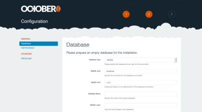
  2. Ask for database and site configuration values, and user credentials:

    October CMS installation 2nd step: Configuration

    Configuration (Large preview)
  3. Ask how to set-up the site: From scratch, already installing a specific theme, or using our own existing project (from which our chosen theme and plugins can be automatically installed):

    October CMS installation 3rd step: Initial set-up

    Initial setup (Large preview)
  4. Next, we click on “Install!”, and in a few seconds (depending on our Internet connection speed) the website will be installed and ready to use:

    October CMS installation is installed

    Site installed (Large preview)

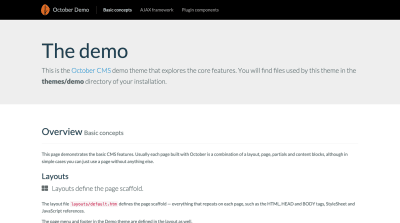
    In this case, I chose to install it from scratch, under http://localhost. Browsing to this URL on the browser, we can encounter the October starter demo theme:

    Starter demo theme

    Browsing the starter demo theme (Large preview)
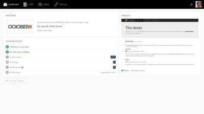
  5. Navigating to http://localhost/backend (unless we changed this URL during the installation process) we can log into the administration panel:

    Admin panel

    Browsing the admin panel (Large preview)
  6. Finally, we delete the installer files from the folder. And voilà, in just a few minutes we have a fully functioning site (well, we still need to enhance it with plugins… we will do that in a while).

    Alternatively, we can also install October from the command-line interface, by executing:

    $ curl -s https://octobercms.com/api/installer | php
    

    This method is faster (it can take as little as 10 seconds to install) because it doesn’t require to input the database configuration. Hence, it is particularly useful for setting-up October CMS as a flat-file system, i.e. a CMS fully set-up through files stored in the local disk, and without a database.

Installation through the Command-Line Interface

Installing October CMS through the CLI takes no time. (Large preview)

Templating System

October CMS has a robust templating system to implement layouts, re-use chunks of code and enable dynamic functionality. Its most important elements are the following ones:

Pages are the most basic structure for storing content. These are readily available, since they are shipped as part of the core (blog posts, on the other hand, must be installed through a plugin). Pages are based on Twig, which is a modern template engine for PHP (devised by the creators of Symfony), and compiled to plain optimized PHP code, so they execute very fast.

Partials contain reusable chunks of code that can be used all throughout the website, as to avoid duplicating code on the different pages or layouts. They are particularly useful for navigation menus, testimonials, calls to action, and other common elements.

Layouts define the scaffolding, or structure, of the page. They define the and HTML elements, and are useful for creating the frame of the site, including the header, footer and sidebars. The actual content in the body is injected by the page.

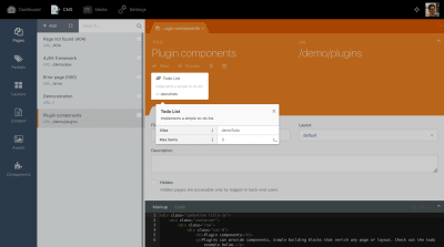
Components are the mechanism to extend functionality in October CMS. Any page, partial or layout can have attached any number of components, which are most commonly provided through plugins, and which are fully configurable. In addition to rendering HTML code on the page, components can also provide services, such as form validation, security check-up, control of user permissions, or others.

Component configuration

Configuring a component attached to a page. (Large preview)

These elements are all implemented through files living in the website’s folder in the local hard drive. As such, it is possible to edit them not only through October CMS’ built-in editor, but also from the developer’s preferred text editor (Sublime, VS Code, PHPStorm, etc).

Editing an element through October CMS' built-in editor and in an external text editor

We can edit elements either through the October CMS’ built-in editor or in an external text editor. (Large preview)

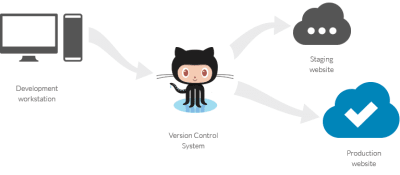
Similarly, the October CMS project can be perfectly managed through any version control system, and it can be easily adapted to any existing workflows. For instance, a project can be set-up through continuous integration, deploying it automatically to the server after new code is pushed to the Git repo.

Git workflow

October can be easily managed with Git. (Large preview)

October CMS Marketplace

October CMS has a marketplace for themes (which allow to change the site’s look and feel) and plugins (which allow to extend the site’s functionalities), providing both free and paid offerings. By providing themes which can be used to quickly establish and then configure the design of the site, and plugins each of which implements some required functionality for the site, the marketplace ultimately leads to lower costs for creating our projects and reduced time to launch them.

The marketplace has been getting bigger! Following October’s growing popularity, its marketplace has received a constant stream of new offerings: It currently boasts 915 plugins, comprising most of the functionalities required for our websites (blogging, SEO, e-commerce, analytics, email, galleries, maps, security, social, user management, and others), and 150+ themes. Both themes and plugins can be submitted to the marketplace by any independent 3rd party developer, company or agency, and they must adhere to quality guidelines, which ensures that they are performant and secure.

Creating An E-Commerce Site Through Shopaholic

Let’s get our hands dirty and implement a real-life use case: An e-commerce website! For this, we will install Shopaholic, the most popular plugin to add e-commerce functionality to October CMS, and the free theme Bootstrap theme for Shopaholic to quickly bootstrap the site (which will be made to look like this demo site). Shopaholic is ideal for our needs because it provides a comprehensive e-commerce solution, which includes an ecosystem of extensions (both free and paid ones) to further enhance it. In addition, we can install the core experience for free and only make a one-time payment for the extensions that we need, which will be cheaper than using cloud solutions which have a recurring fee to use. And finally, because we are the full owners of our own on-premise e-commerce website, we can customize it as much as we need to and we own all the data, which is not possible with cloud solutions.

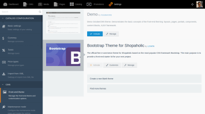
Because of the October marketplace dependency management system, we need only install the theme (the Shopaholic plugin is added as a dependency). Let’s proceed to install the theme then: Inside the October CMS admin, we click in the “Front-end theme” section in the Settings, and then click on “Find more themes”:

Front-end theme manager

Front-end theme manager. (Large preview)

Then, we search for theme “Bootstrap theme for Shopaholic” and, upon clicking on the result in the dropdown, it will install the theme and all its dependencies. Once installed, we go back to the Front-end theme manager page and click on the Activate button on the new theme:

Activating the new theme

Activating the new theme. (Large preview)

After installing the theme and plugins, we will notice a new element “Catalog” on the top menu bar. Clicking on it, we can manage the items in our e-commerce catalog, namely products, categories and brands (these are the core elements; other elements, such as coupons, can be added through extensions). Initially, our catalog will be empty:

Catalog

Catalog comprising products, categories and brands. (Large preview)

Let’s fill it up with some data. We can either create the items one by one or, quite conveniently, import data through CSV and XML files (which allows us to manage a large set of records with Excel or other tools). In our case, since we are creating a demo site for testing purposes, let’s install plugin Fake Data for Shopaholic which provides large sets of mock data and an easy way to import these records to the system. To do this, follow these steps:

  1. Head to Settings => Updates & Plugins in October CMS backend, and install plugin “Fake Data for Shopaholic”.
  2. Head to Dashboard, and click on Manage widgets and then Add widget.
  3. Select widget “Fake data for Shopaholic”, and click on Add.
  4. In the newly added widget, clicking on Generate under section “Generate fake data ” will run the process to import the fake data.

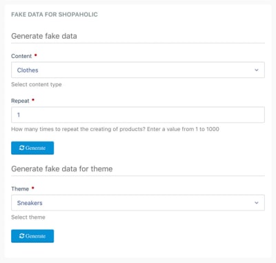
The last step will ask how many times should the insertion be repeated (as to create bulk and be able to test the performance of the site when loading many records) and which data set (clothes or sneakers):

Generating fake data through Laravel's artisan command

Generating fake data through Laravel’s artisan command. (Large preview)

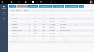
After running this process, our catalog will look better stocked:

Catalog with some mock data

Catalog with some mock data. (Large preview)

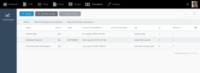
The next step is to create some promotions. To do this, we click on Promotions on the top menu, then on the Create button, and fill the required information. Once each promotion is created, we must edit it again to add products to it. After creating a few of them, our promotion list will look like this:

Promotion list

Creating some promotions. (Large preview)

Now that we have some data, we can finish customizing how our front page will look like. For that, we go to section Settings => Front-end theme => Customize and we complete the information for all tabs (Header, Footer, Social, Main slider, Index page). Once this is ready, our e-commerce site will now be ready:

Demo e-commerce site

Our e-commerce site is ready! (Large preview)

Clicking on a product, we can see how its page looks like:

Product page

Product page. (Large preview)

Auditing The Speed And Reliability Of The E-Commerce Solution

Because we want to sell our products, speed and a good SEO are mandatory, so let’s make an audit using Google Chrome’s Lighthouse on the product page to make sure it runs fast and that it will score high with search engines. Running the audit against the live demo site, it returns the following report:

Lighthouse report of the product page

Lighthouse report of the product page. (Large preview)

Equally important is that the site can withstand heavy load, so that if our product becomes successful and attracts plenty of traffic the server doesn’t crash. For this, we can use the Load Impact tool to run a load test. Running the test using 50 virtual users for 12 minutes against the live demo site (which is hosted on DigitalOcean with a droplet configuration of Standard 2CPU/4 GB RAM) produced the following results:

LoadImpact report

LoadImpact report of a test load using 50 virtual users during 12 minutes. (Large preview)

As can be seen, the website was able to sustain an acceptable response time throughout the load test, giving us the confidence that we can trust the e-commerce plugin when we need it the most: When it’s time to sell the product.

Finally, we can also feel confident of the reliability of the software, since it is covered by unit tests.

Adding Extensions To Shopaholic

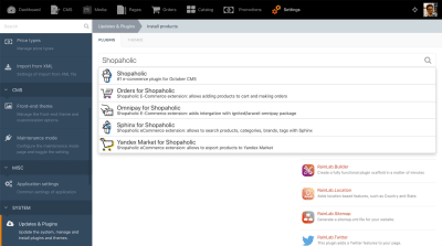
So far so good. However, as it can be seen on the screenshots from our website, there is still no way for the visitor to buy a product. Let’s add this functionality by installing the following free extensions for Shopaholic: Orders, to allow to add products to a cart and make orders, and Omnipay, to process the payment. (For the other Shopaholic extensions, if they are not free and authored by LOVATA, you can use coupon “WELCOME” to get a 50% discount the first time you buy them.) To install these extensions, we head to Settings => Updates & Plugins, search for the plugin names, and click on the results to have them installed.

Plugin installation

Searching for ‘Shopaholic’ displays its plugins. (Large preview)

Once installed, we will see a new item Orders in the top navigation, where all orders will be stored, and items Payment methods and Shipping types in the Settings page, to configure the payment gateways (card, cash, etc) and how to deliver the product (by post, etc). We configure these and load again the product page. Now it shows an “Add to cart” button, allowing the user to place an order:

Product page with cart enabled

Product page with cart enabled. (Large preview)

After adding several items to the cart, we can proceed to the check-out and complete the order:

Cart

Completing the order. (Large preview)

Once the user submits the order, the inventory will be automatically taken care of, updating the number of items for each product in stock, and we will receive an email informing us of the new order (if configured to do so). In section Orders on the admin panel, we can find all the information for the order (products sold, buyer information, method of payment and total, and others), and we can complete the transaction.

Orders page

All the information from the order is here. (Large preview)

The basic work is done: In barely a few hours we managed to have a fully functional e-commerce sith with October CMS and Shopaholic.

Creating Our Own Extension

If none of the several extensions to Shopaholic on the October marketplace provides the functionality needed, we can also create our own extensions.

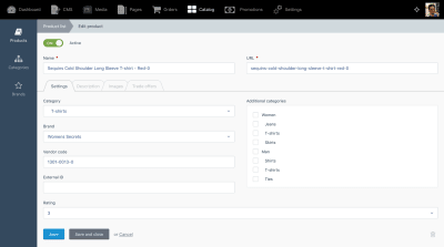
To do this, if you are comfortable with Object-Oriented Programming and PHP and, more specifically, with Laravel, then you are ready to do it. The documentation explains how to add an extension, step by step. For instance, following this tutorial, with barely a few lines of code we can add a custom field “rating” to our products:

Editing a product

Adding a custom field to the product. (Large preview)

We can then retrieve the new “rating” field from the product and display it in the product template:

Product page

Displaying a custom field in the product page. (Large preview)

Extending Shopaholic is not difficult and enables us to fully implement our own e-commerce requirements, and personalize the site to suit our brand.

Conclusion

October CMS is a great candidate for building powerful sites in a very simple manner (showing that “web development is not rocket science”). It delivers the great developer experience granted by Laravel, and its marketplace (which is growing daily) provides a large number of ready-to-use themes and plugins, allowing us to build websites very quickly. One such plugin is Shopaholic, which converts the site into a full-fledged e-commerce platform.

Because of these reasons, building a site with October can be very cost-effective. As a result, it has gained some reputation (by winning the popular vote as best flat-file CMS from 2018) and has increasingly become a tool of choice for businesses and digital agencies crafting sites for their clients.

To find out more from the October community, be welcome to join the October CMS Slack workspace, which is where the creators of themes and plugins published in the marketplace hang out, so you can conveniently chat with them to get their help and advice.

Give October a try (it’s free!), and let us know how it goes.

(ra, yk, il)
Categories: Others Tags:

Why dark mode web designs are gaining popularity

March 10th, 2020 No comments

Dark mode is more popular than ever. More and more web designs, apps, and products have started offering a dark mode option to their users – catering for a unique stylistic demand in the market that has been, until now, a desire exclusive to coders.

Where typical UI’s have focused on using dark colors on a white background (similar to a printed book), dark mode offers the reverse, flipping a traditional design fundamental on its head.

But what has driven dark mode’s popularity in web design? As technology has changed the way users interact with websites -both in the device they use, and the amount of time they spend interacting- various changes in preference have emerged. Parallax designs are one example, as they helped to cater to mobile users to scroll through content with ease. Similarly, dark mode has catered to new user desires, some of which are unique to the current era of technology.

This has led to countless websites and even major products offering dark mode. Both Twitter and Facebook IM have begun to offer it, and it has even been adopted by Mac OS and Windows. It’s no wonder that if these giants have adopted it, that web designers haven’t taken long to follow suit. After all, as this article will explain, dark mode may be the ideal choice for any website that requires lengthy engagement.

What is dark mode?

Dark mode (sometimes known as dark theme), is a dark background with light text. In essence, it is a partial inversion of your typical black text on a white background color scheme. However, it isn’t a complete inversion, as dark mode backgrounds are almost never black. MacOS’s, for example, uses grey text on a darker grey background.

Dark mode was typically the choice for coders, who spent long hours of the day staring at code. They found the dark mode more enjoyable so it became more readily adopted. Now, as user preferences are shifting, more and more websites are either experimenting with the design for aesthetic reasons or catering to their reader’s demands. Everything from typography to logo design, to layout, are being considered with dark mode in mind.

Either way, dark mode is well on its way to becoming a widely used, mainstream choice with its prevalence growing alongside its adoption by popular new technologies, such as VPN’s, SaaS platforms, and cloud services. But as we’ll see, there are both advantages and disadvantages to this.

Advantages and disadvantages of dark mode

There are two benefits of dark mode that are touted above all others. The first is that dark mode is less bright, so it demands less of your battery and consumes less electricity. This, in turn, makes your phone last longer and is better for the environment. But the second, and even more important benefit is that dark mode’s lowered brightness is much easier on the eyes, reducing both eye strain and helping the bodies natural release of melatonin, which leads to better sleep. All in all, longer phone use and better health isn’t exactly an unappealing prospect.

However, many of the health benefits are unproven due to a shortage of rigorous scientific studies. One researcher from the University Cambridge noted that a dark background does reduce glare and eye strain, but it is unclear whether reading text on such a background is better than the traditional alternative. Many studies have had similar concerns. Some have found that reading dark characters on light backgrounds is far better for legibility for readers of all age groups. Others have found that light backgrounds lead to increased perception of detail.

But despite these various points for and against Dark Mode, perhaps the most important consideration is whether it is approved of by Google. Luckily, we have a clear response. When asked whether Dark Mode would affect a websites SEO, Google’s John Mueller said:

I think this is totally cool. I really like the trend to dark mode websites or dark mode apps in general. It’s something that I wouldn’t have expected a few years back, that people would want to have kind of this dark mode/light mode setup.

With regards to SEO that’s absolutely not a problem. Usually, people implement this using CSS, and the way you implement things in CSS doesn’t affect how we would pick things up for indexing. So go for it, I think that’s really awesome.

I don’t think dark mode would be a ranking factor. So … if dark mode is really, really popular then maybe we would need to highlight dark mode sites in search when people have their phone set up to dark mode. But I don’t know if that would actually happen, or if it will really go that far.

How marketers and website builders can use dark mode to their advantage 2020

Whether you believe dark mode is better for your eyes or not, it’s important to understand that there is a real demand for dark mode in your readership. A sizeable portion of visitors to your website will wish to have a dark mode option, so the most simple way to use this to your advantage its to provide them with the option.

Naturally, this is useful if Google does start catering results based on preferences, but for now, it’s just catering to demand. If big companies like Apple, Windows, and Facebook are doing it, why should you be any different? In fact, just by offering the option, you distinguish yourself from your competitors who have failed to see the change in user preferences. A boost to your marketing efforts without any extra cost to your budget.

If you’re coding your website from scratch, this shouldn’t be overly complicated, and there are plenty of guides online. However, if you’re using a platform like WordPress, you want to make sure any changes you make fit with their other functions, such as a content editor.

You could also experiment with letting your dark mode “switch” on, depending on the time of day that the user was accessing the site. For example, if a user was accessing at night time, then it’s far more enjoyable for them to view it in dark mode, as it helps to aid their melatonin release and send them to sleep. Likewise, providing them with a bright mode during the day or early morning will help them wake up.

Conclusion

Dark mode’s popularity isn’t likely to stop any time soon. Both aesthetically and practically, it comes with a lot of benefits that people enjoy. Incorporating it into your web design choices as we move into 2020 will put you ahead of the curve and make your website stand out.

Categories: Others Tags:

Smashing Podcast Episode 11 With Eduardo Bouças: What Is Sourcebit?

March 10th, 2020 No comments
Eduardo Bouças

Smashing Podcast Episode 11 With Eduardo Bouças: What Is Sourcebit?

Smashing Podcast Episode 11 With Eduardo Bouças: What Is Sourcebit?

Drew McLellan

2020-03-10T10:30:00+00:002020-03-12T15:07:49+00:00

In this episode of the Smashing Podcast, we’re talking about an interesting open-source tool called Sourcebit. How can it help our content workflow with JAMstack sites? I spoke to developer Eduardo Bouças to find out.

Show Notes

Weekly Update

Transcript

Drew McLellan: He’s a web developer, technologist, writer and occasional public speaker with a strong track record of working on open source projects. He works as a software engineer on the JAMstack site management platform, Stackbit, and develops open source tools such as Staticman, Speedtracker, and Sourcebit. So we know he’s an expert in the modern web platform. But did you know he’s deathly allergic to Wednesday? My Smashing friends please welcome Eduardo Boucas. Hi, Eduardo, how are you?

Eduardo Bouças: I’m Smashing.

Drew: I wanted to talk to you today about a tool that I know you’ve been working on called Sourcebit. I know you do a lot of work both at the day job Stackbit, and personally in your own time, around sort of tooling with sort of what we now call JAMstack sites. So before we talk about what Sourcebit does itself, perhaps you can tell us a bit about the sort of scenario with the JAMstack site that might lead to somebody needing a tool like Sourcebit.

Eduardo: Sure. So to go back in time a little bit when I started using a static site generator. My first encounter with a JAMstack was with Jekyll, as I’m sure many people are as well. And when I started using Jekyll for my site, the authoring experience was a bit cumbersome. So it involved manually editing Markdown files on my local machine and then pushing them to get repo and then the thing would get integrated and built. And that’s still a workflow that exists today and that many people use and it makes sense for a lot of people in a lot of organizations. But, first of all, it doesn’t scale very well if you have like a larger team and especially if you have people from less technical backgrounds who may not be comfortable with Markdown or with using Git or with that whole pushing to a GitHub repo workflow.

Eduardo: And so it makes a lot of sense, in my opinion to couple a static site generator with what is now these days called a headless or a decoupled CMS. So if you come from a more traditional web development background where you might use something like WordPress, a headless CMS is something that behaves in a very similar way. So you still have this interface where you can author your content, and you have a nice WYSIWYG editor and media management and everything.

Eduardo: But the output of such a platform is not a fully formatted HTML page. And instead, the content is exported in a way in a format that is agnostic of any technology or any tech stack. And so that content is, it’s possible to integrate that content with your static site generator. And that’s why I think it makes a lot of sense to couple a headless CMS with a static site generator because you kind of get the best of both worlds in the sense that you get the performance, the security and the simplicity of using a static site generator, but at the same time, you still get kind of a rich authoring experience by using a nice editorial interface.

Eduardo: And even though it makes a lot of sense to couple those two tools together, it’s not particularly straightforward to integrate them. Especially if you’re using a more traditional file based static site generator, such as Jekyll or Hugo, where everything has to live as a file. So how do you take that content that lives in this headless CMS? And how do you translate that into files that your static site generator can understand and process?

Eduardo: As you said, I’m super passionate about creating tools for developers and particularly creating tools that allows developers to use the JAMstack paradigm with as little friction as possible. And that’s where source that comes in. That’s why I’m super passionate about this project in particular. So the idea is, that Sourcebit allows you to connect to any API based data source such as a headless CMS, you sort of tell it where your content lives, you help it make some sense of the structure of your content. And then Sourcebit takes care of sucking all that content down and writing it into the files with the formats into location static site generator is expecting. So that’s kind of the idea behind Sourcebit.

Drew: So rather than having authors work directly with markdown files, that your static site generator turns to a site, you’ve got your authors working with another tool, a headless CMS, maybe something like Contentful or even WordPress, and then Sourcebit is the bit in between that gets that content from where it’s been authored, and translates it in a way into a format that the static site generator can turn into a static site?

Eduardo: Exactly, yeah. And the way that it could, kind of see two different ways of using the tool that can help developers. One is making Sourcebit part of your deployment routine. So if you’re using a hosting platform like Netlify, for example, and you configure your deploy commands to be a Hugo build, is it the build command for Hugo or something said, so the command that generates the static files for Hugo, you would also have another command as part of that routine. That would be something like Sourcebit fetch. And so at build time, Sourcebit will go pull all the other data, generate all the files that Hugo needs. And then the whole deployment will already use those files and deploy all the content that is coming from the CMS. So that’s kind of one possible use case for Sourcebit.

Eduardo: The other one is to use Sourcebit in a local development workflow. So you can run Sourcebit with something that we call the watch mode. And so Sourcebit keeps looking for changes in the remote data source, so in this case, headless CMS. And so whenever you publish an article or you change an entry into CMS Sourcebit will acknowledge that and it will regenerate all the files for you locally. And so what that means for a developer working locally is that you can have your CMS window next to your Jekyll or Hugo site, running locally, and then you can see changes happening in real time. You change something on the CMS and then you can see that change being reflected on the local side, which I find super useful. So those are kind of the two ways that you could get use Sourcebit.

Drew: So I guess for all that to work Sourcebit has to know about both the system that the content’s stored in and the way that the static site generator needs the files organized in the file system. How do those two things work?

Eduardo: Sourcebit is a plugin-based architecture. So the idea is that you’re going to have different types of plugins that will accomplish different tasks. We have something that we call the source plugins, which are solely responsible for connecting to a data source like Contentful, for example, and they will connect to that data source, they will pull content and they will normalize that content into a format that is kind of agnostic of data source such that if you want to connect multiple data sources, so you’re using WordPress and Contentful, and Sanity, for example, all the content from those data sources will be normalized into a format that is kind of standardized across the board. So the responsibility of the source plugins will be to just that, to connect to a data source, normalize the content and put them into a bucket of data.

Eduardo: And then you have another type of plugin which we call a target plugin. And the target plugin has no knowledge whatsoever about where the data is coming from, but it knows about a particular piece of software that is expecting that data for example, you might have a target plugin for Hugo a target plugin for Jekyll. So the target plug in will be responsible for writing that data into specific format and the specific locations that the static site generated is expecting.

Eduardo: And then you might have other types of plugins that don’t know about the source and don’t know about destination. They’re just responsible for kind of massaging the data and doing all sorts of transformations in between. So that’s kind of the way that the tool is organized. And I think the benefit of that approach is that each plugin is only concerned about a specific area. So if you are, let’s say that you’re maintaining the source plugin for Contentful, you don’t ever need to worry about what static site generators will be supported. You just worry about maintaining that specific plugin that we take care of making sure that it can be plugged in into any combination of static site generators or different outputs that you want to use.

Drew: So is it possible to have multiple sources running at once and use a Sourcebit more like a content aggregator to pull them from lots of different sources at once?

Eduardo: Yes, yes, it’s totally possible. And that’s why we kind of use that principle of normalizing the data, because you might have as many data sources as you want. And then when a plugin comes in to kind of transform that data, it doesn’t really care where the data comes from, everything is treated the same. So it’s totally possible to do that. You can configure as many source plugins as you want. And so it’ll pull data from as many places as you want.

Drew: Yeah, that could be quite interesting. Could you think of a corporate website might have a blog in there, it might have copy from marketing, it might have job openings coming from an HR system. And you could potentially configure Sourcebit to pull that into one location before generating the site, which is quite an exciting prospect, I think.

Eduardo: Yeah, yeah. And CMS is are just one possible data source that you might use this tool with. For example, one of my colleagues that started was creating a source plugin that pulls data from Reddit, for example. And that’s just one very simple example of one possible data source. So as you say, it could get quite interesting because you might be pulling data from a CMS, might be pulling data from Reddit, Twitter or an HR platform and it just all comes down together nicely. So, yeah, it’s a possible use case for it for sure.

Drew: What sort of plugins exist at the moment for different sources?

Eduardo: So we launched the first kind of public version of the tool last week. And we launched with a two source plugins and two target plugins. So the source plugins are for Contentful and Sanity. And the target plugins are for Jacqueline and Hugo. We will keep working on your plugins internally at Stackbit. But our goal is for the community to eventually take ownership of the tool as well like this is a fully open source MIT license project. And so we would love to see people creating their plugins and building stuff with Sourcebit that we haven’t even thought of. So, that’s the ultimate goal. We’ve been in touch with people from different CMS companies who are interested in building their plugins as well. So we’re in constant contact with them. So hopefully we’ll see a nice ecosystem of plugins somewhat soon.

Drew: How complex is it to develop a plugin if you’ve got a completely custom system that you know that you need to integrate with? Is it a very involved difficult task to develop plugin or is it easier than that?

Eduardo: I’m a bit biased to answer that. I like to think that it’s simple and I’ve tried my best to make the process simple and also very well documented. So we have one of the repositories that we make available is kind of a sample plugin, where we have a fully annotated source code for a plugin. So we have comments on every possible function that you might implement outlining the arguments that it receives, how you can use this function to get data from this etc. So hopefully that’ll be a very useful resource. We also have documentation pages where we kind of outline the anatomy of a plugin, like how it pulls data where it’s supposed to push that into. So hopefully, it’s a fairly straightforward process.

Eduardo: But different systems will present different challenges. So I’m sure there will be suggestions and feature requests from someone in the community saying, “I want to integrate with this system. So I kind of need a way of doing this.” And we’ll be more than happy to kind of accommodate those requests and kind of work with the community to make the plugin architecture better over time.

Drew: And it’s all written in, I presume is JavaScript node?

Eduardo: It is. It is.

Drew: I noticed that you mentioned earlier briefly that you can run Sourcebit with a watch flag, and it will help you to have a sort of live updating workflow. Is that something that needs to be implemented by the source plugin, or is that general system? Is it a polling mechanism or are you listening for sort of hooks and things from the source system?

Eduardo: The core application is very lean, and it’s not opinionated at all. So it’s up to each Source plugin to kind of implement that functionality. All the core application does on that front is it tells the plugin what are the kind of the options that the user asked for. So in the two plugins that we launched with, so we have one for Contentful, and one for Sanity, the way that the watch mode is implemented in each of them is very different. For example, in Contentful we have, as I mentioned, a polling mechanism in a regular interval of time, like poll for changes whereas for Sanity, we have like a running web socket that is constantly listening for changes and respond to the changes. But basically, the idea is that the source plugin implements its own listening mechanism and it’s responsible for telling the core application that I have new content please update yourself. That’s kind of the domain idea.

Drew: That sounds like quite a flexible system then that should cope with lots of different sources and different types of system.

Eduardo: Yes. I was just going to say like still on that topic of flexibility, one thing that I wanted to mention as well is Sourcebit is configured using a JavaScript file. So if something similar to what you would do with some like web pack, for example, although a bit simpler. And so you have the option to configure each of the plugins on that file manually. But we also offer this commandline interface, where basically each plugin is able to tell the core application the set of questions that it needs to ask the user in order to configure itself. So basically, when you run npx create-sourcebit, it can create everything from scratch for you.

Eduardo: So it pulls a list of all the available plugins to have the option to sit on a source plugin for Contentful and the target plugin for Jekyll, for example. And then based on the plugins that you choose, it then asks you a series of questions that will ultimately lead to a fully configured JavaScript file. So for example, for Contentful it’ll ask you for your credentials, like how do I access your Contentful account? And then it will actually pull all the content types from Contentful. And it’ll ask you okay, I found this content type called blog posts. What is this? Is this like a page? Is this a data object? And if it’s a page, where should I store this? What kind of fields should I use for the layout for the content?

Eduardo: I think it’s a very user friendly way of configuring the whole project. So hopefully, by the end of this configuration process, you can just run a command and you can pull the content straight away without having to mess around with JavaScript files.

Drew: So that configuration process answering those questions, then writes the JavaScript configuration file for you, which you can then presumably just commit into your source control and distribute to other developers on your project or into your build process for running live. You mentioned a third type of plugin distinct from the source and the target that works on data in this agnostic format in the middle. What sort of scenarios do you imagine that being used for?

Eduardo: We created a plugin that is responsible for transforming assets. So to give you an example, let’s say that I’m using Contentful, and you have images embedded as part of a blog post. And by default, if you just pull that data from Contentful, the images will be using a live URL from like Contentful CDN which is a totally viable option if that’s what you want to use. But you might want to instead, serve the images alongside the content. So have them in your repo and served from whatever service you’re using to serve to site as well. And so that plugin in specific, it will look for any assets that are using, it will pull those assets down, download them basically to your repo or to your local file system which it can then push.

Eduardo: And it will replace any URLs in your files that reference that remote URL, it’ll replace those with references to the local files instead. So basically, when you push the site, you push the content and the assets and everything will just work seamlessly. So, that’s one example of kind of a transformation plugin that is not pulling. It’s not specific to a data source and it’s not specific to a static site generator. It just transforms things in between.

Drew: You mentioned that there are target plugins for Jekyll and Hugo, are there any that you’re expecting to see in the near future?

Eduardo: Well, I’m a big fan of Eleventy. So I’m really hoping to see an Eleventy plugin coming out fairly soon. And then I guess there are some static site generators that already have their own kind of plugin ecosystem. So I’m curious to see if people will still find a need to have a source plugin for those types of static site generators. Like another possible way that you can use Sourcebit by the way, is if you’re using something like Next.js, so like any node based static site generator. You don’t necessarily need a target plugin, you can just require Sourcebit as an NPM module, and you can run the all the mechanisms for fetching data. You can just run those as in memory functions and get your content available as part of your Next.js pages. To answer your question, I guess for those we won’t see target plugins specifically, but we can already use Sourcebit in that way. In terms of next source plugins, I would expect to see Eleventy and maybe a few other kind of file based static site generators in the near future.

Drew: This is all quite exciting stuff, I think. Is it just you working on it in terms of development or is there a bigger team?

Eduardo: I’ve been kind of the main developer working on it, but it’s a team effort. So it’s something that a bunch of people at Stackbit identified as a problem. And we’ve been working together on kind of specification and the right way to approach this. I just happen to be the guy pressing the keys to make it happen.

Drew: And I guess Sourcebit actually can be very useful for Stackbit customers, which is Stackbits motivation for developing and contributing this but obviously, it’s going to be useful to a much wider audience than just Stackbit customers.

Eduardo: Yeah, we have big plans for Sourcebit internally. It’ll really help us achieve our mission in terms of making JAMstack, accessible to as many people as possible, but we wanted to make sure that we share this particular project with the community because we feel that it’ll help a lot of people regardless of whether they’re interested in using Stackbit or not. So that’s why it’s a fully open source project.

Drew: That’s great. Is there anything else you’d like to tell us about Sourcebit?

Eduardo: No. I would just love people to try it out. I’m sure we can share links to like the repo and stuff like that. There’s a YouTube video in the main repository, that shows how the experience is like when using Sourcebit with a headless CMS and a static site generator. So it kind of gives you an idea of what it’s like to use the CLI and the whole interactive setup process, and I would just love people to try it out. And get in touch if they think it could be improved or it’s terrible, or it’s great, or it’s helping them. So yeah, I would love to hear from people.

Drew: That’s great. We’ll link that all from the show notes, but also Sourcebit be found at github.com/stackbithq/sourcebit. So I’ve been learning all about Sourcebit today, what have you been learning about lately?

Eduardo: I’ve been super interested in learning about Serverless. And I’ve actually been trying to learn as much as possible about it for the past few months. It’s a concept that I’m super interested in. It’s one of those seismic changes in how you approach development. And I’m super interested in kind of the use cases that it has and kind of the different ways of rethinking how you build an application for Serverless. So that’s something that I’ve been trying to read about as much as possible and just playing around and trying, like side projects. Yeah, it’s an area I’m super passionate about.

Drew: It’s very interesting, isn’t it? Quite a shift in how you have to think about projects?

Eduardo: Definitely, definitely. There’s a metaphor, and I don’t want to ramble about Serverless here, which is that a metaphor that I think is really helpful is to think about Serverless as kind of using Uber as opposed to owning a car, like it forces you to, you still have a car, like the term Serverless maybe is a bit misleading because you still have a server, but if you have a car, you might just leave your stuff in the car because you know it’s going to be there the next day, whereas if you’re using at Uber, it forces you to rethink and to acknowledge that every day you’re going to get a new car with different people driving it, and it just have to adapt your way around that fact. So, that metaphor really helped me wrap my head around the whole Serverless paradigm.

Drew: Yes, I had not heard that before, that’s quite an interesting way of looking at it. If you, dear listener, would like to hear more from Eduardo, you can follow him on Twitter, where he’s @Eduardoboucas. And you can find his web development periodical build times at Eduardoboucas.com. Thanks for joining us today. Eduardo. Do you have any parting words?

Eduardo: No, not really. Just first of all, thank you so much for having me. It’s been a pleasure. And by the way that weird pronunciation for my last name, maybe I should say that it’s, if you want to find my Twitter handle and website the surname is B-O-U-C-A-S. Boucas is another weird Portuguese pronunciation if you want to find, it’s Eduardoboucas. So, yeah, thank you so much for having me. It’s been a pleasure.

Drew: Thank you so much.

(dm, ra, il)
Categories: Others Tags:

Negative Margins

March 9th, 2020 No comments

PPK digs into the subject, which he found woefully undercovered in web tech documentation. Our entry doesn’t mention them at all, which I’ll aim to fix.

Agree on this situation:

This is by far the most common use case for negative margins. You give a container a padding so that its contents have some breathing space. However, you want the header to span the entire container, ignoring the padding. Negative margins are the way to go.

Like this:

CodePen Embed Fallback

Anecdotally, I find negative margins fairly intuitive. Although that’s surprising since there are so many oddities, like how they sometimes affect the element applied to itself (e.g. move itself to the left) and sometimes affect other elements (e.g. move other elements upward) — plus the fact that it affects margin collapsing which is weird anyway.

It would probably be smart to do this directional margin stuff with logical properties too.

Direct Link to ArticlePermalink

The post Negative Margins appeared first on CSS-Tricks.

Categories: Designing, Others Tags:

Adventures in CSS Semi-Transparency Land

March 9th, 2020 No comments
Diagram. Illustrates how a bunch of semitransparent layers of various alphas are reduced to a single one. We start by taking the first two from the bottom and computing their equivalent, then we take this result and the third layer from the bottom and combine them into a single layer and so on.

Recently, I was asked to make some tweaks to a landing page and, among the things I found in the code, there were two semitransparent overlays — both with the same RGB values for the background-color — on top of an image. Something like this:

<img src='myImage.jpg'/>
<div class='over1'></div>
<div class='over2'></div>

There was no purpose to having two of them other than the fact that having just one didn’t tint the image enough. For some reason, whoever initially coded that page thought that adding another semitransparent overlay was a better idea than increasing the opacity of the first.

So, I decided to ditch a layer and give the remaining one an opacity value that would give a visual result equivalent to the initial one, given by using two layers. Alright, but how do we get the opacity of the one layer equivalent?

If you remember my crash course in mask compositing, then you may have guessed the answer because it’s the exact same formula that we also use for the add compositing operation! Given two layers with alphas a0 and a1, the resulting alpha is:

a0 + a1 - a0⋅a1

The interactive demo below shows a comparative look at a two-layer overlay with alphas a0 and a1 (which you can control via the range inputs) versus a one layer overlay with an alpha of a0 + a1 - a0?a1.

See the Pen by thebabydino (@thebabydino) on CodePen.

Funny enough, they look identical if we remove the image (via the checkbox at the bottom of the demo), but seem a bit different with the image underneath. Perhaps the difference is just my eyes playing tricks on me given the image is lighter in some parts and darker in others.

It definitely doesn’t look different if we don’t have them side by side and we just switch between the two layers of alphas a0 and a1 and the one layer of alpha a0 + a1 - a0?a1.

See the Pen by thebabydino (@thebabydino) on CodePen.

This can be extended to multiple layers. In this case, we compute the equivalent layer of the bottom two layers, then the equivalent layer of this result and the layer right on top of it, and so on:

Reducing multiple semitransparent layers to a single one.

Playing with this has also made me wonder about the solid background equivalent of a solid layer (c0) with a semitransparent overlay (c1 with an alpha of a) on top. In this case, the background of the one layer equivalent is computed on a per channel basis, with the resulting channels being:

ch0 + (ch1 - ch0)*a

…where ch0 is a channel (red, green or blue) of the solid bottom layer, ch1 the corresponding channel of the top semitransparent layer, and a the alpha of the same top semitransparent layer.

Putting this into Sass code, we have:

/* per channel function */
@function res-ch($ch0, $ch1, $a) {
  @return $ch0 + ($ch1 - $ch0)*$a
}

@function res-col($c0, $c1, $a) {
  $ch: 'red' 'green' 'blue'; /* channel names */
  $nc: length($ch); /* number of channels */
  $ch-list: ();

  @for $i from 0 to $nc {
    $fn: nth($ch, $i + 1);
    $ch-list: $ch-list, 
      res-ch(call($fn, $c0), call($fn, $c1), $a);
  }

  @return RGB($ch-list)
}

The interactive demo below (which lets us pick the RGB values of the two layers as well as the alpha of the top one by clicking the swatches and the alpha value, respectively) shows a comparative look at the two layer versus our computed one layer equivalent.

See the Pen by thebabydino (@thebabydino) on CodePen.

Depending on the device, operating system and browser, you may see the two panels in the demo above have identical backgrounds… or not. The formula is correct, but how different browsers on different operating systems and devices deal with the two layer case may vary.

Screenshot collage.
Expected result with panels being identical on the left vs. the slightly different result we may sometimes get between the two layer scenario (top right) and the one layer scenario (bottom right).

I asked for screenshots of a simplified test case on Twitter and, from the replies that I got, the two panels always seem to look the same on mobile browsers, regardless of whether we’re talking about Android or iOS devices as well as Firefox, regardless of the operating system. They also seem to almost always be identical on Windows, though I did receive a reply letting me know both Chrome and Chromium Edge may sometimes show the two panels differently.

When it comes to WebKit browsers on macOS and Linux, results are very much mixed, with the panels slightly different in most cases. That said, switching to a sRGB profile could make them identical. The funniest thing here is, when using a two monitor setup, dragging the window from one monitor to the other can make the difference whether the two panels appear or disappear.

However, in a real use case scenario, the difference is pretty small and we’re never going to have the two panels side-by-side. Even if there’s a difference, nobody is going to know about it unless they test the page in different scenarios, which is something probably only a web developer would do anyway. And it’s not like we don’t also have differences between how the same plain old solid backgrounds look on different devices, operating systems and browsers. For example, #ffa800, which gets used a lot here on CSS-Tricks, doesn’t look the same on my Ubuntu and Windows laptops. The same can be said about the way people’s eyes may perceive things differently.

The post Adventures in CSS Semi-Transparency Land appeared first on CSS-Tricks.

Categories: Designing, Others Tags:

Use a:visited in your CSS stylesheet

March 9th, 2020 No comments

Evert Pot:

Unfortunately, when setting a new color (e.g. a { color: #44F }) the ‘purple visited link’ feature also gets disabled. I think this is a shame, as there’s so many instances where you’re going through a list of links and want to see what you’ve seen before.

The 2 examples I ran into today were:

• AWS Cloudwatch Logs
• Stackoverflow search results

I like those use cases. My take is that :visited is perhaps a bit under-used in general, but not by much. It’s useful in that situation where a user might wonder: hmmmm, have I seen this one yet?

I’m not particularly compelled to use it on this site — as I’m not convinced it matters for the UX if you’ve visited any particular link, particularly not in a blog-like setting as here.

Direct Link to ArticlePermalink

The post Use a:visited in your CSS stylesheet appeared first on CSS-Tricks.

Categories: Designing, Others Tags:

110 Examples of World of Warcraft Art: How Fans Embraced a Franchise

March 9th, 2020 No comments
World of Warcraft Art

World of Warcraft is one of those games that has left its mark on the last 15 years. When it was announced that the already popular RTS game Warcraft 3 was getting a Massive Multiplayer Online Role-Playing Game (MMORPG) adaptation, little did we know that it was going to change video games forever. The game was a huge success when it was launched in 2004, and since then it has drawn millions of players to its fantastical world. The art of World of Warcraft is one of the (if not the most) most important aspects that made the game so successful.

The ‘world’ in World of Warcraft become many people’s passion and changed their lives. When people are so passionate about something, in this case, the world they play, their characters, the heroes and villains of the franchise, it inspires something spectacular. The need to express their commitment and passion in the form of art.

So, we went out and gathered the best art pieces created by fans and designers over the course of 15 years. There was a lot. Art of the world, iconic characters and most people decided to draw their own characters. We compiled the ones that brought back the most nostalgia to us. Let’s go over the top 110 pieces of World of Warcraft art.

World of Warcraft Art: Player Characters

Now, some people are passionate about their characters. I’m certainly not, as I’ve been constantly switching between what looks cool and feels fun. Some of those people who grew a special bond with their characters also happened to be talented artists. The results haven’t disappointed us, let’s have a look our top picks of World of Warcraft character art:

World of Warcraft Art  Nightelf Male Hunter
This is probably our favorite. A Nightelf Hunter with his owl. It’s simple, but the artwork has something great in it that we can’t put our finger on.
World of Warcraft Art Nightborne Huntress
A Nightborne Huntress with her pet wolf hawk.
World of Warcraft Art Worgen Hunter
Who said Worgens couldn’t be as cool as Night Elves?
World of Warcraft Art Worgen Huntress
If you’re not convinced by the previous image, then this artwork should do the trick.
World of Warcraft Art Nightelf and Human
Two friends enjoying a cool evening in Northrend.
World of Warcraft Art Human Rogue
This is also one of our favorites. A Human Rogue depicted as realistic as World of Warcraft can get. Nothing flashy, but so many great details.
World of Warcraft Art Human Warrior
If you’re looking for something flashy, then this human warrior should win over your heart.
World of Warcraft Art Human Warrior
A Human Deathknight, nothing too special about it but the art style is really unique and a fresh breath.
World of Warcraft Art Night elf demon hunter
A Night Elf demon hunter probably with a name that contains a variation of Illidan.
World of Warcraft Art dwarf shaman
It’s not all elves and humans. Dwarf Shamans are pretty cool too.
World of Warcraft Art Nightelf HUntress
A Night Elf Huntress with her pet spirit beast.
World of Warcraft Art Human Frost Death Knight
Other than Night Elves, Human Deathknights are pretty popular too. But, their popularity seems warranted.
World of Warcraft Art Troll Druid
A Troll Druid channeling the power of nature.
World of Warcraft Art Tauren Warrior with Heritage Armor
A Tauren Warrior in her racial attire.
World of Warcraft Art Night Elf Rogue
A Night Elf Rogue that is probably plotting something sinister.
World of Warcraft Art Blood Elf Demon Hunter
A Blood Elf Demon Hunter
World of Warcraft Art Pandaren Monk with Puny Marmot
A Pandaren Monk taking care of a Puny Marmot!
World of Warcraft Art Pandaren Dk and Vulpera Priest
The pawfect duo of a Pandaren Deathknight and a Vulpera Priest.
World of Warcraft Art Undead Deathknight
An Undead Deathknight in an eerie background.
World of Warcraft Art Undead Priest
An Undead Priest, casting a light spell, which hurts them anytime they use it. Talk about dedication.
World of Warcraft Art Void Elf Priest
A Void Elf Priest, who needs armor when you control the void itself?
World of Warcraft Art Void Elf Mage
A Void Elf Mage
World of Warcraft Art Blood Elf Party
Some artists forge a bond with not only their characters but with their guildmates. This Blood Elf party shows that kind of dedication.
World of Warcraft Art Blood Elf Paladin
A classical portrait of a Blood Elf Paladin
World of Warcraft Art Blood Elf Deathknight
Deathknights are awfully popular, this artwork shows why.
World of Warcraft Art Pandaren Female Monk
A Pandaren Monk, careful she’s blind, not deaf.
World of Warcraft Art Vulpera Art
The newest addition to the game, a Vulpera Male who’s ready to hit the road.
World of Warcraft Art Female Blood Elf Deathknight
A perfect artwork of a Blood Elf Deathknight. Realistic, simple, but well painted.
World of Warcraft Art Nightelf Rogue
A Night Elf Rogue, getting ready for some action.
World of Warcraft Art Undead Shadow Priest
Another take on an Undead Priest
World of Warcraft Art Undead Rogue
An Undead Rogue, nimble and ‘dead’ly. The art style is also quite unique and really well done.
World of Warcraft Art Troll Warrior
A Troll Warrior welcoming you to the jungle.
World of Warcraft Art Worgen Warrior
Not sure which one is scarier, the giant hammer or those long, sharp teeth.
World of Warcraft Art Zandalari Troll
A Zandalari Troll, with his sights on gold. Literally.
World of Warcraft Art Orc Warrior
An Orc Warrior that’s spinning to win.
World of Warcraft Art Orc and Fellstalker
An Orc Warrior handing out justice in Outland.

World of Warcraft Art: Environment

One of the most alluring aspects of World of Warcraft is its incredible environment. Anyone who has played the game has various memories in different maps, some even have favorite spots where they go just for sightseeing.

World of Warcraft Art Skyhold
An Arakkoan terrace
World of Warcraft Art The Bone Wastes
Where Terrokkar Forest Meets the Bone Wastes.
World of Warcraft Art The Barrens Great Divide
The infamous Barrens after the Cataclysm.
World of Warcraft Art Bladesdge Mountains
Blades Edge Mountains
World of Warcraft Art Borean Thundra
The cliffs at the edge of Borean Thundra, most players haven’t seen it, it’s beautiful.
World of Warcraft Art Dalaran City
One of the most iconic cities in the Warcraft universe. The floating city of Dalaran
World of Warcraft Art Dalaran in the sky
An aerial view of Dalaran
World of Warcraft Art Streets of Dalaran
Streets of Dalaran, just before the famous Pub Crawl
World of Warcraft Art Icecrown Glacier
Hrothgar’s Landing in Icecrown
Beyond the Dark Portal
The other side of the Dark Portal
World of Warcraft Art The Eastern Plaguelands
Eastern Plaguelands
World of Warcraft Art The Firelands
The Firelands, the raid that has one of the best Transmog.
World of Warcraft Art Gilneas
A harbor of Gilneas, too bad we can’t go back there.
World of Warcraft Art Grizzly Hills
The sapling of a world tree growing in the husk of its predecessor.
World of Warcraft Art Howling Fjord
Howling Fjord, our favorite zone hands down.
World of Warcraft Art Oshu'gun
Oshu’gun the spirit mountain where the Orc shamans of old drew their power from.
World of Warcraft Art Mount Hyjal
Mount Hyjal burning after the Firelands collided with it.
World of Warcraft Art Sindragosa's Fall
Sindragosa’s Fall, one of the most iconic views of Icecrown.
World of Warcraft Art Icecrown Citadel
Icecrown Citadel towering over anyone who dares to enter it.
World of Warcraft Art Ironforge
Ironforge, the dwarven capital where you can find the best ale, and finest blacksmiths.
World of Warcraft Art Kaskala
Kaskala, the fishing village of the Kalu’ak
World of Warcraft Art Wyrmrest Temple
Dragonblight under the beautiful northern lights
World of Warcraft Art Kezan
Kezan before it was sunk
World of Warcraft Art Kezan Volcano
Kezan right before it sunk
World of Warcraft Art Pit of Saron
The interior of Icecrown Citadel
World of Warcraft Art The Black Temple
Shadowmoon Valley from the view of the Black Temple
World of Warcraft Art Suramar
The gardens of Suramar
World of Warcraft Art Teldrassil
A Moonwell in Teldrassil. We’ll miss the serenity of this place. Too bad it’s burnt to crisp.
World of Warcraft Art Terrokkar Forrest
Terrokar Forest
World of Warcraft Art The Exodar
The Exodar. Believe it or not, that’s a spaceship.
World of Warcraft Art The Kalu'ak
A Kalu’ak fishing village
World of Warcraft Art The Maelstrom
The Maelstrom
World of Warcraft Art Tol Barad
Tol Barad, it looks awfully empty for a giant prison complex
World of Warcraft Art Twin Peaks
The Twin Peaks Battleground in Twilight Highlands
World of Warcraft Art Ulduar
Ulduar
World of Warcraft Art Nightbane
The roof of Kharazhan, featuring the hidden boss Nightbane
World of Warcraft Art Borean Thundra Zeppelin
A Zeppelin leaving Borean Thundra
World of Warcraft Art dalaran from the sky
The floating city of Dalaran
World of Warcraft Art Ahn'Qiraj
It wouldn’t be Warcraft without any Lovecraftian Horrors. C’thun looming over Ahn’Qiraj
World of Warcraft Art The Broken Shore
The Broken Shore
World of Warcraft Art Booty Bay
Booty Bay the main attraction of Eastern Kingdoms
World of Warcraft Art Terrokar Forest
Terrokkar Forest, serene but deadly
World of Warcraft Art The Dark Portal
The Dark Portal
World of Warcraft Art The Well of Eternity
The Well of Eternity, where everything went wrong
World of Warcraft Art Nazjatar
Nazjatar after it surfaced
World of Warcraft Art Vashir
Vashir, one of the most visually unique zones in World of Warcraft. Interestingly people tend to dislike it.
World of Warcraft Art Teldrassil from afar
Teldrassil, with all of its beauty, before it was burnt
World of Warcraft Art Ashenvale
Ashenvale Forest
World of Warcraft Art Stormwind Harbor
Arriving at the Eastern Kingdoms
World of Warcraft Art The Deadmines
The iconic dungeon Deadmines
World of Warcraft Art Argus
Argus
World of Warcraft Art Moonglade
Inside Teldrassil
World of Warcraft Art Thunderbluff
A realistic take on Thunder Bluff
World of Warcraft Art Orgrimmar
The gates of Orgrimmar

Additional World of Warcraft Art

Now there’s much more to World of Warcraft then player characters and beautiful scenery. The franchise boasts an astonishing number of leaders, NPCs, races, and more. We’ve compiled a couple of them but actually there were many, many more.

World of Warcraft Art Pandaren vs. Zandalari
Pandaren vs. Zandalari
World of Warcraft Art Moroes
The final meal at Karazhan before Moroes guts your entire party
World of Warcraft Art Medivh
Medivh
World of Warcraft Art Maiev
Warden Maiev
World of Warcraft Art Azshara
Lovecraft and Warcraft both have their fair share of tentacles. Queen Azshara with her updated depiction.
World of Warcraft Art Jaina Proudmoore
Jaina Proudmoore, one of the most loved characters in the entire franchise
World of Warcraft Art Tree of Life
A sad, sad little tree. Probably ran out of mana.
World of Warcraft Art Pandaria
Everyone was skeptical about Pandaren joining the game, until they saw this piece of art.
World of Warcraft Art Cairne and Thrall
Thrall and Cairne rescuing cute little Horde babies.
World of Warcraft Art Hakkar the Soulflayer
Hakkar the Soulflayer before he corrupted the entire player base
World of Warcraft Art Anub'Arak
Anub’arak waiting menacingly before getting looted by a random group of players.
World of Warcraft Art Aramar Thorne, Malfurion Stormrage and Tyrande Whisperwind
Tyrande, Malfurion and the star of the Traveler Novels, Aramar Thorne enjoying the view.
World of Warcraft Art Arthas, Thrall, and Varian running in the snow
This is cute
World of Warcraft Art Kvaldir Raider
Please let us play as Kvaldir or make me forget this piece.
World of Warcraft Art Lunara
Lunara, the Daughter of Cenarius
World of Warcraft Art Bwonsamdi
Bwonsamdi, everyone’s favorite Loa until they die in Zandalar and get mocked by him.
World of Warcraft Art Samuro
An Orc Blademaster doesn’t need too much explanation
World of Warcraft Art Traveler
The travelers in the Traveler novel floating through the Thousand Needles
World of Warcraft Art Troll Druid Cat Form
Your domesticated Troll Druid waiting for you to pet it.

We had a great time while compiling this list of our favorite World of Warcraft art. The nostalgia that all the artwork we checked while selecting the very best was quite overwhelming. On top of the nostalgia, what overwhelmed us was the sheer amount of fan art created for the various elf races in the game. People love elves, believe us. We hope you enjoyed going through this list as much as we did.

Also, if you like to get lost in these types of fantastic artworks, you should check out Dune Art article too!

Which artwork was your favorite? If you believe that we have missed your favorite piece, let us know unless it’s an elf.

Categories: Others Tags: