Archive

Archive for March, 2020

Building a Real-Time Chat App with React and Firebase

March 23rd, 2020 No comments

In this article, we’ll cover key concepts for authenticating a user with Firebase in a real-time chat application. We’ll integrate third-party auth providers (e.g. Google, Twitter and GitHub) and, once users are signed in, we’ll learn how to store user chat data in the Firebase Realtime Database, where we can sync data with a NoSQL cloud database.

The client application is going to be built in React, as it is one of the most popular JavaScript frameworks out there, but the concepts can also be applied to other frameworks.

But first, what is Firebase?

Firebase is Google’s mobile platform for quickly developing apps. Firebase provides a suite of tools for authenticating applications, building reactive client apps, reporting analytics, as well as a host of other helpful resources for managing apps in general. It also provides back-end management for web, iOS, Android, and Unity, a 3D development platform.

Out of the box, Firebase is packaged with features that help developers like ourselves focus on building apps while it handles all server-side logic. Things like:

  • Authentication: This includes support for email and password authentication as well as single sign-on capabilities (via Facebook, Twitter and Google).
  • Realtime database: This is a “NoSQL” database that updates in real time.
  • Cloud functions: These run extra server-side logic.
  • Static hosting: This is a means of serving assets pre-built instead of rendering at runtime.
  • Cloud storage: This gives us a place to store media assets.

Firebase offers a generous free tier that includes authentication and access to their Realtime Database. The authentication providers we’ll be covering email and password — Google and GitHub — are free on that side as well. The Realtime Database allows up to 100 simultaneous connections and 1 gigabyte storage per month. A full table of pricing can be found on the Firebase website.

Here’s what we’re making

We’re going to build an application called Chatty. It will allow only authenticated users to send and read messages and users can sign up by providing their email and creating a password, or by authenticating through a Google or GitHub account. Check out source code if you want to refer to it or take a peek as we get started.

We’ll end up with something like this:

Setting up

You’re going to need a Google account to use Firebase, so snag one if you haven’t already. And once you do, we can officially kick the tires on this thing.

First off, head over to the Firebase Console and click the “Add project” option.

Next, let’s enter a name for the project. I’m going with Chatty.

You can choose to add analytics to your project, but it’s not required. Either way, click continue to proceed and Firebase will take a few seconds to delegate resources for the project.

Once that spins up, we are taken to the Firebase dashboard But, before we can start using Firebase in our web app, we have to get the configuration details down for our project. So, click on the web icon in the dashboard.

Then, enter a name for the app and click Register app.

Next up, we’ll copy and store the configuration details on the next screen in a safe place. That will come in handy in the next step.

Again, we’re going to authenticate users via email and password, with additional options for single sign-on with a Google or GitHub account. We need to enable these from the Authentication tab in the dashboard, but we’ll go through each of them one at a time.

Email and password authentication

There’s a Sign-in method tab in the Firebase dashboard. Click the Email/Password option and enable it.

Now we can use it in our app!

Setting up the web app

For our web app, we’ll be using React but most of the concepts can be applied to any other framework. Well need Node.js for a React setup, so download and install it if you haven’t already.

We’ll use create-react-app to bootstrap a new React project. This downloads and installs the necessary packages required for a React application. In the terminal, cd into where you’d like our Chatty project to go and run this to initialize it:

npx create-react-app chatty

This command does the initial setup for our react app and installs the dependencies in package.json. We’ll also install some additional packages. So, let’s cd into the project itself and add packages for React Router and Firebase.

cd chatty
yarn add react-router-dom firebase

We already know why we need Firebase, but why React Router? Our chat app will have a couple of views we can use React Router to handle navigating between pages.

With that done, we can officially start the app:

yarn start

This starts a development server and opens a URL in your default browser. If everything got installed correctly, you should see a screen like this:

Looking at the folder structure, you would see something similar to this:

For our chat app, this is the folder structure we’ll be using:

  • /components: contains reusable widgets used in different pages
  • /helpers: a set of reusable functions
  • /pages: the app views
  • /services: third-party services that we’re using (e.g. Firebase)
  • App.js: the root component

Anything else in the folder is unnecessary for this project and can safely be removed. From here, let’s add some code to src/services/firebase.js so the app can talk with Firebase.

import firebase from 'firebase';

Let’s get Firebase into the app

We’ll import and initialize Firebase using the configuration details we copied earlier when registering the app in the Firebase dashboard. Then, we’ll export the authentication and database modules.

const config = {
  apiKey: "ADD-YOUR-DETAILS-HERE",
  authDomain: "ADD-YOUR-DETAILS-HERE",
  databaseURL: "ADD-YOUR-DETAILS-HERE"
};
firebase.initializeApp(config);
export const auth = firebase.auth;
export const db = firebase.database();

Let’s import our dependencies in src/App.js:

import React, { Component } from 'react';
import {
  Route,
  BrowserRouter as Router,
  Switch,
  Redirect,
} from "react-router-dom";
import Home from './pages/Home';
import Chat from './pages/Chat';
import Signup from './pages/Signup';
import Login from './pages/Login';
import { auth } from './services/firebase';

These are ES6 imports. Specifically, we’re importing React and other packages needed to build out the app. We’re also importing all the pages of our app that we’ll configure later to our router.

Next up is routing

Our app has public routes (accessible without authentication) and a private route (accessible only with authentication). Because React doesn’t provide a way to check the authenticated state, we’ll create higher-order components (HOCs) for both types of routes.

Our HOCs will:

  • wrap a ,
  • pass props from the router to the ,
  • render the component depending on the authenticated state, and
  • redirect the user to a specified route if the condition is not met

Let’s write the code for our HOC.

function PrivateRoute({ component: Component, authenticated, ...rest }) {
  return (
    <Route
      {...rest}
      render={(props) => authenticated === true
        ? <Component {...props} />
        : <Redirect to={{ pathname: '/login', state: { from: props.location } }} />}
    />
  )
}

It receives three props: the component to render if the condition is true, the authenticated state, and the ES6 spread operator to get the remaining parameters passed from the router. It checks if authenticated is true and renders the component passed, else it redirects to/login.

function PublicRoute({ component: Component, authenticated, ...rest }) {
  return (
    <Route
      {...rest}
      render={(props) => authenticated === false
        ? <Component {...props} />
        : <Redirect to='/chat' />}
    />
  )
}

The is pretty much the same. It renders our public routes and redirects to the /chat path if the authenticated state becomes true. We can use the HOCs in our render method:

render() {
  return this.state.loading === true ? <h2>Loading...</h2> : (
    <Router>
      <Switch>
        <Route exact path="/" component={Home}></Route>
        <PrivateRoute path="/chat" authenticated={this.state.authenticated} component={Chat}></PrivateRoute>
        <PublicRoute path="/signup" authenticated={this.state.authenticated} component={Signup}></PublicRoute>
        <PublicRoute path="/login" authenticated={this.state.authenticated} component={Login}></PublicRoute>
      </Switch>
    </Router>
  );
}

Checking for authentication

It would be nice to show a loading indicator while we verify if the user is authenticated. Once the check is complete, we render the appropriate route that matches the URL. We have three public routes — , and — and a private one called .

Let’s write the logic to check if the user is indeed authenticated.

class App extends Component {
  constructor() {
    super();
    this.state = {
      authenticated: false,
      loading: true,
    };
  }
}

export default App;

Here we’re setting the initial state of the app. Then, we’re using the componentDidMount lifecycle hook to check if the user is authenticated. So, let’s add this after the constructor:

componentDidMount() {
  this.removelistener = auth().onAuthStateChanged((user) => {
    if (user) {
      this.setState({
        authenticated: true,
        loading: false,
      });
    } else {
      this.setState({
        authenticated: false,
        loading: false,
      });
    }
  })
}

Firebase provides an intuitive method called onAuthStateChanged that is triggered when the authenticated state changes. We use this to update our initial state. user is null if the user is not authenticated. If the user is true, we update authenticated to true; else we set it to false. We also set loading to false either way.

Registering users with email and password

Users will be able to register for Chatty through email and password. The helpers folder contains a set of methods that we’ll use to handle some authentication logic. Inside this folder, let’s create a new file called auth.js and add this:

import { auth } from "../services/firebase";

We import the auth module from the service we created earlier.

export function signup(email, password) {
  return auth().createUserWithEmailAndPassword(email, password);
}


export function signin(email, password) {
  return auth().signInWithEmailAndPassword(email, password);
}

We have two methods here: signup andsignin:

  • signup will create a new user using their email and password.
  • signin will log in an existing user created with email and password.

Let’s create our page by creating a new file Signup.js file in the pages folder. This is the markup for the UI:

import React, { Component } from 'react';
import { Link } from 'react-router-dom';
import { signup } from '../helpers/auth';


export default class SignUp extends Component {


  render() {
    return (
      <div>
        <form onSubmit={this.handleSubmit}>
          <h1>
            Sign Up to
          <Link to="/">Chatty</Link>
          </h1>
          <p>Fill in the form below to create an account.</p>
          <div>
            <input placeholder="Email" name="email" type="email" onChange={this.handleChange} value={this.state.email}></input>
          </div>
          <div>
            <input placeholder="Password" name="password" onChange={this.handleChange} value={this.state.password} type="password"></input>
          </div>
          <div>
            {this.state.error ? <p>{this.state.error}</p> : null}
            <button type="submit">Sign up</button>
          </div>
          <hr></hr>
          <p>Already have an account? <Link to="/login">Login</Link></p>
        </form>
      </div>
    )
  }
}
Email? Check. Password? Check. Submit button? Check. Our form is looking good.

The form and input fields are bound to a method we haven’t created yet, so let’s sort that out. Just before the render() method, we’ll add the following:

constructor(props) {
  super(props);
  this.state = {
    error: null,
    email: '',
    password: '',
  };
  this.handleChange = this.handleChange.bind(this);
  this.handleSubmit = this.handleSubmit.bind(this);
}

We’re setting the initial state of the page. We’re also binding the handleChange and handleSubmit methods to the component’s this scope.

handleChange(event) {
  this.setState({
    [event.target.name]: event.target.value
  });
}

Next up, we’ll add the handleChange method that our input fields are bound to. The method uses computed properties to dynamically determine the key and set the corresponding state variable.

async handleSubmit(event) {
  event.preventDefault();
  this.setState({ error: '' });
  try {
    await signup(this.state.email, this.state.password);
  } catch (error) {
    this.setState({ error: error.message });
  }
}

For handleSubmit, we’re preventing the default behavior for form submissions (which simply reloads the browser, among other things). We’re also clearing up the error state variable, then using the signup() method imported from helpers/auth to pass the email and password entered by the user.

If the registration is successful, users get redirected to the /Chats route. This is possible with the combination of onAuthStateChanged and the HOCs we created earlier. If registration fails, we set the error variable which displays a message to users.

Authenticating users with email and password

The login page is identical to the signup page. The only difference is we’ll be using the signin method from the helpers we created earlier. That said, let’s create yet another new file in the pages directory, this time called Login.js, with this code in it:

import React, { Component } from "react";
import { Link } from "react-router-dom";
import { signin, signInWithGoogle, signInWithGitHub } from "../helpers/auth";


export default class Login extends Component {
  constructor(props) {
    super(props);
    this.state = {
      error: null,
      email: "",
      password: ""
    };
    this.handleChange = this.handleChange.bind(this);
    this.handleSubmit = this.handleSubmit.bind(this);
  }


  handleChange(event) {
    this.setState({
      [event.target.name]: event.target.value
    });
  }


  async handleSubmit(event) {
    event.preventDefault();
    this.setState({ error: "" });
    try {
      await signin(this.state.email, this.state.password);
    } catch (error) {
      this.setState({ error: error.message });
    }
  }


  render() {
    return (
      <div>
        <form
          autoComplete="off"
          onSubmit={this.handleSubmit}
        >
          <h1>
            Login to
            <Link to="/">
              Chatty
            </Link>
          </h1>
          <p>
            Fill in the form below to login to your account.
          </p>
          <div>
            <input
              placeholder="Email"
              name="email"
              type="email"
              onChange={this.handleChange}
              value={this.state.email}
            />
          </div>
          <div>
            <input
              placeholder="Password"
              name="password"
              onChange={this.handleChange}
              value={this.state.password}
              type="password"
            />
          </div>
          <div>
            {this.state.error ? (
              <p>{this.state.error}</p>
            ) : null}
            <button type="submit">Login</button>
          </div>
          <hr />
          <p>
            Don't have an account? <Link to="/signup">Sign up</Link>
          </p>
        </form>
      </div>
    );
  }
}

Again, very similar to before. When the user successfully logs in, they’re redirected to /chat.

Authenticating with a Google account

Firebase allows us to authenticate users with a valid Google account. We’ve got to enable it in the Firebase dashboard just like we did for email and password.

Select the Google option and enable it in the settings.

On that same page, we also need to scroll down to add a domain to the list of domains that are authorized to access feature. This way, we avoid spam from any domain that is not whitelisted. For development purposes, our domain is localhost, so we’ll go with that for now.

We can switch back to our editor now. We’ll add a new method to helpers/auth.js to handle Google authentication.

export function signInWithGoogle() {
  const provider = new auth.GoogleAuthProvider();
  return auth().signInWithPopup(provider);
}

Here, we’re creating an instance of the GoogleAuthProvider. Then, we’re calling signInWithPopup with the provider as a parameter. When this method is called, a pop up will appear and take the user through the Google sign in flow before redirecting them back to the app. You’ve likely experienced it yourself at some point in time.

Let’s use it in our signup page by importing the method:

import { signin, signInWithGoogle } from "../helpers/auth";

Then, let’s add a button to trigger the method, just under the Sign up button:

<p>Or</p>
<button onClick={this.googleSignIn} type="button">
  Sign up with Google
</button>

Next, we’ll add the onClick handler:

async googleSignIn() {
  try {
    await signInWithGoogle();
  } catch (error) {
    this.setState({ error: error.message });
  }
}

Oh, and we should remember to bind the handler to the component:

constructor() {
  // ...
  this.githubSignIn = this.githubSignIn.bind(this);
}

That’s all we need! When the button is clicked, it takes users through the Google sign in flow and, if successful, the app redirects the user to the chat route.

Authenticating with a GitHub account

We’re going to do the same thing with GitHub. May as well give folks more than one choice of account.

Let’s walk through the steps. First, we’ll enable GitHub sign in on Firebase dashboard, like we did for email and Google.

You will notice both the client ID and client secret fields are empty, but we do have our authorization callback URL at the bottom. Copy that, because we’ll use it when we do our next thing, which is register the app on GitHub.

Once that’s done, we’ll get a client ID and secret which we can now add to the Firebase console.

Let’s switch back to the editor and add a new method to helpers/auth.js:

export function signInWithGitHub() {
  const provider = new auth.GithubAuthProvider();
  return auth().signInWithPopup(provider);
}

It’s similar to the Google sign in interface, but this time we’re creating a GithubAuthProvider. Then, we’ll call signInWithPopup with the provider.

In pages/Signup.js, we update our imports to include the signInWithGitHub method:

import { signup, signInWithGoogle, signInWithGitHub } from "../helpers/auth";

We add a button for GitHub sign up:

<button type="button" onClick={this.githubSignIn}>
  Sign up with GitHub
</button>

Then we add a click handler for the button which triggers the GitHub sign up flow:

async githubSignIn() {
  try {
    await signInWithGitHub();
  } catch (error) {
    this.setState({ error: error.message });
  }
}

Let’s remember again to bind the handler to the component:

constructor() {
  // ...
  this.githubSignIn = this.githubSignIn.bind(this);
}

Now we’ll get the same sign-in and authentication flow that we have with Google, but with GitHub.

Reading data from Firebase

Firebase has two types of databases: A product they call Realtime Database and another called Cloud Firestore. Both databases are NoSQL-like databases, meaning the database is structured as key-value pairs. For this tutorial, we’ll use the Realtime Database.

This is the structure we’ll be using for our app. We have a root node chats with children nodes. Each child has a content, timestamp, and user ID. One of the tabs you’ll notice is Rules which is how we set permissions on the contents of the database.

Firebase database rules are defined as key-value pairs as well. Here, we’ll set our rules to allow only authenticated users to read and write to the chat node. There are a lot more firebase rules. worth checking out.

Let’s write code to read from the database. First, create a new file called Chat.js in the pages folder and add this code to import React, Firebase authentication, and Realtime Database:

import React, { Component } from "react";
import { auth } from "../services/firebase";
import { db } from "../services/firebase"

Next, let’s define the initial state of the app:

export default class Chat extends Component {
  constructor(props) {
    super(props);
    this.state = {
      user: auth().currentUser,
      chats: [],
      content: '',
      readError: null,
      writeError: null
    };
  }
  async componentDidMount() {
    this.setState({ readError: null });
    try {
      db.ref("chats").on("value", snapshot => {
        let chats = [];
        snapshot.forEach((snap) => {
          chats.push(snap.val());
        });
        this.setState({ chats });
      });
    } catch (error) {
      this.setState({ readError: error.message });
    }
  }
}

The real main logic takes place in componentDidMount. db.ref("chats") is a reference to the chats path in the database. We listen to the value event which is triggered anytime a new value is added to the chats node. What is returned from the database is an array-like object that we loop through and push each object into an array. Then, we set the chats state variable to our resulting array. If there is an error, we set the readError state variable to the error message.

One thing to note here is that a connection is created between the client and our Firebase database because we used the .on() method. This means any time a new value is added to the database, the client app is updated in real-time which means users can see new chats without a page refresh Nice!.

After componentDidMount, we can render our chats like so:

render() {
  return (
    <div>
      <div className="chats">
        {this.state.chats.map(chat => {
          return <p key={chat.timestamp}>{chat.content}</p>
        })}
      </div>
      <div>
        Login in as: <strong>{this.state.user.email}</strong>
      </div>
    </div>
  );
}

This renders the array of chats. We render the email of the currently logged in user.

Writing data to Firebase

At the moment, users can only read from the database but are unable to send messages. What we need is a form with an input field that accepts a message and a button to send the message to the chat.

So, let’s modify the markup like so:

return (
    <div>
      <div className="chats">
        {this.state.chats.map(chat => {
          return <p key={chat.timestamp}>{chat.content}</p>
        })}
      </div>
      {# message form #}
      <form onSubmit={this.handleSubmit}>
        <input onChange={this.handleChange} value={this.state.content}></input>
        {this.state.error ? <p>{this.state.writeError}</p> : null}
        <button type="submit">Send</button>
      </form>
      <div>
        Login in as: <strong>{this.state.user.email}</strong>
      </div>
    </div>
  );
}

We have added a form with an input field and a button. The value of the input field is bound to our state variable content and we call handleChange when its value changes.

handleChange(event) {
  this.setState({
    content: event.target.value
  });
}

handleChange gets the value from the input field and sets on our state variable. To submit the form, we call handleSubmit:

async handleSubmit(event) {
  event.preventDefault();
  this.setState({ writeError: null });
  try {
    await db.ref("chats").push({
      content: this.state.content,
      timestamp: Date.now(),
      uid: this.state.user.uid
    });
    this.setState({ content: '' });
  } catch (error) {
    this.setState({ writeError: error.message });
  }
}

We set any previous errors to null. We create a reference to the chats node in the database and use push() to create a unique key and pushe the object to it.

As always, we have to bind our methods to the component:

constructor(props) {
  // ...
  this.handleChange = this.handleChange.bind(this);
  this.handleSubmit = this.handleSubmit.bind(this);
}

Now a user can add new messages to the chats and see them in real-time! How cool is that?

Demo time!

Enjoy your new chat app!

Congratulations! You have just built a chat tool that authenticates users with email and password, long with options to authenticate through a Google or GitHub account.

I hope this give you a good idea of how handy Firebase can be to get up and running with authentication on an app. We worked on a chat app, but the real gem is the signup and sign-in methods we created to get into it. That’s something useful for many apps.

Questions? Thoughts? Feedback? Let me know in the comments!

The post Building a Real-Time Chat App with React and Firebase appeared first on CSS-Tricks.

Categories: Designing, Others Tags:

CSS Can Influence Screenreaders

March 23rd, 2020 No comments

Ben Myers covers some clear examples of where CSS totally changes what some screen readers announce. For example, some screenreader will see text-transform: uppercase; on a button label that says “Add” and read it like an abbreviation, “A.D.D.”

These cases of CSS messing with our screenreader announcements are initially shocking, perplexing, and maybe even appalling. After all, they seem to conflict with our mental model of CSS, one that’s likely been instilled in us since we started learning web development: HTML is for content, and CSS is for visual appearance. It’s the separation of content and presentation. Here, by changing what screenreaders announce, it feels like CSS is encroaching on content territory.

All the more evidence that we have to actually test things. I tested that example above in VoiceOver, and sure enough, “A.D.D.”

Direct Link to ArticlePermalink

The post CSS Can Influence Screenreaders appeared first on CSS-Tricks.

Categories: Designing, Others Tags:

Inspired Design Decisions With Otto Storch: When Idea, Copy, Art And Typography Became Inseperable

March 23rd, 2020 No comments
A selection of covers from Otto Storch's time as art director for McCall's Magazine.

Inspired Design Decisions With Otto Storch: When Idea, Copy, Art And Typography Became Inseperable

Inspired Design Decisions With Otto Storch: When Idea, Copy, Art And Typography Became Inseperable

Andrew Clarke

2020-03-23T13:00:00+00:002020-03-24T13:05:56+00:00

For the past few years, books about HTML and CSS have almost vanished from my studio bookshelves. I replaced them with books on art direction, editorial, and graphic design.

Recently, I was browsing a new addition to my library and was captivated by one magazine spread. I loved the way its designer has playfully combined images and typography to create a design which was full of energy and movement. To remind myself to take another look at this design, I snapped a picture of it with my iPhone.

When I first saw that striking design, I hadn’t heard of the designer who’d created it, Brooklyn-born Otto Storch. Although he was an award-winning graphic designer, unlike many of his contemporaries, Storch and his work have been largely overlooked.

Storch amassed a vast body of work, and it’s an incredible shame that his work isn’t more widely known, especially online. There’s no Wikipedia page devoted to Storch, and no one has published a book about him or his work.

I’m not only influenced by Otto Storch’s work, but also by the fact he was a prolific designer with a strong work ethic. I’m inspired by how he took what he’d learned from Alexey Brodovitch, combined it with his approach to design, and made distinctive and engaging work. I hope I can do that too.

A selection of covers from Otto Storch's time as art director for McCall's Magazine.

A selection of covers from Otto Storch’s time as art director for McCall’s Magazine. (Large preview)

I’ve never heard Otto Storch‘s name mentioned during a design conference or seen him referenced in a book about web design. But discovering him has made me want to make more people aware of the man and his work.

He’s also made me consider the role of creativity in an industry which is business focussed, fast-moving, and has practical as well as technical constraints. Publishing can be a cut-throat business, and the magazines Storch worked on weren’t high-fashion. What he made wasn’t art, but that didn’t mean it wasn’t creative. Storch understood that ideas are as essential to effective communication as pictures and the written word. Throughout his career, Storch worked hard to include ideas despite the limitations of his medium. That’s an approach which is as essential on the web today as it was in magazines in the 1960s.

Previously On “Inspired Design Decisions”

More From The “Inspired Design Decisions” Series

  1. Inspired Design Decisions: Avaunt Magazine
  2. Inspired Design Decisions: Pressing Matters
  3. Inspired Design Decisions: Ernest Journal
  4. Inspired Design Decisions: Alexey Brodovitch
  5. Inspired Design Decisions: Bea Feitler
  6. Inspired Design Decisions: Neville Brody

Inspired By Otto Storch

Otto Storch was born in 1913, and during the 1930s, he began his career in the forgotten art of pre-digital photographic retouching. During the 1950s, Storch took evening classes and studied design under Alexey Brodovitch who encouraged him to get a job working on a magazine.

Success didn’t happen overnight, and it took seven years of freelancing before Storch Better Living magazine in New York hired him as an assistant art director. McCall published several titles including Popular Mechanics, Blue Book and Red Book, and McCall’s Magazine itself. Storch moved to McCall’s Magazine where he built on what he’d learned from Brodovitch and his experience designing advertising materials, album covers, book covers, and magazines.

Storch wasn’t afraid to make opinionated choices and its this assertiveness which makes much of his work distinctive.

“Good art direction does not come from an uncertain person. I am capable of intense feeling and was willing to lose a popularity contest with departmental editors when necessary. The visual responsibility of the magazine was mine.”

— Otto Storch

Like Bea Feitler, Storch carried on Alexey Brodovitch’s legacy of imaginative magazine layouts. He understood the double-page spread is a creative canvas and made it a feature of his work, sometimes by allowing elements to flow between pages. Other times, Storch made the gutter an integral part of his design.

Storch often used large headlines and images to unify his spreads. For ‘On the cob or off,’ its a corn cob which drips butter on both pages. For another feature, ‘The Forty-winks reducing plan,’ he allowed his subject to stretch out, resting on a bed of running text. This copy sinks under the weight of the sleeping model.

The Forty-winks Reducing Plan. Spread from McCall's Magazine Art direction by Otto Storch. Recreated by Andy Clarke.

The Forty-winks Reducing Plan. Spread from McCall’s Magazine Art direction by Otto Storch. Recreated by Andy Clarke. (Large preview)

The large black-and-white graphic in ‘Why teen-age marriages are falling apart’ isn’t confined to just one page. Instead, it occupies three out of four columns on the spread and so dominates the design. The gravity of a headline in the middle of those concentric circles pulls the eye towards it.

Why Teen-Age Marriages Are Fally Apart. Spread from McCall's Magazine Art direction by Otto Storch. Recreated by Andy Clarke.

Why Teen-Age Marriages Are Fally Apart. Spread from McCall’s Magazine Art direction by Otto Storch. Recreated by Andy Clarke. (Large preview)

In ‘Girls Are Silly, Aren’t Boys Awful,’ Storch placed two children forehead to forehead with the gutter between them. He emphasised this tension by aligning his text in opposite directions.

Girls Are Silly, Aren't Boys Awful. Spread from McCall's Magazine Art direction by Otto Storch. Recreated by Andy Clarke.

Girls Are Silly, Aren’t Boys Awful. Spread from McCall’s Magazine Art direction by Otto Storch. Recreated by Andy Clarke. (Large preview)

Storch made combining images and text look obvious and effortless, but the results he achieved came from years of experience and practice.

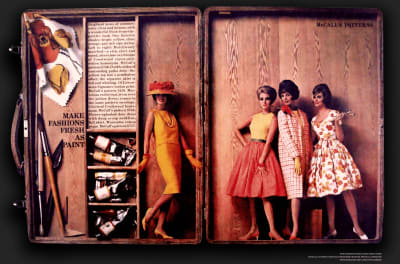
For ‘Make fashions fresh as paint,’ Storch’s tightly packed text fits perfectly into a compartment in an artist’s paintbox. The models in this spread for McCall’s Patterns also fit inside the box. Storch’s playful and unexpected use of scale adds yet another dimension to this design.

Make Fashions Fresh as Paint. Spread from McCall's Magazine Art direction by Otto Storch. Recreated by Andy Clarke.

Make Fashions Fresh as Paint. Spread from McCall’s Magazine Art direction by Otto Storch. Recreated by Andy Clarke. (Large preview)

Storch believed that in editorial design, a strong idea, copy, images, and typography are integral. I think the same is true in web design, despite its apparent differences to print.

Storch understood typography could do much more than present readable content and he had a knack for turning type into graphical objects. In print design for left-to-right languages, the left page is called “verso”, and the right is called “recto.” For McCall’s extract of a book called ‘The First to Know,’ Storch mirrored the recto and verso pages, then set his text into a circle which reflects the circular telephone dial.

The First to Know by Louella Parsons. Spread from McCall's Magazine Art direction by Otto Storch. Recreated by Andy Clarke.

The First to Know by Louella Parsons. Spread from McCall’s Magazine Art direction by Otto Storch. Recreated by Andy Clarke. (Large preview)

There’s plenty Otto Storch, and his designs can teach us about the work we do on the web today. Like Alexey Brodovitch, Storch’s mastered his canvas and rather than be limited by it; he used his pages to present content in ways which made it not just understandable, but also more appealing. This appeal matters, because it connects people with a brand, a product, or a story, and that matters to any business, whatever the medium.

Otto Storch might be a new addition to my list of inspiring designers, but his designs are already influencing mine.

Shape up

The W3C’s CSS Shapes Module Level 1 has been a Candidate Recommendation recommendation since 2014, and all contemporary desktop and mobile browsers have implemented its shape-outside, shape-margin, and shape-image-threshold properties.

[src="shape.png"] {
float: left;
shape-outside: url(shape.png);
shape-margin: 20px; }

It's rare to see CSS Shapes used for anything more elaborate than wrapping text around images, like this.

It’s rare to see CSS Shapes used for anything more elaborate than wrapping text around images, like this. (Large preview)

Web designers aren’t aware of the creative potential offered by CSS Shapes, and that there’s no longer a reason to not use them. It’s also possible web developers still think Shapes have poor support in browsers. Still, with all contemporary browsers now supporting Shapes — and their properties degrading gracefully in legacy browsers — there’s currently no reason to avoid using them.

Do More With Shapes

This design by Otto Storch was one of the first to get my attention. I admired the structural simplicity of its two justified columns of copy, and how the placement of his images — with text wrapped around them to create organic shapes — playfully filled the page with energy and movement.

Left: By a Stroke of Beauty. Spread from McCall's Magazine Art direction by Otto Storch. Right: This movement- filled design uses CSS Shapes and the HTML picture element.

Left: By a Stroke of Beauty. Spread from McCall’s Magazine Art direction by Otto Storch. Right: This movement- filled design uses CSS Shapes and the HTML picture element. (Large preview)

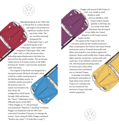
I rarely see layouts with this kind of energy online, so my design includes four brightly coloured Beetles, each Volkswagen placed at an angle to contrast with the two tall columns of text. I need only two structural elements to implement this Storch-inspired design; the main element and an aside. Each of these elements contains paragraphs of running text, plus two picture elements which enable me to swap small images for larger ones:

<main>
<picture>…</picture>
<p>…</p>
<p>…</p>
<picture>…</picture>
<p>…</p>
<p>…</p>
</main>

<aside>
<picture>…</picture>
<p>…</p>
<p>…</p>
<picture>…</picture>
<p>…</p>
<p>…</p>
</aside>

These picture elements fit to the edges of small screens, but I still need whitespace on both sides of my paragraphs of running copy. By using viewport width units, that space always remains in proportion to those screens:

p {
margin-right: 10vw;
margin-left: 10vw; }

I cropped these pictures to make them the appropriate size for small screens.

I cropped these pictures to make them the appropriate size for small screens. (Large preview)

The picture element is one of the most useful additions to HTML. By combining media queries with multiple images, a browser can select an image which is most appropriate for a layout.

Structural elements stack vertically and I introduce larger images for medium-size screens.

Structural elements stack vertically and I introduce larger images for medium-size screens. (Large preview)

I use the media property and min-width value most often, and while this design requires only two images per picture element, its possible to add more images and even combine media values to create complex queries:

<picture>
<source srcset="large.png" media="(min-width: 48em)">
<img src="small.png" alt="Volkswagen Beetle">

The images in these pictures contain cropped versions of my Beetles which are best suited to small screens. I apply the same width to all my images, then add a shape-margin in preparation for the CSS Shapes which come next:

picture {
width: 160px;
shape-margin: 20px; }

Shapes from images are often easier and quicker to implement than using polygon coordinates.

Shapes from images are often easier and quicker to implement than using polygon coordinates. (Large preview)

I find shapes from images easier and quicker to implement than using polygon coordinates. To develop a shape from an image, it needs an alpha channel which is wholly or partially transparent. When images are partially transparent, the shape-image-threshold property can control the areas which form the shape.

I can use the same image for more than one shape. Even though my design includes four differently coloured cars, I need just two shape images:

main picture:first-of-type,
aside picture:first-of-type {
float: left;
shape-outside: url(shape-1-sm.png); }

main picture:last-of-type,
aside picture:last-of-type {
float: right;
shape-outside: url(shape-2-sm.png); }

With my small screen design complete, I introduce larger images for medium size screens as well as shape images to match. I apply new widths for the images to fit larger screens:

@media (min-width: 48em) {

main picture:first-of-type {
width: 290px;
shape-outside: url(shape-1-lg.png); }

main picture:last-of-type {
width: 230px;
shape-outside: url(shape-2-lg.png); }

aside picture:first-of-type {
width: 230px;
shape-outside: url(shape-3-lg.png); }

aside picture:last-of-type {
width: 290px;
shape-outside: url(shape-4-lg.png); }
}

This design doesn't just tell the story of the Volkswagen Beetle, its layout hints at how fun this iconic car was to drive.

This design doesn’t just tell the story of the Volkswagen Beetle, its layout hints at how fun this iconic car was to drive. (Large preview)

Although my design for larger screens might look complex at first glance, the layout couldn’t be simpler, and those main and aside elements form two symmetrical columns:

@media (min-width: 64em) {

body {
display: grid;
grid-template-columns: 1fr 1fr; }
}

Whitespace plays a big part in this large screen design. With those columns introduced, the 10vw horizontal margins I applied to my paragraphs earlier means that whitespace comprises 40% of this layout.

Just as Otto Storch used his pages to present content in ways which made it appealing as well as understandable, this design doesn’t just tell the story of the Volkswagen Beetle, its layout hints at how fun this iconic little car was to drive.

Make text look delicious

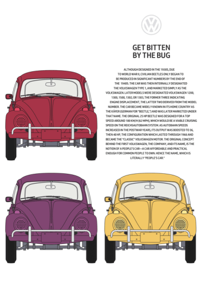
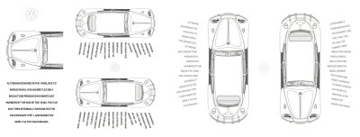
Like Brodovitch, Otto Storch excelled in combining images with text, and he often carved copy into shapes which mirrored them. In this design, Storch created a delicious text block shaped like a glass. We rarely find techniques like this used online, but they can help to draw readers into a story whatever the medium. Inspired by Storch, for my next design, I sculpted my copy to reflect the shape of a Volkswagen Beetle.

I sculpted my copy to reflect the shape of a Volkswagen Beetle.

I sculpted my copy to reflect the shape of a Volkswagen Beetle. (Large preview)

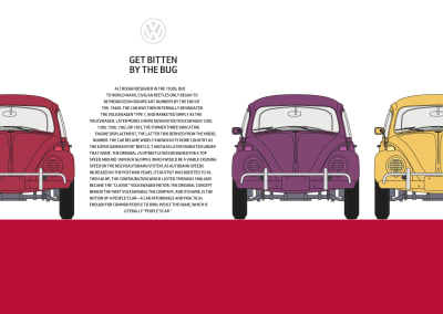
My design includes three alternative layouts. A single column of scrolling content for small screens, a 2×2 grid for medium screens, and a large screen design with a horizontally scrolling content area.

There are four structural elements needed to implement these three designs, one main element for my content, plus large images of three brightly coloured Beetles. I enclose these elements with a section, then add a decorative, presentation division which represents a tarmac road:

<section>

<img src="shape-1.png" alt="">

<main>

<h1>Get bitten by the bug</h1>

</main>

<img src="img-1.png" alt="Volkswagen Beetle">
<img src="img-2.png" alt="Volkswagen Beetle">

</section>

<div> </div>

The finished small screen design.

The finished small screen design. (Large preview)

I don’t need my horizontally scrolling panel to appear on small screens, so add only foundation styles and shapes which sculpt my text into the shape of a Beetle. I start by aligning paragraph text to the centre, and setting it in uppercase. While I wouldn’t normally set text an entire block of text in this way, the solid uppercase letterforms help to emphasise the Beetle shape:

p {
text-align: center;
text-transform: uppercase; }

Early drafts of the CSS Shapes specification included a shape-inside property which would’ve enabled us to wrap text on the inside of shapes as Storch did. I’m disappointed that the W3C postponed this feature until CSS Shapes Module Level 2 which is still an Editor’s Draft. You can achieve similar effects using shape-outside, but I, for one, can’t wait until we can use type as creatively as Otto Storch online.

Two alpha-transparent PNG images create the classic Beetle shape.

Two alpha-transparent PNG images create the classic Beetle shape. (Large preview)

I add two shape images to my paragraph. Text will flow between these images to mirror the face of a Beetle:

<p>
<img src="shape-2.png" alt="">
<img src="shape-3.png" alt="">
…
</p>

I specify dimensions for these two images and set their opacity to zero as I don’t want them seen by a viewer:

p img {
width: 100px;
height: 125px;
opacity: 0; }

These images are purely presentational and convey no content or meaning, so to remove any semantics from them, I add role attributes. To take them out of from the accessibility tree, I also add aria-hidden attributes to these two images:

<img src="shape-2.png" alt="" role="presentation" aria-hidden="true">

To carve my text into the shape of the iconic Volkswagen, I apply shape-outside using the same two images, floating the first image left and the second to the right:

p img:nth-of-type(1) {
float: left;
shape-outside: url(shape-l.png); }

p img:nth-of-type(2) {
float: right;
shape-outside: url(shape-r.png); }

I don’t want my presentation division visible to assistive technologies either, so I add those same role and aria-hidden attributes to this too:

<div role="presentation" aria-hidden="true"> </div>

As I don’t need the division to be visible to people using small screens, I set its display property to none:

div {
display: none; }

A symmetrical 2x2 grid with text sculpted into the iconic shape of the Volkswagen Beetle on medium-size screens.

A symmetrical 2×2 grid with text sculpted into the iconic shape of the Volkswagen Beetle on medium-size screens. (Large preview)

My small screen design is stylish, like the Beetle, but the extra space available on medium-size screens allows me to place my sculpted text alongside the pictures it’s imitating.

Before implementing any design, I make a storyboard.

Before implementing any design, I make a storyboard. (Large preview)

Before implementing any design, I make a storyboard to decide how to rearrange elements as screen sizes change. For medium-sized screens, I arrange my four elements in a 2×2 symmetrical column grid. By using minmax values for sizing these columns, I ensure they fill all available space, but their width never shrinks below 400px:

@media (min-width: 48em) {

section {
display: grid;
grid-template-columns: minmax(400px, 1fr) minmax(400px, 1fr);
grid-gap: 2vw;
align-items: end; }
}

For larger screens, I also need two rows. They should be equal in height and occupy all available vertical space:

@media (min-width: 64em) {

body {
display: grid;
grid-template-rows: 1fr 1fr; }

A large, horizontally scrolling content area dominates this design and is wider than the viewport. The panel includes four columns — three for images and one for my sculpted copy — and each one is a minimum of 400px wide. By setting the maximum width to the viewport and allowing scrolling only on the horizontal axis, any content which is outside the viewport is hidden but still accessible:

section {
grid-template-columns: repeat(4, minmax(400px, 1fr));
max-width: 100vw;
overflow-x: scroll; }

A presentational division which represents the road under the wheels of my Beetle shapes.

A presentational division which represents the road under the wheels of my Beetle shapes. (Large preview)

Below my content is a presentational division which represents the road under the wheels of my Beetle shapes. This element is invisible on smaller screen sizes, so to make it visible, I change the display property from none to block, then add a light grey background colour. The grid properties I previously set on the body element defines the height of this division:

div {
display: block;
background-color: #a73448; }
}

Webkit’s Dave Hyatt originally proposed CSS Reflections as far back as 2008, but so far they haven’t been implemented in other browser rendering engines. CSS Reflections are currently only supported by Google Chrome.

As you might imagine, reflections create a copy of an element. A reflection can appear either above, below or to the left or right. Just as in the physical world, when an element changes in some way, its reflection follows.

There are three experimental properties available for CSS Reflections. Its direction and an optional offset which controls the distance between an element and its reflection. You can also apply a mask to any reflection to change its appearance, for example, by using a gradient mask to fade the intensity of a reflection gradually.

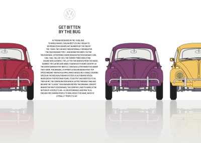
CSS Reflections have limited support in browsers, but they can still add an extra dimension to a design for browsers which have implemented them. I want to add reflections only when a browser supports them and when the screen is large enough to use them to full effect.

CSS Shapes sculpt text into this delicious design.

CSS Shapes sculpt text into this delicious design. (Large preview)

To achieve the result I’m looking for, I use nested media and feature queries which first test a viewport’s minimum width, then whether a browser supports -webkit-box-reflect:below. I add the reflections and change the colour of my presentational division from red to grey:

@media (min-width: 64em) {
@supports (-webkit-box-reflect:below) {

section {
-webkit-box-reflect: below 0 linear-gradient(transparent, white); } 

div {
background-color: #f0f0f1; }
}
}

Mirror symmetry

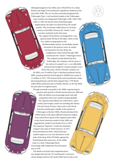
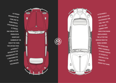
This striking black and red spread from McCall’s Patterns is one of Storch’s most distinctive designs. There’s a reassuring symmetry to its layout and how Storch used the same colours on its two pages. I was immediately drawn to his design and want to achieve a similar effect.

A playful but reassuring symmetry in this large screen design.

A playful but reassuring symmetry in this large screen design. (Large preview)

The HTML I need to implement this design couldn’t be simpler. Just two structural elements, one main and an aside, which both contain picture elements:

<main>
<picture>…</picture>
<p>…</p>
</main>

<aside>
<picture>…</picture>
<p>…</p>
</aside>

These main and aside elements also each contain a paragraph of text. To achieve the rotations needed for this design, I wrap each line of text inside a span element. I wish there was a better, more semantic alternative to these presentational elements, but without additional styles, they don’t disrupt the readability of my paragraphs:

<p>
<span>Although </span>
<span>designed in the </span>
<span>1930s, due to </span>
<span>World War II, </span>
<span>civilian Beetles </span>
<span>only began to </span>
<span>be produced in </span>
<span>significant </span>
<span>numbers by the </span>
<span>end of the 1940s.</span>
</p>

I start by applying a dark grey background colour to the body element:

body {
background-color: #262626; }

Mirroring parts of a design on small screens to create a consistent experience across all screen sizes.

Mirroring parts of a design on small screens to create a consistent experience across all screen sizes. (Large preview)

Then, a minimum height ensures that my main and aside elements always fill the viewport height. To centre their content both horizontally and vertically, I apply flexbox properties and set their direction to column:

main,
aside {
display: flex;
flex-direction: column;
justify-content: center;
align-items: center;
min-height: 100vh;
padding: 2rem 0;
box-sizing: border-box;
color: #fff; }

I want the colour of my main Beetle matched by the subsequent panel, so I set its background colour to the same red:

aside {
background-color: #a73448; }

Whereas long passages of uppercase text are generally more difficult to read than those set in mixed case, uppercase is appropriate for shorter pieces and can create a stylish look:

p {
margin: 0 2rem;
text-align: center;
text-transform: uppercase; }

Structural elements stack vertically and I introduce larger images for medium-size screens.

Structural elements stack vertically and I introduce larger images for medium-size screens. (Large preview)

In my small-screen design, the main and aside elements stack vertically and their heights match that of the viewport. For medium-size screens, I reset the minimum height of those elements to fill half the viewport:

@media (min-width: 48em) {

main,
aside {
min-height: 50vh;
padding: 2rem; }

The extra space available on medium-size screens allows me to style my paragraphs by changing the writing mode, so their text is displayed vertically and reads from right to left:

p {
max-height: 12em;
margin: 0;
text-align: left;
writing-mode: vertical-rl; }

Changing the display property on these span elements to block splits my paragraph onto multiple lines. Then, line-height adds space between the lines, which allows room for my rotations:

p span {
display: block;
line-height: 2; }

Before implementing any design, I make a simple storyboard to demonstrate how my elements will flow across a selection of screen sizes.

Before implementing any design, I make a simple storyboard to demonstrate how my elements will flow across a selection of screen sizes. (Large preview)

Transforms, including rotate, scale, and translate have been a part of CSS for almost two decades. Using transform involves adding a transform-function like rotate, then a value in parenthesis.

To achieve the effect I’m looking for; I rotate the first six lines of my text anti-clockwise by fifteen degrees. The last six lines are rotated by the same amount but in the clockwise direction. All remaining lines remain unaltered:

p span:nth-child(-n+6) {
transform: rotate(-15deg); }

p span:nth-child(n+12) {
transform: rotate(15deg); }

In the future, you’ll be able to use functions like rotate independently of the transform property, but as I write this, only Firefox has implemented individual transforms.

To make room for my rotated text, I add margins to two of my lines:

p span:nth-child(6) {
margin-left: 1em; }

p span:nth-child(12) {
margin-right: 1em; }
}

This design becomes more striking with the space available on large screens. For them, I apply grid values to the body element to create two symmetrical, equal-height columns:

@media (min-width: 64em) {

body { 
display: grid;
grid-template-columns: 1fr 1fr; }

I apply a symmetrical three-column grid to both main and aside elements which both extend to the full viewport height:

main,
aside {
display: grid;
grid-template-columns: 1fr 1fr 1fr;
grid-column-gap: 0;
padding: 2rem;
min-height: 100vh; }

I spread the main picture across second and third columns, and the aside picture into the first and second columns:

main picture {
grid-column: 2 / -1;
grid-row: 1;
padding: 0 5vw; }

aside picture {
grid-column: 1 / 3;
padding: 0 5vw; }

I place the paragraphs into the remaining columns, and by giving all elements the same row number, they will stay on the same line regardless of source order:

main p {
grid-column: 1;
grid-row: 1; }

aside p {
grid-column: 3; }

In this version of my design, the text should run from top to bottom instead of right to left, so I reset the writing-mode to horizontal, top-bottom and then align text to the right:

main p,
aside p {
max-height: none;
writing-mode: horizontal-tb; }

main span {
text-align: right; }

A playful but reassuring symmetry in this large screen design.

A playful but reassuring symmetry in this large screen design. (Large preview)

Finally, I replace the rotation values and margins on my lines of text to better suit this large-screen design:

main p span:nth-child(-n+6) {
transform: rotate(10deg); }

main p span:nth-child(n+12) {
transform: rotate(-10deg); }

main p span:nth-child(6) {
margin: 0 0 15px; }

main p span:nth-child(12) {
margin: 15px 0 0; }

aside p span:nth-child(-n+6) {
transform: rotate(-10deg); }

aside p span:nth-child(n+12) {
transform: rotate(10deg); }

aside p span:nth-child(6) {
margin: 0 0 15px; }

aside p span:nth-child(12) {
margin: 15px 0 0; }
}

Span columns

For many of his most memorable designs, Otto Storch allowed large images and typographic elements to spread across two pages. This technique created striking spreads, including this one where he placed a buttery corn cob on top of two columns of justified text.

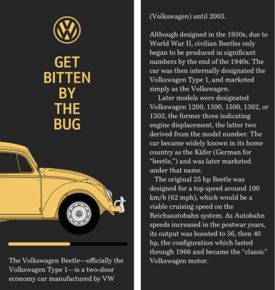
A butter yellow Beetle sits on top of two columns of running text.

A butter yellow Beetle sits on top of two columns of running text. (Large preview)

I want a similarly striking effect for my final Beetle-based design, and to implement it I only need three structural elements; a header — containing an SVG logo, headline, and a picture of my yellow Volkswagen — then main and aside elements:

<header>
<svg>…</svg>
<h1>Get bitten by the bug</h1>
<figure>
<picture>…</picture>
</figure>
</header>

<main>…</main>
<aside>…</aside>

Normal flow plus a few foundation styles are all I need to implement the small screen version of this design. First, I add a dark background and specify white text:

body {
padding: 2rem;
background-color: #262626;
color: #fff; }

Adding a horizontally scrolling panel is one of my favourite small-screen design techniques.

Adding a horizontally scrolling panel is one of my favourite small-screen design techniques. (Large preview)

To place the headline in the centre of the page, I apply margins, set its maximum width using text-based units, then align its uppercase words to the centre:

h1 {
margin: 0 auto 1.5rem;
max-width: 8rem;
text-align: center;
text-transform: uppercase; }

Instead of resizing images, so they fit within a narrow viewport, I often allow them to spread beyond it and add a horizontally scrolling panel. This technique is one of my favourite small-screen design devices.

This figure contains an image which is wider than the viewport and contains the car’s complete profile, including its wheels. By adding overflow-x: scroll; to the figure, I make parts of the picture outside the viewport accessible:

figure {
overflow-x: scroll; }

A narrow column of text emphasises the vertical axis in this medium-size screen design.

A narrow column of text emphasises the vertical axis in this medium-size screen design. (Large preview)

Although medium-size screens inherit many of those foundation styles, when more space becomes available, I want to emphasise the vertical axis in the design by creating a narrow column of text using wide viewport-based margins. I also reset the figure elements overflow to make all its content visible:

@media (min-width: 48em) {

figure {
overflow-x: visible; }

p {
margin-right: 25vw;
margin-left: 25vw; }
}

A butter yellow Beetle sits on top of two columns of running text.

A butter yellow Beetle sits on top of two columns of running text. (Large preview)

The largest version of my design is the most complex. It not only places a large picture of my Beetle on top of two columns of running text, but that text wraps around its wheels. I start by applying grid properties for larger screens to the body element to create a symmetrical two-column grid:

@media (min-width: 64em) {

body {
display: grid;
grid-template-columns: 1fr 1fr;
padding: 4rem; }

My header spans both columns, and then nested grid values arrange the VW logo, headline and image of my Beetle. In this nested grid, the two outer columns occupy all remaining available space, while the centre column automatically resizes to accommodate its content:

header {
grid-column: 1 / -1;
display: grid;
grid-template-columns: 1fr auto 1fr;
grid-row-gap: 4vh; }

I place the logo and headline into this centre column:

svg, 
h1 {
grid-column: 2; }

Then, add margins between the paragraphs:

p {
margin-right: 1rem;
margin-left: 1rem; }

The picture element for this design includes two images. The first is complete with wheels for small and medium screens, and the second is a car missing its wheels for large screens. To bolt wheels back onto this Beetle, I use :before pseudo-elements inside both main and aside elements. Then, I add a shape-margin to add space between them and the running text nearby:

main:before,
aside:before {
display: block;
shape-margin: 10px; }

Using generated content, I add the rear wheel before the main element and float that wheel to the right. The shape-outside property then wraps text around this wheel:

main:before {
content: url(shape-l.png);
float: right;
shape-outside: url(shape-l.png); }

I apply similar values to before the aside element, this time floating the wheel left:

aside:before {
content: url(shape-r.png);
float: left;
shape-outside: url(shape-r.png); }
}

The running text now wraps around the Beetle’s wheels, which makes my design more compelling without sacrificing readability or responsiveness.

Conclusion

Otto Storch created many memorable designs, but I’m sad that he and his work have largely been forgotten. There’s no Wikipedia page devoted to Storch, and no one has published a book about him or his work. Storch’s designs have plenty to offer designers who work on the web, and I hope more people will rediscover him.

His work also demonstrates how much more we can achieve online using Shapes. Despite now being well-supported, this CSS property has been overlooked almost as much as Storch himself. Shapes offer so much more than simple text wrapping, and their full potential has yet to be realised. I hope that will change, and soon.

More From The “Inspired Design Decisions” Series

  1. Inspired Design Decisions: Avaunt Magazine
  2. Inspired Design Decisions: Pressing Matters
  3. Inspired Design Decisions: Ernest Journal
  4. Inspired Design Decisions: Alexey Brodovitch
  5. Inspired Design Decisions: Bea Feitler
  6. Inspired Design Decisions: Neville Brody

NB: Smashing members have access to a beautifully designed PDF of Andy’s Inspired Design Decisions magazine and full code examples from this article.

(vf, ra, yk, il)
Categories: Others Tags:

Introducing 15 Best New Portfolios, March 2020

March 23rd, 2020 No comments

Are you trapped in a fourth floor apartment listening to the guy next door serenade the block from his balcony with a saxophone he made from a length of rubber tubing and an old boot?

While people the world over very sensibly self-isolate, it’s still possible to be productive, why not work on your portfolio? Strap on your noise-cancelling headphones, turn on some white noise, and grab some inspiration from our monthly roundup of the best portfolios launched in the previous four weeks.

This month we see several previous trends still going strong. There’s a whole heap of color, masses of glitch effects, and the re-return of that old favorite, big bold typography. Enjoy!

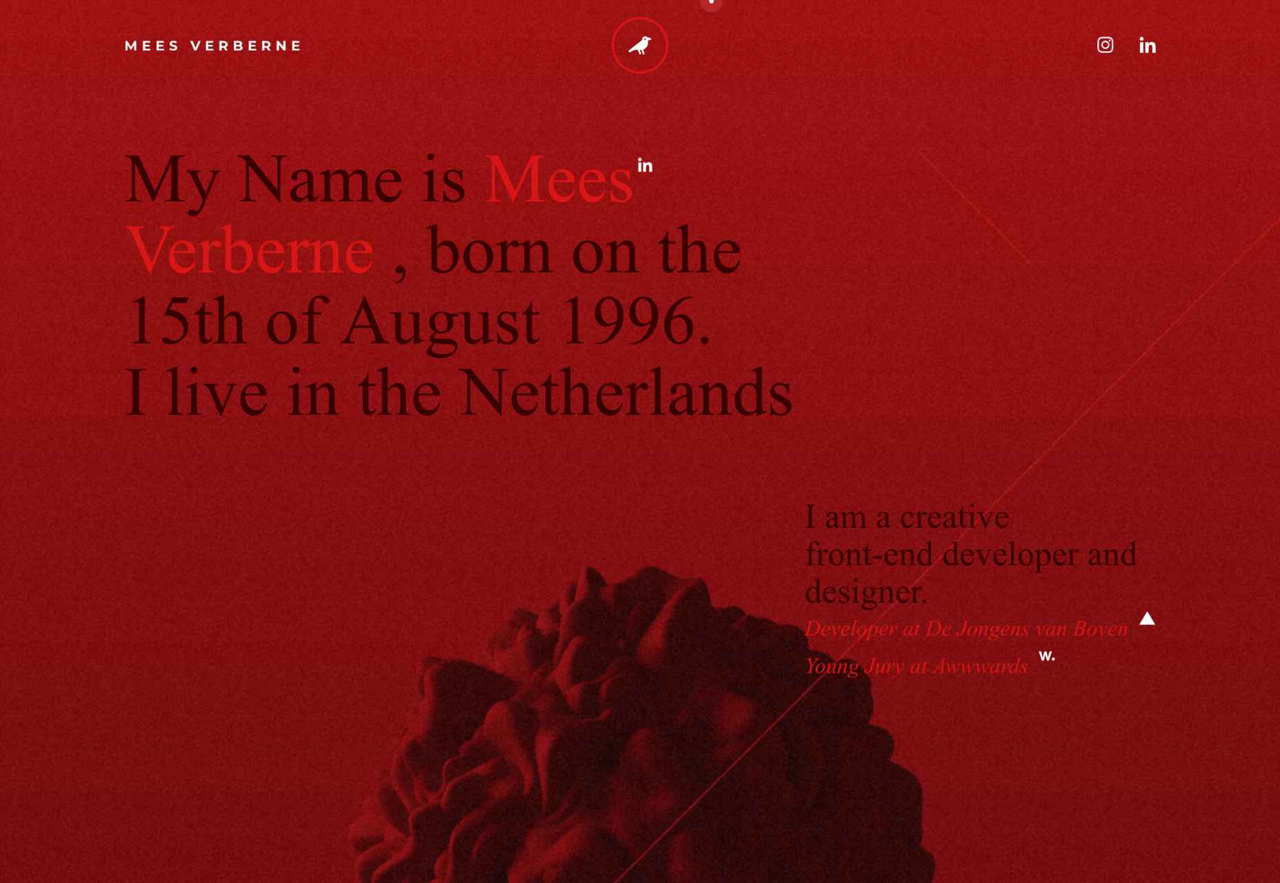
Mees Verberne

Mees Verberne describes himself as a creative front-end developer and designer. He makes full use of the popular glitch trend to give his site some character, but what it really does well is obscure the banding in his gradients, giving him a nice sophisticated lighting effect.

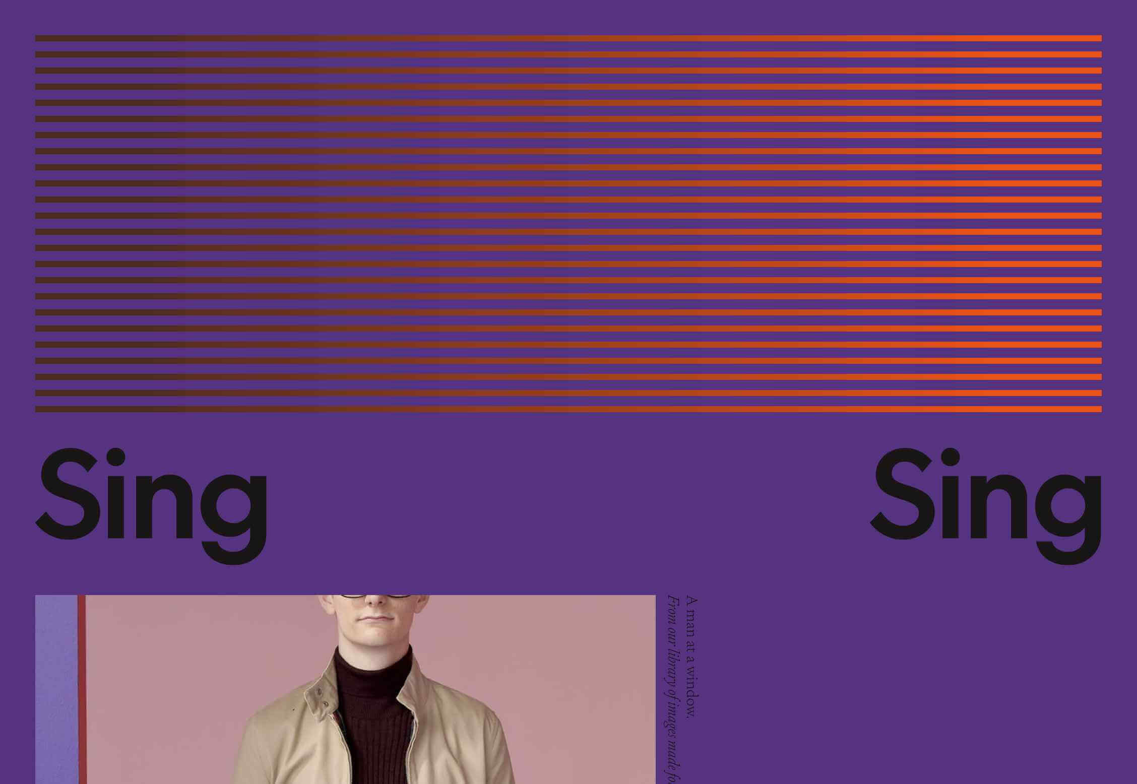
Sing-Sing

Adi Goodrich and Sean Pecknold founded Sing-Sing five years ago. Their award-winning work has a wonderful sense of color, with some genuinely original schemes in their design and film projects. The only criticism I would have is their hamburger menu, which isn’t immediately clear.

David Polonia

If you’re a fan of glitch effects, you’ll love David Polonia‘s site. Normally I advise everyone to avoid sound on websites, but David’s portfolio benefits from the uplifting energy that it provides. There’s so much to explore here, it’s less a portfolio, and more of a showreel.

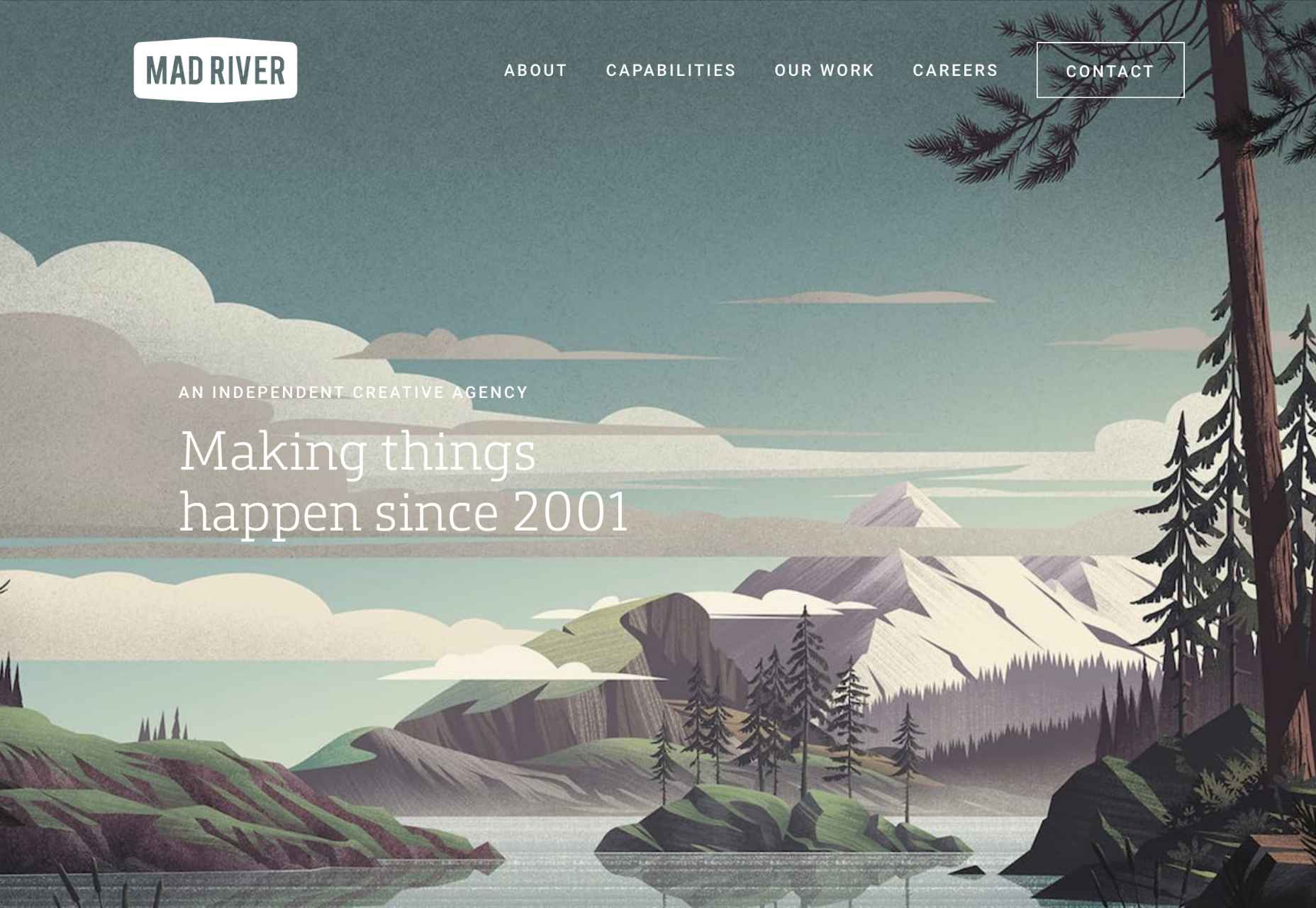
Mad River

Mad River‘s work is the epitome of those hipster-lumberjack designs that have been popular for a few years. So naturally, for a British design agency, its site uses an illustration straight out of a US National Park guidebook. It is very beautiful though, and the site is a pleasure to browse round.

Jamhot

Tank fly boss walk jam nitty gritty you’re listening to the boy from the big bad city — ahem. Clearly someone else has a fondness for 90s-era dance music. Jamhot exudes confidence, but why not when you have that animation on your site’s landing page. Seriously, I could look at this beauty for hours.

Halbstark

I love the mountains, so Halbstark‘s blend of big bold type, and eye onto a mountain scene grabbed me immediately. The zoom effect when your scroll down is sublime, and it leads to a very simple, carefully ordered portfolio that showcases everything you want to see in a reliable agency.

Kota

I said there were plenty of glitch effects this month, and my favorite of them is Kota. Run your cursor over the screen and the large type, with the gradient, will distort and glitch in a liquid style. How’s that for packing in every single current design trend into one graphic?

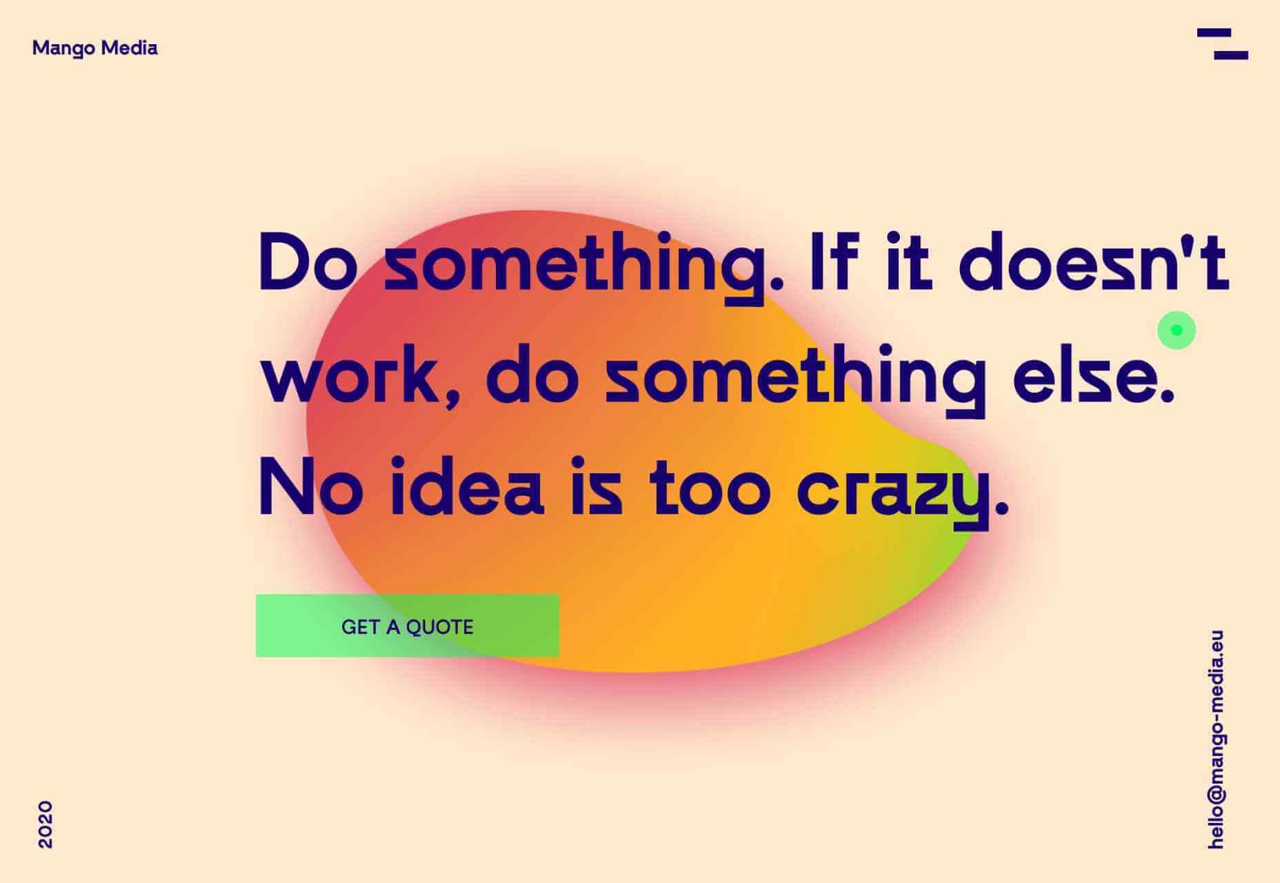
Mango Media

Some of the best sites this month combine several design trends, and Mango Media is one of them. Cursor over the blob and you’ll get bold gradients combined with the ever-popular glitch effect. And kudos for that hamburger menu icon that’s both original and perfectly clear.

Deadwater

With a name like Deadwater, it’s no surprise that this French design agency has employed the liquid effect trend that’s been popular for the last few months. I love the way it’s been combined with a glitch effect to create the sense of being under water.

Works

There’s a long-standing tradition in this series of selecting portfolios that make good use of the color yellow. Works certainly does that with an acid-toned site, that once you scroll uses a ticker-style band of the same color to indicate a selection. It ties everything together perfectly.

Electric Red

So, you think you’ve seen big type? Think again, you’ve not seen anything until you’ve seen Electric Red‘s giant, 3D-rendered ring of spinning red text. The graphic grabs you as soon as you see it, but it’s also interactive, and it needs to be if you want to see enough to work out what it says.

Studio Dot

Studio Dot obviously had to use a big dot on its site, behind which you’ll see a ton of glitchy graphics. What I really love are the links at the bottom of the homepage, which open without clicks when you hover over them for a while — usability aside I love that they tried to innovate in this area.

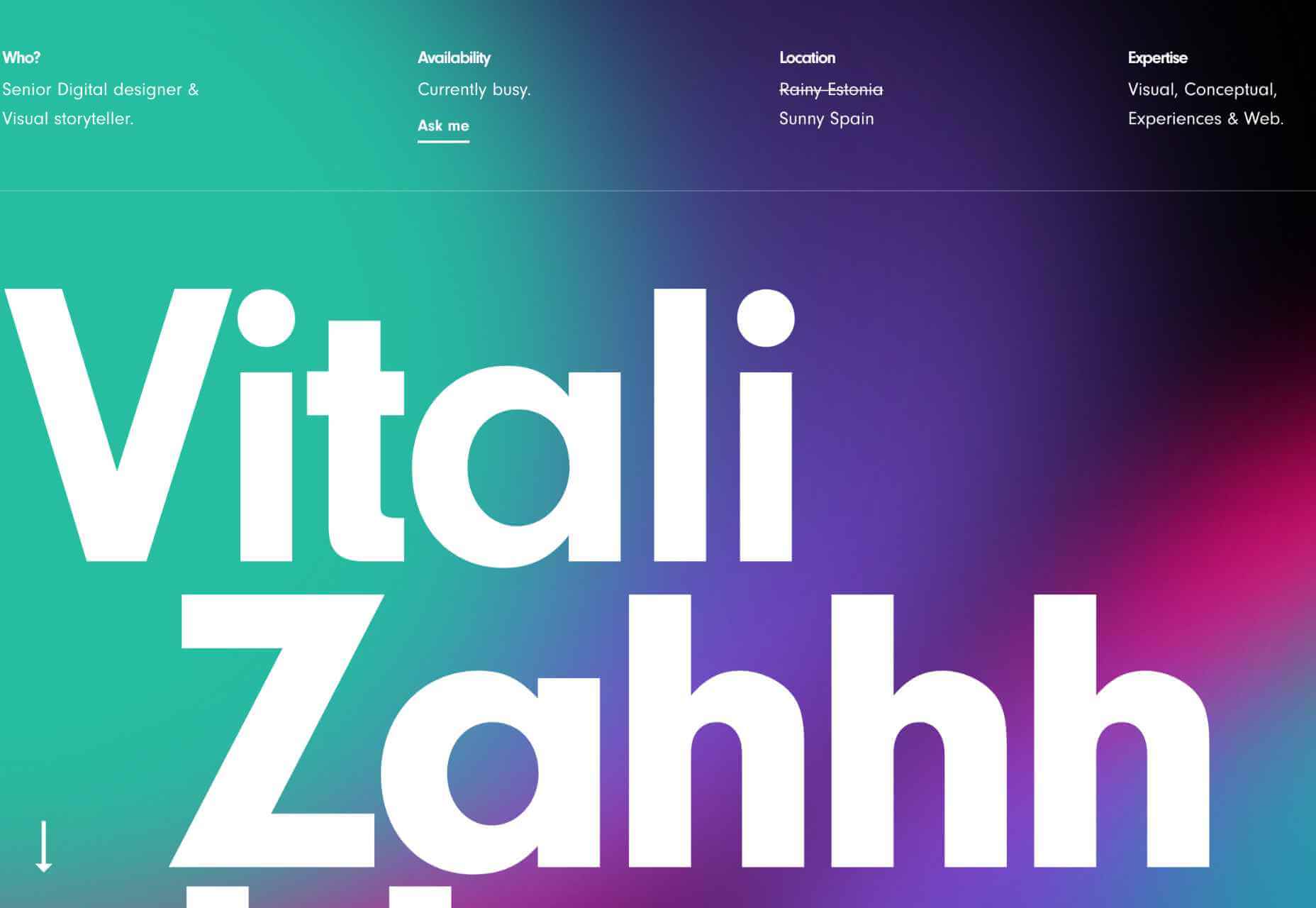
Vitali Zahharov

More animated gradients, this time curtesy of Vitali Zahharov. And yet more big bold typography, which is a trend that’s going to last throughout 2020 and beyond. Vitali’s a freelance designer based in Spain, and he’s worked for some really exceptional clients, scroll down to see selected work.

Tubik Studio

Tubik Studio‘s site devoted to its staff has tons of personality on display, from its juggling balls load bar, to the eccentric sound effects when you cursor over a thumbnail. Its main site is very goal-orientated, so showing off some personality contrasts well and makes it approachable.

Superlab

If you read this series regularly you’ll know that I’m a sucker for animated abstract shapes. I guess I must have loved building blocks as a kid. Superlab‘s are great because they tie everything together, without imposing themselves on the design. Nice bold, confident colors too.

Source

Categories: Designing, Others Tags:

Bad Logos: 31 Worst Logos Ever

March 23rd, 2020 No comments

We can all use a good laugh these days, that’s why we prepared you a list of what not to do while designing a logo while working from home. Hopefully, these logos will put a smile on your faces.

Bad logos might be quite bad for your brand. Your logo is what the people remember you with after all.

There are many different ways you can go with your logo. you have probably identified a business by looking at its logo before, even if their name isn’t on the logo. There are some business logos that when you see them, you can immediately guess what that company does.

Your logo is a huge part of your brand’s identity, it’s probably the first impact on public perception and having a bad logo design could affect your business. World’s multinational companies can spend millions of dollars on their logos – like UK-based oil group BP. They’ve spent £136m back in 2000 when they introduced their current sunflower design.

You probably have come across people posting a logo design job for incredibly low prices on freelancing websites or graphic design communities, and yes, there are people who will design your logo for those prices. It shouldn’t be too much of a shock to those people when they end up with bad logos.

Okay, we understand that there are people who don’t have enough budget, and they are just starting out. You want to get the most out of your business, and logos play an important role, especially if you are just starting and trying to get your name out there. Before having your logo designed, it’s important to learn about the dos and don’t of logo design so you know more about what you are getting into.

Anyway, without further ado, let’s see the worst logos.

Top 31 Bad Logos

Locum

Locum Logo

A Swedish property management company. You do you, Locum, no judgment here.

Bing

Bing Logo

Typography masters at work, we see you Bing.

Megaflicks

Megaflicks Logo

This logo is self-explanatory. At least they know what’s up.

Mont-Sat

Mont-Sat Logo

Your satellite will be working extra smooth in the mornings.

NYC Taxi

NYC Taxi Logo

NYC is known as the cultural hub of the world, and it has a great design and art community. NYC Taxi is not.

A Style

A Style Logo

We’ve never seen the “A” like this before. Freudians might have things to say to these guys.

MSN

MSN

Look, mom! There is a butterfly!

Arlington Pediatric Center

Arlington Pediatric Center Logo

It doesn’t give the most trustable vibes for sure.

Kraft Foods

Kraft Foods Logo

No comment.

Kudawara Pharmacy

Kudawara Pharmacy Logo

What kind of an operation are you running here, sir? Sir?

2012 London Olympics Logo

2012 London Olympics Logo

You might remember the Lisa Simpson memes, can’t be unseen.

The Computer Doctors

The Computer Doctors Logo

They specialize in cooling systems, with their exclusive thermal paste.

Comprehensive Health Care

Comprehensive Health Care Logo

Isn’t that Channing Tatum posting up right before the dance-off?

The Bureau of Health Promotion, Taiwan

The Bureau of Health Promotion, Taiwan Logo

You gotta do what you gotta do to promote, I guess.

Catwear

Catwear Logo

Something is up with the “A”. We’re starting to see a pattern.

Enron

Enron Logo

This is a design by the legendary Paul Rand. Even though we like most of his work, we’re not sure about this one.

Dough Boys

Dough Boys Logo

They are definitely all about that dough, boy.

Kids Exchange

Kids Exchange Logo

The importance of using space. Not the kind of “change” we are looking for, thank you.

Catholic Church’s Archdiocesan Youth Commission

Catholic Church's Archdiocesan Youth Commission Logo

No comment on this one…

Brazilian Institute of Oriental Studies

Brazilian Institute of Oriental Studies Logo

Uhm, sure oriental studies and the struggle for “power”.

Clinica Dental

Clinica Dental Logo

They say how important it is to take care of your teeth. After your teeth are done, you’ll be taking.

Office of Government Commerce

Office of Government Commerce Logo

Commerce is getting hard day by day folks.

Cleveland Browns

Cleveland Browns Logo

This is one of the creative ones, a football helmet for a football team. God, what’s next, just a football as a logo?

Hilton

Hilton Logo

That alignment though.

SafePlace

SafePlace Logo

You’ll always be safe.

Pepsi

Pepsi Logo

This can not be unseen either. Must. stop. drinking.

HASC Center

HASC Center Logo

I’ll show you mine if you show me yours.

Kostelecké Uzeniny Sausages

Kostelecké Uzeniny Sausages Logo

This one seems like it’s straight out of a 80’s flick.

Vermont Maple Syrup

Vermont Maple Syrup Logo

Canadians love their maple syrup. We didn’t know it was in their system though.

Fully Erect Tents

Fully Erect Tents Logo

Your tent won’t ever go flaccid.

Mama’s Baking

Mama's Baking Logo

That mama is definitely baking something!

So these are the 31 bad logos we’ve got. Now you probably fully understand the importance of logo design and how a bad logo design might affect your business now you’ve seen the worst logos.

Let us know about the other bad logos you’ve seen out there!

Cover image: Background vector created by rawpixel.com – www.freepik.com

Categories: Others Tags:

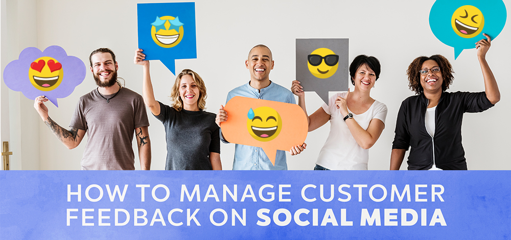
How to Manage Customer Feedback on Social Media

March 23rd, 2020 No comments

People expect brands to match their level of engagement on social media.

Though managing feedback on social media is a challenge, businesses should approach this as a brand-building opportunity.

Every interaction on social media helps you differentiate your company from competitors. Each success, in turn, can be leveraged to further bolster your company’s social presence.

When engaging with customers on social media, companies must:

  • Acknowledge comments promptly
  • Respond to negative feedback
  • Provide excellent customer service
  • Humanize their brand

This article discusses how social media management, when approached as PR, helps businesses grow their brand and audience at once.

Acknowledge Feedback Promptly

When people speak out about your company online, they expect brands to respond.

For businesses, this means if someone leaves you a review on Google or a comment on Facebook, acknowledge and respond to their concerns.

Responding directly to customer feedback demonstrates empathy: It validates their experience shows customers that you care. This helps to reinforce brand loyalty and reduces any feelings of anger or frustration.

Thus, listening to your audience can help develop customer relationships by defusing any ill-will before it gets out of hand.

Respond Substantively to Constructive Feedback

People want brands to be honest and genuine, and this includes how they react to negative comments.

Customers would view a brand more positively if it responded to negative comments on social media.

When responding to negative comments, the goal is to acknowledge the person’s concerns. A proactive response to a negative comment signals your company’s willingness to fix the problem.

People often just want to be heard, and a personalized response can be enough to defuse the negativity and prevent any further action.

By contrast, criticism that goes unanswered can be perceived as valid and gain traction in the community as a result.

Research shows that people perceive your interactions with other customers to reflect how you’d treat them.

For best results, your brand must be honest, quick, and thorough in handling criticism on social media.

Use Social Media to Strengthen Customer Service

People expect to resolve many of their customer service needs on social media.

As web-based communications become the norm for consumers, social media has eased the process of receiving customer service from a company.

Businesses may find it easier to provide customer service on social media, but they’re also being held to a higher standard.

It’s no secret that unhappy customers are very vocal about receiving poor customer service, especially on social media.

What’s more, when they do use social media to express feedback, they generally expect businesses to both comment and resolve their issue usually within a day.

With every inconsistency or shortcoming on record, service teams must be unfailingly pleasant and diligent when they address the needs of customers.

The potential benefit of customer service on social media, though, is that positive feedback can be just as visible as negative feedback.

If your business receives a positive service experience, make sure to encourage customers to leave a positive review.

Generating and then leveraging good feedback helps you sustain the image of a trustworthy company that values its customers.

Humanize Your Brand

Despite the challenges of upkeep, every interaction on social media is an opportunity to improve your brand.

Businesses must use social media as a PR tool that can make their company more relatable. Doing so can increase brand visibility, brand equity, and sparks community engagement.

This means using a fun, friendly tone in your communications and perhaps emojis. It also means generating meaningful customer interactions that create goodwill for your company.

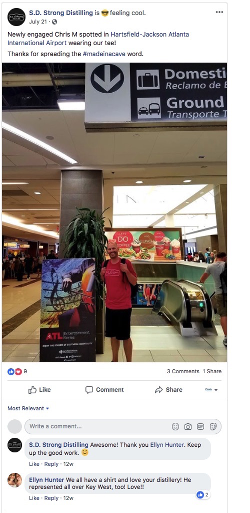
For example, you could share a glowing testimonial left by a customer in need. Or, as S.D. Strong Distilling did, you can share a run-in you had with a customer wearing your brand’s t-shirt at the airport.

When a company gets excited about meeting a fan, it reminds onlookers that a company is actually a group of people who like to connect with one another.

Managing Customer Feedback on Social Media

Social media is integral to peoples’ lives, meaning companies must take a PR-driven approach to community engagement.

Respect your audience by responding to their every comment, and promptly. Remember that companies that respond well to criticism are viewed as more trustworthy.

People want to like their favorite brands, so humanize your company with genuine communications and authentic displays of caring.

Categories: Others Tags:

Flexible Repeating SVG Masks

March 22nd, 2020 No comments

Tyler Gaw reminds us that mask-image can repeat, resize, and move just like background-image does, which is fun to combine and play with. I could see it being a fun option for an


, like Sara is doing.

CodePen Embed Fallback

Direct Link to ArticlePermalink

The post Flexible Repeating SVG Masks appeared first on CSS-Tricks.

Categories: Designing, Others Tags:

Popular Design News of the Week: March 16, 2020 – March 22, 2020

March 22nd, 2020 No comments

Every week users submit a lot of interesting stuff on our sister site Webdesigner News, highlighting great content from around the web that can be of interest to web designers.

The best way to keep track of all the great stories and news being posted is simply to check out the Webdesigner News site, however, in case you missed some here’s a quick and useful compilation of the most popular designer news that we curated from the past week.

Note that this is only a very small selection of the links that were posted, so don’t miss out and subscribe to our newsletter and follow the site daily for all the news.

Social Distancing Google Doodle is Ingeniously Simple

Slack Reveals its Biggest Ever Redesign

Microsoft Launches a Coronavirus Tracker Dashboard on Bing

11 Smart Ways to Monetize a Website (With Examples)

Top 3 Web Design Mistakes You’re Probably Making

Let’s Build a City in Figma

5 Magnificent Examples of Websites that Convert Visitors into Customers

The 5 Types of Projects not to Include in your Portfolio

Introducing: A Brand New Dribbble

MonoLisa Font

Coronavirus UX: How Dashboard Designs Can Impact your Perception

Apple Reveals the Best Night Mode Photos Shot on iPhone

12 Amazing Websites for Downloading Fonts in 2020

Web Accessibility Standards Designers Need to Know

Iconic Logos Reimagined for the Age of Coronavirus

How to Get High-Paying Web Design Clients Fast

Da Vinci’s Principles to Become a Better Designer

11 Things to Consider When Choosing a Website Builder

Snapfont

Creatives Band Together for Support During the Crisis

These Designers Let Us Peek Inside their Home Offices

These People Really Care About Fonts

How Web Designers Can Help in a Crisis

Brands Still Matter – Brandless Boom to Bust

Specialisation is for Insects?-?a Product Designer Impacts the Entire User Experience

Want more? No problem! Keep track of top design news from around the web with Webdesigner News.

Source

Categories: Designing, Others Tags:

Auto-Archival

March 20th, 2020 No comments

I’m sure most of us have used the ol’ Wayback Machine to access some site that’s gone offline. I don’t actually know how it decides what sites to archive and when, but you can tell it to save pages. There is UI for it right on its homepage.

Also, there is a little trick…

Typing https://t.co/R5w2bQZKWz in front of any URL saves that content in the Wayback Machine forever. Nasty tweet? Type https://t.co/R5w2bQZKWz in front of the URL, and archive it forever. Hat tip: @t.

— zeldman (@zeldman) February 23, 2019

That’s still a bit manual though.

Brian Kardell was given access to some kind of secret API that allows submission of pages, and he built a public service around it anyone can use. Here’s his blog post on it. You hit the endpoint with some JSON in your choice of a couple of formats and it’ll do the rest. The idea is that other systems would use this for submissions. Imagine a WordPress plugin that hit it when you hit submit or update on a post. Or a Netlify build plugin that pinged this as you deployed.

I’m not entirely sure what the difference is between this service and the URL technique from Zeldman’s tweet, but I gotta imagine an API-based submission service is more reliable.

The big idea is that you’re telling this service to archive your page forever, which is the mission of the Internet Archive. So, should your site ever go away, the content lives on. So you’d better want that before you do this!

The post Auto-Archival appeared first on CSS-Tricks.

Categories: Designing, Others Tags:

Client-Side Image Editing on Mobile

March 20th, 2020 No comments

Michael Scharnagl:

Ever wanted to easily convert an image to a grayscale image on your phone? I do sometimes, and that’s why I build a demo using the Web Share Target API to achieve exactly that.

For this I used the Service Worker way to handle the data. Once the data is received on the client, I use drawImage from canvas to draw the image in canvas, use the grayscale filter to convert it to a grayscale image and output the final image.

So you “install” the little microsite like a PWA, then you natively “share” an image to it and it comes back edited. Clever. Android on Chrome only at the moment.

Reminds me of this “Browser Functions” idea in reverse. That was a server that did things a browser can do, this is a browser doing things a server normally does.

Direct Link to ArticlePermalink

The post Client-Side Image Editing on Mobile appeared first on CSS-Tricks.

Categories: Designing, Others Tags: