The Hero Generator
I’ve had to implement the same hero for several years now, so like a good lazy programmer, I figured I’d automate it.
Direct Link to Article — Permalink
The post The Hero Generator appeared first on CSS-Tricks.
I’ve had to implement the same hero for several years now, so like a good lazy programmer, I figured I’d automate it.
Direct Link to Article — Permalink
The post The Hero Generator appeared first on CSS-Tricks.
Hey hey, these “chronicle” posts are little roundups of news that I haven’t gotten a chance to link up yet. They are often things that I’ve done off-site, like be a guest on a podcast or online conference. Or it’s news from other projects I work on. Or some other thing I’ve been meaning to shout out. Stuff like that! Enjoy the links!
I chatted with Paul Campbell the other day during Admission Online, an online conference put together by the Tito crew . They’ve published all the videos there including mine.
I had a chance to chat with Paul about his Tito service about last year on ShopTalk in a really great episode. Tito is a best-in-class software tool for running a conference. It helps you build a site, sell tickets, manage attendees, run reports, and all that. Clearly the COVID-19 situation has impacted that business a lot, so I admire the accelerated pivot they are doing by creating Vito, a new platform for running online conferences, and running these conferences super quickly as a way to showcase it. If you’re running an online conference, I’d get on that invite list ASAP.
Jina Anne has been doing something new as well in the online event space. She’s been doing these 30-minute AMA (Ask Me Anything) sessions with interesting folks (excluding me). Upcoming events are here. They are five bucks, and that gets you live access and the ability to actually ask a question. Jina publishes past events to YouTube. Here’s one with me:
I was interviewed on Balance the Grid. Here’s one exchange:
What do you think are some of the best habits or routines that you’ve developed over the years to help you achieve success in your life?
I’m quite sure I have more bad habits than good, so take all this with a bucket of salt. But one thing I like to do is to try to make as much of the time I spend working is spent working on something of lasting value.That’s why I like to blog, for example. If I finish a blog post, that’s going to be published at a URL and that URL is going to get some traffic now, and at least a little bit of traffic forever. The more I do that the more I build out my base of lasting content that will serve me forever.
Over at CodePen, we’ve been busier than ever working toward our grand vision of what CodePen can become. We have a ton of focus on things lately, despite this terrible pandemic. It’s nice to be able to stay heads down into work you find important and meaningful in the best of times, and if that can be a mental escape as well, well, I’ll take it.
We’ve been building more community-showcasing features. On our Following page there are no less than three new features: (1) A “Recent” feed¹, (2) a “Top” feed, and (3) Follow suggestions. The Following page should be about 20× more interesting by my calculation! For example, the recent feed is the activity of all the people you follow, surfacing things you likely won’t want to miss.
You can toggle that feed from “Recent” over to “Top.” While that seems like a minor change, it’s actually an entirely different feed that we create that is like a ranked popularity feed, only scoped to people you follow.
Below that is a list of other recommended CodePen folks to follow that’s created just for you. I can testify that CodePen is a lot more fun when you follow people that create things you like, and that’s a fact we’re going to keep making more and more true.
We’re always pushing out little stuff, but while I’m focusing on big new things, the biggest is the fact that we’ve taken some steps toward “Custom Editors.” That is, Pen Editors that can do things that our normal Pen Editor can’t do. We’ve released two: Flutter and Vue Single File Components.
This is about the time of year I would normally be telling you about the Smashing Conference I went to and the wonderful time I had there, but those in-person conferences have, of course, been re-scheduled for later in the year. At the moment, I’m still planning on Austin in October and San Francisco in November, but of course, nobody knows what the world will be like then. One thing is for sure though: online workshops. Smashing has been doing lots of these, and many of them are super deep courses that take place over several weeks.
Lots of conferences are going online and that’s kinda cool to see. It widens the possibility that anyone in the world can join, which is the web at its best. Conferences like All Day Hey are coming up in a few weeks (and is only a handful of bucks). Jamstack Conf is going virtual in May. My closest-to-home conference this year, CascadiaJS, is going virtual in September.
I got to be on the podcast Coding Zeal. I can’t figure out how to embed a BuzzSprout episode, so here’s a link.
The post CSS-Tricks Chronicle XXXVIII appeared first on CSS-Tricks.
The idea came while watching a mandatory training video on bullying in the workplace. I can just hear High School Geoff LOL-ing about a wimp like me have to watch that thing.
But here we are.
The video UI was actually lovely, but it was the progress bar that really caught my attention – or rather the [progress].value. It was a simple gradient going from green to blue that grew as the video continued playing.
I already know it’s possible to create the same sort gradient on the element. Pankaj Parashar demonstrated that in a CSS-Tricks post back in 2016.
I really wanted to mock up something similar but haven’t played around with video all that much. I’m also no expert in JavaScript. But how hard can that actually be? I mean, all I want to do is get know how far we are in the video and use that to update the progress value. Right?
My inner bully made so much fun of me that I decided to give it a shot. It’s not the most complicated thing in the world, but I had some fun with it and wanted to share how I set it up in this demo.
HTML5 all the way, baby!
<figure>
  <video id="video" src="http://html5videoformatconverter.com/data/images/happyfit2.mp4"></video>
  <figcaption>
    <button id="play" aria-label="Play" role="button">►</button>
    <progress id="progress" max="100" value="0">Progress</progress>
    </figcaotion>
</figure>
The key line is this:
<progress id="progress" max="100" value="0">Progress</progress>The max attribute tells us we’re working with 100 as the highest value while the value attribute is starting us out at zero. That makes sense since it allows us to think of the video’s progress in terms of a percentage, where 0% is the start and 100% is the end, and where our initial starting point is 0%.
I’m definitely not going to get deep into the process of styling the element in CSS. The Pankaj post I linked up earlier already does a phenomenal job of that. The CSS we need to paint a gradient on the progress value looks like this:
/* Fallback stuff */
progress[value] {
  appearance: none; /* Needed for Safari */
  border: none; /* Needed for Firefox */
  color: #e52e71; /* Fallback to a solid color */
}

/* WebKit styles */
progress[value]::-webkit-progress-value {
  background-image: linear-gradient(
    to right,
    #ff8a00, #e52e71
  );
  transition: width 1s linear;
}

/* Firefox styles */
progress[value]::-moz-progress-bar {
  background-image: -moz-linear-gradient(
    to right,
    #ff8a00, #e52e71
  );
}
The trick is to pay attention to the various nuances that make it cross-browser compatible. Both WebKit and Mozilla browsers have their own particular ways of handling progress elements. That makes the styling a little verbose but, hey, what can you do?
I knew there would be some math involved if I wanted to get the current time of the video and display it as a value expressed as a percentage. And if you thought that being a nerd in high school gained me mathematical superpowers, well, sorry to disappoint.
I had to write down an outline of what I thought needed to happen:
part / whole = % / 100. In the context of the video, we can re-write that as currentTime / duration = progress value.That gives us all the marching orders we need to get started. In fact, we can start creating variables for the elements we need to select and figure out which properties we need to work with to fill in the equation.
// Variables
const progress = document.getElementById( "progress" );

// Properties
// progress.value = The calculated progress value as a percent of 100
// video.currentTime = The current time of the video in seconds
// video.duration = The length of the video in seconds
Not bad, not bad. Now we need to calculate the progress value by plugging those things into our equation.
function progressLoop() {
  setInterval(function () {
    document.getElementById("progress").value = Math.round(
      (video.currentTime / video.duration) * 100
    );
  });
}
I’ll admit: I forgot that the equation would result to decimal values. That’s where Math.round() comes into play to update those to the nearest whole integer.
That actually gets the gradient progress bar to animate as the video plays!
I thought I could call this a win and walk away happy. Buuuut, there were a couple of things bugging me. Plus, I was getting errors in the console. No bueno.
Not a big deal, but certainly a nice-to-have. We can chuck a timer next to the progress bar and count seconds as we go. We already have the data to do it, so all we need is the markup and to hook it up.
Let’s add a wrap the time in a since the element can have one.
<figure>
  <video controls id="video" src="http://html5videoformatconverter.com/data/images/happyfit2.mp4"></video>
  <figcaption>
    <label id="timer" for="progress" role="timer"></label>
    <progress id="progress" max="100" value="0">Progress</progress>
    </figcaotion>
</figure>
Now we can hook it up. We’ll assign it a variable and use innerHTML to print the current value inside the label.
const progress = document.getElementById("progress");
const timer = document.getElementById( "timer" );

function progressLoop() {
  setInterval(function () {
    progress.value = Math.round((video.currentTime / video.duration) * 100);
    timer.innerHTML = Math.round(video.currentTime) + " seconds";
  });
}

progressLoop();
Hey, that works!
Extra credit would involve converting the timer to display in HH:MM:SS format.
The fact there there were two UIs going on at the same time sure bugged me. the element has a controls attribute that, when used, shows the video controls, like play, progress, skip, volume, and such. Let’s leave that out.
But that means we need — at the very minimum — to provide a way to start and stop the video. Let’s button that up.
First, add it to the HTML:
<figure>
  <video id="video" src="http://html5videoformatconverter.com/data/images/happyfit2.mp4"></video>
  <figcaption>
    <label id="timer" for="progress" role="timer"></label>
    <button id="play" aria-label="Play" role="button">►</button>
    <progress id="progress" max="100" value="0">Progress</progress>
    </figcaotion>
</figure>
Then, hook it up with a function that toggles the video between play and pause on click.
button = document.getElementById( "play" );

function playPause() {
  if ( video.paused ) {
    video.play();
    button.innerHTML = "❙❙";
  }
  else  {
    video.pause();
    button.innerHTML = "►";
  }
}

button.addEventListener( "click", playPause );
video.addEventListener("play", progressLoop);
Hey, it’s still working!
I know it seems weird to take out the rich set of controls that HTML5 offers right out of the box. I probably wouldn’t do that on a real project, but we’re just playing around here.
I really want to thank my buddy Neal Fennimore. He took time to look at this with me and offer advice that not only makes the code more legible, but does a much, much better job defining states…
// States
const PAUSED = 'paused';
const PLAYING = 'playing';

// Initial state
let state = PAUSED;
…doing a proper check for the state before triggering the progress function while listening for the play, pause and click events…
// Animation loop
function progressLoop() {
  if(state === PLAYING) {
    progress.value = Math.round( ( video.currentTime / video.duration ) * 100 );
    timer.innerHTML = Math.round( video.currentTime ) + ' seconds';
    requestAnimationFrame(progressLoop);
  }
}

video.addEventListener('play', onPlay);
video.addEventListener('pause', onPause);
button.addEventListener('click', onClick);
…and even making the animation more performant by replacing setInterval with requestAnimationFrame as you can see highlighted in that same snippet.
Oh, and yes: I was working on this while “watching” the training video. And, I aced the quiz at the end, thank you very much. ?
The post Some Innocent Fun With HTML Video and Progress appeared first on CSS-Tricks.
The numbers so far show that the difference between no compression and Gzip are vast, whereas the difference between Gzip and Brotli are far more modest. This suggests that while the nothing to Gzip gains will be noticeable, the upgrade from Gzip to Brotli might perhaps be less impressive.
The rub?
Gzip made files 72% smaller than not compressing them at all, but Brotli only saved us an additional 5.7% over that. In terms of FCP, Gzip gave us a 23% improvement when compared to using nothing at all, but Brotli only gained us an extra 3.5% on top of that.
So Brotli is just like spicy gzip.
Still, I’ll take a handful of points by flipping a switch in Cloudflare.
Direct Link to Article — Permalink
The post Real-World Effectiveness of Brotli appeared first on CSS-Tricks.
If you’ve lived outside of the US, then you’ve probably heard of or even used OLX at least once in your lifetime.
OLX is a pretty big deal.
OLX is a platform where you can buy and sell anything; services and goods alike.
You want to get rid of that old scarf hanging in the back of your closet? Awesome. Snap a pic and post it to OLX and wait for someone to buy it off of you.
Looking for a job or want to hire someone? Post about it.
OLX was established back in 2006 in Amsterdam but has since spread worldwide.
This buy-and-sell platform is now in 45 different countries and I personally browse through it every. single. day.
Their logo has always been a little different though, and their new one is no exception.
Today we’re talking about OLX’s new logo and app design.


This is the first time that OLX has ever changed their logo, and if I’m completely honest, when I first saw it, I wasn’t sure how I felt about it.
The first logo was very colorful, and although the colors weren’t necessarily bad, they did make you wonder “why”.
This new logo has a very interesting font. The “L” could easily be mistaken for a bar and be read as “O|X”.
OLX did take a step into the right direction, though.
It is much more modern and it is unique.
Even though there is no symmetry whatsoever in the logo, I can’t say that I hate it.
I actually really like it.
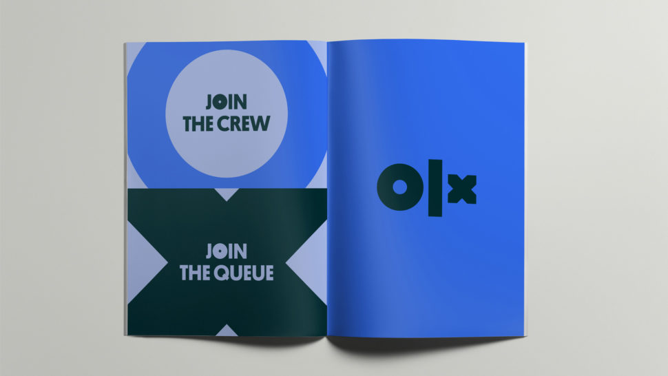
It has a very strong presence, and although the “L” is very thick and the “x” seems too small, I like it.
The fact that each letter is unique is a great representation of how everyone has different needs and that this app has been accommodated to fit the needs of every buyer.


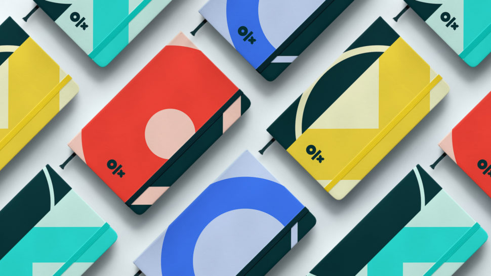
Overall, even though this new transformation may be a little bit all over the place and the ads don’t really explain what OLX actually stands for, it definitely was a step in the right direction.
The app was in need of some modernisation and that’s what they gave it.
With a few tweaks here and there, it could be the perfect fit for them.
What do you make of their new logo and platform?
Let us know in the comments.
Until next time,
Stay creative, folks!
Read More at OLX Gets A Brand New Logo and Platform Design
Early congratulations, A Book Apart! That’s a hell of a milestone. I’m quite sure I’ve read more A Book Apart books than any other tech book publisher.
Katel LeDu runs the ship over there, and she’s given me very special pack of discount codes that will get you my book, Practical SVG, for free. So now it’s my job to get you those codes. There are only 10 of them—not enough for everyone. So I’m going to do some low-down, dirty-rotten, absolutely-shameless cross-marketing: I’m going to give them to the first 10 people who are CodePen PRO who email me at chriscoyier@gmail.com. CodePen PRO is only $12/month if you pay monthly or $8/month if you pay yearly, and this discount code is worth $14, so in the end, you get both and save a few bucks. If you’re already PRO, cool, thanks, you still qualify.
You know what’s cool about Practical SVG? Even though I wrote it 4 years ago, SVG just doesn’t change that fast, so I’d say 90%+ I wouldn’t even change in a re-write. If you’re just learning about SVG as a front-end developer, it’s a fine choice.
In addition to my conniving scheme above, if you just really would like this book and have zero budget for it, or know someone else in that situation, you can also email me about that and we’ll work it out. I just may have a few copies around here I could get you. Hey, I’m trying to make money off you but I ain’t trying to lock away knowledge from anyone that really needs it.
The post A Book Apart Turning 10 appeared first on CSS-Tricks.
As a designer, we’re overloaded with choices every day, but there are some apps that are absolutely worth your time and investment.
Finding the best ones and most useful ones can be a difficult task, so we’re going to make things easy for you and give you our top 10 apps and websites we couldn’t live without.
So sit back, relax, eat your popcorn, and let’s get into this list.
Whether it’s for inspiration or it’s a useful tool that will make your life easier, we’re covering it today.
Let’s do it!
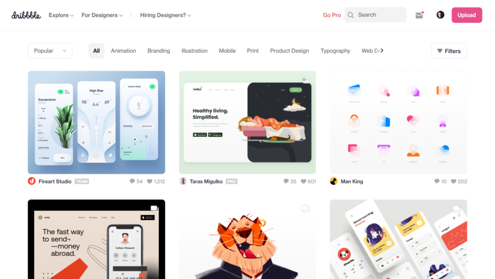
This one is probably obvious, because if you’re a designer, then you know Dribbble.
Type literally anything you’re looking for in the search bar and see what other creative people, like yourself, created and uploaded.
You can upload your own content to share and get exposure, or you can get inspiration for your next project.
You can also follow other designers and have an awesome feed page where you’ll find inspiration you didn’t even know you were looking for.
But we all know that if you’re looking for any type of graphic design inspiration you’re either going to come here or go to Behance. Which leads me to my next must-use design site.
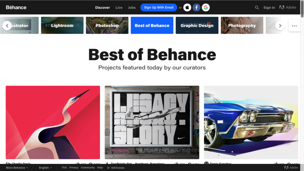
Another great platform where you can get incredible amounts of inspiration from is Behance.
You can also follow other designers and upload your own work there as well.
We recommend that you use both Dribble and Behance to make the most of your inspiration hunt.
And the other obvious ones, don’t sleep on Instagram or Pinterest either!

Adobe XD (and Adobe in general) might be the best thing that happened to designers, especially those that work with other designers.
You can literally work on the same project, in real time, and both make edits at the same time.
Adobe XD has everything you need for team projects. You can edit together, give feedback, work in real time, and everyone stays on the same page at all times.

As a designer, you have to make sure your work looks good across all devices.
That’s where Adobe Edge Inspect comes in.
All you need to do is pair your smartphone or tablet to your computer and you can see exactly what your designs will look like across devices.
With Adobe Edge inspect, you will be able to see real-time results from changes to HTML, CSS and JavaScript.
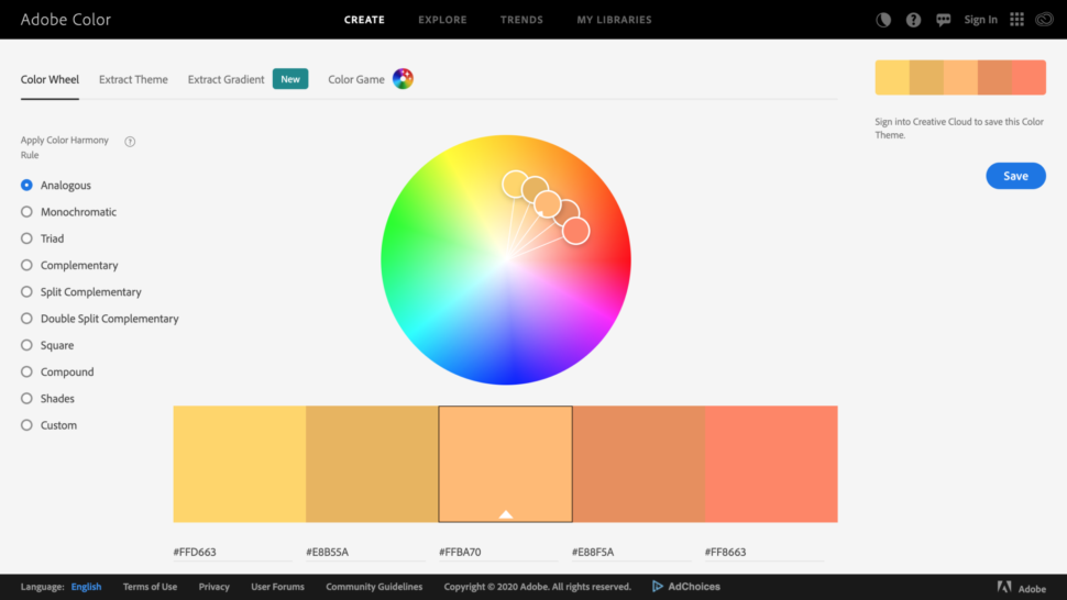
If you want to save time on finding quality color schemes that look bomb, then you’re going to want to get your hands on Adobe Color.
Create and save a color scheme that works for you.
Drag the pins around the color wheel and let Adobe work its magic for you.
If you can’t decide what apps you absolutely need and want to invest a lot of money into, well, you’re not alone.
One thing you could do is sign up for Adobe Creative Cloud.
Adobe Creative Cloud is a platform made for creators and artists.
You’ll get access to 20+ apps that will help you be the best artist you can be.
“Creative Cloud is a collection of 20+ desktop and mobile apps and services for photography, design, video, web, UX and more. Now you can take your ideas to new places with Photoshop on the iPad, draw and paint with Fresco, and design for 3D and AR. Join our global creative community — and make something better together.”
Start a free trial today, find out what you like, and invest in your future!
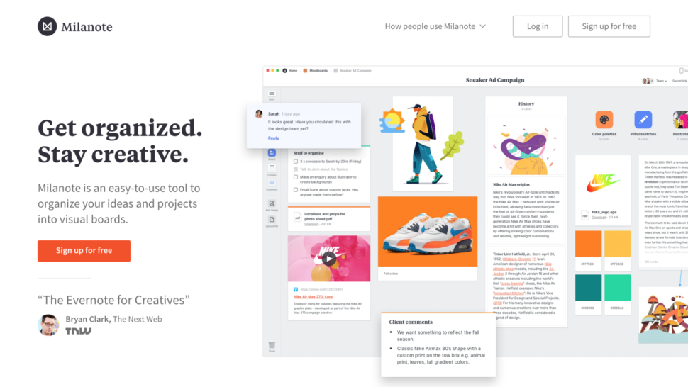
Milanote will help you stay creative and stay organized.
Yes, I totally believe that there is organization in chaos, but I also like to try to keep a tidy workspace, which equals a tidy mind.
With Milanote you can organize your ideas and projects into visual boards.
You can put all your ideas into one place, make a vision board, and invite your team to see it.
You guys already know that we are huge fans of Gal Shir here at Web Design Ledger.
If you don’t know about him and his work, we have an article where we featured him as Designer of the Week!
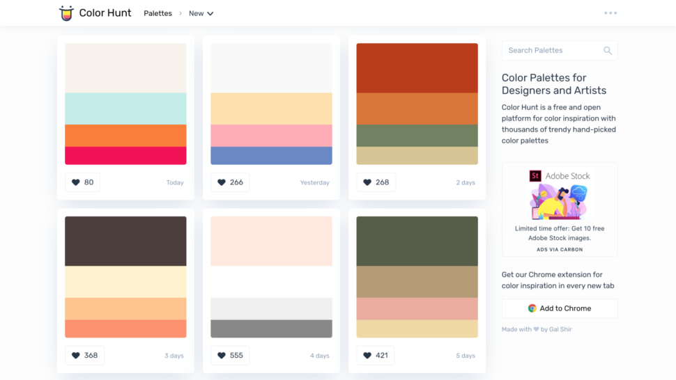
Anyway, he made this awesome free and open platform, called Color Hunt, where you can get color inspiration by going through thousands of trendy and hand-picked color palettes.
If you just scroll through, you’ll see tons of different, gorgeous color palettes, and I’m sure you’re bound to find the perfect one for you and your next project.
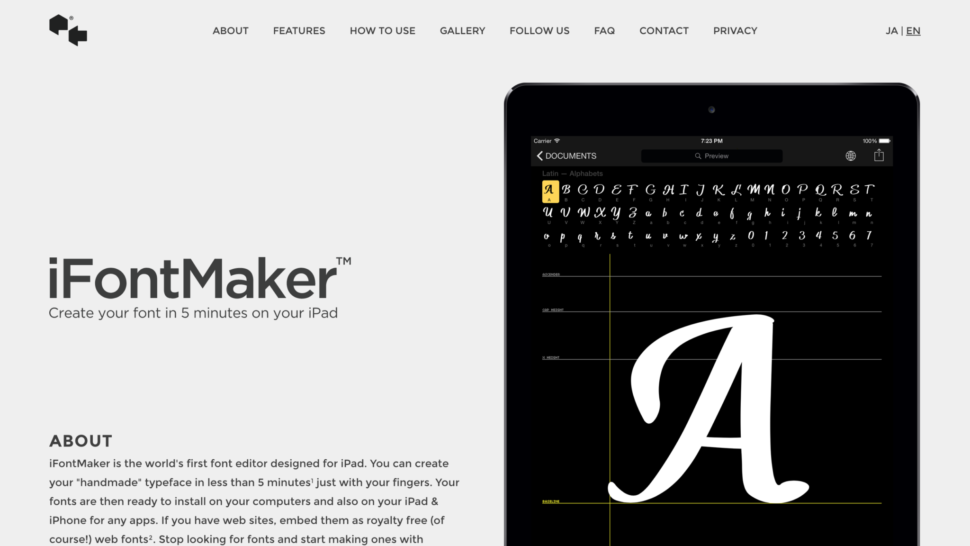
If you’re really looking for an original font, you might as well create your own.
If you have an iPad, then you need to get iFontMaker ASAP.
In just five minutes, you can create your own custom font.
You can be as crazy or as elegant as you want.
I think this is actually one of the coolest apps I’ve seen in a hot minute.
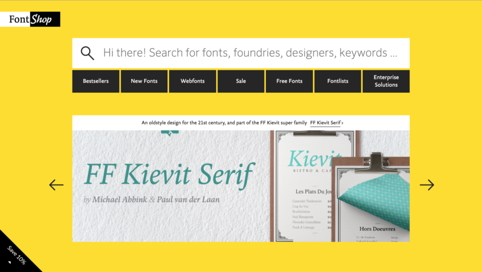
And finally, I present to you, the Font Shop.
If you feel like you can’t find the right font anywhere, try the Font Shop.
They have over 130,000 fonts! Which is quite frankly, insane.
If you’re looking for something classic, they’ve got it. Something funky? They got it.
Give it a go and see what you find!
Of course there are tons of apps that are absolutely essential for your work, and everyone’s list will be slightly different.
These were just a few of the apps I go back and forth with throughout the work day and thought I’d share to make your life a little bit easier.
Next week I’ll make another list if you guys are interested in seeing that, then stay tuned and keep checking back in on the blog.
What are you must-have design tools that you use on a daily basis that I didn’t cover?
Let me know in the comments.
Until next time,
Stay safe and stay creative, folks!
Read More at 10 Websites and Apps All Designers Should Be Using
2020-04-30T12:00:00+00:002020-04-30T13:10:47+00:00
It has been a month since we launched our first online workshop and, to be honest, we really didn’t know whether people would enjoy them — or if we would enjoy running them. It was an experiment, but one we are so glad we jumped into!
I spoke about the experience of taking my workshop online on a recent episode of the Smashing podcast. As a speaker, I had expected it to feel very much like I was presenting into the empty air, with no immediate feedback and expressions to work from. It turned out, however, that in some ways I felt more connected to the group by sharing my knowledge with a bunch of folks who were exactly in the same situation as me — at home trying to make the best of things!
I spoke to Vitaly about how he felt about leading a workshop online, and he also felt that everyone felt more equal, rather than having a teacher up on a podium. He also noted that we were able to see how global our audience is. Online workshops are more accessible to people who can’t travel even in normal times, and seeing everyone at home in their own environment really brought to life that we were working with folks from all around the world.
As a participant, there are definite advantages in attending a workshop from home. You have your own desk and usual setup, and space to spread out. And, given the workshop seating I’ve encountered in the past, most of you probably have a more comfortable chair. You can also rewatch the recording if you want to listen to an explanation again.
As we have now formalized our workshop process, I thought I’d share a little more about how these events run. Unlike in-person workshops where we keep you in a room for an eight hour day, we realized than many of you have a lot of other commitments right now. Perhaps you are also homeschooling your children, trying to keep up with work from home, and it’s hard to be sat in front of a screen working all day. So all of our workshops are split over multiple shorter sessions, so check each workshop description for the full details of days and times. We’ve had great feedback from attendees and speakers about this approach.
In addition to the presenter, there is always at least one other member of the team online, to help with any connectivity or other issues that you might have.
With so many conferences around the world being cancelled, I’m grateful to have virtually attended a very informative @smashingconf workshop for the past couple days. Even from home, the learning never stops. pic.twitter.com/K3pbJBNpof
— Gabriel Tan-Chen (@gabrieltanchen) April 15, 2020
We’ve chosen Zoom because they turned out to be the best compromise in terms of quality, reliability, and accessibility. You can customize your Zoom setup that works best for you. You can resize the windows of the shared screen and the speaker. You can pop out the chat. Whatever works best for you!
We record each of the sessions for attendees, so if you do miss a session you can catch up later. Or you can go back to check out a detail you want to confirm.
You can also join us in Slack, to chat during or after the workshop with fellow attendees.
We have also been using collaborative Google docs during the workshops for attendees to write down their own thoughts, resources, tips, and questions. It’s interesting to see people helping each other in those docs as well as posting questions for the Q&A.
A surprising thing for me about the online workshops was that I answered more questions than I do when I teach in-person. Each session has dedicated time for Q&A, and I did not expect to be able to fill 30 minutes, but could have easily been answering questions for longer.
Blown away by all the knowledge I’ve soaked in from @rachelandrew‘s online CSS layout masterclass. Incredible how much you can learn about a thing you thought you already knew just by hearing it explained again. Thanks for organising this @smashingconf #smashingconf ?
— waz.css (@camila_waz) April 15, 2020
We have an amazing line-up of folk coming to share their wisdom in this online format. There really is something for everyone. Many of the previous workshops sold out, and we have a hard limit on each one, so if you want to be there, please grab a ticket now.
May 7-22, Thu & Fri, 9–11:30 AM PDT
Resilient Web Systems with CSS & Sass with Miriam Suzanne.
Join Miriam for a deep-dive into the heart of CSS: how it works, what makes it special, and how we can harness it for resilient and maintainable design systems that scale. This workshop is spread over six days, 2h each day, with a huge amount to learn and take away.
May 12–26, Thu & Fri, 9–11:30 AM PDT
Smart Interface Design Patterns with Vitaly Friedman.
You’ll study 100s of hand-picked interface design examples in this one. We’ll be designing interfaces together, starting from accordions, to mega-drop-downs, sliders, feature comparisons, car configurators — all the way to timelines and onboarding. This workshop is spread over five days, 2.5h each day, with a huge amount to learn and take away.
May 28–12, Thu & Fri, 9–11:30 AM PDT
Web Performance Masterclass with Harry Roberts.
Over the course of several sessions, we’ll take a journey from the back-end to the front, auditing the performance of real websites. We’ll be plotting data and findings, making it compelling to clients and non-technical stakeholders; drawing up backlogs and hit-lists; hacking on fixes, improvements, and experiments; and learning a whole lot of obscure performance details on the way.
June 11-12, Thu & Fri, 10 AM – 12:30 PM CEST
CSS Layout Masterclass with Rachel Andrew.
Over two days learn the key skills you need to learn CSS Layout and put it into practice in your work. A mix of theory and pragmatic advice in terms of how to deal with browser support. This workshop is at an earlier Europe and Asia friendly time, so folk in those places don’t need to concentrate on Grid late at night.
Jun 16-30, Tue & Wed, 9–11:30 AM PDT
Front-End Accessibility Masterclass with Marcy Sutton.
By adopting an accessibility mindset and making improvements throughout the design and development process, we can truly make an impact in people’s lives. This workshop will cover how to approach accessibility with HTML, CSS, and JavaScript using modern tools and techniques to eliminate barriers to access in web projects.
Jun 18-26, Thu & Fri, 9–11:30 AM PDT
Building Modern HTML Emails with Rémi Parmentier.
Coding HTML emails is a beast of its own with lots of differences from coding web pages. This workshop will make you reconsider everything you know about coding HTML emails and hopefully make you love the craft.
We hope you’ll join us at one of the workshops. We’d also love to know which other workshop topics and speakers you would like to see online. about the workshops and sign up here.
 (ra, il)
2020-04-30T09:30:00+00:002020-04-30T13:10:47+00:00
Mirage JS is helping simplify modern front-end development by providing the ability for front-end engineers to craft applications without relying on an actual back-end service. In this article, I’ll be taking a framework-agnostic approach to show you Mirage JS models and associations. If you haven’t heard of Mirage JS, you can read my previous article in which I introduce it and also integrate it with the progressive framework Vue.js.
Note: These deep-dive series are framework agnostic, meaning that we would be looking at Mirage JS itself and not the integration into any front-end framework.
Mirage JS borrowed some terms and concepts which are very much familiar to back-end developers, however, since the library would be used mostly by front-end teams, it’s appropriate to learn what these terms and concepts are. Let’s get started with what models are.
Models are classes that define the properties of a particular data to be stored in a database. For example, if we have a user model, we would define the properties of a user for our application such as name, email, and so on. So each time we want to create a new user, we use the user model we’ve defined.
Though Mirage JS would allow you mockup data manually, using the Mirage Model class would give you a whole lot of awesome development experience because you’d have at your fingertips, data persistence.
Models wrap your database and allow you to create relationships that are really useful for returning different collections of data to your app.
Mirage uses an in-memory database to store entries you make using its model. Also without models, you won’t have access to associations which we would look at in a bit.
So, in order to create a model in Mirage JS first of, you have to import the Model class from Mirage JS like so:
import { Server, Model } from ‘miragejs'
Then, in our ‘Server’ options we use it as the following:
let server = new Server({
  models: {
    user: Model,
  }
Note: If you don’t know what Mirage JS server is, it’s how Mirage JS intercepts network requests. I explained it in detail in my previous article.
From the above, you could see we are creating a user model instance. Doing so allows us to persist entries for the said model.
To create new entries for our user model, you need to use the schema class like so:
let user = schema.users.create({name: “Harry Potter”})
Note: Mirage JS automatically pluralize your models to form the schema. You could also see we are not explicitly describing before-hand, the properties the user model instance would have. This approach makes for the rapid creation of entries and flexibility in adding fields for the said entries.
You’d most likely be creating instances of your model in the seeds() method of your server instance, so in that scenario you’d create a new user instance using the create() method of the server object like so:
let server = new Server({
  models: {
    user: Model
  },

  seeds(server) {
    server.create("user", { name: "Harry Potter" });
});
In the above code, I redundantly added the snippet for both the server and model creation as to establish some context.
To see a full working Mirage JS server see my previous article on the same subject or check this repo.
You could access the properties or fields of a model instance using dot notation. So if we want to create a new user instance for the user model, then use this:
let user = schema.users.create({name: “Hermione Granger”})
We can also access the name of the user simply by using the following:
user.name
// Hermione Granger
Furthermore, if the instance created has a relationship called ‘posts’ for example, we can access that by using:
user.posts
// Returns all posts belonging to the user
Let’s say you’ve created three instances of the user model and you want to find the first one you could simply use the schema on that model like so:
let firstUser = schema.users.find(1)
// Returns the first user
Mirage exposes a couple of useful properties on model instances. Let’s take a closer look at them.
associationsYou could get the associations of a particular instance by using the associations property.
let harry = schema.users.create({name: “Harry Potter”})
user.associations
// would return associations of this instance if any
According to the Mirage JS docs, the above would return a hash of relationships belonging to that instance.
We can also get all the fields or attributes of a particular instance by using the attrs property of a model instance like so:
harry.attrs
// { name: “Harry Potter” }
This method removes the instances it is called on from Mirage JS database.
harry.destroy()
This method returns true if the model has not been persisted yet to the database. Using the create method of the schema would always save an instance to Mirage JS database so isNew() would always return false. However, if you use the new method to create a new instance and you haven’t called save() on it, isNew() would return true.
Here’s an example:
let ron = schema.users.new({name: “Ronald Weasley”})

ron.isNew()

// true

ron.save()

ron.isNew()

// false
This is quite the opposite of the isNew() method. You could use it to check if an instance has been saved into the database. It returns true if the instance has been saved or false if it hasn’t been saved.
This method reloads an instance from Mirage Js database. Note it works only if that instance has been saved in the database. It’s useful to get the actual attributes in the database and their values if you have previously changed any. For example:
let headmaster = schema.users.create({name: “Albus Dumbledore”})

headmaster.attrs
// {id: 1, name: “Albus Dumbledore”}

headmaster.name = “Severus Snape”

headmaster.name
// Severus Snape

headmaster.reload()

headmaster.name

// Albus Dumbledore
This method does what it says which is, it saves or creates a new record in the database. You’d only need to use it if you created an instance without using the create() method. Let’s see it in action.
let headmaster = schema.users.new({name: “Albus Dumbledore”})

headmaster.id
// null

headmaster.save()

headmaster.name = “Severus Snape”
// Database has not yet been updated to reflect the new name

headmaster.save()
// database has been updated

headmaster.name

// Severus Snape
This method returns a simple string representation of the model and id of that particular instance. Using our above headmaster instance of the user model, when we call:
headmaster.toString()
We get:
// “model:user:1”
This method updates a particular instance in the database. An example would be:
let headmaster = schema.users.find(1)
headmaster.update(“name”, “Rubeus Harris”)
Note: The update() takes two arguments. The first is the key which is a string and the second argument is the new value you want to update it as.
Since we’ve now been well acquainted with Models and how we use them in Mirage JS, let’s look at it’s counterpart — associations.
Associations are simply relationships between your models. The relationship could be one-to-one or one-to-many.
Associations are very common in backend development they are powerful for getting a model and its related models, for example, let’s say we want a user and all his posts, associations are utilized in such scenarios. Let’s see how we set that up in Mirage JS.
Once you’ve defined your models, you can create relationships between them using Mirage JS association helpers
Mirage has the following associations helpers
hasMany()belongsTo()When you use either of the above helpers, Mirage JS injects some useful properties and methods in the model instance. Let’s look at a typical scenario of posts, authors, and comments. It could be inferred that a particular author can have more than one blog post also, a particular post can have comments associated with it. So let’s see how we can mock out these relationships with Mirage JS association helpers:
First import the belongsTo
import { Server, Model, belongsTo } from 'miragejs'
Next we create our models and use the extend method to add our relationships like so
new Server({
  models: {
    post: Model.extend({
      author: belongsTo(),
    }),

    author: Model,
  },
})
The above defines a to-one relationship from the post model to an author model. Doing so, the belongsTo helper adds several properties and methods to the affected models. Hence we can now do the following:
post.authorId // returns the author id of the post
post.author // Author instance
post.author = anotherAuthor
post.newAuthor(attrs) // creates a new author without saving to database
post.createAuthor(attrs) // creates a new author and save to database
This helper like its belongsTo counterpart needs to be imported from Mirage JS before use, so:
import { Server, Model, hasMany } from 'miragejs'
Then we can go on creating our to-many relationships:
  models: {
    post: Model.extend({
      comments: hasMany(),
    }),

    comment: Model,
  },
})
Like belongsTo(), hasMany() helper also adds several properties and method automatically to the affected models:
post.commentIds // [1, 2, 3]
post.commentIds = [2, 3] // updates the relationship
post.comments // array of related comments
post.comments = [comment1, comment2] // updates the relationship
post.newComment(attrs) // new unsaved comment
post.createComment(attrs) // new saved comment (comment.postId is set)
The above snippet is adapted from the well written Mirage JS documentation
Mirage JS is set out to make mocking our back-end a breeze in modern front-end development. In this first part of the series, we looked at models and associations/relationships and how to utilize them in Mirage JS. Stay tuned for the next parts!
2020-04-30T07:20:00+00:002020-04-30T13:10:47+00:00
May is here! And even though the current situation makes this a different kind of May, with a new routine and different things on our minds as in the years before, luckily some things never change. Like the fact that we start into the new month with some fresh inspiration.
Since more than nine years already, we challenge you, the design community, to get creative and produce wallpaper designs for our monthly posts. No matter if you’re into lettering, illustration, or photography, the wallpapers are an opportunity to create a small artwork and share it with people across the globe — to inspire them, to make them smile, or just to cater for some beautiful eye candy.
In this collection, you’ll find their wallpapers for May 2020. They come in versions with and without a calendar and can be downloaded for free. As a bonus goodie, we also added some favorites from our archives at the end of the post — because, well, some things are just too good to be forgotten. A big thank-you to everyone who participated this time around! Enjoy!
Did you know that you could get featured in one of our upcoming wallpapers posts, too? We are always looking for creative talent, so if you have an idea for a wallpaper design, please don’t hesitate to submit it. Join in! ?
“During the last few months we have experienced significant and profound changes in our lifestyle and work habits due to the pandemic. One of the most signifcant changes is how we relate to time. Our day to day blurs as we try to make the best of this situation while hoping for a better tomorrow. While working on my daily lettering practice, I lost track of time and thought what day is it today? From there, I wondered if it was today, yesterday, or tomorrow. The rest followed as I kept thinking how time and routine or the new routine of being home blurs the days for each of us.” — Designed by Alma Hoffmann from the United States.
“Spring is the most inspiring time of the year, so I’ve decided to create this wallpaper to celebrate this beautiful season.” — Designed by Hristina Hristova from Bulgaria.
“Spring is the season of new beginnings. I wanted to create something that represents what spring is to me. Right now the sky is full of birds flying and singing. I used that as inspiration for my wallpaper design.” — Designed by Raeanne Seliga from the United States.

“The promise of the return of spring feels normal in our new strange and abnormal world.” — Designed by Jeffrey Berg from the United States.

Designed by Ricardo Gimenes from Sweden.

“Let’s try to make the best of this situation and have a laugh every now and then!” — Designed by Westie Vibes from Portugal.

“Unfortunately, this sunny May, we have to think about some things that keep us from enjoying the sun-bathed spring with our loved ones. That is why the theme of this month’s wallpaper is the social distancing that will help us save our Castle Earth from the ferocious dragon that is Coronavirus. Stay safe and healthy and enjoy spring responsibly.” — Designed by LibraFire from Serbia.

“There’s never been a more important time to recognize and pay thanks to the incredible job that nurses do day in and day out. They are at the frontline of keeping us all safe. We pay thanks and solute you heroes!” — Designed by Ever Increasing Circles from the United Kingdom.

“As the world is facing time self-quarantining, everyone is facing changes. Your body is taking care of you, as it always has and always will. Sometimes, I need to remind myself to love my body. But it’s important, now and always to love yourself. I designed this wallpaper as a reminder to continue loving yourself and spread the message about body positivity.” — Designed by Autumn Bohner from the United States.

“Green is the color of hope and hope is what we need in these troubling times. I’m a Belgian mobile game designer and this design comes from my latest mobile puzzle game.” — Designed by Bart Bonte from Belgium.

Some things are just too good to gather dust somewhere down in the archives. So may we present: a selection of May favorites from past years. Maybe you’ll spot one of your almost-forgotten favorites in there, too? (Please note that these designs don’t come with a calendar.)
Designed by Julia Versinina from Chicago, USA.

“We don’t usually count the breaths we take, but observing nature in May, we can’t count our breaths being taken away.” — Designed by Ana Masnikosa from Belgrade, Serbia.

“I wanted to make a big painterly vista with some mountains and a deck and such.” — Designed by Mike Healy from Australia.

“Springtime, especially Maytime is my favorite time of the year. And I like popsicles — so it’s obvious isn’t it?” — Designed by Steffen Weiß from Germany.

“The ‘lily of the valley’ came earlier this year. In France, we celebrate the month of May with this plant.” — Designed by Philippe Brouard from France.

“A little-known ‘holiday’ on May 4th known as ‘Bird Day’. It is the first holiday in the United States celebrating birds. Hurray for birds!” — Designed by Clarity Creative Group from Orlando, FL.

Designed by Amanda Focht from the United States.

“May is the last month of spring, the weather is getting hotter every day and it starts to feel almost like summer… So, the best thing to cool ourselves and bring summer closer is to… welcome May with an ice cream!” — Designed by WebOlution from Greece.

“Sunsets in May are the best way to understand who you are and where you are heading. Let’s think more!” — Designed by Igor Izhik from Canada.

Designed by Nathalie Ouederni from France.

“Yoda is my favorite Star Wars character and ‘may’ has funny double meaning.” — Designed by Antun Hirsman from Croatia.

“Winter is nearly here in my part of the world and I think rainy days should be spent at home with a good book!” — Designed by Tazi Design from Australia.

“This month is dedicated to flowers, to join us and brighten our days giving a little more color to our daily life.” — Designed by Verónica Valenzuela from Spain.

“We recently changed our workplace and now we’re in a windy place, so we like the idea of flying in the air, somehow.” — Designed by Monk Software from Italy.

“April and May are usually when everything starts to bloom, especially the magnolia trees. I live in an area where there are many and when the wind blows, the petals make it look like snow is falling.” — Designed by Sarah Masucci from the United States.

Designed by Elise Vanoorbeek from Belgium.
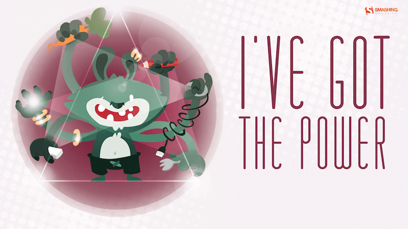
Designed by Uxue Goikoetxea from Spain.

“A fear I need to conquer inspired this wallpaper design. I never really liked the ocean because of how much we don’t know about it or anything that lives in it. However, I have decided to try and focus on the beautiful parts of this great unknown by choosing an octopus.” — Designed by Alexandra Covaleski from the United States.

Please note that we respect and carefully consider the ideas and motivation behind each and every artist’s work. This is why we give all artists the full freedom to explore their creativity and express emotions and experience throughout their works. This is also why the themes of the wallpapers weren’t anyhow influenced by us but rather designed from scratch by the artists themselves.
Thank you to all designers for their participation. Join in next month!
Every second Tuesday, we send a newsletter with useful techniques on front-end and UX. Subscribe and get Smart Interface Design Checklists PDF in your inbox.
Front-end, design and UX. Sent 2× a month.
You can always unsubscribe with just one click.