We Redesigned Web Design Ledger – Here’s It Is!
The news is true, we completely redesigned the best blog in the world, Web Design Ledger!
Okay, maybe we’re a little bit biased, but there’s no denying that the new web design layout is amazing.
We are so excited to show you guys the finished product.
Let me just hit you with the most satisfying before and after ever.
Before…
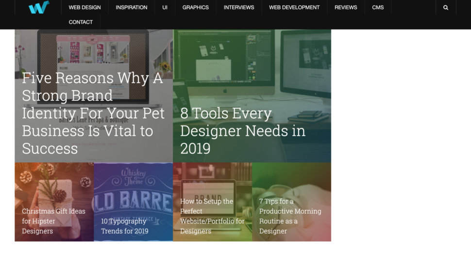
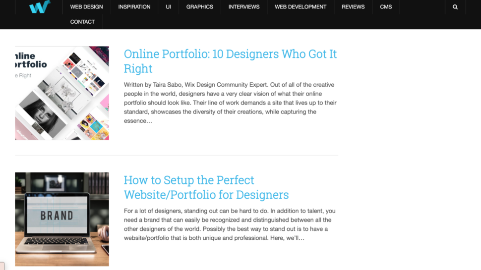
After!
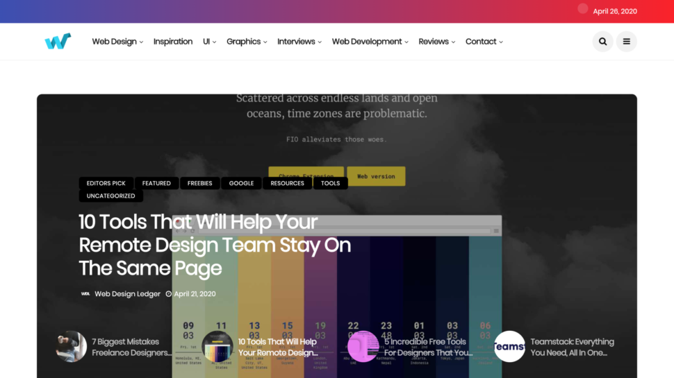
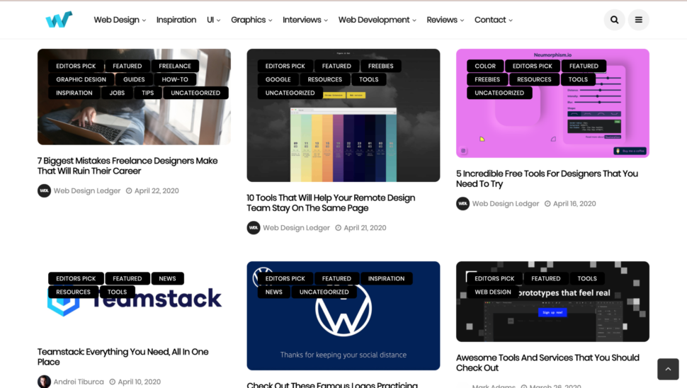
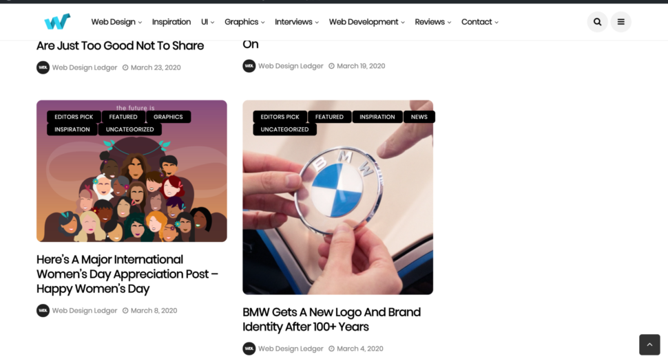
Amazing, right?!
With this new era and new decade that we’ve come into this year, we wanted to bring our design blog along with it and let it go through a major change.
We really wanted it to symbolise a new design era.
It was about time our blog got a facelift, and we’re obsessed with it.
Everything is minimal and has soft edges, and what I’m really thrilled about is that gradient bar at the top of the home page.
Our blog is easier to browse through now than ever and it just has an all-around crisp and fresh vibe to it.
We’ve been working on this design for a long time now, and we couldn’t be happier for you guys to see it.
The old design was great too, but it was time for the old design to retire and for the new design to have its moment and really flourish.
We hope that the rest of this year will be full of exciting things and new changes.
We’re excited to be alongside you through this year and see what it all has to offer.
I know we’re all going through a strange time right now, but together, we’ll pull through this and come out newer and better than ever.
Just like our new design 
What do you guys think of the new design?
Let us know in the comments!
Until next time,
Stay safe and stay creative, folks!
Read More at We Redesigned Web Design Ledger – Here’s It Is!