20 Best New Websites, April 2020
In April’s 20 Best New Websites roundup we’ve got some awesome examples of current design trends, and one or two sites that have struck out in their own direction. There’s an experimental typeface, a museum making perfect use of video, and lots of large type. But the two dominant themes are lots of color, and lots of transitions. Enjoy!
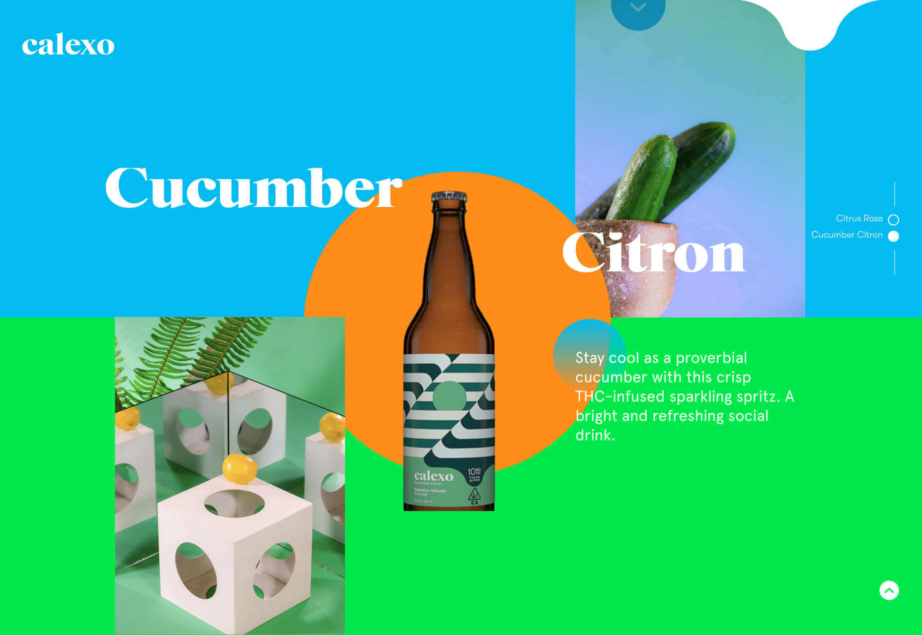
Calexo
This incredible site for THC-infused beverages from Calexo, is bursting with color, and positivity. We absolutely love the animated hamburger menu that seems to embody the spirit of the product.
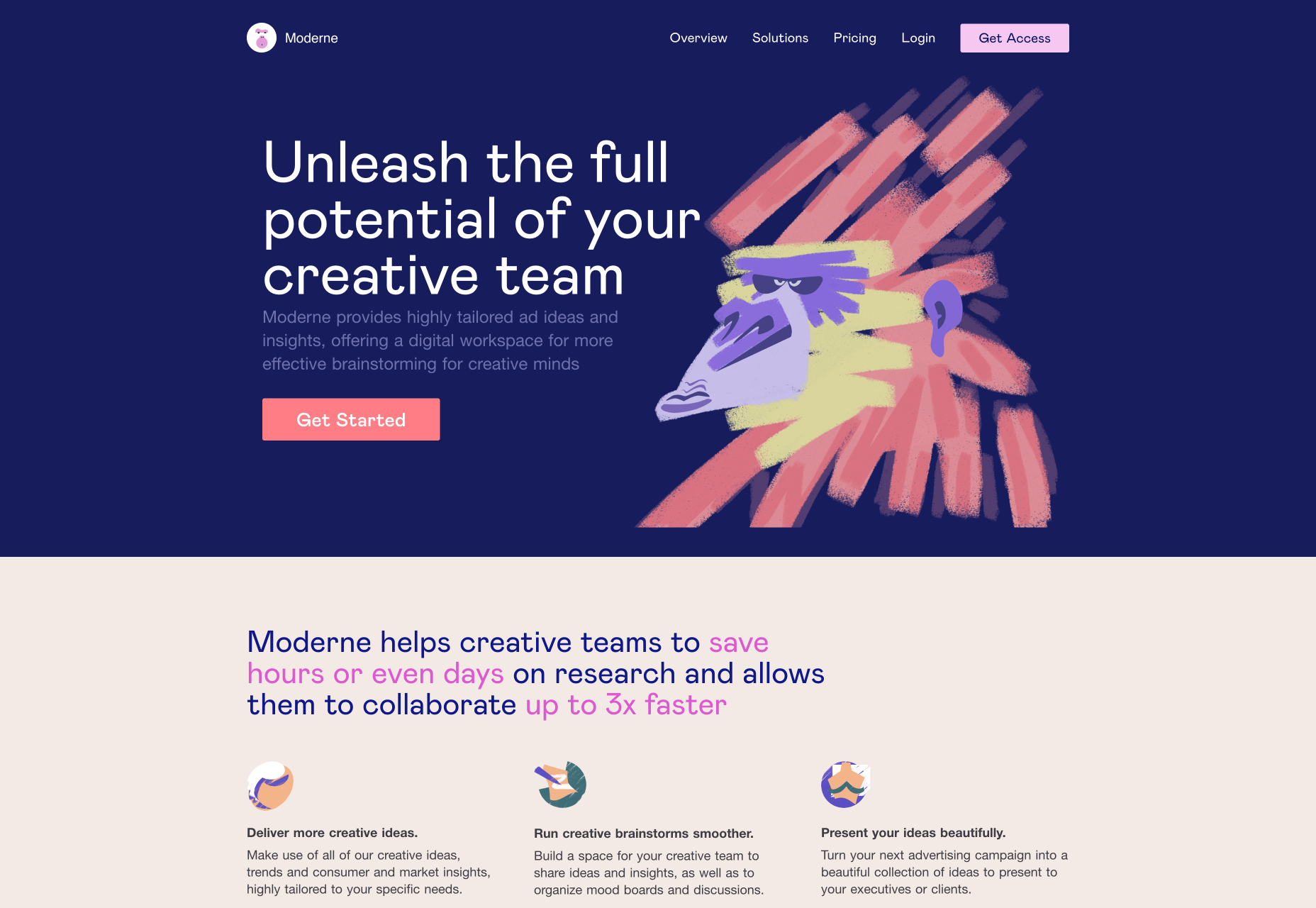
Moderne
Illustration has been a huge trend for the last couple of years, what we love about Moderne’s approach is that it’s embraced the trend, but adopted a completely unique style of illustration that’s certain to spark a trend of its own.
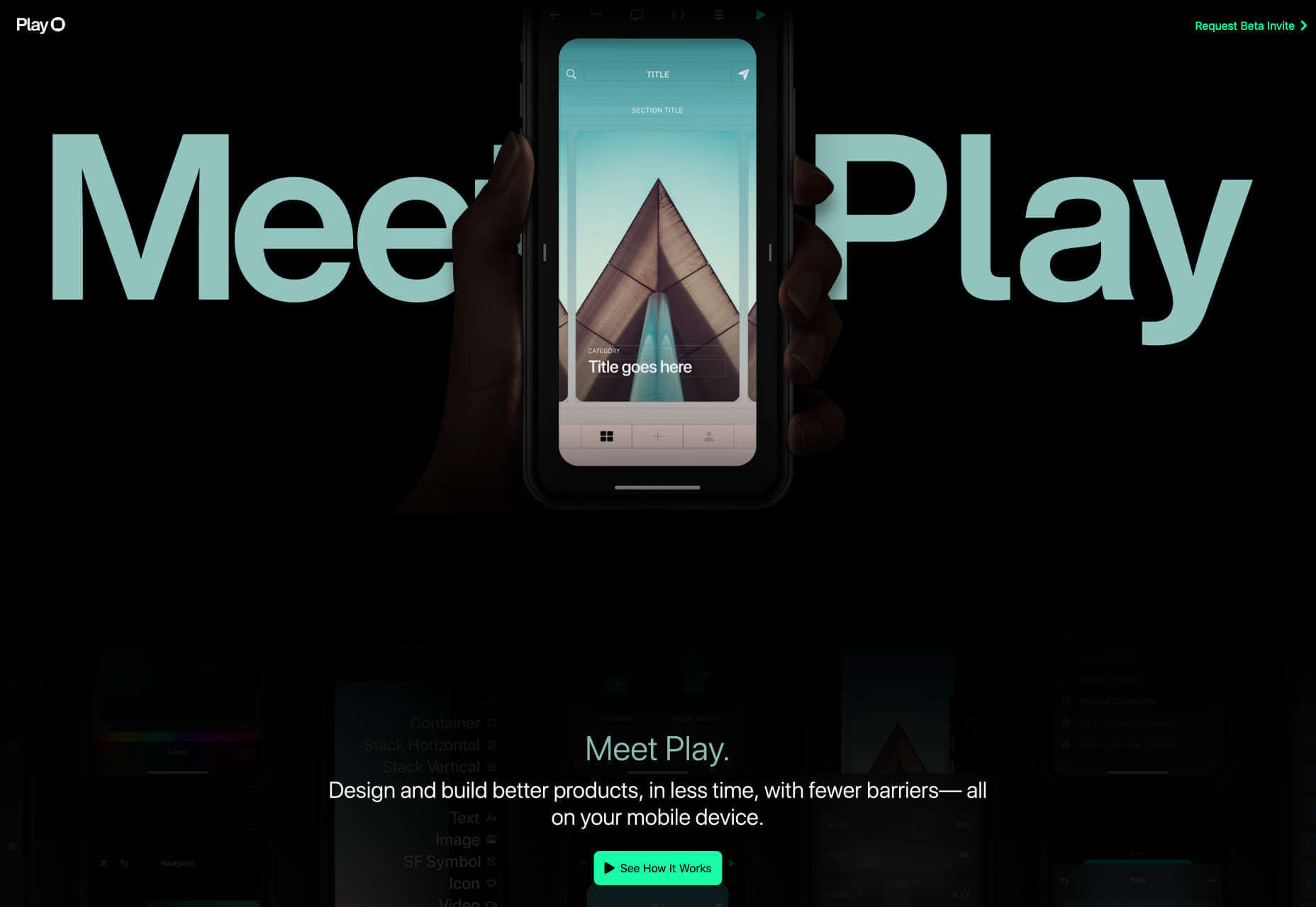
Play
Play is a new app for designing experiences on your phone instead of your desktop. Its site features some awesome, atmospheric product demos, with beautifully shot hand overlays.
bored.solutions
If you’re stuck in lockdown thanks to the coronavirus, or just at a loose end, you’ll appreciate the bored.solutions site which styles a simple collection of links with amazing color blobbing.
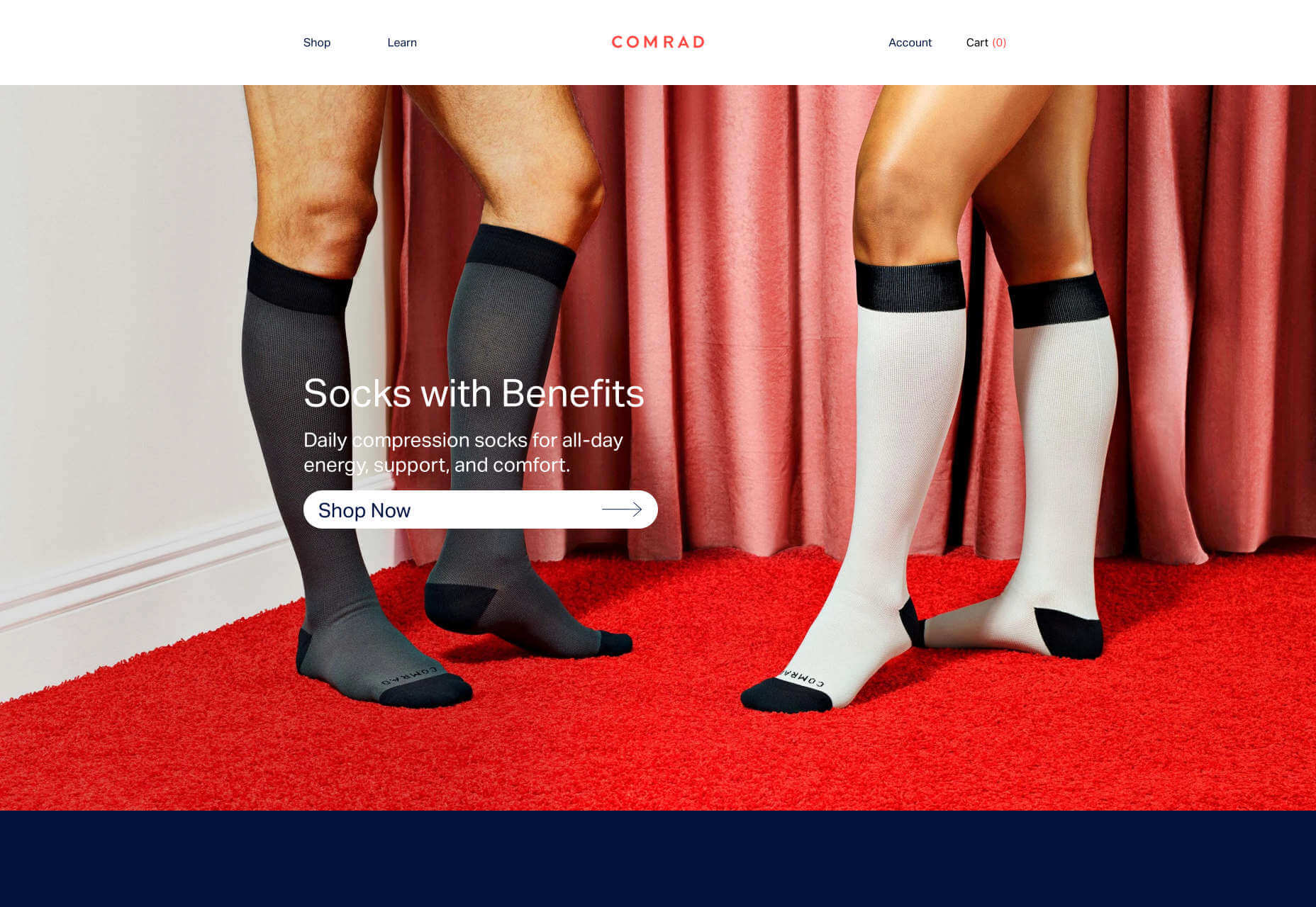
Comrad
It’s pretty hard to enthuse about socks, especially as compression socks aren’t the sexiest option, but Comrad’s site does the job perfectly. And check out the social proof, a 3-times Olympic champion no less.
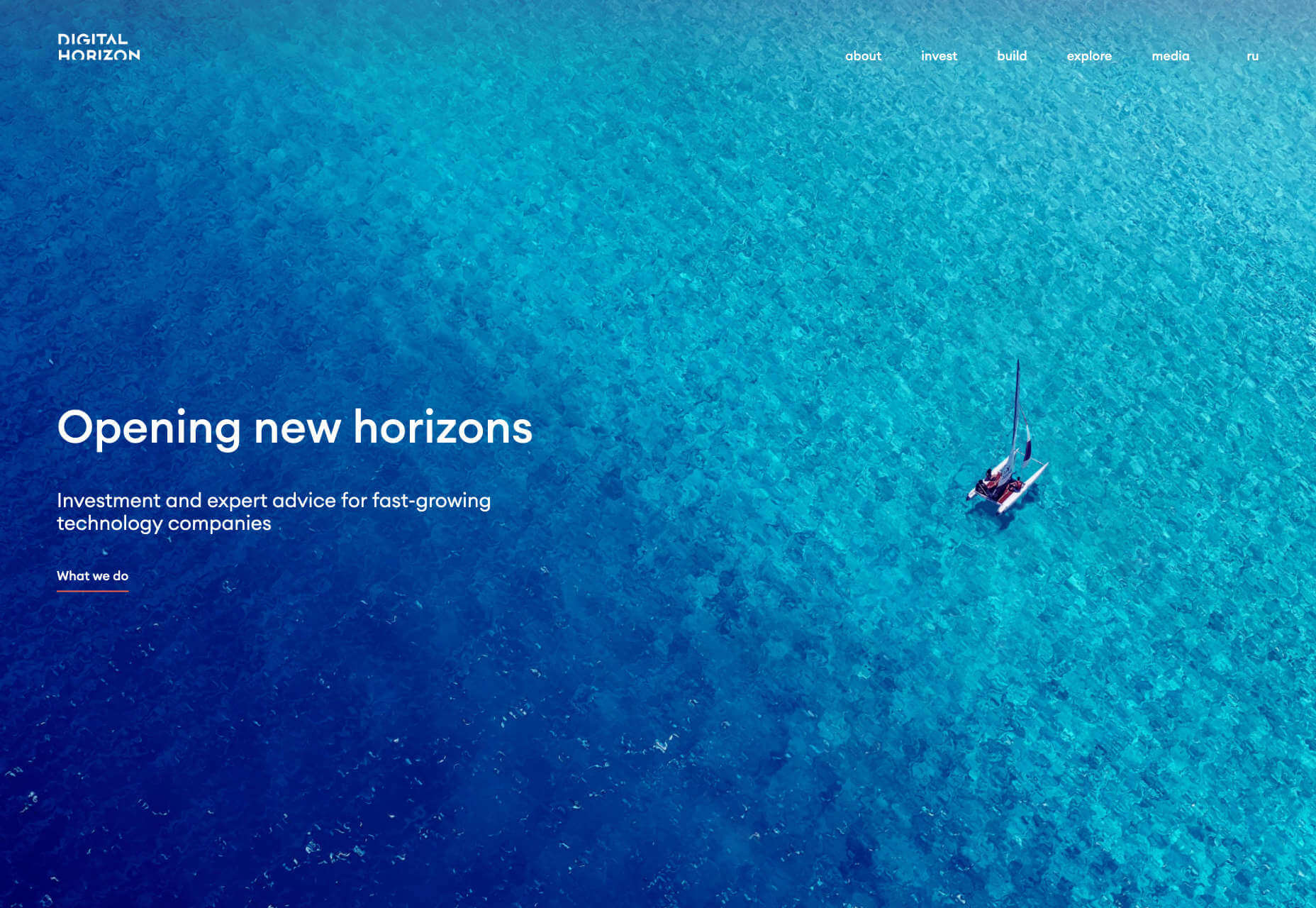
Digital Horizon
Digital Horizon is a venture capitalist investment fund. Its site has some nice slick text transitions, but what really stands out is the incredible use of the animated liquid effect to bring its huge hero image to life.
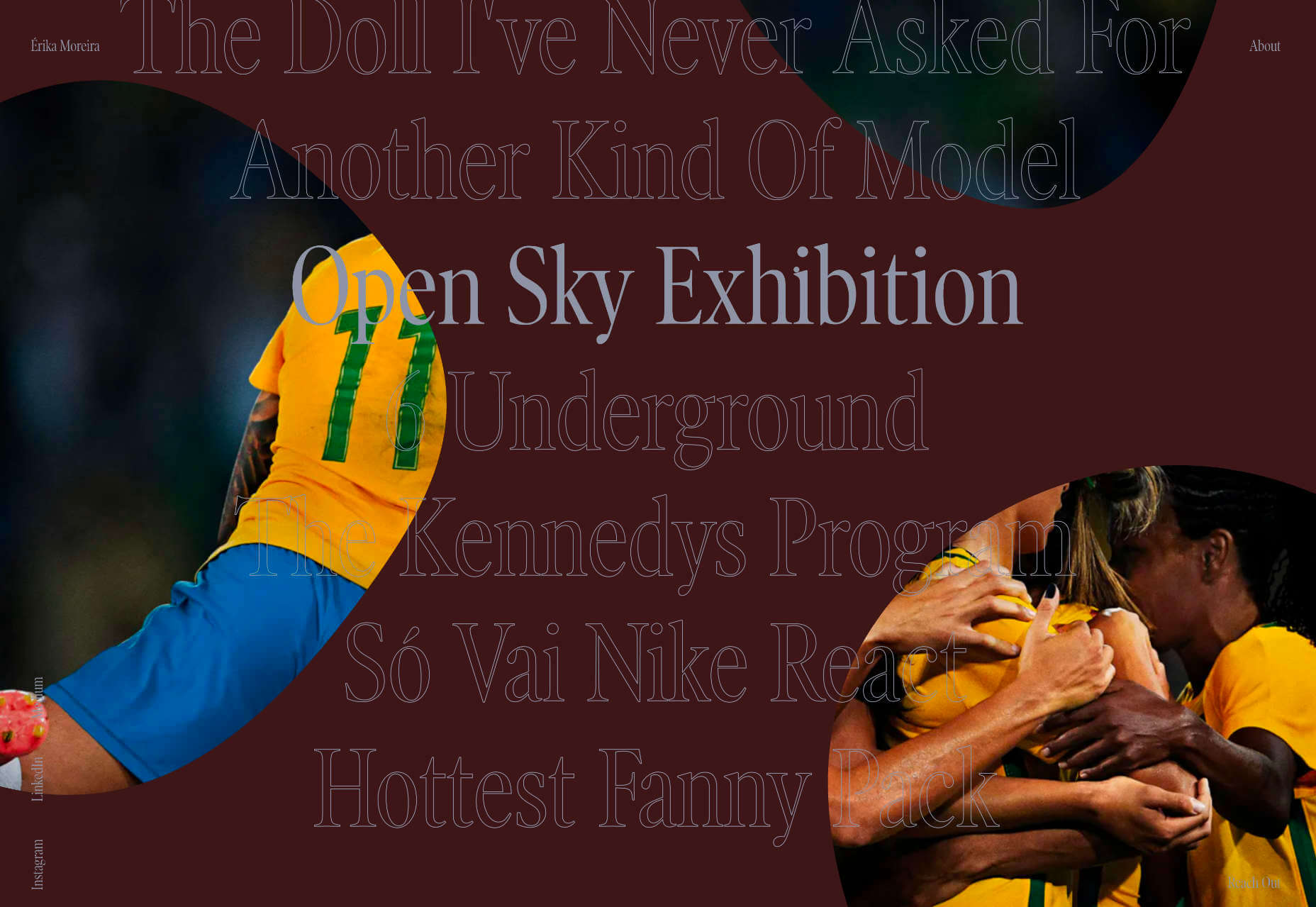
Érika Moreira
This is a fabulous, simple site for Sao Paulo-based copywriter Érika Moreira. We love the big type, and the creative use of case studies. It’s tough to produce a great portfolio for a writer but this is definitely an awesome example.
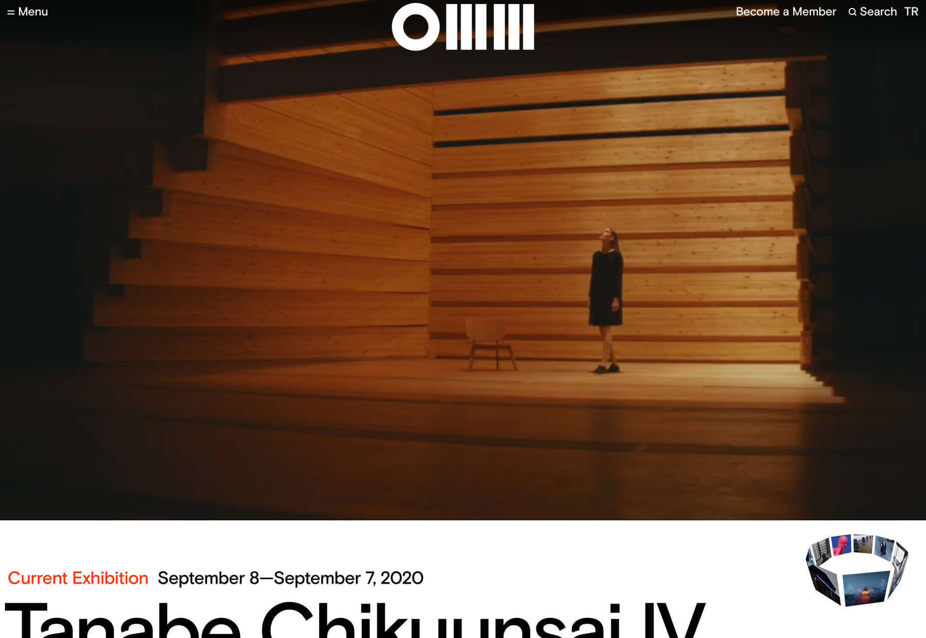
Odunpazar? Modern Museum
Set mid-way between Ankara and Istanbul, in Turkey, is Odunpazar? Modern Museum, a modern art gallery that expertly uses video to convey the experience of visiting the current series of exhibits.
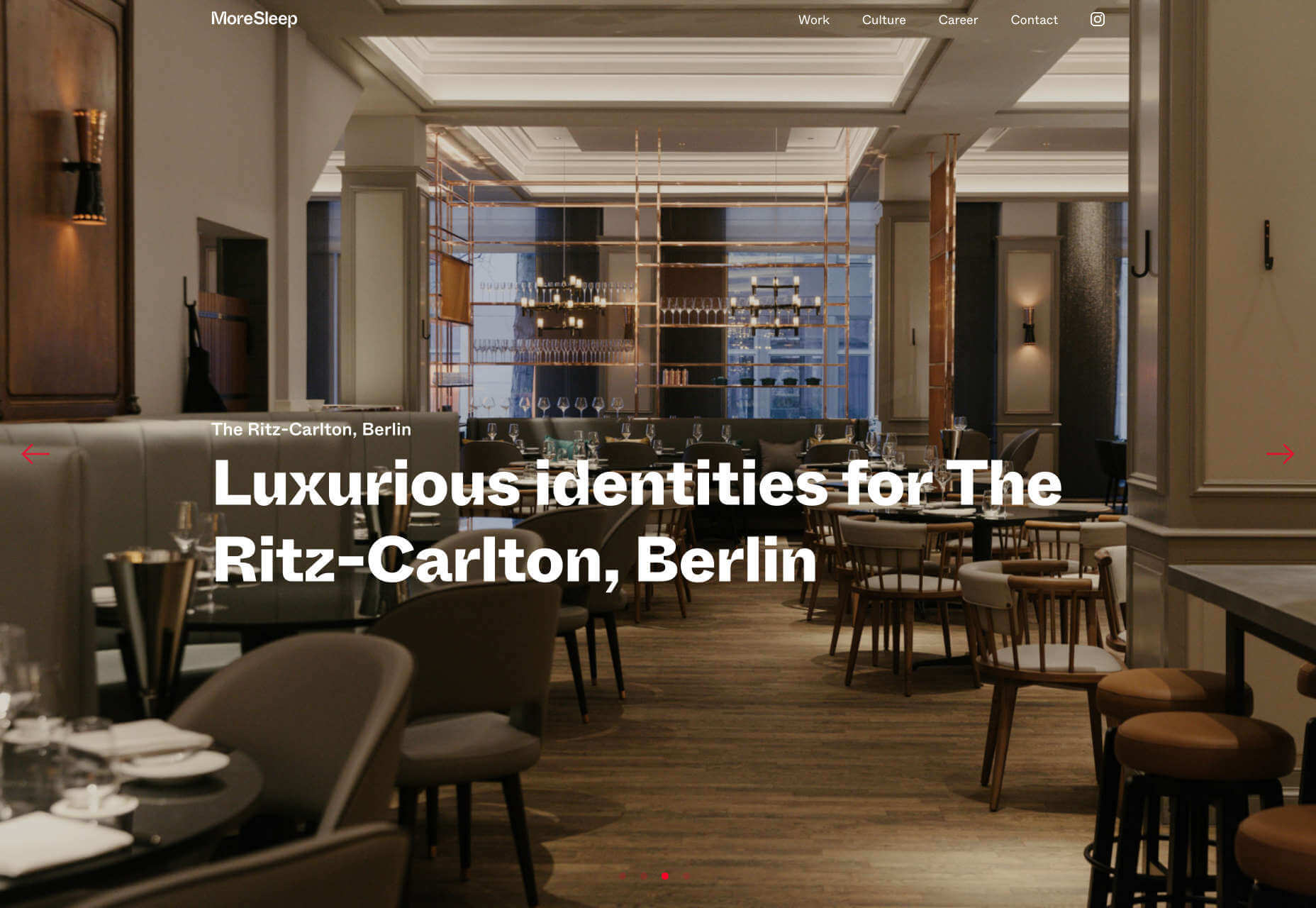
MoreSleep
MoreSleep is a Berlin-based agency, with a presence in LA; Its branding makes fascinating use of some exaggerated ink traps, and we love the animated scribble hover states of the links.
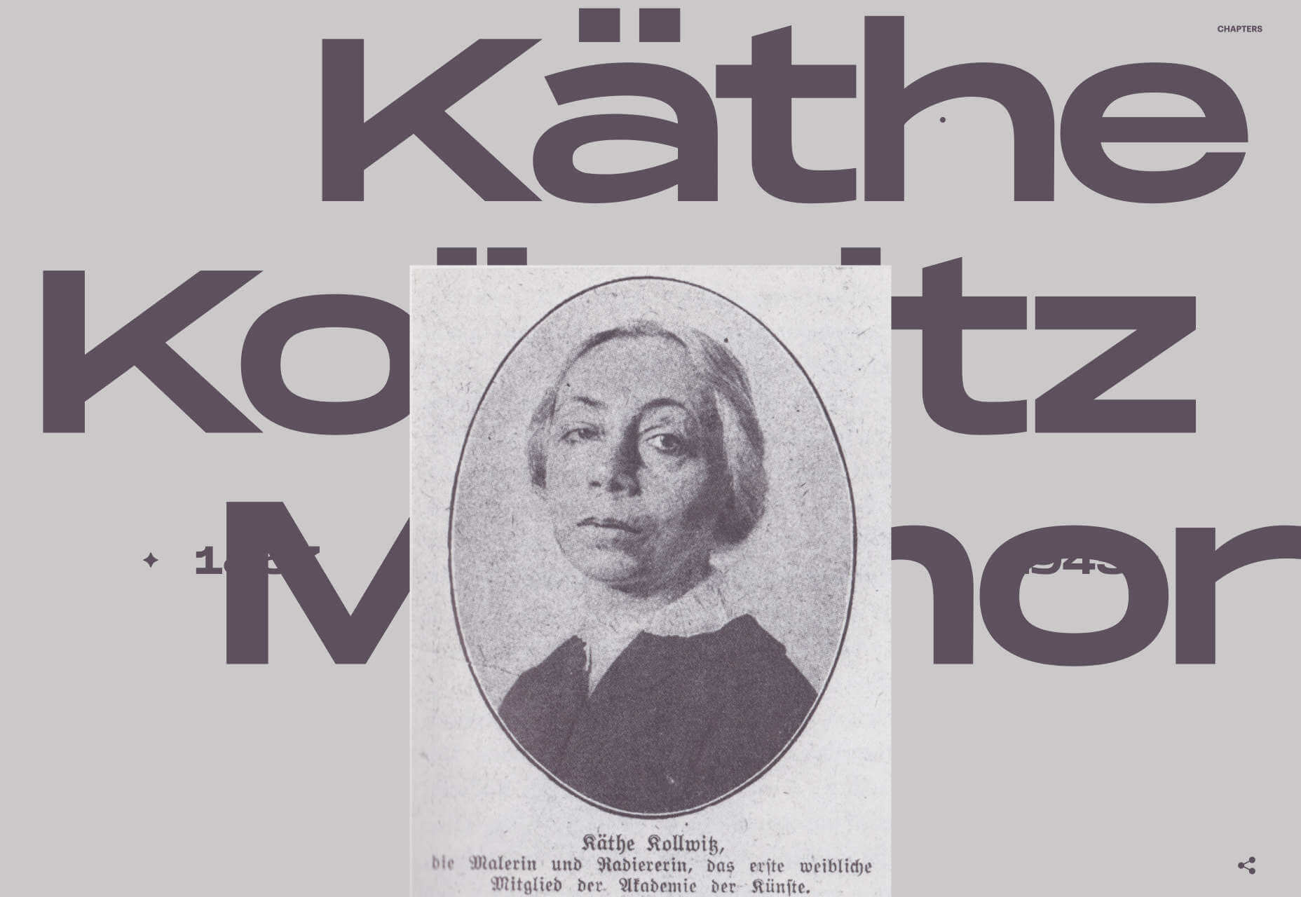
Käthe Kollwitz Memorial
The Käthe Kollwitz memorial site is a tribute to the life and work of the Expressionist printmaker. The site features stunning examples of her work, presented alongside large type and splash style color transitions.
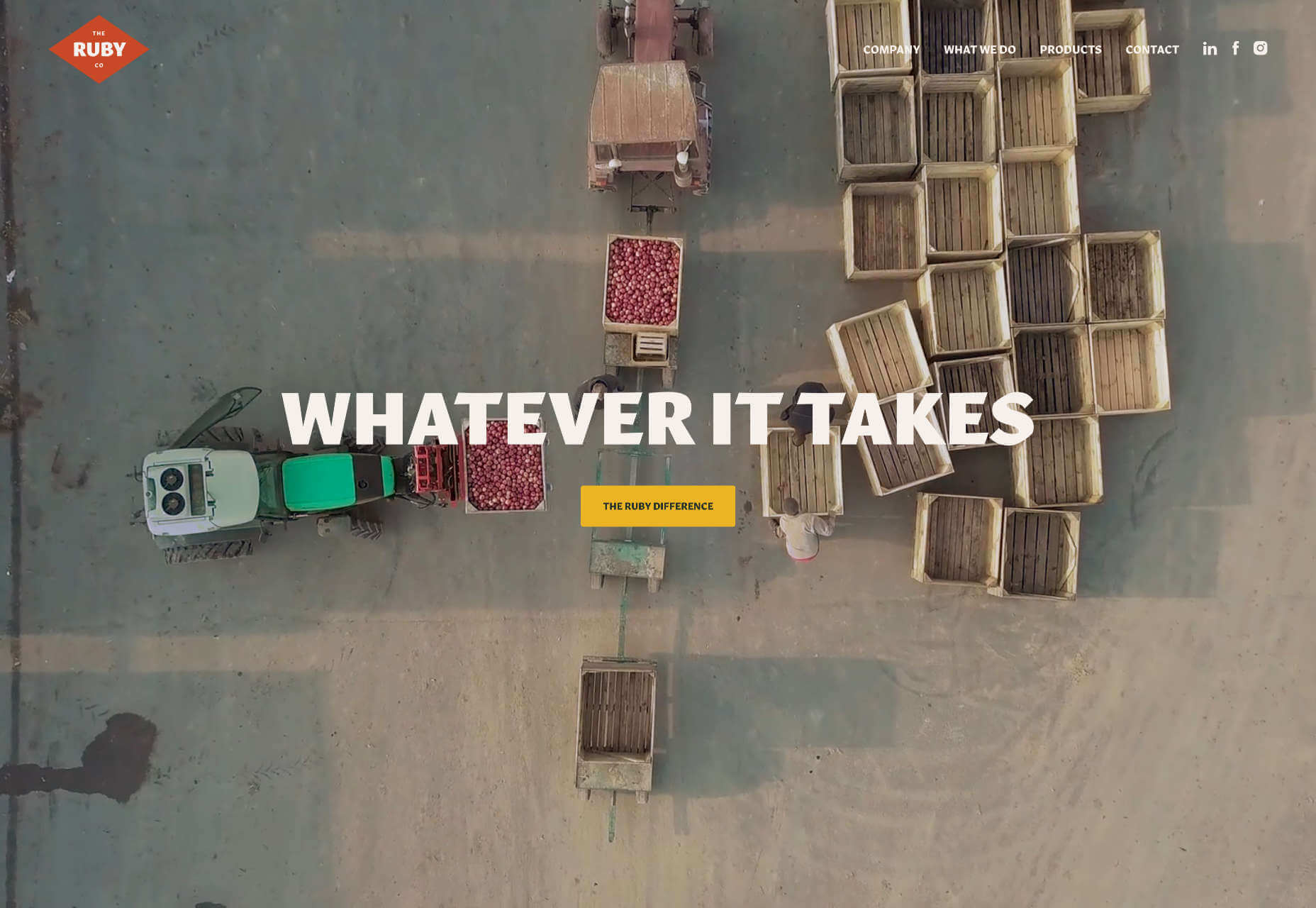
The Ruby Company
Blending video, photography, and some woodcut-style illustrations, The Ruby Company’s site conveys a sense of rising to the challenge, with positivity and some excellent UX writing.
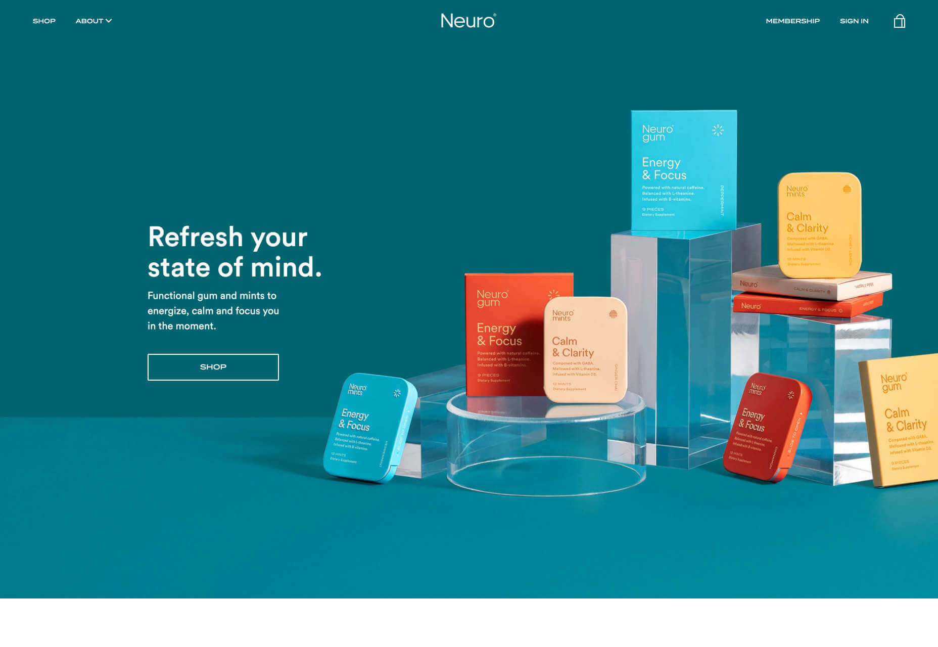
Neuro
Neuro sells gum and mints with a hint of caffeine to help you stay calm and focussed. Its modern brand, with bold warm colors, and simple typography, is perfectly pitched for the millennial market.
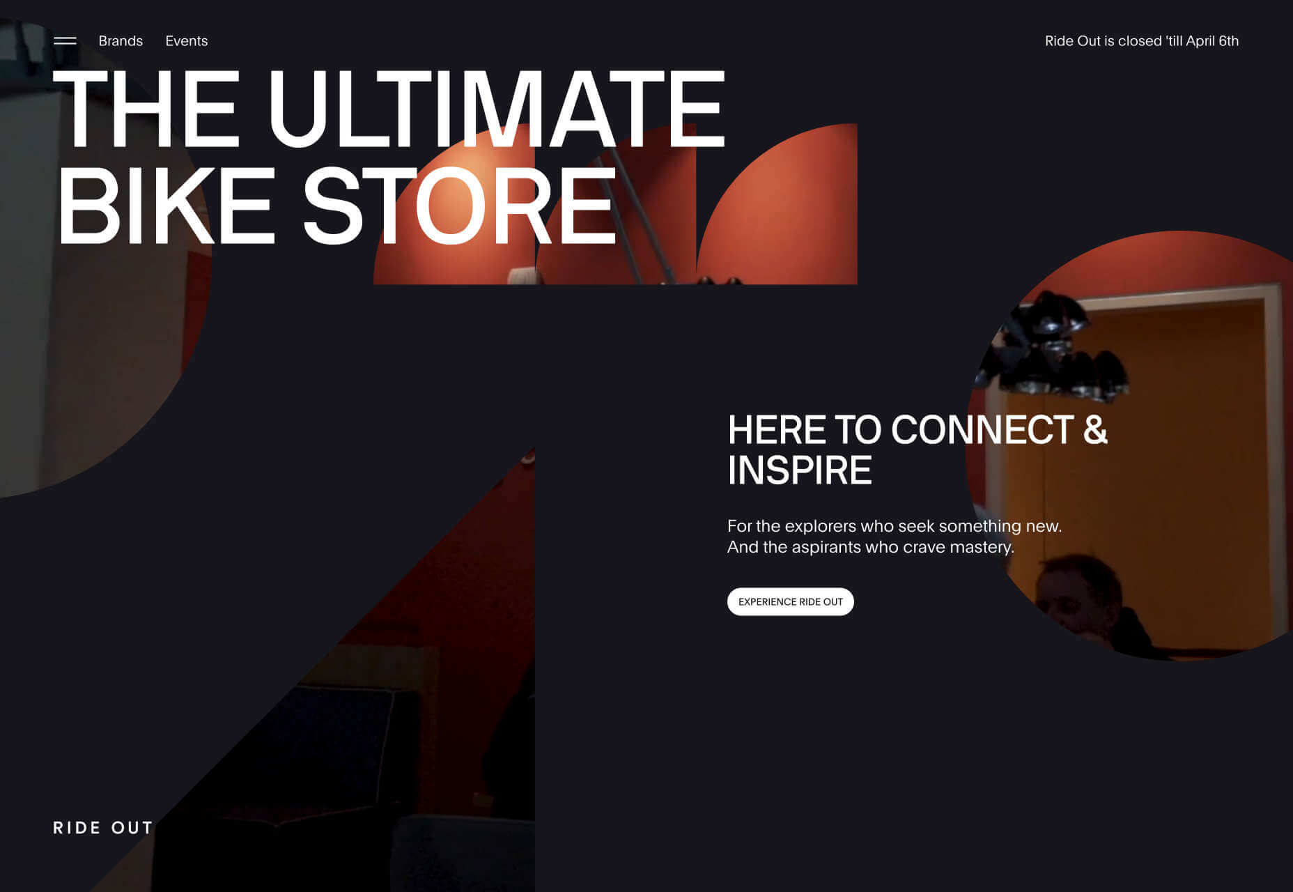
Ride Out
The intriguingly masked video that introduces us to Ride Out, Amsterdam’s ultimate bike store, does so much to tease the in-store content. And we love the wheel inspired spinning links.
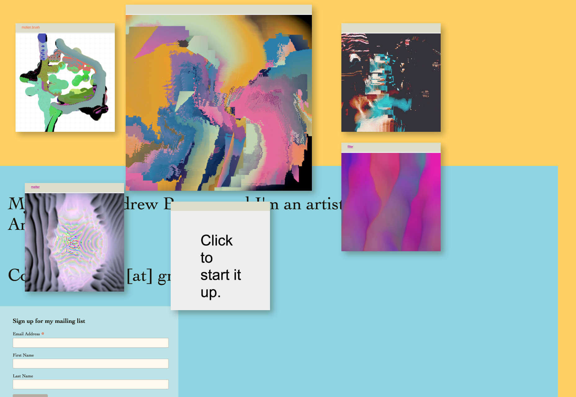
Andrew Benson
Andrew Benson’s site is a crazy single-page site with color, motion, energy, and creative coding. He’s come up with the kind of personal site we loved 20 years ago.
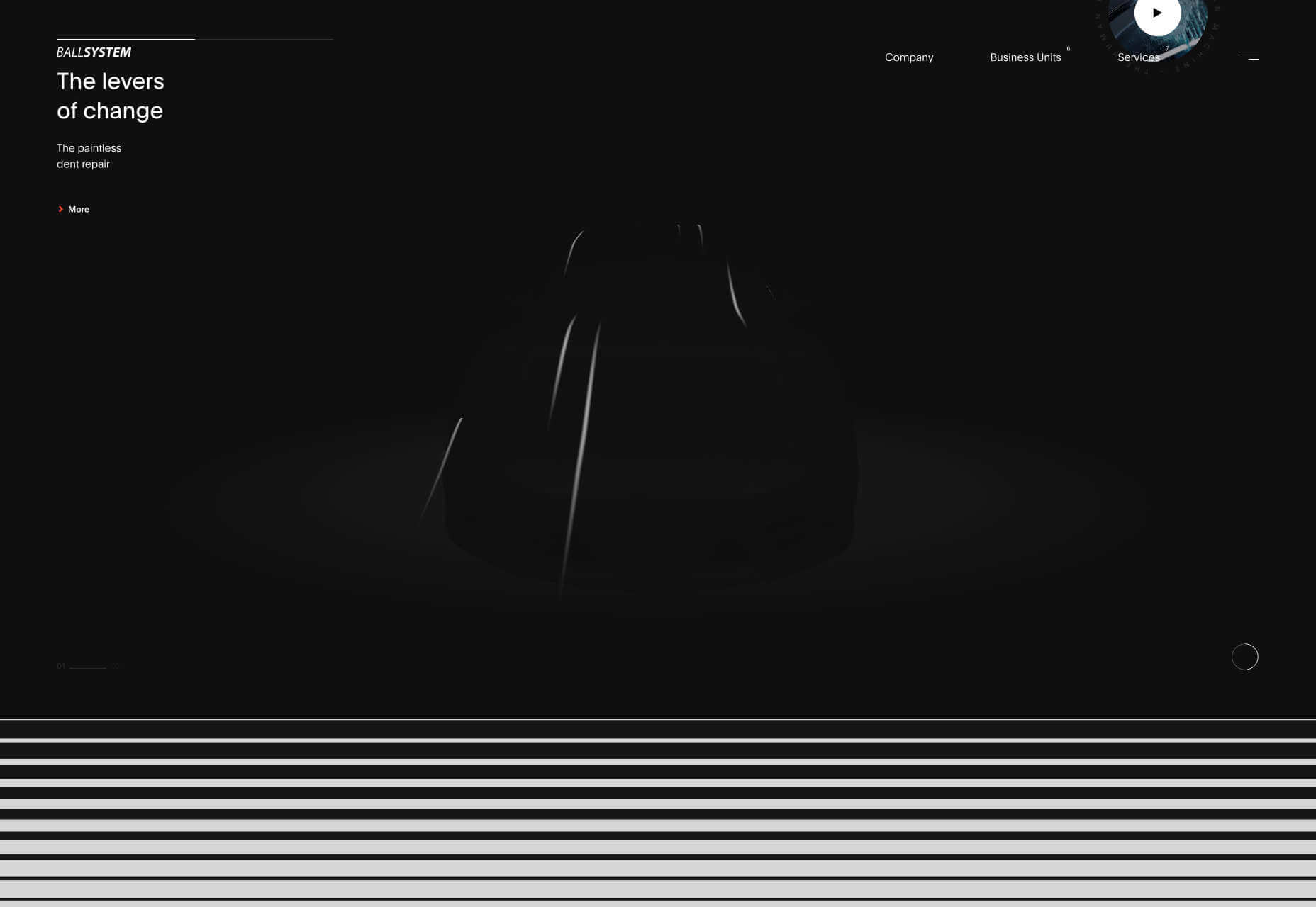
Ballsystem
Ballsystem is an Italian company that smooths out dents in vehicle bodywork. What we love about this site is that every transition, state change, and animation is super smooth, mimicking the company’s product.
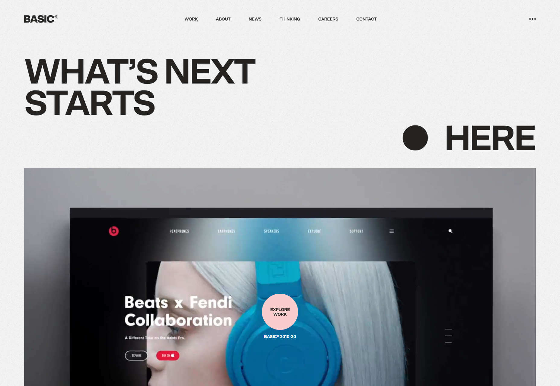
Basic
Basic is a West-coast experience design and branding agency with an exceptional site. There’s awesome attention to detail, from the barely-noticeable glitch effect in the background, to the graceful state transitions.
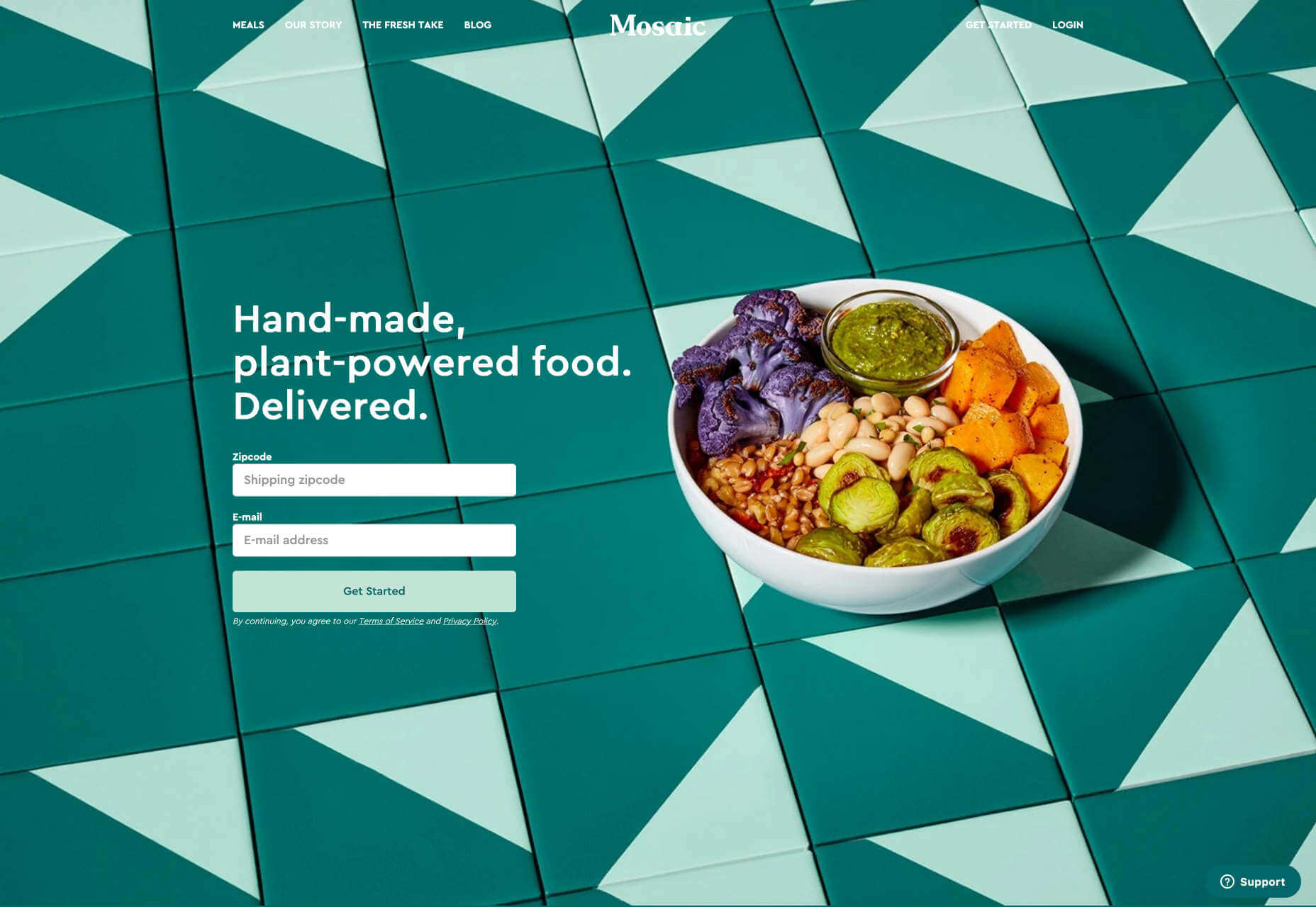
Mosaic Foods
Any food site needs to have great photography, which Mosaic achieves, but we’re also fans of the organic, natural-feeling shapes and colors, and the carefully considered user experience.
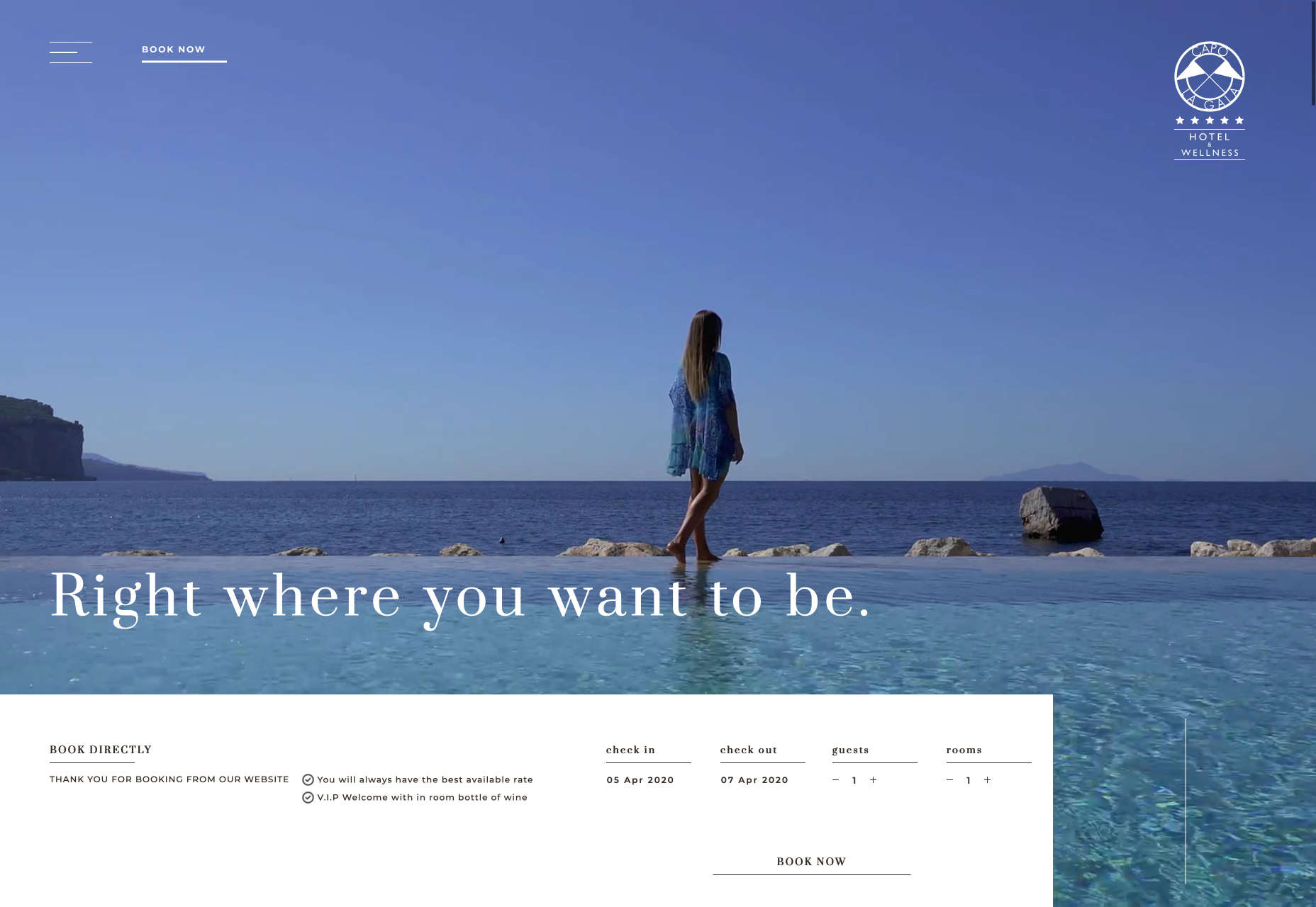
Capo La Gala
The site for Capo La Gala perfectly captures the glamor and light of the Gulf of Naples. With views to both Capri and Vesuvius, the site makes great use of photography combined with video.
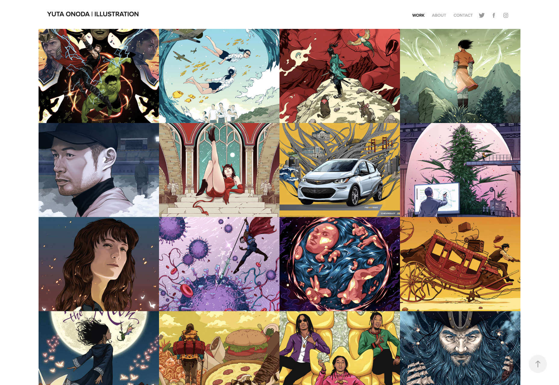
Yuta Onoda
The real strength of Yuta Onoda’s site is having the confidence to present such great work, in such a simple format. It’s a fantastic example of invisible design, and less is more.
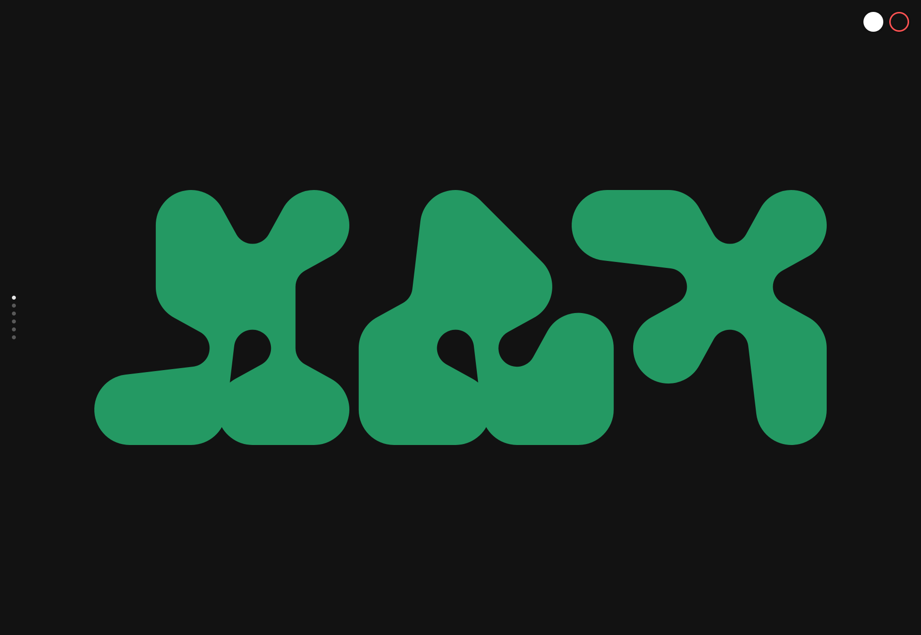
Max
Max is an experimental typeface that would be perfect for somebody’s branding project. It’s a variable font, and the promotional site is a fun digital playground. This is one time when a dark mode option really does help.