Timing is everything. Not just in movies but everywhere.
An employee survey is a powerful tool for employers and management. Transforming the company culture and enhancing employee experience is now taking the centre stage in the business world. The only way to nurture a good organizational culture is adapting with the rapid changes and constantly improving it. And like they say, the first step to improvement is measurement.
If you conduct employee surveys effectively it can do wonders for your organization. It can give you deep insights about the culture, track improvement and reveal problem areas of an organization. Focusing on the right area makes the surveys much more efficient, so it’s vital for you to know how to create a survey.
But it is equally crucial to tap the insights from your employees in the right time and right manner.
To get the timing right, here are 5 important factors that you should consider before circulating an Employee Survey:
1. Purpose of the Survey
Every employee survey should have a well defined and specific purpose. When you establish the purpose, it will help you in narrowing down the best time when the particular survey will be able to gauge most honest and meaningful responses. For example, you may wish to run the survey to track employee engagement, learn about the work environment, ask about the onboarding process and so on. If you want to make changes to the work environment, running a survey 2-3 weeks ahead of planning to understand your employees’ needs and preferences would be a great idea.
2. The types of Survey
Traditionally employee surveys are run once in two years or annually. These are long-form surveys that consist of over 50 Questions from all areas of the organization. Annual or Bi-annual surveys are circulated towards the end of the year. Although this particular form of survey offers some useful insights there is often a huge gap in the timeline between employee needs and action by the management.
Presently most employee surveys are pulse surveys. These are short-form, frequent and fast surveys that typically ask targeted questions to uncover specific company concerns. As the name suggests, pulse surveys try to grab the pulse of the workplace.
There is no right time for running pulse surveys, they should be run frequently typically once a week, to keep a continuous check on your employees attitude.
A combination of an annual long-form survey and frequent pulse survey can give the best results.
3. The Key junctures in Employee Lifecycle
Apart from running regular and annual surveys, there are certain stages in the employee lifecycle where a survey can give you insightful and extremely important information about the company and its culture.
Four most important junctures are:
Employee Onboarding: New employees in the workplace are like new kids in school. They are nervous, excited and full of positive energy. They naturally have high expectations from the employer and the company. When you run a survey among them they bring a fresh perspective to the table. Their outlook reflects how the company is perceived on the outside of the organization. Their answers can also act like baseline data to track their engagement and commitment to the company in the long run.
Work Anniversaries: Another important point in the employee journey that you can’t miss out on is the work anniversaries. Work anniversaries are significant milestones for your employees, they are the equivalent of birthdays in our personal lives. When employees cross the threshold of a year in the organization they get a well-rounded idea about the strengths and weak points. They gain a deeper understanding of the company goals and values, the work environment and the overall culture of the company. Also, work anniversaries are a great opportunity to understand what makes employees stay in the company. So next time you have a work anniversary coming up, make sure to conduct a survey.
Employee Review Processes: Next thing that I like to mention is posting an employee review. Every organization has its own employee review processes and most often than not these are hard to get right. Feedback is crucial in performance management, both from the employer and employees. Once the review process is over, employees should be asked to answer a set of questions regarding the process. Employees can either be happy about a promotion or appraisal or they may feel that their promotion was long overdue. Either way, the responses will give a good idea about the effectiveness of your performance management structure. It will throw the light of possible shortcomings and help in further improving the evaluation process.
Exit Interviews: Letting good employees go is hard for any organization. Often an employee’s decision to leave a company is due to multiple reasons. While some reasons are inevitable, most of the time the reasons are avoidable. Instead of turning your back on your outgoing employees, you should try to understand the factors that led to this. Although it might sound unnecessary, these surveys often are good sources to uncover lesser-known problems in the company. It can add value immensely to your employee retention strategies.
4. Understanding employee psychology
At different times of the year your employees’ psychology will differ and they might have different responses to the questions asked in the survey. As much as possible avoid running a survey during these touch-points. If they are too stressed at a certain point maybe before big project launch, it’s probably not the best time to collect responses. Similarly, if they are too relaxed and overjoyed maybe after an office team party, it is again not a great time to seek answers. The reason is simple, the purpose of running a survey is to gather honest and actionable responses that can be helpful in the betterment of the organization. You don’t want to collect too harsh or too satisfied responses just for the sake of it.
5. Outcomes and Action Plan
The final and most important when it comes to circulating a survey is having an action plan in hand. The management should only run a survey when they are willing and absolutely committed to acting on the results. Simply running a survey or collecting responses is not enough. Keep note that the time period between running a survey and taking a necessary action should be minimum. This is crucial to make the most of the survey process.
Final Words
Running well-designed employee surveys is a scientific way to gauge employee engagement and employee satisfaction. Being mindful about what you are asking, how you are asking and when you’re asking can be detrimental to the success of the survey. Additionally, try to keep the survey questions simple, short and anonymous. The survey shouldn’t cause fatigue among employees. The above are a few suggestions from my personal experiences, feel free to share your thoughts on the comment section below.
Ethics is a timely subject for all of us who work on digital products, so it was no surprise The Ethical Design Handbook was well received. There is a real need for practical solutions beyond just complying with the law. The book offers ways to evaluate current practices, create opportunities for change when needed, and embed ethical design into your workflow.
Something Good In The Mail
As printed copies started to make their way around the world, we got to see some happy responses and thoughtful reviews:
Just got my new @smashingmag book in the mail today: The Ethical Design Handbook.
“After reading this book it is suddenly very clear how saturated the digital realm is with manipulative design. And that it is staged with intent. “The Ethical Design Handbook” teaches both the persuader and the persuaded what design for the most vulnerable looks like and how to avoid surveillance capitalism – the root cause of unethical design.”
“To assist in this decision-making the book also provides some really good practical tools and templates provided for assessing ethical considerations. I hope these will be put to good use by many readers. Throughout, there is an especially strong emphasis on the risks of collecting and managing personal data, and the importance of actually accumulating as little of it as possible. The walkthrough of different types of website cookies is also a great example of a useful artefact to enable relevant team discussions.”
This isn’t the first book for Trine Falbe, Martin Michael Frederiksen and Kim Andersen—they are also the authors of White Hat UX—but The Ethical Design Handbook brought its own unique challenges from the start. The authors had difficulty finding examples of good ethics. DuckDuckGo, Goodwings, and LINGScars are just a few of the ethical sites and services eventually showcased in the Handbook.
Another challenge came just a few days after the release of the book, as quarantine and lockdown orders spread around the world. The spread of COVID-19 dominated the news, and as events were either canceled, rescheduled, or moved online, we had to rethink traditional book release plans.
“We felt it made most sense to stop actively marketing the book at that point. It just didn’t feel right to celebrate and to ask people to support us, when they clearly had so much to worry about.”
— Trine Falbe
Spreading The Word In Ethical Ways
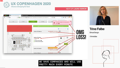
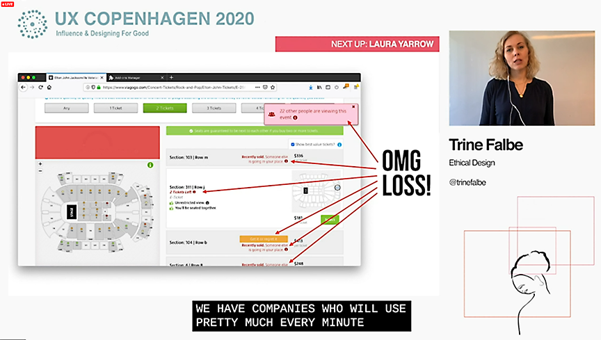
The book launch party planned for UX Copenhagen had to be scrapped when the event went online. Falbe still presented “Ethical Design Beyond the ‘Feel Good’” at the conference, raffled off a couple of books, and took questions from the audience.
Trine Falbe presenting at UX Copenhagen—showing how online ticketing services use urgency, scarcity, and loss aversion to pressure shoppers into buying event tickets. (Large preview)
The Ethical Design Handbook made a few guest appearances at the conference, too:
I was lucky enough to read an early copy of @trinefalbe‘s book ‘The Ethical Design Handbook’ – Although I wish we didn’t have to make a business case for being kind, we do, and Trine lays this out in a really clear way. #uxcopenhagen
The use of online services, delivery apps, and teleconferencing is surging right now as we all find new ways to keep working, take care of each other, and stay connected. If the core mission of design is problem-solving, maybe we DO need designers now more than ever.
There are ethical codes for business, too. But dark patterns, poor privacy protections, and a lack of transparency are proof that many of our digital services are not built on ethical foundations. Companies that do build with ethics in mind don’t have to make big changes when new legislation like GDPR and CCPA becomes law.
Should designers insist on ethical projects and workflow? Can they? The Ethical Design Handbook gives us a place to start: a business case for doing the right thing.
The news around tech companies during the pandemic has made choices even more difficult for users. Tech companies with deep pockets and convenient services have pounced on opportunities to improve their image, but it’s not all good news. Zoom, for example, is one of the more accessible platforms for online meetings, and they’ve made their platform free for schools. Zoom is also making headlines for sending user data to Facebook and plenty of other ethical shortcomings. Many companies will grow during the pandemic, but the ones who stick to ethical practices might be able to keep those new customers.
“If I was running a company that actually protects people’s privacy (like join.me for online meetings) I would make sure to surface that in my communication. Another important element is transparency. People are in a state of crisis, and the last thing we need is to feel tricked. If we find a product or service that treats us well, doesn’t hide costs, doesn’t violate our privacy, and does their best to be honest about it, we will stick with them.
After all of this is over, we’ll remember the companies and people that did good.”
— Trine Falbe
Tell Us Something Good
It’s a safe guess that Smashing readers are giving tech advice to a lot of family and friends right now. What are your favorite ethically-made digital products? What services and apps are you recommending to others? Let us know in the comments!
Finally, if you’d rather just relax and watch a talk, check out “Building Privacy-Conscious Projects” by Heather Burns, recorded at SmashingConf Freiburg in late 2019. If you have a lot of time on your hands, maybe try Trine Falbe’s #CoronaConf: a curated list of conference talks, posted daily.
Austin Gil has kicked off the first in a five-part series about “HTML Forms Right” and to starts with semantics. It’s talking to the “we build our front-ends with JavaScript” crowd. The first block of code is an example of an Ajax form submission where the data submitted is gathered through the JavaScript API FormData.
Why is that so vital? Well, no tag, no FormData. Why else use a form (aside from the Enter-key submission):
“But Austin, I’m building an SPA. Therefore if the user even sees the form, it means JavaScript MUST be enabled.” And you’d be right. Although, if it is an important form, you may want to consider supporting a no-JS world. The day may come that you want to implement SSR.
Server-Side Rendering (SSR) is going to get easier and easier to do as the benefits of it become more and more obvious. Google tells us a page that is client-side rendered has week-long-ish queue to get indexed and re-indexed on changes. Not to mention SSR is almost definitely going to be far faster to load.
Oscar Braunert’s Inclusive Inputs is a nice follow-up read as it begins with form HTML that is so close to being right, but is painfully not right. (Hint: it’s missing the label/input connection). Then he gets into interesting patterns like how to accessibly mark up required fields and fields with errors. Like:
<div class="form-group">
  <label for="password">
    Password
    <span class="required" aria-hidden="true">*</span>
    <span class="sr-only">required</span>
  </label>
  <input
    type="password"
    id="password"
    name="password"
    aria-describedby="desc_pw"
  >
  <p class="aside" id="desc_pw">Your password needs to have at least eight characters.</p>
</div>
Amber Wilson gets into Accessible HTML elements with the twist of avoiding any ARIA usage at all:
You may be aware that ARIA roles are often used with HTML elements. I haven’t written about them here, as it’s good to see how HTML written without ARIA can still be accessible.
Shout out to
.
Sarah Higley does get into ARIA in Roles and relationships, but she warns us to be very careful upfront:
[…] a budding accessibility practitioner might find themselves experimenting with more serious roles like menu, listbox, or even treegrid. These are tantalizing, powerful patterns that allow you to create experiences that are not supported by only vanilla HTML. Unfortunately, they are also brittle; even small mistakes in using these roles can take a user on a very bad trip.
Talk to your kids about ARIA before it’s too late.
Ideally, don’t use ARIA at all. But if the accessibility is screwed up to the point it can’t be fixed at the DOM level, Sarah gets into some tricks. For example, one uses role="presentation" to essentially remove an element’s default role (when it is in the way).
Speaking of ARIA and not using it unless you have to, one of the things you can do with ARIA is label controls. Adrian Roselli has thoughts on how best to do that:
Here is the priority I follow when assigning an accessible name to a control:
1. Native HTML techniques 2. aria-labelledby pointing at existing visible text 3. Visibly-hidden content that is still in the page 4. aria-label
If you’re looking for a new typeface for that side project of yours then here’s a great website by John D. Jameson that collects a bunch of the latest type specimen websites. Everything is on display here, from the daring and bold, to those that are a bit more professional and reserved.
Not only are there a ton of great typefaces on display and for sale, but the websites for these specimens are fantastic, too. My favorite at the moment has to this website by Grilli Type for GT America: Bright colors! Lovely illustrations! Fancy animations that aren’t annoying!
It’s a wonderful example of what’s possible with just a few colors and one big, beautiful typeface:
On that note, make sure to check out the full catalogue of fonts by Grilli Type because yikes is there a lot in there to love.
The internet has been around for a long while, and over time we’ve changed the way we think about web design. Many old techniques and ways of doing things have gotten phased out as newer and better alternatives have been created, and we say that they have been deprecated.
Deprecated. It’s a word we use and see often. But have you stopped to think about what it means in practice? What are some examples of deprecated web elements, and why don’t we use them any more?
What is deprecation?
In everyday English, to “deprecate” something is to express disapproval of it. For example, you might be inclined to deprecate a news story you don’t like.
When we’re speaking in a technical sense, however, deprecation is the discouragement of use for an old feature. Often, the old feature remains functional in the interests of backward compatibility (so legacy projects don’t break). In essence, this means that you can technically still do things the legacy way. It’ll probably still work, but maybe it’s better to use the new way.
Another common scenario is when technical elements get deprecated as a prelude to their future removal (which we sometimes call “sunsetting” a feature). This provides everybody time to transition from the old way of working to the new system before the transition happens. If you follow WordPress at all, they recently did this with their radically new Gutenberg editor. They shipped it, but kept an option available to revert to the “classic” editor so users could take time to transition. Someday, the “classic” editor will likely be removed, leaving Gutenberg as the only option for editing posts. In other words, WordPress is sunsetting the “classic” editor.
That’s merely one example. We can also look at HTML features that were once essential staples but became deprecated at some point in time.
Why do HTML elements get deprecated?
Over the years, our way of thinking about HTML has evolved. Originally, it was an all-purpose markup language for displaying and styling content online.
Over time, as external stylesheets became more of a thing, it began to make more sense to think about web development differently — as a separation of concerns where HTML defines the content of a page, and CSS handles the presentation of it.
This separation of style and content brings numerous benefits:
Avoiding duplication: Repeating code for every instance of red-colored text on a page is unwieldy and inefficient when you can have a single CSS class to handle all of it at once.
Ease of management: With all of the presentation controlled from a central stylesheet, you can make site-wide changes with little effort.
Readability: When viewing a website’s source, it’s a lot easier to understand the code that has been neatly abstracted into separate files for content and style.
Caching: The vast majority of websites have consistent styling across all pages, so why make the browser download those style definitions again and again? Putting the presentation code in a dedicated stylesheet allows for caching and reuse to save bandwidth.
Developer specialization: Big website projects may have multiple designers and developers working on them, each with their individual areas of expertise. Allowing a CSS specialist to work on their part of the project in their own separate files can be a lot easier for everybody involved.
User options: Separating styling from content can allow the developer to easily offer display options to the end user (the increasingly popular ‘night mode’ is a good example of this) or different display modes for accessibility.
Responsiveness and device independence: separating the code for content and visual presentation makes it much easier to build websites that display in very different ways on different screen resolutions.
However, in the early days of HTML there was a fair amount of markup designed to control the look of the page right alongside the content. You might see code like this:
…all of which is now deprecated due to the aforementioned separation of concerns.
Which HTML elements are now deprecated?
As of the release of HTML5, use of the following elements is discouraged:
(use instead)
(use )
(use CSS font properties, like font-size, font-family, etc.)
(use CSS font-size)
(use CSS text-align)
(use
)
(use CSS font properties)
(use )
(not needed any more)
(not needed any more)
(not needed any more)
(use text-decoration: line-through in CSS)
(use text-decoration: line-through in CSS)
(use )
There is also a long list of deprecated attributes, including many elements that continue to be otherwise valid (such as the align attribute used by many elements). The W3C has the full list of deprecated attributes.
Why don't we use table for layouts any more?
Before CSS became widespread, it was common to see website layouts constructed with the
element. While the
element is not deprecated, using them for layout is strongly discouraged. In fact, pretty much all HTML table attributes that were used for layouts have been deprecated, such as cellpadding, bgcolor and width.
At one time, tables seemed to be a pretty good way to lay out a web page. We could make rows and columns any size we wanted, meaning we could put everything inside. Headers, navigation, footers… you name it!
That would create a lot of website code that looked like this:
<table border="0" cellpadding="0" cellspacing="0" width="720">
<tr>
<td colspan="10"><img name="logobar" src="logobar.jpg" width="720" height="69" border="0" alt="Logo"></td>
</tr>
<tr>
<td rowspan="2" colspan="5"><img name="something" src="something.jpg" width="495" height="19" border="0" alt="A picture of something"></td>
<td>Blah blah blah!</td>
<td colspan="3">
<tr>
<!-- and so on -->
</table>
There are numerous problems with this approach:
Complicated layouts often end up with tables nested inside other tables, which creates a headache-inducing mess of code. Just look at the source of any email newsletter.
Accessibility is problematic, as screen readers tend to get befuddled by the overuse of tables.
Tables are slow to render, as the browser waits for the entire table to download before showing it on the screen.
Responsible and mobile-friendly layouts are very difficult to create with a table-based layout. We still have not found a silver bullet for responsive tables (though many clever ideas exist).
Continuing the theme of separating content and presentation, CSS is a much more efficient way to create the visual layout without cluttering the code of the main HTML document.
So, when should we use
? Actual tabular data, of course! If you need to display a list of baseball scores, statistics or anything else in that vein,
is your friend.
Why do we still use and tags?
“Hang on just a moment,” you might say. “How come bold and italic HTML tags are still considered OK? Aren't those forms of visual styling that ought to be handled with CSS?”
It's a good question, and one that seems difficult to answer when we consider that other tags like and are deprecated. What's going on here?
The short and simple answer is that and would probably have been deprecated if they weren't so widespread and useful. CSS alternatives seem somewhat unwieldy by comparison:
<style>
.emphasis { font-weight:bold }
</style>
This is a <span class="emphasis">bold</span> word!
This is a <span style="font-weight:bold">bold</span> word!
This is a <b>bold</b> word!
The long answer is that these tags have now been assigned some semantic meaning, giving them value beyond pure visual presentation and allowing designers to use them to confer additional information about the text they contain.
This is important because it helps screen readers and search crawlers better understand the purpose of the content wrapped in these tags. We might italicize a word for several reasons, like adding emphasis, invoking the title of a creative work, referring to a scientific name, and so on. How does a screen reader know whether to place spoken emphasis on the word or not?
and have companions, including , and . Together, these tags make the meaning context of text clearer:
is for drawing attention to text without giving it any additional importance. It's used when we want to draw attention to something without changing the inflection of the text when it is read by a screen reader or without adding any additional weight or meaning to the content for search engines.
is a lot like but signals the importance of something. It's the same as changing the inflection of your voice when adding emphasis on a certain word.
italicizes text without given it any additional meaning or emphasis. It's perfect for writing out something that is normally italicized, like the scientific name of an animal.
is like in that it italicizes text, but it provides adds additional emphasis (hence the tag name) without adding more importance in context. (‘I'm sure I didn't forget to feed the cat').
is what we use to refer to the title of a creative work, say a movie like The Silence of the Lambs. This way, text is styled but doesn't affect the way the sentence would be read aloud.
In general, the rule is that and are to be used only as a last resort if you can't find anything more appropriate for your needs. This semantic meaning allows and to continue to have a place in our modern array of HTML elements and survive the deprecation that has befallen other, similar style tags.
On a related note, — the underline tag — was at one time deprecated, but has since been restored in HTML5 because it has some semantic uses (such as annotating spelling errors).
There are many other HTML elements that might lend styling to content, but primarily serve to provide semantic meaning to content. Mandy Michael has an excellent write-up that covers those and how they can be used (and even combined!) to make the most semantic markup possible.
Undead HTML attributes
Some deprecated elements are still in widespread use around the web today. After all, they still work — they're just discouraged.
This is sometimes because word hasn't gotten around that that thing you've been using for ages isn't actually the way it's done any more. Other times, it's due to folks who don't see a compelling reason to change from doing something that works perfectly well. Hey, CSS-Tricks still uses the teletype element for certain reasons.
One such undead HTML relic is the align attribute in otherwise valid tags, especially images. You may see tags with a border attribute, although that attribute has long been deprecated. CSS, of course, is the preferred and modern method for that kind of styling presentation.
Staying up to date with deprecation is key for any web developer. Making sure your code follows the current recommendations while avoiding legacy elements is an essential best practice. It not only ensures that your site will continue to work in the long run, but that it will play nicely with the web of the future.
Questions? Post a comment! You can also find me over at Angle Studios where I work.
Justin Duke asks if treating code comments like footnotes could help us understand the code in a file better. In his mockup, all the comments are hidden by default and require a click to reveal:
What a neat idea! Justin’s design reminds me of the way that Instapaper treated inline footnotes.
Instapaper (circa 2012)
I guess the reason I like this idea so much is that a lot of comments don’t need to be read constantly, — they’re sort of a reminder that, “Hey, this needs work in the future” or “Yikes, this is weird and I’m sorry.” Keeping these comments out of the code makes it much easier to scan the whole file, too.
I do wonder if there could be a toggle that shows every comment, just in case you need to read all the comments in sequence rather than clicking to toggle each one.
Anyway, all this talk about comments reminds me of an absolutely fantastic talk by Sarah Drasner at JSConf this year where she discussed why comments are so dang hard to get right:
Some no-frills approaches to building websites require a developer to write every line of HTML by hand. On the other extreme, commercial no-code site builders create all of the HTML for the user automatically, often at the expense of readability in the resultant code. Templating is around the middle of that spectrum, but closer to hand-written HTML than, say, generating page structure in a single-page application using React or a similar library. This sweet spot on the continuum provides many of the benefits of from-scratch manual HTML (semantic/readable code, full control over page structure, fast page loads) and adds separation of concerns and concision, all at the expense of spending some time writing modified HTML by hand. This article demonstrates using Django templating to write complex pages.
Today’s topic applies beyond the Django framework. Flask (another web framework) and Pelican (a static site generator) are just two of many other Python projects that use the same approach to templating. Jinja2 is the templating engine that all three frameworks use, although you can use a different one by altering the project settings (strictly speaking, Jinja2 is a superset of Django templating). It is a freestanding library that you can incorporate into your own projects even without a framework, so the techniques from this article are broadly useful.
A template is just an HTML file where the HTML has been extended with additional symbols. Remember what HTML stands for: HyperText Markup Language. Jinja2, our templating language, simply adds to the language with additional meaningful markup symbols. These additional structures are interpreted when the server renders the template to serve a plain HTML page to the user (that is to say, the additional symbols from the templating language don’t make it into the final output).
Server-side rendering is the process of constructing a webpage in response to a request. Django uses server-side rendering to serve HTML pages to the client. At the end of its execution, a view function combines the HTTP request, one or more templates, and optionally data accessed during the function’s execution to construct a single HTML page that it sends as a response to the client. Data goes from the database, through the view, and into the template to make its way to the user. Don’t worry if this abstract explanation doesn’t fully make sense, we’ll turn to a concrete example for the rest of this article.
Setting Up
For our example, we’ll take a fairly complex webpage, Start Bootstrap’s admin template, and rewrite the HTML as a Jinja2 template. Note that the MIT-licensed library uses a different templating system (based on JavaScript and Pug) to generate the page you see, but their approach differs substantially from Jinja2-style templating, so this example is more of a reverse-engineering than a translation of their excellent open-source project. To see the webpage we’ll be constructing, you can take a look at Start Bootstrap’s live preview.
I have prepared a sample application for this article. To get the Django project running on your own computer, start your Python 3 virtual environment and then run the following commands:
Because this tutorial is focused on frontend, the underlying Django app is very simple. This may seem like a lot of configuration for presenting a single webpage, and to be fair it is. However, this much set-up could also support a much more robust application.
Now, we’re ready to walk through the process of turning this 668 line HTML file into a properly architected Django site.
Templating And Inheritance
The first step in refactoring hundreds of lines of HTML into clean code is splitting out elements into their own templates, which Django will compose into a single webpage during the render step.
Take a look in pages/templates. You should see five files:
base.html, the base template that every webpage will extend. It contains the with the title, CSS imports, etc.
navbar.html, the HTML for the top navigation bar, a component to be included where necessary.
footer.html, the code for the page footer, another component to be included where needed.
sidebar.html, the HTMl for the sidebar, a third component to be included when required.
index.html, the code unique to the main page. This template extends the base template and includes the three components.
Django assembles these five files like Voltron to render the index page. The keywords that allow this are {% block %}, {% include %}, and {% extend %}. In base.html:
{% block content %}
{% endblock %}
These two lines leave space for other templates that extend base.html to insert their own HTML. Note that content is a variable name, you can have multiple blocks with different names in a template, giving flexibility to child templates. We see how to extend this in index.html:
{% extends "base.html" %}
{% block content %}
<!-- HTML Goes Here -->
{% endblock %}
Using the extends keyword with the base template name gives the index page its structure, saving us from copying in the heading (note that the file name is a relative path in double-quoted string form). The index page includes all three components that are common to most pages on the site. We bring in those components with include tags as below:
{% extends "base.html" %}
{% block content %}
{% include "navbar.html" %}
{% include "sidebar.html" %}
<!--Index-Specific HTML-->
{% include "footer.html" %}
<!--More Index-Specific HTML-->
{% endblock %}
Overall, this structure provides three key benefits over writing pages individually:
DRY (Don’t Repeat Yourself) Code
By factoring out common code into specific files, we can change the code in only one place and reflect those changes across all pages.
Increased Readability
Rather than scrolling through one giant file, you can isolate the specific component you’re interested in.
Separation of Concerns
The code for, say, the sidebar now has to be in one place, there can’t be any rogue script tags floating at the bottom of the code or other intermingling between what should be separate components. Factoring out individual pieces forces this good coding practice.
While we could save even more lines of code by putting the specific components in the base.html template, keeping them separate provides two advantages. The first is that we are able to embed them exactly where they belong in a single block (this is relevant only to the footer.html which goes inside the main div of the content block). The other advantage is that if we were to create a page, say a 404 error page, and we did not want the sidebar or footer, we could leave those out.
These capabilities are par for the course for templating. Now, we turn to powerful tags that we can use in our index.html to provide dynamic features and save hundreds of lines of code.
Two Fundamental Tags
This is very far from an exhaustive list of available tags. The Django documentation on templating provides such an enumeration. For now, we’re focusing on the use cases for two of the most common elements of the templating language. In my own work, I basically only use the for and if tag on a regular basis, although the dozen or more other tags provided to have their own use cases, which I encourage you to review in the template reference.
Before we get to the tags, I want to make a note on syntax. The tag {% foo %} means that “foo” is a function or other capability of the templating system itself, while the tag {{ bar }} means that “bar” is a variable passed into the specific template.
For Loops
In the remaining index.html, the largest section of code by several hundred lines is the table. Instead of this hardcoded table, we can generate the table dynamically from the database. Recall python manage.py loaddata employee_fixture.json from the setup step. That command used a JSON file, called a Django Fixture, to load all 57 employee records into the application’s database. We use the view in views.py to pass this data to the template:
from django.shortcuts import render
from .models import Employee
def index(request):
return render(request, "index.html", {"employees": Employee.objects.all()})
The third positional argument to render is a dictionary of data that is made available to the template. We use this data and the for tag to construct the table. Even in the original template that I adapted this webpage from, the table of employees was hard-coded. Our new approach cuts hundreds of lines of repetitive hard-coded table rows. index.html now contains:
The bigger advantage is that this greatly simplifies the process of updating the table. Rather than having a developer manually edit the HTML to reflect a salary increase or new hire, then push that change into production, any administrator can use the admin panel to make real-time updates (http://127.0.0.1/admin, use the credentials you created with python manage.py createsuperuser to access). This is a benefit of using Django with this rendering engine instead of using it on its own in a static site generator or other templating approach.
If Else
The if tag is an incredibly powerful tag that allows you to evaluate expressions within the template and adjust the HTML accordingly. Lines like {% if 1 == 2 %} are perfectly valid, if a little useless, as they evaluate to the same result every time. Where the if tag shines is when interacting with data passed into the template by the view. Consider the following example from sidebar.html:
Note that the entire user object is passed into the template by default, without us specifying anything in the view to make that happen. This allows us to access the user’s authentication status (or lack thereof), username, and other features, including following foreign key relationships to access data stored in a user profile or other connected model, all from the HTML file.
You might be concerned that this level of access could pose security risks. However, remember that these templates are for a server-side rendering framework. After constructing the page, the tags have consumed themselves and are replaced with pure HTML. Thus, if an if statement introduces data to a page under some conditions, but the data is not used in a given instance, then that data will not be sent to the client at all, as the if statement is evaluated server-side. This means that a properly constructed template is a very secure method of adding sensitive data to pages without that data leaving the server unless necessary. That said, the use of Django templating does not remove the need to communicate sensitive information in a secure, encrypted manner, it simply means that security checks like user.is_authenticated can safely happen in the HTML as it is processed server-side.
This feature has a number of other use cases. For example, in a general product homepage, you might want to hide the “sign up” and “sign in” buttons and replace them with a “sign out” button for logged-in users. Another common use is to show and hide success or error messages for operations like form submission. Note that generally you would not hide the entire page if the user is not logged in. A better way to change the entire webpage based on the user’s authentication status is to handle it in the appropriate function in views.py.
Filtering
Part of the view’s job is to format data appropriately for the page. To accomplish this, we have a powerful extension to tags: filters. There are many filters available in Django to perform actions like justifying text, formatting dates, and adding numbers. Basically, you can think of a filter as a function that is applied to the variable in a tag. For example, we want our salary numbers to read “$1,200,000” instead of “1200000.” We’ll use a filter to get the job done in index.html:
<td>${{ employee.salary|intcomma }}</td>
The pipe character | is the filter that applies the intcomma command to the employee.salary variable. The “$” character does not come from the template, for an element like that which appears every time, it’s easier to just stick it outside the tag.
Note that intcomma requires us to include {% load humanize %} at the top of our index.html and 'django.contrib.humanize', in our INSTALLED_APPS in settings.py. This is done for you in the provided sample application.
Conclusion
Server-side rendering with the Jinja2 engine provides key tools for creating clean, adaptable, responsive front-end code. Separating pages into files allows for DRY components with flexible composition. Tags provide fundamental capabilities for displaying data passed from the database by view functions. Done right, this approach can increase the speed, SEO capabilities, security, and usability of the site, and is a core aspect of programming in Django and similar frameworks.
If you haven’t done so already, check out the sample application and try adding your own tags and filters using the complete list.
Django Highlights is a series introducing important concepts of web development in Django. Each article is written as a stand-alone guide to a facet of Django development intended to help front-end developers and designers reach a deeper understanding of “the other half” of the code base. These articles are mostly constructed to help you gain an understanding of theory and convention, but contain some code samples, which are written in Django 3.0.
The other day, I realized that web performance is an enormous topic covering so very much — from minimizing assets to using certain file formats, it can be an awful lot to keep in mind while building a website. It’s certainly far too much for me to remember!
So I made a web performance checklist. It’s a Notion doc that I can fork and use to mark completed items whenever I start a new project. It also contains a bunch of links for references.
This doc is still a work in progress. Any recommendations or links?Feel free to suggest something in the comments below!
Andrew Welch sings the praises of using Docker containers for local dev environments:
Here are the advantages of Docker for me:
• Each application has exactly the environment it needs to run, including specific versions of any of the plumbing needed to get it to work (PHP, MySQL, Postgres, whatever) • Onboarding others becomes trivial, all they need to do is install Docker and type docker-compose up and away they go • Your development environment is entirely disposable; if something goes wrong, you just delete it and fire up a new one • Your local computer is separate from your development environment, so switching computers is trivial, and you won’t run into issues where you hose your computer or are stuck with conflicting versions of DevOps services • The cost of trying different versions of various services is low; just change a number in a .yaml file, docker-compose up, and away you go
Here’s an, uhm, very different perspective I’m anonymously posting that I snagged from a group Slack:
I have spent basically the whole day fucking around with Docker bullshit.
This has now cost the client literally thousands of dollars in me not getting any actual work done. The setup was created by the dev team, who are great, but the brittle, unstable nature of this is, well, bullshit.
I get the motivation but everyone knows that Docker is horribly slow on the Mac. It has for several years and yet it’s still in use. I just don’t get it.
Is there any way that developing with Docker on a Mac can not suck? Asking for a friend. Who is me.
I knew that Cloudinary worked with video as well as images but, the other day, I was curious if Cloudinary offered a video player embed just like other video hosts do (e.g. YouTube, Vimeo, etc). Like an that comes with a special player.
I was curious because, as much as I appreciate the simplicity of just tossing a on a page, there is one little hurdle that I always forget: you have to use a poster attribute if you want anything but a blank white rectangle on mobile browsers. Having to cut a special poster for every video I use is a step I’m frankly just too lazy to do most of the time.
Turns out Cloudinary does a have a player, and it allows for a bunch of nice customization, including handling the poster for you: Video Player Studio.
If I use this player instead, not only do I get a free configurable poster, but other advantages you’d expect from Cloudinary, like serving the video in the best possible format and optimizing the size.
But there is another thing that is a kind of big deal here, particularly for long videos: “adaptive bitrate streaming.” Behind the scenes, some library probably needs to be downloaded, but the bandwidth savings likely pay for that almost instantly. I’m not an expert on any of this by any means, but I’m referring to HLS and MPEG-DASH, which seem to be the big players, and this Cloudinary player offers both.
For the record, this post is not sponsored by Cloudinary. I was just thinking about all this the other day because we frequently embed video here on CSS-Tricks and I already use Cloudinary for all sorts of stuff.
Here’s an example:
In running this past the Cloudinary team, they said two things:
The player is built on top of VideoJS. Credit where credit is due.
They’ve got a blog post that goes far deeper into customizing the player than I talk about here.