Animations have come a long way, continuously providing developers with better tools. CSS Animations, in particular, have defined the ground floor to solve the majority of uses cases. However, there are some animations that require a little bit more work.
You probably know that animations should run on the composite layer. (I won’t extend myself here, but if you want to know more, check this article.) That means animating transform or opacity properties that don’t trigger layout or paint layers. Animating properties like height and width is a big no-no, as they trigger those layers, which force the browser to recalculate styles.
On top of that, even when animating transform properties, if you want to truly hit 60 FPS animations, you probably should get a little help from JavaScript, using the FLIP technique for extra smoother animations!
However, the problem of using transform for expandable animations is that the scale function isn’t exactly the same as animating width/height properties. It creates a skewed effect on the content, as all elements get stretched (when scaling up) or squeezed (when scaling down).
So, because of that, my go-to solution has been (and probably still is, for reasons I will detail later), technique #3 from Brandon Smith’s article. This still has a transition on height, but uses Javascript to calculate the content size, and force a transition using requestAnimationFrame. At OutSystems, we actually used this to build the animation for the OutSystems UI Accordion Pattern.
Generating keyframes with JavaScript
Recently, I stumbled on another great article from Paul Lewis, that details a new solution for expanding and collapsing animations, which motivated me to write this article and spread this technique around.
Using his words, the main idea consists of generating dynamic keyframes, stepping…
[…] from 0 to 100 and calculate what scale values would be needed for the element and its contents. These can then be boiled down to a string, which can be injected into the page as a style element.
To achieve this, there are three main steps.
Step 1: Calculate the start and end states
We need to calculate the correct scale value for both states. That means we use getBoundingClientRect() on the element that will serve as a proxy for the start state, and divide it with the value from the end state. It should be something like this:
Now, we need to run a for loop, using the number of frames needed as the length. (It shouldn’t really be less than 60 to ensure a smooth animation.) Then, in each iteration, we calculate the correct easing value, using an ease function:
function ease (v, pow=4) {
  return 1 - Math.pow(1 - v, pow);
}

let easedStep = ease(i / frame);
With that value, we’ll get the scale of the element on the current step, using the following math:
const xScale = x + (1 - x) * easedStep;
const yScale = y + (1 - y) * easedStep;
You can check the example of a Menu from Paul Lewis article, on Codepen (courtesy of Chris Coyer):
CodePen Embed Fallback
Building an expandable section
After grasping these baseline concepts, I wanted to check if I could apply this technique to a different use case, like a expandable section.
We only need to animate the height in this case, specifically on the function to calculate scales. We’re getting the Y value from the section title, to serve as the collapsed state, and the whole section to represent the expanded state:
    _calculateScales () {
      var collapsed = this._sectionItemTitle.getBoundingClientRect();
      var expanded = this._section.getBoundingClientRect();

      // create css variable with collapsed height, to apply on the wrapper
      this._sectionWrapper.style.setProperty('--title-height', collapsed.height + 'px');

      this._collapsed = {
        y: collapsed.height / expanded.height
      }
    }
Since we want the expanded section to have absolute positioning (in order to avoid it taking space when in a collapsed state), we are setting the CSS variable for it with the collapsed height, applied on the wrapper. That will be the only element with relative positioning.
Next comes the function to create the keyframes: _createEaseAnimations(). This doesn’t differ much from what was explained above. For this use case, we actually need to create four animations:
The animation to expand the wrapper
The counter-expand animation on the content
The animation to collapse the wrapper
The counter-collapse animation on the content
We follow the same approach as before, running a for loop with a length of 60 (to get a smooth 60 FPS animation), and create a keyframe percentage, based on the eased step. Then, we push it to the final animations strings:
We start by creating a style tag to hold the finished animations. As this is built as a constructor, to be able to easily add multiple patterns, we want to have all these generated animations on the same stylesheet. So, first, we validate if the element exists. If not, we create it and add a meaningful class name. Otherwise, you would end up with a stylesheet for each section expandable, which is not ideal.
 var sectionEase = document.querySelector('.section-animations');
 if (!sectionEase) {
  sectionEase = document.createElement('style');
  sectionEase.classList.add('section-animations');
 }
Speaking of that, you may already be wondering, “Hmm, if we have multiple expandable sections, wouldn’t they still be using the same-named animation, with possibly wrong values for their content?”
You’re absolutely right! So, to prevent that, we are also generating dynamic animation names. Cool, right?
We make use of the index passed to the constructor from the for loop when making the querySelectorAll('.section') to add a unique element to the name:
var sectionExpandAnimationName = "sectionExpandAnimation" + index;
var sectionExpandContentsAnimationName = "sectionExpandContentsAnimation" + index;
Then we use this name to set a CSS variable on the current expandable section. As this variable is only in this scope, we just need to set the animation to the new variable in the CSS, and each pattern will get its respective animation-name value.
The rest of the script is related to adding event listeners, functions to toggle the collapse/expand status and some accessibility improvements.
About the HTML and CSS: it needs a little bit of extra work to make the expandable functionality work. We need an extra wrapper to be the relative element that doesn’t animate. The expandable children have an absolute position so that they don’t occupy space when collapsed.
Remember, since we need to make counter animations, we make it scale full size in order to avoid a skew effect on the content.
I would like to highlight the importance of the animation-timing-functionproperty. It should be set to linear or step-end to avoid easing between each keyframe.
The will-change property — as you probably know — will enable GPU acceleration for the transform animation for an even smoother experience. And using the contains property, with a value of contents, will help the browser treat the element independently from the rest of the DOM tree, limiting the area before it recalculates the layout, style, paint and size properties.
We use visibility and opacity to hide the content, and stop screen readers to access it, when collapsed.
And finally, we have our section expandable! Here’s the complete code and demo for you to check:
CodePen Embed Fallback
Performance check
Anytime we work with animations, performance ought to be in the back of our mind. So, let’s use developer tools to check if all this work was worthy, performance-wise. Using the Performance tab (I’m using Chrome DevTools), we can analyze the FPS and the CPU usage, during the animations.
And the results are great!
The higher the green bar, the higher the frames. And there’s no junk either, which would be signed by red sections.
Using the FPS meter tool to check the values at greater detail, we can see that it constantly hits the 60 FPS mark, even with abusive usage.
Final considerations
So, what’s the verdict? Does this replace all other methods? Is this the “Holy Grail” solution?
In my opinion, no.
But… that’s OK, really! It’s another solution on the list. And, as is true with any other method, it should be analyzed if it’s the best approach for the use-case.
This technique definitely has its merits. As Paul Lewis says, this does take a lot of work to prepare. But, on the flip side, we only need to do it once, when the page loads. During interactions, we are merely toggling classes (and attributes in some cases, for accessibility).
However, this brings some limitations for the UI of the elements. As you could see for the expandable section element, the counter-scale makes it much more reliable for absolute and off-canvas elements, like floating-actions or menus. It’s also difficult to styled borders because it’s using overflow: hidden.
Nevertheless, I think there’s tons of potential with this approach. Let me know what you think!
Ethan Marcotte just redesigned his website and wrote about how the process was a distraction from the difficult things that are going on right now. Adding new features to your blog or your portfolio, tidying up performance issues, and improving things bit by bit can certainly relieve a lot of stress. Also? It’s fun!
What about adding a dark mode to our websites? Or playing around with Next.js? How about finally updating to that static site generator we’ve always wanted to experiment with? Or perhaps we could make the background color of our website animate slowly over time, like Robin’s? Or what about rolling up our sleeves and making a buck wild animation like the one on Sarah’s homepage?
Not so long ago, I felt a bout of intense anxiety hit me out of nowhere and I wound up updating my own website — it was nothing short of relaxing, like going to the spa for a day. I suddenly realized that I could just throw all that stress at my website and do something half-useful in the process. One evening I sat down to focus on my Lighthouse score, the next day was all about fonts, and after that I made a bunch of commits to update the layouts on my site.
This isn’t about being productive right now — it’s barely possible to focus on anything for me with the state of things. And also I’m certainly not trying to guilt trip anyone into cranking out more websites. We all need to take a breath and take each day at a time.
But! If treating your website like a worry stone can help, then I think it’s time to roll up our sleeves and make something weird for ourselves.
In this tutorial, you’ll learn what Headless CMS is, and the pros and cons of Headless CMS. In the end, youll have built a shopping cart using GraphCMS (a (backend-only content management system). After that, you can go ahead and build any web app of your choice using a headless CMS and React.
To follow along, you need to have Node and npm/yarn installed on your machine. If you do not have that done already, follow these quick guides to install yarn or npm on your machine. You also need to have a basic understanding of React, Node.js and GraphQL queries. (You can always brush up on React and GraphQL skills, of course!)
As digital products continue to evolve, so does the content we consume. A scalable, cross-platform content management system is crucial to ensuring a product’s growth velocity. Traditional CMS gives the comfort of having the content, the editing interface, templates and custom codes, in a single environment. But with the changes in this mobile era, that’s no longer enough. We need a new breed of CMS — one that can make content available through any channel at which point a Headless CMS is required. A headless CMS gives you the benefits of managing the content and delivering it to any channel. The API makes contents available through any channel and on any device using most favorite tools and programming languages plus it also provides a higher level of security and much better scalability.
What Does This Look Like In Practice?
What happens when you take away the frontend of a CMS? The biggest distinction is that a website can’t be built with a headless CMS on its own. With a traditional CMS, everything happens in the same place.
A headless CMS doesn’t have the features that let you build your site — it doesn’t have site themes or templates. To use a headless CMS, you have to build a site or app, or other experience first, then use the CMS’s API to plug your content into it.
Why Should You Care About Headless?
A headless CMS comes with an API friendly approach, which makes it possible to publish content through an API (either RESTful or GraphQL). It allows you to use the same API to deliver content across various channels such as Android or IOS apps, smartwatches, AR/VR, etc. A headless CMS gives developers the ability to harness creativity quickly. With a traditional CMS, changes can be time-consuming, for example, to tweak a part of your site, you need to re-implement the entire CMS. With a headless CMS, you can make changes to your frontend without having any impact on the back-end infrastructure, hence saving yourself time and resources, which makes it much better.
Traditional vs Headless CMS: The Pros And Cons
It can be complicated to choose between a headless and a traditional CMS. The fact is, they both have potential advantages and drawbacks.
Traditional CMS Pros
It allows for easy customization. A lot of them have drag and drop, this makes it easy for a person without programming experience to work seamlessly with them.
It’s easier to set up your content on a traditional CMS as everything you need (content management, design, etc) are already available.
Traditional CMS Cons
The coupled front-end and back-end results in more time and money for maintenance and customization.
Traditional CMS e.g WordPress relies heavily on plugins and themes which may contain malicious codes or bugs and slow the speed of the website or blog. Here’s a list of 18,305 vulnerable WordPress plugins, themes. Here are security measures for Drupal developers. Check here for more facts.
Headless CMS Pros
Since the frontend and backend are separated from each other, it makes it possible for you to pick which front-end technology suits your needs. This also gives the developer flexibility during the development stage.
Platforms (blogs, websites, etc) built with headless CMS can be deployed to work on various displays such as web, mobile, AR/VR, and so on.
Headless CMS Cons
They give you the hassle of managing back-end infrastructures, setting up the presentation component of your site, app.
They can be more costly to implement — the cost involved in building a user-friendly platform with analytics is high when compared to using traditional CMS.
Best Use Cases For Headless CMS
Headless CMS can have the following use cases:
Static Site Generators (e.g. Gridsome, Gatsby)
Many Jamstack sites created with static site generators like Gridsome, Hugo or Gatsby make use of the headless CMS to manage content, they cannot access a database, Hence content can be stored in a headless CMS and fetched through an API during build time and deployed as static files.
Mobile Apps (iOS, Android)
The advantage of a headless CMS for mobile engineers is that the API enables them to deliver content to an IOS/Android app from the same backend that manages content for their web site, which keeps things in sync.
Web Applications
This approach involves serving content through an API which is then consumed by a web application but offers a centralized place for managing content. An example is an e-commerce application built using HTML, CSS, and JavaScript with content and product data that are maintained in the CMS and served via an external API.
Types Of Headless CMS
There is a list of headless CMSs you might what to check out.
Please note that this article is not written to promote any services or products.
Contentful
An API-driven headless CMS designed to create, manage and distribute content to any platform. Unlike a traditional CMS, they offer the ability to create your content model so that you can decide what type of content you want to manage.
GraphCMS
A headless CMS for users who want to build a GraphQL content infrastructure for their digital products. This CMS is fully built as API focused from the ground up, allowing creators to define the structures, permissions, and relations for the API parameters. In this article, we’d be using GraphCMS because of its GraphQL API approach.
ButterCMS
A CMS that gives complete freedom to build a website or a branded blog with full SEO and supports any tech stack. This tool saves you money and the time for site development time. Butter CMS is a maintenance-free headless CMS tool and can integrate with any language or framework. The powerful interface helps you define and customize every element of your website without any hassle.
Directus
An open-source tool that wraps custom SQL databases with a dynamic API and provides an intuitive admin app for managing its content. Self-host for free, or use the on-demand Cloud service to manage all your omnichannel digital experiences.
Sanity
Another API driven platform for managing structured content. With Sanity, you can manage your text, images, and other media with APIs. You can also use the open-source single page application Sanity Studio to quickly set up an editing environment that you can customize.
Agility
A JAMStack focused Headless CMS with Page Management built-in. Faster to build, manage, and deploy. Agility CMS is a Content-First Headless CMS, allowing you to choose any programming language while also getting the flexibility, speed, and power that comes from lightweight APIs. From there, add features like Page Management, Ecommerce, Online Ticketing, and Search. Agility CMS becomes a complete Digital Experience Platform–saving time, removing limitations and allowing for seamless experiences across all digital channels.
Netlify CMS
A free and open-source, git-based CMS created by Netlify. It allows you to define your content model, integrates third-party authentication and extends the capabilities of its backend (a single-page app built on React).
Note: All of the examples mentioned above have free and paid versions, except Directus and Netlify CMS which are free. For a list of more headless CMS, check here.
In this article, we’re using GraphCMS — a GraphqQL API-oriented headless content management system that takes care of our back-end architecture.
Using GraphCMS
Content is both dynamic and multi-channeled, however current content management systems (CMS) lack the flexibility to meet the demands of modern-day digital content distribution. GraphCMS is the first HeadlessCMS built around GraphQL and offers a solution to this problem with its mission to facilitate painless content flow between content creators, developers, and consumers.
GraphCMS accept almost any kind of data you can imagine ranging from images, maps, etc. It even makes roles and permissions easy. While other headless CMS solutions exist, GraphCMS aims to provide a hassle-free experience for developers; through leveraging an API specification called GraphQL. It eliminates the need for multiple SDKs to interact with content delivery and provides simple multi-channel content accessibility. It makes creating rich content apps very easy.
GraphCMS And GraphQL
GraphCMS sorely relies on GraphQL, its backbone API specification. GraphQL is API query language and runtime. It was developed by Facebook in 2012 and released open-sourced in 2015. Since then, the likes of Pinterest, Github, Twitter, Intuit, Coursera have all adopted GraphQL to power their mobile apps, websites, and APIs. GraphQL is similar to REST in its core purpose of providing a specification for building and utilizing APIs. However, unofficially dubbed “REST 2.0”, GraphQL has optimized different key functionality offered by REST.
The main uniqueness of GraphQL includes protocol-agnostic usage, controlled data fetching, editable fields, and types and in-depth error handling. The results include removal of code redundancy, prevention of over and under fetching data, and significant reduction of network requests.
As a concrete example, let’s take the relationship of a query to a newsfeed. A newsfeed post has an author, a title and comments. If we use a REST-based CMS, we would have to make 3 different server requests for these 3 different endpoints, whereas, in a GraphQL based CMS, we would only have to make 1 request for all 3. Consequently, the results offer relatively quicker queries and less network flooding — in a practical use case, it would not just be one entity making multiple requests, but thousands and millions.
GraphQL reduces the complexity of building APIs by abstracting all requests to a single endpoint. Unlike traditional REST APIs, it is declarative; whatever is requested is returned.
GraphCMS has a generous free tier of 1 million API operations requests per month and 500 GB assets traffic. Also, GraphCMS provides a Graphiql admin interface that provides you full access to your data and you could just download it all and then execute a create many mutations against your new backend to migrate everything over.
In this article, we’ll be using the free tier of 1 million API operations per month and 500 GB asset traffic. You can make use of the same tier for testing, for projects that need more than this, do well to check out their pricing page.
Building Our Project
To see the power of Headless CMS using GraphCMS we would be building a simple shopping cart.
Getting Started
To get started with GraphCMS follow the steps.
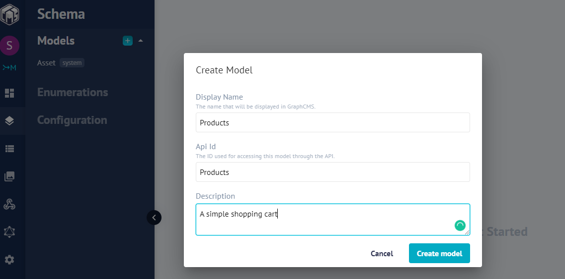
Create an account on GraphCMS. You can use the free tier.
Next, copy the API endpoint URL (Click on the Dashboard) — this is the single endpoint for communication between our React front end and GraphCMS back end.
The easiest way to set up React is to use Create-React-App. (This is an officially supported way to create single-page React applications, and offers a modern build setup with no configuration.) We’ll make use of it to bootstrap the application we’ll be building.
From your terminal, run the command below:
npx create-react-app smashing-stores && cd smashing-stores
Once the installation is successful, start the React server by running npm start.
In creating the layout for our project, we will have five different components.
Navbar
To hold our navigation and cart icon
Allproducts
To display a list of all products
Product
The markup for a single product
Footer
The footer of our app
Cart
To hold the items in our cart
For a quick setup, we will be using Bootstrap to create our components. To include Bootstrap, we would use bootstrap CDN, open up your index.html in the public folder, add the link to the head section:
We declared a functional component Navbar, we return our nav tag with a bootstrap class of navbar navbar-light bg-light. What these classes do is to apply a Navbar with a light background. Inside our nav element, we included an anchor tag with a link to just forward-slash(Homepage) and a class of navbar-brand.
The styled button in the Navbar component has a class named navbar navbar-light bg-light. What this class does it to ensure that our button has a light blue background color and a shadow when hovered.
Creating Our Footer.js
Next, let’s create our Footer. Open up the Footer.js file and add the following code to it:
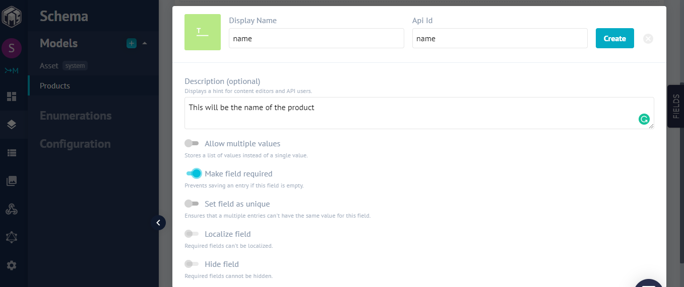
Before we create our product component, we need to query GraphCMS to send us our product details to display. Let’s do that now.
Connecting To The GraphCMS Backend With GraphQL
To connect our application to the backend, we need to install a couple of GraphQL packages. One of the libraries we can use is apollo-boost which gives a client the avenue for connecting to the GraphQL backend using a URI (Uniform Resource Identifier).
The URI is the endpoint provided by GraphCMS and is available on the endpoint section of the dashboard.
Run the following command in your terminal to install the necessary packages:
Once you’re done with the installation update the index.js file in the /src directory to the following code:
import React from 'react';
import ReactDOM from 'react-dom';
import './index.css';
import App from './App';
import { ApolloProvider } from "react-apollo";
import ApolloClient from "apollo-boost";
import * as serviceWorker from './serviceWorker';

const client = new ApolloClient({
  uri: "<YOUR_GRAPHCMS_ENDPOINT>"
});

ReactDOM.render(
  <ApolloProvider client={client}>
    <App />
  </ApolloProvider>,
  document.getElementById('root')
);

serviceWorker.unregister();
Here, we wrapped our entire application with the ApolloProvider which takes a single prop: the client. The ApolloProvider loads the Graph CMS schema and gives us access to all properties of the data model inside our application which is possible because our App component is a child of the ApolloProvider component.
Displaying Our Products
If you got this far, pat yourself on the back. ? We’ve been able to load our schema from GraphCMS into our application.
The next step is to fetch and display our products. Create an /all-product folder under the /component folder and then create an index.js file and add the following to it:
import gql from "graphql-tag";
const PRODUCTS_QUERY = gql`
  query {
    productses {
      id
      name
      price
      description
      createdAt
      image {
        id
        url
      }
    }
  }
`;
export default PRODUCTS_QUERY;
What are “productses”? Our model name is products, but GraphQL pluralizes models, hence the name.
Next, we created a variable called PRODUCTS_QUERY that stores the query from our GraphQl back end. The gql function is used to parse (analyze an object, as it were in our schema) the plain string that contains the GraphQL code (if you’re unfamiliar with the backtick-syntax, you can read up on JavaScript’s tagged template literals).
GraphCMS provides a handy GraphQL explorer named (graphiql) specifically for testing our query.
Testing our endpoint using Graphiql Explorer in our GraphCMS Dashboard. (Large preview)
Now that our query works as it should. Let’s go ahead and create our product’s components.
Creating The Allproducts Component
Open up the Allproducts.js file and add the following code to it:
Here, we wrapped our products with the component and passed the PRODUCTS_QUERY as props. Apollo injected several props into the component’s render prop function. These props themselves provide information about the state of the network request:
loading
This occurs during ongoing requests.
error
This occurs when the requests fail.
data
This is data received from the server.
Finally, we loop through all the received items and pass them as a prop to our Product component. Before we see what it looks like, let’s create our Product component.
Creating Product Component
Open up Product.js and add the following code to it:
Since our Product.js is a functional component that receives product details via props and displays them, we call the addItem function on the onClick event listener to add the current product to the cart when it clicked.
Importing Our Components Into App.js
With our components setup, it’s time we import our components into our App.js base component.
Open it up and add the following to it:
import React from 'react';
import './App.css';
import Footer from './components/Footer';
import Products from './components/Allproducts';
function App() {
  return (
    <div className="App">
      <Products />
      <Footer/>
    </div>
  );
}
export default App;
From lines 3-4, we imported both Footer and Products component in the App component.
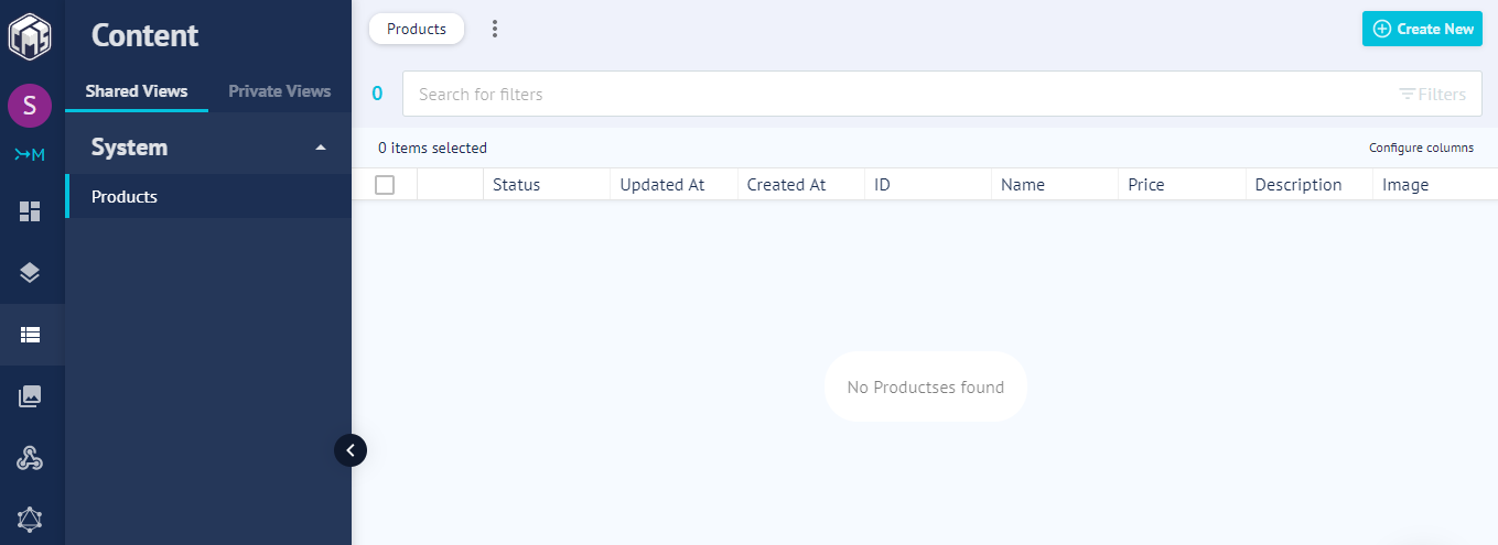
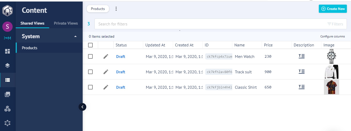
Next, type npm start in your terminal then navigate to https://localhost:3000 in your browser, and you will see the following:
In our parent div, we used a ternary operator that toggles between visibility and hidden state. Next, in other for us to display the items in our cart modal we map through our items.
Lastly, in this section to check out for the total number of items in our cart we used the .length JavaScript method.
Open up your app.css and add the following code to it:
Finally open the shopping cart, add items to it and view it via the ‘Cart’ button:
Conclusion
The concept learned in this article can help you create almost anytime of web apps without paying so much attention to your back-end infrastructure. You can take it further by creating a full-fledged e-commerce store and adding payment etc. I’ll love to see what you were able to make in the comments section.
The supporting repo for this article is available on Github.
It’s April Fools’ Day, and each year on the 1st of April we normally join the rest of the world in posting a humorous, and entirely fictitious story. But this year, we decided to go a different way.
These aren’t normal times. Around the world, millions of people are struggling with the impact of the COVID-19 (coronavirus) outbreak. Many people have lost family members, and many more are struggling to support themselves and their families. For too many of us, the future feels uncertain.
If we’ve learnt one thing in the last few months, it’s that the design community is at its best when we support each other. And so for today’s post we wanted to give a shout out, and a heartfelt “thank you” to all those companies going out of their way to support our readers.
Affinity — makers of Affinity Designer, Affinity Photo, and Affinity Publisher — has introduced three measures to support designers of all levels:
Free trials of the Affinity suite of products (for Mac and Windows) have been extended from 30 days to 3 months;
Anyone who wants to buy a license for any Affinity product (for Mac, Windows, and iPad) will receive a 50% discount off the normal price;
Affinity have also pledged to spend the equivalent of their entire 2020 commissioning budget in the next 3 months, engaging 100+ freelance creatives.
We know we’re not saving the world, but we hope these measures can at least provide some form of relief to those who need it. We’ll pull through this together…
Apple is probably the largest single technology firm in the design space and has announced several measures to combat COVID-19 in the US, and around the world.
Apple will match employee donations two-to-one to COVID-19 response efforts;
All hourly workers will continue to be paid in alignment with normal business operations;
WDC will be entirely digital this year;
Trial versions of Final Cur Pro X and Logic Pro X have been extended to 90 days.
The entire Apple family is indebted to the heroic first responders, doctors, nurses, researchers, public health experts and public servants globally who have given every ounce of their spirit to help the world meet this moment.
This is a bit of a niche offer, but may be perfect for someone. If your team is a non-profit engaged in medical research or disaster response, specifically related to the coronavirus outbreak, Asana will give you 12 months of their Business subscription free of charge.
Codecademy is a leading provider of online web and mobile development courses. To support students who are unable to access their regular learning resources, Codecademy is offering 10,000 free memberships of Codecademy Pro for high school and college students anywhere in the world, for the rest of the school year.
Coursera is an online learning platform that partners with major institutions, including Ivy League schools. Coursera is offering free Coursera for Campus access to any college or University affected by the coronavirus outbreak. Students need to be registered by their learning institution and will need to complete online courses by September 30th.
Cloudflare offers a range of different solutions for keeping remote teams connected. Cloudflare for Teams allows your team to work securely on your remote-access applications, and access company data, without fear of exposing anything sensitive to prying eyes.
Cloudflare for Teams is offered for free, to organizations of any size, at no cost until September 1st, and they’re throwing in an optional 30 minutes onboarding session with one of their experts to get you up and running.
Originally conceived as a communications network for humanity during a crisis…in this moment, [the Internet]’s being put to use for that original purpose.
GoToMeeting is a collaboration platform for remote meetings. It’s great for touching base with clients quickly and easily. GoToMeeting have put together an Emergency Remote Work Kit with four tools to ease your move into remote work. They’re free for 3 months for eligible healthcare providers, educational institutions, municipalities, and non-profits, as well as current LogMeIn customers.
Jamm is a lightweight voice and video collaboration app to help teams collaborate, and bond. It is offering 4 months for free to support teams remote working during the coronavius outbreak.
If you’re a US-based business that is being forced to vacate its premises leaving valuable equipment inside, or if you’re working from home with valuable equipment that’s normally protected by business insurance, then security will be high on your list of priorities. In partnership with Staples, Kangaroo has launched a small business initiative to supply a security kit, including a camera, and professional monitoring (and free inbound and outbound shipping) for 3 months.
This small but hopefully meaningful gesture is entirely consistent with our mission to make security accessible to everyone. Thanks for making our communities great, and here’s to getting through this together.
Loom is a time-saving app for communicating visually. You can record yourself, as well as your screen, and share the video in seconds. It’s excellent for remote design reviews. It has implemented several measures to help teams adjusting to the current work situation:
The number of recordings on free plans, normally limited to 25, is now unlimited until July 1st 2020;
Monthly subscriptions have been reduced by 50% until July 1st, 2020;
Trials have been extended from 14 days to 30 days, again, until July 1st;
Loom Pro is now free, forever, for education.
Our hope is that by stepping up, we’re making a dent in the global impact this pandemic is causing, not just by making our product more accessible, but by helping set the kind of example we hope more businesses will follow.
Nailted is a product for remote teams that helps you maintain a supportive and growth-orientated workforce through feedback, helping you take care of your most important assets, your colleagues. During the coronavirus crisis Nailted is offering its product free of charge.
Pluralsight is a huge online learning platform and it is offering free access to its Recorded Technology Conferences, which show pre-recorded content from technology conferences and events around the globe.
Conference content will be available free of charge to anyone until July 1st 2020;
Any tech conference or event can host its content with Pluralsight free of charge until July 1st;
Singularity University’s live streamed event “COVID-19: The State & Future of Pandemics” will be hosted on the platform;
Pluralsight’s own LIVE Europe conference will be free to access.
Stack Overflow for Teams is a question and answer space for companies to share knowledge within their team. In response to the COVID-19 outbreak Stack Overflow for Teams will be free until June 30th 2020.
We want to help everyone better collaborate and share information as we navigate remote work during these uncertain times.
WeFunder has launched a Fight the Virus Challenge with grants of up to $1m for startups tackling the coronavirus crisis. If you’re working on a project that could help — from remote education tools, to protective clothing, to small business support, and anything at all that helps combat COVID-19 — you have until April 3rd 2020 to apply.
In times of great need, the next generation of great startups is born.
These are all generous offers from companies that want to make a difference to the world we live in. But don’t forget that there are thousands of free and open source projects that are available for free 24/7 365; they deserve support too.
Stay safe everyone. Stay home, flatten the curve. We will, eventually, come out the other side of this.
If you know of an organization that is offering its goods and/or services free of charge, or at reduced cost, to support the design community during the COVID-19 (coronavirus) outbreak, please let us know and we’ll add it to this collection.
When introducing any changes to your website, you do it with the best intention. Be it a regular update, a slight code adjustment, or even complete redesign, all of these modifications are aimed at improvement.
But sometimes,things go wrong and everything turns into a complete disaster. Instead of making better, you end up with non-working pages and errors everywhere. For sure that’s not the result you have expected.
How to avoid these mistakes?
Following the precautions below, you will be safe to make updates anytime. So let’s have a closer look at them:
Apply changes on Sandbox first
No matter how big your temptation is just to change one string of code on production, even when it does not seem important, please refrain from doing it on the live website. Back to the time, when you just started your CSS training, learning HTML or other basics, you learned that you cannot just write code in the notepad and need some special tools such as Visual Studio Code, or any similar tool to be able to preview how your code looks. You might even set up a local server environment on your computer to test the settings before publishing it. That’s a good move!
Still, you need to check how your code feels in real-life conditions i.e. introducing the functional when you use shared hosting may bring it down. So it’s better to have a Sandbox possessing approximately the same server specs where you will be able to test it. Sometimes this process is called Website staging (you can even have a separate hosting account at your local provider for such purposes).
When in doubt, make backups
Just have a copy of your website, better two. That’s a golden rule when you plan to touch anything related to your website. Even when you don’t have such plans, you never know when there is a hacking attempt or unexpected CMS automatic updates that can bring your website down. There exist many backup solutions to any taste. Starting from features inbuilt in your hosting control panel to some external tools such as R1 Soft Backup or Codeguard.
If you use WordPress, Magento, OpenCart or any other popular CMS, you may take a look at different plugins offering automatic updates before any change is made. You can even do it manually by compressing all the files in your website directory and downloading them to your PC.
In case your website contains databases, you may wish to download database backups separately. The majority of hosting providers use PHPMyAdmin plugin to manage databases, so you can log in to it and export the database in question.
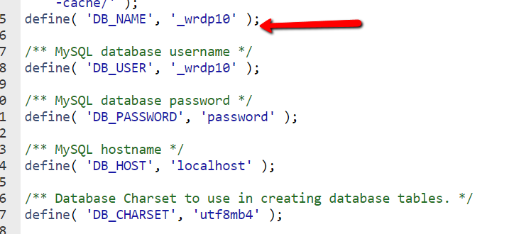
You can find the database name assigned to the website in the configuration files. Usually, they bear the ‘conf’ or ‘config’ part in the file name. If that’s a custom-coded website, you probably know the exact name. In this article, we will illustrate the database modifications on the example of WordPress since it’s the most popular CMS on the market. For WordPress, the config file is called wp-config.php and looks as follows:
Note: For the other popular CMS the config files bear the following names:
Joomla- configuration.php
OpenCart – config.php
Magento – env.php (newer version) and local.xml at /app/etc for the installation directory (older version)
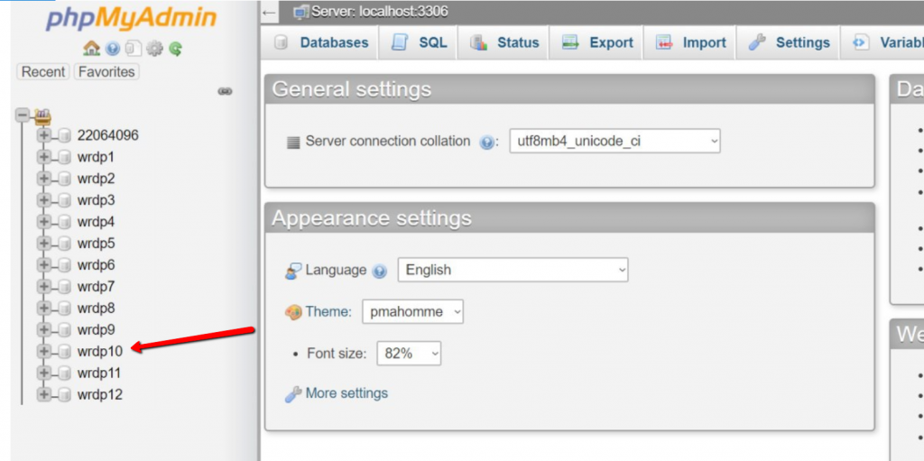
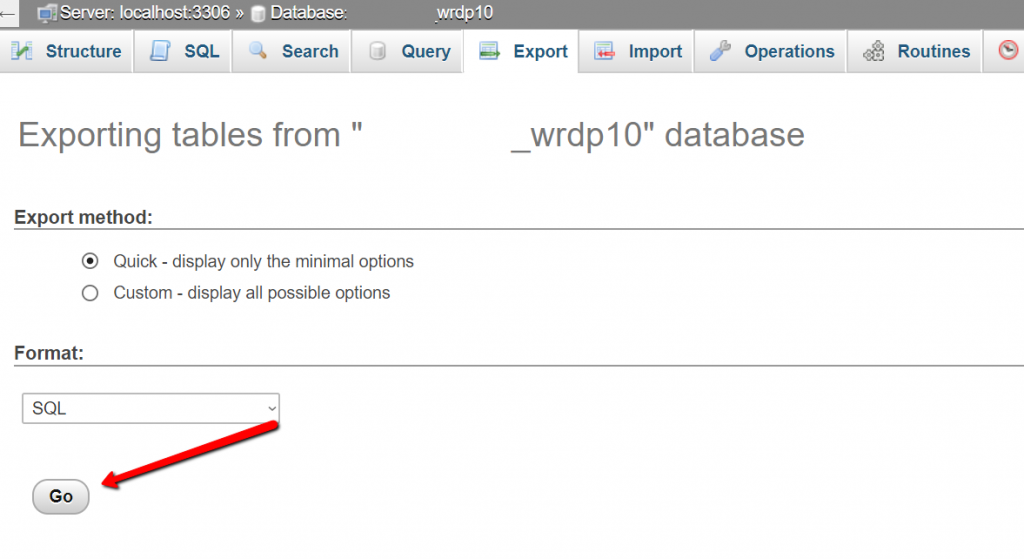
Here’s how to export the database when you know the name:
1. Log in to PHPMyAdmin interface and locate your database:
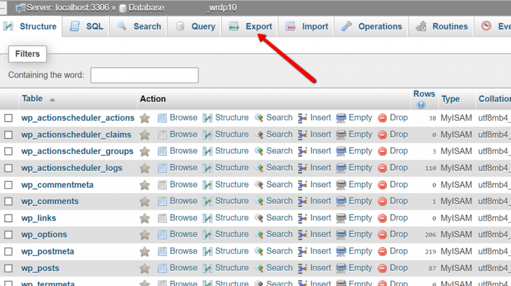
2. Click on it. Once the database opens, press ‘Export’
3. When you press it, you will be prompted with options regarding the Export method and Format and select ‘Go’.
Here we leave the default options and press go so that the database is exported to your PC and ready to work in the local environment.
Don’t mess with SEO
If you plan massive updates related to the website structure that take several days, make sure that your SEO is not affected. Once you tested everything on the Sandbox, make sure there are no broken links that can result in 404 errors on your website that are extremely bad for SEO.
Also, it’s necessary to make sure that all the links that were available in the old version but will not be present in the new one, are properly redirecting. In addition, before going live, check all the subpages once again so that you can re-assure that everything will be fine. In addition, you may also want to discourage the website from crawling during the updates.
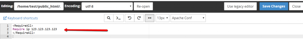
If you are playing with Sandbox on a live hosting, you will definitely need to close the page from public accessibility as when Google detects duplicate content, it will be hard to bring back the previous SEO results. If your hosting uses the Apache server, you may do it via modifying your .htaccess file. Add there the following string:
Make sure that you replace 123.123.123.123 with your actual IP address to work on the website.
Take care of security
Security is the main pillar of your website. Everything is based on security: your website accessibility, chances to fall victim to malicious attackers and reliability of the system. It’s no less important when you are planning the updates to your website. Even if a vulnerability in software is detected, you will have time to roll back to the previous version without being affected provided that other parts of the system are protected.
Among the key security measures are server-based: installing and configuring the Firewalls, taking care of anti-malware software and keeping logs monitoring, automatic security updates. When we talk about website-based security these are restricting access to the admin side of your pages such as blocking login links, security plugins and keeping the latest version of the software you use.
Apart from the server and website, there are some ground rules neglected by the majority of people such as strong passwords, using official and licensed software only and avoiding opening any suspicious emails. Security measures are crucial when making changes to your website as MySQL injections or cross-website scripting and other not pleasant attempts to hack a website occur when you introduce the updates such as installing a new template on your website or upload some files.
Some of these tips may seem obvious and simple, still, due to that, they are not taken seriously that is why the cases when websites going down after the updates are introduced are still widespread. Unfortunately, in most cases, people start following these rules only after they had a bad experience during making changes or after them. However, it’s much easier in terms of time and effort to prevent the catastrophe than to deal with the consequences.
Now when you know what things are crucial during the updates, it will be easier to have a checklist of things to do before introducing updates. Moreover, to keep your website safe and sound!