Archive

Archive for April, 2020

How to Add Lunr Search to your Gatsby Website

April 22nd, 2020 No comments

The Jamstack way of thinking and building websites is becoming more and more popular.

Have you already tried Gatsby, Nuxt, or Gridsome (to cite only a few)? Chances are that your first contact was a “Wow!” moment — so many things are automatically set up and ready to use.

There are some challenges, though, one of which is search functionality. If you’re working on any sort of content-driven site, you’ll likely run into search and how to handle it. Can it be done without any external server-side technology?

Search is not one of those things that come out of the box with Jamstack. Some extra decisions and implementation are required.

Fortunately, we have a bunch of options that might be more or less adapted to a project. We could use Algolia’s powerful search-as-service API. It comes with a free plan that is restricted to non-commercial projects with a limited capacity. If we were to use WordPress with WPGraphQL as a data source, we could take advantage of WordPress native search functionality and Apollo Client. Raymond Camden recently explored a few Jamstack search options, including pointing a search form directly at Google.

In this article, we will build a search index and add search functionality to a Gatsby website with Lunr, a lightweight JavaScript library providing an extensible and customizable search without the need for external, server-side services. We used it recently to add “Search by Tartan Name” to our Gatsby project tartanify.com. We absolutely wanted persistent search as-you-type functionality, which brought some extra challenges. But that’s what makes it interesting, right? I’ll discuss some of the difficulties we faced and how we dealt with them in the second half of this article.

Getting started

For the sake of simplicity, let’s use the official Gatsby blog starter. Using a generic starter lets us abstract many aspects of building a static website. If you’re following along, make sure to install and run it:

gatsby new gatsby-starter-blog https://github.com/gatsbyjs/gatsby-starter-blog
cd gatsby-starter-blog
gatsby develop

It’s a tiny blog with three posts we can view by opening up http://localhost:8000/___graphql in the browser.

Showing the GraphQL page on the localhost installation in the browser.

Inverting index with Lunr.js ?

Lunr uses a record-level inverted index as its data structure. The inverted index stores the mapping for each word found within a website to its location (basically a set of page paths). It’s on us to decide which fields (e.g. title, content, description, etc.) provide the keys (words) for the index.

For our blog example, I decided to include all titles and the content of each article. Dealing with titles is straightforward since they are composed uniquely of words. Indexing content is a little more complex. My first try was to use the rawMarkdownBody field. Unfortunately, rawMarkdownBody introduces some unwanted keys resulting from the markdown syntax.

Showing an attempt at using markdown syntax for links.

I obtained a “clean” index using the html field in conjunction with the striptags package (which, as the name suggests, strips out the HTML tags). Before we get into the details, let’s look into the Lunr documentation.

Here’s how we create and populate the Lunr index. We will use this snippet in a moment, specifically in our gatsby-node.js file.

const index = lunr(function () {
  this.ref('slug')
  this.field('title')
  this.field('content')
  for (const doc of documents) {
    this.add(doc)
  }
})

documents is an array of objects, each with a slug, title and content property:

{
  slug: '/post-slug/',
  title: 'Post Title',
  content: 'Post content with all HTML tags stripped out.'
}

We will define a unique document key (the slug) and two fields (the title and content, or the key providers). Finally, we will add all of the documents, one by one.

Let’s get started.

Creating an index in gatsby-node.js

Let’s start by installing the libraries that we are going to use.

yarn add lunr graphql-type-json striptags

Next, we need to edit the gatsby-node.js file. The code from this file runs once in the process of building a site, and our aim is to add index creation to the tasks that Gatsby executes on build.

CreateResolvers is one of the Gatsby APIs controlling the GraphQL data layer. In this particular case, we will use it to create a new root field; Let’s call it LunrIndex.

Gatsby’s internal data store and query capabilities are exposed to GraphQL field resolvers on context.nodeModel. With getAllNodes, we can get all nodes of a specified type:

/* gatsby-node.js */
const { GraphQLJSONObject } = require(`graphql-type-json`)
const striptags = require(`striptags`)
const lunr = require(`lunr`)

exports.createResolvers = ({ cache, createResolvers }) => {
  createResolvers({
    Query: {
      LunrIndex: {
        type: GraphQLJSONObject,
        resolve: (source, args, context, info) => {
          const blogNodes = context.nodeModel.getAllNodes({
            type: `MarkdownRemark`,
          })
          const type = info.schema.getType(`MarkdownRemark`)
          return createIndex(blogNodes, type, cache)
        },
      },
    },
  })
}

Now let’s focus on the createIndex function. That’s where we will use the Lunr snippet we mentioned in the last section.

/* gatsby-node.js */
const createIndex = async (blogNodes, type, cache) => {
  const documents = []
  // Iterate over all posts 
  for (const node of blogNodes) {
    const html = await type.getFields().html.resolve(node)
    // Once html is resolved, add a slug-title-content object to the documents array
    documents.push({
      slug: node.fields.slug,
      title: node.frontmatter.title,
      content: striptags(html),
    })
  }
  const index = lunr(function() {
    this.ref(`slug`)
    this.field(`title`)
    this.field(`content`)
    for (const doc of documents) {
      this.add(doc)
    }
  })
  return index.toJSON()
}

Have you noticed that instead of accessing the HTML element directly with const html = node.html, we’re using an await expression? That’s because node.html isn’t available yet. The gatsby-transformer-remark plugin (used by our starter to parse Markdown files) does not generate HTML from markdown immediately when creating the MarkdownRemark nodes. Instead, html is generated lazily when the html field resolver is called in a query. The same actually applies to the excerpt that we will need in just a bit.

Let’s look ahead and think about how we are going to display search results. Users expect to obtain a link to the matching post, with its title as the anchor text. Very likely, they wouldn’t mind a short excerpt as well.

Lunr’s search returns an array of objects representing matching documents by the ref property (which is the unique document key slug in our example). This array does not contain the document title nor the content. Therefore, we need to store somewhere the post title and excerpt corresponding to each slug. We can do that within our LunrIndex as below:

/* gatsby-node.js */
const createIndex = async (blogNodes, type, cache) => {
  const documents = []
  const store = {}
  for (const node of blogNodes) {
    const {slug} = node.fields
    const title = node.frontmatter.title
    const [html, excerpt] = await Promise.all([
      type.getFields().html.resolve(node),
      type.getFields().excerpt.resolve(node, { pruneLength: 40 }),
    ])
    documents.push({
      // unchanged
    })
    store[slug] = {
      title,
      excerpt,
    }
  }
  const index = lunr(function() {
    // unchanged
  })
  return { index: index.toJSON(), store }
}

Our search index changes only if one of the posts is modified or a new post is added. We don’t need to rebuild the index each time we run gatsby develop. To avoid unnecessary builds, let’s take advantage of the cache API:

/* gatsby-node.js */
const createIndex = async (blogNodes, type, cache) => {
  const cacheKey = `IndexLunr`
  const cached = await cache.get(cacheKey)
  if (cached) {
    return cached
  }
  // unchanged
  const json = { index: index.toJSON(), store }
  await cache.set(cacheKey, json)
  return json
}

Enhancing pages with the search form component

We can now move on to the front end of our implementation. Let’s start by building a search form component.

touch src/components/search-form.js 

I opt for a straightforward solution: an input of type="search", coupled with a label and accompanied by a submit button, all wrapped within a form tag with the search landmark role.

We will add two event handlers, handleSubmit on form submit and handleChange on changes to the search input.

/* src/components/search-form.js */
import React, { useState, useRef } from "react"
import { navigate } from "@reach/router"
const SearchForm = ({ initialQuery = "" }) => {
  // Create a piece of state, and initialize it to initialQuery
  // query will hold the current value of the state,
  // and setQuery will let us change it
  const [query, setQuery] = useState(initialQuery)
  
  // We need to get reference to the search input element
  const inputEl = useRef(null)

  // On input change use the current value of the input field (e.target.value)
  // to update the state's query value
  const handleChange = e => {
    setQuery(e.target.value)
  }
  
  // When the form is submitted navigate to /search
  // with a query q paramenter equal to the value within the input search
  const handleSubmit = e => {
    e.preventDefault()
    // `inputEl.current` points to the mounted search input element
    const q = inputEl.current.value
    navigate(`/search?q=${q}`)
  }
  return (
    <form role="search" onSubmit={handleSubmit}>
      <label htmlFor="search-input" style={{ display: "block" }}>
        Search for:
      </label>
      <input
        ref={inputEl}
        id="search-input"
        type="search"
        value={query}
        placeholder="e.g. duck"
        onChange={handleChange}
      />
      <button type="submit">Go</button>
    </form>
  )
}
export default SearchForm

Have you noticed that we’re importing navigate from the @reach/router package? That is necessary since neither Gatsby’s nor navigate provide in-route navigation with a query parameter. Instead, we can import @reach/router — there’s no need to install it since Gatsby already includes it — and use its navigate function.

Now that we’ve built our component, let’s add it to our home page (as below) and 404 page.

/* src/pages/index.js */
// unchanged
import SearchForm from "../components/search-form"
const BlogIndex = ({ data, location }) => {
  // unchanged
  return (
    <Layout location={location} title={siteTitle}>
      <SEO title="All posts" />
      <Bio />
      <SearchForm />
      // unchanged

Search results page

Our SearchForm component navigates to the /search route when the form is submitted, but for the moment, there is nothing behing this URL. That means we need to add a new page:

touch src/pages/search.js 

I proceeded by copying and adapting the content of the the index.js page. One of the essential modifications concerns the page query (see the very bottom of the file). We will replace allMarkdownRemark with the LunrIndex field.

/* src/pages/search.js */
import React from "react"
import { Link, graphql } from "gatsby"
import { Index } from "lunr"
import Layout from "../components/layout"
import SEO from "../components/seo"
import SearchForm from "../components/search-form"


// We can access the results of the page GraphQL query via the data props
const SearchPage = ({ data, location }) => {
  const siteTitle = data.site.siteMetadata.title
  
  // We can read what follows the ?q= here
  // URLSearchParams provides a native way to get URL params
  // location.search.slice(1) gets rid of the "?" 
  const params = new URLSearchParams(location.search.slice(1))
  const q = params.get("q") || ""


  // LunrIndex is available via page query
  const { store } = data.LunrIndex
  // Lunr in action here
  const index = Index.load(data.LunrIndex.index)
  let results = []
  try {
    // Search is a lunr method
    results = index.search(q).map(({ ref }) => {
      // Map search results to an array of {slug, title, excerpt} objects
      return {
        slug: ref,
        ...store[ref],
      }
    })
  } catch (error) {
    console.log(error)
  }
  return (
    // We will take care of this part in a moment
  )
}
export default SearchPage
export const pageQuery = graphql`
  query {
    site {
      siteMetadata {
        title
      }
    }
    LunrIndex
  }
`

Now that we know how to retrieve the query value and the matching posts, let’s display the content of the page. Notice that on the search page we pass the query value to the component via the initialQuery props. When the user arrives to the search results page, their search query should remain in the input field.

return (
  <Layout location={location} title={siteTitle}>
    <SEO title="Search results" />
    {q ? <h1>Search results</h1> : <h1>What are you looking for?</h1>}
    <SearchForm initialQuery={q} />
    {results.length ? (
      results.map(result => {
        return (
          <article key={result.slug}>
            <h2>
              <Link to={result.slug}>
                {result.title || result.slug}
              </Link>
            </h2>
            <p>{result.excerpt}</p>
          </article>
        )
      })
    ) : (
      <p>Nothing found.</p>
    )}
  </Layout>
)

You can find the complete code in this gatsby-starter-blog fork and the live demo deployed on Netlify.

Instant search widget

Finding the most “logical” and user-friendly way of implementing search may be a challenge in and of itself. Let’s now switch to the real-life example of tartanify.com — a Gatsby-powered website gathering 5,000+ tartan patterns. Since tartans are often associated with clans or organizations, the possibility to search a tartan by name seems to make sense.

We built tartanify.com as a side project where we feel absolutely free to experiment with things. We didn’t want a classic search results page but an instant search “widget.” Often, a given search keyword corresponds with a number of results — for example, “Ramsay” comes in six variations. We imagined the search widget would be persistent, meaning it should stay in place when a user navigates from one matching tartan to another.

Let me show you how we made it work with Lunr. The first step of building the index is very similar to the gatsby-starter-blog example, only simpler:

/* gatsby-node.js */
exports.createResolvers = ({ cache, createResolvers }) => {
  createResolvers({
    Query: {
      LunrIndex: {
        type: GraphQLJSONObject,
        resolve(source, args, context) {
          const siteNodes = context.nodeModel.getAllNodes({
            type: `TartansCsv`,
          })
          return createIndex(siteNodes, cache)
        },
      },
    },
  })
}
const createIndex = async (nodes, cache) => {
  const cacheKey = `LunrIndex`
  const cached = await cache.get(cacheKey)
  if (cached) {
    return cached
  }
  const store = {}
  const index = lunr(function() {
    this.ref(`slug`)
    this.field(`title`)
    for (node of nodes) {
      const { slug } = node.fields
      const doc = {
        slug,
        title: node.fields.Unique_Name,
      }
      store[slug] = {
        title: doc.title,
      }
      this.add(doc)
    }
  })
  const json = { index: index.toJSON(), store }
  cache.set(cacheKey, json)
  return json
}

We opted for instant search, which means that search is triggered by any change in the search input instead of a form submission.

/* src/components/searchwidget.js */
import React, { useState } from "react"
import lunr, { Index } from "lunr"
import { graphql, useStaticQuery } from "gatsby"
import SearchResults from "./searchresults"


const SearchWidget = () => {
  const [value, setValue] = useState("")
  // results is now a state variable 
  const [results, setResults] = useState([])


  // Since it's not a page component, useStaticQuery for quering data
  // https://www.gatsbyjs.org/docs/use-static-query/
  const { LunrIndex } = useStaticQuery(graphql`
    query {
      LunrIndex
    }
  `)
  const index = Index.load(LunrIndex.index)
  const { store } = LunrIndex
  const handleChange = e => {
    const query = e.target.value
    setValue(query)
    try {
      const search = index.search(query).map(({ ref }) => {
        return {
          slug: ref,
          ...store[ref],
        }
      })
      setResults(search)
    } catch (error) {
      console.log(error)
    }
  }
  return (
    <div className="search-wrapper">
      // You can use a form tag as well, as long as we prevent the default submit behavior
      <div role="search">
        <label htmlFor="search-input" className="visually-hidden">
          Search Tartans by Name
        </label>
        <input
          id="search-input"
          type="search"
          value={value}
          onChange={handleChange}
          placeholder="Search Tartans by Name"
        />
      </div>
      <SearchResults results={results} />
    </div>
  )
}
export default SearchWidget

The SearchResults are structured like this:

/* src/components/searchresults.js */
import React from "react"
import { Link } from "gatsby"
const SearchResults = ({ results }) => (
  <div>
    {results.length ? (
      <>
        <h2>{results.length} tartan(s) matched your query</h2>
        <ul>
          {results.map(result => (
            <li key={result.slug}>
              <Link to={`/tartan/${result.slug}`}>{result.title}</Link>
            </li>
          ))}
        </ul>
      </>
    ) : (
      <p>Sorry, no matches found.</p>
    )}
  </div>
)
export default SearchResults

Making it persistent

Where should we use this component? We could add it to the Layout component. The problem is that our search form will get unmounted on page changes that way. If a user wants to browser all tartans associated with the “Ramsay” clan, they will have to retype their query several times. That’s not ideal.

Thomas Weibenfalk has written a great article on keeping state between pages with local state in Gatsby.js. We will use the same technique, where the wrapPageElement browser API sets persistent UI elements around pages.

Let’s add the following code to the gatsby-browser.js. You might need to add this file to the root of your project.

/* gatsby-browser.js */
import React from "react"
import SearchWrapper from "./src/components/searchwrapper"
export const wrapPageElement = ({ element, props }) => (
  <SearchWrapper {...props}>{element}</SearchWrapper>
)

Now let’s add a new component file:

touch src/components/searchwrapper.js

Instead of adding SearchWidget component to the Layout, we will add it to the SearchWrapper and the magic happens. ?

/* src/components/searchwrapper.js */
import React from "react"
import SearchWidget from "./searchwidget"


const SearchWrapper = ({ children }) => (
  <>
    {children}
    <SearchWidget />
  </>
)
export default SearchWrapper

Creating a custom search query

At this point, I started to try different keywords but very quickly realized that Lunr’s default search query might not be the best solution when used for instant search.

Why? Imagine that we are looking for tartans associated with the name MacCallum. While typing “MacCallum” letter-by-letter, this is the evolution of the results:

  • m – 2 matches (Lyon, Jeffrey M, Lyon, Jeffrey M (Hunting))
  • ma – no matches
  • mac – 1 match (Brighton Mac Dermotte)
  • macc – no matches
  • macca – no matches
  • maccal – 1 match (MacCall)
  • maccall – 1 match (MacCall)
  • maccallu – no matches
  • maccallum – 3 matches (MacCallum, MacCallum #2, MacCallum of Berwick)

Users will probably type the full name and hit the button if we make a button available. But with instant search, a user is likely to abandon early because they may expect that the results can only narrow down letters are added to the keyword query.

That’s not the only problem. Here’s what we get with “Callum”:

  • c – 3 unrelated matches
  • ca – no matches
  • cal – no matches
  • call – no matches
  • callu – no matches
  • callum – one match

You can see the trouble if someone gives up halfway into typing the full query.

Fortunately, Lunr supports more complex queries, including fuzzy matches, wildcards and boolean logic (e.g. AND, OR, NOT) for multiple terms. All of these are available either via a special query syntax, for example:

index.search("+*callum mac*")

We could also reach for the index query method to handle it programatically.

The first solution is not satisfying since it requires more effort from the user. I used the index.query method instead:

/* src/components/searchwidget.js */
const search = index
  .query(function(q) {
    // full term matching
    q.term(el)
    // OR (default)
    // trailing or leading wildcard
    q.term(el, {
      wildcard:
        lunr.Query.wildcard.LEADING | lunr.Query.wildcard.TRAILING,
    })
  })
  .map(({ ref }) => {
    return {
      slug: ref,
      ...store[ref],
    }
  })

Why use full term matching with wildcard matching? That’s necessary for all keywords that “benefit” from the stemming process. For example, the stem of “different” is “differ.” As a consequence, queries with wildcards — such as differe*, differen* or different* — all result in no matches, while the full term queries differe, differen and different return matches.

Fuzzy matches can be used as well. In our case, they are allowed uniquely for terms of five or more characters:

q.term(el, { editDistance: el.length > 5 ? 1 : 0 })
q.term(el, {
  wildcard:
    lunr.Query.wildcard.LEADING | lunr.Query.wildcard.TRAILING,
})

The handleChange function also “cleans up” user inputs and ignores single-character terms:

/* src/components/searchwidget.js */  
const handleChange = e => {
  const query = e.target.value || ""
  setValue(query)
  if (!query.length) {
    setResults([])
  }
  const keywords = query
    .trim() // remove trailing and leading spaces
    .replace(/*/g, "") // remove user's wildcards
    .toLowerCase()
    .split(/s+/) // split by whitespaces
  // do nothing if the last typed keyword is shorter than 2
  if (keywords[keywords.length - 1].length < 2) {
    return
  }
  try {
    const search = index
      .query(function(q) {
        keywords
          // filter out keywords shorter than 2
          .filter(el => el.length > 1)
          // loop over keywords
          .forEach(el => {
            q.term(el, { editDistance: el.length > 5 ? 1 : 0 })
            q.term(el, {
              wildcard:
                lunr.Query.wildcard.LEADING | lunr.Query.wildcard.TRAILING,
            })
          })
      })
      .map(({ ref }) => {
        return {
          slug: ref,
          ...store[ref],
        }
      })
    setResults(search)
  } catch (error) {
    console.log(error)
  }
}

Let’s check it in action:

  • m – pending
  • ma – 861 matches
  • mac – 600 matches
  • macc – 35 matches
  • macca – 12 matches
  • maccal – 9 matches
  • maccall – 9 matches
  • maccallu – 3 matches
  • maccallum – 3 matches

Searching for “Callum” works as well, resulting in four matches: Callum, MacCallum, MacCallum #2, and MacCallum of Berwick.

There is one more problem, though: multi-terms queries. Say, you’re looking for “Loch Ness.” There are two tartans associated with that term, but with the default OR logic, you get a grand total of 96 results. (There are plenty of other lakes in Scotland.)

I wound up deciding that an AND search would work better for this project. Unfortunately, Lunr does not support nested queries, and what we actually need is (keyword1 OR *keyword*) AND (keyword2 OR *keyword2*).

To overcome this, I ended up moving the terms loop outside the query method and intersecting the results per term. (By intersecting, I mean finding all slugs that appear in all of the per-single-keyword results.)

/* src/components/searchwidget.js */
try {
  // andSearch stores the intersection of all per-term results
  let andSearch = []
  keywords
    .filter(el => el.length > 1)
    // loop over keywords
    .forEach((el, i) => {
      // per-single-keyword results
      const keywordSearch = index
        .query(function(q) {
          q.term(el, { editDistance: el.length > 5 ? 1 : 0 })
          q.term(el, {
            wildcard:
              lunr.Query.wildcard.LEADING | lunr.Query.wildcard.TRAILING,
          })
        })
        .map(({ ref }) => {
          return {
            slug: ref,
            ...store[ref],
          }
        })
      // intersect current keywordSearch with andSearch
      andSearch =
        i > 0
          ? andSearch.filter(x => keywordSearch.some(el => el.slug === x.slug))
          : keywordSearch
    })
  setResults(andSearch)
} catch (error) {
  console.log(error)
}

The source code for tartanify.com is published on GitHub. You can see the complete implementation of the Lunr search there.

Final thoughts

Search is often a non-negotiable feature for finding content on a site. How important the search functionality actually is may vary from one project to another. Nevertheless, there is no reason to abandon it under the pretext that it does not tally with the static character of Jamstack websites. There are many possibilities. We’ve just discussed one of them.

And, paradoxically in this specific example, the result was a better all-around user experience, thanks to the fact that implementing search was not an obvious task but instead required a lot of deliberation. We may not have been able to say the same with an over-the-counter solution.

The post How to Add Lunr Search to your Gatsby Website appeared first on CSS-Tricks.

Categories: Designing, Others Tags:

Puzzles and Mysteries

April 22nd, 2020 No comments

Bob Hoffman:

Puzzles, [Malcom Gladwell] wrote, are problems for which there is not enough information. An example of a puzzle: Where is Jimmy Hoffa buried? If we had more information, we would know the answer. If someone told us “Jimmy Hoffa is buried in New Jersey,” we’d know a little more than we know now. If they said, “He’s buried in northern New Jersey,” we’d know even more. If they said, “He’s buried in the Meadowlands,” we’d have an answer to our puzzle.

On the other hand, there are mysteries. Mysteries are problems for which we have plenty of information, but no accurate analysis. An example of a mystery: Why do inner-city schools do such a crappy job of educating kids? There are thousands of studies. Every education department of every university in America has done a study on this; every committee of Congress has done a report on it; every editorial writer has a theory about it, and every pundit has an opinion. And yet, we have no definitive answer.


It’s fun to think about how that correlates to front-end development. When we’re coding, every¹ problem we face is a puzzle. We just need more information and we can figure out what to do. Sometimes, design is like that too. Information can make our designs better. But success in design² has a nebulous quality that makes it feel more like a mystery.

  1. Except for CORS. CORS is a mystery.
  2. And business, marketing, and love.

Direct Link to ArticlePermalink

The post Puzzles and Mysteries appeared first on CSS-Tricks.

Categories: Designing, Others Tags:

7 Biggest Mistakes Freelance Designers Make That Will Ruin Their Career

April 22nd, 2020 No comments

When you’re a freelancer and you start to work directly with your clients, there’s something crucial you need to know.

Your design is not the one and only, most important aspect of the transaction.

While presenting your client with an amazing design is the final goal, there are a lot of other things at stake that could make or break your business deal.

There are 7 things that could potentially ruin any partnership with a client, and they have nothing to do with your design style.

7 Biggest Mistakes Freelance Designers Make And How To Avoid Making Them

I don’t want you to have to make the same mistakes I’ve made when I was a beginner freelancer.

Today, I want to learn from my mistakes and avoid these 7 deadly sins of freelance graphic designers.

1. Poor Communication Skills

Poor communication is the biggest bummer of all the freelance design mistakes that you could make.

Everything you do and the way you’re going to make your client feel is all going to come back to how well you communicate with your client.

Now, communication is a two-way street.

If you and your client don’t communicate exactly what they’re looking for and what you’re capable of doing, then you’re going to find yourself working all-nighters to revise mistakes that could’ve easily been avoided had you communicated.

Some clients are angels, and some are the opposite.

Some clients will verbalize exactly what they’re looking for, and others will give you the vaguest idea of what they want and let you try to figure it out, which sometimes is a blessing, and others, a curse.

One way you can avoid poor communication is by creating a list of basic questions you want to ask each of your clients, regarding their expectations of what your design will be.

Decide what platform you’ll be communicating through and make sure you set hours you will be readily available to discuss changes and set your notification to loud so you never miss a beat.

If you ever feel like a client is being rude, take a deep breath, decide whether you’ll continue working with them or not, then write them a calm message. Remember: things on the internet last forever! Don’t let one snooty client ruin your reputation.

2. Limited Number of Revisions

Nothing is worse than thinking you finally finished a design that you’re happy with and proud of, you just presented it to your client, and they don’t love it.

They want you to revise it.

The number of times you agree to revise your project is something you will need to have discussed beforehand.

Not everyone will be on the same wavelength, so it’s important you decide how many times you will change the final version of your design, and what you will charge if they ask for supplementary changes.

And what do you know it, this all leads back to good communication.

Don’t let people walk all over you, but also don’t be so prideful you won’t make any changes. It’s a beautiful and delicate balance.

3. Not Fulfilling Client’s Needs

Speaking of being prideful, sometimes, you have to suck it up and make a design that you’re not completely proud of.

Lots of clients have complained that some designers they worked with only had themselves in mind when creating their design.

Needs and requests were not met, therefore leading to awful conflict and probably bad word of mouth followed shortly after that.

Try to sus out the vibe of what your client is looking for and see if the style aligns with yours. If it does, awesome!

If it doesn’t, decide whether or not you’re going to do the work anyway and get that coin, or whether to respectfully decline the offer to work with them.

4. Missing The Deadline

When you’re your own boss, it’s easy to get behind and have no “work anxiety” or drive to finish your work on time.

But a good reputation is crucial and constantly missing deadlines is a terrible way to do things.

Set up a deadline that you really think you can make.

Don’t think your Superman or Superwoman, and can handle 10 projects that are all due by next week.

Take on what you know you can handle, and discuss that with your client.

Everyone understands a pushback here and there, but don’t make that a habit.

People might eventually perceive you as lazy, and that’s not what we’re going for here.

5. Mispriced Work

Listen, you gotta know your worth.

In saying this, you should know how much to charge.

Don’t undersell yourself, because you’re the bomb!

But don’t overcharge either, because people don’t like it when someone takes advantage of them.

Give them a quote, and negotiate from there.

6. Not Making Clients Feel Like a Priority

No one likes to feel unimportant.

And maybe you’re not making your clients feel unimportant intentionally.

Sometimes, we all take on more than we can handle.

But if your clients don’t feel like a priority, they might cut your work contract short, or choose not to work with you again in the future.

This mistake goes hand-in-hand with missing deadlines. You can’t take on so much that you will make people feel unimportant.

Everyone wants to feel heard and important, and some companies or clients are cut-throat and won’t work with you again if you don’t make them feel like they’re important to you.

Do your best to make your clients know they’re important to you and you’re doing your best.

Communication, communication, communication.

7. Wasting Time

The final thing I want to talk about is wasting time.

When you work from home, it’s easy to get distracted.

Blame it on your pets or a messy kitchen, and then suddenly you’re 5 hours behind schedule and things are getting out of hand.

I have a whole list of things you can do to stay productive while working from home that will help you stay on top of your A-game.

Make sure you make a good schedule for yourself, one that works for you.

Don’t waste too much time on things that don’t matter. The dishes can wait. Or maybe, they can’t. You should definitely have a clean workspace. But right after that, get back to work!

Wrapping up

Everything is a learning curve, and while you start working from home, take advantage of all the freedom that comes with that, but make a good name for yourself and do your best.

What other giant mistakes do you think designers make that we should cover?

Let us know in the comments.

Until next time,

Stay creative, folks!

Read More at 7 Biggest Mistakes Freelance Designers Make That Will Ruin Their Career

Categories: Designing, Others Tags:

Responsive Web And Desktop Development With Flutter

April 22nd, 2020 No comments

Responsive Web And Desktop Development With Flutter

Responsive Web And Desktop Development With Flutter

Carmine Zaccagnino

2020-04-22T10:00:00+00:002020-04-22T13:47:32+00:00

This tutorial is not an introduction to Flutter itself. There are plenty of articles, videos and several books available online with simple introductions that will help you learn the basics of Flutter. Instead, we’ll be covering the following two objectives:

  1. The current state of Flutter non-mobile development and how you can run Flutter code in the browser, on a desktop or laptop computer;
  2. How to create responsive apps using Flutter, so that you can see its power — especially as a web framework — on full display, ending with a note about routing based on URL.

Let’s get into it!

What Is Flutter, Why It’s Important, What It Has Evolved Into, Where It’s Going

Flutter is Google’s latest app development framework. Google envisions it to be all-encompassing: It will enable the same code to be executed on smartphones of all brands, on tablets, and on desktop and laptops computer as native apps or as web pages.

It’s a very ambitious project, but Google has been incredibly successful until now particularly in two aspects: in creating a truly platform-independent framework for Android and iOS native apps that works great and is fully ready for production use, and in creating an impressive front-end web framework that can share 100% of the code with a compatible Flutter app.

In the next section, we’re going to see what makes the app compatible and what’s the state of non-mobile Flutter development as of now.

Non-Mobile Development With Flutter

Non-mobile development with Flutter was first publicized in a significant way at Google I/O 2019. This section is about how to make it work and about when it works.

How To Enable Web And Desktop Development

To enable web development, you must first be on Flutter’s beta channel. There are two ways to get to that point:

  • Install Flutter directly on the beta channel by downloading the appropriate latest beta version from the SDK archive.
  • If you already have Flutter installed, switch to the beta channel with $ flutter channel beta, and then perform the switch itself by updating your Flutter version (which is actually a git pull on the Flutter installation folder) with $ flutter upgrade.

After that, you can run this:

$ flutter config --enable-web

Desktop support is much more experimental, especially due to a lack of tooling for Linux and Windows, making plugin development especially a major pain, and due to the fact that the APIs used for it are intended for proof-of-concept use and not for production. This is unlike web development, which is using the tried-and-tested dart2js compiler for release builds, which are not even supported for Windows and Linux native desktop apps.

Note: Support for macOS is slightly better than support for Windows and Linux, but it still isn’t as good as support for the web and not nearly as good as the full support for mobile platforms.

To enable support for desktop development, you need to switch to the master release channel by following the same steps outlined earlier for the beta channel. Then, run the following by replacing with either linux, windows, or macos:

$ flutter config --enable-<OS_NAME>-desktop

At this point, if you have issues with any of the following steps that I’ll be describing because the Flutter tool isn’t doing what I’m saying it should do, some common troubleshooting steps are these:

  • Run flutter doctor to check for issues. A side effect of this Flutter command is that it should download any tools it needs that it doesn’t have.
  • Run flutter upgrade.
  • Turn it off and on again. The old tier-1 technical-support answer of restarting your computer might be just what is needed for you to be able to enjoy the full riches of Flutter.

Running And Building Flutter Web Apps

Flutter web support isn’t bad at all, and this is reflected in the ease of development for the web.

Running this…

$ flutter devices

… should show right away an entry for something like this:

Web Server • web-server • web-javascript • Flutter Tools

Additionally, running the Chrome browser should cause Flutter to show an entry for it as well. Running flutter run on a compatible Flutter project (more on that later) when the only “connected device” showing up is the web server will cause Flutter to start a web server on localhost:, which will allow you to access your Flutter web app from any browser.

If you have installed Chrome but it’s not showing up, you need to set the CHROME_EXECUTABLE environment variable to the path to the Chrome executable file.

Running And Building Flutter Desktop Apps

After you’ve enabled Flutter desktop support, you can run a Flutter app natively on your development workstation with flutter run -d , replacing with the same value you used when enabling desktop support. You can also build binaries in the build directory with flutter build .

Before you can do any of that, though, you need to have a directory containing what Flutter needs to build for your platform. This will be created automatically when you create a new project, but you’ll need to create it for an existing project with flutter create .. Also, the Linux and Windows APIs are unstable, so you might have to regenerate them for those platforms if the app stops working after a Flutter update.

When Is An App Compatible?

What have I meant all along when mentioning that a Flutter app has to be a “compatible project” in order for it to work on desktop or the web? Put simply, I mean that it mustn’t use any plugin that doesn’t have a platform-specific implementation for the platform on which you’re trying to build.

To make this point absolutely clear to everyone and avoid misunderstanding, please note that a Flutter plugin is a particular Flutter package that contains platform-specific code that is necessary for it to provide its features.

For example, you can use the Google-developed url_launcher package as much as you want (and you might want to, given that the web is built on hyperlinks).

An example of a Google-developed package the usage of which would preclude web development is path_provider, which is used to get the local storage path to save files to. This is an example of a package that, incidentally, isn’t of any use to a web app, so not being able to use it isn’t really a bummer, except for the fact that you need to change your code in order for it to work on the web if you’re using it.

For example, you can use the shared_preferences package, which relies on HTML localStorage on the web.

Similar caveats are valid regarding desktop platforms: Very few plugins are compatible with desktop platforms, and, as this is a recurring theme, much more work on this needs to be done on the desktop side than is really necessary on Flutter for the web.

Creating Responsive Layouts In Flutter

Because of what I’ve described above and for simplicity, I’m going to assume for the rest of this post that your target platform is the web, but the basic concepts apply to desktop development as well.

Supporting the web has benefits and responsibilities. Being pretty much forced to support different screen sizes might sound like a drawback, but consider that running the app in the web browsers enables you to see very easily how your app will look on screens of different sizes and aspect ratios, without having to run separate mobile device emulators.

Now, let’s talk code. How can you make your app responsive?

There are two perspectives from which this analysis is done:

  1. “What widgets am I using or can I use that can or should adapt to screens of different sizes?”
  2. “How can I get information about the size of the screen, and how can I use it when writing UI code?”

We’ll answer the first question later. Let’s first talk about the latter, because it can be dealt with very easily and is at the heart of the issue. There are two ways to do this:

  1. One way is to take the information from the MediaQueryData of the MediaQuery root InheritedWidget, which has to exist in the widget tree in order for a Flutter app to work (it’s part of MaterialApp/WidgetsApp/CupertinoApp), which you can get, just like any other InheritedWidget, with MediaQuery.of(context), which has a size property, which is of type Size, and which therefore has two width and height properties of the type double.
  2. The other way is to use a LayoutBuilder, which is a builder widget (just like a StreamBuilder or a FutureBuilder) that passes to the builder function (along with the context) a BoxConstraints object that has minHeight, maxHeight, minWidth and maxWidth properties.

Here’s an example DartPad using the MediaQuery to get constraints, the code for which is the following:

import 'package:flutter/material.dart';

void main() => runApp(MyApp());

class MyApp extends StatelessWidget {
  @override
  Widget build(context) =>
    MaterialApp(
      home: MyHomePage()
    );
}

class MyHomePage extends StatelessWidget {
  @override
  Widget build(context) =>
    Scaffold(
      body: Center(
        child: Column(
          mainAxisAlignment: MainAxisAlignment.spaceEvenly,
          children: [
            Text(
              "Width: ${MediaQuery.of(context).size.width}",
              style: Theme.of(context).textTheme.headline4
            ),
            Text(
              "Height: ${MediaQuery.of(context).size.height}",
              style: Theme.of(context).textTheme.headline4
            )
          ]
       )
     )
   );
}

And here’s one using the LayoutBuilder for the same thing:

import 'package:flutter/material.dart';

void main() => runApp(MyApp());

class MyApp extends StatelessWidget {
  @override
  Widget build(context) =>
    MaterialApp(
      home: MyHomePage()
    );
}

class MyHomePage extends StatelessWidget {
  @override
  Widget build(context) =>
    Scaffold(
      body: LayoutBuilder(
        builder: (context, constraints) => Center(
          child: Column(
            mainAxisAlignment: MainAxisAlignment.spaceEvenly,
            children: [
              Text(
                "Width: ${constraints.maxWidth}",
                style: Theme.of(context).textTheme.headline4
              ),
              Text(
                "Height: ${constraints.maxHeight}",
                style: Theme.of(context).textTheme.headline4
              )
            ]
         )
       )
     )
  );
}

Now, let’s think about what widgets can adapt to the constraints.

Fist of all, let’s think about the different ways of laying out multiple widgets according to the size of the screen.

The widget that most easily adapts is the GridView. In fact, a GridView built using the GridView.extent constructor doesn’t even need your involvement to be made responsive, as you can see in this very simple example:

import 'package:flutter/material.dart';

void main() => runApp(MyApp());

class MyApp extends StatelessWidget {
  @override
  Widget build(context) =>
    MaterialApp(
      home: MyHomePage()
    );
}

class MyHomePage extends StatelessWidget {
  final List elements = [
    "Zero",
    "One",
    "Two",
    "Three",
    "Four",
    "Five",
    "Six",
    "Seven",
    "Eight",
    "A Million Billion Trillion",
    "A much, much longer text that will still fit"
  ];


  @override
  Widget build(context) =>
    Scaffold(
      body: GridView.extent(
        maxCrossAxisExtent: 130.0,
        crossAxisSpacing: 20.0,
        mainAxisSpacing: 20.0,
        children: elements.map((el) => Card(child: Center(child: Padding(padding: EdgeInsets.all(8.0), child: Text(el))))).toList()
      )
   );
}

You can accommodate content of different sizes by changing the maxCrossAxisExtent.

That example mostly served the purpose of showing the existence of the GridView.extent GridView constructor, but a much smarter way to do that would be to use a GridView.builder with a SliverGridDelegateWithMaxCrossAxisExtent, in this case where the widgets to be shown in the grid are dynamically created from another data structure, as you can see in this example:

import 'package:flutter/material.dart';

void main() => runApp(MyApp());

class MyApp extends StatelessWidget {
  @override
  Widget build(context) =>
    MaterialApp(
      home: MyHomePage()
    );
}

class MyHomePage extends StatelessWidget {
  final List<String> elements = ["Zero", "One", "Two", "Three", "Four", "Five", "Six", "Seven", "Eight", "A Million Billion Trillion", "A much, much longer text that will still fit"];


  @override
  Widget build(context) =>
    Scaffold(
      body: GridView.builder(
        itemCount: elements.length,
        gridDelegate: SliverGridDelegateWithMaxCrossAxisExtent(
          maxCrossAxisExtent: 130.0,
          crossAxisSpacing: 20.0,
          mainAxisSpacing: 20.0,
        ),
        itemBuilder: (context, i) => Card(
          child: Center(
            child: Padding(
              padding: EdgeInsets.all(8.0), child: Text(elements[i])
            )
          )
        )
      )
   );
}

An example of GridView adapting to different screens is my personal landing page, which is a very simple Flutter web app consisting of a GridView with a bunch of Cards, just like that previous example code, except that the Cards are a little more complex and larger.

A very simple change that could be made to apps designed for phones would be to replace a Drawer with a permanent menu on the left when there is space.

For example, we could have a ListView of widgets, like the following, which is used for navigation:

class Menu extends StatelessWidget {
  @override
  Widget build(context) => ListView(
    children: [
      FlatButton(
        onPressed: () {},
          child: ListTile(
          leading: Icon(Icons.looks_one),
          title: Text("First Link"),
        )
      ),
      FlatButton(
        onPressed: () {},
          child: ListTile(
          leading: Icon(Icons.looks_two),
          title: Text("Second Link"),
        )
      )
    ]
  );
}

On a smartphone, a common place to use that would be inside a Drawer (also known as a hamburger menu).

Alternatives to that would be the BottomNavigationBar or the TabBar, in combination with the TabBarView, but with both we’d have to make more changes than are required with the drawer, so we’ll stick with the drawer.

To only show the Drawer containing the Menu that we saw earlier on smaller screens, you’d write code that looks like the following snippet, checking the width using the MediaQuery.of(context) and passing a Drawer object to the Scaffold only if it’s less than some width value that we believe to be appropriate for our app:

Scaffold(
    appBar: AppBar(/* ... */),
    drawer: MediaQuery.of(context).size.width < 500 ?
    Drawer(
      child: Menu(),
    ) :
    null,
    body: /* ... */
)

Now, let’s think about the body of the Scaffold. As the sample main content of our app, we’ll use the GridView that we built previously, which we keep in a separate widget named Content to avoid confusion:

class Content extends StatelessWidget {
  final List elements = ["Zero", "One", "Two", "Three", "Four", "Five", "Six", "Seven", "Eight", "A Million Billion Trillion", "A much, much longer text that will still fit"];
  @override
  Widget build(context) => GridView.builder(
    itemCount: elements.length,
    gridDelegate: SliverGridDelegateWithMaxCrossAxisExtent(
      maxCrossAxisExtent: 130.0,
      crossAxisSpacing: 20.0,
      mainAxisSpacing: 20.0,
    ),
    itemBuilder: (context, i) => Card(
      child: Center(
        child: Padding(
          padding: EdgeInsets.all(8.0), child: Text(elements[i])
        )
      )
    )
  );
}

On bigger screens, the body itself may be a Row that shows two widgets: the Menu, which is restricted to a fixed width, and the Content filling the rest of the screen.

On smaller screens, the entire body would be the Content.

We’ll wrap everything in a SafeArea and a Center widget because sometimes Flutter web app widgets, especially when using Rows and Columns, end up outside of the visible screen area, and that is fixed with SafeArea and/or Center.

This means the body of the Scaffold will be the following:

SafeArea(
  child:Center(
    child: MediaQuery.of(context).size.width < 500 ? Content() :
    Row(
      children: [
        Container(
          width: 200.0,
          child: Menu()
        ),
        Container(
          width: MediaQuery.of(context).size.width-200.0,
          child: Content()
        )
      ]
    )
  )
)

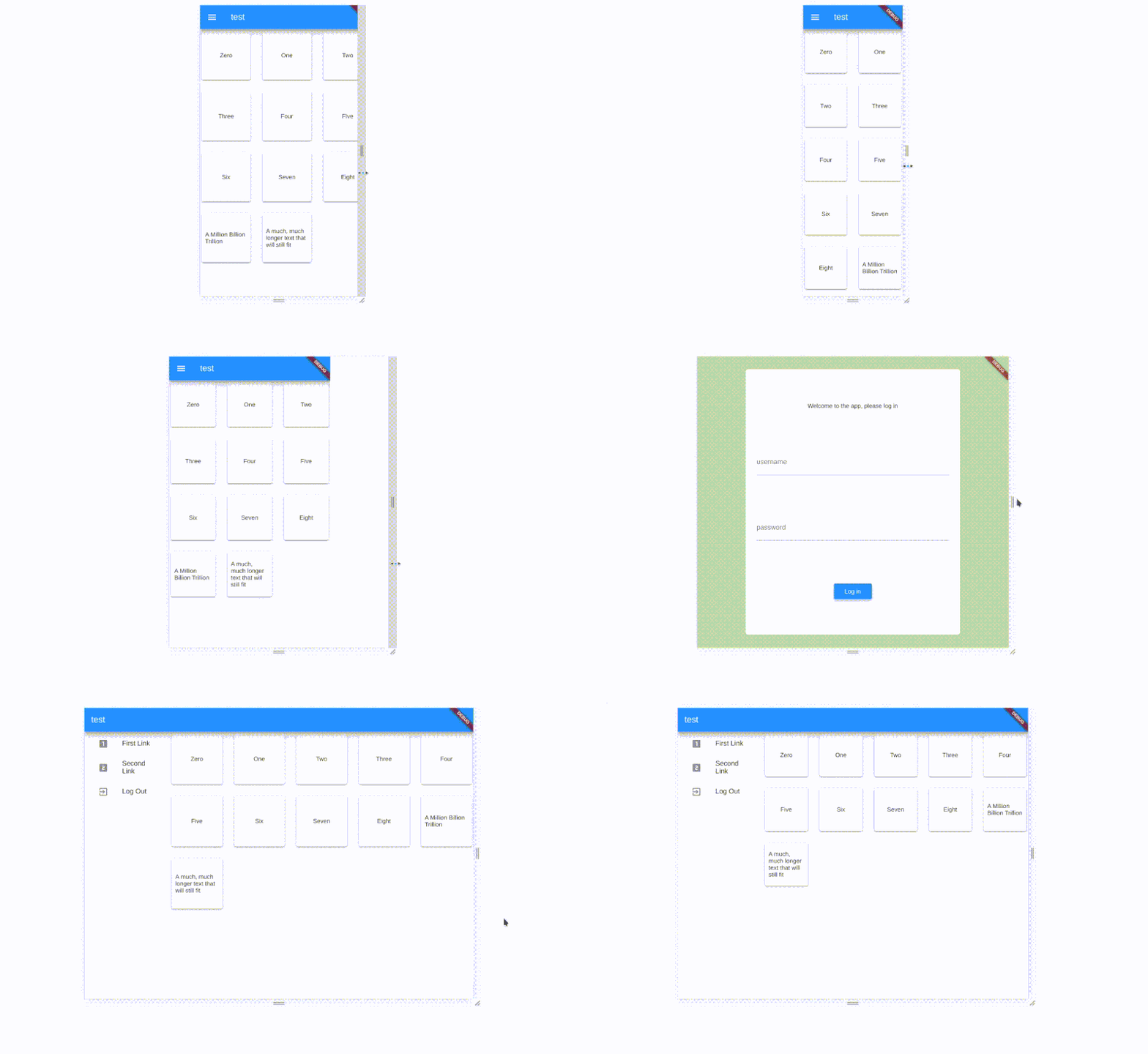
Here is all of that put together:

(Large preview)
import 'package:flutter/material.dart';

void main() => runApp(MyApp());

class MyApp extends StatelessWidget {
  @override
  Widget build(context) => MaterialApp(
    home: HomePage()
  );
}


class HomePage extends StatelessWidget {
  @override
  Widget build(context) => Scaffold(
    appBar: AppBar(title: Text("test")),
    drawer: MediaQuery.of(context).size.width < 500 ? Drawer(
      child: Menu(),
    ) : null,
    body: SafeArea(
        child:Center(
          child: MediaQuery.of(context).size.width < 500 ? Content() :
          Row(
            children: [
              Container(
                width: 200.0,
                child: Menu()
              ),
              Container(
                width: MediaQuery.of(context).size.width-200.0,
                child: Content()
              )
            ]
          )
        )
    )
  );
}

class Menu extends StatelessWidget {
  @override
  Widget build(context) => ListView(
    children: [
      FlatButton(
        onPressed: () {},
          child: ListTile(
          leading: Icon(Icons.looks_one),
          title: Text("First Link"),
        )
      ),
      FlatButton(
        onPressed: () {},
          child: ListTile(
          leading: Icon(Icons.looks_two),
          title: Text("Second Link"),
        )
      )
    ]
  );
}

class Content extends StatelessWidget {
  final List<String> elements = ["Zero", "One", "Two", "Three", "Four", "Five", "Six", "Seven", "Eight", "A Million Billion Trillion", "A much, much longer text that will still fit"];
  @override
  Widget build(context) => GridView.builder(
    itemCount: elements.length,
    gridDelegate: SliverGridDelegateWithMaxCrossAxisExtent(
      maxCrossAxisExtent: 130.0,
      crossAxisSpacing: 20.0,
      mainAxisSpacing: 20.0,
    ),
    itemBuilder: (context, i) => Card(
      child: Center(
        child: Padding(
          padding: EdgeInsets.all(8.0), child: Text(elements[i])
        )
      )
    )
  );
}

This is most of the stuff you’ll need as a general introduction to responsive UI in Flutter. Much of its application will depend on your app’s specific UI, and it’s hard to pinpoint exactly what you can do to make your app responsive, and you can take many approaches depending on your preference. Now, though, let’s see how we can make a more complete example into a responsive app, thinking about common app elements and UI flows.

Putting It In Context: Making An App Responsive

So far, we have just a screen. Let’s expand that into a two-screen app with working URL-based navigation!

Creating A Responsive Login Page

Chances are that your app has a login page. How can we make that responsive?

Login screens on mobile devices are quite similar to each other usually. The space available isn’t much; it’s usually just a Column with some Padding around its widgets, and it contains TextFields for typing in a username and a password and a button to log in. So, a pretty standard (though not functioning, as that would require, among other things, a TextEditingController for each TextField) login page for a mobile app could be the following:

Scaffold(
  body: Container(
    padding: const EdgeInsets.symmetric(
      vertical: 30.0, horizontal: 25.0
    ),
    child: Column(
      mainAxisAlignment: MainAxisAlignment.spaceAround,
      children: [
        Text("Welcome to the app, please log in"),
        TextField(
          decoration: InputDecoration(
            labelText: "username"
          )
        ),
        TextField(
          obscureText: true,
          decoration: InputDecoration(
            labelText: "password"
          )
        ),
        RaisedButton(
          color: Colors.blue,
          child: Text("Log in", style: TextStyle(color: Colors.white)),
          onPressed: () {}
        )
      ]
    ),
  ),
)

It looks fine on a mobile device, but those very wide TextFields start to look jarring on a tablet, let alone a bigger screen. However, we can’t just decide on a fixed width because phones have different screen sizes, and we should maintain a degree of flexibility.

For example, through experimentation, we might find that the maximum width should be 500. Well, we would set the Container‘s constraints to 500 (I used a Container instead of Padding in the previous example because I knew where I was going with this) and we’re good to go, right? Not really, because that would cause the login widgets to stick to the left side of the screen, which might be even worse than stretching everything. So, we wrap in a Center widget, like this:

Center(
  child: Container(
    constraints: BoxConstraints(maxWidth: 500),
    padding: const EdgeInsets.symmetric(
      vertical: 30.0, horizontal: 25.0
    ),
    child: Column(/* ... */)
  )
)

That already looks fine, and we haven’t even had to use either a LayoutBuilder or the MediaQuery.of(context).size. Let’s go one step further to make this look very good, though. It would look better, in my view, if the foreground part was in some way separated from the background. We can achieve that by giving a background color to what’s behind the Container with the input widgets, and keeping the foreground Container white. To make it look a little better, let’s keep the Container from stretching to the top and bottom of the screen on large devices, give it rounded corners, and give it a nice animated transition between the two layouts.

All of that now requires a LayoutBuilder and an outer Container in order both to set a background color and to add padding all around the Container and not just on the sides only on larger screens. Also, to make the change in padding amount animated, we just need to turn that outer Container into an AnimatedContainer, which requires a duration for the animation, which we’ll set to half a second, which is Duration(milliseconds: 500) in code.

Here’s that example of a responsive login page:

(Large preview)
class LoginPage extends StatelessWidget {
  @override
  Widget build(context) =>
    Scaffold(
      body: LayoutBuilder(
        builder: (context, constraints) {
          return AnimatedContainer(
            duration: Duration(milliseconds: 500),
            color: Colors.lightGreen[200],
            padding: constraints.maxWidth < 500 ? EdgeInsets.zero : EdgeInsets.all(30.0),
            child: Center(
              child: Container(
                padding: EdgeInsets.symmetric(
                  vertical: 30.0, horizontal: 25.0
                ),
                constraints: BoxConstraints(
                  maxWidth: 500,
                ),
                decoration: BoxDecoration(
                  color: Colors.white,
                  borderRadius: BorderRadius.circular(5.0),
                ),
                child: Column(
                  mainAxisAlignment: MainAxisAlignment.spaceAround,
                  children: [
                    Text("Welcome to the app, please log in"),
                    TextField(
                      decoration: InputDecoration(
                        labelText: "username"
                      )
                    ),
                    TextField(
                      obscureText: true,
                      decoration: InputDecoration(
                        labelText: "password"
                      )
                    ),
                    RaisedButton(
                      color: Colors.blue,
                      child: Text("Log in", style: TextStyle(color: Colors.white)),
                      onPressed: () {
                        Navigator.pushReplacement(
                          context,
                          MaterialPageRoute(
                            builder: (context) => HomePage()
                          )
                        );
                      }  
                    )
                  ]
                ),
              ),
            )
          );
        }
      )
   );
}

As you can see, I’ve also changed the RaisedButton‘s onPressed to a callback that navigates us to a screen named HomePage (which could be, for example, the view we built previously with a GridView and a menu or a drawer). Now, though, that navigation part is what we’re going to focus on.

Named Routes: Making Your App’s Navigation More Like A Proper Web App

A common thing for web apps to have is the ability to change screens based on the URL. For example going to https://appurl/login should give you something different than https://appurl/somethingelse. Flutter, in fact, supports named routes, which have two purposes:

  1. In a web app, they have exactly that feature that I mentioned in the previous sentence.
  2. In any app, they allow you to predefine routes for your app and give them names, and then be able to navigate to them just by specifying their name.

To do that, we need to change the MaterialApp constructor to one that looks like the following:

MaterialApp(
  initialRoute: "/login",
  routes: {
    "/login": (context) => LoginPage(),
    "/home": (context) => HomePage()
  }
);

And then we can switch to a different route by using Navigator.pushNamed(context, routeName) and Navigator.pushReplacementNamed(context, routeName), instead of Navigator.push(context, route) and Navigator.pushReplacement(context, route).

Here is that applied to the hypothetical app we built in the rest of this article. You can’t really see named routes in action in DartPad, so you should try this out on your own machine with flutter run, or check the example in action:

(Large preview)
import 'package:flutter/material.dart';

void main() => runApp(MyApp());

class MyApp extends StatelessWidget {
  @override
  Widget build(context) =>
    MaterialApp(
      initialRoute: "/login",
      routes: {
        "/login": (context) => LoginPage(),
        "/home": (context) => HomePage()
      }
    );
}

class LoginPage extends StatelessWidget {
  @override
  Widget build(context) =>
    Scaffold(
      body: LayoutBuilder(
        builder: (context, constraints) {
          return AnimatedContainer(
            duration: Duration(milliseconds: 500),
            color: Colors.lightGreen[200],
            padding: constraints.maxWidth < 500 ? EdgeInsets.zero : const EdgeInsets.all(30.0),
            child: Center(
              child: Container(
                padding: const EdgeInsets.symmetric(
                  vertical: 30.0, horizontal: 25.0
                ),
                constraints: BoxConstraints(
                  maxWidth: 500,
                ),
                decoration: BoxDecoration(
                  color: Colors.white,
                  borderRadius: BorderRadius.circular(5.0),
                ),
                child: Column(
                  mainAxisAlignment: MainAxisAlignment.spaceAround,
                  children: [
                    Text("Welcome to the app, please log in"),
                    TextField(
                      decoration: InputDecoration(
                        labelText: "username"
                      )
                    ),
                    TextField(
                      obscureText: true,
                      decoration: InputDecoration(
                        labelText: "password"
                      )
                    ),
                    RaisedButton(
                      color: Colors.blue,
                      child: Text("Log in", style: TextStyle(color: Colors.white)),
                      onPressed: () {
                        Navigator.pushReplacementNamed(
                          context,
                          "/home"
                        );
                      }
                    )
                  ]
                ),
              ),
            )
          );
        }
      )
   );
}


class HomePage extends StatelessWidget {
  @override
  Widget build(context) => Scaffold(
    appBar: AppBar(title: Text("test")),
    drawer: MediaQuery.of(context).size.width < 500 ? Drawer(
      child: Menu(),
    ) : null,
    body: SafeArea(
        child:Center(
          child: MediaQuery.of(context).size.width < 500 ? Content() :
          Row(
            children: [
              Container(
                width: 200.0,
                child: Menu()
              ),
              Container(
                width: MediaQuery.of(context).size.width-200.0,
                child: Content()
              )
            ]
          )
        )
    )
  );
}

class Menu extends StatelessWidget {
  @override
  Widget build(context) => ListView(
    children: [
      FlatButton(
        onPressed: () {},
          child: ListTile(
          leading: Icon(Icons.looks_one),
          title: Text("First Link"),
        )
      ),
      FlatButton(
        onPressed: () {},
          child: ListTile(
          leading: Icon(Icons.looks_two),
          title: Text("Second Link"),
        )
      ),
      FlatButton(
        onPressed: () {Navigator.pushReplacementNamed(
          context, "/login");},
          child: ListTile(
          leading: Icon(Icons.exit_to_app),
          title: Text("Log Out"),
        )
      )
    ]
  );
}

class Content extends StatelessWidget {
  final List<String> elements = ["Zero", "One", "Two", "Three", "Four", "Five", "Six", "Seven", "Eight", "A Million Billion Trillion", "A much, much longer text that will still fit"];
  @override
  Widget build(context) => GridView.builder(
    itemCount: elements.length,
    gridDelegate: SliverGridDelegateWithMaxCrossAxisExtent(
      maxCrossAxisExtent: 130.0,
      crossAxisSpacing: 20.0,
      mainAxisSpacing: 20.0,
    ),
    itemBuilder: (context, i) => Card(
      child: Center(
        child: Padding(
          padding: EdgeInsets.all(8.0), child: Text(elements[i])
        )
      )
    )
  );
}

Onward With Your Flutter Adventure

That should give you an idea of what you can do with Flutter on bigger screens, specifically on the web. It’s a lovely framework, very easy to use, and its extreme cross-platform support only makes it more essential to learn and start using. So, go ahead and start trusting Flutter for web apps, too!

Further Resources

Smashing Editorial(ra, yk, il, al)
Categories: Others Tags:

Fake Code

April 21st, 2020 No comments
SVG blobs that look like code.

Here’s a fun little idea from Knut Synstad. You give it the URL of a GitHub Gist and it converts the Gist into grayscale rounded blobs (SVG) that sorta look like code if you squint. Maybe fun for interesting dynamic backgrounds or for whatever you might use code-looking stock art for.


It reminded me of Christian Naths’s Redacted font, which turns every glyph into a box or squiggles.


And if you need some actual totally fake code, Harry Parton’s Pen is nice for that:

CodePen Embed Fallback

The post Fake Code appeared first on CSS-Tricks.

Categories: Designing, Others Tags:

Building a Scalable CSS Architecture With BEM and Utility Classes

April 21st, 2020 No comments

Maintaining a large-scale CSS project is hard. Over the years, we’ve witnessed different approaches aimed at easing the process of writing scalable CSS. In the end, we all try to meet the following two goals:

  1. Efficiency: we want to reduce the time spent thinking about how things should be done and increase the time doing things.
  2. Consistency: we want to make sure all developers are on the same page.

For the past year and a half, I’ve been working on a component library and a front-end framework called CodyFrame. We currently have 220+ components. These components are not isolated modules: they’re reusable patterns, often merged into each other to create complex templates.

The challenges of this project have forced our team to develop a way of building scalable CSS architectures. This method relies on CSS globals, BEM, and utility classes.

I’m happy to share it! ?

CSS Globals in 30 seconds

Globals are CSS files containing rules that apply crosswise to all components (e.g., spacing scale, typography scale, colors, etc.). Globals use tokens to keep the design consistent across all components and reduce the size of their CSS.

Here’s an example of typography global rules:

/* Typography | Global */
:root {
  /* body font size */
  --text-base-size: 1em;


  /* type scale */
  --text-scale-ratio: 1.2;
  --text-xs: calc((1em / var(--text-scale-ratio)) / var(--text-scale-ratio));
  --text-sm: calc(var(--text-xs) * var(--text-scale-ratio));
  --text-md: calc(var(--text-sm) * var(--text-scale-ratio) * var(--text-scale-ratio));
  --text-lg: calc(var(--text-md) * var(--text-scale-ratio));
  --text-xl: calc(var(--text-lg) * var(--text-scale-ratio));
  --text-xxl: calc(var(--text-xl) * var(--text-scale-ratio));
}


@media (min-width: 64rem) { /* responsive decision applied to all text elements */
  :root {
    --text-base-size: 1.25em;
    --text-scale-ratio: 1.25;
  }
}


h1, .text-xxl   { font-size: var(--text-xxl, 2.074em); }
h2, .text-xl    { font-size: var(--text-xl, 1.728em); }
h3, .text-lg    { font-size: var(--text-lg, 1.44em); }
h4, .text-md    { font-size: var(--text-md, 1.2em); }
.text-base      { font-size: 1em; }
small, .text-sm { font-size: var(--text-sm, 0.833em); }
.text-xs        { font-size: var(--text-xs, 0.694em); }

BEM in 30 seconds

BEM (Blocks, Elements, Modifiers) is a naming methodology aimed at creating reusable components.

Here’s an example:

<header class="header">
  <a href="#0" class="header__logo"><!-- ... --></a>
  <nav class="header__nav">
    <ul>
      <li><a href="#0" class="header__link header__link--active">Homepage</a></li>
      <li><a href="#0" class="header__link">About</a></li>
      <li><a href="#0" class="header__link">Contact</a></li>
    </ul>
  </nav>
</header>
  • A block is a reusable component
  • An element is a child of the block (e.g., .block__element)
  • A modifier is a variation of a block/element (e.g., .block--modifier, .block__element--modifier).

Utility classes in 30 seconds

A utility class is a CSS class meant to do only one thing. For example:

<section class="padding-md">
  <h1>Title</h1>
  <p>Lorem ipsum dolor sit amet consectetur adipisicing elit.</p>
</section>


<style>
  .padding-sm { padding: 0.75em; }
  .padding-md { padding: 1.25em; }
  .padding-lg { padding: 2em; }
</style>

You can potentially build entire components out of utility classes:

<article class="padding-md bg radius-md shadow-md">
  <h1 class="text-lg color-contrast-higher">Title</h1>
  <p class="text-sm color-contrast-medium">Lorem ipsum dolor sit amet consectetur adipisicing elit.</p>
</article>

You can connect utility classes to CSS globals:

/* Spacing | Global */
:root {
  --space-unit: 1em;
  --space-xs:   calc(0.5 * var(--space-unit));
  --space-sm:   calc(0.75 * var(--space-unit));
  --space-md:   calc(1.25 * var(--space-unit));
  --space-lg:   calc(2 * var(--space-unit));
  --space-xl:   calc(3.25 * var(--space-unit));
}

/* responsive rule affecting all spacing variables */
@media (min-width: 64rem) {
  :root {
    --space-unit:  1.25em; /* 👇 this responsive decision affects all margins and paddings */
  }
}

/* margin and padding util classes - apply spacing variables */
.margin-xs { margin: var(--space-xs); }
.margin-sm { margin: var(--space-sm); }
.margin-md { margin: var(--space-md); }
.margin-lg { margin: var(--space-lg); }
.margin-xl { margin: var(--space-xl); }

.padding-xs { padding: var(--space-xs); }
.padding-sm { padding: var(--space-sm); }
.padding-md { padding: var(--space-md); }
.padding-lg { padding: var(--space-lg); }
.padding-xl { padding: var(--space-xl); }

A real-life example

Explaining a methodology using basic examples doesn’t bring up the real issues nor the advantages of the method itself.

Let’s build something together!

We’ll create a gallery of card elements. First, we’ll do it using only the BEM approach, and we’ll point out the issues you may face by going BEM only. Next, we’ll see how Globals reduce the size of your CSS. Finally, we’ll make the component customizable introducing utility classes to the mix.

Here’s a look at the final result:

CodePen Embed Fallback

Let’s start this experiment by creating the gallery using only BEM:

<div class="grid">
  <article class="card">
    <a class="card__link" href="#0">
      <figure>
        <img class="card__img" src="/image.jpg" alt="Image description">
      </figure>


      <div class="card__content">
        <h1 class="card__title-wrapper"><span class="card__title">Title of the card</span></h1>


        <p class="card__description">Lorem ipsum dolor sit amet consectetur adipisicing elit. Tempore, totam?</p>
      </div>


      <div class="card__icon-wrapper" aria-hidden="true">
        <svg class="card__icon" viewBox="0 0 24 24"><!-- icon --></svg>
      </div>
    </a>
  </article>


  <article class="card"><!-- card --></article>
  <article class="card"><!-- card --></article>
  <article class="card"><!-- card --></article>
</div>

In this example, we have two components: .grid and .card. The first one is used to create the gallery layout. The second one is the card component.

First of all, let me point out the main advantages of using BEM: low specificity and scope.

/* without BEM */
.grid {}
.card {}
.card > a {}
.card img {}
.card-content {}
.card .title {}
.card .description {}


/* with BEM */
.grid {}
.card {}
.card__link {}
.card__img {}
.card__content {}
.card__title {}
.card__description {}

If you don’t use BEM (or a similar naming method), you end up creating inheritance relationships (.card > a).

/* without BEM */
.card > a.active {} /* high specificity */


/* without BEM, when things go really bad */
div.container main .card.is-featured > a.active {} /* good luck with that 😦 */


/* with BEM */
.card__link--active {} /* low specificity */

Dealing with inheritance and specificity in big projects is painful. That feeling when your CSS doesn’t seem to be working, and you find out it’s been overwritten by another class ?! BEM, on the other hand, creates some kind of scope for your components and keeps specificity low.

But… there are two main downsides of using only BEM:

  1. Naming too many things is frustrating
  2. Minor customizations are not easy to do or maintain

In our example, to stylize the components, we’ve created the following classes:

.grid {}
.card {}
.card__link {}
.card__img {}
.card__content {}
.card__title-wrapper {}
.card__title {}
.card__description {}
.card__icon-wrapper {}
.card__icon {}

The number of classes is not the issue. The issue is coming up with so many meaningful names (and having all your teammates use the same naming criteria).

For example, imagine you have to modify the card component by including an additional, smaller paragraph:

<div class="card__content">
  <h1 class="card__title-wrapper"><span class="card__title">Title of the card</span></h1>
  <p class="card__description">Lorem ipsum dolor...</p>
  <p class="card__description card__description--small">Lorem ipsum dolor...</p> <!-- 👈 -->
</div>

How do you call it? You could consider it a variation of the .card__description element and go for .card__description .card__description--small. Or, you could create a new element, something like .card__small, .card__small-p, or .card__tag. See where I’m going? No one wants to spend time thinking about class names. BEM is great as long as you don’t have to name too many things.

The second issue is dealing with minor customizations. For example, imagine you have to create a variation of the card component where the text is center-aligned.

You’ll probably do something like this:

<div class="card__content card__content--center"> <!-- 👈 -->
  <h1 class="card__title-wrapper"><span class="card__title">Title of the card</span></h1>
  <p class="card__description">Lorem ipsum dolor sit amet consectetur adipisicing elit. Tempore, totam?</p>
</div>


<style>
  .card__content--center { text-align: center; }
</style>

One of your teammates, working on another component (.banner), is facing the same problem. They create a variation for their component as well:

<div class="banner banner--text-center"></div>


<style>
  .banner--text-center { text-align: center; }
</style>

Now imagine you have to include the banner component into a page. You need the variation where the text is aligned in the center. Without checking the CSS of the banner component, you may instinctively write something like banner banner--center in your HTML, because you always use --center when you create variations where the text is center-aligned. Not working! Your only option is to open the CSS file of the banner component, inspect the code, and find out what class should be applied to align the text in the center.

How long would it take, 5 minutes? Multiply 5 minutes by all the times this happens in a day, to you and all your teammates, and you realize how much time is wasted. Plus, adding new classes that do the same thing contributes to bloating your CSS.

CSS Globals and utility classes to the rescue

The first advantage of setting global styles is having a set of CSS rules that apply to all the components.

For example, if we set responsive rules in the spacing and typography globals, these rules will affect the grid and card components as well. In CodyFrame, we increase the body font size at a specific breakpoint; because we use “em” units for all margins and paddings, the whole spacing system is updated at once generating a cascade effect.

Spacing and typography responsive rules — no media queries on a component level

As a consequence, in most cases, you won’t need to use media queries to increase the font size or the values of margins and paddings!

/* without globals */
.card { padding: 1em; }


@media (min-width: 48rem) {
  .card { padding: 2em; }
  .card__content { font-size: 1.25em; }
}


/* with globals (responsive rules intrinsically applied) */
.card { padding: var(--space-md); }

Not just that! You can use the globals to store behavioral components that can be combined with all other components. For example, in CodyFrame, we define a .text-component class that is used as a “text wrapper.” It takes care of line height, vertical spacing, basic styling, and other things.

If we go back to our card example, the .card__content element could be replaced with the following:

<!-- without globals -->
<div class="card__content">
  <h1 class="card__title-wrapper"><span class="card__title">Title of the card</span></h1>
  <p class="card__description">Lorem ipsum dolor sit amet consectetur adipisicing elit. Tempore, totam?</p>
</div>


<!-- with globals -->
<div class="text-component">
  <h1 class="text-lg"><span class="card__title">Title of the card</span></h1>
  <p>Lorem ipsum dolor sit amet consectetur adipisicing elit. Tempore, totam?</p>
</div>

The text component will take care of the text formatting, and make it consistent across all the text blocks in your project. Plus, we’ve already eliminated a couple of BEM classes.

Finally, let’s introduce the utility classes to the mix!

Utility classes are particularly useful if you want the ability to customize the component later on without having to check its CSS.

Here’s how the structure of the card component changes if we swap some BEM classes with utility classes:

<article class="card radius-lg">
  <a href="#0" class="block color-inherit text-decoration-none">
    <figure>
      <img class="block width-100%" src="image.jpg" alt="Image description">
    </figure>


    <div class="text-component padding-md">
      <h1 class="text-lg"><span class="card__title">Title of the card</span></h1>
      <p class="color-contrast-medium">Lorem ipsum dolor sit amet consectetur adipisicing elit. Tempore, totam?</p>
    </div>


    <div class="card__icon-wrapper" aria-hidden="true">
      <svg class="icon icon--sm color-white" viewBox="0 0 24 24"><!-- icon --></svg>
    </div>
  </a>
</article>

The number of BEM (component) classes has shrunk from 9 to 3:

.card {}
.card__title {}
.card__icon-wrapper {}

That means you won’t deal much with naming things. That said, we can’t avoid the naming issue entirely: even if you create Vue/React/SomeOtherFramework components out of utility classes, you still have to name the components.

All the other BEM classes have been replaced by utility classes. What if you have to make a card variation with a bigger title? Replace text-lg with text-xl. What if you want to change the icon color? Replace color-white with color-primary. How about aligning the text in the center? Add text-center to the text-component element. Less time thinking, more time doing!

Why don’t we just use utility classes?

Utility classes speed-up the design process and make it easier to customize things. So why don’t we forget about BEM and use only utility classes? Two main reasons:

By using BEM together with utility classes, the HTML is easier to read and customize.

Use BEM for:

  • DRY-ing the HTML from the CSS you don’t plan on customizing (e.g., behavioral CSS-like transitions, positioning, hover/focus effects),
  • advanced animations/effects.

Use utility classes for:

  • the “frequently-customized” properties, often used to create component variations (like padding, margin, text-alignment, etc.),
  • elements that are hard to identify with a new, meaningful class name (e.g., you need a parent element with a position: relative ? create

    ).

Example:

<!-- use only Utility classes -->
<article class="position-relative overflow-hidden bg radius-lg transition-all duration-300 hover:shadow-md col-6@sm col-4@md">
  <!-- card content -->
</article>


<!-- use BEM + Utility classes -->
<article class="card radius-lg col-6@sm col-4@md">
  <!-- card content -->
</article>

For these reasons, we suggest that you don’t add the !important rule to your utility classes. Using utility classes doesn’t need to be like using a hammer. Do you think it would be beneficial to access and modify a CSS property in the HTML? Use a utility class. Do you need a bunch of rules that won’t need editing? Write them in your CSS. This process doesn’t need to be perfect the first time you do it: you can tweak the component later on if required. It may sound laborious “having to decide” but it’s quite straightforward when you put it to practice.

Utility classes are not your best ally when it comes to creating unique effects/animations.

Think about working with pseudo-elements, or crafting unique motion effects that require custom bezier curves. For those, you still need to open your CSS file.

Consider, for example, the animated background effect of the card we’ve designed. How hard would it be to create such an effect using utility classes?

The same goes for the icon animation, which requires animation keyframes to work:

.card:hover .card__title {
  background-size: 100% 100%;
}


.card:hover .card__icon-wrapper .icon {
  animation: card-icon-animation .3s;
}


.card__title {
  background-image: linear-gradient(transparent 50%, alpha(var(--color-primary), 0.2) 50%);
  background-repeat: no-repeat;
  background-position: left center;
  background-size: 0% 100%;
  transition: background .3s;
}


.card__icon-wrapper {
  position: absolute;
  top: 0;
  right: 0;
  width: 3em;
  height: 3em;
  background-color: alpha(var(--color-black), 0.85);
  border-bottom-left-radius: var(--radius-lg);
  display: flex;
  justify-content: center;
  align-items: center;
}


@keyframes card-icon-animation {
  0%, 100% {
    opacity: 1;
    transform: translateX(0%);
  }
  50% {
    opacity: 0;
    transform: translateX(100%);
  }
  51% {
    opacity: 0;
    transform: translateX(-100%);
  }
}

Final result

Here’s the final version of the cards gallery. It also includes grid utility classes to customize the layout.

CodePen Embed Fallback

File structure

Here’s how the structure of a project built using the method described in this article would look like:

project/
└── main/
    ├── assets/
    │   ├── css/
    │   │   ├── components/
    │   │   │   ├── _card.scss
    │   │   │   ├── _footer.scss
    │   │   │   └── _header.scss
    │   │   ├── globals/
    │   │   │   ├── _accessibility.scss
    │   │   │   ├── _breakpoints.scss
    │   │   │   ├── _buttons.scss
    │   │   │   ├── _colors.scss
    │   │   │   ├── _forms.scss
    │   │   │   ├── _grid-layout.scss
    │   │   │   ├── _icons.scss
    │   │   │   ├── _reset.scss
    │   │   │   ├── _spacing.scss
    │   │   │   ├── _typography.scss
    │   │   │   ├── _util.scss
    │   │   │   ├── _visibility.scss
    │   │   │   └── _z-index.scss
    │   │   ├── _globals.scss
    │   │   ├── style.css
    │   │   └── style.scss
    │   └── js/
    │       ├── components/
    │       │   └── _header.js
    │       └── util.js
    └── index.html

You can store the CSS (or SCSS) of each component into a separate file (and, optionally, use PostCSS plugins to compile each new /component/componentName.css file into style.css). Feel free to organize the globals as you prefer; you could also create a single globals.css file and avoid separating the globals in different files.

Conclusion

Working on large-scale projects requires a solid architecture if you want to open your files months later and don’t get lost. There are many methods out there that tackle this issue (CSS-in-JS, utility-first, atomic design, etc.).

The method I’ve shared with you today relies on creating crosswise rules (globals), using utility classes for rapid development, and BEM for modular (behavioral) classes.

You can learn in more detail about this method on CodyHouse. Any feedback is welcome!

The post Building a Scalable CSS Architecture With BEM and Utility Classes appeared first on CSS-Tricks.

Categories: Designing, Others Tags:

Constrained CSS grids without `max-width`

April 21st, 2020 No comments

Ain’t nothing wrong with max-width, but Ethan makes a point in the last sentence:

Rather than simply defaulting to max-width as a constraint, I can use the empty space around my design, and treat it as a layout tool.

If the space “around” your grid is actually part of the grid, it’s easier to use. Maybe you’d decide to scootch some author information up there after all, or show an ad, or who knows what. It will be more robust if you do it within the established grid.

Direct Link to ArticlePermalink

The post Constrained CSS grids without `max-width` appeared first on CSS-Tricks.
Categories: Designing, Others Tags:

Drupal to Jamstack

April 21st, 2020 No comments

I’ve been harping for a while that Jamstack doesn’t necessarily mean throwing away your old CMS. In fact, I’d argue that Jamstack is at it’s most powerful when paired with a system that you already know, are comfortable with, and perhaps even like. You’d call that decoupling the front end.

Netlify has a webinar coming up on exactly this, featuring Alex De Winne, who is going to show you a real-world site in a live demo combining Drupal (a classic PHP & MySQL CMS that powers an absolute ton of sites) and Jamstack architecture.

The post Drupal to Jamstack appeared first on CSS-Tricks.
Categories: Designing, Others Tags:

10 Tools That Will Help Your Remote Design Team Stay On The Same Page

April 21st, 2020 No comments

If you weren’t working on a remote team before, well, chances are that you probably are now!

I know that I love working from home, but when you first start working remotely, it can start as a bit of a challenge.

Of course, it has its pros and cons, but it’s just a learning curve.

Through this global pandemic, you can still be as productive and connected to your team as ever, despite working remotely.

There are a few tools that will make your team’s remote life easier, so I’m going to share 10 tools with you that can help you and your team stay productive.

10 Tools That Will Help Your Remote Design Team Stay On The Same Page

We will be going over different categories of tools that will help your remote design team, like project management and roadmapping tools, organization tools, and tools to help you stay personally productive.

Project Management, Communication, and Roadmapping Tools

The first category we’ll be diving into is all about staying on the same page and plan as your team, so let’s get into the best tools for that.

1. Airfocus

Airfocus productivity tool remote work

If you haven’t heard of Airfocus by now, well then, you’ve been missing out big time.

Airfocus is a roadmapping and prioritization tool that will help your team see what is most important to get done today and what needs to get done in the future.

Airfocus will help you make the best decisions today, so that you can get the right stuff done in the future. You don’t have to outdated spreadsheets and unclear roadmaps anymore.

Create priorities, have a bird’s eye view of all your tasks, make to-do lists, and more!

With a beautiful design and easy-to-understand-and-use platform, you can start using Airfocus today so that you can get the right stuff done!

2. Asana

Another tool that will help you and your team all stay on the same page is Asana.

Asana will help you visualize your team’s plan so you can all stay on top of the game.

With Asana’s work management platform, your team can stay focused on their goals, projects, and tasks—no matter when or where they work

You can build project plans, coordinate tasks, and hit all your deadlines all in one app!

3. Basecamp

Basecamp is another great tool for keeping everyone in the loop on what’s going on.

One thing that is different about this tool is that it has an in-app chat, so you can talk directly to your teammates without ever leaving the app.

Set your goals, priorities, and talk to everyone all in one place.

4. Slack

This one is probably a no-brainer, but Slack is a must when it comes to communication.

Probably the best part of Slack is that you can organize loads of channels so there’s a place for everything to be discussed.

No more endless scrolling looking for that “one time” we talked about this or that.

You can have a channel for memes, a channel for sharing ideas, and channel for half the team, and a channel for sharing pictures of your pets.

Anything is possible with Slack.

5. Zoom

My final communication tool that I 100% recommend is Zoom.

Remember the struggle of trying to organize a group call on skype? You could never use video for group calls and it was a premium feature.

Not anymore!

You can use Zoom whenever, wherever, with as many people as you want, and it’s free.

Use Zoom to organize video calls with your entire team!

Organization tools

6. InVision

Design better. Faster. Together.

That’s InVision’s motto. This tool was designed specifically with designers in mind.

My favorite bit of this tool is the Design System Manager. The Design System Manager helps teams centralize their design assets, all in one place, as visuals and in code.

Directly comment on a design and give feedback immediately to your coworkers!

7. Abstract

If you use tools like Sketch and Adobe XD, then you’re going to love this product.

With Abstract, you can integrate the tools you already use, import your design files from your computer that need some teamwork, and collaborate with your team directly on the platform.

Productivity Tools

8. Noisli

Noisli is a must-have app. Sometimes listening to the same old songs gets boring, and you can’t always focus and be able to listen to a podcast while creating something amazing for work.

They have every sound you’re looking for. You want the sound of the rainforest? Cool. You want the sound of a busy coffee shop? Why not. You can also adjust the volume of each individual sound so you can tailor it to the way you can focus best.

Noisli will let you choose any background noise you want and it’ll help you stay productive and on top of things.

9. Figure it out

If you happen to work on a remote team that is currently all over the globe, then you know how hard it is to organize a time to video call that works for everyone.

You gotta know that Betty lives California, but Jack lives in Germany, and you gotta figure out the time difference and it’s a whole thing that will do a number on your sanity.

Figure it out is a chrome extension that will help you know all of your team member’s locations and what time it is for them so that you can easily schedule a meeting or find time to collaborate.

10. Take a Break

Finally, I present to you, Take a Break.

Here’s a direct quote from their site regarding exactly what this app does.

Staring at your computer for too long is not good, and Take A Break, Please is a simple menubar app that forces* you to take your break. You can configure time between breaks and the duration of the break.

When the scheduled break starts, the app will dim your screen and prompt you to take a short break. Take that time to stand up, do some stretching, take a walk, or get yourself a cup of coffee.

That’s an app I can get behind. I’m all for working productively in increments and rewarding myself with 10 minutes of downtime.

I hope you found these tools helpful

If you enjoyed this list, let me know in the comments what your favorite tools was and what you’ll be integrating into your workflow!

If I missed any of your favorite tools, let me know what they are so I can cover them in the future.

Until next time,

Stay creative!

Read More at 10 Tools That Will Help Your Remote Design Team Stay On The Same Page

Categories: Designing, Others Tags:

Unlock Your Team’s Potential With Teamstack

April 21st, 2020 No comments

Teamstack is a password manager for your whole team. Running in the cloud it allows you to manage your tools and resources, and seamlessly scale your teams’ access, from a single, easy-to-use control panel.

Teamstack is powerful, and secure with multi-factor authentication, single sign-in, SAML and form-based authentication. It works with desktop and mobile apps, and in the browser.

Teamstack means easy access for your team, zero access for everyone else.

Why Use Teamstack

All of your data is locked away behind log-ins, in licensed apps and secure databases. Those tools are business assets, and when it comes to mission-critical apps like project management tools, CRMs, or messaging channels, your livelihood depends on them staying secure.

Your data, especially your sensitive data, is the lifeblood of your team. Without the data you hold — be that a codebase, a series of strategy decisions, or even contact details for your clients — your team will struggle to function.

Teamstack not only secures your data, but makes accessing it a breeze for anyone who should have access; making team management a whole lot simpler.

Agile Teams Use Teamstack

Whether you’re onboarding new staff, or managing a stable of freelancers you’ll need a solution to the endless spreadsheets with usernames, passwords, and license keys.

Teamstack is a single-source of truth for your team’s secure log-ins. It works by channelling every log-in through its API. When a team member signs into their Teamstack dashboard they’re granted access to the apps and services that you’ve allocated; a single log-in gives them access to everything they need to do their job, improving security and efficiency.

Teamstack’s particularly useful for project managers working with freelancers

Teamstack’s Cloud Directory is perfect for busy managers; it allows you to manage your team’s access to all of your company’s authentication in a simple-to-use web interface. It’s a huge time-saver for everyone. Especially if your team is forced to work remotely for any reason. And Teamstack’s particularly useful for project managers working with freelancers. Onboarding can take hours, even a whole day, which is less than desirable if you’re working short-term with a freelancer who bills hourly. With its one-click provisioning and group permissions, you can grant access to team resources in seconds.

Just as Teamstack enables simple onboarding, it also enables simple offboarding. When a member of your team leaves, simply cancel their access and they’re locked out across the board.

You can even break your team down into different groups, meaning that full clearance can be granted to execs without exposing your sensitive data to your whole staff, and that different teams can have dedicated policies and access.

Whatever kind of team you’re managing Teamstack gives you fast control over your team’s access.

Teamstack Integrates with Hundreds of Applications

If you’re managing a design studio, tools will be an even more essential part of your process than for the average business.

Teamstack works with over 500 applications, and these are tools you’re probably already using: Adobe Creative Cloud, MailChimp, LinkedIn, Asana, G Suite, Slack, Dropbox, AWS, Github, and hundreds more are all integrated right out of the box.

Teamstack can even integrate with your own custom-built applications, giving everyone on your team access to your own software and systems, with none of the overheads involved in maintaining case-by-case security protocols.

Keeping Data Secure with Teamstack

In many territories, securing your business data — which inevitably includes customer data — is not just good practice, it’s a legal requirement with fines for data loss running into the $millions.

your applications are secure, even when your team is working remotely

Most teams can’t afford to deploy enterprise-level security, but with Teamstack you can rest assured that your applications are secure, even when your team is working remotely.

Using Teamstack’s control panel you can vary authentication requirements across your team. You can set up multi-factor authentication like WebAuthn, or Google Auth, restrict access to context-specific factors (like requiring log-ins to be from your office IP address), and setup IP blacklists to block any threats. All of this means that low-risk groups like your marketing team can log-in quickly, with high-risk groups like your accounts team having additional security in place.

Should you run into trouble, Teamstack maintains a complete audit trail so you can check every log-in attempt across all of your tools. If something looks off, block the user instantly to keep your data secure.

Try Teamstack for Free

WebdesignerDepot readers can get Teamstack’s basic plan, including all add-ons, entirely free of charge for six months. Take take advantage of this generous offer, signup using the coupon code “webdesignerdepot”.

If you find Teamstack as indispensable as we think you will, plans with generous allowances start from just $3 per user per month.

Head over to www.teamstack.com today to claim your free account.

Source

Categories: Designing, Others Tags: