Archive

Archive for April, 2020

How To Create A Compelling Landing Page

April 21st, 2020 No comments
Feature Panel

How To Create A Compelling Landing Page

How To Create A Compelling Landing Page

Paul Boag

2020-04-21T10:00:00+00:002020-04-21T18:35:26+00:00

If you want more leads or increased sales, you need compelling landing pages. According to Hubspot, those companies with over 30 landing pages, will generate seven times more leads than those with fewer than 10.

A landing page is a standalone webpage created to support a specific marketing campaign or targeting a particular search term. They are where users “land” when they click a link in search results, email or an ad.

Typically they encourage users to complete a specific call to action such as making a purchase, subscribing to a newsletter or getting in touch.

So how do we create landing pages that encourage users to act, without resorting to manipulative techniques or dark patterns? The answer lies in a combination of a clear focus, compelling copy, considered design and relentless testing.

It is tempting to leap straight into creating your landing page. However, before we begin, we must have a clear focus, and that starts with defining our value proposition.

Define Your Value Proposition

When a user arrives on your landing page, you have less than eight seconds to grab their attention. That means the first step in creating any compelling landing page is to understand what it is that the page will offer and how you can express that compellingly and concisely. That is typically known as a value proposition.

Start by writing a single sentence that communicates what it is you are offering to the user. This sentence should consist of two parts; what problem you are solving or benefit you provide, and how you achieve that.

For example, Skype’s value proposition is:

“Skype makes it easy to stay in touch. Talk. Chat. Collaborate.”

The first part outlines what benefit it provides, while the second explains how it delivers.

Skype’s value proposition outlines both the benefit they offer and how they deliver that. (Large preview)

However, be careful. It is easy for your value proposition to become meaningless. For example, talking about “best-in-class” or “friendly and approachable” is the kind of thing any company could, and does, say.

To avoid becoming too generic, ask yourself whether the opposite of what you have written would still be a valid option. For example, if your value statement reads:

“We offer high-quality products at an affordable price.”

The opposite would be ridiculous:

“We offer terrible quality products at an astronomic markup.”

So effectively, your value statement is stating the obvious!

However, by contrast, if you wrote:

“We offer handcrafted products for a discerning buyer.”

The opposite would be equally valid:

“We offer factory-produced products for the mass market.”

Not that your value proposition isn’t just limited to this one sentence. Make a list of all the benefits you provide to customers and then any features of your offering that allow you to deliver those benefits.

Pipedrive does a good job at backing up its benefits with a list of features. (Large preview)

With that done, you can turn your attention to your calls to action.

Identify Your Calls To Action

Every landing page needs obvious calls to action. That means you need to ask yourself, what is it you want users to do?

To keep your landing page focused and improve your chance of users acting, resist the urge to add too many calls to action. Asking people to follow you on social media, for example, is just going to distract them from completing your primary call to action.

That said, it is often wise to have a secondary call to action. If you have done your job right, your landing page will have convinced many users to take action. Nevertheless, others will not be ready.

Instead of just giving up on these users, it is often worth offering them a secondary call to action, that requires less of a commitment.

For example, if your primary call to action is to get in touch or make a purchase, your secondary call to action could ask people to signup for a newsletter.

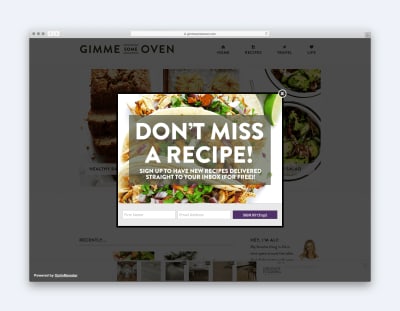
To avoid this secondary call to action distracting, ensure it is not too prominent. That might mean showing it lower on the page or even as an exit-intent overlay. That said, be careful. Some audiences react extremely negatively to popups. They should, therefore, be used sparingly.

Exit-Intent Overlay Example

Although popups can be annoying, there is a case for showing a secondary call to action on exit-intent. (Large preview)

Finally, consider ways of incentivising people to complete the call to action. Perhaps you could offer a free ebook if people subscribe to your mailing list or a discount if they buy via your landing page. Sometimes, something this small can be a nudge that encourages people to take action now rather than put it off to another day.

Of course, a gift is not going to make any difference if other elements put people off. To address that you need to understand what the issues are and find a way to deal with them. That is known as objection handling.

Understand User Objections

What are the reasons that might stop somebody acting on your landing page? Is there a delivery charge or might they be worried about privacy? Do you seem expensive compared to the competition?

If you cannot easily write a list of objections that users might have then you need to do some user research to find out.

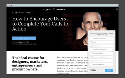
Don’t worry that it will be time consuming or expensive. A one-question survey on your landing page is all you need. If people go to leave your site without acting, you can ask them a single question:

“If you decided not to act today, it would be useful to know why.”

You can then show them a list of possible options for them to choose between or they can add their own.

Example One Question Survey

A simple one question survey can uncover why users are not taking action. (Large preview)

Once you understand the reasons why people are not acting, you can then start to address them.

Ideally, that means eradicating the obstacle, such as offering free delivery or money-back guarantee. But failing that, you need to reassure people the best you can in your landing page copy. It is always better to address an objection than it is to ignore it.

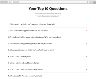
For example, McDonald’s knows that many people claim their chicken comes from the less favorable parts of a bird. Instead of ignoring these concerns, they address them directly on their site.

McDonald's FAQs

McDonald’s are not afraid to address users concerns directly. (Large preview)

There is, however, one more consideration to take into account when dealing with user’s concerns. You need to make sure you address them at the right time and in the right way.

An excellent example of this is privacy and security. People don’t worry about these things when reading a privacy policy. They worry about it as they are about to submit their email address. That is why it is so important to address data protection and privacy while users are completing a form. Users are not going to search your site for the answers; they will simply assume the worst.

Newsletter sign up form with with privacy statement

Closely associating reassurances regarding privacy with a newsletter sign up form often increases conversion. (Large preview)

With our offering laid out and objections addressed, we have done the hard work of appealing to people’s logical minds. Now it is time to give them that positive feeling.

Shape Your Personality

Much of our decision to act happens on a subconscious level. In fact, according to research published in the journal Behaviour and Information Technology, people form an initial impression about a site in 50 milliseconds. They go on to say that due to the halo effect these initial impressions last.

In other words, the branding and aesthetics of a site shape our impressions of the actual offering, despite there being no causal relationship between the two.

So what does all of this mean in practical terms? For a start, it goes to show how much aesthetics matter. However, more importantly, it means we need a clear picture of what first impressions we wish to convey and then be confident that our design does precisely that.

Decide On What You Want To Convey

A good starting point is to create a shortlist of words that convey the impressions you want users to have upon seeing your site.

There will be some words that will be universal. For example, you will probably want your landing page to convey “trustworthiness”. However, many of the terms will depend on your audience and offering.

Once you have your list of words and the designer has produced a design that they hope convey those words, the next step is to test.

Testing Your Design Aesthetics

If the designer has produced multiple approaches, then a simple preference test works well. For example, you can ask the user which of your designs do they consider to be more “approachable”.

Example Preference Test

A simple preference test is often the best way to find the best design aesthetic. (Large preview)

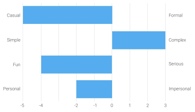
When there is only one design, you can run a semantic differential survey, in which you ask users to rate a website against your keywords. For example, is a design more “approachable” or “unapproachable”?

Example Semantic Differential Survey

A survey can be used to ascertain whether a design is creating the right feeling in users. (Large preview)

Of course, aesthetics is not the only consideration when it comes to design. You also need to make sure your visual hierarchy is right too.

Create Your Visual Hierarchy

Establishing a strong visual hierarchy for your landing page will ensure that users see the right information at the right time and won’t be distracted by irrelevant or secondary content.

Answer The Right Questions At The Right Time

The first step is to ensure you are presenting the right information to the user are the right point on the page. To do that you need to understand the thought process that goes through people’s minds as they view your landing page.

Of course, we cannot be sure of that, as everybody is different. Even usability testing can only give us an indication. However, we can make an educated generalization.

Typically, a user subconsciously asks a series of questions when viewing a landing page. These are, in order:

  • What is this page offering? (Value Proposition)
  • How will that help me? (Benefits)
  • How does the offering work? (Features)
  • Why should I trust this page? (Social Proof)
  • What should I do next? (Call to Action)

It is, therefore, essential that any visual hierarchy for a page reflects the order a user asks these questions, at least to some degree.

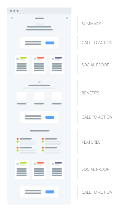
For example, a typical landing page hierarchy might look something like this:

Wireframe of landing page structure

A landing page should combine your value proposition, benefits, features and social proof. (Large preview)

Getting the flow of your content on the page right is only half of the battle when it comes to creating a strong visual hierarchy. The second challenge is ensuring that users see the most critical screen elements.

We can draw attention to essential screen elements in a variety of ways, including, but not limited to:

  • Positioning
  • Colour
  • Size
  • Imagery
  • Animation
  • Negative space

However, probably the most effective technique is to minimize other distractions on a page.

Simplify Your Interface

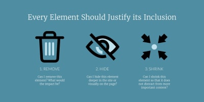
To achieve this, consider adopting a three-step approach, where you systematically review every element on your landing page from the logo to the privacy policy link.

For each element, you will ask three questions in turn.

Illustration showing the three steps of simplification

Have a robust process for simplifying your landing page. (Large preview)

Start by asking could I remove this element? If I removed it, what would the consequences be? Would those consequences be more damaging than the increase in cognitive load that additional screen elements create? If not, you are better removing it.

If you feel that the content is too valuable to the user or aids in conversion, the next question you need to ask is could I hide this element? Could I put it on a sub-page, under a tab or in an accordion?

Vibecast Homepage

Vibecast hide secondary content under an accordion. (Large preview)

This approach works well for secondary content, that although useful to some users who want more detail, is not something the majority of people will be interested in.

Finally, if you cannot hide content, because all users must know it, ask can I shrink this element? For example, people may well want to know about your return policy, but that isn’t as important as the features or benefits your product offers. It, therefore, makes sense to visually deemphasis it, so it is less prominent.

That simple approach together with other design techniques should enable you to create a page with a strong visual hierarchy that draws the user’s attention to the most crucial screen elements, such as calls to action. However, to be sure you should test.

Test Your Visual Hierarchy

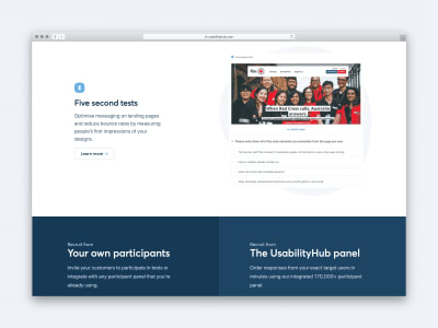
Fortunately, there is a quick and inexpensive way of testing whether users see the essential screen elements. It is called a five-second test.

As the name implies, this test involves showing the users your design for five-seconds before taking it away. You then ask the user to recall what elements they remember.

Usability Hub Website

Usability Hub makes running five-second tests easy. (Large preview)

By paying attention to what the user remembers and the order in which they recall elements, you will gain a better understanding of how effective your page hierarchy is in drawing attention to items that matter the most.

Indeed, when it comes to designing a great landing page, testing will be crucial, even once you launch.

Monitor, Iterate And Test

No team will create the optimal landing page on their first attempt. There is always room for improvement, which is why post-launch testing is such an essential part of shaping the most effective landing page possible.

Once you launch your new landing page, you must monitor it carefully using a session recorder like Hotjar or Fullstory. These tools allow you to watch user behaviour on your page, that should suggest ideas for improvements.

You can test smaller improvements to copy, imagery and color using A/B testing, while more significant changes can be prototyped and tested through usability testing.

Whatever approach you adopt, ultimately it will be a cycle of monitoring, iterating and testing that will ensure the long-term success of any landing page.

(ra, il)
Categories: Others Tags:

Smashing Podcast Episode 14 With Rachel Andrew: How Can I Run Online Workshops?

April 21st, 2020 No comments
Photo of Rachel Andrew

Smashing Podcast Episode 14 With Rachel Andrew: How Can I Run Online Workshops?

Smashing Podcast Episode 14 With Rachel Andrew: How Can I Run Online Workshops?

Drew McLellan

2020-04-21T05:00:00+00:002020-04-21T18:35:26+00:00

In this episode of the Smashing Podcast, we’re talking about running online workshops. How can a traditional event adapt when participants can’t attend in person? Drew McLellan talks to Rachel Andrew to find out.

Show Notes

This episode of the Smashing Podcast is dedicated to the memory of Christopher Schmitt, who sadly passed away last week. A familiar name to many of us over the years as an active contributor to both the Web Standards and Accessibility communities, Christopher, along with his partner Ari, was also a pioneer in conducting online workshops and conferences, which is the subject of this podcast.

Christopher was a skilled web practitioner, a generous educator, and a wonderful person to spend time with. His contributions to our industry were numerous and valued, and he will be missed by us all.

If you have memories of Christopher you’d like to share publicly, you can do so via this community site.

Weekly Update

Transcript

Drew McLellan: She is editor-in-chief of Smashing Magazine as well as being a web developer, writer and public speaker. She’s the founder of web development consultancy, edgeofmyseat.com, responsible for products such as Perch CMS and the slide sharing and public speaking portfolio platform, Notist. She’s a member of the CSS Working Group, and many will know her for her prolific writing and teaching on modern CSS layout techniques, such as CSS grid.

Drew: So we know she’s an expert in CSS and in teaching, but did you know she’s a recognized authority on carving turnip lanterns? My Smashing friends, please welcome Rachel Andrew. Hi Rachel, how are you?

Rachel Andrew: I’m smashing.

Drew: So I could talk to you all day about any number of interesting CSS topics, but you write and you speak so much about these sort of subjects, that there’s a plentiful supply of resources that people can reference. And not least of which being things like your Grid By Example site or you CSS Layout Workshop video course. And of course, there’s plenty right here on Smashing Magazine. But what I wanted to talk to you today was something that was almost a byproduct of your expertise, isn’t it? That you have to end up getting up on stage and communicating what you know with other people. You do an awful lot of speaking at conferences and teaching in person workshops, don’t you?

Rachel: Yes. Yeah, I do. I have to done for about, I don’t know, the last six or seven years. And the last few years I’ve spent about half of the year on the road speaking and yeah, doing workshops. In particular for Smashing Magazine, did a bunch of workshops every year For Smashing. So that’s the something I’ve been doing quite a lot of.

Drew: So what does the shape of your year usually look like with conferences and workshops?

Rachel: Ah pretty much, I’m springing out in particularly. I’m generally just on the road quite often for three or four weeks at a time, go for one thing to the other. I try and link these things up, so I’m not sort of constantly flying back and forth over the Atlantic corridor for you. But yeah, so spending a lot of time either on stage talking to people about CSS or in workshops, and then going to see this working group meetings and sitting with a bunch of other people who really, really likes CSS and talking about CSS. So that’s mainly what I’ve been doing, and in between that actually trying to… Well, spending a lot of time writing these talks and workshops while I’m not giving them. And then then getting back on the road again. So that’s been life for, yeah, several years

Drew: As we speak, we’re in the thick of the Coronavirus pandemic. So this year isn’t really shaping up like a typical year for you or for any of us. So what’s the situation with your conference season looking like at the moment?

Rachel: Yeah, empty. It’s really bizarre looking at my calendar and not having it full of flights and hotel bookings. I’ve spent quite a lot of time in the last few weeks getting flights refunded and getting vouchers to use because I had all of my spring travel booked. I’ve been organized. So it’s been really strange then remove all those things from the calendar and be looking at not going anywhere. It’s very, very unusual for me. So yeah, it’s been quite a shock because it’s not happened for so long. And every year after, I’m not going to do so much travel this year. And of course, the diary fills up and off you go. So for this to happen and to happen so dramatically, and in a way that I don’t actually know when it’s going to start again. I’m looking at things in, say two months time, and thinking, well, will I be able to do those?

Rachel: I don’t personally have any health issues that… if it is okay to travel, I probably feel okay to travel. But I don’t know if it’s going to be okay to travel. I don’t know if it’s going to be sensible to travel because you might go somewhere and then them cause a lockdown and you get stuck there or get stuck in quarantine. So it’s very, very strange to not have this quite rigid plan, which is what I’ve had for the last few years where everything has been planned around me getting on a plane and going to speak somewhere.

Drew: So lots of conferences, probably in conferences and workshops, have been either canceled or postponed. I’m including the rescheduling of our own Smashingconf events and the workshops that go alongside that. Now hopefully, we can look forward to rescheduled Smashingconfs later in the year, but the workshops are also going online, is that right?

Rachel: That’s right, yeah. We’ve very, very quickly… Once we realized we were going to have to postpone San Francisco, we have… See we have workshops, both myself and Vitaly run workshops at Smashingconf, and they were sold out in San Francisco, both of our workshops. And obviously, we have lots of other people who come and run workshops for us, people who we’ve worked with for a long time. And they were finding that all their workshops… And for those of us who do workshops they’re actually a key part of our income. Public speaking, you don’t earn a lot of money typically going and public speaking. Most people aren’t paid a lot, not when you consider the amount of time it takes to write talks and so on. Workshops tend to be quite a nice way for people who are good at teaching this stuff to earn some money.

Rachel: And so they represent people’s income. And so, not only did myself and Vitaly had lost our workshops early this year. We also realized that a lot of our Smashing speakers also, were reliance on those workshops. And so we thought, well, why not just take them online? And very, very quickly, really, within days of that happening, we decided that me and Vitaly would be the first to stick our heads over the parapet, given it’s us. And we could figure out how to do it. And we also have very different workshops. Vitaly is much more collaborative. He has group activities and things. I teach classroom style. So between us we thought, well we kind of covering all the bases. So that was really… We thought, let’s just do it, let’s see if it works. So we advertise them, we figured out how long did each take. And then we sat down and said, well what does an online workshop really look like? What is this?

Drew: I think from a technical perspective, as web developers, we immediately think, how on earth are we going to deliver something like that? There must be lots of different platforms that you looked at. What were the different things you looked at and what Smashing eventually come with?

Rachel: So we’ve had a look at all sorts of things, and we’re still kind of in the process of doing that. We’re using Zoom at the moment, and the reason we’re using Zoom is accessibility. It was the most accessible of the platforms. Obviously, we don’t want to cut people out because of the platform we’ve chosen. And I think the platforms are getting better and people are… I think that a lot of platforms have had people come to them and say, yeah, you look great, but you know, we need you to be accessible. And so, so Zoom is the easiest for people to use at the moment. And so, that’s why we’ve ended up using them.

Rachel: I don’t know whether we will do forever, but that’s what we’re using at the moment, and it’s worked pretty well as a way to do this stuff. And it gives us the flexibility we need. We’re able to do breakout sessions for Vitaly’s workshop and things. And yeah, so platform-wise, it seems to work. We didn’t really have any major issues across the days. And say we’ve run my workshop and Vitaly’s workshop now… Are the two that we’ve actually done, and then we didn’t really have any technical problems as it were. So that was really helpful. Yeah, because it’s always a bit of a worry thinking everyone’s silent in all these different locations, and this has got the work.

Drew: As you say, you’ve run two workshops so far, and there’s an awful lot more scheduled to come up in the future.

Rachel: Yeah, we’ve got a whole bunch of them. So the upcoming stuff, I’m just having a look at the list, we’ve got Brad Frost doing his Design Systems. We’ve got Psychology for UX with Joe Leech, Advanced CSS and Sass with Miriam Suzanne. Vitaly’s doing his Smart Interface Design Patterns again. I’m doing my CSS Layouts Masterclass again in June, and we’ve got a Front-End Accessibility Masterclass with Marty Sutton. So those are the ones lined up until June now.

Drew: That’s quite a big undertaking, isn’t it? All those different instructors as they were, with different styles of teaching and different requirements from the platform.

Rachel: Yeah, I think so. That’s why we started with Vitaly and I because we have this different way of teaching We thought that would be a good start. We could iron out some of the things, and then we’re going to then write up the stuff that we figured out. To hand that over to other instructors. Because we were very keen that they didn’t just become… we didn’t want it to be a second-rate experience. It wasn’t like, Oh well, you can’t come and see us in San Francisco, and so this’ll do. We actually wanted to see, how can we make an online workshop a really cool thing. Because actually, there’s a whole bunch of people who, even if we could all travel around the world… there’s a whole bunch of people who can’t.

Rachel: There’s plenty of people who, they don’t have the budget to fly places, or they’ve got family, or they just don’t like doing that sort of travel, or they’re concerned about spending a lot of time on airplanes. And I think actually, this is something that, that can work very well as a thing, and we’ve been forced into it to some degree. And we’ve had to figure out how to do it, but it’s certainly not a lesser thing. It’s a different thing and we’re figuring out how to make that happen. But it doesn’t have to be a second best from an in person.

Drew: So what does the experience of attending an online workshop feel like for a participant, where obviously it’s can be very different from the in-person experience?

Rachel: I think we looked at what people really say they get from coming to an in-person workshop. And a lot of that isn’t really just the teaching because all of that stuff, you can get lots of ways. You can read things on Smashing Magazine, you can watch video tutorials. Here there’s lots of ways to get this information. Both Vitaly and I are incredibly prolific in all this output that we do in sharing. But actually, what people tend to put on their feedback forms and stuff, from in-person workshops is, they got their questions answered. They were able to spend time talking to the person leading the workshop or with each other as well, with the other attendees, and have questions answered. That kind of interactivity was important. And so that was the thing we wanted to bring.

Rachel: And so, during the workshop there’s a few ways we’re doing that. There is a chat in Zoom itself, so people can chat while the workshop’s going on. So they do that and they introduce each other over and talk about where they are and what time it is because we’ve got people from all over the world. So that’s going on. Both of us had Google Docs open, which anyone could edit. And we tend to do that actually at Smashingconf, anyway, have these collaborative docs that people… people do amazing things. They completely live blog the entire event and put all the resources and so on. So we had those, and it was really interesting to see the attendees, which they would put the questions in there.

Rachel: And they would so much help each other out. Someone would write a question that I hadn’t got to, and someone else would have answered it, and people were clarifying things, and putting links to code pins in. And so, that was really interesting, that there was this collaboration going on while I was teaching. This sort of with other people. And I inadvertently had the same experience, people were helping each other out in terms of making comments and so on. So I think that that was the thing that it did feel like an interaction. It didn’t feel… so I’ve done a lot of presenting online where you just feel like you shout at your computer for an hour and then go away, and you’ve got no idea if anyone enjoyed it. It’s like, all right, there we go. I’ll go and I’ll drink now. But this actually felt like I was with people as an instructor, and the feedback… people were saying, it felt very intimate and that they were talking to me rather than just having something presented at them. Yeah, so that was interesting.

Drew: I guess as you say, the danger of running a workshop online is that it just becomes impersonal and the experience becomes more of a passive one for attendees. Is there anything that you can do in the way that you structure the content that you’re actually teaching?

Rachel: Yes.

Drew: Or the way that you conduct it to encourage people to interact and to participate with the tools that have been provided?

Rachel: Yeah, and I think Vitaly does a lot more of that because he has more… some of our other instructors are going to have more group activities. I teach in person, very much classroom style. My courses are pretty much a brain dump of here’s the stuff I know about CSS, here it is with lots of examples. And I have people coding with me all day, when we do them, but I’m not so much a group activities thing. It’s hard to do a group activity on Here’s the Basics of Grid Layout. So I’ve just found that teaching classroom style works quite well. Whereas I know that Vitaly actually had people breaking off into groups and doing activities, and actually meeting up with some of these people from all over the world who are participating. And so, that’s really quite fun because I think people do get a lot from that, from just the meeting of the people who do their job. Particularly, if you were mostly on your own, to actually get chance to do an activity with other people is quite a nice thing too.

Drew: Is there anything special that’s been done to give the online events something of the feel of the brand, in the same way that you would in an in-person event? I know attending a Smashing event, it always feels like a Smashing event. There’s something of the brand that’s communicated in the way that everything’s done. Is there anything that can be done online to help communicate that same feel?

Rachel: I think it’s difficult, but I think part of it is the attitude that generally smashing has. We’re very friendly and try and be as approachable and sort of informal as it were. So people feel like they’re coming to something which is going to be fun and entertaining. Things like Vitaly was online before my workshop playing a load of music and so on, just because that’s the sort of thing we do at Smashing. We like to entertain people and have some fun. So I think, yeah… I think trying to bring some of that fun that we do have at the live events as much as you can with a virtual thing. I think that’s what we’re trying to do. We’re trying to make it feel like a Smashing thing as much as we can.

Drew: Of course, you mentioned that there are many people who can’t or aren’t willing to travel to in-person events anyway. There must be a lot of advantages, even for those who would normally attend an in-person event. There’s got to be advantages to actually attending a workshop from the comfort of your own desk with your own set up around you.

Rachel: I think definitely. I think that is something a few people mentioned, that it was just nice to be… have the whole set up. Because if you’re a developer working at home, you’ve probably got two screens, and you’ve got your comfortable keyboard and your chair. And certainly for my software workshop where people are coding the whole time, to actually be able to have the presentation on one screen and have your code in front of you. And not be working on a tiny laptop, squashed in with a load of other people, and on an uncomfortable chair for the day. There’s a lot of benefits to that. So I think there are some quite nice things. You obviously, don’t get all the sides. If you don’t get to go off with your new friends and have a drink and have a chat about it all. And there’s things that you do lose by doing this virtually, but there is an awful lot to be said for it as an experience.

Drew: One thing that I’ve seen done quite a lot in the past with online events, is to try and create a bit of a sense of community by having local hubs, even though it’s a distributed global event. Obviously, that’s not something that we can even do at the moment because everybody’s confined to their own home, more or less. Is there anything else that can be done to create that sense of community, do you think? Is there anything that’s Smashing has thought about to try?

Rachel: Yeah. I think it’d be interesting to see where this plays out and whether this becomes a temporary thing, or whether that’s something that we can just carry on doing. I think that… and it would be interesting to see how we can link people up. We also have the Slack channels, so people chat in there. And I think really it’s just trying to… and we know a lot of friendships are made and also work relationships are made, people get new jobs and so on, from coming along to things like a Smashingconf. It’d be nice to try and encourage that sort of… that it’s not just where we do this and then go away afterwards, but that we can carry on the conversations and so on. That people are making and there’s something very nice to be said as well about… we have people from all over the world in my workshop. And that’s pretty cool that all those people were able to get together and spend some time learning.

Rachel: So yeah, I think that there’s all sorts of possibilities for this. We obviously, kicked it all off in a bit of a rush like, let’s just do it and see what happens. But I say, Vitaly and myself, we sold out. There was a lot of interest, and the other tickets are selling really well. So there’s obviously a need for this, and whether it is just now or whether it’s going to be something that we carry on doing, see what people think.

Drew: Being delivered digitally, there’s the fact that a workshop can actually be recorded and then replayed by participants later to go back over everything they’ve missed. Is that something that Smashing is taking advantage of?

Rachel: Yep. Everyone gets copy of the recording, and also we’ve been asked to add to that. At the moment, we haven’t got live captions going during the workshops. That’s something we’re hoping to fix. We’re hoping to actually be able to get the captions in real time. At the moment we’re not doing that, but we are getting them transcribed after the event. So when they get the video, they also have a transcript of the stuff, which is great. It might help, particularly if people are struggling with accents, so what have you. So that’s quite good. And then say, we’d like to look at getting them captioned as well, actually as they go out, with a live captioner, which would then be something that we don’t do in person. Not saying that we can easily do, and with workshops that we’re running live, but actually we can do online. So that would be, I think, a really helpful thing, and hopefully it would open it up to more people.

Drew: You mentioned as a presenter, things are quite different in the way that you actually present and you teach, where you’re just basically shouting it at a computer, hoping that there’s somebody there. I guess it’s quite different because you’re having to take care of all your own technology, your own setup, everything to make sure that you’re in a position ready to present online. How does that differ to how things would go normally if you were going to an event?

Rachel: In some ways it’s easier because I’m quite used to doing stuff online. I think it might be harder if you’re not well set up for recording stuff, I do quite a lot of video and things. So I’m reasonably well set up. But also, we’ve got our crew, we’ve got people online. I think that’s actually really important, is that if you’re presenting, the last thing you want to have to do is deal with someone who can’t get into Zoom or can’t hear the sound or can’t… just having some problem. So we have other members of the team, just like we do in person, have members of the team to help out if someone’s having trouble getting on the wifi or whatever it is. With the online workshops, we have people online to keep an eye on the chat and make sure that people aren’t struggling. And also to alert the presenter, if suddenly they drop offline or something… their sound’s gone weird or whatever it is.

Rachel: We’ve actually had no real technical issues like that, but there’s always that thought when you’re presenting online like, can people hear me? Am I just like talking to my screen and nothing’s happening out there? So having the team online with… or their contact details to be able to get hold of me, if suddenly I dropped off that. It makes you feel a lot more safe and that it’s okay.

Drew: Is there anything that you’ve changed about your setup in your home office to make online presenting easier? What does your set up look like there?

Rachel: Yeah, it’s getting ridiculous to be honest. It is just an excuse to buy things. So for the workshops, I’m coding, so I’m sitting down. When I’m doing more like presentations, I realized that it is just weird to present sitting down. And I don’t feel like I can actually do it very well. So I’ve got a standing desk, and so everything I have in… I’ve got some lighting and bits and pieces, but because I have things bolted to my desk. If I wanted to present standing up, I can just make the desk go up and everything goes with it and then I can present from my feet. And I did an online presentation for the BBC recently that was meant to be an offline in-person thing and got changed. And it felt so much better, being able to move around.

Rachel: And so, I’ve got my camera set up, so I can move about a bit, and I don’t feel like I’m just tied to the spot. And so, that sort of thing, I think, is really useful, being able to feel natural when you’re presenting and not just that you’re slumped in your chair and talking to a camera. And decent lighting I think is really important. I seem to spend an awful lot of time in Zoom calls now. And just people being well-lit is incredibly helpful. And I think, when you presenting or doing a workshop, people want to be able to see your face and your expressions and things, and having some decent lighting will help with that.

Drew: I’ve seen photos from, I think it was Val Head who posted her setup where she had a great big screen, and I think a couple of different computers and maybe an iPad or something as well. What does your technology set up look like there?

Rachel: So I’ve got two too, I’ve got my laptop and then my screen and because… so there’s the chat and things going on, which I don’t tend to take Q&A during, while I’m talking. I tend to deal with it at the end. But I can see the chat, and so I can see if… Sometimes I’ll pick up that someone’s got a very specific issue that I can just deal with at the time, and I might do that. So I’ve got that going on just in the peripheral vision. Because I’m coding, I’ve got the main stuff I’m doing and the screen it’s being output to the attendees is my main screen.

Rachel: I turn all my notes in when I do in person workshops as well. I turn all my notes into an e-pub, so I can have that on my iPad, which is handy because I can jump back and forth with the indexing and so on. So I have all the notes and the stuff to help me remember what I want to do next. But pretty much, and mossy of it’s run as I do in-person workshops. I work with a bunch of examples, basically that we work through, and I explained different things. And then, the attendees can take those examples away to help them remember what they did. So I pretty much do the same thing online. I think what I do probably moves online the easiest because teaching classroom style is quite an easy thing to move online. So you see, I’ve not changed too much. It’s just really making… getting comfortable with the setup so I don’t have to worry about that while I’m working.

Drew: Are there any bits of technology that you have in place that you think a really useful and really recommended for anyone who’s looking to do something similar?

Rachel: I think the lighting and decent mics and decent headsets and mics, so you’re not leaking sound over your ears. That sort of stuff is, I think, important. I like the headset mic rather than a mic on a stand because I’m writing code. I find that if I have a mic on a stand, I move away from it, back and forth all the time because I’m doing things. So having the headset mic means I haven’t got to get around a microphone that’s in front of my face. So that’s what I tend to use and that works quite well for me. So that was my main thing. I think, yeah, having a decent… You don’t have to spend a fortune, but having a good mic and headphones and some lighting, I think makes all the difference.

Drew: They often say, don’t they, that audio quality is more important than video quality when it comes to these things.

Rachel: Yeah. It’s just painful to listen to if you’ve got bad crackly audio.

Drew: So what have you learned so far in this journey? You say that you and Vitaly were the Guinea pigs for the approach. Is there anything key that you weren’t expecting that you’ve learned along the way?

Rachel: I think I’m surprised how intimate it felt and how connected it felt with the people who were attending. I hadn’t expected that at all. I’d expected it to be quite impersonal, and that we’d try very hard to make it feel personal but it would still be that kind of, Oh I’m presenting online now, I’m going away. I think having a good set amount of time for questions… I had half an hour for questions at the end of both of my days, and we used them. And I then went back to the Google doc and answered some stuff in there afterwards. So I think that really helped because people were able to ask their specific questions. I think the approach was splitting them up into multiple days. When we do these things in person, they are full day workshops. And we just figured that a full day for people to sit with a very long time to concentrate.

Rachel: And also it meant that we could put them into a time zone that worked for more people. Because if you’re not going to find a full day, if you’re saying well actually, it’s two or three hours, then more people in different time zones can attend that. So this workshop was my evening. So then it was like 9:00 AM on the West coast of the States, which meant the people on the East coast, the States and also people in the UK and stuff could attend. The next one I’m doing is going to be UK morning, which means that people in Asia and so on and in Australia, it’s not too far out of their day to be able to attend. So that kind of thing works quite well, spacing them up over multiple days. And I think it is easier for people because it’s a long time, a full day listening to someone on a screen. I think you’re probably going to start to zone out no matter how interesting they are.

Drew: And people have other responsibilities in their jobs, don’t they? The number of times that you see people at a in-person conference and they have to leave at the lunch break because they’re needed in the office, because there’s things that have to be done. Life doesn’t stop just because you’ve got a day’s worth of training planned.

Rachel: Yeah, and I think here, and in the current situation as well. A lot of people are working from home and are having to do childcare or home educate their kids. So particularly in the current environment, I think asking both presenters and attendees to be able to block out two and a half, three hours is probably a lot easier for people than be able to block out a full day. Because if you’ve got young children at home, even if you’ve got a partner there, you’re basically saying, you’ve got to be all locked out of this room for nine hours today. That’s a lot. So I think actually, having those shorter sessions is, for a lot of reasons, is probably a good thing.

Drew: If other event organizers are thinking about doing the same with their events, they’re looking at their schedule ahead, seeing all their in person events being canceled, and thinking they’d really need to do something to keep everything ticking over. What should they be taking into consideration before embarking on moving their events online?

Rachel: I think to realize that it’s doable and that people are interested and will pay for this sort of thing. I think getting the tech in place and testing it is important. Having a team to back people up is really important, even if they don’t need to do very much, they’re just sitting there watching the output. It makes you feel a lot more confident as a presenter, knowing that that’s happening. So that I would say is, is important. And really just thinking about the ways in which you can make this seem not like a second class way of learning. It’s a different way of learning, but it doesn’t need to be a lesser way. And rather than being apologetic and saying, Oh, we’re really sorry we can’t do an event, but we’re going to do this. Say, No, hey, this is going to be a really great way for us all to get together and learn something and spend some time with other people, not just in our own four walls.

Rachel: And it’s just a different thing. And I think this is quite an exciting thing that we’re learning how to do. And it’s made us all at Smashing feel so much happier because it could have been quite depressing, losing the conferences. It’s when we were all… we were a little team and we love spending time together as well. We were all so excited to be going to San Francisco and seeing each other and doing the conference. But instead of feeling like we’ve lost that, we actually feel like we’re doing a really great thing and sharing knowledge with our Smashing community. And it’s been really nice. I think it feels like we’re moving forward.

Drew: So the Smashing online workshops are running throughout April, May, and June. And you mentioned some of the great speakers who are lined up for those. And listeners can find out about those and the rescheduled Smashingconfs that are coming to a city near you. Again, smashingmagazine.com/events. So I’ve been learning about online workshops. What have you been learning about lately?

Rachel: I’ve actually been learning the mandolin. I keep meaning to learn the mandolin, and it’s been like, well I’m stuck in the house, so might as well. So I’ve been doing that. That’s been good. I’m terrible. Absolute terrible. But it’s something nice to be doing. I’ve always been learning about gardening because I had a mud pit outside and I thought I might try and turn it into some sort of garden. So that’s what I’ve been doing to get away from the computer a little bit, so I’m not just sat here staring at this all day.

Drew: If you, the listener, would like to hear more from Rachel, you can follow her on Twitter, where she’s at Rachel Andrew. And find all of her writing, speaking, online training, and excellent CSS layout news email newsletter linked from my site at RachelAndrew.coderUK.

Drew: Thanks for joining us today, Rachel. Do you have any parting words?

Rachel: Just to say that, keep on enjoying learning stuff while we’re in this weird situation, but also don’t stress if you’re feeling like you really can’t do anything today because it is weird. Well, none of us were expecting this sort of thing to be happening, and it’s okay to feel not great and not want to learn and not be productive for a while too.

(il)
Categories: Others Tags:

Can JavaScript Detect the Browser’s Zoom Level?

April 20th, 2020 No comments

No, not really.

My first guess was that this was intentionally not exposed in browsers because browsers intentionally don’t want us fighting it — or making well-intentioned but bad-outcome decisions based on that info. But I don’t see any evidence of that.

StackOverflow answers paint how weird cross-browser it can be. This script from 2013 works for me in Chrome, but not at all in Safari and reports incorrectly in Firefox. Even if that script worked, it relies on user agent detection (which is not long for this world) and some incredibly weird hacks.

So please, feel free to correct me if I’m wrong, but I think the answer is that we can’t really do this right now.

There is a thing called the Visual Viewport API

I’m kinda confused by it.

  • The spec is a draft
  • The support chart lists a lot of support
  • window.visualViewport is defined in Firefox, Safari, and Chrome (desktop)
  • But… window.visualViewport.scale is always 1 in Safari and Chrome, and undefined in Firefox. In other words: useless.

I don’t entirely know if that is supposed to accurately represent the browser zoom level, because the spec talks about specifically about pinch-zoom. So, maybe it’s just not intended for desktop browser zoom levels.

What’s a use case here?

I had a fella spell out a situation like this:

He wanted to use CSS grid to layout cemetery plots (interesting already), like a top-down blueprint of a graveyard. There was lots of information in the layout. If you were “zoomed out” so you could see the whole graveyard on one page, the text in each area would be too small to read (sincethe type would be sized to fit within the boxes/graves). Ideally, the page would hide that text while the browser is zoomed out (perhaps a .hide-text class). When zoomed in far enough, the text is shown again.

Like…

// Dunno if "resize" is best. I don't know what the "change zoom" event would be
window.visualViewport.addEventListener("resize", viewportHandler);
function viewportHandler(event) {
  // NOTE: This doesn't actually work at time of writing
  if (event.target.scale > 3) {
    document.body.classList.remove("hide-text");  
  } else {
    document.body.classList.add("hide-text");
  }
}

There is Pixel Density…

Ben Nadel recently blogged: Looking At How Browser Zoom Affects CSS Media Queries And Pixel-Density.

If you look at window.devicePixelRatio and zoom in, the pixel density in Chrome and Firefox will increase as you zoom in and decrease as you zoom out. Theoretically, you could test the original value (it might start at different places for users with different screens) and use changes in that value to guess zoom. But… in Safari it does nothing, as in, it stays the same regardless of zoom. Plus, the operating system zoom level can affect things here, making it extra tricky; not to mention that a page might start at a zoomed in level which could throw off the whole calculation from the start.

The post Can JavaScript Detect the Browser’s Zoom Level? appeared first on CSS-Tricks.

Categories: Designing, Others Tags:

The Contrast Triangle

April 20th, 2020 No comments

Chip Cullen:

Let’s say you’re building a site, and you’re working with a designer. They come to you with some solid designs, and you’re ready to go. You’re also a conscientious front end developer and you like to make sure the sites you build are accessible. The designs you’re working from have some body copy, but you notice that the links inside the body copy are missing underlines.

You are now in The Contrast Triangle.

The “triangle” meaning a three-sided comparison:

  • The contrast between the background and text
  • The contrast between the background and links
  • the contrast between text and links

I would think this matters whether you underline links or not, but I take the point that without underlines the problem is worse.

I’d also argue the problem is even more complicated. You’ve also got to consider the text when it is selected, and make sure everything has contrast when that is the case too. And the hover states, active states, visited states, and focus states. So it’s really like hexacontakaienneagon of contrast or something.

Direct Link to ArticlePermalink

The post The Contrast Triangle appeared first on CSS-Tricks.

Categories: Designing, Others Tags:

Creating Playful Effects With CSS Text Shadows

April 20th, 2020 No comments

Let’s have a look at how we can use the CSS text-shadow property to create truly 3D-looking text. You might think of text-shadow as being able to apply blurred, gradient-looking color behind text, and you would be right! But just like box-shadow, you can control how blurred the shadow is, including taking it all the way down to no blur at all. That, combined with comma-separating shadows and stacking them, is the CSS trickery we’ll be doing here.

By the end, we’ll have something that looks like this:

Quick refresher on text-shadow

The syntax is like this:

.el {
  text-shadow: [x-offset] [y-offset] [blur] [color];
}
  • x-offset: Position on the x-axis. A positive value moves the shadow to the right, a negative value moves the shadow to the left. (required)
  • y-offset: Position on the y-axis. A positive value moves the shadow to the bottom, a negative value moves the shadow to the top. (required)
  • blur: How much blur the shadow should have. The higher the value, the softer the shadow. The default value is 0px (no blur). (optional)
  • color: The color of the shadow. (required)
CodePen Embed Fallback

The first shadow

Let’s start creating our effect by adding just one shadow. The shadow will be pushed 6px to the right and 6px to the bottom:

:root {
  --text: #5362F6; /* Blue */
  --shadow: #E485F8; /* Pink */
}


.playful {
  color: var(--text);
  text-shadow: 6px 6px var(--shadow);
}

Creating depth with more shadows

All we have is a flat shadow at this point — there’s not much 3D to it yet. We can create the depth and connect the shadow to the actual text by adding more text-shadow instances to the same element. All it takes is comma-separating them. Let’s start with adding one more in the middle:

.playful {
  color: var(--text);
  text-shadow: 6px 6px var(--shadow),
               3px 3px var(--shadow);
}

This is already getting somewhere, but we’ll need to add a few more shadows for it to look good. The more steps we add, the more detailed the the end result will be. In this example, we’ll start from 6px 6px and gradually build down in 0.25px increments until we’ve reached 0.

.playful {
  color: var(--text);
  text-shadow: 
    6px 6px        var(--shadow), 
    5.75px 5.75px  var(--shadow), 
    5.5px 5.5px    var(--shadow), 
    5.25px 5.25px  var(--shadow),
    5px 5px        var(--shadow), 
    4.75px 4.75px  var(--shadow), 
    4.5px 4.5px    var(--shadow), 
    4.25px 4.25px  var(--shadow),
    4px 4px        var(--shadow),
    3.75px 3.75px  var(--shadow),
    3.5px 3.5px    var(--shadow),
    3.25px 3.25px  var(--shadow),
    3px 3px        var(--shadow),
    2.75px 2.75px  var(--shadow),
    2.5px 2.5px    var(--shadow),
    2.25px 2.25px  var(--shadow),
    2px 2px        var(--shadow),
    1.75px 1.75px  var(--shadow),
    1.5px 1.5px    var(--shadow),
    1.25px 1.25px  var(--shadow),
    1px 1px        var(--shadow),
    0.75px 0.75px  var(--shadow),
    0.5px 0.5px    var(--shadow),
    0.25px 0.25px  var(--shadow);
}
CodePen Embed Fallback

Simplifying the code with Sass

The result may look good, but the code right now is quite hard to read and edit. If we want to make the shadow larger, we’d have to do a lot of copying and pasting to achieve it. For example, increasing the shadow size to 10px would mean adding 16 more shadows manually.

And that’s where SCSS comes in the picture. We can use functions to automate generating all of the shadows.

@function textShadow($precision, $size, $color){
  $value: null; 
  $offset: 0;
  $length: $size * (1 / $precision) - 1;


  @for $i from 0 through $length {
    $offset: $offset + $precision;
    $shadow: $offset + px $offset + px $color;
    $value: append($value, $shadow, comma);
  }


  @return $value;
}


.playful {
  color: #5362F6;
  text-shadow: textShadow(0.25, 6, #E485F8);
}

The function textShadow takes three different arguments: the precision, size and color of the shadow. It then creates a loop where the offset gets increased by $precision (in this case, it’s 0.25px) until it reaches the total size (in this case 6px) of the shadow.

CodePen Embed Fallback

This way we can easily increase the size or precision of the shadow. For example, to create a shadow that’s 10px large and increases with 0.1px, we would only have to change this in our code:

text-shadow: textShadow(0.1, 10, #E485F8);

Alternating colors

We want to spice things up a bit by going for alternating colors. We will split up the text in individual letters wrapped in spans (this can be done manually, or automated with React or JavaScript). The output will look like this:

<p class="playful" aria-label="Wash your hands!">
  <span aria-hidden="true">W</span><span aria-hidden="true">a</span><span aria-hidden="true">s</span><span aria-hidden="true">h</span> ...
</p>

Then we can use the :nth-child() selector on the spans to change the color of their text and shadow.

.playful span:nth-child(2n) {
  color: #ED625C;
  text-shadow: textShadow(0.25, 6, #F2A063);
}
CodePen Embed Fallback

If we had done this in vanilla CSS, then here’s what we’d end up with:

.playful span {
  color: var(--text);
  text-shadow: 
    6px 6px var(--shadow),
    5.75px 5.75px var(--shadow),
    5.5px 5.5px var(--shadow),
    5.25px 5.25px var(--shadow),
    5px 5px var(--shadow),
    4.75px 4.75px var(--shadow),
    4.5px 4.5px var(--shadow),
    4.25px 4.25px var(--shadow),
    4px 4px var(--shadow),
    3.75px 3.75px var(--shadow),
    3.5px 3.5px var(--shadow),
    3.25px 3.25px var(--shadow),
    3px 3px var(--shadow),'
    2.75px 2.75px var(--shadow),
    2.5px 2.5px var(--shadow),
    2.25px 2.25px var(--shadow),
    2px 2px var(--shadow),
    1.75px 1.75px var(--shadow),
    1.5px 1.5px var(--shadow),
    1.25px 1.25px var(--shadow),
    1px 1px var(--shadow),
    0.75px 0.75px var(--shadow),
    0.5px 0.5px var(--shadow),
    0.25px 0.25px var(--shadow);
}


.playful span:nth-child(2n) {
  --text: #ED625C;
  --shadow: #F2A063;
}

We can repeat the same a couple of times with other colors and indexes until we achieve a pattern we like:

CodePen Embed Fallback

Bonus points: Adding animation

Using the same principles, we can bring the text to life even more by adding animations. First, we’ll add a repeating animation that makes each span move up and down:

.playful span {
  color: #5362F6;
  text-shadow: textShadow(0.25, 6, #E485F8);
  position: relative;
  animation: scatter 1.75s infinite;
}

We can optimize this a little further by using the prefers-reduced-motion media query. That way, folks who don’t want the animation won’t get it.

.playful span {
  color: #5362F6;
  text-shadow: textShadow(0.25, 6, #E485F8);
  position: relative;
  animation: scatter 1.75s infinite;
}

@media screen and (prefers-reduced-motion: reduce) {
  animation: none;
}

Then, in each nth-child(n) we’ll add a different animation delay.

.playful span:nth-child(2n) {
  color: #ED625C;
  text-shadow: textShadow(0.25, 6, #F2A063);
  animation-delay: 0.3s;
}
CodePen Embed Fallback

The post Creating Playful Effects With CSS Text Shadows appeared first on CSS-Tricks.

Categories: Designing, Others Tags:

Exciting New Tools for Designers, April 2020

April 20th, 2020 No comments

While there’s a lot going in the world with the COVID-19 pandemic, the design world is also reacting. You’ll notice that some of the newest tools and resources for designers are for working through or with the virus’ impact or are inspired by this change to our lifestyles.

Here’s what new for designers this month.

Snapfont

Snapfont is a browser extension that lets you test any font on any website in a snap. You can preview differences in body and headline fonts to get a feel for how a website would look or function with different type families. It’s great for testing font sizes, looking at fonts together in a real environment, and provides a “live” testing opportunity before you settle on new font choices. It works with all Google Fonts.

CSS Podcast

The CSS Podcast launched in March and is releasing an episode a week about cascading style sheets. Una Kravets and Adam Argyle, Developer Advocates from Google, break down complex aspects of CSS into digestible episodes covering everything from accessibility to z-index. The episodes are short – generally less than 15 minutes – and are easy to digest.

Saas for COVID-19

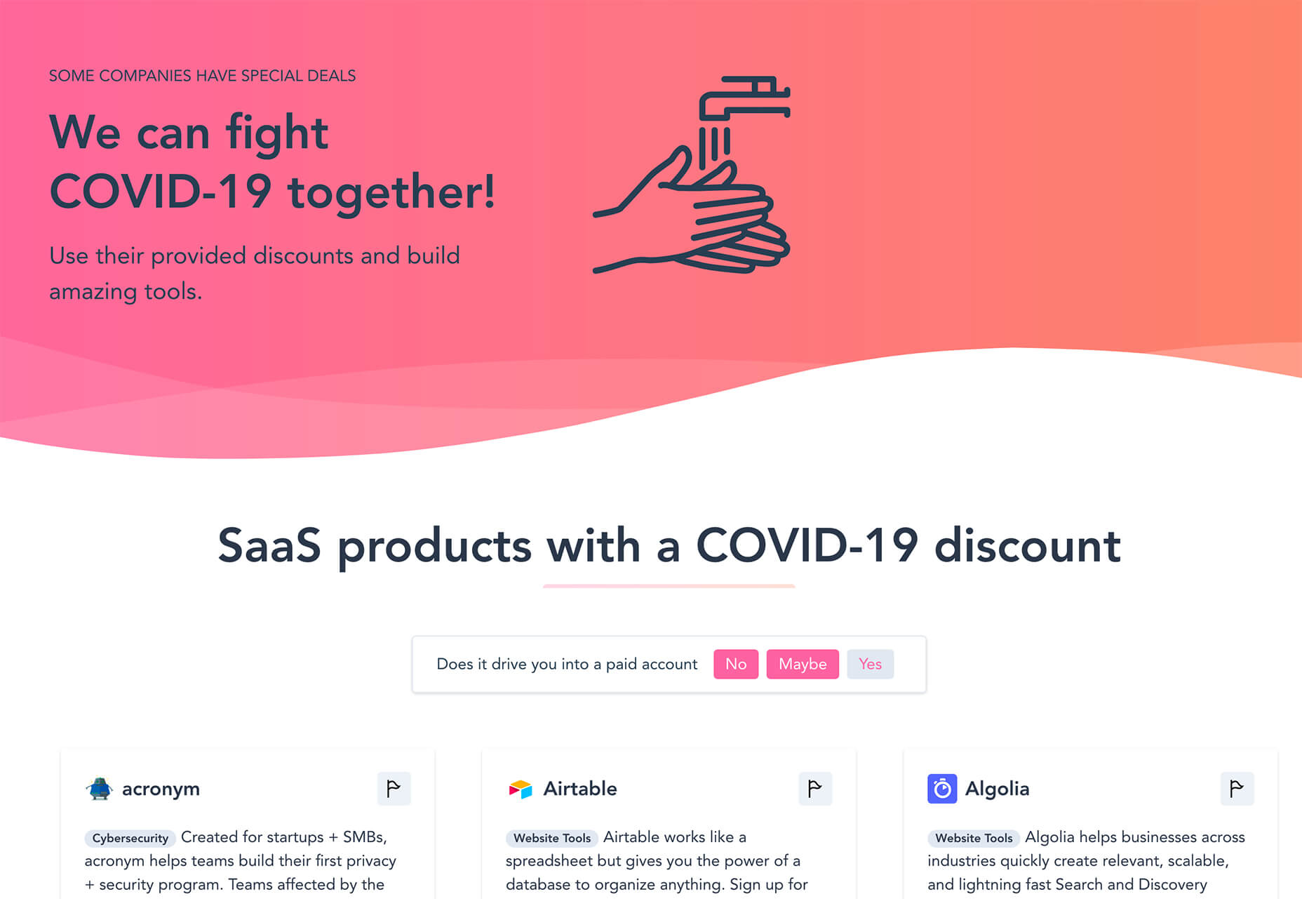
Saas for COVID-19 is a directory of discounts and deals for designers and developers impacted by the worldwide virus. The website build just asks that you use provided discounts to build “amazing tools.”

Virtual Events for Developers

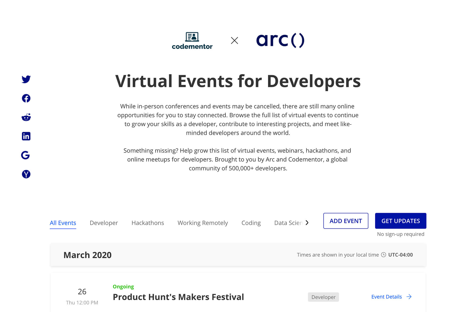
Virtual Events for Developers is another tool that you can use while you may be spending more time at home due to COVID-19. This list is packed with online opportunities for learning and staying connected to the design/dev community.

SnipperApp2

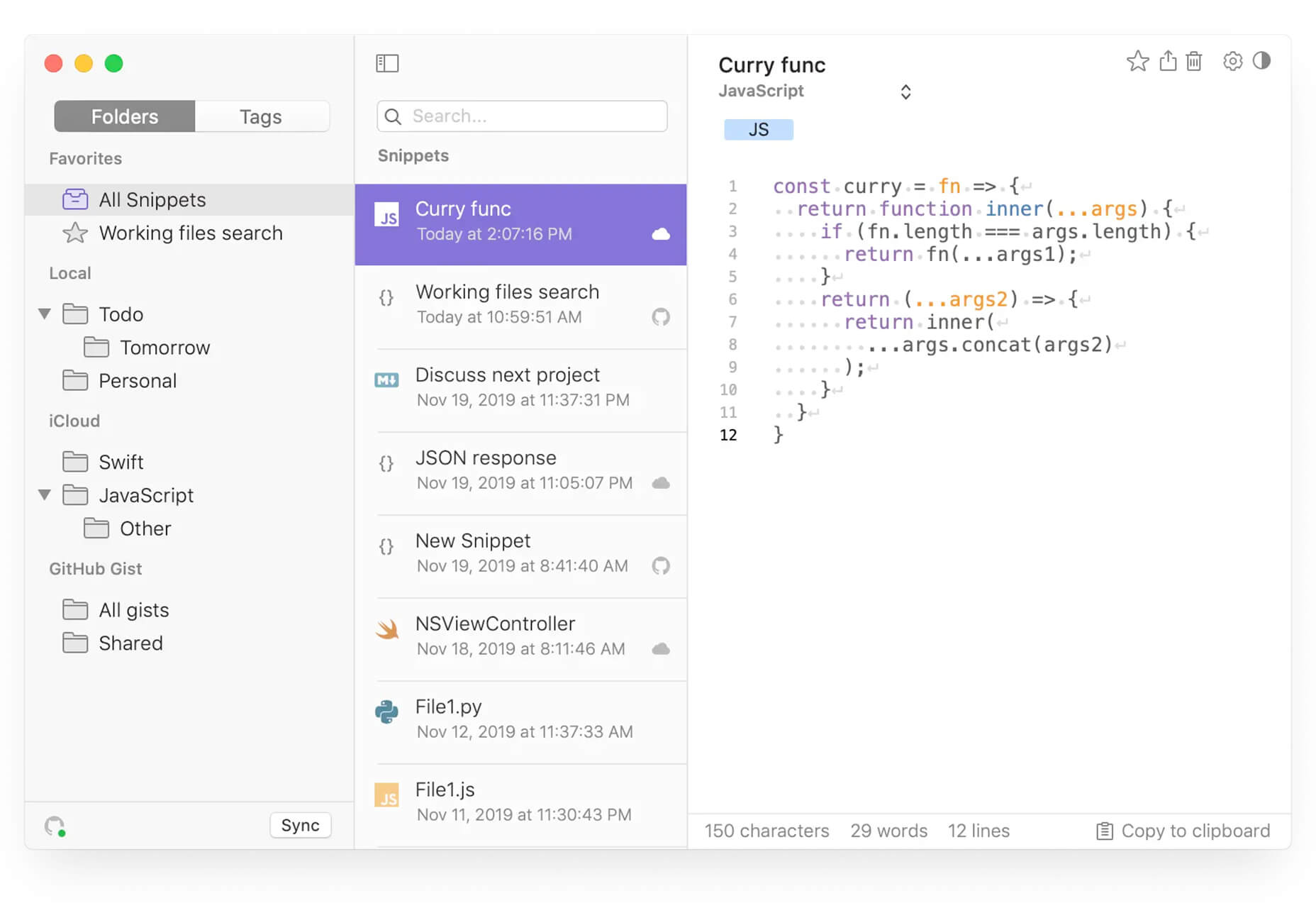
SnipperApp2 is a native Mac OS developer tool that lets you create GitHub markdown notes and save code snippets to multiple storage locations.

Faux Code Generator

The Faux Code Generator turns real code (GitHub Gist) into faux code in the form of an SVG image. Paste in the URL, pick a theme, and create your code.

Midori

Midori is a library for animated image backgrounds. You can pick a number of images, type of transitions, a few effects and see how it works.

Color Push

Color Push is a cool art experience from WeTransfer that uses color and movement to help you create art in 90 seconds or less. Then once you are done, you can download your generative art. WeTransfer says this about it in a blog post about the tool:

The process offers users a moment to zone out from day-to-day tasks and express themselves however they wish.

3D Kinetic Typography

How does 3D kinetic typography look and work? This cool pen by Anna the Scavenger shows it off in a funky style that will have you wanting to do more with it.

StockSolo

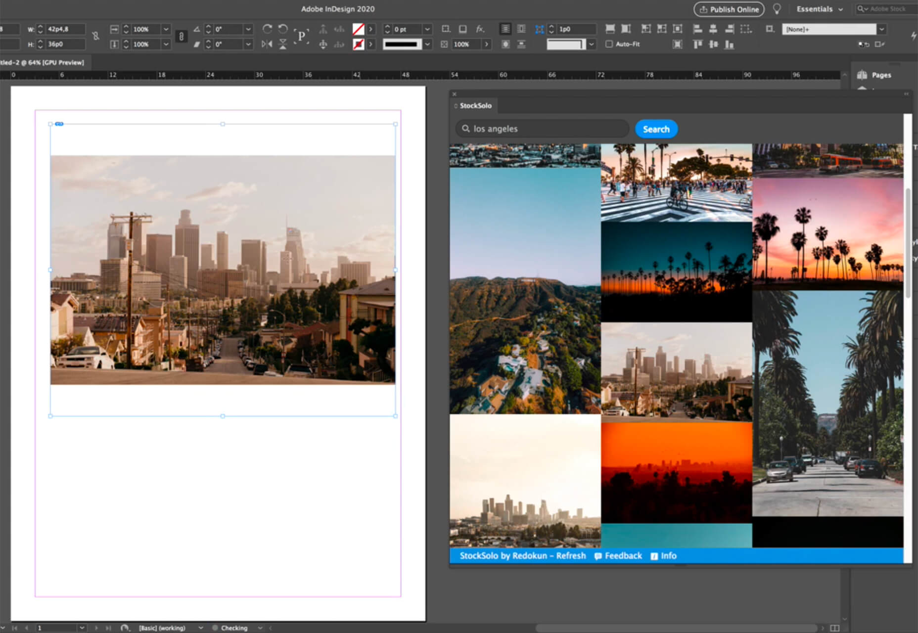
StockSolo is a plugin for Adobe Photoshop, Illustrator, InDesign and XD that brings stock photos to a panel in the native application. Photos are available from Unsplash, Pexels, and Pixabay for use in projects. There are more than 3.2 million images to choose from.

Flat HTML

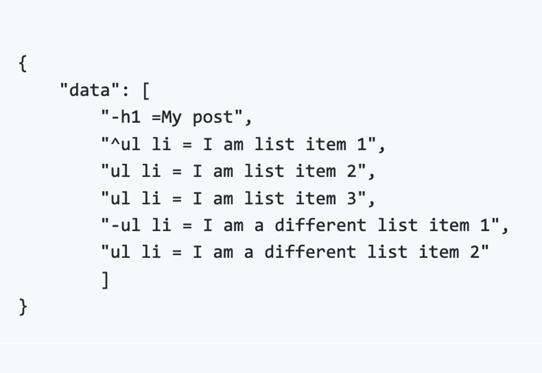
Flat HTML is an alternative to templating and generating complicated HTML. Use it to write a series of statements for what each element should be set to.

Circle Swap Photo Gallery

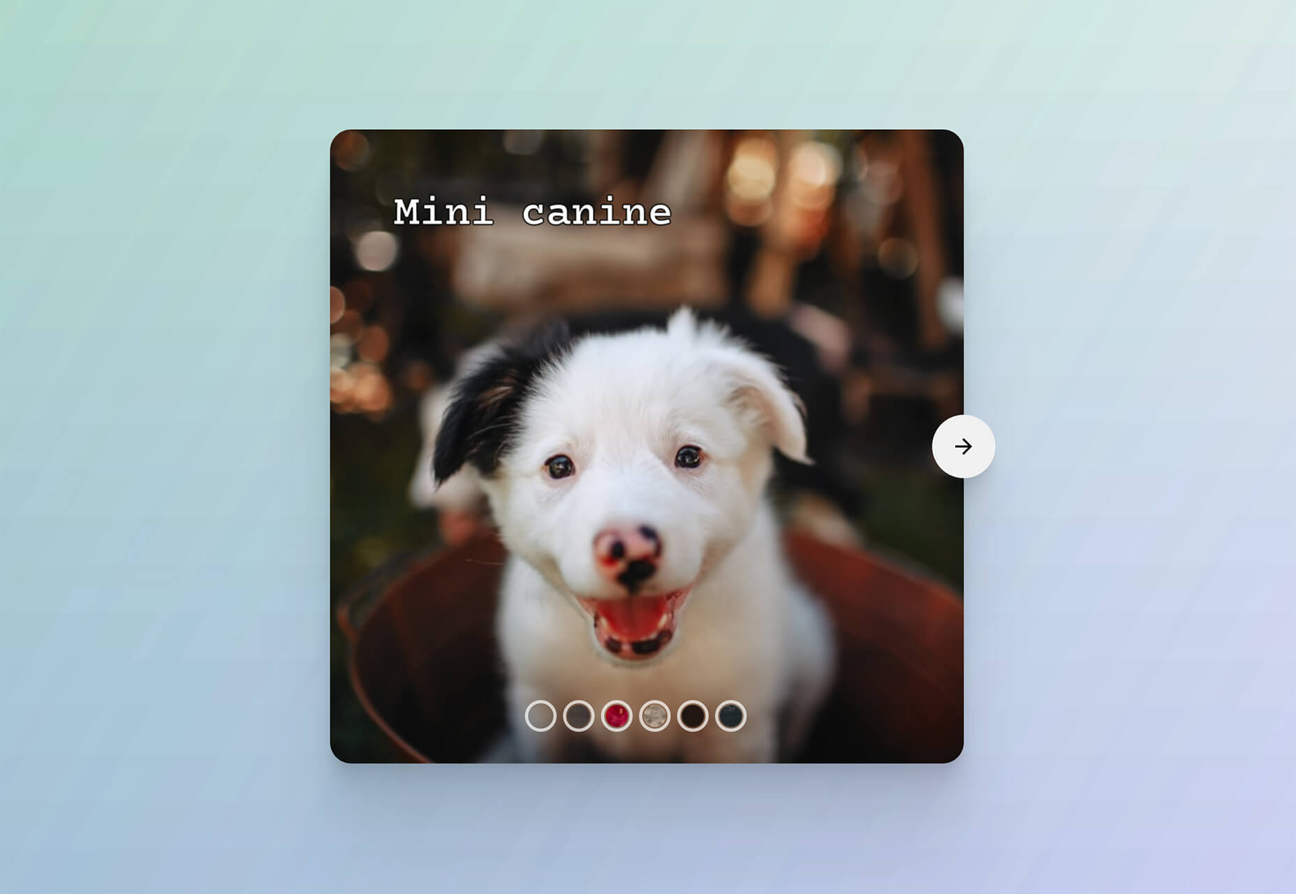
Circle Swap Photo Gallery is a super fun pen by Steve Gardner that uses React and GSAP to swap images in a gallery using a nifty circle animated action. The circle pops to center, rotates, and shows a new image.

BEM Cheat Sheet

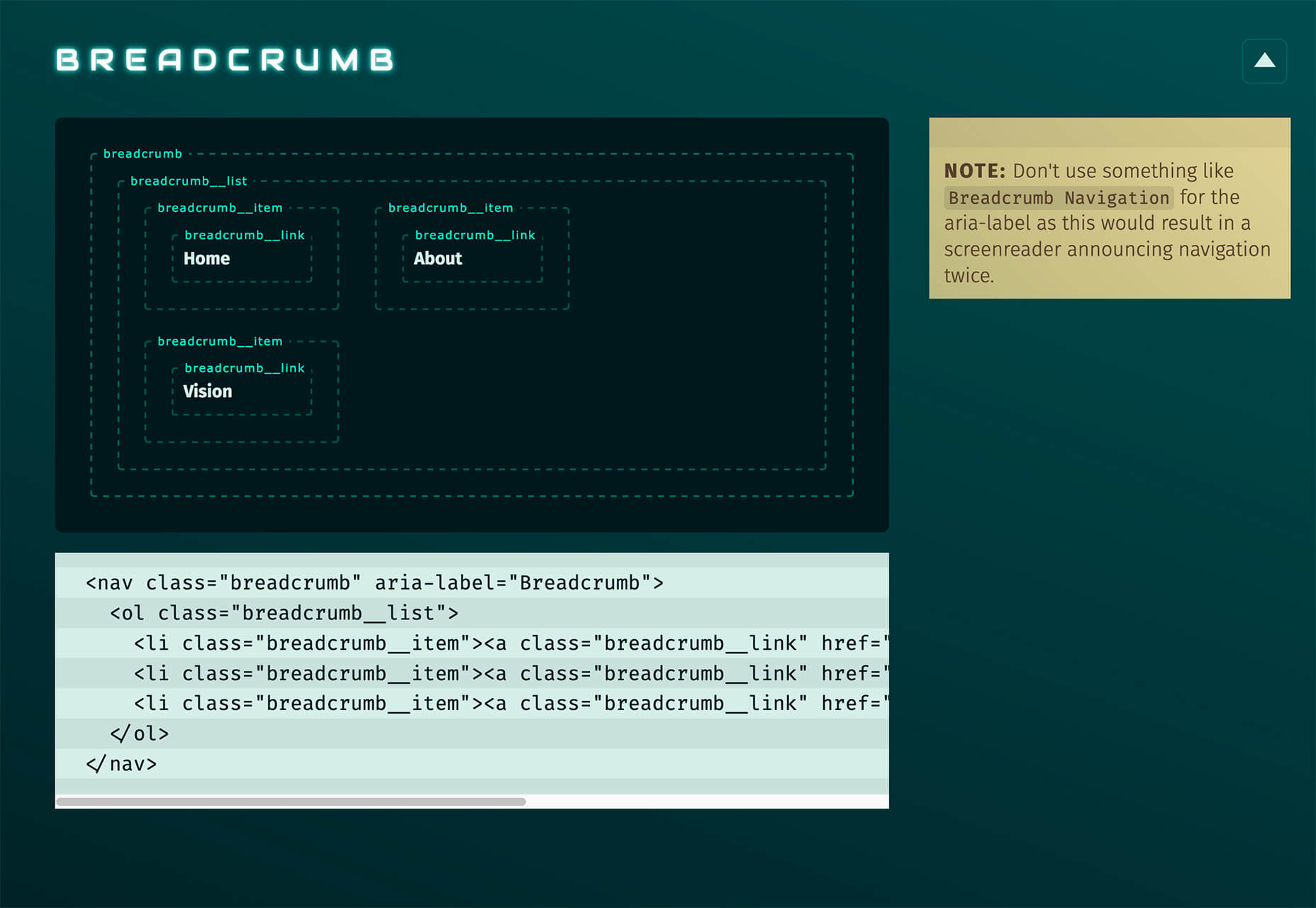
BEM Cheat Sheet is a collection of naming suggestions for some of the most common web components. It’s a resource to help you find the right class name and keep projects moving along.

Jitsi

Jitsi isn’t a design tool per se, but it is a great resource for web designers and developers. This is a secure, fully-featured, and free video conferencing tool. It works as an app and integrates with Slack. It’s all open source and you don’t have to have an account to use it.

Shorthand

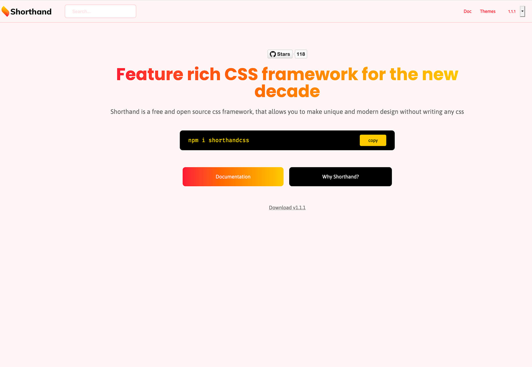
Shorthand is a feature-rich CSS framework that lets you create a modern design without actually having to write the CSS. It’s a customizable tool that is packed with things you want to use – colors, gradients, font styles, transitions, and more.

Boardist

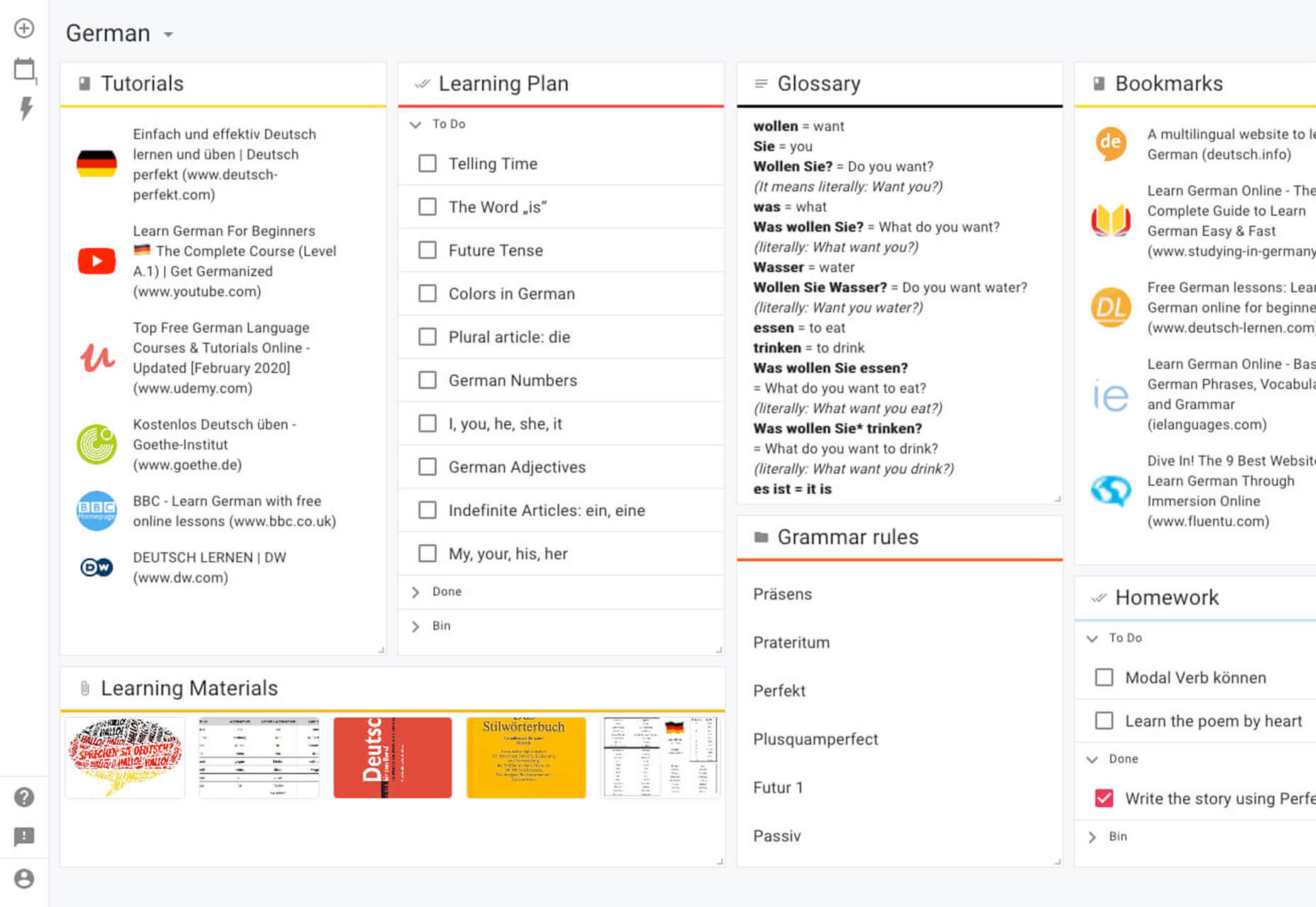
Boardist is an emerging productivity tool that lets you design a “board” space for lists, tasks, and more. Create bookmarks, notes, lists, or files and schedule tasks. It’s designed to keep your projects on track and keep you working well with a team.

Sketch Dark Mode Plugin

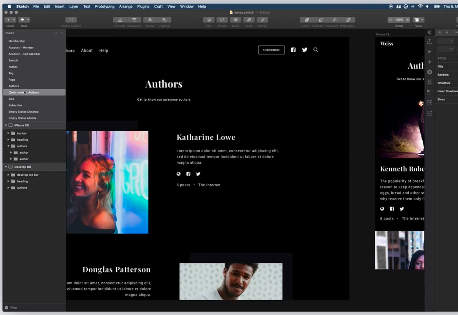
Dark mode is all the rage these days and this plugin allows you to generate a dark mode version of any document in Sketch.

Tabler Icons

Tabler Icons is a set of 450+ SVG icons for web projects in a simple line style. Each icon is designed on a 24×24 grid with a 2 px stroke.

Reflect

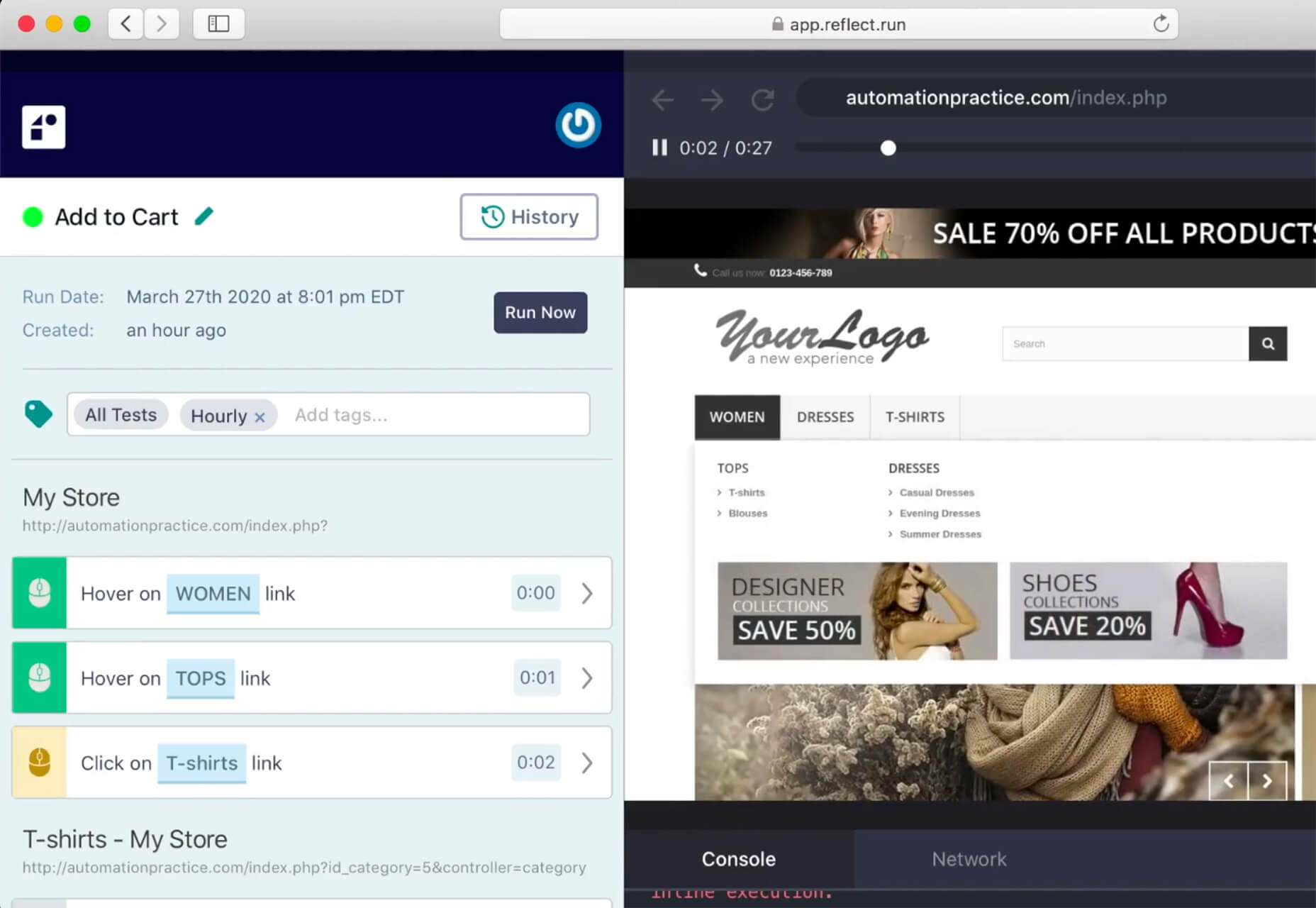
Reflect lets you set up automated end-to-end testing for a web app and even get alerts when things break. This tool lets you do it without writing code.

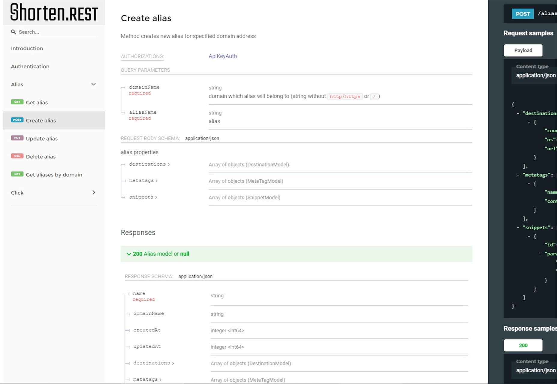
Shorten.rest

Shorten.rest is a robust and flexible transactional URL shortening API. The tool is designed for enterprise-level use and includes a free plan, up to a certain number of clicks per month.

Impacted 2.0

Impacted 2.0 is a rough slab with a harsh feel. It contains a robust character set with 650 characters and more than 600 glyphs. The font is all uppercase, with lowercase options having a new set of rough “defects.”

Hunny Bummy

Hunny Bummy is a spring, playful typeface in a handwriting style. It contains 150+ characters and 80+ glyphs.

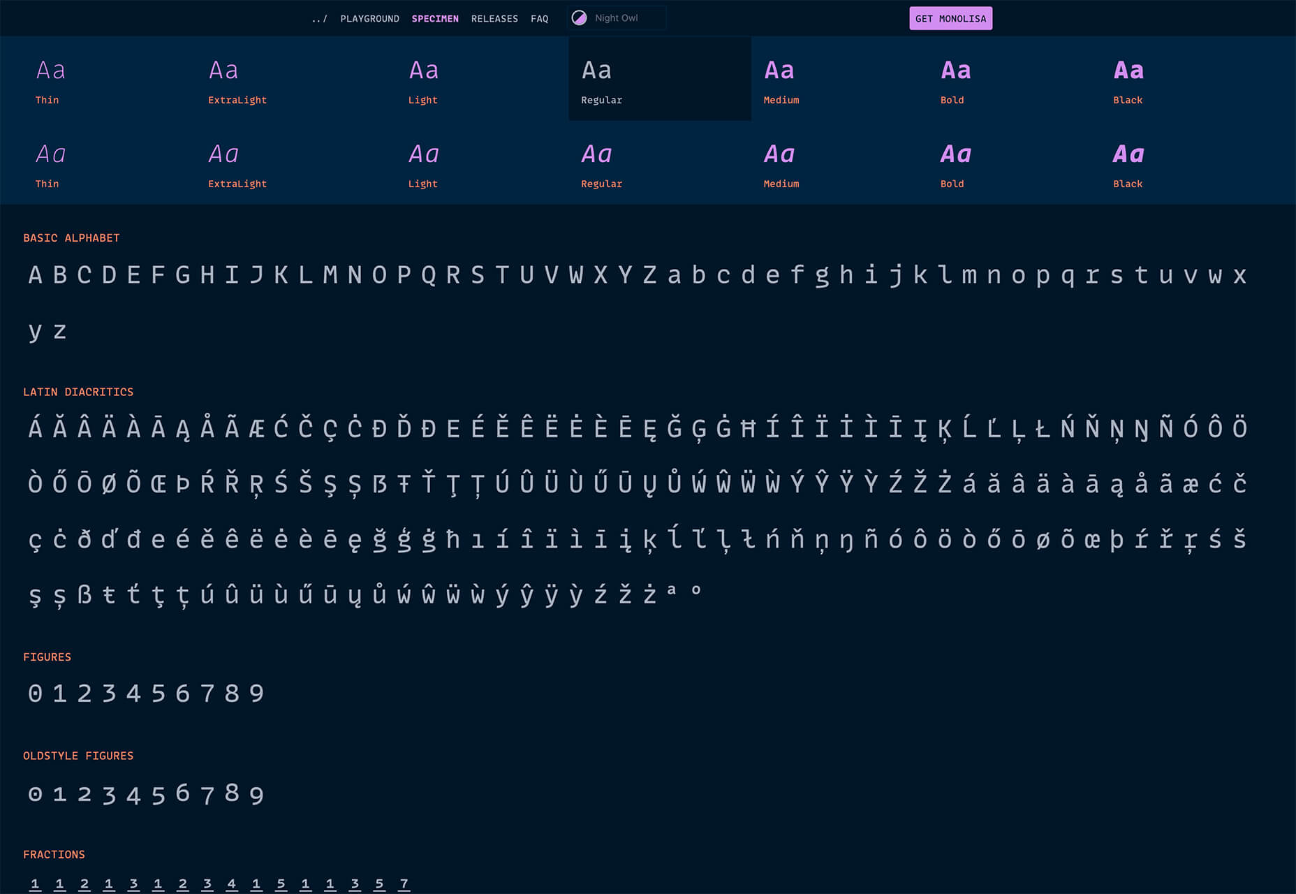
MonoLisa

MonoLisa is a monospace font for developers. The idea behind the typeface design is to improve developer productivity and reduce fatigue from sitting in front of a screen.

Stay Safe

Stay Safe is a handwriting style typeface that fits the mood of the times. It contains a full upper and lowercase character set, numerals, and some glyphs.

Source

Categories: Designing, Others Tags:

Implementing Skeleton Screens In React

April 20th, 2020 No comments
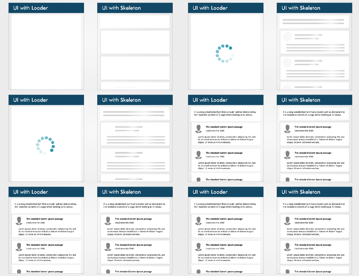
The difference between a loader and a skeleton screen UI

Implementing Skeleton Screens In React

Implementing Skeleton Screens In React

Blessing Krofegha

2020-04-20T10:00:00+00:002020-04-20T16:34:50+00:00

Spinners and loaders have traditionally been the way to tell users that content is going to take a while to load. While this approach is great, it’s quickly becoming obsolete in modern development. Skeleton screens are becoming the perfect replacement for traditional loaders because they focus on progress rather than wait times, hence reducing loading-time frustration.

In this article, we won’t be going through the basics of CSS React or JavaScript syntax, so you don’t have to be an expert in either of these languages to follow along.

The difference between a loader and a skeleton screen UI (Large preview)

UI and UX experts teach us that, while users wait for content to load on a page, we should keep them engaged.

The idea behind using spinners to engage users before content loads is great; however, the result can be less than ideal because most users will get bored staring at a dummy animated spinner like it’s a clock. Luke Wroblewski elaborates on this.

Skeleton screens offer a better user experience by reducing loading-time frustration. By focusing on progress instead of wait times, it create the illusion for users that information will be incrementally displayed on the screen. Bill Chung in his research confirms this.

What Is a Skeleton Screen?

A skeleton screen is a version of the UI that doesn’t contain actual content; instead, it mimics the page’s layout by showing its elements in a shape similar to the actual content as it is loading and becoming available (i.e. when network latency allows).

A skeleton screen is essentially a wireframe of the page, with placeholder boxes for text and images.

What’s Unique About a Skeleton Screen?

A skeleton UI resembles the page’s actual UI, so users will understand how quickly the web or mobile app will load even before the content has shown up. Here are a couple of reasons why you might want to consider using skeleton screens in your next project:

  • mimicking a page’s layout is easier with a skeleton screen,
  • contents loads progressively (not all at once).

Skeleton screens are also referred to as:

  • ghost elements,
  • content placeholders,
  • content loaders.

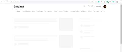
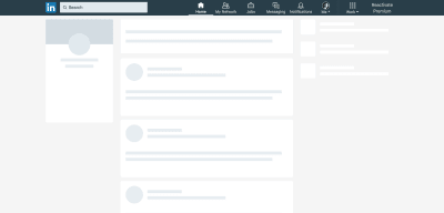
Blockchain.com, YouTube, Facebook, Medium, and other big tech companies display skeleton screens while their content loads to boost the UX.

Blockchain.com

Blockchain.com skeleton screen UI

Blockchain.com’s partially loaded state (notice how a skeleton is used in the graph analytics) (Large preview)

Medium

Medium skeleton screen UI

Medium’s skeleton UI (Large preview)

LinkedIn

LinkedIn skeleton screen UI

LinkedIn’s home feed loading state in 2018 (Large preview)

Types of Skeleton Screens

There are different kinds of skeleton screens. The major ones are text placeholders and image (or color) placeholders.

Most developers prefer to use text placeholders as the skeleton UI on their pages because they’re easy to build, and the developer doesn’t require any details about the substance of the actual content; instead the skeleton mimics the UI.

Color placeholders are harder to build because they require details about the content.

Some popular packages make implementing skeleton screens in web apps easier. Let’s take a closer look at both of them:

We’ll look at the pros and cons of each package, before considering which to use for our application.

React Placeholder

Pros

  • Placeholder components are used to create a custom skeleton UI.
  • Pulse animation (i.e. motion effect on an element) is supported.
  • It comes with a component-based API.

Cons

  • Skeleton components are maintained separately, so updating styles of a component possibly requires updating the skeleton component as well.
  • The learning curve is not linear because there are multiple components for different needs.

The following is an example of a skeleton component using the react-placeholder package:

import { TextBlock, RectShape } from 'react-placeholder/lib/placeholders';
import ReactPlaceholder from 'react-placeholder';

const GhostPlaceholder = () => (
  <div className='my-placeholder'>
    <RectShape color='gray' style={{width: 25, height: 70}} />
    <TextBlock rows={6} color='blue'/>
  </div>
);
<ReactPlaceholder ready={ready} customPlaceholder={<GhostPlaceholder />}>
  <MyComponent />
</ReactPlaceholder>

Importing TextBlock and RectShape from react-placeholder/lib/placeholder and ReactPlaceholder from react-placeholder, we’ve created a functional component named GhostPlaceholder. GhostPlaceholder has a div, and inside the div we’ve used the RectShape component, which describes the dimensions of a rectangle, passes the value of any color, and defines the rectangle’s styles.

Next, we used the TextBlock component to set the values for the rows and color. The TextBlock component defines the number of rows and color of text.

We pass MyComponent as a child of the ReactPlaceholder component, which receives ready and the GhostPlaceholder component as values for its ready and customPlaceholder props.

The MyComponent will load when the skeleton screen UI is shown.

To learn more, check the documentation.

React Loading Skeleton

Pros

  • It is API-based, and it has one component with props for all customization.
  • It can be used as a separate skeleton component and also inside any component directly, so it’s flexible.
  • It supports theming and Pulse animation.

Cons

  • It’s easy to implement for a simple skeleton UI, but complicated for more complex skeletons.
  • Having a separate skeleton component will make it harder to maintain when the UI and styles change.

The following is an example of React Loading Skeleton:

import Skeleton, { SkeletonTheme } from "react-loading-skeleton";

const SkeletonComponent = () => (
  <SkeletonTheme color="#202020" highlightColor="#444">
    <section>
      <Skeleton height={50} width={50} />
    </section>
  </SkeletonTheme>
);

We’ve imported Skeleton and SkeletonTheme from the react-loading-skeleton library, then created a functional component that renders the SkeletonTheme component, with color and hightlightColor as properties.

The SkeletonTheme component is used for theming (for example, adding color effects to the skeleton UI).

Finally, inside the section, we define the Skeleton component, with height and width properties and their appropriate values passed in.

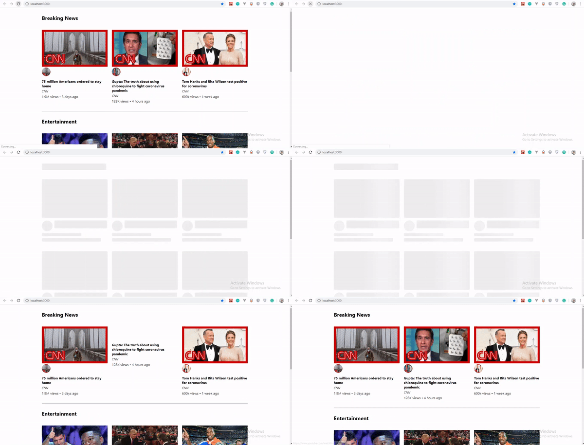
Building a YouTube-Like Skeleton Screen UI

Let’s create a YouTube-like skeleton screen, using React Loading Skeleton, to show how a skeleton UI works.

Set Up React

The easiest way to set up React is to use Create React App, which is “an officially supported way to create single-page React applications. It offers a modern build setup with no configuration.”

We’ll use it to bootstrap the application that we’ll be building. From your terminal, run the command below:

npx create-react-app skeleton-screens && cd skeleton-screens

Once the installation has completed, start the React server by running npm start:

React app - Scaffold React app

React welcome page (Large preview)

Create the YouTube UI Without a Skeleton Screen

First, let’s input YouTube dummy data. Real endpoints would normally be used instead of dummy data, but in this tutorial we will use dummy data.

Create a file in your src/ folder, and name it data.js, add the following code to it.

const dummyData= [
  {
    section: "Recommended",
    channel: "CNN",
    items: [
      {
        id: "fDObf2AeAP4",
        image: "https://img.youtube.com/vi/fDObf2AeAP4/maxresdefault.jpg",
        title: "75 million Americans ordered to stay home",
        views: "1.9M views",
        published: "3 days agos"
      },
      {
        id: "3AzIgAa0Cm8",
        image: "https://img.youtube.com/vi/3AzIgAa0Cm8/maxresdefault.jpg",
        title: "Gupta: The truth about using chloroquine to fight coronavirus pandemic",
        views: "128K views",
        published: "4 hours ago"
      },
      {
        id: "92B37aXykYw",
        image: "https://img.youtube.com/vi/92B37aXykYw/maxresdefault.jpg",
        title: "Willie Jones STUNS Simon Cowell In Pitch Perfect Performance of 'Your Man'!",
        views: "2.47 million views",
        published: "1 month ago"
      },
      {
        id: "J6rVaFzOEP8",
        image: "https://img.youtube.com/vi/J6rVaFzOEP8/maxresdefault.jpg",
        title: "Guide To Becoming A Self-Taught Software Developer",
        views: "104K views",
        published: "17 days ago"
      },
      {
        id: "Wbk8ZrfU3EM",
        image: "https://img.youtube.com/vi/Wbk8ZrfU3EM/maxresdefault.jpg",
        title: "Tom Hanks and Rita Wilson test positive for coronavirus",
        views: "600k views",
        published: "1 week ago"
      },
      {
        id: "ikHpFgKJax8",
        image: "https://img.youtube.com/vi/ikHpFgKJax8/maxresdefault.jpg",
        title: "Faces Of Africa- The Jerry Rawlings story",
        views: "2.3 million views",
        published: "2014"
      }
    ]
  },
  {
    section: "Breaking News",
    channel: "CGTN America",
    items: [
      {
        id: "tRLDPy1A8pI",
        image: "https://img.youtube.com/vi/tRLDPy1A8pI/maxresdefault.jpg",
        title: "Is Trump blaming China for COVID-19? You decide.",
        views: "876k views",
        published: "9 days ago"
      },
      {
        id: "2ulH1R9hlG8",
        image: "https://img.youtube.com/vi/2ulH1R9hlG8/maxresdefault.jpg",
        title: "Journalist still goes to office during pandemic, see her daily routine",
        views: "873 views",
        published: "3 hours ago"
      },
      {
        id: "_TkfQ9MaIgU",
        image: "https://img.youtube.com/vi/_TkfQ9MaIgU/maxresdefault.jpg",
        title: "How are small businesses going to survive the economic downturn of the COVID-19 era?",
        views: "283 views",
        published: "4 day ago"
      }
    ]
  }
];
export default dummyData;

To replicate YouTube’s format, we’ve created dummy data that has an array of objects, with properties such as ID, image, title, number of views, and publication date.

Next, let’s create our YouTube UI. We will have three components:

Card Holds the details of the video’s thumbnail, title, number of views, publication date, and channel.
CardList Returns all cards in a row.
App Mounts our dummyData object, loads the skeleton UI for two seconds, and returns the CardList component.

Inside your src folder, create a folder and name it components. Inside the components folder, create a Card.js file, add the following code to it:

import React from "react";
const Card = ({ item, channel }) => {
    return (
      <li className="card">
        <a
          href={`https://www.youtube.com/watch?v=${item.id}`}
          target="_blank"
          rel="noopener noreferrer"
          className="card-link"
        >
          <img src={item.image} alt={item.title} className="card-image" />
          <img src={item.image} alt={item.title} className="channel-image" />
          <h4 className="card-title">{item.title}</h4>
          <p className="card-channel">
            <i>{channel}</i>
          </p>
          <div className="card-metrics">
            {item.views} • {item.published}
          </div>
        </a>
      </li>
    );
  };
  export default Card;

We created a Card component. Inside it, we imported React from react, and we deconstructed the item and channel props so that they can be used across the Card component. Each Card item component that displays one video will show the thumbnail, number of views, publication date, and title.

CardList Component

Inside the components folder, create a CardList.js file and add the following code to it:

import React from "react";
import Card from "./Card";
const CardList = ({ list }) => {
    return (
      <ul className="list">
        {list.items.map((item, index) => {
          return <Card key={index} item={item} channel={list.channel} />;
        })}
      </ul>
    );
  };
  export default CardList;

In this component, we’ve imported the Card component that we created. The card accepts the item and channel props, which we get by mapping through the list.items. We then export this component as CardList, because we’ll be making use of it in our App component.

Note: The items array that is mapped in this component is the array of objects in our dummyData.

App Component

Inside the app.js file in the src/ directory, delete the code that is there and add the following to it.

import React, { useState, useEffect } from "react";
import "./App.css";
import dummyData from "./data";
import CardList from "./components/CardList";

const App = () => {
  const [videos, setVideos] = useState([]);
  const [loading, setLoading] = useState(false);

  useEffect(() => {
    setLoading(true);
    const timer = setTimeout(() => {
      setVideos(dummyData);
      setLoading(false);
    }, 5000);
    return () => clearTimeout(timer);
  }, []);
  return (
    <div className="App">
      {
        videos.map((list, index) => {
          return (
            <section key={index}>
              <h2 className="section-title">{list.section}</h2>
              <CardList list={list} />
              <hr />
            </section>
          );
        })}
    </div>
  );
};
export default App;

In this component, we’ve imported the useState and useEffect hooks alongside React and the other files that we’ve created and that will be needed in the App component.

Because our data is dummy data, we need to mock it up like the API data by loading the content after a two-second timeout, using the JavaScript setTimeout method.

Next, in the App component, we create a video state, and set the state to an empty array using useState.

To load our dummy data, we’ll use the useEffect hook. In our hook, we create a variable timer that holds the setTimeout() function. Inside the function, we set our video state to our dummyData object, and we ensure that the data loads after two seconds, and, lastly, we cancel the timer while unmounting.

Finally, we map through our video state and return the section element that contains the list-section and the CardList component with its list props.

Adding CSS

Until now, we’ve used a lot of classes without actual CSS. Inside the src folder, delete everything in App.css and replace it with the following code;

.App {
  max-width: 960px;
  margin: 0 auto;
  font-size: 16px;
}
.list {
  display: flex;
  justify-content: space-between;
  flex-wrap: wrap;
  list-style: none;
  padding: 0;
}
.section-title {
  margin-top: 30px;
}
.card {
  width: calc(33% - 10px);
  margin: 20px 0;
}
.card-link {
  color: inherit;
  text-decoration: none;
}
.card-image {
  width: 100%;
}
.channel-image {
  border-radius: 100%;
  padding: 0, 10px, 0, 0;
  width: 40px;
  height: 40px;  
}
.card-title {
  margin-top: 10px;
  margin-bottom: 0;
}
.card-channel {
  margin-top: 5px;
  margin-bottom: 5px;
  font-size: 14px;
}
/* Tablets */
@media (max-width: 1000px) {
  .App {
    max-width: 600px;
  }
  .card {
    width: calc(50% - 22px);
  }
}
/* Mobiles */
@media (max-width: 640px) {
  .App {
    max-width: 100%;
    padding: 0 15px;
  }
  .card {
    width: 100%;
  }
}

Let’s see what our YouTube UI looks like without the skeleton screen. You can see that when the page loads, a white screen appears for two seconds, and then the data loads promptly.

YouTube-Like UI without skeleton screen (Large preview)

Using React Loading Skeleton

Unlike other libraries in which you would meticulously craft a skeleton screen to match the font sizes, line heights and margins of your content, the Skeleton component is designed to be used directly in your components, in place of the content that is loading.

Let’s go over a few reasons why we’ve chosen React Loading Skeleton over others.

Theming

React Loading Skeleton supports theming. Thus, you can easily change the colors of all skeleton components by using SkeletonTheme and pass values to the color props.

Below is an example showing how it works:

import Skeleton, { SkeletonTheme } from "react-loading-skeleton";

<SkeletonTheme color="grey" highlightColor="#444">
  <p>
    <Skeleton height={250} width={300} count={1} />
  </p>

</SkeletonTheme>
<SkeletonTheme color="#990" highlightColor="#550">
  <p>
    <Skeleton height={250} width={300} count={1} />
  </p>

</SkeletonTheme>
Theming effect in action
Theming effect in action (Large preview)

Duration

In addition to the height, width, and color props, we can also specify a duration prop.

<Skeleton duration={2} />

The duration defaults to 1.2. This determines how long it takes to do one cycle of the skeleton animation.

To learn more, check out the documentation.

Implementing Skeleton Screen UI

Now, we’ll install react-loading-skeleton. Run the following command in your terminal to install the package:

npm install react-loading-skeleton

Skeleton Component

Let’s create a skeleton component for our video data. Inside our components folder, create a SkeletonCard.js file, and add the following code:

import React from "react";
import Skeleton from "react-loading-skeleton";
const SkeletonCard = () => {
    return (
      <section>
        <h2 className="section-title">
          <Skeleton height={30} width={300} />
        </h2>

        <ul className="list">
          {Array(9)
            .fill()
            .map((item, index) => (
              <li className="card" key={index}>
                <Skeleton height={180} />
                <h4 className="card-title">
                <Skeleton circle={true} height={50} width={50} />  
                  <Skeleton height={36} width={`80%`} />
                </h4>
                <p className="card-channel">
                  <Skeleton width={`60%`} />
                </p>
                <div className="card-metrics">
                  <Skeleton width={`90%`} />
                </div>
              </li>
            ))}
        </ul>
      </section>
    );
  };
  export default SkeletonCard;

We’ve created an unordered list. Inside it, we’ve used the Array.fill() method. Because we have nine items of dummy data, we’ve used the Array.fill() method to loop through the length of our items object and filled it with no index value, hence making our array empty. See the Array.fill documentation to learn how it works.

Next, we mapped through our empty array to return a list containing the skeleton properties, and we specified the value of each of the skeleton properties.

Here, height connotes the length of a skeleton rectangle, and width refers to the breadth, while circle creates the rounded part of the skeleton UI.

React Loading Skeleton comes with default Pulse animation, which makes it handy. You could create Pulse animation to suit your project, but if you ask me, I would stick with the default.

Finally, the complete source code is available.

We now have a fully functional skeleton screen UI. Our example shows the skeleton for five seconds before showing the content.

Let’s see our result thus far:

YouTube-like UI plus skeleton screen UI
Our YouTube-like skeleton UI (Large preview)

Conclusion

Skeleton screens tremendously improve the user experience by avoiding the frustration of facing an entirely blank screen and giving the user an impression of what content will look like before it loads.

If you aren’t comfortable with any of the packages we’ve looked at, you can create your own skeleton UI by making rectangles and circles that mimic the page’s layout.

Please do share your feedback and experience with in the comments section below. I’d love to see what you come up with!

The supporting repo for this article is available on Github.

References

Smashing Editorial(ks, il, al)
Categories: Others Tags:

Building a PC, Part IX: Downsizing

April 19th, 2020 No comments

Hard to believe that I’ve had the same PC case since 2011, and my last serious upgrade was in 2015. I guess that’s yet another sign that the PC is over, because PC upgrades have gotten really boring. It took 5 years for me to muster up the initiative to get my system fully upgraded! ?

I’ve been slogging away at this for quite some time now. My PC build blog entry series spans 13 glorious years:

The future of PCs may not necessarily be more speed (though there is some of that, if you read on), but in smaller builds. For this iteration, my go-to cases are the Dan A4 SFX

And the Streacom DA2

The attraction here is maximum power in minimum size. Note that each of these cases are just large enough to fit …

  • a standard mini-ITX system
  • SFX power supply
  • full sized GPU
  • reasonable CPU cooler

… though the DA2 offers substantially more room for cooling the CPU and adding fans.

http://i.imgur.com/odoYjle.jpg

I’m not sure you can physically build a smaller standard mini-ITX system than the DAN A4 SFX, at least not without custom parts!

DAN A4-SFX
200mm × 115mm × 317mm = 7.3 liters

Silverstone RVZ02 / ML08
380mm × 87mm × 370mm = 12.2 liters

nCase M1
240mm × 160mm × 328 mm = 12.6 liters

Streacom DA2
180mm × 286mm × 340mm = 17.5 liters

(For comparison with The Golden Age of x86 Gaming Consoles, a PS4 Pro occupies 5.3 liters and an Xbox One S 4.3 liters. About 50% more volume for considerably more than 2× the power isn’t a bad deal!)

I chose the Streacom DA2 as my personal build, because after experimenting heavily with the DAN A4 SFX, I realized you need more room to deal with extremely powerful CPUs and GPUs in this form factor, and I wanted a truly powerful system:

  • Intel i9-9900KS (8 core, 16 thread, 5.0 GHz) CPU
  • Samsung 970 PRO 1TB / Samsung 970 EVO 2TB / Samsung 860 QVO 4TB SATA
  • 64GB DDR4-3000
  • Cryorig H7 cooler (exact fit)
  • NVIDIA GeForce RTX 280 Ti GPU

Compared to my old 2015-2017 system, a slightly overclocked i7-7700k, that at least gives me 2× the cores (and faster cores, both in clock rate and IPC), 2× the memory, and 2× the M.2 slots (two versus one).

The DA2 is a clever case though less perfect than the A4-SFX. What’s neat about it is the hybrid open-air design (on the top and bottom) plus the versatile horizontal and vertical bracket system interior. Per the manual (pdf):

Check out all the bracket mounting options. Incredibly versatile, and easy to manupulate with the captured nut and bolt design:

Note that you can (and really should) pop out the top and bottom acrylic pieces with the mesh dust net.

I had dramatically better temperatures after I did this, and it also made the build easier since the case can fully “breathe” through the top and bottom. You’ll note that the front of the DA2 is totally solid, no air holes, so you do need that extra airflow.

I only have a few criticisms of this Streacom DA2 case:

  • The side panels are tool free, which is excellent, but the pressure fit makes them fairly difficult to remove. Feels like this could be tweaked?
  • (Don’t even think about using a full sized ATX power supply. In theory it is supported, but the build becomes so much more difficult. Use a SFX power supply, which you’d expect to do for a mini-ITX build anyway.)
  • My primary complaint is that the power extension cable gets in the way. I had to remove it and re-attach it during my build. They should custom route the power cable upwards so it blocks less stuff.
  • Less of a criticism and more of an observation: if your build uses a powerful GPU and CPU, you’ll need two case fans. There’s mounting points for a 92mm fan in the rear, and the bracket system makes it easy to mount a 140mm fan blowing inward. You will definitely need both fans!

Here’s the configuration I recommend, open on both the top and bottom for maximum airflow, with three fans total:

If you are a water cooling kind of person – I am definitely not, I experienced one too many traumatic cooling fluid leaks in the early 2000s – then you will use that 140mm space for the radiator.

I have definitely burn-in tested this machine, as I do all systems I build, and it passed with flying colors. But to be honest, if you expect to be under full CPU and GPU loads for extended periods of time you might need to switch to water cooling due to the space constraints. (Or pick slightly less powerful components.)

If you haven’t built a PC system recently, it’s easier than it has ever been. Heck by the time you install the M.2 drives, memory, CPU, and cooler on the motherboard you’re almost done, these days!

There are a lot of interesting compact mini-itx builds out there. Perhaps that’s the primary innovation in PC building for 2020 and beyond – packing all that power into less than 20 liters of space!

Categories: Others, Programming Tags:

Popular Design News of the Week: April 13, 2020 – April 19, 2020

April 19th, 2020 No comments

Every week users submit a lot of interesting stuff on our sister site Webdesigner News, highlighting great content from around the web that can be of interest to web designers.

The best way to keep track of all the great stories and news being posted is simply to check out the Webdesigner News site, however, in case you missed some here’s a quick and useful compilation of the most popular designer news that we curated from the past week.

Note that this is only a very small selection of the links that were posted, so don’t miss out and subscribe to our newsletter and follow the site daily for all the news.

Free Visuals and Templates Against COVID-19

Fullstack – A Game Built Out of Checkboxes

100 Things a UX/UI Designer Should Know

Is the Future of WordPress Code-Free?

Thinking in Design Systems?-?Colors

Rome: An Entire JavaScript Toolchain with Zero Third Party Dependencies

Studio Ghibli Releases Free Video Call Backgrounds

Image Techniques on the Web

How the Virus Transformed the Way Americans Spend their Money

HELP! The Site’s Down!

Colornames.Org – A Collaborative Effort to Name all 16.7m Colors

10 Random Act of Kindness Ideas for Designers

Ways to Increase your Productivity as a Web Developer

The Fonts in Popular Things Identified

COBOL, Programming, and Coding

How to Conduct a Remote Design Sprint

Why You Need a Digital-first Approach for your Brand Design

65+ Most Common WordPress Errors and How to Fix Them

10 Seinfeld Scenes Every Product Manager Should Watch

Coronavirus Means no New Emoji in 2021

7 Odd Signs that your Website has been Hacked

World Health Organization Releases Official COVID-19 Coronavirus App

Best Video Conferencing Apps and Software for Accessibility

Coding Hygiene

Designer Jenna Freitas on Adapting to New Trends & Putting Yourself Out There

Want more? No problem! Keep track of top design news from around the web with Webdesigner News.

Source

Categories: Designing, Others Tags:

How (some) good corporate engineering blogs are written

April 18th, 2020 No comments

Interesting research from Dan Luu:

… it’s pretty common for my personal blog to get more traffic than the entire corp eng blog for a company with a nine to ten figure valuation and it’s not uncommon for my blog to get an order of magnitude more traffic.

I think this is odd because tech companies in that class often have hundreds to thousands of employees. They’re overwhelmingly likely to be better equipped to write a compelling blog than I am and companies get a lot more value from having a compelling blog than I do.

First, yes. There is a crapload of value in having a good blog (top of funnel traffic, showcasing culture for hiring, establishing industry leadership…) yet so few companies do it well even when they have more than enough resources to do so.

Dan doesn’t just speculate on this, he interviewed people at companies that have actually good engineering blogs: Heap, Segment, and Cloudflare. Then he listed their internal process for blogging. The first step in all three is the same: “Someone has an idea to write a post”. That makes sense, but I would think there is something deeper going on with good blogs: engineers that want to come up with ideas because it is encouraged and incentivized. And then after the ball is rolling, there is a positive feedback loop and as few blockers as possible.

Random observations from me:

  • We recently started using Appcues at CodePen, and it was on our radar at all because people at CodePen read their blog and liked it.
  • While Appcues largely blogs about stuff that is directly related to stuff their software can help with, Logrocket, a software product for tracking JavaScript errors, has a blog that isn’t terribly different than CSS-Tricks. It’s just about front-end everything and every single blog post has a section in it that is a pitch for the product. Looks like they’ve been doing it for about 3 years now, so my hunch is that it works extremely well.
  • All the browser vendors to a pretty good job of blogging overall, but at the same time, feel a bit disjointed. What blog(s) should I be reading for Mozilla/Firefox stuff? I don’t know really. Is it the official looking one? Or the “hacks” one? Or the planet one? Or nightly one? Or the one for releases? Google seems to have the same problem. There isn’t an obvious hub of writing.
  • Stripe has a strong engineering blog, but then take it to another level by producing a fancy publication (Increment) that is both online and in print.

Direct Link to ArticlePermalink

The post How (some) good corporate engineering blogs are written appeared first on CSS-Tricks.

Categories: Designing, Others Tags: