Nonprofit Web Development: 5 Tips to Boost Engagement
When someone first hears about your nonprofit and wants to do more research before donating, their first stop will likely be your website. In this day and age, your organization’s website is expected to have all of the information about your cause and how to get involved.
However, if it’s poorly designed or otherwise lacks the information that users are seeking, they may ultimately leave without taking any further action.
Designing an effective website is essential for driving user engagement and securing the crucial support your organization needs to fulfill its mission. There’s a lot that goes into nonprofit web development, though. For those new to the web design landscape, getting started can seem slightly daunting. However, the right content management system (CMS) — also known as a website builder — will simplify the design process and help you effectively convey your brand, drive donations, and further your mission.
With the right CMS tools, you can create an engaging, professional website with little-to-no design or coding experience.
Thanks to new developments in technology, the best nonprofit websites are able to put user engagement at the forefront of their design strategy. To emulate this strategy, consider these important tips during the web development process:
- Focus on smooth navigation.
- Optimize for mobile devices.
- Maintain an active blog.
- Create a compelling donation page.
- Adhere to accessibility guidelines.
Designing your nonprofit’s website can be exciting. It gives your team the opportunity to spread the word about your cause, boost supporter engagement, and express your organization’s vision. If you’re ready to secure support for your nonprofit by creating a well-designed website, let’s get started!

1. Focus on smooth navigation.
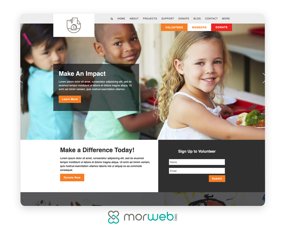
A major part of the user experience is the structure of your nonprofit’s website. If users can’t easily navigate your website, they likely won’t continue engaging with your content. They shouldn’t have to dig through your web pages to find the information they need. Instead, intuitive navigation will help them find exactly what they’re looking for in just a few clicks.
Start by designing a navigation bar that’s visible across your website. For the best results, aim to keep it minimal. To do this, feature high-value pages that you’d like to drive traffic to. For instance, this may include your ‘About Us’ page, your donation form, and your blog. From here, use a hierarchical structure to indicate which pages take precedence.
When creating your navigation bar, keep these tips in mind for an intuitive interface:
- Shorten navigation titles so that they’re between 1 to 3 words.
- Avoid jargon and language that don’t clearly portray the landing page.
- If possible, stick to only one level of drop-down menus.
- Don’t include every single page in your navigation.
Remember, different users visit your website for a number of various reasons. Make sure it’s easy for new users to find out more about your organization, donors to access your donation page, and volunteers to locate new giving opportunities.
If your navigation is unintuitive, users will have a difficult time locating content that’s of interest to them, which may ultimately drive them away from your website. To help, make sure your CMS allows you to customize your menu structure so that you can arrange your navigation menu how you’d like. This way, you’ll have a much simpler time funneling users to your high-value pages.

2. Optimize for mobile devices.
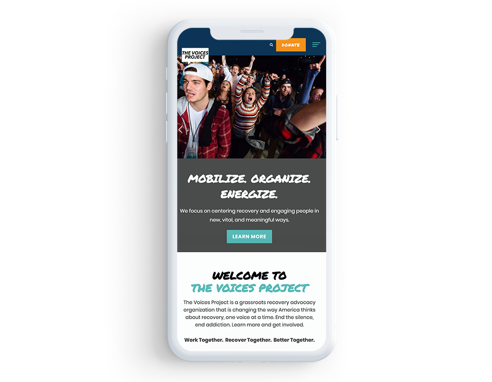
Today, most internet users browse the web on their mobile devices, which means potential supporters may be viewing your content on smaller screens. In fact, mobile users make up roughly half of all nonprofit website traffic, according to Double the Donation’s nonprofit fundraising statistics page. Because of this, you’ll want to ensure that mobile users can access content across your entire website with ease.
To avoid having to manually adjust each element, your CMS should be mobile responsive, meaning it allows mobile users to easily view and interact with your content. This way, they won’t have to zoom in and out or rotate their devices to read your content. Otherwise, they may end up leaving the page due to frustration.
For a positive mobile experience, your system should adjust elements to fit any screen size. Specifically, these elements should include:
- Navigation menus
- Images, videos, and galleries
- Forms
- Pop-ups
As technology progresses, mobile responsiveness is becoming increasingly important. Make sure your team prioritizes this in the web development process so you won’t negatively impact the mobile user experience.

3. Maintain an active blog.
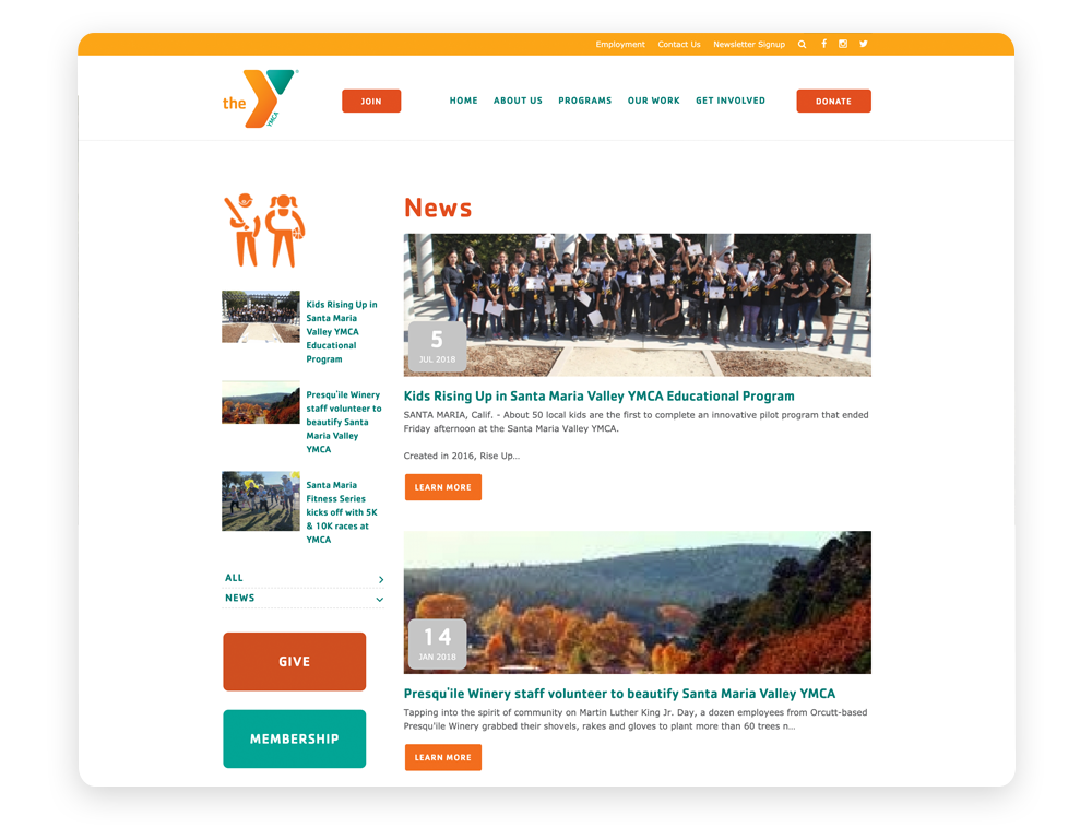
Fuel your organization’s growth by developing powerful blog posts that effectively communicate your mission. Blogs are impactful engagement tools for nonprofits of all sizes. With these valuable resources, supporters can stay up-to-date on all the progress your team is making toward its goals.
When composing your blog posts, keep these best practices in mind to maximize user engagement:
- Incorporate powerful narratives. Storytelling enables readers to connect with your cause on an emotional level. Consider writing narratives about those directly involved with your cause, whether that’s those who benefit from your work or the volunteers and team members who have seen the impact firsthand.
- Use compelling imagery. When used strategically, imagery enables you to better illustrate the importance of your work. You’ll need to go above and beyond generic stock photos by featuring your own high-quality images of staff members, advocates, and those directly impacted by your work.
- Don’t be afraid to use white space. Overloading your pages with too many design elements can distract readers and direct their attention away from your core message. Incorporate white space to break up content and make it easier to digest.
- Create well-designed CTAs. When readers are inspired by your blog posts, make sure they know exactly what their next steps are. Do this by incorporating eye-catching calls-to-action (CTAs) that use actionable phrases such as “Donate Now!” with a link to your donation page.
Running a blog takes time, but luckily, dedicated blogging tools can simplify the process. With the right CMS toolkit, you’ll be able to quickly craft new posts and design them in a way that captures your audience’s attention. No matter the type of content you share, take extra time to ensure it’s valuable. You’ll be much more likely to connect with readers and keep them involved with high-value content.

4. Create a compelling donation page.
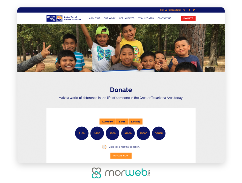
While your overall website provides essential information about your nonprofit, one page in particular serves as a way to deepen engagement and convert users into donors: your donation page.
To drive donor engagement and make sure supporters are excited to give to your cause, your donation page should prioritize their experience from start to finish. To create an effectively-designed form, follow these best practices:
- Only capture essential information. The more fields a donor has to fill out, the more likely it is that they’ll lose momentum and abandon the process. Therefore you should only request vital information, such as their name, contact information, and payment details. If possible, aim to keep it a maximum of one page.
- Brand the page. Make sure your donation page matches the rest of your website, so visitors don’t think they’ve somehow ended up on a third-party website. A CMS with built-in donation pages will feature the same logo, colors, fonts, and images as the rest of your pages.
- Offer multiple giving options. Offer suggested giving amounts and recurring donation options to help donors decide their gift sizes and to encourage continued contributions. By making donating convenient, you can maximize your fundraising potential.
The donation process is when donor engagement is at its peak, and the last thing you want is to lose momentum at this stage. Because of this, you’ll need to ensure that users have a positive experience by taking the time to create an effective design.
For more actionable tips, visit Morweb’s donation page design guide. Do all you can to improve their experience, and you’re sure to secure their financial support—both now and hopefully again in the future.

5. Adhere to accessibility guidelines.
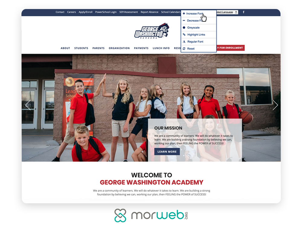
When you’ve taken the time to develop a compelling nonprofit website, you want as many people to be able to view your content as possible. To accomplish this, you’ll need to adhere to web content accessibility guidelines (WCAG) so that those with visual or hearing impairments can interact with your website.
To start, prioritize the following web compliance and accessibility best practices in your design:
- Use high-contrast colors. High-contrast colors enable readers with visual impairments to see and read your content. The WCAG 2.1 guidelines require a minimum contrast ratio of 4.5:1, so be sure to test your contrast colors for each design element.
- Employ clear text structures. The main content on each of your web pages should be clearly titled. This makes it much easier for users with visual impairments and those using screen reader technology to jump to different sections.
- Offer video alternatives. Visitors with visual or hearing impairments may struggle to understand your videos without some extra help. Include captions or a written transcript. Then, consider adding an audio description to describe visual-only elements.
Many web accessibility guidelines require the assistance of a professional web developer. However, there are several steps you can take on your own so long as you’ve invested in a good, non-technical CMS. These are only a handful of tips you should follow, but they should serve as a great starting point. Explore more web compliance and accessibility best practices with this comprehensive guide, so you can enable all users to access your website.
In an increasingly digital world, your nonprofit must have a digital presence in order to continue striving towards its goals. By creating an effective website, you’ll form powerful connections with users and drive engagement.
By leveraging several web development best practices, you’ll put your organization on the digital map and generate buzz around your mission online. So long as you’re armed with a powerful and easy-to-use CMS, your team will be set up to design a beautiful and content-rich website that’s sure to engage your audience.
