Archive

Archive for May, 2020

Dealing With Stale Props and States in React’s Functional Components

May 12th, 2020 No comments

There’s one aspect of JavaScript that always has me pulling my hair: closures. I work with React a lot, and the overlap there is that they can sometimes be the cause of stale props and state. We’ll get into exactly what that means, but the trouble is that the data we use to build our UI can be totally wrong in unexpected ways, which is, you know, bad.

Stale props and states

Long story short: it’s when code that is executed asynchronously has a reference to a prop or state that is no longer fresh, and thus, the value it returns is not the latest one.

To be even more clear, let’s play around with the same stale reference example React has in its documentation.

function Counter() {
  const [count, setCount] = useState(0);

  function handleAlertClick() {
    setTimeout(() => {
      alert("You clicked on: " + count);
    }, 3000);
  }

  return (
    <div>
      <p>You clicked {count} times</p>
      <button onClick={() => setCount(count + 1)}>Click me</button>
      <button onClick={handleAlertClick}>Show alert</button>
    </div>
  );
}

(Live demo)

Nothing fancy here. We have a functional component named Counter. It keeps track of how many times the user has clicked one button and shows an alert that displays how many times that button was clicked when clicking another button. Try this:

  1. Click the “Click me” button. You are going to see the click counter go up.
  2. Now click the “Show alert”button. Three seconds should go by and then trigger an alert telling you how many times you clicked the “Click me” button.
  3. Now, click the “Show alert” button again and quickly click the “Click me” button before it triggers the alert in three seconds.

See what happens? The count shown on the page and the count shown in the alert do not match. The number in the alert is not just some random number, though. That number is the value the count variable had in the moment the asynchronous function inside the setTimeout was defined, which is the moment the “Show alert” button is clicked.

That’s just how closures work. We’re not going to get into the specifics of them in this post, but here are some docs that cover them in greater detail.

Let’s focus on how we can avoid these stale references with our states and props.

React offers a tip on how to deal with stale dates and props in the same documentation where the example was pulled.

If you intentionally want to read the latest state from some asynchronous callback, you could keep it in a ref, mutate it, and read from it.

By keeping the value asynchronously in a ref, we can bypass stale references. If you need to know more about ref in functional components, React’s documentation has a lot more information.

So, that begs the question: How can we keep our props or state in a ref?

Let’s do it the dirty way first.

The dirty way to store props and state in a ref

We can easily create a ref using useRef() and use count as its initial value. Then, wherever the state is being updated, we set the ref.current property to the new value. Lastly, use ref.current instead of count in the asynchronous part of our code.

function Counter() {
  const [count, setCount] = useState(0);
  const ref = useRef(count); // Make a ref and give it the count

  function handleAlertClick() {
    setTimeout(() => {
      alert("You clicked on: " + ref.current); // Use ref instead of count
    }, 3000);
  }

  return (
    <div>
      <p>You clicked {count} times</p>
      <button
        onClick={() => {
          setCount(count + 1);
          ref.current = count + 1; // Update ref whenever the count changes
        }}
      >
        Click me
      </button>
      <button
        onClick={() => {
          handleAlertClick();
        }}
      >
        Show alert
      </button>
    </div>
  );
}

(Live demo)

Go ahead and do the same as last time. Click “Show alert” and then click “Click me” before the alert is triggered in three seconds.

Now we have the latest value!

Here’s why it works. When the asynchronous callback function is defined inside setTimeout, it saves a reference to the variables it uses, which is count in this case. This way, when the state updates, React not only changes the value but the variable reference in memory is completely different as well.

This means that — even if the state’s value is non-primitive — the variable you are working with in your asynchronous callback is not the same in memory. An object that would typically keep its reference throughout different functions now has a different value.

How does using a ref solve this? If we take a quick look at React’s docs again, we find an interesting, but easy-to-miss, bit of information:

[…] useRef will give you the same ref object on every render.

It doesn’t matter what we do. Throughout the lifetime of your component, React will give us the exact same ref object in memory. Any callback, no matter when it’s defined or executed, is working with the same object. No more stale reference.

The cleaner way to store props and state in a ref

Let’s be honest… using a ref like that is an ugly fix. What happens if your state is being updated in a thousand different places? Now you have to change your code and manually update the ref in all those places. That’s a no-no.

We are going to make this more scalable by giving ref the value of the state automatically when the state changes.

Let’s start by getting rid of the manual change to the ref in the “Click me”button.

Next, we make a function called updateState that is called whenever we need to change the state. This function takes the new state as an argument and it sets the ref.current property to the new state and updates the state as well with that same value.

Finally, let’s substitute the original setCount function React gives us with the new updateState function where the state is being updated.

function Counter() {
  const [count, setCount] = useState(0);
  const ref = useRef(count);

  // Keeps the state and ref equal
  function updateState(newState) {
    ref.current = newState;
    setCount(newState);
  }

  function handleAlertClick() { ... }

  return (
    <div>
      <p>You clicked {count} times</p>
      <button
        onClick={() => {
          // Use the created function instead of the manual update
          updateState(count + 1);
        }}
      >
        Click me
      </button>
      <button onClick={handleAlertClick}>Show alert</button>
    </div>
  );
}

(Live demo)

Using a custom hook

The cleaner solution works just fine. It gets the job done just like the dirty solution, but only calls a single function to update the state and ref.

But guess what? We can do better. What if we need to add more states? What if we want to do this in other components too? Let’s take the state, ref and updateState function and make them truly portable. Custom hooks to the rescue!

Outside the Counter component, we are going to define a new function. Let’s name it useAsyncReference. (It can be named anything, really, but note that it’s common practice to name custom hooks with “use” as a prefix.) Our new hook will have a single parameter for now. We’ll call it value.

Our previous solution had the same information stored twice: once in the state and once in the ref. We are going to optimize that by keeping the value just in ref this time. In other words, we will create a ref and give it the value parameter as its initial value.

Right after the ref, we will make an updateState function that takes the new state and sets it to the ref.current property.

Lastly, we return an array with ref and the updateState function, very similar to what React does with useState.

function useAsyncReference(value) {
  const ref = useRef(value);

  function updateState(newState) {
    ref.current = newState;
  }

  return [ref, updateState];
}

function Counter() { ... }

We are forgetting something! If we check the useRef documentation, we learn that updating a ref does not trigger a re-render. So, while ref has the updated value, we wouldn’t see the changes on screen. We need to force a re-render every time ref gets updated.

What we need is a fake state. The value doesn’t matter. It’s only going to be there to provoke the re-render. We can even ignore the state and only keep its update function. We are calling that update function forceRender and giving it an initial value of false.

Now, inside updateState, we force the re-render by calling forceRender and passing it a state different to the current one after setting ref.current to newState.

function useAsyncReference(value) {
  const ref = useRef(value);
  const [, forceRender] = useState(false);

  function updateState(newState) {
    ref.current = newState;
    forceRender(s => !s);
  }

  return [ref, updateState];
}

function Counter() { ... }

Take whatever value it has and return the opposite. The state doesn’t really matter. We are merely changing it so React detects a change in state and re-renders the component.

Next, we can clean the Count component and remove the previously used useState, ref and updateState function, then implement the new hook. The first value of the returned array is the state in the form of a ref. We’ll keep calling it count, where the second value is the function to update the state/ref. We’ll continue calling it setCount.

We also have to change the references to the count since now that they all must be count.current. And we must call setCount instead of calling updateState.

function useAsyncReference(value) { ... }

function Counter() {
  const [count, setCount] = useAsyncReference(0);

  function handleAlertClick() {
    setTimeout(() => {
      alert("You clicked on: " + count.current);
    }, 3000);
  }

  return (
    <div>
      <p>You clicked {count.current} times</p>
      <button
        onClick={() => {
          setCount(count.current + 1);
        }}
      >
        Click me
      </button>
      <button onClick={handleAlertClick}>Show alert</button>
    </div>
  );
}

Making this work with props

We have a truly portable solution for our problem. But guess what… there’s still a little more to do. Specifically, we need to make the solution compatible with props.

Let’s take the “Show alert” button and handleAlertClick function to a new component outside the Counter component. We are gonna call it Alert and it’s going to take a single prop called count. This new component is going to show the count prop value we are passing it in an alert after a three second delay.

function useAsyncReference(value) { ... }

function Alert({ count }) {
  function handleAlertClick() {
    setTimeout(() => {
      alert("You clicked on: " + count);
    }, 3000);
  }

  return <button onClick={handleAlertClick}>Show alert</button>;
}

function Counter() { ... }

In Counter, we’re swapping the “Show alert” button for the Alert component. We’ll pass count.current to the count prop.

function useAsyncReference(value) { ... }

function Alert({ count }) { ... }

function Counter() {
  const [count, setCount] = useAsyncReference(0);

  return (
    <div>
      <p>You clicked {count.current} times</p>
      <button
        onClick={() => {
          setCount(count.current + 1);
        }}
      >
        Click me
      </button>
      <Alert count={count.current} />
    </div>
  );
}

(Live demo)

Alright, time to run through the testing steps again. See? Even though we are using a safe reference to the count in Counter, the reference to the count prop in the Alert component is not asynchronously safe and our custom hook is not suitable to use with props… yet.

Lucky for us, the solution is fairly simple.

All we have to do is add a second parameter to our useAsyncReference hook named isProp, with false as the initial value. Just before we return the array with ref and updateState, we set up a condition. If isProp is true, we set the ref.current property to value and only return ref.

function useAsyncReference(value, isProp = false) {
  const ref = useRef(value);
  const [, forceRender] = useState(false);

  function updateState(newState) {
    ref.current = newState;
    forceRender(s => !s);
  }

  if (isProp) {
    ref.current = value;
    return ref;
  }

  return [ref, updateState];
}

function Alert({ count }) { ... }

function Counter() { ... }

Now let’s update Alert so that is uses the hook. Remember to pass true as a second argument to useAsyncReference since we are passing a prop and not a state.

function useAsyncReference(value) { ... }

function Alert({ count }) {
  const asyncCount = useAsyncReference(count, true);

  function handleAlertClick() {
    setTimeout(() => {
      alert("You clicked on: " + asyncCount.current);
    }, 3000);
  }

  return <button onClick={handleAlertClick}>Show alert</button>;
}

function Counter() { ... }

(Live demo)

Give it another try. Now it works perfectly whether you use states or props.

One last thing…

There’s one last change I’d like to make. React’s useState docs tell us that React will bail out of a re-render if the new state is identical to the previous one. Our solution doesn’t do that. If we pass the current state again to the hook’s updateState function, we will force a re-render no matter what. Let’s change that.

Let’s put the body of updateState inside an if statement and execute it when ref.current is different than the new state. The comparison must be done with Object.is(), just like React does.

function useAsyncReference(value, isProp = false) {
  const ref = useRef(value);
  const [, forceRender] = useState(false);

  function updateState(newState) {
    if (!Object.is(ref.current, newState)) {
      ref.current = newState;
      forceRender(s => !s);
    }
  }

  if (isProp) {
    ref.current = value;
    return ref;
  }

  return [ref, updateState];
}

function Alert({ count }) { ... }

function Counter() { ... }

Now we are finally done!


React can sometimes seem like a black box that is full of little quirks. Those quirks might be daunting to deal with, like the one we just tackled. But if you are patient and enjoy being challenged, you’ll soon realize it’s an awesome framework and a pleasure to work with.

The post Dealing With Stale Props and States in React’s Functional Components appeared first on CSS-Tricks.

Categories: Designing, Others Tags:

How I Put the Scroll Percentage in the Browser Title Bar

May 12th, 2020 No comments

Some nice trickery from Knut Melvær.

Ultimately the trick boils down to figuring out how far you’ve scrolled on the page and changing the title to show it, like:

document.title = `${percent}% ${post.title}`

Knut’s trick assumes React and installing an additional library. I’m sure that library does all kinds of smart stuff, but if you’re looking to do this “vanilla” style, I’d probably rock something like this…

const percentLabel = document.querySelector("#percent");
const originalTitle = document.title;

window.addEventListener("scroll", () => {
  let scrollTop = window.scrollY;
  let docHeight = document.body.offsetHeight;
  let winHeight = window.innerHeight;
  let scrollPercent = scrollTop / (docHeight - winHeight);
  let scrollPercentRounded = Math.round(scrollPercent * 100);
  percentLabel.innerHTML = scrollPercentRounded;
  document.title = `(${scrollPercentRounded}%) ${originalTitle}`;
});

Here’s a project, and here’s the deployed site so you can see it in action.

Direct Link to ArticlePermalink

The post How I Put the Scroll Percentage in the Browser Title Bar appeared first on CSS-Tricks.

Categories: Designing, Others Tags:

Inbound Marketing tactics you can use to generate tons of leads

May 12th, 2020 No comments

Inbound marketing is the art of driving traffic and engagement on the back of great content. Better the content quality, better the number of leads you generate.

Content can be in the form of articles, blog posts, or eBooks, or any other content format you can think of.

Many might think with so much content being churned out, to compete with others on the back of content marketing alone is going to be a truly arduous task. They also feel that producing content at such scale can also be expensive too.

Make no mistake. The content landscape is quickly changing.

Content marketing is changing with behemoth companies pouring in all the resources they can into creating more and more content, with new insights, cutting-edge research, and professional production.

Top-quality content is the norm everywhere.

Creating much better content is the only way to compete with established players.

By pitching free valuable content to people, you’re creating a need among readers. As a result, they come to you in hordes. Great content builds engagement. Don’t use the opportunity to try and sell to them immediately. Instead, wait a bit. And get them to subscribe to newsletters where you nurture them and use the opportunity to pitch to them.

The goal? Gain the trust of a customer and turn that into a long-term relationship.

This way, when they’re ready to purchase, your product comes to their mind.

You sell without selling.

Needless to say, this is a long game that mandates a lot of patience.

1. Grow your email list

Don’t be blindsided by naysayers. Email is alive and thriving. There’s so much you can do with email. For starters, every $1 you spend gets you $40 in return with email marketing. The ROI with email is huge.

A blog, presence on social media, podcasts are great, but I have always felt that the biggest value lies in your email list.

It’s easy to generate leads. Just add sign up forms on your site and you have a lead magnet to make it worthwhile for visitors to give you their email ids. That’s it.

No one wants to be bombarded with sales pitches. Add value with your email marketing campaigns.

By sending a mix of helpful tips, interesting content, you will also get a wide berth with other emails. That’s where you can promote products.

After all, all that you’re doing is offering up solutions that prospects are interested in.

2. Build a high-quality blog

Next— to meet your lead generation goals, you cannot simply do without a blog.

It’s true that there are hundreds of thousands of blogs with millions of posts pushed out every day. It seems a puzzle but you can still attract leads with content marketing.

Alex Turnbull turned around his startup at a time when they were running out of cash and things didn’t look so great for them. They were terrified of the future. This is when blogging came to their rescue.

By getting serious about content marketing they realized where they were wrong.

To do this the first thing they did was get hold of content marketers and ask them where they went wrong.

By finding their unique angle while no one else was doing it, they were able to turn things around

The Groove team realized that their target audience was going through challenges that they at Groove were themselves going through. So team Groove decided to share their challenges with running a SaaS company and put on an ambitious target that reflected in their blog’s tagline that said “A SaaS Startup’s Journey to $100,000 in Monthly Revenue.”

It was a watershed moment and a bold move. A SaaS content marketing gamble that eventually paid off. They got the first 1000 subscribers in 24 hours, followed by 5000 in a month. And very soon they crossed 250k in visitors and 5 million USD in revenue.

With market research, great unique angles for their blog and unprecedented risk—Groove was no longer a fledgling startup. They were a spectacular success now.

More people began joining in droves and liked the product enough to stay around and become customers.

3. Start a podcast

It might not be immediately evident how a podcast can help you. But truth be told over 40% of Americans listen to podcasts. They have podcasts running in their daily lives as background to their commute, when walking their dogs and when doing chores.

A podcast is a good way to generate leads.

With a popular podcast, you can get readers to subscribe to your course, get leads for your business and generate a lot of money.

As the podcast grows you gather a community of like-minded individuals, people who want to succeed, people who need training products and courses.

Finding a unique angle and producing podcasts is your best way to generate leads and signups. Promote them wherever you can.

For SEO Journal podcasts are a lead magnet and a link magnet. Their podcasting page has over 20000 backlinks. It’s a great way to generate tons of traffic and links to your site.

Just like podcasts, another popular form of content is webinars.

4. Create content upgrades

A content upgrade is an extension of your blog post. It’s something that functions as an accessory to your core blog post and as such holds the potential to drive more leads.

Let’s say you wrote a post on the ultimate guide to outreach.

A template for outreach or swipe files are helpful and relevant content upgrades that people beg you for. With content upgrades, Brian Dean from Backlinko boosted conversions by over 785% in one day.

Offering “free blog updates” is a vague value proposition. Instead of offering readers something intangible, create a resource unique to each post and give that away for free. You can also turn your blog posts into high-quality landing pages with a landing page software to make the proposition seem even more valuable. That’s what Brian Dean does.

To generate leads, all Brian did was create and offer a free checklist at the bottom of his post on 200 Ranking Factors.

And conversions shot up.

5. Rope in influencers to create content

Content marketing isn’t limited to your blog. Your social media feed is also a place where you can post quality content.

You can use influencers to post pictures of your product, to run contests, and to create and post unboxing videos or full-fledged product reviews. Influencer marketing is great for eCommerce sites.

Influencer marketing gives you ready access to thousands of their followers and generates new followers, added word-of-mouth, and engagement. Phazon raised $2 million by roping in influencers.

Involving influencers in your inbound marketing strategy will get you leads.

Conclusion

Inbound marketing is the best kind of marketing in place. With just great content and zero marketing budget, you can generate thousands of leads to your business. That means more money in your pocket.


Photo by Campaign Creators on Unsplash

Categories: Others Tags:

Comparison Between Adaptive vs Responsive Design For Ecommerce Conversion

May 12th, 2020 No comments

The pervasiveness of performing tasks on the go has led to the increasing importance of catering to different screen sizes. The need to deliver the same excellent user experience (UX) whatever device a customer is on has posed significant challenges to web developers. And this has led to a debate on whether taking adaptive or responsive design is the better approach.

In this article, we try to shed light on both sides of the argument, helping you decide on which approach you should adopt for your eCommerce site.

ECommerce Stats

But before we dive into the matter of adaptive vs. responsive, take a gander at some of these stats:

  • 47% of users expect websites to load in less than 2 seconds. Therefore, 27% of customers have abandoned their shopping carts because of slow loading times or complicated checkout processes.

Choosing between Adaptive and Responsive Design for better ECommerce Conversion

So with those numbers in mind in the context of eCommerce sites, here are some of the reasons for using both adaptive and responsive designs.

Why choose Adaptive?

https://pixabay.com/photos/question-question-mark-survey-2736480/

Loading Speed

As alluded to in a couple of the stats above, slow loading speeds have a tremendous impact on websites’ conversion and bounce rates. In this regard, websites built using adaptive design generally load faster than responsive ones. This is because adaptive sites only transfer the necessary assets specific to each device.

Ease of Implementation

This area’s a bit contentious. There are those that believe adaptive designs are more difficult to build owing to the need for different layouts for different devices compared to responsive ones that only require a single layout.

However, while you might just need one layout, responsive sites entail more time and effort upfront due to all the extra attention developers need to place on the site’s CSS and organization to ensure the website is fully functional on all screen sizes. And when it comes to eCommerce sites, whether it’s adding items to cart or the checkout process, you want everything to work as the customer expects it to.

Tailor-Made Solutions

In theory, adaptive design better ensures the best possible UX, in accordance with whichever device the user is on. As its name suggests, adaptive design adapts to the user’s situational needs and capabilities.

For example, if you were driving through a long tunnel, you’d prefer a navigation screen that adapts to the environment by adjusting its brightness. This is possible with adaptive design, as opposed to responsive design where a screen flows from desktop design into smaller devices.

Additionally, you can also design to optimize advertisements for your relevant user interfaces based on user data from smaller screens. The same can also be applied when it comes to imagery. With adaptive design, you can keep images’ size ratio without reducing or compressing its quality – a crucial aspect when it comes to users using different screens.

As well, if a user frequents a website, store, restaurant, or general area, a profile is created, which can be used for behavioral targeting and other personalization for UX purposes. When it comes to eCommerce, this could come in the form of shipping information, relevant to the user’s location, or product recommendations (using their activity history).

You can Re-use Existing Website

With this design methodology, developers don’t need to re-code and build an existing website from the ground up. More complex websites are built with legacy code – for these, starting from scratch simply isn’t an option. This will also make it easier to look for someone selling web design services.

Why choose Responsive?

Seamless Experience / Familiarity

Because of its fluid nature, users get the same, seamless experience they would whether they’re on a laptop, smartphone, or tablet. This breeds a feeling of familiarity, and ultimately, trust.

However, it’s important to note that developers need to keep an eye on the visual hierarchy of responsive design projects to ensure this fluidity. This entails a lot of testing with different devices. And with imagery being integral to eCommerce sites, the importance of this is only heightened.

SEO-Friendly

With responsive websites, a single web crawler agent only needs to crawl your page once, as opposed to adaptive sites where different crawler agents need to do so multiple times in order to retrieve all versions of the content. As such, responsive sites directly improve the crawling efficiency, which in turn, indirectly helps search engines index more of the site’s content.

And with eCommerce having numerous product pages under different categories, making it easier to crawl can go a long way.

Budget-Friendly

For those looking to set up their eCommerce site from scratch, responsive design is easier and faster to implement. This also allows you to save on development, support, and maintenance costs because you’re essentially using the same content across all devices. This opens up more time for other essential tasks like marketing, customer support, and content development.

As well, apart from not needing multiple layouts for different screen sizes and device types, you can also organize and control all your content from a centralized location.

Best Examples from Brands

To give you a better visual of how both adaptive and responsive translate, here’s a shortlist of some of the best examples.

Adaptive Design Examples

Staples

Image Source: https://www.uxpin.com/studio/blog/adaptive-design-and-ecommerce-ux-how-they-work-together-to-boost-conversions/

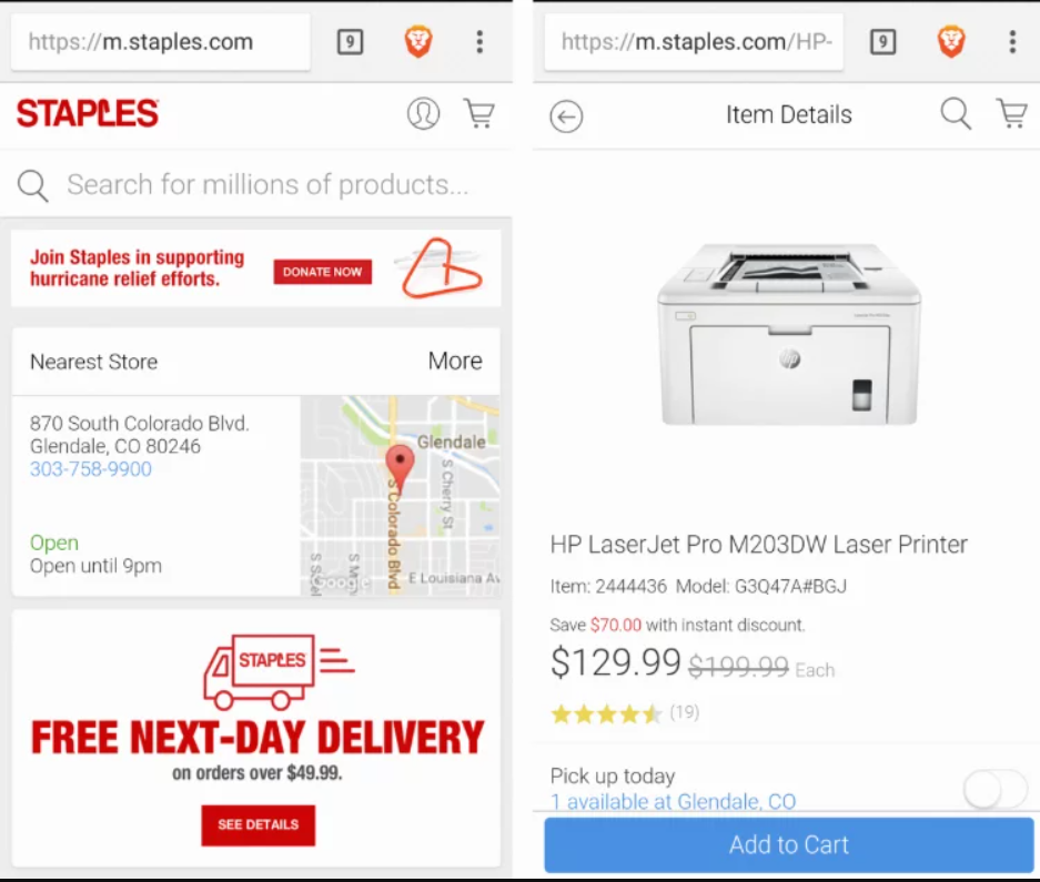
Here, you can see how Staples focuses on highlighting what users on smaller screens are more commonly looking for. These include vital information like location, contact details, personalized shipping information (along with which stores are closest to the user), and the most important product info.

That information provided tailored to the specific user. This leads to a unique, and ultimately, better customer experience.

Nike

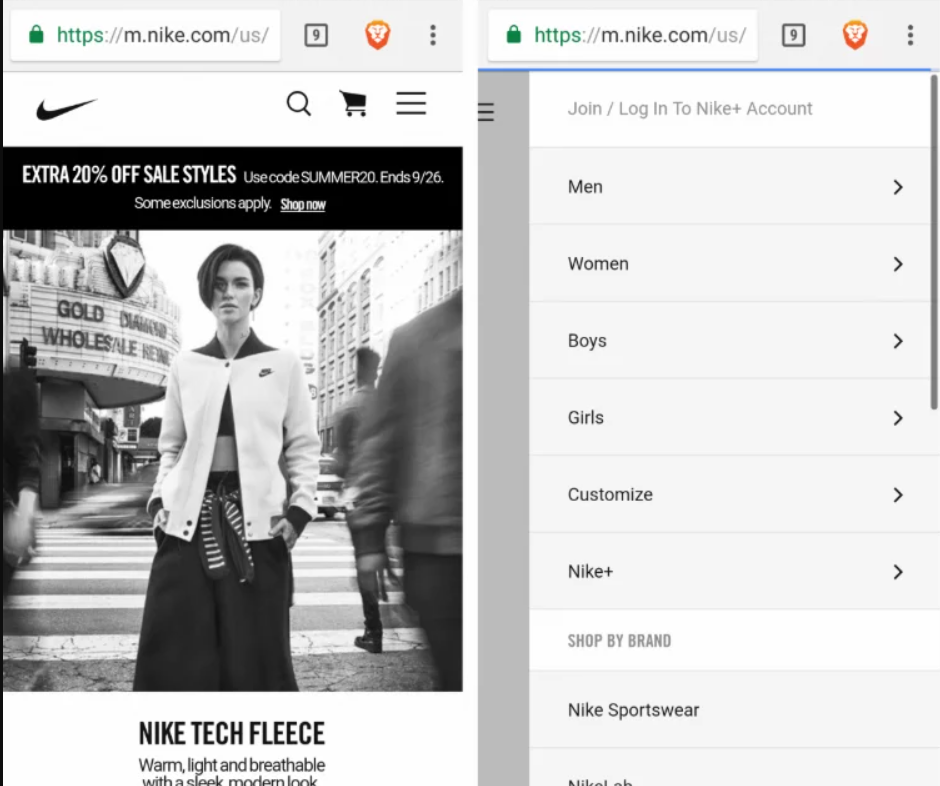
Again, this is a great example of presenting users on the surface with what they mainly need, while keeping other options just a few taps away. Additionally, Nike’s desktop design for this page had a looped video on the homepage. Conversely, the mobile version only has a static frame, designed to save on both bandwidth and hardware resources.

Responsive Design Examples

Hickory Farms

Image Source: https://www.optimonk.com/responsive-ecommerce-sites/

Here, you can see that Hickory Farms allows its customers to shop either by category or price – whether on desktop or mobile. The categories customers would’ve been used to on desktop are also presented very similarly on its mobile counterpart – a seamless experience that’s a mark of responsive design.

Frederick’s

Frederick’s site features excellent use of CSS and Javascript to create a clean, responsive website. The store locator and cart buttons are in the header, a perfect place for it as one of the most used features. And as you would expect from a responsive site, the shopping experience is smooth both on desktop and mobile.

Things to Keep in Mind

For a simpler look at what might be a better fit for your goals and objectives, here’s a quick guide for when to use each.

Use Adaptive When

  • Ideal for existing complex websites where an equally capable mobile version is a must.
  • Recommended for speed-dependent sites.
  • Great for providing highly-targeted experiences, particularly when it comes to users’ location and connection speed.
  • Ideal for those who need more control over how their website is delivered to different users and different devices.

Use Responsive When

  • Perfect for small to medium-sized companies looking to update their existing websites at a reasonable price.
  • Ideal for those looking to build a brand new website.
  • Recommended for service-based industries as their sites are mainly composed of text and images.

Verdict

As you can see, there are merits to both adaptive and responsive designs. It’s mainly up to what resources you currently have, and what goals and objectives you want to accomplish.

Which design approach do you think suits your eCommerce business better? Let us know in the comments below.


Photo by Domenico Loia on Unsplash

Categories: Others Tags:

How to Run a Web Design Business in the COVID-19 Pandemic

May 12th, 2020 No comments

Let’s face it, we’ve all heard about the coronavirus (COVID-19) by now. We’ve also seen it decimate some of our favorite local businesses.

The honest truth is that COVID-19 has changed the way we do business, how businesses market their products and services, and how customers interact with their favorite brands.

It seemed like yesterday when the first case of the virus was first reported to the WHO (World Health Organisation) in China on December 31st, 2019. And from there, we’ve seen outbreak after outbreak throughout most of the world. Because the virus is primarily transmitted from close interpersonal contact, we’ve also seen many countries enforce lockdown measures.

So, with so many restrictive measures in place—what’s it really like to run a web design company in this unfamiliar environment? Here’s how we’ve managed to stay competitive and ensure business continuity during a global pandemic.

The Effects of the Pandemic

It’s important to look at how this pandemic has changed most aspects of business. Around the time that the viral outbreak was declared a pandemic on March 11, many countries in North America and Europe announced official lockdown regulations in order to curb the rapid spread.

Here in Canada, businesses and offices began to close their doors in early March. The vast majority of the workforce is working from home wherever possible. Some businesses, like airlines, cinemas, and restaurants, have been forced to shut down altogether.

Large companies that previously generated hundreds of thousands or millions in revenue closed almost overnight.

In big cities around the world, the first few weeks of these measures were met with a general sense of panic. Some began to stockpile groceries and household necessities. We all saw the people grabbing armfuls of toilet paper, hand sanitizer, and other everyday items.

Now that the initial panic has passed, many of us are looking to the future. While there are more than 60 vaccines in the works, official sources warn that a successful and safe vaccine will not be ready before the end of next year—if at all.

This means that we will likely be living with some form of social distancing in place for many months to come. In other words, this new normal is something we’ll all have to get used to.

While people are coping by developing new at-home routines, many businesses are now looking for new ways to adapt and survive in the new remote world. It’s not hard to see why the old saying “change or die” is more relevant than ever today.

How Does a Web Design Business Run in “Normal Times”?

Let’s first start by clarifying how most web design businesses operate in “normal times.” Before the work from home movement kicked off, GlobalGraphics operated much like any other business. For the most part, our employees worked from a central office.

However, in recent years, we have expanded our capacity to offer extensive online support for our clients. We knew the importance of flexibility in the gig economy, and we started implementing remote solutions for our designers and developers well before COVID-19 arrived.

While the idea of a traditional office is familiar to most—it’s not always practical in the digital age. Digital agencies are more than capable of tapping into an online-only model without compromising on quality and deadlines.

The New Normal: Running a Web Design Business in a Remote World

The spread of COVID-19 has forced us to reimagine our capacity to work-from-home. With our offices closed for the foreseeable future, we have taken drastic steps to transform the way our business is run.

Our aim was to keep operations running largely as they had before. In order to do this effectively, we sought out the best tools for running the office remotely.

Modern cloud-based technology has made remote working possible for our company. Here are a few of the systems we’ve put in place to streamline operations and facilitate remote collaboration and communication.

For Project Management

We previously implemented Basecamp to oversee the progress being made on our various projects. This app allows us to set a series of milestones so that everyone involved with a project can stay up-to-date on what has been done and what needs to be done.

For Meetings

Source: REUTERS

Like many other businesses, we have turned to Zoom for our external client meetings. Zoom allows us to share our screens with clients, making it easy to discuss how a certain project is progressing using a visual aid.

When teams within the company need to meet and discuss projects, we also use Google Meet.

As we no longer have access to a company-wide telephone network, we have turned to Skype for phone calls that do not require video or image technology.

For Emails, Scheduling, and Document Sharing

We have made use of the Gmail Suite for our emails. This system works on any computer, so it is perfect for all of our employees who have their own unique setups at home.

For scheduling meetings, we’ve made use of Google Calendar. Because this connects with the Gmail Suite, we rarely encounter scheduling errors or missed meetings.

Google Docs is another Google application that has made workflow simple and straightforward in our new remote setup.

For Customer Relationship Management (CRM) and Customer Support

To track and monitor our customer relations, the web-based version of ACT! has been instrumental. This exceptional app allows us to keep track of our sales, returning customers, marketing campaigns, and other important statistics.

This app allows potential new customers to get a quick quote. The app then arranges a callback and follow up on our behalf.

The Kayako Support software has been implemented to streamline our customer support service. Using this app, customers are able to register a support ticket from their own homes.

For Accounts and Finances

We’ve also implemented the accounting software Sage Canada Accounts, making it easy to keep track of payments, payroll, and business expenditures. To help our customers make safe payments, we accept a range of online payments, including e-transfer, and cheques in rare cases using our bank’s digital deposit feature.

How Your Business Can Continue in an Online World

As a web design business, the transition has been a natural one. But this isn’t the case for all businesses. Others like cafes, restaurants, and cinemas are struggling to cope with self-isolation measures in place.

However, we believe it is possible to transform just about any business to an online model—so long as they are capable of selling some form of a product or service online or in a way that is compatible with social distancing.

For some businesses, the pandemic may mean the business model itself needs to change in a dramatic way. Here are some examples of how modern technology can help you make a creative transition.

Video Conferencing Apps

Video conferencing apps like Zoom have made it possible for businesses in every sector to conduct effective meetings with clients. Zoom alone surged from 10 million daily active users to over 200 million in just three months.

This technology can be used in a creative way to make client meetings possible for just about anyone. We’ve already seen many businesses get creative with Zoom and other video conferencing apps.

For instance, businesses in the fitness industry have begun to use live video conferencing to lead at-home fitness classes, giving clients the feeling of intimacy and belonging that they once got from attending class in the studio.

Another industry finding success with video conferencing is the private health sector. Several therapists have taken their work online and are able to conduct secure, effective one-on-one therapy sessions with their clients.

Click and Collect Apps

Several applications make it possible for businesses in the retail sector to continue selling their products safely. These apps allow customers to pre-order the items they require.

The technology can then alert the business owner to prepare these items for collection. This type of pre-ordering technology allows some businesses to operate safely and minimise their shipping expenditure.

Virtual Tour Technology

The need for social distancing has taken a serious toll on industries that relied on giving in-person tours. With modern technology, high-quality virtual tours have become a possibility.

In the tourism and art industry, some museums and galleries have made good use of this technology, uploading detailed online tours of their exhibits. In the real estate industry, virtual tours have allowed realtors to show available homes to interested parties.

Food Delivery Services

Many restaurants have come to terms with signing up with the various food delivery services. Not only were these services deemed essential almost everywhere, but they single handedly kept restaurants alive when revenues dropped due to self-isolation measures.

However, these services aren’t perfect either. Many restaurants have complained about high commissions eating away at their already thin margins.

Keep Calm and Business Will Carry On

The devastating COVID-19 pandemic has fundamentally changed the way we all live and work for the foreseeable future.

As individuals and as businesses, it’s up to us to adapt and find new ways of operating in a safe and effective way. The powers of modern technology have made it possible for entire offices to transition to the work from home model.

In fact, by implementing apps efficiently, your company can continue to work, collaborate, and grow just like before.
From all of us at Globalgraphics, thank you for your continued support, and thank you for staying home to protect yourself and others during this difficult time.


Image by Queven from Pixabay

Categories: Others Tags:

CSS Animation Timelines: Building a Rube Goldberg Machine

May 11th, 2020 No comments

If you’re going to build a multi-step CSS animation or transition, you have a particular conundrum. The second step needs a delay that is equal to the duration of the first step. And the third step is equal to the duration of the first two steps, plus any delay in between. It gets more and more complicated until you might just be like, nahhhhh I’ll use more technology to help me.

Paul Hebert:

Lately I’ve been using custom properties to plan out pure CSS timelines for complex animations.

Cool. And it can get completely nuts.

Direct Link to ArticlePermalink

The post CSS Animation Timelines: Building a Rube Goldberg Machine appeared first on CSS-Tricks.

Categories: Designing, Others Tags:

min(), max(), and clamp() are CSS magic!

May 11th, 2020 No comments

Nice video from Kevin Powell. Here are some notes, thoughts, and stuff I learned while watching it. Right when they came out, I was mostly obsessed with font-size usage, but they are just functions, so they can be used anywhere you’d use a number, like a length.

Sometimes pretty basic usage allows for tighter code, but the change to get there feels a little mind-bending. Like how to set a max() here, you really use min().

.el {
  width: 75%;
  max-width: 600px;

  /* tighter, but the change from max to min feels weird */
  width: min(75%, 600px);
}

The min() and max() functions can take more than two values, which is cool, but certainly mind-bending in its own right. It would be nice if DevTools could tell you which one it picked at any given time.

.el {
  width: min(100px, 25%, 50vh, 30ch);
}

You don’t need a calc() to do math inside! This is cool:

.el {
  width: min(10vw + 10%, 100px);
}

It’s reasonable you’d want to be setting a min and max value. You can nest the functions to do this, but it’s less mind-bendy to do with clamp().

.el {
  /* Note we're always using a relative unit somewhere
     so that zooming stays effective. */
  font-size: clamp(0.9rem, 1vw + 1rem, 2.2rem);
}

Here’s the video embedded:

Direct Link to ArticlePermalink

The post min(), max(), and clamp() are CSS magic! appeared first on CSS-Tricks.

Categories: Designing, Others Tags:

Turning a Fixed-Size Object into a Responsive Element

May 11th, 2020 No comments

I was in a situation recently where I wanted to show an iPhone on a website. I wanted users to be able to interact with an application demo on this “mock” phone, so it had to be rendered in CSS, not an image. I found a great library called marvelapp/devices.css. The library implemented the device I needed with pure CSS, and they looked great, but there was a problem: the devices it offered were not responsive (i.e. they couldn’t be scaled). An open issue listed a few options, but each had browser incompatibilities or other issues. I set out to modify the library to make the devices responsive.

Here is the final resizable library. Below, we’ll walk through the code involved in creating it.

The original library was written in Sass and implements the devices using elements with fixed sizing in pixels. The authors also provided a straightforward HTML example for each device, including the iPhone X we’ll be working with throughout this article. Here’s a look at the original. Note that the device it renders, while detailed, is rather large and does not change sizes.

CodePen Embed Fallback

Here’s the approach

There are three CSS tricks that I used to make the devices resizable:

  1. calc(), a CSS function that can perform calculations, even when inputs have different units
  2. --size-divisor, a CSS custom property used with the var() function
  3. @media queries separated by min-width

Let’s take a look at each of them.

calc()

The CSS calc() function allows us to change the size of the various aspects of the device. The function takes an expression as an input and returns the evaluation of the function as the output, with appropriate units. If we wanted to make the devices half of their original size, we would need to divide every pixel measurement by 2.

Before:

width: 375px;

After:

width: calc(375px / 2);

The second snippet yields a length half the size of the first snippet. Every pixel measurement in the original library will need to be wrapped in a calc() function for this to resize the whole device.

var(–size-divisor)

A CSS variable must first be declared at the beginning of the file before it can be used anywhere.

:root {
  --size-divisor: 3;
}

With that, this value is accessible throughout the stylesheet with the var() function. This will be exceedingly useful as we will want all pixel counts to be divided by the same number when resizing devices, while avoiding magic numbers and simplifying the code needed to make the devices responsive.

width: calc(375px / var(--size-divisor));

With the value defined above, this would return the original width divided by three, in pixels.

@media

To make the devices responsive, they must respond to changes in screen size. We achieve this using media queries. These queries watch the width of the screen and fire if the screen size crosses given thresholds. I chose the breakpoints based on Bootstrap’s sizes for xs, sm, and so on.

There is no need to set a breakpoint at a minimum width of zero pixels; instead, the :root declaration at the beginning of the file handles these extra-small screens. These media queries must go at the end of the document and be arranged in ascending order of min-width.

@media (min-width: 576px) {
  :root {
    --size-divisor: 2;
  }
}
@media (min-width: 768px) {
  :root {
    --size-divisor: 1.5;
  }
}
@media (min-width: 992px) { 
  :root {
    --size-divisor: 1;
  }
}
@media (min-width: 1200px) { 
  :root {
    --size-divisor: .67;
  }
}

Changing the values in these queries will adjust the magnitude of resizing that the device undergoes. Note that calc() handles floats just as well as integers.

Preprocessing the preprocessor with Python

With these tools in hand, I needed a way to apply my new approach to the multi-thousand-line library. The resulting file will start with a variable declaration, include the entire library with each pixel measurement wrapped in a calc() function, and end with the above media queries.

Rather than prepare the changes by hand, I created a Python script that automatically converts all of the pixel measurements.

def scale(token):
  if token[-2:] == ';n':
    return 'calc(' + token[:-2] + ' / var(--size-divisor));n'
  elif token[-3:] == ');n':
    return '(' + token[:-3] + ' / var(--size-divisor));n'
  return 'calc(' + token + ' / var(--size-divisor))'

This function, given a string containing NNpx, returns calc(NNpx / var(--size-divisor));. Throughout the file, there are fortunately only three matches for pixels: NNpx, NNpx; and NNpx);. The rest is just string concatenation. However, these tokens have already been generated by separating each line by space characters.

def build_file(scss):
  out = ':root {nt--size-divisor: 3;n}nn'
  for line in scss:
    tokens = line.split(' ')
    for i in range(len(tokens)):
      if 'px' in tokens[i]:
        tokens[i] = scale(tokens[i])
    out += ' '.join(tokens)
  out += "@media (min-width: 576px) {n  
    :root {nt--size-divisor: 2;n  
    }n}nn@media (min-width: 768px) {n 
    :root {nt--size-divisor: 1.5;n  
    }n}nn@media (min-width: 992px) { 
    n  :root {nt--size-divisor: 1;n  
    }n}nn@media (min-width: 1200px) { 
    n  :root {nt--size-divisor: .67;n  }n}"
  return out

This function, which builds the new library, begins by declaring the CSS variable. Then, it iterates through the entire old library in search of pixel measurements to scale. For each of the hundreds of tokens it finds that contain px, it scales that token. As the iteration progresses, the function preserves the original line structure by rejoining the tokens. Finally, it appends the necessary media queries and returns the entire library as a string. A bit of code to run the functions and read and write from files finishes the job.

if __name__ == '__main__':
  f = open('devices_old.scss', 'r')
  scss = f.readlines()
  f.close()
  out = build_file(scss)
  f = open('devices_new.scss', 'w')
  f.write(out)
  f.close()

This process creates a new library in Sass. To create the CSS file for final use, run:

sass devices_new.scss devices.css

This new library offers the same devices, but they are responsive! Here it is:

CodePen Embed Fallback

To read the actual output file, which is thousands of lines, check it out on GitHub.

Other approaches

While the results of this process are pretty compelling, it was a bit of work to get them. Why didn’t I take a simpler approach? Here are three more approaches with their advantages and drawbacks.

zoom

One initially promising approach would be to use zoom to scale the devices. This would uniformly scale the device and could be paired with media queries as with my solution, but would function without the troublesome calc() and variable.

This won’t work for a simple reason: zoom is a non-standard property. Among other limitations, it is not supported in Firefox.

Replace px with em

Another find-and-replace approach prescribes replacing all instances of px with em. Then, the devices shrink and grow according to font size. However, getting them small enough to fit on a mobile display may require minuscule font sizes, smaller than the minimum sizes browsers, like Chrome, enforce. This approach could also run into trouble if a visitor to your website is using assistive technology that increases font size.

This could be addressed by scaling all of the values down by a factor of 100 and then applying standard font sizes. However, that requires just as much preprocessing as this article’s approach, and I think it is more elegant to perform these calculations directly rather than manipulate font sizes.

scale()

The scale() function can change the size of entire objects. The function returns a , which can be given to a transform attribute in a style. Overall, this is a strong approach, but does not change the actual measurement of the CSS device. I prefer my approach, especially when working with complex UI elements rendered on the device’s “screen.”

Chris Coyier prepared an example using this approach.

CodePen Embed Fallback

In conclusion

Hundreds of calc() calls might not be the first tool I would reach for if implementing this library from scratch, but overall, this is an effective approach for making existing libraries resizable. Adding variables and media queries makes the objects responsive. Should the underlying library be updated, the Python script would be able to process these changes into a new version of our responsive library.

The post Turning a Fixed-Size Object into a Responsive Element appeared first on CSS-Tricks.

Categories: Designing, Others Tags:

Modern CSS Solutions for Old CSS Problems

May 11th, 2020 No comments
Typical CSS. They provide CSS animations so it's not done in Javascript, and the styling is all in one place, but then if you want to do anything more than the bare basics then you have to implement a maze of hacks. Why don't they just implement things that make it easier for developers? – Jonathan. Aug 23 '13 at 13:52

This is a hell of a series by Stephanie Eckles. It’s a real pleasure watching CSS evolve and solve problems in clear and elegant ways.

Just today I ran across this little jab at CSS in a StackOverflow answer from 2013.

This particular jab was about CSS lacking a way to pause between @keyframe animations, which is still not something CSS can do without hacks. Aside from hand-wavy and ignorable “CSS is bad” statements, I see a lot less of this. CSS is just getting better.

Direct Link to ArticlePermalink

The post Modern CSS Solutions for Old CSS Problems appeared first on CSS-Tricks.

Categories: Designing, Others Tags:

How Can A Real User Monitoring Tool Help In Improving SEO?

May 11th, 2020 No comments

You feel you have done everything right on your website. The copy looks compelling. The design looks magnificent. But still, visitors are not spending as much time on your website as much as you want them to. You have little to no clue about why it is happening and how to fix it. You try out a bunch of SEO tools, you undergo usability testing, but still, no significant improvements can be seen.

You feel tired and reluctant to try out more SEO tools and do more testing. You still have no clue why visitors are abandoning your well-designed information-rich website. You feel like talking to your visitors to understand what’s wrong, but how is that even possible? They certainly are in no mood to fill out a form on an exit popup or converse with your chatbot before leaving the website. The users that abandoned your website must have experienced issues you were not aware of.

Using a Real User Monitoring Tool

So, what’s next? With the attention span of people decreasing day by day, solving this problem for which you do not even know the root cause is imperative. Here’s how you can understand what’s going on. Try integrating your website with a real user monitoring tool.

Real user monitoring, an approach to web monitoring, is a type of performance monitoring that captures and analyzes every transaction of the user. It is a form of passive web monitoring because the monitoring services run in the background. There’s another type of web monitoring known as synthetic monitoring. In synthetic monitoring, the monitoring scripts are deployed via the browser to simulate paths that website users take.

Real user monitoring technology looks at how visitors interact with a website or an application. Real user monitoring tools enhance the front-end performance of your website by analyzing data to detect anomalies from real user sessions thereby increasing customer satisfaction. These tools can also send you alerts in real-time. Using these tools, you can get to know the exact underlying issues concerning your website.

A real user monitoring tool like Sematext Experience is easy to use. It alerts you when user experience gets affected by website performance. You can inspect page-level specifics, track page loads, HTTP requests, UI interactions, resources, and more. Using such a tool, you can reduce performance-related issues by having 100% visibility into what areas are affecting UX.

How Real User Monitoring Improves SEO?

Real user monitoring lets you know the problematic areas on your website which could be affecting user performance. Here’s how such a tool can help in improving SEO.

Improving Page Loading Time

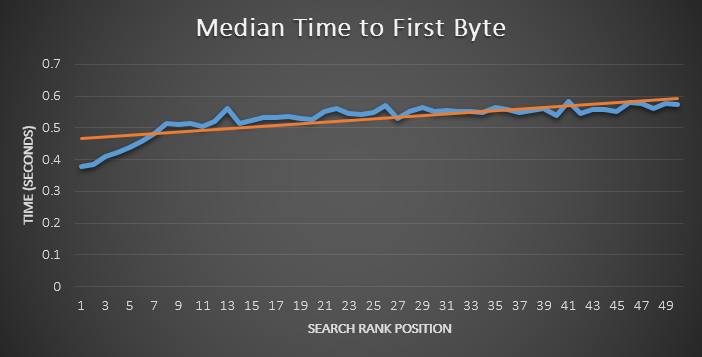
Google indicates that the loading time of web pages is a signal used by its algorithm to rank them. Google could be measuring the time taken to receive the first byte while calculating page speed. A poorly performing website degrades the user experience. Hence, such sites do not deserve to be promoted in search results.

Time-to-first-byte (TTFB) is the time taken by the browser to receive the first byte from a web server when a URL is requested. This metric includes the time taken to send a response, the processing time of the server, and the time taken by the first byte to reach your browser from the server. Here’s a graph of median TTFB vs ranking positions:

Source – https://moz.com/blog/how-website-speed-actually-impacts-search-ranking

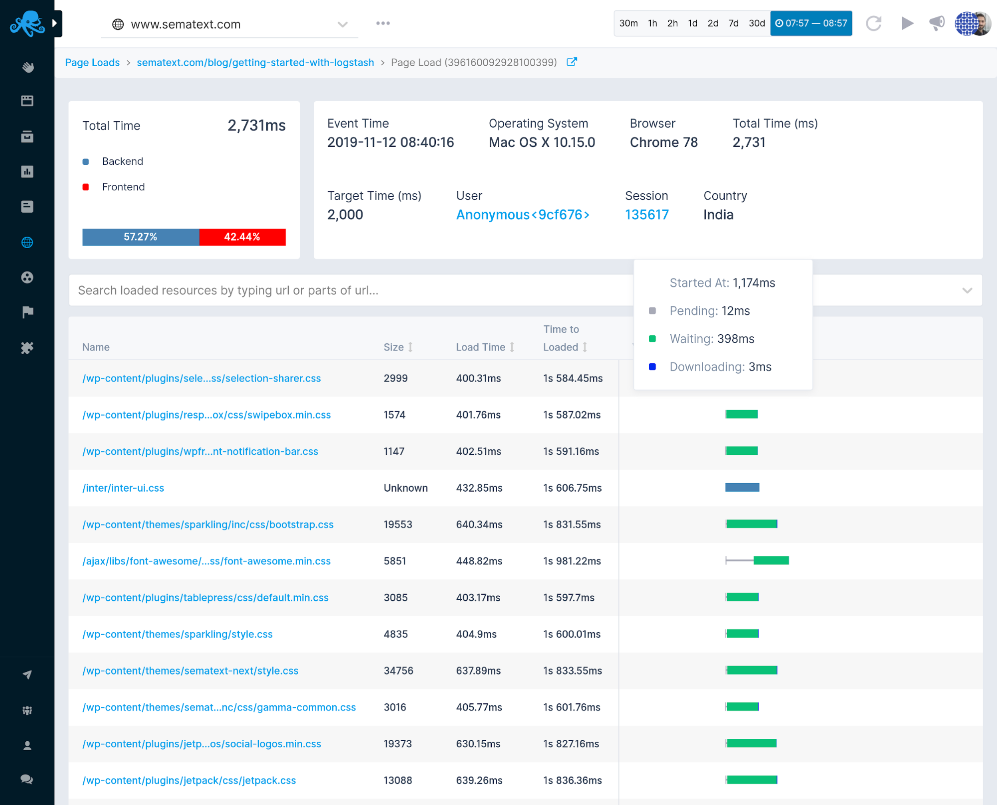
Sematext Experience collects resource timing data for images, CSS, and JavaScript files. When someone visits your website, the browser begins downloading resources. These resources have a big impact on your website’s loading speed.

The resources are shown in the form of a waterfall ordered by the time they were discovered.

Resource Waterfall – Sematext Experience

Load-time performance depends on various factors. If visitors experience slow page-loads or poor HTTP request performance, it is most likely caused by network latency, DNS servers, redirects, application performance, and other factors. A detailed timing breakdown on page loads and HTTP requests is displayed to understand which part(s) of the loading process is slow.

Timing Breakdown – Sematext Performance

We can only optimize what we can measure. Once you have information on the resources which are slow-loading, you can start improving their load times. As SEO is impacted by loading time, here’s a list of tasks you can do to optimize your web pages for better SEO:

  • Reduce the dimensions of images to fit the image containers on your web pages.
  • Compress images to further reduce the space they occupy on your server.
  • Stick to standard image formats (JPG, PNG, GIF).
  • Use CSS sprites for images that you use frequently on your website like icons and buttons. A CSS sprite loads entirely in one go thereby reducing the number of HTTP requests. This technique helps in saving load time by not making users wait for multiple images to load.
  • Reduce the size of your HTML, CSS, and Javascript files using a minification tool.
  • Remove code comments, formatting, and unused code to reduce the size of the files.
  • Reduce the number of redirects to avoid additional waiting time.
  • Move scripts to the Footer to avoid render-blocking javascript code.
  • Use browser caching so the browser doesn’t have to reload the entire page when a visitor comes back to your site. Browsers can cache images, stylesheets, Javascript files, and more. Learn how to leverage browser caching here.
  • Improve the server response time by looking out for performance bottlenecks like slow database queries and routing. Try switching to a new hosting solution to further improve the server response time. The optimal response time is under 200 ms.
  • Use a content distribution network (CDN) which essentially distributes the load of delivering content. It works as follows – copies of your website are stored at multiple data centers located geographically so that users have faster and reliable access to your website.

Improving User Satisfaction

The more the users are satisfied with your website experience, the more likely they will spend a lot more time on your website which in turn will help in improving SEO as time spent on the website directly affects your search engine rankings. Naturally, we want the average time spent on your website to be as high as possible for Google to take note of the importance of your website.

On the other hand, if users are dissatisfied with your website experience, they are more likely to abandon your website which eventually will lead to an increase in the bounce rate. Bounce rate is the percentage of visitors who abandon your website after visiting a single page. A high bounce rate means that visitors don’t like what they see on your website. We want to have the bounce rate as low as possible to have better rankings.

You learned how time spent on the website and the bounce rate impacts the rankings for your website. A real user monitoring tool like Sematext gives a measure of user satisfaction.

User Experience – Sematext Experience

The user satisfaction score is based on the Apdex industry standard. Page loads, on-page transactions, and ajax requests are separated into different user satisfaction scores as they have different performance characteristics.

Conclusion

As 68% of online experiences begin with a search engine and 53.3% of all website traffic comes from organic search (source), it is important to improve the SEO of your website for better rankings. The fact is that there could be issues concerning your website which you might not even be aware of. These issues could secretly be affecting the user experience thereby making visitors abandon your website. You need real user monitoring tools to know these issues to improve your website rankings. Do research regarding which real user monitoring tool is good for you – one that fits your use case. The important part is to monitor the end-user experience and be in control of how users interact with your website.

Read More at How Can A Real User Monitoring Tool Help In Improving SEO?

Categories: Designing, Others Tags: