Archive

Archive for May, 2020

Top 10 Toolkits and Libraries for Deep Learning in 2020

May 8th, 2020 No comments

Deep Learning is a branch of artificial intelligence and a subset of machine learning that focuses on networks capable of, usually, unsupervised learning from unstructured and other forms of data. It is also known as deep structured learning or differential programming.

Architectures inspired by deep learning find use in a range of fields, such as audio recognition, bioinformatics, board game programs, computer vision, machine translation, material inspection, and social media filtering.

Deep learning networks have tremendous capability in terms of accuracy. While training a deep learning net, there is a range of parameters that require adjusting.

There are several deep learning libraries and toolkits available today that help developers ease out this complex process as well as push the boundaries of what they can accomplish. With any further ado, let us present our pick of the top 10 toolkits and libraries for deep learning in 2020:

1. Eclipse Deeplearning4j

Developer – Konduit team and the DL4J community
Since – N/A
Type – Toolkit
Written in – C, C++, Clojure, CUDA, Java, Python, Scala

Eclipse Deeplearning4j is a distributed, open-source, production-ready deep learning toolkit designed for Java, Scala, and the JVM. DL4J has the ability to leverage distributed computing frameworks, to the likes of Apache Hadoop and Apache Spark, for delivering a powerful AI performance.

In environments utilizing multi-GPUs, Deeplearning4j can equal the deep learning framework Caffe in terms of performance. Although written in Java, the underlying computations of DL4J are written in C, C++, and CUDA.

DL4J lets developers compose deep neural networks from a range of shallow networks. Each of them forms a kind of ‘layer’ while adding them in a deep neural net designed using the Deeplearning4j toolkit.

Deeplearning4j allows combining convolutional networks, sequence-to-sequence autoencoders, recurrent networks, or variational autoencoders as required in a distributed, commercial framework working with Hadoop and/or Spark on top of distributed CPUs or GPUs.

Highlights:

  • Can be used with any JVM-based programming language/technology, such as Clojure and Kotlin.
  • Completely open-source under the Apache 2.0 License.
  • Detailed documentation on a range of topics, including API reference docs, distributed training, and GPU setup.
  • Excellent, expanding community support.
  • Keras serves as the Python API.

2. TensorFlow

Developer – Google Brain Team
Since – November 2015
Type – Library
Written in – C++, CUDA, Python

Ever since its release back in 2015, TensorFlow has succeeded to become one of the most beloved deep learning, and machine learning, libraries. Backed by the tech mogul Google, TensorFlow provides support for multi-CPU, and -GPU performance.

As a machine learning platform, TensorFlow is replete with flexible tools, libraries, and community resources. It allows developers to easily and quickly build and deploy DL and ML-powered applications.

TensorFlow allows developers to choose a fitting option from its multiple levels of abstraction. For matching humongous ML model training tasks requirements, the deep learning library offers the Distribution Strategy API that allows distributed training on different hardware configurations without essentially altering the model definition.

Highlights:

  • Ample documentation.
  • Build and train ML models with intuitive high-level APIs facilitating immediate model iteration as well as easy debugging.
  • Simple and flexible architecture fosters powerful experimentation/research.
  • Superb community support.
  • Supports a wide range of programming languages.
  • TensorFlow Trusted Partner Pilot Program
  • Train and deploy models in the browser (TensorFlow.js), in the cloud, on a device (TensorFlow Lite), and on-premises (TensorFlow Extended).

3. Theano

Developer – MILA (Montreal Institute of Learning Algorithms), University of Montreal
Since – 2007
Type – Library
Written in – CUDA, Python

Another powerful library available for deep learning is Theano. It lets developers define, evaluate, and optimize mathematical expressions that involve multi-dimensional arrays in an effective way. Theano is a free and open-source tool available under The 3-Clause BSD License.

Theano does derivatives for functions with one or many inputs. The Python library has tight integration with NumPy, allowing using numpy.ndarray in Theano-compiled functions. As it supports dynamic C code generation, expressions are evaluated faster.

In scenarios involving different expressions that are evaluated once, Theano minimizes the analysis or compilation overhead while still offering symbolic features, like automatic differentiation.

Unfortunately, a major development for the deep learning library has ceased since the release of Theano 1.0.0 in November of 2017. The maintenance of the Python library, nonetheless, now rests in the hands of the PyMC development team.

Highlights:

  • Combines aspects of a CAS (Computer Algebra System) with aspects of an optimizing compiler.
  • Detects and resolves several types of errors.
  • Expresses computations using a NumPy-like syntax.
  • Provides support for the rapid development of efficient ML algorithms.
  • Runs faster than TensorFlow in single GPU tasks.
  • Supports speed and stability optimizations.

4. Keras

Developer – Several
Since – March 2015
Type – Library
Written in – Python

Keras is one of the best Python libraries for data science. It is widely used for developing and training deep learning models. It is also a trusted tool for accomplishing deep learning research. The Python library was developed specifically for facilitating fast experimentation.

With easy extensibility and modularity, Keras enables easy and rapid prototyping. The high-level neural networks API flaunts the ability to run on top of other state-of-the-art deep learning libraries and toolkits, namely Microsoft Cognitive Toolkit, TensorFlow, and Theano.

Keras provides support for both convolutional and recurrent networks. Furthermore, it also supports networks that are a combination of these two network types.

As models developed using Keras are described completely using the Python code, they are compact, easier to debug, and offer great ease when it comes to extensibility.

Highlights:

  • Easy to learn as well as to put to use.
  • Follows best practices for reducing cognitive load.
  • For developing complex architectures, Keras functional API is available.
  • Prioritizes human experience.
  • Robust support for distributed training and multiple GPUs.

5. PyTorch

Developer – FAIR (Facebook’s AI Research lab)
Since – October 2016
Type – Library
Written in – C++, CUDA, Python

PyTorch is an open-source machine learning library that hastens everything ranging from research prototyping to production deployment. As a matter of fact, PyTorch is an evolved version of the immensely popular and one of the earliest machine learning libraries, Torch.

As an ML platform, PyTorch boasts a rich ecosystem of libraries and tools. To make dealing with complex deep learning projects easier, PyTorch features a library dubbed PyTorch Geometric that handles irregular input data, such as graphs, manifolds, and point clouds.

For offering comprehensive scikit-learn compatibility, PyTorch offers the high-level library skorch. As the deep learning library is supported by various major cloud platforms, it offers continuous development and easy scaling.

PyTorch comes with its own scripting language, TorchScript that offers a smooth transition between eager mode and graph mode. Facebook’s AI Research lab a.k.a. FAIR is responsible for handling the further development of the deep learning library.

Highlights:

  • C++ frontend for enabling research in performant, low-latency, bare-metal C++ apps.
  • Capable of running ML models in a production-ready environment.
  • Optimized performance in both research and production scenarios.
  • Proactive community of developers and researchers.
  • Provides native ONNX (Open Neural Network Exchange) support.
  • Supports an experimental, end-to-end workflow from Python to deployment on Android and iOS platforms.

6. Sonnet

Developer – DeepMind
Since – 2017
Type – Library
Written in – N/A

Built on top of TensorFlow 2, Sonnet aims to offer simple, composable abstractions for ML research. Developed by DeepMind, the deep learning library can be employed for accomplishing various types of learning, including reinforcement and unsupervised learning.

Sonnet’s simple-yet-powerful programming model is based on the concept of modules i.e. snt.Module. Sonnet modules have the ability to hold references to methods, other modules, and parameters. These modules are self-contained, entirely independent units.

Things in Sonnet start with the construction of primary Python objects for specific parts of a neural net. Next, these Python objects are connected, in an independent manner, to the computational TF graph.

Separating the processes of creating Python objects and associating the same with the TF graph, results in simplifying the design of high-level architectures.

Sonnet comes with a range of pre-built modules, such as snt.BatchNorm and snt.Linear, and pre-built network of modules, such as snt.nets.MLP. Developers, however, are free to create their own modules. The deep learning library is developed with simplicity in mind.

Highlights:

  • A flexible functional abstraction tool.
  • A good alternative to PyTorch and TensorFlow.
  • Eases the process of reproducing ML research.
  • Easy to use and implement.
  • High-level object-oriented library adding abstraction for developing neural networks and ML algorithms.

7. Apache MXNet

Developer – Apache Software Foundation
Since – 2014
Type – Library
Written in – C++, Go, Java, JavaScript, Julia, Perl, Python, R, Scala

MXNet is a highly scalable, open-source deep learning library from Apache Software Foundation that provides support for a range of devices. It is a comprehensive DL library that is easy to pick up for beginners as well as powerful to leverage for advanced developers.

Apache MXNet provides bindings for an array of programming languages, including C++, Go, JavaScript, Julia, Python, and R. Not only does the deep learning library provide support for multi-GPU operation but also with fast context switching and optimized computations.

The dual Parameter Server and Horovod support allow scalable distributed training and performance optimization in MXNet. It also features a hybrid frontend that has the ability to seamlessly transition from and back to Gluon eager imperative mode and symbolic mode.

The many desirable characteristics of Apache MXNet contribute to it being a part of the Amazon Web Services.

Highlights:

  • Clean, easy-to-maintain code via APIs.
  • Detailed, in-depth documentation.
  • Fast operation.
  • High level of flexibility.
  • Option available to choose among imperative and symbolic programming styles.
  • Suitable for both research and production use.

8. Fastai

Developer – Jeremy Howard and the fast.ai team
Since – 2017
Type – Library
Written in – Python

fastai is a deep learning library that offers high-level components for easily and quickly achieving impressive results in standard DL domains as well as low-level components that can be paired and matched for building new ML approaches.

The aforementioned is made possible, and even without compromising ease-of-use, flexibility, and performance, by virtue of the thoughtfully layered architecture supported by the fastai deep learning library.

fastai’s architecture expresses common underlying patterns of data processing and deep learning techniques as decoupled abstractions. It is possible to express these abstractions clearly and concisely by means of the synergy between Python and the PyTorch library.

fastai features a novel dispatch system for Python in line with a semantic type hierarchy for tensors. Moreover, the deep learning library comes with an extensible computer vision library.

Highlights:

  • Allows implementation of optimization algorithms in 4 to 5 lines of code using a refactoring optimizer.
  • Factors out the common functionality of modern optimizers.
  • Features a novel data block API.
  • One of the fastest-growing deep learning libraries.
  • Supports a new two-way callback system capable of accessing and changing any portion of the available data, model, or optimizer even when on training.

9. Lasagne

Developer – N/A
Since – 2015
Type – Library
Written in – N/A

Lasagne is a work-in-progress lightweight library for building and training neural nets in Theano. The deep learning library leverages a Python interface and provides support for architectures consisting of multiple inputs and multiple outputs.

Using Lasagne doesn’t prohibit developers from using Theano symbolic variables and expressions. Hence, these can be easily manipulated to adapt to the architecture and the learning algorithm that a developer is working on.

Lasagne achieves high-level API operation due to its easy-to-use layers. Theano’s expression compiler enables the lightweight deep learning library to provide transparent support of CPUs and GPUs. It is a great option for defining, evaluating, and optimizing mathematical expressions.

Highlights:

  • Does everything that Theano can do with an additional benefit of user-friendly layering functions.
  • Lightweight deep learning library.
  • Optimization available using ADAM, Nesterov momentum, and RMSprop.
  • Provides support for feed-forward networks to the likes of CNNs and recurrent neural networks.
  • Thanks to Theano’s symbolic differentiation, Lasagne doesn’t necessitate to derive gradients.

10. Microsoft Cognitive Toolkit

Developer – Microsoft Research
Since – 2016
Type – Toolkit
Written in – C++

Previously known as CNTK, the Microsoft Cognitive Toolkit is an open-source deep learning toolkit developed by Microsoft Research that describes neural nets as a series of computational steps via a directed graph.

The Microsoft Cognitive Toolkit is one of the earliest deep learning toolkits to support the ONNX format that allows for moving ML models seamlessly between Caffe2, MXNet, PyTorch, itself, and other deep learning platforms.

The commercial-grade distributed deep learning toolkit allows easily realizing and combining popular neural net model types, like convolutional neural networks, feed-forward DNNs, and recurrent neural networks.

The Microsoft Cognitive Toolkit implements SGD (stochastic gradient descent) learning with automatic differentiation as well as parallelization across several GPUs and servers.

Highlights:

  • Automatic text-to-speech and speech-to-text conversions.
  • Can be included as a library in C#, C++, or Python programs, or employed as a standalone ML tool via BrainScript, Microsoft Cognitive Toolkit’s innate description language.
  • Suitable for speech-and-language-classification research.
  • Supports a good range of features.

Conclusion

That sums up our list of the top 10 toolkits and libraries for deep learning in 2020. The success of a deep learning endeavor greatly depends on making the right choice of a deep learning platform. Hence, listing down all your requirements first is important here.

As the world moves toward a new AI-powered age, the deep learning tools available are bound to get bigger and better. Continuously experimenting and learning deep learning with available tools is the most suitable way to explore what possibilities does DL have to offer on the latest.

Photo by Paul Hanaoka on Unsplash

Categories: Others Tags:

How To Design An Iconic Logo?

May 8th, 2020 No comments

Have you ever wondered why Adidas, Nike, Apple, Unilever, and many others have such remarkable logotypes? What is the inner side of their success? We have an answer! These companies have followed certain rules to create meaningful and interesting logos.

We analyzed their experience and chose the 5 best tips for an iconic logo design. Let’s discuss these points and learn how to use them!

Top 5 Tips For Creating Iconic Logo Design

1. Give it some sense or meaning

When I first saw Toyota’s logo I knew nothing about what it meant. However, since the logo itself made totally no sense to me initially, I decided to google it. What I discovered was the fact that we can retrieve every single letter of the brand name from the logo. Needless to say, my jaw dropped in a long excited ‘Wow!’.

The most crucial point here is that Toyota’s logo is very eye-catching and is easy to recognize among many other car producers. What is more, such an interesting approach to the use of meaning will make the logo an absolute highlight, and if you see the explanation once you’ll never ever forget it.

There’s another option: when you have an idea for a logo, include elements that represent the area you are dealing with. Let’s take a look at our Approval Studio logo.

Approval Studio is a collaboration artwork proofing tool for designers and the logotype fully represents it. There are several people holding hands of each other in a circle to show teamwork – a complete puzzle piece! Speaking of collaboration, it is one more important element of any kind of design work including logos, so if you are interested in a solid artwork approval tool, follow the link below.

Try Approval Studio Now!

2. Use colors wisely

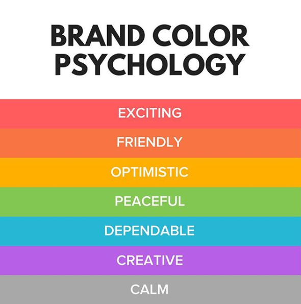
Have you ever heard of colors psychology? Different colors may have different influences on a person and, thus, on the perception of your brand by your target audience.

Image source: https://www.instagram.com/p/BiXDClug33Z/

Consequently, having a clear image of using colors, you can evoke needed feelings regarding your logo and brand in general. Let’s take a look at a list of some colours and discover how we can use them:

Red – excitement. Aim: calling for action or evoking strong emotions. Example: YouTube – a platform that is built on actions filmed on video and your emotional response to them.

Orange – creativity and happiness. Aim: building a positive attitude. Example: Nickelodeon – a cartoon platform designed for kids to have fun.

Pink – toys and childish playfulness. Aim: attracting little kids. Example: Barbie – a toy brand that makes dolls.
Green – nature and money. Aim: making an impact on health and fertility. Example: Greenpeace – an organisation whose main task is environment care.
Blue – stability, peace, and trust. Aim: building a feeling of trust, reliability, and safety. Example: Walmart – a supermarket network that needs the trust of the buyers to thrive.

Purple – power and luxury. Aim: showing status and nobility. Example: Milka – a European chocolate producer that is considered as one of the best in the world.

White – humanity and cleanliness. Aim: creating contrast. It is often combined and interchanged with Black that represents mystery and elegance. Aim: creating consistency. Example: Chanel – one of the most famous fashion houses that are considered as one of the indicators of style and relevance.

Grey – neutrality and balance. Aim: underlining balance between colors and making the logo more color-friendly. Example: Apple – a famous electronic gadget developer that wants to accent how well-balanced and perfect their products are.

Brown – earthy color. Aim: sharing comfort and security. Example: UPS – shipping and logistics service that need its customers to trust their goods to them.

3. Multiple variations

If you consider having multiple lines of your product or types of services, you may need several logo variants. This will prove beneficial in the long run because you may adjust an image to a certain style or idea you need to represent. Considering that trends change very quickly and people get bored with everything old very fast, ability to react fast to the changes with the logo adjustments are instrumental for any company.

For example, Adidas has several clothing lines that have different logos which suit them perfectly. Adidas Originals is about casual clothing, usual Adidas logo represents sports stuff, and Adidas Neo stands for teenager clothes. Let’s take a look:

So, having several logos gives you more ideas for small variations with the flow of time. Refreshing your visual components might be crucial in your brand development and will definitely pay off in the future.

4. Let your logo ‘breathe’

Considering a recent boom of minimalism, your logo needs to be simple and not overwhelmed with excessive elements to catch the eye of a potential customer. Such approach will help you to make the logo more consistent and give it some ‘fresh air’

What does it mean? Whatever is depicted on your logotype needs some space. Do not add too many extra elements around. Also, personal space for each component will change your logo drastically and make it cosy.

Let’s take a look at Unilever.

Every element has its own space and, despite the fact that the logo includes many of them, the overall image looks smart and consistent because all the elements create the letter “U”. It is a lot and not too much at the same time, which makes the logo unique and builds customer’s interest in the brand, making them remember it. Who doesn’t know Unilever, really?

5. A scalable logo means no pains in the back

When you have finished artwork, the time has come to think about rocking the world. The marketing campaign for your brand may and will include many different approaches and strategies, and you have to be prepared for each of them from using digital marketing to huge banners in the city. The logo of your brand will definitely be used in each of them, which means you have to be ready to adjust logo’s size so that it doesn’t lose the quality even on the biggest screens or banners.

Do not wait until you decide to roll in big printing – you may get tons of problems to deal with, and re-making the logo shouldn’t be one of them. You must be ready for everything from the very beginning of your brand. Better safe than sorry as they say – last-minute adjustments might make the quality of work far worse.

Final Thoughts

Working on logos is definitely not easy, but there are certain strategies you can use to make your product more recognizable. A logo is the heart of the brand, and if you want it to perform, take it responsibly. We hope that our guide was helpful, and, at some point, your logos will be extremely famous and everyone will be using them as examples. And, naturally, Approval Studio is more than ready to help you with it. Take care!

Categories: Others Tags:

How To Build A Vue Survey App Using Firebase Authentication And Database

May 8th, 2020 No comments
Survey App architecture

How To Build A Vue Survey App Using Firebase Authentication And Database

How To Build A Vue Survey App Using Firebase Authentication And Database

David Atanda

2020-05-08T11:00:00+00:002020-05-08T15:10:24+00:00

In this tutorial, you’ll be building a Survey App, where we’ll learn to validate our users form data, implement Authentication in Vue, and be able to receive survey data using Vue and Firebase (a BaaS platform).

As we build this app, we’ll be learning how to handle form validation for different kinds of data, including reaching out to the backend to check if an email is already taken, even before the user submits the form during sign up.

Also, the app would handle logging in of the user with restful APIs. It’ll make use of Authguard in Vue router to prevent users that are not logged in from getting access to the survey form, and successfully send the survey data of logged-in users to a secure database.

Just so we’re on the same page, let’s clarify what Firebase is, and what it’ll be doing in this tutorial. Firebase is a toolset to “build, improve, and grow your app”, it gives you access to a large portion of the services that developers would normally have to build themselves, but don’t really want to build, because they’d rather be focusing on the app experience itself. This includes things like analytics, authentication, databases, file storage, and the list goes on.

This is different than traditional app development, which typically involves writing both frontend and backend software. The frontend code just invokes API endpoints exposed by the backend, and the backend code actually does the work. However, with Firebase products, the traditional backend is bypassed, putting the work into the client. This technically allows front-end engineers like myself to build full-stack applications writing just front end code.

The bottom line is that Firebase would act as our backend in this project by providing us with the necessary API endpoints to handle both our authentication and database needs. In the end, you’ll have built a functional survey app using Vue+ Firebase. After that, you can go ahead and build any web app of your choice using these same processes, even with a custom backend.

To follow along, you need to have Node and npm/yarn installed on your machine. If you do not have that done already, follow these quick guides to install yarn or npm on your machine. You also need to have a basic understanding of Vue, Vuex and Vue router syntax for this tutorial.

The starter files for this tutorial are right here, which contains the base files for this project, and here is the repo for the completed demo. You can clone or download the repos and run npm install in your terminal.

After installing the starter file, you’ll see a welcome page, which has the options to sign up and sign in. After getting logged in you can then have access to the survey.

Survey App architecture

This describes how our survey app is going to be functioning. (Large preview)

Feel free to create a new project if you’ll like to build this project entirely on your own, just make sure to install Vuex, Vue router, Vuelidate and axios into your Vue project. So let’s jump right in:

First, we’ll need a Firebase account to set up this project which is very much like creating a container for our app, giving us access to the database, various means of authentication, hosting, etc. It’s straight forward to set up once you’re on the Firebase site.

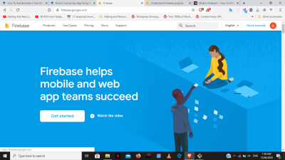
Firebase landing page

The landing page where you can sign up and start your Firebase journey. (Large preview)

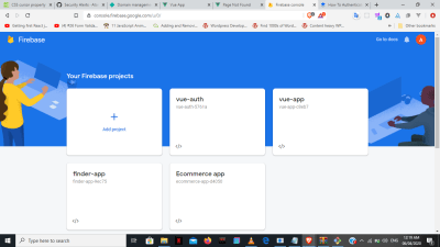
Create new Firebase projects

Creating Firebase projects (Large preview)

Now that we have our project, the next thing is to set up both our authentication system and database (Realtime database) on Firebase.

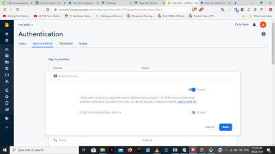
  • Click on the “authentication” option;
  • Set up the “sign-in method” we want (in this case email/password).

Setup sign-in method

Setup email/password Auth method for the project. (Large preview)
  • Click on “database”.
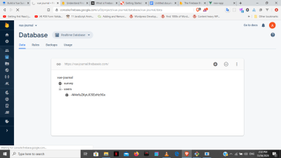
  • Choose “Realtime database” and copy this link that’s right on top.

It’ll be very useful as the API endpoint when we want to send the data to our firebase database.

We’ll refer to this API as the database API. To use it, you’ll have to add the name of the database of your choice when sending it. For example, to send to a database called user. You simply add user.json at the end:

{databaseAPI}/user.json

Real time database

Use the API above the database itself to send data to the database. (Large preview)

After this, we’ll then go to Firebase auth rest API documentation to get our sign up and sign in API endpoints. Within these endpoints, there will be a need for our project’s API key, which can be found in our project settings.

Validation

Back to our code, there’ll be a validation of the signup data before been sent to the server, just to make sure the user is sending appropriate information. We’ll be using Vuelidate which is a cool library that makes validation easier in Vue. First of all, install Vuelidate into the project:

npm i vuelidate

Go to src/components/auth/signup.vue and within the script tag import vuelidate and all the necessary events that we’ll need from the library as seen below.

Note: You can check the docs for a full overview of the library and all available events.

import { required, email, numeric, minValue, minLength, sameAs } from 'vuelidate/lib/validators'

A quick explanation:

required The value is compulsory
email Value must be an email
numeric Must be a number
minValue Least numerical value the user can input.
sameAs Used to compare between two values to make sure they’re the same

Also import axios to be able to send an HTTP request to the server:

import axios from 'axios'

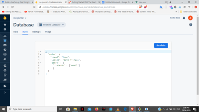
Before we go on, we’ll need to add some rules to the database to be able to validate the email as we should, just as seen below:

Firebase rules

The database rules help decide you can or cannot access the database at any point in time. (Large preview)
"read" = "true"

Meaning that the database can be read without any hindrance from the client-side.

"write" = "auth" !== null

You can’t write on the database except you’re an authenticated user.

"Users" = {
  "onIndex" : ["email"]
}

This allows us to query the users document with an index of email. That is, you can literally filter the database for a unique email.

Then add a custom computed property with the name validations just like we have methods, computed, etc.

Under validations we’ll have methods to validate the necessary data starting from email where it’s required and obviously must be an email. Also, we want to be able to tell a user when an email has already been taken by someone else, by checking the database after the user has typed it using something called async validators all within a custom validator and it’s all supported by vuelidate.


    validations : {
      email: {
        required,
        email,
        unique: val => {
          if (val === '') return true
          return axios.get('https://vue-journal.firebaseio.com/users.json?orderBy="email"&equalTo="' + val + '"')
            .then(res => {
              return Object.keys(res.data).length === 0
            })
        }
      }
    }

Then under unique, query the database using axios and use the default Object.keys to return the response only if it’s length is 0.

For the age, you’ll add required, numeric, and a min value of 18 that’s assigned to minVal as its properties.

age: {
        required,
        numeric,
        minVal: minValue(18)
      }

Password’s properties are required, with a minimum length of 6 assigned to minLen.

password: {
        required,
        minLen: minLength(6)
      }

confirmPassword properties are basically to be the same as the password.

confirmPassword: {
        sameAs: sameAs(vm => {
          return vm.password
        })
      }

To tell the user that the email is taken, use v-if to check if unique is true or false. If true, then it means that the returned Object’s length is 0, and email can still be used as well as vice versa.

In the same manner, you can check if the user input is an actual email using v-if.

And for all the surrounding divs on the individual input, we will add a class of invalid that becomes active once there’s an error on that input.

To bind the validation events to each of the input in the HTML, we use $touch() as seen with the email below.

<div class="input" :class="{invalid: $v.email.$error}">
  <h6 v-if="!$v.email.email">Please provide a valid email address.</h6>
  <h6 v-if="!$v.email.unique">This email address has been taken.</h6>
<input
  type="email"
  placeholder="Email"
  id="email"
  @blur="$v.email.$touch()"
  v-model="email">
</div>

Age, password, and confirmPassword will be binded to their HTML input in a similar manner as the email.

And we’ll make the ‘Submit’ button inactive if there’s an error in any of the input.

<button type="submit" :disabled="$v.$invalid">create</button>

Here’s a complete CodePen example for this vuelidate section.

Vuelidate implementation

Vuelidate is used here to determine the kind of data been sent to the database. (Large preview)

Authentication

This app is an SPA and doesn’t reload like traditional sites, so we’ll be using Vuex, as our single “source of truth” to allow every component in our app to be aware of the general authentication status. We go to our store file, and create both sign-in/sign-up method within actions.

The response (token and userId) received when we send the users data, are going to be stored within our state. This is important because the token is going to be used to know if we’re still logged in or not at any point within our app.

The token, userId, and user are created in the state with an initial value of null. We’ll get to the user much later, but for now, we’ll focus on the first two.

state: {
  idToken: null,
  userId: null,
  user: null
}

Mutations are then created to change the state when needed.

authUser Saves the token and userId
storeUser Stores the user info
clearAuthData Erases the data back to the initial state
mutations: {
  authUser (state, userData) {
    state.idToken = userData.token
    state.userId = userData.userId
  },
  storeUser (state, user) {
    state.user = user
  },
  clearAuthData (state) {
    state.idToken = null
    state.userId = null
    state.user = null
  }
}

For sign-up/sign-in, we’ll have to create individual actions for both, where we send our auth requests to the server. After which our response(token and userId) from sign-up/sign-in is committed to authUser, and saved on the local storage.

signup ({commit, dispatch}, authData) {
      axios.post('https://www.googleapis.com/identitytoolkit/v3/relyingparty/signupNewUser?key=AIzaSyCFr-OMMzDGp4Mmr0t66w2cTGfNazYjptQ', {
        email: authData.email,
        password: authData.password,
        returnSecureToken: true
      })
        .then(res => {
          console.log(res)
          commit('authUser', {
            token: res.data.idToken,
            userId: res.data.localId
          })
          localStorage.setItem('token', res.data.idToken)
          localStorage.setItem('userId', res.data.localId)
          localStorage.setItem('email', res.data.email)
          dispatch('storeUser', authData)
       
          setTimeout(function () {
            router.push('/dashboard')
          }, 3000)
        })
        .catch(error => console.log(error))
    }
login ({commit}, authData) {
      axios.post('https://www.googleapis.com/identitytoolkit/v3/relyingparty/verifyPassword?key=AIzaSyCFr-OMMzDGp4Mmr0t66w2cTGfNazYjptQ', {
        email: authData.email,
        password: authData.password,
        returnSecureToken: true
      })
        .then(res => {
          console.log(res)
          localStorage.setItem('token', res.data.idToken)
          localStorage.setItem('userId', res.data.localId)
          localStorage.setItem('email', res.data.email)
          commit('authUser', {
            token: res.data.idToken,
            userId: res.data.localId
          })
          router.push('/dashboard')
        })
        .catch(error => console.log(error.message))
    }

But here’s the tricky part, what we’ll do with the sign-up action particularly is to send only the email and password to be registered in the authentication database. In the real sense, we don’t have access to use the data in this authentication database, and we did not send any of our sign-up data besides email/password.

So what we’ll do is to create another action to send the complete sign-up data to another database. In this separate database document, we’ll have complete access to all the information we choose to save there. We’ll call this new action is called storeUser

We then go to our sign-up action and dispatch the entire object containing our sign-up data to a database we now have access to through storeUser.

Note: You might not want to send your user’s password with storeUser to the database for security reasons.

storeUser ({ state}, userData) {
      if (!state.idToken) {
        return
      }
      axios.post('https://vue-journal.firebaseio.com/users.json' + '?auth=' + state.idToken, userData)
        .then(res => console.log(res))
        .catch(error => console.log(error))
    }
  }

storeUser adds a query using our newly gotten token and database API while posting to the database.

This is because we cannot write to our database, except we’re authenticated with our proof( the token). That’s the rule we gave Firebase at the beginning, remember?

“write” = “auth” !== null

The complete code for sign-up/sign-in actions are right here.

Then dispatch both the sign-up and sign-in from their components within the onSubmit method to the respective actions in the store.

methods : { 
  onSubmit () {
    const signupData = {
      email : this.email,
      name : this.name,
      age : this.age,
      password : this.password,
      confirmPassword : this.co
      nfirmPassword
    }
    this.$store.dispatch('signup', signupData)
    }
  }
}

Note: signupData contains the form’s data.

methods : {
  onSubmit = {
    const formData = {
      email : this.email,
      password : this.password
    }
    this.$store.dispatch('login', {email: formData.email, password: formData.password})
  }
}

AuthGuard

There’s a need for AuthGuard to prevent users that are not logged in from getting access to the dashboard where they’ll send the survey.

Go to the route file and import our store.

import store from './store'

Within the route, go to the dashboard’s path and add the following:

const routes = [
  { path: '/', component: WelcomePage },
  { path: '/signup', component: SignupPage },
  { path: '/signin', component: SigninPage },
  {
    path: '/dashboard',
    component: DashboardPage,
    beforeEnter (to, from, next) {
      if (store.state.idToken) {
        next()
      } else {
        next('/signin')
      }
    }
  }
]

All this does is to check whether there’s a token in the state, if yes, we give access to the dashboard and vice versa.

LogOut

To create our logout option we’ll make use of clearAuth that we created earlier under mutations which just sets both the token and userId to null.

We now create a new logout action , that commits to clearAuth, delete local storage and add router.replace('/') to redirect the user completely.

actions: {
  logout ({commit}) {
    commit('clearAuth')
    localStorage.removeItem('token')
    localStorage.removeItem('userId')
    router.replace('/')
  }
 }

In the header component, we have an onLogout method which dispatches our logout action in the store.

methods: {
      onLogout() {
        this.$store.dispatch('logout')
      }
    }

We then add a @click to the button which fires the onLogout method as we can see here.

<ul @click="onLogout">Log Out</ul>

UI_State

Now that we’ve given conditional access to the dashboard, the next step is to remove it from the nav bar, so only authenticated users can view it. To do that, we would add a new method under the getters called ifAuthenticated which checks if the token within our state is null. When there’s a token, it shows that that the user is authenticated and we want them to see the survey dashboard option on the nav bar.

getters: {
  isAuthenticated (state) {
    return state.idToken !== null
  }
}

After which, you go back to the header component and create a method auth under computed, which dispatches to our isAuthenticated within the getters we’ve just created in the store. What this does is that isAuthenticated would return false if there’s no token, which means auth would also be null and vice versa.

computed: {
      auth () {
        return this.$store.getters.ifAuthenticated
      }
    }

After this, we add a v-if to our HTML to check if auth is null or not, determining whether that option would show on the nav bar.

<li v-if='auth'>
          <router-link to="/dashboard">Dashboard</router-link>
        </li>
        <li  v-if='!auth'>
          <router-link to="/signup">Register</router-link>
        </li>
        <li  v-if='!auth'>
          <router-link to="/signin">Log In</router-link>
        </li>
  • You’ll find the complete code of the UI State section here.
There’s change in the header based on the authentication status of the user. (Large preview)

AutoLogin

When we reload our app we lose the data and are signed out, having to start all over. This is because our token and Id are stored in Vuex, which is javascript, and this means that our app gets reloaded with the browser when refreshed.

And so finally, what we’ll be doing is to retrieve the token within our local storage. By so doing, we can have the user’s token on the browser regardless of when we refresh the window, and have a method auto log-in our user in as much as the token is still valid.

A new actions method called AutoLogin is created, where we’ll get the token and userId from the local storage, and commit our data to the authUser method in the mutations.

actions : {
  AutoLogin ({commit}) {
      const token = localStorage.getItem('token')
      if (!token) {
        return
      }
      const userId = localStorage.getItem('userId')
      const token = localStorage.getItem('token')
      commit('authUser', {
        idToken: token,
        userId: userId
      })
  }
}

We then go to our App.vue and write a created method, that’ll dispatch the autoLogin from our store every time the app is loaded.

created () {
    this.$store.dispatch('AutoLogin')
  }

Fetch_User_Data

We want to welcome the user on the dashboard by displaying the user’s name. And so, another action called fetchUser is created which first checks if there’s a token as usual. Then, it goes on to get the email from local storage and queries the database as done earlier with the email validation.

This returns an object containing the user’s data initially submitted during sign-up. We then convert this object into an array and commit it to the storeUser mutation initially created.

fetchUser ({ commit, state}) {
  if (!state.idToken) {
    return
  }
  const email = localStorage.getItem('email')
  axios.get('https://vue-journal.firebaseio.com/users.json?orderBy="email"&equalTo="' + email + '"')
    .then(res => {
      console.log(res)
    
     // const users = [] 
      console.log(res.data)
      const data = res.data
      const users = []
      for (let key in data) {
        const user = data[key]
        user.id = key
        users.push(user)
        console.log(users)
      }
     commit('storeUser', users[0])
    })
    .catch(error => console.log(error))
}

After which we create another getter called user which returns the state.user already committed through storeUser.

getters: {
  user (state) {
    return state.user
  },
  isAuthenticated (state) {
    return state.idToken !== null
  }
}

Back to the dashboard, we create a new computed method called name that returns state.user.name only if the user exists.

computed: {
  name () {
      return !this.$store.getters.user ? false : this.$store.getters.user.name
    }
  },
  created () {
    this.$store.dispatch('fetchUser')
  }
}

And we’ll also add the created computed property to dispatch the fetchUser action once the page is loaded. We then use the v-if in our HTML in order to display the name if the name exists.

 <p v-if="name">Welcome, {{ name }} </p>

Send_Survey

To send the survey, we’ll create a postData action that sends the data to the database using the database API, with the token to show the server that the user is logged in.

postData ({state}, surveyData) {
  if (!state.idToken) {
    return
  }
  axios.post('https://vue-journal.firebaseio.com/survey.json' + '?auth=' + state.idToken , surveyData)
    .then(res => {
     console.log(res)
    })
    .catch(error => console.log(error))
}

We come back to the dashboard component and dispatch the data to our postData action in the store.

methods : {
  onSubmit () {
    const postData = {
      price: this.price,
      long: this.long,
      comment: this.comment
    }
    console.log(postData)
    this.$store.dispatch('postData', postData)
  }
}

There we have it, we’ve got a lot of useful features implemented into our demo application while communicating with our Firebase server. Hopefully, you’ll be using these powerful features in your next project as they’re very critical to building modern web apps today.

If you have any questions, you can leave them in the comments section and I’ll be happy to answer every single one of them!

  • The demo for the tutorial is live here.

Vue survey app

The completed survey app (Large preview)

Other resources that may prove useful includes:

  • To understand more about Firebase and the other services it offers, check out Chris Esplin’s article, “What Is Firebase?
  • Vuelidate is a really nice library you should really dig into. You should read through its documentation to gain full insight.https://vuelidate.js.org/.
  • You can also explore axios on its own, especially if you want to use it in bigger projects.
(ra, yk, il)
Categories: Others Tags:

I’m getting back to making videos

May 8th, 2020 No comments

It’s probably one part coronavirus, one part new-fancy-video setup, and one part “hey this is good for CodePen too,” but I’ve been doing more videos lately. It’s nice to be back in the swing of that for a minute. There’s something fun about coming back to an old familiar workflow.

Where do the videos get published? I’m a publish-on-your-own site kinda guy, as I’m sure you know, so there is a whole Videos section of this site where every video we’ve ever published lives. There is also a YouTube channel, of course, which is probably the most practical way for most people to subscribe. We’re about halfway to Wes Bos-level, so let’s go people!

I had literally forgotten about it, but ages ago when I set this up, I created a special RSS feed for the videos so I could submit it as a video podcast on iTunes. That’s all still there and working! An interesting side note is that this enables offline viewing, as most podcatchers can cache subscriptions. Why build an app when you get the core ability for free, right?

I keep the original videos, of course. On individual video pages, I show a YouTube player that could be somewhat easily swapped out for another player if something crazy happened, like YouTube closes down or drastically changed their business model in some way that makes it problematic to show videos with their player. The originals are stored in an S3 bucket. If you’re an MVP Supporter, I give you the original high-quality download link right on the video pages.

If your curious about my workflow, I’m still using ScreenFlow. I don’t make nearly enough use of it, but it feels good in that it’s fairly easy to use, very reliable and fast, and I can always learn and do more with it. Shooting my screen is easy and a built-in feature of ScreenFlow of course. I also have a Rode Podcaster on a boom arm at my desk so the audio is passable. And I just went through a whole process to use a DSLR camera at my desk too, and I think the quality from that is great. It’s all a little funny because I have this whole sound recording booth as well, with a $1,000 audio setup in there, but I only use that for podcasting. The lighting sucks in there, making it no good for video.

It’s this new desk setup that has inspired me to do more video, and I suspect it will continue! One thing I could really use is a new high quality intro video. Just like a five-second thing with refreshed aesthetics. Anyone do that kind of work?

The post I’m getting back to making videos appeared first on CSS-Tricks.

Categories: Designing, Others Tags:

Exciting Things on the Horizon For CSS Layout

May 8th, 2020 No comments

Michelle Barker notes that it’s been a heck of a week for us CSS layout nerds.

  1. Firefox has long had the best DevTools for CSS Grid, but Chrome is about to catch up and go one bit better by visualizing grid line numbers and names.
  2. Firefox supports gap for display: flex, which is great, and now Chrome is getting that too.
  3. Firefox is trying out an idea for masonry layout.

Direct Link to ArticlePermalink

The post Exciting Things on the Horizon For CSS Layout appeared first on CSS-Tricks.

Categories: Designing, Others Tags:

Creating an Accessible Range Slider with CSS

May 7th, 2020 No comments

The accessibility trick is using and wrestling it into shape with CSS rather than giving up and re-building it with divs or whatever and later forget about accessibility.

The most clever example uses an angled linear-gradient background making the input look like a volume slider where left = low and right = high.

CodePen Embed Fallback

Direct Link to ArticlePermalink

The post Creating an Accessible Range Slider with CSS appeared first on CSS-Tricks.

Categories: Designing, Others Tags:

Working With MDX Custom Elements and Shortcodes

May 7th, 2020 No comments

MDX is a killer feature for things like blogs, slide decks and component documentation. It allows you to write Markdown without worrying about HTML elements, their formatting and placement while sprinkling in the magic of custom React components when necessary.

Let’s harness that magic and look at how we can customize MDX by replacing Markdown elements with our own MDX components. In the process, we’ll introduce the concept of “shortcodes” when using those components.

As a heads up, the code snippets here are based on GatsbyJS and React, but MDX can be written with different frameworks as well. If you need a primer on MDX, start here first. This article extends that one with more advanced concepts.

Setting up a layout

We almost always want to render our MDX-based pages in a common layout. That way, they can be arranged with other components on our website. We can specify a default Layout component with the MDX plugin we’re using. For example. we can define a a layout with the gatsby-plugin-mdx plugin like this:

{
  resolve: `gatsby-plugin-mdx`,
  options: {
    defaultLayouts: {
      default: path.resolve('./src/templates/blog-post.js'),
    },
    // ...other options
  }
}

This would require the src/templates/blog-post.js file to contain a component that would render the children prop it receives.

import { MDXRenderer } from 'gatsby-plugin-mdx';


function BlogPost({ children }) {
  return (
    <div>{children}</div>
  );
}


export default BlogPost;

If we are programmatically creating pages, we’d have to use a component named MDXRenderer to achieve the same thing, as specified in the Gatsby docs.

Custom Markdown elements

While MDX is a format where that lets us write custom HTML and React components, its power is rendering Markdown with custom content. But what if we wanted to customize how these Markdown elements render on screen?

We could surely write a remark plugin for it, but MDX provides us with a better, simpler solution. By default, these are some of the elements being rendered by Markdown:

Name HTML Element MDX Syntax
Paragraph

Heading 1

#
Heading 2

##
Heading 3

###
Heading 4

####
Heading 5

#####
Heading 6

######
Unordered List

-
Ordered List

1.
Image ![alt](https://image-url)
A complete list of components is available in the MDX Docs.

To replace these defaults with our custom React components, MDX ships with a Provider component named MDXProvider. It relies on the React Context API to inject new custom components and merge them into the defaults provided by MDX.

import React from 'react';
import { MDXProvider } from "@mdx-js/react";
import Image from './image-component';


function Layout({ children }) {
  return (
    <MDXProvider
      components={{
        h1: (props) => <h1 {...props} className="text-xl font-light" />
        img: Image,
      }} 
    >
      {children}
    </MDXProvider>
  );
}


export default Layout;

In this example, any H1 heading (#) in the MDX file will be replaced by the custom implementation specified in the Provider component’s prop while all the other elements will continue to use the defaults. In other words, MDXProvider is able to take our custom markup for a H1 element, merge it with MDX defaults, then apply the custom markup when we write Heading 1 (#) in an MDX file.

MDX and custom components

Customizing MDX elements is great, but what if we want to introduce our own components into the mix?

---
title: Importing Components
---
import Playground from './Playground';


Here is a look at the `Playground` component that I have been building:


<Playground />

We can import a component into an MDX file and use it the same way we would any React component. And, sure, while this works well for something like a component demo in a blog post, what if we want to use Playground on all blog posts? It would be a pain to import them to all the pages. Instead. MDX presents us with the option to use shortcodes. Here’s how the MDX documentation describes shortcodes:

[A shortcode] allows you to expose components to all of your documents in your app or website. This is a useful feature for common components like YouTube embeds, Twitter cards, or anything else frequently used in your documents.

To include shortcodes in an MDX application, we have to rely on the MDXProvider component again.

import React from 'react';
import { MDXProvider } from "@mdx-js/react";
import Playground from './playground-wrapper';


function Layout({ children }) {
  return (
    <MDXProvider
      components={{
        h1: (props) => <h1 {...props} className="text-xl font-light" />
        Playground,
      }} 
    >
      {children}
    </MDXProvider>
  );
}


export default Layout;

Once we have included custom components into the components object, we can proceed to use them without importing in MDX files.

---
title: Demoing concepts
---


Here's the demo for the new concept:


<Playground />


> Look ma! No imports

Directly manipulating child components

In React, we get top-level APIs to manipulate children with React.Children. We can use these to pass new props to child components that change their order or determine their visibility. MDX provides us a special wrapper component to access the child components passed in by MDX.

To add a wrapper, we can use the MDXProvider as we did before:

import React from "react";
import { MDXProvider } from "@mdx-js/react";
const components = {
  wrapper: ({ children, ...props }) => {
    const reversedChildren = React.Children.toArray(children).reverse();
    return <>{reversedChildren}</>;
  },
};
export default (props) => (
  <MDXProvider components={components}>
    <main {...props} />
  </MDXProvider>
);

This example reverses the children so that they appear in reverse order that we wrote it in.

We can even go wild and animate all of MDX children as they come in:

import React from "react";
import { MDXProvider } from "@mdx-js/react";
import { useTrail, animated, config } from "react-spring";


const components = {
  wrapper: ({ children, ...props }) => {
    const childrenArray = React.Children.toArray(children);
    const trail = useTrail(childrenArray.length, {
      xy: [0, 0],
      opacity: 1,
      from: { xy: [30, 50], opacity: 0 },
      config: config.gentle,
      delay: 200,
    });
    return (
      <section>
        {trail.map(({ y, opacity }, index) => (
          <animated.div
            key={index}
            style={{
              opacity,
              transform: xy.interpolate((x, y) => `translate3d(${x}px,${y}px,0)`),
            }}
          >
            {childrenArray[index]}
          </animated.div>
        ))}
      </section>
    );
  },
};


export default (props) => (
  <MDXProvider components={components}>
    <main {...props} />
  </MDXProvider>
);

Wrapping up

MDX is designed with flexibility out of the box, but extending with a plugin can make it do even more. Here’s what we were just able to do in a short amount of time, thanks to gatsby-plugin-mdx:

  1. Create default Layout components that help format the MDX output.
  2. Replace default HTML elements rendered from Markdown with custom components
  3. Use shortcodes to get rid of us of importing components in every file.
  4. Manipulate children directly to change the MDX output.

Again, this is just another drop in the bucket as far as what MDX does to help make writing content for static sites easier.

More on MDX

The post Working With MDX Custom Elements and Shortcodes appeared first on CSS-Tricks.

Categories: Designing, Others Tags:

Top 5 Video Editing Software

May 7th, 2020 No comments

There was a time when there was not a huge demand for video editing software. But over time, video editing software has become one of the highly used tools of modern society. One of the most common examples where video editing software is highly required is for making Vlogs. Apart from the Vlogs, video making is also helping in the promotion on social media platforms, a short clip for social media or a full feature film, and much more.

So, keeping in consideration this high demand for video editing software, there is various editing software available in the market. According to statista.com, The global video editing software market reached 779.8 million U.S. dollars in 2018 in size and is projected to grow to 932.7 million U.S. dollars by 2025. The increasing consumption of video content is one of the drivers between market growth.

As there is a variety of editing software available in the market, it becomes a little confusing for you to choose the best video editing software for your projects. In this article, I am going to introduce some of the top 5 video editing software. Let’s have a look:

Adobe Premiere Pro

Source: https://www.udemy.com/course/the-complete-adobe-premiere-pro-masterclass/

Among all the video editing software, Adobe Premiere Pro is one of the most famous and the best software which is available in the market right now. Especially if you are a Windows user this software is suitable for you. Premiere Pro is known for an all-singing all-dancing video editor and is used by multitudes of creative professionals.

The reason why this software is so famous is that it can manage numbers of video clips at a time. And they all can be imported from pretty much any source you can think of (files, tapes, cameras of all standards… even VR). This automatic feature is really amazing especially when you have multi-angle shots, and it helps in making your video fine-tune thus making it amazing of all other videos. If you want to work with the videos that are captured on your phone, you can utilize the free companion app available, Adobe Premiere Rush. This app helps make your work easier.

It is ok just to subscribe to Premiere Pro but in case you use more than one of Adobe’s apps, it’ll be worth subscribing to Creative Cloud for a slightly higher monthly fee.

Apple iMovie

source: https://www.wordstream.com/blog/ws/2017/12/15/best-video-editing-software-for-beginners

Well, let me tell you that those who are working with Macs and are looking for something not very complex, there is nothing better than Apple iMovie. There are various amazing filters of Apple iMovie which are really good for making your video classy. Apart from this, there is a feature of AirDrop through which you can drop your files to another Mac device if a video is recorded on the iPhone. This airdrop helps to drop files wirelessly and seamlessly.

Chroma-Key is yet another feature of iMovie which is also known as green-screen. With the help of this tool, you can place your characters in exotic locations—Hawaii, say—at a moment’s notice. You can easily implement custom track and sounds and iMovie ties directly with iTunes and GarageBand. And finally, when you are done with your movie making, you are just required to release it into the wild using iMessage, Facebook, YouTube, or any other of iMovie’s succinctly connected platforms.

Final Cut Pro X

source: https://www.creativebloq.com/features/best-video-editing-software-for-designers

For Mac users, there is one more option for the video editing, and it is Cut Pro X. If in case you use Apple products, this tool is going to help you a lot as it comes with lots of features such as grouping tools, effect options, and a straightforward way you can add and edit audio.

You will really appreciate the work of Final Cut if you are already using Apple products as Final Cut cleverly communicates with your Photos and iTunes collections. One more thing, in response to the Covid-19 crisis, Apple has recently bumped up the 30-day trial period to a very generous 90 days.

Nero Video

Nero is one of the best low-budget options in the video editing tools category, it is quite cheap priced around $49.99. This video editing tool comes with lots of features, tricks, and effects you’ll find among other products for having the best video editing experience. This software is really beneficial for you if you are a beginner. And apart from this, if you are going to spend money in order to learn how to edit videos, then this option is the best for you.

CyberLink PowerDirector

This is one of the best software for serious video editors. This amazing editing software that works very professionally with high-quality features while being budget-friendly. This video editing software is known for its great video correction tools, professional effects, multi-cam editing, motion tracking, and surprisingly easy trimming.

Apart from this, you will get the feature of 360-degree video editing as well, together with support for all the file standards and formats you can imagine. There are various tutorials available in order to guide you with this tool. And you can benefit from them if you have any difficulties.

Final words

So, these were the top 5 video editing software. I hope you got a little idea which video software is suitable for you. All editing software have their own features and specialties. Some are meant for beginners and some are meant for serious editors.

Now, it’s up to you which software you are looking to get developed. If you are one of those businesses who is looking for a good software development company in order to build the best video editing software for your organization, then I would like to suggest you, please explore more about this software, so that you may come to know each and everything about the particular editing software.

Featured Image Source: Tufan Erdogan

Categories: Others Tags:

20 Amazing Examples of Neumorphism – New Design Trends 2020

May 7th, 2020 No comments

Ah, Neumorphism. We love to see it.

Neumorphism is my favorite design trend thus far in 2020 and it’ll take a lot to surpass it.

We’ve been seeing it a lot lately, and we stan.

What is Neumorphism?

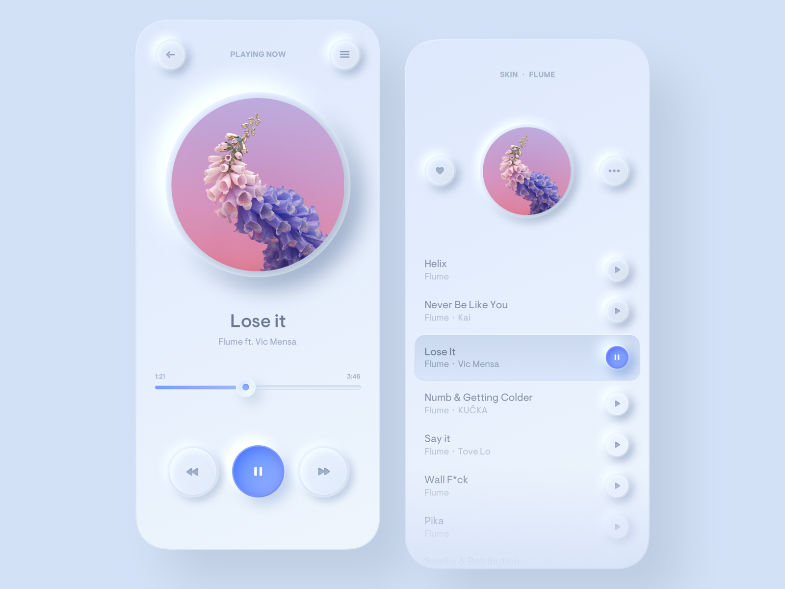
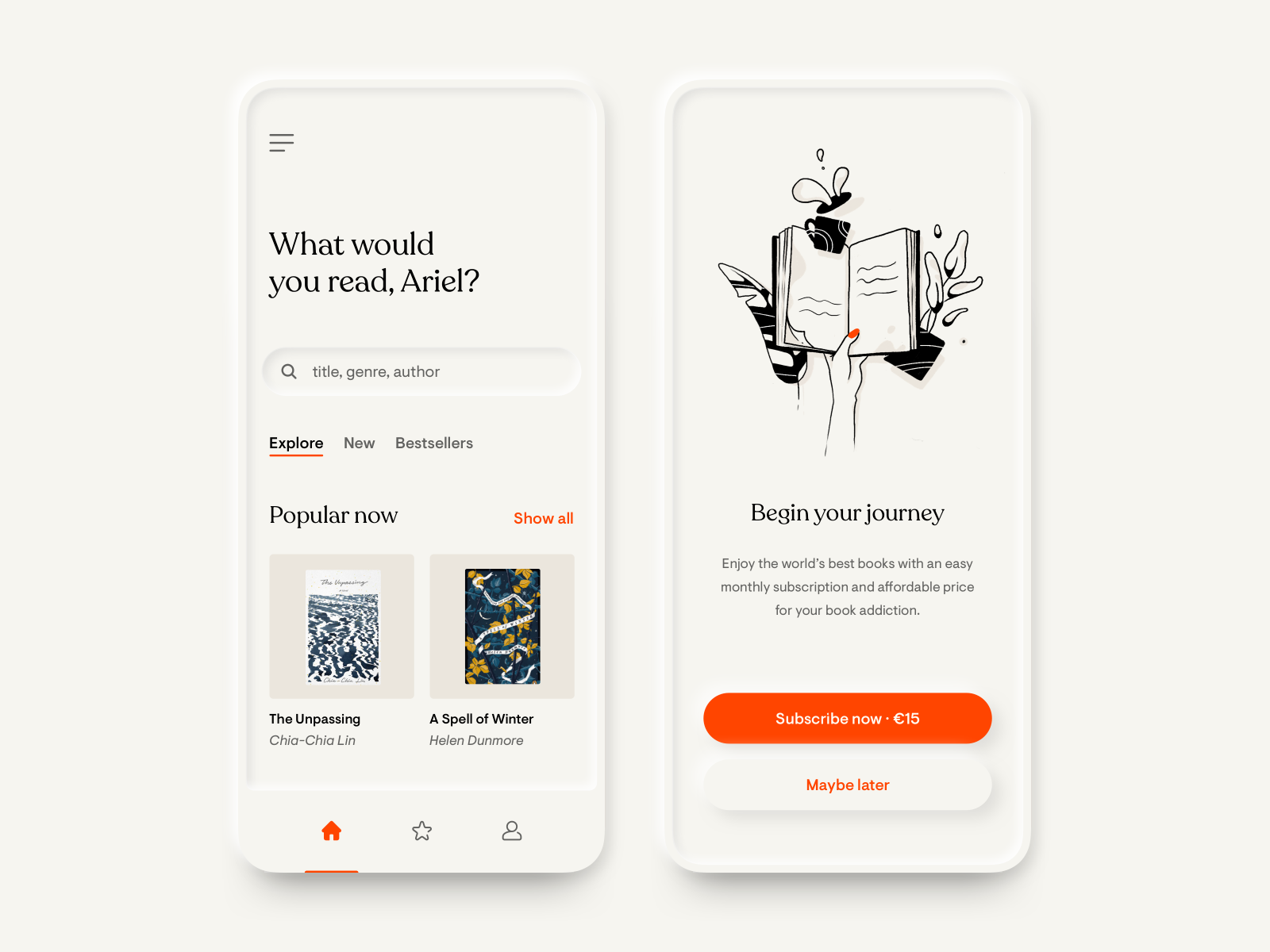
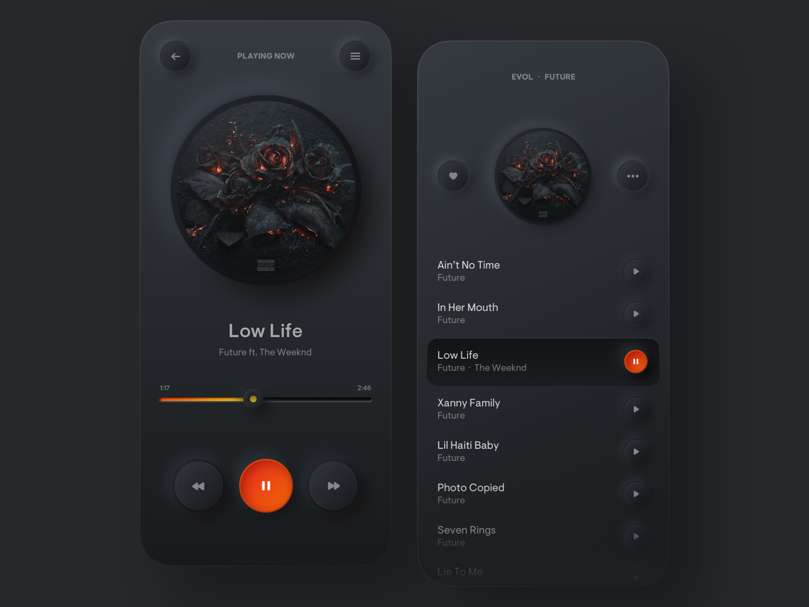
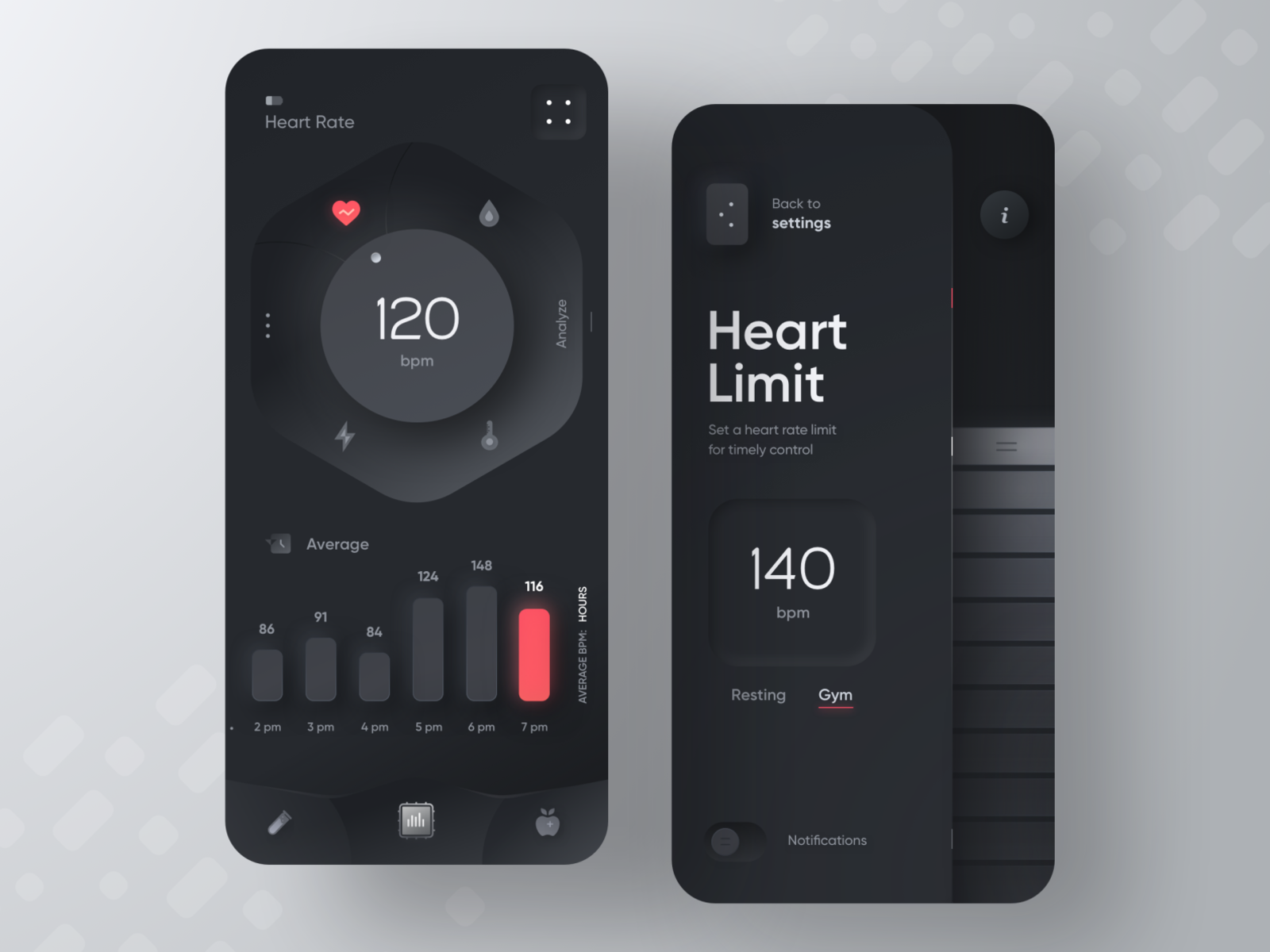
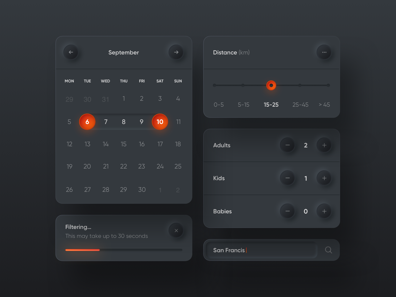
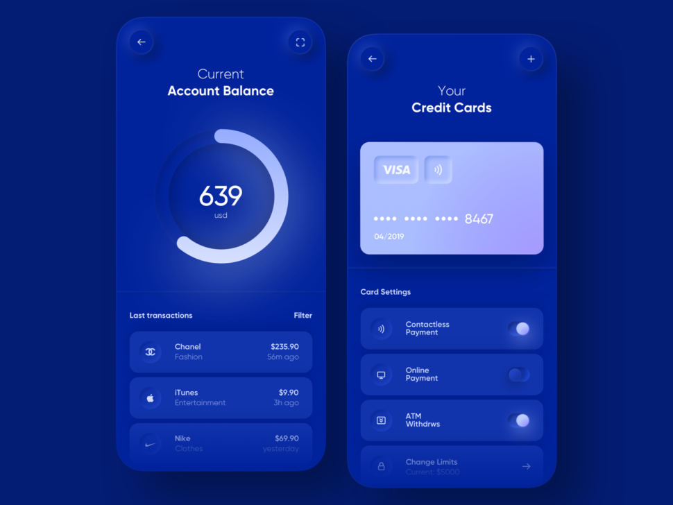
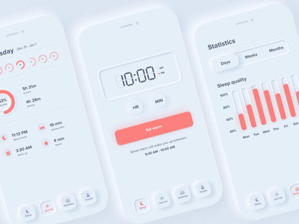
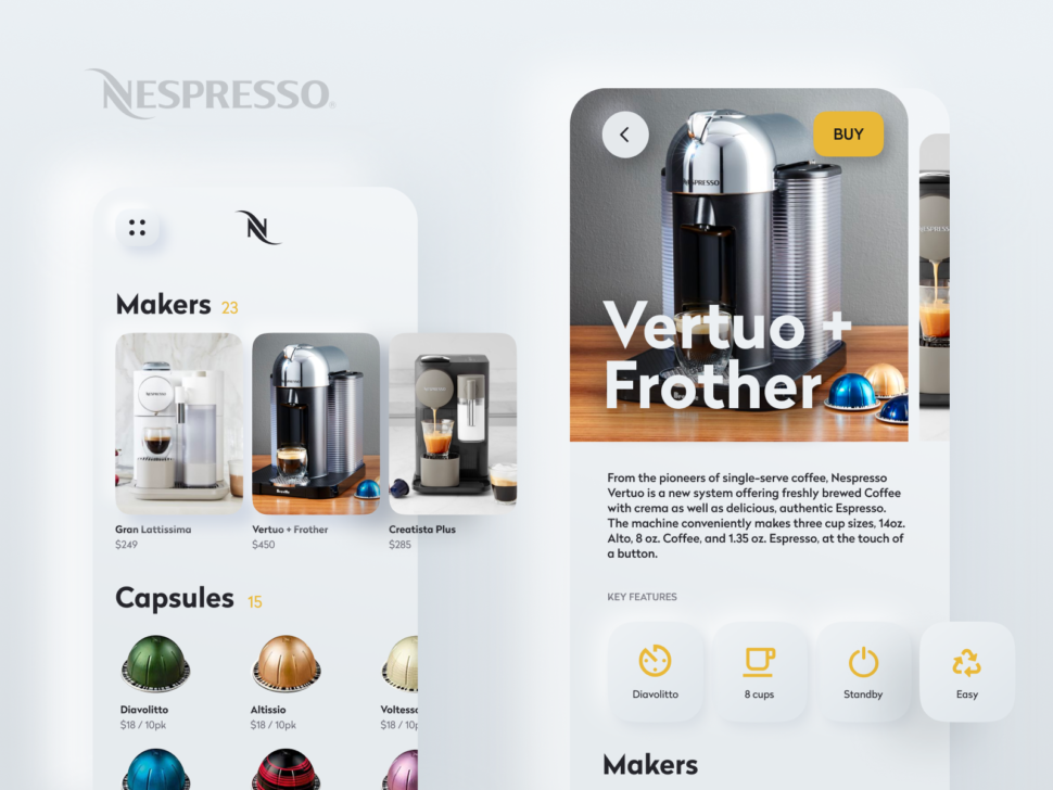
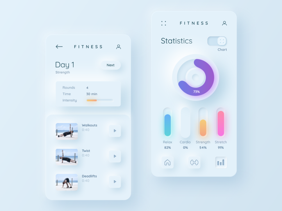
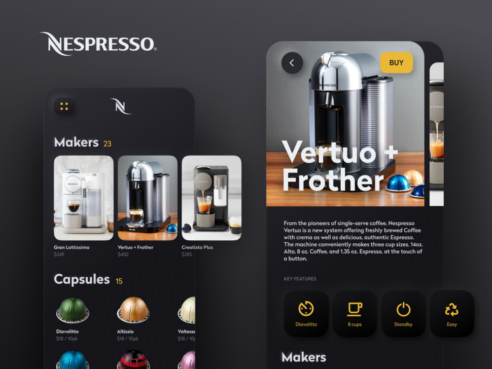
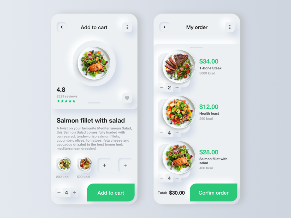
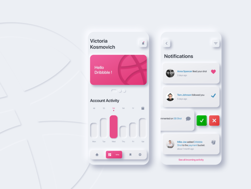
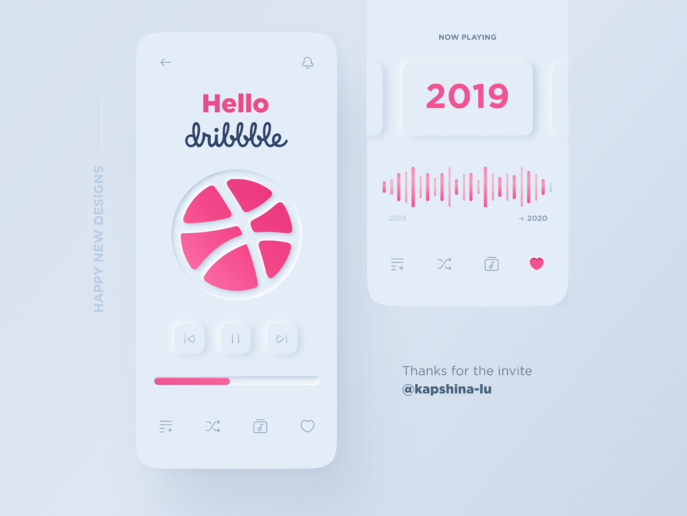
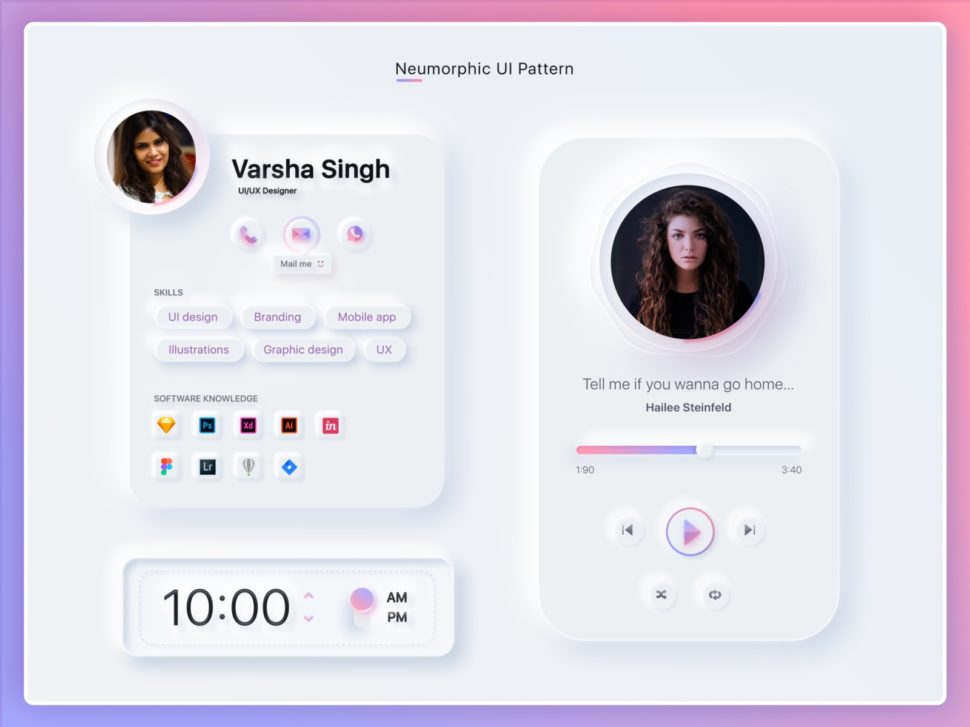
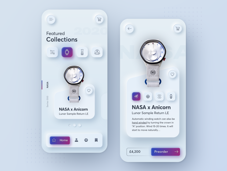
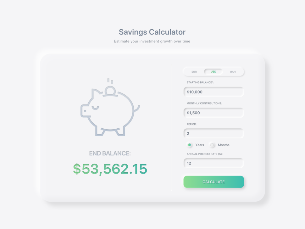
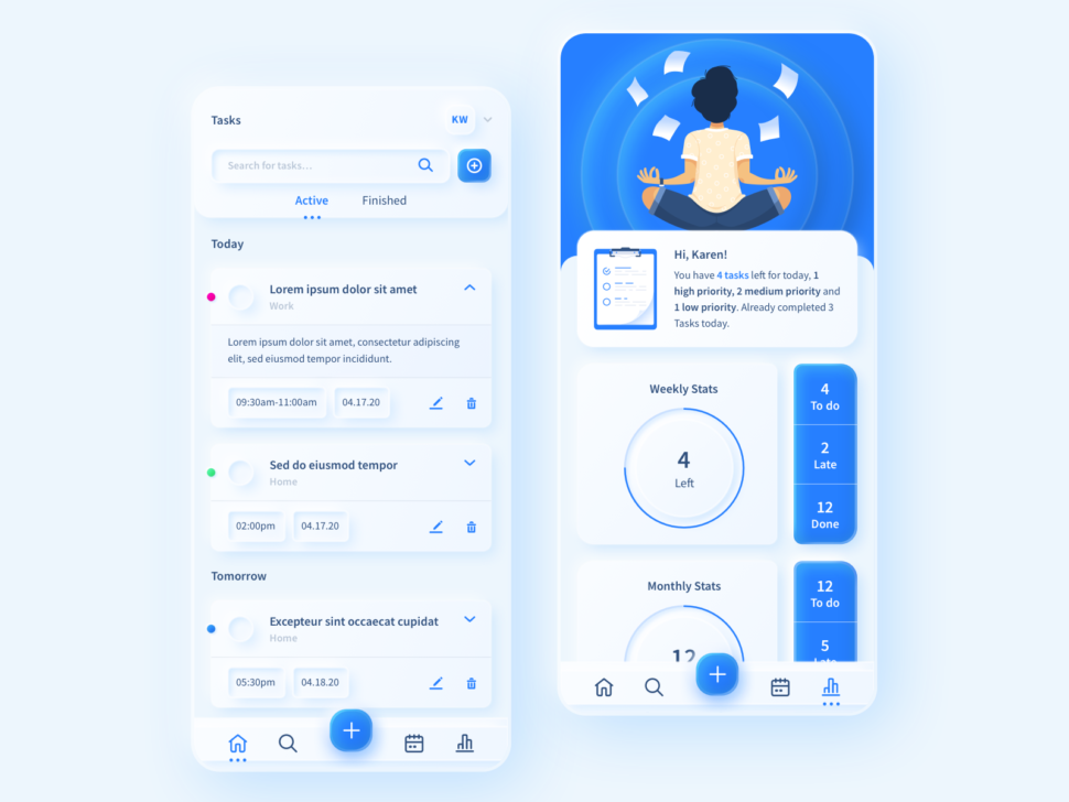
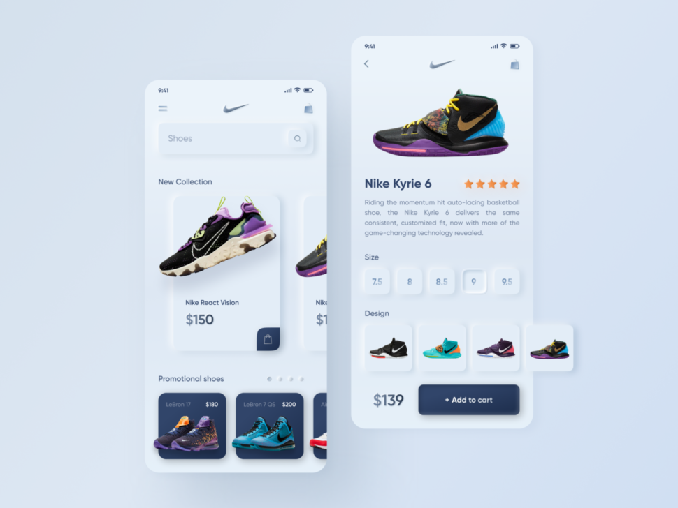
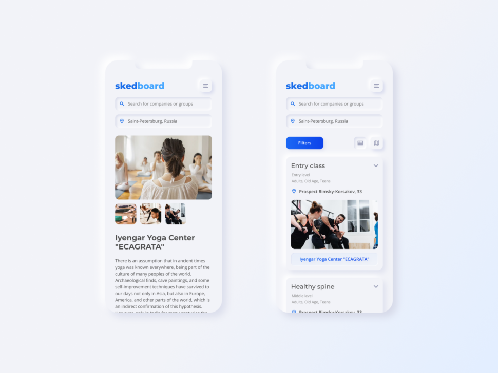
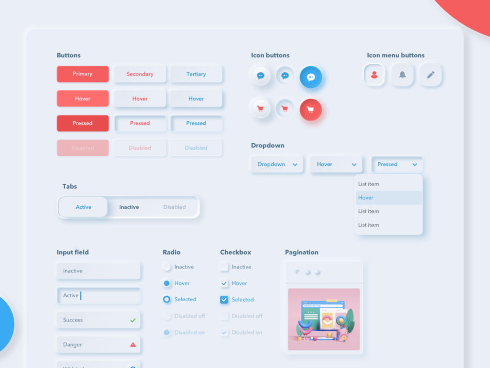
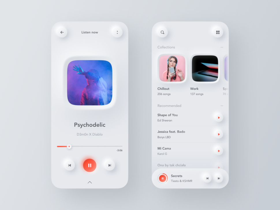
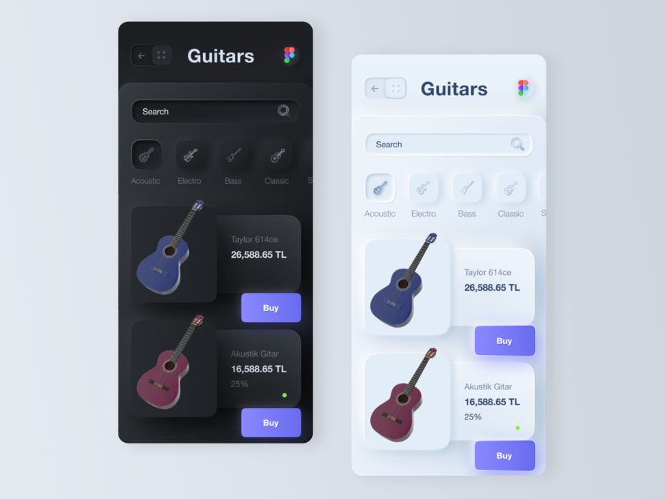
Neumorphism is a new modern graphic design technique that is a combination of skeuomorphism, flat design, and realism.

[source]

Neumorphism is actually a play on words that means New Skeuomorphism.

If you’re not familiar with the term skeuomorphism, well, think of the old version of Apple, before they had all their sleek, minimalist, and modern updates.

[source]

Skeuomorphism is the design concept of making items represented resemble their real-world counterparts. Skeuomorphism is commonly used in many design fields, including user interface (UI) and Web design, architecture, ceramics, and interior design. Skeuomorphism contrasts with flat design, a simpler graphic style. [source]

Neumorphism, on the other hand, takes all of the best qualities of skeuomorphism and combines it with flat design.

Which gives us my favorite design trend of all time.

It’s like when you see neumorphism on an app, you actually think you’re going to touch it and experience it in real life.

It’s the craziest feeling, and that’s probably why I love it so much.

30 Examples of Neumorphism Done Right

I want to show you guys my top favorite examples of neumorphism that I found on Dribbble, so let’s have at it.

[source]

[source]

[source]

[source]

[source]

[source]
[source]
[source]
[source]
[source]
[source]
[source]
[source]
[source]
[source]
[source]
[source]
[source]
[source]
[source]
[source]
[source]
[source]
[source]
[source]
[source]
[source]
[source]

I know I love neumorphism, but I want to know what you think about it!

Let me know in the comments if you think this new trend is a vibe, or if you’re onto a whole different trend.

Until next time,

Stay creative, everybody!

Read More at 20 Amazing Examples of Neumorphism – New Design Trends 2020

Categories: Designing, Others Tags:

Thanks to Covid-19, Website Accessibility Has Never Been More Important

May 7th, 2020 No comments

The first global pandemic of the digital era is upon us. We’re living in unprecedented and uncomfortable times.

For our senior citizens, these past several weeks have been particularly discomforting. According to the CDC, men and women over the age of 65 are significantly more likely to develop complications from COVID-19. As we seek to restrict the spread of coronavirus, it’s critical that we protect one another, especially our elders, and adhere to current directives to practice and enforce social distancing. Isolating ourselves in a bid to stop the spread of disease is incredibly important as we aim to protect seniors, in particular.

As more of us stay home under quarantine (can’t say I would have ever imagined writing those words), it’s only natural that we will become even more reliant on our connection to the digital world.

In one form or another, just about all of us have come to rely on countless digital services. Consider, for instance, the many services that seniors typically rely on. There’s email. There’s medical resources — information as well as online appointments with a doctor. There are shopping websites, particularly for food. Certainly, we are all trying to keep pace with the unceasing wealth of information pouring in day after day surrounding this rapidly evolving global event. So there’s also this basic need for news, which is more heightened than ever. The list goes on and on. From paying our bills to ordering our groceries and staying on top of 24/7 news cycles, unimpeded access to web has never felt so urgent.

But the fact is, for many of the individuals who are most at risk, fully engaging with your website and applications can be difficult or, even, impossible. The prevalence of disabilities and impairments impacting one’s use of a computer or mobile device increases with age, so our seniors are more likely to face obstacles when websites are not coded with website accessibility in mind. This is a demographic that represents 16-percent of the United States population, including seniors.

The needs of our aging population overlap, in many ways, with the needs of our population with disabilities. Seniors often have impairments that make using online and web-based technology difficult. These are just a few of the digital access barriers that are impacting tens of millions of people around the world:

  • Vision: Contrast sensitivity can be reduced, color perception can be difficult, and focus can be hard, making web pages particularly difficult to read when text is not crisp, clear and large. Someone with cataracts, macular degeneration or any other impairment causing low vision may not be able to fully engage and interact with a website if it isn’t created to support zooming or provide options to enlarge text.
  • Motor control and dexterity: Using a mouse can be difficult, painful or even simply impossible for some users. Clicking that mouse or pressing that button, especially on small call-to-action buttons, can be similarly challenging. If you have developed severe tremors that have made it impossible to use a mouse to navigate, a website will only be usable if measures have been taken to support visual focus and keyboard navigation.
  • Cognitive function: The modern web is dynamic, interactive and ever-changing. For example, fast moving carousels that rapidly transition from one block of information to the next can be too overwhelming for those requiring more time to read and process information. Controls are needed to pause highly interactive features and functions.
  • Hearing: As we get older, our hearing gets weaker. It shouldn’t be a surprise to anyone that, for seniors, multimedia content such as videos, podcasts, and other formats can present barriers if captioning and transcripts aren’t provided.

In this moment and for all the reasons mentioned above, it has never been more crucial that our websites and online shopping experiences be accessible. Designing for accessibility means making sure that all users, including those who are ageing and those with disabilities, can access your site and move across it with ease. Looking beyond COVID-19, this is an ever-growing demographic. The number of seniors will drastically increase in the coming decades. If your website isn’t accessible, the time to take action is now.

Luckily, if you’re ready to design your website with the accessibility of an ageing population in mind, you’re not on your own. The Web Content Accessibility Guidelines (WCAG) take into account this wide overlap between users with disabilities and older adults. This informative guidance lays out a clear checklist that web designers should follow and website administrators should keep in mind to ensure that everyone, regardless of their year of birth, can navigate your website across every tab and every corner.

As we look to accommodate senior citizens and also build a web that is equipped for our future selves, here are some key steps you can take to ensure an optimal and accessible user experience for all your users:

Readability

  • Use relative font-sizes and ensure text containers resize.
  • Use legible fonts. When in doubt, use sans serif fonts such as Arial, Open Sans, Helvetica or similar.
  • Consider color blindness and consistently use a high level of contrast between text foreground colors and background color. Ensure a contrast ratio of at least 4.5:1.
  • Make sure links are clearly marked. Using color, alone, is insufficient, whereas underlining helps identify links.
  • Avoid overuse of symbols, acronyms, and iconography. Use text instead.

Function

  • Create enough space between clickable elements such as buttons and links.
  • Test your site as a keyboard user; make sure focusable elements receive focus and that focus is clearly identified; provide skip navigation links to enable greater keyboard navigation efficiency.
  • Make sure link or button purpose is properly conveyed. Users shouldn’t have to guess where they will be taken to next.
  • Provide controls to pause auto-rotating carousels or animated content. Users may need more time to read, understand, and interact.
  • Make sure forms are properly labelled; avoid using placeholder text that disappears on focus.
  • Ensure proper error handling and make sure any alert notifications and modal interfaces are keyboard accessible.

Organization

  • Make sure navigation is consistent, easy to follow, and predictable across the site.
  • Take the time to integrate breadcrumbs, so users can better track their location within the context of your navigation hierarchy.
  • Avoid distracting content, excessive amounts of information and use plain-spoken language.

Multimedia

  • Older viewers may experience a decline in both auditory and visual perception. Be sure to make your videos accessible with captions.
  • Provide transcripts for audio-only content.

This challenging time we are all living through is particularly – and unjustly – amplified for our senior citizens and the millions of individuals with disabilities relying on an equal digital playing field. Equal access online still isn’t a guarantee. Together, we can work to eradicate every barrier to digital access.

Featured image via Pexels.

Source

Categories: Designing, Others Tags: