Archive

Archive for June, 2020

Internationalization In Vue With The Vue I18n Plugin

June 12th, 2020 No comments
config options for Vue I18n plugin.

Internationalization In Vue With The Vue I18n Plugin

Internationalization In Vue With The Vue I18n Plugin

Timi Omoyeni

2020-06-12T10:00:00+00:00
2020-06-15T05:34:05+00:00

Building applications for people from different parts of the world comes with challenges like support for multiple locales and how to integrate it into your application. I remember the first time I faced this challenge, I had to build an application that was going to have multiple languages (English, Yoruba, and French). This was the first time I ever wondered how applications that supported multiple languages were built and also how I discovered “Internationalization”.

In this tutorial, we’re going to learn about Internationalization and how to implement it in our Vue application using the Vue I18n plugin by building a simple app that uses this plugin. This plugin helps you configure your application to work with multiple locales and allows your user to choose between all the available locales without you having to do too much.

I have put together a simple application for the purpose of this tutorial and it can be found on Github.

This article requires basic knowledge of the Vue.js framework. For those looking to get started with Vuejs, I recommend you start from their official documentation.

React Internationalization

How can we build an internationalized React front-end application? Yury Dymov explains how you can detect the user’s locale, save it in the cookie, let the user change their locale, translate the user interface, and render currencies in their appropriate formats. Read article ?

What Are i18n And Vue-i18n?

Internationalization (i18n)

Internationalization (sometimes shortened to “I18N, meaning “I — eighteen letters — N”) is the process of planning and implementing products and services so that they can easily be adapted to specific local languages and cultures, a process called localization. Imagine you’re building a product for people in the USA and France, without internationalization, this would mean building two separate applications in different locales to run on different domains (English version on amazingproduct.us and French version on amazingproduct.fr).

This is where Internationalization comes in. It helps people from both countries easily use the application in the locale of their choice (English or French). Internationalizing your application comes with benefits such as:

  1. Single source code for all languages of the product.
  2. Greater in-country customer acceptance and satisfaction.
  3. It makes the maintenance of the product easier and simpler.
  4. Reduced time, cost, and effort for localization (L10n).

Internationalization in Vue

Internationalization can be implemented in Vue using the Vue I18n plugin. It easily integrates some localization features to your Vue.js application. It can be added to your application in one of the following ways:

  • By direct download/CDN — using this CDN link for the latest release on NPM.

After which it would be included in head section of your html file.

<script src="https://unpkg.com/vue-i18n/dist/vue-i18n.js"></script>
  • By installing from NPM or Yarn.
npm install vue-i18n
// or
yarn add vue-i18n
  • By adding it using the Vue Cli 3.x (You need Vue cli 3.x).
vue add i18n

Setting Up Vue-i18n In Your App

To set this plugin up in your application, we’re going to use the Vue CLI method. That can be done using this command:

vue add i18n

On running this command, you would be prompted to select config options to choose from. For this tutorial, I’ve gone ahead to select all the default options for setting up this plugin. This looks like this:

config options for Vue I18n plugin.

Config options for Vue I18n plugin. (Large preview)

Let’s take a look at what they do:

  1. The first option is to set the default locale the application would be in and in this case, I have gone ahead to set it to English.
  2. The second option is to set a fallback locale for the application and fallback is going to serve as a backup locale for your application if you fail to provide a translation in another locale and I selected English. This would be talked about later on in this article.
  3. The third option is for choosing a directory for storing all the locale json files to be used for localization in the app and I selected the default option which is locales.
  4. The last option is for enabling component-based localization in Single File Components. This means deciding whether or not you want to enable translation inside a component and I enabled it in my configuration. We would talk about this later on in the article.

Once this is done, your plugin would be configured to work in your app and you would be notified of some extra files that this plugin has added to your app.

A list of files added/modified by the plugin.

Vue-i18n config files. (Large preview)

Let us take a look at some of the files that were added to our app so we can understand their purpose:

/locales folder

This folder serves as a base for all the locales that would be used in our app. If you open this folder, you will find an en.json file and this is because en was my selected locale for this project. What this means is that the file you will find inside your locale folder is dependent on your choice while setting up the plugin.

/locales/en.json

This file is for adding texts in the particular locale(file name e.g en, fr) so that when a user switches to that locale, your app fetches all your texts from the JSON file that matches the locale. By default, this file contains one property that serves as a demo for setting up your application, it looks like this:

{
  "message": "hello i18n !!"
}

Here, we have a message property that we can use anywhere in our file using this format:

<p> {{ $t('message') }}

if we view this in our browser, what we would see would be the value of message and not “message”.

Hello i18n.

What vue-i18n displays in the browser. (Large preview)

Now if you change the value of message in your file, it would be updated in your browser accordingly.

HelloI18n.vue

This file serves as an example of how to use the plugin in Single File Components. If you inspect the file, you would find a tag in the script section of this component. According to the documentation you would need to install vue-i18n-loader to use this tag but you do not have to worry about this if you added it as a config option when installing the plugin. Inside this tag, we have an object which contains en (or your default locale) property which has a hello property with a value. This looks like this:

<i18n>
{
  "en": {
    "hello": "Hello i18n in SFC!"
  }
}
</i18n>

What this means is that you have given a component a value that is different from the value found in the en.json file inside the locales folder. In the template section of this component, we have:

<template>
  <div>
    <p>{{ $t('hello') }}</p>
  </div>
</template>

Here, we see $t(''), this is the syntax for referencing texts(t stands for texts) from our plugin, and in this component, we’re using the value of hello that we added inside the i18n tag. If we check our browser, we should see Hello i18n in SFC! even if there is no hello property in the en.json file. This is called Component-based localization and we would go deeper into it later on in this article.

Formatting Texts

This plugin comes with the option to format your texts in different ways which can be helpful in enhancing user experience and we’re going to be looking at some of these formats.

Named Formatting

This type of format option allows you add a dynamic value inside your text which would be defined when rendering the text in your browser. This type of format is useful when you want to add a personalized text with a user’s info on login or after performing an action. To see how that works, we’re going to add a new page to our app and call it formatting.vue, we’re also going to add this as a route in our app.

First, let’s create the file and add the following lines of code:

<template>
  <section>
    <h1>{{$t('formattingTitle')}}</h1>
    <p v-show="showMessage">{{ $t('hello', {name: name}) }}</p>
    <form @submit.prevent="showMessage = true">
      <label for="name">{{ $t('name') }}</label>
      <input type="text" name="name" id="name" v-model="name" />
      <input type="submit" :disabled="name.length < 1" value="send" />
      <label for="hideMessage" v-if="showMessage">
        <input type="checkbox" name="hideMessage" id="hideMessage" v-model="showMessage" /> Show Message
      </label>
    </form>
  </section>
</template>
<script>
export default {
  data() {
    return {
      name: "",
      showMessage: false
    };
  }
};
</script>
<style>
form {
  width: 100%;
  max-width: 300px;
  margin: 20px auto;
}
label {
  display: block;
  width: 100%;
  text-align: left;
  margin-bottom: 5px;
}
input[type="text"] {
  width: 100%;
  height: 30px;
  border-radius: 3px;
  border: 1px solid #eee;
  padding-left: 10px;
  box-sizing: border-box;
  margin-bottom: 10px;
}
input[type="submit"] {
  width: 80px;
  height: 30px;
  border-radius: 3px;
  border: 0;
}
</style>

In the template section of this file, we make use of this plugin to add a title (which we’re yet to add) to this page. Inside the

tag, we make use of the named format to add a personalized message for the user which only displays if (v-show) showMessage is true. We have a form with an input field (connected to our data using v-model) that accepts a name that is passed to our plugin when the user submits the form. We have a checkbox that hides the message and a submit button that toggles showMessage to true.

In the script section, we have name and showMessage inside our data. Both of these variables are used in our form to store the user’s input and toggle the message respectively.

Now, let us add this hello to our en.json file (your default locale file). This looks like this:

{
  "formattingTitle": "How to format your texts",
  "name": "What is your Name?",
  "hello": "Hi {name}, today is a good day"
}

Here, formattingTitle is the title for our formatting page while hello makes use of the name format that we used on the same page.

Finally, let us add this page to our router file. This looks like this:

import Vue from 'vue'
import Router from 'vue-router'
import Home from './views/Home.vue'
Vue.use(Router)
export default new Router({
  mode: 'history',
  base: process.env.BASE_URL,
  routes: [{
      path: '/',
      name: 'home',
      component: Home
    },
    {
      path: '/formatting',
      name: 'formatting',
      // route level code-splitting
      // this generates a separate chunk (about.[hash].js) for this route
      // which is lazy-loaded when the route is visited.
      component: () => import( /* webpackChunkName: "format" */ './views/formatting.vue')
    }
  ]
})

In the router file, we make use of route level code-splitting to load our component into its route (i.e /formatting ) which is another way of adding a component to a route in Vue.

Now, if we navigate to /formatting in our browser, we should see this:
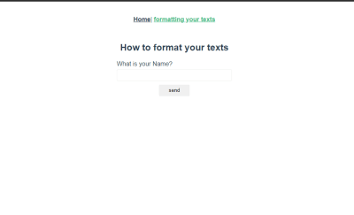
Formatting page with an input field for name.

Current formatting page. (Large preview)

Now, when you enter a value into the input field and press enter, you would see a personalized text above your form field.
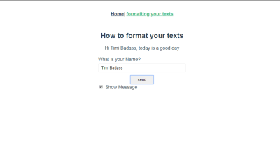
Formatting page containing a personalized greeting text with an input field with a name.

Named formatting in action. (Large preview)

HTML Formatting

This involves using valid HTML in your text instead of plain text. This can be useful when you’re trying to display HTML formatted text to the user. Let us see how that works in our app.

Add the following to your locale file.

{
  "htmlText": "<h1>HTML Rocks ❤❤</h1>"
}

In our formatting.vue file, add the following lines of code after your form to the template section of this file.

<div v-html="$t('htmlText')"></div>

Here, we make use of Vue’s HTML directive to bind our text to this div. If you check it out in your browser, you should see the value of htmlText being rendered and if you inspect the div element, you should see the h1 element nested inside this div.

Formatting page with devtools open below it.

Representation of HTML formatting. (Large preview)

Switching Between Locale

Switching from one locale to another can be done by adding a file with this format to your locale folder.

locale abbrevation + json
//eg en.json, fr.json, ru.json, de.json

After creating this file and adding a text(e.g ‘hello’) we want to use in our app, you can reference a text in that locale in two ways:

  • Per text:
<p>{{ $t('hello', 'de') }} </p>

This would render hello, but in Deutsch assuming we have it defined in that locale.

  • Globally using this.$i18n.locale:
console.log(this.$i18n.locale)
// prints 'en.json' because 'en' is my selected locale
this.$i18n.locale = 'de'
// sets your locale to 'de'

Let us add another use case to our application. The first thing we’re going to do is add a new file to our locale folder and name it de.json then add this line object to the file.

{
  "home": "Zuhause",
  "formatting": "Formatieren Sie Ihre Texte",
  "formattingTitle": "So formatieren Sie Ihre Texte",
  "name": "Wie heißen Sie?",
  "hello": "Hallo {name}, heute ist ein guter Tag",
  "htmlText": "

HTML Rocks ❤❤

" }

We already have the en version of everything here in our en.json file but we want to be able to switch between en and de so we add the Deutsch translation of this to our de.json file.

The next thing would be to add a button that switches between en and de inside our formatting.vue file. Add this to your file:

<template>
  <section>
    <!-- existing div element -->
    <div v-html="$t('htmlText')"></div>
    <button @click="switchLocale">Switch to {{locale}}</button>
  </section>
</template>
<script>
export default {
  data() {
    return {
      name: "",
      showMessage: false,
      locale: "Deutsch"
    };
  },
  methods: {
    switchLocale() {
      this.$i18n.locale = this.locale === "English" ? "en" : "de";
      this.locale = this.$i18n.locale === "en" ? "Deutsch" : "English";
    }
  }
};
</script>

In the template section, we have added a button with a click event that changes the locale from either en to de or vice versa. We also have a locale variable that dynamically changes from English to Deutsch. In the script section, we have added a locale variable to the data function of this component. Finally, we have a switchLocale method that is called whenever a user clicks on the button. This method changes the value of this.$i18n.locale using a ternary operator to determine it’s own value between de and en based on what locale is. This means if locale is English, this.$i18n.locale will be en and if this.$i18n.locale is de, locale will be English.

If you view this in your browser, you should see this:

Formatting Page translated in English.

Formatting page in default locale. (Large preview)

And when you click on the button, you should see that every text on your page; in this component and globally, has changed from the default locale to Deutsch.

Formatting page transalted in Deutsch.

Formatting page in changed locale(de). (Large preview)

If you enter your name and submit the form, you should also see that it has been translated and looks like this:
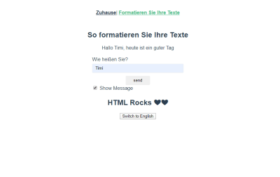
Formatting page with personalized message in Deutsch.

Formatting page with personalized message in Deutsch. (Large preview)

Fallback Localization And Pluralization

Fallback Localization

There are cases where you would not have the value of a property available in a selected locale. Instead of your app crashing as a result, it fetches the value of the text from the default locale and prints a warning error to your console. Let us look at an example.

We’re going to add this text to our en.json file:

  {
  "fallbackLocale": "Fallback Localization",
  "placeholder": "This is the fallback text"
}

And in our de.json file, we’re only going to add this:

{
  "fallbackLocale": "Fallback-Lokalisierung"
}

In our formatting.vue file, add this piece of code inside the file:

<template>
  <section>
    <!-- last button -->
    <button @click="switchLocale">Switch to {{locale}}</button>
    <div>
      <h1>{{ $t('fallbackLocale') }}</h1>
    </div>
    
  </section>
</template>
</style>

Here, we have added a text with the property name fallbackLocale inside an h1 tag that serves as the heading for this page. We also have a p tag that has a property name placeholder inside the plugin but with another parameter, de which as we’ve seen earlier, is a way of telling the plugin to fetch that property in the specified locale (de in this case).

Now, we should see this in our browser.
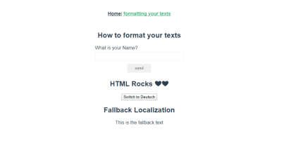
formatting page with fallback text.

Formatting page with fallback text. (Large preview)

We can notice that although we set placeholder to de, the text displayed is in en. This is because although we have set placeholder to display in another locale, it isn’t translated in the selected locale, and hence, the plugin would display this property in the default locale while printing a warning message to your console.
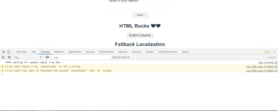
Formatting page with fallback warning in devtools console.

Fallback warning in console. (Large preview)

Pluralization

This is the process of giving plural form to a word. For instance, you’re building an eCommerce application and you want to render an item in a user’s shopping cart based on the number they have in their cart. You can handle pluralization in your plugin by using a pipe | separator between all the plural forms in your locale.

To see how that works, let us add this to our en.json file.

{
  "developer": "no developer | one developer | {n} developers"
}

Note that the variable can be called anything but I have called it n.

And in your formatting.vue file, instead of using $t(''), we would use $tc('') which also accepts a number as a second parameter ( n which we added in our locale file). So, if we add the following lines of code to our template.

<p>{{ $tc('developer', 0) }}</p>
<p>{{ $tc('developer', 1) }}</p>
<p>{{ $tc('developer', 2) }}</p>

Here, we set the first value for n to be zero, the second one is set to 1 and the last one is set to 2. Let us see what this looks like in our browser.
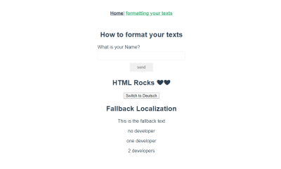
Pluralization of texts on formatting page.

Implementation of pluralization. (Large preview)

We can see that the plugin has translated each value and used the appropriate plural depending on the value of n.

Recommended reading: How To Conduct Website Localization: Don’t Get Lost In Translation

Component-Based Localization

There are cases where you’re only going to need some words or sentences in a component alone or instances where a global text has a different meaning in a particular component and in cases like this, component-based localization comes in handy. Component-based localization is the process of translating text/group of texts inside a component thereby making it only available inside such component. One thing we have to note is that the translation available inside your component takes precedence over the global translation so that if for instance, you’re using hello in more than one place in your app and you want it to have a longer text or more personalized for a component, you only need to create a localization config for that component and define your new translation of hello.

If we open our Components folder, we should see a Helloi18n.vue file that was added to our app when we installed the plugin, this component was added to serve as a guide on how component-based localization works.

To understand better, let us add the following translation inside our element.

<i18n>
{
  "en": {
    "hello": "Hello, {name}, this is i18n in SFC!",
    "greetings": "Component-Based Localization",
    "placeholder": "This is a component-based fallback text"
  }
}
</i18n>

Here, we add a translation for hello, greetings and placeholder, all of which are also translated in the global en.json file.

And in our component, let us add the following:

<template>
  <div>
    <h1>{{ $t("greetings") }}</h1>
    <p v-if="name.length > 0">{{ $t('hello', {name: name }) }}</p>
    <p>{{ $t('placeholder') }}</p>
  </div>
</template>
<script>
export default {
  name: "HelloI18n",
  props: ["name"]
};
</script>

Here, we have a heading that displays a translated greetings text, a paragraph tag that makes use of named formatting to display a personalized hello text from a name variable that would be passed to the component as a prop.

Finally we’re going to display this component in formatting.vue. Let us import it into this file:

<script>
// @ is an alias to /src
import HelloI18n from "@/components/HelloI18n.vue";
export default {
  // existing code
  components: {
    HelloI18n
  }
};

Here, we import the Helloi18n.vue component using @ alias and define it inside the components property of our component.

And add it to our template like this:

<template>
  <section>
    <!-- existing code -->
    <HelloI18n :name="name" />
  </section>
</template>

We defined a prop value name inside the Helloi18n component, so we pass it a value of name which we would get from the input field in the formatting.vue page.

Now, if we view this page in our browser, we should see this:
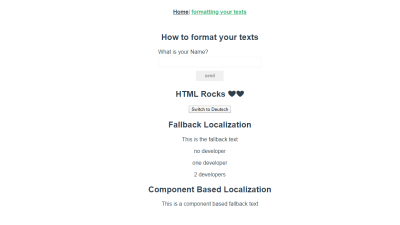
Component-based localization.

Component-based localization. (Large preview)

We can see that although we’re using the same greetings, hello and placeholder text from the global translation file, the translation in the component is exactly what we defined inside the tag.

Conclusion

The Vue I18n plugin has a lot of use cases like:

  • DataTime localization,
  • Number localization,
  • Locale message syntax,
  • Lazy-loading translation, and so on.

All of which help in completely achieving internationalization of your application, so I would recommend you go through the full documentation and play around with some of them to get yourself familiarized with them.

Resources

(ks, ra, yk, il)

Categories: Others Tags:

CUBE CSS

June 11th, 2020 No comments

A CSS methodology from Andy Bell:

The most important part of this methodology is the language itself: CSS. It’s key to note its existence in the name because some alternative approaches, such as BEM—which I have enjoyed for many years—can veer very far away from Cascading Style Sheets. I love CSS, though and think that its core capabilities are actually key to scalable CSS.

A favorite bit…

[…] a design system doesn’t just make you think at a micro-level, but also at a macro-level, because you have to make not just decisions about pixels, but also high-level organisation decisions which the design system helps to solve. Design system work is actually diplomacy work, a lot of the time.

This is often where I see narrow, component-only tunnel vision fall short and really, these approaches are less design systems, but more component libraries that solve a much narrower cohort of problems.

I like the idea of approaching CSS both from an inside-out philosophy — focusing on styling very small specific things then grouping them together to grow bigger thing — and from an outside-in philosophy — not forgetting that components need to be composed together sensibly.

Direct Link to ArticlePermalink

The post CUBE CSS appeared first on CSS-Tricks.

Categories: Designing, Others Tags:

On Adding IDs to Headers

June 11th, 2020 No comments

Here’s a two-second review. If an element has an ID, you can link to it with natural browser behavior. It’s great if headings have them, because it’s often useful to link directly to a specific section of content.

<h3 id="step-2">Step 2</a>

Should I be so inclined, I could link right to this heading, be it from an URL, like https://my-website.com/#step-2, or an on-page link, like:

<a href="#step-2">Jump to Step 2</a>

So, it’s ideal if all headers have unique IDs.

I find it entirely too much work to manually add IDs to all my headers though. For years and years, I did it like this using jQuery on this very site (sue me):

// Adjust this for targetting the headers important to have IDs
const $headers = $(".article-content > h3");

$headers.each((i, el) => {
  const $el = $(el);

  // Probably a flexbox layout style page
  if ($el.has("a").length != 0) {
    return;
  }

  let idToLink = "";

  if ($el.attr("id") === undefined) {
    // give it ID
    idToLink = "article-header-id-" + i;
    $el.attr("id", idToLink);
  } else {
    // already has ID
    idToLink = $el.attr("id");
  }

  const $headerLink = $("<a />", {
    html: "#",
    class: "article-headline-link",
    href: "#" + idToLink
  });

  $el.addClass("has-header-link").prepend($headerLink);
});

That script goes one step further than just adding IDs (if it doesn’t already have one) by adding a # link right inside the heading that links to that heading. The point of that is to demonstrate that the headers have IDs, and makes it easy to do stuff like right-click copy-link. Here’s that demo, if you care to see it.

Problem! All the sudden this stopped working.

Not the script itself, that works fine. But the native browser behavior that allows the browser to jump down to the heading when the page loads is what’s busted. I imagine it’s a race condition:

  1. The HTML arrives
  2. The page starts to render
  3. The browser is looking for the ID in the URL to scroll down to
  4. It doesn’t find it…
  5. Oh wait there it is!
  6. Scroll there.

The Oh wait there it is! step is from the script executing and putting that ID on the heading. I really don’t blame browsers for not jumping to dynamically-inserted links. I’m surprised this worked for as long as it did.

It’s much better to have the IDs on the headings by the time the HTML arrives. This site is WordPress, so I knew I could do it with some kind of content filter. Turns out I didn’t even have to bother because, of course, there is a plugin for that: Karolína Vysko?ilová‘s Add Anchor Links. Works great for me. It’s technique is that it adds the ID on the anchor link itself, which is also totally fine. I guess that’s another way of avoiding messing with existing IDs.

If I didn’t have WordPress, I would have found some other way to process the HTML server-side to make sure there is some kind of heading link happening somehow. There is always a way. In fact, if it was too weird or cumbersome or whatever to do during the build process or in a server-side filter, I would look at doing it in a service worker. I’ve been having fun playing with Cloudflare’s HTMLRewriter, which is totally capable of this.

The post On Adding IDs to Headers appeared first on CSS-Tricks.

Categories: Designing, Others Tags:

How to Reverse CSS Custom Counters

June 11th, 2020 No comments

I needed a numbered list of blog posts to be listed with the last/high first and going down from there. Like this:

5. Post Title
4. Post Title
3. Post Title
2. Post Title
1. Post Title

But the above is just text. I wanted to do this with a semantic

    element.

    The easy way

    This can be done using HTML’ s reversed property on the

      :

      <ol reversed>
        <li>This</li>
        <li>List</li>
        <li>Will Be</li>
        <li>Numbered In</li>
        <li>Reverse</li>
      </ol>

      For most people, this would be enough. Job done.

      But I needed custom styles for the counters.

      Let it be known that custom list number styles can be done with the ::marker pseudo-element, but that isn’t yet supported by Chrome (although I hear it’s coming soon).

      Because I wanted fully cross-browser compatible custom number styles, I went with custom counters.

      Adding and styling a custom counter

      Styling the counters of an ordered list differently from the rest of the list requires disabling the default counters and creating and show our own using CSS Counters. Chris shared a few recipes a while back that are worth checking out.

      Assuming we have the following HTML:

      <ol class="fancy-numbered">
        <li>Item 1</li>
        <li>Item 2</li>
        <li>Item 3</li>
      </ol>

      …we first need to disable the default counters that come with all ordered lists by setting the CSS property list-style-type to none like so:

      ol.fancy-numbered {
        list-style-type: none;
      }

      That takes out all the default numbering. Next, we create a counter in CSS to track the number of items in the list.

      ol.fancy-numbered {
        list-style-type: none;
        counter-reset: a;
      }

      This gives us a counter named “a” but it can be called it whatever you like. Let’s display our counter using the ::before pseudo-element on the list item (

    1. ).

      ol.fancy-numbered li::before {
        content: counter(a)'.';
      }

      This will set the content of the pseudo-element to the value of our counter. Right now, that will print 1’s next to your list item.

      We need to tell the CSS counter how to increment.

      ol.fancy-numbered li::before {
        content: counter(a)'.';
        counter-increment: a;
      }

      The starting value of “a” is zero, which seems weird, but the default increment is 1, meaning that becomes the actual starting point. Incrementing up by 1 just happens to be the default, but we can change that as we’ll soon see.

      We can now proceed to apply any custom styles we want to the counter, because the counter is just a text pseudo-element that is wide open to styling:

      ol.fancy-numbered li::before {
        content: counter(a)'.';
        counter-increment: a;   
        position: absolute;   
        left: 0;   
        color: blue;   
        font-size: 4rem;
      }

      For example, here, we’ve made the counter color blue and increased the font size. These are things that we couldn’t do using the default counter.

      Reversing custom counters

      If we add the reversed property to the

        element like we did before, we will observe no effect because we disabled the default numbering. That’s just what this property does.

        <ol class="fancy-numbered" reversed>
          <li>Item 1</li>
          <li>Item 2</li>
          <li>Item 3</li>
        </ol>

        The code above has no effect on our custom numbering. It’s still probably a good idea to leave it on there, since our intention is to reverse the list. This keeps things semantically accurate.

        To reverse the visual order of our counter-based numbering, we need to know the total number of items in the list and instruct the counter to start from that number and then decrement from there.

        ol.fancy-numbered {
          counter-reset: a 4;
          list-style-type: none;
        }

        Here, we’re setting counter-reset to 4. In other words, we’re telling the browser to start the count at 4 instead of 1. We use 4 instead of 3, again, because the counter() rule is applied to the first item on the list, which is 0. But, in the case where we’re counting backwards, 4 becomes our 0. If we started from 3 and decremented, wind up at 0 instead of 1.

        Next, we alter our counter-increment rule to decrease by 1 rather than increase, by making it a negative integer.

        ol.fancy-numbered li:before {
          content: counter(a)'.';
          counter-increment: a -1;
          position: absolute;   
          left: 0;   
          color: blue;   
          font-size: 4rem;
        }

        And that’s it! Now the world is your oyster for stuff like step trackers:

        CodePen Embed Fallback

        Or how about a timeline:

        CodePen Embed Fallback

        Maybe a business plan?

        CodePen Embed Fallback

        The post How to Reverse CSS Custom Counters appeared first on CSS-Tricks.

Categories: Designing, Others Tags:

Reimaging Graphic Design via a Prism of Cyberpunk, Brutalism & Steampunk

June 11th, 2020 No comments

After the recent pandemic challenge, the planet is entering a new age. During a lockdown, we have faced many technology disruptions that reminded us once again about the importance of massive digital transformation. The post-Coronavirus world is now challenging the status quo and rethinking different industries. The design is not an exception.

That period has let all of us feel a slight touch of the undeniable future that is fastly rushing to us. The sunrise of tech innovations, the dominance of urbanism in our lives, and the desire to breathe in unison with the future — all these factors have created a perfect environment for the birth of new graphic design trends and a blast of the past futuristic tendencies. Here we’re introducing the five digital design trends that are predicted to gain momentum soon.

Cyberpunk Renaissance

The intriguing beauty of cyberpunk is hidden in the fact that most of us forecast that this style might become part of our everyday reality very soon. Cyberpunk is a subgenre of science fiction in a dystopian futuristic setting. It implies a mind-blowing combination of high-tech and a “low-life.” We have witnessed the popularity of cyberpunk after the turn of the millennium. Today, we experience the next wave of cyberpunk in graphic design. The cyberpunk renaissance is here right now.

Today, we can see that many companies in various industries make their brand identity designs (a logo, branding colors, and marketing visuals) based on the cyberpunk aesthetics that is often associated with innovation and extraordinary approaches to things. It helps them build a positive online image, instill desired associations with a brand, and acquire new customers.

Cyberpunk doesn’t necessarily include flying smart cars, urban dystopias, illuminated skyscrapers, etc. Some of the modern graphic designers reimagine logos, branding design, and illustrations via a prism of cyberpunk by incorporating just slight hints at this style, like a bold color palette, digitally enhanced fonts, and extraordinary layouts. Also, we often associate cyberpunk with the Akira-Esque illustrations, the active use of neons, a futuristic glitch effect, and the imitation of metals in design. A pinch of cyberpunk can make your digital business presence even more memorable and distinctive. Let’s take a look at these graphic design examples featuring cyberpunk aesthetics.

Design by Roman Kl?o

Brutalism: Honesty and Unusual Beauty

Illustration by Greg Lapin

Inspired by rough shapes of brutalist architecture, modern designers have started using this style in graphic design. Brutalism looks stark, menacing, and reminds us that there is nothing immortal or persistent in the whole Universe. A lot of brutalist designs are striving to depict the pure beauty of things without excessive decorations. Brutalism is penetrated by motifs that show us that everything is exposed to natural destruction and must be used efficiently and at the right moment.

Brutalism is often associated with simplicity, boldness, and honesty. That’s why brands that aim to emphasize these aspects in their images and reputation, use brutalism for logo design and website design. When incorporating brutalism in design, companies mostly try to let their customers know that they are ready to give up all the unnecessary restrictions and start open and honest communication with their audiences. They are ready to listen to their needs and offer relevant solutions.

Design by Eugene Paryhin for Fireart Studio
Illustration by ??rry v??ce??

Back to the Future with Steampunk

Steampunk is the next amazing subgenre of science fiction that is expected to find its reflection is graphic design. It’s a retro-meets-future style that inspires us to imagine new worlds where the past epochs are blended with the futuristic aesthetics into an engaging combination of the incompatible. This style shows us the future from the retro perspective and reveals the beauty of vintage flying apparatus, gears, timepieces, and mechanisms. These motifs are the most often used in steampunk designs. This trend is commonly associated with copper and brass, as well as a warm ochre color palette.

Even though this style hasn’t been very popular in recent years, it has gained a second life this year. Today, steampunk is one of the most incredible and loved trends gaining momentum in graphic design 2020. The brands love to use steampunk because it feels more human, warmer, and familiar to our minds than cold cyberpunk. Although it still teases our perception with an extraordinary mix of the future and past in a single style. Due to its mood and color spectrum, steampunk is usually associated with a feeling of community, adventures, ardor, and traveling through various epochs and dimensions.

Illustration by Mike | Creative Mints
Illustration by Anton Fritsler (kit8)
Illustration by Marijan Zubak

Ultra-Thin Geometry Aesthetics

The line is a fundamental element of any graphic object, defining its shape, nature, and even mood. This year sees how the stability of straight lines combines with an ethereal feeling of curves and round forms, creating a new style. Ultra-thin geometry has already become widely used by designers in industrial design, digital graphics art, and web design.

Geometric, artificially created lines depict objects from the technological and “human-made” world, while curves often reveal the beauty of nature and organic shapes. The ultra-thin geometry is elegant, abstract, and minimalist. It is mentioned here along with the future-oriented styles since its designs are usually associated with technology innovations and futuristic concepts. The ultra-thin geometry is difficult-to-create without computer assistance. That’s probably why it’s so loved by industrial branding designers and a tech industry.

Design by Aleksandr Kandyba
Design by Ian Douglas

Biopunk: Biotechnology + Cyberpunk

Illustration by Oliver Brown

Biopunk is one more sci-fi subgenre featuring the combination of biotechnology and cyberpunk. Science fiction talks a lot about cyborgs, transhumanism, and millions of other ways biological beings can be augmented by emerging technologies in the future. Biopunk is actually a style that demonstrates these ideas the most narratively.

It is one of the futuristic styles that show how our lives may look like soon. Biopunk is characterised by a prevailing green palette and unbelievable scenarios of the post-apocalyptic world reviving after the ecological catastrophe or invasion of aliens. Today, many companies and environmental organizations use biopunk in their branding and marketing materials as a style that reminds everyone of the importance of caring about the health of our planet. Although biopunk hasn’t been massively known and used in recent years, its popularity is fast-rising today.

Design by George Gold
Humanity Project by CORE Studio

Conclusion

Here we’ve outlined major futuristic trends that will span the digital world this year. Most of these graphic design styles reflect the upcoming reality as well as our vision of the future. Cyborgs, a combination of biology and technology, vintage flying cars, innovative line-art designs, neon-illuminated skyscrapers, and many more incredible things are awaiting us in 2020. Hopefully, these insights will inspire you to use new amazing designs that will help your company build an image of the brand that keeps abreast of the latest innovations.

Categories: Others Tags:

Call Tracking and Analysis: How to Elevate Your Marketing Strategy

June 11th, 2020 No comments

In digital marketing, tracking campaign success is easy. There is a wide range of analytics tools that will help you measure the performance of your SEO, PPC, email marketing, and social media marketing campaigns.

Still, you should not underestimate the power of traditional marketing. According to BrightLocal, 60% of customers say they would call a local business on the phone after finding them online. On the other hand, 16% would send an email, 15% would visit the business location, while only 3% would contact a brand via social networks.

Phone calls are more important than you think. They often generate more leads and convert faster than online marketing channels.

Unfortunately, many businesses still do not track their calls, meaning they cannot attribute leads and conversions to specific marketing campaigns.

That is exactly where phone call tracking steps in, helping you understand what online and offline marketing tactics encouraged a customer to pick up the phone.

Here are a few simple tips on how to improve your marketing efforts with call tracking.

Choose Call Tracking Tools that Meet your Needs

With the right call tracking tool, you can measure the effectiveness of your online and offline marketing campaigns and make data-driven decisions in the future.

For starters, switch from a landline to VoIP (Voice Over Internet Protocol) services. Unlike a traditional landline, VoIP uses internet connections. Apart from being more affordable, it offers many additional features, including call tracking. Some of the best VoIP service providers let you record, track, analyze, and rate customers’ calls. With this kind of data, it will be easier for you to assess the effectiveness of your customer service and understand what media channels are driving customers’ calls. Additionally, you can also see specific data on each call, such as its start time, end time, call duration, caller’s location, etc.

Given that, it is not surprising that the VoIP market will continue to grow. According to the 2019 report by Global Market Insights, the global VoIP market share will reach $55 billion by 2025.

Alternatively, you could choose a call tracking software for your business, such as Phonewagon, CallRetail, or WhatConverts. Call tracking tools identify the source of each phone call, be it social networks, paid ads, or traditional marketing channels, letting you measure their effectiveness. They offer many advanced features, such as:

  • Static call tracking
  • Dynamic call tracking
  • Campaign tracking
  • Keyword tracking
  • Call recordings

Track the Right Metrics

To track calls and audit the effectiveness of your marketing campaigns, you first need to choose the right KPIs to measure, such as:

  • Analyze the overall call volume – tells you how many calls you generated over a reporting period. When compared with the leads generated and sales made, this KPI will show how effective your marketing efforts are.
  • Measure what devices and channels customers’ calls are coming in from. Many call tracking tools let you see how many calls were made from organic, paid, referral, or social media traffic.
  • Measure call attribution by keywords – apart from using keywords to improve rankings and traffic, you can use them to boost phone calls, as well. When knowing what phrases are driving your calls and conversions, you will know how to adapt your PPC campaigns according to them.
  • The total duration of calls – longer calls often indicate that users are engaged. A customer would not waste their time chatting with you if they are not interested in buying your products. By tracking the total length of your calls, you will know what campaigns, channels, keywords, and ads are generating the most qualified leads.
  • Track missed calls. If a customer is held on hold or their call is transferred to voicemail, chances are they will end the phone call and never call you again. For your business, this means a lost lead. To avoid that, you should capture every missed call. That is exactly where Google Ads steps in. It helps you see call details, such as its start time, end time, status, caller’s area code, call type, etc.

Measure your ROI

Your goal is to measure the revenue generated by phone calls. There are a few tactics you could use. For starters, you could track calls from call-only ads or calls made from your website’s CTA buttons or links. Additionally, you could set a minimum call length for each call – each call that lasts longer than that will be considered a conversion.

By applying these tactics, you will understand what types of calls convert, what revenue they generate, and whether your call tracking practices are paying off.

Conclusions

If you think that phone calls are dead, you are wrong. They still help you drive leads to your business. That is why you should start tracking your calls to understand what online and offline marketing tactics resonate with your customers and convert faster. Only this way will you be able to adapt your marketing campaigns to your target audience’s needs and maximize sales.

Categories: Others Tags:

The Importance of Enterprise Risk Management

June 11th, 2020 No comments

Companies are living organisms. As such, they are subject to internal and external influences. And if unexpected events can end up with large companies, imagine those that have a smaller structure. Small and medium-sized companies are even more vulnerable to market effects, for example.

In a world with more and more uncertainties, managers face the challenge of verifying the extent to which these uncertainties interfere with this generation of value, causing damage to the business reputation and to the segment in which it operates.

Uncertainties can generate both risks and opportunities. They can add or decrease. In this sense, Enterprise Risk Management allows managers to address risks and maximize opportunities, thereby adding even more value to the business.

We are tired of hearing that what is not measured cannot be controlled, right? By measuring and using risk analysis techniques, the company achieves a balance between growth and ROI goals, always respecting strategic planning.

And if Risk Management allows you to calculate threats, assess risks and establish action plans to get around all of this, you will agree with the following: the company that does the risk management has more credibility in the market and among customers and partners.

5 reasons to use a Risk Management process

Studying the types of risks of a project is so important for your business, that to leave no doubt we have separated 5 main reasons why your company needs to do Risk Management:

1. Capital optimization

Nothing like knowing where you are stepping. The correct information regarding possible business risks allows administrators and controllers to accurately calculate capital needs. In addition, they will have more capacity to optimize the allocation of that capital.

2. Better responses to risks

With a rigorous identification of risks, it is more efficient to select the answers to these risks (How to avoid? How to mitigate? etc.

3. Reduction of operating losses

Since the potential risks have been identified, no one will be taken by surprise. Having the information in a risk management plan, the chances of reducing the associated losses are much greater.

4. Taking advantage of opportunities

Remember the story that the glass can be half empty or half full? Precisely because it considers several potential risks, the company can anticipate and have a more proactive use of opportunities.

5. Increased profitability

Enterprise Risk Management helps to optimize capital, reduces the risk of operating losses, and prevents loss of resources. This means that in the end profitability will be positively impacted.

How Risk Management works in SMEs

We talked about the vulnerability of small and medium-sized companies to external effects. If the vulnerability is greater, SMEs win by having leaner processes. Therefore, the implementation of a Risk Management system becomes easier.

Among the benefits achieved by Risk Management in an SME is the integration and automation of controllership. As a result, the failures in the relationship with the tax authorities decrease and the company avoids fines and excessive expenses. In addition, the dependence on third parties, such as accountants and auditors, also decreases.

Risk Management in SMEs

As the Risk Management plan also works to improve processes, the company benefits from the combination of reducing operating costs and increasing operational efficiency. But, if everything that has been said so far has not convinced you, we have separated some more benefits:

Integrated financial information, control over the company’s operations, reduction of costs and fraud, optimization of the information flow, accurate and available information in real-time, and elimination of rework.

With all this list of benefits (which by the way can be even greater), we can say that people management and the quality of products and services increase the competitive power of the business. Therefore, it is through management improvements – such as standardized processes and information security, for example – that the company gains in competitiveness.

The advantages are many, but we know that everything new can be a bit of work. That is why it is essential that, when deciding to implement a Risk Management system in an SME, management is fully involved and plays the role of motivators and disseminators of the benefits of this good practice.


Photo by Cristofer Jeschke on Unsplash

Categories: Others Tags:

Building A Facial Recognition Web Application With React

June 11th, 2020 No comments
Sample-App

Building A Facial Recognition Web Application With React

Building A Facial Recognition Web Application With React

Adeneye David Abiodun

2020-06-11T10:00:00+00:00
2020-06-15T05:34:05+00:00

If you are going to build a facial recognition web app, this article will introduce you to an easy way of integrating such. In this article, we will take a look at the Face Detection model and Predict API for our face recognition web app with React.

What Is Facial Recognition And Why Is It Important?

Facial recognition is a technology that involves classifying and recognizing human faces, mostly by mapping individual facial features and recording the unique ratio mathematically and storing the data as a face print. The face detection in your mobile camera makes use of this technology.

How Facial Recognition Technology Works

Facial recognition is an enhanced application bio-metric software that uses a deep learning algorithm to compare a live capture or digital image to the stored face print to verify individual identity. However, deep learning is a class of machine learning algorithms that uses multiple layers to progressively extract higher-level features from the raw input. For example, in image processing, lower layers may identify edges, while higher layers may identify the concepts relevant to a human such as digits or letters or faces.

Facial detection is the process of identifying a human face within a scanned image; the process of extraction involves obtaining a facial region such as the eye spacing, variation, angle and ratio to determine if the object is human.

Note: The scope of this tutorial is far beyond this; you can read more on this topic in “Mobile App With Facial Recognition Feature: How To Make It Real”. In today’s article, we’ll only be building a web app that detects a human face in an image.

A Brief Introduction To Clarifai

In this tutorial, we will be using Clarifai, a platform for visual recognition that offers a free tier for developers. They offer a comprehensive set of tools that enable you to manage your input data, annotate inputs for training, create new models, predict and search over your data. However, there are other face recognition API that you can use, check here to see a list of them. Their documentation will help you to integrate them into your app, as they all almost use the same model and process for detecting a face.

Getting Started With Clarifai API

In this article, we are just focusing on one of the Clarifai model called Face Detection. This particular model returns probability scores on the likelihood that the image contains human faces and coordinates locations of where those faces appear with a bounding box. This model is great for anyone building an app that monitors or detects human activity. The Predict API analyzes your images or videos and tells you what’s inside of them. The API will return a list of concepts with corresponding probabilities of how likely it is that these concepts are contained within the image.

You will get to integrate all these with React as we continue with the tutorial, but now that you have briefly learned more about the Clarifai API, you can deep dive more about it here.

What we are building in this article is similar to the face detection box on a pop-up camera in a mobile phone. The image presented below will give more clarification:

Sample-App

Sample-App. (Large preview)

You can see a rectangular box detecting a human face. This is the kind of simple app we will be building with React.

Setting Development Environment

The first step is to create a new directory for your project and start a new react project, you can give it any name of your choice. I will be using the npm package manager for this project, but you can use yarn depending on your choice.

Note: Node.js is required for this tutorial. If you don’t have it, go to the Node.js official website to download and install before continuing.

Open your terminal and create a new React project.

We are using create-react-app which is a comfortable environment for learning React and is the best way to start building a new single-pageapplication to React. It is a global package that we would install from npm. it creates a starter project that contains webpack, babel and a lot of nice features.

/* install react app globally */
npm install -g create-react-app

/* create the app in your new directory */
create-react-app face-detect

/* move into your new react directory */
cd face-detect

/* start development sever */
npm start

Let me first explain the code above. We are using npm install -g create-react-app to install the create-react-app package globally so you can use it in any of your projects. create-react-app face-detect will create the project environment for you since it’s available globally. After that, cd face-detect will move you into our project directory. npm start will start our development server. Now we are ready to start building our app.

You can open the project folder with any editor of your choice. I use visual studio code. It’s a free IDE with tons of plugins to make your life easier, and it is available for all major platforms. You can download it from the official website.

At this point, you should have the following folder structure.

FACE-DETECT TEMPLATE
├── node_modules
├── public 
├── src
├── .gitignore
├── package-lock.json
├── package.json
├── README.md

Note: React provide us with a single page React app template, let us get rid of what we won’t be needing. First, delete the logo.svg file in src folder and replace the code you have in src/app.js to look like this.

import React, { Component } from "react";
import "./App.css";
class App extends Component {
  render() {
    return (
      
); } } export default App;
src/App.js

What we did was to clear the component by removing the logo and other unnecessary code that we will not be making use of. Now replace your src/App.css with the minimal CSS below:

.App {
  text-align: center;
}
.center {
  display: flex;
  justify-content: center;
}

We’ll be using Tachyons for this project, It is a tool that allows you to create fast-loading, highly readable, and 100% responsive interfaces with as little CSS as possible.

You can install tachyons to this project through npm:

# install tachyons into your project
npm install tacyons

After the installation has completely let us add the Tachyons into our project below at src/index.js file.

import React from "react";
import ReactDOM from "react-dom";
import "./index.css";
import App from "./App";
import * as serviceWorker from "./serviceWorker";
// add tachyons below into your project, note that its only the line of code you adding here
import "tachyons";

ReactDOM.render(<App />, document.getElementById("root"));
// If you want your app to work offline and load faster, you can change
// unregister() to register() below. Note this comes with some pitfalls.
// Learn more about service workers: https://bit.ly/CRA-PWA
serviceWorker.register();

The code above isn’t different from what you had before, all we did was to add the import statement for tachyons.

So let us give our interface some styling at src/index.css file.


body {
  margin: 0;
  font-family: "Courier New", Courier, monospace;
  -webkit-font-smoothing: antialiased;
  -Moz-osx-font-smoothing: grayscale;
  background: #485563; /* fallback for old browsers */
  background: linear-gradient(
    to right,
    #29323c,
    #485563
  ); /* W3C, IE 10+/ Edge, Firefox 16+, Chrome 26+, Opera 12+, Safari 7+ */
}
button {
  cursor: pointer;
}
code {
  font-family: source-code-pro, Menlo, Monaco, Consolas, "Courier New",
    monospace;
}
src/index.css

In the code block above, I added a background color and a cursor pointer to our page, at this point we have our interface setup, let get to start creating our components in the next session.

Building Our React Components

In this project, we’ll have two components, we have a URL input box to fetch images for us from the internet — ImageSearchForm, we’ll also have an image component to display our image with a face detection box — FaceDetect. Let us start building our components below:

Create a new folder called Components inside the src directory. Create another two folders called ImageSearchForm and FaceDetect inside the src/Components after that open ImageSearchForm folder and create two files as follow ImageSearchForm.js and ImageSearchForm.css.

Then open FaceDetect directory and create two files as follow FaceDetect.js and FaceDetect.css.

When you are done with all these steps your folder structure should look like this below in src/Components directory:

src/Components TEMPLATE

├── src
  ├── Components 
    ├── FaceDetect
      ├── FaceDetect.css 
      ├── FaceDetect.js 
    ├── ImageSearchForm
      ├── ImageSearchForm.css 
      ├── ImageSearchForm.js

At this point, we have our Components folder structure, now let us import them into our App component. Open your src/App.js folder and make it look like what I have below.

import React, { Component } from "react";
import "./App.css";
import ImageSearchForm from "./components/ImageSearchForm/ImageSearchForm";
// import FaceDetect from "./components/FaceDetect/FaceDetect";

class App extends Component {
  render() {
    return (
      <div className="App">
        <ImageSearchForm />
        {/* <FaceDetect /> */}
      </div>
    );
  }
}
export default App;
src/App.js

In the code above, we mounted our components at lines 10 and 11, but if you notice FaceDetect is commented out because we are not working on it yet till our next section and to avoid error in the code we need to add a comment to it. We have also imported our components into our app.

To start working on our ImageSearchForm file, open the ImageSearchForm.js file and let us create our component below.
This example below is our ImageSearchForm component which will contain an input form and the button.

import React from "react";
import "./ImageSearchForm.css";

// imagesearch form component

const ImageSearchForm = () => {
  return (
    <div className="ma5 to">
      <div className="center">
        <div className="form center pa4 br3 shadow-5">
          <input className="f4 pa2 w-70 center" type="text" />
          <button className="w-30 grow f4 link ph3 pv2 dib white bg-blue">
            Detect
          </button>
        </div>
      </div>
    </div>
  );
};
export default ImageSearchForm;
ImageSearchForm.js

In the above line component, we have our input form to fetch the image from the web and a Detect button to perform face detection action. I’m using Tachyons CSS here that works like bootstrap; all you just have to call is className. You can find more details on their website.

To style our component, open the ImageSearchForm.css file. Now let’s style the components below:

.form {
  width: 700px;
  background: radial-gradient(
      circle,
      transparent 20%,
      slategray 20%,
      slategray 80%,
      transparent 80%,
      transparent
    ),
    radial-gradient(
        circle,
        transparent 20%,
        slategray 20%,
        slategray 80%,
        transparent 80%,
        transparent
      )
      50px 50px,
    linear-gradient(#a8b1bb 8px, transparent 8px) 0 -4px,
    linear-gradient(90deg, #a8b1bb 8px, transparent 8px) -4px 0;
  background-color: slategray;
  background-size: 100px 100px, 100px 100px, 50px 50px, 50px 50px;
}

The CSS style property is a CSS pattern for our form background just to give it a beautiful design. You can generate the CSS pattern of your choice here and use it to replace it with.

Open your terminal again to run your application.

/* To start development server again */
npm start

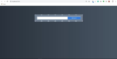
We have our ImageSearchForm component display in the image below.

Image-Search-Page

Image-Search-Page. (Large preview)

Now we have our application running with our first components.

Image Recognition API

It’s time to create some functionalities where we enter an image URL, press Detect and an image appear with a face detection box if a face exists in the image. Before that let setup our Clarifai account to be able to integrate the API into our app.

How to Setup Clarifai Account

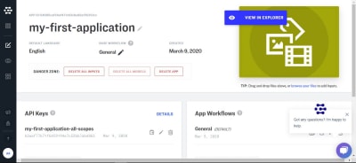
This API makes it possible to utilize its machine learning app or services. For this tutorial, we will be making use of the tier that’s available for free to developers with 5,000 operations per month. You can read more here and sign up, after sign in it will take you to your account dashboard click on my first application or create an application to get your API-key that we will be using in this app as we progress.

Note: You cannot use mine, you have to get yours.

Clarifai-Dashboard

Clarifai-Dashboard. (Large preview)

This is how your dashboard above should look. Your API key there provides you with access to Clarifai services. The arrow below the image points to a copy icon to copy your API key.

If you go to Clarifai model you will see that they use machine learning to train what is called models, they train a computer by giving it many pictures, you can also create your own model and teach it with your own images and concepts. But here we would be making use of their Face Detection model.

The Face detection model has a predict API we can make a call to (read more in the documentation here).

So let’s install the clarifai package below.

Open your terminal and run this code:

/* Install the client from npm */
npm install clarifai

When you are done installing clarifai, we need to import the package into our app with the above installation we learned earlier.

However, we need to create functionality in our input search-box to detect what the user enters. We need a state value so that our app knows what the user entered, remembers it, and updates it anytime it gets changes.

You need to have your API key from Clarifai and must have also installed clarifai through npm.

The example below shows how we import clarifai into the app and also implement our API key.

Note that (as a user) you have to fetch any clear image URL from the web and paste it in the input field; that URL will the state value of imageUrl below.

import React, { Component } from "react";
// Import Clarifai into our App
import Clarifai from "clarifai";
import ImageSearchForm from "./components/ImageSearchForm/ImageSearchForm";
// Uncomment FaceDetect Component
import FaceDetect from "./components/FaceDetect/FaceDetect";
import "./App.css";

// You need to add your own API key here from Clarifai.
const app = new Clarifai.App({
  apiKey: "ADD YOUR API KEY HERE",
});

class App extends Component {
  // Create the State for input and the fectch image
  constructor() {
    super();
    this.state = {
      input: "",
      imageUrl: "",
    };
  }

// setState for our input with onInputChange function
  onInputChange = (event) => {
    this.setState({ input: event.target.value });
  };

// Perform a function when submitting with onSubmit
  onSubmit = () => {
        // set imageUrl state
    this.setState({ imageUrl: this.state.input });
    app.models.predict(Clarifai.FACE_DETECT_MODEL, this.state.input).then(
      function (response) {
        // response data fetch from FACE_DETECT_MODEL 
        console.log(response);
        /* data needed from the response data from clarifai API, 
           note we are just comparing the two for better understanding 
           would to delete the above console*/ 
        console.log(
          response.outputs[0].data.regions[0].region_info.bounding_box
        );
      },
      function (err) {
        // there was an error
      }
    );
  };
  render() {
    return (
      <div className="App">
        // update your component with their state
        <ImageSearchForm
          onInputChange={this.onInputChange}
          onSubmit={this.onSubmit}
        />
        // uncomment your face detect app and update with imageUrl state
        <FaceDetect imageUrl={this.state.imageUrl} />
      </div>
    );
  }
}
export default App;

In the above code block, we imported clarifai so that we can have access to Clarifai services and also add our API key. We use state to manage the value of input and the imageUrl. We have an onSubmit function that gets called when the Detect button is clicked, and we set the state of imageUrl and also fetch image with Clarifai FACE DETECT MODEL which returns a response data or an error.

For now, we’re logging the data we get from the API to the console; we’ll use that in the future when determining the face detect model.

For now, there will be an error in your terminal because we need to update the ImageSearchForm and FaceDetect Components files.

Update the ImageSearchForm.js file with the code below:

import React from "react";
import "./ImageSearchForm.css";
// update the component with their parameter
const ImageSearchForm = ({ onInputChange, onSubmit }) => {
  return (
    <div className="ma5 mto">
      <div className="center">
        <div className="form center pa4 br3 shadow-5">
          <input
            className="f4 pa2 w-70 center"
            type="text"
            onChange={onInputChange}    // add an onChange to monitor input state
          />
          <button
            className="w-30 grow f4 link ph3 pv2 dib white bg-blue"
            onClick={onSubmit}  // add onClick function to perform task
          >
            Detect
          </button>
        </div>
      </div>
    </div>
  );
};
export default ImageSearchForm;

In the above code block, we passed onInputChange from props as a function to be called when an onChange event happens on the input field, we’re doing the same with onSubmit function we tie to the onClick event.

Now let us create our FaceDetect component that we uncommented in src/App.js above. Open FaceDetect.js file and input the code below:

In the example below, we created the FaceDetect component to pass the props imageUrl.

import React from "react";
// Pass imageUrl to FaceDetect component
const FaceDetect = ({ imageUrl }) => {
  return (
  # This div is the container that is holding our fetch image and the face detect box
    <div className="center ma">
      <div className="absolute mt2">
                        # we set our image SRC to the url of the fetch image 
        <img alt="" src={imageUrl} width="500px" heigh="auto" />
      </div>
    </div>
  );
};
export default FaceDetect;

This component will display the image we have been able to determine as a result of the response we’ll get from the API. This is why we are passing the imageUrl down to the component as props, which we then set as the src of the img tag.

Now we both have our ImageSearchForm component and FaceDetect components are working. The Clarifai FACE_DETECT_MODEL has detected the position of the face in the image with their model and provided us with data but not a box that you can check in the console.

Image-Link-Form

Image-Link-Form. (Large preview)

Now our FaceDetect component is working and Clarifai Model is working while fetching an image from the URL we input in the ImageSearchForm component. However, to see the data response Clarifai provided for us to annotate our result and the section of data we would be needing from the response if you remember we made two console.log in App.js file.

So let’s open the console to see the response like mine below:

Image-Link-Form[Console]

Image-Link-Form[Console]. (Large preview)

The first console.log statement which you can see above is the response data from Clarifai FACE_DETECT_MODEL made available for us if successful, while the second console.log is the data we are making use of in order to detect the face using the data.region.region_info.bounding_box. At the second console.log, bounding_box data are:

bottom_row: 0.52811456
left_col: 0.29458505
right_col: 0.6106333
top_row: 0.10079138

This might look twisted to us but let me break it down briefly. At this point the Clarifai FACE_DETECT_MODEL has detected the position of face in the image with their model and provided us with a data but not a box, it ours to do a little bit of math and calculation to display the box or anything we want to do with the data in our application. So let me explain the data above,

bottom_row: 0.52811456 This indicates our face detection box start at 52% of the image height from the bottom.
left_col: 0.29458505 This indicates our face detection box start at 29% of the image width from the left.
right_col: 0.6106333 This indicates our face detection box start at 61% of the image width from the right.
top_row: 0.10079138 This indicates our face detection box start at 10% of the image height from the top.

If you take a look at our app inter-phase above, you will see that the model is accurate to detect the bounding_box from the face in the image. However, it left us to write a function to create the box including styling that will display a box from earlier information on what we are building based on their response data provided for us from the API. So let’s implement that in the next section.

Creating A Face Detection Box

This is the final section of our web app where we get our facial recognition to work fully by calculating the face location of any image fetch from the web with Clarifai FACE_DETECT_MODEL and then display a facial box. Let open our src/App.js file and include the code below:

In the example below, we created a calculateFaceLocation function with a little bit of math with the response data from Clarifai and then calculate the coordinate of the face to the image width and height so that we can give it a style to display a face box.

import React, { Component } from "react";
import Clarifai from "clarifai";
import ImageSearchForm from "./components/ImageSearchForm/ImageSearchForm";
import FaceDetect from "./components/FaceDetect/FaceDetect";
import "./App.css";

// You need to add your own API key here from Clarifai.
const app = new Clarifai.App({
  apiKey: "ADD YOUR API KEY HERE",
});

class App extends Component {
  constructor() {
    super();
    this.state = {
      input: "",
      imageUrl: "",
      box: {},  # a new object state that hold the bounding_box value
    };
  }

  // this function calculate the facedetect location in the image
  calculateFaceLocation = (data) => {
    const clarifaiFace =
      data.outputs[0].data.regions[0].region_info.bounding_box;
    const image = document.getElementById("inputimage");
    const width = Number(image.width);
    const height = Number(image.height);
    return {
      leftCol: clarifaiFace.left_col * width,
      topRow: clarifaiFace.top_row * height,
      rightCol: width - clarifaiFace.right_col * width,
      bottomRow: height - clarifaiFace.bottom_row * height,
    };
  };

  /* this function display the face-detect box base on the state values */
  displayFaceBox = (box) => {
    this.setState({ box: box });
  };

  onInputChange = (event) => {
    this.setState({ input: event.target.value });
  };

  onSubmit = () => {
    this.setState({ imageUrl: this.state.input });
    app.models
      .predict(Clarifai.FACE_DETECT_MODEL, this.state.input)
      .then((response) =>
        # calculateFaceLocation function pass to displaybox as is parameter
        this.displayFaceBox(this.calculateFaceLocation(response))
      )
      // if error exist console.log error
      .catch((err) => console.log(err));
  };

  render() {
    return (
      <div className="App">
        <ImageSearchForm
          onInputChange={this.onInputChange}
          onSubmit={this.onSubmit}
        />
        // box state pass to facedetect component
        <FaceDetect box={this.state.box} imageUrl={this.state.imageUrl} />
      </div>
    );
  }
}
export default App;

The first thing we did here was to create another state value called box which is an empty object that contains the response values that we received. The next thing we did was to create a function called calculateFaceLocation which will receive the response we get from the API when we call it in the onSubmit method. Inside the calculateFaceLocation method, we assign image to the element object we get from calling document.getElementById("inputimage") which we use to perform some calculation.

leftCol clarifaiFace.left_col is the % of the width multiply with the width of the image then we would get the actual width of the image and where the left_col should be.
topRow clarifaiFace.top_row is the % of the height multiply with the height of the image then we would get the actual height of the image and where the top_row should be.
rightCol This subtracts the width from (clarifaiFace.right_col width) to know where the right_Col should be.
bottomRow This subtract the height from (clarifaiFace.right_col height) to know where the bottom_Row should be.

In the displayFaceBox method, we update the state of box value to the data we get from calling calculateFaceLocation.

We need to update our FaceDetect component, to do that open FaceDetect.js file and add the following update to it.

import React from "react";
// add css to style the facebox
import "./FaceDetect.css";
// pass the box state to the component

const FaceDetect = ({ imageUrl, box }) => {
  return (
    <div className="center ma">
      <div className="absolute mt2">
            /* insert an id to be able to manipulate the image in the DOM */
        <img id="inputimage" alt="" src={imageUrl} width="500px" heigh="auto" />
       //this is the div displaying the faceDetect box base on the bounding box value 
      <div
          className="bounding-box"
          // styling that makes the box visible base on the return value
          style={{
            top: box.topRow,
            right: box.rightCol,
            bottom: box.bottomRow,
            left: box.leftCol,
          }}
        ></div>
      </div>
    </div>
  );
};
export default FaceDetect;

In order to show the box around the face, we pass down box object from the parent component into the FaceDetect component which we can then use to style the img tag.

We imported a CSS we have not yet created, open FaceDetect.css and add the following style:

.bounding-box {
  position: absolute;
  box-shadow: 0 0 0 3px #fff inset;
  display: flex;
  flex-wrap: wrap;
  justify-content: center;
  cursor: pointer;
}

Note the style and our final output below, you could see we set our box-shadow color to be white and display flex.

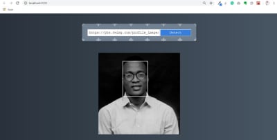
At this point, your final output should look like this below. In the output below, we now have our face detection working with a face box to display and a border style color of white.

Final-App1

Final App. (Large preview)

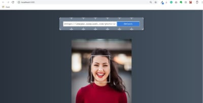
Let try another image below:

Final-App2

Final App. (Large preview)

Conclusion

I hope you enjoyed working through this tutorial. We’ve learned how to build a face recognition app that can be integrated into our future project with more functionality, you also learn how to use an amazing machine learning API with react. You can always read more on Clarifai API from the references below. If you have any questions, you can leave them in the comments section and I’ll be happy to answer every single one and work you through any issues.

The supporting repo for this article is available on Github.

Resources And Further Reading

(ks, ra, yk, il)

Categories: Others Tags:

Creative Background Patterns Using Gradients, CSS Shapes, and Even Emojis

June 10th, 2020 No comments

You can create stripes in CSS. That’s all I thought about in terms of CSS background patterns for a long time. There’s nothing wrong with stripes; stripes are cool. They can be customized into wide and narrow bands, criss-crossed into a checked pattern, and played with in other ways using the idea of hard stops. But stripes can be boring, too. Too conventional, out of fashion, and sometimes even unpleasant.

Thankfully, we can conjure up far more background patterns than you can even imagine with CSS, with code that is similar in spirit to stripes.

Background patterns are images repeated across a background. They can be done by referencing an external image, like a PNG file, or can be drawn with CSS, which is traditionally done using CSS gradients.

Linear gradients (and repeating linear gradients) for instance, are typically used for stripes. But there are other ways to create cool background patterns. Let’s see how we can use gradients in other ways and toss in other things, like CSS shapes and emoji, to spice things up.

Gradient patterns

There are three types of CSS gradients.

Linear (left), radial (center) and conic (right) gradients
  1. linear-gradient(): Colors flow from left-to-right, top-to-bottom, or at any angle you choose in a single direction.
  2. radial-gradient(): Colors start at a single point and emanate outward
  3. conic-gradient(): Similar in concept to radial gradients, but the color stops are placed around the circle rather than emanating from the center point.

I recommend checking out the syntax for all the gradients to thoroughly understand how to start and end a color in a gradient.

Radial gradient patterns

Let’s look at radial gradients first because they give us very useful things: circles and ellipses. Both can be used for patterns that are very interesting and might unlock some ideas for you!

background: radial-gradient(<gradient values>)

Here’s a pattern of repeating watermelons using this technique:

CodePen Embed Fallback
background: 
	radial-gradient(circle at 25px 9px, black 2px, transparent 2px), 
	radial-gradient(circle at 49px 28px, black 2px, transparent 2px), 
	radial-gradient(circle at 38px 1px, black 2px, transparent 2px), 
	radial-gradient(circle at 20px 4px, black 2px, transparent 2px), 
	radial-gradient(circle at 80px 4px, black 2px, transparent 2px), 
	radial-gradient(circle at 50px 10px, black 2px, transparent 2px), 
	radial-gradient(circle at 60px 16px, black 2px, transparent 2px), 
	radial-gradient(circle at 70px 16px, black 2px, transparent 2px), 
	radial-gradient(ellipse at 50px 0, red 33px, lime 33px, lime 38px, transparent 38px) 
	white;
background-size: 100px 50px;

We start by providing a background size on the element then stack up the gradients inside it. An ellipse forms the green and red parts. Black circles are scattered across to represent the watermelon seeds.

The first two parameters for a radial gradient function determine whether the gradient shape is a circle or an ellipse and the starting position of the gradient. That’s followed by the gradient color values along with the start and ending positions within the gradient.

Conic gradient patterns

Conic gradients create ray-like shapes. Like linear and radial gradients, conic gradients can be used to create geometric patterns.

background: conic-gradient(<gradient values>)
CodePen Embed Fallback
background: 
  conic-gradient(yellow 40deg, blue 40deg, blue 45deg, transparent 45deg), 
  conic-gradient(transparent 135deg, blue 135deg, blue 140deg, transparent 140deg) ;
background-size: 60px 60px;
background-color: white;

The rub with conic gradient is that it’s not supported in Firefox, at least at the time of writing. It’s always worth keeping an eye out for deeper support.

This browser support data is from Caniuse, which has more detail. A number indicates that browser supports the feature at that version and up.

Desktop

Chrome Firefox IE Edge Safari
69 No No 79 12.1

Mobile / Tablet

Android Chrome Android Firefox Android iOS Safari
81 No 81 12.2-12.4

Emoji icon patterns

This is where things begin to get interesting. Rather than just using geometric patterns (as in gradients), we now use the organic shapes of emojis to create background patterns. ?

It starts with emoji icons.

Solid-color emoji patterns

We can create emoji icons by giving emojis a transparent color and text shadow.

color: transparent;
text-shadow: 0 0 black;

Those icons can then be turned into an image that can be used as a background, using SVG.

<svg>
  <foreignObject>
    <!-- The HTML code with emoji -->
  </foreignObject>
</svg>

The SVG can then be referred by the background property using data URL.

background: url("data:image/svg+xml,<svg xmlns=%22http://www.w3.org/2000/svg%22 viewBox=%220 0 100 100%22><!-- SVG code --></svg>");

And, voilá! We get something like this:

CodePen Embed Fallback
background: 
    url("data:image/svg+xml,<svg xmlns=%22http://www.w3.org/2000/svg%22 viewBox=%220 0 100 100%22><foreignObject width=%22100px%22 height=%22100px%22><div xmlns=%22http://www.w3.org/1999/xhtml%22 style=%22color:transparent;text-shadow: 0 0 %23e42100, -2px 2px 0 black;font-size:70px%22>🏄‍♀️</div></foreignObject></svg>"), 
    white; 
background-size: 60px 60px; 

Other than emojis, it’s also possible to draw CSS shapes and use them as patterns. Emojis are less work, though. Just saying.

Gradient-colored emoji patterns

Instead of using plain emoji icons, we can use gradient emoji icons. To do that, skip the text shadow on the emojis. Add a gradient background behind them and use background-clip to trim the gradient background to the shape of the emojis.

color: transparent;
background: linear-gradient(45deg, blue 20%, fuchsia);
background-clip: text; /* Safari requires -webkit prefix */

Then, just as before, use the combination of SVG and data URL to create the background pattern.

CodePen Embed Fallback

Translucent-colored emoji patterns

This is same as using block colored emoji icons. This time, however, we take away the opaqueness of the colors by using rgba() or hsla() values for the text shadow.

color: transparent;
text-shadow: 20px 10px rgba(0, 255, 0, .3), 
             0 0 red;
CodePen Embed Fallback

SVG-text emoji patterns

We’ve already looked at all the working methods I could think of to create background patterns, but I feel like I should also mention this other technique I tried, which is not as widely supported as I’d hoped.

I tried placing the emoji in an SVG element instead of the HTML added using . But I wasn’t able to create a solid shadow behind it in all the browsers.

CodePen Embed Fallback
background: 
  url("data:image/svg+xml,<svg xmlns=%22http://www.w3.org/2000/svg%22 viewBox=%220 0 100 100%22><text y=%221em%22 font-size=%2270%22 fill=%22transparent%22 style=%22text-shadow: 0 0 %23e42100, -2px 2px 5px black, 0 0 6px white; ;%22>🏄‍♀️</text></svg>")

Just in case, I tried using CSS and SVG filters for the shadow as well, thinking that might work. It didn’t. I also tried using the stroke attribute, to at least create an outline for the emoji, but that didn’t work, either.

CSS element() patterns

I didn’t think of SVG when I first thought of converting emoji icons or CSS shapes into background images. I tried CSS element(). It’s a function that directly converts an HTML element into an image that can be referenced and used. I really like this approach, but browser support is a huge caveat, which is why I’m mentioning it here at the end.

Basically, we can drop an element in the HTML like this:

<div id=snake >🐍</div>

…then pass it into the element() function to use like an image on other elements, like this:

background: 
  -moz-element(#snake), /* Firefox only */
  linear-gradient(45deg, transparent 20px, blue 20px, blue 30px, transparent 30px) 
  white;
background-size: 60px 60px;
background-color: white;

Now that snake emoji is technically an image that we get to include in the pattern.

CodePen Embed Fallback

Again, browser support is spotty, making this approach super experimental.

This browser support data is from Caniuse, which has more detail. A number indicates that browser supports the feature at that version and up.

Desktop

Chrome Firefox IE Edge Safari
No 4* No No No

Mobile / Tablet

Android Chrome Android Firefox Android iOS Safari
No 68* No No

In this method, the original emoji (or any CSS shape for that matter) used for the background pattern needs to render on screen for it to appear in the background pattern as well. To hide that original emoji, I used mix-blend-mode — it sort of masks out the original emoji in the HTML so it doesn’t show up on the page.


I hope you find the methods in this post useful in one way or another and learned something new in the process! Give them a try. Experiment with different emojis and CSS shapes because gradients, while cool and all, aren’t the only way to make patterns.. The background property takes multiple values, allowing us to think of creative ways to stack things.

The post Creative Background Patterns Using Gradients, CSS Shapes, and Even Emojis appeared first on CSS-Tricks.

Categories: Designing, Others Tags: