Archive

Archive for June, 2020

Higher-Order Components In React

June 8th, 2020 No comments

Higher-Order Components In React

Higher-Order Components In React

Shedrack Akintayo

2020-06-08T12:00:00+00:00
2020-06-10T09:35:11+00:00

Higher-order components (HOCs) in React were inspired by higher-order functions in JavaScript. A HOC is an advanced technique for reusing logic in React components. It is a pattern created out of React’s compositional nature.

HOCs basically incorporate the don’t-repeat-yourself (DRY) principle of programming, which you’ve most likely come across at some point in your career as a software developer. It is one of the best-known principles of software development, and observing it is very important when building an application or writing code in general.

In this tutorial, we will learn what a HOC is, its basic structure, some use cases, and finally an example.

Note: Basic knowledge of React and JavaScript will come in handy as you work through this tutorial.

Best Practices With React

React is a fantastic JavaScript library for building rich user interfaces. It provides a great component abstraction for organizing your interfaces into well-functioning code, and there’s just about anything you can use it for. articles on React ?

Higher-Order Functions In JavaScript

Before jumping into HOCs in React, let’s briefly discuss higher-order functions in JavaScript. Understanding them is critical to understanding our topic of focus.

Higher-order functions in JavaScript take some functions as arguments and return another function. They enable us to abstract over actions, not just values, They come in several forms, and they help us to write less code when operating on functions and even arrays.

The most interesting part of using higher-order functions is composition. We can write small functions that handle one piece of logic. Then, we can compose complex functions by using the different small functions we have created. This reduces bugs in our code base and makes our code much easier to read and understand.

JavaScript has some of these functions already built in. Some examples of higher-order functions are the following:

  • .forEach()
    This iterates over every element in an array with the same code, but does not change or mutate the array, and it returns undefined.
  • .map()
    This method transforms an array by applying a function to all of its elements, and then building a new array from the returned values.
  • .reduce()
    This method executes a provided function for each value of the array (from left to right).
  • .filter()
    This checks every single element in an array to see whether it meets certain criteria as specified in the filter method, and then it returns a new array with the elements that match the criteria.

So many higher-order functions are built into JavaScript, and you can make your own custom ones.

An Example Of Custom Higher-Order Function

Suppose we are asked to write a function that formats integers as currencies, including some customization of specifying the currency symbol and adding a decimal separator for the currency amount. We can write a higher-other function that takes the currency symbol and also the decimal separator. This same function would then format the value passed to it with the currency symbol and decimal operators. We would name our higher-order function formatCurrency.

const formatCurrency = function( 
    currencySymbol,
    decimalSeparator  ) {
    return function( value ) {
        const wholePart = Math.trunc( value / 100 );
        let fractionalPart = value % 100;
        if ( fractionalPart 

formatCurrency returns a function with a fixed currency symbol and decimal separator.

We then pass the formatter a value, and format this value with the function by extracting its whole part and the fractional part. The returned value of this function is constructed by a template literal, concatenating the currency symbol, the whole part, the decimal separator, and the fractional part.

Let’s use this higher-order function by assigning a value to it and seeing the result.

> getLabel = formatCurrency( '$', '.' );
 
> getLabel( 1999 )
"$19.99" //formatted value
 
> getLabel( 2499 )
"$24.99" //formatted value

You might have noticed that we created a variable named getLabel, then assigned our formatCurrency higher-order function, and then passed the currency formatters to the function, which is the currency symbol and a decimal separator. To make use of the function, we call getLabel, which is now a function, and we pass in the value that needs to be formatted. That’s all! We have created a custom higher order of our choice.

What Is A Higher-Order Component?

A higher-order component (HOC) is an advanced element for reusing logic in React components. Components take one or more components as arguments, and return a new upgraded component. Sounds familiar, right? They are similar to higher-order functions, which take some functions as an argument and produce a new function.

HOCs are commonly used to design components with certain shared behavior in a way that makes them connected differently than normal state-to-props pattern.

Facts About HOCs

  1. We don’t modify or mutate components. We create new ones.
  2. A HOC is used to compose components for code reuse.
  3. A HOC is a pure function. It has no side effects, returning only a new component.

Here are some examples of real-world HOCs you might have come across:

react-redux connect(mapStateToProps, mapDispatchToProps)(UserPage)
react-router withRouter(UserPage)
material-ui withStyles(styles)(UserPage)

Structure Of A Higher-Order Component

A HOC is structured like a higher-order function:

  • It is a component.
  • It takes another component as an argument.
  • Then, it returns a new component.
  • The component it returns can render the original component that was passed to it.

The snippet below shows how a HOC is structured in React:


import React from 'react';
// Take in a component as argument WrappedComponent
const higherOrderComponent = (WrappedComponent) => {
// And return another component
  class HOC extends React.Component {
    render() {
      return <WrappedComponent />;
    }
  }
  return HOC;
};

We can see that higherOrderComponent takes a component (WrappedComponent) and returns another component inside of it. With this technique, whenever we need to reuse a particular component’s logic for something, we can create a HOC out of that component and use it wherever we like.

Use Cases

In my experience as a front-end engineer who has been writing React for a while now, here are some use cases for HOCs.

Show a loader while a component waits for data

Most of the time, when building a web application, we would need to use a loader of some sort that is displayed while a component is waiting for data to be passed to its props. We could easily use an in-component solution to render the loader, which would work, but it wouldn’t be the most elegant solution. Better would be to write a common HOC that can track those props; and while those props haven’t been injected or are in an empty state, it can show a loading state.

To explain this properly, let’s build a list of categories of public APIs, using its open API. We tend to handle list-loading, so that our clients don’t panic when the API we are getting data from takes so much time to respond.

Let’s generate a React app:

npx create-react-app repos-list

A basic list component can be written as follows:

//List.js
import React from 'react';
const List = (props) => {
  const { repos } = props;
  if (!repos) return null;
  if (!repos.length) return <p>No repos, sorry</p>;
  return (
    <ul>
      {repos.map((repo) => {
        return <li key={repo.id}>{repo.full_name}</li>;
      })}
    </ul>
  );
};
export default List;

The code above is a list component. Let’s break down the code into tiny bits so that we can understand what is happening.

const List = (props) => {};

Above, we initialize our functional component, named List, and pass props to it.

const { repos } = props;

Then, we create a constant, named repos, and pass it to our component props, so that it can be used to modify our component.

if (!repos) return null;
if (!repos.length) return <p>No repos, sorry</p>;

Above, we are basically saying that, if after fetching has completed and the repos prop is still empty, then it should return null. We are also carrying out a conditional render here: If the length of the repos prop is still empty, then it should render “No repos, sorry” in our browser.

return (
    <ul>
      {repos.map((repo) => {
        return <li key={repo.id}>{repo.full_name}</li>;
      })}
    </ul>
  );

Here, we are basically mapping through the repos array and returning a list of repos according to their full names, with a unique key for each entry.

Now, let’s write a HOC that handles loading, to make our users happy.

//withdLoading.js
import React from 'react';
function WithLoading(Component) {
  return function WihLoadingComponent({ isLoading, ...props }) {
    if (!isLoading) return <Component {...props} />;
    return <p>Hold on, fetching data might take some time.</p>;
  };
}
export default WithLoading;

This would display the text “Hold on, fetching data might take some time” when the app is still fetching data and the props are being injected into state. We make use of isLoading to determine whether the component should be rendered.

Now, in your App.js file, you could pass the loading logic to WithLoading, without worrying about it in your List .

import React from 'react';
import List from './components/List.js';
import WithLoading from './components/withLoading.js';
const ListWithLoading = WithLoading(List);
class App extends React.Component {
  state = {
{
  };
  componentDidMount() {
    this.setState({ loading: true });
    fetch(`https://api.github.com/users/hacktivist123/repos`)
      .then((json) => json.json())
      .then((repos) => {
        this.setState({ loading: false, repos: repos });
      });
  }
  render() {
    return (
      <ListWithLoading
        isLoading={this.state.loading}
        repos={this.state.repos}
      />
    );
  }
}
export default App;

The code above is our entire app. Let’s break it down to see what is happening.

class App extends React.Component {
  state = {
    loading: false,
    repos: null,
  };
  componentDidMount() {
    this.setState({ loading: true });
    fetch(`https://api.github.com/users/hacktivist123/repos`)
      .then((json) => json.json())
      .then((repos) => {
        this.setState({ loading: false, repos: repos });
      });
  }

All we are doing here is creating a class component named App(), then initializing state with two properties, loading: false, and repos: null,. The initial state of loading is false, while the initial state of repos is also null.

Then, when our component is mounting, we set the state of the loading property to true, and immediately make a fetch request to the API URL that holds the data we need to populate our List component. Once the request is complete, we set the loading state to false and populate the repos state with the data we have pulled from the API request.

const ListWithLoading = WithLoading(List);

Here, we create a new component named ListWithLoading and pass the WithLoading HOC that we created and also the List component in it.

render() {
    return (
      <ListWithLoading
        isLoading={this.state.loading}
        repos={this.state.repos}
      />
    );
  }

Above, we render the ListWithLoading component, which has been supercharged by the WithLoading HOC that we created and also the List component in it. Also, we pass the loading state’s value and the repos state’s value as props to the component.

Because the page is still trying to pull data from the API, our HOC will render the following text in the browser.

App loading state (Large preview)

When loading is done and the props are no longer in an empty state, the repos will be rendered to the screen.

App loading’s finished state (Large preview)

Conditionally Render Components

Suppose we have a component that needs to be rendered only when a user is authenticated — it is a protected component. We can create a HOC named WithAuth() to wrap that protected component, and then do a check in the HOC that will render only that particular component if the user has been authenticated.

A basic withAuth() HOC, according to the example above, can be written as follows:

// withAuth.js
import React from "react";
export function withAuth(Component) {
    return class AuthenticatedComponent extends React.Component {
        isAuthenticated() {
            return this.props.isAuthenticated;
        }

        /**
         * Render
         */
        render() {
            const loginErrorMessage = (
                <div>
                    Please <a href="/login">login</a> in order to view this part of the application.
                </div>
            );

            return (
                <div>
                    { this.isAuthenticated === true ? <Component {...this.props} /> : loginErrorMessage }
                </div>
            );
        }
    };
}

export default withAuth;

The code above is a HOC named withAuth. It basically takes a component and returns a new component, named AuthenticatedComponent, that checks whether the user is authenticated. If the user is not authenticated, it returns the loginErrorMessage component; if the user is authenticated, it returns the wrapped component.

Note: this.props.isAuthenticated has to be set from your application’s logic. (Or else use react-redux to retrieve it from the global state.)

To make use of our HOC in a protected component, we’d use it like so:

// MyProtectedComponent.js
import React from "react";
import {withAuth} from "./withAuth.js";

export class MyProectedComponent extends React.Component {
    /**
     * Render
     */
    render() {
        return (
            <div>
                This is only viewable  by authenticated users.
            </div>
        );
    }
}

// Now wrap MyPrivateComponent with the requireAuthentication function 
export default withAuth(MyPrivateComponent);

Here, we create a component that is viewable only by users who are authenticated. We wrap that component in our withAuth HOC to protect the component from users who are not authenticated.

Provide Components With Specific Styling

Continuing the use case above, based on whatever UI state you get from the HOC, you can render specific styles for specific UI states. For example, if the need arises in multiple places for styles like backgroundColor, fontSize and so on, they can be provided via a HOC by wrapping the component with one that just injects props with the specific className.

Take a very simple component that renders “hello” and the name of a person. It takes a name prop and some other prop that can affect the rendered JavaScript XML (JSX).

// A simple component 
const HelloComponent = ({ name, ...otherProps }) => (
 <div {...otherProps}>Hello {name}!/div>
);

Let’s create a HOC named withStyling that adds some styling to the “hello” text.

const withStyling = (BaseComponent) => (props) => (
  <BaseComponent {...props} style={{ fontWeight: 700, color: 'green' }} />
);

In order to make use of the HOC on our HelloComponent, we wrap the HOC around the component. We create a pure component, named EnhancedHello, and assign the HOC and our HelloComponent, like so :

const EnhancedHello = withStyling(HelloComponent);

To make a change to our HelloComponent, we render the EnhancedHello component:

<EnhancedHello name='World' />

Now, the text in our HelloComponent becomes this:

<div style={{fontWeight: 700, color: 'green' }}>Hello World</div>

Provide A Component With Any Prop You Want

This is a popular use case for HOCs. We can study our code base and note what reusable prop is needed across components. Then, we can have a wrapper HOC to provide those components with the reusable prop.

Let’s use the example above:

// A simple component 
const HelloComponent = ({ name, ...otherProps }) => (
 <div {...otherProps}>Hello {name}!</div>
);

Let’s create a HOC named withNameChange that sets a name prop on a base component to “New Name”.

const withNameChange = (BaseComponent) => (props) => (
  <BaseComponent {...props} name='New Name' />
);

In order to use the HOC on our HelloComponent, we wrap the HOC around the component, create a pure component named EnhancedHello2, and assign the HOC and our HelloComponent like so:

const EnhancedHello2 = withNameChange(HelloComponent);

To make a change to our HelloComponent, we can render the EnhancedHello component like so:

<EnhancedHello />

Now, the text in our HelloComponent becomes this:

<div>Hello New World</div>

To change the name prop, all we have to do is this:

<EnhancedHello name='Shedrack' />

The text in our HelloComponent becomes this:

<div>Hello Shedrack</div>

Let’s Build A Higher-Order Component

In this section, we will build a HOC that takes a component that has a name prop, and then we will make use of the name prop in our HOC.

So, generate a new React app with create-react-app, like so:

npx create-react-app my-app

After it is generated, replace the code in your index.js file with the following snippet.

import React from 'react';
import { render } from 'react-dom';
const Hello = ({ name }) =>
  <h1>
    Hello {name}!
  </h1>;

function withName(WrappedComponent) {
  return class extends React.Component {
    render() {
      return <WrappedComponent name="Smashing Magazine" {...this.props} />;
    }
  };
}
const NewComponent = withName(Hello);
const App = () =>
  <div>
    <NewComponent />
  </div>;
render(<App />, document.getElementById('root'));

Once you have replaced the code in your index.js file, you should see the following on your screen:

Our React app (Large preview)

Let’s go through the snippet bit by bit.

const Hello = ({ name }) =>
  <h1>
    Hello {name}!
  </h1>;

Here, we create a functional component that has a prop called name. In this functional component, we render the “Hello” and the value of the name prop in an h1 tag.

function withName(WrappedComponent) {
  return class extends React.Component {
    render() {
      return <WrappedComponent name="Smashing Magazine" {...this.props} />;
    }
  };
}

Above, we create a higher-order functional component named withName(). Then, we return an anonymous class component inside that renders the component wrapped in the HOC. And we assign a value to the prop of the wrapped component.

const NewComponent = withName(Hello);

Here, we create a new component named NewComponent. We use the HOC that we created, and assign to it the functional component that we created at the start of the code base, named hello.

const App = () =>
  <div>
    <NewComponent />
  </div>;
render(<App />, document.getElementById('root'));

All we are doing above is creating another functional component, named App. It renders the NewComponent that we upgraded with our HOC in a div. Then, we use the react-dom function render to display the component in the browser.

That’s all we need to do! Our withName function takes a component as an argument and returns a HOC. A few months from now, if we decide to change things around, we only have to edit our HOC.

Conclusion

I hope you’ve enjoyed working through this tutorial. You can read more about higher-order components in the references listed below. If you have any questions, leave them in the comments section below. I’ll be happy to answer every one.

Resources And References

(ks, ra, il, al)

Categories: Others Tags:

20 Unmissable Websites, June 2020

June 8th, 2020 No comments

Every month we publish a roundup of the 20 most unmissable websites newly launched, or updated in the previous four weeks.

In June’s edition you’ll find everything from corporate sites for global power-houses, to personal sites for innovative designers. This month we’re seeing a lot of flamboyance, a lot of passion, and the color of the moment is (hooray!) yellow. Enjoy!

Black Lives Matter

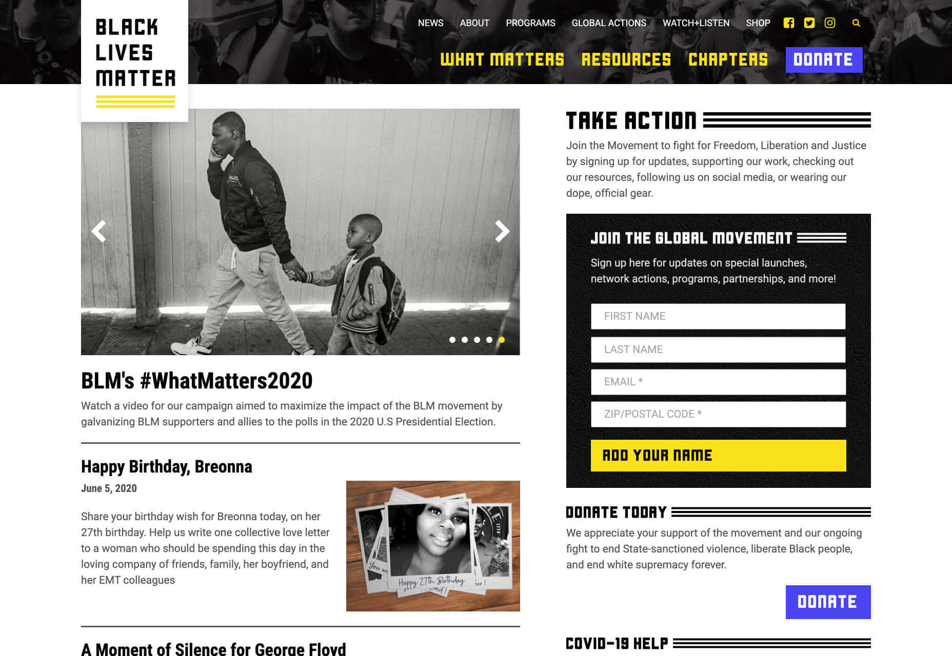
In recent weeks there have been protests in the US and beyond in response to alleged police brutality directed at people of color. The Black Lives Matter website is a central hub for news, resources, and information on civil rights campaigns in 38 countries.

Quip

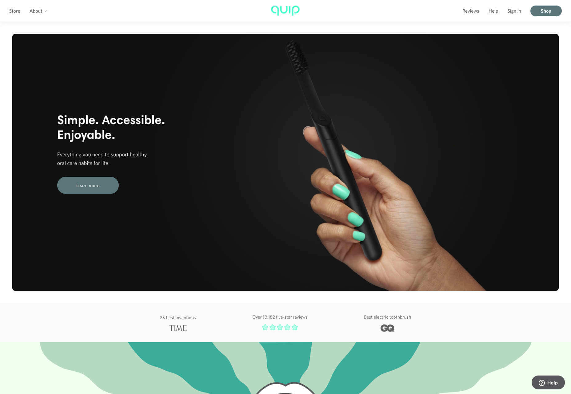
Quip is a site focused on helping us build, and maintain healthy oral care habits. Centred around its innovative products, this site mixes images, illustration, and motion effortlessly to create a healthcare brand that’s highly appealing.

Matthew P Munger

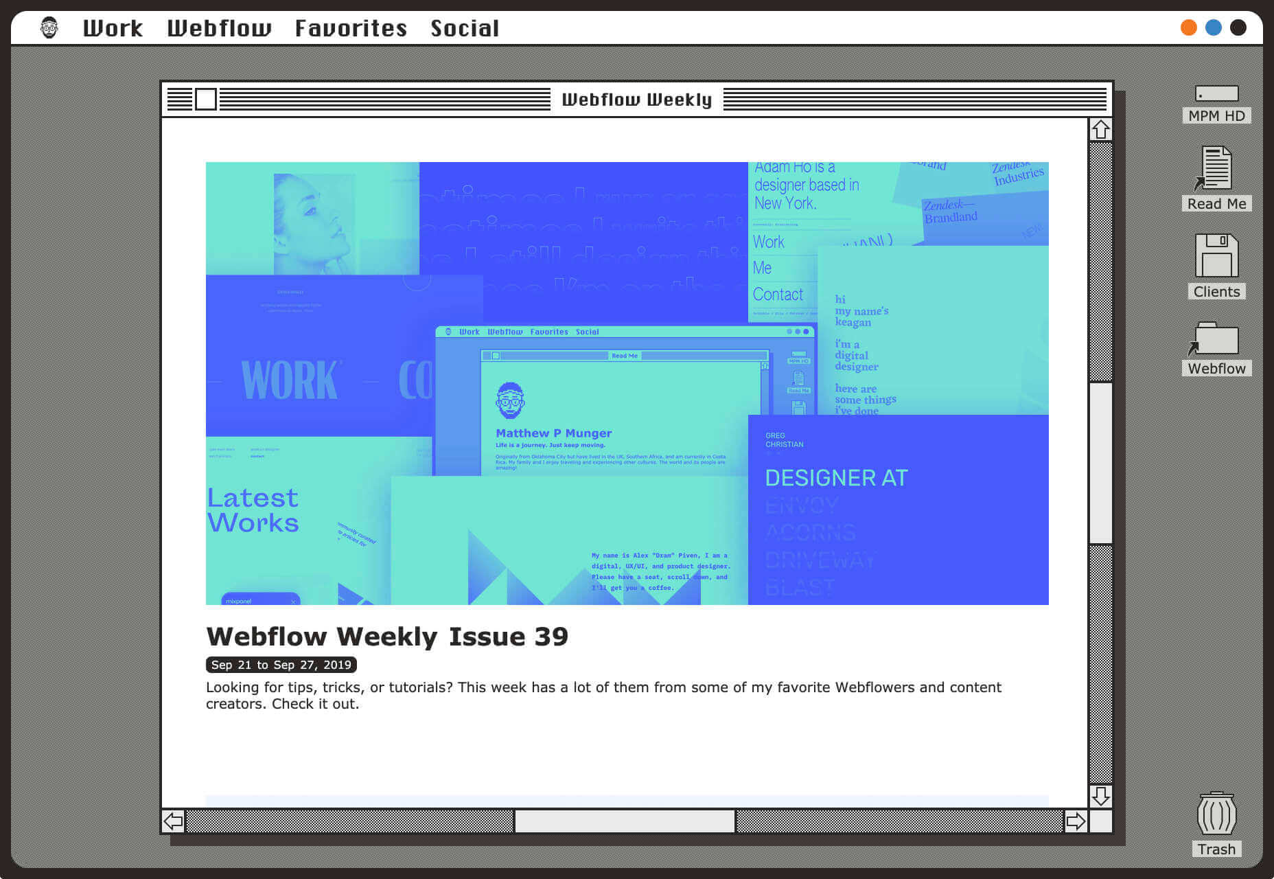
This portfolio site for Matthew P Munger is a delightful jaunt through a Mac OS of yesteryear. What we really enjoyed is that despite being presented in this early-90s style, the UI manages to adapt itself responsively.

Moooi

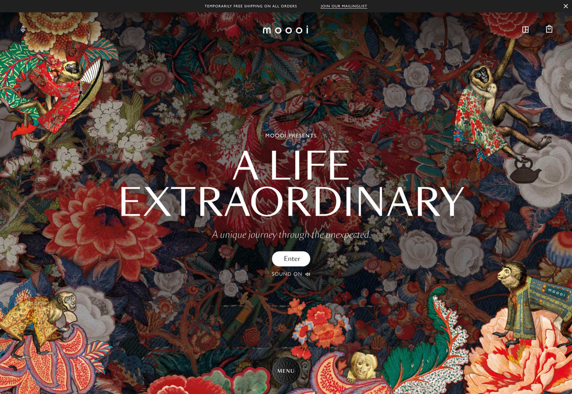
There’s a maximal feel to Moooi’s site, layers of illustration enlarge so you feel like Alice falling down the rabbit hole. But the real excellence of this site is the tiny UI details, like the draggable bar that reveals the product videos.

Jazz Keys

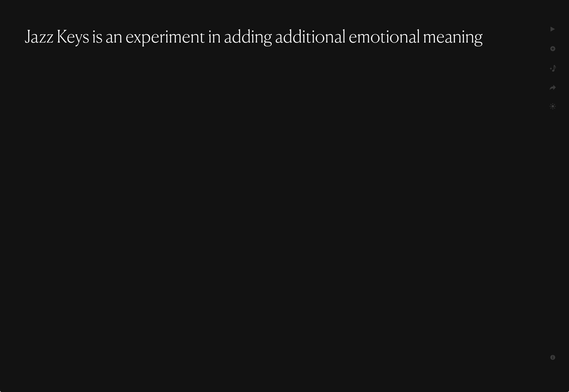
Jazz Keys is an experiment in adding extra emotional meaning to the often impersonal messages we send digitally. Type your message and hear it play in sound. You can send your message to anyone, and let them hear your words.

AIAIAI

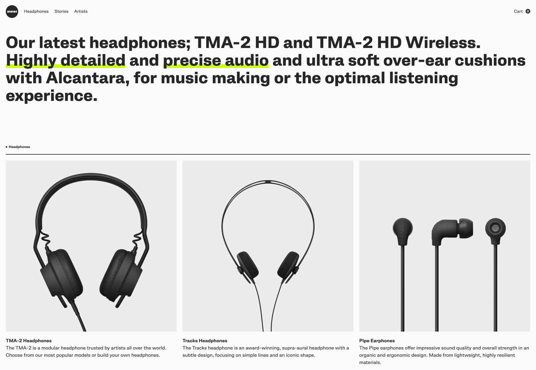
There’s a brutally cool black and white aesthetic to AIAIAI’s site. The dark, low-contrast product photography’s absence of color punctuated by some shocking neon, and the occasional golden shine of a plug.

Stromwerk

Cycling is taking over the world, and one of the biggest new trends is for e-bikes. Stromwerk’s site does an excellent job of taking something that seems a bit like cheating, and transforming it into something rugged and cool.

Satu Pelkonen

Satu Pelkonen is a NY-based creative director who joined Squarespace in 2019. His site features a really cool custom cursor that inverts the thumbnail it’s hovering over, creating a delightful, simple interaction.

Babord

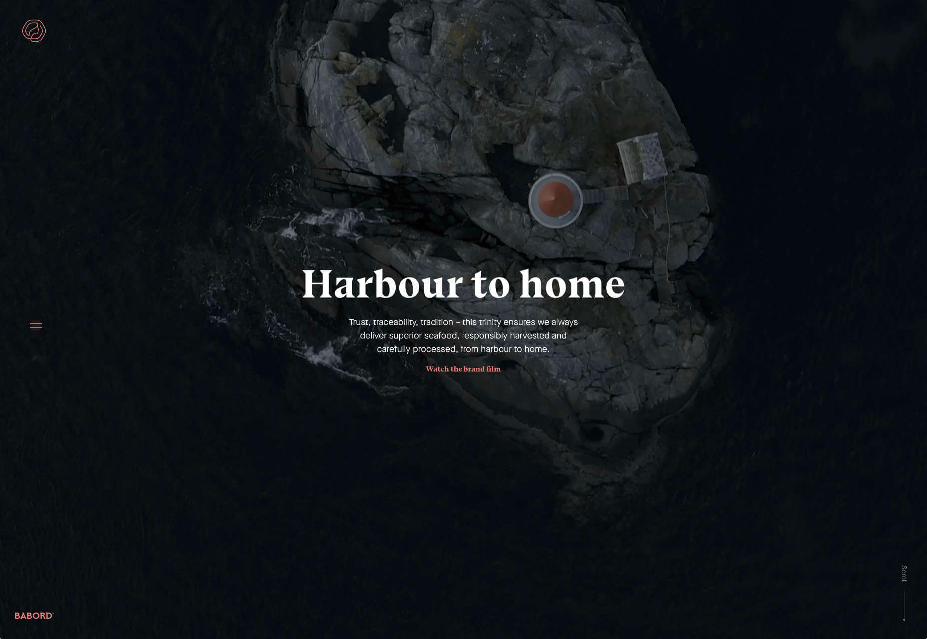
Babord is a Norwegian seafood supplier. The relationship Norwegian’s have with the sea is evident, and the site transforms simple fishing into an almost mystical experience. Plus that brand font is fantastically daring.

Yuko Higuchi x Gucci

Guggi has a history of expansive and ambitious marketing campaigns. This latest micro-site from Italy allows you to play a fun, tile-slide game based around the fashion label’s new kids collection.

Delassus

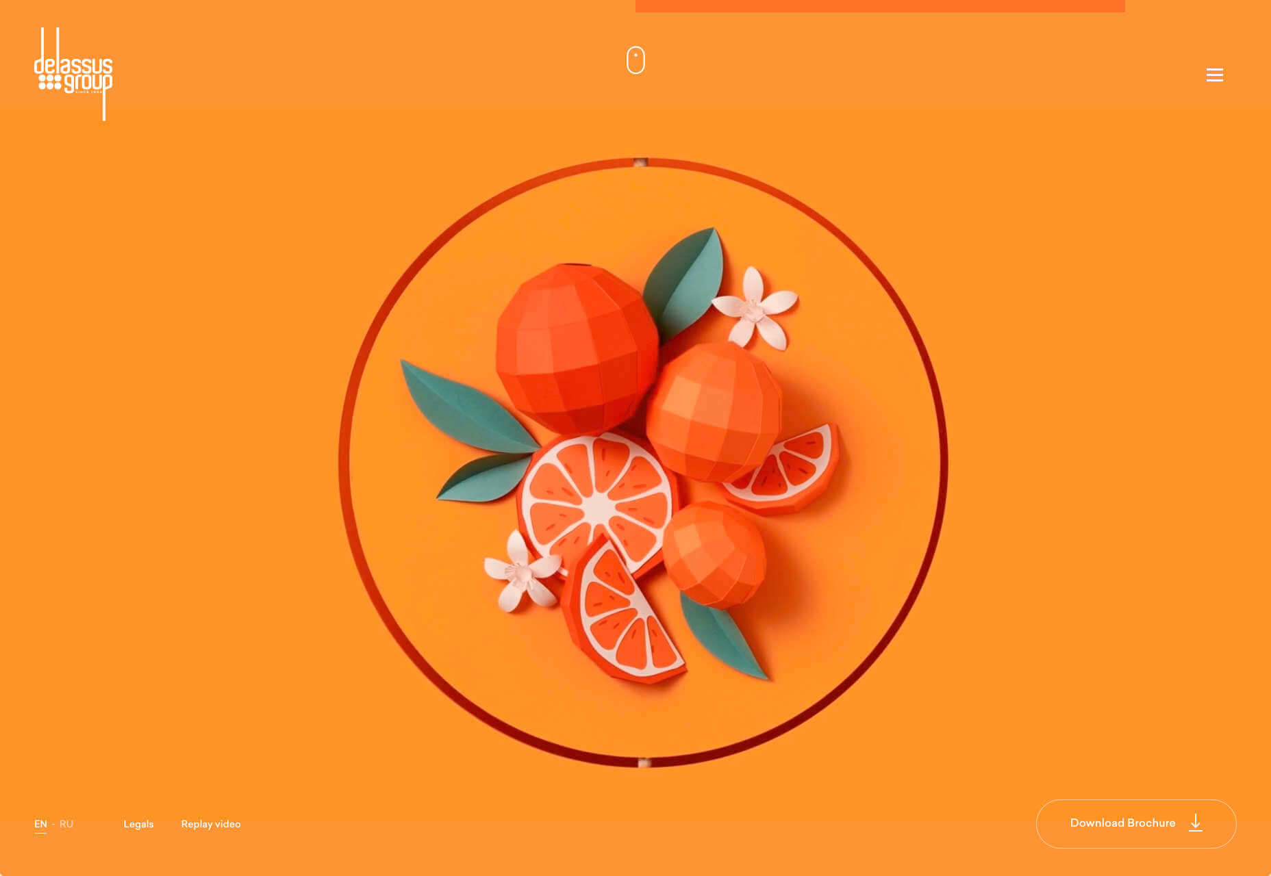
Delassus is a Moroccan company that grows ingredients from citrus fruits to avocados. Its whole site is a cornucopia of 3D design, with models of its products, and humorous typography. Bold, and fun, and practical too.

320 and 360 Wythe

Who would think that bricks and timber could look so glamorous? That’s what this site for two new buildings in Brooklyn achieves. The colors, the mockups, and the old-timey photography give these new builds a much needed heritage.

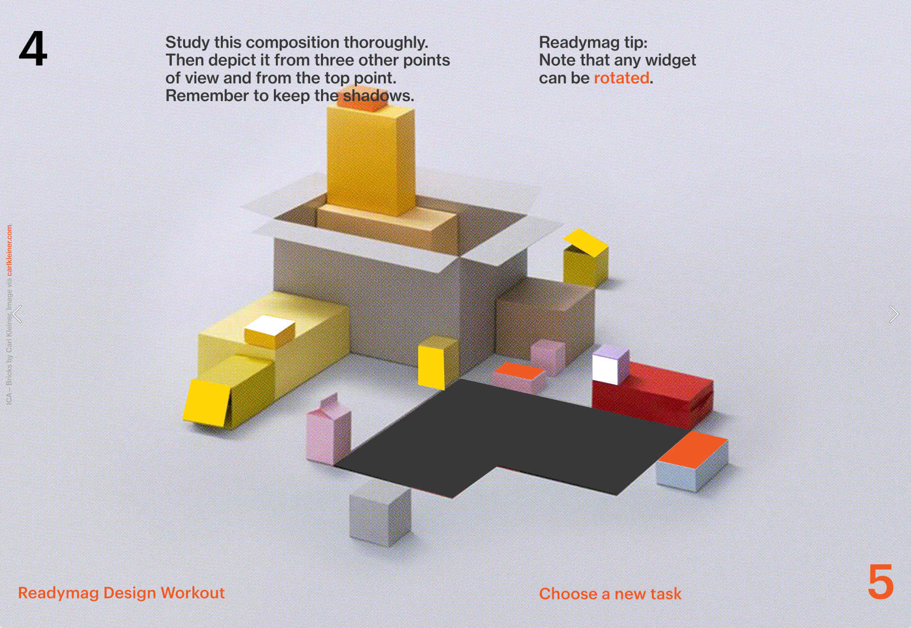
Readymag Design Workout

To keep you creative during the pandemic, Readymag has created this daily training program to hone your design skills and help you with decision making. It’s a drag and drop playground, with real world tasks to challenge you.

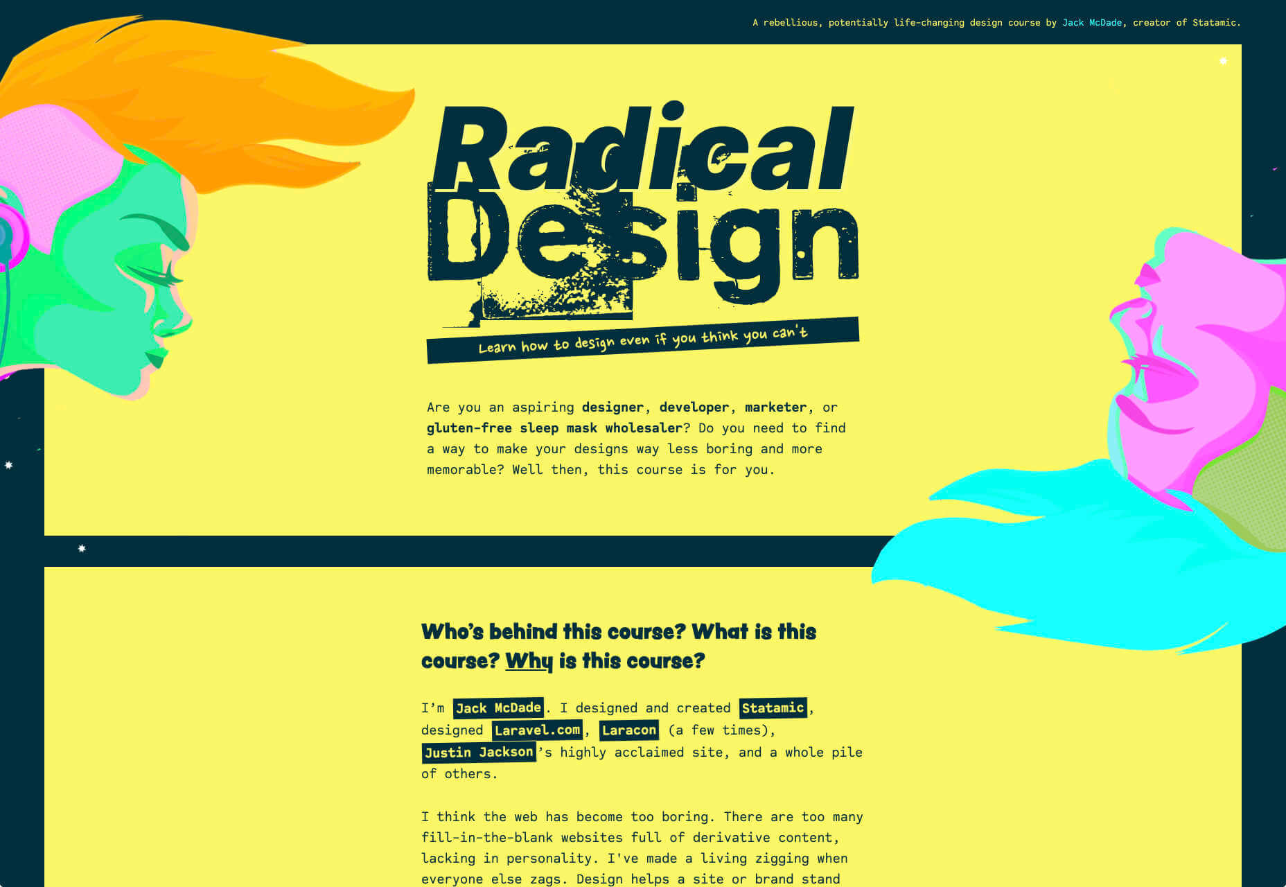
Radical Design Course

If you think that web design’s just too samey, then you’ll appreciate the launch page for the upcoming Radical Design course. It features tons of yellow, engaging typography, and some super-cute illustrations.

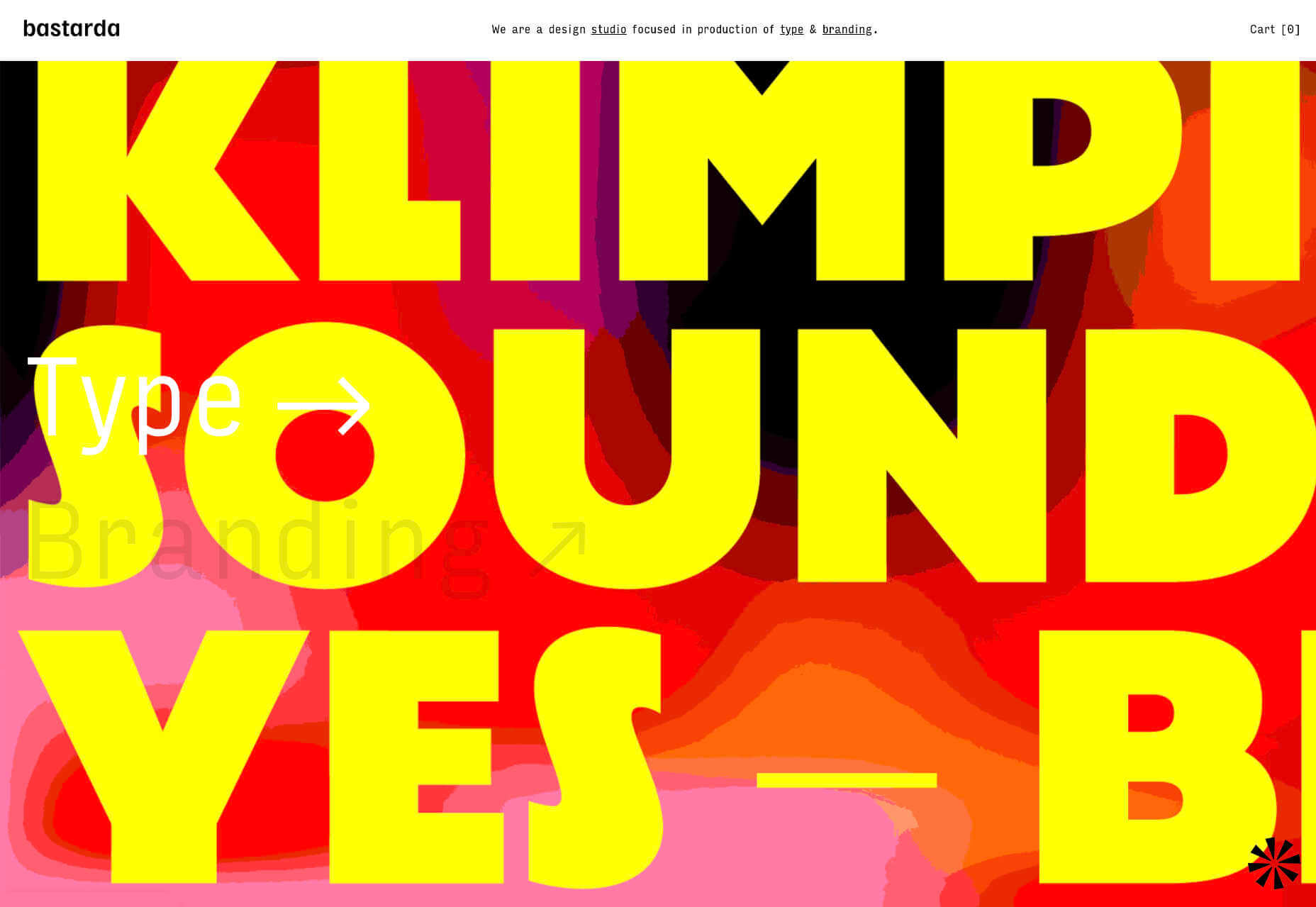
Bastarda

Bastarda is a type and branding design studio from Bogotá, Colombia. It has managed to create a sense of both simple, structured minimalism, and energy and excitement with hovers on its main links that trigger awesome reels.

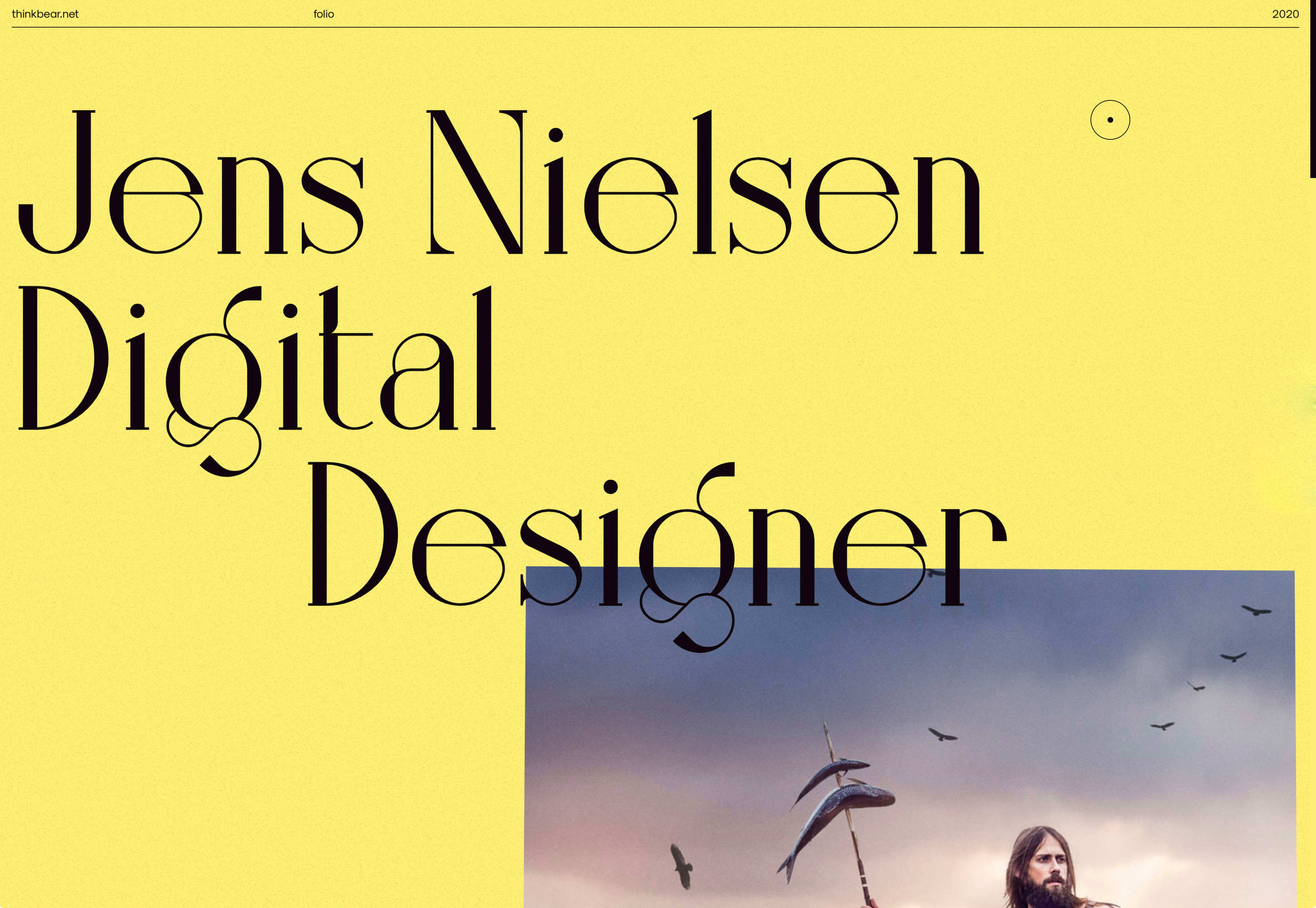
Jens Nielsen

This awesome portfolio for Jens Nielsen features some great artwork, a super-brave choice of font, and some really cool mouse overs that flash up thumbnails of work that’s all linked up on Dribbble.

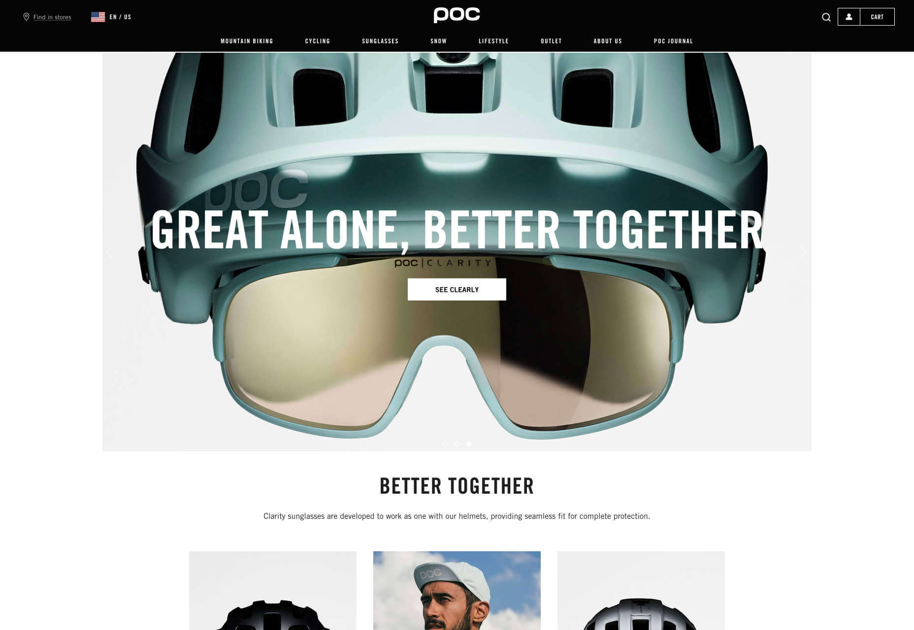
POC

More cycling this month curtesy of POC, makers of cycling helmets and apparel. This site does an awesome job of balancing lifestyle imagery, and a clean, practical e-commerce site that is easy to explore.

Stefanie Nelson Dancegroup

Some of the most striking design of the last century can be found on the radical covers of jazz albums. The Stefanie Nelson Dancegroup site follows a similar path with abstract shapes on the site mimicking body movements.

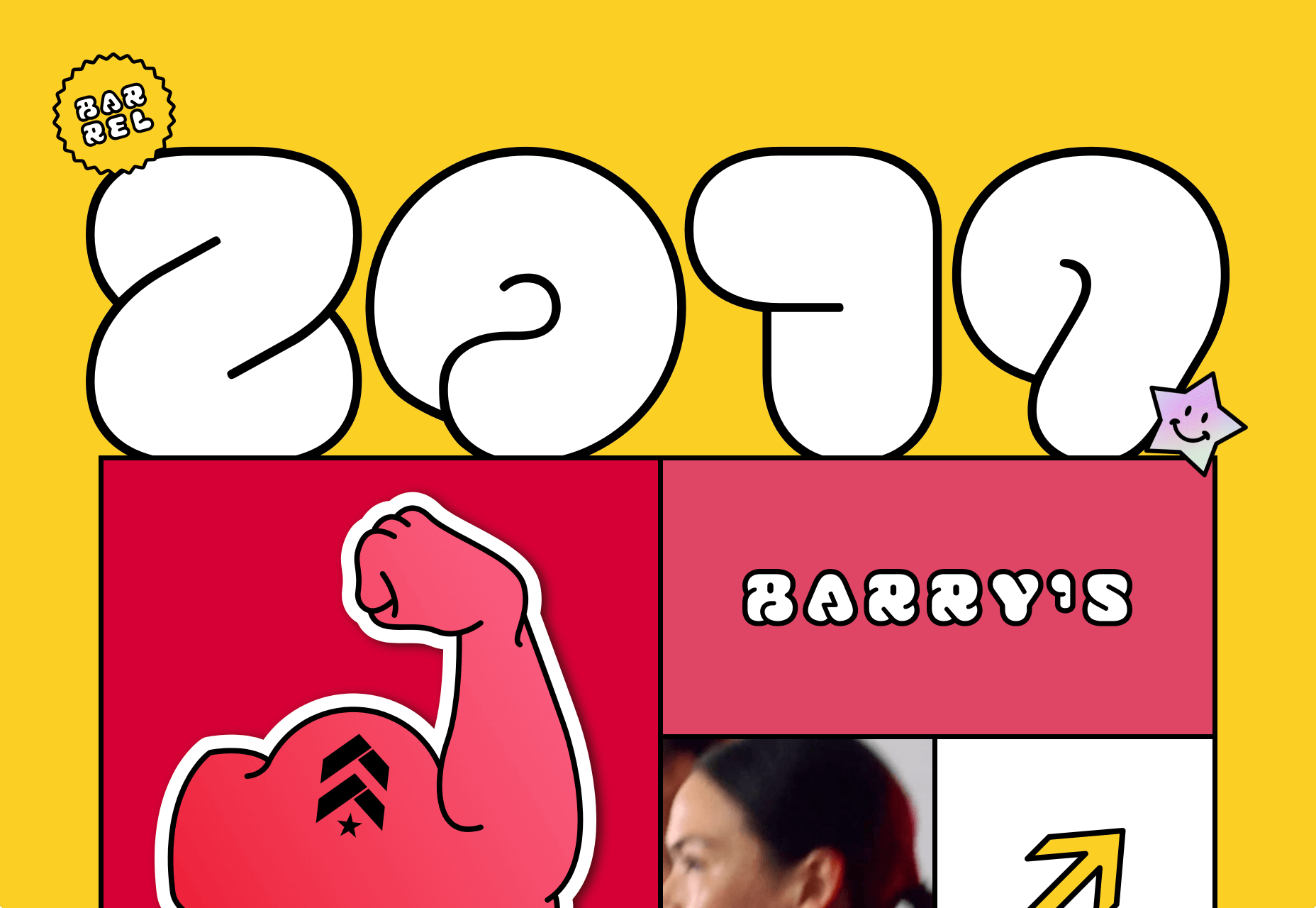
Barrel 2019

Barrel is a design studio that specialises in wellness brands, from workout products to the vitamins you take. This recap of their work from last year is fun, colorful, and a great opportunity for them to break away from their usual style.

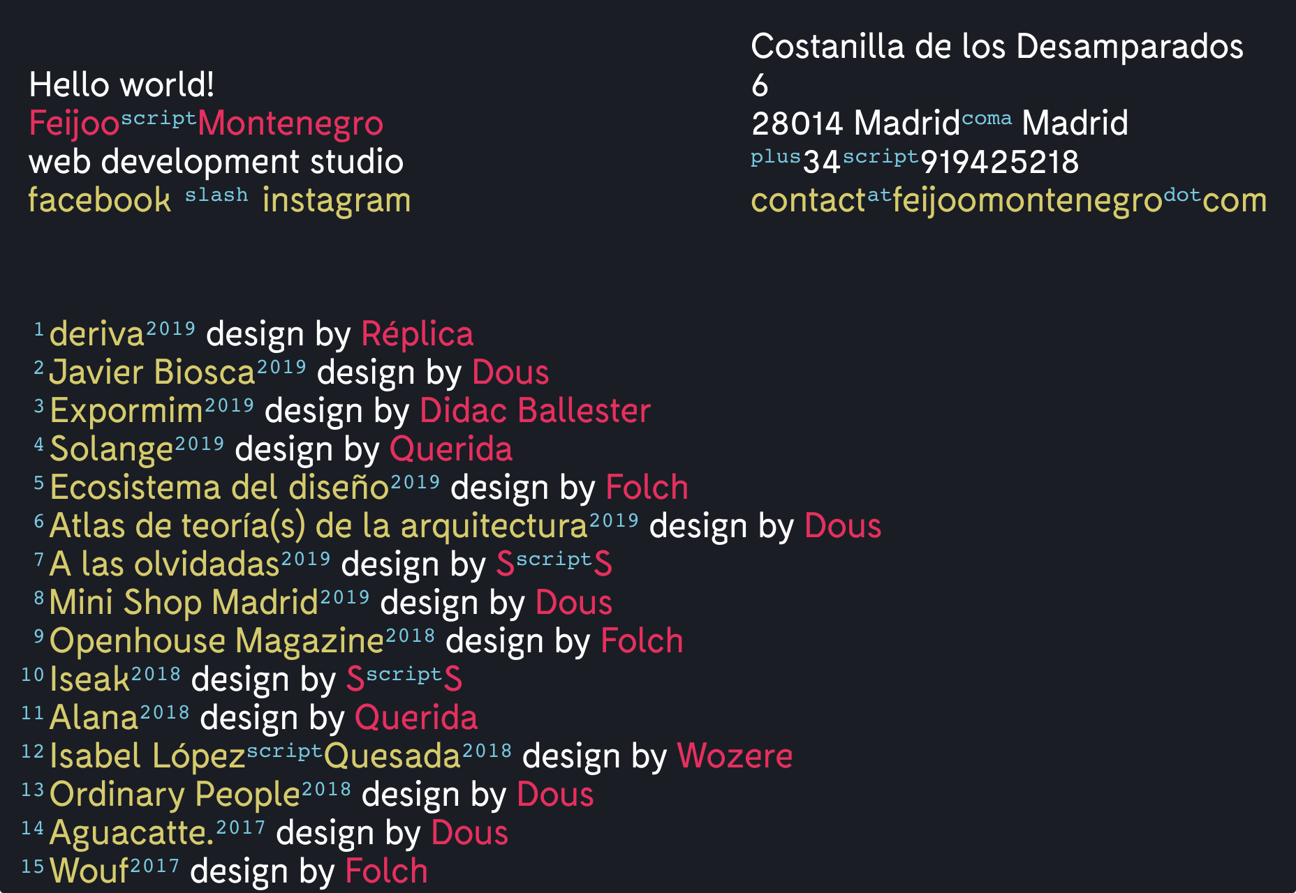
Feijoo

I have a soft-spot for all-text sites, and this simple list one-pager by Feijoo is right up their with my favorites. Perhaps is reminds me of my Sublime Text theme. Either way, I love the details like the numerals being replaced by words.

Source

Categories: Designing, Others Tags:

Diverse Illustration

June 7th, 2020 No comments

Hey gang, #BlackLivesMatter.

One tiny way I thought we could help here on this site, aside from our efforts as individuals, is to highlight some design resources that are both excellent and feature Black people. Representation matters.

Here’s one. You know Pablo Stanley? Pablo is a wonderful illustrator who combines his illustration work with modern design tooling. He has these illustration libraries that come as Sketch and Figma plugins so you can mix and match characters and their clothes, hair, skin color, and such.

Like Humaaans! Look at the possibilities:

Or OpenPeeps that has a different style but the same spirit:

Pablo and a team of folks are building Blush, which brings these things together into one product. Not just Pablo’s work, but the work of more illustrators like Susana Ortiz, Elina Cecila Giglio, Isabela Humphrey, and Else Ramirez to name a few so far.

I literally needed some people illustration the other day for an upcoming project, so I signed up and had a great time with it. I didn’t even know plugins like this were even possible in Figma!

Notice how absolutely non-white-centric all this is.

What I needed for my project was business-style people doing vague business-like things, and when I shopped around my usual stock art place, I get results like this:

It’s not that this company didn’t have diverse illustrations too. The more I looked around, I found plenty of good stuff, but the search results really did have a heavy tilt toward illustrations of groups of white people. That certainly would not have been appropriate for my project, which is ultimately going to be a part of a social experience for a very global product. I’d think a flock of white-only people as a graphic is rarely a good fit for any project.

If you take issue with that paragraph I just wrote, here’s some diverse Buttsss that you can kiss lolz:

And speaking of diverse illustrations, how about getting straight to it with Black Illustrations.

There’s some free stuff, and things you can buy, which cover design aspect that also suffer from lack of representation, like icon sets:

unDraw from Katerina Limpitsouni has great stuff too!

This last thing isn’t an illustration example, but y’all CSS people are likely to get a kick out of it:

100% of the proceeds of that shirt go to to the Black Lives Matter foundation.

I know, I know, ID’s can’t start with a number. If an element had an id="000000", you’d have to select it with #30 00000 in CSS because it’s just weird like that. But the point is still made ;).

The post Diverse Illustration appeared first on CSS-Tricks.

Categories: Designing, Others Tags:

Popular Design News of the Week: June 1, 2020 – June 7, 2020

June 7th, 2020 No comments

Every week users submit a lot of interesting stuff on our sister site Webdesigner News, highlighting great content from around the web that can be of interest to web designers.

The best way to keep track of all the great stories and news being posted is simply to check out the Webdesigner News site, however, in case you missed some here’s a quick and useful compilation of the most popular designer news that we curated from the past week.

20 Landing Page Templates for New Websites

Move Over Data Visualization. The Era of ‘Data Simulation’ is Here

Google Search will Now Favor Websites with Great UX

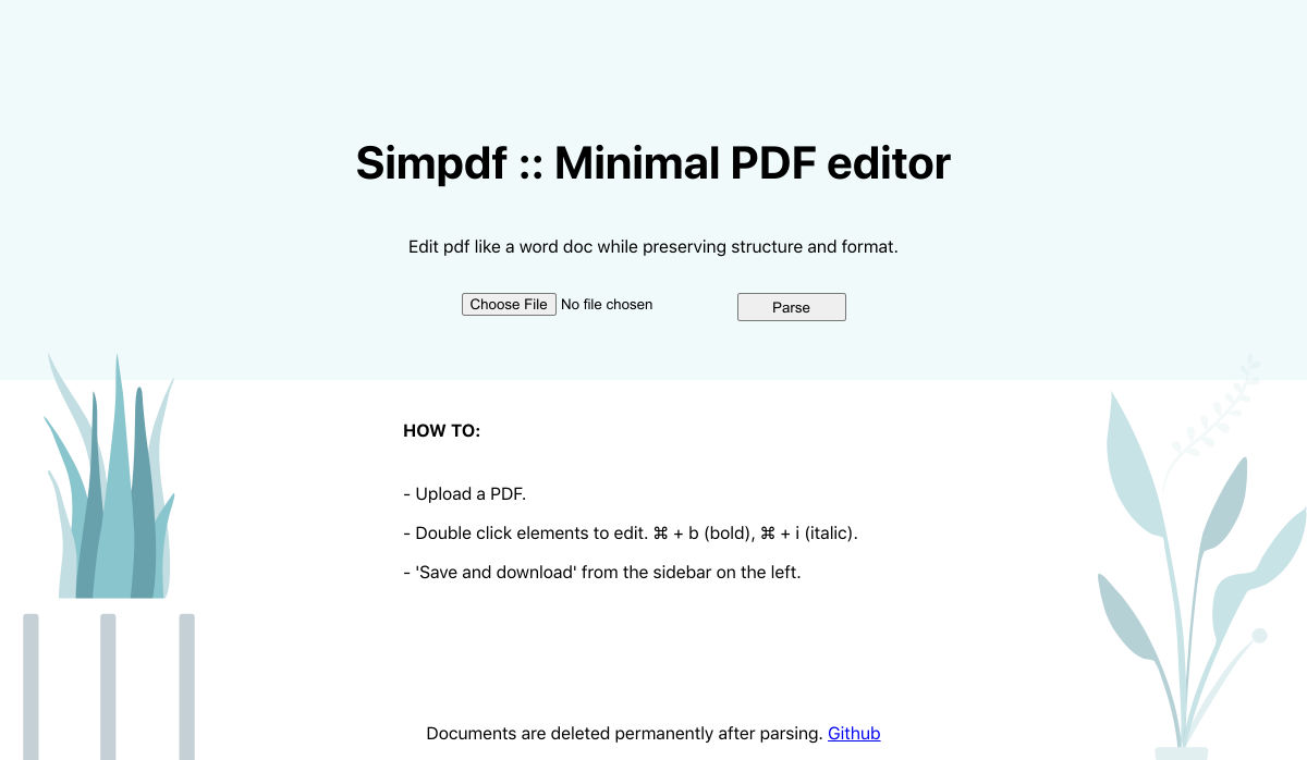
Simpdf – Free PDF Text Editor

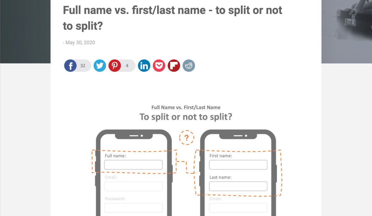
Full Name Vs. First/Last Name – To Split or not to Split?

7 Strategies to Design Landing Pages that Convert in 2020

Black and White Art: 20+ Dainty Illustrations

Here’s What I Didn’t Know About “Content”

ECommerce Design: 6 UX Best Practices

Colors in CSS

Free Vector Tech Illustrations You Can Download, Edit, & Use

Best UI Interaction’s of the Month – May 2020

10 Custom 404 Pages Ranked from Best to Worst

Nobody Told Me UX Would Be like this

Steal this Marketing Mindset, Make your Emails Stand Out

We’ve Got Work to do

I Tried to Build a Mobile App and Here’s What I Learned

Hacked: What to do When your WordPress Website has been Compromised

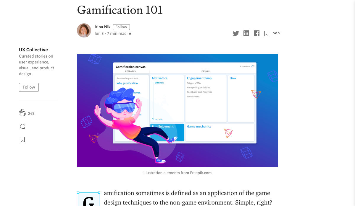
Gamification 101

Church Logo Design Tips – A Branding Guide for Churches

10 Best Design Systems and How to Learn (and Steal) from Them

Black Lives Matter: A Spotlight on Design for Change

The Best Design System Tool is Slack

How to Boost Creativity During a Quarantine

The Inner Dragon: Confidence

Want more? No problem! Keep track of top design news from around the web with Webdesigner News.

Source

Categories: Designing, Others Tags:

How I Used Brotli to Get Even Smaller CSS and JavaScript Files at CDN Scale

June 5th, 2020 No comments

The HBO sitcom Silicon Valley hilariously followed Pied Piper, a team of developers with startup dreams to create a compression algorithm so powerful that high-quality streaming and file storage concerns would become a thing of the past.

In the show, Google is portrayed by the fictional company Hooli, which is after Pied Piper’s intellectual property. The funny thing is that, while being far from a startup, Google does indeed have a powerful compression engine in real life called Brotli.

This article is about my experience using Brotli at production scale. Despite being really expensive and a truly unfeasible method for on-the-fly compression, Brotli is actually very economical and saves cost on many fronts, especially when compared with gzip or lower compression levels of Brotli (which we’ll get into).

Brotli’s beginning…

In 2015, Google published a blog post announcing Brotli and released its source code on GitHub. The pair of developers who created Brotli also created Google’s Zopfli compression two years earlier. But where Zopfli leveraged existing compression techniques, Brotli was written from the ground-up and squarely focused on text compression to benefit static web assets, like HTML, CSS, JavaScript and even web fonts.

At that time, I was working as a freelance website performance consultant. I was really excited for the 20-26% improvement Brotli promised over Zopfli. Zopfli in itself is a dense implementation of the deflate compressor compared with zlib’s standard implementation, so the claim of up to 26% was quite impressive. And what’s zlib? It’s essentially the same as gzip.

So what we’re looking at is the next generation of Zopfli, which is an offshoot of zlib, which is essentially gzip.

A story of disappointment

It took a few months for major CDN players to support Brotli, but meanwhile it was seeing widespread adoption in tools, services, browsers and servers. However, the 26% dense compression that Brotli promised was never reflected in production. Some CDNs set a lower compression level internally while others supported Brotli at origin so that they only support it if it was enabled manually at the origin.

Server support for Brotli was pretty good, but to achieve high compression levels, it required rolling your own pre-compression code or using a server module to do it for you — which is not always an option, especially in the case of shared hosting services.

This was really disappointing for me. I wanted to compress every last possible byte for my clients’ websites in a drive to make them faster, but using pre-compression and allowing clients to update files on demand simultaneously was not always easy.

Taking matters into my own hands

I started building my own performance optimization service for my clients.

I had several tricks that could significantly speed up websites. The service categorized all the optimizations in three groups consisting of several “Content,” “Delivery,” and “Cache” optimizations. I had Brotli in mind for the content optimization part of the service for compressible resources.

Like other compression formats, Brotli comes in different levels of power. Brotli’s max level is exactly like the max volume of the guitar amps in This is Spinal Tap: it goes to 11.

Brotli:11, or Brotli compression level 11, can offer significant reduction in the size of compressible files, but has a substantial trade-off: it is painfully slow and not feasible for on demand compression the same way gzip is capable of doing it. It costs significantly more in terms of CPU time.

In my benchmarks, Brotli:11 takes several hundred milliseconds to compress a single minified jQuery file. So, the only way to offer Brotli:11 to my clients was to use it for pre-compression, leaving me to figure out a way to cache files at the server level. Luckily we already had that in place. The only problem was the fear that Brotli could kill all our processing resources.

Maybe that’s why Pied Piper had to continue rigging its servers for more power.

I put my fears aside and built Brotli:11 as a configurable server option. This way, clients could decide whether enabling it was worth the computing cost.

It’s slow, but gradually pays off

Among several other optimizations, the service for my clients also offers geographic content delivery; in other words, it has a built-in CDN.

Of the several tricks I tried when taking matters into my own hands, one was to combine public CDN (or open-source CDN) and private CDN on a single host so that websites can enjoy the benefits of shared browser cache of public resources without incurring separate DNS lookup and connection cost for that public host. I wanted to avoid this extra connection cost because it has significant impact for mobile users. Also, combining more and more resources on a single host can help get the most of HTTP/2 features, like multiplexing.

I enabled the public CDN and turned on Brotli:11 pre-compression for all compressible resources, including CSS, JavaScript, SVG, and TTF, among other types of files. The overhead of compression did indeed increase on first request of each resource — but after that, everything seemed to run smoothly. Brotli has over 90% browser support and pretty much all the requests hitting my service now use Brotli.

I was happy. Clients were happy. But I didn’t have numbers. I started analyzing the impact of enabling this high density compression on public resources. For this, I recorded file transfer sizes of several popular libraries — including jQuery, Bootstrap, React, and other frameworks — that used common compression methods implemented by other CDNs and found that Brotli:11 compression was saving around 21% compared to other compression formats.

It’s important to note that some of the other public CDNs I compared were already using Brotli, but at lower compression levels. So, the 21% extra compression was really satisfying for me. This number is based on a very small subset of libraries but is not incorrect by a big margin as I was seeing this much gain on all of the websites that I tested.

Here is a graphical representation of the savings.

Vertical bar chart. Compares jQuery, Bootstrap, D3.js, Ant Design, Senamtic UI, Font Awesome, React, Three.js, Bulma and Vue before and after Brotli compression. Brotli compression is always smaller.

You can see the raw data below..Note that the savings for CSS is much more prominent than what JavaScript gets.

Library Original Avg. of Common Compression (A) Brotli:11 (B) (A) / (B) – 1
Ant Design 1,938.99 KB 438.24 KB 362.82 KB 20.79%
Bootstrap 152.11 KB 24.20 KB 17.30 KB 39.88%
Bulma 186.13 KB 23.40 KB 19.30 KB 21.24%
D3.js 236.82 KB 74.51 KB 65.75 KB 13.32%
Font Awesome 1,104.04 KB 422.56 KB 331.12 KB 27.62%
jQuery 86.08 KB 30.31 KB 27.65 KB 9.62%
React 105.47 KB 33.33 KB 30.28 KB 10.07%
Semantic UI 613.78 KB 91.93 KB 78.25 KB 17.48%
three.js 562.75 KB 134.01 KB 114.44 KB 17.10%
Vue.js 91.48 KB 33.17 KB 30.58 KB 8.47%

The results are great, which is what I expected. But what about the overall impact of using Brotli:11 at scale? Turns out that using Brotli:11 for all public resources reduces cost all around:

  • The smaller file sizes are expected to result in lower TLS overhead. That said, it is not easily measurable, nor is it significant for my service because modern CPUs are very fast at encryption. Still, I believe there is some tiny and repeated saving on account of encryption for every request as smaller files encrypt faster.
  • It reduces the bandwidth cost. The 21% savings I got across the board is the case in point. And, remember, savings are not a one-time thing. Each request counts as cost, so the 21% savings is repeated time and again, creating a snowball savings for the cost of bandwidth.
  • We only cache hot files in memory at edge servers. Due to the widespread browser support for Brotli, these hot files are mostly encoded by Brotli and their small size lets us fit more of them in available memory.
  • Visitors, especially those on mobile devices, enjoy reduced data transfer. This results in less battery use and savings on data charges. That’s a huge win that gets passed on to the users of our clients!

This is all so good. The cost we save per request is not significant, but considering we have a near zero cache miss rate for public resources, we can easily amortize the initial high cost of compression in next several hundred requests. After that, we’re looking at a lifetime benefit of reduced overhead.

It doesn’t end there

With the mix of public and private CDNs that we introduced as part of our performance optimization service, we wanted to make sure that clients could set lower compression levels for resources that frequently change over time (like custom CSS and JavaScript) on the private CDN and automatically switch to the public CDN for open-source resources that change less often and have pre-configured Brotli:11. This way, our clients can still get a high compression ratio on resources that change less often while still enjoying good compression ratios with instant purge and updates for compressible resources.

This all is done smoothly and seamlessly using our integration tools. The added benefit of this approach for clients is that the bandwidth on the public CDN is totally free with unprecedented performance levels.

Try it yourself!

Testing on a common website, using aggressive compression can easily shave around 50 KB off the page load. If you want to play with the free public CDN and enjoy smaller CSS and JavaScript, you are welcome to use our PageCDN service. Here are some of the most used libraries for your use:

<!-- jQuery 3.5.0 -->
<script src="https://pagecdn.io/lib/jquery/3.5.0/jquery.min.js" crossorigin="anonymous" integrity="sha256-xNzN2a4ltkB44Mc/Jz3pT4iU1cmeR0FkXs4pru/JxaQ=" ></script>


<!-- FontAwesome 5.13.0 -->
<link href="https://pagecdn.io/lib/font-awesome/5.13.0/css/all.min.css" rel="stylesheet" crossorigin="anonymous" integrity="sha256-h20CPZ0QyXlBuAw7A+KluUYx/3pK+c7lYEpqLTlxjYQ=" >


<!-- Ionicons 4.6.3 -->
<link href="https://pagecdn.io/lib/ionicons/4.6.3/css/ionicons.min.css" rel="stylesheet" crossorigin="anonymous" integrity="sha256-UUDuVsOnvDZHzqNIznkKeDGtWZ/Bw9ZlW+26xqKLV7c=" >


<!-- Bootstrap 4.4.1 -->
<link href="https://pagecdn.io/lib/bootstrap/4.4.1/css/bootstrap.min.css" rel="stylesheet" crossorigin="anonymous" integrity="sha256-L/W5Wfqfa0sdBNIKN9cG6QA5F2qx4qICmU2VgLruv9Y=" >


<!-- React 16.13.1 -->
<script src="https://pagecdn.io/lib/react/16.13.1/umd/react.production.min.js" crossorigin="anonymous" integrity="sha256-yUhvEmYVhZ/GGshIQKArLvySDSh6cdmdcIx0spR3UP4=" ></script>


<!-- Vue 2.6.11 -->
<script src="https://pagecdn.io/lib/vue/2.6.11/vue.min.js" crossorigin="anonymous" integrity="sha256-ngFW3UnAN0Tnm76mDuu7uUtYEcG3G5H1+zioJw3t+68=" ></script>

Our PHP library automatic switches between private and public CDN if you need it to. The same feature is implemented seamlessly in our WordPress plugin that automatically loads public resources over Public CDN. Both of these tools allow full access to the free public CDN. Libraries for JavaScript, Python. and Ruby are not yet available. If you contribute any such library to our Public CDN, I will be happy to list it in our docs.

Additionally, you can use our search tool to immediately find a corresponding resource on the public CDN by supplying a URL of a resource on your website. If none of these tools work for you, then you can check the relevant library page and pick the URLs you want.

Looking toward the future

We started by hosting only the most popular libraries in order to prevent malware spread. However, things are changing rapidly and we add new libraries as our users suggest them to us. You are welcome to suggest your favorite ones, too. If you still want to link to a public or private Github repo that is not yet available on our public CDN, you can use our private CDN to connect to a repo and import all new releases as they appear on GitHub and then apply your own aggressive optimizations before delivery.

What do you think?

Everything we covered here is solely based on my personal experience working with Brotli compression at CDN scale. It just happens to be an introduction to my public CDN as well. We are still a small service and our client websites are only in the hundreds. Still, at this scale the aggressive compression seems to pay off.

I achieved high quality results for my clients and now you can use this free service for your websites as well. And, if you like it, please leave feedback at my email and recommend it to others.

The post How I Used Brotli to Get Even Smaller CSS and JavaScript Files at CDN Scale appeared first on CSS-Tricks.

Categories: Designing, Others Tags:

A/B Testing Instant.Page With Netlify and Speedcurve

June 5th, 2020 No comments

Instant.Page does one special thing to make sites faster: it preloads the next page when it’s pretty sure you’re going to click a link (either by hovering over 65ms or mousedown on desktop, or touchstart on mobile), so when you do complete the click (probably a few hundred milliseconds later), it loads that much faster.

It’s one thing to understand that approach, buy into it, integrate it, and consider it a perf win. I have it installed here!

It’s another thing to actually get the data on your own site. Leave it to Tim Kadlec to get clever and A/B test it. Tim was able to do a 50/50 A/B split with performance-neutral Netlify split testing. Half loaded Instant.Page, the other half didn’t. And the same halves told SpeedCurve which half they were in, so performance charts could be built to compare.

Tim says it mostly looks good, but his site probably isn’t the best test:

It’s also worth noting that even if the results do look good, just because it does or doesn’t make an impact on my site doesn’t mean it won’t have a different impact elsewhere. My site has a short session length, typically, and very lightweight pages: putting this on a larger commercial site would inevitably yield much different results.

I’d love to see someone do this on a beefier site. I’m in the how could it not be faster?! camp, but with zero data.

Direct Link to ArticlePermalink

The post A/B Testing Instant.Page With Netlify and Speedcurve appeared first on CSS-Tricks.

Categories: Designing, Others Tags:

Equivalent Experiences: Thinking Equivalently

June 5th, 2020 No comments
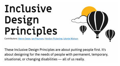
Screenshot of the top portion of the Inclusive Design Principles website. It includes a simple illustration of three hot air balloons floating in front of a cloud and sun. It also has the intro paragraph, “These Inclusive Design Principles are about putting people first. It's about designing for the needs of people with permanent, temporary, situational, or changing disabilities — all of us really.” The contributors are listed as Henny Swan, Ian Pouncey, Heydon Pickering, and Léonie Watson

Equivalent Experiences: Thinking Equivalently

Equivalent Experiences: Thinking Equivalently

Eric Bailey

2020-06-05T12:00:00+00:00
2020-06-06T01:35:33+00:00

This is the second of two articles on the topic of how digital accessibility is informed by equivalency. Previously, we have learned about the underlying biases that inform digital product creation, what isn’t an equivalent experience, the compounding effects of inaccessible design and code, and powerful motivating forces for doing better.

In this article, I will discuss learning how to embrace an equivalent, inclusive mindset. I will also provide practical, robust ways to improve your websites and web apps by providing solutions to common, everyday barriers cited by the people I interviewed.

Setting A Standard

The Web Content Accessibility Guidelines (WCAG) outlines in painstaking detail how to craft accessible digital experiences. While a long and dense document, it is incredibly comprehensive — to the point where it’s been codified as an international standard. For over 10 years, we’ve had a globally agreed upon, canonical definition of what constitutes as usable.

How Would I?

If you need a little help constructing the initial mental framework the WCAG gets at, a question I always ask myself when making something is, “How would I use this if…” It’s a question that gets you to check all the biases that might be affecting you in the moment.

Examples could be:

  • How would I use this if…
    • …I can’t see the screen?
    • …I can’t move my arms?
    • …I’m sensitive to flashing and strobing animation?
    • …English isn’t my primary language?
    • …I have a limited budget for bandwidth?
    • …I’ve set a large default type size?
    • …and so on.

Focus on these four parameters to improve usability of your web design:

1. Visual – make it easy to see
2. Auditory – make it easy to hear
3. Motor – make it easy to interact with
4. Cognitive – make it easy to understand

? Accessibility goals are also usability goals.

— Alex ? (@alexmuench) January 30, 2020

A Gentle Introduction

If you’re looking for a more approachable resource for how to dig into what the WCAG covers, the Inclusive Design Principles would be a great place to start. The seven principles it describes all map back to WCAG success criterion.

Screenshot of the top portion of the Inclusive Design Principles website. It includes a simple illustration of three hot air balloons floating in front of a cloud and sun. It also has the intro paragraph, “These Inclusive Design Principles are about putting people first. It's about designing for the needs of people with permanent, temporary, situational, or changing disabilities — all of us really.” The contributors are listed as Henny Swan, Ian Pouncey, Heydon Pickering, and Léonie Watson

(Large preview)

Learn From The People Who Actually Use It

You don’t have to take my word for it. Here are some common issues cited by the people I interviewed, and how to fix them:

Wayfinding

Headings

Heading elements are incredibly important for maintaining an equivalent, accessible experience.

When constructed with skill and care, heading elements allow screen reader users to quickly determine the contents of a page or view and navigate to content relevant to their interests. This is equivalent to how someone might quickly flit around, scrolling until something that looks pertinent comes into view.

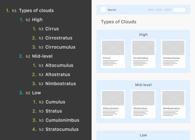
A graphic showing how nested heading elements correspond to the layout of a design for a site called SkyList. The first level heading is “Types of Clouds,” which maps to the page's h1 element. The three h2 heading elements read, “High,” “Mid-level,” and “Low.” Each of these headings is represented in the design as a shaded area. Within each area are card designs, including an image placeholder, a title, and a paragraph placeholder. The h3 heading elements for the High section cards are “Cirrus,” “Cirrostratus,” and “Cirrocumulus.” The h3 heading elements for the Mid-level section cards are “Altocumulus,” “Altostratus,” and “Nimbostratus.” The h3 heading elements for the Low section cards are “Cumulus,” “Stratus,” “Cumulonimbus,” and “Stratocumulus.”

The HeadingsMap browser extension lets you view a page’s heading hierarchy. (Large preview)

Justin Yarbrough voices poorly-authored heading elements as a concern, and he’s not alone.

WebAIM’s screen reader survey cites headings as the most important way to find information. This survey is well-worth paying attention to, as it provides valuable insight into how disabled people actually use assistive technology.

Landmarks

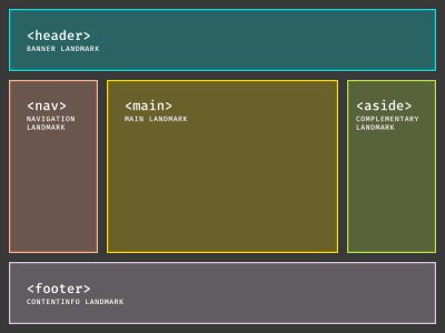
In addition to heading elements, another way to determine the overall structure and layout are landmarks. Landmarks are roles implicitly described by HTML sectioning elements, used to help describe the overall composition of the main page or view areas.

A ‘holy grail' layout showing a header element row stretching across three columns. Below that is another row with three columns, using nav, main, and aside elements. Below that is a third and final column-stretching row  using the footer element. Each element is also labeled with its corresponding landmark.

These are five of the eight landmark HTML elements and the roles using them create. (Large preview)

Here’s what Justin has to say:

“If I’m just trying to find the main content, I’ll first try the Q JAWS shortcut key to see if a main region’s set up. If not, I’m just more or less stuck trying to scan the page to find it arrowing through the page.”

Much as how we might use a layer group name of “primary nav” in our design file, or a class name of c-nav-primary in our CSS, it’s important we also use a nav sectioning element to describe our main site navigation (as well as any other navigation the page or view contains).

Doing so ensures intent is carried all the way through from conception, to implementation, to use. The same notion carries through for the other HTML sectioning elements that create landmarks for assistive technology.

Labeled Controls

Brian Moore tells us about “form fields with no label or at least one that isn’t programmatically associated so it doesn’t read anything.”

It’s another frustratingly common problem.

Providing a valid for/id attribute pairing creates a programmatic association between form inputs and the label that describes what it does. And when I say label, I mean the label element. Not a clickable div, a placeholder, aria-label, or some other brittle and/or overwrought solution. label elements are a tried-and-true solution that enjoys wide and deep support for accessibility.

In addition, a label element should not be used by itself, say for a label on a diagram. This might seem counter-intuitive at first, but please bear with me.

<!-- Please do this -->
<label for="your-name">Your name</label>
<input type="text" id="your-name" name="your-name" autocomplete="name">

<!-- Don't do this -->
<label for="eye">Cornea</label>
<label for="eye">Pupil</label>
<label for="eye">Lens</label>
<label for="eye">Retina</label>
<label for="eye">Optic Nerve</label>
<img id="eye" alt="A diagram of the human eye." src="parts-of-the-eye.png" />

The same kinds of assistive technology that let a person jump to headings and landmarks also allow them to jump to input labels. Because of this, there is the expectation that when a label element is present, there is also a corresponding input it is associated with.

Alternative Descriptions

If you have low or no vision, and/or have difficulty understanding an image, HTML’s alt attribute (and not the title attribute) provides a mechanism to understand what the image is there for. The same principle applies for providing captions for video and audio content like podcasts.

Kenny Hitt mentions that when:

“…someone posts something on Twitter, if it’s just an unlabeled image, I don’t even take the time to participate in the conversation. When you start every conversation by asking what’s in the picture, it really derails things.”

Up until last week, the only way for Twitter to provide alternative descriptions for its images was to enable an option buried away in the subsection of a preference menu. Compare this to a platform like Mastodon, where the feature is enabled by default.

Soren Hamby, mentions Stitcher, a popular podcast app. “The onboarding was a lot of themed graphics, but the alt text for each one was ‘unselected’ and for the same image with a check over it was selected. I think it would be reasonable for them to say ‘sci-fi genre selected’ […] it’s such a small thing but it makes all the difference.”

Ensuring that alternate description content is concise and descriptive is just as important as including the ability to add it. Daniel Göransson, a developer for Axess Lab, has a great article on how to write them effectively.

Robust, accessible features can also be part of evaluation criteria, as well as a great method for building customer loyalty. Soren mentions that they are “often the deciding factor, especially between services.” In particular, they cite Netflix’s audio descriptions.

ARIA

One topic Daniel Göransson’s article on alternative descriptions mentions is to not over-describe things. This includes information like that it is an image, who the photographer is, and keyword stuffing.

The same principle applies for Accessible Rich Internet Applications (ARIA). ARIA is a set of attributes designed to extend HTML to fill in the gaps between interactive content and assistive technology. When ARIA is used to completely replace HTML, it oftentimes leads to an over-described experience.

Brian explains: “There seems to be a perception that more ARIA fixes accessibility and it can help, but too much either reads wrong things or just talks way too much. If on screen text of one or two words is good enough for everyone else, it is good enough for screen reader users too. We don’t need whole sentence or two descriptions of buttons or links i.e ‘link privacy policy’ is far better than something like ‘this link will open our privacy policy, this link will open in a new window’ when the on screen link text is ‘privacy policy.’”

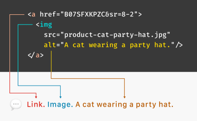
The First Rule of ARIA Use advises us to only use it when a native element won’t suffice. You don’t need to describe what your interactive component is or how it works, the same way you don’t need to include the word “image” in your alternative description.

Provided that you use the appropriate native HTML element, assistive technology will handle all of that for you. Do more, more robustly, with less effort? Sounds great to me!

A code sample of an anchor element wrapping an image, with an alt description that reads, “A cat wearing a party hat.” Arrows from the HTML elements and attributes point towards how everything combines to create a phrase spoken aloud by a screen reader. The phrase reads, “Link. Image. A cat wearing a party hat.

(Large preview)

Unlike most of HTML, CSS, and JS, the success of implemented ARIA is contextual, variable, and largely invisible. In spite of this, we seem to be slathering ARIA onto everything without bothering to check not only if it actually works, but also what the people who actually use it think of it.

Support for ARIA is fragmented across operating systems, browsers, and assistive technology offerings, all their respective versions, and every possible permutation of all three. Simply put, writing ARIA and trusting it will work as intended isn’t enough.

If misconfigured and/or over-applied, ARIA can break. It may not report actual functionality, announce the wrong functionality, and (accurately or inaccurately) over-describe functionality. Obviously, these experiences aren’t equivalent.

Representation matters. To get a better understanding of how the ARIA code you wrote actually works, I recommend hiring people to tell you. Here are four such services that do exactly that:

Contrast

Color Contrast

Color contrast is another common issue, one whose severity often seems to be downplayed. If I could wager a guess, it’s because it’s easy to forget that other people’s vision might be different than your own. Regardless, it is a concern that affects a wide swath of the global population, and we should treat the issue with the seriousness it deserves.

The Click-Away Pound Survey tells us that out of the top issues faced by users with access needs, contrast and legibility weighs in as the fifth most significant issue. On top of that, it has increased as a concern, going from 44% of respondents in 2016 to 55% in 2019.

We live in an age where there’s more color contrast checking resources than I can count. Products like Stark can help designers audit their designs before it is translated into code. Tools like Eightshape’s Contrast Grid and Atul Varma’s Accessible color palette builder let you craft your design systems with robust, accessible color combinations out of the gate.

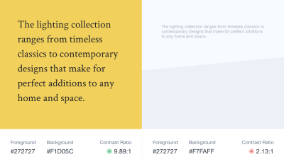
A side-by-side comparison demonstrating acceptable and bad color contrast ratios. The first example shows black text on a dark yellow background, with a passing contrast ratio of 9.89:1. The second example shows light gray text on a light blue background, with a failing contrast ratio of 2.13:1. The text for both examples reads, “The lighting collection ranges from timeless classics to contemporary designs that make for perfect additions to any home and space.”

(Large preview)

The somewhat ironic thing about color contrast is how, ah, visible it is. While some of the previous accessibility issues are invisible—hidden away as the underlying code—contrast is a pretty straightforward issue.

Mostly, contrast is a binary scenario, in that you either can or cannot see content. So, the next time you check your website or webapp with an automated accessibility checker such as Deque’s axe, don’t be so quick to downplay the color contrast errors it reports.

High Contrast

There are technology solutions for situations where even satisfactory color contrast ratios isn’t sufficient—namely, inverted colors mode and High Contrast Mode. Many participants I interviewed mentioned using these display modes during their daily computer use.

Provided you use semantic HTML, both of these modes don’t need much effort on the development end of things to work well. The important bit is to check out what you’re building in these two modes to make sure everything is working as intended.

Striving For Perfection

To quote Léonie Watson,

“Accessibility doesn’t have to be perfect, it just needs to be a little bit better than yesterday.”

By understanding both why, and how to improve your digital accessibility experiences in ways that directly address common barriers, you’re able to provide meaningful and enjoyable experiences to all.

Further Reading

Thank you to Brian Moore, Damien Senger, Jim Kiely, Justin Yarbrough, Kenny Hitt, and Soren Hamby for sharing their insights and experiences.

(ra, il)
Categories: Others Tags:

5 Ways to Build Codeless Websites Using WordPress’ Gutenberg

June 5th, 2020 No comments

Web designers could be forgiven if their eyes glazed over at the mere mention of building a custom website. Creating an advanced website used to require programming knowledge and hours of coding.

But thanks to Gutenberg, even those who don’t know their HTML from their CSS will be able to create professional websites that stand out from the competition.

The initial feedback to the release of Gutenberg certainly was damning: “…Useless…A joke…Terrible…”

You can argue about how WordPress handled the launch of its new content block editor (and you might be right in thinking it wasn’t great) but the dirty secret is that, after a number of updates, Gutenberg has evolved into an excellent tool for building websites.

Below I will show you 5 ways a web designer with limited coding experience can take advantage of Gutenberg to build the types of custom websites that businesses are looking for.

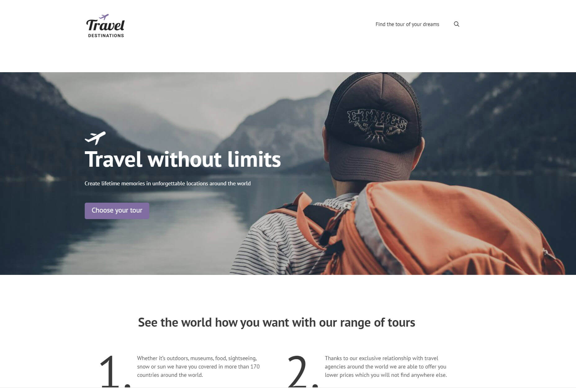
I created a travel website with a number of custom features using these three tools:

  • Gutenberg
  • Toolset – Its new Toolset Blocks allows you to add custom features to your websites including custom post types, a search and dynamic content.
  • GeneratePress – A lightweight and fast theme that is easy for beginners to use.

Now I’ll let you in on a secret. I’m not a developer. In fact, I have limited coding experience. Yet I was able to use Gutenberg to build a professional website with a number of features that custom websites would require. Below I’ll go through five of them.

1. You Can Create Dynamic Content

An advantage it has over page builders is that Gutenberg comes with a number of block extensions to enhance your websites. One of those is Toolset which offers dynamic content capabilities.

Dynamic content means you can create an element (such as an image) that will draw the correct content from the database. So when you create a list of posts you only need to add each block for each element once, but that block will display different content for each post.

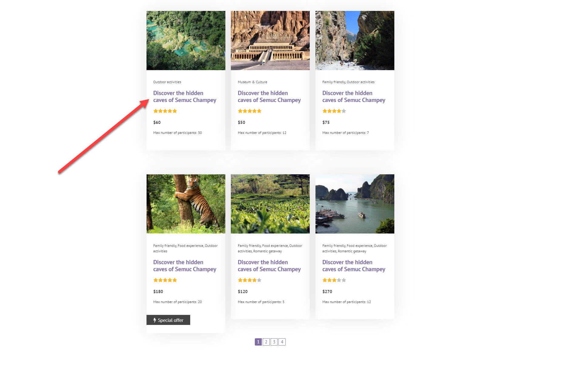
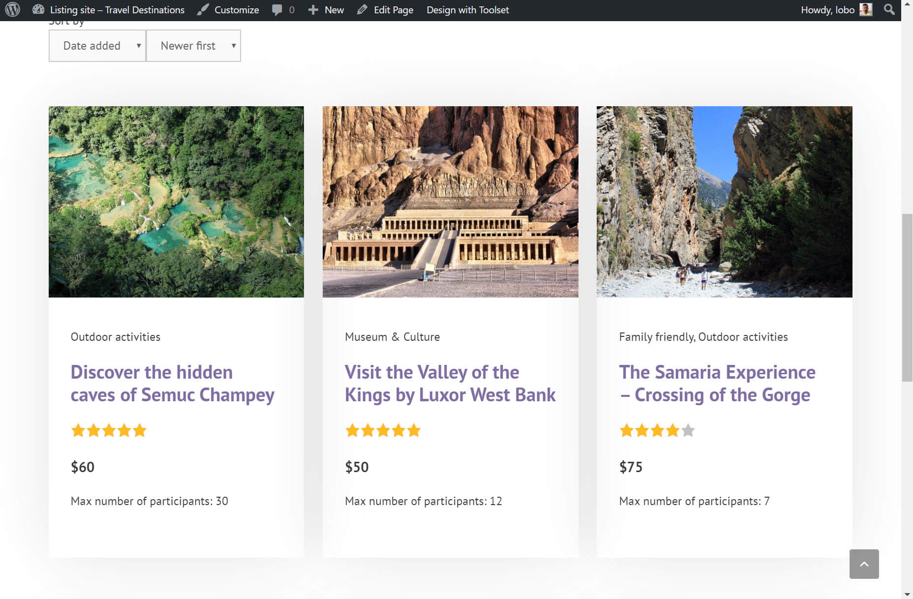
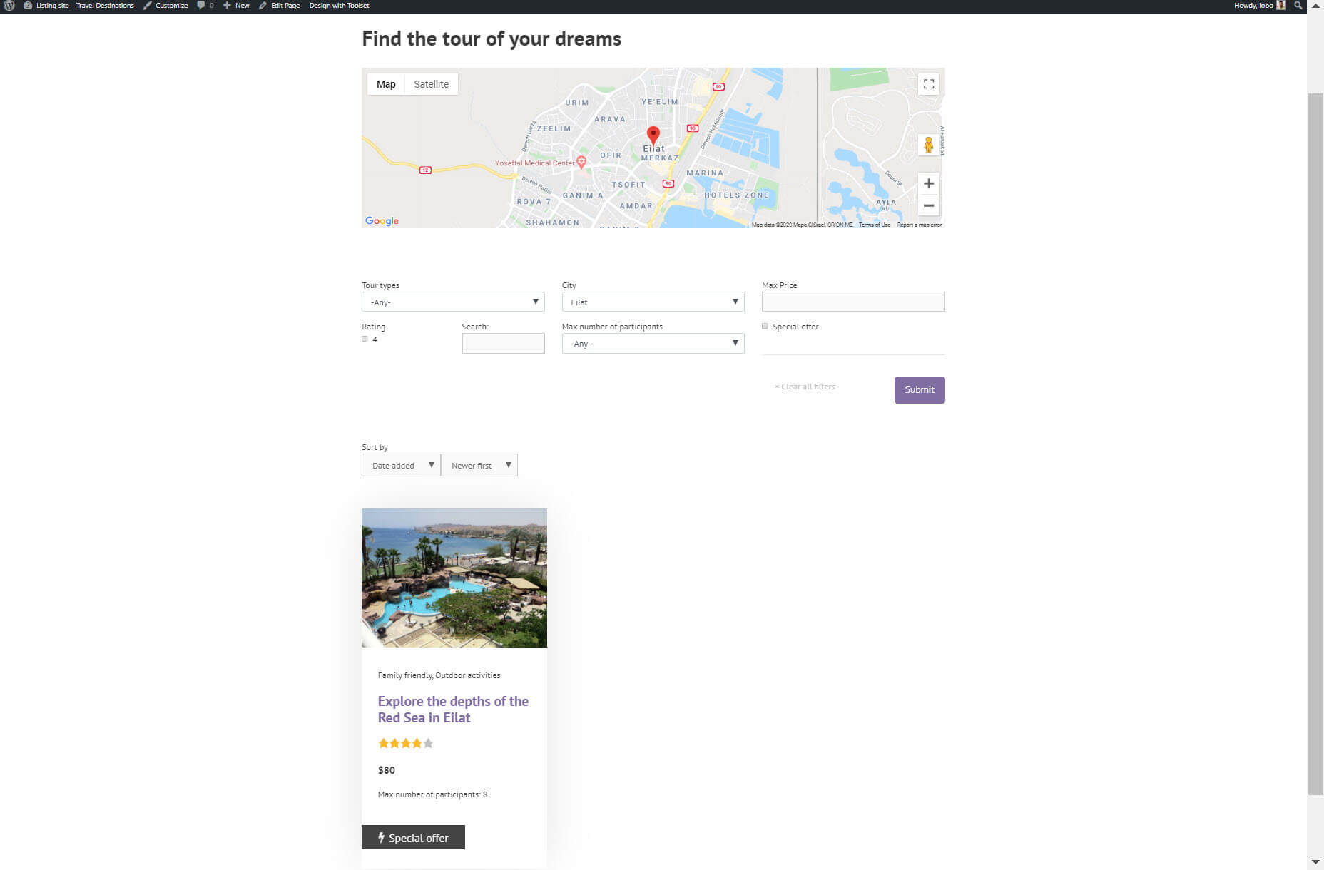
For example, I’ve created a list of tours posts – later I’ll go into how you can do this with Gutenberg. Do you notice something strange about the headings below?

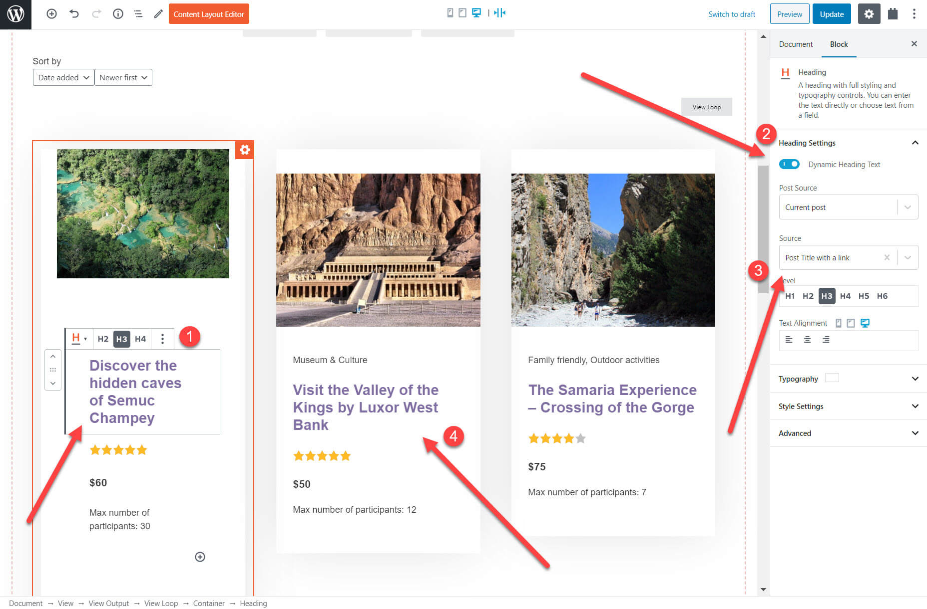
The heading is exactly the same for each of my tours. That’s because the headings are static, the opposite of dynamic. It means when I add my blocks, whatever text I enter in the heading will be displayed for each of the posts. However, when it is dynamic, you will see the correct heading on every tour.

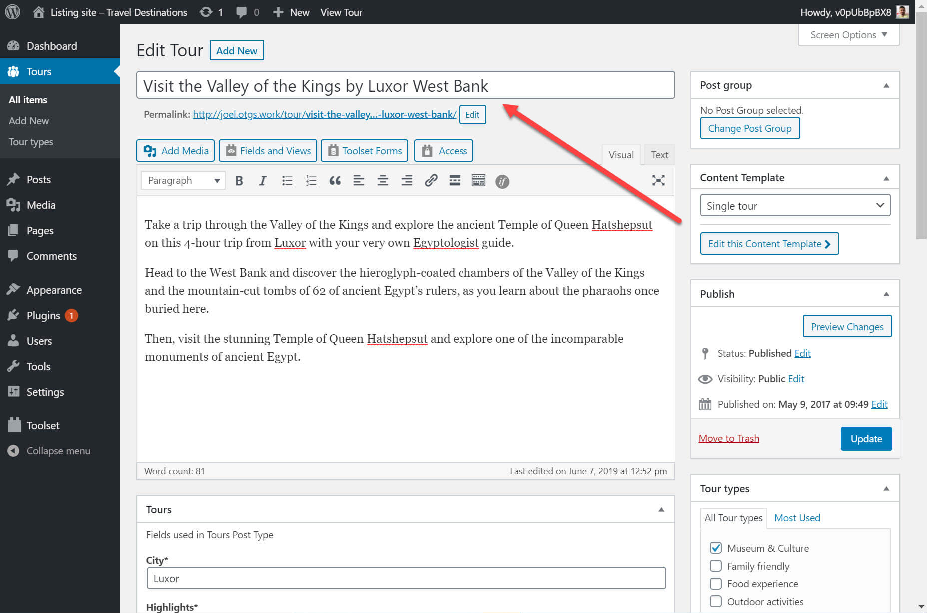
To illustrate, here is my tour post about visiting the West Bank on the back-end. You can see the post title at the top.

I want to display this tour post with the correct heading in my list of content. All I need to do thanks to Gutenberg and Toolset is the following:

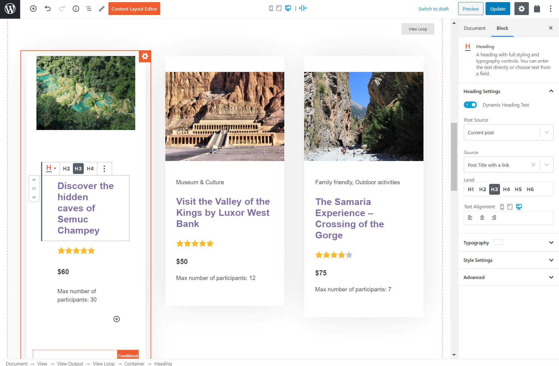
  1. Select Toolset’s heading block — unlike the normal Gutenberg blocks, Toolset’s allows you to make your content dynamic;
  2. Select the dynamic option;
  3. Choose the source for your heading;
  4. Confirm that the heading is correct.

You can create dynamic content for a number of other blocks available on Gutenberg including images, custom fields and the link for buttons.

2. Display Custom Lists of Content

On a custom website, there will be times when you will want to list your content from a particular post type on different parts of your website. For example, a list of properties for sale on your real estate homepage.

Each of these properties uses the same layout, displaying the same information such as the price, number of bedrooms and number of bathrooms in the same way. This information is added using custom fields which are pieces of information you can add to WordPress content. Page builders on their own can’t build custom fields. However, you can create them using Gutenberg and its blocks plugins.

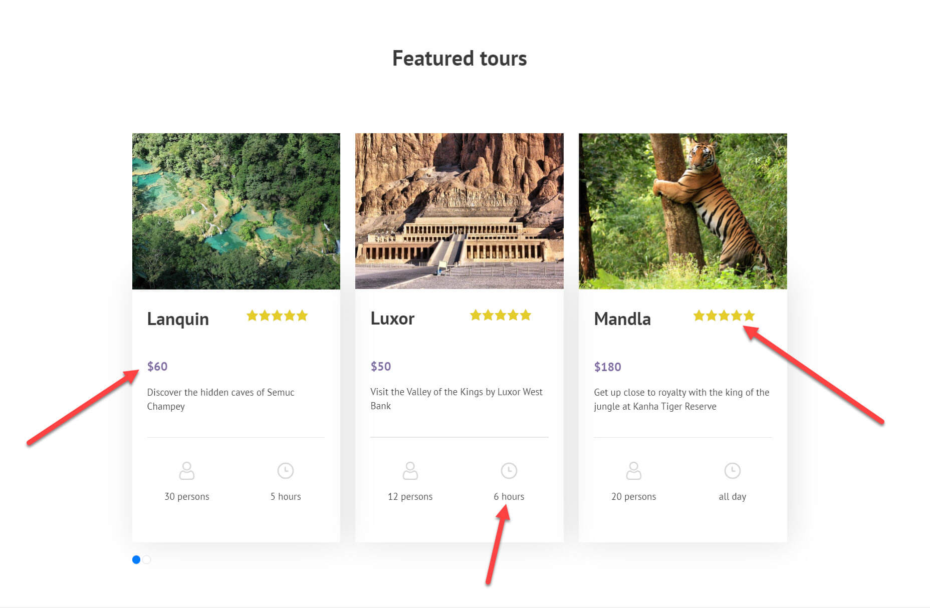
Below for my travel website, I displayed a slider with a list of featured tours. The list includes a number of custom fields including the price, rating and duration.

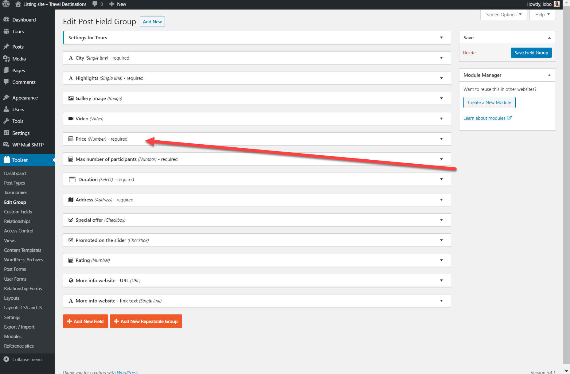
I used Gutenberg and Toolset to create the custom fields which you can see in my list above. Here are all of the custom fields I created. I’ve highlighted the price field as an example.

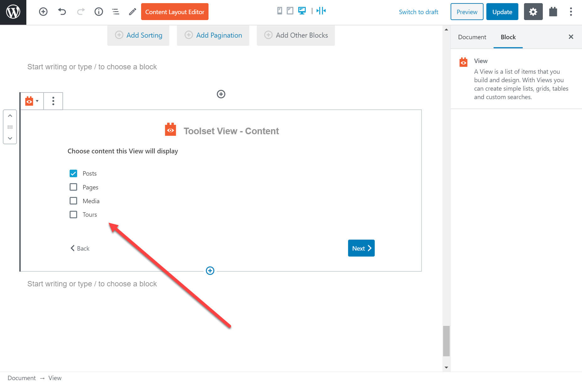
On the back-end I can use Toolset’s View block to create a list of posts. I can choose what posts I want to display and how I want to display them.

For example, below you can see that I am able to select which content I want to display.

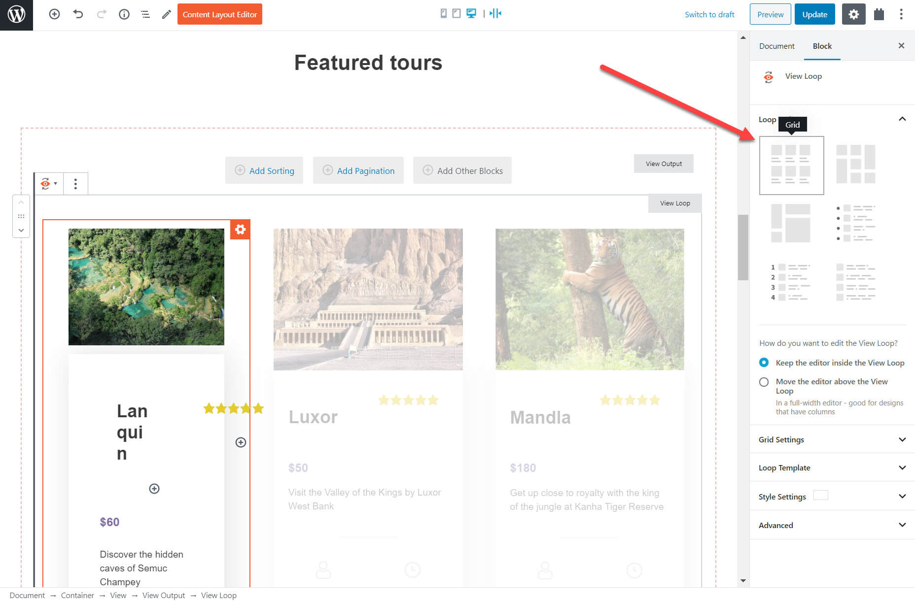
I can also decide how I want to display my list, whether it is in the form of a grid, ordered list, unformatted or much more.

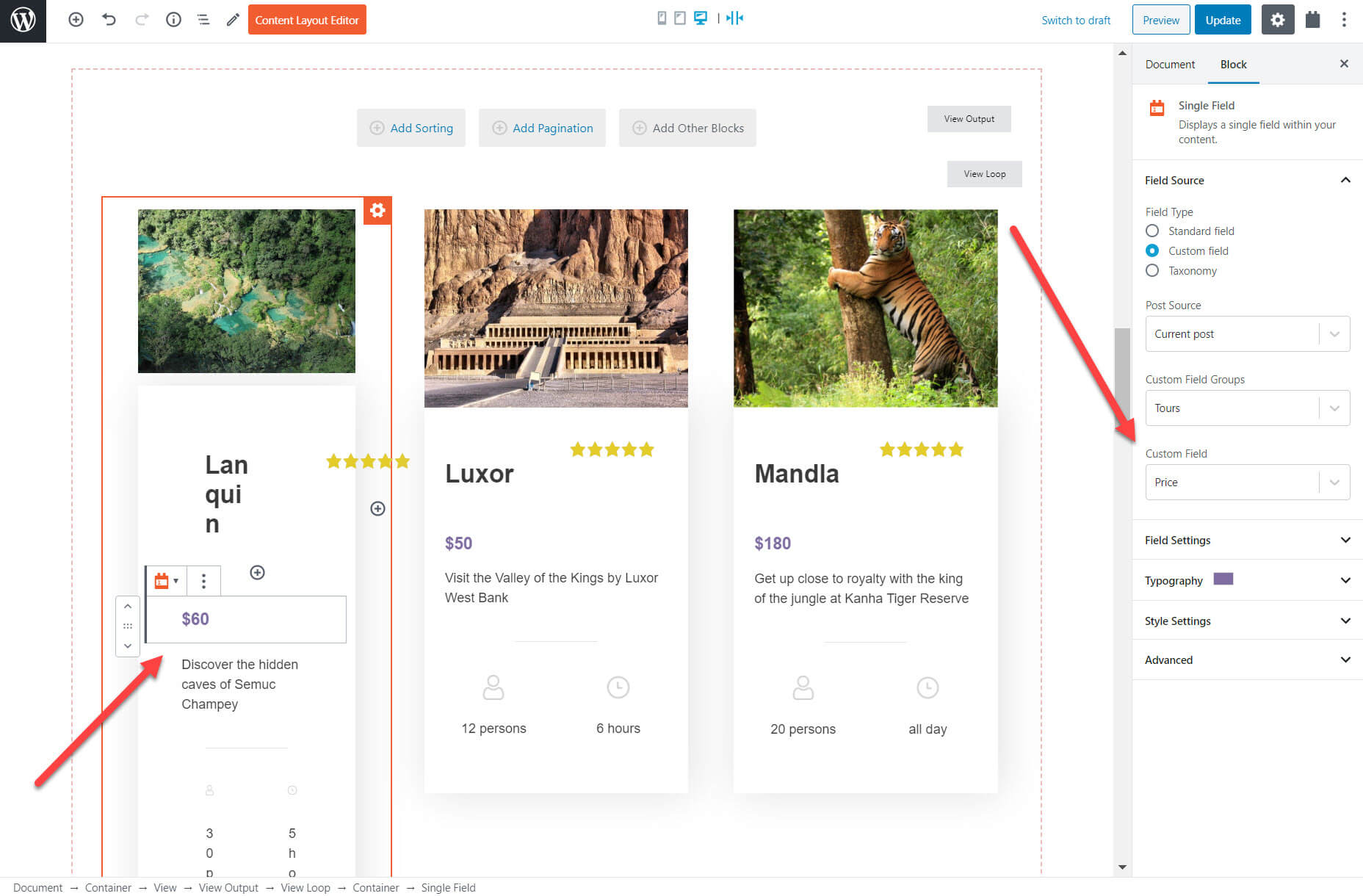
I can now select which fields I want to display. Many of these fields will be the custom fields that I created previously. Each of my tours will display the fields in the same layout. Once again, I’ve highlighted the price custom field below. For each field I create a block and then choose the source of the content (such as the price) on the right hand sidebar.

Once I have arranged the layout for my posts I can decide exactly which posts I display and in what order. Using Gutenberg and Toolset I can select:

  • The order I display posts such as the most recent blog post;
  • The number of posts I display;
  • If I want a filter on my posts, for example display only the tours that cost less than a certain amount.

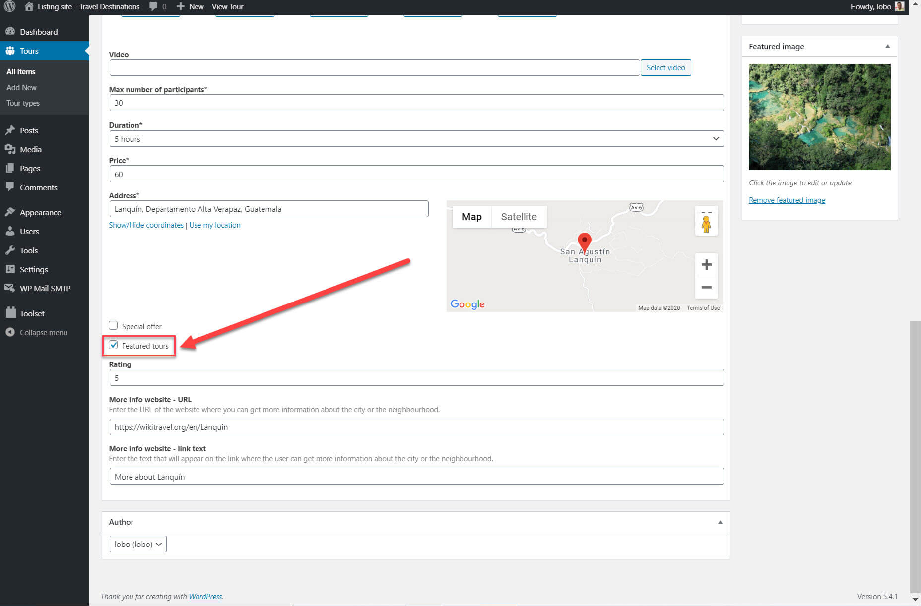
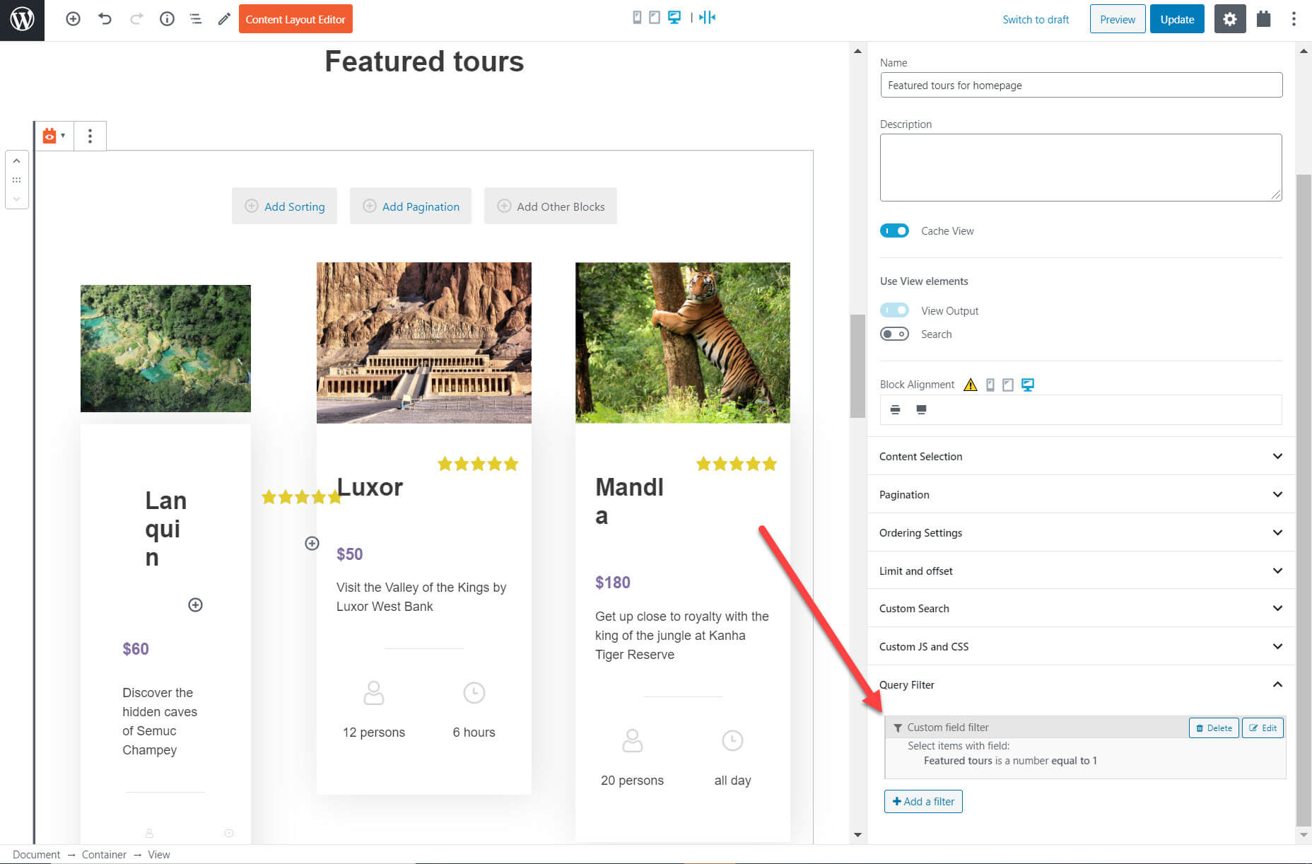
I added a filter to display only the featured tours. As part of my custom fields I created a field for “Featured tours” which you can click for each post on the back-end.

I can use Gutenberg and Toolset to create a filter using the right-hand sidebar which tells my list of content to only display those tours posts which are featured.

Notice how I am able to completely customize my lists of posts on Gutenberg without using any coding at all. Even designers without any programming experience will be able to add a list of posts to their website.

3. Create a Template For Your Content

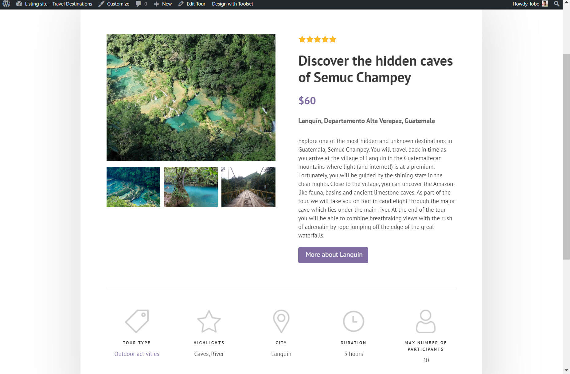
A template is your blueprint for your post types that provides each of your posts with a structure. For example, I’ve created a template for my tours post types which means each tour post will have exactly the same structure when you look at it on the front-end.

As you can see, both posts are from the same template. You know this because each post has the same layout, with the content following the same structure.

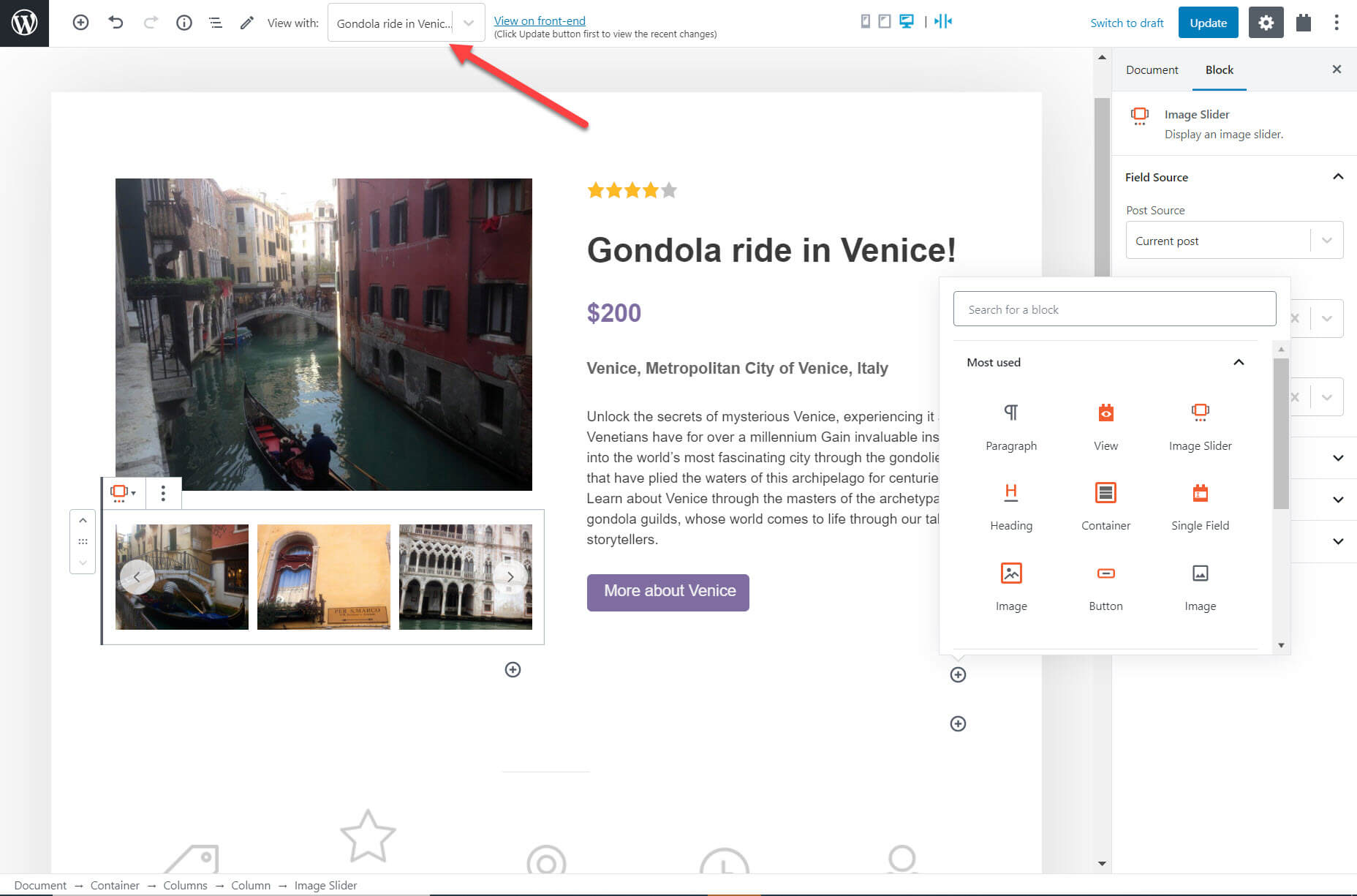
All I needed to do to create my template on my Gutenberg Editor was insert my blocks and add dynamic content. As I’m adding the content I can use the drop-down at the top of the page to switch between the posts to see what the template looks like with different post content.

4. Create a Custom Search

One of the most important features on a custom website is a search.

If you are designing a directory website which sells items, for example, you will want to make it as easy as possible for potential customers to find your products. The best way is with a search that contains filters so they can narrow the results down and find exactly what they’re looking for.

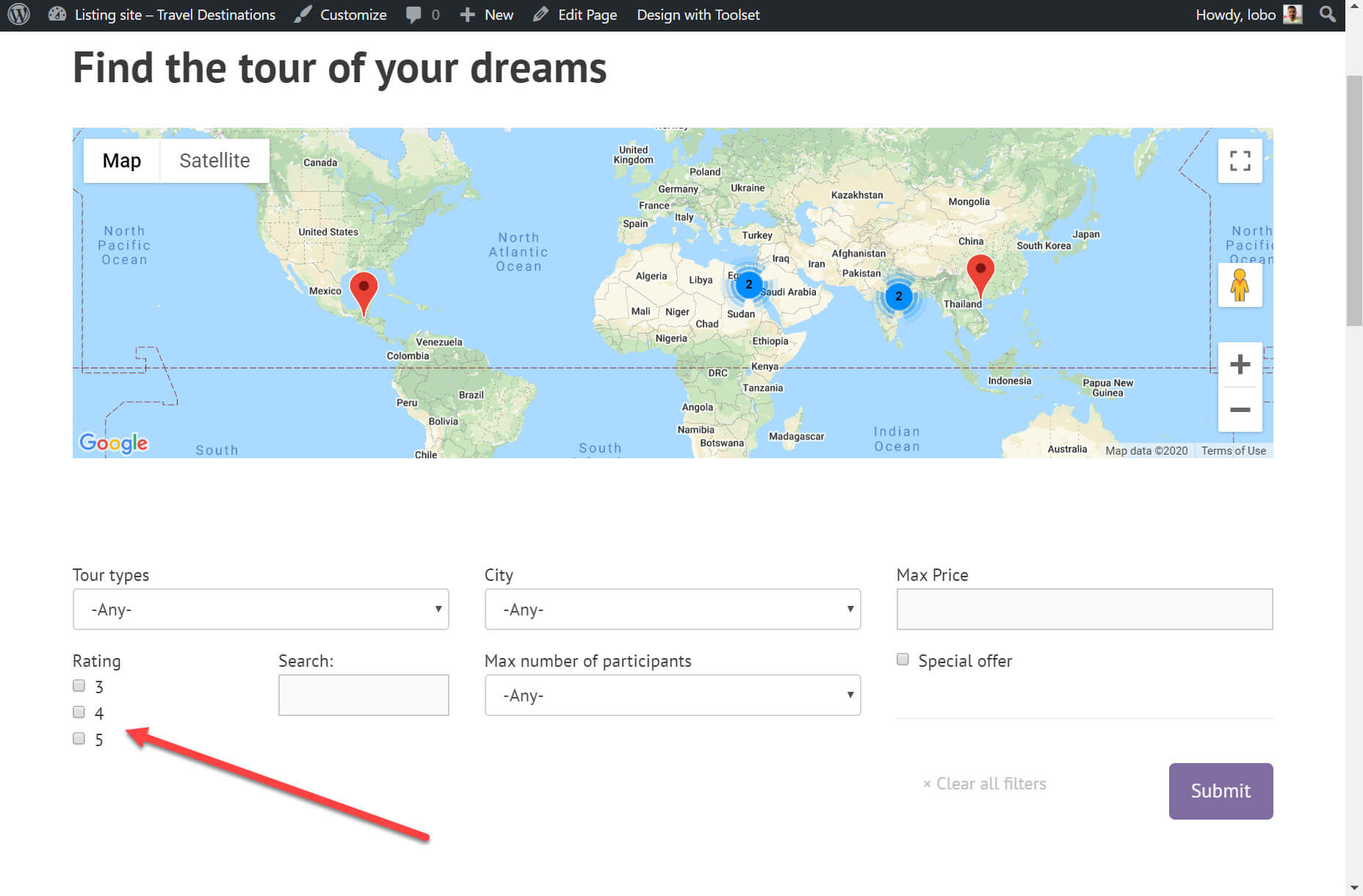
Below you can see the custom search I created using Gutenberg and Toolset for my tours. It contains a number of filters. One of the filters is to only show those tours with a rating of 3-5 stars.

Creating a custom search consists of two steps. First, creating the search (which you can see above) and second, designing the results.

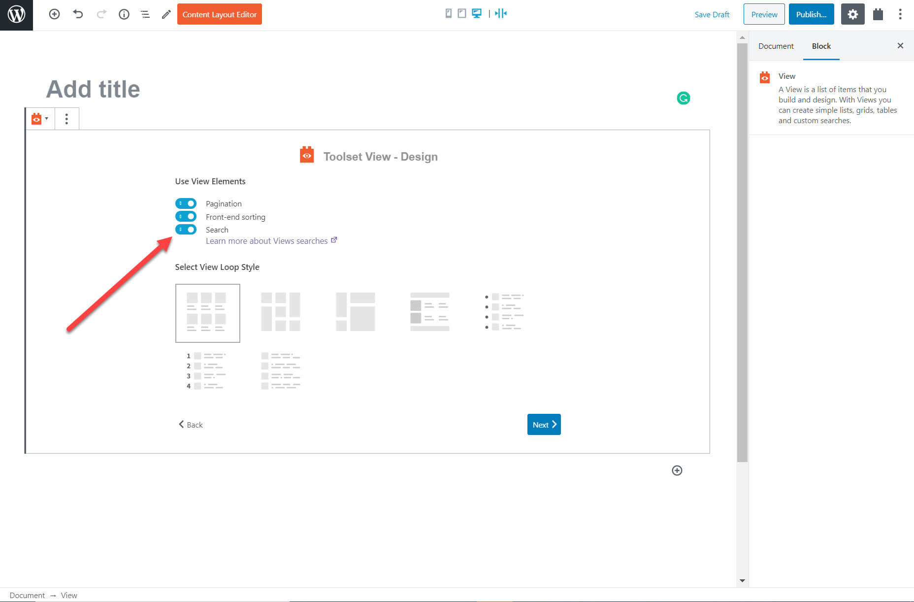
I created the search using Toolset’s View block on a new page. Below are the options to enhance the block. I can select the search option, add front-end sorting so that the user can sort the results when they appear (lowest to highest price, for example) and pagination to split the content into pages.

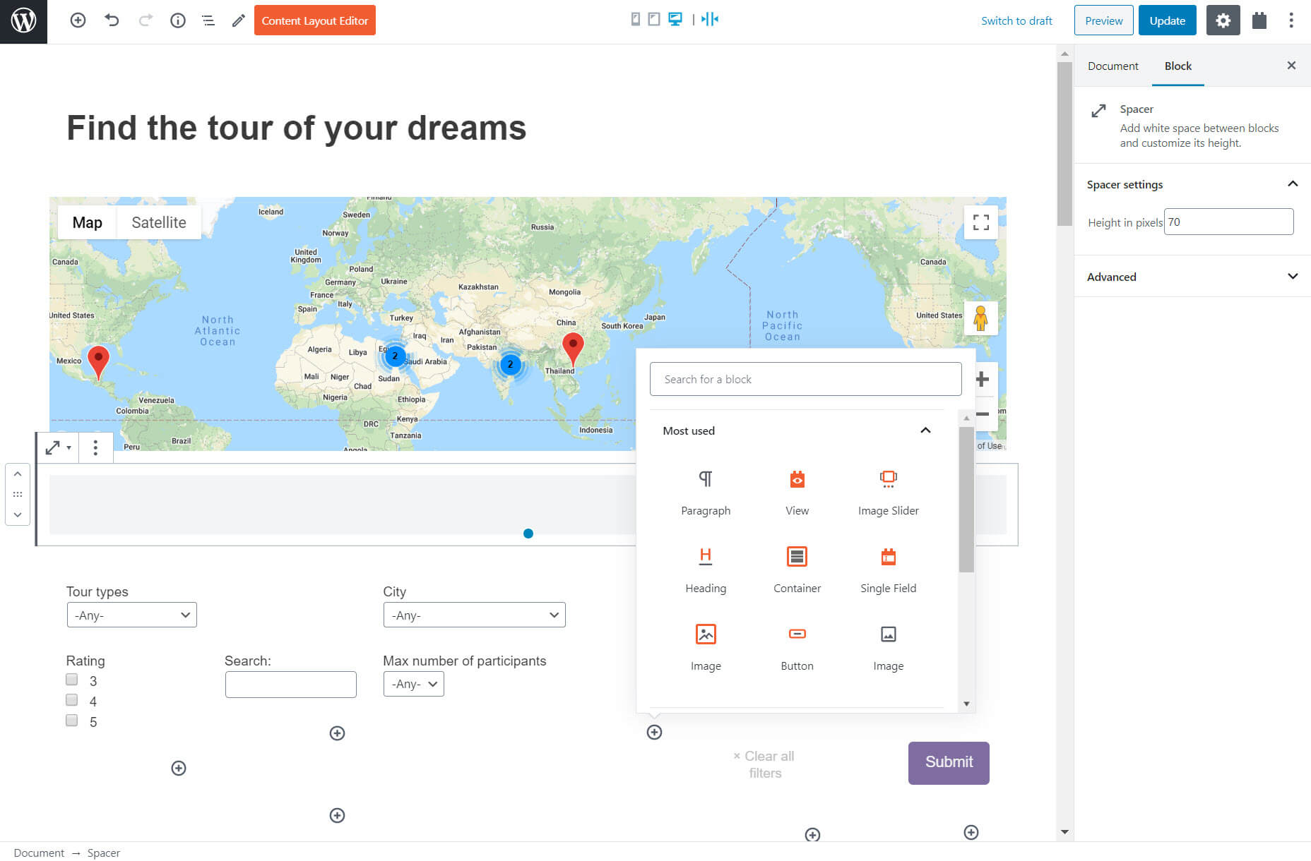
Once I add the block I can proceed to add additional filters such as the maximum price. I can also include a map and markers to display the results. Once again thanks to Gutenberg and its extensions I do not need to use coding. I just select the blocks and adjust the options on the right-hand sidebar.

For the results, I added blocks just like I did for the template and custom list of content.

And just like that, I have a custom search for my tours. I can now enter searches using the filters on the front-end.

5. Create an Archive of Similar Posts

An archive makes it easier for users to find all the posts you have published. If you want an archive with standard fields such as a heading and post content then a page builder such as Elementor is a great option. However, if you want to include custom fields with dynamic content then you will need to use Gutenberg,

I built an archive for all of my tours on my travel website. When someone clicks on the archive they will see every tour I have created. You can create a tour for any of your posts.

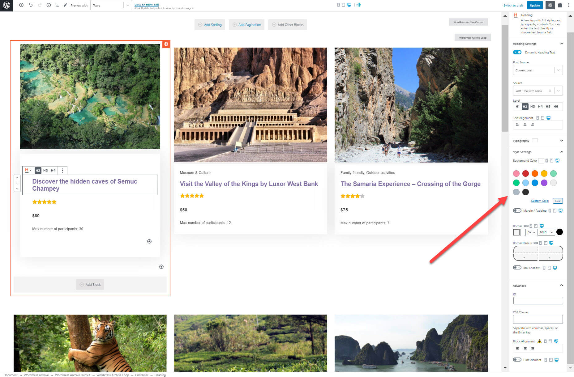
Just like with the custom list of content I can add the blocks for the content and arrange the posts how I want.

I can also style the blocks by changing the text color, adding a padding/margin, add the background color, and much more.

You Do Not Need to be a Professional Developer to Create Professional Websites

Now that you have seen how even a coding beginner can build complete custom websites it is time for you to try it out yourself. Here are some tutorials and documentation worth going through:

  • If you are new to Gutenberg, Colorlib offers a good WordPress Gutenberg tutorial which will introduce you to how you can create blocks.
  • The plugin I used with Gutenberg, Toolset, offers a training course on how you can use the two tools to build WordPress directory websites. It is a great way to understand exactly what features you can build and how for any type of website.
  • To keep up to date with any changes to Gutenberg it is also worth keeping an eye on the block editor handbook.

Gutenberg is still in its infancy and is far from the finished product. But that does not mean it can’t revolutionize the website building contracts you can take on. If you take advantage of its visual UI and blocks plugins you will be able to build custom websites that you never before thought were possible.

Source

Categories: Designing, Others Tags:

Understand why CSS has no effect with the Inactive CSS rules indicator in Firefox DevTools

June 4th, 2020 No comments

It’s useful when DevTools tells you that a declaration is invalid. For example, colr: red; isn’t valid because colr isn’t a valid property. Likewise color: rd; isn’t valid because rd isn’t a valid value. For the most part, a browser’s DevTools shows the declaration as crossed out with a warning () icon. It would be nice if they went a step further to tell you which thing was wrong (or both) and suggest likely fixes, but hey, I don’t wanna look a gift horse in the mouth.

Firefox is starting to go a step further in telling you when certain declarations aren’t valid, not because of a syntax error, but because they don’t meet other qualifications. For example, I tossed a grid-column-gap: 1rem on a random

and I was told this in a little popup:

grid-column-gap has no effect on this element since it’s not a flex container, a grid container, or a multi-column container.

Try adding either display:grid, display:flex, or columns:2. Learn more

Well that’s awful handy.

Elijah Manor has a blog post and video digging into this a bit.

Direct Link to ArticlePermalink

The post Understand why CSS has no effect with the Inactive CSS rules indicator in Firefox DevTools appeared first on CSS-Tricks.

Categories: Designing, Others Tags:

A Primer on Display Advertising for Web Designers

June 4th, 2020 No comments

A lot of websites (this one included) rely on advertising as an important revenue source. Those ad placements directly impact the interfaces we build and interact with every day. Building layouts with ads in them is a dance of handling them in fluid environments, and also balancing the need to showcase our content and highlight the ads to make sure they are effective.

In this post, I am going to share a few tips and ideas for integrating ad units into layouts. We’ll take a look at some placement options where we might consider or commonly expect to place advertisements in webpages, then move into styling strategies.

I might use some modern CSS properties along the way that are not fully supported in older browsers. Take a look at @supports if you wish to support old browsers in a progressive enhancement friendly way.

Common Digital Ad Placements

There are many, many different places we can drop ads onto a page and an infinite number of sizes and proportions we could use. That said, there are standard placements and sizes that are commonly used to help establish a baseline that can be used to set pricing and compare metrics across the industry. We’ll cover a few of them here, though you can see just how many options and variations are in the wild.

The Navigation Bar Placement

The space right above the main navigation of a site is often a great placement to put an advertisement. It’s great because — in many cases — navigation is at the top of the page, providing a prominent location that both lends itself to using a full-width layout and lots of user interaction. That’s often why we see other types of important content, like alerts and notifications, occupy this space.

The easiest way to do this is simply placing the ad element above the navigation and call it a day. But what if we want to “stick” the navigation to the top of the page once the ad scrolls out of view?

CodePen Embed Fallback

Here we’re using position: sticky to get that effect on the navigation. As documented by MDN, a sticky element is where:

The element is positioned according to the normal flow of the document, and then offset relative to its nearest scrolling ancestor (and containing block).

It might be tempting to use fixed positioning instead, but that removes the navigation from the normal document flow. As a result, it gets fixed to the top of the viewport and stays there as you scroll. That makes sticky a more viable method with a smoother user experience.

A fixed element literally stays put while it remains in view, while a sticky element is able to “stick” to the top when it reaches there, then “unstick” upon return.

Now, we could do the reverse where the ad is the sticky element instead of the navigation. That’s something you’ll need to weigh because hiding the navigation from view could be poor UX in certain designs, not to mention how persistent advertisements could interfere with the content itself. In other words, tread carefully.

The Header Placement

Displaying ads in the site header is another place we commonly bump into advertisements. There are two widely used patterns using the header placement. In advertising industry jargon, they’re referred to as:

  • Billboard: A rectangular ad that is presented as a main call-to-action These are typically 970?250. We could use the widest size there, 970px, to set the size of a site’s main content area.
  • Leaderboard: An ad that is wide, short, and often shares space with another element. These are typically 728?90.

The billboard spot, despite being large, is rarely used (estimated at only 2% of sites), but they do command higher rates The leaderboard is far and away the most widely used digital ad size, with a 2019 SEMrush study citing 36% of publishers using leaderboards and 57% of advertisers purchasing them.

CodePen Embed Fallback

The nice thing about a leaderboard is that, even if we use the same 970px container width that the billboard ad command, we still have enough room for another element, such as a logo. I tend to use flexbox to separate the site logo from the ad. I also give the container a fixed height that either equals or is greater than the 90px leaderboard height.

.header .container {
  /* Avoid content jumping */
  height: 90px;
  /* Flexibility */
  display: flex;
  align-items: center;
  justify-content: space-between;
}

The Sidebar Placement

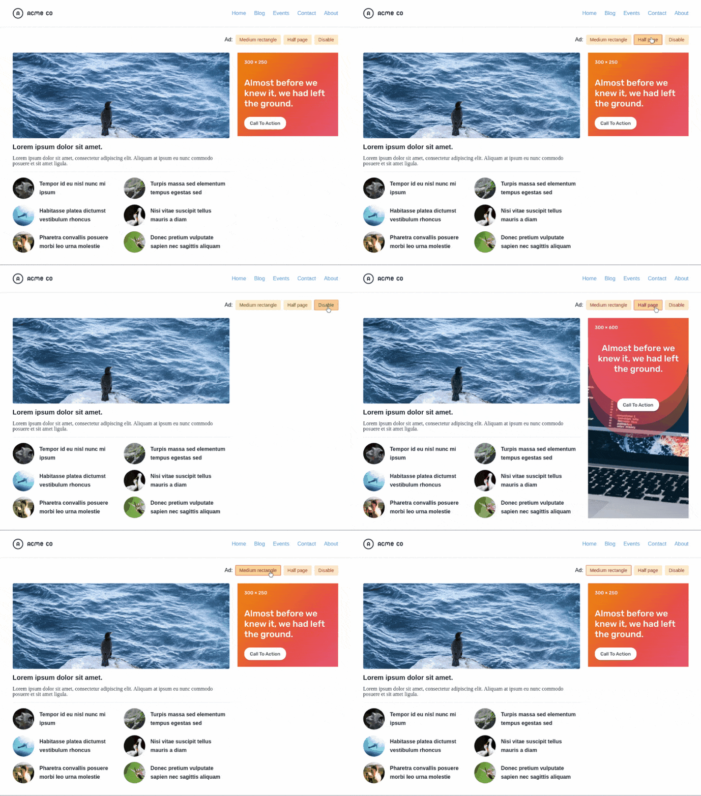
The mid page unit ad (also known as medium rectangle) weighs in at 300?250 and is the top-performing ad unit — literally #1!

Google study of 2018 clickthrough rates (clicks per thousand views) compared for different ad placements. Google no longer provides these stats. (Source:Smart Insights)

Mid page units have influenced the design of sidebars on sites for a long time. Again, you can see an example right here on CSS-Tricks.

Crack that open in DevTools and you will see that it has a rendered width of exactly 300px.

We can achieve the same thing using CSS grid:

CodePen Embed Fallback

Let’s say this is the markup of our layout:

<div class="wrapper">
  <main>Main content</main>
  <aside>Sidebar</aside>
</div>

We can set the wrapper as our grid container and define two columns, the second of which is the exact 300px width of our ad unit:

.wrapper {
  display: grid;
  grid-template-columns: minmax(0, 1fr) 300px;
}

If we aren’t displaying too many ads in the sidebar and want to draw more attention to them, we can try using the same sticky technique we did with the navigation placement:

<div class="wrapper">
  <main>Main content</main>
  <aside>
    <div class="is-sticky">Sidebar</div>
  </aside>
</div>
.is-sticky {
  position: sticky;
  top: 0;
}

But you must keep in mind that it will affect reach if the sidebar is longer than the viewport or when using a dynamic sidebar:

(View demo)

There are two ways I tend to solve this issue. The first is to keep it simple and only make important ads sticky. It’s the same concept applied to the CSS-Tricks sidebar, the only difference is that JavaScript toggles the visibility:

The second is to use a JavaScript library that includes scrolling behavior that can be used to listen for when the user reaches the end of the sidebar before triggering the sticky positioning:

There are other considerations when working with ads in the sidebar. For example, let’s say the ad we get is smaller than expected or the script that serves the ads fails for some reason. This could result in dreaded whitespace and none of the approaches we’ve looked at so far would handle that.

Where’d the widget go? The disable button is a simulation for an ad blocker.

Here’s how I’ve tackled this issue in the past. First, our markup:

<header class="header">
  <div class="container">

    <div class="header-content"> ... </div>
    
    <aside class="aside">
      <div class="aside-ad"> ... </div>
      <div class="aside-content"> ... </div>
    </aside>

  </div>
</header>

Then, we set the right measurements for the grid columns:

.header .container {
  display: grid;
  grid-template-columns: minmax(0, 1fr) 300px;
  grid-gap: 24px;
  min-height: 600px; /* Max height of the half-page ad */
}

Now let’s make the sidebar itself a flexible container that’s the exact width and height that we exact the ad to be, but hides any content that overflows it.

.aside {
  display: flex;
  flex-direction: column;
  overflow: hidden;
  height: 600px;
  width: 300px;
}

Finally, we can style the .aside-content element so that it is capable of vertical scrolling in the event that we need to display the widget:

.aside-content {
  overflow-y: auto;
}

Now, we’ve accounted for situations where the size of the ad changes on us or when we need fallback content.

No more whitespace, no matter what happens with our ad!

Styling Digital Ads

Now that we’ve looked at placements, let’s turn our attention to styling digital ads. It’s always a good idea to style ads, particularly for two reasons:

  1. Styling ads can help them feel like a native part of a website.
  2. Styling ads can make them more compelling to users.

Here are a few tips we can leverage to get the most from ads:

  • Use a flexible layout so things look good with or without ads. Let’s say an image doesn’t load for some reason or suddenly needs to be removed from the site. Rather than having to refactor a bunch of markup, it’s ideal to use modern CSS layout techniques, like flexbox and grid, that can adapt to content changes and reflow content, as needed.
  • Use styling that is consistent with the site design. Ads that look like they belong on a site are not only easier on the eye, but they leverage the trust that’s been established between the site and its readers. An ad that feels out of place not only runs the risk of looking spammy, but could compromise user trust as well.
  • Use a clear call to action. Ads should provoke action and that action should be easy to identify. Muddying the waters with overbearing graphics or too much text may negatively impact an ad’s overall performance.
  • Use accurate language. While we’re on the topic of content, make sure the ad delivers on its promises and sets good expectations for users. There’s nothing more annoying than expecting to get one thing when clicking on something only to be sold something else.
  • Use high-res images. Many ads rely on images to draw attention and emphasize content. When we’re working with ads that contain images, particularly smaller ad placements, it’s a good idea to use high-resolution images so they are crystal clear. The common way to do that is to make an image twice the size of the space to double its pixel density when it renders.

When working with custom ads where you have control over how they are implemented, like the ones here on CSS-Tricks, it’s a lot easier to adapt them to a specific layout and design. However, in cases where they are injected dynamically, say with a script, it might not be possible to wrap them in a div that can be used for styling; tactics like using ::before and ::after pseudo-elements as well as [attribute^=value] selectors are your friend in these situations.

Many advertising platforms will generate a unique ID for each ad unit which is great. They often start with the same prefix that we can use to target our styles:

[id^="prefix-"] {
  /* your style */
}
CodePen Embed Fallback

Handling Responsive Ads

Ad platforms that provide a script to inject ads will often handle responsive sizing by bundling their own styles and such. But, when that’s not the case, or when we have complete control over the ads, then accounting for how they display on different screen sizes is crucial. Proper responsive handling ensures that ads have a clear call-to-action at any screen size.

Flexbox, Grid and nth-child

One thing we can do is re-order where an ad displays. Again, flexbox and grid are great CSS techniques to lean on because they employ the order property, which can change the visual placement of the ad without affecting the order of the actual source code.

In this example, we will try to reorder our items so the ad is visible “above the fold,” which is a fancy way of saying somewhere at the top of the page before the user needs to start scrolling.

Here’s our markup:

<div class="items">
  <div class="ad">...</div>
  <div class="item">...</div>
  <div class="item">...</div>
  <!-- and so on... -->
</div>

We can use :nth-child to select one or more items based on their source order, according to a formula:

.items {
  display: grid;
  /* ... */
}


.item:nth-child(-n+2) {
  order: -1;
}


@media only screen and (min-width: 768px) {
  .article:nth-child(-n+3) {
    order: -1;
  }
}

This selector will target the first n elements and set their order to a negative value. This allows the ad to dive between the items depending on the size of the viewport:

CodePen Embed Fallback

Handling Static Ads

Not all ads can be perfectly flexible… or are even designed to be that way. We can still sprinkle in some responsive behavior to ensure they still work with a layout at any given screen size.

For example, we can place the ad in a flexible container and hide the parts of the ad that overflow it.

Obviously, there’s a good deal of design strategy needed for something like this. Notice how the important ad content is flush to the left and the right is simply cut off.

Here’s the markup for our flexible container:

<div class="ad">
  <img src="https://i.imgur.com/udEua3H.png" alt="728x90" />
</div>

Depending on whether the ad’s important content is on the left or right of the ad layout, we can justify the container content either to flex-start, flex-end, or even center, while hiding the overflowing portion.

.ad {
  display: flex;
  justify-content: flex-end; /* depending on the side your important content live */
  overflow: hidden;
}
CodePen Embed Fallback

Handling Responsive Images

While ads aren’t always made from static images, many of them are. This gives us an opportunity to put the tag to use, which gives us more flexibility to tell the browser to use specific images at specific viewport sizes in order to fill the space as nicely as possible.

<picture>
  <!-- Use the ad_728x90.jpg file at 768px and above  -->
  <source media="(min-width: 768px)" srcset="ad_728x90.jpg">
  <!-- The default file -->
  <img src="ad_300x250">
</picture>
CodePen Embed Fallback

We covered it a little earlier, but using high-resolution versions of an image creates a sharper image, especially on high-DPI screen. The element can help with that. It’s especially nice because it allows us to serve a more optimized image for low-resolution screens that are often associated with slower internet speeds.

Another thing you can do is using srcset to support multiple display resolutions which will allow the browser to choose the appropriate image resolution:

<img srcset="ad_300x250@2.jpg, ad_300x250@2.jpg 2x" src="ad_300x250_fallback.jpg" />

We can even combine the two:

<picture>
  <!-- ... -->
  <source media="(min-width: 768px)" srcset="ad_728x90.jpg, ad_728x90@2.jpg 2x" />
  <!-- ... -->
  <img srcset="ad_300x250@2.jpg, ad_300x250@2.jpg 2x" src="ad_300x250_fallback.jpg" />
</picture>

Let’s make sure we set the right width for the ad:

.selector {
  width: 250px;
}

And let’s use media queries for to handle the different assets/sizes:

.selector {
  width: 300px;
  height: 250px;
}


@media (min-width: 768px) {
  .responsive-ad {
    width: 728px;
    height: 90px;
  }
}

For more flexibility, we can make the image responsive in relation to its parent container:

.selector img {
  display: block;
  width: 250px;
  height: auto;
}

In the case of srcset, there’s no need to worry much about performance because the browser will only download the needed asset for a specific resolution.


Phew, there’s so much to consider when it comes to display advertising! Different types, different sizes, different variations, different layouts, different formats, different viewport sizes… and this is by no means a comprehensive guide to all-things-advertising.

But hopefully this helps you understand the elements that make for effective ads as a site publisher, especially if you are considering ads for your own site. What we’ve covered here should certainly get you started and help you make decisions to get the most from having ads on a site while maintaining a good user experience.

The post A Primer on Display Advertising for Web Designers appeared first on CSS-Tricks.

Categories: Designing, Others Tags: